film title presentation
TRANSCRIPT
Film title designs By Paige Marsh
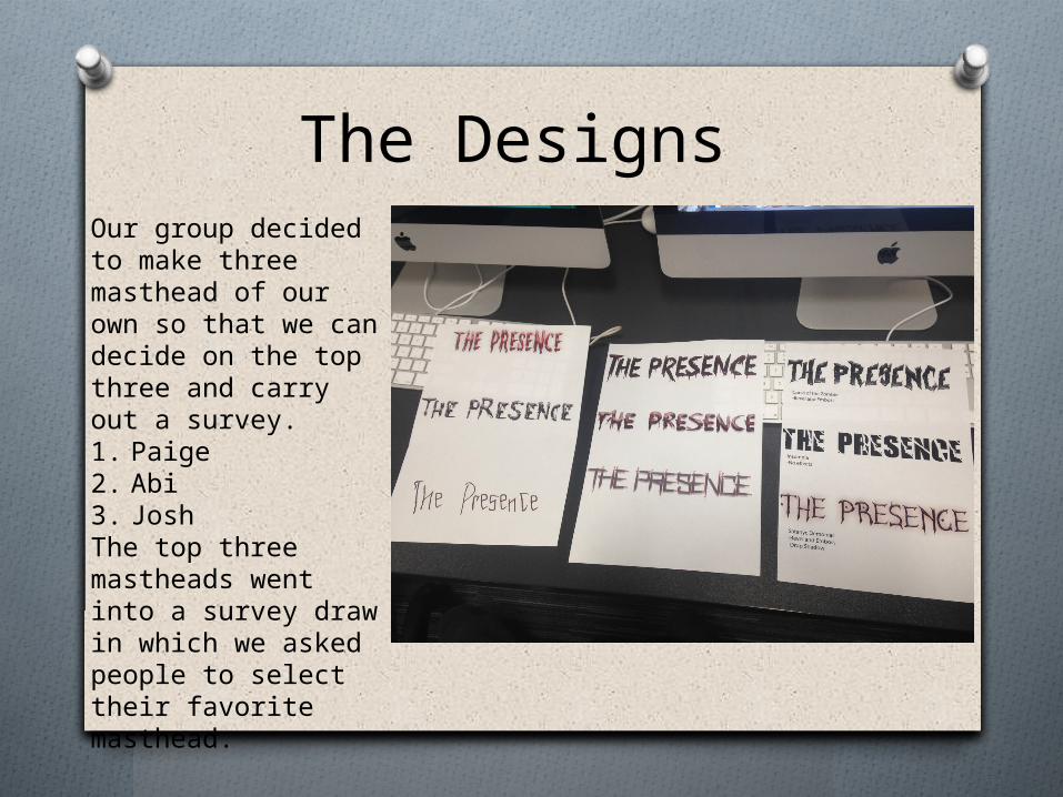
The Designs Our group decided to make three masthead of our own so that we can decide on the top three and carry out a survey. 1. Paige 2. Abi3. Josh The top three mastheads went into a survey draw in which we asked people to select their favorite masthead.

The Selected film titles Bevel and emboss, creating the different textures in the text and also the gradient change from black to grey, this gives it depth making it look like it stands out from the screen.
Drop shadow, this effect creates the red tinted cloud surrounding the text. The effect makes the text look more Sinister.
The text was imported from Dafont.com the font is called satanyc demoniac. This Gives the text a demonic look which suits the Story line
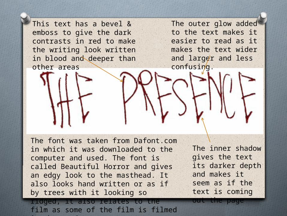
This text has a bevel & emboss to give the dark contrasts in red to make the writing look written in blood and deeper than other areas
The inner shadow gives the text its darker depth and makes it seem as if the text is coming out the page
The outer glow added to the text makes it easier to read as it makes the text wider and larger and less confusing.
The font was taken from Dafont.com in which it was downloaded to the computer and used. The font is called Beautiful Horror and gives an edgy look to the masthead. It also looks hand written or as if by trees with it looking so ridged, it also relates to the film as some of the film is filmed in the woods.
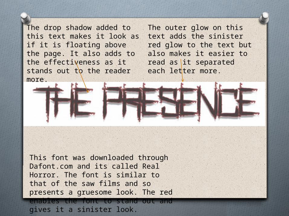
The outer glow on this text adds the sinister red glow to the text but also makes it easier to read as it separated each letter more.
The drop shadow added to this text makes it look as if it is floating above the page. It also adds to the effectiveness as it stands out to the reader more.
This font was downloaded through Dafont.com and its called Real Horror. The font is similar to that of the saw films and so presents a gruesome look. The red enables the font to stand out and gives it a sinister look.
Selected film title
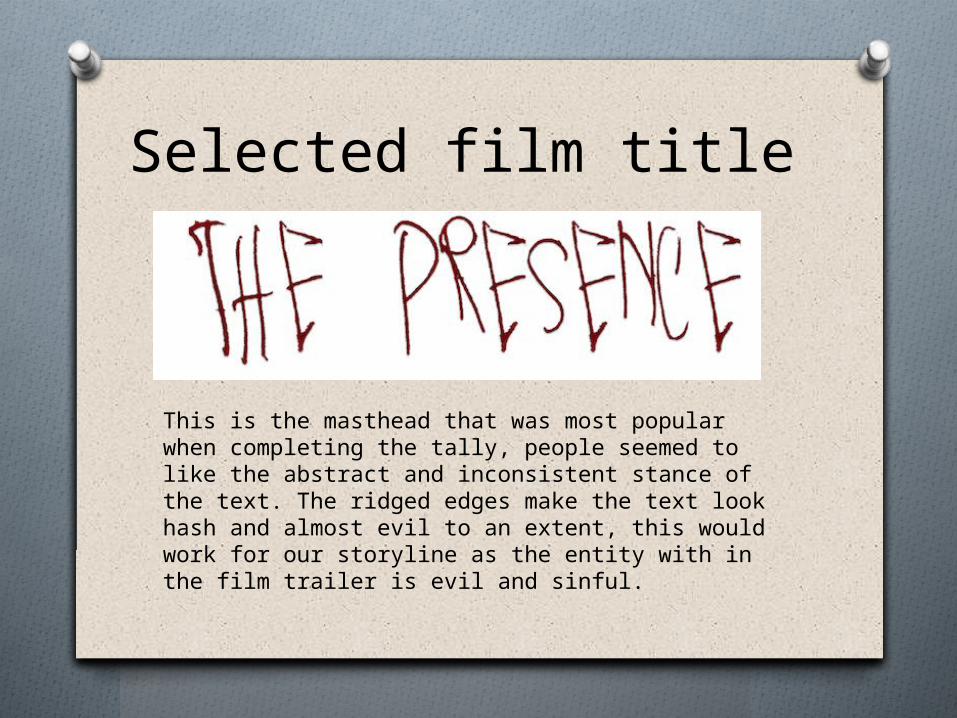
This is the masthead that was most popular when completing the tally, people seemed to like the abstract and inconsistent stance of the text. The ridged edges make the text look hash and almost evil to an extent, this would work for our storyline as the entity with in the film trailer is evil and sinful.