exercise 4.3 create publication- quality maps · create a publication-quality map of hiv prevalence...
TRANSCRIPT

*This training was developed as part of a joint effort between MEASURE Evaluation and MEASURE DHS, with funding provided by USAID and PEPFAR.
GIS Techniques for
Monitoring and Evaluation of HIV/AIDS and Related Programs
Exercise 4.3
Create Publication-Quality Maps
Exercise 4.3: Create Publication-Quality Maps 2 of 27
Exercise 4.3: Create Publication-Quality Maps Background: All free and open source GIS software packages can create maps, but not all of them can create publication-quality maps without assistance from third-party software packages such as Adobe Illustrator or Microsoft PowerPoint. For single indicator maps, however, QGIS provides a map composer interface that provides sufficient functionality for generating publication-quality maps. Summary: In this exercise, you will use the map composer interface within QGIS to create a publication-quality map of HIV prevalence by sex as bar charts superimposed on total HIV prevalence among adults age 15-49, which is the last map produced for exercise 4.2. To help you overcome the limitations of QGIS with respect to the generation of multi-indicator legends, some additional guidance on that topic will be provided at the end.
Objectives:
• Introduce the Map Composer window in QGIS.
• Compose a map showing HIV prevalence by sex as bar charts superimposed on a base map showing total HIV prevalence by district.
• Export the map for publication.
Requirements: To complete these exercises, you will need to have QGIS and several plugins installed on your machine, as instructed in exercise 2.1. You will also need to have downloaded and unzipped the data files associated with the exercise. Remember, these files can reside anywhere on your computer, but must be kept together, with the same original file structure.

Exercise 4.3: Create Publication-Quality Maps 3 of 27
Step 1: Launch QGIS. � Option 1: Click on the desktop shortcut.
� Option 2: Click on Start > All programs > QGIS Dufour > QGIS Desktop 2.0.1. Step 2: Create a new project from the one produced for exercise 4.2. � On the main QGIS menu, select Project > Open.
� Navigate to the folder “Exercises 4.1, 4.2, and 4.3” your folder may have a different
name—just use the one you have been working in) and open the file qgis_exercise_4.2.qgs.
� To save a new project, save the current project with a new name (see below).
• On the main QGIS menu, select Project > Save As.
Exercise 4.3: Create Publication-Quality Maps 4 of 27
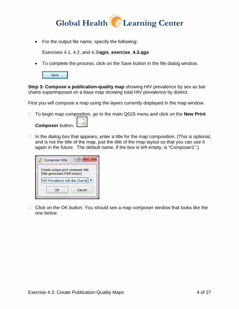
• For the output file name, specify the following:
Exercises 4.1, 4.2, and 4.3\qgis_exercise_4.3.qgs
• To complete the process, click on the Save button in the file dialog window.
Step 3: Compose a publication-quality map showing HIV prevalence by sex as bar charts superimposed on a base map showing total HIV prevalence by district. First you will compose a map using the layers currently displayed in the map window. � To begin map composition, go to the main QGIS menu and click on the New Print
Composer button.
� In the dialog box that appears, enter a title for the map composition. (This is optional, and is not the title of the map, just the title of the map layout so that you can use it again in the future. The default name, if the box is left empty, is “Composer1”.)
� Click on the OK button. You should see a map composer window that looks like the one below.

Exercise 4.3: Create Publication-Quality Maps 5 of 27
� To enlarge your view of the map composition canvas, which is the white rectangle in the middle of the window, go to the top menu and click on the Zoom full button.
You should now see a window that resembles the one below.

Exercise 4.3: Create Publication-Quality Maps 6 of 27
� To add the map in the QGIS map window to the map composition canvas in the map composer, go to the top menu in the map composer and click on the Add new map
button. � To indicate the area on the map canvas in which you would like to place the map,
left-click in the upper-left corner of the canvas and drag the cursor to the lower-right corner of the canvas in order to draw a box that occupies the entire map canvas. This should give you a black rectangle just within the edges of the map canvas (see below).
� To see the map on the canvas, release the left click on the mouse or keyboard. You should see a map that resembles the one below.
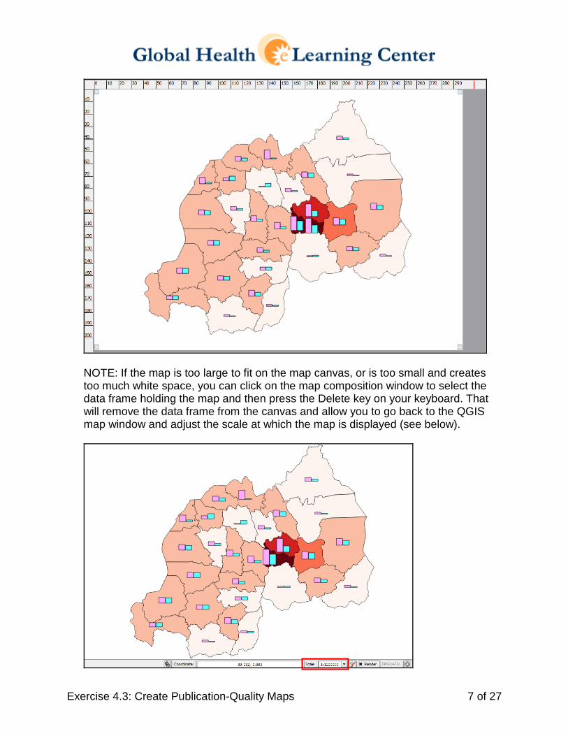
Exercise 4.3: Create Publication-Quality Maps 7 of 27
NOTE: If the map is too large to fit on the map canvas, or is too small and creates too much white space, you can click on the map composition window to select the data frame holding the map and then press the Delete key on your keyboard. That will remove the data frame from the canvas and allow you to go back to the QGIS map window and adjust the scale at which the map is displayed (see below).
Exercise 4.3: Create Publication-Quality Maps 8 of 27
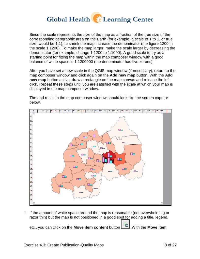
Since the scale represents the size of the map as a fraction of the true size of the corresponding geographic area on the Earth (for example, a scale of 1 to 1, or true size, would be 1:1), to shrink the map increase the denominator (the figure 1200 in the scale 1:1200). To make the map larger, make the scale larger by decreasing the denominator (for example, change 1:1200 to 1:1000). A good scale to try as a starting point for fitting the map within the map composer window with a good balance of white space is 1:1200000 (the denominator has five zeroes). After you have set a new scale in the QGIS map window (if necessary), return to the map composer window and click again on the Add new map button. With the Add new map button active, draw a rectangle on the map canvas and release the left-click. Repeat these steps until you are satisfied with the scale at which your map is displayed in the map composer window. The end result in the map composer window should look like the screen capture below.
� If the amount of white space around the map is reasonable (not overwhelming or razor thin) but the map is not positioned in a good spot for adding a title, legend,
etc., you can click on the Move item content button . With the Move item

Exercise 4.3: Create Publication-Quality Maps 9 of 27
content button selected, you can left-click on the map window and drag the map where you would like it.
(If you make a mistake, you can click on the Revert last change button.)
� To accommodate a title and other cartographic elements, move the map content to the center-right in the map composer window (see below).
The map content should not be touching the edges of the map canvas, and the three closest sides of the map canvas should be about the same distance from the map content. When adding the remaining cartographic elements, you should attempt to fill in white space with useful information while avoiding clutter.
� To add a title, on the map composer main menu click on the Add new label button
and left-click in the white space near the top of the map composer window. You should see a text box that contains the default label of “QGIS” (see below).
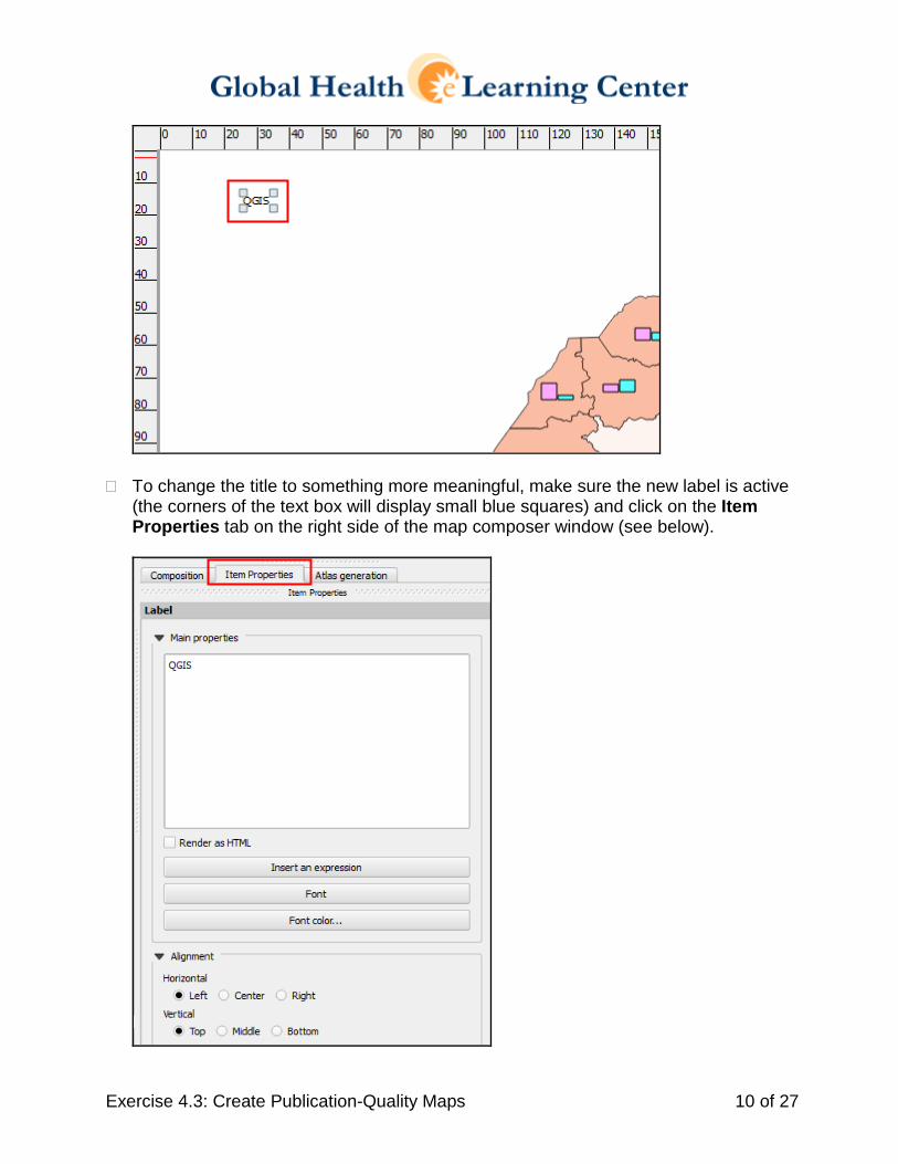
Exercise 4.3: Create Publication-Quality Maps 10 of 27
� To change the title to something more meaningful, make sure the new label is active (the corners of the text box will display small blue squares) and click on the Item Properties tab on the right side of the map composer window (see below).
Exercise 4.3: Create Publication-Quality Maps 11 of 27
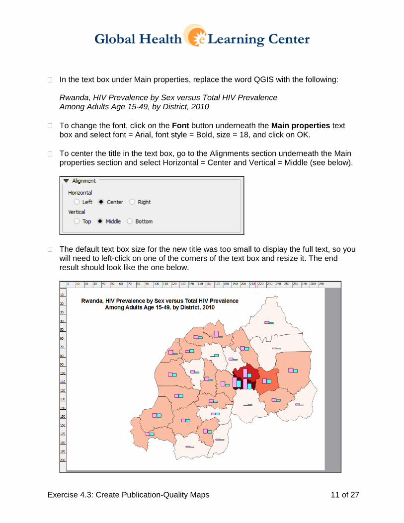
� In the text box under Main properties, replace the word QGIS with the following:
Rwanda, HIV Prevalence by Sex versus Total HIV Prevalence Among Adults Age 15-49, by District, 2010
� To change the font, click on the Font button underneath the Main properties text box and select font = Arial, font style = Bold, size = 18, and click on OK.
� To center the title in the text box, go to the Alignments section underneath the Main
properties section and select Horizontal = Center and Vertical = Middle (see below).
� The default text box size for the new title was too small to display the full text, so you will need to left-click on one of the corners of the text box and resize it. The end result should look like the one below.

Exercise 4.3: Create Publication-Quality Maps 12 of 27
� To add a legend, click on the Add new legend button and left-click in the available white space in the map composer window. You should see a map canvas that looks like the one below.
� There are problems with the legend: (1) the labels for the data layers are not
descriptive and (2) the layer that corresponds to the bar charts does not show colored bar chart graphics to facilitate map interpretation.
To correct these issues:
• First save the project by clicking on the Save project button.
• Switch back to the main QGIS interface and make the following changes to the layer properties: • Turn back on the layer RWA_districts_HIV_pop2010_FP and rename it “HIV
Prevalence by Sex”. To rename the layer, you can highlight the layer name and press the F2 button on the keyboard to go into editing mode, or you can enter a new name by highlighting the layer name in the Layers panel and on the main QGIS menu selecting Layer > Properties > General > Layer name.

Exercise 4.3: Create Publication-Quality Maps 13 of 27
• Open the properties window for the layer that is now named HIV Prevalence by Sex. To perform this task, double-click on the layer name or highlight the layer name and select Layer > Properties.
• In the Layer Properties window for the layer HIV Prevalence by Sex, select the Style option and select Graduated symbols with 2 classes. Then change the labels for the two classes to be Female HIV Prevalence and Male HIV Prevalence. Finally, double-click on the colored symbols to the left of the class values and labels and change the colors to match those used for the bar charts (see below).
• To save the changes, click on Apply and OK. You should see a map that
looks like the one below.
Exercise 4.3: Create Publication-Quality Maps 14 of 27
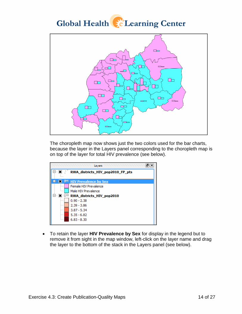
The choropleth map now shows just the two colors used for the bar charts, because the layer in the Layers panel corresponding to the choropleth map is on top of the layer for total HIV prevalence (see below).
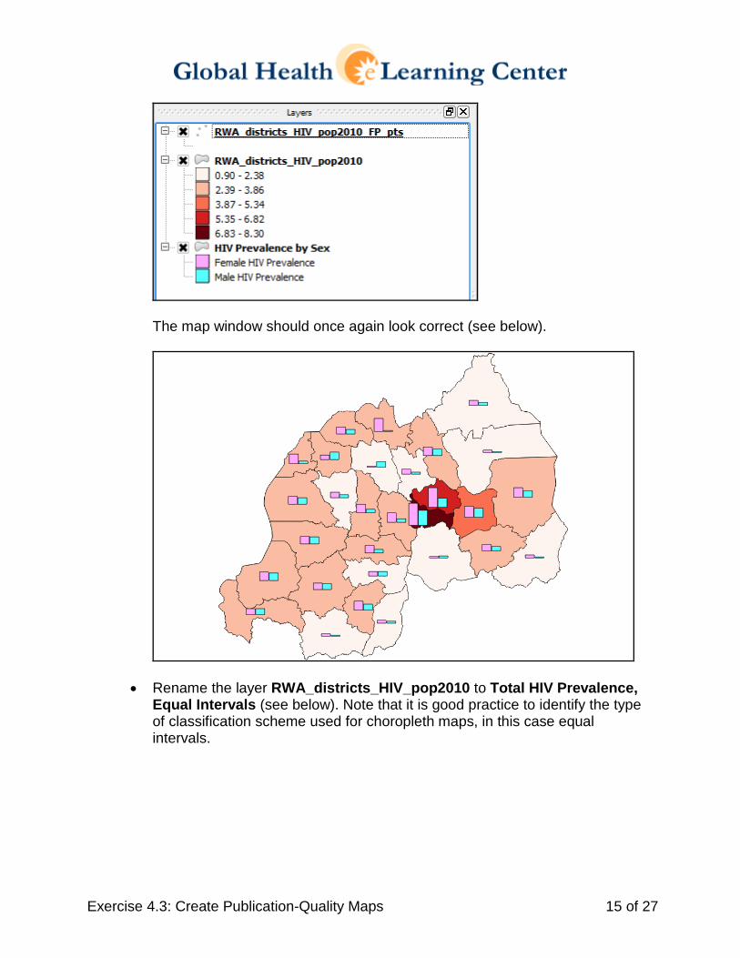
• To retain the layer HIV Prevalence by Sex for display in the legend but to remove it from sight in the map window, left-click on the layer name and drag the layer to the bottom of the stack in the Layers panel (see below).
Exercise 4.3: Create Publication-Quality Maps 15 of 27
The map window should once again look correct (see below).
• Rename the layer RWA_districts_HIV_pop2010 to Total HIV Prevalence, Equal Intervals (see below). Note that it is good practice to identify the type of classification scheme used for choropleth maps, in this case equal intervals.
Exercise 4.3: Create Publication-Quality Maps 16 of 27
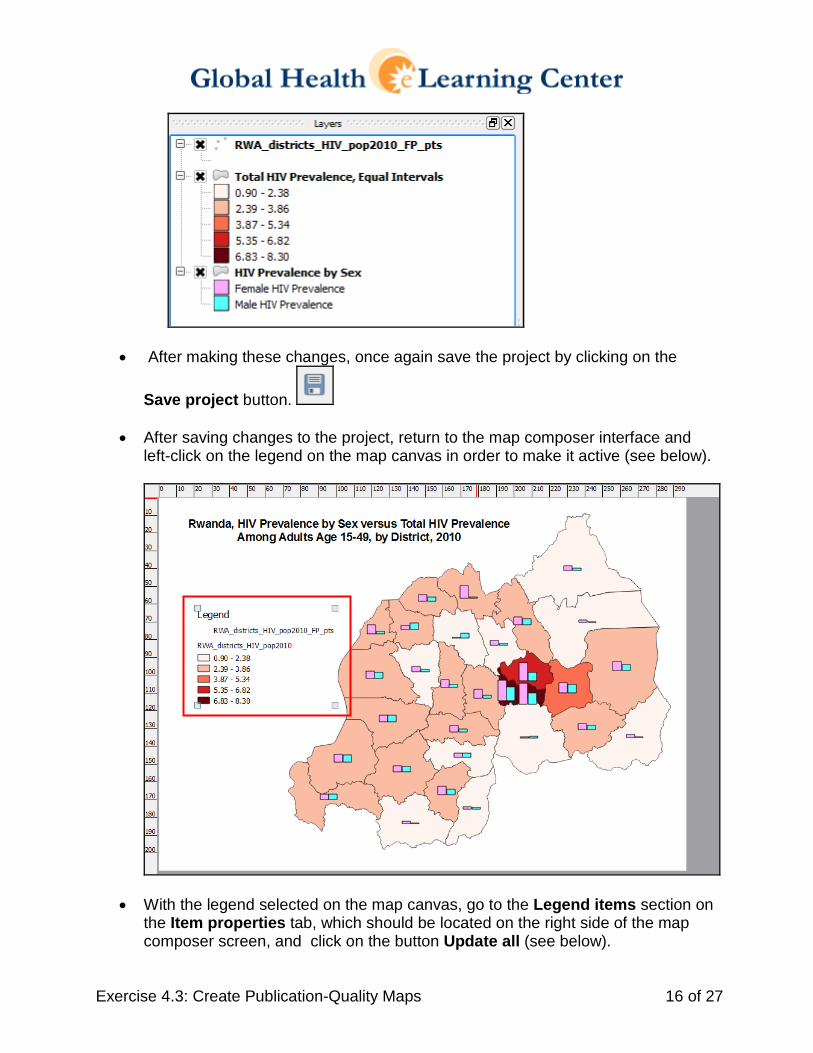
• After making these changes, once again save the project by clicking on the
Save project button.
• After saving changes to the project, return to the map composer interface and left-click on the legend on the map canvas in order to make it active (see below).
• With the legend selected on the map canvas, go to the Legend items section on the Item properties tab, which should be located on the right side of the map composer screen, and click on the button Update all (see below).
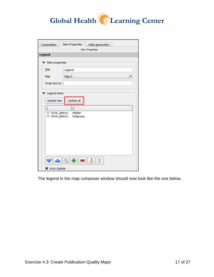
Exercise 4.3: Create Publication-Quality Maps 17 of 27
The legend in the map composer window should now look like the one below.
Exercise 4.3: Create Publication-Quality Maps 18 of 27
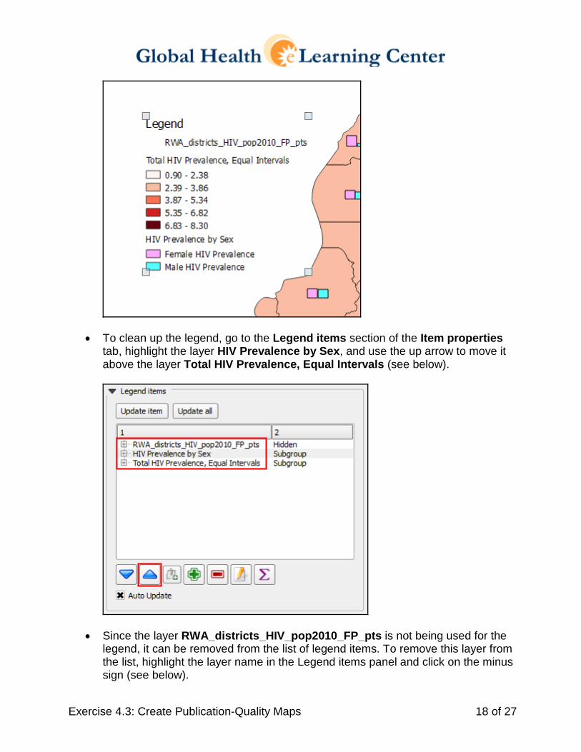
• To clean up the legend, go to the Legend items section of the Item properties tab, highlight the layer HIV Prevalence by Sex, and use the up arrow to move it above the layer Total HIV Prevalence, Equal Intervals (see below).
• Since the layer RWA_districts_HIV_pop2010_FP_pts is not being used for the legend, it can be removed from the list of legend items. To remove this layer from the list, highlight the layer name in the Legend items panel and click on the minus sign (see below).
Exercise 4.3: Create Publication-Quality Maps 19 of 27
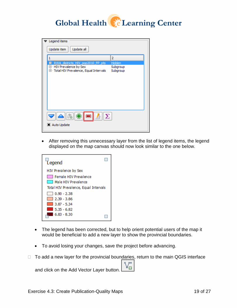
• After removing this unnecessary layer from the list of legend items, the legend
displayed on the map canvas should now look similar to the one below.
• The legend has been corrected, but to help orient potential users of the map it would be beneficial to add a new layer to show the provincial boundaries.
• To avoid losing your changes, save the project before advancing. � To add a new layer for the provincial boundaries, return to the main QGIS interface
and click on the Add Vector Layer button.
Exercise 4.3: Create Publication-Quality Maps 20 of 27
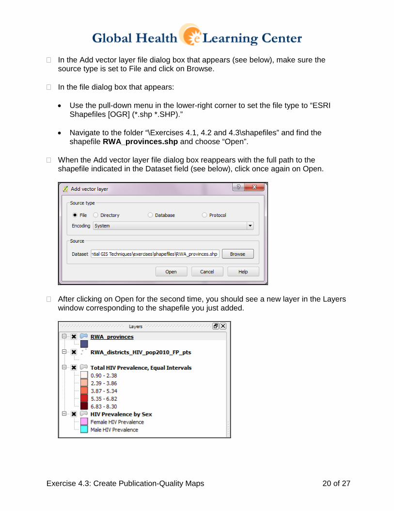
� In the Add vector layer file dialog box that appears (see below), make sure the source type is set to File and click on Browse.
� In the file dialog box that appears:
• Use the pull-down menu in the lower-right corner to set the file type to “ESRI
Shapefiles [OGR] (*.shp *.SHP).”
• Navigate to the folder “\Exercises 4.1, 4.2 and 4.3\shapefiles” and find the shapefile RWA_provinces.shp and choose “Open”.
� When the Add vector layer file dialog box reappears with the full path to the
shapefile indicated in the Dataset field (see below), click once again on Open.
� After clicking on Open for the second time, you should see a new layer in the Layers window corresponding to the shapefile you just added.
Exercise 4.3: Create Publication-Quality Maps 21 of 27
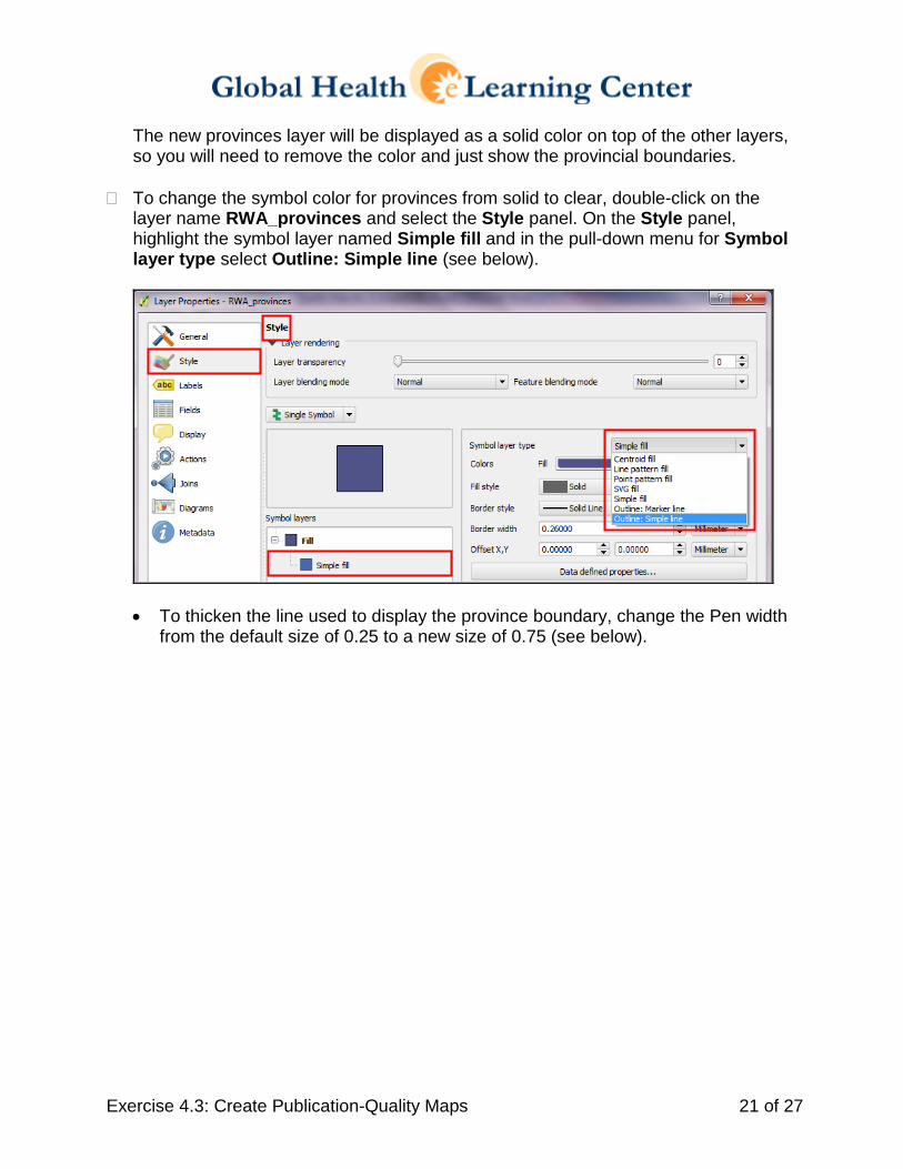
The new provinces layer will be displayed as a solid color on top of the other layers, so you will need to remove the color and just show the provincial boundaries.
� To change the symbol color for provinces from solid to clear, double-click on the layer name RWA_provinces and select the Style panel. On the Style panel, highlight the symbol layer named Simple fill and in the pull-down menu for Symbol layer type select Outline: Simple line (see below).
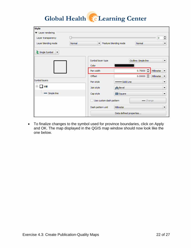
• To thicken the line used to display the province boundary, change the Pen width
from the default size of 0.25 to a new size of 0.75 (see below).
Exercise 4.3: Create Publication-Quality Maps 22 of 27
• To finalize changes to the symbol used for province boundaries, click on Apply and OK. The map displayed in the QGIS map window should now look like the one below.
Exercise 4.3: Create Publication-Quality Maps 23 of 27
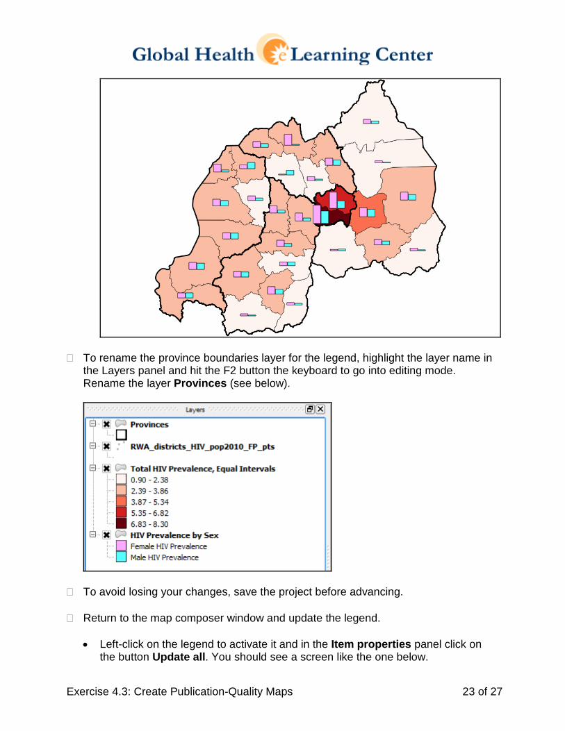
� To rename the province boundaries layer for the legend, highlight the layer name in the Layers panel and hit the F2 button the keyboard to go into editing mode. Rename the layer Provinces (see below).
� To avoid losing your changes, save the project before advancing.
� Return to the map composer window and update the legend. • Left-click on the legend to activate it and in the Item properties panel click on
the button Update all. You should see a screen like the one below.
Exercise 4.3: Create Publication-Quality Maps 24 of 27
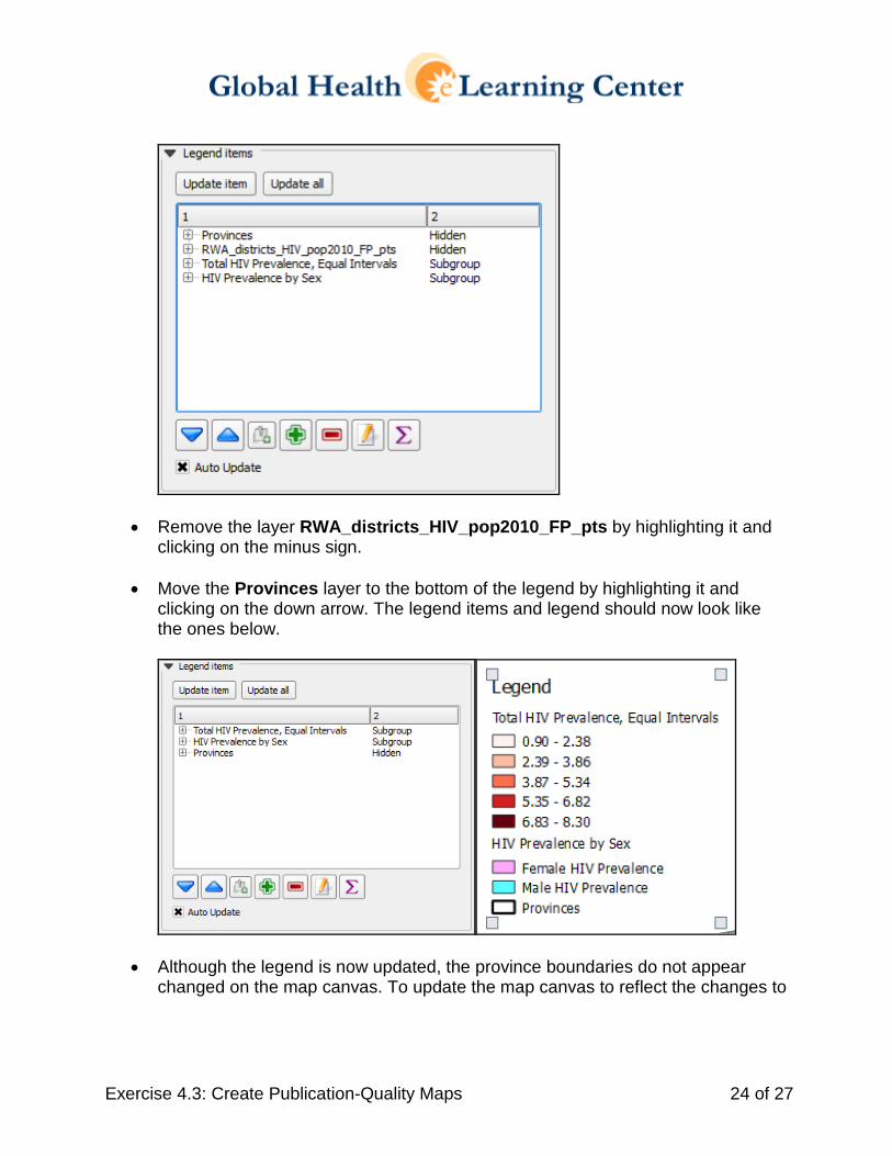
• Remove the layer RWA_districts_HIV_pop2010_FP_pts by highlighting it and clicking on the minus sign.
• Move the Provinces layer to the bottom of the legend by highlighting it and clicking on the down arrow. The legend items and legend should now look like the ones below.
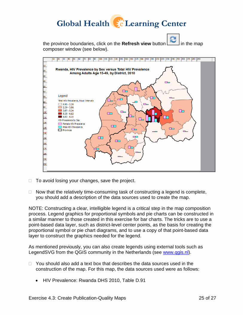
• Although the legend is now updated, the province boundaries do not appear changed on the map canvas. To update the map canvas to reflect the changes to
Exercise 4.3: Create Publication-Quality Maps 25 of 27
the province boundaries, click on the Refresh view button in the map composer window (see below).
� To avoid losing your changes, save the project.
� Now that the relatively time-consuming task of constructing a legend is complete, you should add a description of the data sources used to create the map.
NOTE: Constructing a clear, intelligible legend is a critical step in the map composition process. Legend graphics for proportional symbols and pie charts can be constructed in a similar manner to those created in this exercise for bar charts. The tricks are to use a point-based data layer, such as district-level center points, as the basis for creating the proportional symbol or pie chart diagrams, and to use a copy of that point-based data layer to construct the graphics needed for the legend. As mentioned previously, you can also create legends using external tools such as LegendSVG from the QGIS community in the Netherlands (see www.qgis.nl). � You should also add a text box that describes the data sources used in the
construction of the map. For this map, the data sources used were as follows:
• HIV Prevalence: Rwanda DHS 2010, Table D.91
Exercise 4.3: Create Publication-Quality Maps 26 of 27
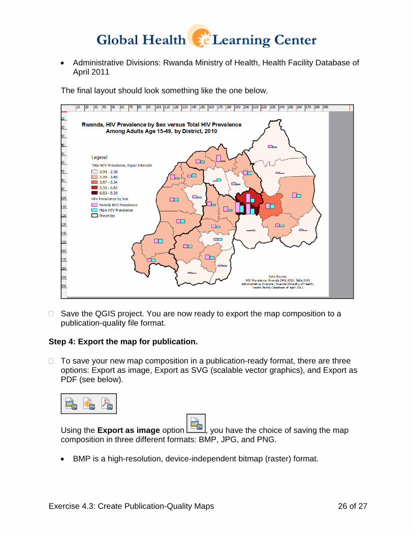
• Administrative Divisions: Rwanda Ministry of Health, Health Facility Database of April 2011
The final layout should look something like the one below.
� Save the QGIS project. You are now ready to export the map composition to a publication-quality file format.
Step 4: Export the map for publication. � To save your new map composition in a publication-ready format, there are three
options: Export as image, Export as SVG (scalable vector graphics), and Export as PDF (see below).
Using the Export as image option , you have the choice of saving the map composition in three different formats: BMP, JPG, and PNG. • BMP is a high-resolution, device-independent bitmap (raster) format.
Exercise 4.3: Create Publication-Quality Maps 27 of 27
• JPG is a file format designed to store compressed versions of photographs and other raster images. The compression methods employed can result in some loss of information with respect to the original image.
• PNG is also a file format for storing compressed versions of photographs and
other raster graphics, but the compression method used for the PNG file format does not result in a loss of data with respect to the original images.
� Save the images using the path and file names specified below. • BMP image: Session 4 Essential GIS Techniques\exercises\RWA_hivmap.bmp • JPG image: Session 4 Essential GIS Techniques\exercises\RWA_hivmap.jpg • PNG image: Session 4 Essential GIS Techniques\exercises\RWA_hivmap.png
Question: Look at the file sizes for the three maps. Which one is the largest and which is the smallest?
Answer: The BMP image is the largest. The JPG image is the smallest.
Question: Is there a significant difference in the clarity of the three images? Answer: There is not a significant difference in the clarity of the images when viewed on a computer screen, which has a relatively low resolution. For printing purposes, however, the BMP and JPG images were saved by QGIS at 300 dpi (dots per inch), whereas the PNG image was saved at only 96 dpi, and would not be appropriate for printing.
Question: Which map would you send to a publisher and which map would you e-mail to a colleague? Answer: You would send the BMP or JPG image to a publisher based on their higher print resolution (300 dpi). The BMP image would probably be too large to e-mail, although either the JPG or PNG file could easily be sent to a colleague for on-screen viewing and collaboration.
� Save the QGIS project and quit QGIS. END