exercise #2 - clas users | college of liberal arts and...
TRANSCRIPT

LAB MANUALLAB MANUALGIS 4037 (Sect. 6234) and GEO 5134C (Sect. 0953)GIS 4037 (Sect. 6234) and GEO 5134C (Sect. 0953)
Remote Sensing of the Environment
Dr. Michael W. BinfordEmail: [email protected]
Office: TUR 3139Office hours: Monday 4:00 p.m.- 5:00 p.m. or by appointment
Lecture LaboratoryMonday 1:55 – 3:50 p.m. Wednesday 1:55 a.m. – 3:50 p.m.
TUR 3012 TUR 3006
Labs
Week/Date Topic__ Grade Week 1: Aug 26TH Lab 0: General Introduction LabWeek 2: Sep 2nd Lab 1: Image Interpretation & Analysis of Satellite Data 5%Week 3: Sep 9th Lab 2: Image Display & Cursor Operations 5%Week 4: Sep 16th Lab 3: Data Formats, Contrast Stretching and Density Slicing 5%Week 5: Sep 23th Lab 4: Geometric Correction 5%Week 6: Sep 30th Lab 5: Image Annotation & Map Composition 5%Week 7: October 7th Lab 6: Spectral Enhancement: Band Ratioing & Image Filtering 5%Week 8: Oct 14th Lab 7: Spectral Enhancement: Image Indices and PCA 5%Week 9: Oct 21st Lab 8: Image Classification 5%Week 10: Oct 28th Lab 9: Training Samples & more Classification 5%Week 11: Nov 4th Lab 10: Supervised Classification & Accuracy Assessment 5%Week 12: Nov 11th Lab 11: Change Detection: An Introduction to Spatial Modeler & Advanced Change Detection 5%Week 13: Nov 18th Lab 12: Image Calibration 5%Week 14: Nov 25th No Lab or Work Day – day before ThanksgivingWeek 15: Dec 2nd Lab 13: Surface Temperatures 5%Week 15: Dec 9th Lab 14: Extra Credit Lab 5%
Lab Total = 65% of Class Grade
All the data you will need for these labs can be found at:S:\geoglab\GEO5134c-4037_Remote_Sensing-Digital_Image_Processing\Fall_2009_data
1

GIS 4037 AND GEO 5134 Week 1 General Introductory LabFor Fun and New Knowledge; Intro to ERDAS Imagine 9.3
Part I
First of all, insert your USB Flash Drive into one of the USB ports on the computer. Your USB Flash Drive will be your working data storage. You can read the data from S:\geoglab\GEO5134c-4037_Remote_Sensing-Digital_Image_Processing\Fall_2009_Data but you cannot write to the folder. Over the course of the semester, you will copy the files from the S: drive to your flash drive as you need them. When you produce a new data file, you will save it to your flash drive, not to the lab computer. A wise user has two or more flash drives, and periodically backs up the primary flash drive on the secondary flash drive. “The flash drive failed” or “my data were lost” are unacceptable excuses for not handing in a lab report on time. In fact, there is no excuse for not handing in a lab report on time, but lack of backups is the flimsiest reason.
In Windows, navigate to S:\geoglab\GEO5134c-4037_Remote_Sensing-Digital_Image_Processing\Fall_2009_Data and copy the two files tm_gville_22mar1997.img and tm_gville_22mar1997.rrd to a directory on your Flash Drive. This is the UFAD directory where you will find images for use in this class ALL SEMESTER. You can read from but not write to this directory. From now on, when the lab manual says to open a file, the first thing that you should do is to copy the file to your Flash Drive. Note that this data set, acquired by the Landsat Thematic Mapper (TM), a particular satellite remote sensing instrument, has two separate data files. Whenever you copy data, always copy all the files that have the same file name but different file name extensions (e.g. .img and .rrd in this case).
Run ERDAS Imagine 9.3 (Windows Start button – All Programs - ERDAS - Geospatial Imaging 9.3 - ERDAS Imagine 9.3), select the Classic Viewer, and load the Landsat TM Image that you just copied: ‘tm_gville_22mar1997.img’ (Viewer Window – File:Open:Raster Layer then browse to the your Flash Drive directory that you are using).
Imagine 9.3 can be configured to read and write to a specific directory during a session by setting the directories in the “Preferences” file. After Imagine is started, click on Session:Preferences on the Icon Panel (the toolbar across the top of the screen). The Preference Editor box is set by default to the User Interface & Session preferences. You’ll see boxes for entering the working directory names: “Default Data Directory” and “Default Output Directory” – the program reads from the data directory and writes to the output directory automatically. Type in (sorry, no browse capability in Imagine Preference Editor) the full path name: e.g. E:\GEO5134_Remote_Sensing\Lab_0 (E: may be your USB Flash Drive – check the actual drive letter on your computer, and the /GEO5134_Remote_Sensing\Lab_0 is the directory you create on the Flash Drive – you can name this anything you want.) to read from the directory, and the full path name: E:\GEO5134_Remote_Sensing\Lab_0 to write to this directory. Then click the ‘user save’ button. While you are in the preferences window, look at all the options under each category. You won’t know what all of these mean for now, but later on many of the options will be clear. Close the Preference Editor window.
Opening Images, Playing with Colors, and Conducting Analyses. Now the fun begins. Change the data that control the colors in the false-color composite image (Viewer window – Raster: Band Combinations). Try all sorts of different band combinations. Zoom in and out, find the airport, the golf courses, Butler Plaza, Newnan’s Lake (the kidney-shaped lake east of Gainesville), and I-75. Identify other features on the ground. How do you know what they are? Explore various other commands to
2

play with in Imagine. Let your curiosity be your guide. You can’t damage anything by punching buttons.
The instructor will talk you through two different kinds of analyses that strangely exemplify most of the work done with environmental satellite remote sensing: a land-cover classification and a calculation of a continuous-field variable that is related to vegetation primary productivity. You won’t necessarily know what is going on, but you will learn later (if you knew, you wouldn’t be taking this class).
Part II: Imagery on the Internet
Objectives Browse various remote sensing and free imagery resources available on the web. We may not complete
this section in the lab time in which case this is what you need to do for next Wednesday.
A. Browse the SitesThis lab will introduce you to various free remote sensor data sources and tutorials available on the Internet. After browsing these sites, you will download an image of your choice and play with it! You are free to use any type of imagery: photography, multispectral, radar, etc. This will be a good set of locations to keep, although as with most things on the Internet these locations are constantly changing. This list is also available, with links, at http://www.clas.ufl.edu/users/mbinford/geo5134c/Remote_Sensing_Class_Imagery_Site_Links.html.
Imagery Sites
USGS EROS Data Center EarthExplorer
Global Land Cover Facility - University of Maryland
USGS Landsat Pathfinder Program
Tropical Rain Forest Information Center (TRFIC) $
Michigan State University: Landsat.org
Earth from Space (Johnson Space Center) $
NSSDC Photo Gallery: Earth
Goddard DAAC FTP site
Virtually Hawaii: Remote Image Navigator
International Institute for Geo-Information Science and Earth Observation
The NASA/JPL Imaging Radar Home Page
NASA Visible Earth
Center for International Earth Science Information Network (CIESIN) (all sorts of physical, social, and economic data but not really much remote sensing data)
3

Commercial Remote Sensing Image Providers
GeoEye (GeoEye-1) Merger company of Space Imaging and OrbImage
DigitalGlobe (QuickBird and other satellites and instruments)
The WWW Virtual Library: Remote Sensing Organizations
Remote Sensing Tutorials
CCRS Remote Sensing Tutorial
CCRS Remote Sensing Glossary Database
RSCC VOLUME 3 - Introductory Digital Image Processing
GIS Data & Resources
GIS Data Depot $
Guide to Mostly On-line and Mostly Free U.S. Geospatial and Attribute Data Federal Geographic Data Committee International Geospatial Data Catalog $USGS Publications and Data Products $
USGS: Geo Data - SDTS GIS Data $
USGS ASTER products, including imagery and DEM (Start Here)
Florida Geographic Data Library
Land Boundary Information System – Florida DOQQ, DLG, etc.
Florida DEP GIS Data
Digital Chart of the World
4

GEO4938 AND GEO5134 Lab 1:
Image Interpretation & Analysis of Aerial & Satellite Data
Adapted from John R. Jensen
Objectives
To introduce fundamental image interpretation techniques To introduce basic ERDAS Imagine display and screen cursor control procedures. To analyze and understand basic characteristics of various remote sensing multispectral systems
Part II. Analysis of Aerial and Satellite Data
There is an abundance of digital data available in the remote sensing market today. This market is expected to grow substantially in the next few years with many new platforms being developed. This exercise will introduce you to some of the most common forms of airborne and satellite sensor data available today. Examples of airborne data include aerial photography data such as the National Aerial Photography Program (NAPP) and airborne multispectral scanning systems such as the Airborne Terrestrial Applications Sensor (ATLAS). Examples of common satellite based platforms include the multispectral scanning systems in Landsat Multispectral Scanner (MSS) and Thematic Mapper (TM) and the area array sensors systems in SPOT Image XS High Resolution Visible (HRV).
For this exercise we will mainly be using Imagine’s Viewer window (opened from the Viewer icon on the Imagine icon panel to display and analyze various images. The Viewer can be repositioned by placing the cursor in the title bar at the top of one of the windows and pressing the left mouse button. While holding down the button, drag the window to the desired location. Additional windows can be opened if desired. (You may need to grab the windows by the corner to resize.) Any window can be moved to the front (overlaying all the others) simply by double clicking on the title bar. You have the option of repositioning the icon panel on the screen; this can be done with the Flip Icons option located in the Session dropdown menu. When you do this the imagine viewer #1 should enlarge automatically. You can resize the imagine viewer to a smaller size now using the previously methods. You can revert back to the horizontal icon arrangement by choosing Flip Icons again.
Now you are ready to display an image. Move the cursor back to the imagine viewer and select the File dropdown menu with the left mouse button. In the file menu select the Open option and then slide to the menu which opens to the right and select the Raster option to get the corresponding menu. You can also type Ctrl R to access the open raster layer menu if the cursor is over the viewer or you can click on the viewer icon that looks like a manila folder that is half open. Additional viewers may be opened by clicking the viewer button on the IMAGINE icon panel.
In the Open File menu you should see a list of files in the usr/local/imagine/830/examples directory. These are example files that are included with the software. Feel free to browse these files at your convenience. Move to the image directory to see the files we will be using for this exercise (G:\classes\RemoteSensing\GEO 5134c Remote Sensing - GIS 4037 Digital Image Processing\Fall_2007_data). To open a file, position the cursor over the file to be displayed and press the left mouse button (lmb). The file name should appear in a window above the file names. If you do not see a list of the files with a *.img extension, you are not looking in the correct directory, or the File Type has not been specified as IMAGINE Image (*.img).
Before clicking OK when opening an image, you will need to assign the spectral bands of the image to the color planes red, green, blue (RGB). These spectral band assignments will be given to you. Make sure that the Display option is set to True Color if you are displaying a multispectral image. You also have the option of making the image fit the viewer frame by clicking the small box next to Fit to Frame. Once you have specified all these option, you are ready to click OK. Note that all these options can be specified in the “Preferences” window
5

under the “Sessions” drop-down menu on the icon panel. If an image requires less space in the imagine viewer (there are large black boarders on the sides) then you can resize the imagine viewer to use your screen "desktop" area more efficiently. This will become important in future exercises when many imagine viewers will need to be open at once. To remove an image displayed in the imagine viewer move to the File drop-down menu in that viewer and select it with the lmb, then find the Clear option and select it. You can also click on the "eraser" tool icon in the Viewer.
Additional information about each image can be found in the Tools drop down menu in the IMAGINE icon panel. Choose Image Information and wait for the Image Info dialog box to appear. Select Open in the File drop down menu and choose the image for which you are requesting information. Once you have opened an image in your viewer, you can access the Quick View menu by positioning the cursor over the viewer window and pressing the right mouse button (rmb). Examine the options and move the cursor over the Fit Image to Window box and select it. The Quick View menu should then disappear. This will affect only the viewer you are currently using. For other viewers you will need to repeat the process. You can additionally use the View - Fit Image to Window command to achieve the same result.
Open and browse the following files and answer the questions that follow: Landsat MSS mss10-17-82sflorida.img Color Infrared Composite RGB = Bands 4,2,1
Quickbird quickbird_haiti_17jan03.img Color Infrared Composite RGB = Bands 4,2,1
Landsat TM tm_gville_22mar1997.img Color Infrared Composite RGB = Bands 4,3,2 and Natural Color Composite RGB = Bands 3,2,1
6

Landsat ETM etm_stjohnsriver_11feb2003.img Color Infrared Composite RGB = Bands 4,2,1 Natural Color Composite RGB = Bands 3,2,1
SPOT XS HRV spot_marcoisland_21oct1988.img Color Infrared Composite RGB = Bands 4,3,2 Panchromatic 10 meter RGB = Bands 1,1,1
Questions
7

With reference to all of the different satellite sensors used in this lab, your web browsing during the last lab, and links on the class syllabus under week 4, answer the following:
1. Which Landsat platforms have the Multispectral Scanner (MSS), which have the Thematic Mapper (TM), and which have the Enhanced Thematic Mapper plus (ETM+)? (5 points)
2. Study the differences between the MSS and TM bands. How are the TM bands an improvement over the MSS bands? Why do the TM bands offer improved vegetation discrimination over those of the MSS? How does Landsat 7 offer more in mapping capabilities? (6 points)
3. Explain the primary difference between energy sensed with TM band 6, and the energy collected by the other sensors aboard TM. (4 points)
4. In the basic color infrared composites (Landsat 4-3-2 or 4-2-1, QuickBird 4-2-1, SPOT 4-3-2), what do the red hues indicate? Why? Be specific. (5 points)
5. Which satellite has off-nadir viewing capabilities? How can this characteristic be useful in acquiring data? (4 points)
6. Notice the difference between spatial resolution on the SPOT panchromatic (band 1) and multispectral mode (bands 2-4). Discuss some advantages/disadvantages of varying spatial resolutions and what platform and instrument, of any of those viewed today, would you use for each of the following applications: (Justify your responses) 1. Precision agricultural 2. Urban and regional planning 3. Forestry Inventory 4. Sea surface temperature mapping
(4 points per question = 16 points total)
Lab total of 40 points
8

GEO4938 AND GEO5134c Lab #2:Image display and cursor operations
Adapted from: John R. Jensen
Objective
To introduce basic ERDAS IMAGINE display and screen cursor control procedures. Note lmb = left mouse button, and rmb = right mouse button.
Part I - Introduction to ERDAS IMAGINE
During this semester, we will be using ERDAS IMAGINE image processing and GIS software: ERDAS (Earth Resource Data Analysis System) is a mapping software company specializing in Geographic Imaging solutions since 1978. Software functions include importing, viewing, altering, and analyzing raster and vector data sets. For more information on ERDAS, you can browse their company web page http://www.erdas.com/. This link is redirected to http://gis.leica-geosystems.com/. Leica bought ERDAS a few years ago.
We will be analyzing four images in this exercise. Login to the system. The image that you will work with this week is currently in the network data directory
G:\classes\GEO 5134c Remote Sensing\Fall_2007_data
After you have successfully logged onto the system, launch IMAGINE by selecting it from the Program list. Wait for all menus to appear (the IMAGINE icon panel along the top of the screen and IMAGINE Viewer #1). This may take a minute or two, then examine the options on the icon panel along the top of the screen. These icons represent the various components and add-on modules purchased with the system. You have the option of displaying the icon panel horizontally across the top of the screen or vertically down the left side of the screen using the Session - Flip Icons menu item.
Familiarize yourself with the five menus located along the top of the icon panel in the left corner: Session, Main, Tools, Utilities, and Help. The Session menu controls many of the session settings such as user preferences and configuration. The Main menu allows access to all the modules located along the icon panel. The Tools menu allows you to display and edit annotation, image, and vector information, access surface draping capabilities, manage postscript and true type fonts, convert coordinates, and view Erdas Macro Language (EML) script files. The Utilities menu allows access to a variety of compression and conversion algorithms including JPEG, ASCII, image to annotation, and annotation to raster. The Help menu brings up the On-Line Help documentation as well as icon panel and version information. An index of keywords helps you to quickly locate a help topic by title. A text search function also helps you find topics in which a word or phrase appears.
The menu you will probably use the most under the Session menu is the Preference Editor. The Preference Editor is accessed under Preferences. It allows you to customize and control many individual or global IMAGINE parameters and default settings. Use the left mouse button (lmb) on the scroll arrows on the side of this menu to examine the available categories. With the User Interface & Session category open, change the Default Data and Output Directories to (for example): G:\yourusername to access your personal space on the system, or G:\share\username for placing assignments so the instructor can read them.
9

Also, scroll down until you see the Delete Session Log on Exit and Delete History File on Exit. Click on both of these check boxes and make sure they are on if you haven’t done so previously. Leave all other options in their default settings. Save the changes using the Save To - User Level option under the File drop down menu in the Preference Editor. You may now exit the editor by selecting Close under the File drop down menu. One of the first things you should do whenever you use IMAGINE is to check and set these preference settings in the Preference Editor.
Part I - Image Display (See Text RSE Ch 7)
Now you are ready to display the first image. Move the cursor back to the IMAGINE Viewer and select the File dropdown menu with the lmb. In the file menu select the Open option and then slide to the menu which opens to the right and select the Raster option to get the corresponding menu. You can also type Ctrl R to access the open raster layer menu if the cursor is over the Viewer or you can click on the Viewer icon that looks like a manila folder that is half open. Additional Viewers may be opened by clicking the Viewer icon on the IMAGINE icon panel.
On the left side of the menu you should see a list of files in your account. Position the cursor over the file you want to display (mi-FL_10-21-88spot.img) and click the lmb once (do not double-click). The file name should appear in the file name window in the Viewer. If you do not see the correct files in your account then you are either not looking in the correct directory or you do not have the Files of type specified as IMAGINE Image (*.img).
Before clicking OK, you need to assign the spectral bands of the image to the color planes red, green, blue (RGB). Click on the Raster Options folder tab and assign band 3 (NIR) to red, band 2 (Red) to green, and band 1 (Green) to blue. Make sure that the Display option is set to True Color. You also have the option of making the image fit the Viewer frame by depressing the small box next to Fit to Frame. Now you are ready to click OK. If the SPOT image is requiring less space in the IMAGINE Viewer (there are large black borders on the sides) then you can resize the IMAGINE Viewer to use your screen desktop area more efficiently. This will become important in future exercises when many IMAGINE Viewers will need to be open at once. To remove an image displayed in the IMAGINE Viewer move to the File dropdown menu in that Viewer and select it with the lmb, then find the Clear option and select it. You can also click on the "eraser" tool icon in the Viewer.
To find out additional information about this image, go to the ‘Utility’ drop down menu in the open Viewer. Choose Layer Info and wait for the Image Info dialog box to appear. You can also access Image Info by clicking on the "info" icon in the Viewer icon menu (third one from the left). Now answer the following questions:
1a. What is the pixel size in the X and Y direction? (2 points)
1b. What are the units of measurement? (2 points)
10

1c. What is the image georeferenced to? (2 points)
1d. What is the maximum brightness value indicated in the Statistics Info for the green band? (2 points)
1e. What is the minimum brightness value indicated in the Statistics Info for the red band? (2 points)
1f. Look at the histogram for the NIR band and explain the reason for the bi-modal distribution. (4 points)
1g. Examine the Map Info contents in the panchromatic band. Can you identify any errors? (2 points)
Now exit the Image Info dialog box by choosing Close under the File drop down menu and return to the IMAGINE Viewer #1. Select the Three Layer Arrangement under the File:Open option. Choose mi-FL_10-21-88spot.img as the IMAGINE file to display once again. In the Options folder, set the display as True Color and set the Layers to Color equal to Red = 3, Green = 2, and Blue = 1 (RGB = 3, 2, 1) and click OK. This will open the color composite in Viewer #1 and each of the individual bands in grayscale mode in Viewers #2, 3, and 4.
Now position the cursor over the Viewer and press the right mouse button (rmb) to access the Quick View menu. Examine the options and move the cursor over Fit Image to Window and select it. The Quick View menu should then disappear. This will affect only the Viewer you are currently using. For other Viewers you will need to repeat the process. You can additionally use the View - Fit Image to Window command to achieve the same result. An Area of Interest (AOI) box should have appeared in Viewer #1 and is geolinked to the other three Viewers. With the cursor Viewer icon selected, the AOI box can be dragged around and resized for simultaneous band comparison and analysis. When you are finished answering the following questions, close the other Viewers by selecting Close Other Viewers under the File pull-down menu in Viewer #1.
Leave the four IMAGINE Viewers up in order to answer the following questions and to complete the rest of the exercise.
2a) What would be some advantages of having multiple Viewers open when working with a large research project? (3 points)
2b) Compare each of the three grayscale bands (green, red, and NIR) and briefly describe how they differ in their spectral responses to terrestrial features. (6 points)
2c) Explain how the three gray-scale images (viewers 2, 3, and 4) are combined to form the color composite image in Viewer 1. (10 points)
2c) If you wanted to study the road network of Marco Island, which of the possible image displays from band 1 (Green), 2 (Red), and 3 (NIR) would be best? Why? (4 points)
11

Part II - Cursor, Magnification, and Overlay Operations
The next image we will browse is a Landsat Thematic Mapper (TM) scene of Gainesville, FL. Open the file tm_gville_22mar1997.img the same way you opened the first image and assign Red = Band 4 (NIR), Green = Band 3 (red), and Blue = Band 2 (green). Make sure you click the Fit to Frame box before opening it, or you can fit the image to the Viewer using the QuickView menu.
To magnify (or reduce) an image the easiest option is to use the "magnifying glass" tools that are located immediately above the image in the gray Viewer area. The area over which you place the cursor will be the general center for the area that is magnified. However, you may at some times wish to magnify the image by a certain factor, such as 2X or 4X. To do so you can select Zoom under the View menu or Quick View menu and then select the appropriate choice. If you chose Zoom in by X or Zoom out by X a menu will appear allowing you to chose not only the zoom factor but also the interpolation method. You might wish to try each method for the sake of understanding them. When you have completed your selection click OK and the magnified image will appear. Another method of explicitly specifying the zoom factor is under the Raster Options feature when you open a file. When Fit to Frame is not highlighted, you can enter in the Zoom factor in the lower left hand corner. Finally, you also have the ability to change the frame scale of the image. The process can be implemented using the View - Scale option. The icon with the hand also gives you panning capabilities within the Viewer.
You can also create a magnifying window by either choosing View - Create Magnifier or accessing the QuickView menu and selecting Zoom - Create Magnifier. This brings up an additional window that corresponds to your AOI box in your Viewer. The AOI box can be resized by dragging on the corners. To close the magnifier, place your cursor inside it and select the Close Window option in the QuickView menu.
Sometimes it is necessary to determine the coordinates and brightness values of specific pixels on the displayed image. The inquire cursor allows you to do this. Go into the Quick View menu of the IMAGINE Viewer and select Inquire Cursor. This will open a pixel information menu that allows you to move a crosshair cursor on the Viewer. You can use the black arrows to move the crosshair cursor in any pixel increment you set. For now
12

leave the increment at 1.00 and note that the increment is variable between the file and map coordinate system. You can move the crosshair cursor using the black arrows or by pressing and holding the lmb while the mouse cursor touches the crosshair cursor. For "fine tuning" use the keyboard arrows to move the cursor. The black circle will move the crosshair cursor back to the center of the Viewer.
Coordinate values for the image can be obtained in either map, paper, file, or latitude, longitude as long as this data exists in the image file. The file tm_gville_22mar1997.img has map and file coordinates, either of which can be selected by clicking on the button in the top left of the Inquire Cursor box that says Map. Notice that the coordinate system is defined for you. The image projection is also shown but if you have not selected the Map option that may not necessarily be the x, y coordinate system. The table shows the R,G,B pixel brightness values for both the image file (FILE PIXEL) and the color lookup table (LUT VALUE). Move the Viewer cursor and notice how the values change. To move the crosshair cursor using the mouse you must initially place the arrow cursor at the center of the crosshairs and click on the lmb. Keep the lmb depressed to move the crosshair cursor.
3a) Which of the coordinates would you use to describe a pixel location to someone working on a different software system? (i.e. not Imagine) Why? (4 points)
3b) Position the crosshairs on a representative pixel and record the actual data values in each band (1-3) for the following features: (2 points each = 8 points total)
a. Urban b. Water c. Forests d. Grass
Now close the Inquire Cursor dialog and open another image in Viewer #1 without closing the TM scene. You can use IMAGINE to overlay imagery that is georeferenced to the same coordinate system. To do this, be sure to uncheck the Clear Display option under Raster in the Select Layer to Add dialog box. Now overlay the file gville_doq.sid on top of the TM scene using RGB=1,2,3. This scene is a higher resolution (3m x 3m) image of west Gainesville. Now zoom in to the downtown area and experiment with the utilities listed below.
4a) Using the Utility - Measure tool, what is the perimeter and total area of the Ben Hill Griffin Stadium on the UF campus? (4 points)
4b) Briefly discuss how these utilities could be useful for an image analyst: a. Utility - Blend b. Utility - Swipe c. Utility - Flicker
(2 points each = 6 points total)
A natural color composite of the downtown scene can be viewed by selecting Raster - Band Combinations and changing the RGB values to RGB=3,2,1. This is the way humans would view the scene if looking down from a plane.
13

Part III - Spectral and Spatial Profile Tools
For this part of the exercise you will examine an image of estuary marshland of smooth cordgrass near Isle of Palms, SC. We will be using the spectral and spatial profile tools for the analysis. Open the image tm_cedarkey_17dec1997.img with RGB = 4, 3, 2. When the image is displayed, click on the Start Profile Tools icon (next to the hammer icon) in the Viewer tool bar. Another way to access the Profile Tools is to go to Raster - Profile Tools in the Viewer menu bar. Select Spectral and click OK. After the Spectral Profile tool appears, click on Edit - Chart Options. Now click on the Y-axis folder and change Y-axis maximum value to 80.0 and click Apply, then close the chart options dialog box. Using the crosshair icon, place three spectral profile points at the file coordinates listed below. To do this, first randomly drop the point in the image and then type in the x and y file coordinates. Do this for each of the three points below. (Note: If the ‘Map’ option is selected change to ‘File’ in the upper right hand pull down menu.
5. Review the Spectral Profile plot of all three points listed below and briefly explain the spectral curve difference of each point as it relates to the electromagnetic spectrum. You may want to zoom in on the individual points for a more detailed analysis. You can also print these graphs if you wish. ( 5 points each = 15 points total)
5a) 242, 470 (Healthy Cordgrass) 5b) 99, 1370 (Water) 5c) 392, 1191 (Oyster Bed)
Now open the Spatial Profile tool by clicking on the Start Profile Tools icon in the Viewer tool bar or go to Raster - Profile Tools in the Viewer menu bar. Select Spatial and click OK. When the Spatial Profile tool appears, change the Y-axis in the chart to 80.0 and click on the polyline icon (next to the cursor icon). Draw a polyline on the image in the Viewer. Single-click to set vertices and double-click to set an endpoint. The default is to view one band at a time. View different bands by incrementing the Plot Layer option up or down to the band you want to view. To view multiple bands simultaneously in the profile chart, select Edit – Plot Layers in the Spatial Profile Tool. When the Band Combination dialog opens, add the layers you want to view by selecting each band one at a time and clicking on the Add Selected Layer icon (top icon). Then click Apply and close the dialog. Now briefly answer the remaining questions:
6a) Cordgrass is known to grow very dense at the edges of the inlet rivers and less dense as you move away from the river. Draw a profile line on the image that illustrates this point using three of the seven bands and print or sketch the graph. In addition make a screen grab of the location that you drew your profile, and print it, so we know what area you selected, or give the coordinates of this line. Describe the general trends of the changes in data values using your knowledge of spectral signatures and explain why the values change as they do. (6 points)
14

6b) Based on your analysis, what band do you think would be most sensitive to the evidence of smooth cordgrass biomass and why? (3 points)
When you have finished your assignment exit IMAGINE. Hand in your typed answers to each of the questions as well as any printed graphs from the spectral and spatial profile tools.
Lab worth 85 points in total
15

GEO4938 AND GEO5134 Lab #3 Data Formats, Contrast Stretching, and Density Slicing
Adapted from: John R. Jensen
Objectives o Understand common data storage formats
o Obtain image statistics and contrast stretch histograms
o Perform a histogram equalization
o Density-slice an image into specified classes
Part I. Data Formats and Import/Export (See Text IDP at the end of chapter 2)
Beginning with this exercise we will frequently use images in formats other than IMAGINE (*.img), such as the LAN (*.lan) format. The ".lan" suffix signifies that the files were created using a previous version of IMAGINE (e.g. IMAGINE 7.5). The images will be copied from the class data directory just like before. However, for our purposes they must be imported into Imagine 8.5 and converted to IMAGINE (*.img) format before we can begin to process them. Directions for doing this are found below.
Begin by finding the murrells-inlet_cams_1997-08-02.lan file in the class data director on the S: drive. . After you begin IMAGINE, find and select the Import button on the main icon panel.
When the Import/Export dialog box appears, do the following:
o Make sure the [Import] option is selected.
o Specify Type as [LAN (Erdas 7.x)]. Notice all the different data formats that can be imported.
o Specify Media as [File].
o Now select murrells-inlet_cams_1997-08-02.lan as the input file.
o After you have specified the Input File (*.lan), a filename with the same prefix but with an IMAGINE (*.img) extension should automatically appear in the Output File (*.img) column. Make sure the file is going to be written to the correct directory, select [OK] and wait for another window to appear. We will not be modifying the image during the import process but, there are some options menus that you may wish to look at, especially the Import Options (where you can layer stack selected individual bands).
o When you are ready to import the image, select [OK]. When the import job has completed, select [OK] from the job state window.
Now display the newly imported murrells-inlet_cams_1997-08-02.img file in the viewer with RGB = 6, 4, 2. This equates to placing the NIR band (6) in the red image plane, the red band (4) in the green image plane, and the green band (2) in the blue image plane.
16

1) Briefly describe (you may want to use simple illustrations) the logic and differences between the four common generic binary data storage formats and any advantages/disadvantages of each: a) band sequential (BSQ)b) band interleaved by line (BIL)c) band interleaved by pixel (BIP)d) run-length encoding
(3 points each = 12 points total)
Part II. Contrast Stretching and Histogram Equalization (Text DIP, Chpt. 7)
Image
For this part of the exercise, you will be using unrectified nine-band CAMS (NASA Calibrated Airborne Multispectral Scanner) data acquired August 2, 1997 over Murrell's Inlet, South Carolina. You will need the IMAGINE (*.img) file you imported in Part I. It is IMPORTANT that throughout Part I, you do NOT save any contrast changes you make to this image. You will perform some basic contrast stretching procedures on this image. You may want to turn on the Bubble Help found under [Session | Preferences | User Interface & Session]. This will help you navigate more smoothly through the IMAGINE icons.
Display murrells-inlet_cams_1997-08-02.img in an imagine viewer with the following CIR band selection: band 6 in the red plane, band 4 in the green plane, and band 2 in the blue plane (RGB = 6,4,2). Once the image is displayed in the viewer, open the ImageInfo dialog, by selecting in the viewer window, Utility, LayerInfo. The ImageInfo window displays band, statistics, and map information for the selected channel as well as projection (including elevation) information if the image has been rectified and projected. The band (layer) you choose to view can be modified so that you can in turn view each band individually. Since this image has not been rectified or projected, the Map Info is in file coordinates, not map coordinates (i.e. UTM coordinates) and the Projection Info is blank.
Find and select the button that displays the layer Histogram. The range of the x-axis consists of brightness values from 0 to 255 (corresponding to 8-bits; refresher: 0 is black and 255 is bright white). The y-axis starts at 0 and increases upwards, showing the total number of pixels that are being placed into each x-axis range from 0 to 255. You can query the histogram by moving the cursor into the window displaying the histogram. Roam around inside the graph and notice that the cursor arrow becomes a cross. The x- and y-axis values are displayed for the center cross location within the histogram. The red line down the middle represents the mean value of the histogram. Resize the histogram window by dragging the corners for a closer inspection of the data distribution.
17

Note that changing the layer in the ImageInfo dialog will change the histogram as well.
murrells-inlet_cams_1997-08-02.img histogram of band 7
2) On a sheet of paper, recreate each of the histograms for all nine bands and briefly interpret the general characteristics of each band's histogram based on your knowledge of the electromagnetic spectrum. Label the highest frequency represented, minimum, maximum, and the mean value for each band. ( 20 points)
Now close the ImageInfo window and leave the CIR image displayed in the Viewer. Select the [Raster | Contrast | Brightness/Contrast] menu item. A menu will appear with sliding bars that allow you to change the brightness (symbol that looks like the sun) and the contrast (symbol that looks like a circle half shaded) of the image. Click the [Apply] button in this menu to view the contrast changes applied in the viewer. Experiment using this tool by increasing the contrast of the image to a level where the estuaries and wetlands within Murrell's Inlet can be identified. 3a) Why do you think the contrast between the uplands and the wetlands is so great? (4 points)3b) What contrast levels did you choose to view the estuaries and wetlands within Murrell's Inlet? ( 3 points)
When you are done experimenting with the contrast tool, select [Reset] then [Apply] and close the window. Do NOT save any contrast changes you made to the image. After the image has been redisplayed in the default contrast settings, go to the [Raster | Contrast | General Contrast] menu item. When the Contrast Adjust tool appears, click on the [Breakpts...] button. This brings up the Breakpoint Editor and three histograms (one for each band displayed in the image) should appear. Each histogram corresponds with the color memory plane in which the individual bands are being displayed (Red, Green, Blue). Notice the light gray histogram that is behind each colored histogram (you may need to increase the size of the Breakpoint Editor to see this clearly). These light gray histograms correspond to the input file's raw data values that you saw earlier in this exercise. The change between these two histograms (light gray and colored) represents the contrast enhancements that have automatically been performed to the image by the software. The enhancement represented graphically by the colored histograms is a contrast stretch over 2 standard deviations from the mean data value in each band.
4a) On a new sheet of paper, draw and label in the same way as before the newly contrast stretched histograms for bands 6 (histogram in the red plane) and 4 (histogram in the green plane). ( 6 points)
18

Each sloped line that crosses a histogram illustrates the transformation of image data values into brightness values and is a graph of the lookup table. The line shows how the input file value of x is changed to produce an output brightness value of y. By moving the cursor into the windows and over the histograms the cursor changes again into a cross and information about the histograms can be gained. The buttons along the top of the Breakpoint Editor allow you to manipulate these line transformations in different ways. Now go back to the Contrast Adjust window and make sure the Method is set to [Histogram Equalization] and then click [Apply]. Notice the changes that occur in the Breakpoint Editor to all three histogram patterns and in the slopes of their lines. Now click the [Apply All] button in the Breakpoint Editor. You may want to zoom in on selected areas to get a better feel on what the contrast enhancements are doing to the displayed image.
4b) What happens to the histograms when using histogram equalization? How does it affect the image? When would histogram equalization not be appropriate to use? (6 points)Now move the cursor into each histogram window and when over the graph select the right mouse button, this should display a hidden function window. In this hidden window find and select [Undo All Edits] for each of the three histograms and then click [Apply All] in the Breakpoint Editor. This will return the histogram to its original condition. Now go to the Contrast Adjust window where you selected histogram equalization before and this time change that selection to [Standard Deviations]. Notice that the default standard deviation setting to view images is 2.0. Move down to the single box just below this selection and change the number of the standard deviations to 4.0 and then select [Apply] in that window and then [Apply All] in the Breakpoint Editor. Notice the changes that occur in both the image and in the histograms. 5a) What happens to the image when the Standard Deviation is changed to 4.0? Why? (4 points)Now change the number for the standard deviations to 1.0 and select [Apply] in both menu windows.
5b) What happens to the image when the Standard Deviation is changed to 1.0? Why? (4 points)
Part III. Density Slicing
Density slicing is a form of selective one-dimensional classification. The continuous gray scale of an image is "sliced" into a series of classifications based on ranges of brightness values. All pixels within a "slice" are considered to be the same information class (i.e. water, forest, urban etc.). This slicing takes place in the Raster Attribute Editor in IMAGINE 8.5.
19

Close all contrast tools and go to [File | Clear] (you don't need to save any changes). Now open the etm_stjohnsriver_11feb2003.img file as a [Pseudo Color] image using the NIR channel (band 4). You are going to density-slice the image into three general land cover classes:
1. Water
2. Vegetation
3. Urban/Barren
To do this you will need to select the [Raster | Attributes...]. Also, bring up the raw data value histogram for band 4 to aid in your feature discrimination. This can be done using the same procedures discussed in Part I.
Once you have both a histogram and a Raster Attribute Editor open you are ready to proceed. Examine the row and columns in the Raster Attribute Editor. The rows in the table correspond to the input file data values that can range from 0 to 255 (8 bits). The columns show a histogram frequency and a color for each brightness value, as well as a binary opacity (on / off) setting. As you scroll through the Raster Attribute Editor you should see a progression from dark to light in color. You can resize this table to display more or less of the columns and rows as you wish.
Move the cursor back into the Viewer where the NIR band is displayed and with the right mouse button bring up a Quick View menu and select [Inquire Cursor]. Roam the cursor around the image and watch to see what typical brightness values (pixel values) are associated with the water class, the vegetation class, and the urban/bare land class within the NIR band. You should be trying to get an idea about what boundary values correspond with each of these classes (i.e. vegetation = 80 to 255, water = 40 to 79, urban/bare land 1 to 39. NOTE: these are wrong choices and are only given for example. At this point you may wish to consult the histogram of the NIR band to make any further estimates as to the class into which you plan to place a particular brightness value.
After you have used the Inquire Cursor and determined the boundary values for the three classes listed above, move back to the Raster Attribute Editor. What you will now do is to assign to each of these three classes characteristic colors that will represent them in the image (i.e. instead of water being dark black in the NIR band it will appear as the color you chose- blue might be nice). The method for assigning your characteristic colors is quite simple. Use the left mouse button to select ("highlight") each row you feel is characteristic of one particular class, i.e. water. This can be done by clicking on each row number (farthest left column) individually or by selecting a series of rows. To select a series you should depress the left mouse button, and while keeping it depressed, move the mouse up or down within the row column. This will have the effect of scrolling the attribute editor up or down, highlighting all the rows along the way. If you wish to do a combination of scrolling and selecting individually then make sure you hold the shift key down anytime you depress the left mouse button and proceed as before.
Once you have made your row selections you can modify the color in all of them by depressing the right mouse button when the cursor is over the color column. Note that the color will only change in the rows you have selected. You have the option of choosing a canned color or using [Other...] to create your own color. If you choose [Other...] the Color Chooser will open and you have two options to choose from: [Standard] or [Custom]. The [Standard] gives you the ability to choose colors by name. The [Custom] option allows you to choose a color using the three sliding bars in RGB (Red, Green, Blue) mode or IHS (Intensity, Hue, Saturation) mode. You can also pick a color by using the cursor to move the black circle within the color wheel. You will no doubt end up using some combination of all the above. Whatever process you choose to pick a color, select [Apply] and the color should appear on the IMAGINE Viewer representing that "slice" or class of the NIR band. Repeat this step for all three classes.
20

5) Record the range of values you used to density slice each land cover class ( 3 points) :
11 Water =
11 Vegetation =
11 Urban/Bare land =
Now save this new density-sliced image into your G:/share/username folder using [File | Save | Top Layer As].
In grading the color coded NIR band I will be looking for:
Are the 3 land cover classes represented correctly (i.e. are the boundary choices within reason)?
Were there 3 different colors assigned to the 3 different classes?
Do the colors reasonably represent their land cover classes (e.g. red for water would be a poor choice, etc.)? (8 points)
Lab total points = 75 points
21

GEO4938 AND GEO5134 Lab #4Image Annotation and Map Composition
Adapted from John R. Jensen
Objectives o To understand how to create annotation layers
o To create a map composition using ERDAS Imagine's Map Composer
o Learn what the elements of a good map are (search online for this).
Basics must include: TITLE, LEGEND, NORTH ARROW, AUTHOR, ETC.
Read about the elements of good cartographic communication before you begin this exercise: http://www.colorado.edu/geography/gcraft/notes/cartocom/cartocom_f.html , especially the link to “Elements that are found on virtually all maps” http://www.colorado.edu/geography/gcraft/notes/cartocom/cartocom_f.html.
Important Note: .MAP FILES AND THEIR DATA HAVE TO BE IN THE SAME DIRECTORY WHEN THE MAP IS CREATED, AND CANNOT MOVED AROUND AFTERWARDS BECAUSE .MAP FILES DO NOT HAVE DATA!
Part I Image Annotation Before you begin this section first select the IMAGINE Online Documentation option under the Session dropdown menu selection Help. Click on the Imagine Online Documentation button, then press the show button in the upper right-hand corner of the screen (if show is not there, Internet Explorer has blocked Active-X controls. You must change the option to allow blocked content.). From this screen you can access the majority of the on-line help manuals. Take a brief look at the Annotation contents entry to get familiar with image annotation. Begin by displaying an image in the viewer. In the File dropdown menu in the viewer select New - Annotation Layer... In the window that opens give the name exercise4.ovr (save this to your home directory NOT the class directory) (.ovr is for annotation layers) for the annotation layer file and press OK.
The Annotation Tool menu will appear. Click on the Create Text Annotation button in the menu . Now move your cursor in the viewer where you want to place text. Single click and a window will appear for you to enter a text string. Write something relevant to remote sensing. When you are done entering text, click OK. Now select the text by clicking it. A double click with the mouse will bring up the Text Properties window. You can move the text by selecting it (lmb) and sliding it around while holding the lmb down. A box will appear around the text string and you can also alter the size by selecting the box and manipulating it...experiment. If you want to make any changes in font style, color etc., make them while the text is selected and apply them. To de-select text, select an area on screen away from the text. You can change the text style by clicking on the
Display Annotation Styles button When the Styles window appears, open the Text Styles menu with the rmb and choose Others... The Custom folder will give you several options to choose from including fill color, font style, and size. Use this tool to make your choices about the text you will place in the annotation layer. You have the ability to change the text selections, etc. at a later point as well if you are not satisfied with these original choices.
Annotation for images should contain certain entries so that others can tell what has been altered in the image that may be important to how they use it to make decisions. The following items are good to include on an annotation: 1) Your name 2) The sensor system (SPOT, TM, CAMS etc.) 3) Any alterations listed that were done to the image (rectified, filtered etc.) 4) The band assignments to their display colors (R,G,B = 1,2,3 etc.) 5) The date you completed the work on the image. This information should also NOT be put on top of the image but off to the side or below it. This is because you would not want the annotation covering up vital parts of the image so that they could not be viewed.
When you are finished save the image and its annotation file by selecting Save under the viewer menu File.
22

Part II Map Composer Image
The ERDAS Imagine Map Composer is a WYSIWYG (What You See Is What You Get) editor for creating cartographic-quality maps and presentation graphics. Maps can include single or multiple continuous raster layers, thematic (GIS) layers, vector layers, and annotation layers. To start the map composition process, select the Composer button from the Imagine icon panel.
In the menu that appears, select New Map Composition. You can also create a new composition by selecting File - New - Composition from the Imagine viewer menu bar. When the New Map Composition dialog opens, enter the name exercise4-a.map as the new map name and select your own directory as the location to save the map. Specify a Map Width of 7.5 and a Map Height of 10 (to allow for a small margin on the 8.5x11 map). Make sure the Units are set to inches and then click OK. A blank Map Composer viewer will display along with the Annotation tool palette. The functions of each of the major icons in the Annotation tool palette are described on the attached index sheet of commands (overleaf)
With your cursor in the Map Composer viewer, right-hold Fit Map To Window from the QuickView menu, so that you can see the entire map composition page. Now in the Imagine viewer, open the modeler_output.img file and select Fit to Frame before opening. Once this image is opened, you must now define your map frame (where you want your image to appear on your composition). Click on the Map Frame icon to draw the boundary of the map frame. Near the top of the Map Composer viewer, shift-drag your cursor downward at an angle to draw the map frame. You can position the size of the map frame later. Make sure you allow ample space for a title, legend, north arrow, and scale bar. When you release the mouse button, the Map Frame Data Source dialog should appear. Click on Viewer... and then click anywhere in the viewer displaying the modeler_output.img image.
Draw the Map Frame
The Map Frame dialog should open, giving you options for sizing, scaling, and positioning the new map frame. A cursor box also displays in the viewer. This cursor box allows you to select the area you want to use in the map composition. You can move the map frame in the Map Composer window and the cursor box in the viewer by dragging and resizing them with the mouse, or you can move one or both boxes by manipulating the information in the Map Frame dialog. You can also rotate the box in the viewer if you want to change the orientation. In the Map Frame dialog, click Change Map and Frame Area (Maintain Scale) so that you can accurately size the map frame. Now enter the value of 5.5 in both the Frame Width and the Frame Height fields. Now click on Change Scale and Map Area (Maintain Frame Area) and enter the Upper Left Frame
23

24

Coordinates X value of 1.0 and a Y value of 9.0. Set the Scale to 50,000. Now position the cursor box in the viewer to the area you want to display in the map composition, and click OK. You may edit the map frame by clicking on the Select Map Frame icon in the Annotation tool palette. When this tool is selected, you can select any map frame within the composition for resizing or repositioning purposes. If you make a mistake during this long process, you can delete a map frame by going to View - Arrange Layers... in the Map Composer viewer menu bar. When the Arrange Layers dialog appears, position your cursor above the map frame you want to delete and hold down the right mouse button. Select Delete Layers from the Frame Options popup list, then click Apply.
Add a Neatline and Tick Marks Next we will add a neatline and some tick marks to our composition. A neatline is a rectangular border around a map frame. Tick marks are small lines along the edge of the map frame that indicate the map units (meters, feet, etc.). You must be using a georeferenced image in order to produce tick marks. Now go to the Annotation tools palette and select the Grid/Tick icon and click on the map frame on which you want to place the neatline and tick marks. When the Set Grid/Tick Info dialog appears enter the following parameters:
Horizontal Axis (Length Inside) = 0.06 Spacing = 5000 Click on Copy to Vertical (to copy to vertical axis) Click Apply
If you are satisfied with the appearance of the neatline, click Close in the Set Grid/Tick Info dialog, otherwise click Undo Previous Edits button in the tools menu to make adjustments.
Change Text/Line Styles The text and line styles used for neatlines, tick marks, and grid lines depend on the default settings in the Styles dialog. You can either set the styles before adding annotation or change the style once they are placed on the map. In your map, you will set the line style to 1 point for the neatline and tick marks, and the text size to 10 points for the tick labels. Do this by clicking on the labels outside the map frame. From the Map Composer viewer menu bar, select Annotation - Styles... Set the text and line styles using the same methods explained in Part I. Annotation may be grouped and ungrouped by selecting Annotation - Group or Ungroup.
Make a Scale Bar As with adding tick marks, in order to create a scale bar you must be using an image that is georeferenced (rectified). Select the Scale Bar Tool icon from the Annotation tool palette. Move the cursor into the Map Composer viewer and the cursor changes to the scale bar positioning cursor. Drag the mouse to draw a box under the right corner of the map frame, outlining the length and location of the scale bar. You can change the size and location later if needed. Follow the directions by clicking in the map frame to indicate that this is the image whose scale you are showing. In the Scale Bar Properties dialog, select Kilometers and Miles as the
25

Units and set the Maximum Length to 2.0 Inches. Click Apply. You may redo the scale bar if you are dissatisfied with the results. You may reposition the scale bar by clicking on the center point and dragging it to the desired position. Create a Legend In order to create a legend, you must have a file opened that contains thematic data. Click on the Legend icon in the Annotation tool palette. Move the cursor into the Map Composer window and click under the left side of the map frame to indicate the position of the upper left corner of the legend. Click in the map frame to indicate that this is the image you want to use to create the legend. When the Legend Properties dialog appears, the Basic properties should be displayed. The Class Names are listed under Legend Layout. Under Legend Layout rename the Class_5 by highlighting it and typing SPOT Panchromatic. Now select rows 2 through 6 to select the classes to be displayed in the legend. Now click on the Title tab at the top of the dialog and left justify the Title Alignment. Click Apply. Like all other graphics, you may reposition the legend by selecting it and dragging with the mouse. Add a Map Title Click on the Text icon in the Annotation tool palette. Move the cursor to the top of the map and click where you want to place text. When the Annotation Text dialog appears, enter the following title: Environmental Sensitivity Analysis and click OK. Change the text style by selecting Annotation - Styles in the Map Composer menu bar and setting the following parameters:
Size: 20 points Font Name: Antique-Olive (Under the Custom folder) Position the title by double-clicking on the text and entering the following parameters in the Text Properties dialog: X: 3.75 Y: 9.5 Vertical Alignment: Bottom Horizontal Alignment: Center Place a North Arrow Map Composer contains many symbols, including north arrows. These symbols are pre-drawn groups of elements that are stored in a library. If the Styles dialog isn't opened, select Annotation - Styles... from the Map Composer menu bar. In the Styles dialog, hold down the popup list next to Symbol Style: and select Other... In the Symbol Chooser dialog, select North Arrows in the menu popup list. Select north arrow 4 from the list. Change the size to 36 points and click Apply. Close the Symbol Chooser dialog and select the Symbol tool from the Annotation tool palette (looks like a crosshair). In the Map Composer viewer, click under the map image, between the legend and the scale bars. Once the north arrow is displayed, you can reposition all graphics so they appear neat and orderly on the composition. Remember you can double-click on most graphics to bring up a Properties dialog for editing purposes. Write Descriptive Text Include on your map composition the following descriptive text using the following properties:
San Diego, California Environmental Sensitivity Analysis
Size: 10 points Text Font: Antique-Olive Fill Style: Soild Black
When grading the map composer file yourusername-ex4a.map, I will be looking for all of the above items with their associated correct properties and organized placement. When you feel you have met each of these criteria in your map composition be sure to Save the map composition in your home directory and print the map.
50 points
26

Part III Create your own Map Now use your creative abilities to create a second map (yourusername-ex4b.map) using an image we have previously worked on or an image of your choice acquired elsewhere. You may want to display and compare different bands, or display contrast enhancements... the choice is yours. Be sure to include a title, scale bar, legend, north arrow, descriptive text, and other map essentials that are appropriate for your image. Save the map composition in your home directory when finished and print a copy to be handed in.
25 points
Total points 75
27

GEO4938 and GEO5134C Lab #5Geometric Correction
Adapted from John R. JensenObjectives
o To rectify a raw digital image using a) image to map rectification; b) image to image registration; and/or c) GPS ground control rectification methods
In order to complete this exercise, you will follow two options to rectify an image. The first option is to use image to map rectification techniques where you obtain reference points directly from digital orthophoto quadrangle (DOQ) coordinates. The second option is use image-to-image registration techniques where you obtain reference points from an already geocorrected image.
Data sets stored as images may have features such as roads and rivers that may allow you to associate the data with a geographic location. However, raw data do not represent locations on the surface of the Earth unless the data carry some reference to the ground location. Geometric rectification (or georeferencing) is the process by which the geometry of an image area is made planimetric, thus allowing the data to be used to provide accurate map locations for features in the data. The process almost always involves relating GCPs (ground control points e.g., meters in northing and easting for the Transverse Mercator map projection) to pixel coordinates from the image (e.g., row and column values). This is necessary whenever accurate area, direction, and distance measurements are required. Most serious earth science remote sensing research is based on analysis of data that has been correctly rectified to a base map.
Method I - Image to Map Rectification with a Digital MapImage
Originally, Image to Map rectification was done by measuring the X and Y, latitude and longitude, or easting and northing coordinates of points on a paper map, usually a topographic quadrangle (often 1:50,000, 1:100,000, and 1:250,000 scales) and then typing in the coordinates as the references (see below). These coordinates were then associated with a point on the image designated with the GCP Editor (see below), and the interpolation models were calculated. Many areas of the world will still require this approach because the original maps are not available digitally. Recently, georectified, digital images of many of the developed world’s topographic quadrangles and rectified high spatial resolution aerial photography is available for registering satellite data. This exercise, while nominally an image-to-map rectification, uses a properly registered digital orthophoto quadrangle (DOQ) for the reference
28

points in the same way that an image-to-image rectification would occur. The difference here is that the reference data are in a much finer spatial resolution than the image to be rectified.
Two basic operations must be performed in order to geometrically rectify a remotely sensed image to a map coordinate system:
1. Spatial Interpolation, which defines the nature of the geometric coordinate transformation that must be applied to rectify or relocate every pixel in the original input image to its proper position in the rectified output image. 2. Intensity Interpolation, which is the mechanism for determining the brightness value to be assigned to each pixel in the rectified output image.
Imagine offers several methods to rectify images to maps. In this exercise you will perform a simple rectification of an unrectified Landsat 7 ETM+ image to a UTM map projection. The procedure follows the general outline:
1. The GCP Editor is used to create .gcc files containing image (row and column values) that relate to map coordinates (UTM meters) for selected ground control points.
2. The .gcc file is input to the Transformation Editor, which creates a matrix containing the transformation coefficients.
3. A geometric model file (.gms) is then created using the model properties and the original .img image files are input into the Resample Display program to produce a rectified .img image file.
You are now going to use a Digital Orthophoto Quadrangle (DOQ) of Gainesville and UF to rectify your image. The image you will be using is in MrSID format and is called gville_doq.sid.
Open the MrSID file gville_doq.sid and the Imagine file etm_gville_11_feb_2003.img into separate viewers. Place both images in the viewers before you begin rectification.
GCP Selection Go to your viewer displaying the Landsat image of Gainesville and find and select the Geometric Correction... button in the Raster dropdown menu. A menu should appear that allows you to select the Geometric Model. Select Polynomial and click OK. The Polynomial Model Properties window should appear as well as the Geo Correction Tools. We are going to be using a Polynomial Order of 1 (default). Now let's start the GCP Editor by clicking on the crosshair button in the Geo Correction
Tools box Once you click on this button, the GCP Tool Reference Setup menu should appear. Select Existing Viewer, select the viewer with the DOQ and click OK. This should bring up a dialog box asking you to select a Reference Layer. Go to your directory and click on gville_doq.sid and click OK. When the Reference Map Information box appears click OK again and wait for all windows to position themselves. The GCP Tool window should appear on the bottom of the screen and two Chip Extraction Viewers (magnifiers) should appear, one for each viewer. These viewers are to assist in the placement of your GCPs.
In the GCP Tool window select File - Save Input As... to name a new GCP file. Move the cursor to the blank window at the top of this menu and type the name ex6input.gcc (again making sure you are in your directory). Once you move the cursor out of that window the .gcc file extension is automatically added. Select the OK button. Now do the same for the reference points you will add. Go to File - Save Reference As... and name the file ex6ref.gcc (in your own home directory). Throughout the GCP placement process, you should periodically save both the input (source) and reference (destination) files
29

by going under File - Save Input and File - Save Reference. This will update your GCP locations in your .gcc file. By saving both the input and reference GCPs will allow you to load them at a later time using the Load options under the File pull-down menu.
Now examine the DOQ a little closer. You should be able to recognize the similar road networks, golf courses, athletic stadiums, and other features within your image. You will now use this DOQ to rectify your image. Imagine also supports a robust vector module that allows a variety of editing functions found under the Vector menu in the viewer. If you are rectifying from a vector file, all the attributes associated with the opened vector layer can be viewed under Vector - Attributes. You can change the viewing properties (i.e. color, style) under Vector - Viewing Properties. You may want to save your viewing properties you have assigned as a symbology file (.evs). By doing this, you don't have to reassign the colors every time you reopen the vector file. Now go to the viewer displaying the DOQ file and place the cursor inside the viewer. Notice that the UTM coordinates appear in the lower left-hand corner of the viewer. You will now select Ground Control Points (GCPs) using UTM coordinates for image rectification. GCPs consist of two pairs of x, y coordinates:
o source or input coordinates, which are usually data file coordinates in the image being rectified, and
o destination or reference coordinates, the coordinates of the map or reference image to which the source image is being rectified.
When selecting GCPs, collect points evenly distributed throughout the entire area to be georeferenced. This will aid in a good rectification. Features like road intersections, corners of large building complexes, and land/water points etc. are good choices for finding locations on both images and topographic maps. A good number of GCPs for this exercise is 15-20 (in the real world the number could reach 100’s). Now go to the GCP Tool window and select View - Tools... The following box should appear:
The crosshair button is for dropping a GCP onto either the source or destination viewer. If you had no reference map or image, you would have to enter the coordinates by hand or enter a GCP file collected with a Global Positioning System (GPS). Now position the chip extraction viewer to a corresponding area on both the image and the road coverage. Drop GCP #1 by clicking on the crosshair button and then moving to the Landsat image and clicking on the location (street intersection) you want to place the GCP. Now repeat this process, but this time drop a GCP in the corresponding point on the DOQ. Remember that the road coverage represents street centerlines so placement of GCPs should take this into consideration. When you are finished with the placement of both the source and destination locations for GCP #1, you should be sent to the GCP#2 row automatically. Note: you can fine-tune the location of your GCPs by selecting them with your cursor and using the arrow keys to move them to their desired position. Also, you may want to change the color of your GCPs by going to the GCP Tool window and placing the cursor over the Color row of the corresponding GCP. Hold down the right mouse button over the color and select a new color.
30

GCP Tool Menu Buttons
After you have placed 3-4 GCPs, you may want to use the GCP Prediction feature by going to Edit - Point Prediction. Reference from Input will predict reference points from input points and Input from Reference will predict input points from reference points. The GCP Matching feature allows you to compare spectral values when registering an input image to a reference image (raster to raster).
During the GCP selection process, you may wish to use the Automatic Transformation Calculation button (see menu above). This will display the coefficients of the transformation matrix and calculate the RMS error between the file points and map points. For this exercise you will try to get the Root Mean Square (RMS) error to be less than 15.0. In the GCP Tool window use the scroll bar at the bottom to move your view to the far right-hand side. Here are the listings of the errors (residuals, RMS error and contribution for each GCP). This can help you determine the GCPs you might wish to change. If the RMS Error for all your GCPs is below 10, then congratulations, you are talented at selecting GCPs. The Total RMS Error for all GCPs is listed just right of the buttons in the GCP Tool (for example: (Total) 6.4179)). Try to get the total as low as possible. If the Total RMS Error is above 15.0 m, you will need to either delete a GCP to improve the RMS error or move the GCPs until the RMS error figure is more appropriate. You might want to see the RMS error be automatically calculated by grabbing one of the GCPs with your cursor and dragging it around the image, but be sure to put it back in its proper place!
The procedure for deleting a GCP from the table is to move the cursor to the far left-hand side of the table and in the first box of the row relating to that GCP you select the lmb (the whole row should turn yellow) then select the rmb and in the quickview menu that appears find and select the Delete Selection option. Try not to delete too many GCPs - it's better to try and make them fit before removing them.
Resampling and Rectification Once your RMS error is below 15.0 m you are ready to resample the image. Click on the Display Model Properties button in the Geo Correction Tools window. Browse through the Parameters, Transformation, and Projection folders to view the various settings. Now save this geometric model by clicking on Save and naming the file ex6.gms. Now close the Model Properties window and click on the Display Resample Image Dialog button in the Geo Correction Tools window.
Display Model Properties
31

Display Resample Image Dialog
When the Resample window opens, find the Output Cell Sizes boxes. Change both the X and Y to 30. (This indicates the size of the pixels for the rectified image; 30 x 30 m for ETM+ Data) Select the nearest neighbor resampling algorithm (it should already be selected). Now name the output image ex6.img (in your directory), click OK, and let the resample model do its stuff. Your rectified image will be created and stored under the filename which you have designated, (ex6.img). Close down the GCP Tool window by going under File - Close and saving all files. Now start a new viewer to display ex6.img and compare the unrectified image to the newly rectified image. When finished, make sure you have the ex6.img image in your home directory. Method II - Image to Image Registration Now we will perform an image to image registration, we will using an unrectified 30 x 30 meter TM scene of Atlanta tmAtlanta.img and registering it to a State Plane rectified 10 x 10 m SPOT panchromatic image panAtlanta.img. Bring up the TMAtlanta.img file in a viewer and go to Raster -> Geometric Correction. Then follow all the instructions listed in the Method I, but when the GCP Tool Reference Setup menu appears, click on Image Layer (New Viewer). Your reference image is the panAtlanta.img file. Using image to image registration techniques, you will locate reference points on your SPOT scene and locate the same corresponding points on the unrectified TM scene. When finished collecting GCPs and you have an RMSE near 1, resample the TM image using nearest neighbor with an output pixel size of 30 x 30 meters. Then evaluate your accuracy by overlaying your TM scene onto the SPOT scene and using the Swipe Tool under Utilities.
To finish the exercise, create map compositions of your two newly rectified images. Be sure to include the map essentials that pertain to your image discussed in exercise 4. Name the map composition ex5.map and leave it in your home directory and print a copy to hand in with your assignment for grading. Each map composition (total of 2) is worth 15 points each. (30 points)
Answer the following questions pertaining to geometric correction:
1) Suppose you selected a number of GCPs that were taken from both natural (fork in the river) and man-made (road intersection) features. Briefly summarize the reasons why some of your GCP's might have higher or lower initial RMS errors than the others. How might the attributes of images like study area location and resolutions of the sensor system used (e.g. spatial, spectral etc.) lead to easier or more difficult rectifications of the images.
(6 points)
2) Note the dataset you are using for ground truth (e.g. A Digital Line Graph or a previously rectified image). What kind of error could be associated with your approach to GCP acquisition?
(3 points)
3) What other sources could you consider using for obtaining ground truth for GCP acquisition?
(3 points)
32

4) In the exercise, erroneous ground control points are deleted to improve the geometric fit. Sometimes however, it may be necessary to raise the RMS tolerance level (i.e. not enough points). What would this mean in terms of the reliability of the rectification?
(4 points)
5) Is the spatial location of your GCPs (i.e., their distribution across the image)(in reference to scene rectification) important to ensure an acceptable rectification? Why or why not?
(4 points)
6) What's your definition of the ideal Ground Control Point?
(4 points)
Total points 48
33

GEO4938 and GEO5134C Lab 6: Spectral Enhancement: Band Ratioing and Image Filtering
Adapted from John R. Jensen
Objectives To introduce band ratioing techniques.
To learn and understand image filtering techniques.
Part I - Band Ratioing
CASI-2 Image
File - swift_casi_2000-07-01_subset.img
Location - Swift Creek, North Carolina
Date - July 1, 2000
Snapshot - RGB = 10,7,3 over Aeroscan LiDAR canopy.
Compact Airborne Spectrographic Imager-2 (CASI-2)
Band 01 = (484.0nm +/- 25.4nm) - BlueBand 02 = (529.9nm +/- 20.8nm) - GreenBand 03 = (568.6nm +/- 18.1nm) - GreenBand 04 = (606.5nm +/- 16.3nm) - GreenBand 05 = (637.8nm +/- 15.4nm) - RedBand 06 = (671.2nm +/- 12.6nm) - RedBand 07 = (698.0nm +/- 12.6nm) - RedBand 08 = (721.0nm +/- 08.8nm) - RedBand 09 = (737.3nm +/- 07.8nm) - NIRBand 10 = (784.4nm +/- 14.6nm) - NIRBand 11 = (860.7nm +/- 15.6nm) - NIR
Band ratioing is a process by which brightness values of pixels in one band are divided by the brightness values of their corresponding pixels in another band in order to create a new output image. These ratios may enhance or subdue certain attributes found in the image, depending on the spectral characteristics in each of the two bands chosen. Begin by displaying the swift_casi_2000-07-01_subset.img image using RGB = 10, 7, 3 and with the No Stretch option checked; then find and select the Image Interpreter button on the Imagine icon panel.
In the menu list that appears find and select the Utilities... option. In the Utilities option window select Operators... In the two empty input windows select swift_casi_2000-07-01_subset.img as the image and in the empty output window add a filename of your choice. Under the input files, select the bands you wish to use. For instance, if you wanted to do a 9/5 band ratio you would select layer nine for input file #1 and layer five for input file #2. Select the Operator to be used, in this case the division symbol. Leave all other fields in their default values. Select OK in the Two Input Operators window. Do this for each of the ratios listed below, being sure to give them an easily distinguishable name.
34

1) Band 9 / Band 52) Band 10 / Band 13) Band 11 / Band 2
To combine these into one file so that they can be viewed as a three-layer image, it is necessary to next select the Layer Stack option in Image Interpreter's Utilities menu. The Utilities menu should already be open from the previous work. Place the first ratio image (9/5) that you created in the Input File space by clicking on the open file button and give the Output File a name such as swift-ratio-layerstack.img. Now click on the Add button and you should see the path and name of the first ratio image in the window. DON'T click OK until you have entered all three images. Continue going to the Input File again but this time add the name of the second ratio image (10/1). Select Add and complete the process by adding the last ratio image (11/2). If you mess up, just click the clear button and start over. Leave all other fields in their default settings. Once you see all three files in the window you may now click OK.
You can now display the new ratio layer stack image as a color composite as well as viewing the three individual ratio layers. Do this by opening a three layer arrangement under Open - Three Layer Arrangement under the File menu in the viewer. In the blank window select the ratio layer stack output file you created and choose RGB = 1, 2, 3 in True Color, and select the OK button. In the three smaller Imagine viewers that display the gray scale results of the band ratios, look in the title bar of the viewer to determine the layer. If you ordered them correctly in the Layer Stack section the layers should correspond to the ratios listed above, i.e. layer 1 should be the 9/5 ratio. The composite will probably look unfamiliar to you. A roving box should also appear in your color composite window. This window can be resized with the mouse and corresponds with the area displayed in the three small viewers. The box can be dragged around the larger viewer as an additional query method.
1) Turn in a brief statement of what information specifically is highlighted in each of the band ratios.
9 / 5 Ratio:10 / 1 Ratio:11 / 2 Ratio: 9 points
2) Using band ratioing techniques, does a high or low correlation between bands extract the most information? Why? 4 points
3) Based on the band ratios you have just performed, which one most enhances vegetation and vegetation differences? Why? 4 points
35

Part II Image Filtering
This section of the exercise deals with image filtering and uses the Landsat TM images tm_northhaiti_8nov1988.img and quickbird_haiti_17jan03.img. You will select a subset of tm_northhaiti_8nov1988.img and apply a series of filters to it as well as to the quickbird_haiti_17jan03.img image, which has already been subsetted. To best appreciate the effects of these techniques you should choose an area that includes the QuickBird image and that has a variety of lines or edges present (i.e. the edge of a forest, road, wetland boundary, land/water boundary etc.). You might want to create a separate folder to house all of the files you create in this part of the exercise.
Subset the image. Make sure the entire tm_northhaiti_8nov1988.img is displayed in a viewer and select the right mouse button (rmb) inside the viewer to bring up the Quick View utility menu. In the Quick View menu select Inquire Box. In the menu that appears change the map coordinates to file coordinates. The white box that Imagine places over the image shows the extent of the area that will be subsetted. You can move the box with out changing its dimensions by placing the cursor inside the white box and, while holding down the lmb, moving the box to another location. You can change the dimensions of the box by holding down the lmb while the cursor arrow is on an edge or side of the box and, then dragging the cursor around (the box should follow). You can also change the dimensions of the box by directly entering the row and column values in the menu that appeared with the white box.
Once you have positioned your box in the area to be subsetted, click on the DataPrep button in the Imagine icon panel. In its menu find and select the Subset option. Use the following directions to fill in the appropriate menu choices and note that we will make an individual subset for each band.
1. Select tm_northhaiti_8nov1988.img as the input file.
2. Name the output file (it might be helpful in keeping track with each of the many subsets you will do by using output filenames that are descriptive, i.e. haitiband1, hband2, etc.).
3. Select Coordinate Type equal to File then click on the button that says "From Inquire Box". Notice that your inquire box coordinates have been automatically included in the spaces that determine the boundary of the subset.
4. In the lower part of the window find the words Select Layers. In the space to the right you will find the entry "1:6", this means layers 1 through 6 (which is actually will be included in the subset (the default is to include all image layers). You want to extract each individual layer as a separate file, so change this entry to read only the desired layer (i.e. if you want to extract only layer 2, type 2 in the entry).
5. Select OK and the subset process will begin.
36

Do this for each of the six bands (i.e. haiti1.img, haiti2.img, haiti3.img, etc.).
Now you will select the filter type to use on the subsets. Under the Image Interpreter menu, select the Spatial Enhancement option and then the Convolution option. This opens a window which allows you to select from a variety of existing convolution matrices or create your own. The size of the matrix (3x3, 5x5, 7x7 etc.) is also chosen here. To filter an image subset do the following:
1. Select the input file for convolution (start with haiti1.img).
2. Enter an output file name for the resulting filtered image (it might help you to include in the filename the type of filter that was used i.e. - haiti1hpf7x7.img meaning haiti. img, band1 subset, hpf for high pass filter, and 7x7 for the matrix size).
3. Under Kernel you have some default filter types and sizes available for use. Most of the kernels you will need can be found under this menu. To create your own filter, (you will need to do this for both the Laplacian and the compass gradiant filter) select New below the Kernel window. An empty Kernel will open that has the title "(untitled)". Under File, in the Kernel window, select Librarian. The Kernel Librarian window should appear. Scroll to your directory if it is not already there (it probably is not) and type in the Library filename space a name for your own kernel library. An example would be my-kernel.klb. When you have created your own kernel library make sure you give it a name and a description then click Save. Make it the active kernel library by selecting it. The kernel should automatically receive the name you specify into the Kernel Editor. You can modify the kernel simply by typing in the cells in the Kernel Editor . When you are done with your changes select Save in the Kernel Librarian window and Close the window.
4. Select the Fill option for Handle Edges By.
5. Select the OK button and the filtering process will begin. NOTE: Imagine has a “Batch Processing” function which is very useful for doing multiple iterations using the same data. When you have filled in the input and output boxes, the “batch” button lights. See what it does and how to work it.
Below are six types of filters that need to be run on each of the six bands. Choose a feature of interest in the image and see how it changes with the passing of each filter. Use your knowledge of spectral reflectance characteristics to answer the questions below. Repeat these steps for quickbird_haiti_17jan03.img also, and answer the questions below for both images.
a. A 3x3 Low-Pass filter b. A 7x7 Low-Pass filter
c. A 3x3 Edge Enhancement filter
d. A Laplacian filtered image using the following matrix values (Notice the similarity to a high-pass filter):
1 -2 1
-2 4 -2
1 -2 1
e. Any size High-Pass filter
f. Design a Directional Compass Gradient filter to enhance lines running SW-NE (see the textbook for help).
37

To answer the following questions it might be helpful to have each of the filtered images and the composite image in viewers for quick reference.
4) Which of the following would make an image blurrier, a 3x3 or a 7x7 Low-Pass filter? Why? 6 points
5) What edges are highlighted with the 3x3 Edge Enhancer? Is anything else enhanced as well?
6 points
6) What does the Laplacian filter tend to enhance and/or suppress in the scene?
6 points
7) What is the result of performing a High-Pass filter on an image?
6 points
8) Compare the filters of the QuickBird image with the Thematic Mapper image. Discuss the benefits of each filter for the two.
6 points9) To complete the rest of the exercise choose either the QuickBird or TM images and create and print a new map composition containing four images: choose any of the three filtered images you created as well as an example of the image you filtered with your uniquely designed filter. Be sure your map composition has appropriate annotation. The items identified in the previous labs should be used as a guide for how this composition will be graded.
30 points
Total points = 77
38

Lab #7: GEO4938 andGEO5134CSpectral Enhancement: Image Indices and Principle Components Analysis
Adapted from John R. Jensen
Objectives
To introduce several common spectral enhancement indices
To learn techniques for performing a principle components analysis
Image
Part I Spectral Enhancement Image Indices
ERDAS Imagine offers several well-known indices used for spectral enhancement and other analytical purposes. Vegetation indices are used to measure the presence and condition of green vegetation. These indices are based on differences in the response of vegetation as measured in the NIR and red regions of the spectrum.
For this part of the exercise, open the Image Interpreter menu and select Spectral Enhancement. In the Spectral Enhancement menu, select the Indices... option. This should open the Indices dialog box which allows you to specify the sensor and has a variety of index functions. Select tm_gville_22mar1997.img as the Input File and give the Output File any name you choose (i.e. gville-ndvi.img) being sure to locate it into your own home directory. The Coordinate Type should be set to map and Sensor set to Landsat TM. Set Select Function to NDVI and turn on the Stretch to Unsigned 8-bit (this saves space). Leave the other variables in their default state. Note the function being used and the bands that are incorporated into this function. Select OK after you have set all the variables. View the results and answer the following question. (Note: you should view an infrared color composite (5-4-3 or 4-3-2) of tm_gville_22mar1997.img for comparison.)
1) Compare and briefly discuss the normalized difference values computed for water, vegetation, urban, and wetland vegetation areas. [8 points]2) Create & describe 3 other vegetation indices that ERDAS Imagine offers. Discuss their potential uses and the differences in data output and functionality. [9 points]
3) Perform a spectral enhancement of the image tm_gville_22mar1997.img using the MINERAL COMPOSITE mineral ratio index. Describe the function that this index performs. [4 points]
4) Create a map composition using three output images derived from spectral enhancement indices of your choice. Be sure to include the original image for comparison purposes and list the
39

index function that was applied to each image. Save this map composition as exercise7a.map and print a copy to hand in with your assignment (all 4 images need to be on one map). [20 points]
Part II Principle Components Analysis Image analysts can use Principal Components Analysis (PCA) as a data reduction technique whereby the information content from a number of bands is compressed into a few principal components. In other words, PCA can be used to reduce the dimensionality of the data without a loss of information. In addition, PCA images may be more easily interpreted than the conventional color infrared composite. For your reference, during the first pass, a covariance matrix of the input bands is computed. This covariance matrix is then used during the second pass to compute the principal components or eigenvectors. An explanation of covariance matrices, Eigenvalues and Eigenvectors can be found in Jensen, Introductory Image Processing.
Principal Component Analysis procedures using Imagine:
Open the tm_gville_22mar1997.img file (4,3,2) in a viewer. Next, under the Interpreter menu select Spectral Enhancement then Principal Comp... When the Principle Components dialog box appears, use tm_gville_22mar1997.img as the input file and give an appropriate name for the output file (i.e. gville-pca.img again saving this file in your own work directory). Select File as the coordinate type. In this part of the exercise, we will be processing the entire scene. Note that it would also be possible to subset the image using an inquire box or coordinates that the user types in. Leave the Data Type unchanged, i.e. Input: Unsigned 8 Bit and Output: Float Single. Leave all Output Options in their default state. In both the Eigen matrix and Eigenvalues sections select the Write to File: option. A default name for each should appear in their respective screens (check these files are being written to your home directory). Finally, select 6 for the Number of Components Desired. Note that this is the number of components in the output image – the Eigenvalues and Eigen matrix will be written with all 7 possible components. If you are interested in viewing a graphical representation of the PCA process (it might help you understand it more, then again it might not) click on View before you complete the enhancement by clicking on OK.
When the processing stops, click OK and then open a new viewer. In that viewer open your freshly created PCA image using File - Open - Multi-Layer. Seven windows should now open, showing you the individual six PCA "bands" and one composite image. You can also open another viewer and display color composites of different combinations of the components containing most of the variance to provide more information. Do so by opening the PCA image not as a multi-layer but as you would a normal composite image. Choose the RGB combination that you feel most exemplifies the majority of the information present given your knowledge about information in each of the six layers from observation of the individual layers.
To answer the next few questions, you will need to study the images and the files containing the Eigenvector matrix (*.mtx) and Eigenvalues (*.tbl). To view, and understand, the two output files, open each of them in a word processing program (e.g. MS Word), or a text editor, such as Notepad. The *.mtx when opened will more than likely appear as a set of seemingly random numbers. To make sense of them, enlarge the screen so that the numbers are aligned in seven columns, one for each of the principal components (you may have some negative numbers). If you have successfully completed this task you should have a table of seven columns with seven rows each. The columns correspond to the seven principal components and the seven rows correspond to the seven bands of TM data. The numbers represent a factor score (Eigenvector) that each band contributed to the individual component. If band 4 contributed close to 1.0 to the component, one could then assume that that specific component is a good measure of vegetation cover. The *.tbl file gives you the Eigenvalues for each of the six principal components. The total of these figures will give you the total variance.
40

5) How much variance is explained by each component by percentage? (see textbook, chapter 7 for PCA discussion)
Component 1 2 3 4 5 6 7 Variance (%)
[12 points]
6) Discuss the factor loadings (degree of correlation) and factor scores (eigenvectors) of each component from the matrix and determine what each component represents? (see textbook, chapter 7 for PCA discussion) [12 points]
Component 1 - Component 2 - Component 3 - Component 4 - Component 5 - Component 6 - Component 7 -
7) Which three components would prove most useful when displayed as a color composite? Why? [5 points]
8) Make a map composition of the original image (shown in the color composite of your choice) versus the PCA image (using the 3 most useful components as described in question #7 above) to make a second color composite. In addition, compare and contrast the 2 color composites shown in this map composition. [25 points]
Total points 95
41

Attachment for Lab #7: Complete this handout and hand in with your assignment for questions 5 and 6.
5) Calculate the variance explained by each component.i) first sum the 6 Eigenvalues from *.tbl file (use values to 4 decimal places only)
Sum all Eigenvalues = __________________________
ii) Use the equation below to calculate the variance for each component:
% Variance explained = (Eigenvalues of component * 100) / sum of all Eigenvalues
So for each calculation the ‘Eigenvalues of component’ is the only value which is changed. As you go from component 1 to component 6 (there are 6 components because there are 6 bands) the % variance explained will decrease rapidly (remember the discussion in class). The cumulative % is a check as all 6 components should equal 100%, check this is the case (being off by 0.023 or some equally small value is just a function of truncating the values or rounding up to only 4 decimal places, this is fine).Show your calculations below:
Component # 1 =
Component # 2 =
Component # 3 =
Component # 4 =
Component # 5 =
Component # 6 =
Component #7 =
Component 1 2 3 4 5 6 7% Variance
Cumulative %(100%)
42

6) Write out the values from the *.mtx file, these are the factor scores or eigenvectors…to 4 decimal places, in the file below. The file is already set up as below so simply put the values from the *.mtx file into the table below.
1 2 3 4 5 6 7
1
2
3
4
5
6
7
So to actually calculate factor loadings you would need to calculate a covariance matrix (easy to do in Imagine) and then follow the calculations in the book, Table 8-8 (page 299). However, for this lab we will just use the eigenvectors (values in the table above). Higher values indicate a greater factor loading, i.e., that band is contributing more to that component. This is the same regardless of sign, i.e., a high negative value also indicates a high factor loading. Usually 2-3 bands will stand out although in some instances, and especially for later components, a single band may be the dominant contributor.
To see the difference doing this (using eigenvectors and not actual factor loadings) will make, re-read pages 296-301 and compare tables 8-7 (eigenvectors) and 8-8 (factor loadings). Note how similar these tables are in terms of the patterns of values and which bands contribute to the components, hence this technique is appropriate. If this was your own research though you would need to go the extra step and calculate the actual factor loadings as you will also notice the results between the two tables are NOT identical and there are differences. While this does not matter in this class exercise, it is a factor in real-world research. So be sure for your own work to undertake this additional step. Complete below
Component # Bands it is predominantly made up of So this component represents? 12345
43
Component
Band

6
44
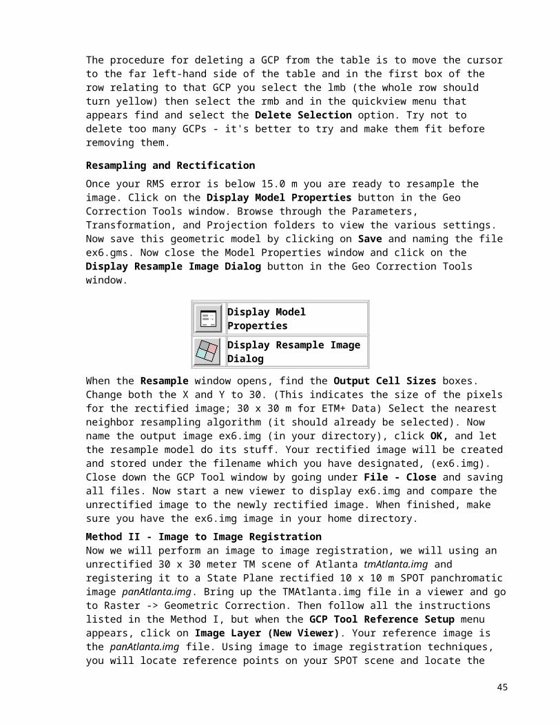
GEO4938 AND GEO5134 Lab #8: Image Classification Adapted from John R. Jensen
Objectives Define and evaluate a signature
Perform supervised classification
Generate clusters using an unsupervised classification approach (ISODATA)
Evaluate the clusters in feature image space
Image
Part I Training Site Selection
A. Signature Extraction To begin, open a color infra-red composite of tm_siestakey_17dec1997.img in a viewer (RGB= bands 4,3,2) and fit to frame. The ERDAS Imagine Signature Editor allows you to create, manage, evaluate, edit, and classify signatures (.sig extension). Both parametric (statistical) and non-parametric (feature space) signatures can be defined. In this exercise, we will be defining signatures by collecting them from the image to be classified using the Signature Editor and Area of Interest (AOI) tools. The Signature Editor can be accessed through the Classifier icon in the Imagine icon panel. This device will enable you to select and save training sites and make them available for future use in a supervised classification. You may launch the Signature Editor without having obtained any previous signatures or you can retrieve a .sig file using Load under the File menu within the Signature Editor. The Signature Editor has many interesting and useful tools. The tools you should concern yourself with are the buttons directly beneath the menu bar, especially the three that have pluses and minuses on them. These will be used in conjunction with the AOI editor to enter training sites into a .sig file. The first button looks like an L with a plus next to it and is used to add a currently selected AOI site to the file. The next one to the right will replace the highlighted field with the current AOI site. The third button is used to merge training sites (signatures) once you feel they have similar spectral characteristics.
Create New Signature(s) from AOI
Replace Current Signature(s) with AOI
Merge Selected Signatures
To gather the spectral signature of the sites you would like to place in the signature editor as training sites, you will need to use the AOI (Area Of Interest) tools. The AOI menu can be accessed through the current viewer's menu bar. In the AOI pull down menu you will be presented with many choices (AOI Styles changes the way the cursor styles look). The Tools and Commands options are important
45

because they allow you to select the type of polygon, modify the polygon, etc. with which you want to encompass your AOI. The Seed Properties option is also important because it allows you to modify the limits of seed area growth by area and/or distance in addition to letting you select the Neighborhood selection criteria. We will be using the Neighborhood default setting which specifies that four pixels are to be searched, then only those pixels above, below, to the left, and to the right of the seed or any accepted pixels are considered contiguous. Under Geographic Constraints, the Area check box should be turned on to constrain the region area in pixels. Enter 500 into the Area number field and press Return. This will be the maximum number of pixels that will be in the AOI. Enter 10.00 in the Spectral Euclidean Distance number field. The pixels that are accepted in the AOI will be within this spectral distance from the mean of the seed pixel. Before closing the Seed Properties window, click on Options and make sure that the Include Island Polygons box is turned on in order to include polygons in the growth region.
To begin the process then, you must select an area on the image using one of the AOI tools, such as the polygon or rectangle tool, or you can place a seed and grow a region using the Region Grow tool (looks like a magnifying glass in the AOI menu). Use whatever you need in that particular instance, just make sure you think you know what the area represents in terms of ground cover. In the viewer, zoom into an area where you want to select an AOI using the viewer's magnifier tool and then select the AOI polygon tool and draw a polygon around your chosen area (or you may plant a seed to grow). After the AOI is created, a bounding box surrounds the polygon or region, indicating that it is currently selected. While the area is selected, use the Create New Signature button to add the selected area into the Signature Editor. Now click inside the Signature Name column for the signature you just added and give it a name (use names like urban1, urban2, etc. to define your individual AOIs). You may also want to change the color in the Color column. You can use the Image Alarm tool under View in the Signature Editor to get a preview of the extent that the classes you have chosen represent the rest of the image. If you select the Image Alarm option a pop-up box titled Signature Alarm will open. In this box you can choose to indicate classes that overlap and the color that represents overlap. This can be useful if you are considering merging classes. The signature alarm will also, as mentioned, let you see the extent of each of the classes (you will need to do this anyway before you can see the overlap). Do this by selecting (highlighting) a class or a set of classes in the signature editor using the cursor. You can select the color you would like to represent the class as by clicking on the colored square with the right mouse button. Once you have made your selections click on the OK button in the signature alarm and let Imagine do its work. Using this tool, you can see what areas are covered and which are not using the classes you have selected. For this lab, take at least six relatively distinct training sites for each of the following classes found in the Siesta Key scene:
1. Urban
2. Residential (mixture of veg. and concrete)
3. Wetlands
4. Forest
5. Water
When you are done generating the training sites for these 5 classes and you feel they are representative of whole scene based on your use of the signature alarm, save the signature editor file as ex8supervised.sig using the Save As menu item under file in the signature editor menu being sure to save this file in your own working directory.
B. Feature Selection
46

The Signature Mean Plot button to the left of the histogram in the signature editor, allows you to view the mean plots of your training data on the screen and thus estimate which of the TM bands best discriminates between the different training sites that you have selected. Select this option as well as the histogram (if you feel this is more helpful: hint use the all selected signatures and all bands options and make sure you have all of the classes highlighted when you do this). The most precise way to accomplish the task of determining which bands to use is to through the use of the Separability option under the Evaluate menu in the Signature Editor. Select 3 for the Layers Per Combination choice. Consult with Dr. Jensen's book to determine which Distance Measure to use (p. 220) and how to interpret the results that will appear in the cell array (choose Cell Array option). Use the Best Average listing method and click OK. The results of this operation will appear in a pop-up box titled Separability CellArray. Note which 3 bands seem to do the best job of spectrally separating your classes. Also note which classes overlap and which are spectrally separable. You will need this information for the next part of the exercise.
Display Signature Mean Plot Window
Display Signature Histogram Window
Part II. Supervised Classification Now that you have specified your training sites, you are ready to proceed with the supervised classification. Under the Classify menu in the Signature Editor, choose the Supervised Classification option. Because you have already selected a signature file it will not ask for one. If you were to close the signature editor and access the supervised classification through the Imagine Classifier menu, you would be able to open a .sig file. In the Supervised Classification pop-up box that appears give a name for your output file. The Parametric Rule setting should set to Minimum Distance (see textbook for descriptions of the differences, advantages and disadvantages of the various classification logic schemes) and everything else should be left as you find them. Select OK when everything is in place. Open a new viewer and display the results then answer the following questions concerning signature extraction and supervised classification:
1) What function does the Image Alarm present? (4 points)2) Explain why you think the mean plot and the separability CellArray seem to differ on the three most important bands in certain instances. (6 points)3) Which Distance Measure method did you chose and why? Which three bands appear to be the most discriminant in separating the classes? (Use the results from the Signature Separability measures on this one). (6 points)4) Which land classes seem to be confused the most and why do think this is the case? (8 points)
5) If you could combine or throw out certain signatures (training sites) to create sufficient separability between classes, which would you manipulate and how? (6 points)
47

Part II. Unsupervised Classification (Clustering) Unsupervised classification differs from a supervised classification in that the computer develops the signatures that will be used to classify the scene rather than the user. The classification process results in a number of spectral classes that the analyst must then assign (a posteriori) to information classes of interest. This requires knowledge of the terrain present in the scene as well as its spectral characteristics. The Unsupervised Classification option is selected in the Classification menu under the Imagine Classifier icon. You will notice that the Unsupervised Classification dialog box states that it is an ISODATA unsupervised classification. The Iterative Self-Organizing Data Analysis Technique (ISODATA) is a widely used clustering algorithm and is different from the formerly used chain method because it makes a large number of passes through the remote sensing dataset, not just two passes. It uses the minimum spectral distance formula to form clusters. It begins with either arbitrary cluster means or means of an existing signature set, and each time the clustering repeats, the means of these clusters are shifted. The new cluster means are used for the next iteration.
The ISODATA utility repeats the clustering of the image until either a maximum number of iterations have been performed, or a maximum percentage of unchanged pixels has been reached between two iterations. Performing an unsupervised classification is simpler than a supervised classification, because the ISODATA algorithm automatically generates the signatures. However, as stated before, the analyst must have ground truth information and knowledge of the terrain, or ancillary high-resolution data if this approach is to be successful.
To begin the unsupervised classification, click on the Classification icon and then select Unsupervised Classification... Fill in the input and output information in the Unsupervised Classification dialog box. Give both the Output Cluster Layer and Output Signature Set a similar name and save in your home directory. Make sure that under Clustering Options the Initialize from Statistics box is on and set Number of Classes to 30. Set Maximum Iterations to 20 and leave the Convergence Threshold set to 0.950. Maximum Iterations is the number of times that the ISODATA utility will recluster the data. It prevents the utility from running too long, or from getting stuck in a cycle without reaching the convergence threshold. The convergence threshold is the maximum percentage of pixels whose cluster assignments can go unchanged between iterations. This prevents the ISODATA utility from running indefinitely. Leave everything else in its default state. When you have entered all of the relevant information click OK to begin the process.
Part IV. Cluster Identification To aid in evaluation we will need to view the results of the clustering so that we may see how the clusters are arranged in feature space and thereby make informed decisions about the nature of the cluster. The first step that will allow us to do so is the creation of feature space images. The Feature Space Image button can be found on the Classification menu. When it has been selected a dialog box will appear saying Create Feature Space Images at the top. Select the original image (not the clustered one) as the Input Raster Layer and make sure the Output Root Name is similar to the raster layer and the directory path is correct and to your home directory. Leave the rest of the selections at their default settings and click OK. When the processing is complete open a new viewer and view the output images (i.e. the cola_3-6-00tm7 2_5.fsp.img file as the raster layer). Note that the 2_5 (and other options) represents the layers that are being shown in the image. In this case layer 2 (band 2) will be displayed on the x-axis and layer 5 (band 5) on the y-axis. Pay close attention when you look in the book for help in determining which clusters represent which ground elements.
48

The next step is to open the Signature Editor (under the Classification menu) with the *.sig file you created in the unsupervised classification. Select all the clusters (they should all be highlighted in yellow). In the Signature Editor main menu select Feature and then in that pull-down menu select Objects. This will display a Signature Objects dialog box that allows you to tell Imagine which viewer you want to receive the signature editor information about the clusters. In this case we want the viewer in which you have displayed your chosen feature space graphic. Select that viewer # in the Signature Objects space provided that represents this viewer. Select Plot Ellipses and Plot Means (or you can try the others if you like). Leave everything else in its default state and click OK. Only selected clusters in the Signature Editor window will be drawn. More than likely your ellipses and means are multi-tonal in nature. If you would like them all to be white, red, green, etc., select all the classes in the Signature Editor dialog box using the mouse and change the color to the one you desire. Save the information as an Annotation Layer.
To analyze the content of the clusters, you should use a combination of techniques. The first should be to use the mean scatter plot to make some educated guess about the information in each cluster. You might want to label each of the 30 clusters on the scatter plot using the Label option in the Signature Objects dialog box so you know what cluster is containing which class. You will more than likely have to zoom in to get a better look at some of the clusters given the close proximity of clusters to each other. You should also have a viewer open with the original scene displayed. This will further help you identify the land cover class. If you are feeling adventurous, you can overlay your classified image on the original image and set all the clustered image's colors to transparent using the Raster Attribute Editor found under the Viewer menu (Raster - Attributes). Once you have set all classes to transparent then you can individually color (by making them opaque) particular classes and see where they are on the image. Another method may be to use the Utility - Swipe or the Utility - Fade tools in the Viewer by opening the classified image on top of the raw data (do not Clear Display after opening the first raw image). Regardless of how you choose to proceed you should not rely on any one particular method but a combination of methods and some common sense to arrive at a sound classification.
When you have decided upon the class breakdowns, use the Raster Attribute editor to assign class names and colors to the classification image. Create the same five classes you used in the supervised classification and place each of the 30 clusters into one of the classes by giving it the same color and class name as every other cluster in that class. When you are satisfied with your unsupervised classification, finish the lab by doing the following:
6) Create a figure locating what clusters you placed in each of your final five classes. (10 points)
7) Compose a one-page description (single-spaced, typed, size 12 Times font, 1” margins) comparing the advantages and disadvantages between using a supervised and unsupervised classification approach. When would one approach be more appropriate than the other? Address the following issues: Accuracy? What could be causing some of the spectral overlap present between classes? What could you do to improve your results? Is there anything missing in your final image that was visually apparent in your Landsat scene? Are there any features you would like to see added to Imagine's classification procedures? (30 points)
8) Create a new map composition (exercise8.map) comparing the completed supervised and unsupervised classification (put both images on 1 page). Make sure the colors/patterns assigned to classes are the same between maps and somewhat appropriate to the class type. Include all appropriate cartographic elements. Remember, you are the map expert! (or you should be by now). Print this map and hand in with your assignment. (30 points)
Total points 100
49

GEO4938 AND GEO5134 Lab #9: Training Samples and More Classification
In this lab, the class will self organize and classify Gainesville imagery which has been made available. You will decide what classes for which you need to obtain training samples in order to create a supervised classification of the supplied Landsat 7 TM scene of part of Alachua County. Once you have, as a group, decided what classes you will create then you will divide up the classes and assign different people/groups to obtain the training samples. I would suggest each person gather 10 training samples to provide you with a decent sample size. Once all the training sample forms have been completed, email to me ([email protected]) the x/y (UTM) location of the TS and the land cover type you named it. I will create a single coordinate file of these points and import it into Imagine, and then let you all know where this file is so you can complete the second part of the lab, which is the classification itself. Using the techniques you learned in last week’s lab and lecture, a hybrid approach, or anything else you can come up with, create the best supervised classification you can of the image you have been given. I have a reference data set for the area and will test your classified products. You can create these classifications in groups, as a single image for the entire class, or as individuals, it is up to you to decide.
Image for Classification-Landsat 7: gnv-subset-etm-11-feb-2003-17-39.img; 5-4-3, R-G-B composite.
50

For other products to help you with fieldwork and to locate yourself you may want to check out the FGDL. In order to see the data available to you go to the FGDL http://www.fgdl.org/
The Florida Geographic Data Library (FGDL) FGDL is a mechanism for distributing satellite imagery, aerial photographs and spatial (GIS) data throughout the state of Florida. The data are organized by county, or other regulatory boundaries, and is distributed on CD-ROMs and are also available for download (Use Netscape) online. The FGDL is warehoused and maintained at the University of Florida's GeoPlan Center, a GIS Research and Teaching Facility. There are currently about 240 layers of GIS data in the FGDL, including FDOR Tax Data and several types of Remotely Sensed images, such as Landsat TM and Aerial Photography. New data layers will be continuously added to the FGDL as they become available. ou may want to check out road coverages (to overlay on your image) or aerial photography coverages of the area (higher resolution) to help you locate yourself on the image. Important Note: the FGDL uses a different projection/datum than the images, and data from FGDL must be reprojected.
Accuracy AssessmentUnder the Classification menu is an option for Accuracy Assessment. I will create a test dataset for you once I know the classes you collected. Hence you will be able to use this file (I will email the name and location of the file to you once created, but I need your data in order to go ahead and create this file for you) in the accuracy assessment to test against your own supervised classification. You can use the text book (IDIP chapter 13) and the help files in Imagine to interpret your accuracy assessment results and you must report producer’s and user’s accuracy per class, overall accuracy and the Kappa statistic.
To be handed in:1. 10 CIPEC Training Sample forms (per person) filled in and completed (60 points)
2. Map Composition showing the input image, and the classified output image and all the usual information to make it a clear, informative document which can stand alone from the analysis (40 points)
Total points = 100
51

CIPEC TRAINING SAMPLE PROTOCOL Observation type (check one):
Within-site observation Edge observation Vantage observation
RESEARCH ID: 005 COUNTRY ID: SITE ID: RANDOM SAMPLE TS #:_____ OPPORTUNISTIC TS#_____
TODAY'S DATE (mm/dd/yr):__ /____/00 LOCAL TIME______ COLLECTOR’S NAME/EMAIL:________________________
TS AREA NAME / OWNER NAME (if applicable)______________________________________________________________
IMAGE PRODUCTS USED: Image ID/dates: Color Composite Used: R= 5, G=4 , B=3
GEOGRAPHIC COORDINATES IN FIELD:
UTM Northing (Y )____________________ [m] UTM Easting (X):_____________________ [m] UTM Zone 16
Datum NAD27
GPS INFO: FILE NAME:______________________________ PDOP:_____________ Garmin Unit #:_________________
LOCATION OF PLOT TOPOGRAPHICALLY: Ridge_____ Slope______ Flat______ Steepness of Slope:______ (0-90)
Azimuth (downhill direction of maximum slope in which water would naturally run)_____ (0-360) ELEVATION ____________meters above sea level (altimeter reading)
DIAGRAMS OF GENERAL OBSERVATIONS : Show GPS points, North , & training sample area in relationship to features.
Aerial View | Profile Diagram (parallel to maximum slope) |
|||||
(include land marks, north arrow and scale bar) | (overall draw of vegetation and slope, include vertical scale)
LAND COVER TYPE (put a check mark next to land cover type or write in others):EXISTING VEGETATION TYPE
DISTURBED: AGRICULTURE/PLANTATION:
Semi-deciduous broadleaf forest SS 1 (initial succession) Broadleaf cropMixed semi-dec. forest (needle/broad)
SS 2 (intermediate succession) Wood perennial fruit crop
Mountain needleleaf forest SS 3 (advanced succession) Agroforestry/cropsCloud forest Disturbed forest (logging) Agroforestry/pastureGrassland Burned field PastureTall grasses and shrubs Quarry/Gravel pit Pasture wi shrubs/woody
regrowthOther: Forest with cleared understory Bare soil
Other: Stubble fieldPlowed field
INFRASTRUCTURE: Coffee plantation, no shade trees
Urban area Coffee plantation, sparse
52

shade Rural settlement Coffee plantation, dense shadeGravel Other:Other:
If existing vegetation is secondary, give original vegetation if known:___________________________________________
VEGETATION STRUCTURE ESTIMATES : [ N/A:_____ No vegetation in sample]
Use ground cover estimate sheet to nearest 5%: % herbaceous ____ ; % litter, ____; % soil ____; % rock ____
Canopy closure: ______% cover Average canopy height:___________m, Height of emergent trees:__________m No trees:_____
Average DBH of canopy trees: 2-10 cm___; 10-20 cm____; 20-30cm____; 30-50 cm____; 50-70 cm____; 70cm-1m____; > 1m ____
Average DBH of emergent trees: 2-10cm___; 10-20 cm____; 20-30 cm____; 30-50cm____; 50-70 cm____; 70cm-1m____; > 1m ____
Presence of Saplings: Absent_____, Few _____, Moderate_____, Abundant _____
Presence of Seedlings: Absent_____, Few _____, Moderate_____, Abundant _____
Presence of Epiphytes: Absent_____, Few _____, Moderate_____, Abundant _____ Presence of Succulents: Absent_____, Few _____, Moderate_____, Abundant _____
Presence of Others: ____________________________Absent_____, Few _____, Moderate_____, Abundant _____
DOMINANT SPECIES (Sci. names; common names)_______________________________________________________________ ____________________________________________________________________________________________________________
PRESENCE OF MANAGED SPECIES (agriculture, agroforestry, plantation): Number of managed species (inc. planted)_____
Sci. Name (Family/Genus/Species):____________________________________ Common name:_____________________________ Density: Few _____, Moderate_____, Abundant _____
Sci. Name (Family/Genus/Species):____________________________________ Common Name:_____________________________
Density: Few _____, Moderate_____, Abundant _____
Other Observations:___________________________________________________________________________________________
LAND USE HISTORY (Fill out as far back in time as possible, recording dates of change to forest, pasture, crop, plantation, etc.):
Time period (mm/yr) Land Cover/Land Use Informant:______
_____________________________________________________________________________________
_____________________________________________________________________________________
53

_____________________________________________________________________________________
_____________________________________________________________________________________
ESTIMATED AGE OF LAND COVER IF NO INFORMANT IS AVAILABLE:_____________________________ GENERAL OBSERVATIONS:
Photos: Roll #:__________ Exposures # / direction (N, S, E, W, Sky, Ground):___________________________________________
Seasonal change affects land use or land cover: No____ Yes____ If yes, explain:________________________________________
Training sample marked on image products: No___ Yes___ If no, explain:____________________________________________
Other Comments:_________________________________________________________________________________________
54

CIPEC Training Sample Protocol Instructions (5/01)
General Instructions
For each training sample, you should:1. Check your location on the topographic and image maps using surface features such as ridges, roads, curves in
a river, etc.2. Draw the training sample that is being observed on the topographic and image maps using permanent, ultra
fine tip pens.3. Polygons should be at least one pixel large, but may follow the “lay of the land” or the feature of interest, as
depicted in the image.4. Fill in the Training Sample Form.5. Mark the Tally Sheet.
Training Sample Areal Size
Every training sample should be at least 60 x 60 m to ensure that at least one full pixel falls within the training sample (Justice and Townshend 1985?). Training samples may be larger than this, if the observers are confident that the locale is similar. It is especially useful to examine larger training samples using the “Vantage” method, but one should make certain that these are not viewed from a distance of greater than 1 km, unless appropriate binoculars or scopes are used.
Recommendations for Organization
Three ring notebooks are nice because you can organize the Training Samples by Category or date and flip through each with ease.
The following Items and their Descriptions are listed in the order of appearance on the training sample data sheets.
Item Description
Section 1.
Observation type (check one) Where the observer is located relative to the training sample (TS)
Within-sample observation
Observer is recording data within the TS and will use a reference area of at least 60 x 60 m^2
Edge observation Observer is recording data from the edge of the TSVantage observation Observer is recording data from a point that allows a full view of the training
sample from a distance (record approximate distance below)RESEARCH ID Identification number of the project COUNTRY ID Country identification numberSAMPLE ID Study sample location identification numberTRAINING SAMPLE # Training sample identification numberTODAY'S DATE (mm/dd/yr) Date of training sample collection in Month/Date/Year (use the four digit year
—e.g., 2001)LOCAL TIME Hour of the day, 24-hour timeCOLLECTOR NAME Names of all training sample observersTS CLASS The class name marked in Appendix B. Land Cover Type Explanations (or
Section 9)TS AREA NAME / OWNER NAME
Local or common name for TS, if it exists and/or owner’s name
Section 2.
55

IMAGE PRODUCTS USED This section describes what type of images and maps were used in the field and their specific identification information
Image ID/date Image file name (e.g., OAX04291998TM)Color Composample Used R=_____ G=_____ B=_____ Input the band number for each color gun Map only: Y / N Circle Y or N to indicate if the TS is visible and recorded on the map onlyImage Map Name The name of the image field map (corresponds with topo. map name) on
which the TS is markedTopo Map Name The name and/or number of the topographic map on which the TS is marked
Section 3.
OBSERVED CLASS For use with basic forest/nonforest classification. Mark one.
Forest Forested land. Define this category in the field or for the specific study site. Fill in the criteria for “forest” in Appendix A. The percent cover is likely the most important criterion.
Nonforest Land cover that is not forest, or does not meet the “forest” criteria.Does observation agree with image analysis? Y / N
Circle Y or N to indicate if the TS observation in the field is the same as the class identification in a classified image.
Explain “No” in Observations Explain how the observation differs and to what degreeSection 4.
GEOGRAPHIC COORDINATES IN FIELD
This section describes the geographic location of the training sample.
UTM Zone and Datum These are taken from the GPS unit. Record the UTM zone in which TS is located and the datum in which the GPS coordinates are being collected.
UTM Easting (X) [m] The X-Coordinate. Record to the nearest whole number. Usually the smaller number indicated by the GPS. Units: meters
UTM Northing (Y) [m] The Y-Coordinate. Record to the nearest whole number. Usually the larger number indicated by the GPS. Units: meters
ELEVATION msl Units: meters above sea level.Section 5.
GPS INFO This section describes other information recorded by the GPS unit
FILE NAME The GPS waypoint identifier.PDOP The position dilution of precision. Has to do with the “spread” or separation
geometry of the satellites. Higher spread = better precision. Range: PDOP = 1 Excellent; PDOP = 8 Poor
Est. Accuracy Record the Estimated Accuracy from the GPS unit. The estimated accuracy is observed to find an appropriate level of accuracy—use this instead of collecting a specific number of points.
Section 6.
LOCATION OF PLOT TOPOGRAPHICALLY
This section provides descriptive information on the TS that may be useful for identifying if the TS is likely to be located in a shadowed area, etc.
Ridge Check this category if the TS is located on the top of a hill or ridge.Slope Check this category if the TS is located on a sloped surface.Flat Check this category if the TS is located on a flat surface.Steepness of Slope ___ (0-90)
Record the slope angle. Units: degrees
Azimuth _____ (0-360) The downhill direction of maximum slope and therefore the direction in which water would naturally flow downhill.
56

Units: degreesSection 7.
ACCESSIBILITY CLASS This information describes how difficult it is for people to access the TS area. Be sure to record the estimated distance from road.
Difficult Fill in definition in the field. Record criteria in Appendix A.Moderate Fill in definition in the field. Record criteria in Appendix A.Easy Fill in definition in the field. Record criteria in Appendix A.Very easy Fill in definition in the field. Record criteria in Appendix A.Est. distance from road Units: kilometers
Section 8.
DIAGRAMS OF GENERAL OBSERVATIONS:
Show GPS point, North arrow, & training sample area relative to major features, especially those visible on image. Indicate veg. structure. Vantage observations: show location of observer relative to TS point.
Aerial View Depiction of TS from above.
Profile Diagram Depiction of TS in profile or parallel to maximum slope.
Section 9.
LAND COVER TYPE This section provides the TS class that will be used in image classification.
I. Land Cover Classes
EXISTING VEGETATION TYPE
Class Description Local Translation
Semi-deciduous broadleaf forest
Forest cover with species of trees that show incomplete deciduous behavior in that they do not drop all leaves
Bosque de hojas anchas (bosque encino)
57

from any individual at any time during the year.
Mixed semi-dec. forest (needle/broad)
Mixed forest with conifers and broadleaved species where neither shows dominance over the other. Includes: pine-oak forest
Bosque pino-encino o bosque coníferas y encinos
Mountain needleleaf forest Conifer forest at high altitudes Bosque coníferas
Cloud forest Vegetation in contact with the clouds can capture a considerable amount of water in addition to the orographic rainfall that is often produced in these zones.Generally found between 1,200 and 2,500 masl but in many cases it can reach more than 3,000 masl or begin below 1,000 masl. Clouds occur with a certain frequency, regularity, or periodicity and in combination with winds that permit a more intensive exchange between vegetation and the atmosphere.
Bosque mesófilo de montañaBosque mesófilo con encinoBosque mesófilo primarioBosque mesófilo de zona baja
Grassland Land area dominated by short grasses (< 50 cm) Pastizal
Tall grasses and shrubs Land area dominated by tall grass and some shrub cover; tall grass is more prevalent than shrubs
Pastizal
Dry woody scrub Shrub lands; includes thorn short forest, matorral Matorral xerófilo
Cactus/succulents Semi-arid to arid lands where major vegetation type is cactus or other succulents. Grass can exist here, but cactus/succulents make up
Other:
DISTURBED TYPES
Class Description Spanish Translation
SS 1 (initial succession)SS 2 (intermediate succession)SS 3 (advanced succession)Disturbed forest (logging) Forest managed or illegally loggedBurned field Field that has been harvested and shows signs of
recent burning Quarry/Gravel pit Self-explanatoryForest with cleared understory Forest where understory is absent or disturbed by
humans, animals, wildfire, etc.Other:
II. Land Use
INFRASTRUCTURE TYPES
Class Description Spanish TranslationUrban area City or other community that is larger than a rural
settlementRural settlement Settlement whereGravel Dominant cover is gravel, such as a gravel road
58

Other:
AGRICULTURE/PLANTATION TYPES
Class Description Spanish Translation
Annual broadleaf crop E.g., corn, alfalfa, soybeans, other beansWood perennial fruit crop E.g., olive trees, orange trees, almond treesAgroforestry/crops Mosaic of agroforestry (including managed forest and
timber plantation) and other cropsAgroforestry/pasture Mosaic of agroforestry (including managed forest and
timber plantation) and pasture land (grass dominated)
Pasture Grassland used for grazing animalsPasture wi shrubs/woody regrowth
Grassland used for grazing animals that has a sparse shrub or tree cover
Bare soil Unvegetated land that is not gravel, rock, pavement, etc. Bare soil dominates.
Stubble field Field that has been harvested and only the stubble stems remain visible.
Plowed field Field that has been plowed recently and is soon to be or recently seeded.
Coffee plantation, no shade treesCoffee plantation, sparse shade
Sparse shade (trees) = (define in field)
Coffee plantation, dense shade Dense shade (trees) = (define in field)
Other:
Item Description
If existing vegetation is secondary give original vegetation if known
Fill in with adequate detail for time series or change detection analysis—may be used for a TS in an earlier date image.
Section 10.
VEGETATION STRUCTURE & GROUND COVER ESTIMATES
This section describes the vegetation present in the TS. Descriptions refer to an area of at least 60 x 60 m^2 or the TS polygon.
Vegetation in sample: Y / N Circle Y or N if the TS is vegetated.
Use ground cover estimate sheet to nearest 5%
Estimates of percent ground cover (vegetation < 2 m in height)
% grasses Percent cover of grasses (record grass cover here for any grass-dominated land cover type)
% other herbaceous Percent cover of non-grass herbaceous plants
% litter Percent cover of vegetative litter (incl. Leaves, twigs, and small branches)
% soil Percent cover of soil showing through vegetation cover.
% rock Percent cover of bare rock
59

% crop Percent cover of agricultural crop
% other Percent cover of other stuff (incl. Mosses, large woody debris, ). If moss cover is very high, record moss cover separately.Define the rules for separating out specific “other” things in Appendix A.
Notes Record other observations of interest or importance.
Canopy closure Canopy closure refers to tree canopy only.Tree = an individual of a woody species with a DBH of > 10 cm.
% cover Percent cover of treesAverage canopy height (m) Estimated average height of mature, canopy trees.
Units: metersCanopy trees = trees that form the main layer of tree canopy
Height of emergent trees (m) Estimated average height of mature, emergent trees.Units: metersEmergent tree = tree that grows to a height that is significantly higher than the majority of the trees at this site.
No trees Mark this if there are no trees within the TS.
Average DBH of canopy trees Estimated average DBH of canopy trees Average DBH of emergent trees Estimated average DBH of emergent trees.Saplings (2 – 9.9 cm) Sapling = individual of a woody species that is < 10 cm in diameter at the
base or at breast heightFew Fill in definition and criteria in the field. Record criteria in Appendix A.Moderate Fill in definition and criteria in the field. Record criteria in Appendix A.Abundant Fill in definition and criteria in the field. Record criteria in Appendix A.Seedlings (0-1.9 cm) Seedlings = individuals of woody species that are < 2 cm in diameter at the
baseFew Fill in definition and criteria in the field. Record criteria in Appendix A.Moderate Fill in definition and criteria in the field. Record criteria in Appendix A.Abundant Fill in definition and criteria in the field. Record criteria in Appendix A.OtherFew Fill in definition and criteria in the field. Record criteria in Appendix A.Moderate Fill in definition and criteria in the field. Record criteria in Appendix A.Abundant Fill in definition and criteria in the field. Record criteria in Appendix A.
DOMINANT SPECIES (Sci. name/common name)
Record the most numerous or influential species (single species or several species) in this TS. If there is more than one dominant species, list species in the order of dominance
MANAGED SPECIES (agriculture, agroforestry, plantation)
This section describes managed species in the TS.Managed species = any type of vegetation that is managed, altered, or controlled for production purposes. Incl. Broadleaved or other herbaceous-type crop, tree crops for timber or plantations, etc.**What about forests that are managed to control for wildfires?
Number of managed species (inc. planted)
Record how many species are being managed or planted (as in the case of crops).
60

Sci. Name (Family/Genus/Species) Record the scientific species or taxonomic name.Common name Record the name by which this species is known locally.Density: Record the density of the managed species using the linguistic levels below.Few Fill in definition and criteria in the field. Record criteria in Appendix A.Moderate Fill in definition and criteria in the field. Record criteria in Appendix A.Abundant Fill in definition and criteria in the field. Record criteria in Appendix A.
Others Record any other managed species.
Section 11.
LAND USE HISTORY Fill out as far back in time as possible, recording dates of change to forest, pasture, crop, plantation, etc.
Section 12.
GENERAL OBSERVATIONS This section provides information about photographs, etc.
Number of photos taken Record the number of photographs taken (take photo in each of the four cardinal directions and record which is photo is taken in what direction)
Film: Roll # The film roll number written on the film case itself.Digital Camera Codes To be determined.Training sample marked on image products
Indicate if the TS is marked on the image product or map. If not, explain why not.
Other observations Record any other observations of importance.
Section 10.
VEGETATION STRUCTURE & GROUND COVER ESTIMATES
Use ground cover estimate sheet to nearest 5%
Estimates of percent ground cover (vegetation < 2 m in height)
% other Define the rules for separating out specific “other” things here.
APPENDIX A. IMAGE MAPS WITH TRAINING SAMPLES LOCATED ON THEM
Map Name/Number Training Samples Map Name/Number Training Samples
61

GEO4938 AND GEO5134 Lab #10: Supervised Classification and Accuracy Assessment
Image for Classification-Landsat 7: gnv-subset-etm-11-feb-2003-17-39.imgPoint coverage of TS’s lab10_tsExcel File of all information: 1 sheet training sample information, 1 sheet for accuracy assessment information training-samples-and-accuracy-asessment-lab10.xls
The first file should already be on your machine but you need to copy the latter 2 files over to your machine from my machine. See board for location.
Part 1: Supervised Classification of the Image Using your Training Sample Data
Open the Excel file of training samples, review the contents in the Training Sample sheet and for now ignore the sheet titled accuracy assessment.
You will use the information in the Training Sample sheet to find locations on your image to take your signatures form in creating your supervised classification. You have already had a lab which walks you though supervised classification so refer to that lab for details you do not remember. Here I will only add the new information. So you can view the excel file, look at the coordinates and you could use the inquire cursor to find those locations of known land cover on the image and to gather a signature for that class at the location. Do not just select individual pixels but get a larger area for the signatures, remember you were all told to collect training samples from areas in the center of homogenous land cover types.
A second (and better and easier) way to view the information form the excel file is to convert the data into a point coverage file and to open it on top of the image file (File | Open | Vector). In addition you can make the points labeled with their land cover class. This process takes a number of steps which I describe below, but I have already done it for you (aren’t I nice) and this is the file lab10_ts which you should have already copied over. So open this file on your Gainesville image. (Be sure you do not have ‘clear display’ box checked as an option when you open this or it will delete the raster file below).
62

Given this process is a little complicated I did this for you and so you can just open the already created Vector Points file on top of your image. When you do this, due to the default display type being small black dots on the image, you may not see the points appear. To make them a more appropriate color, symbol, or to show text/attribute information we need to edit them. In the viewer window you need to select Vector | Viewing Properties. Click on the symbol to the right of the ‘Points” (looks like a page of paper)
63
An Aside: How would you have converted the excel file into a point GIS file?If you ever need to do this these are the steps:
1. Save a version of the excel file with only 3 columns in it x, y, landcover#2. Save the file using ‘Save As’ and select the file type as ‘*.txt’ (you can only save a single sheet
so hit yes to this, and OK to other messages which will appear)3. In your windows explorer, find this file and change the extension form *.txt to *.dat by renaming
it. You will get some error messages or cautions, just hit ‘yes’ and accept them.4. In Imagine Select Vector | ASCII to point vector layer5. A dialogue box opens and you can preview your data and play with different format options,
Note: you can only bring in the x and y coordinate columns not any attribute information, so only 2 columns will come in…this is correct.)
6. Open the new vector file you just created File | Open | Vector7. In the Viewer pull down the Vector menu and select ‘Enable Editing’ and this will allow you to
edit the information you just created. We need to do this as we have to add in the attribute information for land cover class (or any other information you had in an excel file could be added in the same way)
8. Under the Vector Menu in the Viewer, select ‘Attributes’9. The attribute file opens and you will just see the x and y locations and no other columns (it will
add an ID# but it is simply a counter or rows). Select Add Attributes under the menu options in the Attribute Window. A number of new columns, ‘area’ ‘perimeter’ ID etc. will now all appear.
10. Leaving the attribute file open, go to your excel file where you saved only the x,y, landcover# information. Copy the entire column of information on Land Cover # (RML/LMC – right mouse click/left mouse click) by LMC on the column to highlight, and then RMC and select copy. Go to the Imagine Attributes file and highlight the last column in the attribute table, this is ‘lab10_ts_ID’ in our example file, but is basically a count of each row. This is data we do not need so we are going to use this column to add the information we do want which is land cover class. So highlight the entire column and then RMC and select paste, and all the data from the land cover # from the excel file, will magically appear here.
11. Note: you can also select to ‘Add column’ and create a new column in the attribute file, then specify it as text, number, color, whatever, and add data in the same way. This copy and paste function is very useful
12. Finally, check that the data were imported correctly by returning to your excel file and noting a couple of x/y locations and their landcover class, and then go to the attribute file and check this is what the data is in your new file.

A submenu appears, go down to the other option, and this gives you a full menu for how you want the points to look on the viewer. I would make them large and a color which you can see. Select Apply and then close the window. In addition to the point location it would also be useful to have the Class # appear next to each point so it is easy for you to see. TO do this select the checkbox next to the Attribute Option, and then from the pull down menu below it select the variable form the attribute list which relates to land cover class #, in this file it is Lab_10TS_ID and then select Apply and minimize this window. You should now have nice points with their land cover code written next to each point (you can change the color and size of these values in the same way as you did for the point data if you wish)
You are now ready to use this information you have obtained in the field to train your supervised classification. So, create your signatures for each class, Test the separability, merge classes if needed and come up with a supervised classification that you are completely happy with.
64

Part 2: Accuracy Assessment of the Supervised Classification created
In your excel spreadsheet save sheet 2 – Accuracy Assessment as a *.txt file format, note this file contains only x, y, landcover #
Open your final Supervised Classification in a Viewer. Select Classifier from the main menu, then Accuracy Assessment Under the Accuracy Assessment dialogue box select File | Open | and select your supervised classification file. Note: nothing is added to the data file, but the header of the box now links to your supervised classification filename. Then select Edit | Import User Defined points (play with the options to bring in your excel file which you saved a s a *.txt file, the defaults should work, if not play with the different options and use the help file to open the data) You will now get a file with Name, x, y, class, reference. Only the first 3 columns will contain any visible data. This is good.
Next you need to bring in your landcover # data form the excel file, the column which did not copy over. To do this copy and paste the column (as described in the aside box on an earlier page) and paste the data into the column titled ‘Reference’ in the Accuracy Assessment Viewer. Once this data is in the file you can now run your accuracy assessment on your supervised classification. Select Report| Options (ensure all are selected with checkmarks, if not select them) Then select Report | Accuracy Report
65

Save the output to a text file (File, Save As) or just copy and paste it somewhere. These are the results of your accuracy assessment. You can use the text book (IDIP pgs 499-500) and the help files in Imagine to interpret your accuracy assessment results and you must report producer’s and user’s accuracy per class, overall accuracy and the Kappa statistic in a table. See the text as to how to present this information. Do NOT just copy and paste the output directly.
6. Present the Tabular results of your Accuracy assessment (Producer’s and User’s Accuracy per class, overall accuracy, and the Kappa Statistic) you calculated. See IDIP to see how to present and interpret this information. Do NOT just hand me your text output file.
(50 points)
7. Write a 1 –2 page text description (single-spaced, Times New Roman, font size 12) of how good your classification is (use the #’s you got in the accuracy assessment to guide you in this evaluation), what the problems were, what classes had larger errors and why, what additional data may be useful in improving your analysis and a discussion of any ancillary data you used.
(50 points)
Total points = 100
66

GEO 5134/GIS 4037 Lab #11Change Detection of Coastal Vegetation and
Introduction to the Spatial ModelerAdapted from John R. Jensen
Objectives
Compare and contrast two different change detection methods to analyze changes in land use/land cover between two dates.
Introduce the ERDAS Imagine Spatial Modeler
Images
Part I. Introduction Change detection is the process of identifying differences in the state of a feature or phenomenon by observing it at different times. In remote sensing it is useful in land use/land cover change analysis such as monitoring deforestation or vegetation phenology. However, there are many remote sensor system and environmental parameters that must be considered whenever performing change detection. Failure to understand the impact of the various parameters on the change detection process can lead to inaccurate results. Ideally, the remotely sensed data used should be acquired by a remote sensor system that holds the following resolutions constant: temporal, spatial, spectral, and radiometric. For example, changes in radiance values between images may be caused by a number of different factors such as a field which may have different soil moisture content and therefore appear different in two individual images.
Bring up two viewers and display the Jacksonville 1988 and 1992 images and compare them side-by-side in a color infrared composite (RGB=4, 3, 2). These images depict recent urban development on the St John’s River in Duval county, Florida. Visually examine the differences as an initial familiarization technique. It is important to have an idea of where you might expect to see changes? Answer the following questions:
1a. Which resolutions were held constant in these two images? Were these images acquired on anniversary dates? How might this impact the change detection process? (8)
67

1b. What might be an optimal time to detect changes in wetlands? (4)
Part II. Change Detection Methods Of the many change detection methods available, we will be examining two. Ideally, it is important that the analyst has acknowledged the cultural and biophysical characteristics of the area and preferably has obtained some ancillary data. The analyst should also be aware of the different techniques available, including the limitations and advantages of their respective algorithms.
Method 1: Image Differencing in Spatial Modeler This involves the subtraction of two images and the addition of a constant value to the result. This results in a differenced distribution for each band (see chapter 9 in the textbook). The Spatial Modeler function in ERDAS Imagine allows the user to graphically create a spatial model and execute it. In this simple example, we will create a change detection model which uses both the tm_jax_23oct1988.img and tm_jax_20jan1992.img as inputs, develops an image differencing algorithm as the function, and creates a change detection image as an output.
Begin by opening the Spatial Modeler menu by selecting the Modeler icon in the Imagine icon panel. Review the function of each of the Model Maker's tools before going on.
Description of the Model Maker Tools Use this tool to select items on the Model Maker page. Once selected, these graphics (or text) can be moved or deleted. Click and drag a selection box to select multiple elements. Multiple selected elements can be dragged to a new location as a unit. You can also use the arrow to double click on any of the graphics below to further define their contents.
Creates a raster object , which is a single or layerset of raster data typically used to contain or manipulate data from image files.
Places a vector object , which is usually an Arc/Info coverage or an Annotation layer.
Creates a matrix object , which is a set of numbers arranged in a fixed number of rows and columns in a two-dimensional array. Matrices may be used to store numbers such as convolution kernels or neighborhood definitions. Creates a table object, which is a series of numeric values or character strings. A table has one column and a fixed number of rows. Tables are typically used to store columns from an attribute table, or a list of values which pertain to individual layers of a raster layer set.
Creates a scalar object, which is simply a single numeric value.
Creates a function definition, which are written and used in the Model Maker to operate on the objects. The function definition is an expression (like "a + b + c") that defines your input. You can use a variety of mathematical, statistical, Boolean, neighborhood, and other functions, plus the input objects that you set up, to write function definitions. Use this tool to connect objects and functions together. Click and drag from one graphic to another to connect them in the order they are to be processed in the model. To delete a connection, simply click and drag in the opposite direction (from the output to the input).
68

Creates descriptive text to make your models readable. The Text String dialog is opened when you click on this tool.
Now select the Model Maker button in the Spatial Modeler menu. Wait for the Model Maker dialog box and the model tools to appear. Select the raster object tool and place a raster object in the model window (towards the top left of the window). It will have a question mark as a title for now, but you will assign the input raster file later. Repeat the process and place a second and third raster icon in the window (one on the top right and one near the bottom center. If you make a mistake, use the Edit menu to cut the selected mistake out of the model.
Now select the function tool and place a function symbol near the center of the model window. Use the connect tool to connect the raster objects on top to the function symbol by selecting a point inside the top left raster icon and dragging a line to the center of the function symbol. Release the mouse and a connection arrow should appear. Now connect the upper right raster icon to the function symbol, and then the function symbol to the lower raster object. The resulting function should look somewhat like the model depicted below:
Now double click on the top left raster object. The Raster Object dialog box will open. Select tm_jax_23oct1988.img as the input and leave all other options in their default state. When this is completed, select OK. The name of the image should now be present below the raster object. Complete the same process for the upper right raster object with tm_jax_20jan1992.img as the input.
Next, double click on the function symbol. In the Function Definition window that appears, you will create the image differencing algorithm to be used in this model. In the list showing the available inputs, the number in parentheses corresponds to the individual raster layer. We will be using the full scene image for the calculations and NOT the individual layers. Use the dialog box calculator to create the following algorithm in the blank space in the bottom of the dialog box. (tm_jax_23oct1988.img - tm_jax_20jan1992.img) + 128
69

Finally, double click on the bottom raster object, which is your raster model output, and give it an output file name (save this image in your own home directory). Again, leave the rest of the selections in their default state. When all objects are labeled and the function definition complete, look at the top of the model window and find the Process option. Run the model by selecting Run. When the model is done processing, select OK and exit the Model Maker without saving any changes. In a new viewer, display the model output image using the same RGB layers you used in the first part of the exercise.
2. Why is it necessary to add a constant of 128 to the image difference equation? (3)3. Compare the output model image with the two original images. What areas appear to have the most land cover change? What do the different colors represent? (10)
Method 2: Multi-Date Visual Change Detection Using Write-Function Memory Insertion This method involves the use of one band from each date of imagery. Each band is put in an image plane to create a layer stack and the composite is displayed. The corresponding colors represent change in either direction or no change. Select the Interpreter icon in the Image icon panel and then select the Utilities option. In the menu that appears, select the Layer Stack. We will be creating a layer stack using only the NIR bands in each of the 1988 and 1992 images. When the Layer Stack dialog box appears, only select layer 4 of tm_jax_23oct1988.img as the first input file and click Add. This should add the first input image name and path into the blank space above the Add button. Now add the 1992 NIR band to the image by selecting layer 4 of the tm_jax_23oct1992.img in the input file space. After you have specified an output file name (being written to your own home directory), leave the rest of the information in its default state and click OK. Wait until the processing is complete and then display the output image in true color mode. Assign layer 1 to red, layer 2 to green, and blue to either layer 1 or 2 (Note: 1:2:2 seems to be provide the most clearly defined change areas). After the image is displayed, go to Raster - Band Combinations and turn off the blue gun by clicking on the button next to the word Blue. This combination leaves you with just the red (1988) and green (1992) layers in the viewer window. The resulting image should have only red, green and yellow shades. Study this image and answer the following questions: 4. What do each of the colors in the composite represent? (6)
5. What could be possible sources of error for these dates in an identified land cover change for the following classes, explain why: a. Forest b. Wetland c. Residential (9)
6. Create a map composition showing the 2 different change detection output images (on a single map) and include all the required information for the map. Add a legend (text or some other form) to each map composition which describes the colors/values/shades on each map – you will need a separate legend for each map. (20)
7. Briefly compare the advantages and disadvantages of each change detection technique used in this exercise. (10)
Total points = 70
70

GEO4938 and GEO5134 Lab #11bAdvanced Change Detection Trajectory Analysis Techniques
In the following analyses we will use Landsat TM (Landsat 5) and ETM+ (Landsat 7) products. This will be a lab where I test your abilities and give only limited guidance in terms of point and click type instructions. Most of this you have done before or have done something similar enough for you to be able to determine ‘how’ you could do it. As such, this will test your abilities in the software and the questions will test your knowledge of the science and its applications. Steps will be given without instructions of ‘how to’ and you will have to refer back to previous labs and to play with the software or use the help files a little more. This is a more realistic analysis, using real data, and as such it may be more difficult as not everything will work out as it does in all the predetermined labs. The techniques you will undertake are the mainstay of remote sensing in the world – change detection techniques and so learning how to do such analyses with ‘real world’ (i.e., ill-behaving) data is important.
Objectives of this part of the lab are:Continue to advance with the ModelMaker, this time concerned with change detection based on land cover trajectories, i.e., classifications from multiple dates incorporate together to show change over time and NDVI change analyses
1. Introduction to the ‘Change detection’ interface2. Analysis of climate data across dates to ensure accurate analysis of output data3. Comparison of different change detection techniques in terms of information they give you
with specific reference to methods using continuous data versus those using discrete data.
Images: Copy these files over from the G: folder for the class: 1 Landsat 7 ETM+ image for the Alachua County area and 2 Landsat 5 TM Images
2000-jan-02_ETM_alachua.img 1995-jan-12_TM_alachua.img 1990-jan-14_TM_alachua.img
71

Then:1. Create 3 Forest/NonForest classifications for each image date. You need to decide how you wish
to define these classes and it is completely up to you. (Think back to your supervised classification of this region to help guide you in this.) You will be using these images to create a change trajectory analysis and hence the ‘Value’ you assign to the forest and nonforest classes is important, as when added together it must create unique values. i.e. a pixel which represents, forest in 1990 + forest in 1995 + forest in 2000, will be assigned a value which is the product of summing all the classifications together, and the result of the addition for each possible combination of values must be unique.
2. As an example of a problematic change image, assume for each image I assign Forest a class value = 1 (i.e. the pixel value is 1) and a value of 2 for nonforest. Then my Change matrix would produce the following possible numerical combinations:
Change Class 1990-1995-2000 Numerical outputF + F + F 1 + 1 + 1 = 3
F + NF + F 1 + 2 + 1 = 4F + F + NF 1 + 1 + 2 = 4NF + F + F 2 + 1 + 1 = 4
NF + NF + F 2 + 2 + 1 = 5NF + F + NF 2 + 1 + 2 = 5F + NF + NF 1 + 2 + 2 = 5
NF + NF + NF 2 + 2 + 2 = 6
Any class with the same numerical value as another change class is useless; we would not know which class to assign it to in our change image. Create a change image using these values. Then, create a change image that shows unique trajectories (different numbers for the different trajectory classes in
72

the table). You know the addition of the 3 dates of images will produce a unique change output. To do this simply use ModelMaker and add the 3 images together to create a new image output.
One of the most useful ways to create an easily interpreted change image is to increment each preceding land-cover image by a factor of ten. If F is 1 and NF is 2 in the most recent image, then the previous image would have F=10 and NF=20, and the image before that would be recoded to F=100 and NF=200. Then, when the successive images are added together the result indicates the change. For example, F – F – NF would be 100 + 10 +2 = 112. Very easy to interpret, no? Several limitations come with this method. You can’t have more than 10 land cover classes and you must be careful to specify the appropriate data type (“unsigned Byte Integer has a range of 0-255, so any number larger than this will be ignored). Be sure you keep the image data type to be the same as the input images. Open and review the images. Open as a ‘Pseudo color’ Image (under the Raster Options tab in the Open file dialogue box) and assign class names to each of the change classes.
3. Create 3 NDVI Images from the original input data files for each date.
4. Create NDVI Image subtraction Images using ModelMaker to show changes across each pair of dates. As such you should have an image for 1990/1995, 1995/2000 and 1990/2000. Look at the changes in the histograms as well as what you see on screen. In addition you can open the image as Pseudo color (not grayscale) and change the colors, create groupings, graduated scales etc.
5. In addition to ModelMaker there are some preset functions that allow you to do change detection. Let’s play with these options. From the main menu select ‘Interpreter’, ‘Utilities’ ‘Change Detection’. This dialogue box allows you to specify something as specific as a % change (in NDVI or brightness values, or temps etc) or a specific numerical value. It is a great tool. Play with it and create an additional set of change images for image time-series. You are the Master (so to speak) and can create any type of change image you wish but it must be informative and useful. As an example (and if you cannot think of anything you could do something similar) you could create for each of your paired NDVI images an image that shows areas of 25% change (+ or -) in NDVI values across your images. This would indicate areas of significant vegetation increase or decrease. You can also play with the % values etc. Try and create a unique and informative product.
Questions and Products
1. For the study area describe preceding year/month climate information (search for this online) and discuss the implications of the climatic differences on your change analysis, paying particular attention to precipitation changes. [15 points]
2. How did you determine your “Forest” and “NonForest” classes, what criteria did you use, and what implications may this have on your change analysis. [10 points]
3. Create a map composition showing the 3 input images in a color composite of your choice and the resulting change trajectory analysis (3 summed F/NF trajectory classifications).
[15 points]
4. Discuss what changes have occurred in the area as highlighted by your change trajectory analysis. [10 points]
73
5. Create the three map compositions showing your NDVI Image subtractions. [10 points]
6. Discuss what changes have occurred in the area as highlighted by your NDVI image subtraction images. [10 points]
7. Create a map composition showing your ‘Change Detection’ Images which you devised using this function in Imagine. [15 points]
8. Discuss why you chose the methods you did and what they reveal about the study area.[10 points]
9. Discuss the different change detection methods used in this analysis, advantages and disadvantages, when one technique may be preferred over the others and specific uses. In addition, discuss the implications of using a continuous dataset (NDVI), a continuous data set which is truncated (% or # levels you set in the change detection dialogue) or a discrete dataset (Classes) in change detection analysis. Again advantages and disadvantages, preference for one technique over another, etc. [25 points]
Total points = 120
74

GEO4938 and GEO5134 Lab 12: Image Calibration and Thermal Calculations. A Two-Day Lab
In Part I this lab will teach you the steps you need to go through to calibrate an image. In this case we will calibrate a Landsat TM 5 image, and the process is different (as is the spreadsheet) for the different image products. In addition in Part II we will use a Landsat 7 Image and convert the band 6 radiance data (which is how the product arrives) into blackbody surface temperatures. Both of the procedures will use ModelMaker as a calculator in which you determine the math you need to undertake and then write a model to perform the math. In Part I you will simply perform a linear regression (y = mx + b) on each band, where Y = new band data (you’ll perform the calibration to create a new band Y) and X = original band data (the data you will transform). And the slope and intercept you will get from running the excel spreadsheet. To get these values you will need to extract information form the image itself and from the header information file also. In Part II you will simply perform a mathematical routine based on a given equation to obtain temperatures. No other spreadsheet information is needed in this section. So. For Part I first work though the excel spreadsheet for the image you have been given and obtain your m and b values for your equation. Once you have these open model maker, input the image and then for each band create a function ((m* band#) + b). You will create 6 new bands and then use the function StackLayers under the ‘Data Generation” function menu in the Modeler to recreate 1 image file. For Part II you simply input the raster file and perform the function calculation on Band 6, outputting the data to a new raster layer. The information you will be using for each part is listed below:
NOTE: There are two additional resources for conducting this lab. First, the spreadsheets created by Glenn Green at Indiana University’s CIPEC are named: CIPEC_landsat_5_calibration.xls for Landsat 5 calibration and CIPEC_L7etm_NLAPS_RadCalCPF.xls for Landsat 7 calibration, as should be obvious. Download the spreadsheet files and use them when appropriate in this exercise.
Second, the Landsat 7 Data Users Guide, Data Products (Chapter 11) web site has all the calculations described for L7 calibration and temperature calculation. The URL is http://ltpwww.gsfc.nasa.gov/IAS/handbook/handbook_htmls/chapter11/chapter11.html.
Today’s work:
Part I:Image to be calibrated: 1995-jan-12_TM_alachua.imgHeader file information for this image: LT5017039009501210.H1Excel spreadsheet: CIPEC_landsat_5_calibration.xls
Next Week’s Work:
Part II:Image to have temperature conversion: etm_24_feb_2002_tcp-centered_15_km_square_6_bands_plus_thermal.img{NOTE: The thermal low-gain and high-gain bands are supplied as band 7 and band 8 in this data set.}
75

To be handed in and answered:
Part I
1. Print your final output from the excel spreadsheet in terms of the equations you will be entering into Imagine [12 points]
2. Create a map composition showing (in whatever band composition you chose) the image before and after calibration (adding all the usual map components) [20 points]
3. Describe what happened to the histogram of each band (use figures if you like but don’t waste paper by printing out each band on a separate page directly form Imagine, sketches are fine) during the calibration process. [12 points]
Part II
4. Write out the equation you used as it was written in the Imagine Function Editor. Be sure to include spaces, parentheses…everything as it is written on the screen. [8 points] Note the output temperatures are in Kelvin. If you wish to obtain Celsius data simply add 273 to the output data.
5. Create a map composition showing a color composite of your choice for the study area and then the converted band 6 temperature data image. Be sure to include a legend and units when necessary.
[20 points]
6. Describe the pattern of temperatures, relate the temperatures to the other bands by visual analysis
[20 points]
7. Describe the difference between low-gain and high-gain thermal bands, and when you should use which one for temperature measurements. You will have to look this up on the web to answer.
[20 points]
76

©1999
by Glen Green with
Charles Schweik, Mark Hanson, Lori Webber, (Chetan Agarwal, Greg Bullman, Laura Carlson,
Mark Reisinger, and Stephanie Shields), Julie Hanson, Ana Cristina Barros, (Daniel Ems, Eric Pruitt, Angelica Toniolo
Chuck Winkle, Salvador Espinosa), and Bradley Davis
Table of Contents Abstract Objective A: Use Flowchart to Determine Which Spreadsheet to Use, based on Instrument, Satellite #, Header Availability, and Format B: Calculate Mathematical Functions to Convert DNs to Apparent At-Sensor Radiance Values C: Calculate Mathematical Functions to Convert Apparent At-Sensor Radiance Values to Apparent At-Sensor Reflectance Values D: Calculate a Range Factor to Optimize r * Over the Image Dynamic Range E: Calculate Mathematical Functions to Convert Apparent At-Sensor Reflectance Values to Surface Reflectance Values F: Use Calibration Functions to Convert Raw Image DNs to Surface Reflectance Values in MultiSpec G: Display DN image and Calibrated image and Associated Stick Spectra Bibliography
Abstract The Landsat system is one of the most important datasets to Global Change research because it has relatively fine resolution (28.5 meters for TM scenes), it covers a broad spatial extent (most of the Earth’s terrestrial surface) and its 25 year temporal extent is a period where significant human-induced terrestrial change has occurred. The Global Change community is rapidly moving toward the application of multiple-time, multiple location Landsat studies, and therefore, a new emphasis on the use of quantitative physical measures, such as surface reflectance, are both desirable and also, in many analytic cases, required. Global change related research has taken advantage of this through one-time, one-location land cover inventories and multiple-time, one-location change detection studies. Unfortunately, as the Global Change community begins to move toward multiple-time, multiple location comparative studies, and several important non-surface related sources of variance associated with sensors, illumination and atmospheric effects compromise comparability. Significant technical and logistical difficulties also limit our ability to remove this variance. Radiometric calibration can greatly improve our ability to compare land-cover change at one location and are also required for studies involving multiple temporal use of Landsat images in two or more geographically distinct locations. These techniques are also expected to improve our ability to link Landsat produced physical measures to other terrestrial measures of land-cover collected in other disciplines. By converting Digital Numbers (DN) to the physical units of surface reflectance, radiometric calibration permits the comparison of satellite data across time, space, and wavelength, an essential element in monitoring global change. These calibrated data can then also be compared to physical measures from other disciplines. This Stage will present hands-on procedures for calibrating Landsat satellite image data on the PC platform.
77

ObjectiveIn this Stage we will radiometrically calibrate the optical bands of an image collected by the Landsat satellites so that the calibrated image brightness represents a physical measure: surface reflectance, which can be more directly associated with land cover. This process will include the mathematical calculation of a series of calibration functions (slope and intercept values) in an Excel spreadsheet. These functions will then be used to convert the original DN values of the image to values of surface reflectance in image processing software.
Radiometric calibration of the 4 visible and near infrared Landsat MSS bands (1, 2, 3, and 4) or the 6 visible, near and mid infrared Landsat TM bands (1,2,3,4,5, and 7) converts image Digital Numbers (DNs) to a quantitative physical value: surface reflectance. Calibration procedures are also available for Landsat band 6 Thermal images; however, calibration in that spectral regime is fundamentally different and is not dealt with here.
Justification for radiometric calibration is presented below:
Comparisons between remotely sensed data from different sources such as various satellite, airborne, and ground based sensors (Landsat, SPOT, AVHRR, field and laboratory spectrometers) is only possible if image DNs are converted to a consistent physical measure.
Radiometrically calibrated image derived spectra can be compared directly to known reference spectra published in the scientific literature.
Analysis of multi-temporal images (mosaics and time series analysis) requires the use of comparable and consistent physical units or standards.
Also, the use of linear combinations of various spectral bands from a single sensor, such as NDVI or band ratios, requires absolute radiometric units, which preserve the relative band to band spectral information.
In addition, vegetation canopy models, used for the quantitative estimation of agronomic variables require physical parameters.
The intrinsic spectral properties of various land cover materials must be separated from other non-surface sources of variability which can influence image DN values, such as:
Sensor Related Sources of Variance - Intra-instrument difference (Landsat satellite platforms 1, 2, 3, 4, and 5) - Instrument drift (with time) - Inter-instrument differences (MSS and TM) - Bandpass differences
Illumination Related Sources of Variance - Solar irradiance differences with season (Earth-Sun distance) - Solar zenith angle differences with season and location - Solar irradiance differences with wavelength
Atmospheric Sources of Variance - caused by differing aerosol type and amount, and water vapor amount
78

Many of these effects vary daily (atmospheric conditions) and seasonally (solar zenith angle and Earth-Sun distance).
The calibration process described in this Stage corrects each Landsat band for all three of these above mentioned effects. However the method used in this Stage to correct for atmospheric effects is a simple subtractive process, for a more thorough approach to Atmospheric Correction see Stage 4.
The steps described in this Stage:
1) Convert raw Landsat Digital Numbers (DNs) values to apparent at-sensor radiance values,
2) Convert these radiance values to apparent at-sensor reflectance values,
3) Convert these apparent at-sensor reflectance values to surface reflectance values.
These computations are done in an Excel spreadsheet, using metadata from the image header and other sources, plus DN values of a dark target (lake) derived from the image itself. The radiometric calibration functions for each band that are derived in the spreadsheet are then used to transform the Image DNs so they represent values of surface reflectance. This transformation of image DNs to surface reflectance is done in image processing software, such as Imagine.
Each pixel (picture element) of a Landsat satellite image has an associated brightness value for each band. These values are called Digital Numbers (DNs) and they are a measure of image brightness of the Earth-Atmosphere system. These 8 bit (28) values range between 0 and 255 (for Landsat Thematic Mapper data).
A: Use Flowchart to Determine Which Spreadsheet to Use, based on Instrument, Satellite #, Header Availability, and FormatSeven different Excel spreadsheets have been created to perform Radiometric Calibration. The choice of spreadsheet depends on several different variables. The Stage 3 Flowchart (see next page) guides the user through these choices. The user should consult the flowchart to determine their choice of spreadsheet. You can consult your Landsat image's Header file for this information.
1) You must know whether you will calibrate a Landsat Multispectral Scanner (MSS) or a Thematic Mapper (TM) scene.
2) For TM data you must know whether you have an image from Landsat # 4, 5, or ETM+ (7)
3) For Both MSS and TM data you must determine whether you have a Header file or not
4) For TM data you must know whether the Header is Fast Format (from Space Imaging-EOSAT) or NLAPS (from EDC)
Once you have decided which Excel spreadsheet to use, obtain the appropriate file (here we will use Landsat 5 with header file). These spreadsheets are filled out for various scenes. You will change these values, substituting in those values appropriate for your scene.
79

B: Calculate Mathematical Functions to Convert DNs to Apparent At-Sensor Radiance Values Calculation of calibration functions begins by accounting for sensor related sources of variance. Landsat instruments are engineered for linear responses to incoming radiance from the Earth-Atmosphere system. These linear responses can be described by slope and intercept values for each band (or using the engineering names gains and biases). Thus the DN value of a given band that an instrument produces for a given pixel is linearly related (by these slope and intercept values) to the radiance from below entering that instrument at that time within that band. Thus, for a given band these slope and intercept values are essentially factors that adjust DN values by multiplicative and additive terms converting them to radiance values.
With these relationships and the Landsat image DNs, we can calculate a values of radiance detected at the satellite, Apparent At-Sensor Radiance (L*) for a given band. Note that radiance at a particular wavelength, is a directional stream of radiation (i.e., “a pencil of light”) measured in units of energy per area per steradian per wavelength interval in units of [Wm-2sr-1µm-1]. A steradian (sr) is a unit of solid (conical) angle unit.
80

Spreadsheet 3-6: TM scene from Landsat 5
This spreadsheet is based on procedures from Teillet and Fedosejevs (1995) and Teillet (personnal communication) using a White Sands, NM target (Thome, et al., 1994).
Apparent At-Sensor Radiance values (L*) can be calculated for each band from:
1) Identify Image Acquisition Date and enter it in the Spreadsheet
-From header.txt file identify the satellite number. This spreadsheet works only with Landsat 5 TM data. The header.txt file also lists the acquisition date of the image.
2) Enter the acquisition date into the appropriate cells on the spreadsheet
The spreadsheet will then calculate the number of days (D) since the launch of Landsat 5 (March 1, 1984) to the date of image acquisition.
3) Calculate Calibration Gain (G) and Offset (DSL0) Coefficients
The spreadsheet multiplies (D) above and a constant [DN / Wm-2sr-1µm-1] for each band to calculate the Gain Coefficient (G). The Calibration Offset Coefficients (DSL0) are constant with time for each band.
4) Determine Apparent At-Sensor Radiance (L*) for each band
Using the relationship L* = (DN - DSL0) / G, the spreadsheet calculates L* a function of DN corrected for sensor drift with time. Converting this equation to the more standard form (L* = Slope x DN + Intercept) allows us to compare these values to those calculated by the other 5 spreadsheets. C: Calculate Mathematical Functions to Convert Apparent At-Sensor Radiance Values to Apparent At-Sensor Reflectance Values 1) Now we will normalize the image for differences in Solar Irradiance with season.
These differences are caused by variation in the Earth-Sun Distance (see Figure below).
The value of ds is measured in Astronomical Units (AU) where one AU is the mean distance from the Earth to the Sun. This number is close to 1 but changes a little each day because the Earth’s orbit
81

around the sun is slightly elliptical. Thus, for this normalization, we must know the date the image was taken (we get this from above in the spreadsheet). Its value can be corrected by the Eccentricity Correction Factor (Ecor). Follow these steps:
The spreadsheet will automatically copy the acquisition date from above.
Using this date, consult Table 1.2.1 from Iqbal, 1983 (reproduced in the spreadsheet to the right).
In the table, determine the appropriate Eccentricity Correction Factor (Ecor) for the scene you are calibrating and enter it.
The spreadsheet will calculate: ds2 = 1/Eo.
2) Now we will adjust the functions that we generated in Section B above to normalize for differences in Solar irradiance between bands.
Eo is a measure of the mean Solar irradiance at a particular wavelength. It is a flux of radiant energy with units of [Wm-2µm-1]. Eo changes as a function of wavelength. These values are taken from Teillet and Fedosejevs (1995), and have already been entered in the spreadsheet.
-we will use Mean Solar Spectral Irradiances (Eo) [Wm-2µm-1] for the Landsat 5 TM bandpasses.
3) Now we will adjust the functions to normalize for differences in Solar Elevation angle
The Landsat satellites acquire images from their nadir position, (or from the perspective of the ground, at a 900 angle from the surface of the Earth, with scanner facing straight down). The Solar Elevation angle is the angle between the horizon and the sun and is measured in degrees.
Find the Solar Elevation angle (see Figure below) in the Header.txt file or on GLIS and enter it in the spreadsheet. The spreadsheet will then automatically subtract the solar elevation angle from 90 to arrive at the Solar Zenith Angle (see Figure below).
4) The object of this step is to convert Apparent At-Sensor Radiance values (L*) to Apparent At-Sensor Reflectance values (r*) for each band.
The simplest way to think about At-Sensor Reflectance values (r*) is as a ratio of the light reflected by the Earth-Atmosphere system (and measured by the Landsat instrument) to that light going into the Earth-Atmosphere system for a particular pixel and band. Each Landsat band corresponds to a different wavelength interval. r* can change with wavelength and therefore is different for each band.
82
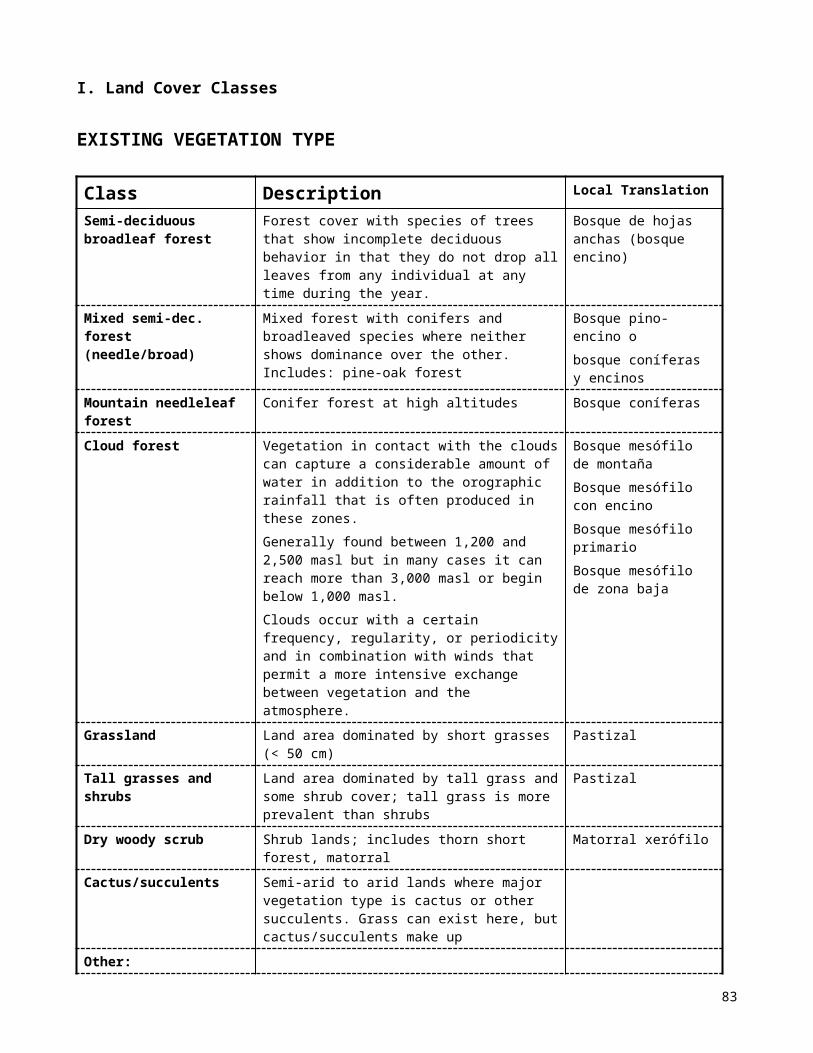
r* is unitless and varies between 0 and 1. A value close to 1 would mean that most the energy from the sun at that wavelength is reflected by the Earth-Atmosphere system, and a value near 0 would indicate that the Earth-Atmospheric system absorbs most of the energy from the sun at those wavelengths.
The relationship is:
r* = ( L* ds2)/(E0 Cos(Solar Zenith angle))
Where:
= 3.14159 L* = Apparent At-Sensor Radiance [Wm-2sr-1 µm-1](calculated in Section B above) ds
2= the square of the distance from the Earth to the Sun in [AU] E0 = the mean Solar exo-atmospheric irradiance [Wm-2 µm-1]
These calculations are based on an assumption of Lambertian Scattering (See Figure below) from the Earth’s surface. A Lambertian reflector scatters light equally in all directions, which means that the brightness is independent of the viewing angle. A sheet of white paper is a good example of a good Lambertian reflector while a mirror is not. The brightness of a Lambertian reflector is inversely related to the cosine of the zenith angle. Thus, if we for the moment assume the Earth's surface is a Lambertian scatterer, r* depends on the cosine of the solar zenith angle.
- The spreadsheet performs these calculations
D: Calculate a Range Factor to Optimize r* Over the Image Dynamic Range Each pixel (picture element) of a Landsat image is stored as a Digital Number (DN) which contains 1 byte (8 bits) of information. Each byte can take 28 or 256 possible brightness values (0 to 255). However, calculation of r* returns a value between 0 and 1. To produce an image of Reflectance in many image processing packages we must store r* as 8-bit data, values between 0 and 255. We could
83

do this by simply multiplying the r* values we calculated by 255. But that might compress (clip) the data’s range, if the image’s r* values are not spread over the entire range between 0 and 1. Multiplying by a factor that is too large will push the data beyond the range allowable for 8-bit data storage (255) and saturation will occur resulting in data loss. To avoid losing information from our final r* image, it is necessary to scale their actual range (between 0 and 1) over a range of 0 to 255. Therefore, it is necessary to find a multiplicative factor that will best preserve the original dynamic range of the data. To find this factor, which we refer to as a Range Factor, do the following procedure:
1) Construct a histogram to determine maximum and minimum values for the original bands Minimum and maximum DN values for each band are used to calculate the appropriate Range Factor for image calibration that maintains the image's original dynamic range. The analyst can determine these values by producing a histogram from the image using Imagine and by viewing these data.
Visual selection of minimum and maximum DN values
Minimum and maximum DN values are used to determine the DN range of the data. Looking at the histogram you will notice that the frequency of pixels in each band has one or two peaks. They are distributed between 0 and 255 DN values. Selecting minimum and maximum values will represent the range of the distribution of pixels. These two values can be considered the extremes of the data distribution, closer to the peak for each band. When determining the values, simply estimate visually, the beginning and end of each band curve. Don't worry about cutting off some pixels with DN values far from the peak. In scenes with some cloud cover, the long tail of the curve at high DN values can be cut off because it represents only a few pixels in relative terms.
Note: For DN value = zero there will be a large number of pixels. They are related to the borders of the image, where data is not present because satellite scene is displayed as a parallelogram shape in a Space Oblique Mercator Projection (SOM). These values are not important for displaying.
2) Maximum and minimum DN values for each band are entered in the spreadsheet.
Record the estimate minimum and maximum values into the original spreadsheet.
In practice, the minimum DN value for the bands doesn’t measurably affect the optimum dynamic range. The spreadsheet will automatically choose the highest Max value. The spreadsheet will then automatically divide 255 by the largest r*. Round this figure down to the nearest hundred, and enter this value for the Range Factor using the drop down list.
The spreadsheet will then automatically multiply this Range Factor by the Max r* and the Min r* for each band and enter that value in the appropriate boxes. Check these figures to make sure the range does not exceed 255.
The spreadsheet will then produce functions for the conversion of Raw Image DN values to Apparent At-Sensor Reflectance values [unitless values from 0 to 1] multiplied by a Range Factor to keep the values between 0 and 255.
E: Calculate Mathematical Functions to Convert Apparent At-Sensor Reflectance Values to Surface Reflectance Values In this section we remove the effects of the atmosphere on Apparent At-Sensor Reflectance values. We calculate calibration functions for conversion from Apparent At-Sensor Reflectances (r*) to
84

Surface Reflectance value (r) for each band. Remember that calibration parameters are calculated separately for each optical channel of the satellite (bands 1-5 and 7).
Landsat image data is available from a number of different sources and can be stored in different formats. If the file has an .img extension then it can simply be opened in Imagine and the process can continue. Fast Format (Band Sequential, BSQ format) data files must be further compiled/imported and reformatted for use by specific image processing software (see earlier lab which dealt with this).
So import the file (the filename and location will be given in class) and create a layer stack of the Landsat TM 6 bands. Note: Because you will not be calibrating the thermal band (TM Band 6), the sixth band in the image will be TM band 7, but the computer will from now on refer to TM band 7 as Band 6
Dark Target Selection
1) Locate a deep non-turbid lake
with the cursor select the dark portion of the lake
Obtain values for each band using the cursor tools
include line and column values of the lake’s location in the image
2) determine the line and column values of your selected area and enter them on your spreadsheet.
3) determine the darkest value in each of the channels for your selected area in the text window and record those values on your spreadsheet.
The spreadsheet takes these DN values and computes the Apparent At-Sensor Reflectance of the dark target (lake). It also assumes that the lake has the reflectance of fresh water deep non-turbid lakes as measured in the field by Bartolucci. The spreadsheet then assumes that the difference between the calculated Apparent At-Sensor Reflectance of the lake and the Bartolucci values are the additive atmospheric component. This additive atmospheric component is then subtracted from the Apparent At-Sensor reflectance from Section D to produce Calibration Functions that will allow Surface Reflectance to be calculated from Image DN values. F: Use Calibration Functions to Convert Raw Image DNs to Surface Reflectance Values in MultiSpecNow that we have calibration functions that transform DN to Surface reflectance values (r) for each band, we can apply these transforms to the original image data. Use Imagine ModelMaker to accomplish this step. This will radiometrically calibrate the landsat image data, band by band, according to our transform calibration functions. Finally, LayerStack each calibrated band back into a single file and save the new image under a new name. Save the calibration model as a *.gmd file.
G: Display DN image and Calibrated image and Associated Stick Spectra
1) Open both the calibrated (surface reflectance) file and the uncalibrated (raw) file
Use bands 4, 5, and 7 as R, G, B
85

Enlarge each image and put them side by side with uncalibrated one to the left.
With the cursor, click on any bright red area (forest) of uncalibrated image
Graph the Spectra for this location of forest. Do the same for the calibrated image.
Compare the values and the patterns represented in each.
Bibliography For further information on basic image calibration concepts, justification and nomenclature please refer to the following documents: Robinove, C.J., 1982, Computation with physical values from Landsat Digital Data, Photogrammetric
Engineering and Remote Sensing, v.48, p.781-784. Hill, J. 1991, A quantitative approach to remote sensing: sensor calibration and comparison, in Remote
Sensing and Geographical Information Systems for Resource Management in Developing Countries, Belward and Valenzuela (eds.), p.97-110, ECSC, EEC, EAEC.
Markham, B., and Barker, J., 1986, Landsat MSS and TM post-calibration dynamic ranges, exo-atmospheric reflectances and at-satellite temperatures, Landsat Technical Notes, n. 1, EOSAT.
Green, G.M., 1988, Appendix I: Landsat Thematic Mapper image calibration, in Physical Basis for Remotely Sensed Spectral Variation in a Semi-arid Shrub land and an Oak-hickory Forest: Implications for Mapping Soil Types in Vegetated Terrains, Ph.D. dissertation, Washington University.
Liou, Kuo-Nan, 1980, An Introduction to Atmospheric Radiation, International Geophysics Series, v.26, Academic Press, N.Y., p. 3-5, 46.
Iqbal, Muhammad, 1983, An Introduction to Solar Radiation, Academic Press, N.Y, p. 1-5. Teillet, P.M. and Fedosejeus, G., 1995, On the Dark Target Approach to Atmospheric Correction of
Remotely Sensed Data, Canadian Journal of Remote Sensing, Vol.21, no.4, p.374-387. Teillet, P.M., Personal Communication Thome, K.J., Biggar, S.F., Gellman, D.I., and Slater, P.N., 1994, Absolute-Radiometric Calibration of
Landsat-5 Thematic Mapper and The Proposed Calibration of the Advanced SpaceborneThermal Emmission and Reflection Radiometer, in Proceedings IGARSS 1994: 2 295-229.
From Landsat 7 Online Manual
http://ltpwww.gsfc.nasa.gov/IAS/handbook/handbook_htmls/chapter11/chapter11.html
86

11.3.3 Band 6 Conversion to TemperatureETM+ Band 6 imagery can also be converted from spectral radiance (as described above) to a more physically useful variable. This is the effective at-satellite temperatures of the viewed Earth-atmosphere system under an assumption of unity emissivity and using pre-launch calibration constants listed in Table 11.5. The conversion formula is:
Where:T = Effective at-satellite temperature in Kelvin
K2 = Calibration constant 2 from Table 11.5K1 = Calibration constant 1 from Table 11.5
L = Spectral radiance in watts/(meter squared * ster * m)�
Table 11.5 ETM+ Thermal Band Calibration Constants
Constant 1- K1watts/(meter squared * ster * μm)
Constant 2 - K2 Kelvin
Landsat 7 666.09 1282.71
87