evolution traditional web access through fixed line services. mobile web – access web from hand...
TRANSCRIPT
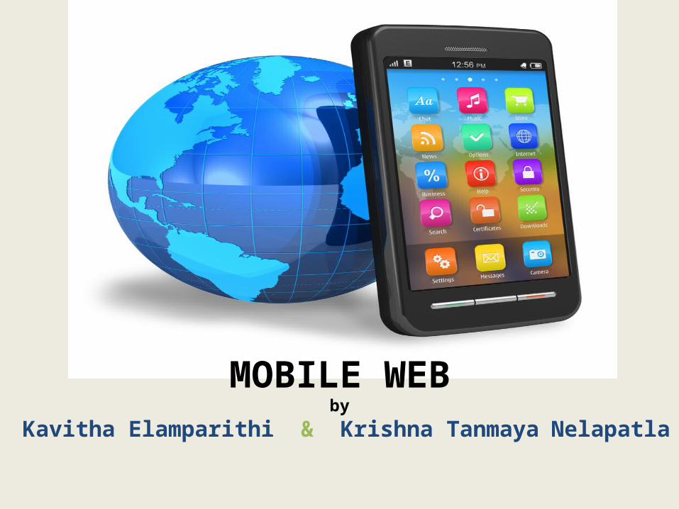
MOBILE WEBby
Kavitha Elamparithi & Krishna Tanmaya Nelapatla
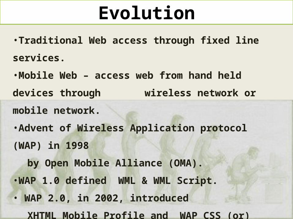
Evolution•Traditional Web access through fixed line
services.
•Mobile Web – access web from hand held
devices through wireless network or mobile
network.
•Advent of Wireless Application protocol (WAP)
in 1998
by Open Mobile Alliance (OMA).
•WAP 1.0 defined WML & WML Script.
• WAP 2.0, in 2002, introduced
XHTML Mobile Profile and WAP CSS (or)
Wireless CSS .
•Today’s mobile browsers render with HTML,
JavaScript, CSS and HTML5

• Similar to Desktop Web Development uses HTML, CSS and JavaScript.
• Mostly uses Progressive Enhancement design Approach which involves –well-structured HTML markup– Styling using CSS– interactive features (behavior) using
JavaScript.
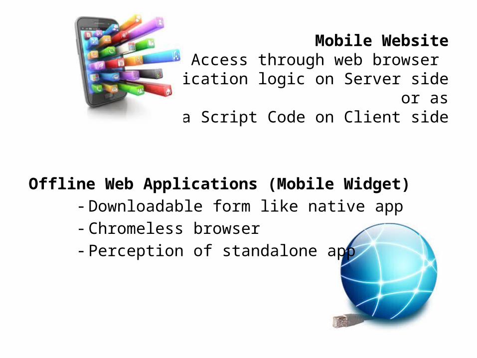
Mobile Website - Access through web browser
- Application logic on Server side or as
Java Script Code on Client side
Offline Web Applications (Mobile Widget)- Downloadable form like native app- Chromeless browser - Perception of standalone app
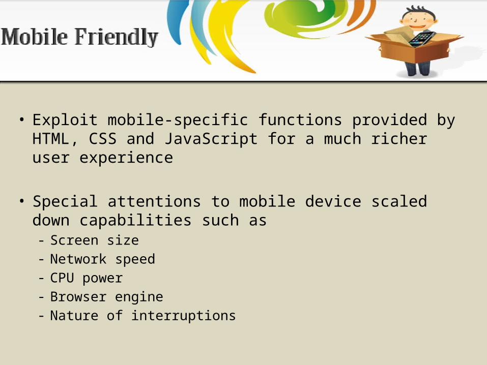
• Exploit mobile-specific functions provided by HTML, CSS and JavaScript for a much richer user experience
• Special attentions to mobile device scaled down capabilities such as - Screen size- Network speed - CPU power - Browser engine - Nature of interruptions

• Device Detection• View Port Meta Tag• CSS Media Queries• Orientation Detection• Touch and Gesture Events• Open Native Applications• Device APIS• Browser Fragmentations• Data Optimization
Features for Friendly Mobile
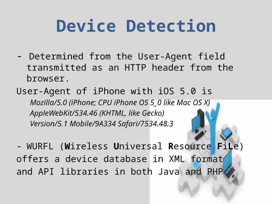
Device Detection
- Determined from the User-Agent field transmitted as an HTTP header from the browser.
User-Agent of iPhone with iOS 5.0 isMozilla/5.0 (iPhone; CPU iPhone OS 5_0 like Mac OS X)AppleWebKit/534.46 (KHTML, like Gecko)Version/5.1 Mobile/9A334 Safari/7534.48.3
- WURFL (Wireless Universal Resource FiLe) offers a device database in XML format and API libraries in both Java and PHP.
• A Viewport is a rectangular viewing region • Tells the browser how to behave when it
renders the webpage• Viewport properties–width, height, and initial-scale<meta name="viewport" content="width=device-width, initial-
scale=1, maximum-scale=1">
• Informs browsers that the site is optimized for mobile.

CSS Media Queries• Media queries is a CSS3 extension to media types that allows
us far greater control over rendering across different devices
• It is a logical expression, evaluating to true or false, that tests one or more features of the output device to which the CSS is to be applied.
• Can be used in – <link> tags – @import at-rule, and – @media at-rule.
• Example that applies to hand-held devices, but only if the viewport width is at least 20em:
@media handheld and (min-width:20em) { ⋮ one or more rule sets…
}

Orientation Detection
• Ability to switch between landscape and portrait modes
• Detect screen orientation and orientation changesOn iOS and Android, – window.onorientationchange event– querying window.orientation for the angle.
On Smart phone browsers that do not support device - window.onsize event and - distinguish portrait vs. landscape modes by checking window.screen.height and window.screen.width

Touch and Gesture Events
• iOS provides Gesture Events access to predefined
gestures containing scaling and rotation information
• W3C’s three basic Touch Events– touchstart: a finger is placed on a Document Oject
Model (DOM) element;– touchmove: a finger is dragged along a DOM
element;– touchend: a finger is removed from a DOM element.
• Gesture Events and Touch Events are sent during a multi-touch sequence.
Open Native Applications
• HTML links to launch phone calls or SMS functions<a href="tel:01234567890">Call us</a><a href="sms:01234567890">Text us</a>
• iOS application binds to a custom URL scheme and uses it to launch from either a browser or from another application.
• Android, Intent can be registered as part of an HTTP URL or be activated from a MIME type.

Device APIS
W3C Working Group on Device APIs and Policy aims to create specifications for device JavaScript APIs, such as file, contacts, calendar, messaging, media capture and system information.
Browser Fragmentations
• Key challenges is to ensure support for all different browsers.
• Low-end browsers to high-end smart phone browsers are capable to render full desktop websites.
• Proxy based render content and logic on the server side.• Challenges in Fragmentation effects required debugging
make tweaking to support on every different Java ME device.Write once run everywhere never really materialized for mobile

Data Optimization
• Wireless data services have relatively limited bandwidth and higher latency compared to its fixed Internet counterpart.
• Good practice to remove indentations and other unneeded empty spaces from HTML.
• Minifying JavaScript serves code obfuscation.
• Combine multiple CSS or JavaScript files to reduce the number of HTTP requests
HTML5
Major new features:• Better semantic tags such as <article>, <section>,
<nav>, <menu>, and <footer>, <video> and <audio> tags.
• DOM Storage, which can be considered as an extension of the cookie function. • Application Cache (or AppCache) allows developers to specify which files the browser should cache and make available to offline users.
WebKit
• WebKit is an open source browser engine originally developed by Apple and licensed through them LGPL and BSD licenses.
• Users: Safari on iOS; Android browser; New browser on Blackberry;
Adds many extensions to CSS• Those extensions start with -webkit-. For
example, thefollowing device-pixel-ratio Media Query can be used to target the style for high pixel density displays
• <link rel=’stylesheet’ href=’highRes.css’ media=’only screen and(-webkit-min-device-pixel-ratio: 2)’ />
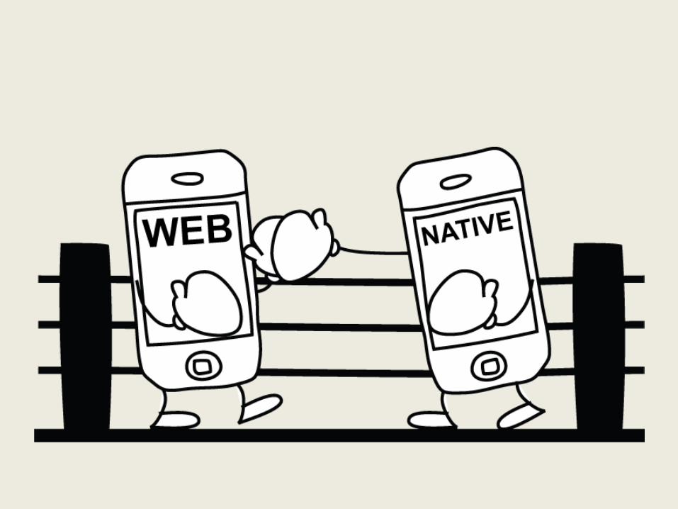

Apps comparison:
Web Apps:• They are easy to deploy• They are cross platform• Web apps are both cheaper
and faster to develop and maintain,
• Web app developers more easily available
Native Apps:• Performance• Access to special features• Monetization• Superior architecture
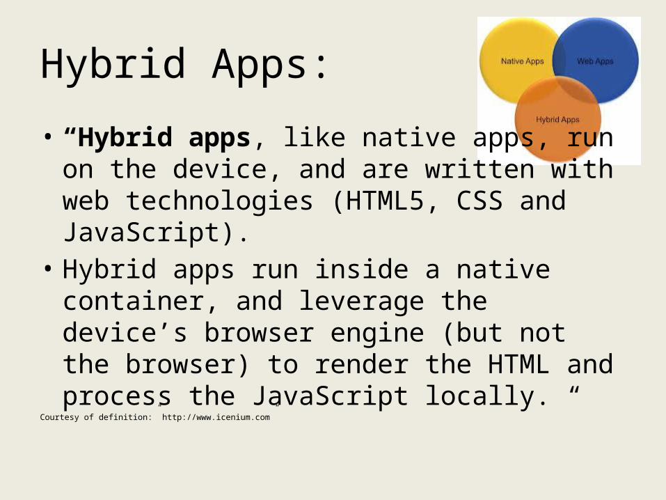
Hybrid Apps:
• “Hybrid apps, like native apps, run on the device, and are written with web technologies (HTML5, CSS and JavaScript).
• Hybrid apps run inside a native container, and leverage the device’s browser engine (but not the browser) to render the HTML and process the JavaScript locally. “
Courtesy of definition:” http://www.icenium.com”
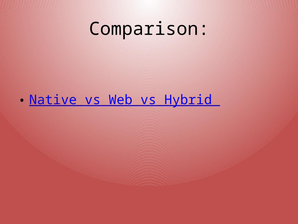
Comparison:
• Native vs Web vs Hybrid

Offline Web Application Tools• HTML5 APPCACHE:AppCache is a new feature of HTML5. It
uses a manifest (a simple text file) to determine which resources in the web application should be cached by the browser
• W3CWIDGET:The goal of W3C Widget Packaging and Configuration specification is to propose a standard
method for building and packaging widgets.
• WAC:The Wholesale Applications Community (WAC) is an open global alliance that is creating a unified and open platform based on standard Web applications.
MOBILEWEB APPLICATION FRAMEWORKS
• jQuery Mobile is based on jQuery and jQuery UI foundation. It provides a set of easy-to-use APIs for DOMtraversing and manipulation,event handling, animation, advanced effects and AJAX (the Asynchronous JavaScript and XMLprogramming methods).
• SenchaTouch is the mobile counterpart to the Ext JS framework. It provides a rich set of UI components, storage and data binding facilities using JSON and HTML5 offline storage, and more.

DEVELOPMENT TOOLS
• Unlike native application development, MobileWeb application development does not have “official IDEs.”
• Used:Notepad++, Aptana Studio,Selenium , weinre
References:
• http://reference.sitepoint.com/css/mediaqueries• http://en.wikipedia.org/wiki• http://developer.apple.com/library/ios/#featuredarticles/iPhoneURLScheme_Reference/Articl
es/MailLinks.html• http://
www.icenium.com/community/blog/icenium-team-blog/2012/06/14/what-is-a-hybrid-mobile-app-
• http://www.mrc-productivity.com/blog/2012/03/hybrid-vs-native-vs-mobile-web-comparison-chart/
• Wikipedia• Mobile platforms and development pdf

Quiz
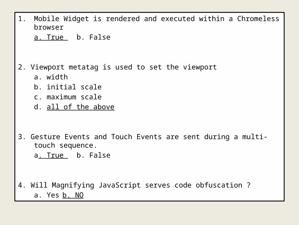
1. Mobile Widget is rendered and executed within a Chromeless browser
a. True b. False
2. Viewport metatag is used to set the viewport
a. width
b. initial scale
c. maximum scale
d. all of the above
3. Gesture Events and Touch Events are sent during a multi-touch sequence.
a. True b. False
4. Will Magnifying JavaScript serves code obfuscation ?
a. Yes b. NO
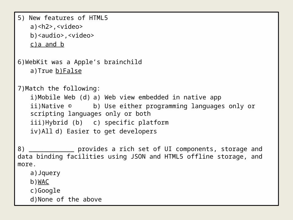
5) New features of HTML5
a)<h2>,<video>
b)<audio>,<video>
c)a and b
6)WebKit was a Apple’s brainchild
a)True b)False
7)Match the following:
i)Mobile Web (d) a) Web view embedded in native app
ii)Native © b) Use either programming languages only or scripting languages only or both
iii)Hybrid (b) c) specific platform
iv)All d) Easier to get developers
8) ____________ provides a rich set of UI components, storage and data binding facilities using JSON and HTML5 offline storage, and more.
a)Jquery
b)WAC
c)Google
d)None of the above