everyone loves a map! trish watts and steve davies
TRANSCRIPT
Everyone loves a map!
Trish Watts and Steve Davies
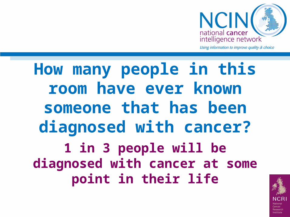
How many people in this room have ever known someone that has been
diagnosed with cancer?
1 in 3 people will be diagnosed with cancer at some point in their life
UK wide initiative using data to drive improvements in care for cancer patients
At the core of the network are 11 cancer registries covering the UK, who collect cancer data from the hospitals
We work with the Department of Health, cancer charities and the NHS to produce research and analysis
Background
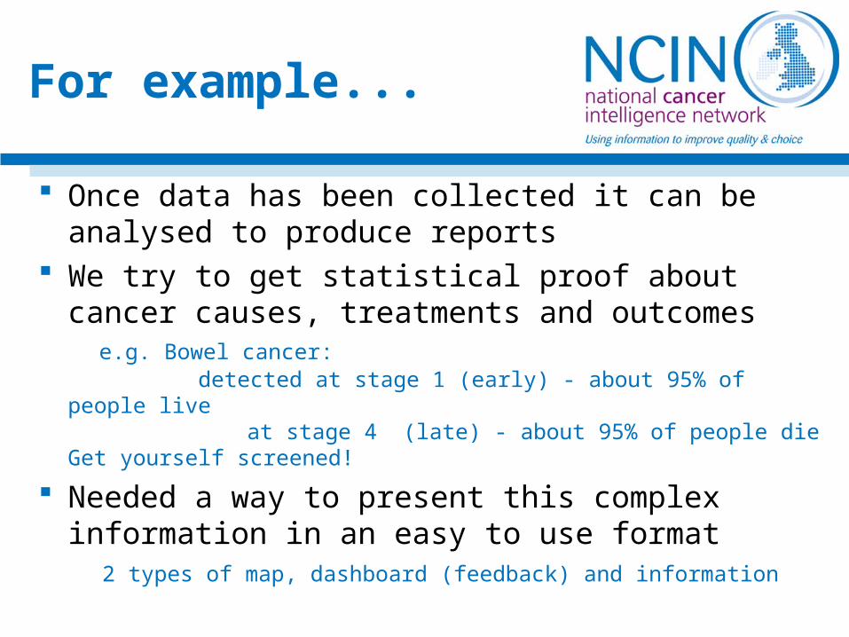
Once data has been collected it can be analysed to produce reports
We try to get statistical proof about cancer causes, treatments and outcomes e.g. Bowel cancer: detected at stage 1 (early) - about 95% of people live
at stage 4 (late) - about 95% of people dieGet yourself screened!
Needed a way to present this complex information in an easy to use format
2 types of map, dashboard (feedback) and information
For example...
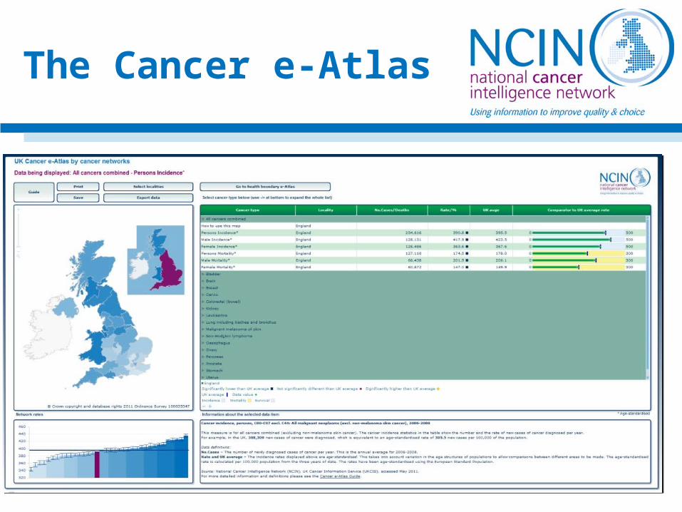
The Cancer e-Atlas
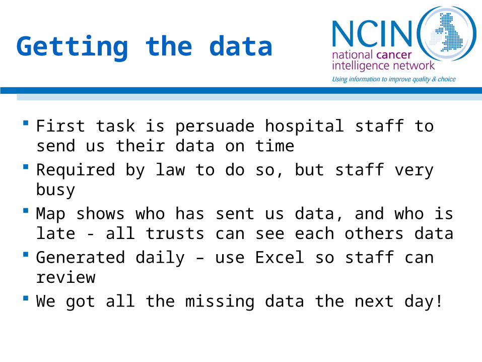
First task is persuade hospital staff to send us their data on time
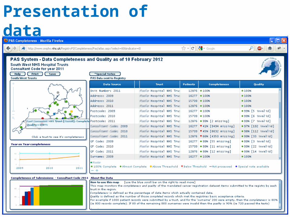
Required by law to do so, but staff very busy Map shows who has sent us data, and who is
late - all trusts can see each others data Generated daily – use Excel so staff can review We got all the missing data the next day!
Getting the data
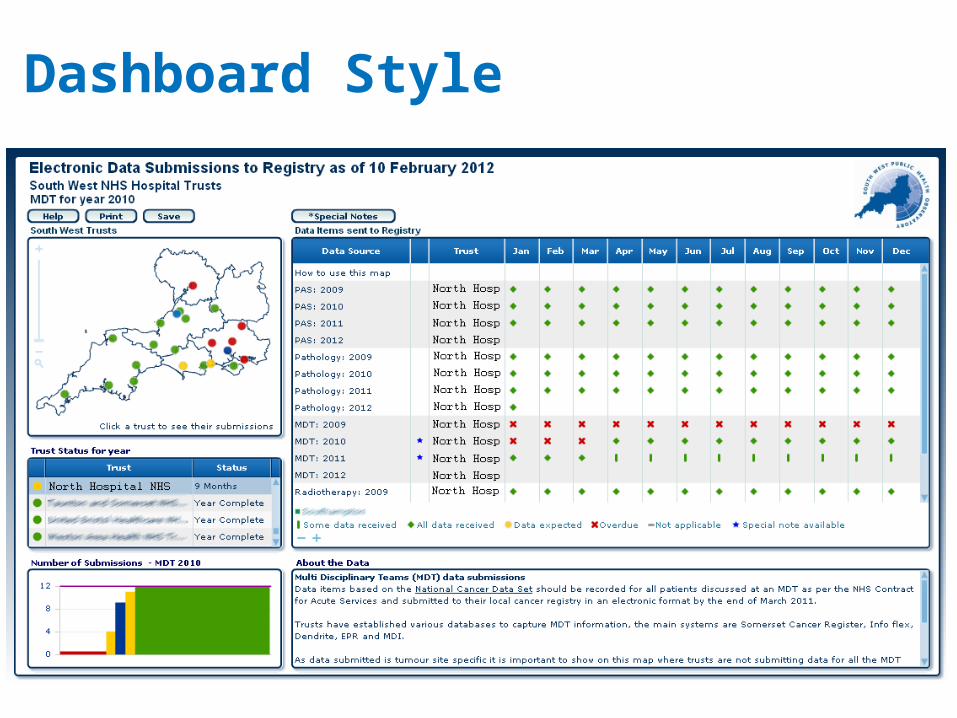
Dashboard Style
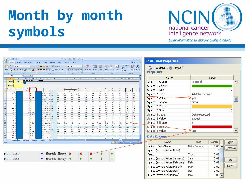
Month by month symbols
Must be able to load at all screen resolutions Give all required information in one place Maps load to show basic help text Lots of context sensitive help Bars and dots independently controlled
Presentation of data

Presentation of data
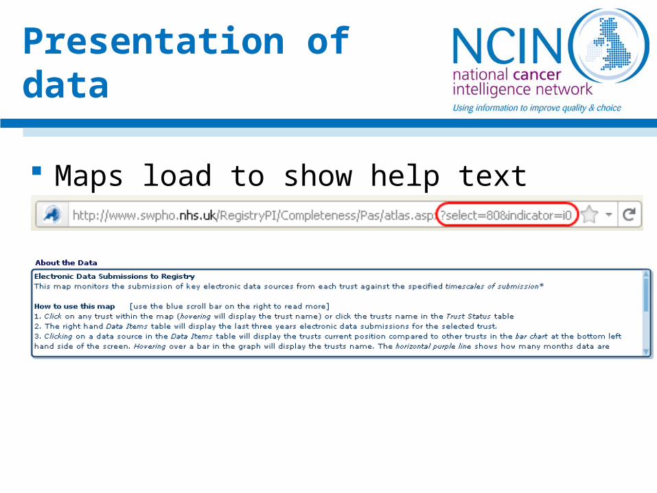
Maps load to show help text
Presentation of data

Presentation of data
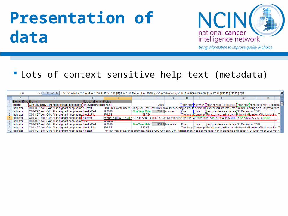
Lots of context sensitive help text (metadata)
Presentation of data
Presentation of data
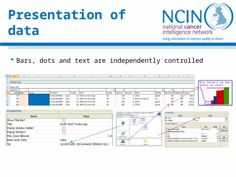
Bars, dots and text are independently controlled
Presentation of data
Make map relevant to audience Buttons and boxes named to fit with function Help pages give specific user guidance Map colours – if no targets, can’t show percentiles Bar colours – percentage, value and ratio
Presentation II
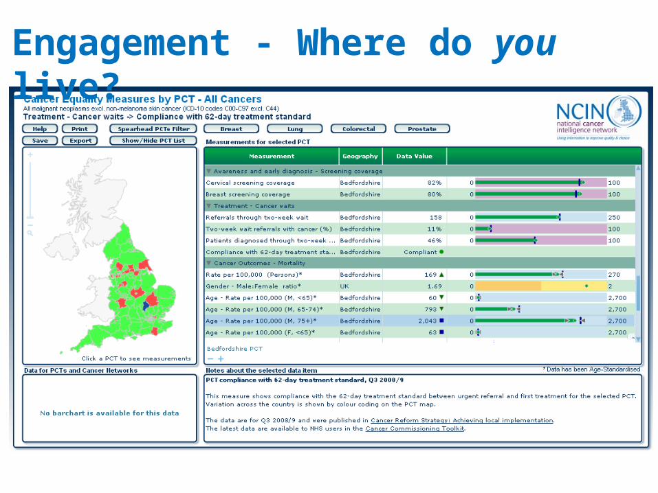
Engagement - Where do you live?
Presentation of data
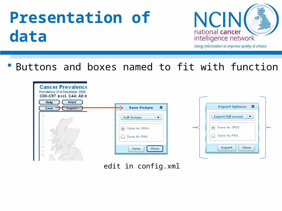
Buttons and boxes named to fit with function
edit in config.xml
Presentation of data
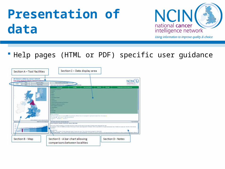
Help pages (HTML or PDF) specific user guidance
Presentation of data
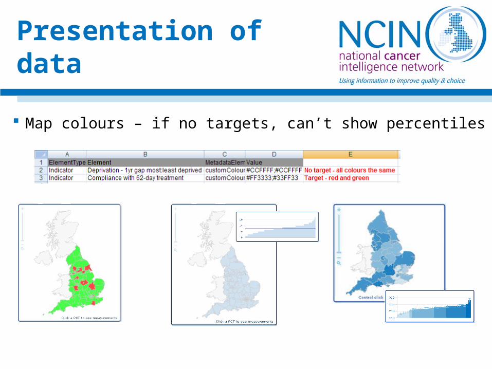
Map colours – if no targets, can’t show percentiles
Presentation of data
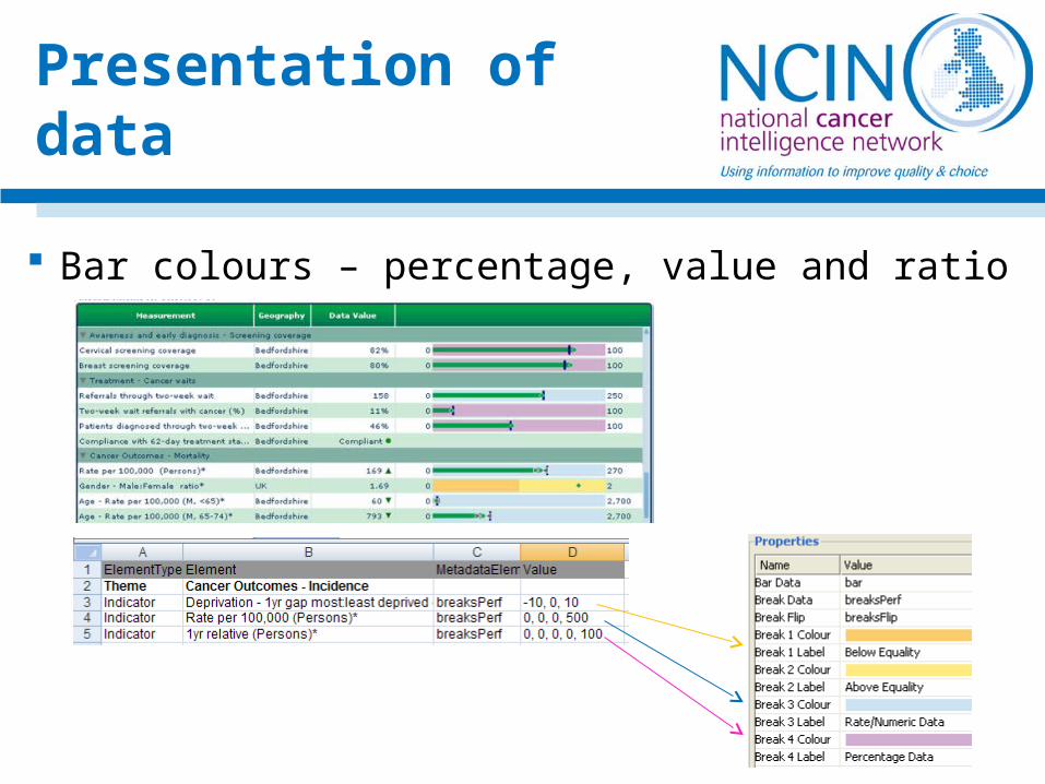
Bar colours – percentage, value and ratio
Update and improve the current atlases and looking towards some automation in their production
Encourage the cancer registries who each have a lead for a specific type of cancer to create atlases for their area (we currently have cervical and head and neck atlases)
New visualisations for other data that become available
Future developments

Thank you for listening!Please take some information with you
Any questions?
www.ncin.org.uk