evaluation question 2
DESCRIPTION
Evaluation Question 2TRANSCRIPT

How effective is the combination of your main product and ancillary texts?
In my opinion, my ancillary products and my music video combine and compliment each other well. I feel as though an audience member would see the connection and immediately realise that it was the same group. Unlike some posters and digipak’s that do not feature the artist or group as they are well known enough I felt that it was a necessity for me. I wanted all three products to be similar however have enough diversity to excite their target audience enough to want to buy the digipak and look at the poster as opposed to all the images looking the same. Because I used a group a long shot was needed to create a more effective look in the urban surrounding that I chose for both my poster and my digipak.
The message of the song is the three singers telling their audience that they will never be able to be as good as they are. I tried to use different eye contact on my poster with them all looking in different directions as if they are telling people everywhere the same message and it does not simply apply to the people right in front of them. Direct eye contact is made from one of the singers to catch the audience members eyes and to draw them in. The wall of graffiti behind them gives the audience a rough insight into what will feature in the music video as this is a main focus in my video and is featured in many shots and many different locations.
The colour code of Black, white and red was taken and worked well on the poster, especially when one of the singers added red shorts to make themselves part of the advert and not only a background image for the information. The original idea was for me to use this colour code for my digipak also and then the introduction in my video. However while editing on Photoshop and Final cut Pro, it made my product look out of date and old and did not suit my genre or visual. Therefore I used a graphic effect for these which gave it a vintage look without out dating it too much. I feel that this maintained the connection of all three products to the band and would be recognised. I also chose for the front and back of my digipak to be almost identical, with the only difference being that they had turned around. This added to the simplicity of it that I wanted to remain as much as possible and it also was almost like a ‘hello’ and ‘goodbye’ from the band.
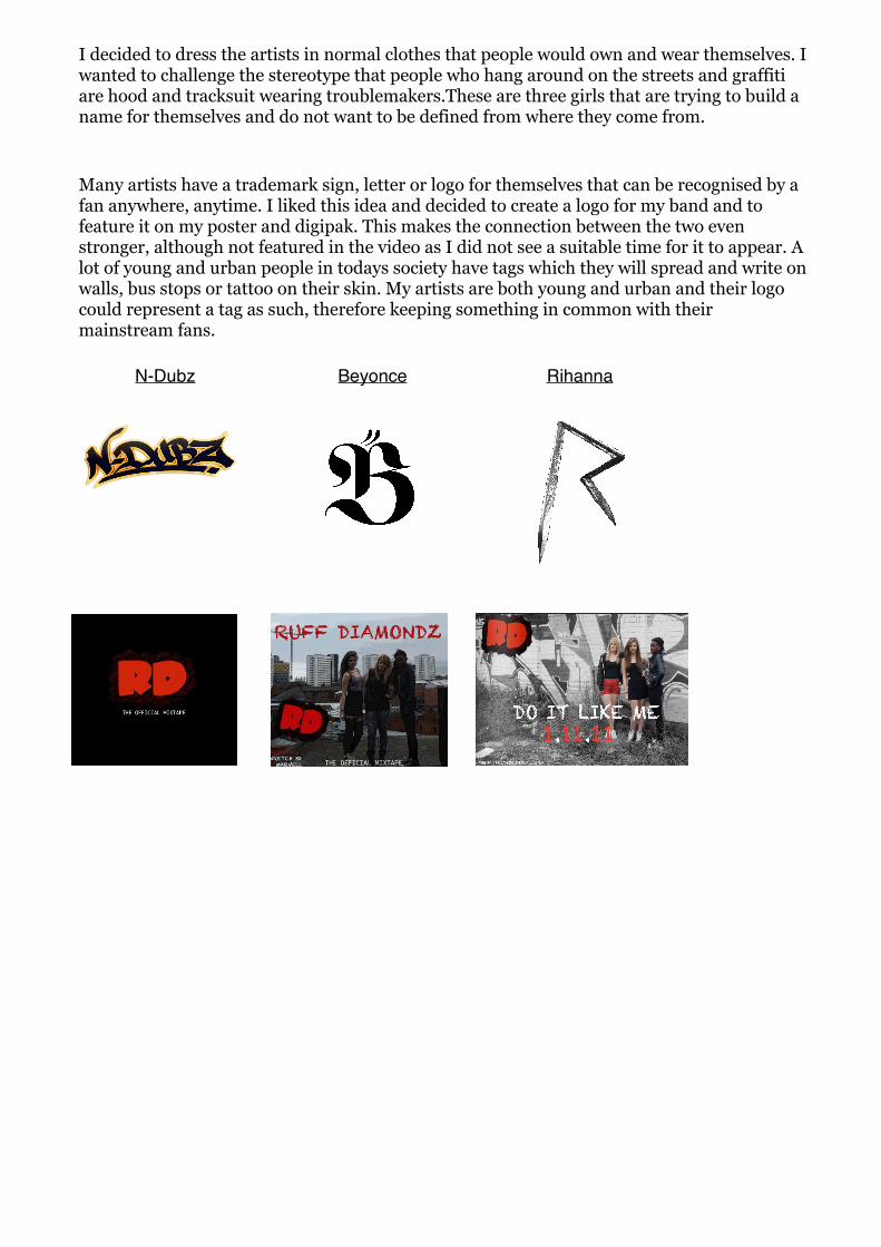
Many artists have a trademark sign, letter or logo for themselves that can be recognised by a fan anywhere, anytime. I liked this idea and decided to create a logo for my band and to feature it on my poster and digipak. This makes the connection between the two even stronger, although not featured in the video as I did not see a suitable time for it to appear. A lot of young and urban people in todays society have tags which they will spread and write on walls, bus stops or tattoo on their skin. My artists are both young and urban and their logo could represent a tag as such, therefore keeping something in common with their mainstream fans.
I decided to dress the artists in normal clothes that people would own and wear themselves. I wanted to challenge the stereotype that people who hang around on the streets and graffiti are hood and tracksuit wearing troublemakers.These are three girls that are trying to build a name for themselves and do not want to be defined from where they come from.
Rihanna BeyonceN-Dubz