evaluation pro - forma
TRANSCRIPT

Graphic Narrative EvaluationCourse:Niamh Darby

Niamh Darby 2
Does your final product reflect your original intentions? To plan for my final product, I experimented with various techniques to see which ones I preferred and to see how long each would take ensuring I could manage my time efficiently. One of the techniques I tested was a shape feature, where I created a cat and a panda only using the shapes Photoshop contained. I found this very time consuming, as I had to change the dimensions of each shape so my final product correctly reflected the original image I was working from. The task, which helped me decide what to use in constructing my final product, was rotoscoping. Even though, this technique took more time I felt happier with the end products during the practice session, compared to the shape task. Therefore, I felt the additional time was worth spending as this enabled me to produce a better final product. Knowing the time needed to produce quality images, I ensured I managed my time effectively while creating my test pages. With this planning I knew I would be able to create my pages, using the rotoscoping method, in the time I was given to complete my product. Another way I planned for my final product was idea generation. I decided on my story, ‘Jack and the Beanstalk’, and I wanted to keep it close to the original. For the idea generation, I created a mind map of various elements such as the colours I would use and the layout of my pages, for example; for the colours, I decided to keep them simple and easy to look at for my younger target audience. In keeping the colours simple, they could discuss these in addition to the story and characters helping them get even more involved with the product. In order to create the layout of my pages effectively, I created digital flat plans, using clip art to show where the image would be and serif text to show the final text font. I found this very helpful when creating my final product.

Niamh Darby 3

Niamh Darby 4
How well have you constructed your images?
While constructing my images, I needed to manage my time effectively as I mentioned before, the rotoscoping was very time consuming. To achieve my overall visual appearance, I created a schedule with specific timings and tasks to do in the allocated time. I planned my schedule to include contingency time so I had the opportunity to catch up where specific tasks may have over ran, this helped me to stay on track. I am pleased with the overall visual appearance of my pages, especially both the final page and text pages. In order to create a realistic feel to my pages, I added little details such as creases to character’s clothes and furniture. I used primary colours, along with other simple colours, so the images were easy for younger children to see and understand each individual colour. This is also the reason I chose to rotoscope as I felt it provided a more realistic feel compared to the shapes. My preferred page is the final page as I think this shows realism, which is what I wanted to get across in my book. I added little developments to the characters clothes and to the sky so certain objects were recognisable straight away.

Niamh Darby 5
Little details such as creases on the dresses and trousers show realism and give my book a more personal feel. I tried to make the characters faces more defined and realistic than cartoon faces. Personally, I don’t like cartoon faces as I feel they are not detailed enough and can only show a limited amount of emotions in books, as it takes a long time to recreate the face over and over again with different expressions. This page (page 10) is my favourite in the book because I feel I put the most detail into this page. The sentences on the text page are kept short for the younger audience to understand and features the medieval style first letter of the sentence. This feature is consistent throughout the final product.

Niamh Darby 6
How well have you used text to anchor your images?
I considered various options of the page designs, however I decided for the layout of my pages, I wanted one page with the image and a separate page with the text. In my opinion, this looks more professional and I preferred the neatness for the reader. I took inspiration from the research of other children’s books. My idea for this layout style came specifically from Lynley Dodd’s children’s book ‘Hairy Maclary’s Rumpus at the Vet’. This book has page dimensions (25cm by 19cm) similar to mine (21cm by 21.5cm) and a consistent layout. I have used this layout style, as I felt my audience would be able to understand the story more without being distracted as they are only focusing on the image or the text as they are both not on the same page. I didn’t want to copy exactly what Dodd had in her book, I wanted to create a medieval theme to my book, so I sourced the alphabet in a medieval font and rotoscoped the first letter of each first word on the page and stretched it out so it matched the length of the passage on the page. I was very pleased with my final pages. On one of my pages, I used text on the image to emphasize a certain sentence and so it stood out for my audience. I felt this would emphasise the importance of the sentence and this is why it was on the page as well as in the passage next to the image.

Niamh Darby 7
To create this page, I rotoscoped the giant’s foot at a normal size and used the Free Transform tool to enlarge the subject. I then used the warp tool, which is an option within the Free Transform tool, to warp the text in the image around the foot so it was incorporated into the image even more. In addition to the text in the image being different to any other images in the book, I also changed Jack’s posture to show fear. I feel this emotion is portrayed well as the reader knows instantly Jack is afraid and wants to hide away from the Giant.

Niamh Darby 8
Is your product suitable for your audience?
In my proposal, I stated, “my age target group is 6 to 8 year olds as there will be a few sentences on each text page and I think a younger audience struggle to read and understand the story, but this age range was my initial target audience”. I feel my final product reflects these proposals, as I created my text pages around these aims and only put one or two sentences on each page apart from page 7, where there is a transition in time. I feel this approach keeps the story simple yet interesting enough for the age range of readers.I also mentioned I would be using the Free Transform (ctrl/cmd + T) on Photoshop which allowed me to enlarge the text and move it around the page to where I wanted it to go. I made sure the text was in the center of the page and was easy to read by using a sensible and suitable font for my book. I chose ‘PT Serif’ as it was the style I wanted my font to look like from the beginning of the planning process. I chose the colour black as I felt any other colours would make my book less professional and a little too young.

Niamh Darby 9
This is page 7 in my book. In the image, I used another expression on Jack’s Mother to show joy and happiness. I know it is a simple image but it still attracts the attention of my audience as I have used bright primary colours, which was one of my aims for the final product. The text page shows a transition in time, I used asterisks to symbolize this. I also used short sentences, again, this was one of my aims, as it is easier for my younger target audience to understand and digest.

Niamh Darby 10
What do you like/dislike about the techniques you have used?
I chose to rotoscope every element in my book. To rotoscope in Photoshop, you have to paste the image you want to recreate onto a blank document. Next, make sure you are the ‘Polygonal Lasso Tool’ (ctrl/cmd +L) so you can select the area you want to rotoscope. You can use the ‘Quick Selection Tool’ (ctrl/cmd + W) to do the same job, but I have found this tool make the end outcome blurry and not sharp. Clearly I wanted my product to be as sharp as possible, also with the ‘Polygonal Lasso Tool’ you can select specific points on an image. For example, in the image, on the next slide, I have selected the outline of the subject’s face. When you select all around the area you want, the selection will have a moving dotted line surrounding it. After you have selected the area, right click and a menu should appear. On the menu, click the ‘Layer Via Copy’ option. This should create another layer in the side bar. Click the eye next to ‘Layer 1’ to turn it off and it should show the selection you have just made. Double click the ‘Layer 2’ tab, and then double click the ‘Colour Overlay’. This is where you can change the colour of the area you have selected. I chose a skin coloured tone, as it is the outline of a face. Click ‘OK’ and there is the selection you made with the colour you selected. Continue using this method to create the whole face and you should have a finished product that you have rotoscoped.

Niamh Darby 11
Niamh Darby 12
What do you like/dislike about how your final product looks?
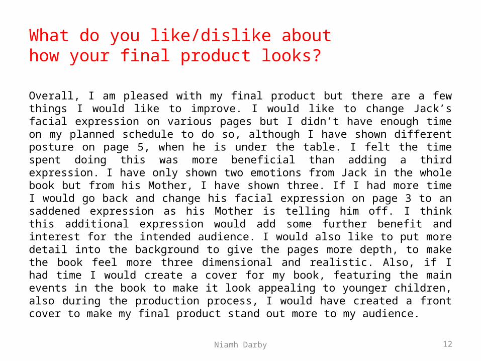
Overall, I am pleased with my final product but there are a few things I would like to improve. I would like to change Jack’s facial expression on various pages but I didn’t have enough time on my planned schedule to do so, although I have shown different posture on page 5, when he is under the table. I felt the time spent doing this was more beneficial than adding a third expression. I have only shown two emotions from Jack in the whole book but from his Mother, I have shown three. If I had more time I would go back and change his facial expression on page 3 to an saddened expression as his Mother is telling him off. I think this additional expression would add some further benefit and interest for the intended audience. I would also like to put more detail into the background to give the pages more depth, to make the book feel more three dimensional and realistic. Also, if I had time I would create a cover for my book, featuring the main events in the book to make it look appealing to younger children, also during the production process, I would have created a front cover to make my final product stand out more to my audience.

Niamh Darby 13
This is page 5 of my book. I used a different posture with Jack to convey a scared and weak emotion compared to just showing it on his face. I felt this showed a variation in my book, and would also show my younger audience the different ways to display an emotion.
This is page 3 of my book. If I had more time, I would go back and change Jack’s expression to an upset and disappointed one. I feel this would help my audience relate to my book more and they would feel what Jack is in the book.
Niamh Darby 14
Why did you include the content you used?
While I was writing my script, I added an image description so I knew what to do in the production process. The image descriptions were brief but I knew how much detail I wanted to put into the final images. In my images I used limited effects provided by Photoshop, as I wanted to create the effects myself with the rotoscoped sections. Again, with my text, I wanted to make sure it was understandable for a younger audience. I chose to keep my text the colour black, again so it was understandable and easy to read. I took inspiration from Eric Carle’s ‘The Bad Tempered Ladybird’, as the text in his book is consistently coloured black and has short sentences throughout, just as I have included in my book. I used primary colours in my book, so my younger target audience could easily name and spot them in my images, again increasing their interaction with the book and story.

Niamh Darby 15
Comic Book – Sebastian Stan as the Winter Soldier (Captain America 2: The Winter Soldier)
There were specific filters and other techniques I could have used to create my book, the example I have shown is the comic book effect. I created three practice images and this was the one I loved the most. I edited the original image, shown on the left, and put a “cutout” filter on my image which make the image look like it was from a comic book. I also moved the Threshold layer to create an offset look which I think is the best feature in the image. I also added my favourite line from that specific scene “Who the hell is Bucky?” as I felt the image reflected what the scene is about. Although, if I was going to use this technique in my final product, I would focus more on the text as well as the image with it, to give the viewer more focus points in the book.

Niamh Darby 16
What signs, symbols or codes have your used in your work?
In my book, I tried to show a difference between the good characters and the bad ones, I feel this is important in all stories but especially those aimed at younger audiences. I didn’t feature the Giant as much as people would have expect in this story but when reading the book I wanted the reader to still feel his presence even though he is not seen on the page. With the locations in the book, I wanted to make Jack’s house and village surroundings look weaker than the Giant’s. This was to show how poor Jack and his Mother were before the beanstalk was grown. Also, I didn’t want to make their kitchen look too elegant for the same reason, whereas any features in the Giant’s castle or outside the castle would look more alive and expensive. I featured the Giant’s foot in my book; I enlarged it to take up most of the space on the page to show the Giant is much more superior in size than Jack and also to highlight the size of his body including other images on the page.

Niamh Darby 17
What representations can be found in your work?
I feel there are some modern and coincidently older stereotypes featured in my book, for example; the ‘Mother and Son’ stereotype. The mother stays at home cooking and cleaning, whereas the son goes out and works to bring money home for his Mother. There is no father figure seen in my book or in the original story which could be argued now has more stereotypical emphasis than when originally created given the number of single parent families. There is a type of pet figure in the story with the cow, which they have to sell at the start of the story. Also, another stereotypical couple in my book is the Giant and his wife. Just like Jack’s mother, the Giant’s wife has to cook and clean after the Giant. The Giant and Jack have similar roles, even though the Giant is superior to Jack. There are no different races or religions featured in my book. Different age groups are featured in my book, as Jack is much younger than the other characters. I wanted the Giant’s wife and Jack’s mother to come across as a similar age, because the Giant’s wife could be another motherly figure in his life. There is a representation of different social classes with the single parent family being so poor they have to sell things to survive and the Giant having excessive wealth and space.

Niamh Darby 18
My book features a single parent family with Jack and his Mother. In the original story, there is no father figure mentioned and in other adaptations, there is none mentioned either. This shows nothing has changed from when the story was first written to modern day. This might be why Jack is more drawn to a motherly figure rather than a fatherly figure. The final product also shows subtle age similarities between Jack and the Giant’s wife. I think the audience can gather that they are the both motherly figures towards Jack due to his age as well. I think the oldest character is the Giant even though we don’ see his actual face or features, the reader can just tell.

Niamh Darby 19
What style have you employed in your products?
In order to understand children’s books more, I carried out research across three popular children’s books. I looked at the number of pages and the page sizes so I had a good idea of the length and size my book was going to be, for example; I found out ‘The Bad Tempered Ladybird’ by Eric Carle has 39 pages and varied page sizes throughout, even though the illustrations were all landscape. The page dimensions were 21cm by 21.5cm, which were the final page dimensions I wanted for my product. Another section I researched was the text and image layout of each book. I found ‘The Song of the Trees’ did not have a consistent layout throughout; it had some pages filled with double images and others with just one image. I decided I did not want this for my book, I wanted a consistent layout which I felt would be more engaging for the reader. I also wanted appropriate and consistent text and font style on each page, which was easy for a younger audience to understand. I feel I achieved this in my completed product. The final section I researched was the overall visual style of the book. I found ‘Hairy Maclary’s Rumpus at the Vet’ by Lynley Dodd had bright colours featured throughout and were very detailed than the other two books I had researched. I think the overall visual style of my book was influenced more by Lynley Dodd’s style than the other books, as I knew bright primary colours and simple text would attract my younger target audience.

Niamh Darby 20
One similarity between ‘The Bad Tempered Ladybird’ and my final product is the page dimensions. I found these very easy to work with and I had the right amount of space to create my text and images. Another similarity is the primary colours used in the images and realism of the images as well. I feel my images portray this very well and also the little details on their face make y characters stand out more than a normal cartoon.
One similarity between ‘Hairy Maclary’s Rumpus at the Vet’ and my final product is the consistent layout of the pages. I used the same measurements for all of the text pages so they were all in line and in the center of the page and also the same colour and font of the text. Another similarity, again, is the primary colours used in the images but I found the images in Dodd’s book were unrealistic and portrayed a false interpretation of characters.

Niamh Darby 21
What were the strengths and weaknesses of the pre-production and planning?
I found the planning and research very helpful in the pre-production process as after the research, I had a clear idea of what I wanted my final product to look like. The research helped me see what attracted my target audience and what strong and weak elements all three books featured, this helped me stop any weaknesses being featured in my book. One of the weak elements I discovered was in ‘Hairy Maclary’s Rumpus at the Vet’. I found the images featured weren’t very realistic or textured. The planning also helped me manage my time appropriately. Before I started thinking about the book I was going to develop, I tested various methods of creating characters and scenery. As I have mentioned before I preferred the rotoscoping technique. Even though, it did take a long time to create the three tester rotoscopes I successfully managed to finish my book before the deadline which meant I had time to go back and add more detail to the characters and their surroundings. I wanted to add as much detail as possible, as I wanted my book to seem realistic and believable to a younger audience.
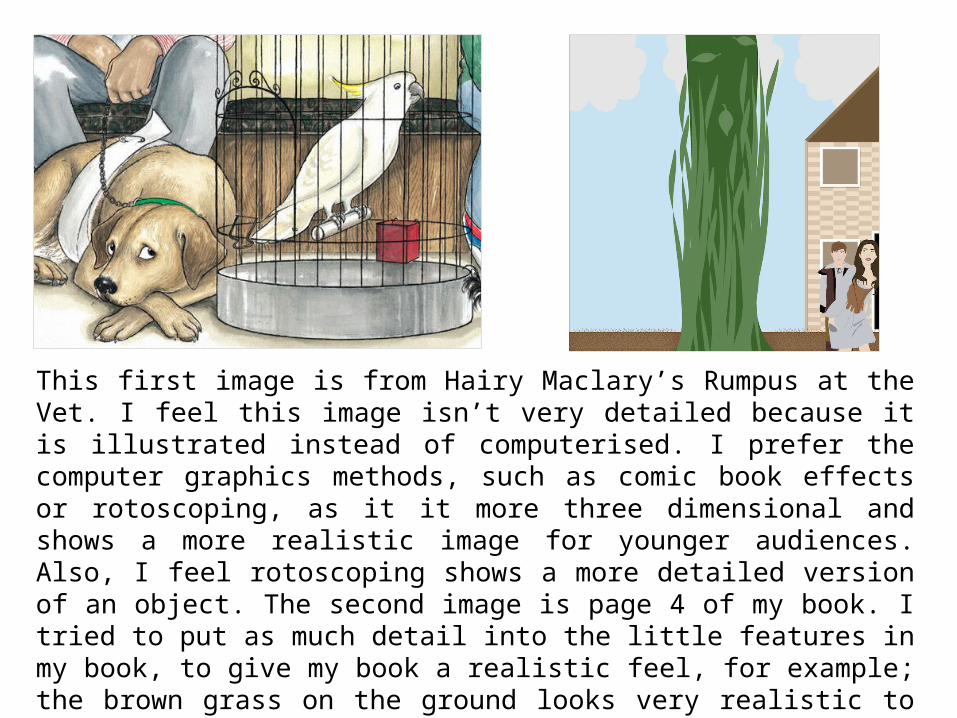
This first image is from Hairy Maclary’s Rumpus at the Vet. I feel this image isn’t very detailed because it is illustrated instead of computerised. I prefer the computer graphics methods, such as comic book effects or rotoscoping, as it it more three dimensional and shows a more realistic image for younger audiences. Also, I feel rotoscoping shows a more detailed version of an object. The second image is page 4 of my book. I tried to put as much detail into the little features in my book, to give my book a realistic feel, for example; the brown grass on the ground looks very realistic to me and to my audience as well. Also, the house looks very detailed and three dimensional, I used a shadow effect on the roof and the base of the house to give this feel for my audience.

Niamh Darby 23
Historical and cultural context
Compared to other adaptations, I felt my product is more chid friendly. While researching my story online, I found an adaptation of ‘Jack and the Beanstalk’ where Jack steals drugs from the Giant instead of gold. This adaptation would not be suitable for my target audience as it may be seen to encourage them to steal drugs and it sets a bad influence. Also the reference to drugs highlights subjects which are not appropriate for such a young target audience. I think the story itself is well known for the pantomime adaptation, which always generally features local or well-known celebrities playing the character of Jack. I love pantomimes and their adaptation, so I wanted to make my characters look like they would be featured in a pantomime. I feel I have achieved this for my final product. Another adaptation the story I chose is films. In 2013, an adaptation called ‘Jack and the Giant Slayer’ was released. This film had lots of reviews mentioning the amount of violence in the film and how it wasn’t suitable for younger audiences because Jack stabs the Giant in the head. This also shows this adaptation is nothing like the original story. This film comes across as very gruesome for my target audience so I didn’t include any violence that would scare younger audiences, even the death of the Giant in my adaptation is only hinted at and not actually seen.

I wanted to base the costumes of my characters on pantomime adaptations of my story. I noticed most of the adaptations I researched were mainly medieval influenced, especially for Jack, so I chose to use those clothes for my characters as well. I found similar costumes online that resembled the same ones in the pantomime.

Niamh Darby 25
Peer Feedback by Lewis Powell • It’s good that you have given your reasons for using rotoscoping, you explained that even
though it was time consuming you were happier with the end result.• Good explanation that you have used simple colours for younger children.• Also you have explained that the characters look a lot more realistic than other simplistic
cartoons, I also agree that you have kept things simple enough so that your younger audience will understand.
• You have included some information into how you positioned your text in your work.• You have explained about the text being had for younger children to read • You have explained well the technique that you have used and shown through images which
helps to understand the process you went through.• You have explained well how you have tried to show the difference between good and bad in
your story. • You have also explained well the modern stereotyping of a mother and son relationship.• Really good explanation of a single parent family representation.• Explained well how the planning and pre-production helped you creating your work. • Good explanation about how your product compares to other versions of jack and the
beanstalk and I agree that yours has a more child friendly approach.