evaluation of artery visualizations for heart disease ...kgajos/papers/2011/borkin11-infoviz.pdf ·...
TRANSCRIPT

Evaluation of Artery Visualizations for Heart Disease Diagnosis
Michelle A. Borkin, Student Member, IEEE, Krzysztof Z. Gajos, Amanda Peters, Dimitrios Mitsouras,Simone Melchionna, Frank J. Rybicki, Charles L. Feldman, & Hanspeter Pfister, Senior Member, IEEE
Fig. 1. Left: Traditional 2D projection (A) of a single artery, and 3D representation (C) of a right coronary artery tree with a rainbowcolor map. Right: 2D tree diagram representation (B) and equivalent 3D representation (D) of a left coronary artery tree with adiverging color map.
Abstract — Heart disease is the number one killer in the United States, and finding indicators of the disease at an early stage iscritical for treatment and prevention. In this paper we evaluate visualization techniques that enable the diagnosis of coronary arterydisease. A key physical quantity of medical interest is endothelial shear stress (ESS). Low ESS has been associated with sites oflesion formation and rapid progression of disease in the coronary arteries. Having effective visualizations of a patient’s ESS data isvital for the quick and thorough non-invasive evaluation by a cardiologist. We present a task taxonomy for hemodynamics based ona formative user study with domain experts. Based on the results of this study we developed HemoVis, an interactive visualizationapplication for heart disease diagnosis that uses a novel 2D tree diagram representation of coronary artery trees. We present theresults of a formal quantitative user study with domain experts that evaluates the effect of 2D versus 3D artery representations andof color maps on identifying regions of low ESS. We show statistically significant results demonstrating that our 2D visualizations aremore accurate and efficient than 3D representations, and that a perceptually appropriate color map leads to fewer diagnostic mistakesthan a rainbow color map.
Index Terms —Quantitative evaluation, qualitative evaluation, biomedical and medical visualization.
1 INTRODUCTION
In the United States, the leading cause of death is heart disease result-ing in over 600,000 deaths per year [24]. Early prevention and treat-ment is vital for saving lives, and visualization plays an essential role
• M. Borkin, K. Gajos, A. Peters, and H. Pfister are with the School ofEngineering & Applied Sciences, Harvard University, E-mail:{borkin,kgajos,apeters,pfister}@seas.harvard.edu .
• D. Mitsouras & F. Rybicki are with the Applied Imaging Science Lab andC. Feldman is with the Vascular Profiling Lab at Brigham and Women’sHospital & Harvard Medical School, E-mail:{dmitsouras,frybicki,cfeldman}@partners.org .
• S. Melchionna is with the IPCF-CNR, Consiglio Nazionale delle Ricerche,E-mail: [email protected] .
Manuscript received 31 March 2011; accepted 1 August 2011; posted online23 October 2011; mailed on 14 October 2011.For information on obtaining reprints of this article, please sendemail to: [email protected].
for patient diagnosis in cardiovascular imaging. A new non-invasivediagnostic technique under development uses Computed TomographyAngiography (CTA) data from patients combined with blood flow sim-ulations to calculate hemodynamic risk factors, in particular Endothe-lial Shear Stress (ESS), in coronary arteries [40]. Visualization meth-ods of this data are of great value for this emerging researchand havethe potential to lead to faster, more accurate heart diseasediagnoses.
Current visualizations techniques, as shown in Fig. 1 (left), use ei-ther a 2D cylindrical projection of a single artery or a 3D represen-tations of the coronary artery tree. In both cases, ESS is mapped tothe surface using a color encoding, typically with a rainbow(or “spec-trum”) color map. Both representations have their advantages and dis-advantages: 2D allows one to see all the data at once, but anatomicalinformation is lost both in the shape of a vessel and in how each indi-vidual vessel connects to other branches. 3D preserves the anatomicalstructure, but introduces issues of occlusion and requireshuman inter-action to rotate the model in order to see all the data. The fundamentalvisualization issue is how to display a scalar quantity – ESS– that is

parameterized on the surface of a three-dimensional spatial structure –coronary artery trees – using effective visual encodings.
In collaboration with doctors and researchers in cardiovascularimaging and applied physics, we set out to investigate the effective-ness of different visualization strategies for this problem. We firstconducted an informal qualitative user study with our domain expertsto develop a task taxonomy and determine their current visualizationpractices and needs. During this process we developed HemoVis, anovel 2D tree diagram representation that presents all the data at oncewhile still encoding pertinent anatomical information such as vesselcircumference and branch structure (Fig. 1, B). Despite positive feed-back about HemoVis, we encountered resistance from users toworkonly with the 2D representation and to use a diverging color map thatemphasizes features in the data more effectively. To investigate theseissues we conducted a formal quantitative user study with medical do-main experts to evaluate the effectiveness of 2D versus 3D representa-tions, and the effect color has on task completion performance.
The first contribution of this paper is a task taxonomy for hemody-namics that is based on a qualitative user study with medicalexperts.Guided by this task analysis, our second contribution is thedesign ofHemoVis, an interactive visualization application for heart disease di-agnosis that uses a novel 2D projection and layout for arterytrees. Thethird and main contribution of the paper is a quantitative user studywith domain experts that shows statistically significant results demon-strating that our 2D representations are more accurate and efficientthan 3D visualizations. In addition, the performance in 3D drops withan increase in the complexity of what is being examined whilethe 2Drepresentation is insensitive to it. Our study also shows that a percep-tually appropriate color map leads to fewer diagnostic mistakes thana rainbow color map both in 2D and in 3D, and that task completiontimes were nearly twice as slow with the rainbow color map in 3D. Tothe best of our knowledge, this is the first quantitative evaluation of theeffect of spatial and color encodings for a domain task with medicalprofessionals and real patient data.
2 RELATED WORK
Vessel visualization: Vessels or branched systems are primar-ily visualized with 3D representations [7, 13, 28, 31] with scalar quan-tities such as ESS mapped onto the surface using color encodings [12].In 2D, a common technique is to generate a Curved Planar Reforma-tion (CPR) visualization of the vascular structure, where an image isgenerated by taking slices along a generated centerline anddisplayingthe intensity units [15, 44]. A drawback of CPR is that it provideslimited information about the artery wall, thus not giving aclear indi-cation of how wide or narrow the vessel is at any particular point norconvey ESS data for the entire artery. There are also other 2Dprojec-tion techniques all with the goal of flattening the structureinto a singleview [39, 51, 52]. 3D representations have the problem of occlusionthat does not allow a doctor or researcher to see all the data simultane-ously. Techniques have been developed to improve 3D representationsusing visual cues such as shadows and transparency to improve spatialacuity in 3D [20, 34] or to include 2D data [45]. In our 2D represen-tation, all the necessary data including ESS is displayed for a medi-cal practitioner to assess the severity of disease within ananatomicalframe of reference.
2D vs. 3D visualizations: Formal evaluations are a valuablemeasure to determine the effectiveness of visual representations anddata encodings [18, 30]. A variety of case studies and formaluserstudies have demonstrated that 2D data encodings and representationsare generally more effective than 3D for tasks involving spatial mem-ory, spatial identification, and precision [9, 48]. Excellent examplesexist in the realms of vector field [11, 21, 25] and geospatialvisualiza-tion [2, 4, 17, 19, 29]. Although 2D is typically more effective, thereare strategies to improve 3D performance, such as using occlusion andperspective [42, 50] or stereographic displays [47]. Our work inves-tigates the effectiveness of 2D versus 3D artery representations in thecontext of heart disease diagnosis by medical experts.
Color map evaluations: Choosing the appropriate color mapis essential for the effective display and analysis of quantitative data.Based on fundamental human perceptual principles and the type ofdata being displayed (sequential, diverging, or categorical), there areformal and systematic ways to make an appropriate color choice basedon the task at hand [14, 27, 33, 38, 46]. Based on laboratory user stud-ies, specific guidelines are available for the effective design of colormaps [32, 36, 49]. A particular color map of interest is the rainbowmap which, despite being a favorite color map across the sciences [5],is poorly suited for most data tasks and can prove misleadingsince itis not perceptually ordered and isoluminant [5, 23, 38, 37, 49]. Quan-titative studies confirm these facts [16, 35] and propose better waysto design color maps and discern when isoluminant maps are suitable.Despite this general body of knowledge, there has been little studyon the effects of the color map within a real-life domain application.We present a quantitative evaluation of the rainbow map’s effects ontask accuracy and efficiency by domain experts within a real domainapplication.
3 SCIENTIFIC BACKGROUND
Atherosclerosis, the disease focused on in this research, occurs whenplaque forms in the arterial wall, causing possible obstruction of bloodflow as well as changes in the outer dimension of the artery. Sitesof plaque deposit (atherosclerotic lesions) form where the endothe-lial cells that line the arterial wall exhibit increased inflammation andpermeability to lipid molecules such as LDL (i.e., bad cholesterol).Over time these plaques can either become a low-risk type that isquite large and causes a narrowing of the artery (stenosis), or a high-risk type that can rupture, potentially causing a heart attack. Thesehigh-risk deposits are not detectable with conventional imaging. Inthe United States, approximately 300,000 deaths per year occur fromcoronary artery disease and∼60% are caused by rupture of these high-risk plaques [10]. However, recent research has shown that areas oflow endothelial shear stress (ESS), i.e., the frictional force of bloodon the artery wall, stimulate the development of these high-risk le-sions [8, 43], and that these lesions primarily appear wherethere isdisturbed flow, e.g., at artery bifurcations, bends, and regions of in-creased diameter. Thus ESS is a powerful indicator of plaqueforma-tion and disease progression.
However, it is impossible to directly measure ESSin vivo for anentire arterial tree. As a consequence, one needs to rely on blood flowsimulations to calculate a patient’s ESS based on their artery geome-tries. Combining this blood flow simulation with a patient’s3D re-construction of their coronary arteries allows doctors to detect areasof low ESS, identify plaque sites non-invasively, and take preventativemeasures before a heart attack occurs [40]. In order to have ecologi-cal validity and develop visualizations specifically targeted at the mostimportant diagnostic tasks, we conducted a formative qualitative userstudy to determine a user’s tasks, what data needs to be visualized toperform these tasks, and what are the best ways to visualize the re-quired data.
4 FORMATIVE QUALITATIVE USER STUDY
4.1 Overview & Logistics
The first goal of this study was to characterize the medical and re-search problems being addressed by the participants and their specificdomain tasks related to atherosclerosis. This was achievedby con-ducting a series of semi-structured interviews with 10 medical doctorsand researchers representing the potential future users ofsuch data.All the participants were interviewed at and affiliated withBrighamand Women’s Hospital (Boston, MA). In an attempt to cover as broadan audience as possible, study participants ranged in age, gender, ex-perience level, education background, job seniority, clinical versus re-search focus, and department (radiology versus cardiology).
Each participant was interviewed and asked the same set of ques-tions to gather sufficient information on their background and experi-ence, research interests, knowledge of hemodynamics, and their cur-rent workflow goals and tasks. Each participant was then shown a

Table 1. Domain tasks, broken down by clinical versus research focus,of participants based on a formative qualitative user study.
ID Task Clinical Research1 Identify stenosis or blockage X X2 Identify regions of low ESS X X3 View all ESS data for heteroge-
neous patternsX X
4 Study blood flow (velocity) pat-terns
X
5 Identify regions of blood recircu-lation
X
6 Investigate other physical vari-ables of blood flow
X
7 Follow patient’s disease progres-sion
X X
series of images covering 2D and 3D representations of ESS. The de-sired outcome was, based on the resulting feedback, to answer the fol-lowing questions: What data should be shown to accomplish tasks ofclinical importance? What are the optimal 2D representations? Whatare the optimal 3D representations? Should the data be encoded in 2Dor 3D? And what color schemes are best to aid the individual intaskcompletion?
4.2 Task TaxonomyThe participants’ jobs fall into two broad categories: clinical diagnos-tics and fundamental research. The former represents thoseindividu-als who work on making clinical diagnoses for specific patients, andthe latter represents individuals who work on investigating the funda-mental causes of heart disease. Some individuals fall into both cat-egories (e.g., doctors who split their time between medicalpracticeand research). Table 1 represents all the domain tasks citedby partic-ipants and category of individuals that cited the task. Bothcategoriesof individuals need to accomplish the same basic set of tasksessen-tial to the immediate diagnosis of patients based on factorsthat have aproven link to atherosclerosis (i.e., low ESS, artery geometry). How-ever, those with a research focus care about further exploring the datato investigate variables or aspects not necessarily with a proven link todisease.
Each of these domain tasks can be abstracted to fundamental ana-lytic tasks presented by Amar et al. [1]. Tasks 1 and 2 correspond tofinding extrema. The clinical diagnostics study participants expoundedon the need for these tasks to be accomplished in a quick and efficientmanner with minimal cognitive effort for rapid diagnosis ofthe patient.These tasks are usually done inside or just outside a procedure roomto expedite taking preventative measures (e.g., insertionof a stent). Ina research setting the time pressure was lower. Task 3 corresponds toclusteringof the data. In a clinical setting, this task is not as essentialor of the same importance as 1 or 2, but would be necessary for diag-nosis in complicated cases. Task 4-6 are aboutfinding anomaliesin thedata. In these cases time is not a factor, and being able to analyze thedata carefully is the primary goal. Finally, task 7 is acorrelation task,requiring comparison of multiple data sets, if available for a patient, inorder to follow the progression of the disease.
4.3 2D RepresentationsProjections The first portion of the qualitative user study was
focused on 2D projections of the arteries. This is relevant to Tasks1-3 (see Table 1). All but one of the participants had been exposedto reading ESS values from a cylindrical projection representation ofan artery, and all were familiar with ESS in general. Initially twodifferent types of projections were shown to participants (Fig. 2 topand middle). The top image is a traditional cylindrical projection inwhich the length of the image is based on the length of the artery,and the width is arbitrarily chosen. The middle image represents a
Fig. 2. The three different cylindrical projection techniques presentedto users during the formative qualitative user study. Top: Traditionalcylindrical projection. Middle: Projection with circumference mapped toimage height above the x-axis. Bottom: Projection with circumferencemapped to the width of image symmetric on centerline (preferred pro-jection by users).
variation on this cylindrical projection in which the widthequals thecircumference of the artery at the cross section.
During the user study, the first two participants in the post-evaluation interview commented on the middle cylindrical projection.They both said that it was slightly confusing to them and that, whenviewing the image, they were mentally reflecting the image over thex-axis to make it symmetric. Upon presenting them with the pseudo-cylindrical projection based on their feedback depicted inFig. 2 (bot-tom), they both commented that this was a superior mapping. Thisprojection maps the circumference of the artery at the crosssection tothe height, and centers it along a centerline. For the remainder of thestudy we presented all three projections to the participants.
All the participants preferred the pseudo-cylindrical projection map(Fig. 2 bottom). When asked whether this projection is confusing, theyreplied “no”. Although not exactly reproducing the real geometry, therepresentation is able to encode enough geometric information to showthe user the relationship between geometry and ESS as well aswherestenoses occur. This representation is also intuitive for clinicians sincethe 2D mapping mimics what one would see if an artery is cut-open(“butterflied”) for ex vivostudies.
Tree Diagram Layout Continuing with 2D representations, fortasks 1-3, all of the study participants were presented witha visualiza-tion of the artery tree in with each node was representative of an arteryand branches indicative of bifrucations (Fig. 3). When presented withthe hierarchical tree layout in Fig. 3 (top), no one had ever seen any-thing like it before and all except one individual respondedthat theygreatly preferred this data representation and found it useful. UnlikeCPR visualizations that only include two locations of the artery wall[15, 44], this tree diagram not only shows the artery structure but con-veys the length and width of each vessel. The most common feedbackon the tree diagram was the great benefit of being able to see all thedata at once without the usual occlusion challenges found in3D repre-sentations, and being able to display and compare multiple data sets atthe same time (task 7). The two most commonly cited scenarioswherethis would be useful are for viewing a patient’s data with thebloodflow simulation adjusted to simulate a patient at rest and at heightenedphysical exertion (i.e., low and high flow rates), and for viewing mul-tiple image acquisitions of a patient over time in order to view andcompare the simulation output for each. This latter scenario would aidthe doctor in observing the progression of disease over time.
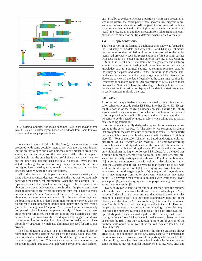
Fig. 3. Original and final tree layout schemes. Top: Initial design of treelayout. Bottom: Final tree layout based on feedback from users to makeit more anatomically representative.
As shown in the initial sketch (Fig. 3 top), the study subjects werepresented with some possible interactions with the tree data includ-ing the ability to open and close branches, move branches around thescreen, and interactively crop the color scale. All of the participantssaid that closing the branches is not useful since they always want tosee the other data sets and keep the data in context. Everyonealsostated that being able to move or drag branches around the screen isnot a good idea since they want to maintain the same static anatomicalstructure when viewing the data for context.
All of the user study participants, except the research staff partici-pants without advanced degrees, noted that the tree was not accuratelyconveying the anatomical information. When the initial design (Fig. 3top) was created, the branches were arranged to fit the space avail-able on the screen. Independent of each other, the participants wereasked to describe or draw what adjustments they would make tocreatean anatomically “correct” version of the tree. All of these individu-als made the same recommendations. For the vertical arrangement,the branches should be ordered from major to minor arteries with theplacement of each descending branch point below the “parent” vessel(and if descending branch “superior”, i.e., branch points anatomicallygo upwards, place it above the parent vessel). If there are two veryclose major bifurcations, then present it in the tree diagram as a trifur-cation. Finally, always have the tree diagram lines angled and drawnin the same direction as the blood flow (does not make sense to haveblood flow “upstream”) which also eliminates the need for directionalarrows.
The final diagram is shown in Fig. 3 (bottom). It should also benoted that the sample data set we used for the study has a largecom-plex branched structure and that the ESS data is high resolution com-pared to a typical data set. This was chosen on purpose to represent themost complicated large case available with conventional scan technol-
ogy. Finally, to evaluate whether a portrait or landscape presentationwas more useful, the participants where shown a tree diagramrepre-sentation in each orientation. All the participants preferred the land-scape orientation depicted in Fig. 3 (bottom) since it was intuitive to“read” the visualization and flow direction from left to right, and com-parisons were easier for multiple data sets when stacked vertically.
4.4 3D Representations
The next portion of the formative qualitative user study wasfocused onthe 3D display of ESS data, and which of 2D or 3D display techniquesmay be better for the completion of the domain tasks. All of the partic-ipants had previously seen 3D representations of ESS as a 3D surfacewith ESS mapped in color onto the exterior (see Fig. 1, C). MappingESS in 3D is useful since it maintains the true geometry and anatomya doctor is accustomed to seeing, and makes it easier to translate theknowledge back to a surgical setting. A common practice, cited bythe study participants and visible in the literature, is to choose stan-dard viewing angles that a doctor or surgeon would be interested in.However, to view all the data effectively at the same time requires in-teractivity or animated rotation. 2D projections of ESS, such as thosediscussed in Secion 4.3, have the advantage of being able to show allthe data without occlusion, to display all the data in a static state, andto easily compare multiple data sets.
4.5 Color
A portion of the qualitative study was devoted to determing the bestcolor schemes to encode scalar ESS data in either 2D or 3D. Exceptfor this portion of the study, all images presented during the studywere created using a rainbow color scheme. Rainbow is the standardcolor map used in the medical literature, and we did not want the par-ticipants to be distracted by unusual colors when asking about spatialdata encoding techniques.
A total of eight carefully designed simple color schemes were pre-sented to the users (see Fig. 4). The priority was designing aschemethat brought out the data structure to accomplish tasks 1-3,particularlythe data which is not as visible when viewed with the standardrainbowmap [22]. Four of the color schemes are based on diverging color ta-bles from Cynthia Brewer’s ColorBrewer [6]. The other two divergingcolor schemes were designed based on the concept of luminance be-ing easy to read with it encoding the scalar ESS value and withchromaonly highlighting the highest or lowest ESS values. Also included wasa simple luminance scheme with no color. The color schemes pre-sented to the study participants are shown in Fig. 4: a rainbow map[A], a desaturated rainbow map with yellow at the mid-point (ratherthan the standard green) [B], a diverging map from blue to redwithwhite at the divergence point [C], a diverging map from blue to redwith cream at the divergence point [D], a sequential greyscale map[E], a diverging map from red to black with white at the divergencepoint [F], a diverging map from blue to black with white at thediver-gence point [G], and a diverging map from purple to orange with whiteat the divergence point [H].
Every study participant except one said that they liked the rainbowscheme the best. The reasons for this are that it is what they are “usedto seeing”, the colors are more saturated than those in the other scalesmaking it “easier to see”, it is the “most aesthetically pleasing” of thechoices, and that it is the “easiest to directly determine the numericalvalue” of the ESS based on matching the color to the scale. However,the participants were astute and saw, after viewing all the color maps,that red is the most eye-catching as it has a “pop-out” effect[3]. Mul-tiple study participants acknowledged that their primary task is iden-tifying regions of low ESS so it would make sense to have the areasof concern be red. Thus they suggested a more useful version of therainbow scale would be to invert it, so that red indicates lowESS andblue high ESS.
Examining the non-rainbow schemes, the simple grayscale showsgreat detail and subtleties in the ESS data, especially compared tothe rainbow scale. However, most of the participants objected to thisscheme citing that when they see a black-and-white image they as-sume the data is raw radiological imagery (e.g., x-ray, MRI,etc.) and

Fig. 4. Color schemes presented during the qualitative user study. Therainbow scheme (A) was preferred by most since it is what they areaccustomed to viewing. The next most popular scheme was the red-black diverging scale (F). The grayscale image (E) was unanimouslydisliked since participants assume black-and-white images to be rawradiological data, while color indicates that the data has been processedor simulated.
not simulated data. When they see a false-color scale, they immedi-ately make the assumption that it is processed and/or simulated dataand not raw imagery. Thus it is important to include some formofcolor when mapping data like ESS to avoid confusion.
Of the non-rainbow schemes, the one study participants liked thebest was the red-to-black diverging scale. They felt it did the best jobof grabbing their attention to the highlighted areas of extreme ESSand showing the data structure. Although some of these usershadpointed out that a pure luminance scale with no color usuallyindicatesraw imaging data, none of them complained or mentioned this whenpicking the red-to-black scale. Finally, one user liked thedivergingred-to-blue schemes the best. Also, a number of participants gavepositive comments during this color design portion of the study, ac-knowledging that they could see more structure in the data when usinga non-rainbow scheme, and that they would consider using a divergingcolor scheme instead in their own data analysis.
In summary, the key take-aways and lessons learned during the for-mative qualitative user study are to keep the data representation asanatomically correct as possible (i.e., choice of 2D projection and treediagram layout); that a 2D data display is more effective fordata anal-ysis and for comparing multiple data sets; that the best color choiceis a diverging color scheme utilizing red to highlight the regions ofgreatest interest; and that a pure black-and-white color scheme shouldbe avoided since users associate it with raw radiological data. As willbe discussed in the following section, we applied all these principlesin the development and design of HemoVis.
5 HEMOVIS
Using an iterative task-driven design based on our formative quali-tative user study, we developed a 2D interactive visualization calledHemoVis1(Figs. 5 & 6). The design is based on the qualitative evalua-tion with additional feedback from select users and the tasktaxonomywith a focus on the tasks that are most relevant for both clinical andresearch settings (1-3 & 7 from Table 1) as described in Sec. 4.2.
HemoVis has two viewing modes:tree (Fig. 5) and individual(Fig. 6). In tree mode, a tree diagram of the arterial system is pre-
1Available online at http://www.seas.harvard.edu/∼borkin/HemoVis
Fig. 5. HemoVis in the “tree” mode displaying a patient’s left coronaryartery tree with color mapped to ESS.
Fig. 6. HemoVis in the “individual” mode displaying a single artery withsmall tree diagram for navigation in the lower right.
sented in which each node is representative of an artery and each linesegment representing a bifrucation. Each artery is displayed using the2D pseudo-cylindrical projection discussed in Sec. 4.3, islabeled withits anatomical name, and has its ESS values encoded with color. Thecolor and size scales are displayed to the left of the tree diagram. Theupper right of the screen displays the relevant metadata forthe par-ticular data set. The interaction techniques implemented are based onexpert feedback from the qualitative study and follow-up discussions.The user is able to simultaneously view additional simulation data setsfor the same patient by clicking the small triangles. A user can mouse-over the images to display exact quantitative ESS and circumferencemeasurements. If the second data set is open for a particularartery,then a cross-hair cursor will appear on the image opposite from themouse cursor indicating the equivalent position. One can also changethe desired color mapping by selecting one of the colored boxes inthe lower left corner. To switch modes, there are two mode buttonsin the upper left. In the alternate individual mode, only onearteryis displayed at a time allowing the user to take care at studying par-ticular arteries in high resolution. In this mode there is also a smallnon-interactive version of the entire coronary tree in the lower rightcorner to help keep the displayed artery in context as well asbe usedto navigate the branches by clicking them. HemoVis is implementedin Processing2.
The data for both our qualitative and quantitative (Sec. 6) user stud-ies comes from the Multiscale Hemodynamics Project3. The patients’coronary geometries are obtained from CTA data acquired with a 320detector row Toshiba AquilionONE scanner. The data is 4D from aseries of cardiac cycles which is then registered into a single volume.The data is then semi-automatically segmented using Vitrea(Vital Im-
2http://www.processing.org3http://hemo.seas.harvard.edu

ages Inc). The end result is a series of 3D surfaces of the heart andcoronary arteries. These geometries are then loaded into MUPHY, amulti-physics and multi-scale code combining Molecular Dynamics(MD) with a Lattice Boltzmann (LB) method, to model the bloodflowthrough the static geometries [26]. The simulation was run using a par-allel implementation on Harvard’s IBM BlueGene/L. The result is 3Ddata of the simulated blood flow and associated properties includingESS.
However, despite positive feedback from users and the domain ex-pert driven iterative design, many potential users were reluctant to trythe prototype because they were not convinced it was really better thana 3D representation. Also, despite expert acknowledgment during theformative qualitative study’s section on color choice thatsome of thenon-rainbow schemes did an excellent job of displaying features intheir data and presenting users with background literatureon the rain-bow color map (see Sec. 2), the users were reluctant to choosean alter-native color map to rainbow. Additionally we wanted to quantitativelyinvestigate, with this real world example, what effect datarepresen-tation and color encoding has on task performance. As a result, wedecided to conduct a formal quantitative user study to evaluate if a 2Drepresentation is more effective than 3D and if color can effect howone perceives ESS features.
6 QUANTITATIVE USER STUDY
We conducted a formal quantitative user study to determine whether a2D or 3D data representation of ESS was more effective and efficientfor diagnosing a patient’s coronary artery disease. We alsowanted tosee if there were quantitatively measurable performance effects basedon the color scheme utilized, specifically the rainbow and the divergingred/black color maps. Having an effective visualization isimportant inmaking an accurate diagnosis, but having an efficient visualization isalso important in order to allow a medical professional to take rapidpreventative measures if needed as well as increasing overall hospitalefficiency. To maintain high external validity of our results for thisdomain, we worked with medical professionals and real patient data.
6.1 Hypotheses
Our hypotheses entering the user study were:
H.1 Compared to a 3D representation, a 2D data representation willresult in fewer diagnostic errors and faster performance.
H.2 A non-rainbow color map, specifically a diverging color map,will result in fewer diagnostic errors and faster performance thana rainbow color map.
6.2 Participants and Apparatus
In order to have a large number of medically literate participants in thestudy, we chose to use medical students. These participantsall had thebasic medical expert training and knowledge of cardiovascular diseaseand anatomy and did, therefore, have the necessary expertise to fullyunderstand and complete the tasks presented in the study. Participantshad no prior bias towards any specific ESS visualization because thenon-invasive diagnostic technique being presented here isnot yet apart of standard clinical practice.
Twenty-one Harvard Medical students participated in the study.This included 12 women and 9 men, with a spread of 1st through 4th
year students. All participants reported having normal color visionand were additionally checked at the beginning of their session usinga standard Ishihara pseudo-isochromatic plate series for detection ofprotan/deutan (i.e., red/green) and tritan (i.e., blue/yellow) color vi-sion deficiencies. Each participant was monetarily compensated fortheir time at the end of their session.
All study sessions were conducted in the same room with identicallighting, and on the same MacBook Pro 15” laptop. Participants whereoffered the choice of a wireless mouse or trackpad based on whichthey felt more comfortable using; every participant chose the wirelessmouse. The 2D representations were displayed using Preview, andthe 3D representations were displayed using Paraview. Audio, video
screen capture, and mouse clicks and movements were all recordedwith Screenflick.
6.3 Tasks and Procedure
The study session for each participant started with the color vision test,followed by a basic survey to obtain demographic information andto assess their knowledge of both heart disease and fluid dynamics.The participants were then provided with two pages of backgroundinformation giving a brief overview of the project and the new non-invasive diagnostic tool being evaluated. Next the participants wheregiven instructions for their task (“identify all low ESS regions”) andshown a series of images (see Fig. 1 (B) for sample 2D and (D) forequivalent 3D representation) for them to perform the task on with asurvey in-between each image to gauge their confidence levels. Thesession concluded with verbal questions and feedback.
During the main part of the experiment, each participant wasshownon a LCD screen a series of 8 images with the first 2 serving as a train-ing tasks. The images alternated between 2D and 3D representationsto minimize difference in learning effects between the two represen-tations, and the images included an evenly distributed mix of left andright coronary artery trees (since the left and right sides have slightlydifferent anatomical structures and complexities as demonstrated inthe 3D representations (C and D) of Fig. 1 ). The data used in the 3rdand 4th images shown to the participant were also used in the 7th and8th images but using the alternate 2D/3D representation to allow for alarger number of measurements per participant.
The participant’s task (which was explained in both printedand ver-bal instructions with annotated sample visualizations) was to identifyall the low ESS regions in each image. In both 2D and 3D conditions,a person could indicate small regions by clicking on them with theleft mouse button, while larger regions could be marked by encirclingthem with the mouse cursor. These actions left no visible mark on theimage, but were recorded by our software for post-experimental anal-ysis. In 3D, the participant could arbitrarily rotate the model. Basedon results from our pilot run of this study, we did not enable zoom-ing because it did not improve the diagnostic accuracy, but frequentlycaused participants to become disoriented, losing track ofwhich partsof the image they had examined and which they had not.
After each image, the participants filled-out a questionnaire where,based on the task they had just completed, they were asked to respondon a 7-point Likert scale (1 = strongly disagree, 7 = stronglyagree) tofour statements: “I found it easy to identify low shear stress regions”,“I was able to perform the task efficiently”, “I am confident I foundall the low shear stress regions”, and “I am confident all the places Imarked are really low shear stress.”
At the end of the session, each participant was verbally asked whichvisualization style (i.e., 2D or 3D) they preferred and why,and askedwhether they had other comments, questions, or feedback. Each ses-sion lasted approximately 40 minutes.
6.4 Experimental Design & Analysis
The study was a mixed between- and within-subject design with thefollowing factors and levels:
• dimensionality of representation (2D or 3D);
• color mapping (rainbow or diverging).
Dimensionality of representation was a within-subject factor andcolor mapping was a between-subject factor.
Our dependent measures were the fraction of low ESS regions iden-tified, the number of false positives (i.e., non-low ESS regions identi-fied as ESS), and the time to complete a diagnosis. Because thetime tocomplete a diagnosis was impacted by the number of low ESS regionsa participant identified in each image as well as the total number of lowESS regions present in each image, we additionally comparedpartic-ipants’ performance in terms of the average amount of time taken toidentify a low ESS region (i.e., total time spent on an image dividedby the number of low ESS regions identified).

Fig. 7. Average percent of low ESS regions identified broken downby 2D and 3D representation, and color. Error bars correspond tothe standard error and the asterisks indicate results of statistical sig-nificance. Participants were more accurate in 2D and when using thediverging color map.
To generate the two accuracy-related measures, each participant’sresponses (regions they encircled with the mouse cursor or clickedon) were compared against answer keys generated by cardiovascularimaging specialists. After each trial, we also collected four subjectivemeasures as described in the previous section.
Half of the participants started with a 2D representation and halfwith a 3D representation. Similarly, half of the participants startedwith a left coronary artery tree and half started with a right. The or-derings of data sets (three hearts) were counterbalanced using LatinSquare design. Genders were balanced between the two color mappingconditions and between tasks starting with 2D and 3D representations.
The time to complete a diagnosis followed a lognormal distribu-tion. We log-transformed these data as is common practice and an-alyzed it with a t-test. For the remaining measures, we used non-parametric tests: the Wilcoxon signed rank test for within-subjectcomparisons, and the Mann-Whitney U test for between-subject com-parisons. To guard against Type I errors, we applied the Holm’ssequentially-rejective Bonferroni procedure [41] to the analyses of thesubjective responses and to the additional analyses that did not corre-spond directly to our two stated hypotheses.
Because of the substantial qualitative differences between the 2Dand 3D conditions, we analyzed the effects of color separately for eachof these two conditions.
6.5 Results
Preliminaries A contrast analysis of the fraction of low ESS re-gions identified across the 6 test tasks revealed no significant learningeffects (Z =−21.5, p= 0.47)4. That is, the participants’ ability to cor-rectly identify low ESS regions did not change significantlythrough-out the experiment. We thus include results from all 6 tasks in oursubsequent analyses.
Accuracy We observed a main effect of the dimensionality ofrepresentation on the fraction of low ESS regions identified(Z =−115.5, p < 0.001): participants correctly identified 77% of low ESSregions in 2D images, but only 56% in 3D (see Fig. 7). In both 2D
4Z = z-score for the Wilcoxon signed rank test, p = p-value.
Fig. 8. Average percent of low ESS regions identified broken downby 2D and 3D representation, and left and right artery systems. Errorbars correspond to the standard error and the asterisks indicate resultsof statistical significance. In 3D, users were less accurate identifying re-gions in the most complex data sets (i.e., left artery systems). Whereasin 2D, performance was the same regardless of task complexity.
and 3D conditions, we also observed significant effects of color map-ping on the fraction of low ESS regions identified. For 2D images,participants in the diverging condition found∼47% more low ESS re-gions than the participants in the rainbow condition (U = 1, p< 0.001,r = 0.83)5. For 3D images, the diverging color map resulted in an∼82% improvement over the rainbow color map (U = 7, p = 0.001,r = 0.74).
For the top performing combination (2D with non-rainbow), the lowESS regions that were not identified by participants were generally thesmallest in area of all the regions in a given data set. These regionswere also very close to the diverging point in the color map borderingbetween “low ESS” and “normal”. In the other conditions, there wasno observed regularity in the low ESS regions missed.
We observed a negligible number of false positives (only 6 instancesacross all users). These false positives occurred in both color schemes,but all occurred only in 3D representations.
We additionally examined the difference in accuracy between theleft and right coronary artery branches as shown in Fig. 8. The leftbranch systems are more complex due to additional bifurcations in-herent to the anatomy. In our data sets, the left artery systems rangedfrom 7 to 10 branches (M = 8)6 and the right artery systems rangedfrom 4 to 7 branches (M = 6). On average the left artery systemshad 25 low ESS regions and the right artery systems 17 low ESS re-gions. There was no significant difference in accuracy between thesedata types in 2D (Z = −1.57, p = 0.117). However, in 3D partici-pants were significantly less accurate when identifying regions in leftartery systems than in right systems (Z = −3.35, p = 0.001). Thisprovides evidence that in 3D the performance accuracy decreases withincreased data complexity.
Efficiency On average, participants spent less time per image inthe 2D condition (M = 56 seconds) than in the 3D condition (M =73 seconds) and this difference was statistically significant (t(21) =−2.52, p = 0.021)7 (see Fig 9). In the 2D condition, we also observed
5U = Mann-Whitney U measure, p = p-value, r = Z /√
N6M = mean.7t(#) = t-test with # of participants.

Fig. 9. Average total time spent on each image broken down by 2Dand 3D representation, and color. Error bars correspond to the stan-dard error and the asterisks indicate results of statistical significance.Participants completed tasks more quickly in 2D than 3D.
a significant effect of color mapping on the average task completiontime (t(21) = −1.57, p = 0.013): participants spent less time on im-ages using the rainbow color map (M = 47 seconds) than on images us-ing the diverging color map (M = 65 seconds). We saw no such effectin the 3D condition (t(21) = −0.351, p = 0.741). Even though par-ticipants completed 2D images more quickly with the rainbowcolormap, they had poor accuracy as described in the previous section.
Therefore, we next look at the average amount of time taken toiden-tify a low ESS region (i.e., total time spent on an image divided by thenumber of low ESS regions identified). As illustrated in Fig.10, thereis a significant difference between participants’ performance in 2D and3D (Z = 115.5, p < 0.001) with participants identifying regions morequickly in 2D (M = 2.5 seconds per region) than in 3D (M = 7.8 sec-onds per region). There is no significant effect of color mapping in 2Dwith respect to this measure (U = 44, p= 0.439,r = 0.169) indicatingthat the utility and effectiveness of the 2D representationoutweighsthe effect of color in regards to rate of identifying regions. However,we did observe a significant effect of color mapping in 3D (U = 18,p = 0.009, r = 0.567) with participants identifying regions approxi-mately twice as fast with the diverging color map. Thus the effect ofthe rainbow color map on task efficiency has a greater impact in 3Dthan in 2D.
Subjective Responses When examining the subjective state-ments, statistically significant differences were observed between the2D and 3D representations.
As shown in Fig. 11, on a 7-point Likert scale (1 = strongly dis-agree, 7 = strongly agree) participants indicated that on average itwas easier to identify low ESS regions in 2D than in 3D (Z = −75.5,p < 0.001). They also reported that it was more efficient to identifyregions in 2D (Z = −72.5, p < 0.001), and that they were more confi-dent they found all the low ESS regions in 2D (Z =−68.0, p< 0.001).There was no statistically significant effect of dimensionality of pre-sentation on participants’ confidence that what they markedas lowESS were in fact really a low ESS regions (Z = −33.5, p = 0.146).This is consistent with their actual performance: as reported earlier,we observed very few false positives throughout the study.
We observed no statistically significant effects of color scheme onany of the participants’ subjective responses. This indicates that theparticipants thought they did well using the rainbow color map even
Fig. 10. Average rates of seconds per region to identify brokendown by 2D and 3D representation, and color. Error bars correspond tothe standard error and the asterisks indicate results of statistical signifi-cance. Participants were more efficient in 2D, and in 3D there was a sig-nificant difference in participant performance between color schemes.
when in reality they did not perform as well as the participants whoused the diverging color map.
6.6 Discussion
The results fully support our first hypothesis: participants missedfewer low ESS regions in 2D than in 3D and they completed the tasksmore quickly (both in terms of total time and when comparing timesspent per low ESS region identified).
This was also reflected in the verbal question portion at the end ofthe study sessions in which 18 out of the 21 participants saidthey pre-ferred the 2D representation citing it was “easier”, “more efficient”,and “better for viewing the data since all the data is visibleat once”.Of the 3 participants who preferred the 3D representation, 2of theparticipants verbally acknowledged that the 2D visualization was bet-ter and more efficient for completing the task but chose 3D as their“preferred” representation due to aesthetics.
The results also partially support our second hypothesis: in both 2Dand 3D conditions participants who were presented with the data usingthe diverging color scheme made fewer diagnostic mistakes than thosewho saw the same data presented in the rainbow color scheme. Theefficiency results are less equivocal: even though the rainbow colorscheme resulted in faster total completion times in 2D, controlling forthe number of low ESS regions identified, we saw no performance dif-ferences due to color mapping in 2D, but in 3D we observed partici-pants being nearly twice as slow on a per region basis with therainbowcolor mapping than with the diverging.
Part of the reason why the 2D representation is efficient is becausepeople are able to easily “read” across the image and mark regions ina systematic manner. We concluded this based on the observedorderin which participants identified low ESS regions and statements fromparticipants during the verbal feedback section. In contrast, there isno obvious strategy for “reading” across the 3D representation. The3D visualization also requires one to rotate and interact with the im-age, thus it takes longer for someone to view all the data. In additionto participants verbally complaining about the added interaction, par-ticipants had a difficult time remembering where they had previouslyidentified a region of low ESS in the 3D representation. Thus in or-der to make the 3D visualization more effective, one would need todevelop a good “mark-up” strategy such that a person knows what re-

Fig. 11. Averages of subjective responses broken down by 2D and3D representation, and color. The four statements are rated on a 7-pointLikert scale (1 = strongly disagree, 7 = strongly agree), and the asterisksindicate results of statistical significance. Participants felt it was easierand faster in 2D, and they felt more confident in 2D.
gions they have already identified or arteries already inspected. The2D representation also makes it easier to identify regions of low ESSby easily exposing complex 3D features, such as artery bendsand bi-furcation, where low ESS regions are likely to occur. Indeed, our re-sults demonstrated that as the complexity of the tasks increased, par-ticipants were able to maintain their accuracy in the 2D condition, butnot in the 3D condition.
Additionally, based on the results of this work, our medicalpartic-ipants and collaborators are now convinced of the utility ofa 2D datarepresentation and appropriate color map choice:
“Three-dimensional volume visualizations provide the ability to vi-sually follow the connections between different branches.HemoVispresents a surprisingly elegant solution to this problem in2D by sim-ply and cleanly plotting individual 2D multi-spectral presentations ofall vessels concurrently, and simply superposing a graph showing theirconnectivity. In this manner I think the visualization is a simple yetelegant, and powerful solution for conveying a mix of innately 2D(stenosis degree) and innately 3D (endothelium) information.”
“We have struggled for many years to find a way to displayanatomic (i.e., geometric) data and endothelial shear stress data in acomprehensive and intuitive manner. I think HemoVis elegantly solvesthis problem and should be useful to clinicians and researchers alike.HemoVis is especially helpful in highlighting critical areas of low en-dothelial shear stress and assessing their relationship tothe surround-ing anatomy.”
“It was surprising to find that different color mapping techniquescan render the task of identifying low shear stress regions less ambiva-lent. By enhancing the perception of identifiable patterns in this com-plicated problem that spans multiple independent scientific disciplinesand hence differently trained scientists, it becomes that much easier toreach significant conclusions. One can only wonder in just how manyother instances we make our task more difficult than it needs to besimply by maintaining the status quo. I for one am now more open toconsider visualization an integral aspect of research, particularly be-fore dismissing hypotheses that rely on identifying complicated datapatterns.”
7 CONCLUSIONS & FUTURE WORK
Through our formative qualitative user study, we have developed atask taxonomy for blood flow visualization and we have developed anew 2D tree diagram representation of coronary artery trees. The re-sults of our quantitative study demonstrate that the 2D representation
is not sensitive to increased complexity in the task and users are moreaccurate and efficient at identifying regions of interest ina 2D repre-sentation than a 3D representation, and that the rainbow color map cansignificantly reduce a person’s accuracy and efficiency.
We are continuing to develop HemoVis based on the principlesandresults of this study. Also, even though the 2D representation is moreaccurate and efficient for our tasks, having a 3D representation is stillessential for surgical planning. We will investigate the most effectiveways to connect these two representations through linked views in fu-ture work. We also plan to investigate other user interface designs andinteractions for HemoVis. For example, if a doctor were in a clini-cal setting that allowed for detailed study of the data and interaction,could adding filters to narrow the range of ESS focus or adjustment ofcolor scale parameters be useful.
The work presented in this paper is broadly applicable to other do-main applications as well as visualization in general. The new 2D treediagram representation utilized in HemoVis is applicable to the visual-ization of other branched anatomical structures (e.g., cerebral and ve-nous arterial systems, pulmonary systems) and general fluiddynamicalpipe structures (e.g., engineering). In terms of general visualization,this work serves as both an example and template of how to convinceusers of good visualization practices. In this case, a success story ofchanging users’ opinions with particular regard to appropriate dimen-sionality of data representation and color choice. This work not onlyshows a real world example demonstrating just how significant an im-pact rainbow color can have on a user’s task, but also a way forotherresearchers to counter this issue by demonstrating to theirusers howcolor impacts their task performance.
ACKNOWLEDGMENTS
We would like to acknowledge and thank the entire MultiscaleHemo-dynamics Project team. We would also like to thank Tamara Munzner,Miriah Meyer, and Bernice Rogowitz for their helpful comments onthis research and paper. This work was supported in part by ToshibaMedical Systems Corporation (PI FJ Rybicki, MD, PhD), the Cyber-Infrastructure Lab at the Harvard School of Engineering andAppliedSciences, and NSF Grant PHY-0835713. M. Borkin was supported bythe Department of Defense through the National Defense Science &Engineering Graduate Fellowship (NDSEG) Program, and A. Peterswas supported by the Department of Energy through the Computa-tional Science Graduate Fellowship (DOE CSGF) Program.
REFERENCES
[1] R. Amar, J. Eagan, and J. Stasko. Low-level components ofanalyticactivity in information visualization. InProceedings of the Proceedingsof the 2005 IEEE Symposium on Information Visualization, pages 15–,Washington, DC, USA, 2005. IEEE Computer Society.
[2] N. Andrienko, G. Andrienko, and P. Gatalsky. Exploratory spatio-temporal visualization: an analytical review.Journal of Visual Languages& Computing, 14(6):503 – 541, 2003. Visual Data Mining.
[3] B. Bauer, P. Jolicoeur, and W. B. Cowan. Distractor heterogeneity versuslinear separability in colour visual search.Perception, 25(11):1281 1293,1996.
[4] J. Bertin.Semiology of Graphics: Diagrams, Networks, Maps. Universityof Wisconsin Press, 1983.
[5] D. Borland and R. T. II. Rainbow color map (still) considered harmful.IEEE Computer Graphics and Applications, pages 14–17, 2007.
[6] C. A. Brewer. Color use guidelines for data representation. In Proceed-ings of the Section on Statistical Graphics, American Statistical Associa-tion, pages 55–60, 1999.
[7] K. Buhler, P. Felkel, A. L. Cruz, and R. L. Cruz. Geometric methodsfor vessel visualization and quantification - a survey. InIn GeometricModelling for Scientific Visualization, pages 399–420. Springer-Verlag,2002.
[8] Y. S. Chatzizisis, A. U. Coskun, M. Jonas, E. R. Edelman, C. L. Feldman,and P. H. Stone. Role of Endothelial Shear Stress in the Natural History ofCoronary Atherosclerosis and Vascular Remodeling: Molecular, Cellular,and Vascular Behavior.J Am Coll Cardiol, 49(25):2379–2393, 2007.
[9] A. Cockburn and B. McKenzie. Evaluating the effectiveness of spatialmemory in 2d and 3d physical and virtual environments. InProceed-

ings of the SIGCHI conference, CHI ’02, pages 203–210, New York, NY,USA, 2002. ACM.
[10] A. V. Finn, M. Nakano, J. Narula, F. D. Kolodgie, and R. Virmani.Concept of vulnerable/unstable plaque.Arterioscler Thromb Vasc Biol,30(7):1282–1292, 2010.
[11] A. Forsberg, J. Chen, and D. Laidlaw. Comparing 3d vector field visual-ization methods: A user study.IEEE Transactions on Visualization andComputer Graphics, 15(6):1219–1226, 2009.
[12] A. S. Forsberg, D. H. Laidlaw, A. van Dam, R. M. Kirby, G. E. Kar-niadakis, and J. L. Elion. Immersive virtual reality for visualizing flowthrough an artery. InVIS ’00: Proceedings of the conference on Visualiza-tion ’00, pages 457–460, Los Alamitos, CA, USA, 2000. IEEE ComputerSociety Press.
[13] H. K. Hahn, B. Preim, D. Selle, and H. O. Peitgen. Visualization andinteraction techniques for the exploration of vascular structures. InVIS’01: Proceedings of the conference on Visualization ’01, pages 395–402,Washington, DC, USA, 2001. IEEE Computer Society.
[14] C. Healey. Choosing effective colours for data visualization. Visualiza-tion’96. Proceedings., pages 263–270, 1996.
[15] A. Kanitsar, D. Fleischmann, R. Wegenkittl, P. Felkel,and M. E. Groller.Cpr: curved planar reformation. InVIS ’02: Proceedings of the confer-ence on Visualization ’02, pages 37–44, Washington, DC, USA, 2002.IEEE Computer Society.
[16] G. Kindlmann, E. Reinhard, and S. Creem. Face-based luminance match-ing for perceptual colormap generation.—, 2002.
[17] A. Kjellin, L. Pettersson, S. Seipel, and M. Lind. Evaluating 2d and3d visualizations of spatiotemporal information.ACM Transactions onApplied Perception (TAP), 7(3):1–23, 2010.
[18] R. Kosara, C. G. Healey, V. Interrante, D. H. Laidlaw, and C. Ware. Userstudies: Why, how, and when?IEEE Computer Graphics and Applica-tions, 23:20–25, 2003.
[19] E. L. Koua, A. Maceachren, and M. J. Kraak. Evaluating the usabil-ity of visualization methods in an exploratory geovisualization envi-ronment. International Journal of Geographical Information Science,20:425–448(24), April 2006.
[20] A. Kuß, M. Gensel, B. Meyer, V. Dercksen, and S. Prohaska. Effectivetechniques to visualize filamentsurface relationships.Computer GraphicsForum, 29(3):1003–1012, 2010.
[21] D. Laidlaw, R. Kirby, C. Jackson, J. Davidson, T. Miller, M. D. Silva,W. Warren, and M. Tarr. Comparing 2d vector field visualization meth-ods: A user study.IEEE Transactions on Visualization and ComputerGraphics, pages 59–70, 2005.
[22] H. Levkowitz and G. T. Herman. Color scales for image data. IEEEComputer Graphics and Applications, 12:72–80, 1992.
[23] A. Light and P. J. Bartlein. The End of the Rainbow? ColorSchemes forImproved Data Graphics.EOS Transactions, 85:385–391, Oct. 2004.
[24] D. Lloyd-Jones and e. al. Heart Disease and Stroke Statistics–2009 Up-date: A Report From the American Heart Association Statistics Com-mittee and Stroke Statistics Subcommittee.Circulation, 119(3):e21–181,2009.
[25] J. Martin, E. S. II, R. J. M. II, Z. Liu, and S. Cai. Resultsof a user study on2d hurricane visualization.Computer Graphics Forum, 27(3):991–998,2008.
[26] S. Melchionna, M. Bernaschi, S. Succi, E. Kaxiras, F. J.Rybicki, D. Mit-souras, A. U. Coskun, and C. L. Feldman. Hydrokinetic approach tolarge-scale cardiovascular blood flow.Computer Physics Communica-tions, 181(3):462 – 472, 2010.
[27] K. Moreland. Diverging color maps for scientific visualization. Advancesin Visual Computing, pages 92–103, 2009.
[28] K. Museth, T. Muller, and A. Ynnerman. Model-free surface visualizationof vascular trees.IEEE/Eurographics Symposium on Visualization, 2008.
[29] D. J. Peuquet. It’s about time: A conceptual framework for the represen-tation of temporal dynamics in geographic information systems. Annalsof the Association of American Geographers, 84(3):441–461, 1994.
[30] C. Plaisant. The challenge of information visualization evaluation. InProceedings of the working conference on Advanced visual interfaces,AVI ’04, pages 109–116, New York, NY, USA, 2004. ACM.
[31] B. Preim and S. Oeltze. 3d visualization of vasculature: An overview,2008.
[32] P. Rheingans. Color, change, and control for quantitative data display.Proceedings of the 3rd conference on Visualization’92, pages 252–259,1992.
[33] P. Rheingans. Task-based color scale design (proceedings paper).
spie.org, Jan 2000.[34] F. Ritter, C. Hansen, V. Dicken, O. Konrad, B. Preim, andH. Peitgen.
Real-time illustration of vascular structures.IEEE Transactions on Visu-alization and Computer Graphics, pages 877–884, 2006.
[35] B. Rogowitz and A. Kalvin. The which blair project: A quick visualmethod for evaluating perceptual color maps.Proceedings of the confer-ence on Visualization’01, pages 183–190, 2001.
[36] B. Rogowitz, A. Kalvin, A. Cohen, and T. Watson. Invitedpaper: Whichtrajectories through which perceptually uniform color spaces produce ap-propriate colors scales for interval data?(gamut mapping i)(report. IS&TColor Imaging Conference Proceedings, Jan 2000.
[37] B. Rogowitz and L. Treinish. Data visualization: the end of the rainbow.Spectrum, IEEE, 35(12):52–59, 1998.
[38] B. Rogowitz, L. Treinish, and S. Bryson. How not to lie with visualiza-tion. Computers in Physics, 10(3):268–273, 1996.
[39] T. Ropinski, S. Hermann, R. Reich, M. Schafers, and K. Hinrichs. Mul-timodal vessel visualization of mouse aorta pet/ct scans.IEEE Transac-tions on Visualization and Computer Graphics, 15(6):1515–1522, 2009.
[40] F. J. Rybicki, S. Melchionna, D. Mitsouras, A. U. Coskun, A. G. Whit-more, M. Steigner, L. Nallamshetty, F. G. Welt, M. Bernaschi, M. Borkin,J. Sircar, E. Kaxiras, S. Succi, P. H. Stone, and C. L. Feldman. Predictionof coronary artery plaque progression and potential rupture from 320-detector row prospectively ecg-gated single heart beat ct angiography:Lattice boltzmann evaluation of endothelial shear stress.The Interna-tional Journal of Cardiovascular Imaging, 25(2):289–299, 2009.
[41] J. P. Shaffer. Multiple hypothesis-testing.ANNUAL REVIEW OF PSY-CHOLOGY, 46:561–584, 1995.
[42] B. Shneiderman. Why not make interfaces better than 3d reality? Com-puter Graphics and Applications, IEEE, 23(6):12–15, 2003.
[43] P. H. Stone, S. Saito, S. Takahashi, Y. Makita, S. Nakamura, T. Kawasaki,A. Takahashi, T. Katsuki, S. Nakamura, A. Namiki, A. Hirohata, T. Mat-sumura, S. Yamazaki, H. Yokoi, S. Tanaka, S. Ohtsuji, F. Yoshimachi,J. Honye, D. Harwood, M. Papafaklis, M. Reitman, A. U. Coskun, andC. L. Feldman. The prediction trial: In-vivo assessment of coronary en-dothelial shear stress, arterial remodeling, and plaque morphology to pre-dict coronary atherosclerosis progression and rupture in man. InJournalof the American College of Cardiology 2011, 2011.
[44] M. Straka, M. Cervenansky, A. La Cruz, A. Kochl, M. Sramek, E. Groller,and D. Fleischmann. The vesselglyph: Focus & context visualization inct-angiography. InVIS ’04: Proceedings of the conference on Visualiza-tion ’04, pages 385–392, Washington, DC, USA, 2004. IEEE ComputerSociety.
[45] M. Termeer, J. O. Bescos, M. Breeuwer, A. Vilanova, F. Gerritsen, andM. E. Groller. Covicad: Comprehensive visualization of coronary arterydisease.IEEE Transactions on Visualization and Computer Graphics (ac-cepted for publication), 13(6):
[46] C. Tominski, G. Fuchs, and H. Schumann. Task-driven color coding.pages 373–380, Jul 2008.
[47] M. Tory, A. Kirkpatrick, and M. Atkins. Visualization task performancewith 2d, 3d, and combination displays.IEEE Transactions on Visualiza-tion and Computer Graphics, pages 2–13, 2006.
[48] M. Tory, D. Sprague, F. Wu, W. So, and T. Munzner. Spatialization de-sign: Comparing points and landscapes.IEEE Transactions on Visualiza-tion and Computer Graphics, pages 1262–1269, 2007.
[49] C. Ware. Color sequences for univariate maps: Theory, experiments andprinciples. IEEE Computer Graphics and Applications, pages 41–49,1988.
[50] C. Ware. Designing with a 2 1/2-d attitude.Information Design Journal,10(3):258–65, 2001.
[51] L. Zhu, S. Haker, and A. Tannenbaum. Conformal flattening maps for thevisualization of vessels.SPIE Medical Imaging, 4681:742748, 2002.
[52] L. Zhu, S. Haker, and A. Tannenbaum. Flattening maps forthe visualiza-tion of multibranched vessels.IEEE Transactions on Medical Imaging,24(2):191–198, 2005.