evaluation 1- in what ways does your media product use, develop or challenge forms and conventions...
TRANSCRIPT
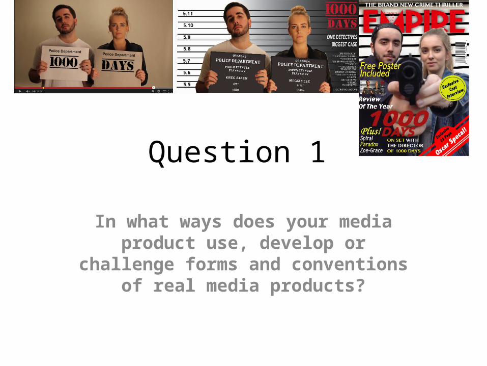
Question 1
In what ways does your media product use, develop or challenge forms and conventions of real media products?
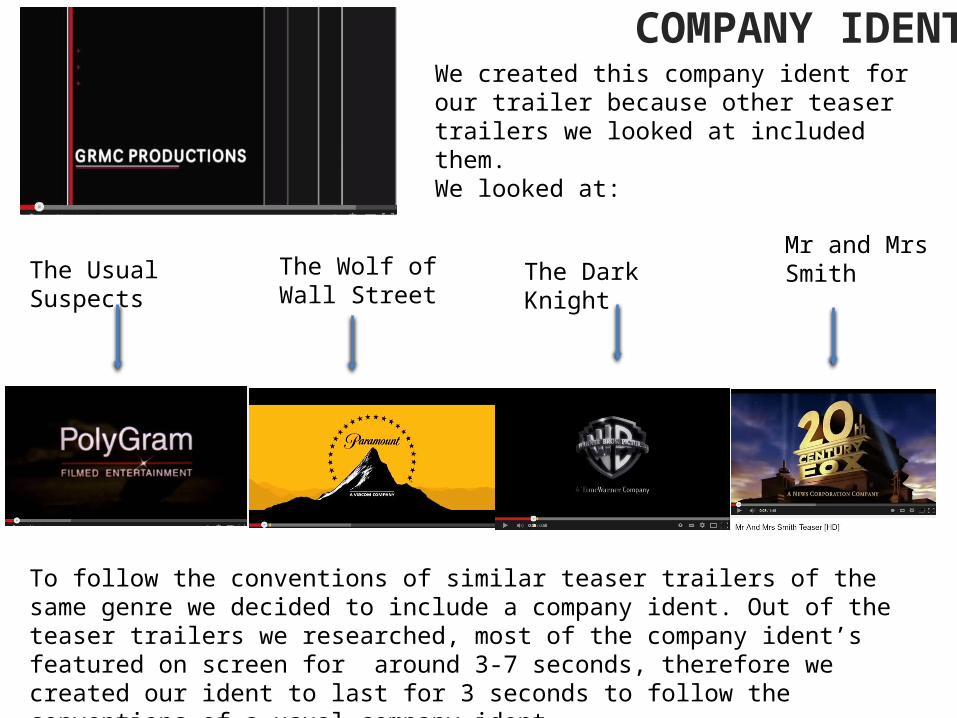
We created this company ident for our trailer because other teaser trailers we looked at included them. We looked at:
Mr and Mrs SmithThe Usual Suspects The Wolf of Wall
StreetThe Dark Knight
To follow the conventions of similar teaser trailers of the same genre we decided to include a company ident. Out of the teaser trailers we researched, most of the company ident’s featured on screen for around 3-7 seconds, therefore we created our ident to last for 3 seconds to follow the conventions of a usual company ident.
COMPANY IDENT

TITLESHere are some titles from the teaser trailer’s we researched.
We took elements from each of these title sequences to make our own titles. In reflection of the genre, we wanted to create a title sequence that was quite simple, but looked professional. We didn’t want to include a fancy font because none of the teaser trailers we researched included this. We wanted to match the conventions of a typical crime genre film so thought a simple font would create an effective feel.
However, we did challenge some of the typical conventions because we just placed white text onto a black background. Most of the trailers we researched has something else added, but we didn’t want to distract from the text on screen.

Throughout the process of making our title sequence we paid close attention to the title sequence of ‘Mr and Mrs Smith’. We liked the title sequence for this teaser trailer because it is something different that is not normally shown. The images swiping across the screen give a sense of surveillance and people being watched. This is exactly the feel we wanted to create due to the fact that the crime couple have been on the run for 1000 days.
We researched how to include this transition in our trailer and created it using Final Cut Pro. Ours is slightly different to ‘Mr and Mrs Smith’ in the respect that our images are a different colour. We decided to put a blue effect on the images to create a dark and cold atmosphere that reflects the theme of the teaser trailer.

EDITINGMost of the teaser trailers we have researched have a very fast paced edit. This is to create a sense of urgency. We have closely followed this convention and made our edit very fast paced. The edit swaps between shots at a fast pace to create a sense of urgency and rushing. However, we have also included some slower paced editing to create tension and the use of music helps to create this atmosphere.
https://www.youtube.com/watch?v=DmnueoQmuqA
https://www.youtube.com/watch?v=iszwuX1AK6A
https://www.youtube.com/watch?v=TWB_icm5M38
https://www.youtube.com/watch?v=9MjV4EwR7Mg Here are some similar teaser trailers to ours that follow the same convention that most crime genre films follow of fast paced editing.

SHOTSWe have included a variety of shots in our teaser trailer, however mostly close ups. Due to the fact that it is a teaser trailer we didn’t want to give too much away, therefore, using close ups allows the audience to see what certain characters are doing it does not allow them to see what setting or environment they are in. This leaves certain things on a cliff hanger which means the audience will want to watch the whole film to find out more. It also gives a mysterious feel to the trailer because the audience cannot see everything that is going on.
We have also included some mid shots because this enables the audience to see more of the character and what they are doing, EG the shot of Pippa cleaning the gun, this allows the audience to see what she is doing however we don’t see everything which still leaves the mystery element.

SHOTSWe have included similar shots as in other crime genre easer trailers to follow the typical conventions.
In both ‘1000 Days’ and ‘Mr and Mrs Smith’ we see close ups and mid shots of the female figure holding the weapon. This could suggest that the female is the powerful and dominant one within the relationship.

SHOTS
We see an over the shoulder shot in both ‘1000 Days’ and ‘Life of Crime’. This shows female characters talking to male characters. The panic in both of the females eyes could imply that they have received bad news from the male and are both feeling worried.
The title sequence are both similar in ‘1000 Days’ and ‘Mr and Mrs Smith’.

DURATIONMost teaser trailers are between 10 seconds ad 90 seconds long. This in order for the audience to find out what the genre of the film is and to get an rough insight into the storyline. Theatrical trailers are normally around 2 minutes long.
The length of our teaser trailer is 58 seconds which allows the audience to meet the 3 main characters: Pablo Estevez, Pippa Estevez and the detective. They see a number of shots, mostly ones that imply it is a crime film by showing guns, inside the police station and the victim.
Most of the other teaser trailers we have looked at have adhered to this convention. ‘Mr and Mrs Smith’: 1:49‘Life of Crime’: 1:48‘The Dark Knight’: 0:55‘The Wolf of Wall Street’: 1:30‘The Usual Suspects’: 1:18

POSTERHere is the poster for ‘100 Days’.
Here are some similar posters that we have made close reference to throughout the whole process…
Poster’s can be put in many places in order to advertise a film EG bus stop, magazines and in newspapers, therefore it is vital that a poster conveys the best parts about a film. It is important that it conveys the genre of the film and other information like who is in it, who was involved in making it and when it is being released.

POSTER
‘The Usual Suspects’ poster is the poster that gave us the most inspiration for our poster. We liked the idea of the police boards. This instantly tells the audience what the genre is. It tells the audience that these people are in trouble and makes them what to find out why. However, we changed our image slightly by having a mid shot of just the characters heads and the top of their bodies. We felt this was more effective because it highlighted their faces more, making it easier for the audience to get an insight into what they are thinking.
The horizontal lines across the back of the shot holds more than one meaning, not only the literal meaning of the measuring lines, but also could represent prison bars and connotes the feeling of being trapped. This foreshadows the film because in the end they will both end up in prison for the crimes they have committed. We also included the police boards, unlike in ‘The Usual Suspects’ poster. We thought that this would be something different and it also helped with the layout because we could put vital information on them, EG the actors names.

POSTER
Our poster follows similar conventions to the posters of ‘Mr and Mrs Smith’ and ‘Parker’. Both of these films includes a female and male relationship, which is why we looked into the posters of these films. The layouts are quite similar in the sense that the male and female look as if they are against each other. For ‘Mr and Mrs Smith’ and ‘Parker’ the male and female are placed on opposite sides of the shot, which implies they are enemies or in some sort of competition with each other. This is a similar theme that runs through out trailer and film, therefore we thought it would be effective to follow the layout of these posters.
The colouring of ‘Parker’ is similar to ‘1000 Days’. There is a colour divide down the shot, separating the two characters. We have created a similar thing, however our colour divide is more subtle. The black v white works well because it connotes good v evil, as well as red v black.

POSTER
We have followed similar conventions as ‘Life of Crime’ have. Even though the colouring is very different, the layout is similar. ‘Life of Crime’ poster also has a divide between characters: the characters at the top v the characters at the bottom.
However, something that is very similar is the tag line, ours is ‘One Detectives Biggest Case’, while ‘Life of Crime’s line is ‘Right Target. Wrong Woman’. Very few posters we looked at included this, however the ones that did looked very professional and effective. The short line can reveal a lot about the trailer and film and I think it’s effective to include one. It made the whole poster look well thought out and gave it a professional look.

POSTERThe font of our title on the poster is similar to some similar posters, however it is also different too.
The font on all of these poster is quite plain and simple, however this gives the poster a professional look. We wanted to create something professional and even though a fancy font could’ve worked well with the genre, we decided to keep it quite plain. We didn’t want the title to distract from the main image and a fancy font could’ve done this. Our font is similar to all of these posters, however it is different and we have challenged the conventions because we have made our title red. Due to the background of the poster being black, we couldn’t have black writing and we thought white writing wasn’t eye catching enough. Therefore, we chose red because red has many connotations, including love and danger and overall our film is about danger, as well as love because it involves a married couple. This makes the poster match and link to the main product of the teaser trailer.

MAGAZINE Here is our magazine and some other Empire magazines we looked at for inspiration. We referred to these examples throughout the process of designing it.

MAGAZINEOur magazine for ‘1000 Days’ follows the typical conventions of other ‘Empire’ magazines. On most of the examples we looked at the main character’s head would be over lapping the title of the magazine, therefore we did the same to follow the usual conventions.
Most ‘Empire’ magazines have one min image, usually a mid to long shot of the main character, we also did this, however changed it slightly by having two figures on the front. There is usually also a main point of focus, EG on the first magazine it’s the large knife, on the Harry Potter issue it is the wand and on the Public Enemies, Bourne Legacy, James Bond and Sherlock Holmes, the main focus is on the knife. We also have a main focus on our image, which is the gun. This immediately draws the audiences attention to the object and implies to them where their main focus should be.

MAGAZINEThe title ‘Empire’ is in red on every magazine, therefore we have kept it the same colour for ours.The colour themes of ‘Empire’ magazines are always quite different depending on the film that is featured. Red is a colour that is usually included, as well as blue and yellow. The colour theme of our poster is red and yellow to follow the typical conventions of an ‘Empire’ magazine. The title the trailer that features on our poster is also red so it made sense that we chose red for the title and colour theme of the magazine.
The layout of typical ‘Empire’ magazines are all very similar. They include the main point of focus, EG the main character holding an object, the title of the film and then lots of other things surrounding the main image. They include things like interviews with the actors, as well as competitions and other films that are featured within the magazine. We have included things like this too. We have a free poster inside, as well as shown other films that are included in the issue. In my opinion, all ‘Empire’ front covers look quite busy with a lot included on the front page, however I feel this is effective because it shows that the magazine is packed full of information. Our magazine looks quite busy too to match the design of the normal ‘Empire’ magazines.
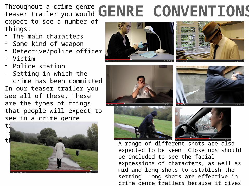
GENRE CONVENTIONSThroughout a crime genre teaser trailer you would expect to see a number of things:- The main characters- Some kind of weapon- Detective/police officer- Victim- Police station - Setting in which the crime has been
committedIn our teaser trailer you see all of these. These are the types of things that people will expect to see in a crime genre trailer, which is why it is important to include these elements.
A range of different shots are also expected to be seen. Close ups should be included to see the facial expressions of characters, as well as mid and long shots to establish the setting. Long shots are effective in crime genre trailers because it gives the idea of someone being watched.

GENRE CONVENTIONSOn a poster or magazine cover for a crime genre film you would expect to see the main character/characters in order to grasp a sense of the theme and storyline. Our poster and magazine cover both feature the two main characters, Pablo Estevez and Pippa Estevez.
The setting in which the poster is shot is also very crime related and pretty much gives away the storyline. The characters are standing against a measuring board in a police station, which implies they have done something wrong. As well as this, the magazine cover shows them both holding a gun which further hints at the storyline, perhaps they have shot someone etc.