euro health consumer index 2017 · contrary to popular belief, not least among healthcare...
TRANSCRIPT

i
Euro Health
Consumer Index 2018

___________________________________________________________________________
2
Euro Health Consumer Index 2018
The Green countries on the map on the front cover are scoring >750 on the 1000-point scale.
Red are countries scoring <650.
The minimum possible score is 333.
___________________________________________________________________________
3
Euro Health Consumer Index 2018
Professor Arne Björnberg, Ph.D. [email protected]
Ann Yung Phang, RN, B.A. [email protected]
Health Consumer Powerhouse
2019-02-25
Number of pages: 90
This report may be freely quoted, referring to the source.
© Health Consumer Powerhouse Ltd., 2019.
ISBN 978-91-980687-5-7
Health Consumer Powerhouse
Euro Health Consumer Index
2018
Report

___________________________________________________________________________
4
Euro Health Consumer Index 2018
Contents
DO NOT FORGET THE SMALL PRINT! ........................................................................................................ 5
1. SUMMARY............................................................................................................................................ 6
1.1 GENERAL OBSERVATIONS – EUROPEAN HEALTHCARE IMPROVING ........................................................................ 6 1.2 COUNTRY PERFORMANCE ............................................................................................................................ 8 1.3 COUNTRY ANALYSIS OF THE 35 COUNTRIES ..................................................................................................... 9 1.4 TIGHTER OUTCOMES CRITERIA SHOWS WEALTH GAP IN EUROPEAN HEALTHCARE .................................................. 20 1.5 BBB; BISMARCK BEATS BEVERIDGE – NOW A PERMANENT FEATURE ................................................................. 21
2. INTRODUCTION .................................................................................................................................. 22
2.1 BACKGROUND ........................................................................................................................................ 22 2.2 INDEX SCOPE .......................................................................................................................................... 23 2.3 ABOUT THE AUTHORS............................................................................................................................... 23
3. RESULTS OF THE EURO HEALTH CONSUMER INDEX 2018 ................................................................... 24
3.1 RESULTS SUMMARY ................................................................................................................................. 26
4. BANG-FOR-THE-BUCK ADJUSTED SCORES ........................................................................................... 29
4.1 BFB ADJUSTMENT METHODOLOGY ............................................................................................................. 29 4.2 RESULTS IN THE BFB SCORE SHEET ............................................................................................................. 30
5. TRENDS OVER THE 12 YEARS .............................................................................................................. 31
5.1 RANKING STRICTLY RELATIVE – A LOWER POSITION DOES NOT NECESSARILY MEAN DETERIORATION OF SERVICES ......... 31 5.2 HEALTHCARE QUALITY MEASURED AS OUTCOMES ......................................................................................... 31 5.3 WAITING LISTS: A MENTAL CONDITION AFFECTING HEALTHCARE STAFF AND ADMINISTRATORS? ............................. 33 5.4 UNDER-THE-TABLE PAYMENTS ................................................................................................................... 34 5.5 "MDD - THE ENDEMIC CONDITION CRIPPLING EUROPEAN HEALTHCARE" .......................................................... 35
6. HOW TO INTERPRET THE INDEX RESULTS? ......................................................................................... 39
7. EVOLVEMENT OF THE EURO HEALTH CONSUMER INDEX .................................................................... 40
7.1 SCOPE AND CONTENT OF EHCI 2005.......................................................................................................... 40 7.2 SCOPE AND CONTENT OF EHCI 2006 – 2017 .............................................................................................. 40 7.3 EHCI 2018 ........................................................................................................................................... 41 7.4 INDICATOR AREAS (SUB-DISCIPLINES)........................................................................................................... 42 7.5 SCORING IN THE EHCI 2018 ..................................................................................................................... 43 7.6 WEIGHT COEFFICIENTS ............................................................................................................................. 43 7.7 INDICATOR DEFINITIONS AND DATA SOURCES FOR THE EHCI 2018 ................................................................... 45 7.8 THRESHOLD VALUE SETTINGS ..................................................................................................................... 50 7.9 “CUTS” DATA SOURCES ........................................................................................................................... 51 7.10 CONTENT OF INDICATORS IN THE EHCI 2018 ............................................................................................. 52
8. REFERENCES ....................................................................................................................................... 90
8.1 MAIN SOURCES ....................................................................................................................................... 90

___________________________________________________________________________
5
Euro Health Consumer Index 2018
Do not forget the small print!
No doubt the Swiss gold medal in the 2018 Euro Health Consumer Index will raise
questions. The main message is that The Netherlands still offers excellent healthcare, but
the Swiss just a little better! And do not let the medallists take your attention from the
“small print”; all the things happening, or worse, not happening, behind the headlines.
Such as:
A bunch of midget or minor CEE countries delivering good value-for-money healthcare, often with tiny budgets (from wealthy Western perspectives). Not least doing away with waiting for care is part of the success in ways that should make chronic access failures such as Ireland, UK, Sweden and Norway blush with shame.
Increased EHCI attention to mental health did not only contribute to getting a new winner for the first time in a decade – it points to a shift in the healthcare landscape. Awareness is spreading of how human beings are exposed to stress and discontinuity, bringing anxiety and depression to disturbing heights, not least among young people. Healthcare must be better prepared and improve treatment access and methods.
Europe, still waits for a consumer-friendly e-Health breakthrough; the technology is here but the will seems to be lacking.
Across the Baltic the traditional Swedish-Finnish duel has spread from ice-hockey to healthcare. The Finns set the example, running healthcare with better outcomes and better cost-efficiency than the Swedish big brother. Do Swedes travel east to learn? Hardly – maybe a bit embarrassing?
And the Big Mystery remains: in continuous movements during the last hundred years medical science and treatment methods have developed with astonishing results for mankind. In midget state Montenegro, 999 of 1 000 infants survive (EHCI top honours). You can have cataract surgery done in ten minutes. And in most parts of Europe nine out of ten stroke patients survive. In contrast, in real life still most Europeans cannot move across borders to obtain treatment, and one third of Europeans live in poor-access countries.
Another way to put it: there are growing European mountains of healthcare data and statistics that are often used to successfully improve medical procedures. Little learning progress is made on health systems reform; doctors and some managers implement change, politicians and administrators more rarely do.
Johan Hjertqvist Founder, Health Consumer Powerhouse, Ltd. (HCP)
The EHCI 2018 was produced with no outside financial support, i.e. 100% of the costs were borne by the Health Consumer Powerhouse, Ltd.
___________________________________________________________________________
6
Euro Health Consumer Index 2018
1. Summary
In spite of financial crisis-induced austerity measures, such as the much publicized restrictions on the increase of healthcare spend, European healthcare keeps producing better results. Survival rates of heart disease, stroke and cancer are all increasing, even though there is much talk about worsening lifestyle factors such as obesity, junk food consumption and sedentary life. Infant mortality, perhaps the most descriptive single indicator, also keeps going down, and this can be observed also in countries such as the Baltic states, which were severely affected by the financial crisis.
Earlier editions of the Euro Health Consumer Index (EHCI), 2006 – 2016, have shown this improvement beyond reasonable doubt (see Section 5.)
“Internet pharmacopoeias” existed in only two countries (Sweden and Denmark) when the EHCI was started – today, almost every country has them, which is why this indicator is no longer in the EHCI. Infant mortality when first introduced had 9 countries scoring Green – today, 24 countries do that. (The limit of less than 4 deaths per 1000 births for a Green has therefore been lowered to 3.) Similar observations can be made for many indicators.
In order to keep the EHCI challenging, the EHCI 2017 – 2018 have to some degree sacrificed the longitudinal analysis aspect by raising the cut-off limits between Red/Yellow/Green scores on a number of indicators, and by the introduction of more stringent data such as 30-day case fatality for heart infarct and stroke.
1.1 General observations – European healthcare improving
In spite of the tightening of score criteria, the “800 Club” – countries scoring more than 800 points out of the maximum 1000 – had an increased number of members in 2017: 12 countries, all Western European, scored above 800 points (up from 11 in 2016) of the maximum 1000. In 2018, with some score cut-offs tightened further, the formal “800 Club” has only 8 members, but with three more countries scoring 796 – 799.
The tightening of the score criteria, particularly for treatment results, seems to have created a gap between wealthy and less wealthy countries; previous EHCI editions have shown that money does help to provide the best treatment, and also to allow hospital admissions on lighter indications, which might not be cost-effective but does provide better outcomes. The last member close to the 800 Club, Germany in 12th place at 785 points leads Portugal in 13th place with a gap of 31 points.
The tightening of score cut-offs has sacrificed the longitudinal analysis aspect, as a country can gain in the ranking even with a loss in score points; the EHCI 2006 – 2016 did show beyond reasonable doubt that European healthcare is continuously improving.
It is vital to remember that the EHCI is a strictly relative measure of national Healthcare system performance!
1.1.1 New indicators with significant effects on country rank
Ever since 2005, the HCP has been working hard on obtaining decent quality indicators on the very large problem area of Mental Healthcare. Two indicators have been replaced from the EHCI 2018:
Indicator 2.6 Waiting time in A&E departments had the drawback of mainly reflecting the accessibility of other parts of a healthcare system, i.e. measuring the same
___________________________________________________________________________
7
Euro Health Consumer Index 2018
phenomenon over again. In 2018, that indicator was replaced by 2.6 Waiting time for first appointment in Paediatric Psychiatry.
Indicator 3.8 Prevalence of depression was suffering from poor quality and partially old data. It has therefore been replaced by 3.8 Suicide rates. It is vital to note that the indicator does not measure the absolute level of suicide deaths per 100 000, as this parameter suffers from cultural distortions; particularly in catholic countries in southern Europe, there has long been an underreporting of suicides. For this reason, the indicator measures the inclination of the trend line of suicide rates 1999 – 2016. To account for the variation in suicide reporting, the trend line is calculated on the logarithmic values of the suicide rates. That contains the hidden assumption that suicide reporting cultural differences are essentially constant over the time period studied. This means that if e.g. Greece would report a decrease from 4 to 3 per 100 000, it would get the same score as a country reporting a decrease from 40 to 30. If anything, this practice is probably a favourable treatment of the low-reporting countries.
Interestingly, these two indicators on Mental Health show a difference from the common pattern of wealthy countries dominating the Green scores, particularly on Outcomes. Less affluent countries (CEE and elsewhere) seem to do remarkably well on these Mental Healthcare indicators! E.g.; on the suicide rate indicator both The Netherlands and the U.K. show an increase of suicides over the period, and thus get a Red score. This is the main explanation for The NL losing its top position in the EHCI for the first time in a decade!
1.1.2 No correlation between accessibility to healthcare and money spent
It is inherently cheaper to run a healthcare system without waiting lists than having waiting lists! Contrary to popular belief, not least among healthcare politicians, waiting lists do not save money – they cost money!
Healthcare is basically a process industry. As any professional manager from such an industry would know, smooth procedures with a minimum of pause or interruption is key to keeping costs low!
In the EHCI 2017 there were some surprising newcomers among countries having no or minimal waiting lists in healthcare. Tiny Montenegro has achieved a similar improvement to what Macedonia did in 2013 by introducing a national real time e-referral system. In 2018, only Switzerland scores “All Green” on Accessibility. Frequently, there is a negative bias in Patient Organisation responses on Waiting Times and a positive bias in official national data.
Serbia, having bought a license for the Macedonia system, is a bit slower in the implementation than their smaller neighbours, but is on course to eliminating waiting lists.
If countries with limited means can achieve virtual absence of waiting lists – what excuse can there be for countries such as Ireland, the UK, Sweden or Norway to keep having waiting list problems?
MDD! (See Section 5.5!)

___________________________________________________________________________
8
Euro Health Consumer Index 2018
1.2 Country performance
The introduction of much longed for indicators on Mental Healthcare; 2.6 Waiting time for paediatric psychiatry and 3.8 Inclination of trend line for suicide rates led to a quite unexpected and dramatic result in the top of the EHCI ranking. The Netherlands rather unexpectedly (for the HCP) had two heavily weighted Green scores replaced by Red scores! The result of that is that for the first time in 10 years, The Netherlands is not top of the EHCI. The loss of points from 924 to 883 led to the “eternal runner-up” Switzerland finally taking the top position in spite of a minor loss of 5 points, taking the Gold at 893 points!
Switzerland has for a long time had a reputation for having an excellent, although expensive, healthcare system, and it therefore comes as no surprise that rewarding clinical excellence results in a prominent position in the EHCI.
The changes in rank should not at all be dismissed as an effect of changing indicators, of which there are 46 in the EHCI 2018, as three indicators where almost all countries scored Green were removed in 2017 as non-discriminating. (1.1 Healthcare law based on Patients' Rights, 1.3 No-fault malpractice insurance (data definition problems), 6.2 Layman-adapted Pharmacopoeia on the www).
Bronze medallists are Norway, at 857 points. Norway is losing 87 out of the missing 143 points from a perfect 1000 on their totally inexplicable waiting list situation!
Denmark was silver medallist some years ago, and has had a dip in the ranking, which was probably linked to the tightening of regulations for access to healthcare services. In 2017, with clinical excellence being more obviously rewarded, Danes seemed to have learned to live with the access rules and comes a strong 4th at 855 points.
Belgium, 5th at 849 points, has been slowly but steadily climbing in the “800 Club” for some years.
Finland (6th, 846 points) seems to have used traditional Finnish pragmatism to get out of the Waiting List swamp of a few years ago, and treatment results have also become first class.
Luxembourg is in 7th position at 809 points. The very wise decision not to provide all forms of care at home, even though LUX could afford it, and allow their citizens to seek care in other EU countries, makes data availability slightly troublesome – it is likely that perfect data availability would give Luxembourg a higher score.
The Swedish score (8th place, 800 points) for clinically excellent healthcare services is, as ever, dragged down by the seemingly never-ending story of access/waiting time problems, in spite of national efforts such as Vårdgaranti (National Guaranteed Access to Healthcare). Out of the Swedish gap of 200 to a perfect 1000, 112 points are lost due to an abysmal waiting time situation. The only countries scoring lower on Accessibility are Ireland (alone in the bottom position of this sub-discipline) and the U.K. – media reports about a worsening waiting time situation in Britain seem to be confirmed in the EHCI.
Portugal, 13th at 754 points are in lonely spot in the EHCI – 31 points behind Germany in 12th place, but with a 23-point lead over the Czech Republic (731), Estonia (well done: 729!) and the U.K. (728). They are trailed by Slovakia (17th, 722), where patients in 2018 seem less enthusiastic about the Waiting Time situation than they were in 2017 when Slovakia briefly joined the exclusive group of countries scoring All Green on Accessibility.
Serbia (18th, 699 points) keeps climbing slowly thanks to a greatly improved Waiting Time situation, partly due to heavy investing in radiation therapies and MR scanners, and introduction of e-Prescriptions.

___________________________________________________________________________
9
Euro Health Consumer Index 2018
In southern Europe, Spain and Italy provide healthcare services where medical excellence can be found in many places. Real excellence in southern European healthcare seems to be a bit too much dependent on the consumers' ability to afford private healthcare as a supplement to public healthcare. Also, both Spain and Italy show large regional variation which tends to result in a lot of Yellow scores for these countries.
“Climber of the Year” 2017: Montenegro, has also greatly improved Accessibility with a domestic IT solution – no Macedonian license. Montenegro keeps crawling upward from 25th to 23rd. The most impressive achievement is that Montenegro has dethroned long-time champion on Infant Mortality (Iceland), with a mortality of 1.3 in 1000 births!
1.3 Country analysis of the 35 countries
1.3.1 Switzerland
Gold medallists, 893 points (down from 898).
Switzerland has enjoyed a solid reputation for excellence in healthcare for a long time. Therefore it is not surprising that when the n.a.’s of previous EHCI editions have mainly
been eliminated, Switzerland scores high. Considering the very respectable money ploughed into the Swiss healthcare system, it should! In 2018, the only country to score All Green on Accessibility, and also wins (together with Norway) on the most heavily weighted sub-discipline Outcomes.
In 2018, Switzerland is outdistancing a “hornets’ nest” of 10 other Western European Countries scoring above 796 points! Swiss healthcare has probably been this good also before; the highly decentralised cantonal structure of the country has made data collection difficult.
1.3.2 The Netherlands
The Netherlands is the only country which has consistently been among the top three in the total ranking of any European Index the Health Consumer Powerhouse has published since 2005. The 2016 NL score of 927 points was by far the highest ever seen in a HCP Index.
The introduction of much longed for indicators on Mental Healthcare; 2.6 Waiting time for paediatric psychiatry and 3.8 Inclination of trend line for suicide rates led to a quite unexpected and dramatic result in the top of the EHCI ranking. The Netherlands rather unexpectedly (for the HCP) had two heavily weighted Green scores replaced by Red scores! The result of that is that for the first time in 10 years, The Netherlands is not top of the EHCI. The loss of points from 924 to 883 led to the “eternal runner-up” Switzerland finally taking the top position.
Counting from 2006, the HCP has produced not only the generalist Index EHCI, but also specialist Indexes on Diabetes, Cardiac Care, HIV, Headache, Hepatitis and other diagnostic areas. The Netherlands is unique as the only country consistently appearing among the top 3 – 4, regardless what aspects of healthcare which are studied.
1.3.3 Norway
3rd place, 857 points. Norwegian wealth and very high per capita spend on healthcare seem to be paying off – Norway has been slowly but steadily rising in the EHCI ranking over the years. Traditionally, Norwegian patients complained about waiting times. This
___________________________________________________________________________
10
Euro Health Consumer Index 2018
has subsided significantly, but is still where Norway loses most of the points missing: -87 points compared with class leader Switzerland!
The poor accessibility of Norwegian healthcare must be more or less entirely attributed to mismanagement, as lack of resources cannot possibly be the problem. The fact that it is cheaper to operate a healthcare system without waiting lists (i.e. waiting lists do not save money, they cost money) could actually explain the Norwegian situation. Too much money can be a curse, hindering rationalization or the learning of efficient logistics.
Norway, well-known for citizens always flitting around on skis, wins the sub-discipline Prevention.
1.3.4 Denmark
4th place, 855 points. Denmark was catapulted into 2nd place by the introduction of the e-Health sub-discipline in the EHCI 2008. Denmark was in a continuous rise since first included in the EHCI 2006. Interestingly, when the EHCI 2012 was reverted to the EHCI 2007 structure, Denmark survived this with flying colours and retained the silver medal with 822 points! Denmark has also made dramatic advancement in the reduction of heart disease mortality in recent years.
However, in 2013, the introduction of the Prevention sub-discipline did not help Denmark, which lost 20 points on this sub-discipline relative to aggressive competitors. Although the causality is hard to prove, that Danish score drop did coincide in time not only with the removal of Outcomes data from its hospital quality information system. It also coincided with the tightening of access to healthcare, with only two telephone numbers being available to Danish patients; the number of their GP, or the emergency number 112!
In 2018, with clinical excellence being rewarded higher, it seems that Danish patients have partially learned to cope with the accessibility restrictions!
1.3.5 Belgium
Perhaps the most generous healthcare system in Europe1 seems to have got its quality and data reporting acts together, and ranks 5th in the EHCI 2018 (849 points), up from 8th and 832 points in 2017. Still not quite top class on medical treatment results (“Outcomes”).
1.3.6 Finland
6th, 839 points. As the EHCI ranking indicates, Finland has established itself among the European champions, with top Outcomes at a fairly low cost. In fact, Finland does well in value-for-money healthcare.
Some waiting times are still long, provision of “comfort care” such as cataract surgery and dental care is limited and out-of-pocket payment, also for prescription drugs, is significantly higher than for Nordic neighbours.
This probably means that the public payors and politicians traditionally were less sensitive to “care consumerism” than in other affluent countries.
1 Some would say over-generous: a personal friend of the HCP team, living in Brussels, was “kidnapped and
held” in hospital for 6 days(!) after suffering a vague chest pain one morning at work.

___________________________________________________________________________
11
Euro Health Consumer Index 2018
1.3.7 Luxembourg
Luxembourg (7th, 809 points), being the wealthiest country in the EU, could afford to build its own comprehensive healthcare system. Unlike Iceland, Luxembourg has been able to capitalize on its central location in Europe. With a level of common sense which is unusual in the in-sourcing-prone public sector, Luxembourg has not done this, and has for a long time allowed its citizens to seek care in neighbouring countries. It seems that they do seek care in good hospitals. Probably for this reason, Luxembourg loses points on the Abortions indicator – for reasons of discretion, many LUX women probably has that done outside of the small and intimate Grand Duchy.
LUX patients probably get even better treatment than the EHCI shows, as being treated abroad makes data collection complicated.
The HCP has received some protest from LUX about the bad score on cigarette consumption, on the argument that most of those cigarettes are smoked by other nationalities. From a European public health standpoint, selling cheap cigarettes and alcohol to your neighbours is no better than consuming it all yourself.
1.3.8 Sweden
Sweden tumbled in the EHCI 2013 from 6th place to 11th. In the EHCI 2016, Sweden dropped further to #12, at the same 786 points as in 2015. In 2018, Sweden is back up in 8th place, and back in the 800 Club at 800 points, thanks to clinical excellence being rewarded high.
Sweden enjoys the companionship only of a number of CEE countries having more than 30 abortions per 100 live births, which in CEE probably is a remnant from before 1990. This is why Sweden is not the top scorer on clinical Outcomes in the EHCI, which it was in a recent OECD study.
At the same time, the notoriously poor Swedish accessibility situation seems very difficult to rectify, in spite of state government efforts to stimulate the decentralized county-operated healthcare system to shorten waiting lists by throwing money at the problem (“Queue-billions”). Sweden now has the highest healthcare spend per capita, (after the three super-wealthy countries, see Section 4.1). “Throwing money at a problem” is obviously not an effective way of problem-solving. The HCP survey to patient organizations confirms the picture obtained from the official source www.vantetider.se, that the targets for maximum waiting times, which on a European scale are very modest, are not really met. The target for maximum wait in Sweden to see your primary care doctor (no more than 7 days). In the HCP survey, British and Irish patients paint the most negative pictures of accessibility of any nations in Europe.
Another way of expressing the vital question: Why can North Macedonia reduce its waiting times to practically zero, and Sweden cannot?
1.3.9 Austria
Austria (9th, 799 points) suffered a drop in rank in 2012.
In 2016, Austria made a comeback into the “800 Club”, and is still in the same group of countries. The introduction of the Abortion indicator did not help: Austria does not have the ban on abortion found in Poland and Malta, but abortion is not carried out in the public healthcare system. Whether Austria should deserve a Red or an n.a. score on this indicator
could be a matter of discussion – there are no official abortion statistics.
Surprisingly modest score on Outcomes, but still good – same score as Belgium.

___________________________________________________________________________
12
Euro Health Consumer Index 2018
1.3.10 Iceland
Due to its location in the North Atlantic, Iceland (10th, 797 points) has been forced to build a system of healthcare services, which has the capability (not dimensions!) of a system serving a couple of million people, which is serving only 300 000 Icelanders. Iceland scores fairly well on Outcomes.
Lacking its own specialist qualification training for doctors, Iceland does probably benefit from a system, which resembles the medieval rules for carpenters and masons: for a number of years after qualification, these craftsmen were forbidden to settle down, and forced to spend a number of years wandering around working for different builders. Naturally, they did learn a lot of different skills along the way. Young Icelandic doctors generally spend 8 – 10 years after graduation working in another country, and then frequently come back (and they do not need to marry a master builder’s widow to set up shop!). Not only do they learn a lot – they also get good contacts useful for complicated cases: the Icelandic doctor faced with a case not possible to handle in Iceland, typically picks up the phone and calls his/her ex-boss, or a skilled colleague, at a well-respected hospital abroad and asks: Could you take this patient?, and frequently gets the reply: “Put her on a plane!
1.3.11 France
11th, 796 points. Dropped out of the top 10 after reducing formerly liberal access to specialist services around 2009, but has slowly and steadily been climbing back. This pattern is not unusual after rule changes for Access (see Denmark above!). The management of the HCP have relocated to France; with a background from Sweden, our personal experience makes us believe that French patients must be a bit grumpy about Waiting Times in healthcare – from a Swedish perspective, Accessibility is fabulous!
A technically competent and efficient system, with a tendency to medicalize a lot of conditions2, and to give patients a lot of drugs!
France has long had the lowest heart disease mortality in Europe, and was the first country (1988), where CVD was no longer the biggest cause of death. Also, France was #1 in the Euro Heart Index 20163.
1.3.12 Germany
Germany (12th, 836 points) took a sharp dive in the EHCI 2012, sliding in the ranking from 6th (2009) to 14th. As was hypothesised in the EHCI 2012 report, when patient organisations were surprisingly negative, this could have been an artefact created by “German propensity for grumbling”, i.e. that the actual deterioration of the traditionally excellent accessibility to health care was less severe than what the public thought, and the negative responses were an artefact of shock at “everything not being free anymore”.
The 2017 survey results seem to confirm this theory, and it would appear that German patients have discovered that “things are not so bad after all”.
Germany has traditionally had what could be described as the most restriction-free and consumer-oriented healthcare system in Europe, with patients allowed to seek almost any type of care they wish wherever they want it (“stronger on quantity than on quality”). The traditional weakness of the German healthcare system: a large number of rather small general hospitals, not specializing, resulting in mediocre scores on treatment quality,
2 Wadham, Lucy; The Secret Life of France, Faber Faber, 2013.
3 www.healthpowerhouse.com/publications/euro-heart-index-2016/

___________________________________________________________________________
13
Euro Health Consumer Index 2018
seems to be improving – a tendency visible also in 2018, when Germany is sharing 8th place on Outcomes.
The slightly disturbing observation for Germany is the low rate of kidney transplants – roughly half of that of neighbouring countries. Kidney transplant is one of the very few therapies which has a pay-back time (~2 years, if the patient gets off dialysis) from reduced healthcare costs only, and also provides huge improvements in survival rates and quality of life. It seems that generous remuneration for dialysis clinics might be a factor keeping down the transplant rate!
1.3.13 Portugal
13th; 754 points. Strong performance, gaining more points than in 2017 in spite of tighter score criteria in 2018. Does well in the Bang-for-the-Buck analysis!
1.3.14 The Czech Republic
The Czech Republic has always been a solid performer among CEE countries, and in 2018 lands in 14th place (731 points, a few points up since 2017!). The main difference from neighbouring Slovakia is a better score on Range and Reach of Healthcare Services.
1.3.15 Estonia
15th place, 729 points (up from 19th place and 691 in 2017, which is quite impressive considering the tighter scoring). Not exceptional on any of the sub-disciplines, Estonia has done well in the EHCI for a number of years, not least in the context of the quite limited economic resources of this small country. A leader in the Bang-for-the-Buck adjusted Index (see Chapter 4). One of very few countries managing to keep resistant infection rates low – restrictive antibiotics prescribing?
1.3.16 United Kingdom
16th place, 728 points. A 2014 survey to the public of the UK, asking about “What is the essence of being British?” got the most common response “Having access to the NHS”. Nevertheless, the UK healthcare system has never made it into the top 10 of the EHCI, mainly due to poor Accessibility (in 2018 only beating Ireland on this sub-discipline) and an autocratic top-down management culture(?). The country, which once created the Bletchley Park code-breaking institution would do well to study the style of management of professional specialists created there4!
Mediocre Outcomes of the British healthcare system have been improving, but in the absence of real excellence, the tightened 2017 criteria puts the U.K. on par with Estonia and the Czech Republic in the middle of the field.
1.3.17 Slovakia
17th place, 722 points. The surprising All Green score on Accessibility in 2017, based on Patient Organisation responses, seems not to have been sustainable, although the 2018 performance is not too bad.
4 McKay, Sinclair; The Secret Life of Bletchley Park, chapter 17, *Aurum Press, London (2010).

___________________________________________________________________________
14
Euro Health Consumer Index 2018
1.3.18 Serbia
18th place, 699 points. Serbia was “climber of the year” in 2016, and continues crawling upward.
The major part of the climb is the effect on Waiting Times by licensing and implementing the Macedonian IZIS system for direct specialist care booking, plus e-Prescriptions, in Serbia named MojDoktor (www.mojdoktor.gov.rs). Serbia being a larger country than North Macedonia, the full effect has not materialized fully by the time of EHCI 2018 publication. In order to obtain the full effect, the implementation of MojDoktor has to be mandated for all Serbian hospitals, which has not yet happened at the time of publication of this report.
Serbia is also slowly improving on clinical results (Outcomes indicators), which were All Red in 2013. Belongs to the unusually large group of less affluent countries getting Green scores on the new Mental Health indicators.
1.3.19 Spain
19th place, 698 points. Very regionally decentralised. Spanish healthcare seems to rely a bit too much on seeking private care for real excellence. Outcomes indicators in 2018 have improved, now being on par with the Iceland and Portugal. The 2018 Patient Organisation survey (again) gave a poor view on Accessibility.
1.3.20 Italy
20th place, 687 points. Italy has the largest internal difference of GDP/capita between regions of any European country; the GDP of the poorest region is only 1/3 of that of Lombardy (the richest). Although in theory the entire healthcare system operates under one central ministry of health, the national Index score of Italy is a mix of Northern Italian and Rome Green scores, and Southern Italian Red scores, resulting in a lot of Yellows.
1.3.21 Slovenia
21st place, 678 points.
Slovenia has a GDP/capita which is 3 – 4 times that of the other ex-Yugoslav countries (except Croatia at ~75% of the Slovenian GDP). This difference was not created in just over two decades – in 1985, Croatia and Slovenia together produced 75% of the GDP of Yugoslavia!
With a population of only 2 million people, it sometimes takes only a limited number of skilled and dedicated professionals to make a difference in certain medical specialities. This has been observed in hepatitis, where Slovenia ranked #2 in Europe in the 2012 Euro Hepatitis Index5, and also in diabetes and CVD, Slovenia ranking #6 in the 2014 Euro Diabetes Index6 and 5th in the Euro Heart Index 20164.
What seems to hinder Slovenia in the EHCI is the hitherto limited success in implementing e-Health solutions and productivity-enhancing performance-based (“DRG”) hospital financing.
5 http://www.healthpowerhouse.com/files/euro-hepatitis-index-2012/Report-Hepl-HCP-121104-2-w-
Cover.pdf
6 http://www.healthpowerhouse.com/files/EDI-2016/EDI-2016-report.pdf
___________________________________________________________________________
15
Euro Health Consumer Index 2018
1.3.22 Ireland
22nd place, 669 points.
Ireland has been dropping in the Index for one main reason:
In 2018, Ireland is alone in last position for Accessibility, with patient organisations steadily giving very pessimistic feedback in the HCP survey.
Unfortunately, this was confirmed by the Irish HSE and MoH after the release of the EHCI 2015 report, when they said in a memo that the programme initiated to reduce healthcare waiting times in Ireland aims at a target of no more than 18 months’ (!) wait for a specialist appointment. Even if and when that target is reached, it will still be the worst waiting time situation in Europe.
The referendum in May 2018, resulting in allowing abortion in Ireland, helped regain points on Outcomes, where Ireland is doing considerably better than neighbours the U.K.
1.3.23 Montenegro
23rd place, 668 points, up from 25th place in 2017 (“Climber of the Year” in the EHCI 2017). The country has only 650 000 inhabitants, making it possible for reforms to take effect rapidly. This was showing by Montenegro having in just one year fully implemented their own version of an open, transparent real-time e-Referral and e-Prescription system, radically reducing waiting times.
Perhaps the most impressive achievement is that Montenegro has dethroned long-time champion on Infant Mortality (Iceland), with a mortality of 1.3 in 1000 births! This is essentially due to a decision taken in 2014, when there was a tragic case of an infant dying of sepsis. They then decided, and implemented(!), that all risk pregnancies should be referred to the expert neonatal clinic of the University Hospital at Podgorica, with a truly remarkable result.
The fact that Montenegro is a small country with 650 000 people does not diminish this achievement – large countries could do the same, regionalised if not nationwide.
1.3.24 Croatia
24th place, 644 points (up 24 points from 2017, and from #26 to 24). Croatia (and even more Slovenia) were the remarkable success stories among the ex-Yugoslavian countries, until the Macedonian wonder of 2014. In spite of a GDP/capita, which is still modest by Western European standards, Croatian healthcare does excel also at advanced and costly procedures such a kidney transplants: the Croatian number of 45 transplants per million population is among the top countries of Europe.
1.3.25 North Macedonia
25th place, 638 points. North Macedonia was the absolute “Rocket of the Year” in 2014, ranking 16th with a score of 700 points, up from 555 points and 27th place in 2013. This also makes the country the “EHCI Rocket of all Time”; no country ever gained 11 positions in the ranking in only one year!
The area, where North Macedonia still has a way to go is on actual medical treatment results. There is no quick fix for this; even with very determined leadership, it will probably be a matter of ~5 years to produce significant improvement. It seems that some out-of-date treatment methods, still in use from Yugoslav times, are hindering improvement.

___________________________________________________________________________
16
Euro Health Consumer Index 2018
The country has made a remarkable breakthrough in electronic booking of appointments – since July 2013, any GP can call up the booking situation of any specialist or heavy diagnostic equipment in the country in Real Time with the patient sitting in the room, and book anywhere in the country with a few mouse clicks. This has essentially eliminated waiting times, provided that the patient is willing to travel a short distance (the entire country measures approximately 200 km by 130, with the capital Skopje located fairly centrally). It seems that patients have caught on, with North Macedonia receiving high scores for Accessibility, particularly in out-patient care – still some distance to go for in-patient care and advanced diagnostics.
Much of this can probably be attributed to firm leadership, with the Minister of Health declaring “I want that system up and running on July 1, 2013; basta! The system (“IZIS”) also includes e-Prescriptions. This leadership is not as firm today, and North Macedonia has also been slowly sliding in the EHCI.
The North Macedonia IZIS system is well worth a study trip from other countries! The message to all other European ministers and other persons in charge of healthcare systems: “Go and do likewise.”7 This advice does not exclude that e-health implementation most often may need some time to settle and that down-sides can occur over time, before patients get used to their new-born power and choice.
1.3.26 Cyprus
26th place, 635 points. Very difficult to score in the EHCI, as Cyprus does not really have a public healthcare system in the general European meaning.
“The percentage of public expenditure on health is 44 % of the total health expenditure and is indeed the lowest in the EHCI. That used to be due to the absence of a National Health Insurance Scheme. The share paid from private insurance companies on health is about 11.4%, whereas the out-of-pocket household expenditure without any insurance coverage come up to 44% of the total health expenditure.”8
The next lowest public share of health expenditure among the 35 EHCI countries is 55 % (Bulgaria). Including healthcare services accessed by private payment would trivialize the EHCI exercise, as this would result in All Green scores for many countries, particularly on Accessibility indicators.
As the EHCI normally does not reward a country for such services obtained by paying privately, it was decided to have Cyprus run out-of-competition in the EHCI 2017.
The Cyprus parliament did pass a bill in June 2017, providing universal coverage. This seems to be taking effect, as have novel efforts of the public system contracting private providers to improve Accessibility.
1.3.27 Malta
27th place, 631 points. Decent accessibility, but not too strong on treatment results. Also, there seem to be gaps in the public subsidy system of Maltese healthcare. This is particularly prominent for drug subsidies; many Maltese do not bother with receiving a subsidy. The result is that Malta has little data on drug use!
7 Luke 10:37
8 Cyprus Statistical Office, www.mof.gov.cy/mof/cystat/statistics.nsf/index_en/index_en , Personal communication, 2017.
___________________________________________________________________________
17
Euro Health Consumer Index 2018
1.3.28 Lithuania
28th place, 622 points (up from 31st and 574 points in 2017). In 2015, Lithuania recovered from the nosedive to 510 points and #32, which the country took in 2014. This shows that the EHCI can sometimes be sensitive to small changes in responses from the often limited number of patient organisations responding to the HCP survey. In 2017, Lithuania is almost back on its long time trend.
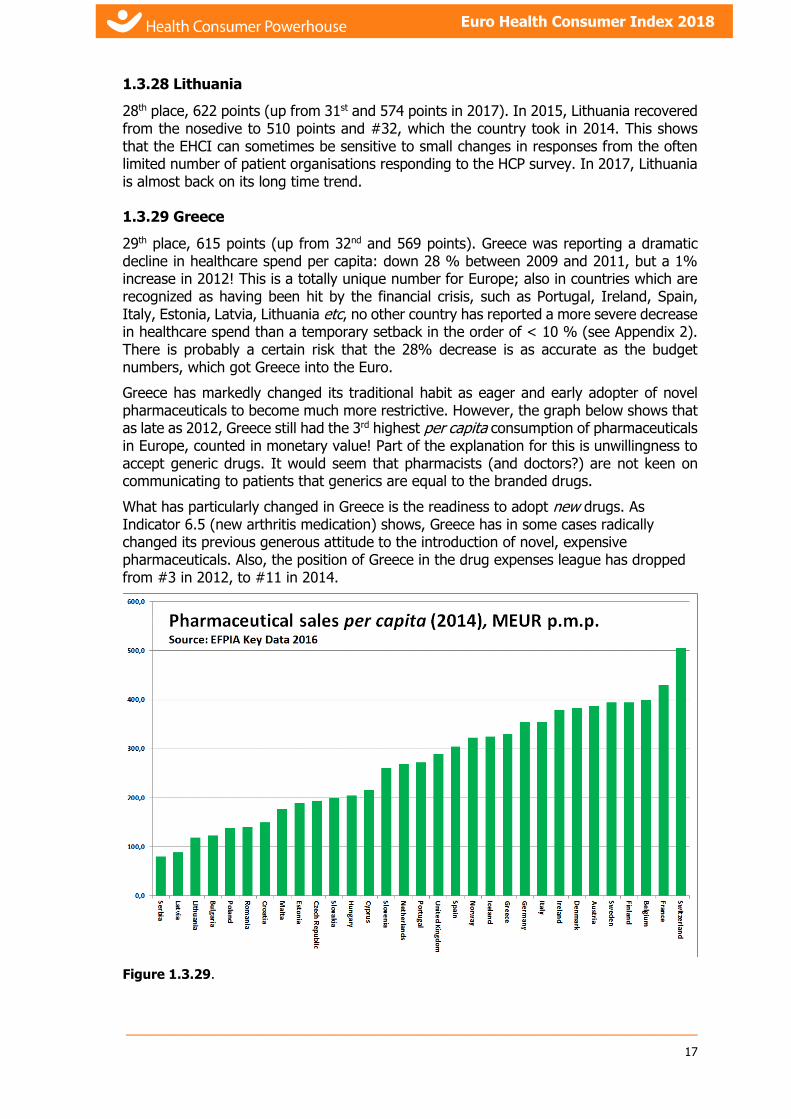
1.3.29 Greece
29th place, 615 points (up from 32nd and 569 points). Greece was reporting a dramatic decline in healthcare spend per capita: down 28 % between 2009 and 2011, but a 1% increase in 2012! This is a totally unique number for Europe; also in countries which are recognized as having been hit by the financial crisis, such as Portugal, Ireland, Spain, Italy, Estonia, Latvia, Lithuania etc, no other country has reported a more severe decrease in healthcare spend than a temporary setback in the order of < 10 % (see Appendix 2). There is probably a certain risk that the 28% decrease is as accurate as the budget numbers, which got Greece into the Euro.
Greece has markedly changed its traditional habit as eager and early adopter of novel pharmaceuticals to become much more restrictive. However, the graph below shows that as late as 2012, Greece still had the 3rd highest per capita consumption of pharmaceuticals in Europe, counted in monetary value! Part of the explanation for this is unwillingness to accept generic drugs. It would seem that pharmacists (and doctors?) are not keen on communicating to patients that generics are equal to the branded drugs.
What has particularly changed in Greece is the readiness to adopt new drugs. As Indicator 6.5 (new arthritis medication) shows, Greece has in some cases radically changed its previous generous attitude to the introduction of novel, expensive pharmaceuticals. Also, the position of Greece in the drug expenses league has dropped from #3 in 2012, to #11 in 2014.
Figure 1.3.29.
___________________________________________________________________________
18
Euro Health Consumer Index 2018
Greek pharma expenditure is possibly affected by the fact, that Greece (and Italy) are the two countries in Europe, where the levels of corruption9 exceed what could be expected against the poverty level.
1.3.30 Latvia
30th place (two down since 2017), in spite of 605 points (up 18 points since 2017). Being every bit as victimized by the finance crisis as Greece, Latvia together with Lithuania has made a remarkable comeback. Both countries show improvement on the really vital indicator Infant mortality; Latvia has achieved an improvement from 6.2/1000 births (Red score) in 2012 to 3.9/1000 (Green score) in 2014, 3.8 in the EHCI 2018 (with the tightened criteria giving only a Yellow score). This seems sustainable – in a small country, these numbers would be sensitive to random variation.
1.3.31 Bulgaria
31st, 591 points (up from 33rd, 548 points).
Bulgaria made a remarkable advance between 2012 and 2013 by the power of patient organisations in 2013 giving much more positive responses on survey questions on the EHCI sub-discipline Accessibility. Such an improvement is very difficult to achieve if it is not the result of a system reform such as the North Macedonia booking/referral system. The HCP team has checked the accuracy of those reports, and they seem to be founded on reality, and also seem sustainable!. Unfortunately, Bulgaria loses points on Outcomes and Range & Reach of HC Services.
1.3.32-33 Poland and Hungary
Poland (32nd at 585 points) and Hungary (33rd at 565) have not done well in the EHCI in recent years, despite having good and plentiful medical education and a long tradition of solidarity-financed public healthcare.
The reason(s) for this is not obvious. However, it is well known from management practice, that if top management starts focussing on things other than producing the best products or services, the quality of products/services declines. In a corporation, “other things” can be Business For Fun such as “sexy” company acquisitions, using the corporate jet for hunting trips with posh people, or whatever.
In recent years, the governments seem to have focussed on things other than the optimal running of the country, such as killing off the free press, politicizing the judicial system, keeping out also very modest quotas of migrants or banning abortion in all but the most extreme circumstances.
One real area of excellence in Polish healthcare seems to be cardiac care. Poland comes out well almost regardless how that is measured; low Standardized Death Rates (particularly compared with neighbouring CEE countries) and making it into the fairly small group of countries scoring Green in 2017 on the 30-day Case Fatality indicator.
Since the start of the EHCI, ongoing political discussions on fundamental reform in Poland and Hungary (as well as in Romania and many other CEE countries) has yet delivered little. The public and the medical profession deserve better.
9 www.euractiv.com/section/health-consumers/news/novartis-under-scrutiny-for-alleged-pharma-scandal-in-
greece/?nl_ref=28487074
___________________________________________________________________________
19
Euro Health Consumer Index 2018
1.3.34 Romania
34th place, 549 points.
Romania does have severe problems with the management of its entire public sector. In healthcare, discrimination of minority groups such as roma (3½ - 4% of the population) affects the poor Outcomes, which in the EHCI 2018 is unfortunately punished harder than in previous editions.
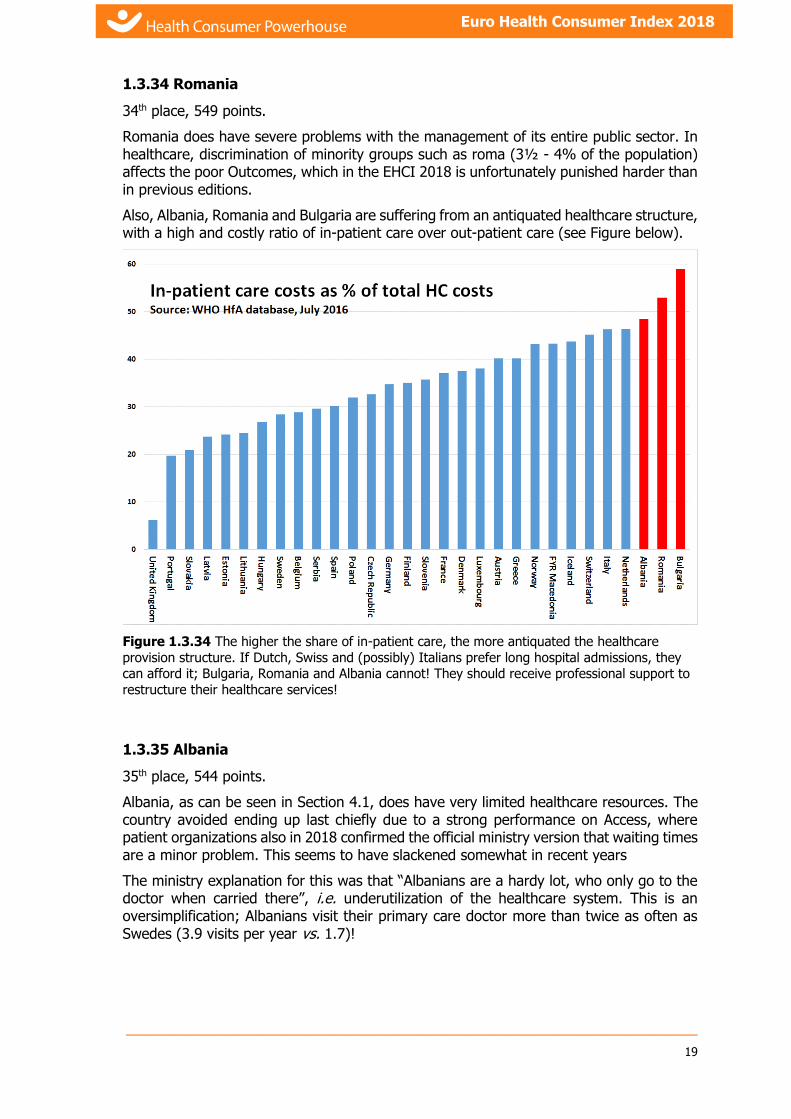
Also, Albania, Romania and Bulgaria are suffering from an antiquated healthcare structure, with a high and costly ratio of in-patient care over out-patient care (see Figure below).
Figure 1.3.34 The higher the share of in-patient care, the more antiquated the healthcare
provision structure. If Dutch, Swiss and (possibly) Italians prefer long hospital admissions, they can afford it; Bulgaria, Romania and Albania cannot! They should receive professional support to
restructure their healthcare services!
1.3.35 Albania
35th place, 544 points.
Albania, as can be seen in Section 4.1, does have very limited healthcare resources. The country avoided ending up last chiefly due to a strong performance on Access, where patient organizations also in 2018 confirmed the official ministry version that waiting times are a minor problem. This seems to have slackened somewhat in recent years
The ministry explanation for this was that “Albanians are a hardy lot, who only go to the doctor when carried there”, i.e. underutilization of the healthcare system. This is an oversimplification; Albanians visit their primary care doctor more than twice as often as Swedes (3.9 visits per year vs. 1.7)!
___________________________________________________________________________
20
Euro Health Consumer Index 2018
1.4 Tighter Outcomes criteria shows wealth gap in European healthcare
The top end of the ranking in 2018 is showing a concentration of the wealthier countries, which is more obvious than in previous editions. This is largely an effect of tightening the score criteria, not least for Outcomes, where Green scores since the 2017 edition are limited to countries providing clinical excellence. It has been observed in previous EHCI editions, and certainly in the HCP Euro Heart Index10, that really good Outcomes are connected to financial resources.
1.4.1 Outcomes quality keeps improving essentially everywhere
Indicators such as Cancer Survival or Infant Mortality keep showing improvement over time. This is true also for countries such as the Baltic states, which have undergone a financial “steel bath”, in every way comparable with that hit southern Europe or Ireland. As an example, both Latvia and Lithuania have shown remarkable improvement in Infant Mortality right during the period of the worst austerity measures. Montenegro has taken over from Iceland for the lowest Infant Mortality rates!
This is probably a positive effect of doctors being notoriously difficult to manage – signals from managers and/or politicians are frequently not listened to very attentively. This would be particularly true about providing shoddy medical quality as this would expose doctors to peer criticism, which in most cases is a stronger influencing factor than management or budget signals.
1.4.2 Delays and/or restrictiveness on the introduction of novel pharmaceuticals
As is shown by Indicators 6.3 – 6.5 (section 7.10.6), saving on the introduction/deployment of drugs, particularly novel, patented (expensive) drugs, seems to be a very popular tactic for containing healthcare costs in many countries. This has been observed also in previous HCP Indices11.
This is particularly obvious for Greece – a country, which traditionally has been a quick and ready adopter of novel drugs. The Greek public bill for prescription drugs was 8 billion euro as late as 2010, for 11 million people. As a comparison, the Swedish corresponding number was 4 billion euros for 9½ million people – and drug prices have traditionally been lower in Greece. That Greek readiness to introduce new drugs has dropped dramatically, along with the introduction of generic substitution.
Still, the Greek drug consumption by monetary value was the third highest in Europe as late as 2012! By 2014, that had shrunk to be the 11th highest.
10 https://healthpowerhouse.com/publications/euro-heart-index-2016/
11 The Euro Hepatitis Index 2012, http://www.healthpowerhouse.com/files/euro-hepatitis-index-2012/Report-Hepl-HCP-121104-2-w-Cover.pdf

___________________________________________________________________________
21
Euro Health Consumer Index 2018
1.5 BBB; Bismarck Beats Beveridge – now a permanent
feature
The Netherlands example seems to be driving home the big, final nail in the coffin of Beveridge healthcare systems, and the lesson is clear: Remove politicians and other amateurs from operative decision-making in what might well be the most complex industry on the face of the Earth: Healthcare! Beveridge systems seem to be operational with good results only in small population countries such as Iceland, Denmark and Norway.
1.5.1 So what are the characteristics of the two system types?
All public healthcare systems share one problem: Which technical solution should be used to funnel typically 8 – 11 % of national income into healthcare services?
Bismarck healthcare systems: Systems based on social insurance, where there is a multitude of insurance organisations, Krankenkassen etc, who are organisationally independent of healthcare providers.
Beveridge systems: Systems where financing and provision are handled within one organisational system, i.e. financing bodies and providers are wholly or partially within one organisation, such as the NHS of the UK, counties of Nordic states etc.
For more than half a century, particularly since the formation of the British NHS, the largest Beveridge-type system in Europe, there has been intense debating over the relative merits of the two types of system.
Already in the EHCI 2005, the first 12-state pilot attempt, it was observed that “In general, countries which have a long tradition of plurality in healthcare financing and provision, i.e. with a consumer choice between different insurance providers, who in turn do not discriminate between providers who are private for-profit, non-profit or public, show common features not only in the waiting list situation …”
Looking at the results of the EHCI 2006 – 2018, it is very hard to avoid noticing that the top consists of dedicated Bismarck countries, with the small-population and therefore more easily managed Beveridge systems of the Nordic countries squeezing in. Large Beveridge systems seem to have difficulties at attaining really excellent levels of customer value. The largest Beveridge countries, the U.K., Spain and Italy, keep clinging together in the middle of the Index. There could be (at least) two different explanations for this:
1. Managing a corporation or organisation with 100 000+ employees calls for considerable management skills, which are usually very handsomely rewarded. Managing an organisation such as the English NHS, with close to 1½ million staff, who also make management life difficult by having a professional agenda, which does not necessarily coincide with that of management/administration, would require absolutely world class management. It is doubtful whether public organisations offer the compensation and other incentives required to recruit those managers.
2. In Beveridge organisations, responsible both for financing and provision of healthcare, there would seem to be a risk that the loyalty of politicians and other top decision makers could shift from being primarily to the customer/patient. Primary loyalty could shift in favour of the organisation these decision makers, with justifiable pride, have been building over decades, with justifiable pride, have been building over decades (or possibly to aspects such as the job-creation potential of such organisations in politicians’ home towns).

___________________________________________________________________________
22
Euro Health Consumer Index 2018
2. Introduction
The Health Consumer Powerhouse (HCP) has become a centre for visions and action promoting consumer-related healthcare in Europe. “Tomorrow’s health consumer will not accept any traditional borders”, we declared in last year’s report, but it seems that this statement is already becoming true; the 2011 EU Directive for patients’ rights to cross-border care is an excellent example of this trend. In order to become a powerful actor, building the necessary reform pressure from below, the consumer needs access to knowledge to compare health policies, consumer services and quality outcomes. The Euro Health Consumer Indexes are efforts to provide healthcare consumers with such tools. Not only do consumers gain from the transparency of benchmarking, the quality and function of healthcare systems improve as outcomes are displayed and analysed in an open, systematic, and repeated fashion.
This understanding now seems to be shared by the European Commission, during 2016 initiating the formation of an assessment system aimed to identifying successful national health systems. The ultimate purpose is said to be strengthening pan-EU best practices to provide better for value healthcare.
2.1 Background
Since 2004 the HCP has been publishing a wide range of comparative publications on healthcare in various countries. First, the Swedish Health Consumer Index in 2004 (also in an English translation). By ranking the 21 county councils by 12 basic indicators concerning the design of ”systems policy”, consumer choice, service level and access to information we introduced benchmarking as an element in consumer empowerment. In two years’ time this initiative had inspired – or provoked – the Swedish Association of Local Authorities and Regions together with the National Board of Health and Welfare to start a similar ranking, making public comparisons an essential Swedish instrument for change.
For the pan-European indexes in 2005 – 2008, HCP aimed to basically follow the same approach, i.e. selecting a number of indicators describing to what extent the national healthcare systems are “user-friendly”, thus providing a basis for comparing different national systems.
Furthermore, since 2008 the HCP has enlarged the existing benchmarking program considerably:
In January 2008, the Frontier Centre and HCP released the first Euro-Canada Health Consumer Index, which compared the health care systems in Canada and 29 European countries. The 2009 edition was released in May, 2009.
The Euro Consumer Heart Index, launched in July 2008, compares 29 European cardiovascular healthcare systems in five categories, covering 28 performance indicators. A new edition was published in 2016, with a special extension on Secondary Prevention in 2017.
The first edition of Canada Health Consumer Index was released in September 2008 in co-operation with Frontier Centre for Public Policy, examining healthcare from the perspective of the consumer at the provincial level, and repeated 2009 and 2010.
The Euro Consumer Diabetes Index, launched in September 2008, provided the first ranking of European diabetes healthcare services across five key areas:

___________________________________________________________________________
23
Euro Health Consumer Index 2018
Information, Consumer Rights and Choice; Generosity, Prevention; Access to Procedures and Outcomes. A new edition was published 2014.
Other Indexes published include the Euro HIV Index 2009, the Euro Headache Index 2012 and the Euro Hepatitis Index 2012.
This year's edition of Euro Health Consumer Index covers 48 (+ a COPD mortality indicator) healthcare performance indicators for 35 countries.
Though still a somewhat controversial standpoint, HCP advocates that quality comparisons within the field of healthcare is a true win-win situation. To the consumer, who will have a better platform for informed choice and action. To governments, authorities and providers, the sharpened focus on consumer satisfaction and quality outcomes will support change. To media, the ranking offers clear-cut facts for consumer journalism with some drama into it. This goes not only for evidence of shortcomings and method flaws but also illustrates the potential for improvement. With such a view the EHCI is designed to become an important benchmark system supporting interactive assessment and improvement.
As we heard one of the Ministers of health saying when seeing his country’s preliminary results: “It´s good to have someone still telling you: you could do better.”
2.2 Index scope
The aim has been to select a limited number of indicators, within a definite number of evaluation areas, which in combination can present a telling tale of how the healthcare consumer is being served by the respective systems.
2.3 About the authors
Project Management for the EHCI 2018 has been executed by Prof. Arne Björnberg, Ph.D., Executive Chairman of the Health Consumer Powerhouse.
Dr. Björnberg has previous experience from Research Director positions in Swedish industry. His experience includes having served as CEO of the Swedish National Pharmacy Corporation (”Apoteket AB”), Director of Healthcare & Network Solutions for IBM Europe Middle East & Africa, and CEO of the University Hospital of Northern Sweden (“Norrlands Universitetssjukhus”, Umeå).
Dr. Björnberg was also the project manager for the EHCI 2005 – 2017 projects, the Euro Consumer Heart Index 2008 and numerous other Index projects.
Dr. Björnberg is Visiting Professor at the European Center for Peace and Development, a faculty of the United Nations’ University of Peace.
Ann Yung Phang, RN, B.A. is an intensive care nurse with over 18 years of critical care experience. She has practised in multi international acute hospital settings, including the London Hammersmith NHS trust and The Great Ormond Street Children’s hospital in the cardiac intensive care unit in London. Later she moved to the USA and worked as a general and cardiac intensive care nurse for children at Lucille Salter Packard Children’s Hospital Stanford in California. After California she moved to Hawaii and practiced critical care nursing there for both adults and children. In between this she has participated in mission trips as a part of a team providing cardiac surgery for children in developing countries. She is still actively working as a critical nurse in the USA.

___________________________________________________________________________
24
Euro Health Consumer Index 2018
3. Results of the Euro Health Consumer Index 2018

___________________________________________________________________________
25
Euro Health Consumer Index 2018

___________________________________________________________________________
26
Euro Health Consumer Index 2018
3.1 Results Summary
Figure 3.2 EHCI 2018 total scores.
This 12th attempt at creating a comparative index for national healthcare systems has confirmed that there is a group of EU member states, which all have good healthcare systems seen from the customer/consumer’s point of view.
The scoring has intentionally been done in such a way that the likelihood that two states should end up sharing a position in the ranking is almost zero (actually no shared positions in 2018). It must therefore be noted that great efforts should not be spent on in-depth analysis of why one country is in 15th place, and another in 17th. Very subtle changes in single scores can modify the internal order of countries, particularly in the middle of the ranking list, and in the EHCI 2018 also for positions 7 – 12.
The scoring criteria have been tightened on some indicators in the EHCI 2018, in order to keep the Index challenging. Nevertheless, there are 8 Western European countries making it into the “800 Club”, i.e. scoring more than 800 out of the theoretical maximum of 1000 (“All Green on every indicator), with three more within 4 points of 800. The EHCI 2017 and 2018 reward real clinical excellence more than previous editions, creating a visible gap between the more affluent and the other countries (31 points between #12 Germany and #13 Portugal.
The EHCI 2018 total ranking of healthcare systems, for the first time in a decade, does not have The Netherlands as the winner as it lost 41 points by the introduction of the two new Mental Healthcare-related indicators (now 883 points. The top position in 2018 was taken by Switzerland, which lost only 5 points in the tightening of score criteria, scoring 893 points out of 1000.
It seems very difficult to build an Index of the HCP type without ending up with The Netherlands on the medallists’ podium, creates a strong temptation to actually claim that

___________________________________________________________________________
27
Euro Health Consumer Index 2018
the winner of the EHCI 2018 could indeed be said to have “the best healthcare system in Europe”. There should be a lot to learn from looking deeply into the Dutch progress!
Switzerland has for a long time had a reputation for having an excellent healthcare system, and it therefore comes as no surprise that the more profound research which eliminated most n.a. scores results in a top position in the EHCI.
Bronze medallist is Norway (857 points), which has been steadily climbing in the EHCI., Norway and Switzerland (with Finland) score highest on Outcomes. Were it not for the Norwegian loss of 87 points on Accessibility, Norway would be the supreme winner!
Denmark, (in spite of not winning any sub-discipline) is 4th at 855 points.
In southern Europe, Spain and Italy provide healthcare services where medical excellence can be found in many places. Real excellence in southern European healthcare seems to be a bit too much dependent on the consumers' ability to afford private healthcare as a supplement to public healthcare. Also, both Spain and Italy show large regional variation, which tends to result in a lot of Amber scores for these countries.
Portugal keeps climbing steadily in the EHCI, in 2018 being alone in a “no man’s land” as #13; 31 points behind Germany, and 23 points ahead of the Czech Republic.
Some eastern European EU member systems are doing surprisingly well, particularly the Czech Republic, Estonia and Serbia, considering their much smaller healthcare spend in Purchasing Power adjusted dollars per capita. However, readjusting from politically planned to consumer-driven economies does take time.
Generally European healthcare continues to improve but medical outcomes statistics is still appallingly poor in many countries.
If healthcare officials and politicians took to looking across borders, and to "stealing" improvement ideas from their European colleagues, there would be a good chance for a national system to come much closer to the theoretical top score of 1000.
3.1.1 Country scores
With the possible exception of Switzerland and The Netherlands, there are no countries, which excel across the entire range of EHCI indicators. The national scores seem to reflect more of “national and organisational cultures and attitudes”, rather than mirroring how large resources a country is spending on healthcare. The cultural streaks have in all likelihood deep historical roots. Turning a large corporation around takes a couple of years – turning a country around can take decades!
____________________________________________________________________________________________________
28
3.1.2 Results in “Hexathlon”
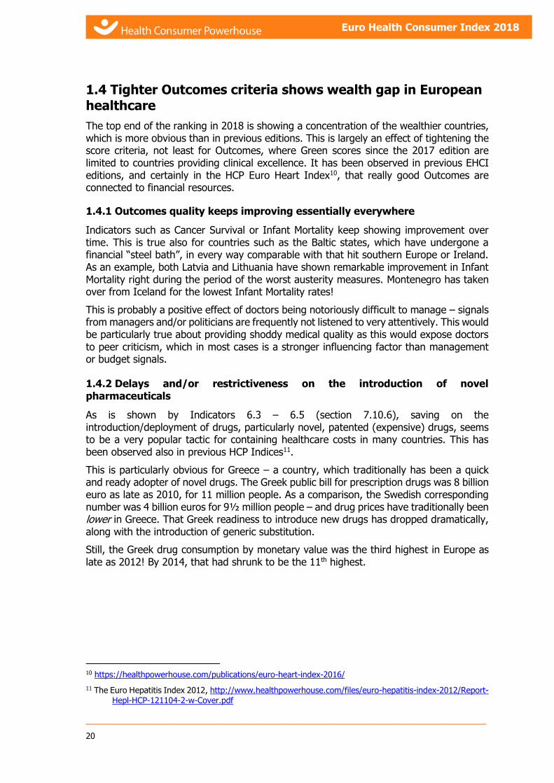
The EHCI 2018 is made up of six sub-disciplines. As no country excels across all aspects of measuring a healthcare system, it can therefore be of interest to study how the 35 countries rank in each of the six parts of the “hexathlon”. The scores within each sub-discipline are summarized in the following table:
As the table indicates, the total top position of the Swiss healthcare system is to a great extent a product of an even performance across the sub-disciplines, very good medical quality and excellent Accessibility. Switzerland is in top position for Accessibility, with Belgium, Serbia and Bulgaria(!) right behind. No country scores All Green on Outcomes. The Swedish healthcare system would be a real top contender, scoring high on Range & Reach of Services along with the NL, were it not for an accessibility situation, which by Swiss standards can only be described as abysmal.
Sub-discipline Top country/countries Score Maximum score
1. Patient rights and information
Netherlands, Norway 125! 125
2. Accessibility Switzerland 225! 225
3. Outcomes Finland, Norway, Switzerland 278 300
4. Range and reach of services Netherlands, Sweden 125! 125
5. Prevention Norway 119 125
6. Pharmaceuticals Germany, Netherlands 89 100

_____________________________________________________________
29
Euro Health Consumer Index 2018
4. Bang-For-the-Buck adjusted scores
With all 28 EU member states and seven other European countries included in the EHCI project, it becomes apparent that the Index tries to compare states with very different financial resources. The annual healthcare spending, in PPP-adjusted (Purchasing Power Parity) US dollars, varies from just over $700 in Albania to above $6000 in Norway, and Switzerland. Continental Western Europe and Nordic countries generally fall between $3000 and $5000. As a separate exercise, the EHCI 2018 has added a value for money-adjusted score: the Bang-For-the-Buck adjusted score, or “BFB Score”.
4.1 BFB adjustment methodology
It is not obvious how to make such an adjustment. If scores would be adjusted in full proportion to healthcare spend per capita, the effect would simply be to elevate all less affluent states to the top of the scoring sheet. This, however, would be decidedly unfair to the financially stronger states. Even if healthcare spending is PPP (Purchasing Power Parity) adjusted, it is obvious that also PPP dollars go a lot further to purchase healthcare services in member states, where the monthly salary of a nurse is € 300, than in states where nurse’s salaries exceed € 4000. For this reason, the PPP adjusted scores have been calculated as follows:
Healthcare spends per capita in PPP dollars have been taken from the WHO Global Health Expenditure database (January 2019; latest available numbers, all 2016) as illustrated in the graph below:
Figure 4.1 WHO Global Health Expenditure database (January 2019).
For each country has been calculated the square root of this number. The reason for this is that domestically produced healthcare services are cheaper roughly in proportion to the healthcare spend. The basic EHCI scores have been divided by this square root. For this exercise, the basic scoring points of 3, 2 and 1 have been replaced by 2, 1 and 0. In the

_____________________________________________________________
30
Euro Health Consumer Index 2018
basic EHCI, the minimum score is 333 and the maximum 1000. With 2, 1 and 0, this does not (or only very marginally) change the relative positions of the 35 countries, but is necessary for a value-for-money adjustment – otherwise, the 333 “free” bottom points have the effect of just catapulting the less affluent countries to the top of the list.
The score thus obtained has been multiplied by the arithmetic means of all 35 square roots (creating the effect that scores are normalized back to a similar numerical value range to the original scores).
4.2 Results in the BFB Score sheet
The outcome of the BFB exercise is shown in the graphic below. Even with the square root exercise described in the previous section, the effect is to dramatically elevate many less affluent nations in the scoring sheet.
Figure 4.2 The BFB scores, naturally, are to be regarded as somewhat of an academic exercise.
Not least the method of adjusting to the square root of healthcare spent certainly lacks scientific
support.
With the great score increase on reduced Waiting Times, Serbia and North Macedonia are rewarded for the increased Accessibility scores. As is shown in Section 5.3, there is essentially no correlation between Accessibility and financial resources!
Ireland, the UK, Sweden and Norway get penalized for their poor Accessibility scores.
_____________________________________________________________
31
Euro Health Consumer Index 2018
5. Trends over the 12 years
The tightening of score limits to keep the EHCI challenging disturbed the longitudinal analysis into 2017, which is why that has not been made. However, the previous ten years have shown that European healthcare has been continuously improving also right through conditions such as the 2008 financial crisis.
5.1 Ranking strictly relative – a lower position does not necessarily mean deterioration of services
That some countries have a downward trend among other countries cannot be interpreted in the way that their healthcare systems have become worse over the time studied – only that they have developed less positively than the European average!
5.2 Healthcare Quality Measured as Outcomes
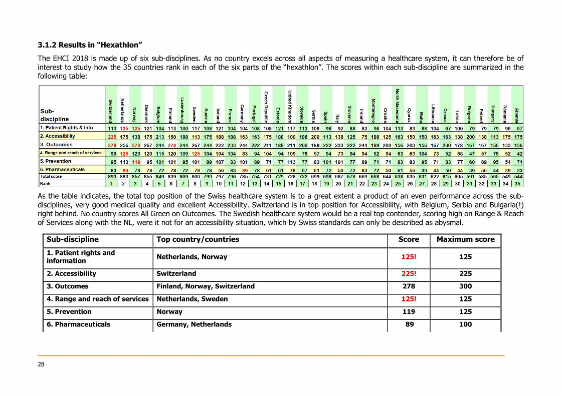
For a detailed view of the results indicators, please see section 7.10.3. Generally it is important to note that regardless of financial crises and austerity measures, treatment results in European healthcare keep improving. Perhaps the best single indicator on healthcare quality, 3.3 Infant deaths, where the cut-offs between Red/Amber/Green scores were kept constant 2006 – 2016, showed an increase in the number of Green scores from 9 in 2006 to 24 in 2016. The figure below shows the “healthcare quality map” of Europe based on the Outcomes sub-discipline scores in EHCI 2018:
_____________________________________________________________
32
Euro Health Consumer Index 2018
Even to the naked eye, it is obvious that being wealthy helps to produce good results in healthcare, even if money is not the only explanation for the results on Outcomes. There is no low-income country in the “Green” territory.
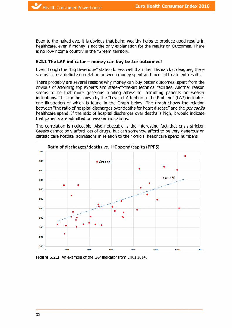
5.2.1 The LAP indicator – money can buy better outcomes!
Even though the “Big Beveridge” states do less well than their Bismarck colleagues, there seems to be a definite correlation between money spent and medical treatment results.
There probably are several reasons why money can buy better outcomes, apart from the obvious of affording top experts and state-of-the-art technical facilities. Another reason seems to be that more generous funding allows for admitting patients on weaker indications. This can be shown by the “Level of Attention to the Problem” (LAP) indicator, one illustration of which is found in the Graph below. The graph shows the relation between “the ratio of hospital discharges over deaths for heart disease” and the per capita healthcare spend. If the ratio of hospital discharges over deaths is high, it would indicate that patients are admitted on weaker indications.
The correlation is noticeable. Also noticeable is the interesting fact that crisis-stricken Greeks cannot only afford lots of drugs, but can somehow afford to be very generous on cardiac care hospital admissions in relation to their official healthcare spend numbers!
Figure 5.2.2. An example of the LAP indicator from EHCI 2014.

_____________________________________________________________
33
Euro Health Consumer Index 2018
5.3 Waiting lists: A Mental Condition affecting healthcare staff and administrators?
Over the years, one fact becomes clear: gatekeeping means waiting. Contrary to popular belief, direct access to specialist care does not generate access problems to specialists by the increased demand; repeatedly, waiting times for specialist care are found predominately in systems requiring referral from primary care, which seems to be rather an absurd observation.
Figure 5.3a. “Waiting time territory” (red) and Non-wait territory (green) based on EHCI 2018 scores.
Also visible to the naked eye, there is a striking absence of a financial connection with good waiting time situation in healthcare. This could explain the limited effect of showering a billion euros over Swedish County Councils to make them reduce waiting times.

_____________________________________________________________
34
Euro Health Consumer Index 2018
It seems that waiting times for healthcare services are a mental condition affecting healthcare administrators and professionals rather than a scarcity of resources problem. It must be an interesting behavioural problem to understand how an empathic profession such as paediatric psychiatrists can become accustomed to telling patients and their parents that the waiting time for an appointment is in the order of one year for a child with psychiatric problems (a common occurrence in Sweden)!
One of the most characteristic systems for GP gatekeeping, the NHS in the UK, spent millions of pounds, starting in 2008, on reducing waiting and introduced a maximum of 18 weeks to definitive treatment after diagnosis. The patient survey commissioned by the HCP for the 2012 and 2013 Indices did show improvement, much of which seems to have been lost by 2018.
This is different from Ireland, where patient organisation survey responses are still much more negative than (the very detailed) official waiting time data. For this reason, after several years of accepting official Irish waiting time statistics, the EHCI since 2015 has scored Ireland on patients’ versions of waiting times.
HCP will continue to advocate the free choice, equal and direct access and measures intended to diminish the information handicap of the consumer as cornerstones of 21st century modern European healthcare.
5.3.1 Why is there no correlation between accessibility and money?
Answer: Because it is inherently cheaper to run a healthcare system without waiting lists than having waiting lists! Contrary to popular belief, not least among healthcare politicians, waiting lists do not save money – they cost money!
Healthcare is basically a process industry. As any professional manager from such an industry would know, smooth procedures with a minimum of pause or interruption is key to keeping costs low!
5.3.2 The “good old days” that never were!
Why are the traces of the “financial crisis” so comparatively modest, particularly regarding medical treatment results (Outcomes)? One fundamental reason is that healthcare traditionally used to be very poor at monitoring output, which leads healthcare staff, politicians and the public to overestimate the service levels of yesteryear!
Cost-cutting in healthcare was not talked about much until the early 1990’s, and the economic downturn at that time, which forced serious cost-cutting more or less for the first time in decades. Before 1990, healthcare politicians’ main concern used to be “How do we prioritize the 2 – 3% annual real-term increase of resources?”
In waiting time territory such as Scandinavia and the British Isles, the waiting list situation was decidedly worse not only 10 – 15 years ago, but most certainly also before 1990. Interviews with old-timer doctors and nurses frequently reveal horror stories of patients all over corridors and basements, and this from the “good old days” before the financial crisis.
5.4 Under-the-table payments
Even more notable: one of the indicators, introduced for the first time in 2008, is asking whether patients are expected to make informal payments to the doctor in addition to any

_____________________________________________________________
35
Euro Health Consumer Index 2018
official fees. Under-the-table payments serve in some (rather surprising Western European) countries as a way to gain control over the treatment: to skip the waiting list, to access excellence in treatment, to get benefit of modern methods and medicines.
The cross-European survey on informal payments remains, in spite of its obvious imperfections, the only study ever done on all of Europe, which also illustrates the low level of attention paid by nations and European institutions to the problem of parallel economy in healthcare.
This observation gives reason for two questions:
1. Unlike other professionals, such as airline pilots, lawyers, systems engineers etc, working for large organisations, doctors are unique in being allowed to run side jobs without the explicit permission of the main employer. What is the reason(s) for keeping that?
2. What could be done to give doctors “normal” professional employment conditions, i.e. a decent salary and any extra energy spent on working harder (yes, and making more money) for their main employer, instead of disappearing to their side practices, frequently leaving large hospitals standing idle for lack of key personnel?
5.5 "MDD - the Endemic Condition Crippling European Healthcare"
MDD stands for “Management Deficiency Disorder”.
5.5.1 Performance of European healthcare systems
Since 2005, the Health Consumer Powerhouse has been analysing and ranking the performance of European national healthcare systems12. Since 2008, this ranking has been topped by the same healthcare system: that of The Netherlands, until overtaken by Switzerland in 2018. Although the HCP have continually expanded the Index (the latest edition contains 46 indicators for 35 countries), the victory margin for The NL kept increasing to the unprecedented 50 points in 2012. What is particularly encouraging is that this top position was very likely connected with the 2006 healthcare reform in The NL, which had at least two important parts:
a) The introduction of managed competition between 10 private healthcare insurers, who are not allowed to decline taking on any patient. The state supplements extra premiums for people with chronic conditions or otherwise elevated health risk.
b) Politicians deliberately backing out of operative decision making in healthcare, which is left largely to the medical profession, who are legally obliged to counsel with patient organisation representatives. The result of this can be described as a significant net gain in management capacity, i.e. a relief of MDD!
Even though the Dutch healthcare system is rather expensive per capita as shown above (Figure 4.1), The NL is still holding up very well in the value-for-money adjusted version of the EHCI (Figure 4.2). This supports the hypothesis that the top position of the Dutch
12 https://healthpowerhouse.com/en/
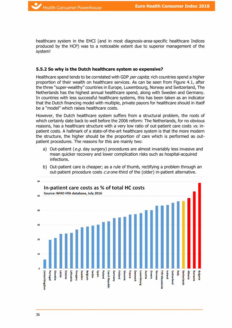
_____________________________________________________________
36
Euro Health Consumer Index 2018
healthcare system in the EHCI (and in most diagnosis-area-specific healthcare Indices produced by the HCP) was to a noticeable extent due to superior management of the system!
5.5.2 So why is the Dutch healthcare system so expensive?
Healthcare spend tends to be correlated with GDP per capita; rich countries spend a higher proportion of their wealth on healthcare services. As can be seen from Figure 4.1, after the three “super-wealthy” countries in Europe, Luxembourg, Norway and Switzerland, The Netherlands has the highest annual healthcare spend, along with Sweden and Germany. In countries with less successful healthcare systems, this has been taken as an indicator that the Dutch financing model with multiple, private payors for healthcare should in itself be a “model” which raises healthcare costs.
However, the Dutch healthcare system suffers from a structural problem, the roots of which certainly date back to well before the 2006 reform: The Netherlands, for no obvious reasons, has a healthcare structure with a very low ratio of out-patient care costs vs. in-patient costs. A hallmark of a state-of-the-art healthcare system is that the more modern the structure, the higher should be the proportion of care which is performed as out-patient procedures. The reasons for this are mainly two:
a) Out-patient (e.g. day surgery) procedures are almost invariably less invasive and mean quicker recovery and lower complication risks such as hospital-acquired infections.
b) Out-patient care is cheaper; as a rule of thumb, rectifying a problem through an out-patient procedure costs c:a one-third of the (older) in-patient alternative.
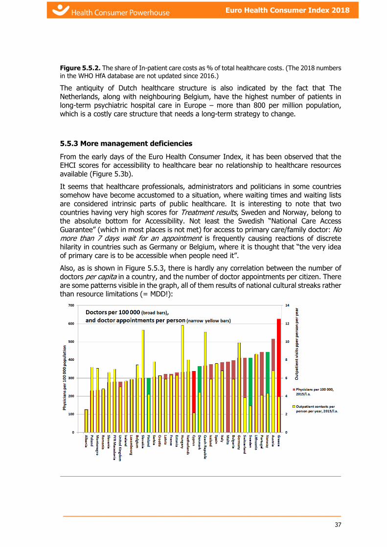
_____________________________________________________________
37
Euro Health Consumer Index 2018
Figure 5.5.2. The share of In-patient care costs as % of total healthcare costs. (The 2018 numbers
in the WHO HfA database are not updated since 2016.)
The antiquity of Dutch healthcare structure is also indicated by the fact that The Netherlands, along with neighbouring Belgium, have the highest number of patients in long-term psychiatric hospital care in Europe – more than 800 per million population, which is a costly care structure that needs a long-term strategy to change.
5.5.3 More management deficiencies
From the early days of the Euro Health Consumer Index, it has been observed that the EHCI scores for accessibility to healthcare bear no relationship to healthcare resources available (Figure 5.3b).
It seems that healthcare professionals, administrators and politicians in some countries somehow have become accustomed to a situation, where waiting times and waiting lists are considered intrinsic parts of public healthcare. It is interesting to note that two countries having very high scores for Treatment results, Sweden and Norway, belong to the absolute bottom for Accessibility. Not least the Swedish “National Care Access Guarantee” (which in most places is not met) for access to primary care/family doctor: No more than 7 days wait for an appointment is frequently causing reactions of discrete hilarity in countries such as Germany or Belgium, where it is thought that “the very idea of primary care is to be accessible when people need it”.
Also, as is shown in Figure 5.5.3, there is hardly any correlation between the number of doctors per capita in a country, and the number of doctor appointments per citizen. There are some patterns visible in the graph, all of them results of national cultural streaks rather than resource limitations (= MDD!):

_____________________________________________________________
38
Euro Health Consumer Index 2018
Figure 5.5.3. Doctors per 100 000 population (broad bars) and doctor appointments per citizen
per year (narrow bars).
Slovakians, Czechs and Hungarians go to the doctor more than all other nations.
All the five Nordic nations (green broad bars in the graph), including Denmark, which enjoys a high degree of appreciation for its family doctor system among its people, seem to burden their doctors rather sparingly, along with the Portuguese and Maltese. NB: Portugal is the only European country having had worse access to primary care doctors than Sweden – the target for primary care doctor appointment waiting time in Portugal used to be “no more than 15 days”.
Austrian doctors do not seem overburdened with patients.
Greeks (having by far the highest number of doctors per capita in Europe) and Cypriots seem to trouble their doctors even less, or “Could that possibly be tax evasion-induced under-reporting of appointments?” More MDD!
5.5.4 Still more cases of MDD
All anomalies in European healthcare, which are the result of national/local idiosyncrasies (= MDD!) would take days to list. Here, only a few examples are given:
Performance-based financing (PBF) systems (basically an absolutely essential idea!) designed by (and for?) lemurs, with managers abdicating and expecting Excel to do the management for them.
o Frequently, PBF systems are distorted in Beveridge countries by high-cost hospitals receiving more money for the same service that more cost-effective hospitals! University hospitals seem particularly good at convincing politicians that “We are so special, so we need more money!”
NPM (New Public Management – potentially a good idea) handled by people, who never were within sniffing distance of a professionally run corporation; “watching the tradespeople ape their betters”13.
Norway (!) for a long time used to belong to the worst under-users of late generation cancer drugs.
The U.K. is underinvested in radiation treatment and drug deployment, which is reflected in poorer cancer survivals rates than in financially comparable countries.
German kidney patients have poor access to forms of dialysis, which the patient can do at home. This is presumably due to clinic-bound dialysis being very profitable. Home dialysis is not only roughly half as expensive per treatment year – survival rates are superior, as patients tend to treat themselves 6 – 7 times per week instead of the standard 3 in clinics.
There are four countries which historically have had a high drug use (in monetary value), none of which is for clinical reasons:
o Greece – lots of doctors, who all have ballpoint pens.
o Ireland – the most generous drug subsidies in Europe.
13 Kipling, R. Kim, 1901
_____________________________________________________________
39
Euro Health Consumer Index 2018
o Iceland – 300 000 people being hit by the industry with the “full” costs of providing registration and drug packs in an archaic language.
o France – anybody heard of anybody escaping from a French doctor appointment without a prescription?
This list could be extended for several pages!
5.5.5 Can MDD be cured?
There is good news and bad news. The good news is: Yes, it can! The therapies have been around for 3500 years14 and therefore are off patent! The bad news is (as with many medical conditions): the problem is not finding the treatment, it is patient compliance. Very few countries can show politicians with the Dutch courage to back out of operative decision making and stay on the strategic level.
The large research and teaching hospital is probably the most complex organisation created by Man, with multiple objectives, a very multi-faceted “business idea” and staffed by people, who like all professionals have their own professional agenda, which can sometimes be difficult to make coincide with the “business agenda” of the organisation. Healthcare therefore needs and deserves superior management, instead of being run by amateurs (politicians) with little experience and less training at running large complex organisations. The therapy could be:
1. Design and install performance-based financing systems. No human activities should be financed for just being around!
2. Appoint professional managers, and this means Leaders of People, not accountants or finance analysts! In many European countries, the hospital CEO is nothing but a Head Paper Shuffler. It is enough to ask the simple control question: “Can the CEO hire or fire heads of clinics?” In many countries, this is handled in a committee system = “You scratch my back, and I’ll scratch yours.” Firing people is of course not something a professional manager should need to do frequently, but it is still a useful control question.
3. A professional manager does not believe that Excel can do the necessary decision-making. The main task for professional managers15 is to see to it that people and organisation parts who do well are rewarded, and those who do less well are helped, corrected or (in a few extreme cases) replaced.
4. After these things are in place, the most important task for the hospital CEO is to stand in the main entrance of the hospital, equipped with a stool and a whip, keeping amateurs (including bureaucrats and politicians) out, to let the professionals get on with it!
6. How to interpret the Index results?
The first and most important consideration on how to treat the results is: with caution!
14 Exodus 18:13-27, approx. 1513 B.C.
15 Blanchard, K. & Johnson, S. The One-Minute Manager, 1981.

_____________________________________________________________
40
Euro Health Consumer Index 2018
The Euro Health Consumer Index 2018 is an attempt at measuring and ranking the performance of healthcare provision from a consumer viewpoint. The results definitely contain information quality problems. There is a shortage of pan-European, uniform set procedures for data gathering.
Again, the HCP finds it far better to present the results to the public, and to promote constructive discussion rather than staying with the only too common opinion that as long as healthcare information is not a hundred percent complete it should be kept in the closet. Again, it is important to stress that the Index displays consumer information, not medically or individually sensitive data.
While by no means claiming that the EHCI 2018 results are dissertation quality, the findings should not be dismissed as random findings. The Index is built from the bottom up – this means that countries who are known to have quite similar healthcare systems should be expected not to end up far apart in the ranking. This is confirmed by finding the Nordic countries in a fairly tight cluster, England and Scotland clinging together as are the Czech Republic and Slovakia, Greece and Cyprus.
Previous experience from the general Euro Health Consumer Indexes reflects that consumer ranking by similar indicators is looked upon as an important tool to display healthcare service quality. The HCP hopes that the EHCI 2018 results can serve as inspiration for how and where European healthcare can be improved.
7. Evolvement of the Euro Health Consumer Index
7.1 Scope and content of EHCI 2005
Countries included in the EHCI 2005 were: Belgium, Estonia, France, Germany, Hungary, Italy, the Netherlands, Poland, Spain, Sweden, the United Kingdom and, for comparison, Switzerland.
To include all 25 member states right from the start would have been a very difficult task, particularly as many memberships were recent, and would present dramatic methodological and statistic difficulties
The EHCI 2005 was seeking a representative sample of large and small, long-standing and recent EU membership states.
As already indicated, the selection criteria had nothing to do with healthcare being publicly or privately financed and/or provided. For example, the element of private providers is specifically not at all looked into (other than potentially affecting access in time or care outcomes).
7.2 Scope and content of EHCI 2006 – 2017
The EHCI 2006 included all the 25 EU member states of that time plus Switzerland, using essentially the same methodology as in 2005.
The number of indicators was also increased, from 20 in the EHCI 2005 to 28 in the 2006 issue. The number of sub-disciplines was kept at five; with the change that the “Customer
_____________________________________________________________
41
Euro Health Consumer Index 2018
Friendliness” sub-discipline was merged into “Patient Rights and Information”. The new sub-discipline “Generosity” (What is included in the public healthcare offering?) was introduced, as it was commented from a number of observers, not least healthcare politicians in countries having pronounced waiting time problems, that absence of waiting times could be a result of “meanness” – national healthcare systems being restrictive on who gets certain operations could naturally be expected to have less waiting list problems.
In order to test this, the new sub-discipline “Generosity” of public healthcare systems, in 2009 called “Range and reach of services”, was introduced. A problem with this sub-discipline is that it is only too easy to land in a situation, where an indicator becomes just another way of measuring national wealth (GDP/capita). The suggested indicator “Number of hip joint replacements per 100 000 inhabitants” is one prominent example of this. The cost per operation of a hip joint is in the neighbourhood of € 7000 (can be more in Western Europe – less in states with low salaries for healthcare staff). That cost, for a condition that might be crippling but not life-threatening, results in provision levels being very closely correlated to GDP/capita.
To achieve a higher level of reliability of information, one essential work ingredient has been to establish a net of contacts directly with national healthcare authorities in a more systematic way than was the case for previous EHCI editions. The weaknesses in European healthcare statistics described in previous EHCI reports can only be offset by in-depth discussions with key personnel at a national healthcare authority level.
In general, the responsiveness from Health Ministries, or their state agencies in charge of supervision and/or Quality Assurance of healthcare services, was good in 2006 – 2008. Written responses were received from 19 EU member states. This situation greatly improved in 2009 – 2012 and stayed very positive until and including 2017 (see section 8.9.2).
7.3 EHCI 2018
The project work on the Index is a compromise between which indicators were judged to be most significant for providing information about the different national healthcare systems from a user/consumer’s viewpoint, and the availability of data for these indicators. This is a version of the classical problem “Should we be looking for the 100-dollar bill in the dark alley, or for the dime under the lamppost?”
It has been deemed important to have a mix of indicators in different fields; areas of service attitude and customer orientation as well as indicators of a “hard facts” nature showing healthcare quality in outcome terms. It was also decided to search for indicators on actual results in the form of outcomes rather than indicators depicting procedures, such as “needle time” (time between patient arrival to an A&E department and trombolytic injection), percentage of heart patients trombolysed or stented, etcetera.
Intentionally de-selected were indicators measuring public health status, such as life expectancy, lung cancer mortality, total heart disease mortality, diabetes incidence, etc. Such indicators tend to be primarily dependent on lifestyle or environmental factors rather than healthcare system performance. They generally offer very little information to the consumer wanting to choose among therapies or care providers, waiting in line for planned surgery, or worrying about the risk of having a post-treatment complication or the consumer who is dissatisfied with the restricted information.

_____________________________________________________________
42
Euro Health Consumer Index 2018
7.3.1 New indicators introduced for EHCI 2018
Ever since 2005, the HCP has been working hard on obtaining decent quality indicators on the very large problem area of Mental Healthcare. Two indicators have been replaced from the EHCI 2018:
Indicator 2.6 Waiting time in A&E departments had the drawback of mainly reflecting the accessibility of other parts of a healthcare system, i.e. measuring the same phenomenon over again. In 2018, that indicator was replaced by 2.6 Waiting time for first appointment in Paediatric Psychiatry.
Indicator 3.8 Prevalence of depression was suffering from poor quality and partially old data. It has therefore been replaced by 3.8 Suicide rates. It is vital to note that the indicator does not measure the absolute level of suicide deaths per 100 000, as this parameter suffers from cultural distortions; particularly in catholic countries in southern Europe, there has long been an underreporting of suicides. For this reason, the indicator measures the inclination of the trend line of suicide rates 1999 – 2016. To account for the variation in suicide reporting, the trend line is calculated on the logarithmic values of the suicide rates. That contains the hidden assumption that suicide reporting cultural differences are essentially constant over the time period studied. This means that if e.g. Greece would report a decrease from 4 to 3 per 100 000, it would get the same score as a country reporting a decrease from 40 to 30. If anything, this practice is probably a favourable treatment of the low-reporting countries.
Interestingly, these two indicators on Mental Health show a difference from the common pattern of wealthy countries dominating the Green scores, particularly on Outcomes. Less affluent countries (CEE and elsewhere) seem to do remarkably well on these Mental Healthcare indicators! E.g.; on the suicide rate indicator both The Netherlands and the U.K. show an increase of suicides over the period, and thus get a Red score. This is the main explanation for The NL losing its top position in the EHCI for the first time in a decade!
7.4 Indicator areas (sub-disciplines)
The 2018 Index is, just like previous EHCI editions, built up with indicators grouped in six (this number has varied) sub-disciplines.
The EHCI 2013 was given a sixth sub-discipline, Prevention, as many interested parties (both ministries and experts) have been asking for that aspect to be covered in the EHCI. One small problem with Prevention might be that many preventive measures are not necessarily the task of healthcare services. The Index at least tries to concentrate on such aspects of Prevention, which can be affected by human decision makers in a reasonably short time frame.
After having had to surrender to the “lack of statistics syndrome”, and after scrutiny by the expert panel, 46 indicators survived into the EHCI 2018.
The indicator areas for the EHCI 2018 are:

_____________________________________________________________
43
Euro Health Consumer Index 2018
Sub-discipline Number of indicators
1. Patient rights and information 10
2. Accessibility/Waiting time for treatment 6
3. Outcomes 9
4. Range and reach of services (“Generosity”) 8
5. Prevention 7
6. Pharmaceuticals 6
7.5 Scoring in the EHCI 2018
The performance of the respective national healthcare systems were graded on a three-grade scale for each indicator, where the grades have the rather obvious meaning of
Green = good (), Amber = so-so () and red = not-so-good (). A green score earns
3 points, an amber score 2 points and a red score (or a “not available”, n.a.) earns 1 point.
Having six non-EU countries in the Index, who should not be stigmatized for not (yet) being EU member states on indicator “1.8 Free choice of care in another EU state”, forced the introduction of a new score in the EHCI 2009: “not applicable”. These countries therefore receive the “n.ap.” score, which earns 2 points. That score was also applied on indicator 1.9 for Iceland and Malta, as they essentially have only one real hospital each.
In 2013, a Purple score: , earning 0 points, was introduced for particularly abominable results. It has been exclusively applied on indicator “3.7 Abortion rates” for countries not giving women the right to abortion. It is good to see that what used to be four countries obtaining that score, in 2018 the number is down to two!
Since the 2006 Index, the same methodology has been used: For each of the sub- disciplines, the country score is calculated as a percentage of the maximum possible (e.g. for Waiting times, the score for a state has been calculated as % of the maximum 3 x 6 = 18).
Thereafter, the sub-discipline scores were multiplied by the weight coefficients given in the following section and added up to make the final country score. These percentages were then rounded to a three digit integer, so that an “All Green” score on the 46 indicators would yield 1000 points. “All Red” would give 333 points.
7.6 Weight coefficients
The possibility of introducing weight coefficients was discussed already for the EHCI 2005, i.e. selecting certain indicator areas as being more important than others and multiplying their scores by numbers other than 1.
For the EHCI 2006, explicit weight coefficients for the five sub-disciplines were introduced after a careful consideration of which indicators should be considered for higher weight. The accessibility and outcomes sub disciplines were decided as the main candidates for higher weight coefficients based mainly on discussions with expert panels and experience from a number of patient survey studies.

_____________________________________________________________
44
Euro Health Consumer Index 2018
In the EHCI 2018, the scores for the five sub-disciplines were given the following weights, (same as in 2017):
Sub-discipline Relative weight (“All
Green” score contribution
to total maximum score of 1000)
Points for a Green score in each sub-discipline
1.Patient rights, information and e-Health
125 12.50
2.Accessibility (Waiting time for treatment)
225 37.50
3.Outcomes 300 33.33
4.Range and reach of services (“Generosity”)
125 15.62
5.Prevention 125 17.85
6.Pharmaceuticals 100 16.67
Total sum of weights 1000
Table 7.6 Sub-discipline weights in the EHCI 2018
Consequently, as the percentages of full scores were added and multiplied by (1000/Total sum of weights), the maximum theoretical score attainable for a national healthcare system in the Index is 1000, and the lowest possible score is 333.
It should be noted that, as there are not many examples of countries that excel in one sub-discipline but do very poorly in others, the final ranking of countries presented by the EHCI 2018 is remarkably stable if the weight coefficients are varied within rather wide limits.
The project has been experimenting with other sets of scores for green, amber and red, such as 2, 1 and 0 (which would really punish low performers, and which is used in the “Bang-for-the-Buck” calculation), and also 4, 2 and 1, (which would reward real excellence). The final ranking is remarkably stable also during these experiments.

_____________________________________________________________________________________________________________
45
Health Consumer Powerhouse Euro Health Consumer Index 2018 report
7.7 Indicator definitions and data sources for the EHCI 2018
It is important to note, that since 2009, the HCP has been receiving much more active feedback from national healthcare agencies in all but a few of the 35 countries. In those cases, the responses in the survey commissioned from Patient View 2018 have been applied very cautiously, e.g. when the “official” data says Green, and the survey says “definitely Red”, the country has been awarded a Yellow score.
Sub- discipline Indicator Comment
Score 3 Score 2
Score 1 Main Information Sources
1. Patient Rights & Information
1.2 Patient organisations involved in decision making
Yes, statutory Yes, by common practice in advisory capacity
No, not compulsory or generally done in practice
Patients' Perspectives of Healthcare Systems in Europe; survey commissioned by HCP 2018. Personal interviews.
1.4 Right to second opinion
Without paying extra Yes Yes, but difficult to access due to bad information, bureocracy or doctor negativism
No Patients' Perspectives of Healthcare Systems in Europe; survey commissioned by HCP 2018. Personal interviews.
1.5 Access to own medical record
Can patients read their own medical records?
Yes, they get a copy by simply asking their doctor(s)
Yes, but cumbersome; can require written application or only access with medical professional "walk-though"
No, no such statutory right.
Patients' Perspectives of Healthcare Systems in Europe; survey commissioned by HCP 2018. Personal interviews; www.dohc.ie.
1.6 Registry of bona fide doctors
Public awareness of ready access to the info: "Is doctor X a bona fide specialist?"
Yes, on the www or in widely spread publication
Yes, but in publication expensive or cumbersome to acquire
No Survey commissioned from Patient View by HCP 2018. National physician registries.; p://www.sst.dk/Tilsyn/Individuelt_tilsyn/Tilsyn_med_faglighed/Skaerpet_tilsyn_med_videre/Skaerpet_tilsyn/Liste.aspx; http://
1.7 Web or 24/7 telephone HC info with interactivity
Information which can help a patient take decisions of the nature: “After consulting the service, I will take a paracetamol and wait and see” or “I will hurry to the A&E department of the nearest hospital”
Yes Yes, but not generally available, or poorly marketed to the public
No or sporadic Patients' Perspectives of Healthcare Systems in Europe; survey commissioned by HCP 2018. Personal interviews; http://www.nhsdirect.nhs.uk/; www.hse.ie; www.ntpf.ie.
1.8 Cross-border care seeking financed from home
Reimbursement of cross-border care 2015
> 10 Euro ¢ per capita during 2015
<10 Euro ¢ per capita during 2015
No reimbursements during 2015
MEMBER STATE DATA on cross-border healthcare following Directive 2011/24/EU Year 2015 (no later data 2018-11-26)
_____________________________________________________________________________________________________________ 46
Health Consumer Powerhouse Euro Health Consumer Index 2018 report
1.9 Provider catalogue with quality ranking
“NHS Choices” in the U.K. a typical qualification for a Green score.
Yes To some extent, regional or not well marketed to the public
No Patients' Perspectives of Healthcare Systems in Europe; survey commissioned by HCP 2018. Internet search. http://www.sykehusvalg.no/sidemaler/VisStatiskInformasjon____2109.aspx; http://www.hiqa.ie/; http://212.80.128.9/gestion/ges161000com.html.
1.10 Patient records e-accessible
By doctor to whom patient has been referred
Yes, widely available
With some pioneer hospitals/clinics
No, or very rare http://ec.europa.eu/public_opinion/flash/fl126_fr.pdfhttp://www.europartnersearch.net/ist/communities/indexmapconso.php?Se=11; www.icgp.ie; Commonwealth Fund International Health Policy Survey of Primary Care Physicians"Benchmarking ICT use among GP:s in Europe"; European Commission, April 2008; study made by Empirica, Bonn, Germany (p.60), Gartner Group
1.11 Patients' access to on-line booking of appointments?
Can patients book doctor appointments on-line?
Yes, widely available
With some pioneer hospitals/clinics
No, or very rare Survey commissioned by HCP from Patient View 2018. Interviews with healthcare officials.
1.12 e-prescriptions
Fully functional e-Prescription services across the country or substantial parts of certain regions
Some pharmacies have this service
No, or very rare. Survey commissioned by HCP from Patient View 2018. Interviews with healthcare officials.
2. Accessibility (waiting times for treatment)
2.1 Family doctor same day access
Can I count on seeing a primary care doctor today?
Yes Yes, but not quite fulfilled No Survey commissioned from Patient View by HCP 2018. National healthcare agencies. https://www.thetimes.co.uk/edition/news/millions-of-patients-face-three-week-wait-for-gp-qdvvlbfd0
2.2 Direct access to specialist
Without referral from family doctor (GP)
Yes Quite often in reality, or for limited number of specialities
No Survey commissioned by HCP from Patient View 2018. Interviews with healthcare officials, feedback from national agencies.
2.3 Major elective surgery <90 days
Coronary bypass/PTCA and hip/knee joint
90% <90 days 50 - 90% <90 days > 50% > 90 days Survey commissioned by HCP from Patient View 2018. Interviews with healthcare officials, feedback from national agencies.
2.4 Cancer therapy < 21 days
Time to get radiation/ chemotherapy after decision
90% <21 days 50 - 90% <21 days > 50% > 21 days Survey commissioned by HCP from Patient View 2018. Interviews with healthcare officials, feedback from national agencies. www.socialstyrelsen.se: Väntetider cancervård
2.5 CT scan < 7days
Wait for advanced diagnostic (non-acute)
Typically <7 days
Typically <21 days Typically > 21 days Survey commissioned by HCP from Patient View 2018. Interviews with healthcare officials, feedback from national agencies.
2.6 Waiting time for Paediatric Psychiatry
Waiting time for a first appointment for psychiatric care
90% <30 days 50 - 90% <30 days > 50% > 30 days Survey commissioned by HCP from Patient View 2018. Interviews with healthcare officials, feedback from national agencies.
3. Outcomes 3.1 30-day Case Fatality for AMI
30-day case fatality for hospitalised heart infarct. For countries not in OECD:
< 6 % 6 - 10 % > 10 % OECD Health at a Glance 2017. WHO HfA database, 2017-12-06. European Heart Network, 2017
_____________________________________________________________________________________________________________
47
Health Consumer Powerhouse Euro Health Consumer Index 2018 report
Inclination of ischaemic heart disease death trend line (log values)
3.2 30-day Case Fatality for stroke
30-day case fatality for hospitalised isch. stroke. For countries not in OECD: Inclination of stroke death trend line (log values)
< 8 % 8 - 10 % > 10 % OECD Health at a Glance 2017. WHO HfA database, 2017-12-06
3.3 Infant deaths per 1000 live births ≤3 < 5 ≥5 WHO Europe Health for All mortality database 2018-12-03, latest available statistics.
3.4 Cancer survival
1 minus ratio of mortality/incidence 2012 ("survival rate")
≥ 70 % 69.9 - 60 % < 60 % IARC Cancer Today; http://gco.iarc.fr/today ; 2018-12-18
3.5 Deaths before 65 YO
All causes, Years lost, /100000 population, age standardised
< 4000 4001 - 6000 > 6000 WHO HfA database 2018
3.6 MRSA infections
Susceptibility results for S. aureus isolates, % of hospital infections being resistant
<5% <20% >20% https://ecdc.europa.eu/en/publications-data/surveillance-antimicrobial-resistance-europe-2017
3.7 Abortion rates
# per 1000 live births; low = Good, banned=purple
< 200 201 - 300 > 300 WHO European Health Information Gateway, 2018-12-12
3.8 Suicide rates Suicides per 100 000, all ages. Log values trendline inclination
≤ -0.02 > -0.02, < 0 ≥ 0 WHO European Health Information Gateway, 2018-11-18
3.9 % of diabetes patients with HbA1c < 7
Diabetes type 1 and diabetes type 2 (latest available period) < 50 %
50-60% > 60 % National registries, regional registries, National audits, diabetes management programs, other national regional programs, publication on national/relevant studies.
4. Range and
reach of services provided
4.1 Equity of healthcare systems
Public HC spend as % of total HC spend
≥ 80 % <80 % - >70 % ≤ 70 % WHO HfA database, 2018-12-12
4.2 Cataract operations per 100 000 age 65+
Total number of procedures divided by 100 000's of pop. ≥
65 years
> 5000 5000 - 3000 < 3000 OECD Health Data 2017, WHO HfA database, national data
4.3 Kidney transplants per million pop.
Living and deceased donors, procedures p.m.p.
≥ 40 40 - 30 < 30 Council of Europe Newsletter 23, September 2018
4.4 Is dental care included in the public healthcare offering?
% of average income earners stating unmet need for a dental examination (affordability), 2014/l.a.
< 5 % 5 - 9.9 % ≥ 10 % Eurostat: http://appsso.eurostat.ec.europa.eu/nui/show.do
4.5 Informal payments to doctors
Mean response to question: "Would patients be expected to make unofficial payments?"
No! Sometimes; depends on the situation
Yes, frequently Survey commissioned from Patient View by HCP 2018. National healthcare agencies.

_____________________________________________________________________________________________________________ 48
Health Consumer Powerhouse Euro Health Consumer Index 2018 report
4.6 Long term care for the elderly
# of nursing home and elderly care beds per 100 000 population 65+
≥ 5000 4999 - 3000 < 3000 WHO HfA database, 2018-12-17
4.7 % of dialysis done outside of clinic
% of all Dialysis patients on PD or HD in the home
≥ 15 % <15 % - 8 % < 8 % European Renal Association Annual Report 2014, www.ceapir.org
4.8 Caesarean sections
# per 1000 live births; low = Good pre-natal care
< 210 210 - 300 > 300 WHO Health for All Database 2017-12-07, United Nations Information on Abortion
5. Prevention
5.1 Infant 8-disease vaccination
Tetanus, pertussis, poliomyelitis, haemophilus influenza B, hepatitis B, measles,mumps, rubella arithmethic mean
≥95.0 % ≥90.0 - ≥94.9% ≤89.9 % WHO HfA database, July 2016, http://data.euro.who.int/cisid/?TabID=352277
5.2 Blood pressure
% of people 18+ with a blood pressure > 140/90
≤ 25% >25 - 30 % > 30 % WHO Global Health Observatory 2016-10-28
5.3 Smoking Prevention
Cigarette sales per capita age 15+ with illicit cigarettes
< 1000 1000 - 1499 ≥ 1500 KPMG Project Sun 2017
5.4 Alcohol "Binge drinking adjusted" alcohol intake p.p. 15+
< 11 litres pure alcohol p.p.
11 - 15 litres pure alcohol p.p.
> 15 litres Global Status Report on Alcohol and Health 2018,WHO. Special Eurobarometer 331 April 2010.
5.5 Physical activity
Hours of physical education in compulsory school
≥ 751 750 - 600 < 600 https://eacea.ec.europa.eu/national-policies/eurydice/sites/eurydice/files/it_2017_2018_internet_0.pdf
5.6 HPV vaccination
National programme for teenage girls
Yes, free of charge to patient
Yes; patient pays significant part of cost
No. WHO Health Information Gateway 2018-12-20
5.7 Traffic deaths
Deaths p.m.p., all ages < 40 40 - 60 > 60 WHO HfA December 2018
6. Pharmaceuticals
6.1 Rx subsidy Proportion of total sales of pharmaceuticals paid for by public subsidy
≥ 70% 69.9 - 50 % < 50% WHO HfA database july 2016, EFPIA: The pharmaceutical industry in figures - Key Data 2016
6.3 Novel cancer drugs deployment rate
ATC code L01XC (monoclonal antibodies) Use per capita, MUSD p.m.p.
> 15 15 - 10 < 10 IMS MIDAS database, 12 months ending June 2013, www.nuffieldtrust.org.uk/data-and-charts/prescribing-spend-person-uk
6.4 Access to new drugs (time to subsidy)
Between registration and inclusion in subsidy system
<150 days <300 days >300 days
Patients W.A.I.T. Indicator 2011 and 2012 Reports – based on EFPIA’s databases
6.5 Arthritis drugs
TNF-α inhibitors, Standard Units per capita, prevalence adjusted
> 300 300 - 100 < 100 IMS MIDAS database July 2015 - June 2016. eumusc.net: Report v5.0 Musculoskeletal Health in Europe (2012), Special Eurobarometer 272 (2007)
_____________________________________________________________________________________________________________
49
Health Consumer Powerhouse Euro Health Consumer Index 2018 report
6.6 Statin use Statin deployment (ATC code
C10A), prevalence adjusted, SU/capita 50+
> 150 149 - 50 < 49 IMS MIDAS database, July 2015 - June 2016
6.7 Antibiotics/capita
ATC code J01, DDD/1000 inhabitants per day
< 17 17 – 22 > 22 ECDC: Consumption of antibiotics by antibiotic group in 30 EU/EEA countries, 2014, IMS MIDAS database, 12 months ending June 2013
Table 7.7: Indicator definitions and data sources for the EHCI 2018

_____________________________________________________________ 50
Health Consumer Powerhouse Euro Health Consumer Index 2018 report
Euro Health Consumer Index 2018
7.7.1 Additional data gathering - survey
In addition to public sources, as was also the case for the 2005 - 2015 Indexes, a web-based survey to Patient organisations was commissioned from PatientView Ltd., 1 Fleet Place, London EC24M 7WS, UK, Tel: 0044-(0)1547-520-965, E-mail: [email protected]. In 2018, this survey included the six Accessibility indicators, two e-Health indicators plus 8 other indicators. The survey can be accessed on https://www.surveymonkey.com/r/Euro-Health-Consumer-Index-2018 . A total of 803 patient organisations responded to the survey from all countries except Montenegro.
Since 2009, the feedback from National Agencies has been a lot better and more ambitious than for previous EHCI editions. For that reason, the responses from the PV survey have been used very cautiously when scoring the indicators. On any indicator, where the HCP has received substantial information from national sources (i.e. information including actual data to support a score), the PV survey results have only been used to modify the score based on national feedback data, when the PV survey responses indicate a radically different situation from that officially reported.
Consequently, the PV survey has essentially been used as a CUTS data source (see section 7.9) only for the waiting time indicators, and for indicator 4.5 Informal payments to doctors.
7.7.2 Additional data gathering – feedback from National Ministries/Agencies
On January 6th, 2019, preliminary score sheets were sent out to Ministries of Health or state agencies of all 35 countries, giving the opportunity to supply more recent data and/or higher quality data than what is available in the public domain.
This procedure had been prepared for during the autumn of 2018 by extensive mail, e-mail, telephone contacts and personal visits to ministries/agencies. Finally, feedback responses, in the form of returned “Single Country Score Sheets (SCSS)” and/or thorough discussions at personal visits to MoH:s/national agencies, have been had from official national sources.
Score sheets sent out to national agencies contained only the scores for that respective country. Corrections were accepted only in the form of actual data, not by national agencies just changing a score (frequently from Red to something better, but surprisingly often honesty prevailed and scores were revised downwards).
7.8 Threshold value settings
The performance of national healthcare systems was graded on a three-grade scale for each indicator (see more information in Scoring section).
It has not been the ambition to establish a global, scientifically based principle for threshold values to score green, amber or red on the different indicators. Threshold levels have been set after studying the actual parameter value spreads, in order to avoid having indicators showing “all Green” or “totally Red”.
Setting threshold values is typically done by studying a bar graph of country data values on an indicator sorted in ascending order. The usually “S”-shaped curve yielded by that is studied for notches in the curve, which can distinguish clusters of states, and such notches are often taken as starting values for scores. A slight preference is also given to threshold values with even numbers. An illustration of this procedure can be the scoring diagram for the indicator 3.6 MRSA Resistance:
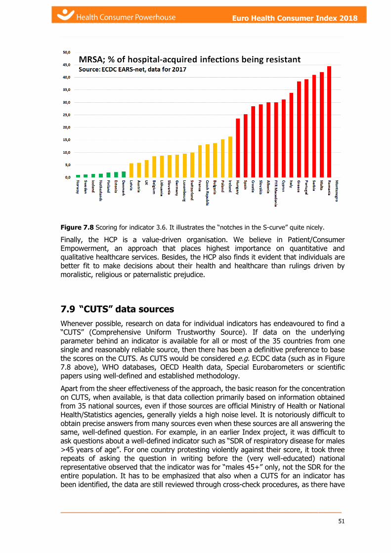
_____________________________________________________________
51
Euro Health Consumer Index 2018 Euro Health Consumer Index 2018
Figure 7.8 Scoring for indicator 3.6. It illustrates the “notches in the S-curve” quite nicely.
Finally, the HCP is a value-driven organisation. We believe in Patient/Consumer Empowerment, an approach that places highest importance on quantitative and qualitative healthcare services. Besides, the HCP also finds it evident that individuals are better fit to make decisions about their health and healthcare than rulings driven by moralistic, religious or paternalistic prejudice.
7.9 “CUTS” data sources
Whenever possible, research on data for individual indicators has endeavoured to find a “CUTS” (Comprehensive Uniform Trustworthy Source). If data on the underlying parameter behind an indicator is available for all or most of the 35 countries from one single and reasonably reliable source, then there has been a definitive preference to base the scores on the CUTS. As CUTS would be considered e.g. ECDC data (such as in Figure 7.8 above), WHO databases, OECD Health data, Special Eurobarometers or scientific papers using well-defined and established methodology.
Apart from the sheer effectiveness of the approach, the basic reason for the concentration on CUTS, when available, is that data collection primarily based on information obtained from 35 national sources, even if those sources are official Ministry of Health or National Health/Statistics agencies, generally yields a high noise level. It is notoriously difficult to obtain precise answers from many sources even when these sources are all answering the same, well-defined question. For example, in an earlier Index project, it was difficult to ask questions about a well-defined indicator such as “SDR of respiratory disease for males >45 years of age”. For one country protesting violently against their score, it took three repeats of asking the question in writing before the (very well-educated) national representative observed that the indicator was for “males 45+” only, not the SDR for the entire population. It has to be emphasized that also when a CUTS for an indicator has been identified, the data are still reviewed through cross-check procedures, as there have

_____________________________________________________________ 52
Health Consumer Powerhouse Euro Health Consumer Index 2018 report
Euro Health Consumer Index 2018
frequently been occasions where national sources or scientific papers have been able to supply more recent and/or higher precision data.
7.9.1 The “Rolls-Royce gearbox” factor
Another reason for preferably using CUTS whenever possible is the same reason why Rolls-Royce (in their pre-BMW days) did not build their own gearboxes. The reason was stated as “We simply cannot build a better gearbox than those we can get from outside suppliers, and therefore we do not make them ourselves”. For the small size organisation HCP, this same circumstance would be true for an indicator where a Eurobarometer question, the WHO HfA database or another CUTS happens to cover an indicator.
7.10 Content of indicators in the EHCI 2018
The research team of the Euro Health Consumer Index 2018 has been collecting data on 46 healthcare performance indicators, structured in a framework of six sub-disciplines. Each of these sub-disciplines reflects a certain logical entity, e.g. Medical outcomes or Accessibility.
For reader friendliness and clarity, the indicators come numbered in the report.
Where possible, CUTS - Comprehensive Uniform Trustworthy Sources - were used; see section 7.9 for more information on this approach, typical for HCP research work.
7.10.1 Patients' Rights and Information
This sub-discipline is testing the ability of a healthcare system to provide the patient with a status strong enough to diminish the information skew walling the professional and patient.
Why does HCP love this sub-discipline? Because it is a GDP non-dependent indicator family. Even the poorest countries can allow themselves to grant the patient a firm position within the healthcare system; and the 2018 Euro Health Consumer Index is proving this observation again.
There are 10 indicators in this sub-discipline:
1.2 Patients' Organisations involved in decision making
Do patient organisations have right to participate in healthcare decision making? Sometimes we find that patient's organisations are welcomed to get involved, sometimes they do it by law, sometimes they do it only informally, but usually, sometimes only formally without a real participation, sometimes not at all.
Sources of data: Patients' Perspectives of Healthcare Systems in Europe; survey commissioned by HCP 2018 National healthcare agencies. European Observatory HiT reports. Non-CUTS data.
1.4 Right to second opinion
As in other areas of human life, there are not many questions and conditions with only one right answer, in medicine also. Therefore, do the patients have the right to get the

_____________________________________________________________
53
Euro Health Consumer Index 2018 Euro Health Consumer Index 2018
second opinion, without having to pay extra? Is it a formal right, but unusual practice, or well-established institute?
The patient organisation participation in healthcare decisions seems to be slowly but steadily improving in Europe.
Fig. 7.10.1.4: Green scores appearing for some countries is because of recently improved legislation or submittance of trustworthy data.
Sources of data: Patients' Perspectives of Healthcare Systems in Europe; survey commissioned by HCP 2018. National healthcare agencies. Non-CUTS data.
1.5 Access to own medical record
Can patients readily get access to, and read, their own medical records? In recent years, this situation seems to have improved significantly in most countries of Europe. Some countries are still affected by bureaucratic procedures, where patients have to fill in forms, or have partially restricted access to their medical record.
Even where patient records are supposed to be available to individual patients, patient awareness of this is low in several countries.
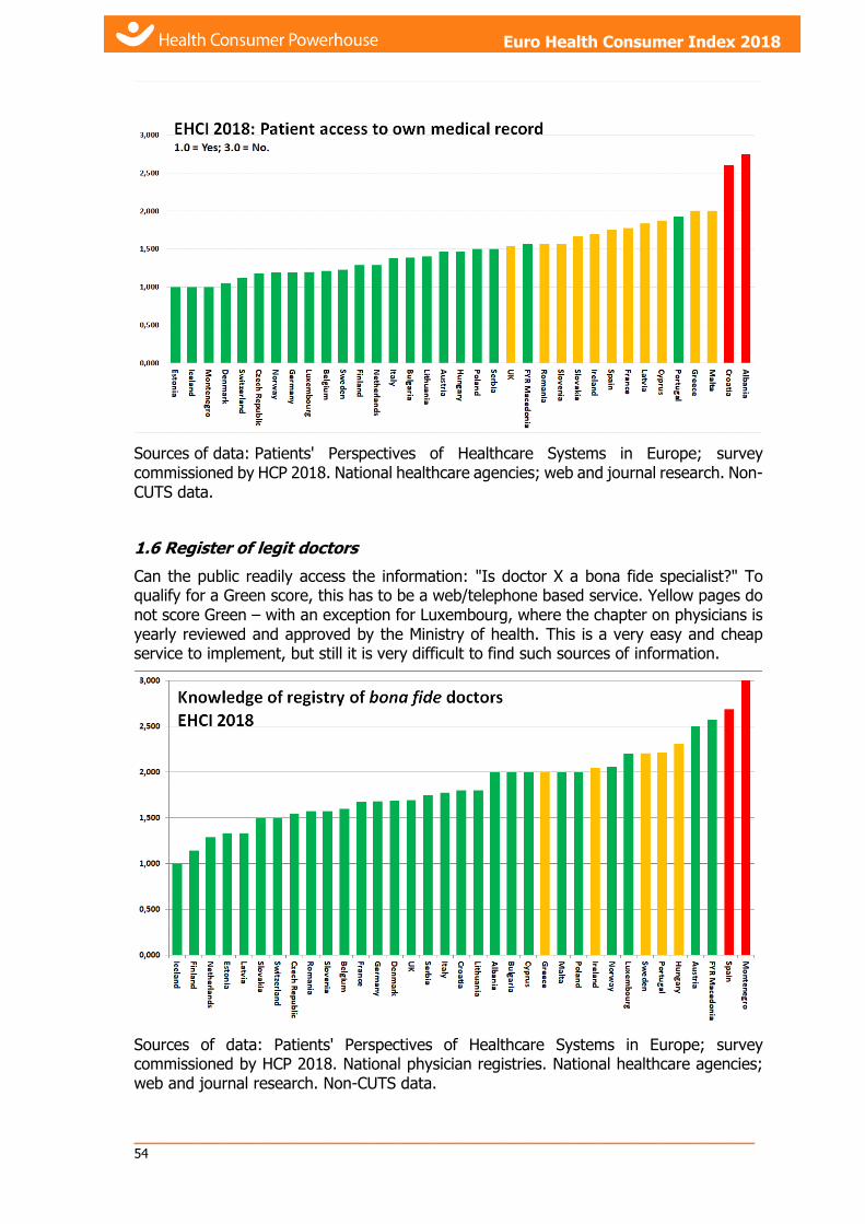
_____________________________________________________________ 54
Health Consumer Powerhouse Euro Health Consumer Index 2018 report
Euro Health Consumer Index 2018
Sources of data: Patients' Perspectives of Healthcare Systems in Europe; survey commissioned by HCP 2018. National healthcare agencies; web and journal research. Non-CUTS data.
1.6 Register of legit doctors
Can the public readily access the information: "Is doctor X a bona fide specialist?" To qualify for a Green score, this has to be a web/telephone based service. Yellow pages do not score Green – with an exception for Luxembourg, where the chapter on physicians is yearly reviewed and approved by the Ministry of health. This is a very easy and cheap service to implement, but still it is very difficult to find such sources of information.
Sources of data: Patients' Perspectives of Healthcare Systems in Europe; survey commissioned by HCP 2018. National physician registries. National healthcare agencies; web and journal research. Non-CUTS data.

_____________________________________________________________
55
Euro Health Consumer Index 2018 Euro Health Consumer Index 2018
1.7 Web or 24-7 telephone healthcare info with interactivity
Simple description of this indicator used in previous years' editions remains the same: Information which can help a patient take decisions of the nature: “After consulting the service, I will take a paracetamol and wait and see” or “I will hurry to the A&E department of the nearest hospital” The most comprehensive service of this kind is still the British NHS Direct. Several countries have developed decentralized solutions such as “round-the-clock” primary care surgeries, which offer the same service.
Sources of data: Patients' Perspectives of Healthcare Systems in Europe; survey commissioned by HCP 2018. National healthcare agencies, web search. Non-CUTS data.
1.8 Cross-border care seeking financed from home
The directive on the application of patients’ rights to cross-border healthcare was decided on 2011-03-09. EU countries had until 25 October 2013 to pass their own laws implementing the Directive. Therefore, the criteria for scores on this indicator were tightened considerably compared with previous ECHI editions.
For the first time, the European Commission has published data on payment streams for citizens receiving care in another EU country (Figure below). Unfortunately, no comprehensive updated data was available by year-end 2018.
According to the data reported to the commission, Austria was the only country where these costs in 2014 exceeded EUR 1/capita. Data on some countries was missing, such as for The Netherlands and Malta, who both have an established tradition of allowing care outside the country.
As was predicted in the EHCI 2015 report, penetration of the Dutch observation that “free access to cross-border care will not exceed 1% of healthcare budgets” seems to require assisted delivery.

_____________________________________________________________ 56
Health Consumer Powerhouse Euro Health Consumer Index 2018 report
Euro Health Consumer Index 2018
Figure 7.10.1.8 MEMBER STATE DATA on cross-border healthcare following Directive 2011/24/EU, Year 2015, European Commission, plus updates from national bodies.
Sources of data: MEMBER STATE DATA on cross-border healthcare following Directive 2011/24/EU, Year 2015, European Commission. National healthcare agencies.
1.9 Provider catalogue with quality ranking
In 2005, Dr. Foster of the UK was the single shining star on the firmament of provider (hospital) listing, where patients could actually see which hospitals had good results in term of actual success rates or survival percentages. Today, that has evolved into “NHS Choose and Book”16.
In 2016, there are still only a few more examples, where the Health Consumer Powerhouse believes that the most notable was the Danish www.esundhed.dk/sundhedskvalitet/Pages/default.aspx , where hospitals were graded
from to as if they were hotels, with service level indicators as well as actual results, including case fatality rates on certain diagnoses. Unfortunately, this website no longer contains actual treatment results.
In 2016, the British NHS Choices remained the standard European qualification for a Green score. The “best clinics” published by the weeklies LePoint/Figaro in France gave a Green in 2016, as the HCP survey indicated a high degree of familiarity with that among patients. Also, in 2016 Estonia, The Netherlands, Norway, Portugal and Slovakia scored Green. Germany, scoring Yellow in 2012, now scores Green (again) as public access to this information has been restored. Sweden has the information available in a 400+ page book, but that can hardly be described as easily accessed by patients.
16 www.chooseandbook.nhs.uk

_____________________________________________________________
57
Euro Health Consumer Index 2018 Euro Health Consumer Index 2018
Figure 7.10.1.9 The Yellow scores for Iceland and Malta are awarded not to discriminate against
islands having only one real hospital each.
Sources of data: Survey commissioned by HCP from Patient View 2018, www.nhs.uk/Conditions/Pages/hub.aspx ; www.esundhed.dk/sundhedskvalitet/Pages/default.aspx; www.sykehusvalg.no/sidemaler/VisStatiskInformasjon____2109.aspx ; www.hiqa.ie/ ; http://212.80.128.9/gestion/ges161000com.html, www.bqs-institut.de/. Non-CUTS data.
1.10 Patient records e-accessible (by receiving doctor after referral)
This indicator was previously “Percentage of GP practices using computer for storage of individual patient data and communication with other parts of the healthcare system”. Finally in 2018, 20 years later than what should have been, this is becoming the norm in Europe! Therefore, the scoring criteria have been tightened to the above.
Sources of data: OECD Health Policy Studies Health Data Governance Privacy, Monitoring and Research (2015) http://ec.europa.eu/public_opinion/flash/fl126_fr.pdf ; http://www.europartnersearch.net/ist/communities/indexmapconso.php?Se=11 ; www.icgp.ie ; Commonwealth Fund International Health Policy Survey of Primary Care Physicians"Benchmarking ICT use among GP:s in Europe"; study made by Empirica, Bonn, Germany (p.60), Gartner Group. Non-CUTS data.
1.11 Do patients have access to on-line booking of appointments?
The supply/demand ratio for specialist appointments or major surgery is very similar to that of hotel rooms or package holidays. There is no real reason why patients should not be able to book available “slots” at their convenience. This exists rather sparingly in Europe; in 2009, one of the only two Green scores went to Portugal, where “4 million people in the Lisbon region” were said to have access to this service. In 2018, twenty countries have made this service available to sizeable groups of citizens – quite an improvement (2013: 9 countries). Among countries now scoring Green on this indicator
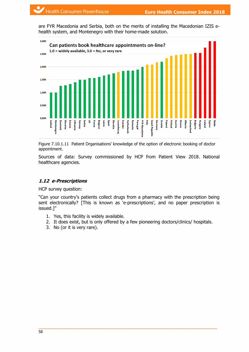
_____________________________________________________________ 58
Health Consumer Powerhouse Euro Health Consumer Index 2018 report
Euro Health Consumer Index 2018
are FYR Macedonia and Serbia, both on the merits of installing the Macedonian IZIS e-health system, and Montenegro with their home-made solution.
Figure 7.10.1.11 Patient Organisations’ knowledge of the option of electronic booking of doctor appointment.
Sources of data: Survey commissioned by HCP from Patient View 2018. National healthcare agencies.
1.12 e-Prescriptions
HCP survey question:
“Can your country's patients collect drugs from a pharmacy with the prescription being sent electronically? [This is known as ‘e-prescriptions’, and no paper prescription is issued.]”
1. Yes, this facility is widely available. 2. It does exist, but is only offered by a few pioneering doctors/clinics/ hospitals. 3. No (or it is very rare).

_____________________________________________________________
59
Euro Health Consumer Index 2018 Euro Health Consumer Index 2018
Figure 7.10.1.12 Survey responses to the above question.
The Baltics, Montenegro, Slovenia and the Nordic countries are leading Europe. Considering that an e-Prescription is just a very standardised piece of e-mail, the rate of progress is depressingly slow.
Sources of data: Survey commissioned by HCP from Patient View 2018, National healthcare agencies.
7.10.2 Waiting time for treatment
2.1 Family doctor same day access
Testing a very reasonable demand: Can patients count on seeing a primary care doctor today, on the only indication “The patient suffers from the opinion that he needs to see a doctor”?

_____________________________________________________________ 60
Health Consumer Powerhouse Euro Health Consumer Index 2018 report
Euro Health Consumer Index 2018
Figure 7.10.2.1a Survey responses to the question: “Can your country's patients see their primary
care doctor that same day (with or without an appointment)?” 1.0 = all yes; 3.0 = all “normally
not”.
The responses on this indicator basically show that there is no logical explanation for waiting times in primary care; the findings seem to be randomly placed in the order of national wealth; there is no correlation with financial matters (GDP or healthcare spend per capita) nor the range of services provided, nor the density of primary care network (see graph below). In some rather unexpected countries, the GP even has the obligation to answer the phone to every patient registered in his practice 24 hours per day, 7 days a week.
Figure 7.10.2.1b Doctors per 100 000 people (broad bars) and Number of outpatient contacts per person (narrow bars). As the graph shows, there is very poor correlation between doctors per capita and Access to doctor. There are some culture streaks: the Nordic countries (green broad
bars) only want patients to see a doctor when really sick. Swiss and Portuguese do not disturb
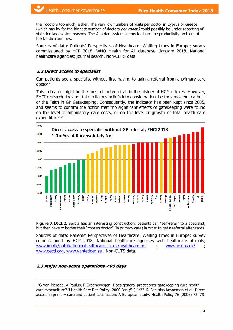
_____________________________________________________________
61
Euro Health Consumer Index 2018 Euro Health Consumer Index 2018
their doctors too much, either. The very low numbers of visits per doctor in Cyprus or Greece
(which has by far the highest number of doctors per capita) could possibly be under-reporting of
visits for tax evasion reasons. The Austrian system seems to share the productivity problem of the Nordic countries.
Sources of data: Patients' Perspectives of Healthcare: Waiting times in Europe; survey commissioned by HCP 2018. WHO Health for All database, January 2018. National healthcare agencies; journal search. Non-CUTS data.
2.2 Direct access to specialist
Can patients see a specialist without first having to gain a referral from a primary-care doctor?
This indicator might be the most disputed of all in the history of HCP indexes. However, EHCI research does not take religious beliefs into consideration, be they moslem, catholic or the Faith in GP Gatekeeping. Consequently, the indicator has been kept since 2005, and seems to confirm the notion that “no significant effects of gatekeeping were found on the level of ambulatory care costs, or on the level or growth of total health care expenditure"17.
Figure 7.10.2.2. Serbia has an interesting construction: patients can “self-refer” to a specialist, but then have to bother their “chosen doctor” (in primary care) in order to get a referral afterwards.
Sources of data: Patients' Perspectives of Healthcare: Waiting times in Europe; survey commissioned by HCP 2018. National healthcare agencies with healthcare officials; www.im.dk/publikationer/healthcare_in_dk/healthcare.pdf ; www.ic.nhs.uk/ ; www.oecd.org, www.vantetider.se . Non-CUTS data.
2.3 Major non-acute operations <90 days
17G Van Merode, A Paulus, P Groenewegen: Does general practitioner gatekeeping curb health
care expenditure? J Health Serv Res Policy. 2000 Jan ;5 (1):22-6. See also Kroneman et al: Direct access in primary care and patient satisfaction: A European study. Health Policy 76 (2006) 72–79
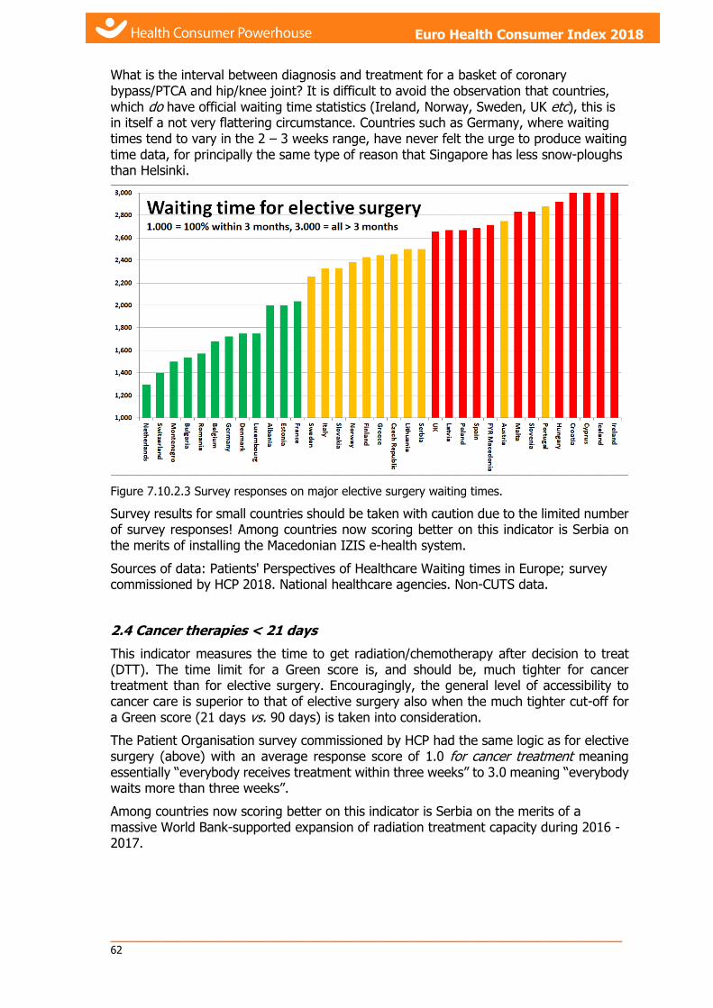
_____________________________________________________________ 62
Health Consumer Powerhouse Euro Health Consumer Index 2018 report
Euro Health Consumer Index 2018
What is the interval between diagnosis and treatment for a basket of coronary bypass/PTCA and hip/knee joint? It is difficult to avoid the observation that countries, which do have official waiting time statistics (Ireland, Norway, Sweden, UK etc), this is in itself a not very flattering circumstance. Countries such as Germany, where waiting times tend to vary in the 2 – 3 weeks range, have never felt the urge to produce waiting time data, for principally the same type of reason that Singapore has less snow-ploughs than Helsinki.
Figure 7.10.2.3 Survey responses on major elective surgery waiting times.
Survey results for small countries should be taken with caution due to the limited number of survey responses! Among countries now scoring better on this indicator is Serbia on the merits of installing the Macedonian IZIS e-health system.
Sources of data: Patients' Perspectives of Healthcare Waiting times in Europe; survey commissioned by HCP 2018. National healthcare agencies. Non-CUTS data.
2.4 Cancer therapies < 21 days
This indicator measures the time to get radiation/chemotherapy after decision to treat (DTT). The time limit for a Green score is, and should be, much tighter for cancer treatment than for elective surgery. Encouragingly, the general level of accessibility to cancer care is superior to that of elective surgery also when the much tighter cut-off for a Green score (21 days vs. 90 days) is taken into consideration.
The Patient Organisation survey commissioned by HCP had the same logic as for elective surgery (above) with an average response score of 1.0 for cancer treatment meaning essentially “everybody receives treatment within three weeks” to 3.0 meaning “everybody waits more than three weeks”.
Among countries now scoring better on this indicator is Serbia on the merits of a massive World Bank-supported expansion of radiation treatment capacity during 2016 - 2017.

_____________________________________________________________
63
Euro Health Consumer Index 2018 Euro Health Consumer Index 2018
Sources of data: Survey commissioned by HCP 2018. Cancer wait report from the Swedish Board of Health and Welfare (2018). National healthcare agencies. Non-CUTS data.
2.5 CT scan < 7days
As a representative for waiting times for advanced diagnostics was chosen Time to get a CT scan after referring doctor’s decision. There proved to be some difficulty making respondents (in national healthcare agencies) not answer in terms of “acute” or “non-acute” examinations. Again, is has to be emphasized that waiting times for a CT scan is both poor service quality and also increases costs, not saving money, as the procedure of keeping track of patients for weeks/months is by no means costless, and the examination itself is if anything cheaper if the patient (and the care provider) has the underlying cause fresh in their minds.
The Patient Organisation survey commissioned by HCP had the same logic as for elective surgery (above) with an average response score of 1.0 for a non-acute CT scan meaning essentially “everybody receives an examination within one week” to 3.0 meaning “everybody waits more than three weeks”.
Among countries now scoring better on this indicator is Serbia on the merits of installing the Macedonian IZIS e-health system.

_____________________________________________________________ 64
Health Consumer Powerhouse Euro Health Consumer Index 2018 report
Euro Health Consumer Index 2018
Figure 7.10.2.5 Survey responses non-acute CT scan waiting times. < 7 days for a Green might
seem tight, but there is no real life reason to have longer waits.
Sources of data: Survey commissioned by HCP 2018. National healthcare agencies. Non-CUTS data.
2.6 Waiting time for first appointment in Paediatric Psychiatry
Indicator 2.6 Waiting time in A&E departments had the drawback of mainly reflecting the accessibility of other parts of a healthcare system, i.e. measuring the same phenomenon over again. In 2018, that indicator was replaced by 2.6 Waiting time for first appointment in Paediatric Psychiatry.
Figure 7.10.2.6 Survey responses on A&E department waiting times
Sources of data: Survey commissioned by HCP 2018. National healthcare agencies. Non-CUTS data.
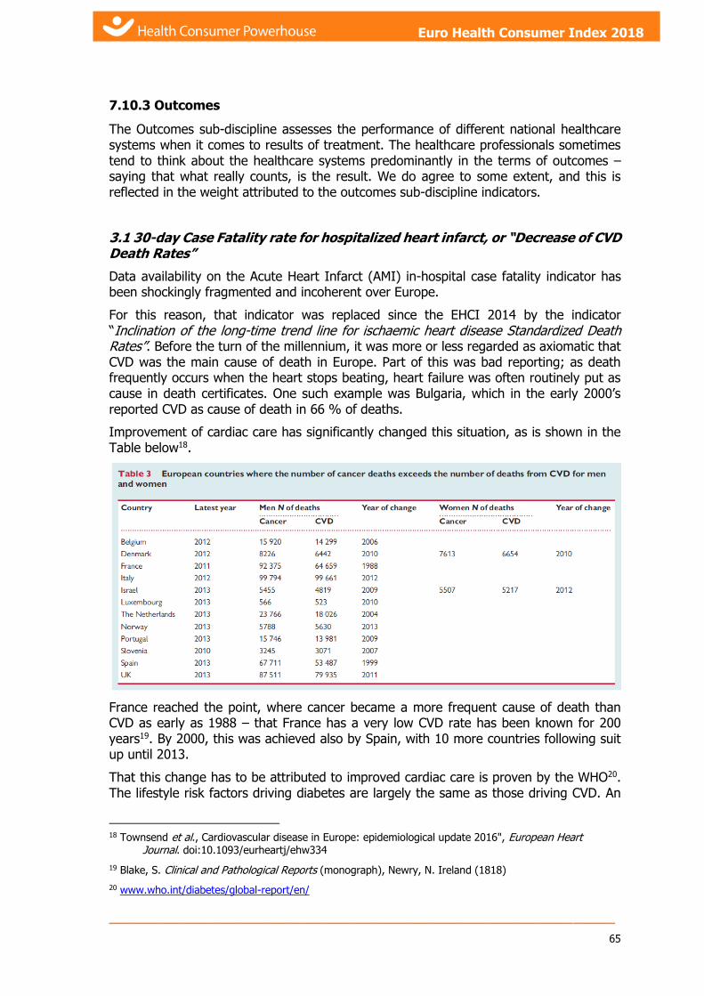
_____________________________________________________________
65
Euro Health Consumer Index 2018 Euro Health Consumer Index 2018
7.10.3 Outcomes
The Outcomes sub-discipline assesses the performance of different national healthcare systems when it comes to results of treatment. The healthcare professionals sometimes tend to think about the healthcare systems predominantly in the terms of outcomes – saying that what really counts, is the result. We do agree to some extent, and this is reflected in the weight attributed to the outcomes sub-discipline indicators.
3.1 30-day Case Fatality rate for hospitalized heart infarct, or “Decrease of CVD Death Rates”
Data availability on the Acute Heart Infarct (AMI) in-hospital case fatality indicator has been shockingly fragmented and incoherent over Europe.
For this reason, that indicator was replaced since the EHCI 2014 by the indicator “Inclination of the long-time trend line for ischaemic heart disease Standardized Death Rates”. Before the turn of the millennium, it was more or less regarded as axiomatic that CVD was the main cause of death in Europe. Part of this was bad reporting; as death frequently occurs when the heart stops beating, heart failure was often routinely put as cause in death certificates. One such example was Bulgaria, which in the early 2000’s reported CVD as cause of death in 66 % of deaths.
Improvement of cardiac care has significantly changed this situation, as is shown in the Table below18.
France reached the point, where cancer became a more frequent cause of death than CVD as early as 1988 – that France has a very low CVD rate has been known for 200 years19. By 2000, this was achieved also by Spain, with 10 more countries following suit up until 2013.
That this change has to be attributed to improved cardiac care is proven by the WHO20. The lifestyle risk factors driving diabetes are largely the same as those driving CVD. An
18 Townsend et al., Cardiovascular disease in Europe: epidemiological update 2016", European Heart
Journal. doi:10.1093/eurheartj/ehw334
19 Blake, S. Clinical and Pathological Reports (monograph), Newry, N. Ireland (1818)
20 www.who.int/diabetes/global-report/en/
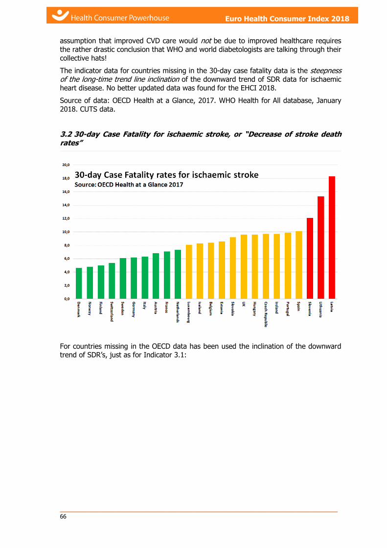
_____________________________________________________________ 66
Health Consumer Powerhouse Euro Health Consumer Index 2018 report
Euro Health Consumer Index 2018
assumption that improved CVD care would not be due to improved healthcare requires the rather drastic conclusion that WHO and world diabetologists are talking through their collective hats!
The indicator data for countries missing in the 30-day case fatality data is the steepness of the long-time trend line inclination of the downward trend of SDR data for ischaemic heart disease. No better updated data was found for the EHCI 2018.
Source of data: OECD Health at a Glance, 2017. WHO Health for All database, January 2018. CUTS data.
3.2 30-day Case Fatality for ischaemic stroke, or “Decrease of stroke death rates”
For countries missing in the OECD data has been used the inclination of the downward trend of SDR’s, just as for Indicator 3.1:

_____________________________________________________________
67
Euro Health Consumer Index 2018 Euro Health Consumer Index 2018
Sources of data: OECD Health at a Glance 2017, WHO Health for All database, December 2017. CUTS data.
No better updated data was found for the EHCI 2018.
3.3 Infant deaths
Infant mortality rate is the number of infants dying before reaching one year of age, per 1,000 live births in a given year. In the well developed countries the increased infant mortality occurs primarily among very low birth weight infants, many of whom are born prematurely; in Europe, very low birth weight infants probably account for more than half of all infant deaths. In Europe, with infant deaths normally counting below 5/1000, good check-ups during pregnancy and access to state-of-the-art delivery care are probably the key factors behind attaining really low numbers. Luxembourg and Iceland have long had the lowest infant death rate on Earth, less than 2/1000.
In the EHCI 2018, the really remarkable country is Montenegro. After a tragic death of an infant due to sepsis in 2014, it was decided that all risk pregnancies should be referred to the Clinical Centre (University Hospital) Podgorica. In a country of 600 000, this decision has been adhered to since then, resulting in a dramatic reduction of infant deaths; Montenegro today has the lowest infant mortality rate in Europe, and probably in the world!
This indicator might be the best single indicator, which could be used to judge the overall quality of a healthcare system. It is interesting to note that this indicator seems totally resilient to effects of financial crises; infant mortality numbers have been, and still are, steadily improving since 2005! The Green/Yellow/Red cut-offs were kept the same since the start of the EHCI. The number of countries scoring Green increased from 9 in 2006, to 24 in 2016.
In the EHCI 2017 the longitudinal analysis aspect was sacrificed and the G/Y/R cut-offs sharpened to 3/5 per 1000 instead of 4/6.
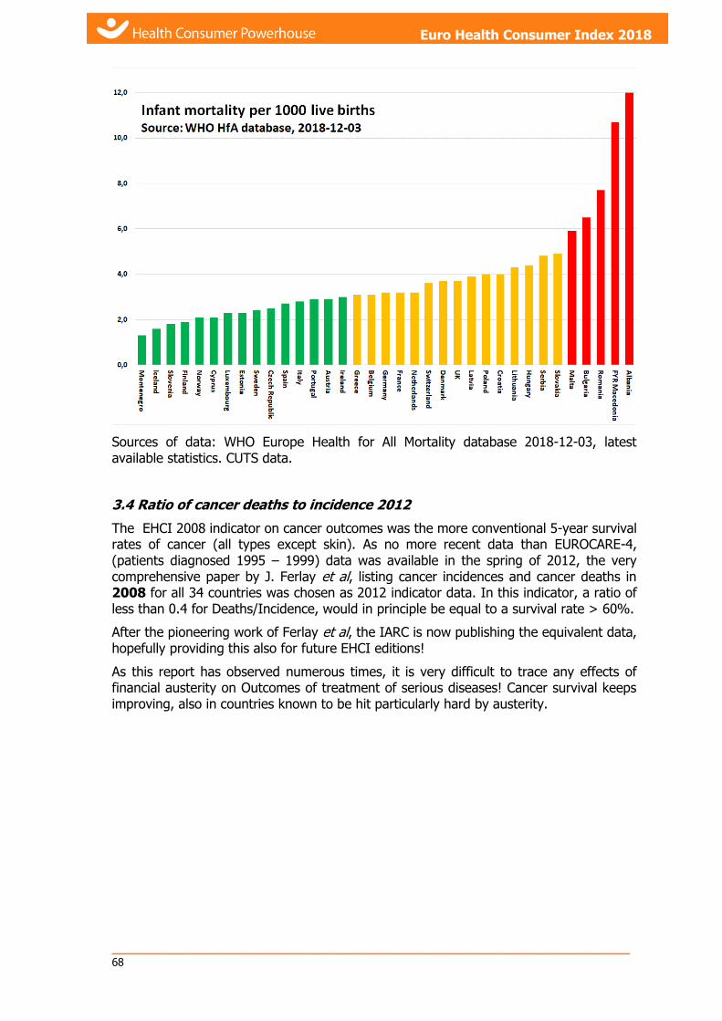
_____________________________________________________________ 68
Health Consumer Powerhouse Euro Health Consumer Index 2018 report
Euro Health Consumer Index 2018
Sources of data: WHO Europe Health for All Mortality database 2018-12-03, latest available statistics. CUTS data.
3.4 Ratio of cancer deaths to incidence 2012
The EHCI 2008 indicator on cancer outcomes was the more conventional 5-year survival rates of cancer (all types except skin). As no more recent data than EUROCARE-4, (patients diagnosed 1995 – 1999) data was available in the spring of 2012, the very comprehensive paper by J. Ferlay et al, listing cancer incidences and cancer deaths in 2008 for all 34 countries was chosen as 2012 indicator data. In this indicator, a ratio of less than 0.4 for Deaths/Incidence, would in principle be equal to a survival rate > 60%.
After the pioneering work of Ferlay et al, the IARC is now publishing the equivalent data, hopefully providing this also for future EHCI editions!
As this report has observed numerous times, it is very difficult to trace any effects of financial austerity on Outcomes of treatment of serious diseases! Cancer survival keeps improving, also in countries known to be hit particularly hard by austerity.
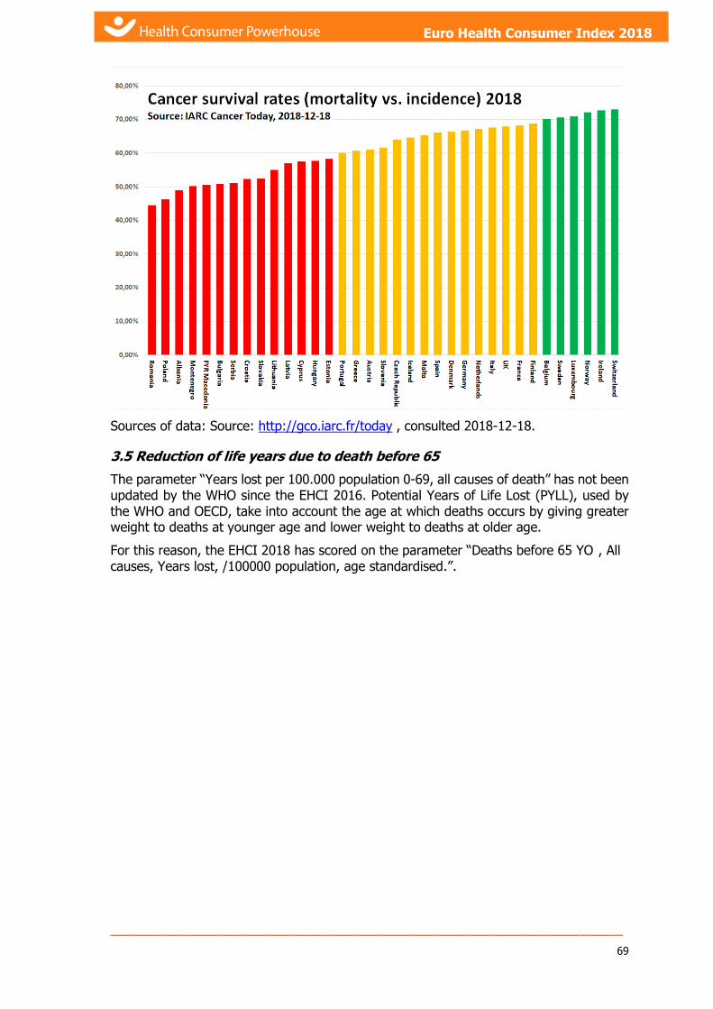
_____________________________________________________________
69
Euro Health Consumer Index 2018 Euro Health Consumer Index 2018
Sources of data: Source: http://gco.iarc.fr/today , consulted 2018-12-18.
3.5 Reduction of life years due to death before 65
The parameter “Years lost per 100.000 population 0-69, all causes of death” has not been updated by the WHO since the EHCI 2016. Potential Years of Life Lost (PYLL), used by the WHO and OECD, take into account the age at which deaths occurs by giving greater weight to deaths at younger age and lower weight to deaths at older age.
For this reason, the EHCI 2018 has scored on the parameter “Deaths before 65 YO , All causes, Years lost, /100000 population, age standardised.”.
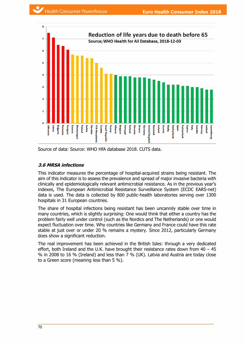
_____________________________________________________________ 70
Health Consumer Powerhouse Euro Health Consumer Index 2018 report
Euro Health Consumer Index 2018
Source of data: Source: WHO HfA database 2018. CUTS data.
3.6 MRSA infections
This indicator measures the percentage of hospital-acquired strains being resistant. The aim of this indicator is to assess the prevalence and spread of major invasive bacteria with clinically and epidemiologically relevant antimicrobial resistance. As in the previous year’s indexes, The European Antimicrobial Resistance Surveillance System (ECDC EARS-net) data is used. The data is collected by 800 public-health laboratories serving over 1300 hospitals in 31 European countries.
The share of hospital infections being resistant has been uncannily stable over time in many countries, which is slightly surprising: One would think that either a country has the problem fairly well under control (such as the Nordics and The Netherlands) or one would expect fluctuation over time. Why countries like Germany and France could have this rate stable at just over or under 20 % remains a mystery. Since 2012, particularly Germany does show a significant reduction.
The real improvement has been achieved in the British Isles: through a very dedicated effort, both Ireland and the U.K. have brought their resistance rates down from 40 – 45 % in 2008 to 16 % (Ireland) and less than 7 % (UK). Latvia and Austria are today close to a Green score (meaning less than 5 %).
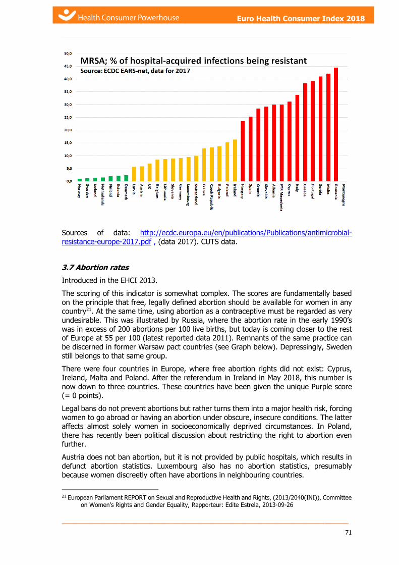
_____________________________________________________________
71
Euro Health Consumer Index 2018 Euro Health Consumer Index 2018
Sources of data: http://ecdc.europa.eu/en/publications/Publications/antimicrobial-resistance-europe-2017.pdf , (data 2017). CUTS data.
3.7 Abortion rates
Introduced in the EHCI 2013.
The scoring of this indicator is somewhat complex. The scores are fundamentally based on the principle that free, legally defined abortion should be available for women in any country21. At the same time, using abortion as a contraceptive must be regarded as very undesirable. This was illustrated by Russia, where the abortion rate in the early 1990’s was in excess of 200 abortions per 100 live births, but today is coming closer to the rest of Europe at 55 per 100 (latest reported data 2011). Remnants of the same practice can be discerned in former Warsaw pact countries (see Graph below). Depressingly, Sweden still belongs to that same group.
There were four countries in Europe, where free abortion rights did not exist: Cyprus, Ireland, Malta and Poland. After the referendum in Ireland in May 2018, this number is now down to three countries. These countries have been given the unique Purple score (= 0 points).
Legal bans do not prevent abortions but rather turns them into a major health risk, forcing women to go abroad or having an abortion under obscure, insecure conditions. The latter affects almost solely women in socioeconomically deprived circumstances. In Poland, there has recently been political discussion about restricting the right to abortion even further.
Austria does not ban abortion, but it is not provided by public hospitals, which results in defunct abortion statistics. Luxembourg also has no abortion statistics, presumably because women discreetly often have abortions in neighbouring countries.
21 European Parliament REPORT on Sexual and Reproductive Health and Rights, (2013/2040(INI)), Committee
on Women’s Rights and Gender Equality, Rapporteur: Edite Estrela, 2013-09-26

_____________________________________________________________ 72
Health Consumer Powerhouse Euro Health Consumer Index 2018 report
Euro Health Consumer Index 2018
Source: WHO Health for All database, 2018-12-12. Ireland national data, including estimate of abortions performed abroad. CUTS data.
3.8 Suicide rates
Indicator 3.8 Prevalence of depression was suffering from poor quality and partially old data. It has therefore been replaced by 3.8 Suicide rates. It is vital to note that the indicator does not measure the absolute level of suicide deaths per 100 000, as this parameter suffers from cultural distortions; particularly in catholic countries in southern Europe, there has long been an underreporting of suicides. For this reason, the indicator measures the inclination of the trend line of suicide rates 1999 – 2016. To account for the variation in suicide reporting, the trend line is calculated on the logarithmic values of the suicide rates. That contains the hidden assumption that suicide reporting cultural differences are essentially constant over the time period studied. This means that if e.g. Greece would report a decrease from 4 to 3 per 100 000, it would get the same score as a country reporting a decrease from 40 to 30. If anything, this practice is probably a favourable treatment of the low-reporting countries.
Interestingly, these two indicators on Mental Health show a difference from the common pattern of wealthy countries dominating the Green scores, particularly on Outcomes. Less affluent countries (CEE and elsewhere) seem to do remarkably well on these Mental Healthcare indicators! E.g.; on the suicide rate indicator, both The Netherlands and the U.K. show an increase of suicides over the period, and thus get a Red score. This is the main explanation for The NL losing its top position in the EHCI for the first time in a decade!

_____________________________________________________________
73
Euro Health Consumer Index 2018 Euro Health Consumer Index 2018
Sources: WHO European Health Information Gateway, 2018-11-18. CUTS data.
3.9 % of patients with HbA1c > 7. Diabetes type 1 and diabetes Type 2
A general target of HbA1c (“long term glucose”) of ≤7.0% for most patients is in general recommended in national guidelines. HbA1c targets however, would need to be individualised – for example, this may need to be higher for some people, including children and the elderly.
The indicator measures % of patients with high levels. This is an indication on inadequate treatment; a good public healthcare system as a small “tail” of inadequate treatment. Measuring the average HbA1c levels does not give a good picture.
Scores are Green: < 50% of patients, Red: > 60% of patients. In countries with good diabetes care, this is below 40% - in this data, those are 9 Wester European countries plus Latvia!
Some countries report % of patients >7.5 % or >6.5 % HbA1c. In these cases, the study was lucky to find that the results could be inter- or extrapolated to >7.0 with no ambiguities being introduced.
Sources: Interviews with health care officials, physicians and public health experts, diabetes registries. Unfortunately non-CUTS data.
7.10.4 Range and reach of services provided
4.1 Equity of healthcare systems
The simple indicator “What % of total healthcare spend is public?” was introduced in 2009 as a measure on equity of healthcare systems. Switzerland was (and is) judged to be a victim of the same kind of definition problems as is The Netherlands, where on formal
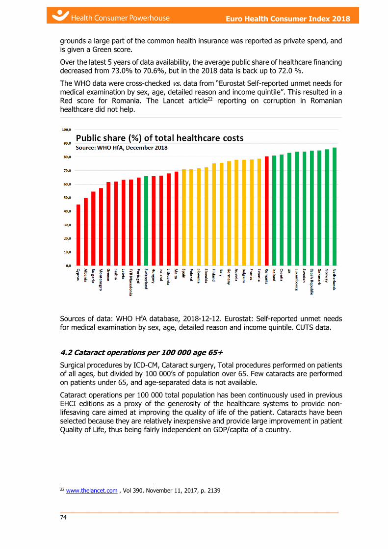
_____________________________________________________________ 74
Health Consumer Powerhouse Euro Health Consumer Index 2018 report
Euro Health Consumer Index 2018
grounds a large part of the common health insurance was reported as private spend, and is given a Green score.
Over the latest 5 years of data availability, the average public share of healthcare financing decreased from 73.0% to 70.6%, but in the 2018 data is back up to 72.0 %.
The WHO data were cross-checked vs. data from “Eurostat Self-reported unmet needs for medical examination by sex, age, detailed reason and income quintile”. This resulted in a Red score for Romania. The Lancet article22 reporting on corruption in Romanian healthcare did not help.
Sources of data: WHO HfA database, 2018-12-12. Eurostat: Self-reported unmet needs for medical examination by sex, age, detailed reason and income quintile. CUTS data.
4.2 Cataract operations per 100 000 age 65+
Surgical procedures by ICD-CM, Cataract surgery, Total procedures performed on patients of all ages, but divided by 100 000’s of population over 65. Few cataracts are performed on patients under 65, and age-separated data is not available.
Cataract operations per 100 000 total population has been continuously used in previous EHCI editions as a proxy of the generosity of the healthcare systems to provide non-lifesaving care aimed at improving the quality of life of the patient. Cataracts have been selected because they are relatively inexpensive and provide large improvement in patient Quality of Life, thus being fairly independent on GDP/capita of a country.
22 www.thelancet.com , Vol 390, November 11, 2017, p. 2139

_____________________________________________________________
75
Euro Health Consumer Index 2018 Euro Health Consumer Index 2018
This indicator has proven unexpectedly complicated.
Sources of data: OECD Health Data 2017, WHO HfA database November 2017, WHO Prevention of Blindness and Visual Impairment Programme, European Community Health Indicators, National healthcare agencies. Very non-CUTS data!
4.3 Kidney transplants per million population
This indicator measures procedures per million population. There is a commonly encountered notion that this number is greatly influenced by factors outside the control of healthcare systems, such as the number of traffic victims in a country. It must be judged that the primary explanation factors are inside healthcare, such as “the role and place of organ donation in anaesthesiologists’ training”, “the number of Intensive Care Unit beds p.m.p.”, the organisation of healthcare to optimise the handling of organs, etc. Experience tells that well-implemented national strategies can significantly increase donations.
The relatively low transplant rate for particularly Germany, support that transplant rates are governed by cultural factors rather than national wealth. Economic factors, such as clinic-bound dialysis being highly remunerated, might also play a role in keeping down transplant rates.
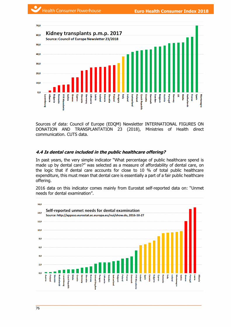
_____________________________________________________________ 76
Health Consumer Powerhouse Euro Health Consumer Index 2018 report
Euro Health Consumer Index 2018
Sources of data: Council of Europe (EDQM) Newsletter INTERNATIONAL FIGURES ON DONATION AND TRANSPLANTATION 23 (2018), Ministries of Health direct communication. CUTS data.
4.4 Is dental care included in the public healthcare offering?
In past years, the very simple indicator “What percentage of public healthcare spend is made up by dental care?” was selected as a measure of affordability of dental care, on the logic that if dental care accounts for close to 10 % of total public healthcare expenditure, this must mean that dental care is essentially a part of a fair public healthcare offering.
2016 data on this indicator comes mainly from Eurostat self-reported data on: “Unmet needs for dental examination”.
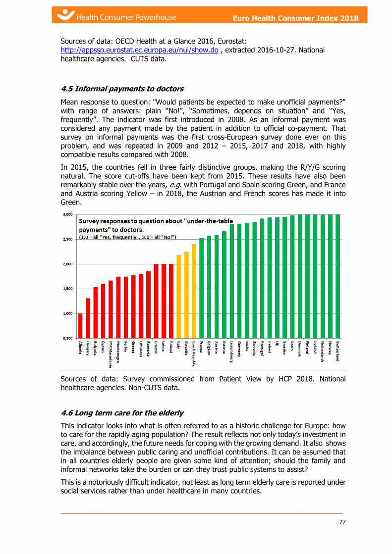
_____________________________________________________________
77
Euro Health Consumer Index 2018 Euro Health Consumer Index 2018
Sources of data: OECD Health at a Glance 2016, Eurostat: http://appsso.eurostat.ec.europa.eu/nui/show.do , extracted 2016-10-27. National healthcare agencies. CUTS data.
4.5 Informal payments to doctors
Mean response to question: "Would patients be expected to make unofficial payments?" with range of answers: plain “No!”, “Sometimes, depends on situation” and “Yes, frequently”. The indicator was first introduced in 2008. As an informal payment was considered any payment made by the patient in addition to official co-payment. That survey on informal payments was the first cross-European survey done ever on this problem, and was repeated in 2009 and 2012 – 2015, 2017 and 2018, with highly compatible results compared with 2008.
In 2015, the countries fell in three fairly distinctive groups, making the R/Y/G scoring natural. The score cut-offs have been kept from 2015. These results have also been remarkably stable over the years, e.g. with Portugal and Spain scoring Green, and France and Austria scoring Yellow – in 2018, the Austrian and French scores has made it into Green.
Sources of data: Survey commissioned from Patient View by HCP 2018. National healthcare agencies. Non-CUTS data.
4.6 Long term care for the elderly
This indicator looks into what is often referred to as a historic challenge for Europe: how to care for the rapidly aging population? The result reflects not only today’s investment in care, and accordingly, the future needs for coping with the growing demand. It also shows the imbalance between public caring and unofficial contributions. It can be assumed that in all countries elderly people are given some kind of attention; should the family and informal networks take the burden or can they trust public systems to assist?
This is a notoriously difficult indicator, not least as long term elderly care is reported under social services rather than under healthcare in many countries.

_____________________________________________________________ 78
Health Consumer Powerhouse Euro Health Consumer Index 2018 report
Euro Health Consumer Index 2018
The HCP team made considerable effort to find more outcomes-related data. Since 2012, we have had to settle for “# of nursing home and elderly care beds per 100 000 population 65+”.
Source: WHO Health for All database, December 2018. CUTS data.
4.7 Share of dialysis done outside of clinics
Dialysis is necessary for the survival of patients with renal and liver malfunctions. There are a few ways to perform this treatment. Dialysis performed as clinic-bound dialysis (hemo-dialysis: HD) has several drawbacks:
a) Treatment episodes are usually 3x4 hours per week, which is a far cry from the 168 hours per week of functioning healthy kidneys. Patients who do home dialysis (Peritoneal dialysis; PD, or HD in the home) frequently treat themselves up to 7 x 6 hours, i.e. nightly, with better treatment outcomes.
b) Patients have great difficulties keeping a job, as dialysis requires presence in a clinic essentially three days a week.
c) Dialysis in a clinic is much more expensive, typically kEUR 50 – 60 per patient per year (in Western Europe).
It seems that a low rate of home dialysis is not mainly due to preferences/capabilities of patients, but rather due to either
i. Lack of professionalism of local nephrologists (there are centres of excellence around which close to 50% of dialysis patients dialyse themselves in the home), or
ii. Greed (clinic dialysis is very profitable for the clinics).
For these reasons, a high share of home dialysis gives a Green score on this indicator.
_____________________________________________________________
79
Euro Health Consumer Index 2018 Euro Health Consumer Index 2018
Sources: European Renal Association-EDTA Annual Report 2014. www.ceapir.org. National Ministries. Basically CUTS data.
4.8 % of births by Caesarean section
Caesarean sections are associated with an increased risk of maternal death and puerperal complications, so use should be restricted to a few well-defined indications such as dangerous placental or foetal position. The World Health Organisation estimates that no more than 10 – 15% of deliveries are associated with a medically justifiable reason for a Caesarean section.
In scoring, it has been assumed that high Caesarean rates are an indication on poor pre-natal support and poor baby delivery services – consequently, a high Caesarean rate has been given a Red score. The general recommendation is that a woman should not have more than two Caesarean deliveries, which strongly indicates that complete recovery cannot be expected. Also, the typical French practice for getting back in shape after a delivery – post-natal physiotherapy – seems both more humane and more economical than invasive surgery.
This way of delivery can be medically important and should of course be available. But HCP suspects that Caesarean section may camouflage a lack of good information and support before delivery as well as lack of access to pain control or doctors wanting to schedule births.
The highest rates of Caesareans in the world are found in Cyprus, Greece and Latin America (Brazil and Venezuela also close to or above 50 %).
Please note in the graph below that even though a Caesarean is costly, there is definitely no positive correlation between national wealth and high Caesarean rates; rather the reverse!
Source: WHO Health for All database, 2018-12-03 (poorly updated since 2016!). National data. CUTS data.
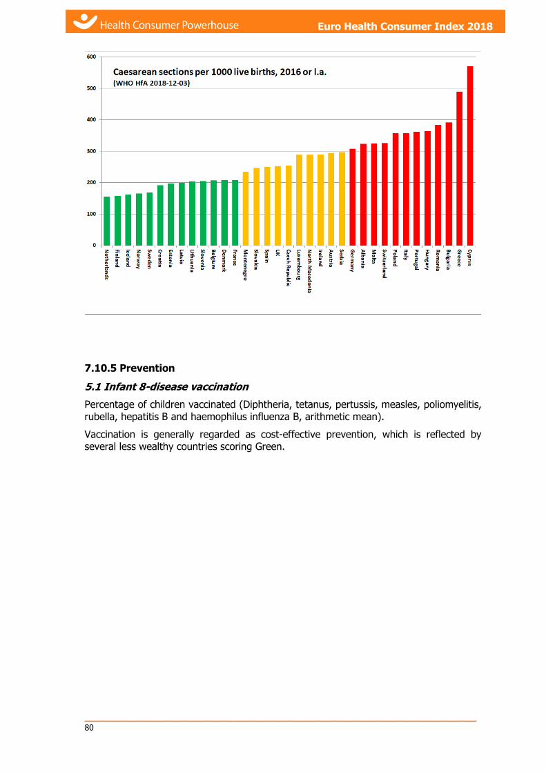
_____________________________________________________________ 80
Health Consumer Powerhouse Euro Health Consumer Index 2018 report
Euro Health Consumer Index 2018
7.10.5 Prevention
5.1 Infant 8-disease vaccination
Percentage of children vaccinated (Diphtheria, tetanus, pertussis, measles, poliomyelitis, rubella, hepatitis B and haemophilus influenza B, arithmetic mean).
Vaccination is generally regarded as cost-effective prevention, which is reflected by several less wealthy countries scoring Green.

_____________________________________________________________
81
Euro Health Consumer Index 2018 Euro Health Consumer Index 2018
Sources of data: WHO HfA database, July 2016. National vaccination registries. National healthcare agencies. CUTS data.
5.2 Blood pressure
This indicator measures the % of adult population registering high blood pressure (> 140/90).

_____________________________________________________________ 82
Health Consumer Powerhouse Euro Health Consumer Index 2018 report
Euro Health Consumer Index 2018
As is evident from the graph, hypertension in Europe is not associated with high standard of living, but rather a combination of lifestyle factors (CEE food, smoking and drinking habits) and a lack of treatment tradition – hypertension treatment is not expensive.
It seems that the UK and Ireland are following the North American example of actively treating hypertension, as well as high blood lipids!
Source: WHO Global Health Observatory, extracted October 2016. CUTS data.
5.3 Smoking prevention
The EHCI 2018 uses actual cigarette sales per capita on this indicator. Due to high shares of duty-free and illicit cigarettes, the consumption of some countries, most probably Norway and the UK, are often underestimated. Project Sun, carried out by audit firm KPMG, claims to have compensated for these sales.
Source: KPMG Project Sun, 2017, Data from national agencies.
5.4 Alcohol consumption
Unlike cigarette smoking, alcohol as a risk factor is not always harmful. It has been shown in numerous studies that a modest alcohol intake (the equivalent of one glass of wine per day for women, and 1 – 2 glasses per day for men) reduces the risk of death from CVD enough to result in a lower mortality than for total abstainers.
On the other hand, drinking vast quantities of alcohol on single occasions (“binge drinking”) is a known risk factor for CVD, and also for some cancer forms. This seems particularly true for binge drinking involving hard liquor consumption.
For these reasons, this indicator is based on “total alcohol consumption (litres of pure alcohol), binge drinking adjusted”. The adjustment is made by multiplying the nominal

_____________________________________________________________
83
Euro Health Consumer Index 2018 Euro Health Consumer Index 2018
consumption by (1 + percentage of population having had ≥ 5 drinks on their latest drinking occasion).
The slightly unorthodox approach of “binge drinking adjustment” has received some comments from national bodies. It should be noted that the EHCI is a relative exercise, meaning that the R/Y/G score of a country is only affected by this adjustment, if the country has a binge drinking rate significantly different from the European average!
Note the low alcohol consumption of the two countries having the highest share of moslem population!
Sources: Global Status Report on Alcohol and Health 2018, WHO. Special Eurobarometer 331 April 2010 (for binge drinking habits). National reports. Mainly CUTS data.
5.5 Physical activity
Physical exercise is beneficial to reduce risk for illness for a vast spectrum of diseases. There is statistics on parameters such as “number of hours of jogging or similar per person per week” for many countries. However, the radio noise level of this data seems to be quite high. Also, this is a parameter which is very difficult for any decision makers to change for a significant part of a population within a reasonable time frame.
Therefore, the physical exercise parameter chosen for the EHCI 2018 is “number of hours of physical exercise in compulsory school” (counting a maximum of 10 school years), according to nationally set standards. This is a parameter that e.g. a government has the power to change.

_____________________________________________________________ 84
Health Consumer Powerhouse Euro Health Consumer Index 2018 report
Euro Health Consumer Index 2018
Source: https://eacea.ec.europa.eu/national-policies/eurydice/sites/eurydice/files/it_2017_2018_internet_0.pdf, National agencies. CUTS data.
5.6 HPV vaccination
In recent years, many countries have included HPV vaccination for girls in their lower teens in national vaccination programmes. This indicator has been scored as:
Green: National programme for HPV vaccination in place, free of charge to patient.
Yellow: National programme for HPV vaccination, patient pays (significant part of) cost.
Red: No national HPV vaccination programme.
It would have been desirable to measure the degree of coverage of these vaccination programmes – such data is not yet available.
In 2018, this indicator looks a candidate for retirement in 2019 – almost all countries are scoring Green.
Sources: Source: WHO Health Information Gateway 2018-12-20. National healthcare agencies. Mainly CUTS data.
5.7 Traffic deaths
This was a new prevention indicator introduced in 2014. It is not really healthcare dependent, but nevertheless amenable to decision making by humans. Traffic deaths, and also personal injuries due to traffic accidents, have been much reduced over the last 30 – 40 years in almost all countries in Europe. There still are large variations between European countries, as is shown by the Graph below. The graph should also eliminate any speculation that the high organ transplant rates of Spain is due to a high number of traffic victims!

_____________________________________________________________
85
Euro Health Consumer Index 2018 Euro Health Consumer Index 2018
Source: WHO Health for All database, December 2018.
7.10.6 Pharmaceuticals
For reasons of copyright, HCP is not in a position to include graphs showing the actual data behind the drug use indicators, only relative comparisons.
Also, purchasing pharmaceutical data comes at a considerable cost. In the absence of significant sponsoring of the EHCI 2018 project, the HCP has not been able to afford updating of the sales data since 2016.
6.1 Rx subsidy %
What percentage of total drug sales (including OTC drugs) is paid by public subsidy?
Where data from EFPIA has shown higher numbers, such as for Iceland, the score has been adjusted up from the WHO HfA values.
Sources of data: WHO HfA database, November 2017, EFPIA: Personal Communication. National healthcare and medical products agencies.
Non-CUTS data.
6.3 Novel cancer drugs deployment rate
This indicator measures the use, in MUSD p.m.p., of the ATC code group L01XC (monoclonal antibodies). The measure DDD (Defined Daily Doses) rather than monetary
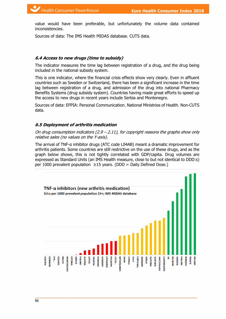
_____________________________________________________________ 86
Health Consumer Powerhouse Euro Health Consumer Index 2018 report
Euro Health Consumer Index 2018
value would have been preferable, but unfortunately the volume data contained inconsistencies.
Sources of data: The IMS Health MIDAS database. CUTS data.
6.4 Access to new drugs (time to subsidy)
The indicator measures the time lag between registration of a drug, and the drug being included in the national subsidy system.
This is one indicator, where the financial crisis effects show very clearly. Even in affluent countries such as Sweden or Switzerland, there has been a significant increase in the time lag between registration of a drug, and admission of the drug into national Pharmacy Benefits Systems (drug subsidy system). Countries having made great efforts to speed up the access to new drugs in recent years include Serbia and Montenegro.
Sources of data: EFPIA: Personal Communication. National Ministries of Health. Non-CUTS data.
6.5 Deployment of arthritis medication
On drug consumption indicators (2.9 – 2.11), for copyright reasons the graphs show only relative sales (no values on the Y-axis).
The arrival of TNF-α inhibitor drugs (ATC code L04AB) meant a dramatic improvement for arthritis patients. Some countries are still restrictive on the use of these drugs, and as the graph below shows, this is not tightly correlated with GDP/capita. Drug volumes are expressed as Standard Units (an IMS Health measure, close to but not identical to DDD:s) per 1000 prevalent population ≥15 years. (DDD = Daily Defined Dose.)

_____________________________________________________________
87
Euro Health Consumer Index 2018 Euro Health Consumer Index 2018
Sources of data: IMS MIDAS database. For prevalence data: eumusc.net: Report v5.0 Musculoskeletal Health in Europe (2012). Special Eurobarometer 272 (2007). National agencies. CUTS data.
6.6 Statin use
Sales per capita (SU per capita 50+ SDR adjusted). Statins, which have been on the market for almost 30 years, are the primary therapy used to prevent cardiovascular events. They lower LDL-C levels by inhibiting the enzyme HMG-CoA reductase, which has a vital role in the production of cholesterol in the liver. Statins typically reduce LDL-C levels by 30 – 40% and are directly associated with reducing the risk of heart attack and stroke. The ECHI is using actual sales data.
It is interesting to note that the straight per capita use, when NOT corrected for CVD prevalence, is more even across Europe than the prevalence-adjusted! There are (at least) two possible explanations for this:
i) Active use of these essential drugs brings down CVD mortality, resulting in higher per capita numbers in the prevalence-adjusted data.
ii) The medical profession is more affected by “kitchen wisdom” popular belief about which share of the population should receive these drugs, than governed by guidelines.
Source: IMS MIDAS database, 12 months ending June 2016. CUTS data.
6.7 Antibiotics consumption
As the following graphs will show, there is shocking disagreement between different sources regarding antibiotics consumption. The 2016 indicator is based on “Quality indicators for antibiotic consumption in Europe (1st Graph below). That was used as a CUTS.
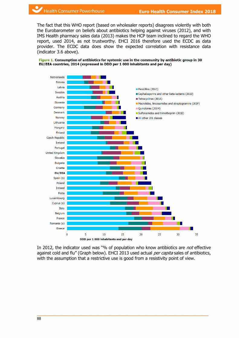
_____________________________________________________________ 88
Health Consumer Powerhouse Euro Health Consumer Index 2018 report
Euro Health Consumer Index 2018
The fact that this WHO report (based on wholesaler reports) disagrees violently with both the Eurobarometer on beliefs about antibiotics helping against viruses (2012), and with IMS Health pharmacy sales data (2013) makes the HCP team inclined to regard the WHO report, used 2014, as not trustworthy. EHCI 2016 therefore used the ECDC as data provider. The ECDC data does show the expected correlation with resistance data (indicator 3.6 above).
In 2012, the indicator used was “% of population who know antibiotics are not effective against cold and flu” (Graph below). EHCI 2013 used actual per capita sales of antibiotics, with the assumption that a restrictive use is good from a resistivity point of view.

_____________________________________________________________
89
Euro Health Consumer Index 2018 Euro Health Consumer Index 2018
The EHCI 2012 indicator.
Source: Special Eurobarometer 338, April 2010. CUTS data.
The EHCI 2013 indicator.
If the French, Brits and Belgians really do know that antibiotics do not work against viral infections: How come they use so much?
The graph below illustrates the data of the 2016 WHO report. It probably has large errors!

_____________________________________________________________ 90
Health Consumer Powerhouse Euro Health Consumer Index 2018 report
Euro Health Consumer Index 2018
The EHCI 2014 indicator.
Source 2017: ECDC “Quality indicators for antibiotic consumption in Europe.” CUTS data.
8. References
8.1 Main sources
The main sources of input for the various indicators are given in Table 7.7 above. For all indicators, this information has been supplemented by interviews and discussions with healthcare officials in both the public and private sectors.
The “Single Indicator Score Sheets” are published on the Internet, so that all can see what main data have been used, and also the scoring methodology. These sheets are on www.healthpowerhouse.com/ehci2018-indicators/ .
Indicators, for which data could not be converted to straightforward numbers are missing on that site. Also, for copyright reasons, so is numerical data for indicators based on drug sales numbers, which are illustrated in a Powerpoint presentation on the website.