ethan burns eaburns at cs.unh - eatoasts.appspot.com filewhat are plots for? introduction outline...
TRANSCRIPT

1 / 37
Understanding Your Data Through Plots
Ethan Burnseaburns at cs.unh.edu
September 13, 2012

Introduction
Introduction
■ Outline■ Why Do We CareAbout Plots?■ What are PlotsFor?
■ Tables of Data
■ Pictures of Data
■ More Tables
■ More Pictures
Distributions ofValues
Trends in Data
Simple Plotting Tool
Other Tools
2 / 37

Outline
Introduction
■ Outline■ Why Do We CareAbout Plots?■ What are PlotsFor?
■ Tables of Data
■ Pictures of Data
■ More Tables
■ More Pictures
Distributions ofValues
Trends in Data
Simple Plotting Tool
Other Tools
3 / 37
■ Why use plots?
■ Different types of plots
■ Tools that I use

Why Do We Care About Plots?
Introduction
■ Outline■ Why Do We CareAbout Plots?■ What are PlotsFor?
■ Tables of Data
■ Pictures of Data
■ More Tables
■ More Pictures
Distributions ofValues
Trends in Data
Simple Plotting Tool
Other Tools
4 / 37
Grad Students do Research:
■ Theoretical analysis
■ Experimental analysis—lots of data

What are Plots For?
Introduction
■ Outline■ Why Do We CareAbout Plots?■ What are PlotsFor?
■ Tables of Data
■ Pictures of Data
■ More Tables
■ More Pictures
Distributions ofValues
Trends in Data
Simple Plotting Tool
Other Tools
5 / 37
1. Understand behavior of new techniques
We need to see what the data is telling us
2. Demonstrate (to others) that new approaches work well
We want to convince others using our data
Clear, and obvious display of data

Tables of Data
Introduction
■ Outline■ Why Do We CareAbout Plots?■ What are PlotsFor?
■ Tables of Data
■ Pictures of Data
■ More Tables
■ More Pictures
Distributions ofValues
Trends in Data
Simple Plotting Tool
Other Tools
6 / 37
Experiments generate lots of data
My data:
1 2 3 4 5 6 7 8
run 1: -2.47 0.75 2.96 13.57 16.65 26.18 36.32 50.98
run 2: -1.46 2.37 7.17 10.68 18.60 26.05 37.46 46.85
run 3: 1.40 1.86 6.00 5.95 15.37 28.78 38.20 47.01
run 4: 1.98 -0.23 1.13 4.70 16.27 25.89 34.31 48.83
run 5: 0.31 -1.90 4.56 5.52 17.41 25.69 33.86 47.33
What is going on here?

Pictures of Data
Introduction
■ Outline■ Why Do We CareAbout Plots?■ What are PlotsFor?
■ Tables of Data
■ Pictures of Data
■ More Tables
■ More Pictures
Distributions ofValues
Trends in Data
Simple Plotting Tool
Other Tools
7 / 37
6420
40
20
0
run1
run0
run2
run3
run4
Now we can see what our data is telling us
More Tables
Introduction
■ Outline■ Why Do We CareAbout Plots?■ What are PlotsFor?
■ Tables of Data
■ Pictures of Data
■ More Tables
■ More Pictures
Distributions ofValues
Trends in Data
Simple Plotting Tool
Other Tools
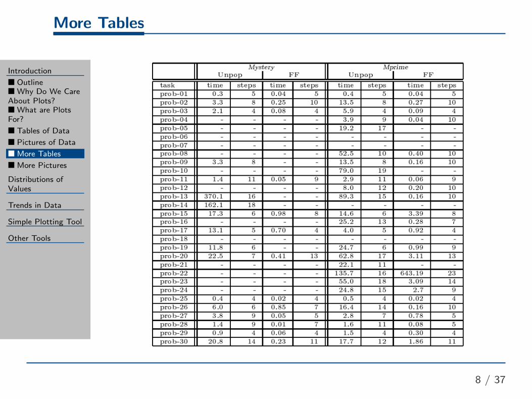
8 / 37

More Pictures
Introduction
■ Outline■ Why Do We CareAbout Plots?■ What are PlotsFor?
■ Tables of Data
■ Pictures of Data
■ More Tables
■ More Pictures
Distributions ofValues
Trends in Data
Simple Plotting Tool
Other Tools
9 / 37

Distributions of Values
Introduction
Distributions ofValues
■ Histograms
■ Heatmap
■ Bin Width
■ Comparing
■ Box Plots■ Grouped BoxPlots
■ Log Scales
■ Paired Data
■ Summary
Trends in Data
Simple Plotting Tool
Other Tools
10 / 37

Histograms
Introduction
Distributions ofValues
■ Histograms
■ Heatmap
■ Bin Width
■ Comparing
■ Box Plots■ Grouped BoxPlots
■ Log Scales
■ Paired Data
■ Summary
Trends in Data
Simple Plotting Tool
Other Tools
11 / 37
Histograms show a distribution of values:
bytes in my .tex file
ASCII10050
frequency
300
200
100
0
newline
and
tab space
punctuation
letters and
numbers
Can quickly show modes—areas of high frequency

2D Histograms: Heatmaps
Introduction
Distributions ofValues
■ Histograms
■ Heatmap
■ Bin Width
■ Comparing
■ Box Plots■ Grouped BoxPlots
■ Log Scales
■ Paired Data
■ Summary
Trends in Data
Simple Plotting Tool
Other Tools
12 / 37
Heatmap
100500
100
50
0

Bin Width
Introduction
Distributions ofValues
■ Histograms
■ Heatmap
■ Bin Width
■ Comparing
■ Box Plots■ Grouped BoxPlots
■ Log Scales
■ Paired Data
■ Summary
Trends in Data
Simple Plotting Tool
Other Tools
13 / 37
The width of bins can have a big impact on the histogram
bytes in my .tex file
ASCII10050
frequency
300
200
100
0
If bins are too big, information can be hidden

Bin Width
Introduction
Distributions ofValues
■ Histograms
■ Heatmap
■ Bin Width
■ Comparing
■ Box Plots■ Grouped BoxPlots
■ Log Scales
■ Paired Data
■ Summary
Trends in Data
Simple Plotting Tool
Other Tools
13 / 37
The width of bins can have a big impact on the histogram
bytes in my .tex file
ASCII1000
frequency 2000
1000
0
If bins are too big, information can be hidden

Bin Width
Introduction
Distributions ofValues
■ Histograms
■ Heatmap
■ Bin Width
■ Comparing
■ Box Plots■ Grouped BoxPlots
■ Log Scales
■ Paired Data
■ Summary
Trends in Data
Simple Plotting Tool
Other Tools
13 / 37
The width of bins can have a big impact on the histogram
bytes in my .tex file
ASCII2001000
frequency 2000
1000
0
If bins are too big, information can be hidden
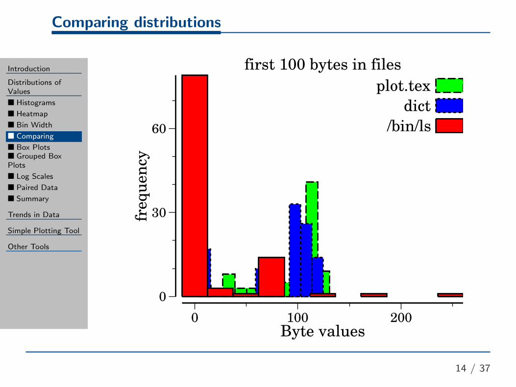
Comparing distributions
Introduction
Distributions ofValues
■ Histograms
■ Heatmap
■ Bin Width
■ Comparing
■ Box Plots■ Grouped BoxPlots
■ Log Scales
■ Paired Data
■ Summary
Trends in Data
Simple Plotting Tool
Other Tools
14 / 37
first 100 bytes in files
Byte values2001000
frequency
60
30
0
plot.tex
dict
/bin/ls

Box Plots
Introduction
Distributions ofValues
■ Histograms
■ Heatmap
■ Bin Width
■ Comparing
■ Box Plots■ Grouped BoxPlots
■ Log Scales
■ Paired Data
■ Summary
Trends in Data
Simple Plotting Tool
Other Tools
15 / 37
fir st 100 bytes in files
ASCII
200
100
0
/bin /ls dict plot .t ex

Box Plots
Introduction
Distributions ofValues
■ Histograms
■ Heatmap
■ Bin Width
■ Comparing
■ Box Plots■ Grouped BoxPlots
■ Log Scales
■ Paired Data
■ Summary
Trends in Data
Simple Plotting Tool
Other Tools
15 / 37
fir st 100 bytes in files
ASCII
200
100
0
/bin /ls dict plot .t ex
3rd quartile
1st quartile
median
maximum
'minimum'
outside
points

Grouped Box Plots
Introduction
Distributions ofValues
■ Histograms
■ Heatmap
■ Bin Width
■ Comparing
■ Box Plots■ Grouped BoxPlots
■ Log Scales
■ Paired Data
■ Summary
Trends in Data
Simple Plotting Tool
Other Tools
16 / 37
norm
alized reward
1
0.8
0.6
react h=80.2 damage
react h=80.4 damage
0.2 order
react h=80.2 damage
react h=80.4 damage
0.4 order

Log Scales
Introduction
Distributions ofValues
■ Histograms
■ Heatmap
■ Bin Width
■ Comparing
■ Box Plots■ Grouped BoxPlots
■ Log Scales
■ Paired Data
■ Summary
Trends in Data
Simple Plotting Tool
Other Tools
17 / 37
Raw values
time (seconds)
100
50
IDA*
Log10 values
log10 tim
e (seconds)
2
1
0
-1
IDA*
log10 values can spread out data for visualization

Paired Data
Introduction
Distributions ofValues
■ Histograms
■ Heatmap
■ Bin Width
■ Comparing
■ Box Plots■ Grouped BoxPlots
■ Log Scales
■ Paired Data
■ Summary
Trends in Data
Simple Plotting Tool
Other Tools
18 / 37
Unpaired Data
log10 tim
e (seconds)
2
1
0
-1
My IDA* Korf's IDA*
Paired Data
Factor of Korf's IDA* tim
e
1
0.9
0.8
My IDA*
Paired data—show instance-by-instance differences

Summary
Introduction
Distributions ofValues
■ Histograms
■ Heatmap
■ Bin Width
■ Comparing
■ Box Plots■ Grouped BoxPlots
■ Log Scales
■ Paired Data
■ Summary
Trends in Data
Simple Plotting Tool
Other Tools
19 / 37
■ Histograms easily show data distributions
◆ Careful when choosing bin widths
◆ Histograms are difficult to compare
■ Heatmaps are like histograms for 2D data
■ Box plots make comparing distributions easy
◆ Grouped box plots can help to show trends
■ Log scales can help spread out data for visualization
■ Paired data is more powerful

Trends in Data
Introduction
Distributions ofValues
Trends in Data
■ Lines■ Lines and ErrorBars
■ Scatter Plots■ ConfidenceIntervals■ More ScatterPlots
■ Scatters and Lines■ More Logs andPaired Data
■ Summary
Simple Plotting Tool
Other Tools
20 / 37

Lines
Introduction
Distributions ofValues
Trends in Data
■ Lines■ Lines and ErrorBars
■ Scatter Plots■ ConfidenceIntervals■ More ScatterPlots
■ Scatters and Lines■ More Logs andPaired Data
■ Summary
Simple Plotting Tool
Other Tools
21 / 37
3000
4000
5000
6000
7000
8000
9000
0 2 4 6 8 10 12 14
Thr
ough
put (
Meg
abits
/sec
ond)
Size (Megabytes)
iSER-Assisted WRITE commands (Size v.s. Throughput)
Kernel-space iSER-assisted iSCSI WRITEsUser-space iSER-assisted iSCSI WRITEs

Lines and Error Bars
Introduction
Distributions ofValues
Trends in Data
■ Lines■ Lines and ErrorBars
■ Scatter Plots■ ConfidenceIntervals■ More ScatterPlots
■ Scatters and Lines■ More Logs andPaired Data
■ Summary
Simple Plotting Tool
Other Tools
22 / 37
log10(sample size)63
fraction correct
0.9
0.6
0.3New
Previous

Scatter Plots
Introduction
Distributions ofValues
Trends in Data
■ Lines■ Lines and ErrorBars
■ Scatter Plots■ ConfidenceIntervals■ More ScatterPlots
■ Scatters and Lines■ More Logs andPaired Data
■ Summary
Simple Plotting Tool
Other Tools
23 / 37
Korf 15
log10 CPU Time-3 -2 -1 0 1
Solu
tion
Len
gth
60
120
180
240
DeterministicRefine A* 10Refine A* 75Beam Search
wA* 1.5wA* 10

Confidence Intervals
Introduction
Distributions ofValues
Trends in Data
■ Lines■ Lines and ErrorBars
■ Scatter Plots■ ConfidenceIntervals■ More ScatterPlots
■ Scatters and Lines■ More Logs andPaired Data
■ Summary
Simple Plotting Tool
Other Tools
24 / 37
Korf 15
log10 CPU Time-3 -2 -1 0
Solu
tion
Len
gth
50
100
150
200 DeterministicRefine A* 10Refine A* 75Beam Search
wA* 1.5wA* 10
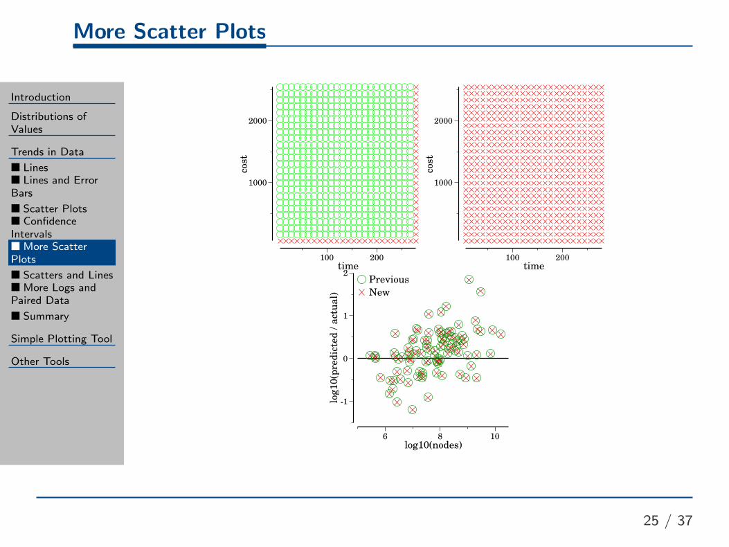
More Scatter Plots
Introduction
Distributions ofValues
Trends in Data
■ Lines■ Lines and ErrorBars
■ Scatter Plots■ ConfidenceIntervals■ More ScatterPlots
■ Scatters and Lines■ More Logs andPaired Data
■ Summary
Simple Plotting Tool
Other Tools
25 / 37
time200100
cost
2000
1000
time200100
cost
2000
1000
log10(nodes)1086
log10(predicted / actual)
2
1
0
-1
Previous
New

Scatters and Lines
Introduction
Distributions ofValues
Trends in Data
■ Lines■ Lines and ErrorBars
■ Scatter Plots■ ConfidenceIntervals■ More ScatterPlots
■ Scatters and Lines■ More Logs andPaired Data
■ Summary
Simple Plotting Tool
Other Tools
26 / 37
Scaling waypoints
log10 total wall time1.20.60
final sol cost
0.8
0.410.
20.
30.
40.
10.
20.
30.
40.
10.
20.
30.
40.
min
greedy
LP

More Logs and Paired Data
Introduction
Distributions ofValues
Trends in Data
■ Lines■ Lines and ErrorBars
■ Scatter Plots■ ConfidenceIntervals■ More ScatterPlots
■ Scatters and Lines■ More Logs andPaired Data
■ Summary
Simple Plotting Tool
Other Tools
27 / 37

More Logs and Paired Data
Introduction
Distributions ofValues
Trends in Data
■ Lines■ Lines and ErrorBars
■ Scatter Plots■ ConfidenceIntervals■ More ScatterPlots
■ Scatters and Lines■ More Logs andPaired Data
■ Summary
Simple Plotting Tool
Other Tools
27 / 37
plat2d
log10 wf0-2-4-6
goal ach
ievement time
30000
20000
10000
0
speedy
bugsy
bugsy -hd
astar

More Logs and Paired Data
Introduction
Distributions ofValues
Trends in Data
■ Lines■ Lines and ErrorBars
■ Scatter Plots■ ConfidenceIntervals■ More ScatterPlots
■ Scatters and Lines■ More Logs andPaired Data
■ Summary
Simple Plotting Tool
Other Tools
27 / 37
plat2d
log10 wf0-2-4-6
log10 goal ach
ievement time
4
2
0
astar
speedy
bugsy -hd
bugsy

More Logs and Paired Data
Introduction
Distributions ofValues
Trends in Data
■ Lines■ Lines and ErrorBars
■ Scatter Plots■ ConfidenceIntervals■ More ScatterPlots
■ Scatters and Lines■ More Logs andPaired Data
■ Summary
Simple Plotting Tool
Other Tools
27 / 37
plat2d
log10 wf0-2-4-6
log10 factor of best goal ach
ievement time
1.6
0.8
0
astar
speedy
bugsy -hd
bugsy

Summary
Introduction
Distributions ofValues
Trends in Data
■ Lines■ Lines and ErrorBars
■ Scatter Plots■ ConfidenceIntervals■ More ScatterPlots
■ Scatters and Lines■ More Logs andPaired Data
■ Summary
Simple Plotting Tool
Other Tools
28 / 37
■ Lines easily show trends in data
■ Scatter plots can show trends in points
■ Use confidence intervals—or some measure of variance
■ Logs can be helpful here too
■ Paired data is always better

Simple Plotting Tool
Introduction
Distributions ofValues
Trends in Data
Simple Plotting Tool
■ What is It?
■ Why a New Tool?
■ Spread Sheets
■ Benefits of SPT
Other Tools
29 / 37

What is It?
Introduction
Distributions ofValues
Trends in Data
Simple Plotting Tool
■ What is It?
■ Why a New Tool?
■ Spread Sheets
■ Benefits of SPT
Other Tools
30 / 37
Simple Plotting Tool—SPThttp://www.cs.unh.edu/~eaburns/spt
■ An(other) open source plotting tool
■ Created by the UNH artificial intelligence group
■ Easy to create many useful types of plots
■ An Objective Caml API
■ A simple lisp-like input language

Why Make a New Plotting Tool?
Introduction
Distributions ofValues
Trends in Data
Simple Plotting Tool
■ What is It?
■ Why a New Tool?
■ Spread Sheets
■ Benefits of SPT
Other Tools
31 / 37
Spread sheets a lot of manual work
GNU plot is ugly (in my opinion, and Wheeler’s too)
Matplotlib better—still draws ticks inside and data on the axes
R not too bad!

Spread Sheets
Introduction
Distributions ofValues
Trends in Data
Simple Plotting Tool
■ What is It?
■ Why a New Tool?
■ Spread Sheets
■ Benefits of SPT
Other Tools
32 / 37

Benefits of SPT
Introduction
Distributions ofValues
Trends in Data
Simple Plotting Tool
■ What is It?
■ Why a New Tool?
■ Spread Sheets
■ Benefits of SPT
Other Tools
33 / 37
■ Professional quality plots (not cartoony)
◆ Greater data-ink ratio (Edward Tufte)
Axes do not box in the data
Not too many tick marks
◆ Axes are not drawn over the data
■ Very easy to make box plots
With confidence intervals
Grouped box plots too
■ Lines and scatters with 95% confidence intervals
■ Histograms and heatmaps from x,y(,z) tuples

Other Tools
Introduction
Distributions ofValues
Trends in Data
Simple Plotting Tool
Other Tools
■ Results Database
■ Alternatives
■ Plotinum
34 / 37

Results Database
Introduction
Distributions ofValues
Trends in Data
Simple Plotting Tool
Other Tools
■ Results Database
■ Alternatives
■ Plotinum
35 / 37
I store my results in a simple database called RDB—ResultsDataBase (or is it Ruml DataBase?)
■ A simple file-system-based database
■ Easy to find data files given a set of key=value pairs
■ Has an OCaml API, a C++ API, and shell scriptingsupport
■ Simple data files: key=value, or key=multi-value pairs
■ Framework connecting RDB → OCaml → SPT

Other More Standard Alternatives
Introduction
Distributions ofValues
Trends in Data
Simple Plotting Tool
Other Tools
■ Results Database
■ Alternatives
■ Plotinum
36 / 37
■ MongoDB
■ CouchDB
■ SQLite

Plotinum: My Latest Plotting Tool
Introduction
Distributions ofValues
Trends in Data
Simple Plotting Tool
Other Tools
■ Results Database
■ Alternatives
■ Plotinum
37 / 37
■ Another-nother open source plotting tool
0 0.5 1
0
0.5
1
http://code.google.com/p/plotinum
■ Written in Go
golang.org, check it out!
■ Simpler, more flexible, and more extendable than SPT
...but, a little less complete at the moment