espm & laep c177 - lab 2c177.ced.berkeley.edu/labs/lab2/c177-lab2.pdf · espm & laep c177 -...
TRANSCRIPT

ESPM & LAEP c177 - Lab 2 Sampling Points and Descriptive Statistics
© Biging - Radke 2017
GSI: Joshua Verkerke & Jed Collins
Contents 1. Generate Sampling Points with different sampling designs in ArcMap 10.4.1 2. Calculate the descriptive statistics 3. Simple Point Pattern Analysis 4. Complete a small exercise using descriptive statistics in ArcMap 10.4.1 Data Descriptions Please download the data for Oakland Schools, Oakland Violent Crime, and Oakland Census Block Group here: http://ratt.ced.berkeley.edu/classes/c177/lab2/c177_Lab2_data.gdb.zip Other Oakland Data: http://ratt.ced.berkeley.edu/downloads/Oakland/Oakland_Misc_data_2006_vintage_2016.html
Install Software Jenness Extention Tool: Jeff Jenness Repeating Shapes Tool in ArcGIS 10.x http://www.jennessent.com/arcgis/repeat_shapes.htm

Preparations You need to activate extensions before you proceed to do the lab. Menu ! Customize ! Extensions … Check the following boxes You also need Editor toolbar and Geostatistical Analyst Toolbar Menu ! Customize ! Toolbars … Check Editor and Geostatistical Analyst

1. Generate Sampling Points with different sampling designs
1.1 Simple Random Sampling Data Management Tools ! Sampling ! Create Random Points
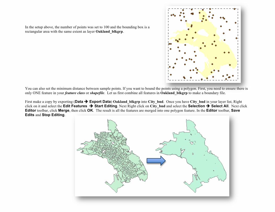
In the setup above, the number of points was set to 100 and the bounding box is a rectangular area with the same extent as layer Oakland_blkgrp. You can also set the minimum distance between sample points. If you want to bound the points using a polygon. First, you need to ensure there is only ONE feature in your feature class or shapefile. Let us first combine all features in Oakland_blkgrp to make a boundary file. First make a copy by exporting (Data ! Export Data) Oakland_blkgrp into City_bnd. Once you have City_bnd in your layer list, Right click on it and select the Edit Features ! Start Editing. Next Right click on City_bnd and select the Selection ! Select All. Next click Editor toolbar, click Merge, then click OK. The result is all the features are merged into one polygon feature. In the Editor toolbar, Save Edits and Stop Editing.

Now create random points within City_bnd.

1.2 Systematic Sampling Data Management Tools ! Sampling ! Create Fishnet

In the example above, I chose City_bnd as the box extent of output and set rows and columns both at 25 and Cell Size Width and Height at 3000. The output geometry type is set to POLYGON. Check Create Label Points to generate sample points in the center of the grids.
Next clip the sample grids using the City_bnd boundary. Analysis Tools ! Extract ! Clip
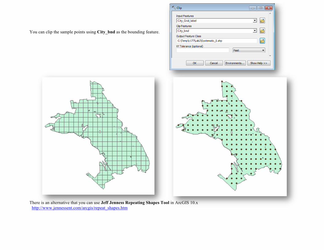
You can clip the sample points using City_bnd as the bounding feature. There is an alternative that you can use Jeff Jenness Repeating Shapes Tool in ArcGIS 10.x http://www.jennessent.com/arcgis/repeat_shapes.htm

1.3 Stratified Sampling Data Management Tools ! Sampling ! Create Random Points
For a Stratified Sample, select Oakland_blkgrp as the Constraining Feature Class and set the number points as 5. This parameter causes the tool to generate 5 points for each feature/stratum (or census block group in this instance) in the feature class.

1.4 Cluster Sampling Here a two-stage cluster sampling design is introduced. First the Primary Sampling Unit (PSU) should be determined. Here I demonstrate two ways. 1.4.1 Census Block as PSU You can use Geostatistical Analyst Toolbox to randomly select a few features from Oakland_blkgrp. Geostatistical Analyst ! Utilities ! Subset Features If you choose PERCENTAGE_OF_INPUT, the number in Size of training feature subset is the percentage proportion, otherwise it is the absolute number of records/features. In the configuration above, 10% of the polygons as PSU is randomly sampled.

The result is a separate layer of 10% randomly selected polygons. Now you can follow the guide in Stratified Sampling to generate, for instance, 5 points for each PSU polygon in the new layer.

1.4.2 Regular Grids as PSU The 25 rows and 25 columns Grid from section1.2 above was generated in using systematic sampling. We had clipped the Grid Cells using City_bnd. Each Grid Cell is a PSU so that the Subset Features tool in the Geostatistical Analyst toolbox is used to select a proportion of PSUs. Geostatistical Analyst ! Utilities ! Subset Features

Next we use Data Management Tools ! Sampling ! Create Random Points, as we did in the stratified sampling to generate random points within each proportion of PSUs. The result should look like the following.
2. Descriptive Statistics
2.1 Central Tendency Identifying the most centrally located features in a distribution
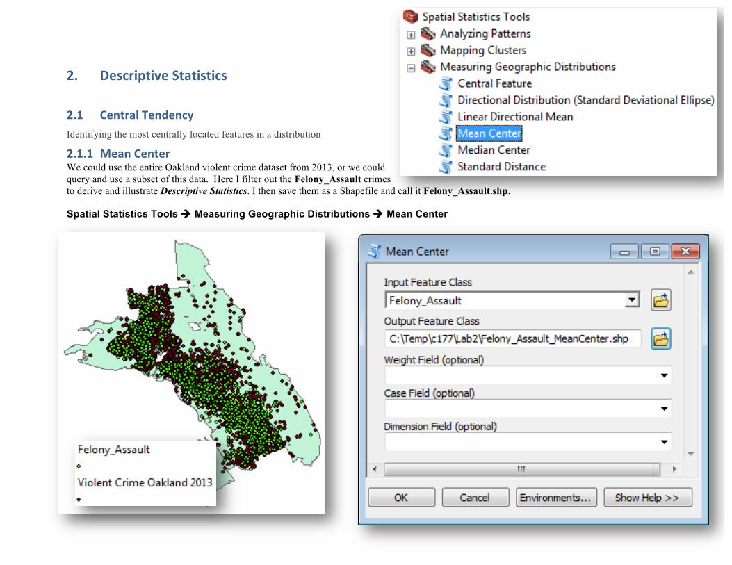
2.1.1 Mean Center We could use the entire Oakland violent crime dataset from 2013, or we could query and use a subset of this data. Here I filter out the Felony_Assault crimes to derive and illustrate Descriptive Statistics. I then save them as a Shapefile and call it Felony_Assault.shp. Spatial Statistics Tools ! Measuring Geographic Distributions ! Mean Center

Output is a single point, the geographic or spatial mean of the point set.

2.1.2 Median Center The Median Center is similar to Mean Center. However, the Mean Center calculates means for X and Y coordinates independently while the Median Center is the location with minimum sum of Euclidean distances to all points in the distribution. Here we seek to …minimize the Euclidean Distance d to all features (i) in the dataset Spatial Statistics Tools ! Measuring Geographic Distributions ! Median Center

2.2 Variances
2.2.1 Standard Distance The Standard Distance tool calculates the standard distance (deviation) and applies it as a radius to generate various circles based on the 1st, 2nd or 3rd standard deviation from the mean. In a normal distribution, 1-standard deviation covers 68% of the data, 2-standard deviation covers 95% and 3-standard deviation covers 99%.
Spatial Statistics Tools ! Measuring Geographic Distributions ! Standard Distance
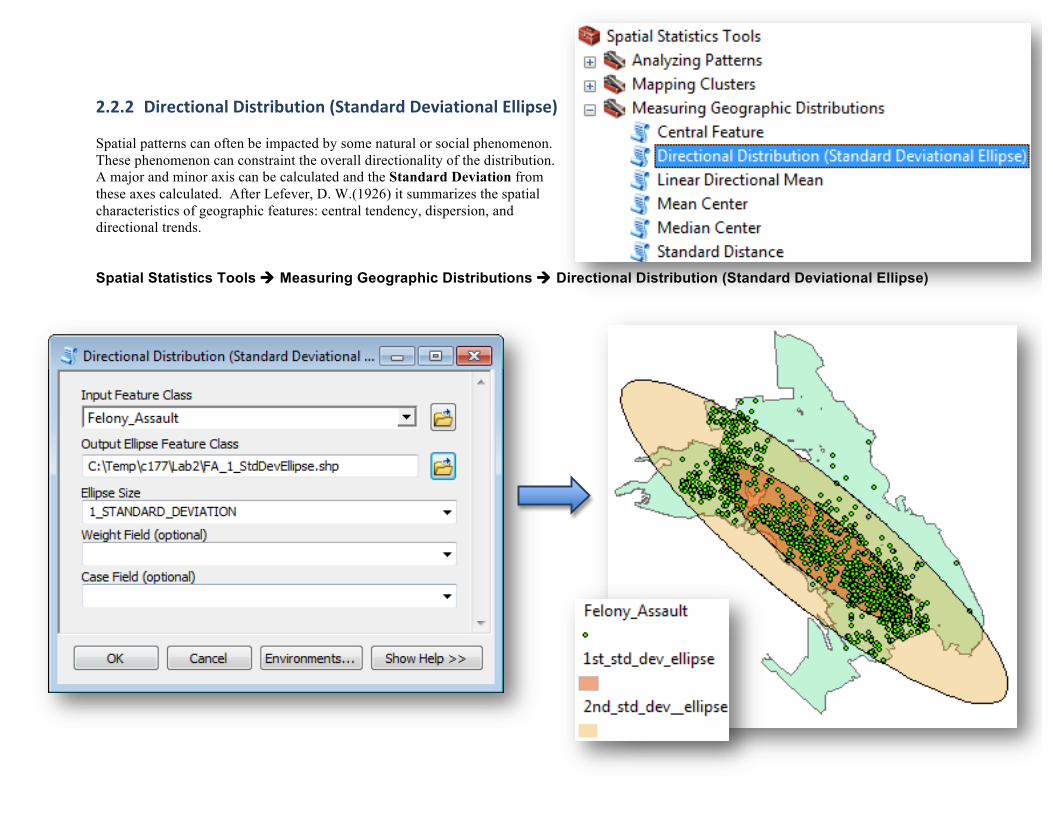
2.2.2 Directional Distribution (Standard Deviational Ellipse) Spatial patterns can often be impacted by some natural or social phenomenon. These phenomenon can constraint the overall directionality of the distribution. A major and minor axis can be calculated and the Standard Deviation from these axes calculated. After Lefever, D. W.(1926) it summarizes the spatial characteristics of geographic features: central tendency, dispersion, and directional trends. Spatial Statistics Tools ! Measuring Geographic Distributions ! Directional Distribution (Standard Deviational Ellipse)

3. Point Pattern Analysis
If we hope to analyze and understand spatial interaction and why it even occurs, we need to first identify geographic patterns. Quantifying broad spatial patterns by applying statistical metrics can help us answer questions associated with spatial characterization such as clustering or regularity. Although we can sense of the general pattern in data by mapping them, in order to quantify this we must apply statistical metrics that allow us to compare patterns of different distributions. Some of these metrics (tools), based in inferential statistics, begin with a null hypothesis that the objects (points or features) in a dataset exhibit a spatially random pattern. Often, a p-value, representing the probability that the null hypothesis is correct (the observed pattern = spatially random) is calculated and associated with a relatively high level of confidence in order to make a pattern decision. 3.1 Average Nearest Neighbor One way of generating inferential statistics and employing them in decision making is to examine the spatial distribution of point pattern nearest neighbors. Here we can calculate a Nearest Neighbor Index (NNI) based on the average distance from each point (or feature) to its nearest neighboring point (or feature). We can compare the Observed Mean Distance to the Expected Mean Distance and calculate a Nearest Neighbor Index (NNI) where we can compare it to NNI of theoretical patterns ranging along a spectrum from totally dispersed to totally clustered. In ArcGIS we can envoke an Average Nearest Neighbor tool here: Spatial Statistics Tools ! Analyzing Patterns ! Average Nearest Neighbor The z-score and p-value results that accompany the results form this tool are measures of statistical significance that tell us whether or not to reject the null hypothesis (denoted H0 ). For the Average Nearest Neighbor statistic, the null hypothesis states that features are randomly distributed. Please note that the statistical significance for this tool (the method employed here) is strongly influenced by the area size of your distribution.

DO NOT forget to check the Generate Report (optional) box. When the process is done, you can open the ArcCatalog application and go to your default or scratch workspace location to find the report in HTML format. Some software configurations produce a clickable pop-up window in the lower-right corner that you can click for the result summary and the report location on the hard drive in the computer. If you cannot find this (depends on how the software has been setup), go to C:\Users\your-account-name\Documents\ArcGIS to find the HTML report file. On my computer it is located here:
The HTML file summarizing results will not automatically appear in the ArcCatalog window. If you want HTML files to be displayed in ArcCatalog, open the ArcCatalog software and: 1) select the Customize menu option, 2) click ArcCatalog Options, and 3) select the File Types tab. Click on the New Type button and specify HTML for File extension. Click OK.

Locate the HTML report file and open it with your web browser. Mine was located here: C:/Users/john radke/Documents/ArcGIS/NearestNeighbor_Result.html The result tells me that the points are clustered using average nearest neighbor algorithm. The p-value is a probability and here is very small (p-value = 0.000) which means it is very unlikely (small probability) that the observed spatial pattern (Felony_Assault) is the result of random processes. We reject the null hypothesis (H0: that Felony_Assault crimes = random point pattern) and there are underlying variables that influence the spatial distribution of Felony_Assault crimes.

How small is small enough? In order to answer this question we should first look at a Standard Normal Distribution.

Z-scores are standard deviations. A z-score of 2.0 means the result is 2 standard deviations away from the mean. Like p-values, z-scores are based on the Standard Normal Distribution. Very high (positive) or very low (negative) z-scores, associated with very small p-values (such is our case here with Felony_Assaults) are found in the tails of the normal distribution. When results have small p-values and either a very high or a very low z-score, it is unlikely that the observed spatial pattern is the result of random processes. We reject your H0 . The rejection of H0 is a subjective judgment regarding the degree of risk we are willing to accept for being wrong (falsely rejecting H0 ). Therefore it is best to setup the argument and choose a confidence or cutoff level before we undertake our pattern analysis. In the sciences we generally choose one of three confidence levels shown in the table below as percents.
A confidence level of 99% is the most conservative and indicates that we are unwilling to reject the H0 unless the probability that the pattern was created by random chance is really small (p-values < 1 percent probability). In our analysis of Felony_Assaults we did have a very small p-value (p-value = 0.000) and therefore we can choose the most conservative confidence level of 99% and we still reject our H0 . In our analysis of Felony_Assaults, our z-score = -41.73 which lies beyond 2.58 standard deviations from the mean (230.43) and on the clustered side (smaller distance than the mean nearest neighbor distance) of the distribution. Therefore the spatial structure is clustered and there is evidence of some underlying spatial processes at work. Some independent variable (or variables) is causing Felony_Assaults.
3.2 Create Thiessen Polygons (or the Voronoi Diagram) It is common to organize, group and classify spatial observations to better synthesize or the very least better hypothesize underlying process. It has been argued that this type of mental classification process is fundamental to learning and comprehension. Searching for clusters, for density in patterns, or identifying groups in data can help to formalize spatial properties or space-time properties. It is most appropriate, therefore, to think of Point Pattern Analysis as an exploratory tool that can help us learn more about underlying process and structures in data. Identifying pattern and shape can lead to very powerful hypotheses in applications. Geographies 1st law of geography (at the very least a pseudo law)
Geographer Waldo Tobler (1970) proposed: “Everything is related to everything else, but close things are more closely related.” This idea underlies many of the algorithms that construct spatial decompositions in point pattern analysis. Spatial Decompositions Spatial decompositions are a form of spatial indexing where one uses statistics or computational morphology to generate new geometries that represent the current distribution. The Standard Distance and Standard Deviational Ellipse above are just two examples of spatial decompositions. The spatial decomposition of data is becoming more common with many tools now packaged in popular software such as ESRI’s ArcGIS. The location characteristics of observations are abstracted and reconstituted as spatial data models (points, lines, polygons or raster cells) that characterize the spatial extent of data (Goodchild,1992). Further processing within these new data models can take the form of vertical (overlay) or horizontal (proximity) spatial data analysis (Gong, 1994), now common practice in the processing of data in geographic information science. Radke and Flodmark (1999) assert: “Decomposing a point set into simple line or polygon sets can result in perceptually meaningful shapes or structures that better describe the original point set’s morphology. These new structures can provide better descriptors of form, or anthromorphic decompositions as they are referred to by Pavlidis (1977), between neighboring points. Essential or extreme points in the pattern can be used to decompose and detect the geometrical properties of the points set understudy and can greatly assist in hypothesis formulation”. Notions of Proximity Proximity here refers to nearness in space or time. The proximity of all neighbors affects their potential for interaction. Notions of proximity can be effective in modeling the clustering of populations. It can help us formulate hypotheses such as; “Too much proximity to toxic chemicals can lead to a fatal disease”. One of the oldest spatial theoretical Spatial Decompositions that helps us quantify proximity was Thiessen’s (1911) polygons. If we begin with simply buffering polygons by some increasing buffer distance, the buffering circles eventually impact or make contact with one another to form a set of cells, a cellular network consisting of polygons commonly referred to as Thiessen polygons or the Voronoi Diagram. (Thiessen. 1911 ; Okabe et al, 2000)

Buffering circles Thiessen polygons or the Voronoi Diagram The theoretical background for creating Thiessen polygons is as follows: ▪ Where S is a set of points in coordinate or Euclidean space (x,y), for any point p in that space, there is one point of S closest to p, except where
point p is equidistant to two or more points of S. ▪ ▪ A single proximal polygon (Voronoi cell) is defined by all points p closest to a single point in S, that is, the total area in which all points p are
closer to a given point in S than to any other point in S. (ESRI online help) ESRI’s online tool can be found in the Analysis Tools tool box. Analysis Tools ! Proximity ! Create Thiessen Polygons We generate the Thiessen polygons of the Felony_Assault point set.

Note: I had set my Geoprocessing ! Environments… ! Processing Extent to that of the same as layer City_bnd as the Create Thiessen Polygons output needs a bounding box to limit the diagram from reaching to its theoretical extent, infinity. I then clip the Felony_Assault Thiessen polygons to the City_bnd boundary.


Assignment
Exercise
Using a subset of the Oakland Crime Events in 2013, determine if there is a pattern Crime and its relationship with school locations. Hints: Open the attribute table of VCrimeOakland2013.shp 1) You can make a query of crime types to extract a certain type. 2) You can also select crimes in certain months/seasons/school terms and compare these patterns using mean center and standard deviation ellipse. 3) Formulating hypotheses may help you decide on what Crime Type to extract. Here are some example questions: Is there a shift of crimes with months? Is there any difference in crime patterns between school breaks and normal school activities? Where does a certain type of crime occur as opposed to others? Which type of crime is more likely to occur near schools? Are the crime patterns (of a certain type) in a certain time period: random, clustered or dispersed? Formulate your own questions and use the tools introduced (and possibly other tools not introduced) to study the datasets and form your own conclusions.
Submission 1. Submit your doc via bCourses (where you download this instruction) 2. Include five screenshots of your sample points (SRS, Systematic, Stratified, 2 Clustered) 3. Your analysis of the exercise topic (Try to use central tendency, standard deviation and average nearest neighbor to support your analysis)

References Bolstad, Paul. (2002). GIS Fundamentals: A First Text on Geographic Information Systems. Eider Press Gong, P. (1994). “Integrated Analysis of Spatial Data From Multiple Sources: An Overview”, Canadian Journal of Remote Sensing, 20(4):349-359. Goodchild, M.F. (1992). “Geographical Information Science”, International Journal of Geographical Information Systems, 6(1):31-45.
Lefever, D. W.(1926). “Measuring Geo raphic Concentration by means of the Standard Deviation Ellipse.”American Journal of Sociology 52, 88-94.
Okabe, A. , Boots, B. , Sugihara, K.., and Chiu, S. N. . (2000). Spatial Tessellations: Concepts and Applications of Voronoi Diagrams. JohnWiley & Sons, Chichester, UK.
Pavlidia, T. (1977). Structural Pattern Recognition, Springer-Verlag, New York.
Radke, J. D., Flodmark, A (1999), "The use of spatial decompositions for constructing street centerlines", Geographic Information Sciences 5 (1): 15–23.
Thiessen. A.H. (1911). Precipitation averages for large areas. Monthly Weather Review, 39(7): 1082-1084
Tobler W., (1970) "A computer movie simulating urban growth in the Detroit region". Economic Geography, 46(2): 234-240.
http://desktop.arcgis.com/en/desktop/latest/tools/spatial-statistics-toolbox/an-overview-of-the-measuring-geographic-distributions-toolset.htm