edition 396, 26 february 2021
TRANSCRIPT

Edition 396, 26 February 2021
Page 1 of 20
Contents
Dog-eat-dinner: a tough day in the life of a broker analyst Marcus Padley
What drives Australian versus global equity performance? David Bassanese
Invest in Australian value stocks before it is too late Reece Birtles
Gains of a lifetime reward new retail investors Gemma Dale
FANMAG: Because FAANGs are so yesterday Ishan Ghosh PhD
Overdue overhaul of Australia’s aged care system Rachel Lane
‘Super-defensive equities’ may rescue struggling 60/40 portfolios Alastair MacLeod
Editorial
There's a favourite phrase that climate change sceptics like
to use, that ‘the science is not settled’. It's so powerful
because it's easy to find a qualified scientist who disagrees
with 95% of his or her colleagues. Investing is even worse,
because it is more open to personal interpretations and
subject to behavioural biases. The science is certainly not
settled.
So one minute, a leading investment analyst says we are in
a stockmarket bubble and then the next, another reports
it's the best conditions for equities ever. Confusing? While
there are parts of the market where stocks are priced for
perfection, the shares of other companies have struggled.
Consider the sectors which have done well during COVID,
and those which have lost.
While many US experts such as Jeremy Grantham and
Stanley Druckenmiller are predicting market doom, a
leading Australian investor, Chris Stott of 1851 Capital
told the AFR on 22 February 2021:
“So the data over the next 12 months should look pretty
spectacular, some of the best economic prints we’ve seen
for well over a decade if not longer. I think the outlook for
the economy today is a lot stronger than what it was pre-
COVID. And the sharemarket’s still just shy of its pre-
COVID peak, so when you marry all that up the outlook for
the equity market looks as good as we’ve ever seen it.”
Strong stuff. "As good as we've ever seen it". Chris
invests in Australian stocks, which have not seen as much
of the frothy excess of the US. This Vanguard chart shows
current equity valuations (based on Price/Earnings
measures) relative to fair value, and Australia looks
reasonable.

Page 2 of 20
This week on LinkedIn, Bridgewater's Ray Dalio asks the question, 'Are we in a stock market bubble?' and he
uses his systemised 'bubble indicator' for a perspective on the US market. He concludes:
"In brief, the aggregate bubble gauge is around the 77th percentile today for the US stock market overall. In
the bubble of 2000 and the bubble of 1929 this aggregate gauge had a 100th percentile read ... There is a very
big divergence in the readings across stocks. Some stocks are, by these measures, in extreme bubbles
(particularly emerging technology companies), while some stocks are not in bubbles ... the share of US
companies that these measures indicate being in a bubble is about 5% of the top 1,000 companies in the US,
which is about half of what we saw at the peak of the tech bubble."
So when anyone asks if the market is in a bubble, ask which market they are talking about. Take care, for
example, with long-term fixed rate bond issues for corporates in the current rising rate environment. Spreads
are very tight.
The other complication in assessing value is that many companies are coming out of COVID much better than
expected. If anyone should be able to predict the health of corporate Australia, it is the CEO of a major bank,
but ANZ's CEO Shayne Elliott said this week:
"Look at the results of corporate Australia. It's pretty staggering in terms of profitability. What we didn't count
on was the level of government support and the impact of really low interest rates."
As we head into the final days of the February 2021 company reporting season, Marcus Padley takes a look
inside the frantic world of stockbrokers and their struggle to cope with dozens of companies releasing results
each day. He explains why so many broker forecasts tend to a consensus level.
If you think Marcus is
exaggerating, consider this chart
of broker stock
recommendations for the Dow
Jones Global Titans 50 Index
which covers multinational
companies in the Dow Jones
Global Indices. The companies
are overwhelmingly listed in the
US, and many are the tech
companies identified as driving a
bubble. Look at the Consensus
Summary columns. Of the 50
companies in the so-called
bubble market, only 12 have a
sell recommendation across the
six biggest brokers making 300
recommendations. 'Holds' are
more common but both are
overwhelmed by 'buys'. What
generates such optimism?
Drawing out this theme of
Australian versus US equity
performance, David Bassanese
explains why the markets differ,
the impact of currency and
which he expects to perform
best in future.
Then Reece Birtles pitches in
with his take on 'value versus
growth'. It's another example of
the stocks left behind in the
rally, and the cycle is already
showing signs of turning. Value's
time in the sun will come.

Page 3 of 20
A major change in the investing landscape hit the markets in 2020 with the rapid increase in participation by
younger investors. Gemma Dale documents the trend including what they are investing in, and it's not what
most people assume. The newbies have started well on the investing journey.
Back to the US success stories and the big tech stocks, Ishan Ghosh makes a surprising claim that their
exceptional performance is not unusual compared with big companies of the past, and in fact, many large US
tech companies have done poorly over the last year. So those themes we think are running hot are harder to
pick than we might think.
Rachel Lane is a leading policy influencer in aged care, and she explains the changes needed to a poor
system. Anyone who has been through the tedious detail will sympathise.
And Alastair MacLeod focusses on a problem facing many people, especially retirees, that their 60/40
portfolio is dragged down by low bond rates, and he suggest alternatives in 'defensive equity' strategies.
In this week's White Paper section, something different with a new podcast recording with Hamish Douglass
of Magellan. He speaks to Morningstar in the US on their The Long View programme about how Magellan
started and how he builds compounding portfolios.
And the Facebook thing? I didn't realise so many people receive their news via a social media feed. And don't
the news organisations post their content and links onto Facebook so more people will read them? That's what
Firstlinks does and we benefit from traffic directed back to our website, so it's not clear to me why Facebook
should pay for it.
I'm old school in paying subscriptions for news I want, reading the website, app or newspaper directly. For
Firstlinks, only 2% of our users come through social, with 98% of readers directly accessing through our
website, the newsletter, search or referrals. We have developed our direct audience for nearly 10 years and do
not rely heavily on Facebook. Treasurer Josh Frydenberg was speaking as if the only way to view web sites
was via Facebook when he said on Channel 7's Sunrise about his call to Mark Zuckerberg:
"We spoke yesterday morning and I expressed my deep disappointment as to what Facebook had done ... we
view those actions yesterday as unnecessary, as heavy-handed, as wrong and as damaging the reputation of
Facebook here in Australia. To restrict access to the New South Wales Fire and Rescue or to restrict access to
the Royal Children’s Hospital or other important sites, is very problematic and it was a heavy-handed tactic."
Restrict access? Does Facebook control access to web sites? Don't people know how to find web sites on the
internet? We welcome any comments on this issue ... what proportion of the news you read or watch do you
receive on Facebook?
Dog-eat-dinner: a tough day in the life of a broker analyst
Marcus Padley
As we end the February results season spare a thought for those poor but highly paid broker analysts.
The job of a broker analyst is to scrutinise stocks, and during results season, when a company's announcement
drops, the sooner they do it, the better. Here's why February is purgatory for them, and why you should know
what they are doing.
First in, best dressed with broker commissions
In order to be competitive, at the very least, on the announcement of an important company result, the big
broker analyst must immediately read the announcement and hit the biggest institutional clients straight away.
A crisp and accurate analysis is essential, including an action recommendation that hopefully generates an
order that makes both the broker and the client look very clever, very quickly.
Analyst bonuses are based on a few KPIs. The first is corporate fees from the companies they cover. The next is
market share compared with all the other brokers of trades in the stocks they cover - when a company choses
a broker to do a corporate deal, the first thing they check is the market share in their own stock to identify the
broker most engaged in their stock. Generating orders is the daily bread and butter but getting a corporate deal
is the cherry on top.

Page 4 of 20
A quick update to the dealing desk, then the world
On top of that, the big broker analyst must verbally brief the whole of their dealing desk with a similarly
accurate, informed and hero-making opinion. Their dealers can then disperse the view rapidly down the phone
lines in the pursuit of even more first-mover inspired salary-justifying orders.
And all before the competition do the same thing.
Next, the analyst tunes into the conference call with the company, furthering their own personal brand and that
of the broker through the teleconference protocol which includes stating your name and institution and asking
brilliantly insightful questions you already know the answers to. Your future employers, who are almost
certainly listening, might also be impressed. Then, in less than half an hour, the analyst issues a written
summary of the results that further carries their brand and brilliance to the inboxes of the entire industry.
At the same time, if they want to remain employed, their opinion mustn’t jeopardise any relationships their
broking house might already have with that company and, if you know which side your bread is buttered,
actually furthers the relationship with the company ... just in case they have a corporate deal paying healthy
fees sometime in the future.
And finally, amid the constant barrage of client and dealer questions and even a visit or two to the biggest
clients' offices, these analysts write a fresh and original 20-page piece of research for the next day’s morning
note that 'stands out' from the other broker research. It must be proofed and submitted by the research
editor’s deadline somewhere between closing time on the day of the announcement and 4am the next morning.
Dinner's in the dog
That’s if the analyst only has one result a day. Some analysts are responsible for two or three company
announcements a day. On the biggest day of the results season, there are 20 Top 200 company results all of
which must be digested, analysed and regurgitated before the research is sent out at 6am.
Good luck getting home that day, week, month. “Dinner’s in the dog” is a great 'Welcome Home' post-it note
when you’re busting your arse bringing home the bacon. Tough stuff.
But before you pull out your violins, imagine doing all that and getting it wrong. Imagine what it’s like for an
analyst running with a buy recommendation when the results are terrible, or a sell recommendation when the
results are great. There’s standing out and there’s standing out for the wrong reasons. Get it wrong and you’ll
be pushing research out at 4am in a cloud of shame. Your dealer group will abuse you for their lost goodwill,
the corporate department will send you to Coventry (or worse) forever. The clients will drop you for your lack of
value and your competitors, and potential employers, will rejoice in your misfortune and tear up the CV your
headhunter just sent them.
Is it any wonder forecasts hug the consensus? In a broker-eat-broker world just remaining a broker is
sometimes reward enough. Survival is a bonus. Success is rare.
So spare a thought for the brokers as you read the research this February. You have the luxury, in the clarity of
the morning, on a full stomach, after a good night’s rest, with the power of hindsight, in the context of multiple
opinions, of casting judgment on a professional, under a lot of pressure, with an empty stomach operating at
4am in the morning whilst their dog sleeps at home, bloated by a well-done rump steak.
They’re a tough breed those broker analysts, in a dog-eat-dinner world.
Marcus Padley is the author of the daily stock market newsletter Marcus Today and the Co-Manager of the
Marcus Today Separately Managed Accounts. To invest with Marcus or sign up for his newsletter, see
marcustoday.com.au.

Page 5 of 20
What drives Australian versus global equity performance?
David Bassanese
Australia’s equity market performance versus global markets has waxed and waned over recent decades. A key
driver of relative performance has been global sector performance, in particular, technology versus mining
stocks.
Long-run trends in equity market performance
As the chart below shows, Australian relative equity market performance has been through several marked
cycles in recent decades. In the late 1990s, the local market tended to underperform. It then enjoyed a
sustained period of outperformance from the bursting of the global dotcom bubble in 2000 until the end of the
GFC in late 2009. Since the GFC, the local market has once again tended to underperform.
Note, moreover, the swings in relative performance historically have tended to be a bit wider versus unhedged
global equities than versus hedged global equities. That’s because when Australian equities have been
outperforming, the Australian dollar has also tended to rise. This has detracted from global equity returns in
unhedged, $A terms.
By contrast, when Australian equities have been underperforming, the Australian dollar has also tended to fall,
which has added to global equity returns in unhedged, $A terms. This is a vital distinction.
Why has Australian relative equity performance shifted over time?
As seen in the chart below, and at the risk of oversimplifying, a major driver appears to be the relative
performance of the global technology sector versus the global mining sector. When technology has
outperformed (as in the late 1990s and since the GFC), global equities has also tended to outperform. When
the mining sector has outperformed (as during the noughties China-driven commodity boom between the
dotcom bubble and the GFC), Australian equities has also tended to outperform.

Page 6 of 20
More recent performance: A shift-share analysis
Another more detailed way of understanding relative performance is by undertaking what’s known as a ‘shift-
share’ analysis. This deconstructs relative performance into two parts:
1. Industry effect – whereby Australia's performance is based on our relative exposure to global sectors doing
either well or poorly.
2. Competitiveness effect – whereby our performance is based on the performance of local sectors compared
to their global counterparts.
As seen in the table below, over the past year, Australia’s market has been broadly flat whereas global markets
(in hedged or local currency terms) have risen a solid 15%.
As at 5 February 2021.

Page 7 of 20
Across sectors, the biggest drag has been technology, due to the industry mix rather than competitiveness
effect. In particular, although local tech stocks did even better than their global counterparts (48.8% vs.
42.2%), local performance suffered because our listed technology sector is relatively small by global standards
(a market share of 3% vs. 19% globally).
The consumer discretionary sector was also a drag, as this strongly-performing global sector has a relatively
small weight in the local market and because local consumer stocks underperformed their global peers (though
the latter is also partly a tech story as strongly-performing Amazon is treated as a consumer discretionary
stock).
Financials were also a drag as Australia has a relatively high weight in this global sector which has performed
poorly over the relevant period). Other notable drags were industrials and health care due to competitiveness
effects – our local sector underperformed their global peers. The healthcare drag may reflect the relatively good
performance of leading global vaccine companies, and recent strength in the $A which has hurt offshore
earnings of local companies like CSL.
Where to from here: technology/growth or resources/value?
Of course, all this begs the question: which will be the dominant global thematic over the next few years? Are
we about to enter an inflationary commodity ‘super-cycle’ based on a synchronised rebound in global economic
growth, which could expose commodity supply bottlenecks following years of low prices and an under-
investment in new capacity? This appears to be the commodity bull case.
Or will the disinflationary global technology boom – largely in place since the GFC – continue to prevail?
My judgement is that the latter, rather than the former, will remain dominant, although commodities/resources
could enjoy a short-run post-COVID bounce.
After all, commodity prices have been in a long-term downtrend, which has occasionally been interrupted by
the emergence of a new industrial superpower, such as China most recently especially after its entry into the
World Trade Organisation (WTO) in 2001. There’s no new industrial superpower on the horizon that will have a
similar voracious demand for raw materials.
Meanwhile, the technological revolution, encompassing growth in robotics and the shift to cleaner energy, still
appears in its early stages, which could see ever greater efficiency in the use of today’s popular raw materials.
Innovation will also continue to allow corporations to slash costs, which should keep inflation low, much to the
misplaced concern of today’s central bankers.
Of course, I’ll be watching should trends prove otherwise. If I’m right, I suspect Australia’s ability to outperform
global peers will remain somewhat challenged given our relatively low exposure to technology stocks and higher
exposure to financial and resource-related stocks.
David Bassanese is Chief Economist at BetaShares, a sponsor of Firstlinks. This article is for general information
purposes only and does not consider the investment circumstances or needs of any individual.
For more articles and papers from BetaShares, please click here.
Invest in Australian value stocks before it is too late
Reece Birtles
We previously argued the Value style of investing was ripe for a rebound back in September 2019 but COVID-
19 put a spanner in the works for the improving outlook for global economic growth and the Value style at the
time.
The pandemic downturn exacerbated the market’s tendency to overreact and extrapolate, which put Value
investing under significant pressure. However, the positive COVID-19 vaccine announcements in November
2020 resulted in green shoots for a potentially enduring Value rally.

Page 8 of 20
We see that significant opportunities for Value stocks remain from the wide value spreads on offer. Ahead of
spreads narrowing as economies rebound, now is the time to position portfolios in Australian Value stocks.
(As a brief reminder, a 'Value' stock is where the share price appears low relative to its intrinsic value based on
common market value measurements).
Value performance has been under pressure
Traditionally, history has shown that Value style (based on the MSCI World Value Index) has typically
outperformed the broader index (MSCI World Index) over the long term. However, over the last 12 months
(through to 20 January 2021), the 10-year rolling return deficit between Value and Growth styles has more
than doubled the previous large deficit during the tech bubble, and Value has given up nearly 40 years of
cumulative outperformance over Growth.
MSCI World Value – MSCI World: Rolling 10-year
annualised relative return differential
MSCI World Value/Growth
Cumulative relative return
Source: Martin Currie Australia, FactSet, as at 20 January 2021
But EPS for Value have been consistent with Growth
Despite that, earnings per share (EPS) performance between the styles has been remarkably similar over the
last 25 years. This means that the returns differential has been primarily driven by a multiple re-rating for
growth stocks. That is, the price people are willing to pay for growth stocks despite similar earnings prospects
has been significant.
Cyclicality of world and Australian Value spreads
We have in the past created a ‘world’ Value spread based on an extreme valuation dispersion environment
using a composite of typical value metrics including current P/E, next 12-month P/E, dividend yield and
Price/Book).
I have now extended the analysis to Australia, using the MSCI Australia Value and Growth indices.
For the Australian indices, the Value vs. Growth performance dynamic has been much more cyclical than it has
been for the world indices, with less of a structural decline over the last 10 years given the more consistent
quality characteristics of Australian Value and Growth companies.

Page 9 of 20
World Value spreads and MSCI World
Value/Growth cumulative relative return
MSCI Australia Value/Growth: Cumulative
relative return
Source: Martin Currie Australia, FactSet, as at 20 January 2021
*Composite of current P/E, next twelve-month P/E, dividend Yield and P/B for MSCI World
Return differential for Australian stocks also driven by Growth re-ratings
EPS growth for Australia Value stocks have been superior to Growth, especially post the GFC. As such, the
returns differential has been primarily driven by a multiple re-rating for Growth stocks to an extreme equal to
the tech bubble.
MSCI Australia: Next 12-month
EPS by Style (log scale)
MSCI Australia: Next 12-month
P/E by Style
Source: Martin Currie Australia, FactSet, as at 20 January 2021
2020 created the largest valuation opportunity ever
Calculating the ‘Australia’ Value spreads based on the same metrics as above, we can see a similar trend to the
global Value spreads. Looking at when valuation spreads reach extreme levels (>1) has been a good predictor
of stronger future Value returns.
On this basis, the year 2020 witnessed the largest valuation spreads on record for the MSCI Australia indices.
Furthermore, we believe Martin Currie Australia's proprietary discounted cash flow (DCF) based Value spreads
are the best measure for the Australian market given they are forecast Growth and quality adjusted.
Page 10 of 20
Comparing the composite MSCI World and Australia Value spreads with our in-house ‘return to fair value’ based
Value spreads (for both the S&P/ASX 200 and our portfolio), the pattern is similar and each show the extreme
level of spread in 2020.
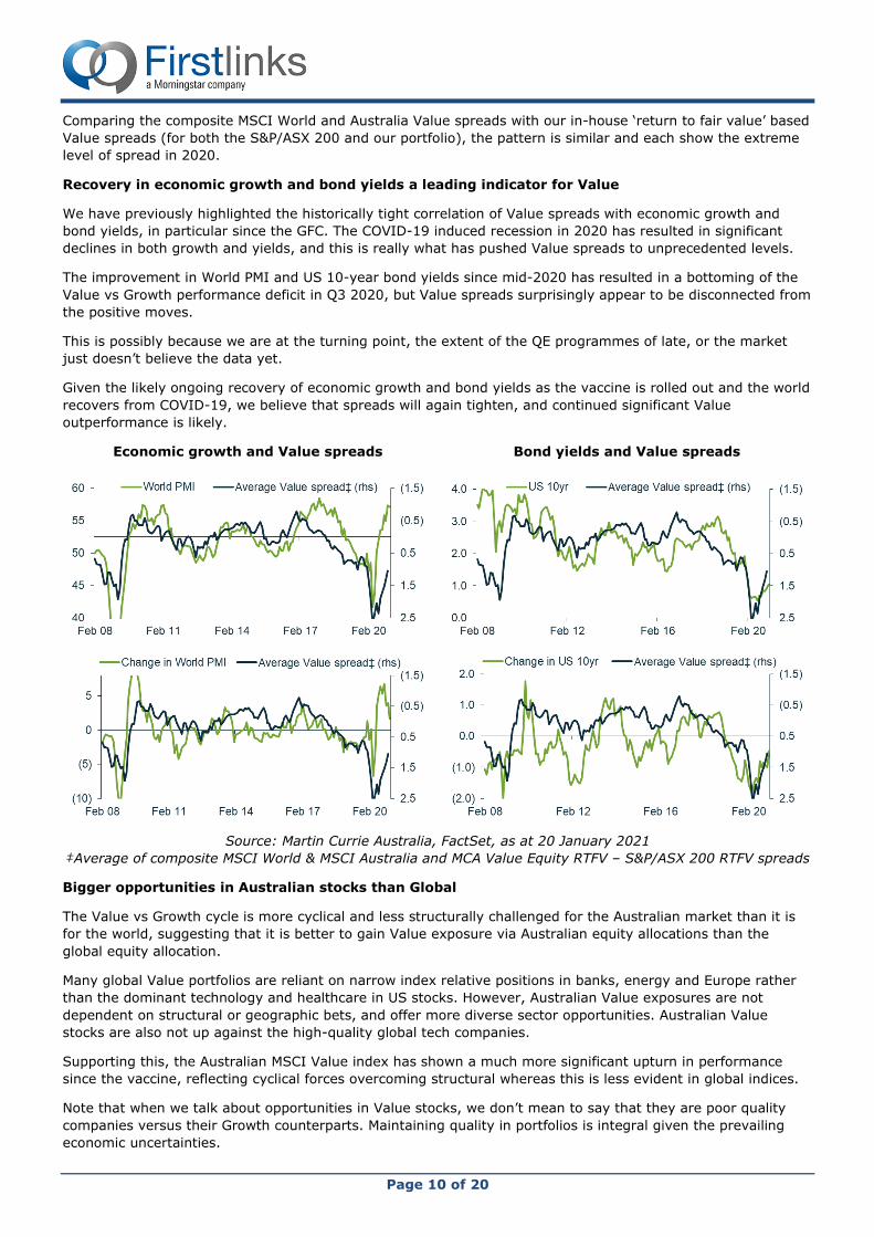
Recovery in economic growth and bond yields a leading indicator for Value
We have previously highlighted the historically tight correlation of Value spreads with economic growth and
bond yields, in particular since the GFC. The COVID-19 induced recession in 2020 has resulted in significant
declines in both growth and yields, and this is really what has pushed Value spreads to unprecedented levels.
The improvement in World PMI and US 10-year bond yields since mid-2020 has resulted in a bottoming of the
Value vs Growth performance deficit in Q3 2020, but Value spreads surprisingly appear to be disconnected from
the positive moves.
This is possibly because we are at the turning point, the extent of the QE programmes of late, or the market
just doesn’t believe the data yet.
Given the likely ongoing recovery of economic growth and bond yields as the vaccine is rolled out and the world
recovers from COVID-19, we believe that spreads will again tighten, and continued significant Value
outperformance is likely.
Economic growth and Value spreads
Bond yields and Value spreads
Source: Martin Currie Australia, FactSet, as at 20 January 2021
‡Average of composite MSCI World & MSCI Australia and MCA Value Equity RTFV – S&P/ASX 200 RTFV spreads
Bigger opportunities in Australian stocks than Global
The Value vs Growth cycle is more cyclical and less structurally challenged for the Australian market than it is
for the world, suggesting that it is better to gain Value exposure via Australian equity allocations than the
global equity allocation.
Many global Value portfolios are reliant on narrow index relative positions in banks, energy and Europe rather
than the dominant technology and healthcare in US stocks. However, Australian Value exposures are not
dependent on structural or geographic bets, and offer more diverse sector opportunities. Australian Value
stocks are also not up against the high-quality global tech companies.
Supporting this, the Australian MSCI Value index has shown a much more significant upturn in performance
since the vaccine, reflecting cyclical forces overcoming structural whereas this is less evident in global indices.
Note that when we talk about opportunities in Value stocks, we don’t mean to say that they are poor quality
companies versus their Growth counterparts. Maintaining quality in portfolios is integral given the prevailing
economic uncertainties.

Page 11 of 20
Many of the key stocks which we believe are undervalued by the broader market have particularly good quality
characteristics. For example, these include:
• Nine Entertainment, which is benefiting from the shift to video/online, and has cost-out driving its EPS
acceleration;
• Star Entertainment, which will benefit from the reopening in Australia and is not reliant on international
travel;
• Inghams Group, who is seeing the end of drought bringing lower feed costs, and experiencing growing
demand for cheap chicken protein;
• Worley, where renewable projects in solar and wind are driving large revenue growth;
• the big 4 Australia banks, which are seeing the post-COVID-19 loan provision unwind increasing both
EPS and DPS; and
• Medibank Private, who is dominating industry profitability and has the ability to acquire to produce high
returns.
Value spreads are lagging the upward trend in PMI and yield, whereas we would expect a much tighter
correlation. We believe that as the recovery continues, there is more room to go in the Value rally that started
in November 2020. The timings of style cycles are notoriously hard to predict, so investors need to be
positioned in quality Australian Value stocks now to capitalise on narrowing spreads.
Reece Birtles is Chief Investment Officer at Martin Currie Australia, a Franklin Templeton affiliate. Franklin
Templeton is a sponsor of Firstlinks. This article is general information and does not consider the circumstances
of any individual. Past performance is not a guide to future returns.
For more articles and papers from Franklin Templeton and affiliates, please click here.
Gains of a lifetime reward new retail investors
Gemma Dale
Despite the major players being mostly anonymous Reddit users, the GameStop frenzy in late January 2021
caught the attention of news outlets and commentators. The challenge of a new breed of retail investors has
been discussed in broadsheets, online and among regulators not just in the US, but across the globe. Added to
the strange Davey Day Trader-Robinhood excitement of 2020, the modern equivalent of column inches given to
new investors has been far from glowing.
They may be new but they have done well so far
Despite this, or in concert with it, hundreds of thousands of novice Australian investors chose close to the
perfect time to start their portfolios in 2020.
At nabtrade, total accounts increased over 30% following the collapse of the market in March 2020, as new
investors flocked to share investing. When the S&P/ASX200 fell 30% in just three weeks, investors rushed to
open accounts at five times the usual rate. As the year progressed, new accounts were continuing at two to
three times the usual number. Other online brokers had similar experiences.
The big fear of regulators and commentators was that this influx would be mostly driven by newly-minted day
traders and novices buying speculative investments.
Instead, the top 10 stocks bought included the big four banks, well known travel companies, an ETF and two
high-flyers from the Buy Now Pay Later sector.
nabtrade analysis has revealed that all of the top 10 stocks bought by new investors have generated a positive
return since they were purchased. Not surprisingly, Afterpay was the most profitable trade, returning an
average of 173% for new investors in 2020[1]. NAB shares generated the next best return, with 38%, and NAB
was bought by 25% more accounts than the next most popular, Qantas.

Page 12 of 20
NAB Qantas CBA Westpac Flight Centre Zip Co ANZ Webjet Afterpay VAS
38% 30% 32% 19% 23% 1% 33% 33% 173% 20%
New investors generated returns of over 30% for three of the big four banks, and greater than 20% for the
most popular travel stocks. With the exception of Zip Co, the minimum average return was 19%. This analysis
does not include any gains since 31 December 2020.
Fortune favours the brave
To be frank, new investors had an astonishing year in 2020. The S&P/ASX200 returned over 50% from its lows,
and new investors have captured, on average, more than half of that return, meaning most of them bought in
before it started to flatten out in June. Buying in a pandemic shows a great deal of confidence for inexperienced
investors.
It’s very difficult to pick the bottom of any market, and most investors didn’t pick the absolute bottom when
they bought. Many have also sold into rallies, which has reduced their return as the market has continued to
recover. Over half, however, have not sold any of their investments during the period.
Overall, the average new investor has done far better than the average expected annual return for the
S&P/ASX200 of 8-10% (including dividends), and remember that the benchmark was almost flat over the whole
of 2020.
This was not simply a punt into tech stocks commonly portrayed in the media. Investors chose to go with well-
established companies, such as the banks, and recovery businesses, like the travel sector, believing that they
were oversold, and would rally strongly as the world recovered from the pandemic.
Holding onto good buys was key to maximising gains in 2020. Young investors, known as Gen Z, showed the
strongest tendency to buy and hold, and have therefore generated a stronger average return than older
investors. Ironically, this group, often deemed as takers of the riskiest positions, was the least likely to actively
trade their new investments.
Investors who bought outside the most popular stocks were less successful on average. This was particularly
true of the Buy Now Pay Later sector. Although Afterpay was one of the best-performing companies of the year,
investors were down an average 32% on Openpay, 25% on Laybuy, 19% on SplitIt and 13% on Sezzle. Three
times more accounts bought Afterpay than SplitIt and Openpay, and five times more bought Afterpay than
Sezzle. Laybuy was bought by just 69 accounts of 10,000 analysed. New investors showed a strong tendency to
stick to strong brands, even in hot sectors.
Hoping this is the start of good experiences
The returns most new investors have generated in 2020 are rare for new and even experienced investors and
are unlikely to be repeated in a more normal market. Far from punting away their life savings or speculating
with stimulus cheques as has been hypothesised in the US, most new investors have bought wisely and held
on. May we all have such good fortune in the market in 2021!
[1] Even casual followers would be aware that Afterpay fell to a low of $8, and currently sits at over $150, so
173% probably seems a modest return. It should be noted that the vast majority of investors fail to buy at the
absolute lowest point, some have taken profits, while others have added to their holdings at higher prices. The
average buy price for Afterpay on nabtrade in 2020 was $40. Most investors are still holding at least some of
their APT investment so their overall return would be much higher than when this analysis was produced in late
2020.
Gemma Dale is Director of SMSF and Investor Behaviour at nabtrade, a sponsor of Firstlinks. This material has
been prepared as general information only, without reference to your objectives, financial situation or needs.
For more articles and papers from nabtrade, please click here.

Page 13 of 20
FANMAG: Because FAANGs are so yesterday
Ishan Ghosh PhD
A handful of large technology stocks have garnered attention for outsize returns in recent years. Collectively
referred to by the FANMAG acronym, Facebook, Amazon, Netflix, Microsoft, Apple, and Google (now trading as
Alphabet) all substantially outperformed the US market (as defined by the Total Return US Market Research
Index*) in the eight calendar years that they have all been public companies (Facebook went public in May
2012).
Emerging as winners from among a large number of companies that fared less well during 2013–2020, these
juggernauts bested most of their surviving peers with annualised outperformance versus the US market ranging
from 7.3% (Alphabet) to 42.6% (Netflix), as shown in Exhibit 1.
(Note that performance data used in the exhibits is from January 2013 to November 2020).
Exhibit 1: At the top of their game, annualised compound return in excess of US market
But many other tech companies underperformed
While this performance dazzled investors and
dominated headlines during 2013–2020, a
more complete picture emerges when
accounting for the many companies whose
investors were less fortunate over the period.
As shown in Exhibit 2, of the 10 largest US
technology stocks as of January 2013, all but
Apple, Microsoft, Alphabet, and Amazon
underperformed the US market over the same
period that elevated their tech peers to
financial market stardom.
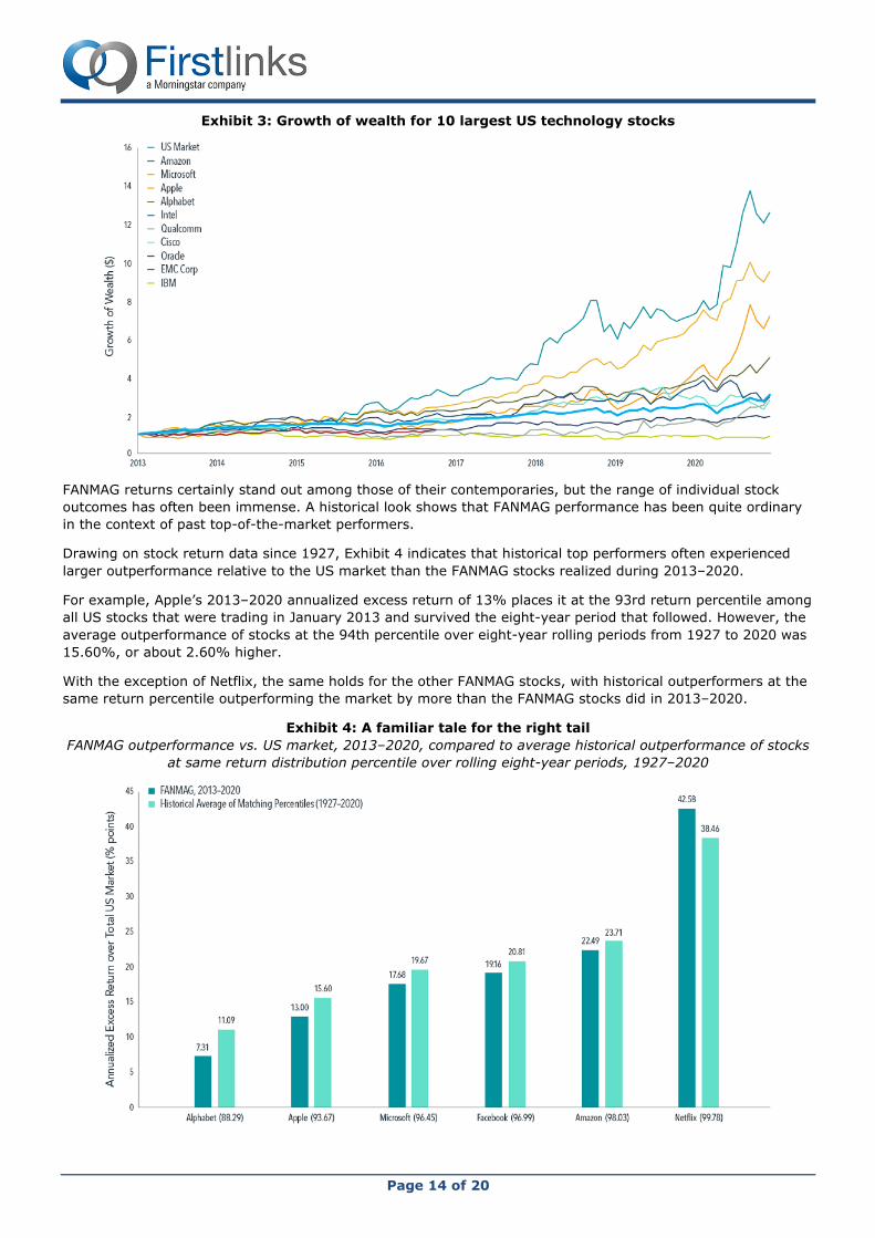
Exhibit 3 shows the hypothetical growth of
wealth for an investor who put $1 in each of
the 10 largest technology stocks and the US
market in January 2013. While the $1 invested
in Amazon and Apple, for example, would have
grown to $12.63 and $7.18, respectively, by
November 2020, the returns of their non-
FANMAG tech contemporaries would have
failed to even surpass the US market.
Exhibit 2: Same game, different outcome
Performance of the 10 largest US technology stocks.
Page 14 of 20
Exhibit 3: Growth of wealth for 10 largest US technology stocks
FANMAG returns certainly stand out among those of their contemporaries, but the range of individual stock
outcomes has often been immense. A historical look shows that FANMAG performance has been quite ordinary
in the context of past top-of-the-market performers.
Drawing on stock return data since 1927, Exhibit 4 indicates that historical top performers often experienced
larger outperformance relative to the US market than the FANMAG stocks realized during 2013–2020.
For example, Apple’s 2013–2020 annualized excess return of 13% places it at the 93rd return percentile among
all US stocks that were trading in January 2013 and survived the eight-year period that followed. However, the
average outperformance of stocks at the 94th percentile over eight-year rolling periods from 1927 to 2020 was
15.60%, or about 2.60% higher.
With the exception of Netflix, the same holds for the other FANMAG stocks, with historical outperformers at the
same return percentile outperforming the market by more than the FANMAG stocks did in 2013–2020.
Exhibit 4: A familiar tale for the right tail
FANMAG outperformance vs. US market, 2013–2020, compared to average historical outperformance of stocks
at same return distribution percentile over rolling eight-year periods, 1927–2020
Page 15 of 20
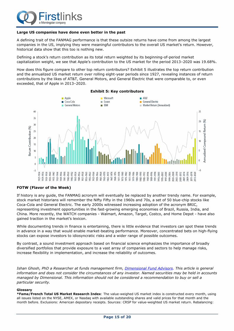
Large US companies have done even better in the past
A defining trait of the FANMAG performance is that these outsize returns have come from among the largest
companies in the US, implying they were meaningful contributors to the overall US market’s return. However,
historical data show that this too is nothing new.
Defining a stock’s return contribution as its total return weighted by its beginning-of-period market
capitalization weight, we see that Apple’s contribution to the US market for the period 2013–2020 was 19.68%.
How does this figure compare to other top return contributors? Exhibit 5 illustrates the top return contribution
and the annualized US market return over rolling eight-year periods since 1927, revealing instances of return
contributions by the likes of AT&T, General Motors, and General Electric that were comparable to, or even
exceeded, that of Apple in 2013–2020.
Exhibit 5: Key contributors
FOTW (Flavor of the Week)
If history is any guide, the FANMAG acronym will eventually be replaced by another trendy name. For example,
stock market historians will remember the Nifty Fifty in the 1960s and 70s, a set of 50 blue-chip stocks like
Coca-Cola and General Electric. The early 2000s witnessed increasing adoption of the acronym BRIC,
representing investment opportunities in the fast-growing emerging economies of Brazil, Russia, India, and
China. More recently, the WATCH companies - Walmart, Amazon, Target, Costco, and Home Depot - have also
gained traction in the market’s lexicon.
While documenting trends in finance is entertaining, there is little evidence that investors can spot these trends
in advance in a way that would enable market-beating performance. Moreover, concentrated bets on high-flying
stocks can expose investors to idiosyncratic risks and a wider range of possible outcomes.
By contrast, a sound investment approach based on financial science emphasizes the importance of broadly
diversified portfolios that provide exposure to a vast array of companies and sectors to help manage risks,
increase flexibility in implementation, and increase the reliability of outcomes.
Ishan Ghosh, PhD a Researcher at funds management firm, Dimensional Fund Advisors. This article is general
information and does not consider the circumstances of any investor. Named securities may be held in accounts
managed by Dimensional. This information should not be considered a recommendation to buy or sell a
particular security.
Glossary
*Fama/French Total US Market Research Index: The value-weighed US market index is constructed every month, using
all issues listed on the NYSE, AMEX, or Nasdaq with available outstanding shares and valid prices for that month and the
month before. Exclusions: American depositary receipts. Sources: CRSP for value-weighted US market return. Rebalancing:

Page 16 of 20
Monthly. Dividends: Reinvested in the paying company until the portfolio is rebalanced. Results shown during periods prior to
each index’s index inception date do not represent actual returns of the respective index.
Overdue overhaul of Australia’s aged care system
Rachel Lane
The current aged care system has failed many senior Australians and providers for years. By participating in the
Royal Commission into Aged Care Quality and Safety, we have contributed to the important ongoing process of
industry improvement. We were pleased to see our ideas reflected in many of the commission’s
recommendations.
Principles to underpin the design of a fairer system
To support development of a better aged care system that is appropriate to the needs and wishes of all
Australians, it is proposed that the following principles should underpin the design of a new financing approach:
• Quality
• Respect and dignity
• Equity
• Transparency and accountability
• Sustainability
• Responsiveness and innovation
• Streamlined and accessible
Overall, the system that is required is one in which people can access the services they need without delay,
with costs and quality standards that are transparent and providers that are accountable and responsive to the
needs of people using their services and who will work with them to innovate and drive efficiencies that will
enhance sustainability without compromising agreed standards. To achieve these goals fundamentally the
system needs to be less complex. The role of the Commonwealth Government is to provide the environment in
which that can occur and to ensure the system is fair and equitable.
The principles we proposed can be seen in many of the recommendations, particularly:
• Recommendation #8: A new aged care programme – designed to be more streamlined, accessible and
equitable.
• Recommendation #9: Meeting preferences to age in place – clearing the waiting list for home care
packages and allocating funding and services in ways that are responsive, sustainable, transparent,
accountable, equitable and high quality.
• Recommendation #20: Planning based on need, not rationed – proposes a funding approach that is
equitable, respectful, supportive of dignity, sustainable, responsive, streamlined and accessible.
• Recommendation #82: Immediate changes to the Basic Daily Fee – proposes a boost to fees from 1 July
2021, on condition that providers report on, and accept accountability for, high quality services.
Home Care Packages: limitations in the current model
As the Royal Commission has heard, in 12 months more than 16,000 people died waiting for a home care
package. For others, a lack of access to supports has resulted in premature entry into residential aged care.
Rationing of packages is out of step with community preferences, denying people access to supports that may
allow them to stay home. This impacts quality of life, particularly for those without family or friends to help fill
the gap.
Transparency
For many the expectation of home care is that you simply “order in” the care you need. In reality accessing a
home care package is a test of patience, resourcefulness and forensic accounting. You need patience during the
long waits for assessment and for care to start; resourcefulness in finding services, volunteers and family
members to fill in the gaps; and forensic accounting to determine whether or not you are getting a good deal.
Administration and case management are services that providers must deliver; without them the package
doesn’t operate. But they are tasks that are largely invisible, making it difficult to know what is really involved
and easy for unscrupulous operators to gouge their customers.

Page 17 of 20
How much care the person can receive with the net funding will depend on where they live, the type of care
and services they receive and who provides it.
Care providers who employ care staff have a vested interest in using their own staff to provide care and
services which in theory has the potential to offer economies of scale. In practice, consumer choice is often
restricted to the services (and rostering availability) of the employed carers with an hourly rate for the services
that is far greater than the cost of wages.
Affordability
A significant concern is the home care package fee structure. Older people are expected to contribute towards
the cost of their package which includes a basic daily fee based on the level of package and an income-tested
care fee which is calculated by Centrelink.
The costs associated with a home care package can result in affordability issues for low income pensioners. The
basic daily fee can amount to 15% of annual income, even without considering expenses associated with daily
living or any other supports older people might require but cannot access through their home care package. It
is possible that older people may not be able to afford the fee contribution which in turn may become a barrier
to accepting a package.
Disparity between Home Care and Residential Aged Care Funding
When you crunch the numbers on the funding models it becomes clear that people living in residential aged
care receive more funding for care than those receiving home care.
At the ultimate amount the funding for someone receiving a home care package is just over $192/day while the
care funding for someone (potentially the very same person) in residential aged care is around $256/day, that’s
more than 34% additional funding for your care based on where you live.
Similarly the converse can also occur, a person with dementia may receive a higher amount of funding through
a level 4 Home Care package (with the dementia supplement) than an aged care facility can receive through
the Aged Care Funding Instrument (ACFI).
These disparities in funding raise a number of questions, including why the funding arrangements are different,
whether it creates a necessity for some people to enter residential aged care when if the funding was the same
they could afford to stay at home and whether the funding, particularly as it relates to dementia behaviours
restricts access to residential aged care for some.
Recommendations
Current Home Care Package limitations are tackled head-on by the recommendations:
• Disparity of funding for people receiving care based on whether they remain at home or move to residential
aged care service is removed by Recommendation #89: Maximum funding amounts for care at home.
• Transparency and affordability are the focus of both Recommendation #93: Standardised statements on
services delivered and costs in home care, and Recommendation #96: Fees for care at home.
The recommendations make a point of separating fees for care at home, including respite care, from fees for
domestic assistance, social supports, assistive technology and other costs. This may assist with some of the
pricing anomalies that we draw attention to in the issue of disparity and affordability. It will all depend on the
details of the implementation.
Our vision is of a system that offers older Australians a true choice between receiving care at home and moving
into residential aged care. In the current situation, too many are forced to move into residential care because
they cannot access sufficient government funding or cannot afford the user contributions.
Concluding comment
If an expert is required to assist an older person to successfully navigate the aged care system, then it is by
definition failing to meet the needs of all. While we believe that there will always be value in seeking expert
advice, a simpler, more user-friendly system with a higher standard of accountability and transparency is
needed. Whether the proposed recommendations can achieve this remains to be seen in the implementation.

Page 18 of 20
As the Principal of Aged Care Gurus, Rachel Lane was invited to contribute to the Commissioner for Senior
Victorians’ submission to the Royal Commission into Aged Care Quality and Safety. This is a summary of that
submission and its recommendations. You can view the full paper here.
‘Super-defensive equities’ may rescue struggling 60/40 portfolios
Alastair MacLeod
Investors concerned about the outlook for their balanced (60% shares/40% bonds) portfolios may need to
consider alternate strategies to deliver their future investment objectives.
Specifically, the reasons for including a large allocation to bonds looks particularly challenged. Aside from
meagre future return expectations, the ability of bonds to meaningfully appreciate during a crisis appears
impaired for the foreseeable future. When preparing for the next crisis, investors will likely need to look further
than bonds for negatively-correlated exposures.
Two such exposures that should appreciate during future crises include:
• Tail hedging – option positions that appreciate in bear markets, and
• Unhedged foreign currency exposures - a more simplistic defensive approach, but one that has delivered a
negative correlation during a crisis.
When integrated together within a global equity portfolio, these embedded features have consistently delivered
a positive total portfolio return in Australian dollars during periods of peak to trough drawdown. We have coined
the phrase ‘super-defensive equities’ to describe an equity strategy that includes both these negatively-
correlated exposures.
Meagre expected returns
Fixed income is coming off the absolute
best of times, with the massive decline in
interest rates over the past few years
helping to generate near equity returns for
both government and corporate bonds.
Over the past three years, Australian
government bonds have returned 6.1%
and corporate bonds 5.9%, which compare
favourably with Australian equities over the
same period despite presenting a
dramatically lower risk profile.
As a secondary effect, this secular rally in
bonds has caused much of the future
expected returns from this asset class to be
‘pulled forward’, which in turn has left
Australian bond indices trading well above
par. Future expected returns are likely to
suffer accordingly and are represented by
meagre yields to maturity.
Figure 2: Australian bond indices
Price Coupon Yield to
maturity
Weighted average
maturity
S&P/ ASX Corporate Bond Index 107.68 3.32% 1.20% 4.7 years
S&P/ ASX Government Bond Index 110.86 2.65% 0.73% 8.2 years
Source: S&P
It is difficult to envisage returns for balanced portfolios that come close to what was delivered over the past
decade. This view is consistent with the current five-year forecasts from BlackRock of negative 0.6% returns for
Australian government bonds and positive 0.5% for Australia corporate bonds.
Figure 1: 3-year asset class returns
Source: Wheelhouse

Page 19 of 20
Impaired defensiveness
Alongside the secular decline in interest rates witnessed since the GFC, there has also been a markedly lower
positive contribution to returns from bonds during periods of market crisis. There is little room for bonds to
appreciate meaningfully during equity market corrections.
The chart below records the movement in
Australian government bonds versus
equities, from the beginning of a large
drawdown to the trough (calendar month
basis).
While bonds have remained robustly
defensive during these drawdowns and did
not decline in value, their recent inability to
meaningfully appreciate makes them less
attractive to smooth returns within a
balanced portfolio. Furthermore, the last 20
years of negative bond/equity correlations
is something of an outlier. Over the very
long-term, bonds exhibit a more positive
relationship, meaning they often fell
alongside equities in a crisis. Combined
with the poor expected future returns, the
current allocation to bonds more closely
resembles an allocation to cash.
This poses the question of how do balanced portfolios expect to deliver on their investment objectives when
they have an effective 40% allocation to cash?
Positive contributions from tail hedging
Properly designed and managed, active tail hedging strategies can provide a positive contribution to portfolio
returns during a crisis. The protection is mechanical in nature (markets go down, hedges go up) and not reliant
on historic correlations or interest rate cycles.
A basic approach to tail hedging involves the purchase of equity put options, which act as a kind of insurance
on the equity portfolio. Similar to insurance, a premium is paid, however when markets decline the put options
are designed to increase in value, sometimes exponentially, which serve to offset equity losses. Efficient tail
hedging requires specialist skill, including managing the expiry of the contracts and payoff design (at what point
they should be bought and start adding value).
Another important point is that the systematic purchase of put options is expected to create some drag on
returns. Depending upon the level of protection required, the long-term cost of a tail hedge can vary broadly.
The defensive tail-based strategy used within the Wheelhouse Global Equity Income Fund is expected to have
an annualised cost of 1.5%. While this cost is not inconsequential, tail hedging may allow a portfolio to remain
fully invested in equities, with the significantly higher expected returns (versus bonds) funding an efficient
hedge. Relative to a large fixed income exposure, this may deliver higher returns with a more reliable defensive
profile.
Positive contributions from a falling Australian dollar
Historically the Australian dollar has fallen during global market crises, as investors seeking protection buy
‘safe-haven’ currencies such as the US dollar.
The chart below plots a 20-year history of market corrections (>10% declines) in the global equity benchmark
(MSCI World ex Australia) on a US dollar basis, from the onset of the drawdown to trough (monthly basis). Due
to the 2.5-year extended drawdown following the tech bubble deflation, we have included a separate point
(March 2000 – September 2001) to reflects the initial 18-month phase. Plotted next to these declines is the
positive contribution from the decline in the Australian dollar (vs USD) during these periods.
Figure 3: Returns from Australian bonds vs equities in
drawdowns
Source: Wheelhouse

Page 20 of 20
Negative correlation matters most during times of crisis. The Australian dollar has reliably added meaningful
positive return to an Australian-based investor in global equities.
While historical correlations do not offer ‘mechanical’ protections, we see no reason why this relationship should
not continue, so long as the US dollar retains its safe-haven status relative to the Australian dollar.
Furthermore, with interest rate differentials effectively zero, there is virtually no carry cost at present for
having the defensive benefit of an unhedged global equity exposure.
Conclusion
A portfolio with 40% effectively in cash will likely have very different future returns and drawdown than
balanced portfolios of the past. This represents the worst of both worlds for a balanced portfolio investor.
We have not considered active management, or other types of fixed income securities in this analysis, which
may alter this relationship. However, we expect benchmark returns for all fixed income securities to be far
lower in the future.
‘Super-defensive equity’ strategies as defined here are one solution that may deliver a higher rate of return,
alongside a smoother return profile, during the next crisis.
Alastair MacLeod is Managing Director of Wheelhouse Partners. This article is for general information only and
does not consider the circumstances of any individual.
Disclaimer
This message is from Morningstar Australasia Pty Ltd, ABN 95 090 665 544, AFSL 240892, Level 3, International Tower 1,
100 Barangaroo Avenue, Barangaroo NSW 2000, Australia.
Any general advice or 'class service' have been prepared by Morningstar Australasia Pty Ltd and/or Morningstar Research Ltd,
subsidiaries of Morningstar, Inc, without reference to your objectives, financial situation or needs. Refer to our Financial
Services Guide (FSG) for more information at www.morningstar.com.au/s/fsg.pdf. You should consider the advice in light of
these matters and if applicable, the relevant Product Disclosure Statement before making any decision to invest. To obtain
advice tailored to your situation, contact a professional financial advisor. Past performance does not necessarily indicate a
financial product's future performance.
For complete details of this Disclaimer, see www.firstlinks.com.au/terms-and-conditions. All readers of this Newsletter are
subject to these Terms and Conditions.
Figure 4: Australian dollar returns during >10% drawdowns in global benchmark (USD)
Source: Wheelhouse