earth&&skytradingsy stem& - forex mentor...
TRANSCRIPT

1
Earth & Sky Trading System
By Pierre Du Plessis

2
Risk Disclosure Statement
The contents of this e-‐Book are for informational purposes only. No part of this publication is a solicitation or an offer to buy or sell any financial market. Examples are provided for illustration purposes only and should not be construed as investment advice or strategy. All trade examples are hypothetical. No representation is made that any account or trader will or is likely to achieve profits or loses similar to those discussed in this e-‐Book. By purchasing this e-‐Book, and/or subscribing to our mailing list you will be deemed to have accepted these and all other terms found on our web page ForexMentorPro.com in full. The information found in this e-‐Book is not intended for distribution to, or use by any person or entity in any jurisdiction or country where such distribution or use would be contrary to the law or regulation or which would subject us to any registration requirement within such jurisdiction or country.
CFTC RULE 4.41
HYPOTHETICAL OR SIMULATED PERFORMANCE RESULTS HAVE CERTAIN LIMITATIONS. UNLIKE AN ACTUAL PERFORMANCE RECORD, IMULATED RESULTS DO NOT REPRESENT ACTUAL TRADING. ALSO, SINCE THE TRADES HAVE NOT BEEN EXECUTED, THE RESULTS MAY HAVE UNDER-‐OR OVER COMPENSATED FOR THE IMPACT, IF ANY, OF CERTAIN MARKET FACTORS, SUCH AS LACK OF LIQUIDITY. SIMULATED TRADING PROGRAMS IN GENERAL ARE ALSO SUBJECT TO THE FACT THAT THEY ARE DESIGNED WITH THE BENEFIT OF HINDSIGHT. NO REPRESENTATION IS BEING MADE THAT ANY ACCOUNT WILL OR IS LIKELY TO ACHIEVE PROFIT OR LOSSES SIMILAR TO THOSE SHOWN.
Copyright © Forex Mentor Pro 2011. All rights reserved.
Any redistribution or reproduction of part or all of the contents in any form is prohibited other than the following:
You may print or download to a local hard disk copies for your personal and non-‐commercial use only;
You may not, except with our express written permission, distribute or commercially exploit the content. Nor may you transmit it or store it in any other website or other form of electronic retrieval system.

3
Earth & Sky Trading System
Introduction – About Me
Name: Pierre du Plessis
Country: South Africa
Age: 38 years
Occupation: Professional Full time Currency Trader.
Bio – I live in the Garden Route, South Africa and am married with three children. I am also known as daddy.daycare to my friends. I trade from home hence very involved with the day to day family needs. School lifts, hockey, rugby, karate – you name it, daddy.daycare will be there.
I`ve been a currency trader for the last 4 years. A lot of my recent success came about when I joined Forex Mentor Pro and I changed to trading 4 hour and daily charts. I have spent years trading 15 minute charts with some success, but this change of direction has taken me to a different level. Once you have mastered trading from bigger time frames – you will never look back.
My trading method is a combination of Marc`s M2 system and a few twists of my own.

4
With this system you will trade with the main trend and that will test your patience.
What does the word patience mean?
Patience emphasizes calmness, self-‐control, and the willingness or ability to tolerate delay.
I personally like the part where it says – ability to tolerate delay. That’s the secret of trading – to tolerate delay and wait for the market to come to you.
So in short, there will be times where you need to wait for price to come to you, the best way to do that without getting impatient or trigger happy is to get a hobby. Get something that will distract you from trading until the price gets to the preferred trading zone.
What does the word discipline mean?
DISCIPLINE (noun) The noun DISCIPLINE has 5 senses:
1. a branch of knowledge 2. a system of rules of conduct or method of practice 3. the trait of being well behaved 4. training to improve strength or self-‐control 5. the act of punishing
Familiarity information: DISCIPLINE used as a noun is common.
DISCIPLINE (verb) The verb DISCIPLINE has 2 senses:
1. train by instruction and practice; especially to teach self-‐control 2. punish in order to gain control or enforce obedience
Why did you need to know the definition of these two words before

5
we start? A system is useless if you don’t have patience and discipline. I can give you the best systems in the world that makes other people plenty of money, but if you as an individual don’t have the discipline or the patience to trade a system, I will guaranty you, as a trader you will not be successful. These two factors will be the key to your success as a trader.
You must remember that some point you’re going to have to figure out how it is that you want to trade. This requires deciding on an approach that is suitable for YOU, and committing to it.
Very few people actually do this, on the other hand those that do, generally get very well rewarded for it.
This system will guide you into the right direction.

6
An Overview of Currency Trading All of us occasionally need our minds jogging so it is hoped this will help.
Forex – What is it?
The Foreign Exchange market is the full name but it is known by many other titles, a selection of which are “FOREX” or “Forex”. Additionally term such as “Retail Forex:”, “FX”, or “Spot FX” or indeed “Spot” all describe what is, at present, the world’s largest financial market. This market trades at in excess of $4 trillion daily. The daily amount traded on the New York Stock Market is circa $25 billion daily, thus one can observe that the multiple is 160 greater on the Forex market. This leads us to ask the following question.
“What is the Foreign Exchange Market constituted of?”
Put simply the answer is money, but this must not be seen as necessarily hard cash. The trades are almost predominantly electronic and as such represent the buying of one currency and the sale of another – effectively “back to back transactions”.
Trade is conventionally undertaken via a broker or dealer. There is an established pattern of pairs such as EUROUSD or USDGBP, but one should be aware that with the introduction of currencies such as the rouble new patterns are rapidly being established.
As previously stated trade is not always, indeed is predominantly not, physical thus as one needs to put one’s mind around that concept. If one can think in the somewhat abstract terms of acquiring a share in say the Japanese economy, and substitute that for the tangible currency, and then link that to the inflationary or recessionary trends in the economy, the picture is drawn.

7
It is fair to say that the exchange rate of a currency bears strong relationship to the state of an economy. However, in the case of a currency linked to many countries such as the Euro, it is the combined effect of a number of countries economies which will affect the exchange rate of that currency.
Spot Rate
This has neither a physical or central location. It is as previously stated largely electronic thus it is akin to an Over-‐the-‐Counter (OTC) or “Interbank” market, as it is run within a network of banks on a continuous basis for 24 hours 5 days of the week i.e. Monday to Friday.
Retail Traders
Until about 20 years ago Forex was the sole domain of major players in the field of banking. Substantial limited capital in the region of between $10 -‐ $50 million was required, which precluded any involvement by the individual. The growth of the Internet has revolutionised that position, and now trading accounts are available to what one may term as “Retail Traders”.
All one needs to become one of these traders is a computer, good broadband, solid information on the basics of trading Forex and time. In the initial stages of trading, investment is best undertaken in relatively small amounts, accompanied by plenty of time to think through your strategies. To formulate these one need to understand the two types of trading.
Types of Trading
There exist two types of analysis which should be explained: Technical and Fundamental.
Technical Analysis involves the dissection and breakdown of price movements through the medium of charts. This allows for the

8
identification of trends, allowing for an understanding of profitable trading opportunities.
Fundamental analysis focuses on market analysis through the strength or weaknesses of its economy.
A combination of the two types of analysis will allow for success.
Chart Types
The types are:
1. Line charts 2. Bar charts 3. Candlestick charts
Line and bar charts will be familiar to almost all people so they need no explanation, whereas candlestick charts will be new to most investors. These have been developed and evolved to price movements of a security, derivative or currency over given periods of time.
They can best be depicted as a combination of line and bar charts, but are frequently used to obtain technical analysis of pricing patterns. Candlesticks are seen as more informative than bar charts. They display absolute prices and relationships to prior period prices. To assist in delineating the figures, quite frequently, candlesticks are coloured.

9
Candlesticks (AKA Candlestick Charts) Candlesticks are formed by using the high, open, close and low prices.
The lines (wicks) which protrude above or below the body of the candle indicate the high and low pricing bands. These are called shadows.
The top of the upper shadow is the high, whilst conversely the bottom of the lower shadow is the low.
The longer the wick the stronger the buying or selling in the period in question. The shorter the wick the indication is less buying and selling has transpired. In the traditional parlance of the financial world we have both “bull and bear” markets.
Basic Candlestick Patterns
N.B.: The following candlestick examples are black and white for demonstration only. On the charts black equals down (bear) and white equals up (bull).
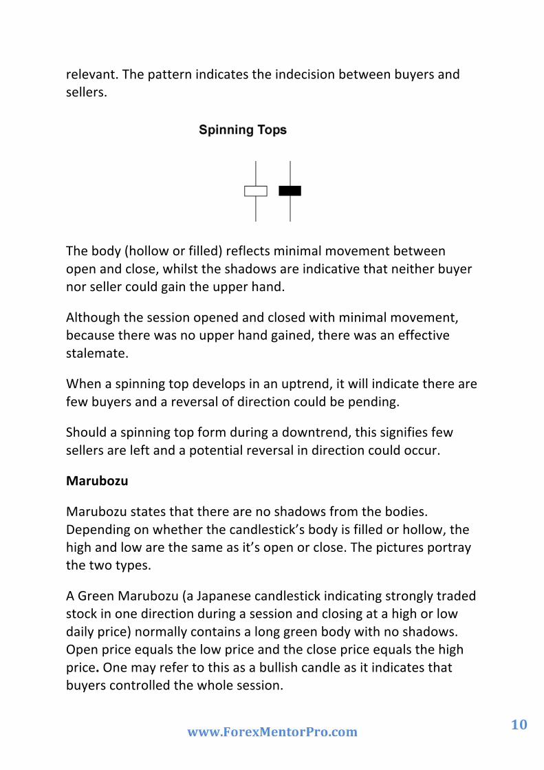
Spinning Tops
Candlesticks with a long upper and lower shadow and small red bodies have the name “Spinning Tops”. The body colour is not
10
relevant. The pattern indicates the indecision between buyers and sellers.
The body (hollow or filled) reflects minimal movement between open and close, whilst the shadows are indicative that neither buyer nor seller could gain the upper hand.
Although the session opened and closed with minimal movement, because there was no upper hand gained, there was an effective stalemate.
When a spinning top develops in an uptrend, it will indicate there are few buyers and a reversal of direction could be pending.
Should a spinning top form during a downtrend, this signifies few sellers are left and a potential reversal in direction could occur.
Marubozu
Marubozu states that there are no shadows from the bodies. Depending on whether the candlestick’s body is filled or hollow, the high and low are the same as it’s open or close. The pictures portray the two types.
A Green Marubozu (a Japanese candlestick indicating strongly traded stock in one direction during a session and closing at a high or low daily price) normally contains a long green body with no shadows. Open price equals the low price and the close price equals the high price. One may refer to this as a bullish candle as it indicates that buyers controlled the whole session.

11
A Red Marubozu contains a long red body with no shadows. Open price equals the high and close the low. As opposed to the green candle this is bearish and controlled by sellers.
Doji
A Doji candlestick represents the equilibrium between supply and demand. These candlesticks have virtually the same open and close price. The Doji thus has a very small body that appears as a thin line.
Doji is an indication of indecision or a fight to get turf positioning between buyers and sellers. Prices oscillate around the open price during the session, but close near to the open price. Neither buyer nor seller has obtained a majority decision.
There are four special types of Doji lines.

12
Long Legged Doji
Designated by long upper and lower shadows, almost synonymous in length, but traders should be vigilant in observing the close in relation to the midpoint. A close below the midpoint is a show of weakness.
Dragonfly Doji
Forms when open, high, close and low create a long lower shadow. The indications from these events are that sellers are forcing prices down during the session, but buyers are forcing prices back to the opening level or better.
Gravestone Doji
It has a long upper shadow with no lower shadow, and is formed when the open, low and close are equal. The high creates the long upper shadow. The Gravestone Doji indicates buyers driving up prices during the session, and sellers bringing down the prices below the opening level.
Four Price Doji
Open, low, high and close are all equal. This is the clearest example of indecision between bulls and bears.
When a doji forms on your chart, pay special attention to the preceding candlesticks.
If a Doji is created after a series of candlesticks with long hollow bodies, the signs point towards the buyers becoming weaker. To maintain a rising position more buyers are required but they are conspicuous by their absence. Sellers are in the wings to drive down the prices.

13
Retain in your mind that a Doji does not mean a short is always existent. Look for further clarification. Wait for a bearish candlestick to close below the long green candlestick’s open.
Should a Doji form after a series of candlesticks with long filled bodies, (akin to red Marubozu), the Doji is indicating sellers are falling away. They need more sellers to strengthen their position. Buyers are loitering to force the prices back up.
While the decline is faltering as new sellers are in a dearth, further buying strength is required to cement any reversal. Keep a look out for a green candlestick to close above the long red candlesticks’ open.

14
Reversal Patterns
Prior Trend
For a pattern to qualify as a reversal pattern there should be a prior trend to reverse. Bullish reversals are marked by a preceding downward trend as opposed to the prior uptrend depicting a bearish reversal. The trend is traceable via technical analysis.
The trend line determined the trend direction before the reversal.

15
Hammer and Hanging Man
The visual appearance of both charts is the same but both have a different meaning depending on a past price action. Both have little bodies, (green or red), long lower shadows and short or indeed absent upper shadows.
The hammer forms during a downward trend and indicates a bullish reversal pattern. The name has been applied to this trend as the “market is hammering out a bottom”. Hammers signal that the bottom is imminent and prices will recover. This trend occurs when price is falling. The long lower shadow indicates that sellers pushed prices lower, and that despite selling pressure buyers could sustain the market to allow price to close near the open.
One does however need to retain a sense of caution when seeing a hammer form in a downward trend. It maybe a trigger to buy but caveat emptor is always a good policy. A more bullish indicator would assist in reducing your risk,
16
Recognition Criteria
The long shadow is about two or three times the length of the real body.
Little or no upper shadow. The real body is at the upper end of the trading range. The colour of the real body is no importance.
These are similar to the above, save that the body colour is unimportant, though a red body is more bearish than a green body.
The hanging man which marks a strong resistance level represents a bearish reversal pattern. As prices rise, the formation of a hanging man predicts sellers are in preponderance over buyers. The long lower shadow elicits that prices were pushed lower by the seller. Buyers did force prices up but only to a position near the open. The indication is no buyers are available to raise the price.

17
Inverted Hammer and Shooting Star
The inverted hammer and shooting star look identical. The singular difference is whether the trend is upward or downward. Both candlesticks have minute bodies, (filled and hollow) long upper shadows and small or absent lowers shadows.
The Inverted Hammer indicates the possibility of a reversal as the price has been on the fall. Its long upper shadow shows the buyers tried to bid the price higher. Nonetheless, sellers reacted to the buyers’ actions and attempted to reverse their actions, but the buyers maintained their position by closing near the open. This allows us to presume that the sellers’ position was weak so the buyers assume their position.
The shooting star is identical to the inverted hammer in that it is a bearish reversal pattern, but occurs when the price has been rising. Its shape shows that the price opened at its low, recovered, but fell back to its base. In this situation the sellers have overpowered the buyers. This is a bearish indicator due to the absence of buyers.

18
Summary of Candlesticks
Candlesticks use all four positions, open, high, low and close.
Strong buying or selling is indicated by long bodies. The longer the body, the more intense the buying or selling pressure.
Conversely short bodies are indicative of little buying or selling.
Upper shadows signify the session high.
Lower shadows signify the session low.
Candlesticks with a long upper shadow, long lower shadow and small real bodies are called spinning tops. The pattern allows one to see the indecision between sellers and buyers.
Marubozu means there are no shadows from the bodies. Dependant on whether the candlestick’s body is filled or hollow, the high and low are the same as it’s open or close.
Doji candlesticks have the same open and close price or at least their bodies are extremely short.
The hammer takes on a bullish reversal which emanates from a downward trend. You will recall the hammer is so named because it is hammering out a bottom.
The hanging man is a bearish reversal pattern indicative of a top or strong resistance level.
When price is falling, the possibility of a reversal is indicated and an inverted hammer occurs.
The shooting star is a bearish reversal pattern that reflects the internal hammer, but occurs when a rising price is present.
This is important information

19
Make a chart of all these basic candle patterns and reversal candlestick patterns, laminate it and stick it on your desk or wall. It will come in very handy to identify reversal patterns once price gets into your trading zone.
Ok – after that mouthful let’s move on to some other fun stuff, the indicators we will use with this system.

20
Support and Resistance Support and resistance is one of the most widely used concepts in trading. The price concern present produces a lack of consistency in application.
When there is an upward movement, and then a reversal in the market, the highest point before it is pulled back is known as resistance.
When the market regains its upward trend, the lowest point reached before it started to recover is known as support.
Indicators
Two kinds of indicators occur: leading and lagging. Before a new trend or reversal occurs a leading indicator will appear.
A lagging indicator lags behind the trend. Technical indicators have two categories: Oscillators and trend following or momentum indicators.
Oscillators can be Stochastic, RSI, and Parabolic SAR. Momentum indicators can be MACD, Moving Averages. From the type of market you are trading in you can establish the appropriate direction.

21
Chart Indicators
As you accumulate knowledge you are effectively building you own tool box. Some of the tools you might have are:
Stochastic
Indicates overtraded conditions. The time to sell because the market is overbought when the moving average lines are above 80.
The time to buy is when the market is oversold and the average lines are below 20.
Relative Strength Index (RSI)
Akin in principal to Stochastic in that it portrays overbuying or overselling.
When the indicator is above 75, the market is overbought and selling is the best path.
When RSI is below 25, the market is oversold and buying should kick in.
RSI is also effective in trend formations. If a trend is in the offing wait for the RSI to go above or below 50.
Indicators are however only guides, thus a combination of them, allied to your experience, is the wisest approach. Your own preferences can be established.

22
MACD
A good indicator of spotting early trend movements. It is made up of two diametrically opposed moving averages and vertical lines as in a histogram, a chart which measures the distance between two moving averages.
Moving average lines are those of other moving averages. The problem is that as it uses many moving averages it is a lagging indicator.
One possible approach to a MACD is to wait for the fast line to either “crossover” or “cross under” the slow line and enter the trade accordingly, as it indicates a fresh trend.
The following indicators are positioned at the top of the chart.
Moving Average
A moving average can be used to level out price action. There are numerous types of moving averages. The 2 most common types are: Simple Moving Average and Exponential Moving Average.
Simple moving averages give the most advantageous form of moving averages, but the spiking effect rather negates their benefits.
Exponential moving averages strengthen the weight to recent prices and thus give a better picture of trading activity.

23
The current activities take precedence over past or future predicted market activities.
Irregular moving averages respond quicker to price action and react to trends better. The drawback is that the spiking effect again kicks in and that can remove you from the market.
Smooth moving averages have a time lag to price action, but benefit from the deletion of spikes and fake outs. Nonetheless, due to their slow reaction, one can miss out on trade opportunities. They are rather a belt and braces approach to trading.
Simple moving averages are smoother than Exponential moving averages.
Longer period moving averages are smoother than shorter period moving averages.
We will use Exponential Moving Averages on our charts.
Bollinger Bands
A measure of the market’s volatility. Seen as acting in a similar fashion to mini support and resistance levels.
The top Bollinger band will be a moving resistance area and the bottom Bollinger band will be a moving support area.
Weekly/Monthly Pivot Points
Pivot points fall into the realm of professional traders and market makers, and are used to establish entry and exit points based on current day’s trading in opposition to that of the prior day. Trends need to be fully understood before using this method, and probably this is an area for professionals and not retail traders.
Pivots are seen as useful in Forex, as many currency pairs have a tendency to fluctuate between these levels.

24
Range-‐bound traders entrance the market near specific support levels, whilst when the pairs show resistance they will issue a sell order.
Breakout Traders use pivot points to locate key levels that need to be disturbed for a move to be considered as bona fide.
As pivotal points are non-‐complex in the main, place them in your toolbox. They give visibility of the causal effects of price movement. Effectively you can synchronise your thinking with market changes.
Support pivot points with other technical analysis tools such as candlestick patterns, MACD crossover, Moving Averages Crossovers, Stochastic overbought/oversold levels and trend line break at pivot point areas.
Always remember that in all trading there is risk, so the greater the analysis and supporting patterns you employ to support the decision
you take, the chances of a successful trade are increased.
This was a succinct approach to Forex, but by no means a comprehensive outline. It has been drawn up to keep you from the initial pitfalls of trading. One should never forget that through trading you will build up a bank of knowledge which will be based on the solid foundations gained from the preceding definitions and tips.
So now we are ready to move on. It is good to review some chart examples and indicators.

25
Chart 1: On this chart we have an example of a Bollinger band and three Exponential Moving Averages

26
Chart 2: On this chart we have an example of Stochastic, RSI and MACD indicator with our EMAs and Bollinger bands

27
Chart 3: On this chart we have an example of weekly pivot points on a 4 hour chart

28
Chart 4: On this example we have a complete chart with all our indicators
This is how your 4 hour or Daily chart will look like – don’t worry it is not as bad as it looks.
Now you are almost ready to trade
29
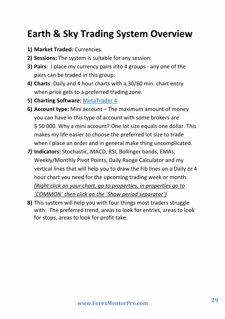
Earth & Sky Trading System Overview 1) Market Traded: Currencies. 2) Sessions: The system is suitable for any session. 3) Pairs: I place my currency pairs into 4 groups -‐ any one of the
pairs can be traded in this group. 4) Charts: Daily and 4 hour charts with a 30/60 min. chart entry
when price gets to a preferred trading zone. 5) Charting Software: MetaTrader 4 6) Account type: Mini account – The maximum amount of money
you can have in this type of account with some brokers are $ 50 000. Why a mini account? One lot size equals one dollar. This makes my life easier to choose the preferred lot size to trade when I place an order and in general make thing uncomplicated.
7) Indicators: Stochastic, MACD, RSI, Bollinger bands, EMAs, Weekly/Monthly Pivot Points, Daily Range Calculator and my vertical lines that will help you to draw the Fib lines on a Daily or 4 hour chart you need for the upcoming trading week or month. (Right click on your chart, go to properties, in properties go to `COMMON` then click on the `Show period separator`)
8) This system will help you with four things most traders struggle with: The preferred trend, areas to look for entries, areas to look for stops, areas to look for profit take.

30
A Stress Free Trading Plan and System
In order to become a profitable currency trader, you will need a descent trading plan. A trading plan will be your rule book and currency bible. Without it you won’t secede as a trader. Read it every day and stick to it.
You can have all the trading tools in the world, but if you don’t have a plan on how you will use them, you will never be successful.
Remember, you are starting a business, and if you want your business to succeed, you need to have a PLAN!
What currencies will you trade?
1) EURUSD against the USDCHF. (Move in opposite direction). 109 pips per day
2) EURJPY against the GBPUSD. (Move in same direction). 112 pips per day
3) AUDUSD against the AUDJPY. (Move same direction). 72 pips per day
4) EURGBP and the USDJPY. (Left over pairs). 62 pips per day
The pips you see next to each group are the daily average for the specific group. This is handy for manual profit take. Although it’s a daily range, it also has significance on the weekly range. So – let’s say I am in a EURUSD trade and I am 109 pips in profit, you might want to start to look for reasons why price might start to struggle at this area and manually exit the trade.

31
Let’s see what correlation means
Correlation: Correlation is a statistical measurement of the relationship between two variables. Possible correlations range from +1 to –1.
A zero correlation indicates that there is no relationship between the variables.
A correlation of –1 indicates a perfect negative correlation, meaning that as one variable goes up, the other goes down.
A correlation of +1 indicates a perfect positive correlation, meaning that both variables move in the same direction together.
I don’t like the CAD pairs – so I don’t trade them
After dumping the CAD pairs it will leave you with 8 pairs. But now you have to be careful. Why? – Some of them are correlated meaning they go in the same direction or the some of them in the opposite direction. I have 2 monitors allocated for charts – so I place the following pairs next to each other in 4 groups.
The 4 Groups are
1) EURJPY against the GBPUSD (Positive correlation). 2) AUDJPY against the AUDUSD (Positive correlation). 3) EURUSD against the USDCHF (Negative Correlation). 4) EURGBP against the USDJPY (Left over pairs).
So now you only have 4 possible currencies to trade for the week.
Why only 4 currencies? Because of the correlation that comes into play. If you get a signal for a setup you will only take one pair at a time. When these charts are next to each other you will be able to see the better trade of the two that is forming or which one has the bigger profit take potential with the smallest stop.
Placing the pairs next to each other can also be used as confirmation if you want to take a trade. So say you might want to take an entry

32
on the EURUSD because of a trend line break at a weekly pivot level – changes are good you will see it on the USDCHF chart as well.
It can also show you when not to trade this group. If it looks like the correlation of the group is a bit messy for the week – don’t trade that
specific group.
Example of correlation placing two charts next to each other
This is a 4 hour AUDUSD and an AUDJPY chart next to each other. These two pairs move in the same direction. When on trends down the other one will follow. Have a look on the charts at the blue rectangles. Notice how both currency pairs went outside the Bollinger band before both started to trend down. This is correlation at work.

33
Trading Times
Monday to Thursday:
You will manage open trades on Fridays. You will have no new entries on Fridays. You will not trade Non-‐Farm Payroll News (no problem – you don’t trade Fridays).
You will not trade interest rate announcements. You will not trade any other kind of news. You will not trade USA or European bank holidays.

34
Fibonacci Your Fibonacci (Fib) Settings: 0, 50, 62.5, 75 and 100. (Your trading zone will be between the 50% and 75% Fib level) That will be the light blue area on my chart examples. This is the only area where you will start to look for your weekly entries. If price gets to the trading zone and you have the time -‐ move down to the smaller time frames like the 60 min or 30 min chart and wait for a current trend line break. If you wait for the trend line break, price will show you where to place your stop. This will be above the previous high or low before the trend line break happened or you can look at the candles to the left of the chart after the trend line brake that will give you support or resistance levels that can be used for stop areas.
This is your Trading Zone – Between the 50% and 75% Fib pull back area. Only when price gets here – you will attempt to hit a home run.

35
Example of a trading zone on a 4 hour chart
Get to love a current trend line! You would have notice in my previous posts that I absolutely love current trend lines. Why? It gives you the confirmation you need to take a trade. You can’t just trust areas of support, resistance, pivots, Fib levels and the rest of it for an entry!! This will be the areas of interest for us where we will look for potential trade set ups. In order for us to take the trade we need confirmation – How? A current trend line break will give you that confirmation. If we wait for the trend line break, we will be able to see where to place our stops and where to look for profit take areas. Here is something that is so simple that you always must ask yourself before you place a trade. (You can’t do it with a forward order)

36
Say you are looking to go short at a level but price gets to your 50% Fib trading zone level – ask yourself -‐ ` Self, did price break my current bull trend line?` If the answer is no – why do you want to short here? Now price gets to the next level of interest – ask the same question – don’t just trust EMAs pivots and the rest of the indicators. To assume things in trading is dangerous ..................assume stands for: Making an ASS OF YOU AND ME!! Remember all the indicators we use can give us an indication, a guide line if price is in an overbought or oversold area but a trend line break will give us the confirmation that the price has turned and swing the odds to our side.
THE ONLY THING YOU NEED TO TRUST IS THE QUESTION -‐
`Did price break my current trend line? `
What is the meaning of Confirmation? 1. a. The act of confirming. (Area where price might react like, in the trading zone at EMAs, Fibs, pivot points this type of thing.) b. Something that confirms; verification. (Price broke the trend line at these aeries) 2. a. A Christian rite admitting a baptized person to full membership in a church. (So that you can start praying that you did the right thing.) b. A ceremony in Judaism that marks the completion of a young person's religious training. (Everybody is having a party because you made it as a trader) Trend lines are probably the most common form of technical analyses used today. They are probably one of the most underutilized as well.

37
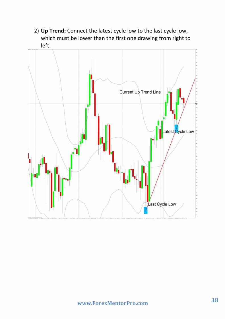
If drawn correctly, they can be as accurate as any other method. Unfortunately, most traders don't draw them correctly or they try to make the line fit the market instead of the other way around. In their most basic form, an uptrend line is drawn along the bottom of easily identifiable support areas (valleys). In a downtrend, the trend line is drawn along the top of easily identifiable resistance areas (peaks) How to draw a current trend line:
1) Down Trend: Connect the latest cycle high to the last cycle high, which must be higher than the first one drawing from right to left.
38
2) Up Trend: Connect the latest cycle low to the last cycle low, which must be lower than the first one drawing from right to left.

39
Your trading windows you will have open on your platform
Daily chart with monthly Fibs set with......200, 55, 34 EMA, Bollinger Bands set at 20 – 0 – 2. The 34/55 EMA sets the main trading direction.

40
4 Hour chart with weekly Fibs, set with ......200, 55, 34 EMA, Bollinger Band set at 20 – 0 – 2. The 34/55 EMA sets the current 4 hour trading direction.
MACD with settings: 12,26,9. Stochastic with settings: K period 12, slow 6 and D period 3 (80 -‐20).
RSI with settings: 9 with a middle line at 50 (75 – 25).

41
Setup for entry
You will try to only trade the 4 hour chart when the direction of the 4 hour and the Daily 34/55 EMA are pointing in the same direction. (Have a look at the 34 and 55 EMA on both charts – they are both trending down according to the 34 and 55 EMA.)

42
Earth & Sky 34 EMA Blue (Sky) -‐ 55 EMA Brown (Earth) If blue is above brown, you will look for longs, if blue is under brown, you will look for shorts in the market. Remember the blue = Sky and brown = Earth. This will give you an immediate sense of direction in the market. If the Sky is above the Earth then the market is long, if the Sky is under the Earth then the market is short on that specific time frame. This is an example where the Sky is under the Earth = market is short on this 4 hour chart. That means we will only look for entries to short to follow the 4 hour trend direction.

43
If the 4 hour EMA is different from the Daily EMA, then you will move away from the 4 hour chart on this pair and look for an entry only on the daily chart. Remember the Daily chart will have the monthly Fib on it, not the weekly Fib. Let`s have a look at an example with Fibs on a Daily chart.
The 34 EMA is above the 55 EMA, so the direction is up. Last month’s opening price was lower than the closing price so we can Fib from the bottom to the top –from point 1 to point 2 on the chart. Can you see how the vertical lines on the Daily chart breaks up the area into monthly parts – also notice on the chart that price didn’t give as the pullback we wanted in the beginning of the month and how I followed price with my Fib until we did get the pullback (blue area on the chart at point 2) You will only start trading the 4 hour chart when the direction is the same again as the Daily.
Daily chart with monthly Fib

44
If you want to stay on the 4 hour chart but cant Fib the previous week because the closing price (like in this chart) was higher than the opening price of last week but the EMAs still tells you the direction is down – you can place weekly pivots on the 4 hour chart to identify other areas of interest. Have a look at this example. The EMAs told us the direction is down. Notice price is at the 1ste weekly pivot resistance area with a 200 EMA in the way. Price is also outside the Bollinger band. Now you will move down to a smaller time frame, place your current trend line and wait for the trend line break before we place an order to go short.
4 Hour Chart with weekly pivots:

45
On a Daily Chart we will have the monthly trading zone between the 50% -‐ 75% Fib area.
On a 4 Hour Chart we will have the weekly trading zone between the 50% -‐75% Fib areas.
Now you have identified a possible trading zone area with your Fib where price might react.
4 Hour Chart with the upcoming weeks trading zone and Marc Walton’s Forex Mentor Pro Analysis for potential trade areas.
If price gets back to or into the trading zone, then you will pay attention to the MACD – where is the histogram? What is it doing? Stochastic – is it crossing in an overbought or oversold area? Is the RSI in an overbought or oversold area? What candle patterns can you see? What is happening on the 1 hour

46
chart going thru the above indicators again asking yourself what are they doing?
4 Hour Chart with weekly Fibs and the trading zone
After you moved down to a smaller time frame like a 30 or 60 min chart. Place a current trend line and wait for the break before you place an order. If you are able to wait for the trend line break, then you will be able to see where to place your stop that will mean you can have a bigger lot size than if you

47
were only to trade with forward order that requires in general a bigger stop. This is the same currency pair, same trading zone but on a 1 hour chart – so the vertical lines you see on the chart breaks the week up now into daily intervals. Pay attention to the MACD – where is the histogram? What is it doing? Stochastic – is it crossing in an overbought or oversold area? Is the RSI in an overbought or oversold area?
1Hour chart with trend line break
48
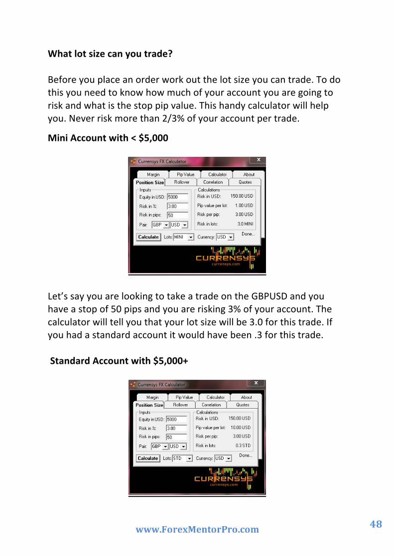
What lot size can you trade? Before you place an order work out the lot size you can trade. To do this you need to know how much of your account you are going to risk and what is the stop pip value. This handy calculator will help you. Never risk more than 2/3% of your account per trade.
Mini Account with < $5,000
Let’s say you are looking to take a trade on the GBPUSD and you have a stop of 50 pips and you are risking 3% of your account. The calculator will tell you that your lot size will be 3.0 for this trade. If you had a standard account it would have been .3 for this trade. Standard Account with $5,000+

49
Stops and Exits:
Stops have to be @ the 75 or 100% Fib levels if you trade forward orders. You will look for EMAs, Bollinger bands and pivot lines, trend lines that can be use as a barrier between your entry and your stop. So let’s say you place a forward order at the 50% Fib pull back area, you will have to place your stop at the 75% Fib pullback area. This is an example on a 4 hour chart with a 200 EMA that gives you the barrier between your entry and stop.
If you have the time and trade the current trend line break in the trading zone area on the smaller time frames, then you can have your stops above the previous high or low price made before the trend line break or you can look to the left of the chart to identify support and resistance levels that can be used for stop areas. Look for EMAs, Bollinger bands and pivot lines, anything that can be use as a barrier between your entry and your stop. This is an example of a trend line break for the same currency pair, same time, and same trading zone as the above chart but on a 1 hour chart. Stops can be placed after the trend

50
line break a couple of pips above the high price made before the trend line break.
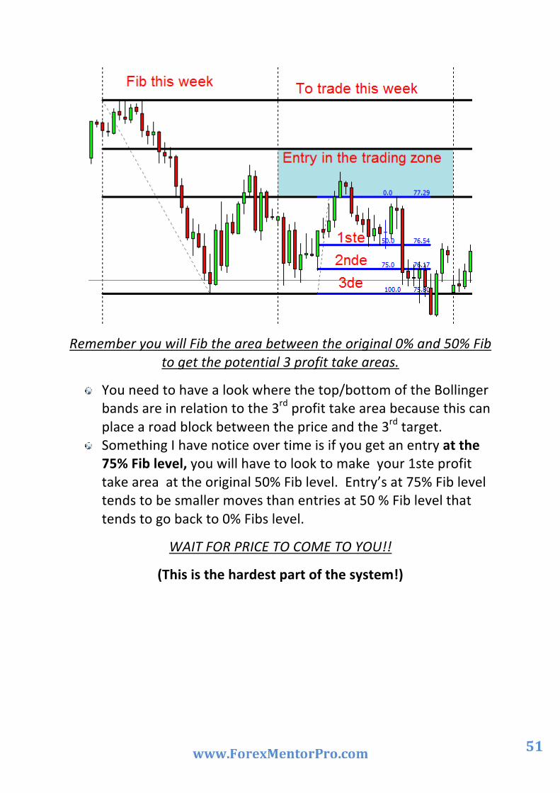
Profit take: If you Fib the area in-‐between the original 0% to 50% Fib area, it will give you your 1st, 2nd and 3rd profit take areas. (Using the 50% as your 1ste target, 75% as your 2nd target and the 100 % as your 3de target).
Don’t worry if you don’t understand – I will show you with an
example.
51
Remember you will Fib the area between the original 0% and 50% Fib to get the potential 3 profit take areas.
You need to have a look where the top/bottom of the Bollinger bands are in relation to the 3rd profit take area because this can place a road block between the price and the 3rd target.
Something I have notice over time is if you get an entry at the 75% Fib level, you will have to look to make your 1ste profit take area at the original 50% Fib level. Entry’s at 75% Fib level tends to be smaller moves than entries at 50 % Fib level that tends to go back to 0% Fibs level.
WAIT FOR PRICE TO COME TO YOU!!
(This is the hardest part of the system!)

52
Stuff you will need
1) Weekly Pivot indicator: Download 2) Monthly Pivot indicator: Download 3) Daily range calculator: Download 4) Lot calculator: http://currensys.com/FreeForex.php
When to trade and when not to trade – that’s the question!
Yes, it is true that the Forex is open 24 hours a day, 5 days a week, but that doesn’t mean it’s always active the whole day. You can make money in the Forex when the market moves up, and you can even make money when the market moves down. However, you will have a very difficult time trying to make money on certain days.
Here is a couple of suggestions when to trade and when to sit on your hands – go fishing or go shopping with the wife.
When to trade if you want to lose money!
If you really do not want to trade during the busier times of the market when trade volume and pip movement is highest and where you will make money easier, then by all means, feel free to trade on these times mentioned below. I guarantee you’ll have a more difficult time trading!
Fridays: Fridays are very unpredictable and is a good day to trade if you want to lose the profits you made during the week.
Sundays: There is very little movement on these days.
Holidays: Banks are closed which means very little volume for whatever country is having the holiday. Holidays are great to trade when you would rather lose your money than take a day off and enjoy the other things in life.

53
News Reports: No one really knows where the price will go when a news report comes out. You could lose a fortune trading during news releases if you don't know what you're doing.
Pip ranges
After a bit of research looking at the pip range for the 4 major pairs for each day of the week, what did I learn?
Well it looks like the middle of the week is the time to look for that 4 hour or daily M2entry. That will be on a Tuesday and Wednesday. Fridays are usually busy until 12pm EST and then the market pretty much drops dead until it closes at 5pm EST.

54
My Work Station The best will be to have 2 monitors so that you can run two correlation pairs next to each other like say the 4 hour EURUSD chart against a 4 hour USDCHF chart. In currency trading you need to see things clearly. This is difficult on a laptop. If you are not able to see clearly, it might cost you money or you might lose out on a good trade. I have three monitors, one as my main work station and my second and third am allocated for my charts. On my desk I have a laminated copy of my stress free trading plan. This helps me to keep focused on what I want price to do before a take an entry. On my wall I have a black board with a weekly trading record. This helps me to see where I am for the week/month and what need to be done to reach my monthly target. The last but not the least is a reliably calculator. You will use this everyday working out stops, pips, profit take areas and lots more.

55
Now that you have seen the system – how does it work?
Trading for me is all about levels. You have notice traders talk about selling the rallies in a down trend or buying the dips in an uptrend. This system will help you with four things most traders struggle with:
1) The preferred trend. 2) Areas to look for entries. 3) Areas to look for profit take. 4) Areas to look for stops.
This system will show you where there is a potential rally or potential dip for a specific currency pair in the market. These rallies or dips will usually be in the preferred trading zone.
Armed with this information, you will be able to identify the better levels in the market for your potential entry.
First you need to know how to Fib it
This is the backbone of this system. First you need to change your values on your Fib to my settings. You only need the 0%, 50%, 62.5% and the 100% settings.
Sometimes you need to be a little creative with the way you draw your Fibs.
Remember, we are looking for a trading zone where we will look for possible entries not a specific value.
This will come with practice and later you will find it second nature and do it without any headaches.
To make my trading zone more obvious, I will highlight it with a rectangle. Do it on your charts as well – it makes it so much essayer if you go thru the charts to see which currency pair is in the trading zone.

56
Something one of our members posted regarding how to draw Fibs:
“The only trouble with a Fib being subjective is sometimes it feels like I'm trying to make the Fib fit and area I'm interested in. But very
often it is correct.
Maybe this is the correct approach for “Fibbing” as we are looking for confluence when looking for areas of interest.”
In the end it needs to be like a puzzle where all the pieces fit together to give you that confluence we need to identify the more appropriate/better trading zone.
Let’s have a look at some examples.
1) Normal market: 4 hour chart for weekly Fibs.
We are in a down trend; The 34 EMA is under the 55 EMA. Last week `s closing price was lower than the opening price. So – now you need to Fib from last week’s high to last week’s low to get this week’s trading zone. You don’t have to change charts. All the information you need is on the 4 hour chart.
Remember – Fib from last week’s high to last week’s low.

57
AUDJPY -‐ 4 Hour Chart
2) Falling Market: 4 hour chart for weekly Fibs.
We are in a down trend; The 34 EMA is under the 55 EMA. Last week `s closing price was lower than the opening price. So – now you need to Fib from last week’s high to last week’s low to get this week’s trading zone but price was falling past last week’s low without a pullback on Monday and Tuesday.
No problem – follow price with your Fib until you can see price is making the pullback we need. You will Fib from last week’s high to this week’s current low to get this week’s trading zone. You don’t

58
have to change charts. All the information you need is on the 4 hour chart.
Remember – Fib from last week’s high following price in the current week till you see the pullback.
EURO/$ -‐ 4 Hour Chart
3) Drawing Fibs on a Daily chart for monthly Fibs.
Sometimes the need arises to draw monthly Fibs on a daily chart. This will be when the 4 hour EMAs are going in the opposite direction from the Daily 34/55EMAs.
Remember the vertical lines. On a daily chart it will give you monthly intervals. So, no need to stress. You do exactly the same as you would have done on a 4 hour chart – now you will have the monthly trading zone on a daily chart. Notice how I followed price in the beginning of the month with the Fib until the pullback.
59
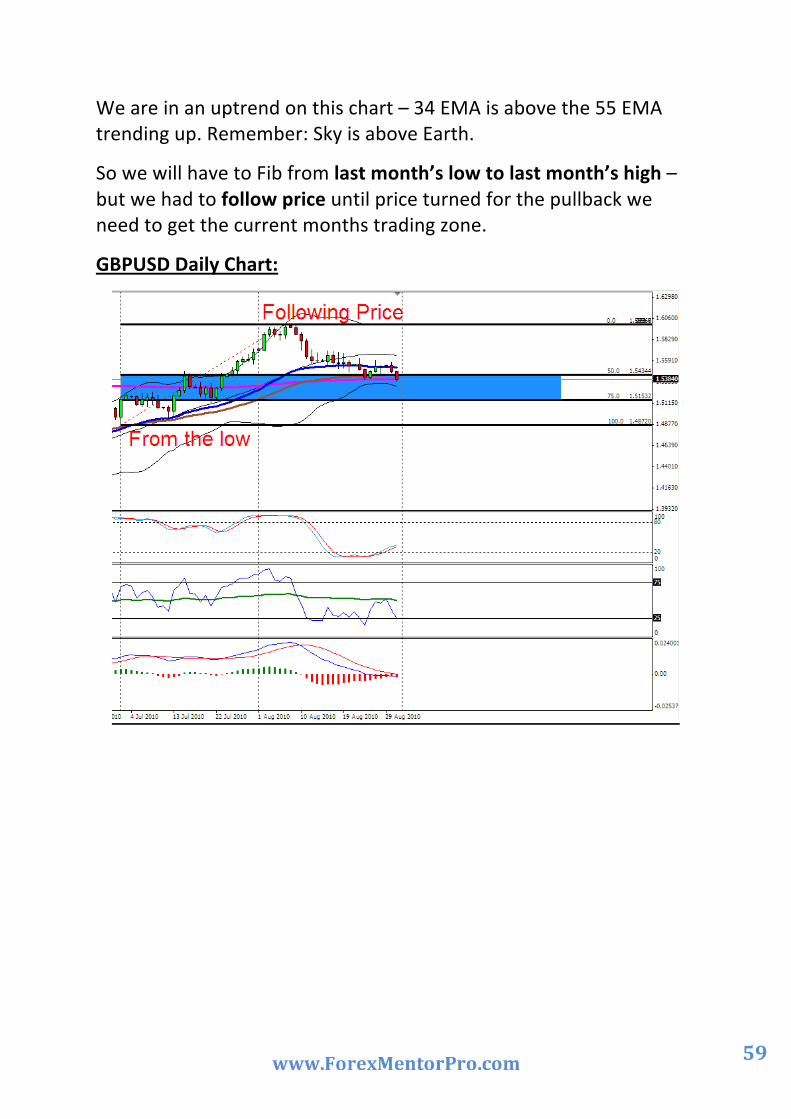
We are in an uptrend on this chart – 34 EMA is above the 55 EMA trending up. Remember: Sky is above Earth.
So we will have to Fib from last month’s low to last month’s high – but we had to follow price until price turned for the pullback we need to get the current months trading zone.
GBPUSD Daily Chart:

60
Let’s have a look at some examples using this system:
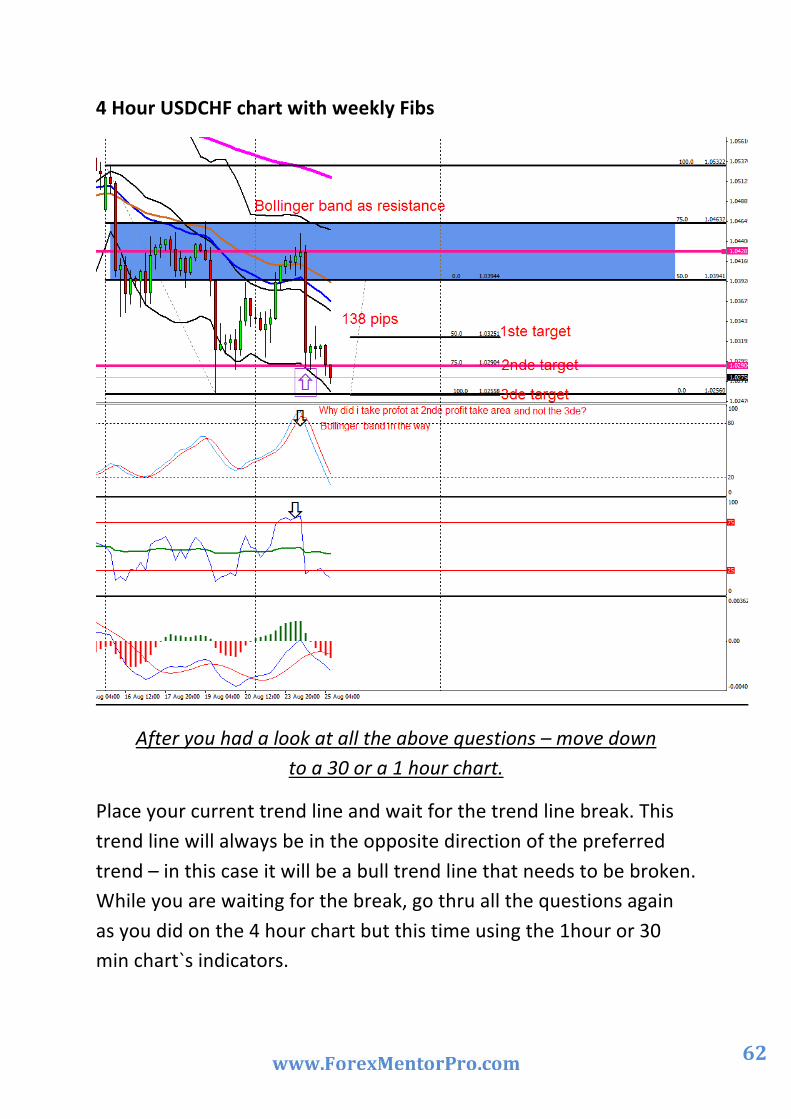
1) Example of a sell: USDCHF 4 hour chart – 15 August to 22 August 2010
What to look for and what to do:
Monday morning you open your charts and start doing your analyses for the week.
Daily Chart: The 34 EMA is under the 55EMA = Main direction down.
Move to 4 hour chart: The 34 EMA is under the 55 EMA = Direction down (Same as the Daily chart)
Now we need to Fib. Last week to get this week’s trading zone. First have a look at what price had done last week. All the information you need is on the 4 hour chart, you don’t have to change to a weekly chart. By using the vertical lines on the chart, you will be able to see last week’s price action within last week’s block and use that to information to Fib to get the current weeks trading zone.
The opening price of last week was higher than the closing price from last week, so it was trending down – that means we will have to Fib from last week’s high to last week’s low to get our trading zone for this current week.
After doing that we have our -‐
1) 0% Fib at 1.02560
2) 50% Fib at 1.03941
3) 75% Fib at 1.04632
4) 100% Fib at 1.05322

61
You have identified the preferred area to look for your weekly entry; the trading zone will be between 1.03941 and 1.04632.
Now you wait but stay with the 4 hour chart for price to come to you.
Price came into our trading zone what now?
Ask yourself:
1) What is the Bollinger band doing – is price outside it – is it a one in a million years Bollinger band? Is it trending down?
2) Is the 34/55 EMA still open and still trending down? 3) Where is the 200 EMA in relation to price? 4) What is my Stochastic doing – is it crossing – is it in the
overbought area? 5) What is the RSI doing –is it in the overbought area? Is the RSI line
crossing the 50 middle line? 6) What is the MACD doing – is the histogram crossing or about to
cross? What are the 2 moving average lines doing? Is it open or about to cross?
7) Is Marc`s potential entry point near this area? 8) Is there a whole number in the trading zone?
62
4 Hour USDCHF chart with weekly Fibs
After you had a look at all the above questions – move down to a 30 or a 1 hour chart.
Place your current trend line and wait for the trend line break. This trend line will always be in the opposite direction of the preferred trend – in this case it will be a bull trend line that needs to be broken. While you are waiting for the break, go thru all the questions again as you did on the 4 hour chart but this time using the 1hour or 30 min chart`s indicators.

63
While you are waiting for the trend line break, identify areas where you will place your stop – look for previous highs to the left of your chart, pivot points, Bollinger bands, EMAs. Look for something you can place between your entry price and your stop that will react as a barrier.
Ok – price broke the trend line – wait for that candle to close under the trend line before you place your trade.
Before you place your trade – quickly go to the risk calculator and work out the lot size you can trade. Remember not more than 2/3% of your account per trade and know the stop in pip value before the calculator can be used.
You place the trade – you identified an area to place your stop now (in this case above the high point price made before the trend line break) we need to identify areas for profit take.
Fib the area between your primary 0% and 50% area from the bottom to the top.
Your potential profit take areas will be
1) 50% Fib at 1.03262 2) 75% Fib at 1.02921 3) 100% Fib at 1.02560
(This 100% Fib area will also be the original 0% on the primary Fib)
Price came down past our first profit take are. We decide to take profit at our second profit take area because we had a Bollinger band the way on the 4 hour chart that could act as a barrier before price will get to the 3de profit take area. (Have a look at the 4 hour chart and see if you can notice the bottom Bollinger band.)

64
USDCHF 30 Min chart with trend line break
Fib the original 0% to 50% Fib area to get the profit take areas.

65
2) Example of a buy:
What to look for and what to do:
Monday morning you open your charts and start doing your analyses for the week.
Daily Chart: The 34 EMA is above the 55EMA = Main direction up.
Move to 4 hour chart: The 34 EMA is above the 55 EMA = Direction up. (Same as the Daily chart)
Now we need to Fib. Last week to get this week’s trading zone. First have a look at what price had done last week. All the information you need is on the 4 hour chart, you don’t have to change to a weekly chart. By using the vertical lines on the chart, you will be able to see last week’s price action within last week’s block and use that to information to Fib to get the current weeks trading zone.
The opening price of last week was lower than the closing price of last week, so it was trending up – that means we will have to Fib. from last week’s low to last week’s high to get our trading zone for this current week. The market opened on Monday with a gap – so we followed price with our Fib. We will Fib from point 1 to point 2.
After doing that we have our -‐
1) 0% Fib at 0.9386
2) 50% Fib at 0.9275
3) 75% Fib at 0 .9220
4) 100% Fib at 0.9160
You have identified the preferred area to look for your weekly entry; the trading zone will be between .9275 and .9220

66
Now you wait but stay with the 4 hour chart for price to come to you.
Price came into our trading zone what now?
Ask yourself:
1) What is the Bollinger band doing –is price outside it –is it a one in a million years Bollinger band? Is it trending up?
2) Is the 34/55 EMA still open and still trending up? 3) Where is the 200EMA in relation to price? 4) What is my stochastic doing –is it crossing – is it in the oversold
area? 5) What is the RSI doing –is it in the oversold area? Is the RSI line
crossing the 50 middle line? 6) What is the MACD doing – is the histogram crossing or about to
cross? What are the 2 moving average lines doing? Is it open or about to cross.
7) Is Marc`s potential entry near this area? 8) Is there a whole number in the trading zone?

67
4 Hour AUDUSD chart with a weekly Fib
68
After you had a look at all the above questions – move down to a 30 or a 1 hour chart.
Place your current trend line and wait for the trend line break. This trend line will always be in the opposite direction of the preferred trend– in his case it will be a bear trend line that needs to be broken. While you are waiting for the break, go thru all the questions again as you did on the 4 hour chart but this time using the 1hour or 30 min chart`s indicators.
While you are waiting for the trend line break, identify areas where you will place your stop – look for previous highs to the left of your chart, pivot points, Bollinger bands, EMAs. Look for something you can place between your entry price and your stop that will react as a barrier.
Ok – price broke the trend line – wait for that candle to close under the trend line before you place your trade.
Before you place your trade – quickly go to the risk calculator and work out the lot size you can trade. Remember not more than 2/3% of your account per trade and know the stop in pip value before the calculator can be used.
You place the trade – you identified an area to place your stop now we need to identify areas for profit take.
Fib the area between your primary 0% and 50% area from the bottom to the top.
69
Your potential profit take areas will be
1) 50% Fib at 0.9331
2) 75% Fib at 0.9358
3) 100% Fib at 0.9386
(The 100% Fib will also be the original top 0% on the primary Fib)
Price came up past our first profit take are. We decide to take profit at our second profit take area because we had a Bollinger band in the way on the 4 hour chart that could act as a barrier before price will get to the 3rd profit take area. Have a look at the 1 hour chart and see if you can notice the top Bollinger band acting as resistance plus the double top price formed at our profit take area before price started to trend down.

70
AUDUSD 1 hour chart with trend line break
Fib the 0% to 50% Fib area to get the profit take areas.
71
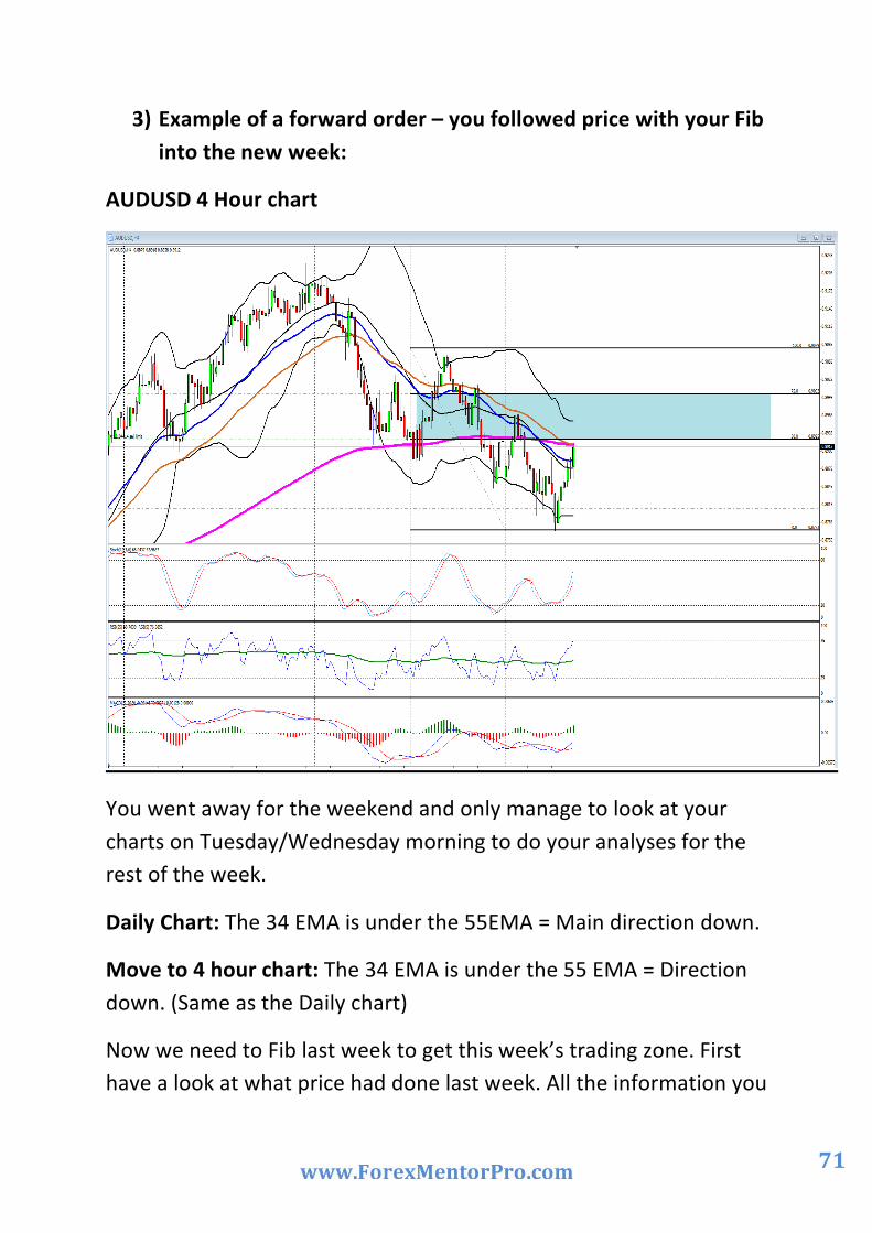
3) Example of a forward order – you followed price with your Fib into the new week:
AUDUSD 4 Hour chart
You went away for the weekend and only manage to look at your charts on Tuesday/Wednesday morning to do your analyses for the rest of the week.
Daily Chart: The 34 EMA is under the 55EMA = Main direction down.
Move to 4 hour chart: The 34 EMA is under the 55 EMA = Direction down. (Same as the Daily chart)
Now we need to Fib last week to get this week’s trading zone. First have a look at what price had done last week. All the information you

72
need is on the 4 hour chart, you don’t have to change to a weekly chart. By using the vertical lines on the chart, you will be able to see last week’s price action within last week’s block and use that to information to Fib to get the current weeks trading zone.
The opening price of last week was higher than the closing price from last week, so it was trending down – that means we will have to Fib. From last week’s high to last week’s low to get our trading zone for this current week, but you went away and notice price already made a new low this week but is starting to trend back up. So what now?
You Fib from last week’s high to this current weeks low to get a potential trading zone.
After doing that we have our -‐
1) 0% Fib at 1.02560
2) 50% Fib at 1.03941
3) 75% Fib at 1.04632
4) 100% Fib at 1.05322
You have identified the preferred area to look for your weekly entry; the trading zone will be between 1.03941 and 1.04632.
You notice price is trending up to your trading zone; just under the trading zone we have the 200 EMA and the 55 EMA on the 4 hour chart. You need to go out and can’t wait for the trend line break on the smaller time frames.
You place your forward order at the 50% Fib level – 1.03941
You place your stop at the 75% Fib level – with the 200 and 55 EMAs and the Bollinger band as resistance between your entry price and stop. Remember forward orders require bigger stops than where you

73
have waited for a trend line break -‐ that means your lot size for this trade will have to be smaller.
You Fib the original 50/75% Fib area to get your profit take areas and notice that there will be a Bollinger band before price will get to the 3de profit take area.
You set your profit take at the 75% Fib – 2nde profit take area and walk away.
A couple of hours later you came back notice you are in profit and manage your trade from there till the preferred profit take area is reached.
Remember currency trading is addictive.
My kids always tell me when they are upset with me -‐ ` You are not the boss of me!`
This is the way how you need to feel about currency trading. Trading is not your boss but if you are not careful with it ……………very addictive. When I start to feel like it is taking over my life – then I know it’s time to take a break from it. The market will still be there next week.
What is my advice to you as a new trader?
Stick to a trading plan. That is your currency bible. It will give you the guidelines to become a profitable currency trader. Without it you will be lost. With it you stand a better change at the battle field. With it, trading doesn’t have to be stressful. You will have a road map for the week so you can be focused on what needs to happen before you take a trade.

74
Attached you will find a shorter “Stress free trading plan” and a probability study -‐ In order for you to keep trading the system, make a copy, laminate it and keep it on your desk for daily reference. Use the check list to assist you before you place a trade.
Remember to live a simple life and give back to the community.
Don’t be big mouth about you trades – you are only as good as your last trade in this business.
Regards
Pierre.
Pierre Du Plessis
“Man is so made that whenever anything fires his soul, impossibilities vanish”.
Jean de la Fontaine.

75
Trading Cheat Sheet Currency
1) Euro/Dollar against the Dollar/CHF. (Move in opposite direction). 109 pips
2) Euro/JPY against the GBP/Dollar. (Move in same direction). 112 pips
3) Aussie/Dollar against the Aussie/JPY. (Move same direction). 72 pips
4) Euro/GBP and the Dollar/ JPY. (Left over.) 62 pips
I will only take 1 group entry at a time – I don’t trade the CAD pairs.
(If you trade the CAD Pairs included it here.)
Why these pairs? These are the pairs Marc trades so I will get his weekly/daily updates and I will get back up from Marc and the blog members if I need it.
Trading Times: Monday to Thursday
Manage open trades on Fridays. No new entries on Fridays. Don’t trade NFP. ( No problem – I don’t trade Fridays) Don’t trade interest rate announcements.
FIB Setting: 0, 50, 62.5,75,100. (My trading zone will be between the 50% and 75% Fib level). This is the only area where I will start looking for my weekly entries. If price gets to my zone, I will look at my indicators to give me more confirmation regarding overbought/oversold areas. If I have the time, I will move down to the smaller time frames like the 60 min or 30 min chart and wait for a current trend line break. If I wait for the trend line break, price will show me where to place my stop. This
76
will be above the previous high or low before the trend line break happened or I can look at the candles to the left of the chart after the trend line break that will give you support or resistance levels that can be used for stops. Open trading windows
Daily chart with monthly Fibs set with......200, 55, and 34 EMAs, Bollinger Bands set at 20. The 34/55 EMA sets the main trading direction.
4 Hour chart with weekly Fibs, set with ......200, 55, 34 EMAs, Bollinger Band set at 20.
MACD with settings: 12,26,9. Stochastic with settings: K period 12, slow 6 and D period 3 (80 -‐20).
RSI with settings: 9 with a middle line at 50 (75 – 25). Setup for entry
Calculate lot size using lot calculator set at 2/3% per trade.
I will only trade the 4 hour chart when the direction of the 4 hour and the Daily 34/55 EMAs are pointing in the same direction.
If the direction on the 4 hour chart EMAs are different from the Daily chart EMAs, then I will move away from the 4 hour chart and look for entries on a Daily chart with the monthly trading zone. Only once the direction of the 4 hour EMAs is the same as the Daily EMAs will I move back to a 4 hour chart as my main trading chart.
34 EMA Blue (Sky) -‐ 55 EMA Brown (Earth) If blue is above brown, I will look for longs, if blue is under brown, I will look for shorts in the market.
On a Daily Chart: between the 50% -‐ 75% = trading zone area = monthly Fibs.

77
On a 4 Hour Chart: between the 50% -‐75% = trading zone area = weekly Fibs.
Now I have identified a possible trading zone area with my Fib where price might react.
If price gets to or into the trading zone, then I will pay attention to the MACD – where is the histogram? What is it doing? Stochastic – is it crossing in an overbought or oversold area? Is the RSI in an overbought or oversold area?
Now I will move down to a smaller time frame like a 30 or 60 min chart. I will place a current trend line and wait for the break before I place an order. If I am able to wait for the trend line break, then I will be able to see where to place my stop that will mean I can have a bigger lot size than if I only trade with a forward order.
Stops and Exits
Stops have to be @ the 75/100% Fib levels if I trade forward orders. I will look for something like a Bollinger band, pivot point, EMA ......that I can use between my entry and my stop.
If I have the time and trade the current trend line break in the trading zone area on the smaller time frames, then I can have my stops above the previous high or low price made before the trend line break or I can look to the left of the chart to identify support and resistance levels that can be used for stop areas.
If I Fib the area in between the original 0% to 50% Fib area, I will get my 1ste, 2nde and 3de profit take areas. I will have a look where the top/bottom of the Bollinger bands are in relation to my 3 de profit take area because this can be a road block between the price and the 3de target.
If I get an entry at the 75% Fib, then I will take my 1ste profit at the 50% Fib level. Entry’s at 75% Fib area tends to be smaller moves than entries at 50 % that tends to go back to 0% Fibs area.
WAIT FOR PRICE TO COME TO YOU!!

78
Probability Study
On Mondays
1) What is the direction of the daily 34/55 EMA? UP/DOWN
2) Is the 4 hour 34/55 EMA the same as the Daily? YES / NO
3) If the answer is no trade from the Daily chart.
4) Draw the Fib on your preferred time frame.
Questions you need to ask when price gets into the trading zone
Looking on the chart:
1) Where is the 200 EMA in relation to price? Answer:..........................................................................................
2) Is the 34/55 EMA still open and still trending in the preferred
direction? Answer:..........................................................................................
3) Do I have any weekly/monthly pivot points in the trading zone?
Answer:..........................................................................................
4) Do I have any whole numbers in the trading zone? Answer:..........................................................................................
5) Do I have any reversal candle patterns forming at these levels in
the trading zone? Answer:...........................................................................................
6) Do I have any trend lines coming from older areas in the trading
zone that can give resistance or support? Answer: .........................................................................................

79
7) Is Marc`s potential entry point near these areas?
Answer:............................................................................................
8) What is the Bollinger band doing – is price outside it – is it a one in a million years Bollinger band? Is it trending down or up? Is it curling up or down? Answer:............................................................................................
9) What is the MACD doing – is the histogram crossing or about to
cross? What are the 2 moving average lines doing? Is it open or about to cross? Answer:..............................................................................................
10) What is my Stochastic doing – is it crossing – is it in the overbought oversold area? Answer:.............................................................................................
11) What is my RSI doing – is it crossing the 50 middle line – is it in
the overbought/ oversold area? Answer:............................................................................................
If the probability study shows me that price will most likely react in
the trading zone wait for confirmation by asking myself...
“Did price break the current trend line?”

80
Example of a Probability study
Probability study for the AUDUSD on the 4 hour chart:
Direction:
1) Is price is above/under the 200 EMA: UNDER 2) What is the direction of the 34/55 EMAs on the 4 hour chart:
SHORT
Potential Trading zone:
3) How do we Fib: Last week`s high to the current low 4) Trading Zone: 1.5821 to 1.5952 (50-‐75% Fib) 5) Sweet Spot: 1.5886 (62.5 %Fib)
What is happening in the trading zone?
6) Do we have any EMAs in the trading zone: 200, 55 EMA ON THE 4 hour chart plus the 34/55 EMA on Daily chart.
7) Do we have a weekly pivot in the trading zone: Yes, but it is on the other side of the 200 EMA on the 4 hour chart.
8) Do we have a Bollinger band in the trading zone: No 9) Do we have a psychological level`s in the trading zone: Yes, 15900
at the current 200 EMA on the 4 hour chart. 10) Do we have a trend line in the trading zone: Yes, bear trend
line from 4 week`s back. 11) Rule: The trend is your friend – Sell the rallies in a down trend
What will my trading plan be using the probability study?
Price is under the 4 hour 200 EMA. We have good separation between the 34/55 EMA and it is still trending down.
If I Fib from last week’s high to the current weeks low to get this week’s trading zone. We have the 55 and 200 EMA on the 4 hour

81
chart plus the 34/55 EMA on the Daily chart in the preferred trading zone.
We have a weekly R1 pivot on the other side of the 200 EMA but it still falls in my trading zone at 1.5924.
We have the weekly main pivot and the 38.3 Fib area in the same area at 1.5759.
We have a trend line on the 4 hour chart that is in the zone, it’s on the other side of the 200 EMA. I have loads of reasons to believe that once price past the 1.5759 area that I will start to see some resistance and that price will turn.
My trading plan for this pair is to wait for price to come to me. I set an alarm to go off once price close above the 1.5759 area. Only then will I start to look for reasons to short this pair. The closer price can get to my preferred trading zone starting at 1.5821 area the better.

82
About Forex Mentor Pro As I mentioned in the introduction, I am a member of Forex Mentor Pro, the 5 Star rated training and mentoring service by Marc Walton and Dean Saunders. I use Marc’s analysis as a vital confirmation for my system, as I have mentioned in this eBook.
I also run the Forex Mentor Pro Members Forum, and am on-‐hand every trading day to provide support, tips and advice to all Members.
I hope to see you in the members area soon!
Good trading to you,
Pierre.