duane shelton and sam monbo wtec sti 2012 montreal september 6-8, 2012 input-output modelling and...
TRANSCRIPT
Duane Shelton and Sam MonboWTEC
STI 2012 Montreal
September 6-8, 2012
Input-Output Modelling and Simulation of Scientometric Indicators:
A Focus on Patents

Outline
Patents as important indicators of science
Best input-output models, systems with memory
Simulation and validation on past data
What-if games for the future Conclusions
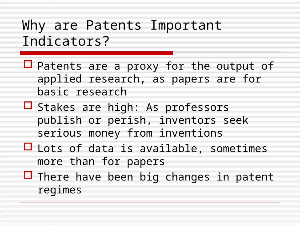
Why are Patents Important Indicators?
Patents are a proxy for the output of applied research, as papers are for basic research
Stakes are high: As professors publish or perish, inventors seek serious money from inventions
Lots of data is available, sometimes more than for papers
There have been big changes in patent regimes
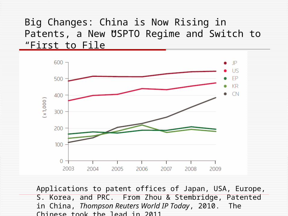
Applications to patent offices of Japan, USA, Europe, S. Korea, and PRC. From Zhou & Stembridge, Patented in China, Thompson Reuters World IP Today, 2010. The Chinese took the lead in 2011.
Big Changes: China is Now Rising in Patents, a New USPTO Regime and Switch to “First to File”
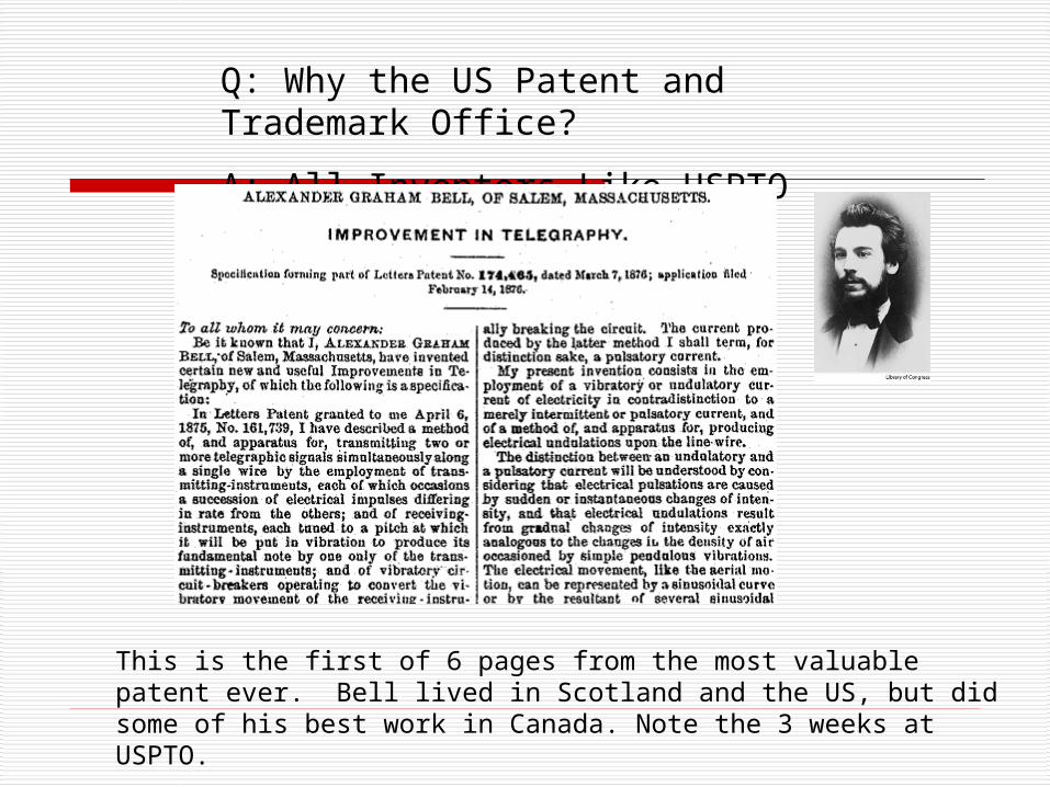
Q: Why the US Patent and Trademark Office?
A: All Inventors Like USPTO patents
This is the first of 6 pages from the most valuable patent ever. Bell lived in Scotland and the US, but did some of his best work in Canada. Note the 3 weeks at USPTO.
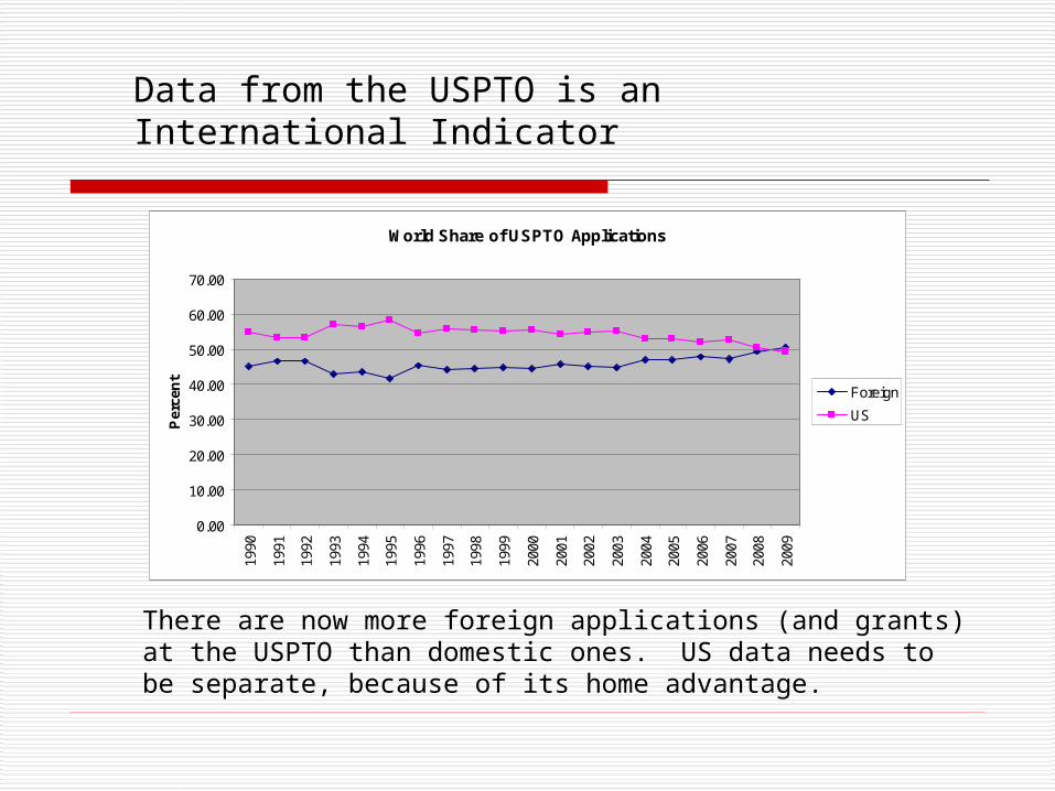
World Share of USPTO Applications
0.00
10.00
20.00
30.00
40.00
50.00
60.00
70.00
1990
1991
1992
1993
1994
1995
1996
1997
1998
1999
2000
2001
2002
2003
2004
2005
2006
2007
2008
2009
Per
cen
t
Foreign
US
Data from the USPTO is an International Indicator
There are now more foreign applications (and grants) at the USPTO than domestic ones. US data needs to be separate, because of its home advantage.
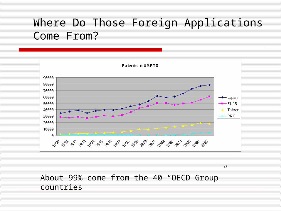
Patents in USPTO
0
10000
20000
30000
40000
50000
60000
70000
80000
90000
1990
1991
1992
1993
1994
1995
1996
1997
1998
1999
2000
2001
2002
2003
2004
2005
2006
2007
Japan
EU15
Taiwan
PRC
Where Do Those Foreign Applications Come From?
About 99% come from the 40 “OECD Group” countries
Input-Output Models
Obviously resources are needed to invent and pay for patent applications
Which national resource indicators are most strongly correlated with patents: Overall “GERD,” gross expenditures on R&D GERD sources: Government, Industry, Abroad (funding from
abroad), Other GERD spending: HERD, BERD, Non-Profit (other than
universities), and GOVERD (government labs) Number of researchers

Triadic
USPTO
1999 2007 1999 2007
Capital vs. Labor
GERD 0.924 0.895 0.947 0.830
Researchers 0.847 0.680 0.664 0.428
Funding Components
Industry 0.934 0.913 0.970 0.861
Government 0.881 0.818 0.834 0.628
Spending Components
HERD 0.949 0.890 0.910 0.791
BERD 0.921 0.905 0.966 0.852
Same Year Correlations: Patents vs. Inputs
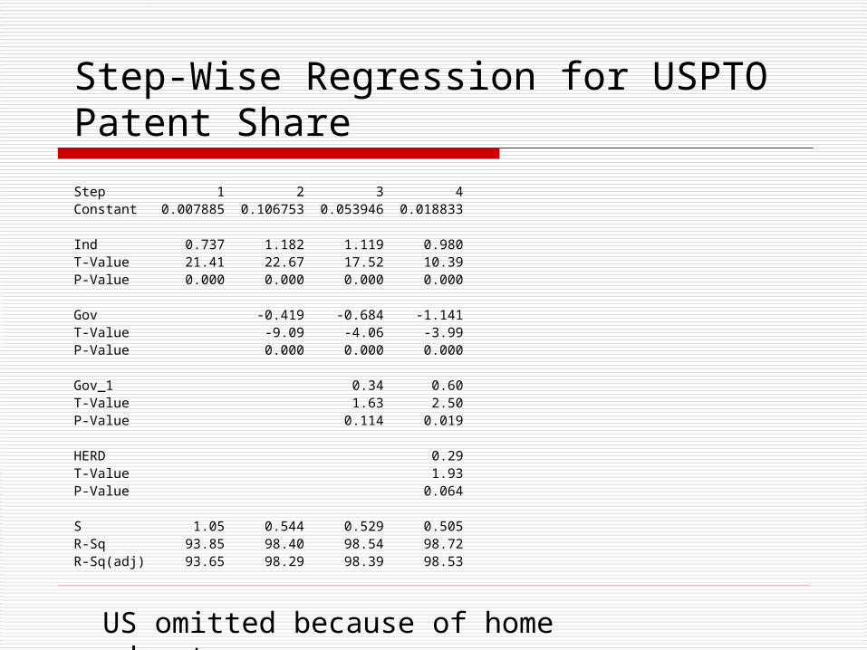
Step-Wise Regression for USPTO Patent Share
Step 1 2 3 4Constant 0.007885 0.106753 0.053946 0.018833
Ind 0.737 1.182 1.119 0.980T-Value 21.41 22.67 17.52 10.39P-Value 0.000 0.000 0.000 0.000
Gov -0.419 -0.684 -1.141T-Value -9.09 -4.06 -3.99P-Value 0.000 0.000 0.000
Gov_1 0.34 0.60T-Value 1.63 2.50P-Value 0.114 0.019
HERD 0.29T-Value 1.93P-Value 0.064
S 1.05 0.544 0.529 0.505R-Sq 93.85 98.40 98.54 98.72R-Sq(adj) 93.65 98.29 98.39 98.53
US omitted because of home advantage
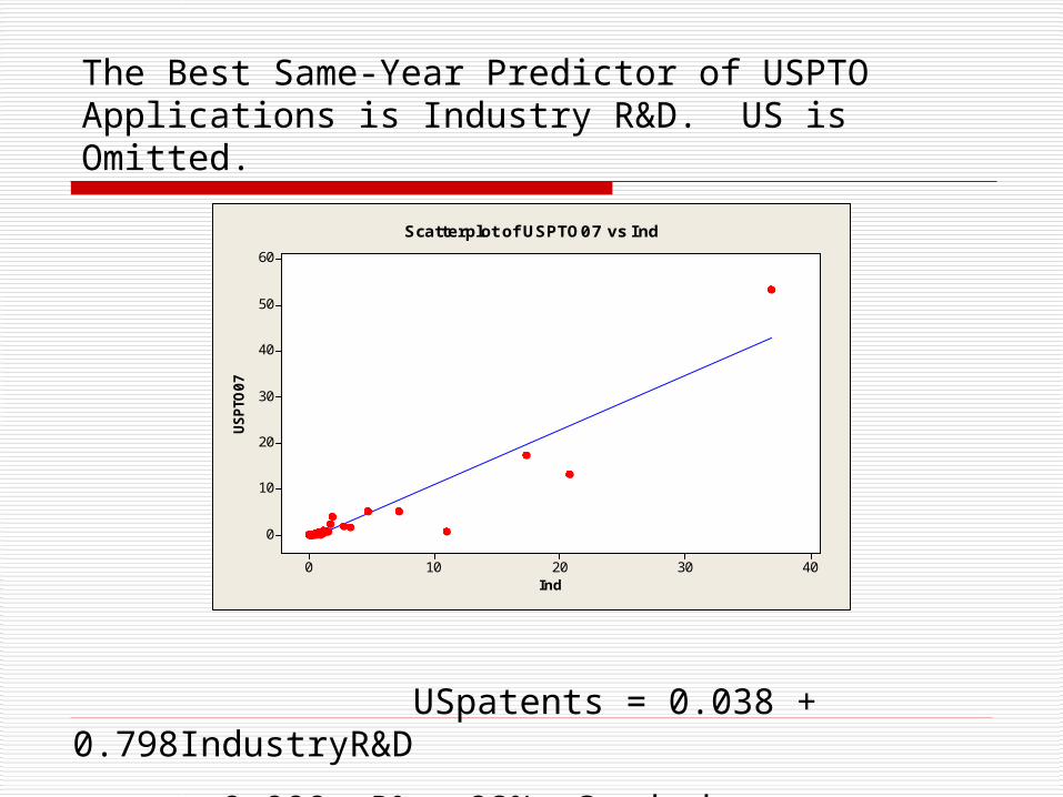
Ind
USPTO
07
403020100
60
50
40
30
20
10
0
Scatterplot of USPTO07 vs Ind
The Best Same-Year Predictor of USPTO Applications is Industry R&D. US is Omitted.
USpatents = 0.038 + 0.798IndustryR&D
p = 0.000, R2 = 92%, Good, but, can lags improve this?

Cross Correlation of Papers with Government R&D
0.983
0.984
0.985
0.986
0.987
0.988
0.989
0.99
0 1 2 3 4
Years of Lag
Not Patents, but Papers From the SCI in 2007
The correlations are very high, and there seems to be very little delay in getting published papers out from R&D investment in.
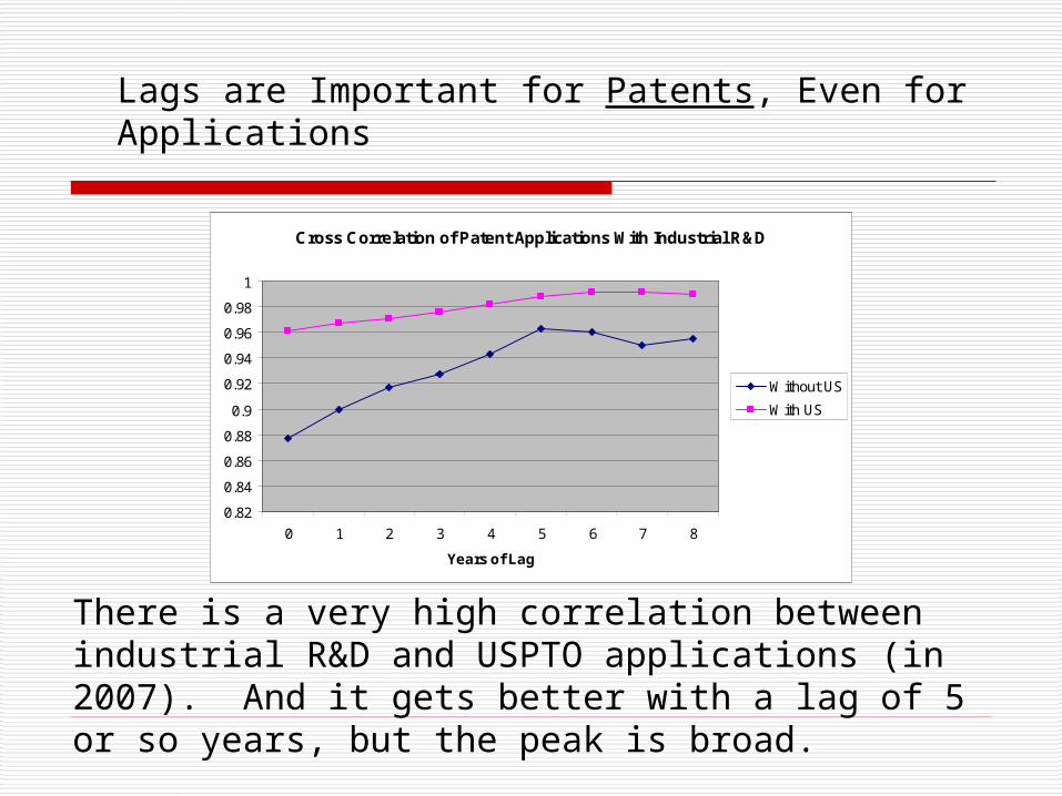
There is a very high correlation between industrial R&D and USPTO applications (in 2007). And it gets better with a lag of 5 or so years, but the peak is broad.
Lags are Important for Patents, Even for Applications
Cross Correlation of Patent Applications With Industrial R&D
0.82
0.84
0.86
0.88
0.9
0.92
0.94
0.96
0.98
1
0 1 2 3 4 5 6 7 8
Years of Lag
Without US
With US
log I02
log A
pps1
0
5.04.54.03.53.02.52.01.5
5
4
3
2
1
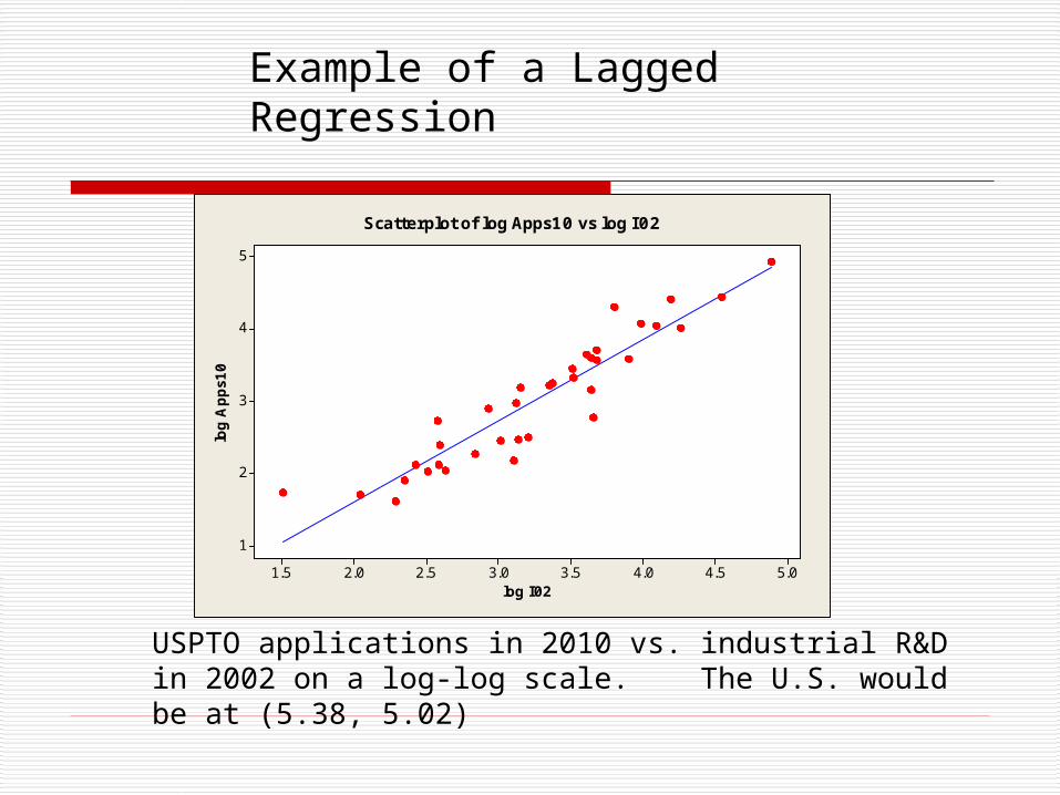
Scatterplot of log Apps10 vs log I02
USPTO applications in 2010 vs. industrial R&D in 2002 on a log-log scale. The U.S. would be at (5.38, 5.02)
Example of a Lagged Regression

USPTO Input and Output
Disposals (grants + abandonments) are the total output. This is an unstable system: arrival rates > departure rates. How can these additional delays be modelled?
USPTO StatsFiscal Year Basis
0
50
100
150
200
250
300
350
400
450
500
1993
1994
1995
1996
1997
1998
1999
2000
2001
2002
2003
2004
2005
2006
2007
2008
1000
s Applications
Allowed (Grants)
Disposals
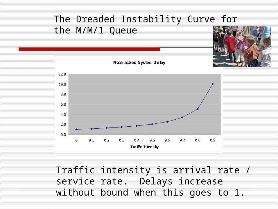
Normalized System Delay
0.0
2.0
4.0
6.0
8.0
10.0
12.0
0 0.1 0.2 0.3 0.4 0.5 0.6 0.7 0.8 0.9
Traffic Intensity
The Dreaded Instability Curve for the M/M/1 Queue
Traffic intensity is arrival rate / service rate. Delays increase without bound when this goes to 1.

Foreign Industry R&D Funding
U.S. Industry R&D Funding
Patent Office
Applications
Backlog Queue Server
Grants
Multiplier
Delay
Multiplier
Delay
Abandonments
GPSS/H is used for simulation
Model for Applications and Grants from R&D Inputs
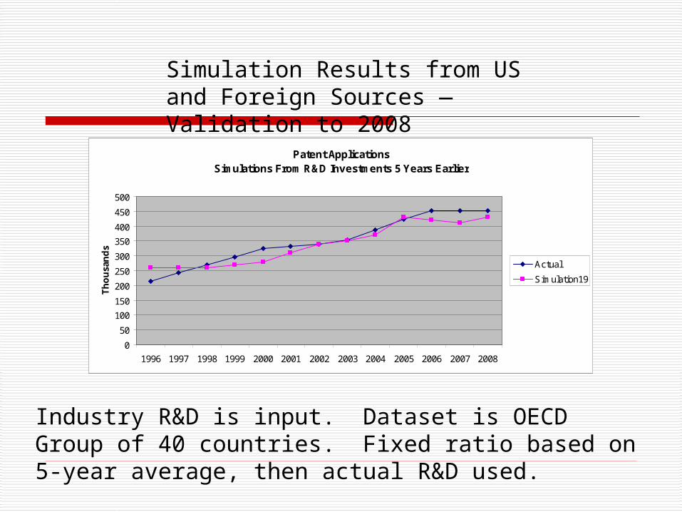
Patent ApplicationsSimulations From R&D Investments 5 Years Earlier
0
50
100
150
200
250
300
350
400
450
500
1996 1997 1998 1999 2000 2001 2002 2003 2004 2005 2006 2007 2008
Th
ou
san
ds
Actual
Simulation19
Industry R&D is input. Dataset is OECD Group of 40 countries. Fixed ratio based on 5-year average, then actual R&D used.
Simulation Results from US and Foreign Sources —Validation to 2008
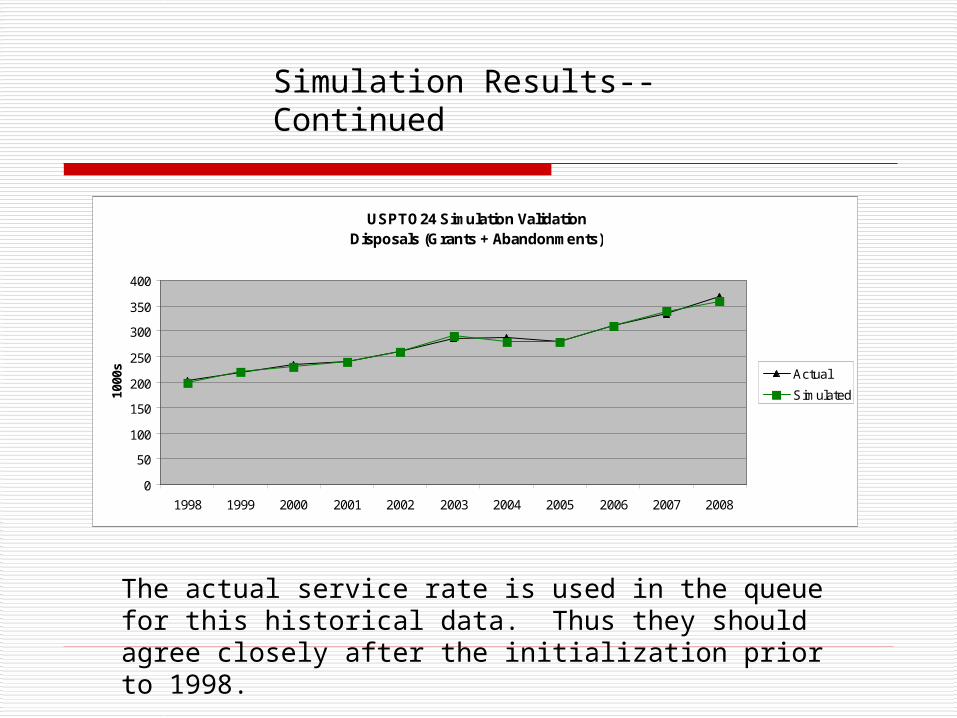
The actual service rate is used in the queue for this historical data. Thus they should agree closely after the initialization prior to 1998.
USPTO24 Simulation ValidationDisposals (Grants + Abandonments)
0
50
100
150
200
250
300
350
400
1998 1999 2000 2001 2002 2003 2004 2005 2006 2007 2008
1000
s Actual
Simulated
Simulation Results--Continued
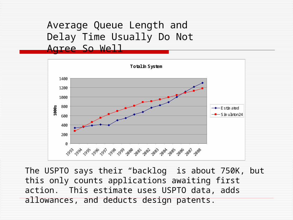
The USPTO says their “backlog” is about 750K, but this only counts applications awaiting first action. This estimate uses USPTO data, adds allowances, and deducts design patents.
Average Queue Length and Delay Time Usually Do Not Agree So Well
Total in System
0
200
400
600
800
1000
1200
1400
1993
1994
1995
1996
1997
1998
1999
2000
2001
2002
2003
2004
2005
2006
2007
2008
1000
s Estimated
Simulaton24
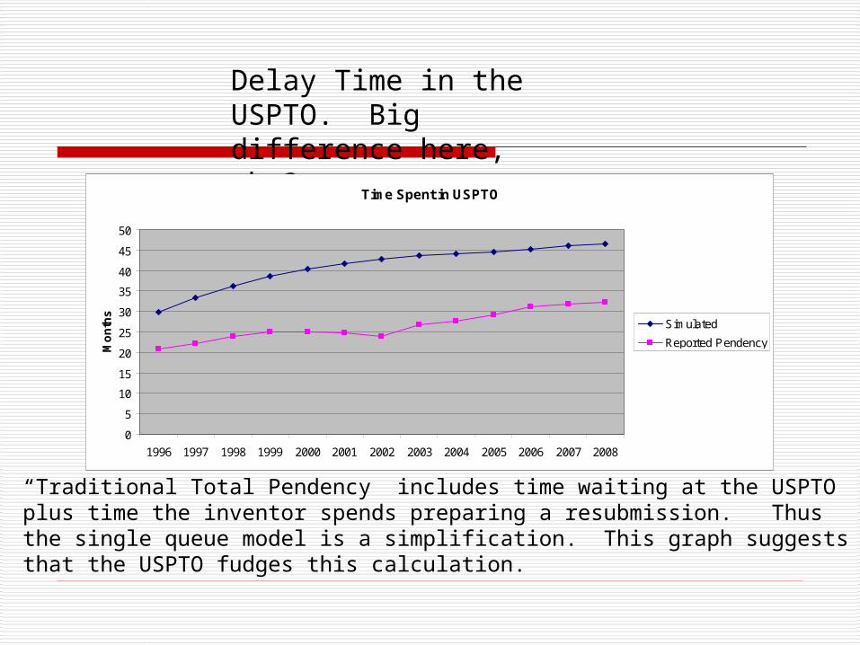
“Traditional Total Pendency” includes time waiting at the USPTO plus time the inventor spends preparing a resubmission. Thus the single queue model is a simplification. This graph suggests that the USPTO fudges this calculation.
Delay Time in the USPTO. Big difference here, why?
Time Spent in USPTO
0
5
10
15
20
25
30
35
40
45
50
1996 1997 1998 1999 2000 2001 2002 2003 2004 2005 2006 2007 2008
Mo
nth
s
Simulated
Reported Pendency

What-If Results
The model was validated through 2008 It can be used to forecast through 2014 at least,
since R&D data is available to 2009 But, first there have been big changes at the
USPTO in 2009 - 2011
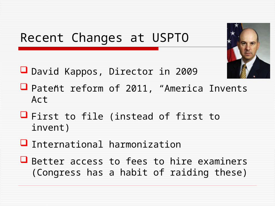
Recent Changes at USPTO
David Kappos, Director in 2009
Patent reform of 2011, “America Invents Act”
First to file (instead of first to invent)
International harmonization
Better access to fees to hire examiners (Congress has a habit of raiding these)
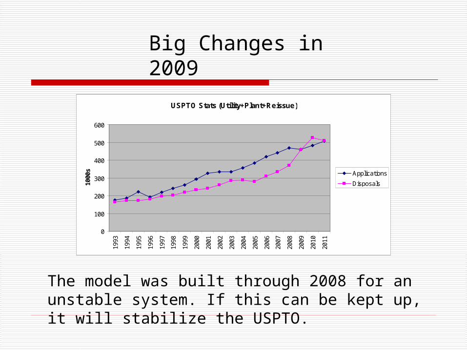
USPTO Stats (Utility+Plant+Reissue)
0
100
200
300
400
500
600
1993
1994
1995
1996
1997
1998
1999
2000
2001
2002
2003
2004
2005
2006
2007
2008
2009
2010
2011
1000
s Applications
Disposals
Big Changes in 2009
The model was built through 2008 for an unstable system. If this can be kept up, it will stabilize the USPTO.
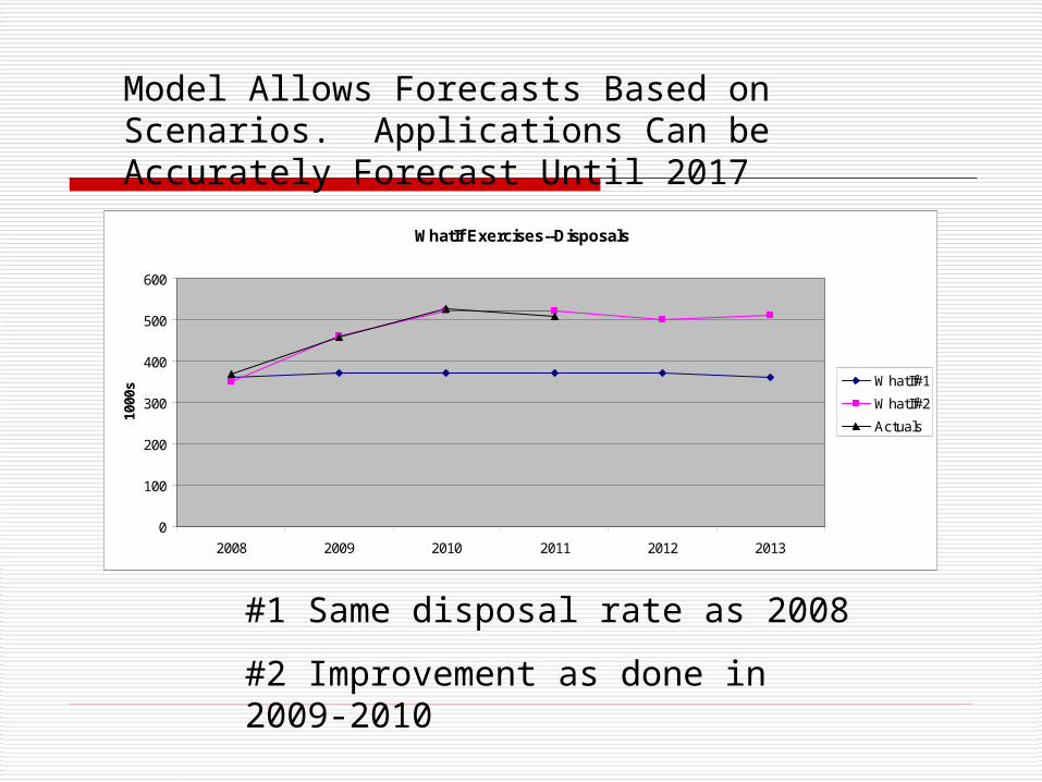
WhatIf Exercises--Disposals
0
100
200
300
400
500
600
2008 2009 2010 2011 2012 2013
1000
s WhatIf#1
WhatIf#2
Actuals
Model Allows Forecasts Based on Scenarios. Applications Can be Accurately Forecast Until 2017
#1 Same disposal rate as 2008
#2 Improvement as done in 2009-2010
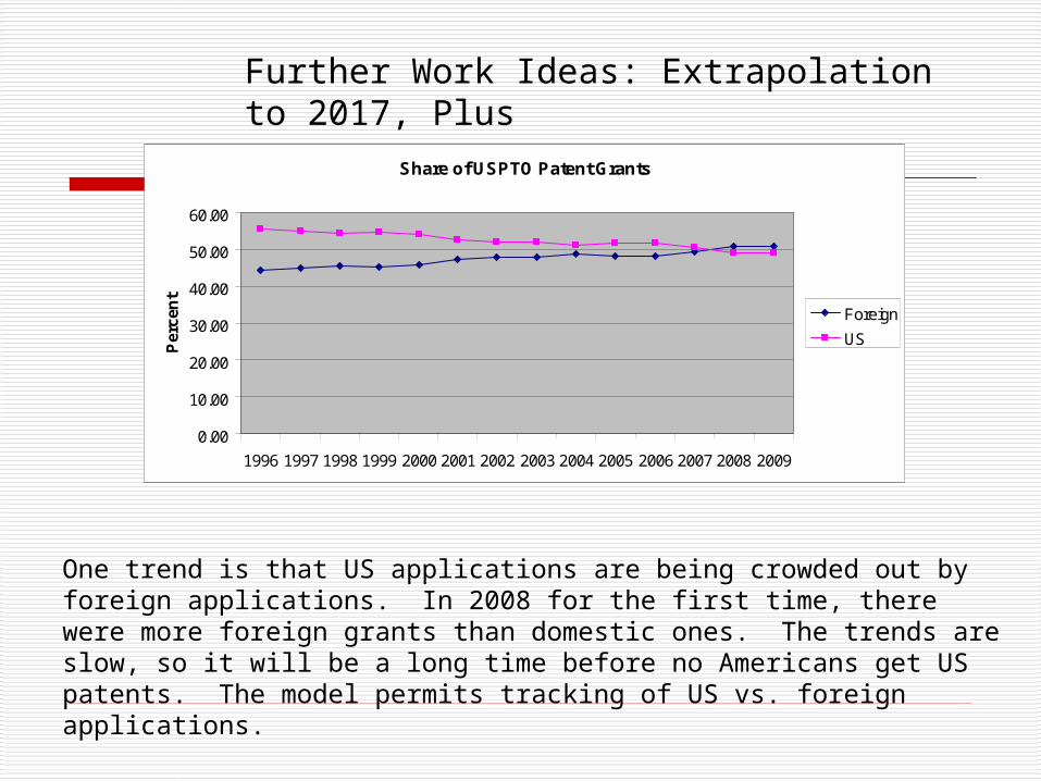
Share of USPTO Patent Grants
0.00
10.00
20.00
30.00
40.00
50.00
60.00
1996 1997 1998 1999 2000 2001 2002 2003 2004 2005 2006 2007 2008 2009
Per
cen
t
Foreign
US
One trend is that US applications are being crowded out by foreign applications. In 2008 for the first time, there were more foreign grants than domestic ones. The trends are slow, so it will be a long time before no Americans get US patents. The model permits tracking of US vs. foreign applications.
Further Work Ideas: Extrapolation to 2017, Plus
Conclusions
The simulation shows that lagged R&D investments as an input can accurately model patent applications, grant outputs, and total backlog
Until 2009 USPTO was an unstable queue with arrival rate > service rate
However, its performance only gradually deteriorates—there is no imminent danger of collapse
The simulation allows what-if games, complicated by the big changes in 2009
Further work: forecasts to 2017, US vs. foreign patents, time delay discrepancy
References
https://sites.google.com/site/patentology/annexure-usptoqueue An queueing analysis of the USPTO
Publish or Patent: Bibliometric Evidence for Empirical Trade-offs in National Funding Strategies. JAIST 2012. With L. Leydesdorff.
http://www.uspto.gov/patents/stats/index.jsp