Download - Typography Primer | ADOBE
TYPOGRAPHY PRIMER
��������
��������
��������
��������
������������������������
��������
��������
��������
��������
��������
��������
��������
����������������������������������������
����
�������
����
�������
����
������� ��� ��� ��� ��� ��� ��� ��� ���
����
����
��
���
���
������������������
������������
������������������
������������
���
������������������������������������
��������
����������������������������������������
����
����
��������
��������
��������
��������
������
����������
��������
��������
��������
��������
��������
��������
��
����
����
����
��������
����
����������������
��������
��
����
����
����
����
����
����
����������������
��������
��������
��������
���������������
������
��������
��������
��������
��������
����
����
����
����
��������
��
��������
����
����
����
��������
��������
����
����
����
��
��������
����������������������������������������
����
���
���
����
����
����
��������
����
����
����
����
����
����������������������������������������
����
������
������
����
����������������������������������������
����
����
��������
��������
��������
��������
���
���
����������������������������������������
����
����
����
����
��������
��
����
����
����
��������
����
����������������
��������
��
����
����
����
����
����
����
����������������
����
����
��������
������������
����
������������������������
����
��
��������
����
����
����
��������
��������
����
����
����
��
��������
��������
����
����
����
����
����
��������
��������
������������������������
�������
��
�
TYPOGRAPHY PRIMER
�
TYPOGRAPHY PRIMER 3 www.adobe.com/type
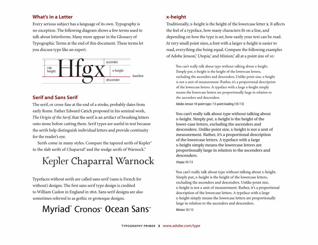
What’s in a LetterEvery serious subject has a language of its own. Typography is
no exception. The following diagram shows a few terms used to
talk about letterforms. Many more appear in the Glossary of
Typographic Terms at the end of this document. These terms let
you discuss type like an expert.
Hfgxcapheight x-height
ascender
descenderbaseline
Serif and Sans SerifThe serif, or cross-line at the end of a stroke, probably dates from
early Rome. Father Edward Catich proposed in his seminal work,
The Origin of the Serif, that the serif is an artifact of brushing letters
onto stone before cutting them. Serif types are useful in text because
the serifs help distinguish individual letters and provide continuity
for the reader’s eye.
Serifs come in many styles. Compare the tapered serifs of Kepler®
to the slab serifs of Chaparral® and the wedge serifs of Warnock.™
Kepler Chaparral Warnock
Typefaces without serifs are called sans serif (sans is French for
without) designs. The fi rst sans serif type design is credited
to William Caslon in England in . Sans serif designs are also
sometimes referred to as gothic or grotesque designs.
Myriad® Cronos® Ocean Sans™
x-heightTraditionally, x-height is the height of the lower case letter x. It affects
the feel of a typeface, how many characters fit on a line, and
depending on how the type is set, how easily your text can be read.
At very small point sizes, a font with a larger x-height is easier to
read, everything else being equal. Compare the following examples
of Adobe Jenson,™ Utopia,® and Minion,® all at a point size of :
You can’t really talk about type without talking about x-height. Simply put, x-height is the height of the lowercase letters, excluding the ascenders and descenders. Unlike point size, x-height is not a unit of measurement. Rather, it’s a proportional description of the lowercase letters. A typeface with a large x-height simply means the lowercase letters are proportionally large in relation to the ascenders and descenders.
Adobe Jenson 10-point type / 13-point leading (10 /13)
You can’t really talk about type without talking about x-height. Simply put, x-height is the height of the lower-case letters, excluding the ascenders and descenders. Unlike point size, x-height is not a unit of measurement. Rather, it’s a proportional description of the lowercase letters. A typeface with a large x-height simply means the lowercase letters are proportionally large in relation to the ascenders and descenders.
Utopia 10 /13
You can’t really talk about type without talking about x-height. Simply put, x-height is the height of the lowercase letters, excluding the ascenders and descenders. Unlike point size, x-height is not a unit of measurement. Rather, it’s a proportional descrip tion of the lowercase letters. A typeface with a large x-height simply means the lowercase letters are proportionally large in relation to the ascenders and descenders.
Minion 10 /13
TYPOGRAPHY PRIMER 4 www.adobe.com/type
Measuring TypeTo understand how type works, you must know how it is measured.
Basically, typefaces are measured in two ways: height and width.
Type Height
In earlier times when type was cast in metal, it was sold in dis crete
sizes that were mea s ured in points. Today’s digital fonts can be
enlarged or reduced by simply selecting, or specifying, a point size.
Originally, the term point size referred to the height of the
metal body that held the characters. This was slightly larger than
the distance from the highest to the lowest feature in the design.
A traditional point is approximately 1/72 of an inch or . inch.
With the advent of desktop publishing, the point became exactly
1/72 of an inch. Picas are another unit of measurement used for type;
one pica equals points, and six picas equal an inch.
This method of measuring is still used for digital type. Typefaces
that have very long ascenders and descenders look smaller than
other typefaces when both are printed at the same point size. This
incongruity is illustrated below.
26pt Postino®
26 �oint Bickham Scrip� ®
Type Width
In addition to height, a typeface is commonly identifi ed by its width.
The width of a typeface is often expressed in the font’s style name,
such as condensed or extended. Other expressions of width include
compressed, expanded, and wide.
Jimbo® Regular Condensed Jimbo Reg Extended
Variations on a ThemeA type family generally contains three variations on the regular face:
italic, bold, and bold italic. However, many families have been
designed to include variation in weight from ultra light to ultra black;
variation in width from condensed to extended; multiple character
sets, such as small capitals, titling capitals, swash capitals, oldstyle
figures, alternates; and more.
This variety enables you to achieve just the look you want and
allows for a good deal of flexibility. For example, it is often necessary
to make a given amount of type fit into a predeter mined amount of
space on the page. When space is an issue, a condensed or extended
version of a typeface can be a real lifesaver!
Times*RomanItalicBoldBold Italic
Adobe Garamond®
RegularItalicSemiboldSemibold ItalicBoldBold Italic�wash �apitalssmall capitals
Titling capitals
��
TYPOGRAPHY PRIMER 5 www.adobe.com/type
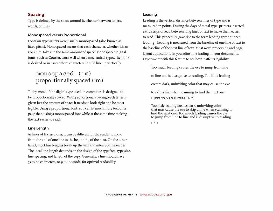
SpacingType is defined by the space around it, whether between letters,
words, or lines.
Monospaced versus Proportional
Fonts on typewriters were usually monospaced (also known as
fi xed pitch). Monospaced means that each character, whether it’s an
i or an m, takes up the same amount of space. Monospaced digital
fonts, such as Courier, work well when a mechanical typewriter look
is desired or in cases where characters should line up vertically.
monospaced (im)proportionally spaced (im)
Today, most of the digital type used on computers is designed to
be proportionally spaced. With proportional spacing, each letter is
given just the amount of space it needs to look right and be most
legible. Using a proportional font, you can fi t much more text on a
page than using a monospaced font while at the same time making
the text easier to read.
Line Length
As lines of text get long, it can be difficult for the reader to move
from the end of one line to the beginning of the next. On the other
hand, short line lengths break up the text and interrupt the reader.
The ideal line length depends on the design of the typeface, type size,
line spacing, and length of the copy. Generally, a line should have
to characters, or to words, for optimal readability.
Leading
Leading is the vertical distance between lines of type and is
measured in points. During the days of metal type, printers inserted
extra strips of lead between long lines of text to make them easier
to read. This procedure gave rise to the term leading (pronounced
ledding). Leading is measured from the baseline of one line of text to
the baseline of the next line of text. Most word processing and page
layout applications let you adjust the leading in your documents.
Experiment with this feature to see how it affects legibility.
Too much leading causes the eye to jump from line
to line and is disruptive to reading. Too little leading
creates dark, uninviting color that may cause the eye
to skip a line when scanning to fi nd the next one.
11-point type / 24-point leading (11 / 24)
Too little leading creates dark, uninviting color that may cause the eye to skip a line when scanning to fi nd the next one. Too much leading causes the eye to jump from line to line and is disruptive to reading.
11 / 11
TYPOGRAPHY PRIMER 6 www.adobe.com/type
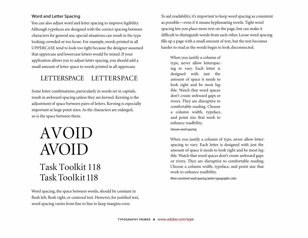
Word and Letter Spacing
You can also adjust word and letter spacing to improve legibility.
Although typefaces are designed with the correct spacing between
characters for general use, special situations can result in the type
looking crowded or too loose. For example, words printed in all
UPPERCASE tend to look too tight because the designer assumed
that uppercase and lowercase letters would be mixed. If your
application allows you to adjust letter spacing, you should add a
small amount of letter space to words printed in all uppercase.
LETTERSPACE LETTERSPACE
Some letter combinations, particularly in words set in capitals,
result in awkward spacing unless they are kerned. Kerning is the
adjustment of space between pairs of letters. Kerning is especially
important at large point sizes. As the characters are enlarged,
so is the space between them.
AVOIDAVOIDTask Toolkit 118Task Toolkit 118
Word spacing, the space between words, should be constant in
flush left, flush right, or centered text. However, for justified text,
word spacing varies from line to line to keep margins even.
To aid readability, it’s important to keep word spacing as consistent
as possible—even if it means hyphenating words. Tight word
spacing lets you place more text on the page, but can make it
difficult to distinguish words from each other. Loose word spacing
fills up a page with a small amount of text, but the text becomes
harder to read as the words begin to look disconnected.
When you justify a column of type, never allow letterspac-ing to vary. Each letter is designed with just the amount of space it needs to look right and be most leg-ible. Watch that word spaces don’t create awkward gaps or rivers. They are disruptive to comfortable reading. Choose a column width, typeface, and point size that work to enhance readbility.
Uneven word spacing
When you justify a column of type, never allow letter-spacing to vary. Each letter is designed with just the amount of space it needs to look right and be most leg-ible. Watch that word spaces don’t create awkward gaps or rivers. They are disruptive to comfortable read ing. Choose a column width, typeface, and point size that work to enhance readbility.
More consistent word spacing, better typographic color
TYPOGRAPHY PRIMER 7 www.adobe.com/type
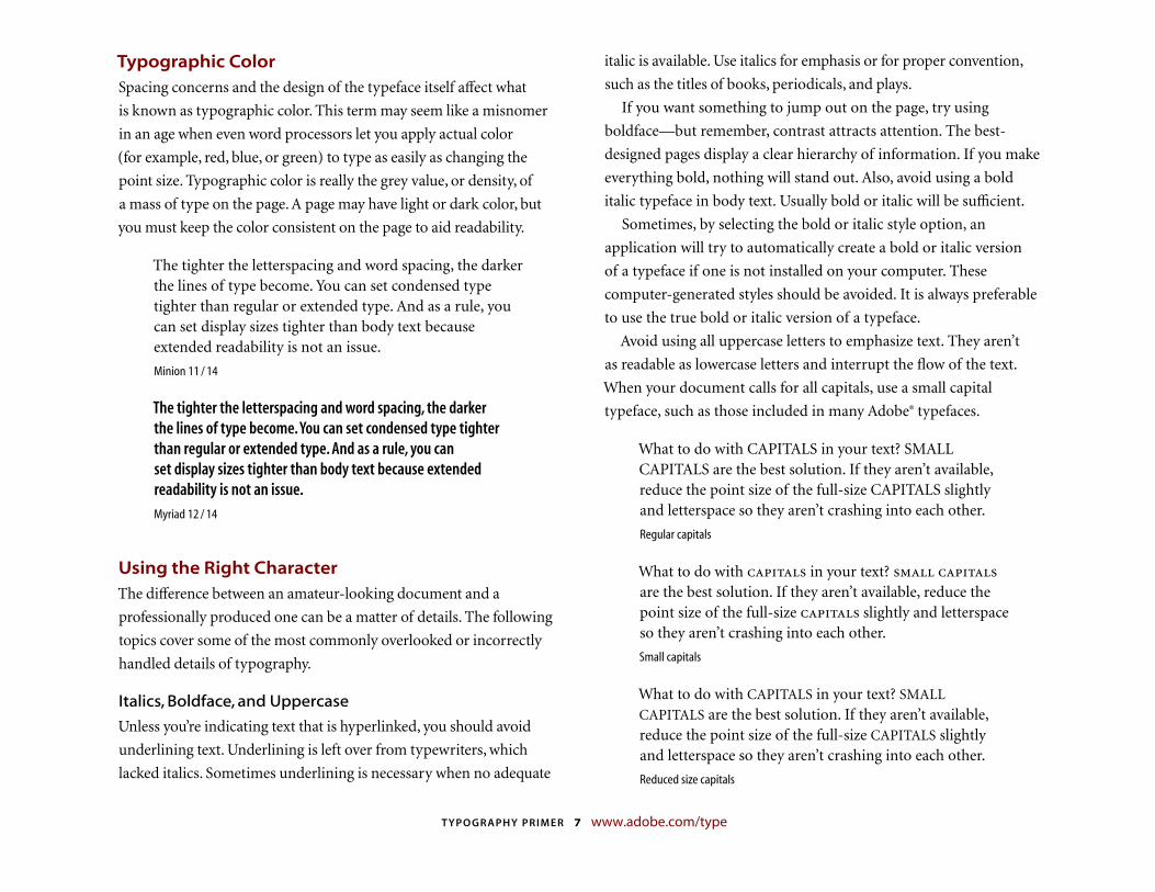
Typographic ColorSpacing concerns and the design of the typeface itself affect what
is known as typographic color. This term may seem like a misnomer
in an age when even word processors let you apply actual color
(for example, red, blue, or green) to type as easily as changing the
point size. Typographic color is really the grey value, or density, of
a mass of type on the page. A page may have light or dark color, but
you must keep the color consistent on the page to aid readability.
The tighter the letterspacing and word spacing, the darker the lines of type become. You can set condensed type tighter than regular or extended type. And as a rule, you can set display sizes tighter than body text because extended readability is not an issue.
Minion 11 / 14
The tighter the letterspacing and word spacing, the darker the lines of type become. You can set condensed type tighter than regular or extended type. And as a rule, you can set display sizes tighter than body text because extended readability is not an issue.Myriad 12 / 14
Using the Right CharacterThe difference between an amateur-looking document and a
professionally produced one can be a matter of details. The following
topics cover some of the most commonly overlooked or incorrectly
handled details of typography.
Italics, Boldface, and Uppercase
Unless you’re indicating text that is hyperlinked, you should avoid
underlining text. Underlining is left over from typewriters, which
lacked italics. Sometimes under lining is necessary when no adequate
italic is available. Use italics for emphasis or for proper convention,
such as the titles of books, periodicals, and plays.
If you want something to jump out on the page, try using
boldface—but remember, contrast attracts attention. The best-
designed pages display a clear hierarchy of information. If you make
everything bold, nothing will stand out. Also, avoid using a bold
italic typeface in body text. Usually bold or italic will be sufficient.
Sometimes, by selecting the bold or italic style option, an
application will try to automatically create a bold or italic version
of a typeface if one is not installed on your computer. These
computer-generated styles should be avoided. It is always preferable
to use the true bold or italic version of a typeface.
Avoid using all uppercase letters to emphasize text. They aren’t
as readable as lowercase letters and interrupt the flow of the text.
When your document calls for all capitals, use a small capital
typeface, such as those included in many Adobe® typefaces.
What to do with CAPITALS in your text? SMALL CAPITALS are the best solution. If they aren’t available, reduce the point size of the full-size CAPITALS slightly and letterspace so they aren’t crashing into each other.
Regular capitals
What to do with capitals in your text? small capitals are the best solution. If they aren’t available, reduce the point size of the full-size capitals slightly and letterspace so they aren’t crashing into each other.
Small capitals
What to do with CAPITALS in your text? SMALL
CAPITALS are the best solution. If they aren’t available, reduce the point size of the full-size CAPITALS slightly and letterspace so they aren’t crashing into each other.
Reduced size capitals
TYPOGRAPHY PRIMER 8 www.adobe.com/type
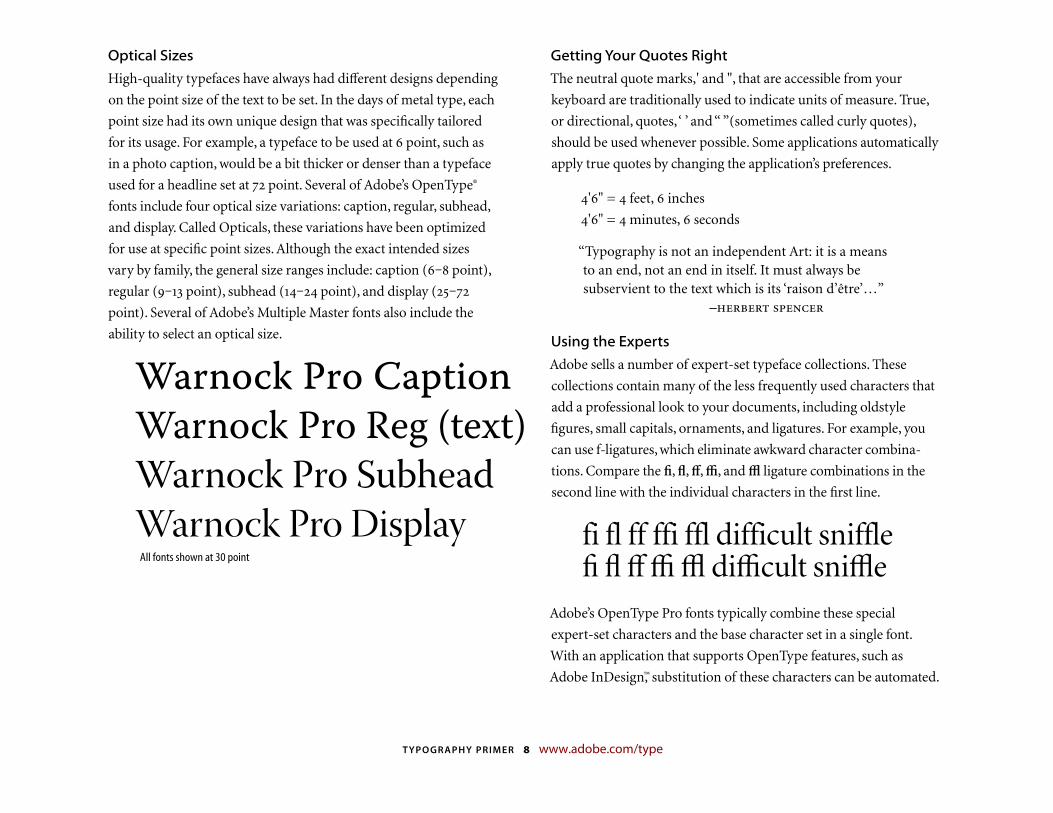
Optical Sizes
High-quality typefaces have always had different designs depending
on the point size of the text to be set. In the days of metal type, each
point size had its own unique design that was specifi cally tailored
for its usage. For example, a typeface to be used at point, such as
in a photo caption, would be a bit thicker or denser than a typeface
used for a headline set at point. Several of Adobe’s OpenType®
fonts include four optical size variations: caption, regular, subhead,
and display. Called Opticals, these variations have been optimized
for use at specifi c point sizes. Although the exact intended sizes
vary by family, the general size ranges include: caption (– point),
regular (– point), subhead (– point), and display (–
point). Several of Adobe’s Multiple Master fonts also include the
ability to select an optical size.
All fonts shown at 30 point
Getting Your Quotes Right
The neutral quote marks,' and ", that are accessible from your
keyboard are traditionally used to indicate units of measure. True,
or directional, quotes, ‘ ’ and “ ”(sometimes called curly quotes),
should be used whenever possible. Some applications automatically
apply true quotes by changing the application’s preferences.
'" = feet, inches
'" = minutes, seconds
“Typography is not an independent Art: it is a means to an end, not an end in itself. It must always be subservient to the text which is its ‘raison d’être’…” –
Using the Experts
Adobe sells a number of expert-set typeface collections. These
collections contain many of the less frequently used characters that
add a professional look to your documents, including oldstyle
figures, small capitals, ornaments, and ligatures. For example, you
can use f-ligatures, which eliminate awkward character combina-
tions. Compare the fi, fl, ff, ffi, and ffl ligature combinations in the
second line with the individual characters in the first line.
fi fl ff ffi ffl difficult sniffle fi fl ff ffi ffl difficult sniffle
Adobe’s OpenType Pro fonts typically combine these special
expert-set characters and the base character set in a single font.
With an application that supports OpenType features, such as
Adobe InDesign,™ substitution of these characters can be automated.
Warnock Pro CaptionWarnock Pro Reg (text)
Warnock Pro SubheadWarnock Pro Display
TYPOGRAPHY PRIMER 9 www.adobe.com/type
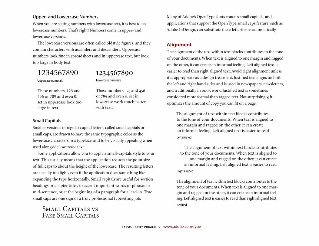
Upper- and Lowercase Numbers
When you are setting numbers with lowercase text, it is best to use
lowercase numbers. That’s right! Numbers come in upper- and
lowercase versions.
The lowercase versions are often called oldstyle figures, and they
contain characters with ascenders and descenders. Uppercase
numbers look fine in spreadsheets and in uppercase text, but look
too large in body text.
1234567890Uppercase numerals
These numbers, 123 and 456 or 789 and even 0, set in upper case look too large in text.
Lowercase numerals
These numbers, and
or and even , set in lowercase work much better with text.
Small Capitals
Smaller versions of regular capital letters, called small capitals or
small caps, are drawn to have the same typographic color as the
lowercase characters in a typeface, and to be visually appealing when
used alongside lowercase text.
Some applications allow you to apply a small-capitals style to your
text. This usually means that the application reduces the point size
of full caps to about the height of the lowercase. The resulting letters
are usually too light, even if the application does something like
expanding the type horizontally. Small capitals are useful for section
headings or chapter titles, to accent important words or phrases in
mid-sentence, or at the beginning of a paragraph for a lead-in. True
small caps are one sign of a truly professional typesetting job.
Small Capitals vsFAKE SMALL CAPITALS
Many of Adobe’s OpenType fonts contain small capitals, and
applications that support the OpenType small caps feature, such as
Adobe InDesign, can substitute these letterforms automatically.
AlignmentThe alignment of the text within text blocks contributes to the tone
of your documents. When text is aligned to one margin and ragged
on the other, it can create an informal feeling. Left aligned text is
easier to read than right aligned text. Avoid right alignment unless
it is appropriate as a design treatment. Justified text aligns on both
the left and right hand sides and is used in newspapers, newsletters,
and traditionally in book work. Justified text is sometimes
considered more formal than ragged text. Not surprisingly, it
optimizes the amount of copy you can fit on a page.
The alignment of text within text blocks contributes to the tone of your documents. When text is aligned to one margin and ragged on the other, it can create an informal feeling. Left aligned text is easier to read
Left aligned
The alignment of text within text blocks contributes to the tone of your documents. When text is aligned to
one margin and ragged on the other, it can create an informal feeling. Left aligned text is easier to read
Right aligned
The alignment of text within text blocks contributes to the tone of your documents. When text is aligned to one mar-gin and ragged on the other, it can create an informal feel-ing. Left aligned text is easier to read than right aligned text.
Justifi ed
TYPOGRAPHY PRIMER 10 www.adobe.com/type
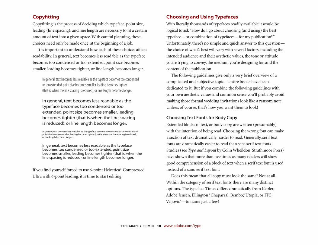
Copyfi ttingCopyfitting is the process of deciding which typeface, point size,
leading (line spacing), and line length are necessary to fit a certain
amount of text into a given space. With careful planning, these
choices need only be made once, at the beginning of a job.
It is important to understand how each of these choices affects
readability. In general, text becomes less readable as the typeface
becomes too condensed or too extended, point size becomes
smaller, leading becomes tighter, or line length becomes longer.
In general, text becomes less readable as the typeface becomes too condensed or too extended, point size becomes smaller, leading becomes tighter (that is, when the line spacing is reduced), or line length becomes longer.
In general, text becomes less readable as the typeface becomes too condensed or too extended, point size becomes smaller, leading becomes tighter (that is, when the line spacing is reduced), or line length becomes longer.
In general, text becomes less readable as the typeface becomes too condensed or too extended, point size becomes smaller, leading becomes tighter (that is, when the line spacing is reduced), or line length becomes longer.
In general, text becomes less readable as the typeface becomes too condensed or too extended, point size becomes smaller, leading becomes tighter (that is, when the line spacing is reduced), or line length becomes longer.
If you find yourself forced to use -point Helvetica* Compressed
Ultra with -point leading, it is time to start editing!
Choosing and Using TypefacesWith literally thousands of typefaces readily available it would be
logical to ask “How do I go about choosing (and using) the best
typeface—or combination of typefaces—for my publication?”
Unfortunately, there’s no simple and quick answer to this question—
the choice of what’s best will vary with several factors, including the
intended audience and their aesthetic values, the tone or attitude
you’re trying to convey, the medium you’re designing for, and the
content of the publication.
The following guidelines give only a very brief overview of a
complicated and subjective topic—entire books have been
dedicated to it. But if you combine the following guidelines with
your own aesthetic values and common sense you’ll probably avoid
making those formal wedding invitations look like a ransom note.
Unless, of course, that’s how you want them to look!
Choosing Text Fonts for Body Copy
Extended blocks of text, or body copy, are written (presumably)
with the intention of being read. Choosing the wrong font can make
a section of text dramatically harder to read. Generally, serif text
fonts are dramatically easier to read than sans serif text fonts.
Studies (see Type and Layout by Colin Wheildon, Strathmoor Press)
have shown that more than five times as many readers will show
good comprehension of a block of text when a serif text font is used
instead of a sans serif text font.
Does this mean that all copy must look the same? Not at all.
Within the category of serif text fonts there are many distinct
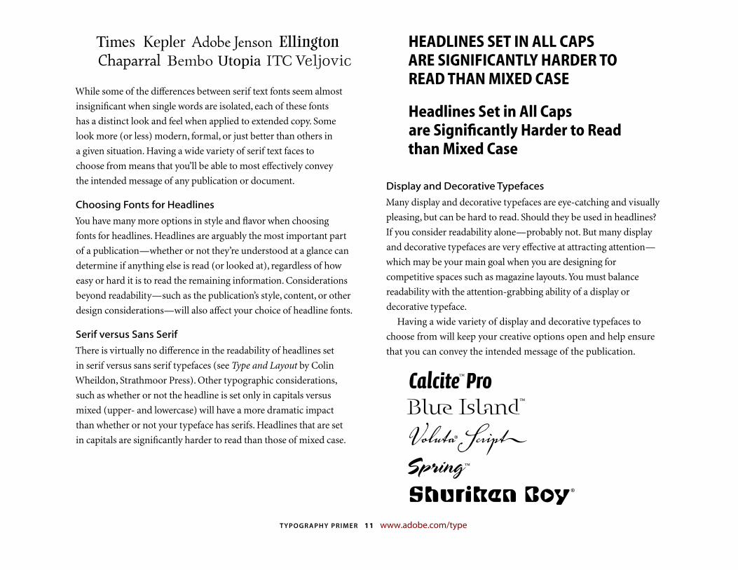
options. The typeface Times differs dramatically from Kepler,
Adobe Jensen, Ellington,® Chaparral, Bembo,® Utopia, or ITC
Veljovic®—to name just a few!
TYPOGRAPHY PRIMER 11 www.adobe.com/type
Times Kepler Adobe Jenson Ellington Chaparral Bembo Utopia ITC Veljovic
While some of the differences between serif text fonts seem almost
insignificant when single words are isolated, each of these fonts
has a distinct look and feel when applied to extended copy. Some
look more (or less) modern, formal, or just better than others in
a given situation. Having a wide variety of serif text faces to
choose from means that you’ll be able to most effectively convey
the intended message of any publication or document.
Choosing Fonts for Headlines
You have many more options in style and flavor when choosing
fonts for headlines. Headlines are arguably the most important part
of a publication—whether or not they’re understood at a glance can
determine if anything else is read (or looked at), regardless of how
easy or hard it is to read the remaining information. Considerations
beyond readability—such as the publication’s style, content, or other
design considerations—will also affect your choice of headline fonts.
Serif versus Sans Serif
There is virtually no difference in the readability of headlines set
in serif versus sans serif typefaces (see Type and Layout by Colin
Wheildon, Strathmoor Press). Other typographic considerations,
such as whether or not the headline is set only in capitals versus
mixed (upper- and lowercase) will have a more dramatic impact
than whether or not your typeface has serifs. Headlines that are set
in capitals are significantly harder to read than those of mixed case.
HEADLINES SET IN ALL CAPS ARE SIGNIFICANTLY HARDER TO READ THAN MIXED CASE
Headlines Set in All Caps are Signifi cantly Harder to Read than Mixed Case
Display and Decorative Typefaces
Many display and decorative typefaces are eye-catching and visually
pleasing, but can be hard to read. Should they be used in headlines?
If you consider readability alone—probably not. But many display
and decorative typefaces are very effective at attracting attention—
which may be your main goal when you are designing for
competitive spaces such as magazine layouts. You must balance
readability with the attention-grabbing ability of a display or
decorative typeface.
Having a wide variety of display and decorative typefaces to
choose from will keep your creative options open and help ensure
that you can convey the intended message of the publication.
Calcite™ ProBlue Island™
Voluta® Script�Spring ™
Shuriken Boy ®
TYPOGRAPHY PRIMER 12 www.adobe.com/type
Combining Typefaces in a PublicationAlmost all publications will contain headlines and body copy, or at
least subordinate textual information. Commonly you’ll need or
want to use different typefaces for the various levels of information
in the publication. This presents a new problem—how do you
effectively combine typefaces within a publication?
There are several possible outcomes when you combine typefaces
in a publication—they may complement one another, contrast
with one another, or conflict with one another. The first two
outcomes are usually good, the last one is usually bad. Here are a
few guidelines to help you choose:
� Avoid using an excessive number of typefaces in a single
publication. Some experts recommend using no more than two
typefaces on a single page, while others set the number slightly
higher. Judicious use of typeface variety helps the reader sort
information and navigate through a document. Too many
competing faces create chaos.
� Avoid using two or more similar fonts on a page. Selecting fonts
that are not different enough can cause conflict. For example,
it’s usually a poor idea to use two script typefaces on a single page,
or a script face and an italic, or two different slab serifs, or two
different old faces, etc.
� Remember that fonts are part of the overall design of a
publication and should be chosen to match (or contrast with)
the design style of the publication. Readability is important,
but so is design!
Additional Tips
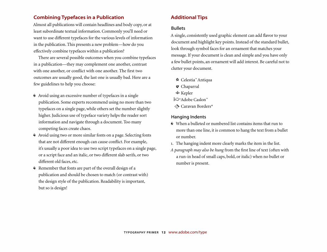
Bullets
A single, consistently used graphic element can add flavor to your
document and highlight key points. Instead of the standard bullet,
look through symbol faces for an ornament that matches your
message. If your document is clean and simple and you have only
a few bullet points, an ornament will add interest. Be careful not to
clutter your document.
� Celestia™ Antiqua
� Chaparral
� Kepler
� Adobe Caslon™
� Caravan Borders*
Hanging Indents
� When a bulleted or numbered list contains items that run to
more than one line, it is common to hang the text from a bullet
or number.
. The hanging indent more clearly marks the item in the list.
A paragraph may also be hung from the first line of text (often with
a run-in head of small caps, bold, or italic) when no bullet or
number is present.
TYPOGRAPHY PRIMER 13 www.adobe.com/type
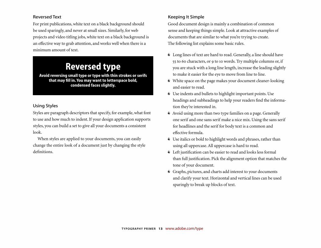
Reversed Text
For print publications, white text on a black background should
be used sparingly, and never at small sizes. Similarly, for web
projects and video titling jobs, white text on a black background is
an effective way to grab attention, and works well when there is a
minimum amount of text.
Reversed typeAvoid reversing small type or type with thin strokes or serifs
that may fi ll in. You may want to letterspace bold, condensed faces slightly.
Using Styles
Styles are paragraph descriptors that specify, for example, what font
to use and how much to indent. If your design application supports
styles, you can build a set to give all your documents a consistent
look.
When styles are applied to your documents, you can easily
change the entire look of a document just by changing the style
definitions.
Keeping It Simple
Good document design is mainly a combination of common
sense and keeping things simple. Look at attractive examples of
documents that are similar to what you’re trying to create.
The following list explains some basic rules.
� Long lines of text are hard to read. Generally, a line should have
to characters, or to words. Try multiple columns or, if
you are stuck with a long line length, increase the leading slightly
to make it easier for the eye to move from line to line.
� White space on the page makes your document cleaner-looking
and easier to read.
� Use indents and bullets to highlight important points. Use
headings and subheadings to help your readers find the informa-
tion they’re interested in.
� Avoid using more than two type families on a page. Generally
one serif and one sans serif make a nice mix. Using the sans serif
for head lines and the serif for body text is a common and
effective formula.
� Use italics or bold to highlight words and phrases, rather than
using all uppercase. All uppercase is hard to read.
� Left justification can be easier to read and looks less formal
than full justification. Pick the alignment option that matches the
tone of your document.
� Graphs, pictures, and charts add interest to your documents
and clarify your text. Horizontal and vertical lines can be used
sparingly to break up blocks of text.
TYPOGRAPHY PRIMER 14 www.adobe.com/type
Glossary of Typographic TermsThis section provides a small glossary of terms frequently used in
the type world.
alignment The positioning of text within the text block or frame.
Alignment can be flush left, flush right, justified, or centered.
Flush left and flush right are sometimes referred to as left justified
and right justified.
ascender The part of lowercase letters (such as k, b, and d) that
ascends above the x-height of the other lowercase letters in a font.
Adobe Type Manager® (ATM®) ATM Light is a system software
component for the Windows® and Mac OS platforms that
automatically generates high-quality bitmapped character shapes
on a computer monitor from PostScript® Type or OpenType
outline font data. ATM Light also allows you to print PostScript
fonts on non-PostScript printers. ATM Deluxe is Adobe’s personal
font management application.
baseline The imaginary line on which the majority of the
characters in a typeface rest.
body text The paragraphs in a document that make up the bulk
of its content. Body text should be set in an appropriate and easy
to read face, typically at or point size.
boldface A typeface that has been enhanced by rendering it in
darker, thicker strokes so that it will stand out on the page.
Headlines that need emphasis should be boldface. Italics are
preferable for emphasis in body text. Some publishing
applications allow you to apply a computer-generated, or fake,
bold style to a regular weight font. Using this technique is not
recommended.
bullet A dot or other special character placed at the left of items in
a list to show that they are individual, but related, points.
cap height The height from the baseline to the top of the uppercase
letters in a font. This may or may not be the same as the height
of ascenders. Cap height is used in some systems to measure the
type size.
centered Text placed at an equal distance from the left and right
margins. Titles are often centered. It is generally not good to mix
centered text with flush left or flush right text.
character, character code A single letter, punctuation mark, number,
space, or any other object or symbol in a typeface set. In the
context of modern computer operating systems, it is often
defined as a code with a meaning attached to it. For example, the
decimal character code represents the letter a. Also see
character encoding, keyboard layout, OpenType, Unicode.
character mapping See character encoding.
character encoding A table in a font or a computer operating system
that maps character codes to glyphs in a font. Most operating
systems are moving from a platform-specifi c single-byte
encoding system that limited the number of possible glyphs in a
font to to a new two-byte international encoding standard
called Unicode. Unicode allows for the inclusion of up to ,
glyphs in a single font. Adobe’s OpenType fonts are based on
Unicode. Also see character, glyph, keyboard layout, Unicode.
color See typographic color.
condensed A narrower version of a font, used to fit a maximum
number of characters into a given space.
TYPOGRAPHY PRIMER 15 www.adobe.com/type
contrast A subjective feeling that graphic elements (such as fonts)
are different but work together well. This gives a feeling of variety
without losing harmony. Within a particular font, contrast also
refers to the differences of stroke thicknesses that make up the
characters. For example, Myriad has low contrast and Bodoni has high contrast.
copyfi tting The process of adjusting the size and spacing of type to
make it fit within a defined area of the page.
decorative font An appearance-based or usage-based category of
fonts. Decorative fonts are often ornate and attention-grabbing.
In her book The Non-Designer’s Design Book, Robin Williams has
provided a useful working definition of a decorative font:
“...if the thought of reading an entire book in that font makes you
wanna throw up, you can probably put it in the decorative pot.”
descender The part of lowercase letters (such as y, p, and q) that
descends below the baseline of the other lowercase letters in
a font. In some typefaces, the uppercase J and Q also descend
below the baseline.
dingbats Symbol characters such as decorations, arrows, and
bullets.
display fonts Another category of fonts with characteristics
similar to decorative fonts. In some typeface families, a font is
categorized as a display font when it has been specifically
designed for larger sizes (usually over points) with thinner
strokes, more delicate serifs, etc.
dpi An abbreviation for dots per inch. Refers to the resolution at
which a device, such as a monitor or printer, can display text
and graphics. Monitors are usually to dpi or less, and laser
printers are usually dpi or higher. An image printed on a laser
printer looks sharper than the same image on a monitor.
drop cap A design treatment in which the first capital letter of a
paragraph is set in a larger point size and aligned with the top of
the first line. This method is used to indicate the start of a new
section of text, such as a chapter. Also see raised cap.
ellipsis A punctuation character consisting of three dots, or periods,
in a row. It indicates that a word or phrase has been omitted.
em, em space, em quad Common units of measure ment in
typography. An em is tradition ally defined as the width of the
uppercase M in the current face and point size. It is more properly
defined as simply the current point size. For example, in point
type, one em is a distance of points.
em dash A dash the length of an em, used to indi cate a break in a
sentence: His friend—also an editor—thought the same thing.
en, en space, en quad Common units of measure ment in
typography. An en is traditionally defined as the width of
the uppercase N in the current face and the current point size.
It is more properly defined as half the width of an em.
en dash A dash the length of an en, used to indicate a range
of values: 1960–1990.
encoding See character encoding.
expert set, expert collection A font that has a more refined, or
expanded, set of typographic characters than regular fonts.
Expert sets may contain oldstyle figures, ligatures, small capitals,
embellishments, fractions, or other unique characters. Also see
OpenType.
face See typeface.
TYPOGRAPHY PRIMER 16 www.adobe.com/type
family A collection of typefaces that were designed and intended
to be used together. For example, the Utopia family consists
of roman and italic styles, as well as regular, semibold, and bold
weights. Each of the style and weight combinations is referred
to as a font or typeface.
fl ush left Text that is aligned on the left margin is said to be set flush
left or flush left, ragged right. The term ragged right is sometimes
used alone to mean the same thing.
fl ush right Text that is aligned on the right margin is said to be set
flush right or flush right, ragged left. The term ragged left is
sometimes used alone to mean the same thing.
font One weight, width, and style of a typeface: Optima* Bold and
Helvetica Light Condensed are examples of fonts. Before digital
type, a font usually referred to a specifi c point size of a particular
style of a typeface. For example, -point Helvetica Bold would
have been considered a font. Today, the terms font, typeface,
and family are often used interchangeably, though family usually
refers to the general type design, such as Helvetica, and font
and typeface usually refer to the specifi c weight, width, or style
of a type design, such as Helvetica Bold.
font family See family.
glyph In the context of modern computer operating systems, glyph
is often defined as a shape in a font that is used to represent a
character code on screen or paper. The most common example of
a glyph is a letter in a specifi c font, but the symbols and shapes in
a font like ITC Zapf Dingbats® are also glyphs. Also see character,
character encoding, keyboard layout.
hanging indent A document style in which the first line of a
paragraph is aligned with the left margin, and the remaining lines
are all indented an equal amount. This is an effective way to
display lists of information.
headline The short lines of emphasized text that introduce detail
information in the body text that follows. Also the category of
typefaces that are designed to work best in headline text.
headline font A font that has been designed to look good at large
point sizes for use in headlines. Headline fonts generally do not
contain a complete set of characters since they do not require a
full set of special symbols and punctuation.
hints The mathematical instructions added to digital fonts to make
them sharp at all sizes and on display devices of different
resolutions.
italic A slanting or script-like version of a face. The upright faces
are often referred to as roman. Some publishing applications
allow you to apply a computer-generated, or fake, italicized style
to a roman font. Using this technique is not recommended.
Also see oblique.
justifi ed A block of text that has been spaced so that the text aligns
on both the left and right margins. Justified text has a more
formal appearance, but may be harder to read if not properly set.
kerning The adjustment of horizontal space between individual
characters in a line of text. Without kerning adjustments, many
letter combinations can look awkward. The objective of kerning
is to create visually equal spaces between all letters so that the eye
can move smoothly along the text. Some combinations of
characters naturally have excessive space between them (such as
Ta or Vo) and must be manually adjusted by the designer or
typographer. These adjusted combinations are called kerned
pairs. Kerning may be applied automatically by desktop
TYPOGRAPHY PRIMER 17 www.adobe.com/type
publishing programs based on tables of values built into the font.
Some programs also allow manual kerning to make fine
adjustments. Adjustments in kerning are especially important in
large display and headline text lines. Also see letterspacing.
keyboard layout, keyboard mapping A keyboard layout or mapping
is a table used by a computer operating system to govern which
character code is generated when a key or key combination
is pressed. Sometimes known as a character mapping. Also see
character, character encoding, glyph.
leading (pronounced ledding) The amount of space added between
lines of text to make the document legible. The term originally
referred to the thin lead spacers that printers used to physically
increase space between lines of metal type. Most applications
automatically apply standard leading based on the point size of
the font. Closer leading fits more text on the page, but decreases
legibility. Looser leading spreads text out to fill a page and makes
the document easier to read. Leading can also be negative, in
which case the lines of text are so close that they overlap or touch.
letterspacing Adjusting the average distance between letters
in a block of text to fit more or less text into the given space or
to improve legibility. Kerning allows adjustments between
individual letters, letterspacing is applied to a block of text as a
whole. Letterspacing is sometimes referred to as tracking or track
kerning. Letter spacing is often adjusted to open up the look of
a typeface or to add drama to a headline by stretching it across
a page. Also see kerning, tracking.
ligature Two or more letters combined into a single letterform. In
some typefaces, character combinations such as fi and fl overlap,
resulting in an unsightly shape. The fi and fl ligatures were
designed to improve the appearance of these characters. Letter
combinations such as ff, ffi, and ffl are available in Adobe’s expert
set fonts and in most OpenType Pro fonts. OpenType fonts may
also have other ligatures designed to improve appearance of other
letter combinations (such as � ) or for artistic effect.
multiple master A class of PostScript font developed by Adobe that
allows you to modify and create new fonts based on a particular
style. For instance, you could create fonts that are bolder or
expanded while still maintaining the correct proportions, stroke
width changes, and other subtle design characteristics of the
original typeface. Also see PostScript, PostScript Type .
oblique A slanting version of a face. Oblique is similar to italic, but
without the script quality of a true italic. The upright faces are
usually referred to as roman. Also see italic.
OpenType A cross-platform font fi le format developed by Adobe
and Microsoft. OpenType is an extension to the TrueType fi le
format that can now support PostScript font data and new
typographic features. Based on Unicode, OpenType fonts may
include an expanded character set and layout features to provide
richer linguistic support and advanced typographic control.
Feature-rich Adobe OpenType fonts are distinguished by the
word Pro, which is part of the font name and appears in
application font menus. OpenType fonts can be installed and
used alongside PostScript Type and TrueType fonts. Also see
Unicode, TrueType, PostScript Type .
optical size A specifi c typeface design that is tailored for the point
size it is to be used at. Several of Adobe’s OpenType fonts include
four optical size variations—caption, regular, subhead, and
display—that have been optimized for use at specifi c point sizes.
Although the exact intended sizes vary by family, the general size
TYPOGRAPHY PRIMER 18 www.adobe.com/type
ranges include: caption (– point), regular (– point), subhead
(– point), and display (– point). Several of Adobe’s
Multiple Master fonts also include the ability to select an optical
size.
PFB fi le The portion of a Windows PostScript Type font that
contains the font’s outline information.
PFM fi le The portion of a Windows PostScript Type font that
contains the font’s metrics information.
paragraph rules Graphic lines associated with a paragraph that
separate blocks of text. Rules are commonly used to separate
columns and isolate graphics on a page. Some programs allow
paragraph styles to be created that include paragraph rules above
and/or below the paragraph.
pica A unit of measure in typography. A pica is equal to points.
The traditional British and American pica is . inches. In
PostScript printers, a pica is exactly 1/6 of an inch.
picture font A font that displays pictures or symbols instead of
letters or characters. Picture fonts are useful for making logos,
borders or interesting bullets. Like clip art, they can also be used
as graphic raw material in some graphics software packages,
such as Adobe Photoshop® or Adobe Illustrator.® Also known as
pi fonts, symbol fonts, and dingbats.
point A unit of measure in typography. There are approximately
points to the inch. A pica is points.
point size The most common method of measuring type. The
distance from the top of the highest ascender to the bottom
of the lowest descender in points. In Europe, type is sometimes
measured by the cap height in millimeters.
PostScript Adobe’s mathematically-based page description
language that communicates with your output device and
conveys information regarding how to create complex letter
shapes and graphics. Developed by Adobe in .
PostScript Type 1 A font format designed to conform to the
PostScript page description language. On Windows, PostScript
Type fonts consist of a fi le that contains the font’s outline
information and a fi le that contains the font’s metrics. On the
Mac OS platform, PostScript fonts are composed of screen fonts
(or bitmapped fonts) and printer fonts (or outline fonts).
PostScript fonts require a PostScript printer to render accurately
or they can be printed to a non-PostScript output device using
Adobe Type Manager. Also see PostScript font, Multiple Master.
printer font One of the two components of a PostScript font for
the Mac OS. The printer font contains mathematically-defi ned
outlines for all characters (or glyphs) in that font, and is
downloaded to the printer when that font is used in a document.
Also known as an outline font.
proportional fi gures Numerals that have different widths depending
on their shape. When setting body text, it is preferrable to use
proportional fi gures. Also see tabular fi gures.
raised cap A design treatment in which the first capital letter of a
paragraph is set in a large point size and aligned with the baseline
of the first line of text. Also see drop cap.
reverse The technique of printing or displaying white or light-
colored text on a black or dark background for emphasis. This
technique greatly reduces legibility, especially with small type.
TYPOGRAPHY PRIMER 19 www.adobe.com/type
rivers Word spaces that align vertically from line to line in poorly
justifi ed text creating a distracting river of white space in a block
of copy.
roman Commonly refers to the upright version of a face within a
font family, as compared to the italic version.
rule A solid or dashed graphic line in documents used to separate
the elements of a page. Rules and other graphic devices should be
used sparingly, and only for clarifying the function of other
elements on the page.
sans serif A typeface that does not have serifs.
screen font One of two components for a PostScript font on
the Mac OS platform. These are created by sending electronic
information to pixels (dots) on the computer screen thus
allowing you to view the font on-screen. Also known as a
bitmapped font.
script font Fonts that appear to have been hand lettered with a
calligraphy pen or brush, or sometimes with a pencil or technical
pen.
serif A small decorative stroke at the end of a letter’s main strokes.
Serifs improve readability by leading the eye along the line of
type.
style One of the variations in appearance, such as italic and bold,
that make up the faces in a type family.
symbol font A category of type in which the characters are special
symbols rather than alphanumeric characters.
tabular fi gures Numerals that all have the same width. This makes it
easier to set tabular matter. Most fonts have tabular fi gures. Also
see proportional fi gures.
text font Text fonts are used for body copy and are most commonly
serif fonts. In large families of typefaces these are often denoted
with the suffixes regular or book (for example, Utopia Regular or
ITC Veljovic Book).
tracking Adjusting the average distance between letters in a block
of text. Generally, large type requires proportionally less space
between letters to appear subjectively right visually while small
type requires more letter spacing to appear right. Also see
letterspacing.
TrueType An outline font technology developed by Apple Computer.
Type 1 See PostScript Type .
type family See family.
typeface The letters, numbers, and symbols that make up a design
of type. A typeface is often part of a type family of coordinated
designs. The individual typefaces are named after the family and
are also specifi ed with a designation, such as italic, bold, or
condensed. For example, the italic style of the Times family is
referred to as a typeface or font.
typographic color The apparent blackness of a block of text. Color
is a function of the relative thickness of the strokes that make up
the characters in a font, as well as the width, point size, and
leading used for setting the text block.
Unicode An international double-byte character encoding standard
that encompasses virtually all of the world’s languages.
Supported by many of the leading hardware and software
manufacturers, Unicode assigns a unique value to each of the
characters (or glyphs) in all of the world’s languages.
TYPOGRAPHY PRIMER 20 www.adobe.com/type
unjustifi ed Depending on alignment, this term refers to text that is
set flush left, flush right, or centered.
weight The relative darkness of the characters in the various
typefaces within a type family. Weight is indicated by relative
terms such as thin, light, bold, extra-bold, and black.
white space The blank areas on a page where text and illustrations
are not printed. White space should be considered an important
graphic element in page design.
width One of the possible variations of a typeface within a font
family, such as condensed or extended.
word spacing Adjusting the average distance between words to
improve legibility or to fit a block of text into a given amount of
space.
x-height Traditionally, x-height is the height of the lowercase letter
x. It is also the height of the body of lowercase letters in a font,
excluding the ascenders and descenders. Some lowercase letters
that do not have ascenders or descenders still extend a little bit
above or below the x-height as part of their design. The x-height
can vary greatly from typeface to typeface at the same point size.
For Further ReadingThere are several excellent books that can provide you with
additional assistance in choosing and using typefaces and in making
type work better in your designs, including:
Beyond the Mac Is Not a Typewriter by Robin Williams. Peachpit
Press, Berkeley, .
The Non-Designer’s Design Book by Robin Williams. Peachpit Press,
Berkeley, .
Type & Layout: How Typography and Design Can Get Your Message
Across—Or Get in the Way by Colin Wheildon. Strathmoor Press,
Berkeley, .
Stop Stealing Sheep & Find Out How Type Works by Erik
Spiekermann. Adobe Press, San Jose, .
The Elements of Typographic Style by Robert Bringhurst. Hartley &
Marks Publishers Inc., Vancouver,
Adobe, the Adobe logo, Adobe Caslon, Adobe Garamond, Adobe Jenson, Adobe Type Manager, ATM, Bickham Script,
Blue Island, Calcite, Chaparral, Cronos, Illustrator, InDesign, Jimbo, Kepler, Minion, Myriad, Photoshop, Postino, PostScript,
Shuriken Boy, Utopia, Voluta, and Warnock are either registered trademarks or trademarks of Adobe Systems Incorporated
in the United States and/or other countries. Bembo and Ellington are trademarks of the Monotype Corporation registered
in the U.S. Patent and Trademark Offi ce and may be registered in certain other jurisdictions. Ocean Sans is a trademark
of the Monotype Corporation and may be registered in certain jurisdictions. Caravan Borders, Helvetica, Optima, and Times
are registered trademarks or trademarks of Linotype-Hell AG and/or its subsidiaries. ITC Veljovic and ITC Zapf Dingbats
are registered trademarks of the International Typeface Corporation. Spring is a trademark of LetterPerfect. Celestia is a
trademark of MvB Design. Mac is a trademark of Apple Computer, Inc., registered in the U.S.and other countries. OpenType
and Windows are either registered trademarks or trademarks of Microsoft Corporation in the U.S.and/or other countries.
© 2000 Adobe Systems incorporated. All rights reserved.


