
1
11/7/01 CS4: HCI lecture 9 1
Interface Design I: Basic Principles of Information Presentation
Rob Procter
11/7/01 CS4: HCI lecture 9 2
Introduction• How do we design effective information displays?
– Pay attention to how information is used
• How do we get users to focus attention on important data?
• How do we cue interaction?• Cognitive psychology provides basic guidelines for
visual design • Design practice provides guidelines for more complex
design decisions• People have substantial perceptual differences
– Age may be a major factor

2
11/7/01 CS4: HCI lecture 9 3
Basic Information Needs• Navigation:
– Where am I? – How did I get here? – What can I do here?– Where can I go from here? – How do I get there?
• Problems of satisfying these needs and robustness principle:– In rich information environments such as the WWW– In highly constrained environments such as mobile devices
11/7/01 CS4: HCI lecture 9 4
Visual Perception
• Some characteristics of the visual system:– Flicker sensitivity: critical flicker frequency (CFF)
depends on retinal position
– Visual acuity: minimum perceptible angle is approx 1” of an arc
– Sensitive to geometric properties
– Sensitive to movement and change

3
11/7/01 CS4: HCI lecture 9 5
Visual Perception• An active process:
– Raw data + recognition schemas; bottom up and top down
– Global analysis isolates informative areas, perceptual landmarks
– Proceeds through a series of serial data acquisitions– Integration in space and time gives sensation of
parallel data acquisition
• Users may not know “where to look”
11/7/01 CS4: HCI lecture 9 6
Physiological Guidelines• Colours must be considered in context
• Avoid simultaneous display of highly saturated, spectrally extreme, colours
• Avoid pure blue for text, thin lines and small shapes
• Avoid red and green in periphery of large displays

4
11/7/01 CS4: HCI lecture 9 7
Cognitive Guidelines
• Use colour sparingly, i.e., 5+/- 2 colours• Use colour to draw attention• Use colour to reflect organisation and establish
relationships• Be consistent• Follow conventions, but investigate first• Design initially in monochrome and don’ t rely
on colour alone
11/7/01 CS4: HCI lecture 9 8
Guidelines for Text
• Legibility: soft copy quality is improving
• Case:
• Formatting: Don’ t make edges of text too interesting������������ ���� : ��������������� �"!#�"!�$• Size: 10 pt. is smallest recommended
Normal reading is done most easily if the text is in both upper and lower case
ALL UPPER CASE IS HARDER TO READ THAN A MIX OF UPPER AND LOWER CASE

5
11/7/01 CS4: HCI lecture 9 9
Graphics• Graphics has re-emerged after a long period dominated by text
– Better for overviews
– Short search paths
– Distinguishes connectedness from adjacency
– Supports manipulations such as zooming, bridging different levels of abstraction
• Long history of use has provided a wealth of guidelines:– Typography
– Graphics• Edward Tufte
– Comics
– Film
11/7/01 CS4: HCI lecture 9 10
Icons• Boundaries should be solid, closed and contrast-
bounded• Technological icons minimise culturally variable
interpretations• Use representation hierarchy to direct recognition and
interpretation• Keep them simple
– over-elaborate effects may hinder interpretation
• Supplement with labels where appropriate• Colour aids identification• Animation aids comprehension
6
11/7/01 CS4: HCI lecture 9 11
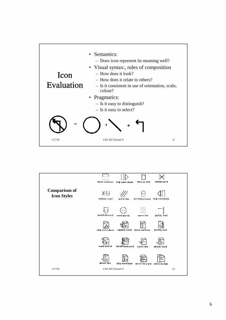
Icon Evaluation
• Semantics:– Does icon represent its meaning well?
• Visual syntax:, rules of composition– How does it look?– How does it relate to others?– Is it consistent in use of orientation, scale,
colour?
• Pragmatics:– Is it easy to distinguish?– Is it easy to select?
11/7/01 CS4: HCI lecture 9 12
Comparison of Icon Styles

7
11/7/01 CS4: HCI lecture 9 13
Layout
• Include all (but only) essential information
• Consistency of placement aids interpretation
• Proximity effect suggests relationships so group items semantically
• Make boundaries clear
• Establish a consistent visual syntax/hierarchy
11/7/01 CS4: HCI lecture 9 14
Layout Example
8
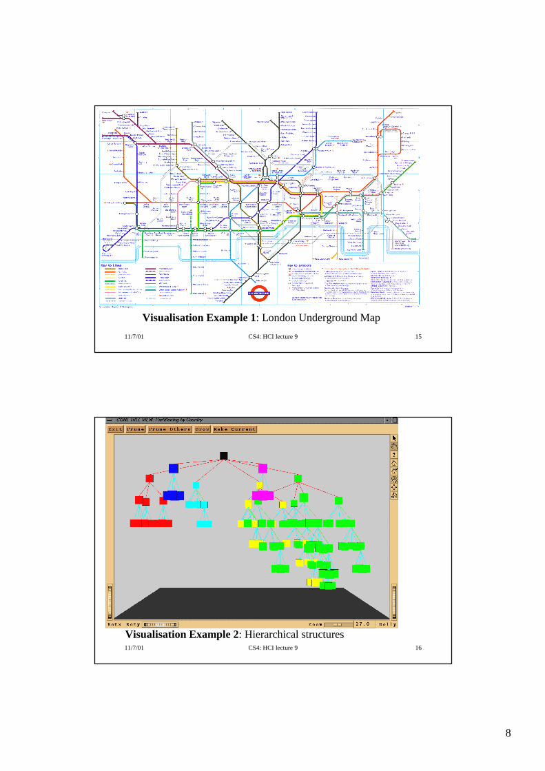
11/7/01 CS4: HCI lecture 9 15
Visualisation Example 1: London Underground Map
11/7/01 CS4: HCI lecture 9 16
Visualisation Example 2: Hierarchical structures
9
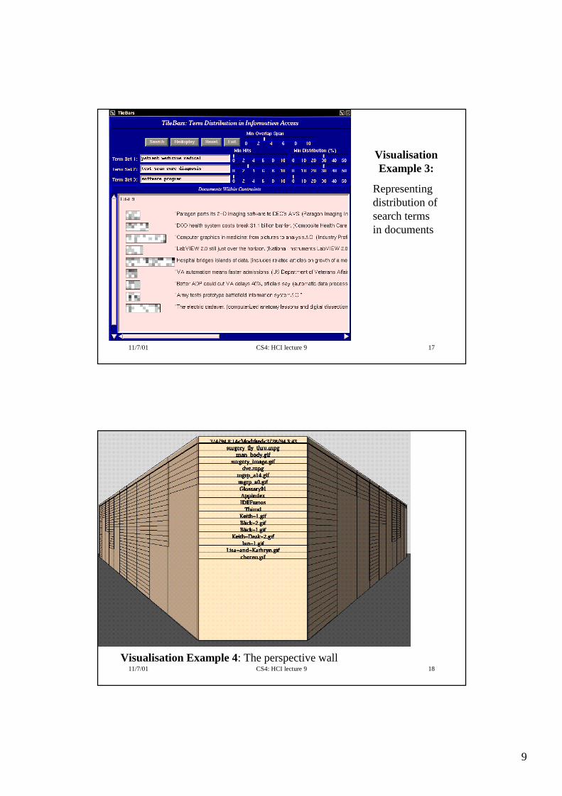
11/7/01 CS4: HCI lecture 9 17
Visualisation Example 3:
Representing distribution of search terms in documents
11/7/01 CS4: HCI lecture 9 18
Visualisation Example 4: The perspective wall
10
11/7/01 CS4: HCI lecture 9 19
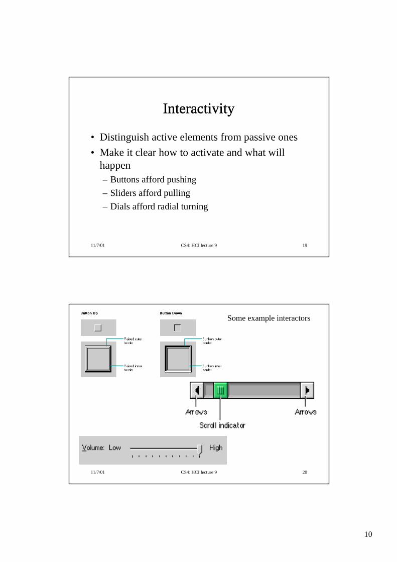
Interactivity
• Distinguish active elements from passive ones
• Make it clear how to activate and what will happen– Buttons afford pushing
– Sliders afford pulling
– Dials afford radial turning
11/7/01 CS4: HCI lecture 9 20
Some example interactors

11
11/7/01 CS4: HCI lecture 9 21
Animation
• Good attention getter
• Good for signalling changes– Salient objects should never just appear/disappear
• Use for effecting display overlaps– Fades, dissolves, etc.
– Helps maintain sense of continuity
• Comic and film narrative conventions
11/7/01 CS4: HCI lecture 9 22
Sound
• Map properties of interaction on to sound dimensions:– Pitch
– Loudness
– Duration
– Rhythm
– Timbre – characteristic sound ‘quality’
• Interface sound design is typically arbitrary and synthetic

12
11/7/01 CS4: HCI lecture 9 23
Sound
• Confirmatory feedback
• Monitoring state, ‘background information’– Disk, printer noise etc.
– Example of user improvisation in use of ‘data’
• Reducing reliance on visual system
• Grabbing attention
11/7/01 CS4: HCI lecture 9 24
Further Reading
• Dix et al. chapter 15, p. 583-90; chapter 16
• Newman and Lamming, chapter 15, p. 388-94
• Tufte, Visual Explanation, Graphics Press, 1987


