Download - Build Low Fidelity Wireframes


Build Low-Fidelity Wireframes
Vishnu Gopal

Where is your team now?
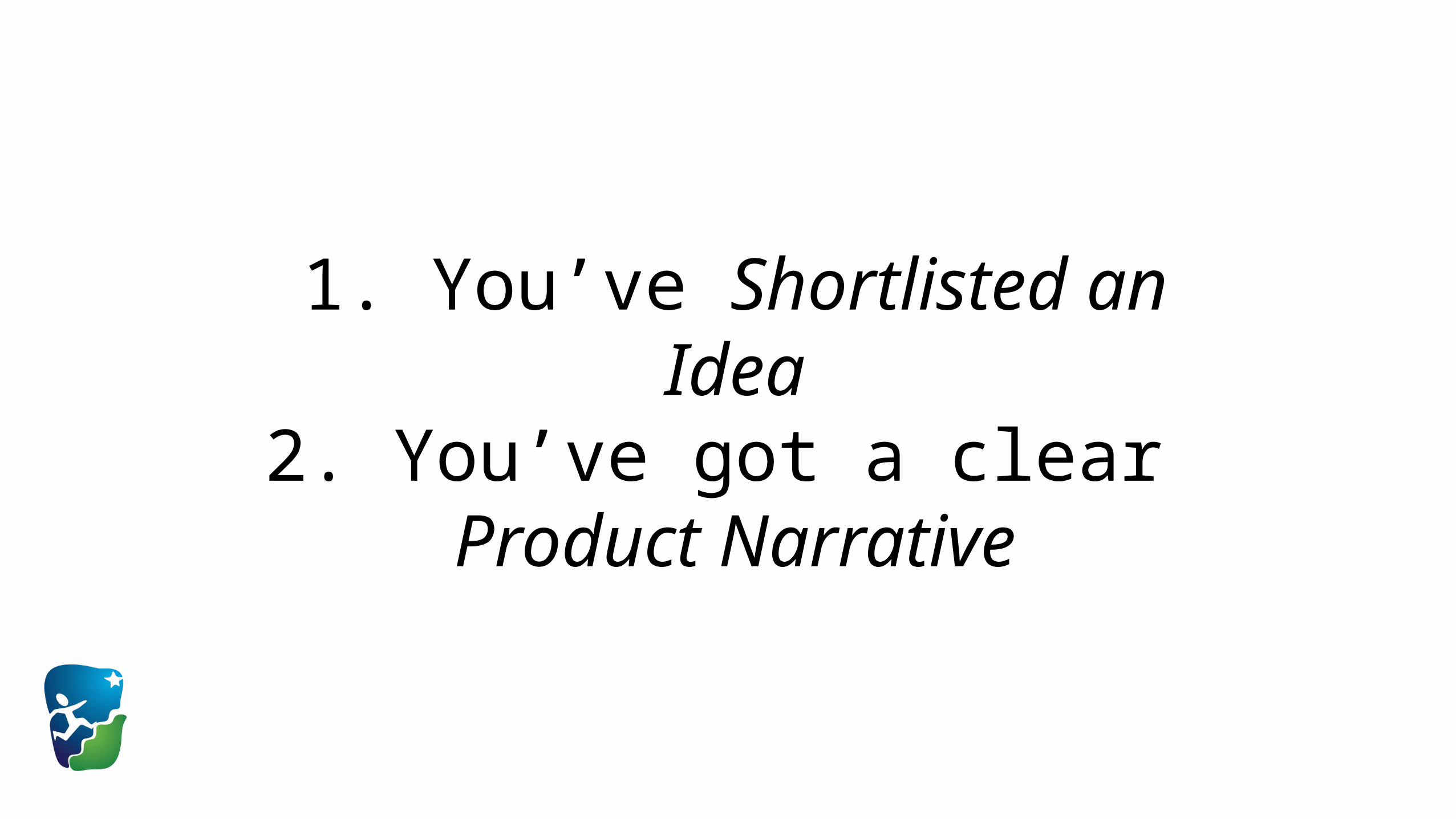
1. You’ve Shortlisted an Idea2. You’ve got a clear
Product Narrative
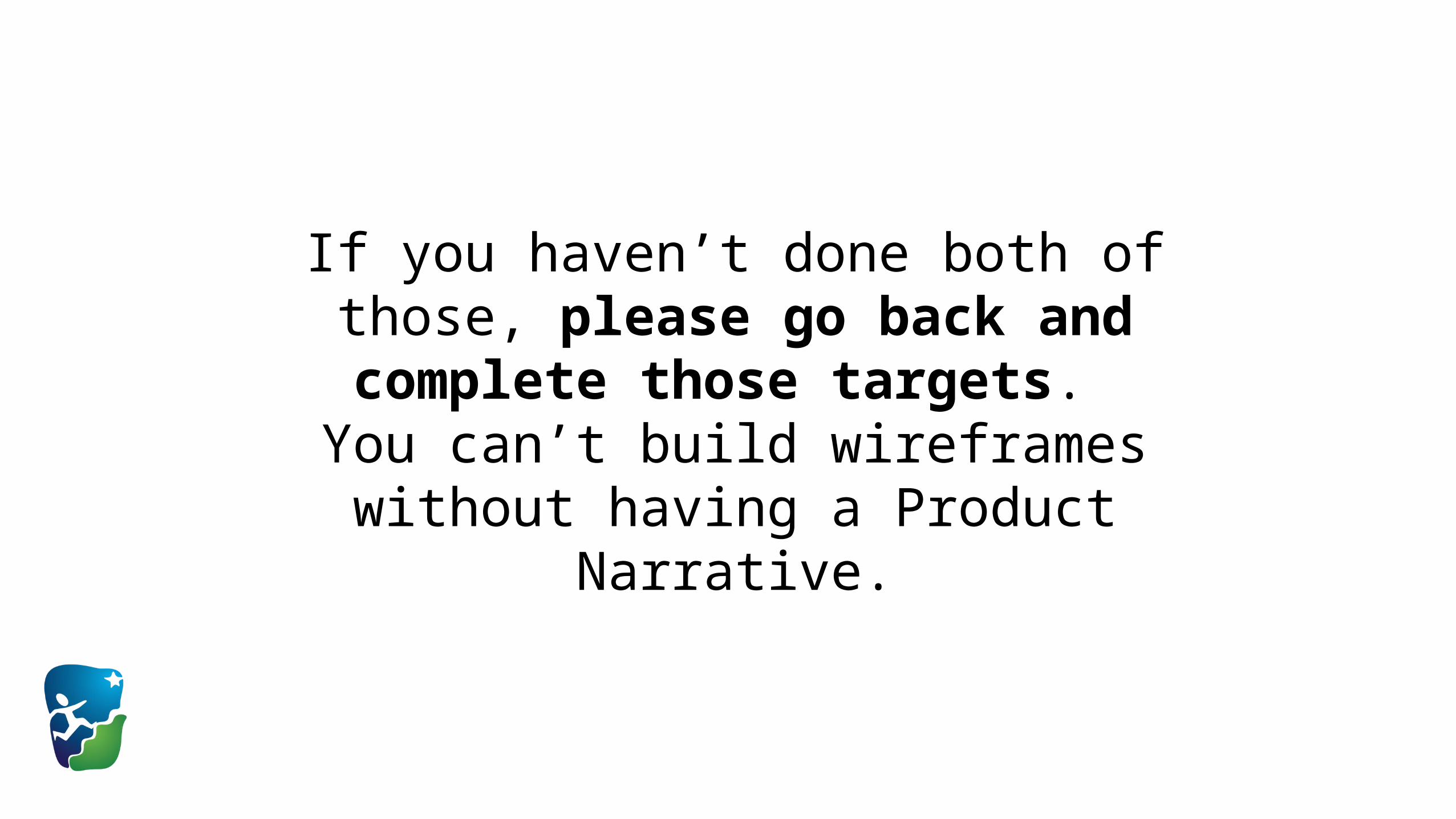
If you haven’t done both of those, please go back and complete those targets.
You can’t build wireframes without having a Product Narrative.

Why is this important?
Before you build, it’s a good idea to know what is it
that you are building.
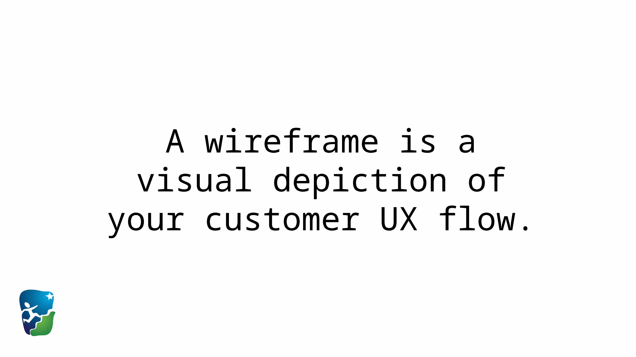
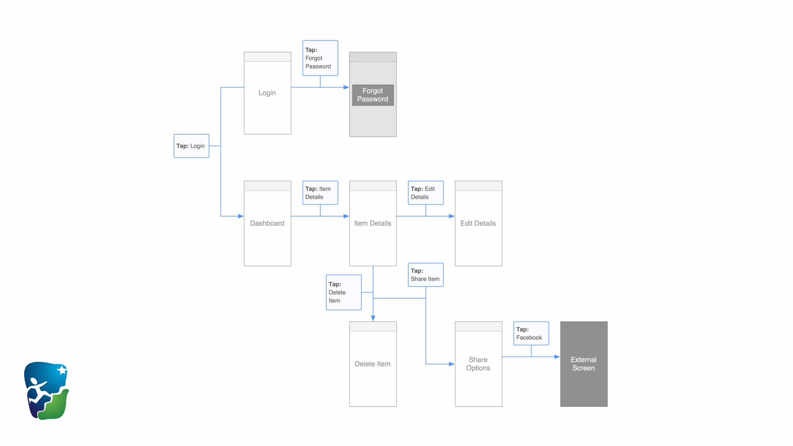
A wireframe is a visual depiction of your customer UX flow.
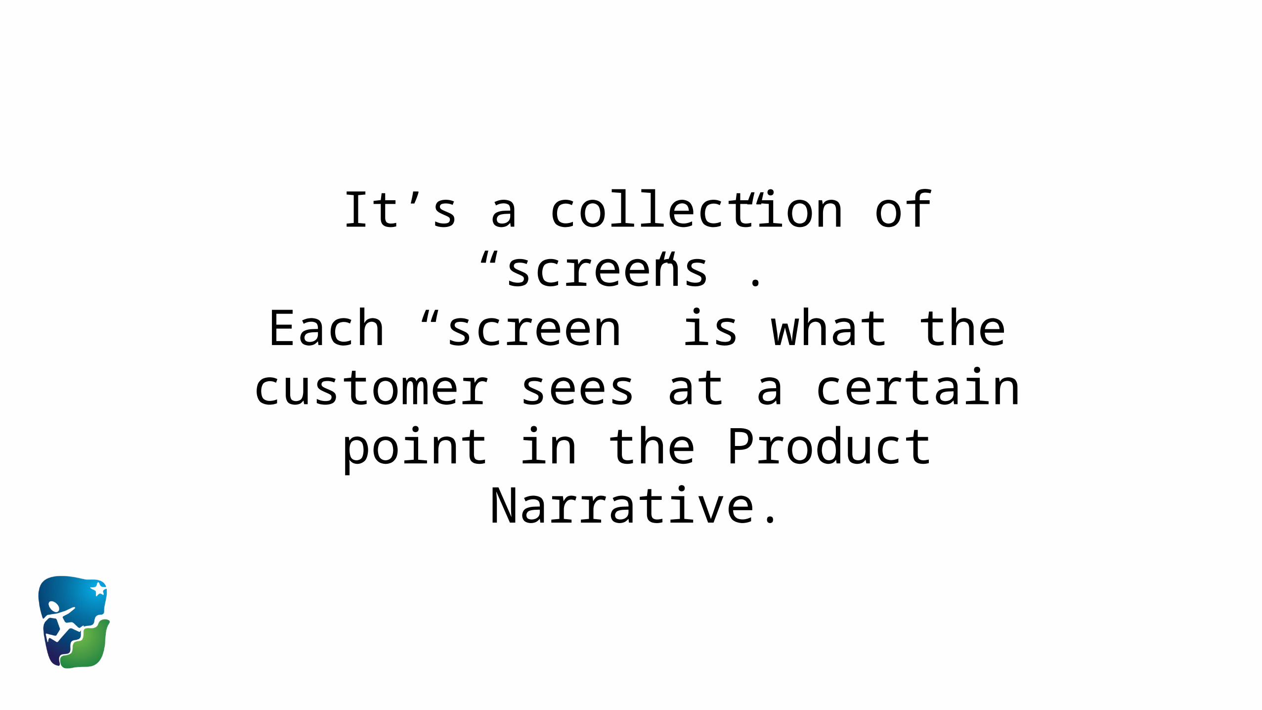
It’s a collection of “screens”. Each “screen” is what the customer sees
at a certain point in the Product Narrative.

Let’s look at some examples:
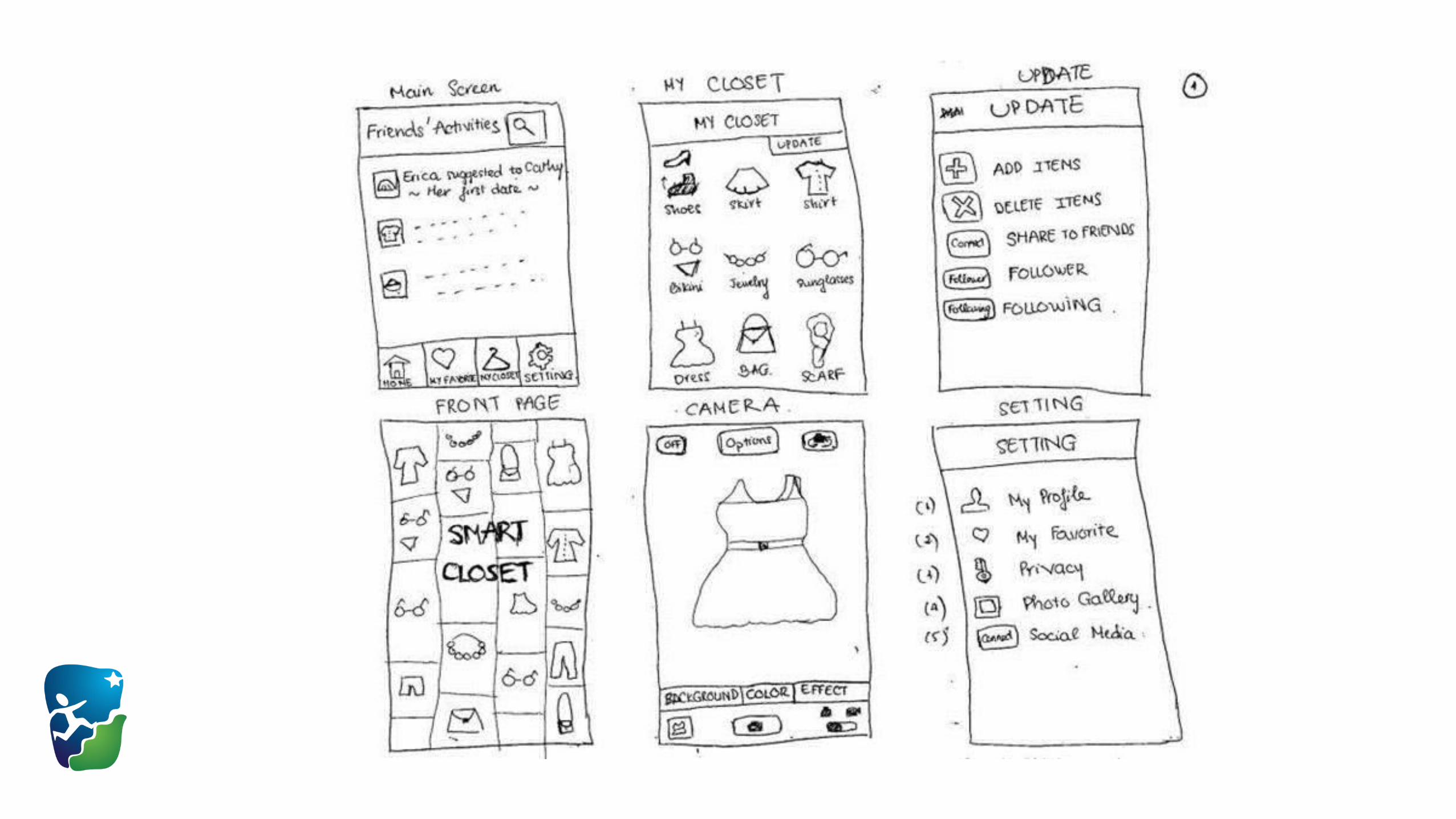
In the previous screenshot, each “screen” of a mobile application
is mocked up.
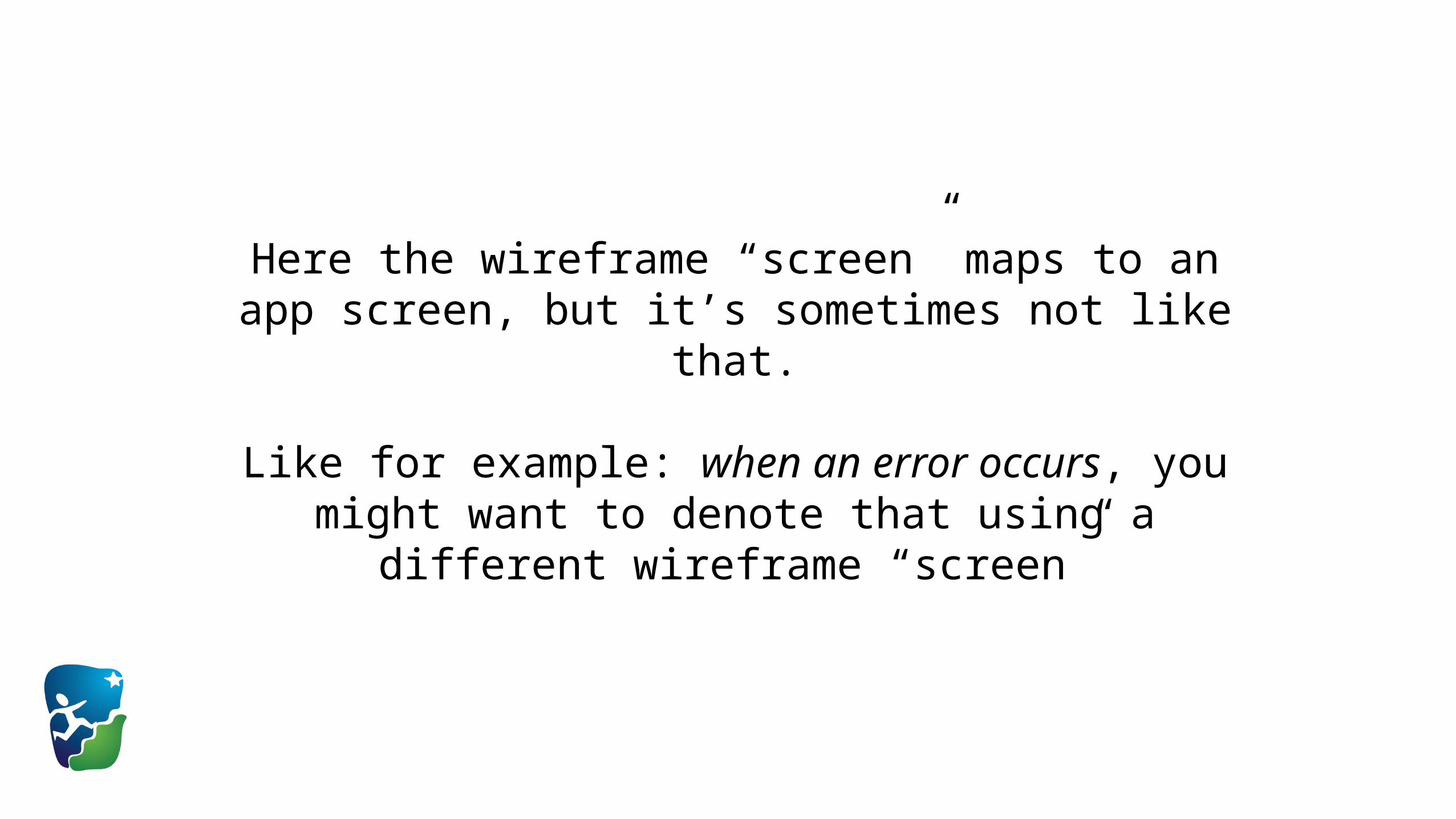
Here the wireframe “screen” maps to an app screen, but it’s sometimes not like that.
Like for example: when an error occurs, you might want to denote that using a different wireframe “screen”
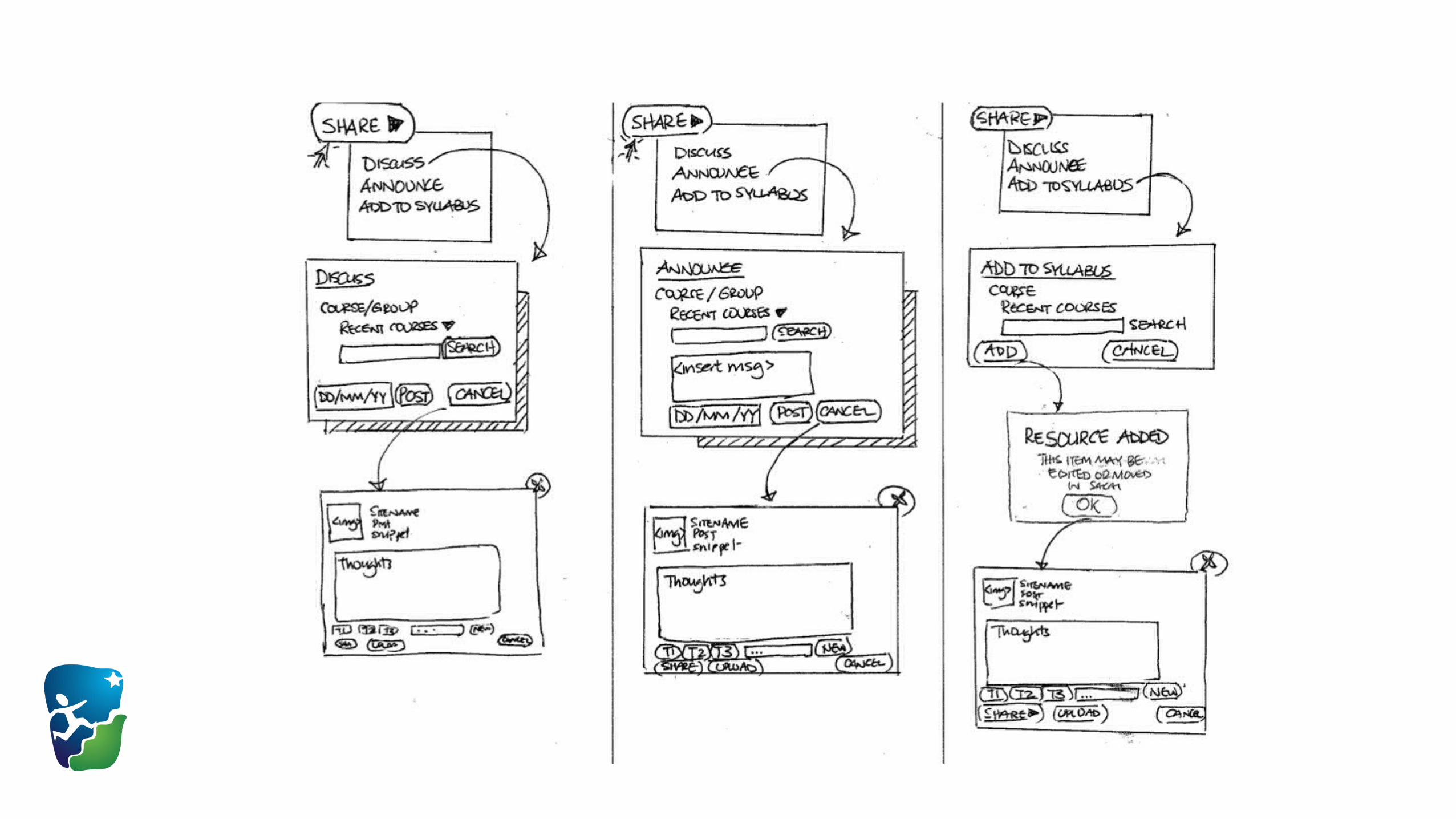
As you can see here, you can also use wireframes to describe just one portion of customer UX.
In the previous image, it’s “What happens when the user clicks the Share button?”

The purpose of a wireframe is to communicate & clarify.
So, you can use annotations (the yellow circles in the previous
example) to clarify intent and purpose.

Annotations (as in the previous example) also describe how customers move from one
“screen” to another.
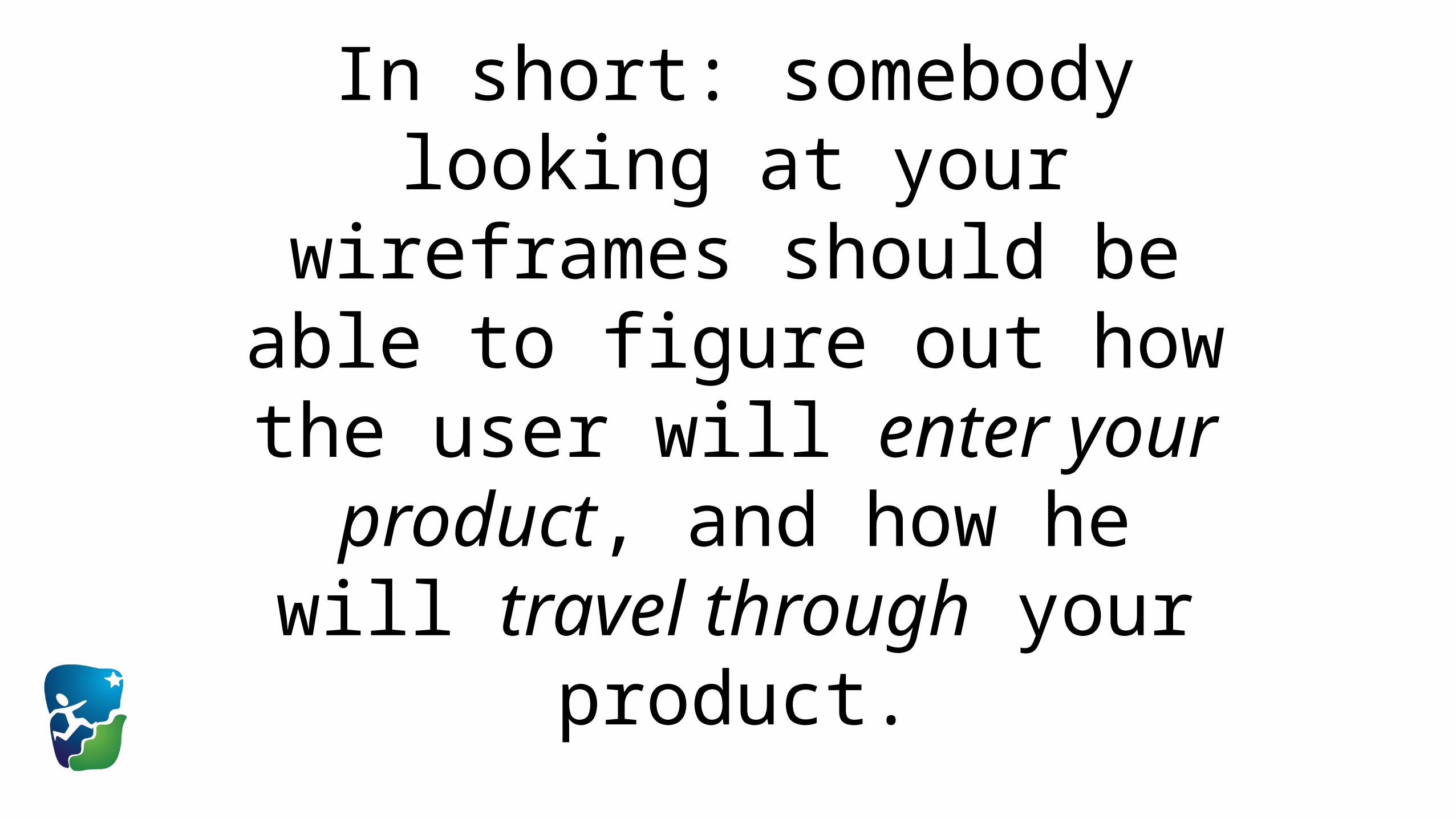
In short: somebody looking at your wireframes should be able to figure out how the user will
enter your product, and how he will travel through your product.
How do you start building wireframes?

Two principles:
1. Lower-fidelity ones are better to start.
2. Build from the “inside out”.
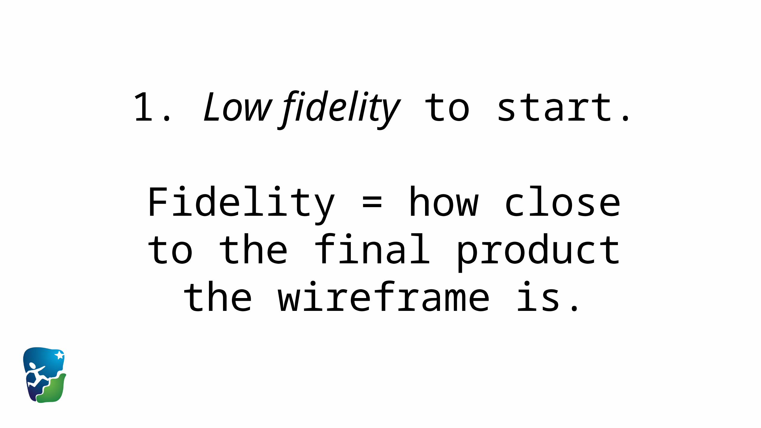
1. Low fidelity to start.
Fidelity = how close to the final product the wireframe is.

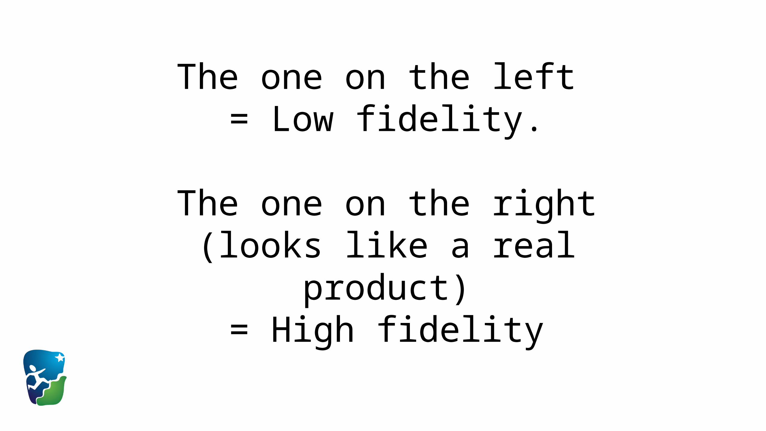
The one on the left = Low fidelity.
The one on the right (looks like a real product)= High fidelity
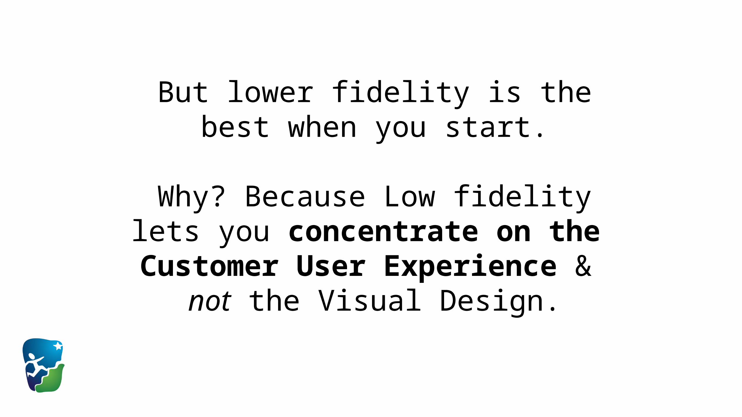
But lower fidelity is the best when you start.
Why? Because Low fidelity lets you concentrate on the
Customer User Experience & not the Visual Design.

Second principle:
Build from the “inside out”.
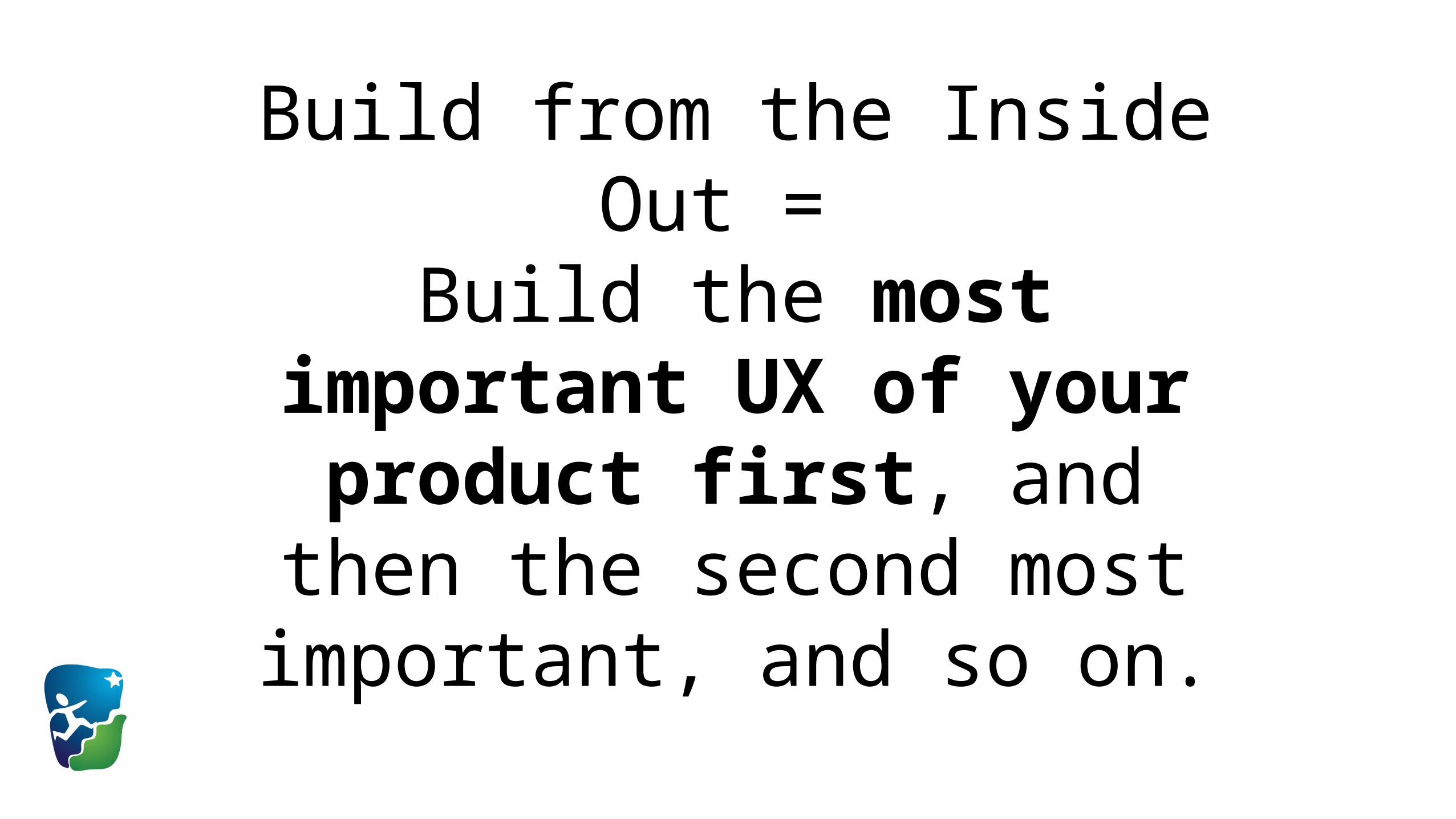
Build from the Inside Out = Build the most important UX
of your product first, and then the second most important,
and so on.
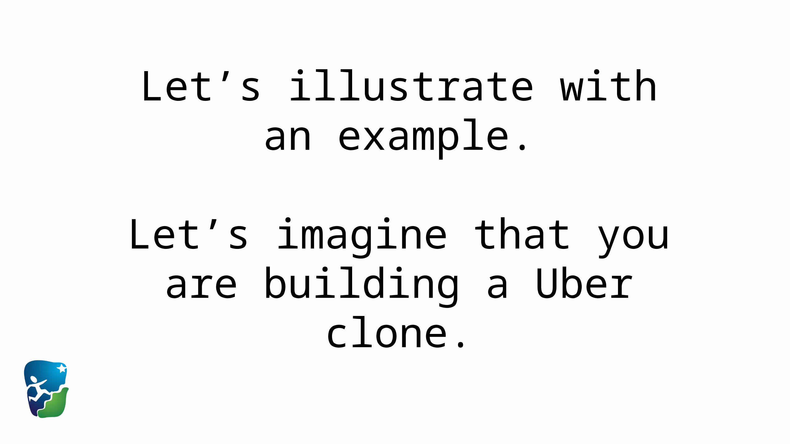
Let’s illustrate with an example.
Let’s imagine that you are building a Uber clone.

Your Uber clone has these 10 “screens”:
SignupLogin
Type DestinationFinding Car
Car AvailableCar Not Available
Car ArrivedOn Trip
Destination ReachedFare Collection
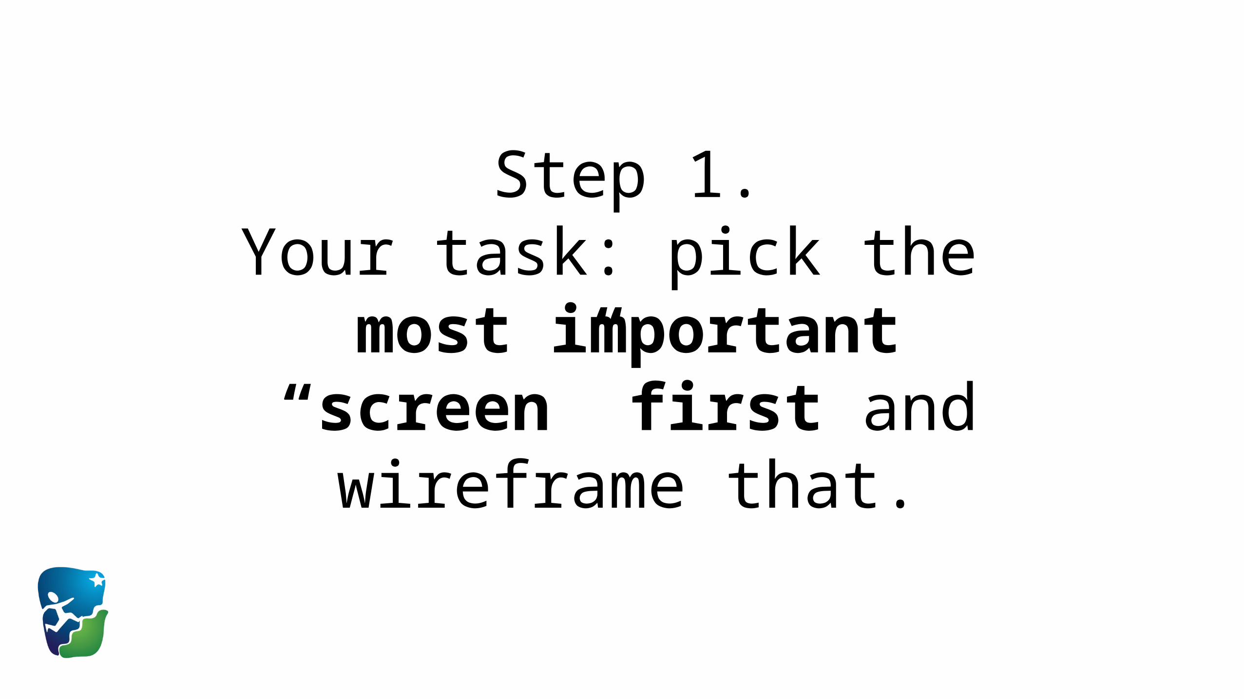
Step 1.Your task: pick the
most important “screen” first and wireframe that.
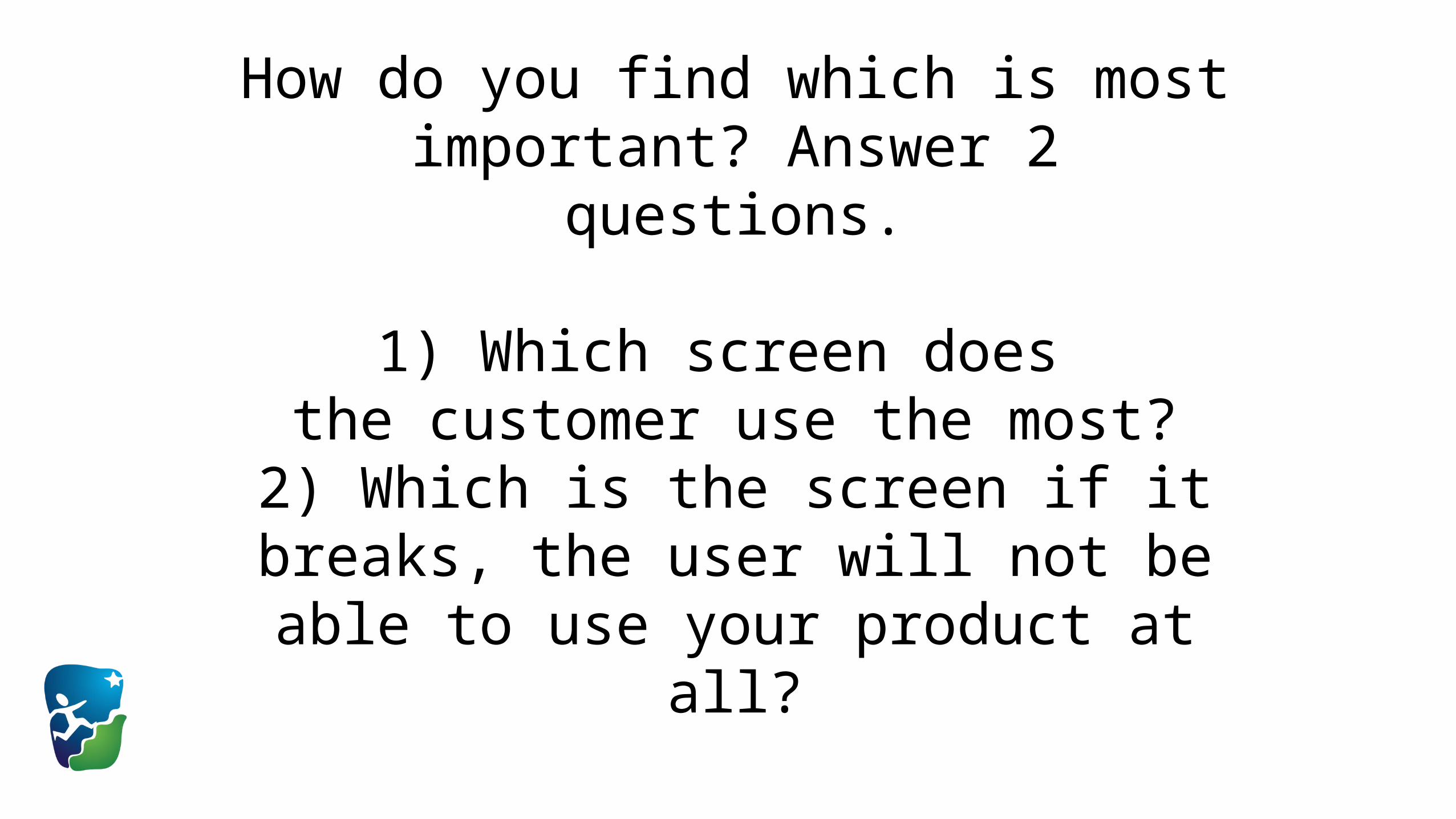
How do you find which is most important? Answer 2 questions.
1) Which screen does the customer use the most?
2) Which is the screen if it breaks, the user will not be able to use your product at all?
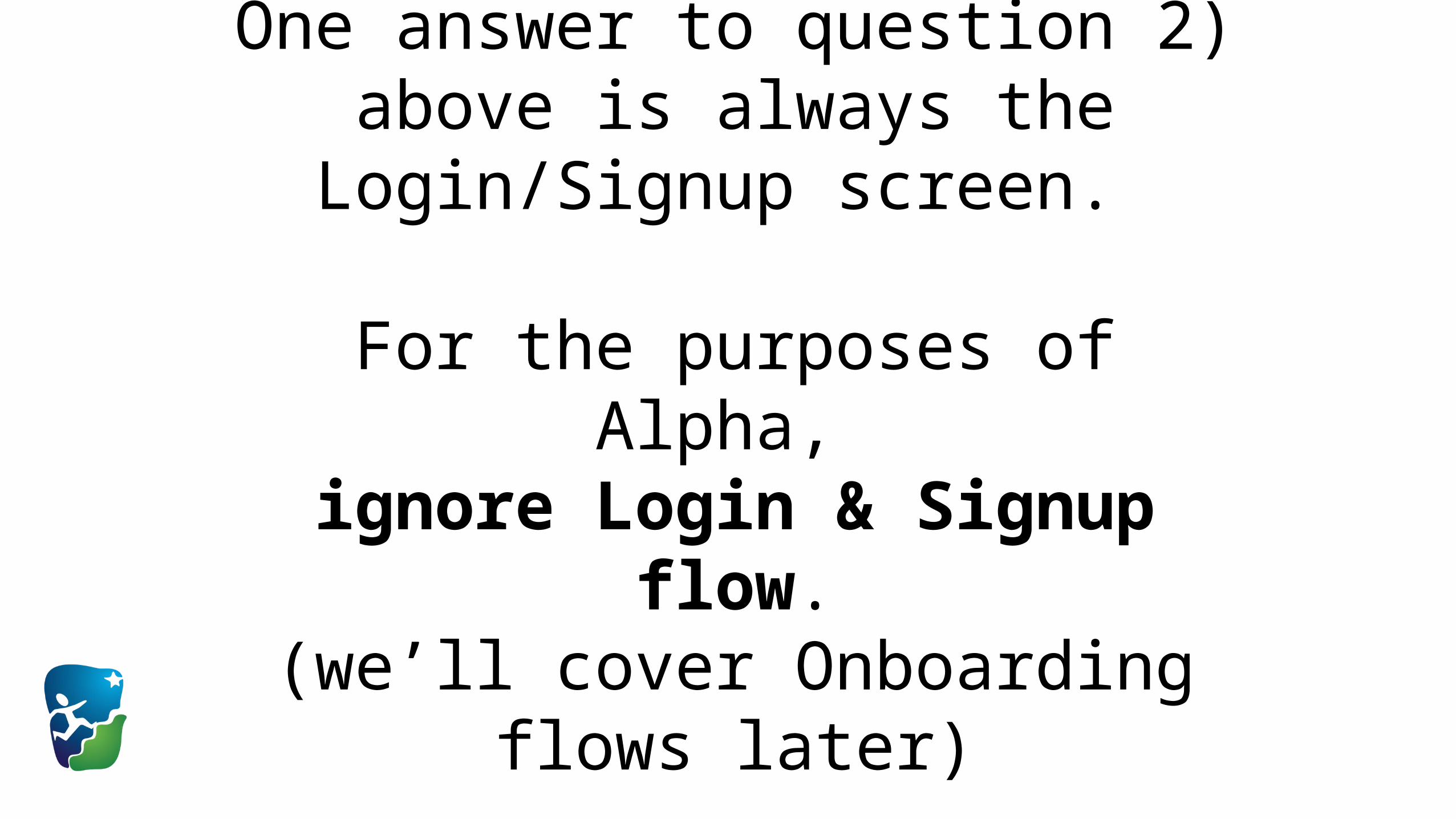
One answer to question 2) above is always the Login/Signup screen.
For the purposes of Alpha, ignore Login & Signup flow.
(we’ll cover Onboarding flows later)
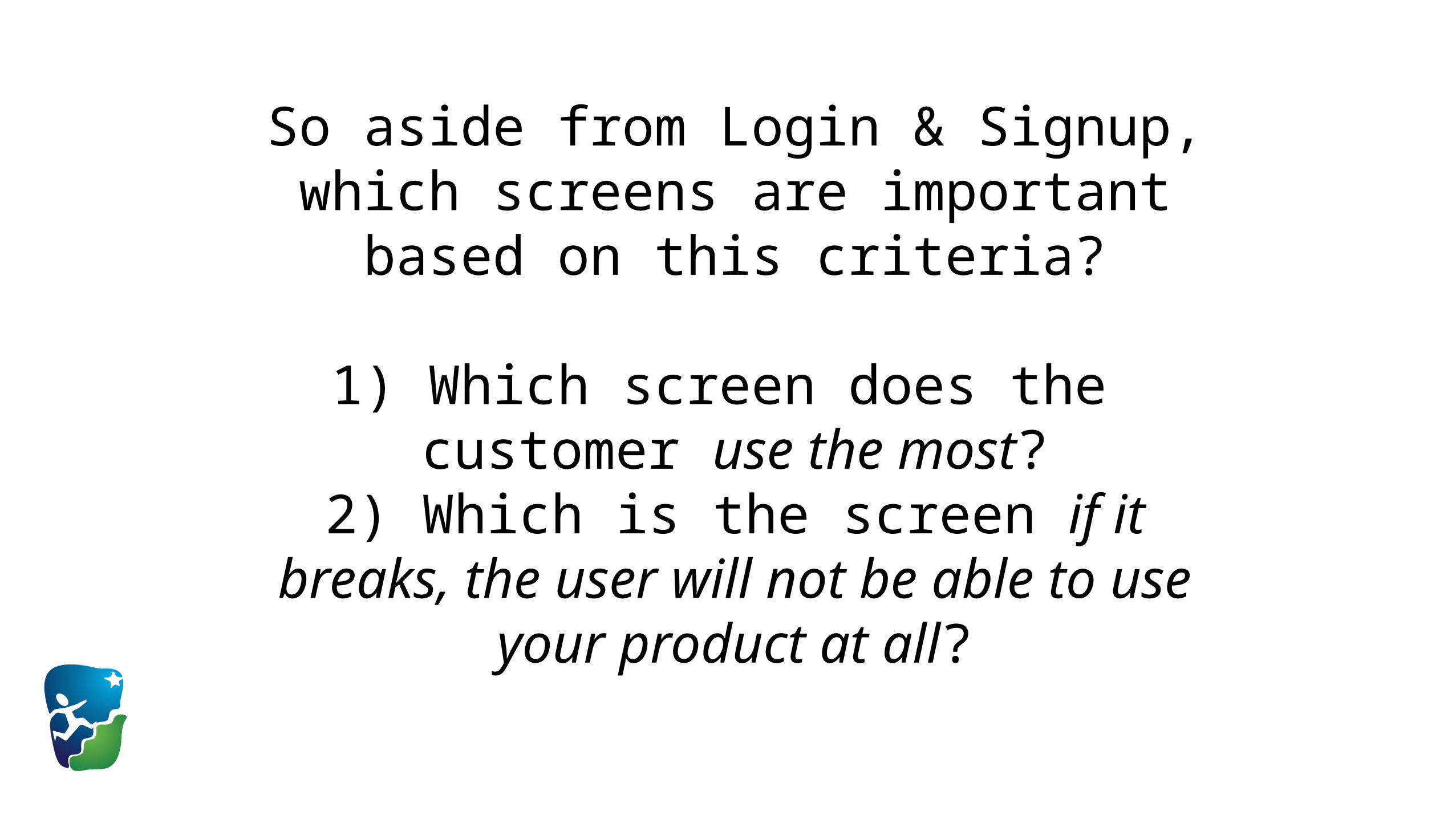
So aside from Login & Signup, which screens are important based on this criteria?
1) Which screen does the customer use the most?
2) Which is the screen if it breaks, the user will not be able to use your product at all?
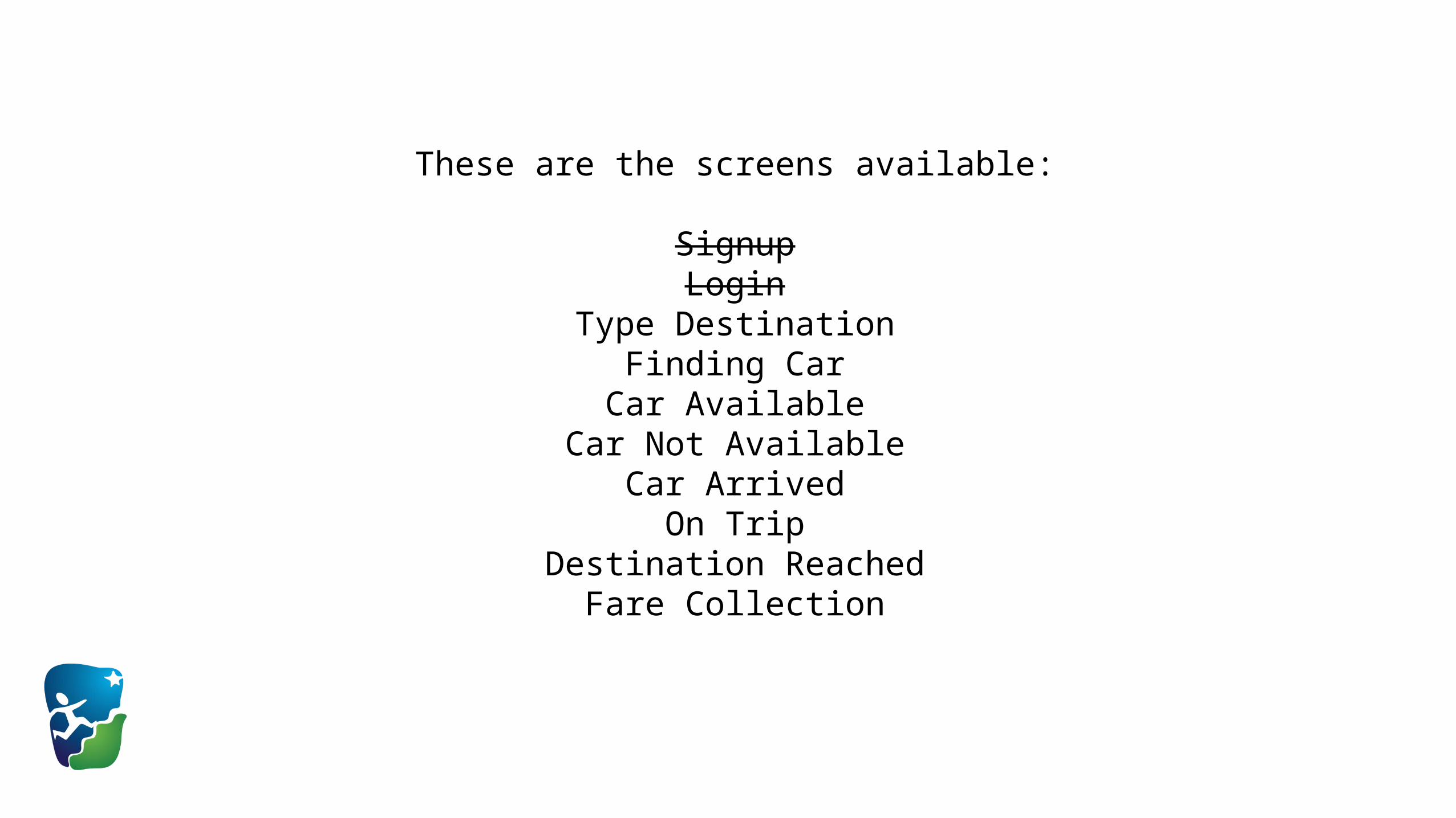
These are the screens available:
SignupLogin
Type DestinationFinding Car
Car AvailableCar Not Available
Car ArrivedOn Trip
Destination ReachedFare Collection
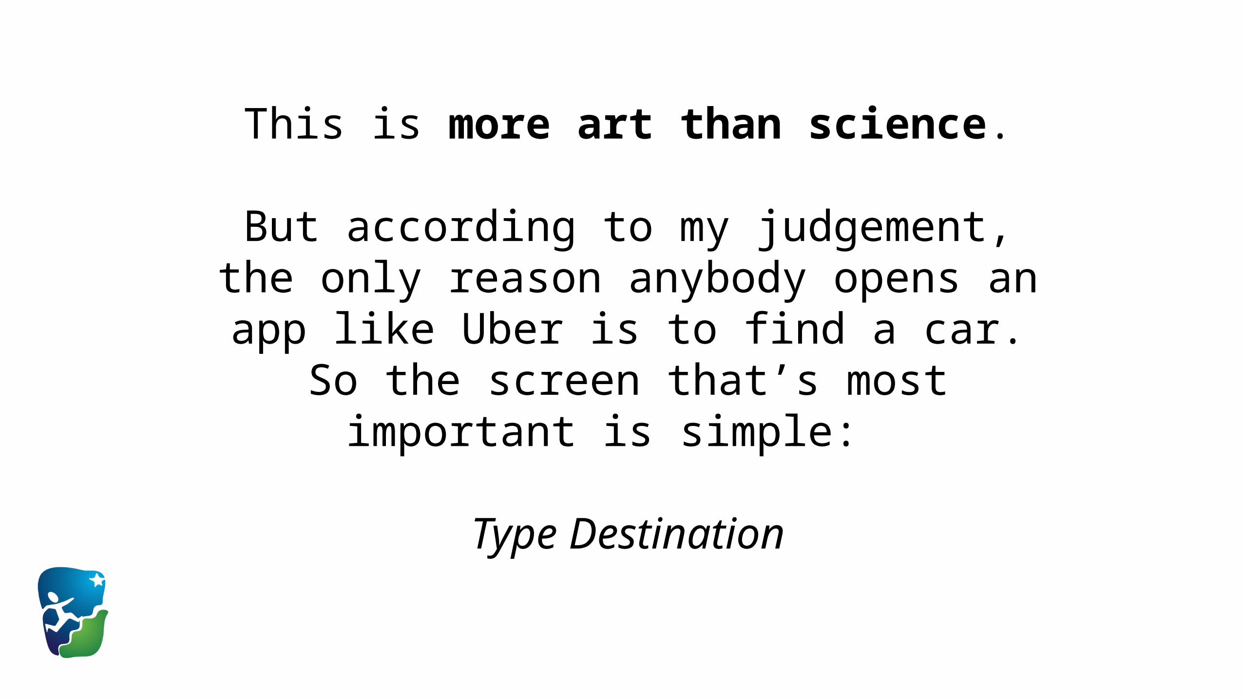
This is more art than science.
But according to my judgement, the only reason anybody opens an app like Uber is to find a car. So the screen that’s most important is simple:
Type Destination

Cool, so Step 1 done.You have identified which is the
most important “screen”
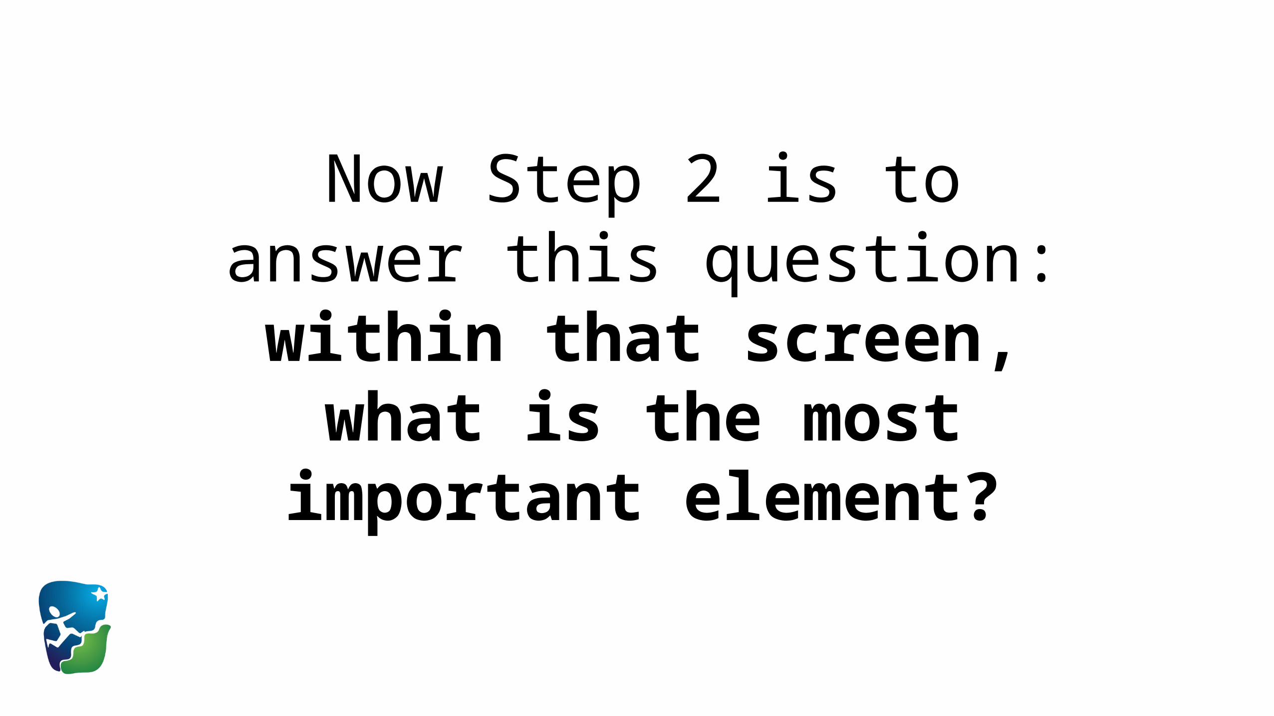
Now Step 2 is to answer this question:
within that screen, what is the most important element?

i.e. within Type Destination, what is the
most important element you should wireframe first?
To make this clear, let’s look at a concrete real-world example.

This is how the new Uber app
approaches the problem.
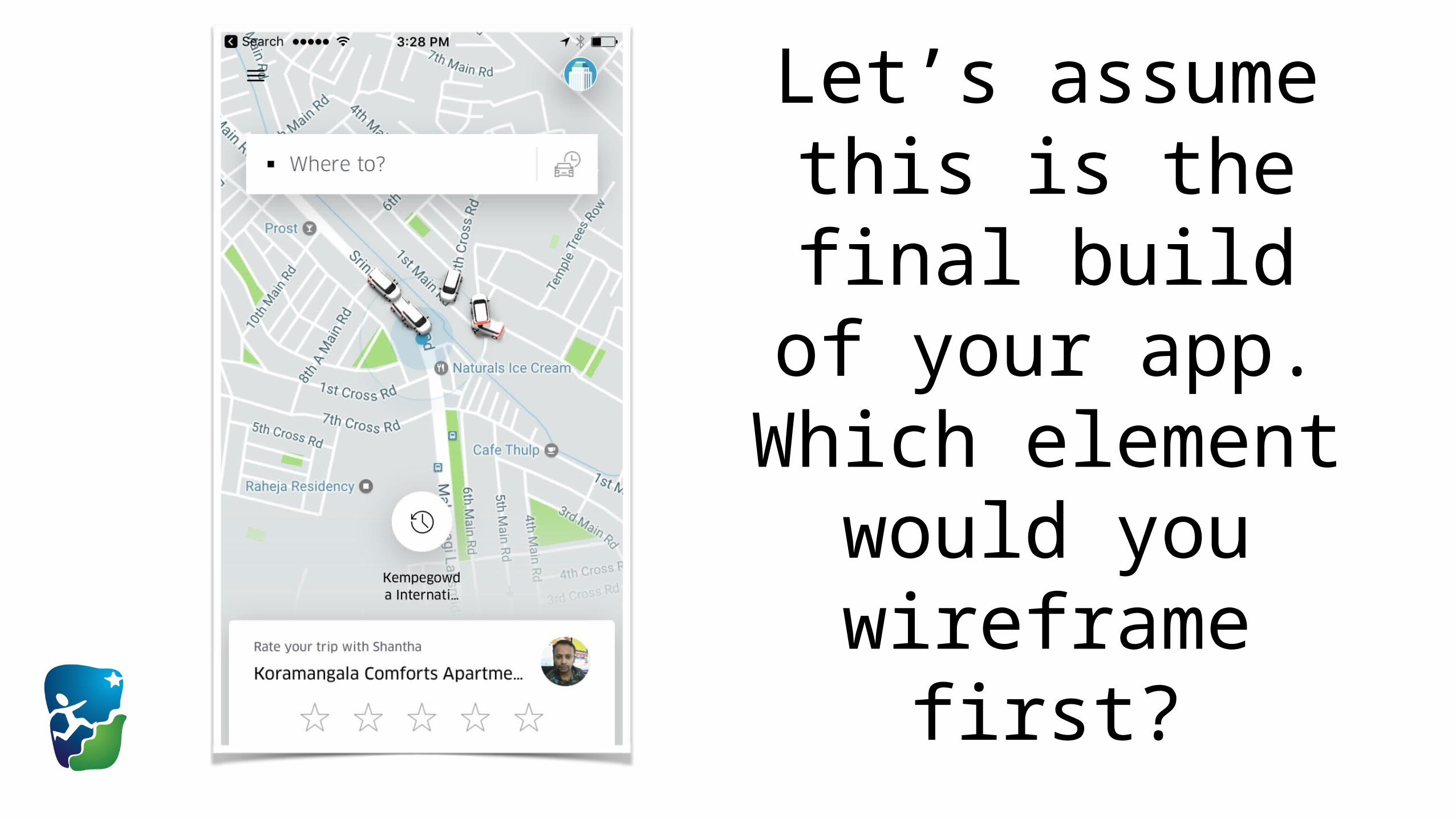
Let’s assume this is the final build of your app. Which
element would you wireframe first?

Remember: this is the
Type Destination “Screen”.

Is it this?
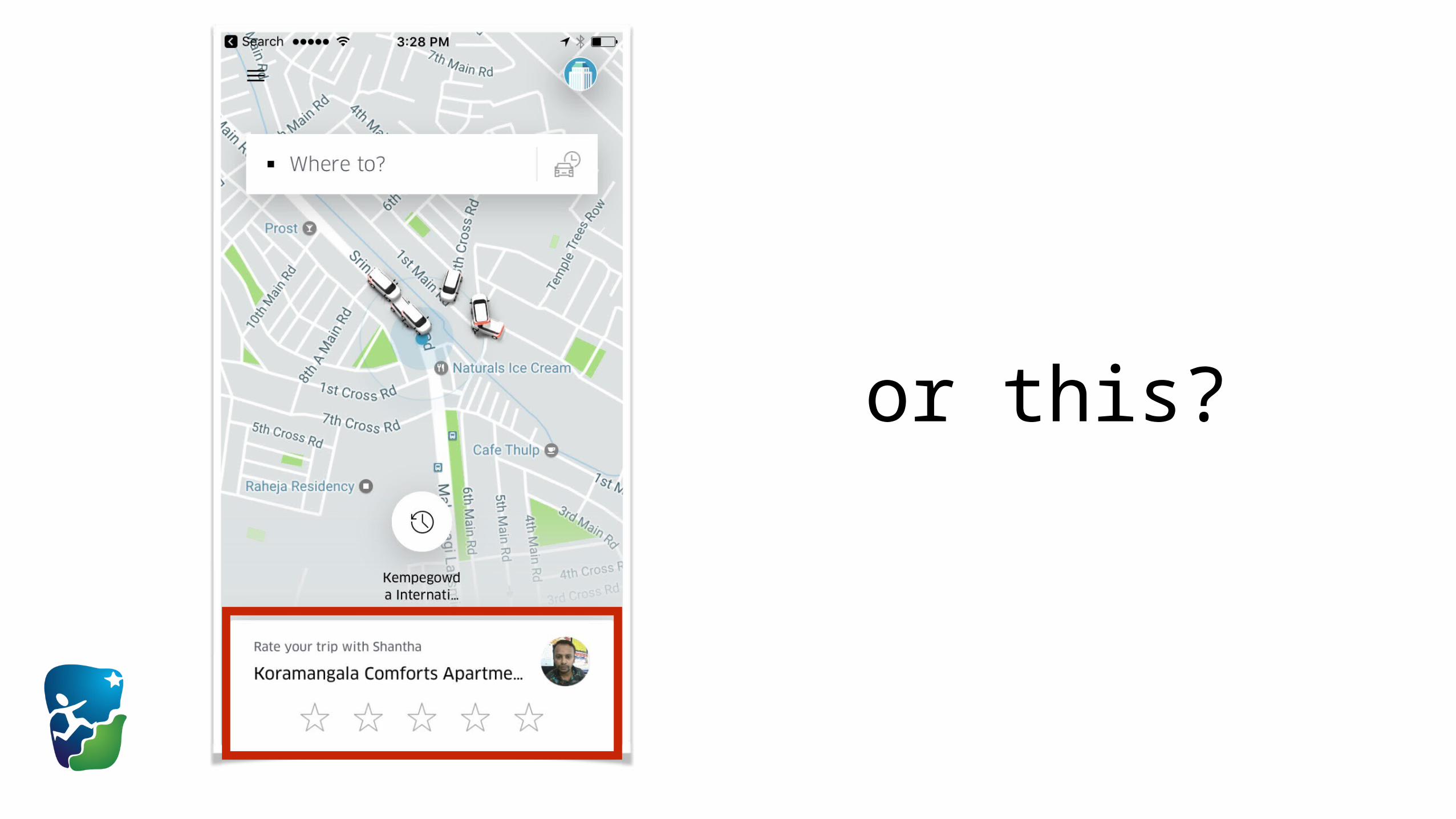
or this?
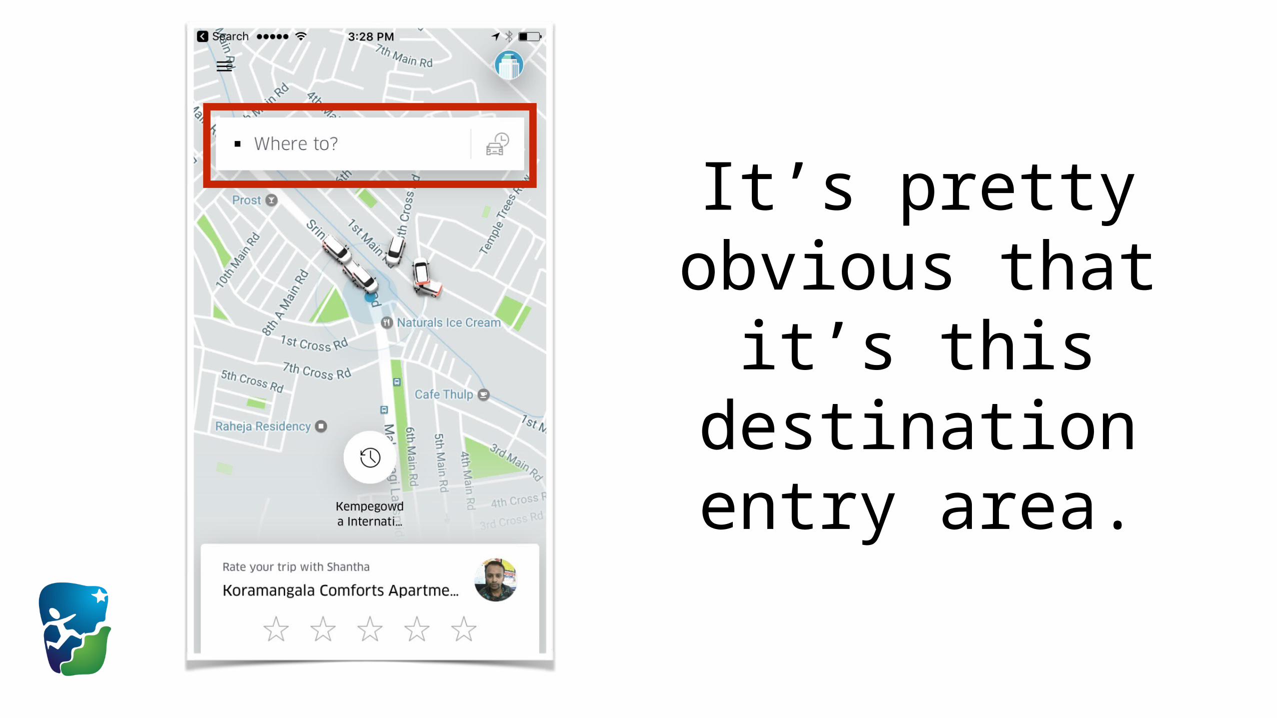
It’s pretty obvious that it’s this
destination entry area.
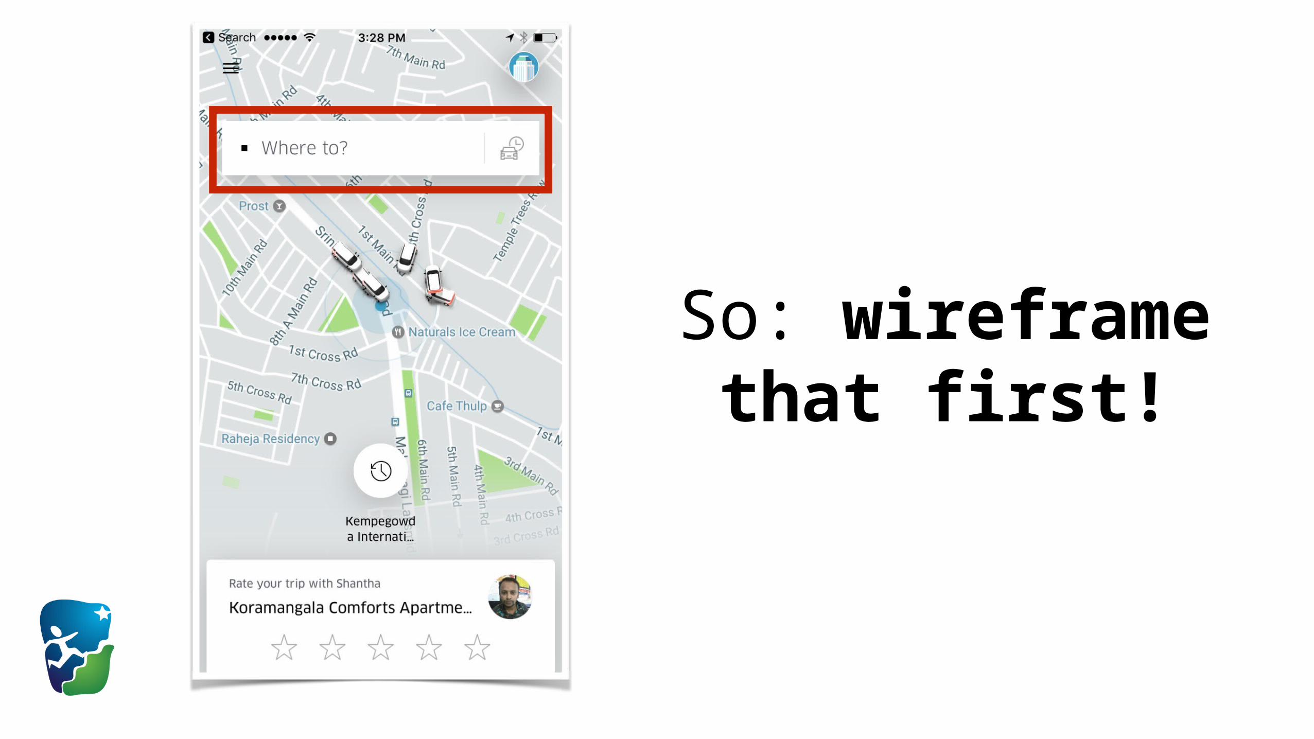
So: wireframe that first!
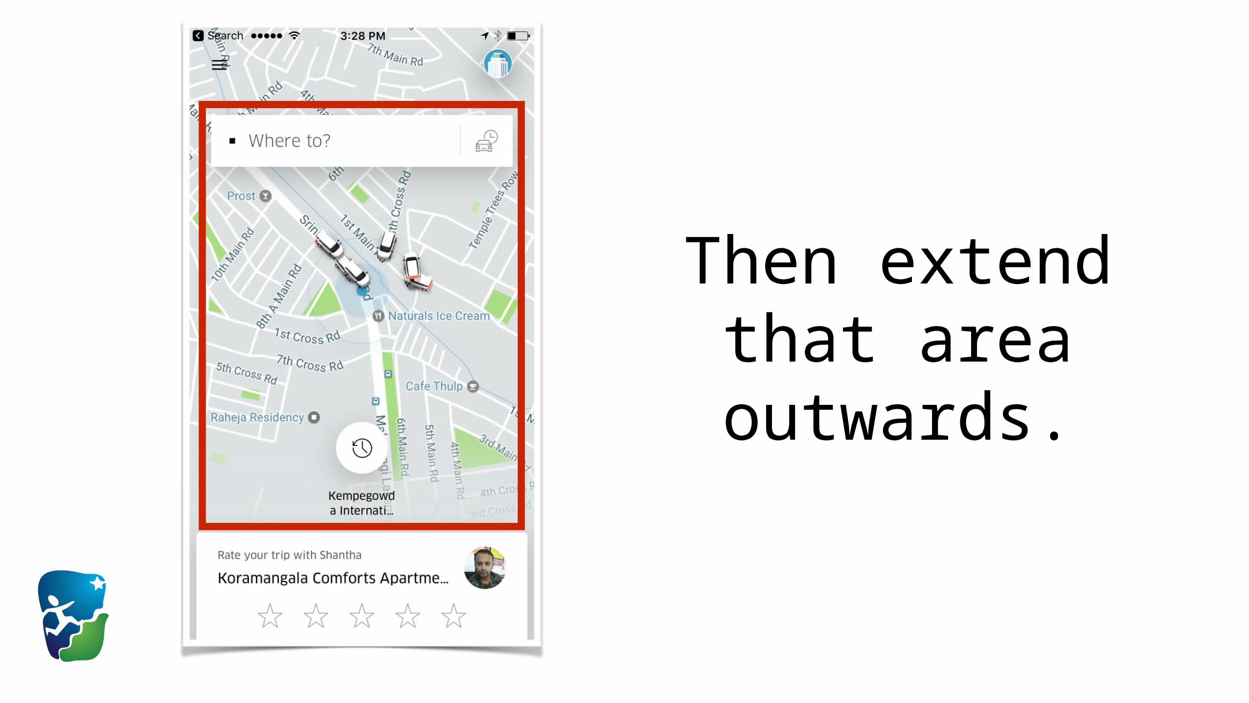
Then extend that area outwards.
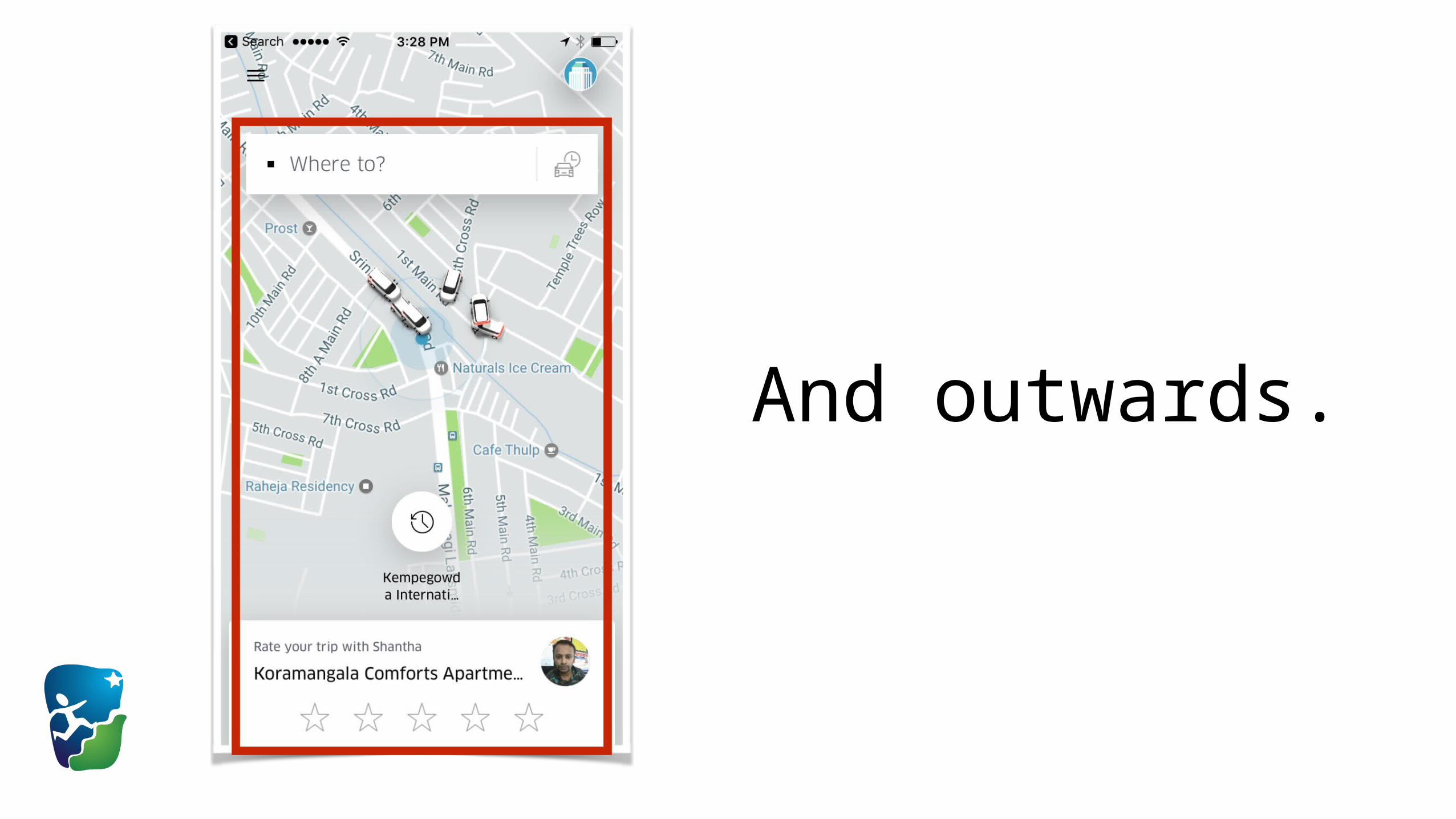
And outwards.

Note: you should probably leave
common navigation to the
last.

This is what we mean by Build from
the “inside out”.

That’s it! :)
Let’s recap:
1. Lower-fidelity wireframes are better to start.
2. Build wireframes from the “inside out”.
Todo: Based on your Product Narrative, build a set of
Low-fidelity Wireframes for your Product.

There are several online tools available to build
Low-fidelity Wireframes.
There are several tools available to build
Low-fidelity Wireframes.
https://moqups.com is a good tool to start.

See Rubric too for more info.