Download - 2005.Q4 | artonview 44 Summer 2005
TransformaTions • helen frankenThaler
is
sU
e
no
.4
4
su
mm
er
2
00
5–
06
artonview
IS
SU
E N
o.4
4 S
Um
mE
r 2
00
5–
06
NA
TIO
NA
L
GA
LL
Er
Y O
F
AU
ST
rA
LIA

T h e W A T E R F R O N T
C A N B E R R A ’ S M O S T A N T I C I P A T E D O P E N F O R I N S P E C T I O N
The time has finally arrived. You are invited to make Canberra’s most exclusive address your home.
The Waterfront offers superb, north-facing apartments on the banks of Lake Burley Griffin. Here you
can experience a superb level of l iving, complete with the most stunning views imaginable.
The Waterfront features iconic architecture by leading architects PTW, in conjunction with the Stockland
Design Team, which is eloquently complemented by sumptuous interiors and expressive seasonal
landscaping.
At home on the Kingston Foreshore you will experience a lifestyle like no other with arts, cafés, dining
and entertainment just beyond your door.
This is an exceptional opportunity to acquire one of Canberra’s finest apartments. Luxury
two and three bedroom apartments and penthouses are now available.
WE I N V I T E YO U TO V I S I T T H E WAT E R F R O N T M A R K E T I N G S U I T E & D I S P L AY A PA R T M E N T , O P E N 7 D AY S
F R O M 1 P M - 5 P M . M U N D A R I N G D R I V E , K I N G S T O N F O R E S H O R E . A LT E R N AT I V E LY , P L E A S E C A L L
1 8 0 0 0 9 8 8 3 1 O R V I S I T W W W . T H E - W A T E R F R O N T . C O M . A U F O R F U R T H E R I N F O R M A T I O N .
4709
_4
26 November 2005 – 5 February 2006
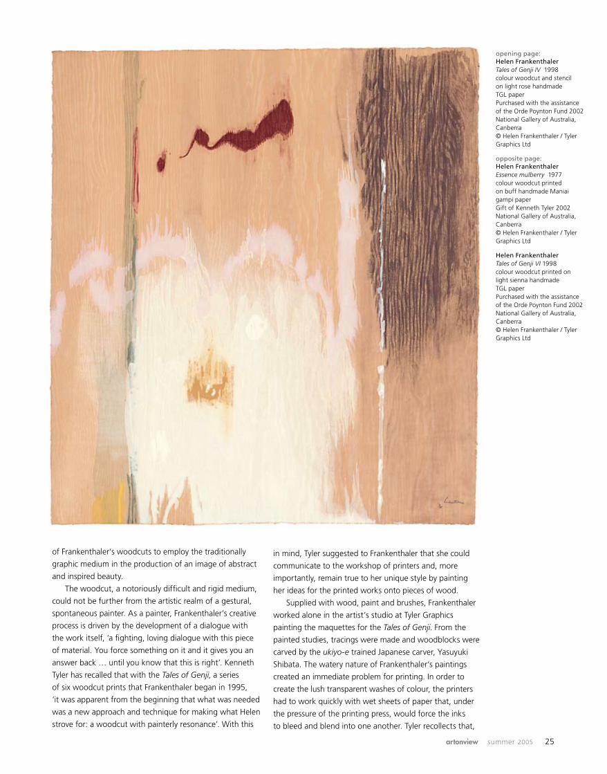
Helen Frankenthaler Tales of Genji VI 1998 colour woodcut and stencil Purchased with the assistance of the Orde Poynton Fund 2002 National Gallery of Australia, Canberra

2 Director’s foreword
4 Director’s vision
8 Transformations: the language of craft
22 Against the grain: the woodcuts of Helen Frankenthaler
28 Discovering Constable: rediscovering nature
31 New acquisitions
42 The magic of slow time: contemporary works on display  in the Australian galleries
46 Travelling exhibitions: Darwin Art-port
50 Imagining Papua New Guinea
52 The National Gallery of Australia Photography Fund
54 Behind the scenes: installing St Petersburg 1900
56 Membership news
58 The art of caring
62 Faces in view
contents
PublisherÂNational Gallery of AustraliaÂnga.gov.au
Editor ÂEve Sullivan
Designer ÂSarah Robinson
Photography ÂEleni KypridisÂBarry Le LievreÂBrenton McGeachie ÂSteve NebauerÂJohn Tassie
Designed and produced Âin Australia by the ÂNational Gallery of AustraliaÂPrinted in Australia by ÂPirion Printers, Canberra
artonview issn 1323-4552
Published quarterly: ÂIssue no. 44, Summer 2005© National Gallery of Australia
Print Post Approved Âpp255003/00078
All rights reserved. Reproduction without permission is strictly prohibited. The opinions expressed in artonview are not necessarily those of the editor or publisher.
Submissions and correspondence Âshould be addressed to: ÂThe editor, artonview ÂNational Gallery of Australia ÂGPO Box 1150 ÂCanberra ACT 2601 Â[email protected]
Advertising Â(02) 6240 6587 Âfacsimile (02) 6240 6427Â[email protected]
RRP: $8.60 includes GSTÂFree to members of the ÂNational Gallery of Australia
For further information on National Gallery of Australia Membership contact: ÂCoordinator, Membership ÂGPO Box 1150 ÂCanberra ACT 2601 Â(02) 6240 6504Â[email protected]
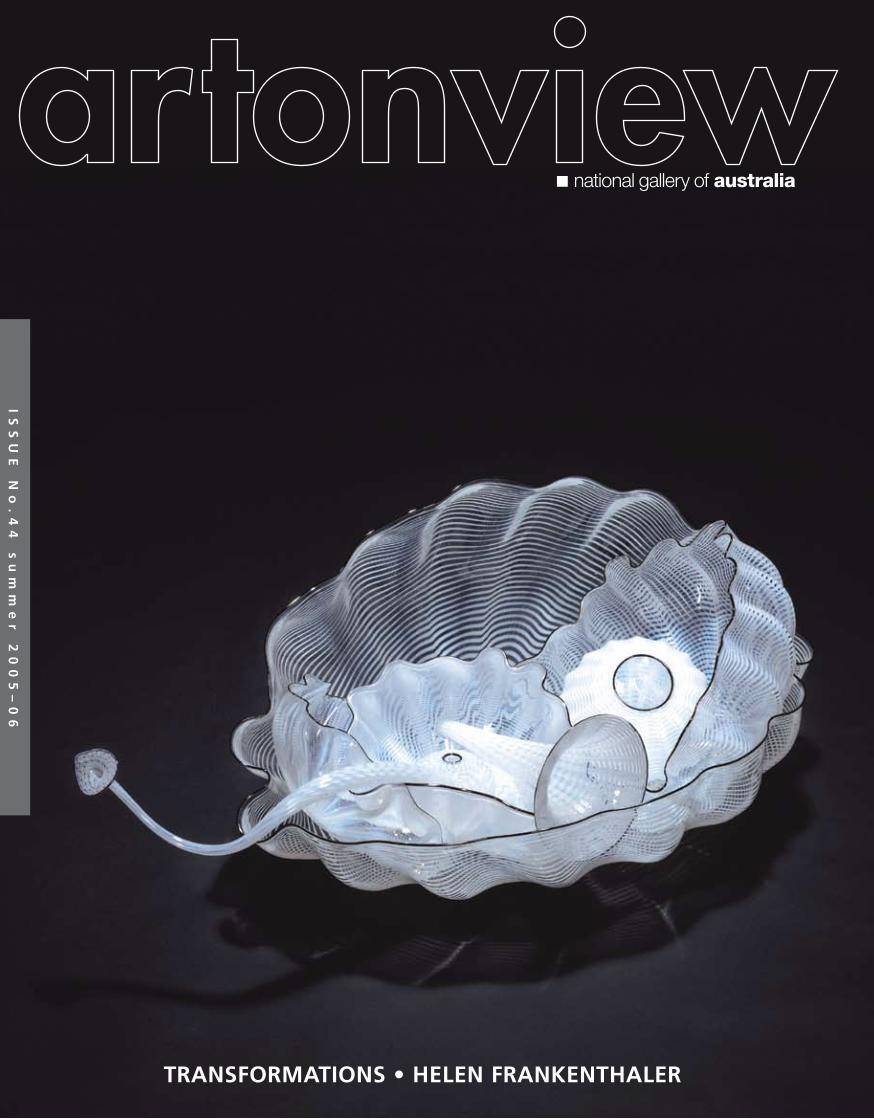
front cover: Dale Chihuly Polished ivory seaform set with charcoal lip wraps 2000 blown glass © Chihuly, Inc. National Gallery of Australia, CanberraÂback cover: Edward Eberle Tin feathers metal wings 2001 porcelain with painted terra sigillata decoration National Gallery of Australia, Canberra
artonview
CorrectionÂApologies to the artist Bert Flugelman: Caryatid Minotaur 2004–05, exhibited courtesy of the artist in the 2005 National Sculpture Prize, was incorrectly captioned ‘Private collection, Perth’ in the spring 2005 edition of artonview. This caption was a reference to the original maquette submitted for preselection to the prize. (Ed.)
2 national gallery of australia
I commenced my term as Director of the National
Gallery of Australia determined to hold off making any
definitive statements about my vision for the National
Gallery of Australia until I had a sufficient overview of the
collections and issues to do with the building, staffing and
the management structure across the Gallery’s broad field
of operations. Eight months on, after much consultation
with Gallery staff and Council, I have come up with a
brief centred upon a mandate for the future development
of the national collection and its presentation to the
public in an enhanced Gallery building that I hope is clear
and comprehensive. As discussed in the first part of the
Vision for the National Gallery of Australia published
here, art museums must come to terms with so many
competing objectives to do with building the collection,
and serving a broad range of audience needs both now
and in the future to perform the representative role of a
‘national gallery’. There are no big surprises here, but it
is all the same aspirational and conservative in the best
sense, highlighting the high and also I believe realistic
expectations of what can be achieved.
Even apart from the broader fundraising objectives
and ongoing development of plans for the building, in
consultation with stakeholders, including the Minister,
the Department, Gallery Council and Foundation, and the
architects, there is already a clear approach to privileging
core areas of the collection that is well underway and
evident to visitors from the works on display now. You
need only walk into the Asian Art galleries to see old and
new acquisitions recently unveiled to see for yourself our
strengths in this area, along with the new acquisitions and
donations on view in the Australian Art galleries, including
those works recently donated by Alcoa Australia, under
the Australian Government’s Cultural Gifts program.
director’s foreword
This season of exhibitions features in particular the
most substantial survey yet of works from our Decorative
Arts and Design Collection in Transformations: the
language of craft, with many international and
Australian practitioners working in a diverse range of
media represented in this exhibition who were here for
the opening and to attend the conference and forums.
I also attended the launch in Sydney of the Decorative
Arts and Design Collection Development Fund generously
hosted by Ashley Dawson-Damer. My special thanks go
to Raphy Star, David Thomas and Meredith Hinchliffe for
their support of the purchase of works for the collection.
Meredith also volunteered many days to assist Senior
Curator, Robert Bell, with research for this extensive
project. The sponsorship of Qantas Freight, through the
particular support of Ben Andrew, and Kingsley Mundey
of International Art Services, assisted the Gallery to
cover the transport costs of bringing so many fragile and
delicate objects to Australia. Thank you also to Channel
Seven for their support with advertising.
Another highlight of this season’s exhibitions
is Against the grain: the woodcuts of Helen
Frankenthaler, featuring the marvellous collection
of woodcuts – and some of the original woodblocks
– produced in an extraordinary collaboration with
master printer Ken Tyler, joining other works from the
Gallery’s renowned Kenneth Tyler Collection, supported
so generously by Tyler himself. Tyler’s visit at the end of
November was a highlight for those able to attend his
master class and demonstration class in Canberra, and
other associated events.
Another treasure that must wait till next issue to be
featured is the cycle of fifty-one prints, Der Krieg (War),
by Otto Dix which will open in the Project Gallery later this
month to further draw on the riches in our collection of
International Prints, Drawings and Illustrated Books.
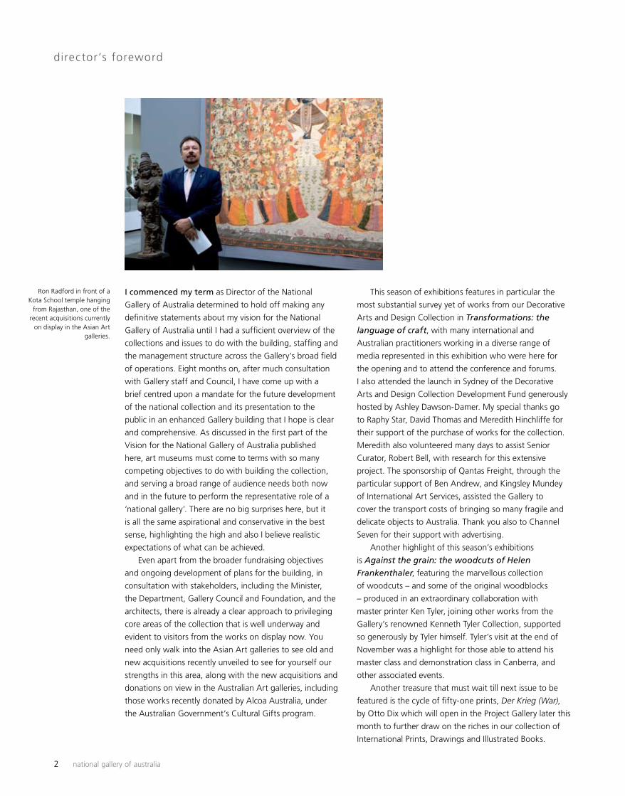
Ron Radford in front of a Kota School temple hanging
from Rajasthan, one of the recent acquisitions currently
on display in the Asian Art galleries.
artonview summer 2005 3
Imagining Papua New Guinea, the small exhibition
of works on paper currently showing in the Children’s
Gallery, displays many works from a collection recently
acquired by the Gallery from Ulli and Georgina Beier,
further confirming our focus on art of this region and, in
particular, neighbouring Oceania.
Opening in late February is the exhibition Crescent
moon: Islamic art & civilization in Southeast Asia,
sponsored by Santos Limited, currently showing at the Art
Gallery of South Australia, the outcome of a successful
joint curatorial collaboration, which features many
important works from the national collection. So, too,
Constable: impressions of land, sea and sky, opening
in March, has been organised by the National Gallery of
Australia and will tour to the Museum of New Zealand,
Te Papa Tongarewa. In its presentation here, the exhibition
will draw significant links with the development of
Australian landscape painting in an extended display.
Canberra has never been so abundant and green,
following the generous rains, as a reminder of a previous
era when our aspirations were indeed more European.
I would like to take this opportunity to extend to all our
members, donors and sponsors our very best wishes for
the festive season.
Ron Radford, Director
credit lines
Donations William Anderson Roslynne Bracher Meredith Hinchliffe Michael Joel AM Simon R McGill Kathleen Montgomery Dame Elisabeth Murdoch AC DBE Gene Sherman and Brian Sherman AM
Gifts Bill Beresford Imron Cotan K David G Edwards Estate of Dr George Martin J Berger Estate of Mrs Ruth Komon Maureen and Bernard Laing Robyn Maxwell Daphne Morgan Mike Parr Jon Plapp and Richard McMillan Raphy Star
Grants Gordon Darling Foundation Thomas Foundation Principal Sponsors Santos Ltd
Supporting Sponsors Qantas Freight Seven Network
Sponsors Casella Wines Hyatt Hotel International Art Services Malaysia Airlines Saville Park Suites The Brassey Canberra Voodoo Hosiery

4 national gallery of australia
The core functions of an art museum are ‘to preserve, research and interpret works of art, and their accompanying information, for the public benefit’. A great art museum, therefore, is one that collects and conserves works of great aesthetic excellence, researches them with rigorous scholarship, and then uses the results of its research to interpret works of art for the museum’s various audiences. ÂA great art museum should be a powerhouse from which visitors and other users can always receive a charge of psychic energy. A ‘national gallery’, especially one in the national capital of a federation like Australia, Canada or the United States, has extremely various audiences – not only the local residents but also the nation’s entire citizenship. They are often nonattenders of museums in, say, home cities like Melbourne or Brisbane, Toronto or Vancouver, Boston or Chicago but are tempted to attend while on a visit to their national capitals in Canberra, Ottawa and Washington. Further, there are politically sensitive audiences, and the local embassies, which note the presence or absence of honour given to the art of their own part of the world. Our vision should comprise, first and foremost, the presentation of works of the highest artistic excellence. Our inexperienced nationwide visitors are less willing than frequent gallery-goers to enjoy academic points of art-historical or cultural significance; the broad audiences respond less to cultural analysis than to aesthetic force. ÂWe should also accommodate some of the international politico-cultural expectations peculiar to Canberra audiences. There are, as well, two flagship roles. One is to be the leading research and interpretation centre for Australian Âart – and in the not-too-distant future to create a formal
Vision for the National Gallery of Australia: part one
This vision statement was presented by Ron Radford, Director of the National Gallery of Australia, to the National Gallery of Australia Council in draft version in June and August 2005. Publicly launched at the Gallery’s birthday on 12 October, it presents the Director’s vision for Âthe national collection, and a concept for an improved National Gallery of Australia building.
Centre for Australian Art that will be both a research institute and a public-education centre. The other is to set professional standards for, and provide professional-development assistance to, Australia’s smaller art museums. A nation should first treasure its own culture, and then that of its close neighbours, as well as participate in the world’s internationalised contemporary culture. In its national art museums, a mature nation should strongly reflect a confident appreciation of its own art and a sympathetic interest in that of its neighbours. Our Australian culture, both Indigenous and non-Indigenous, has always been a highly visual one. The National Gallery of Australia’s collections, exhibitions, publications and building must therefore proudly echo our national and international cultural and strategic aspirations. For a nation formed over only two centuries, but with an ancient Indigenous past, Australia’s new National Gallery should not try to emulate the national museums of the European Old World, formed from princely and aristocratic collections, or those formed by the robber barons in the United States. Nor should we repeat the British colonial collections formed from the mid-nineteenth century onwards in Australia’s six colonial capitals. I believe we should be even more unlike all other national galleries than we are at present. Our geography, our recent past and Indigenous past give the National Gallery of Australia its future direction.
The collections The collections are the core of the National Gallery of Australia – they must remain the kernel of the building and the central focus of the institution. No blockbuster exhibition can ever be as large, as valuable, as wide-
artonview summer 2005 5
ranging and as consistently high in quality as the collection displays. The three-billion-dollar collections of the National Gallery of Australia are owned by all Australians for the enjoyment of all Australians and international visitors. Those audiences expect to find the collections well maintained and imaginatively used. The collections have many strengths. They include the sole strong twentieth-century European and American collection to be found not only in Australia but also in the Asia-Pacific region – a collection that covers all media. Besides painting and sculpture it embraces modern European and American decorative arts and design. The holdings of nineteenth- and twentieth-century European and American prints and photographs are among the very largest and most important in the world. The Asian collections also have considerable strength and they represent most Asian cultures, with an emphasis on India and South-East Asia. The Indonesian textile collection and the Indian trade-cloth collection are the largest and finest in the world.
There is a small but high-quality collection of the art Âof our closest Pacific neighbours – the regions of Polynesia, Melanesia and Micronesia which include Maori art from New Zealand and the art of New Guinea, the Solomon Islands, New Caledonia, Vanuatu, Fiji, Samoa, Hawaii and other Pacific islands. Apart from major paintings by the great Colin McCahon, and various works on paper, New Zealand’s pakeha (settler) art is not yet well represented. Australia’s own visual culture looks extremely impressive in a strong and representative collection from all periods and all regions and cultures. We have by far the largest Indigenous Australian art collection of any art museum. ÂThe collection of Australian art from the l940s onwards is unrivalled. Our collections are strong in all media. The Australian print collection is the Gallery’s only near-encyclopaedic collection. The twentieth-century Australian drawing collection is unrivalled, and the Australian decorative-arts collection, which includes folk arts, is also very strong.
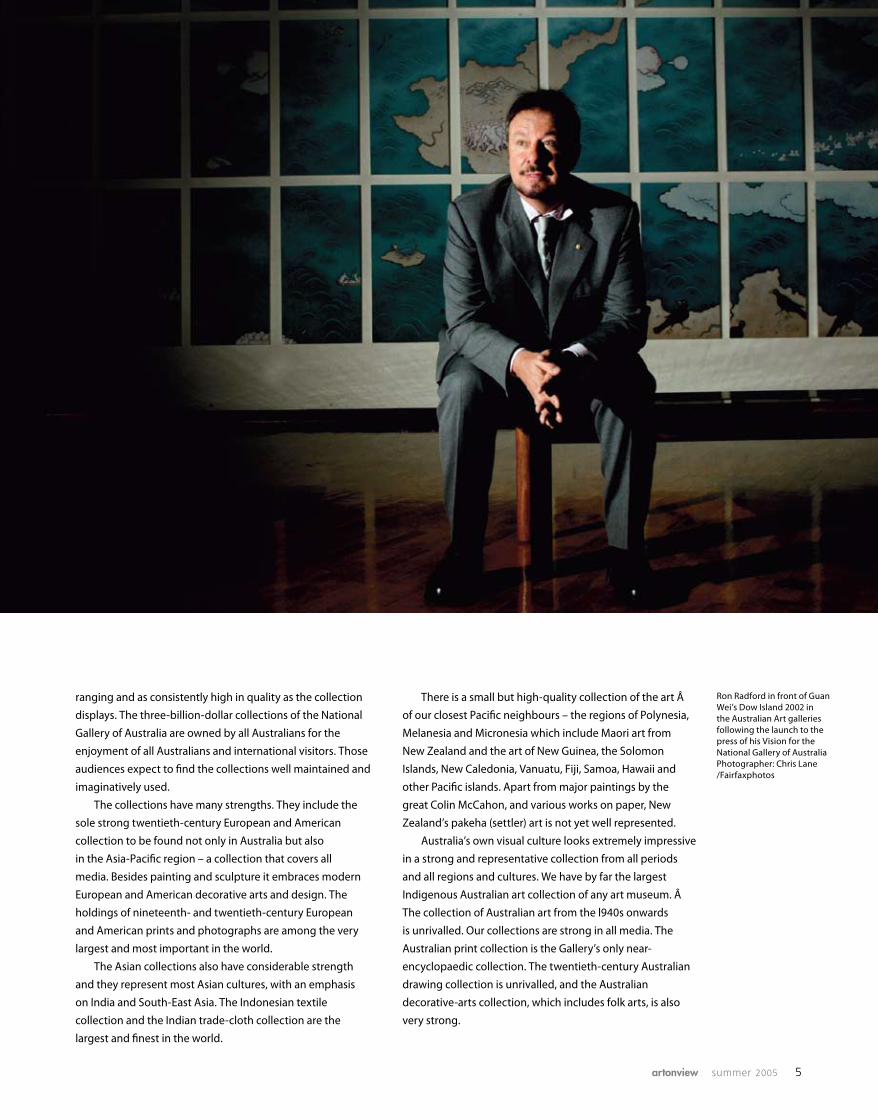
Ron Radford in front of Guan Wei’s Dow Island 2002 in the Australian Art galleries following the launch to the press of his Vision for the National Gallery of AustraliaPhotographer: Chris Lane/Fairfaxphotos
6 national gallery of australia
No state gallery needs to aspire in this way to such
a large and comprehensive collection of Australian art
as the National Gallery of Australia. Our attention to all
regions means that visitors from, say, Queensland, Western
Australia, the Northern Territory or Tasmania, are already
pleasantly surprised by the excellence of their own art in the
context of the whole of Australian art. The collection can
effectively give the Australian people a sense of ownership
of, and contribution to, a great tradition of art-making.
The regional comprehensiveness is a base on which future
audience-building can occur, both in bringing audiences
to the national capital, and then bringing them on from
the Australian War Memorial and Parliament House to the
National Gallery of Australia.
In conclusion, Australian art, Asia-Pacific art, and
modern art worldwide are the strengths on which we
should build.
Collection focusA central focus of the national collection should be the
Australian collection. The Asia-Pacific region should also
be a major focus. It can mirror the strategic importance of
our geographic neighbours and our special allies. Canberra,
the capital of Australia, is a twentieth-century city created
by Australians for Australians. Canberra does not have the
British colonial history of the state capital cities. The six state
art galleries were all founded during the British colonial
period, and began with British collections that remain
for them a strength. This is also the case for some of the
large Australian regional galleries formed in the nineteenth
century such as those at Ballarat, Bendigo, Warrnambool,
Geelong and Launceston.
The National Gallery of Australia’s collections were
formed largely in the last quarter of the twentieth century;
the building opened in Canberra in 1982, in the second-
last decade of that century. Its collections rightly reflect
recent Australian history and, situated in the national
political capital, should also be highly relevant to Australia’s
contemporary strategic engagements.
Australia and our regionIt is crucial therefore that the National Gallery of Australia
be strongly focused on Australian art, including Australian
Indigenous art, from all states and territories. The Gallery
represents all periods of Australian art, from the late-
eighteenth to the twenty-first century, supremely well.
The collections should also embrace the art of our
nearest neighbours – New Zealand, Papua New Guinea,
the Pacific Islands, Indonesia, other South-East Asian
countries and India.
China, Japan, Korea, the Himalayan countries, the
Middle East and Central Asia should be represented but
they are further to the periphery. It is unnecessary, and
too late, to duplicate Melbourne and Sydney’s more
comprehensive Chinese collections, and Adelaide, Sydney
and Melbourne’s significant Japanese collections. In this
way, while emphasising our immediate region, we will
not be competing in the main collecting areas of the state
galleries. Indeed our collections should, where possible,
complement theirs.
To complement, not compete with, the state collections
is particularly important as the buying power of the
combined Australian art museums is now more limited than
formerly in comparison with the wealthier museums of
Europe and America. It is desirable that Australia’s limited
combined acquisition resources be used carefully and
strategically. The National Gallery of Australia should always
be seen to be doing the right thing nationally in this way.
No state gallery concentrates on art, past and present,
of the Pacific region. Those in Melbourne and Sydney are
more committed to North Asian art than South-East Asian
art. Brisbane concentrates on contemporary Asia-Pacific art.
Only Adelaide has a sizeable Middle Eastern Islamic
collection. The National Gallery of Australia already holds a
few Middle Eastern and Mughal Islamic objects and is well
positioned to further develop a small, high-quality collection
of work from this artistically rich culture, hitherto neglected
by Australia’s collecting institutions. Such a collection is also
relevant to our holdings of South-East Asian Islamic art.
European and American twentieth century artAs noted, the National Gallery of Australia holds the only
major collection of European and North American twentieth-
century art in our part of the world. For a national gallery
starting late in the twentieth century, it made sense to focus
on this area. In Canberra, mid-to-late-nineteenth-century
European art has been collected as a precursor to the
twentieth century, an area not especially well represented
by the state galleries. (Before the then conservative state
galleries realised the importance of many of the major
twentieth-century artists, it was already too late to afford
a full range of major works in this area.) Indeed, early-
twentieth-century Modernism and late-nineteenth-century
European art have been the most expensive kinds of art for
over sixty years, and still remain so.
The early-twentieth-century International collection,
otherwise representative, only lacks paintings by Kandinsky
(the first abstract painter), Mondrian, Braque, Klee and
Beckmann. It also lacks a major Picasso. Our fine American
collection of the second half of the twentieth century only
lacks works by the major artists Barnett Newman and Cy
Twombly. Considering how large and important the existing
collection is, these gaps are few but significant, and it will
require enormous financial resources to fill them. Australia
badly needs major paintings by Kandinsky, Mondrian and
Barnett Newman. The National Gallery of Australia is the
only art museum in Australia that could conceivably afford
works by such significant artists in the future, and its
collection is the only one that provides a very strong context
for their display.

artonview summer 2005 7
It is interesting to note that when the National Gallery of
Australia began, from the early 1970s, to buy American art
with enthusiasm, America led the world in cutting-edge art,
as had been the case since the mid 1940s.
It is essential that the Gallery continues buying good
contemporary art worldwide, and not only from the Asia-
Pacific region. America can also be seen as part of the
Pacific Rim and, as it happens, America’s emergence in the
l940s as an art power coincides with Australia’s powerful
and continuing defence and economic alliance with the
United States. The Gallery’s well-developed American
collection, and its continuing worldwide attention to
contemporary art, can be regarded as politically strategic.
In filling major gaps in the International, Asian, Pacific,
and Australian collections, it is important that the Gallery
buys works of the highest quality, which can always be on
display. To this end we should acquire fewer objects of better
quality. Buying objects for study storage should not be an
option. If a costly work cannot be considered for permanent
display, then its acquisition should be questioned.
New Acquisition Policy and Ten Year Acquisition Strategy The Gallery is in the process of adapting the previous
Acquisitions Policy (1994). The new policy will be an
important public document. Concurrently, the Gallery
should also develop a confidential Ten Year Acquisition
Strategy. The latter, an innovative, competitive and strategic
document (or series of documents for each curatorial area),
will outline in detail the serious gaps in the collections,
and even highlight known works, in private collections,
which the Gallery needs. The weaknesses of the collections
should be fully documented, particularly the limitations
of the nineteenth- and early-twentieth-century Australian
collection, the lack of depth in the Indian and South-East
Asian sculpture and painting collection, the currently limited
contemporary Asia-Pacific collection and the twentieth- and
twenty-first century International design collection. Once
approved, this Ten Year Acquisition Strategy should be
strictly adhered to.
Dormant collectionsThe Gallery’s collections, put together recently, over just
three decades, cannot be expected to geographically cover
most areas of world art in historical depth, as do many long-
established national museums overseas. In order to focus
the acquisition resources (and limited display space), we
need to concentrate on what is central to Australia’s national
collection, and do this exceptionally well. The collection areas
we concentrate on should look highly credible not only to
the rest of Australia but also to the rest of the world.
Therefore, we should not direct further acquisition
resources to the small but excellent African, Mesoamerican,
Incan and North American Indigenous collections, or to the
tiny and imbalanced European Old Master collection. The
four dormant collections contain many fine works and
will be held in trust for Australia; the African and North
American Indigenous holdings are the only such high-quality
public collections in Australia. These collections can be
added to by the occasional gift. They could be displayed in
small groups – there are hallway possibilities for showcase
display – and they may be displayed occasionally in various
contexts in the temporary exhibitions galleries; for example,
Indigenous objects that came from the collection of the
surrealist artist Max Ernst deserve to receive a focused study
within the context of Surrealism. In the case of the art of
Africa and the Americas, we could consider the possibility
that some works be lent from time to time to other
Australian institutions perhaps for three-year periods.
In the more attention-getting area of European Old
Masters, Melbourne, Adelaide and Sydney have relatively
substantial collections. Melbourne and Adelaide in particular
have been collecting Old Master pictures since the end of
the nineteenth century. The National Gallery of Australia
has fewer than twenty European Old Master paintings and
sculptures, an Australia public collection fifth in size after
Brisbane’s. Although there are some fine individual works
in the National Gallery of Australia’s collection of European
Old Masters, it is not cohesive and looks out of place in
a contemporary building with such strong contemporary
collections. Twenty works can never represent 500 years of
European painting and sculpture. Even though Old Master
paintings are usually much less costly than nineteenth- and
twentieth-century Modern Masters, it would now require
impossibly huge resources to equal Melbourne, Adelaide
or even Sydney’s longstanding Old Master collections. We
could consider lending our European Old Masters to the
three Australian state galleries that have long made a
commitment to collecting in this area. Even Melbourne,
Adelaide and Sydney’s collections are small compared
with European and American collections of the same
material – yet supplemented with our works they have a
better chance to show a fuller history of European art for
Australian audiences. The National Gallery of Australia
would be regarded as generous and truly national by
lending works for long-term display to the state galleries,
always to be labelled as on loan from the National Gallery
of Australia. Long-term loans of Old Master paintings and
sculptures could be rotated between Melbourne, Adelaide
and Sydney. Any works they don’t want to borrow could be
offered to other state galleries. We could borrow them back
occasionally for exhibitions in context.
Part two of the 2005 Director’s Vision for the National Gallery of Australia will be published in the autumn issue of artonview and is available online at nga.gov.au/Vision
Quotations are from the 1966 Lindsay Report from a ‘National Art Gallery Committee of Inquiry’, our founding document commissioned by Prime Minister Menzies. The Lindsay Report placed its greatest emphasis on modern art worldwide, on the whole of Australian art, and on ‘works of art representing the high cultural achievement of Australia’s neighbours in southern and eastern Asia and the Pacific Islands’. Similarly the 1994 Acquisitions Policy: National Gallery of Australia, the most carefully-considered such document developed and published by the National Gallery Council, also emphasised Australasian (i.e. Pacific) art. The present vision statement is therefore partly a reaffirmation of past Council policies that have not yet been fully implemented.
a

8 national gallery of australia
For the past 130 years, the philosophies, virtues and
processes of craft have occupied art, craft and design
theorists, writers and practitioners alike. The promotion
and celebration of craft fostered design and the decorative
arts as an alternative to what was seen by many critics
and design reformers in the late-nineteenth century as
debased industrial manufacture. Dialogue was promoted
through the Arts and Crafts movement in the United
Kingdom and the United States, and its subtext in the
various expressions of national romanticism in northern
and eastern Europe: in Kunsthandwerk in Germany, in
skønvirke in Denmark, in the nuances between bijutsu-
kogei and mingei in Japan, and in the widely disseminated
ideas behind vackrare vardagsvara (more beautiful things
for everyday use) in Sweden. Such discussions helped
to focus attention on craft as a way of thinking across
the spectrum of art and design, moving the word itself
from an adjective to a noun, and the practice from its
traditional anonymity to its more interrogative, interpretive
potential as a celebration of individual expression.
Transformations: the language of craft
Seeking to locate craft practice in the broader
discourse of contemporary arts, craft writers and
practitioners have engaged with its theories and
language to open new avenues of critical inquiry and
debate. Investigating the relationship between theory
and practice has given many artists working in craft
media new ways to understand their work and to
articulate it to a wider audience. Learning to experience
and understand the tacit language of the crafted object
as it presents itself to our senses, and interacts with our
preconceptions and experiences of the world of things,
can be intensely pleasurable and persuasive.
This strategy of persuasion defined the concept of
Transformations. The exhibition is a celebration of the
recent work of eighty-five Australian and international
artists working in the area of studio craft who are forging
new expressions within the fields of glass, ceramics,
textiles, wood, metalwork, and (through a variety of
materials) in furniture, jewellery and sculpture. The work
of international artists most prominent and influential in
11 November 2005 – 29 January 2006
exhibition galleries
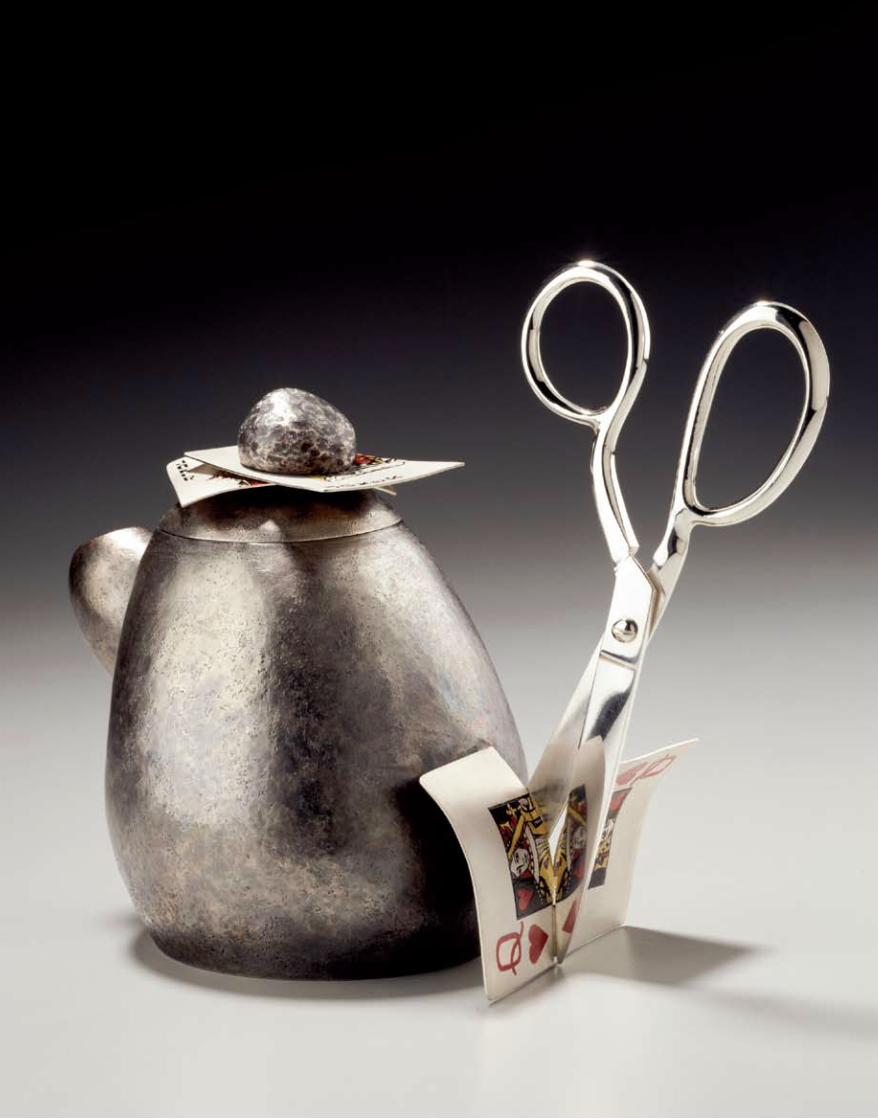
Marilyn da Silva Rock, paper, scissors teapot
2003 sterling silver and enamel paint
Lent by Marilyn da Silva Photographer: M Lee
Fatherree
YO AKIYAMA KEIKO AMENOMORI-SCHMEISSER GIAMPAOLO BABETTO GORDON BALDWIN GILES BETTISON JULIE
BLYFIELD MICHAELBRENNAND-WOOD ALISON BRITTON HARLAN BUTT TANIJA & GRAHAM CARR CLAUDI CASANOVAS
JOHN CEDERQUIST SCOTT CHASELING DALE CHIHULY SHARON CHURCH DEB COCKS PATRICK COLLINS LIA COOK
MARILYN DA SILVA EDMUND DE WAAL GEORG DOBLER PIPPIN DRYSDALE EDWARD EBERLE BERN EMMERICHS MERRAN
ESSON ARLINE FISCH DONALD FORTESCUE ROBERT FOSTER DAVID FREDA WARWICK FREEMAN TETSUO FUJIMOTO
SUEHARU FUKAMI KEVIN GORDON PATRICK HALL BETH HATTON YASUO HAYASHI BRIAN HIRST AGNETA HOBIN SERGEI
ISUPOV RITZI JACOBI HERMANN JÜNGER JUN KANEKO TSUKASA KOFUSHIWAKI DANIEL KRUGER SARA LINDSAY NEL
LINSSEN JESSICA LOUGHLIN HELMUT LUECKENHAUSEN BODIL MANZ IVAN MAREŠ ROBERT MARSDEN KARL MILLARD
KLAUS MOJE MASCHA MOJE RON NAGLE KIMPEI NAKAMURA JIRI NEKOVÁR ALBERT PALEY GWYN HANSSEN PIGOTT
PETER PRASIL WENDY RAMSHAW KIRSTIE REA DAVID REGAN KRISTINA RISKA CHRISTOPHER ROBERTSON GERD
ROTHMANN MICHAEL ROWE BILL SAMUELS ADRIAN SAXE HELEN SHIRK ROBERT SMIT MARTIN SMITH BETTINA
SPECKNER IVANA ŠRÁMKOVÁ KEN THAIDAY SNR CATHERINE TRUMAN GRANT VAUGHAN TONE VIGELAND IRENE
VONCK TONI WARBURTON DAVID WATKINS ALICE WHISH SUSAN WRAIGHT GULUMBU YUNUPINGU TOOTS ZYNSKY
artonview summer 2005 9

10 national gallery of australia
these fields is seldom seen in Australia; this exhibition
offers visitors a chance to encounter their unique and
compelling objects that challenge our perceptions of
design and function, and the meaning of materials.
Such works reveal the creativity, skill and imagination
of the contemporary craft practitioner in the negotiation
and articulation of materials, structure, and production
technologies; the passionate expression of the languages
of abstraction, narrative, design and ornamentation;
and the skills that transform materials from the everyday
to the extraordinary. The work of these international
artists is shown with that of Australian artists engaged
in similar themes and concerns.
The modern concept of individual studio craft
practice took root in Australia at the beginning of the
twentieth century. Initially it reflected and built upon
the ideals and philosophies of the Arts and Crafts
movement before acquiring meaning as a strand of
modernism. The studio craft resurgence from the early
1960s reflected broader conceptual and technical
explorations in all media by craft artists in North
America, Europe and Japan. International work initially
started to gain currency in Australia through publications
and exhibitions, then as a result of visits and workshops,
and later from the experiences of Australians who had
begun working in studios and with artists overseas.
While there is still a lingering perception that studio
craft is something of a new movement in the context of
contemporary art in Australia, its strong development
over the past forty years has resulted in a vibrant and
diverse range of practices. These have positioned
Australian artists to become active and influential
participants in international dialogues about directions
and developments in craft and design.
Beginning in the early 1970s craft organisations
and government funding agencies, such as the Australia
Council Crafts Board and later the Visual Arts/Craft
Board, offered networking and financial assistance for
visits to Australia by overseas artists, often in the form
of workshops, residencies and lecture tours coinciding
with the inclusion of their work in survey exhibitions.
A number of the artists in Transformations undertook
such engagements and have had a significant influence
on craft practice in Australia as a result of their visits.
This exhibition of recent work creates a bridge to
their earlier work that has remained in Australia in
the collection of the National Gallery of Australia, and
state and regional art museums. Such artists include
Giampaolo Babetto, Michael Brennand-Wood, Alison
Britton, Dale Chihuly, Edmund de Waal, Arline Fisch,
Warwick Freeman, Yasuo Hayashi, Ritzi Jacobi, Hermann
Jünger, Jun Kaneko, Albert Paley, Wendy Ramshaw,
Gerd Rothmann, Michael Rowe, Helen Shirk and David
Watkins. Many artists built enduring networks with
the Australian artists who hosted them or who worked
with them during their visits, facilitating subsequent
opportunities overseas.
Over the past forty years, the expansion of
tertiary training in craft-based artforms has involved
practitioners in the wider concerns of contemporary art,
and has brought new expectations for the role of craft
skills in interpreting and articulating them. It has done
so through the focused work of individuals who have
developed their practice with the knowledge that their
work is valued as an alternative to a plethora of look-
alike manufactured products.
Toots Zynsky Pennellata 2005
glass filet de verreLent by Toots Zynsky
Photographer: Toots Zynsky
Georg DoblerBrooch 2000
silver and amethyst National Gallery of Australia,
CanberraPhotographer: John Carlono
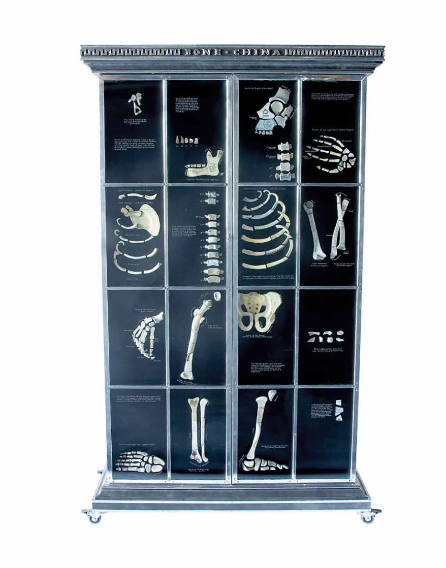
Patrick Hall Bone china 2005
plywood, aluminium, glass and ceramic
National Gallery of Australia, Canberra
Photographer: Peter Whyte
12 national gallery of australia
In choosing to work within the constructs and
disciplines of craft-based practices, artists and designers
align themselves not only with the rich narrative of human
history, but also with the language of invention and
technological exploration. Over time, social and industrial
revolutions have turned on the development and use of
specific materials. Responding to necessity and fuelling
desire across cultural and economic barriers, designers
and makers have interpreted the possibilities of new
ideologies, materials and manufacturing technologies.
Great centres for processing, manufacturing, design
and distribution sprung up around craft practices and
have attracted designers, artists and craft specialists for
centuries, connecting industrial towns and local craft
traditions with metropolitan ideologies concerned with
design and fashion. Many of the artists in this exhibition
have gravitated to such places to connect with and learn
from those great traditions, and to integrate something
of that spirit in their practices.
Increasingly, however – in a world connected less by
geographic destination than by technology, ideology and
invention – artists and designers, theorists, technologists
and commentators work in fluid dialogues across
cultures. Their work draws from many of the currents
that activate society: the semiology of craft; global sub-
cultures and counter-cultures; the place of craft skills in
the construction and nurturing of kinships and family;
retrospection, fantasy, satire, desire and subversion; the
ethics and consequences of the production, processing
and disposal of materials; the recycling of materials of
all kinds; and the allure of new materials and imaging
technologies. All are connected through the sheer
pleasure of creating and working with materials that are
sensual, intimate and visually engaging.
It is a paradox that while we have become a society
with an ability to quickly assimilate new technology and
find value in a plethora of new types of functional and
decorative objects, we are doing so with a diminishing
understanding of the history and development of
design and the decorative arts. We rely increasingly on
advertising and celebrity endorsement as a substitute
for the understanding and discrimination that comes
from direct experience. For many, such experience of
significant unique craft works is rare, resulting in a limited
comprehension of the rich cultural, formal and material
values that such objects represent. While such values
can be interpreted in the context of the visual arts, they
may also be understood by considering them in the
framework of the performing arts. The understanding of
dance and music suggests ways of interacting with crafted
objects and the unseen ‘performer’ behind them. We can
consider and enjoy these objects by engaging with the
shared concepts of spatial organisation, time, rhythm,
body control, and the confidence and skill in the use of
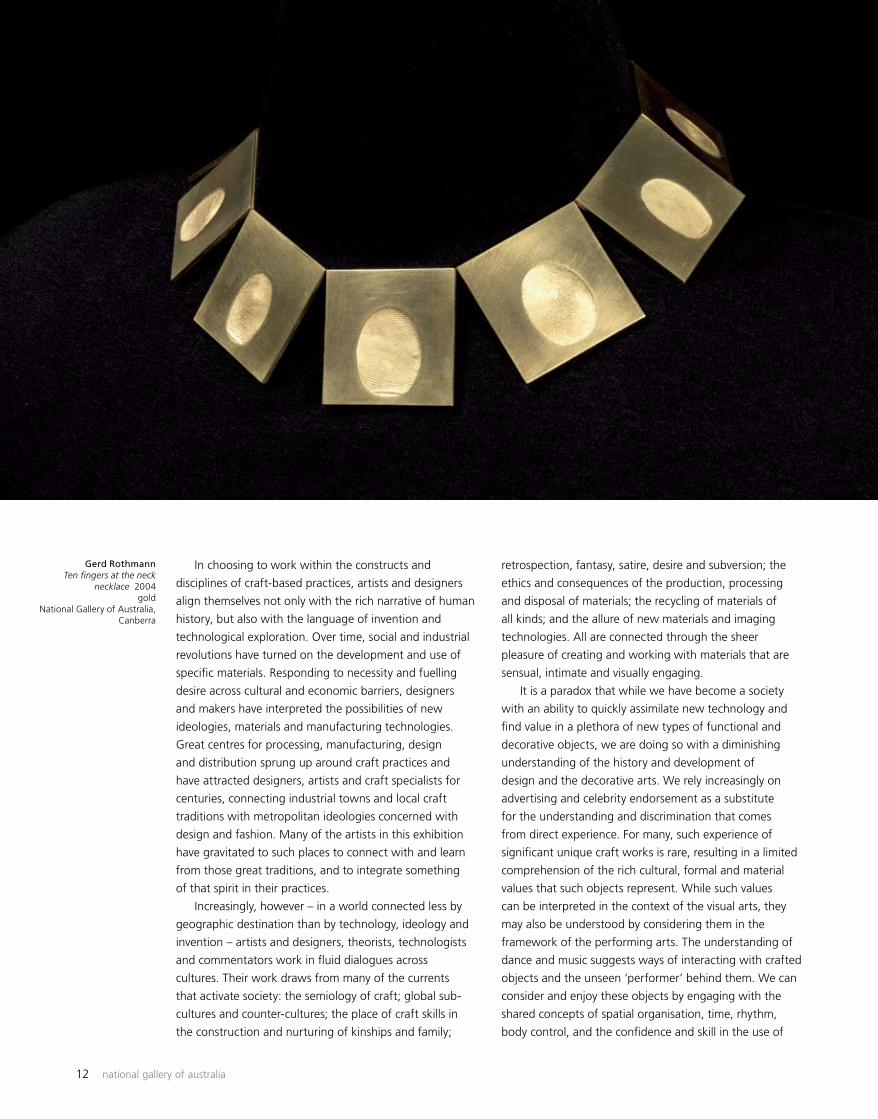
Gerd Rothmann Ten fingers at the neck
necklace 2004gold
National Gallery of Australia, Canberra
artonview summer 2005 13
tools and instruments. By engaging with the nuances and
performance of materials, the framework of tradition and
the theatrics of presentation, object makers can heighten
our experience of their work.
Transformations encourages visitors to encounter
the eloquence of crafted objects as mediators of space
and experience, and to consider the place of craft skills,
traditions and values in an increasingly dematerialised,
yet regimented, culture of consumption. The works in this
exhibition are drawn together in the themes of Narrative,
Materiality and Structure, creating settings in which
unique crafted objects give form to innovations in the
use of materials and technologies, offer commentaries
on nature and the urban environment, express personal
narratives, and reflect regional identity.
An examination of the works in each section of
the exhibition reveals connections across a diversity of
work practices, approaches to materials and personal
backgrounds. The disposition of the works in the exhibition
offers a complex set of relationships where the meaning
of one can be inflected by our experience of others.
Objects accrue meaning in the landscape of our own
imagination, despite the juxtapositions and relationships
suggested by their placement in a particular exhibition.
These objects trigger associations that draw us into a
potentially haptic, intuitive relationship with them.
Narrative, the exhibition’s first section, explores
translation, transience and memory as points of departure
for a variety of visually complex objects. They employ
metaphor and realism to explore cultural resonances,
mythology and our relationship with the natural world.
Works in the second section of the exhibition, Materiality,
are defined by an expression of their material qualities,
shown in objects where the sensuous, physical properties
of materials are explored. Through their orchestration
of process, artists bring a poetic physicality to the
transformation of raw materials such as clay, metal,
wood, glass and fibre. The third section, Structure, brings
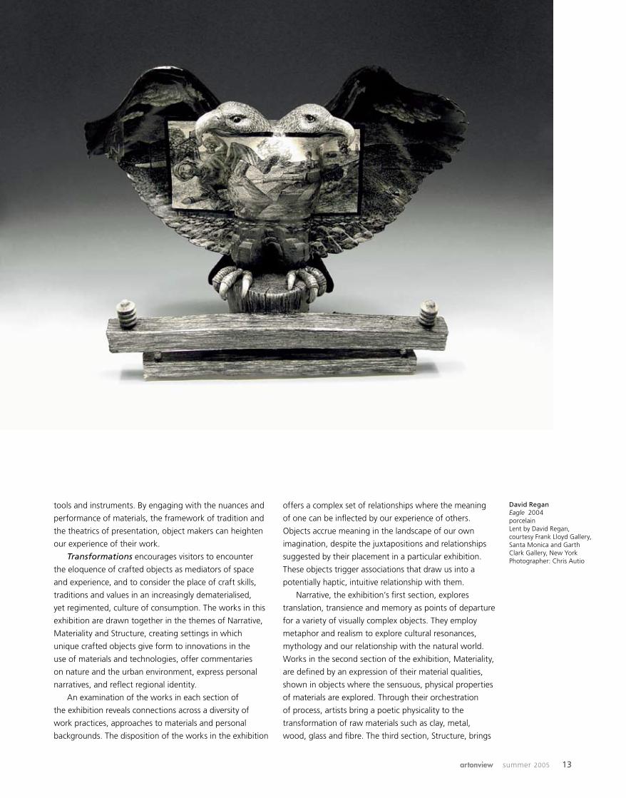
David Regan Eagle 2004porcelainLent by David Regan, courtesy Frank Lloyd Gallery, Santa Monica and Garth Clark Gallery, New YorkPhotographer: Chris Autio

14 national gallery of australia
together works that are defined by a concern with the
organisation of elements, through rhythm, reductiveness,
balance and the nature of time. Other objects in this
section can be understood through their relationships to
space and light, or through the nuances of groupings,
placement, and variations of forms, colour and texture.
With its continuous evolution and traditions of
functionality, ornamentation and ceremony, craft has
always reflected human experience. Through the skill and
ingenuity of its practitioners, craft manifests in objects that
help us navigate our way through our lives, offering us new
ways to imagine being in the world. Our perception of the
world is continually being reshaped through the exposure
to fragmented visual information and discontinuous
episodes, many stressful and destructive, yet others
transcendent and inspirational. In a world increasingly
dominated by commercial design and branding, and global
industrial manufacture – where location and means of
production are determined by economic rationalism rather
than tradition – the practices of craft exist as signs of
achievement and personal narratives that can re-locate
us in time, place and experience.
Robert BellSenior Curator, Decorative Arts and Design
This article is an extract from the exhibition catalogue Transformations: the language of craft, published in 2005 by the National Gallery of Australia
a
Alice Whish Milky Way constellation
2004powder-coated,
laser-cut mild steelNational Gallery of Australia,
Canberra
Grant Vaughan Ovoid form 2005
Australian white beech (Gmelina leichhardtii)
and lacquerPurchased 2005 with funds
from the Meredith Hinchliffe Fund
National Gallery of Australia, Canberra
Sueharu Fukami Scene II 2004
porcelain with celadon glaze on mikiage stone,
and copper-plated stainless-steel stand
Purchased 2005 with funds from Raphy Star
National Gallery of Australia, Canberra
Photographer: Takashi Hatakeyama

REC
H00
36
Qantas operates around 560 internationalservices every week to over 80 destinationsin 40 countries.We carry freight on every oneof those flights. Add to that our expandingfreighter network with connections to Asia,USA and Europe and we can get your freightto just about anywhere. For more detailsplease contact your local Qantas Freightoffice or Qantas Freight reservations on 1300 368 747 for callers within Australia.
We can get your freight toevery corner of the globe.
RECH0006_Global_297x233 12/07/05 3:25 PM Page 1

16 national gallery of australia
Transformations: narrative, materiality, structure
The three themes of Narrative, Materiality and
Structure create a logical framework through which
to view Transformations: the language of craft.
With eighty-five artists represented in the exhibition,
this framework helps to make the connections between
the artists, the materials used, and the works themselves.
By exhibiting the work of Australian artists alongside
the work of international artists, we can investigate the
language used by artists living in environments different
to our own. Their spoken language is different, but is the
language of their art also different?
The artists included in the first section, Narrative, deal
with myriad themes. Michael Brennand-Wood is an artist
from the United Kingdom, embroidering by hand and by
sewing machine. Using fabric in fine art is unusual, and
is indicative of the way Brennand-Wood sets challenges
for himself. He says ‘the things that are most difficult are
the things that sustain you’ and is happy breaking new
ground. His concepts recur over and over in his work as
he re-investigates and reworks them. Brennand-Wood works
intensively and for several years has been studying pattern
in textiles, while creating his own highly patterned works.
Historically, as people moved around the world, the
patterns in the fabric of their clothes were transferred to
others. They were copied and reworked, absorbed into
the ever-growing populations, and through historical
clothing we can follow migration paths.
Working in this context, Brennand-Wood draws on
a vast range of interests including historical lace, maps,
music, flowers and scientific experiments to create his
own patterned work. Building an intense and dense
three-dimensional picture, he addresses other issues.
We know this artist is concerned with global issues
through the titles of his work: Died pretty – flag of
convenience points to this. It is brought home to us when
we see toy soldiers scattered among the embroidered
flowers, reminding us that war is not a pretty sight,
no matter how it might be disguised.
Michael Brennand-Wood Died pretty – flag of convenience 2005
embroidered flowers, acrylic, toy soldiers, wire, paint
tubes, fabric and resin on wood panel
Lent by Michael Brennand-Wood
Photographer: Stephen Brayne
Sergei Isupov To be object of attentions
2004painted and glazed porcelain
Lent by Sergei Isupov, courtesy Ferrin Gallery,
Lenox, MAPhotographer: Katherine
Wetzel

artonview summer 2005 17

18 national gallery of australia
artonview summer 2005 19
The marriage of pattern and form can tell us a great deal.
As Soetsu Yanagi said in The unknown craftsman: a
Japanese insight into beauty, ‘to divine the significance
of pattern is the same as to understand beauty itself …
The relationship between beauty in the crafts and pattern
is particularly profound’.
Artists have represented the human figure in three-
dimensional form in clay for thousands of years. The figure
itself and its surface ornamentation may convey aspects
of the human condition or the figure might, as in Sergei
Isupov’s case, be a tabula rasa.
Russian-born and now living in the United States of
America, Isupov is exhibiting two works: To be object
of attentions and Firebird. To be object of attentions is
a porcelain sculpture of a human head with two small
horns. For this artist the material is almost irrelevant and,
as his dealer Leslie Ferrin says, ‘his work is 3-D sculpture
with 2-D painting’. However, he would not achieve the
same impact on a flat surface. The nose of the sculpture
gives body to the pleated skirt on the female figure
stretched across its face. The legs of the anthropomorphic
figure holding her right arm dissolve into cracks on the
side of the sculpture’s forehead, creating visual tension
between the form and its painted surface.
Viewers will read their own meanings into this painted
surface. Perhaps the female is not being tortured, as one
might initially assume, and while she does not look happy,
she appears to be resigned rather than in distress. Isupov
distils his own feelings and observations into his imagery
– and we can only speculate what he may have been
thinking about when creating this work.
In his fine enamelled jewellery David Freda, also from
the United States, portrays his feelings for creatures, many
of which make us uneasy. His fascination with wildlife
of all sizes since he was a small boy has taken Freda into
a world of natural history. He wants his viewers to see
the world as he does, a world that parallels our own of
‘mating, hatching, feeding, and fighting’. As an artist he
uses the vast colour palette of enamels as others might
use precious and semi-precious stones.
Stag beetles, grubs and raspberries, a necklace in
silver, gold and enamels, shows the life cycle of the
stag beetle. Raspberries are the beetles’ favourite food
and they are linked with pupae to form the chain on
which the beetle hangs. Unlike many other enamellists
Freda works sculpturally, using colour to replicate nature
and enhance his creations. He has developed specialist
metalsmithing techniques to create realistic necklaces
David Freda Stag beetles, grubs and raspberries necklace 2001fine and sterling silver, 24- and 18-carat yellow gold, and glass enamelsLent by David FredaPhotographer: Barry Blau
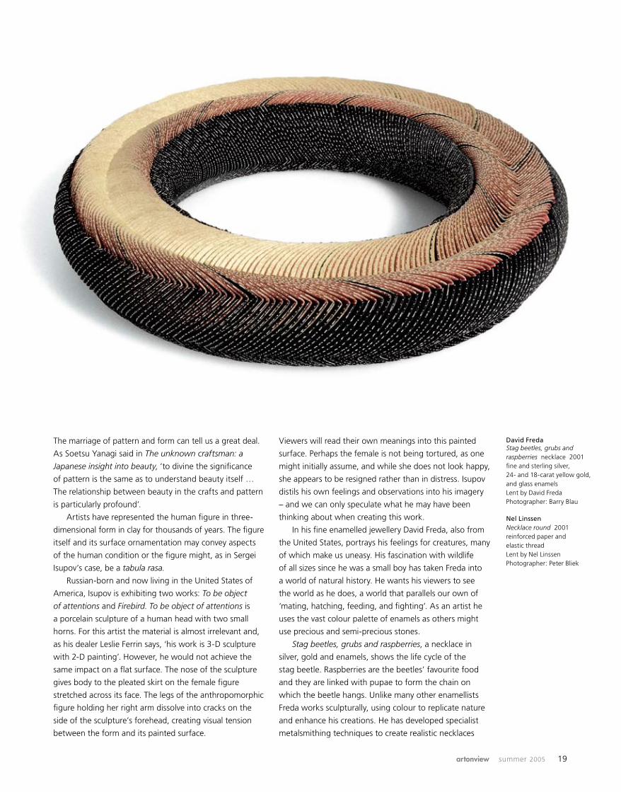
Nel Linssen Necklace round 2001reinforced paper and elastic threadLent by Nel LinssenPhotographer: Peter Bliek

20 national gallery of australia
and brooches of orchids, hatching snake eggs and fish.
Through his acute observation we learn about the beauty
of nature and perhaps question why we squirm at the
bugs and reptiles he portrays.
In 1947, when Japanese ceramicist Yasuo Hayashi was
nineteen years old, he was one of a group of potters who
formed Shiko-kai, an avant-garde group promoting a new
ceramic art movement in Japan. His work is not vessel-
based, and this was almost unique in Japan at the time.
Since those early days, he explored new ways of creating
a dialogue with his audience, using reality and graphic
illusion, and has always intended that we should be fully
involved with his work.
Through the use of shade and light, defined by lines
on the surface, flat surfaces appear to curve towards
the viewer and to have volume. While his ceramics have
become more three-dimensional, as seen in Memory of
the house ‘05-1, he continues to use graphic techniques
of line and colour to create perspective. Hayashi
incorporated several viewpoints into earlier works,
taking the exterior into the interior of the work, creating
imaginary spaces through visual illusions.
In Memory of the house ‘05-1 he conveys the volume
of the house on the surface of the work, which has a
distinct front and back. Three or four lines indicate several
different spaces or rooms and he takes us through them.
Blocks of colour – blue, red, black and white oblique
stripes – and texture further delineate the rooms.
Hayashi recalls the home of his childhood, returning to
the security of his family, and he continues to invite us
to join him and at the same time to explore our own
memories of childhood homes.
Artists explore the different qualities of their chosen
materials and create a dialogue between the materials
and the viewer in the second section of the exhibition,
Materiality.
Nel Linssen, who lives and works in the Netherlands,
creates sensuous jewellery using folded paper. She takes
an intuitive approach to her bracelets and necklaces made
from paper. It is, however, an approach based on years of
research, and haptic knowledge of her material, and of
the way it must be cut, folded, drilled and fitted together.
The relationship between the wearer and Linssen’s
necklaces is closer than in jewellery made from most
other materials. As the wearer moves, the viewer sees
the nuances of change in colour and texture. While the
wearer is aware of the sensuous nature and movement
of the jewellery, the viewer is drawn to the constant
changes wrought by the slightest movement of the body.
Light and shade play on the surfaces of the thick coils
that wrap around the wearer’s neck or arms, conveying a
sense of solidity and weight. In this way, Linssen’s work
is evocative of traditional jewellery made from precious
metals and stones, belying the light paper from which it is
constructed.
Leather is not commonly considered a sculptural
material: it so much a part of our lives through functional
uses, that we take it for granted. Australian artists Tanija
and Graham Carr use leather, carving its thick surface
as though it were timber or stone. Theirs is a truly
collaborative partnership. Both trained as architects.
They draw on this training and discuss each piece, from
the first idea of form and concept to the last line of
decorative surface. This mode of practice is unusual,
Tanija and Graham Carr Untitled bowl form 2001
leatherNational Gallery of Australia,
Canberra
Yasuo Hayashi Memory of the house ’05-1
2005glazed stoneware
Lent by Yasuo HayashiPhotographer: Yasuo Hayashi
Keiko Amenomori-Schmeisser
Ripples 1999paint and dye on linen,
shibori techniqueNational Gallery of Australia,
Canberra

artonview summer 2005 21
even among those who make objects, such as those that
are included in Transformations.
There is a timeless quality about the Carrs’ Untitled
bowl form, which has a strong sculptural presence. It is
carved to give a richly textured surface. The patterning
is intricate, ordered and repetitive. The repetition brings
rhythm and order to the ornamentation of the form.
Protruding lugs give it the appearance of having been
made of wood joined together with rivets, as if to serve a
functional or ritual purpose.
Artists included in the third section of the exhibition,
Structure, are concerned with the arrangement and
organisation of elements in their work. Keiko Amenomori-
Schmeisser is a Japanese–Australian artist working
primarily in textiles and specialising in shibori. She has
lived and worked in Germany, Japan and Australia and
her work is influenced by each of these places. Her first
design lessons were a consequence of being taught at
eleven years old the pictographs and culture of Japanese
calligraphy. She learned the importance of the white
space on the page and the need for balance and tension
between the black and white within a given space.
Shibori is the Japanese term given to both the process
and the product of fabric that is tied, knotted and
otherwise manipulated to create a resist pattern when
dyed. The structure of Amenomori-Schmeisser’s work is
created by folding and stitching. Through stitching she
shapes the fabric, changing the direction of the stitches,
using different thicknesses of thread and different
stitching to achieve the amount of colour and texture she
requires. Surface paint adds to the structure of Ripples
and gives the cloth rigidity that allows three-dimensional
forming to create tension and movement. Her work is
influenced by memories, observations, experiences and
travel to many parts of the world. Coincidentally, she has
said that ‘transformation’ is a key concept for her work.
Viewers will find that the language of craft transcends
the spoken word. This exhibition brings together artists
who deal with similar issues, no matter where they live.
The vocabulary is both aesthetic and technical. New
technologies have opened further avenues for exploration
by individual craft artists, as well as opportunities for
more intense communication between artists living in
different countries.
Transformations: the language of craft will make
a contribution to the exchange between artists around
the world. Just as importantly, viewers will increase their
knowledge and understanding of craft in the twenty-first
century.
Meredith Hinchliffe
Meredith Hinchliffe is an arts advocate and writer living and working in Canberra.
a

22 national gallery of australia
Against the grain: the woodcuts of Helen Frankenthaler
There are no rules, that is one thing I say about every medium, every picture ... that is how art is born, that is how breakthroughs happen. Go against the rules or ignore the rules, that is what invention is about. Helen Frankenthaler
26 November 2005 – 5 February 2006
orde poynton gallery
In 1950, at the age of twenty-two, Helen Frankenthaler
met the art critic Clement Greenberg and began
mixing with the New York School of artists. Two things
immediately set her apart from her contemporaries – her
gender and her age. Frankenthaler was one of a handful
of female artists who successfully contributed to the
artistic territory dominated by such giants as Jackson
Pollock and Willem de Kooning. Much younger than these
artists, Frankenthaler emerged as one of the first in what
has come to be known as the ‘second generation’ of
Abstract Expressionist painters. Frankenthaler accompanied
Greenberg to many exhibition openings, visited the studios
of other artists and frequented the (now legendary) Cedar
Street Bar and the Artists’ Club. She was adept at analysing,
discussing and deconstructing the robust action painting
produced around her and actively participated in the artistic
dialogue of the 1950s. Yet, she knew she was alone in her
quest to develop an individual style. Frankenthaler began
her search for a departure point – a method of mark-
making that was uniquely hers. She found it in 1952 with
a large-scale oil painting entitled Mountains and sea.
Mountains and sea was created after Frankenthaler
returned to her New York studio from a trip to Nova
Scotia, where she had painted numerous watercolours of
the rocky seascape. She spread her canvas on the floor, a
technique adopted from Jackson Pollock, but it was what
she did next that made that crucial, radical departure from
his work. Frankenthaler, in the habit of working quickly
and using watercolour washes, applied paint diluted with
turpentine directly onto the unprimed canvas. The artist
has recalled that she felt ‘the landscapes were in my arms
as I did it’. Working instinctively, she allowed the diluted
mix to soak into the canvas and using subtle washes she
filled it with large, lyrical gestures – a style that has since
become her signature. The technique, described by the
artist as ‘soak-stain’, was a fusion of image and ground
that resulted in the ultimate flat surface. This experimental
method was a radical digression from what had come
before and was the breakthrough that propelled Helen
Frankenthaler into the spotlight of the New York art scene.
Frankenthaler was well-equipped for this sudden
attention. Born in New York in 1928, the youngest of
three daughters to wealthy Jewish parents, she was
educated at the prestigious Dalton School, New York, and
Bennington College, Vermont. She studied at Dalton under
the Mexican muralist Rufino Tamayo and at Bennington
under the American Cubist Paul Feeley. It was Feeley who
directed Frankenthaler in the development of her early
Cubist-derived style and, more importantly, gave her an
understanding of pictorial composition and space. Feeley
taught Frankenthaler to stand in front of a work of art
and dissect it: ‘We would really sift through every inch of
what it was that worked; or if it didn’t, why. And cover
up either half of it or a millimetre of it and wonder what
was effective in it … in terms of paint, the subject matter,
the size, the drawing.’ Early encouragement to become
involved in the arts, in combination with Frankenthaler’s
meticulous training, led to the development of her
unwavering determination to become an artist.
Determination is an essential characteristic of the
artist whose work evolves from experimentation. It is
Frankenthaler’s intrinsic sense of exactly what is required to
balance line, form and colour within a given pictorial space
that permits her to unleash a spontaneous, yet controlled
gesture: ‘you have to know how to use the accident, how
to recognise it, how to control it, and ways to eliminate it
artonview summer 2005 23
24 national gallery of australia
so that the whole surface looks felt and born all at once.’
Frankenthaler recognised early in her career that to grow
as an artist and to develop aesthetically it was crucial that
she continually challenge herself and work outside of her
comfort zone. Painting was Frankenthaler’s primary artistic
passion, but an obsession to push her creative limits led
her to turn her attention to print media.
Frankenthaler created her first prints in 1961 with
Tatyana Grosman at Universal Limited Art Editions
(ULAE) in West Islip, Long Island. It was in this intimate
lithographic workshop, where artists were treated as
personal guests and for whom Grosman would go to
any lengths to facilitate artistic needs, that Frankenthaler
began to experiment with print media. There was a long
period of print education and technical trial and error
for Frankenthaler: ‘Whether it be graphics, sculpture,
tapestry, ceramics – whatever the medium – there is the
difficulty, challenge, fascination and often productive
clumsiness of learning a new method: the wonderful
puzzles and problems of translating with new materials
… [a] translation of my image in a new vocabulary.’ While
Frankenthaler also created her first woodcuts at ULAE it
was not until 1976, when she commenced collaboration
with master printer Kenneth Tyler, that she began a
sustained investigation of the woodcut medium.
Kenneth Tyler was exactly the master printer
Frankenthaler required to transpose her bold gestural
experiments into the realm of the technological. The
artist’s first woodcut with Tyler was Essence mulberry,
produced in 1977. The inception of this stunning, eight-
colour woodcut was inspired by two factors. The first
was an exhibition of fifteenth-century woodcuts that
Frankenthaler had seen at the Metropolitan Museum of
Art, where she was particularly struck by the colour of the
prints and determined to discover all she could about the
ancient medium. The second was when the artist, working
with Tyler at his Bedford workshop, noticed a mulberry
tree growing outside the studio. She commented upon
the vibrant colour of the berries and Tyler squashed some
of them into juice. Frankenthaler dipped a paintbrush
into the juice and proceeded to paint onto a piece of
Japanese calligraphic paper. The resulting mulberry colour
against the delicate paper was the starting point for the
development of the print.
With Essence mulberry both the artist and the
master printer recognised the start of an extraordinary
collaboration. Frankenthaler has confessed that even
today she will look at Essence mulberry and say to Ken,
‘How did we do it? How did we get it?’, believing that,
‘It is one thing for the artist to have a certain magic and
produce a certain magic but for the technicians and the
press and Ken to get it’ was something truly special. She
admits that she ‘wanted things that I couldn’t at times
articulate … but between our exchange we got this music’.
Essence mulberry is seen today as a watershed, the first
artonview summer 2005 25
of Frankenthaler’s woodcuts to employ the traditionally
graphic medium in the production of an image of abstract
and inspired beauty.
The woodcut, a notoriously difficult and rigid medium,
could not be further from the artistic realm of a gestural,
spontaneous painter. As a painter, Frankenthaler’s creative
process is driven by the development of a dialogue with
the work itself, ‘a fighting, loving dialogue with this piece
of material. You force something on it and it gives you an
answer back … until you know that this is right’. Kenneth
Tyler has recalled that with the Tales of Genji, a series
of six woodcut prints that Frankenthaler began in 1995,
‘it was apparent from the beginning that what was needed
was a new approach and technique for making what Helen
strove for: a woodcut with painterly resonance’. With this
in mind, Tyler suggested to Frankenthaler that she could
communicate to the workshop of printers and, more
importantly, remain true to her unique style by painting
her ideas for the printed works onto pieces of wood.
Supplied with wood, paint and brushes, Frankenthaler
worked alone in the artist’s studio at Tyler Graphics
painting the maquettes for the Tales of Genji. From the
painted studies, tracings were made and woodblocks were
carved by the ukiyo-e trained Japanese carver, Yasuyuki
Shibata. The watery nature of Frankenthaler’s paintings
created an immediate problem for printing. In order to
create the lush transparent washes of colour, the printers
had to work quickly with wet sheets of paper that, under
the pressure of the printing press, would force the inks
to bleed and blend into one another. Tyler recollects that,
opening page: Helen Frankenthaler Tales of Genji IV 1998 colour woodcut and stencil on light rose handmade TGL paper Purchased with the assistance of the Orde Poynton Fund 2002 National Gallery of Australia, Canberra © Helen Frankenthaler / Tyler Graphics Ltd
opposite page: Helen Frankenthaler Essence mulberry 1977 colour woodcut printed on buff handmade Maniai gampi paper Gift of Kenneth Tyler 2002 National Gallery of Australia, Canberra © Helen Frankenthaler / Tyler Graphics Ltd
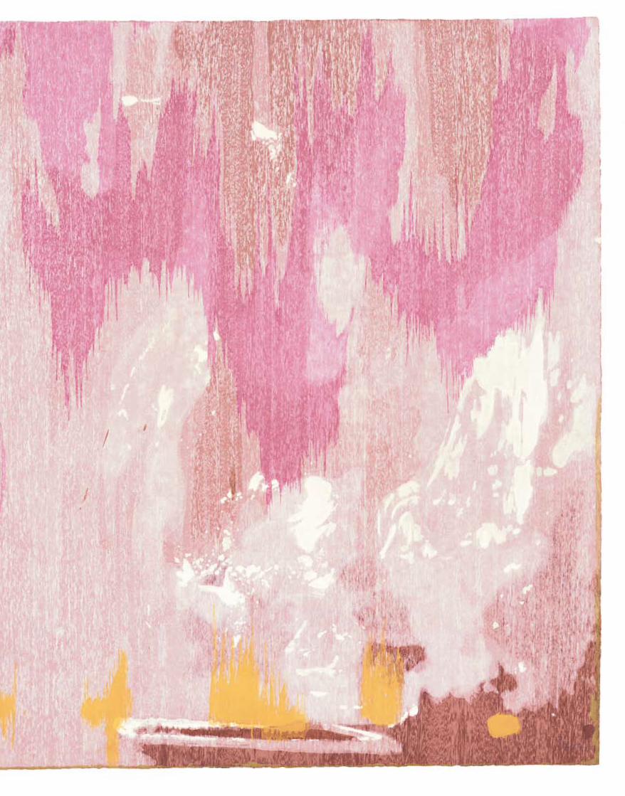
Helen Frankenthaler Tales of Genji VI 1998 colour woodcut printed on light sienna handmade TGL paper Purchased with the assistance of the Orde Poynton Fund 2002 National Gallery of Australia, Canberra © Helen Frankenthaler / Tyler Graphics Ltd

artonview summer 2005 27
‘None of us knew what we were doing … and half the
time we didn’t know what we were saying. The technique
had absolutely no history. We were making it up as we
went along’. Through trial and error and laborious proofing
sessions, the workshop overcame these technical difficulties.
Despite the leap into the creative unknown, the six
resulting Tales of Genji woodcuts are truly seductive
prints. It is with awe that one looks at these works and
realises that the project took the artist and the workshop
a mammoth three years to complete. It is the Tales of
Genji woodcuts that form the pinnacle in experimental
print collaboration between Frankenthaler and Tyler
Graphics, and the series that forced the development of
new printmaking techniques that were perfected two years
later in Frankenthaler’s final woodcut with Tyler Graphics,
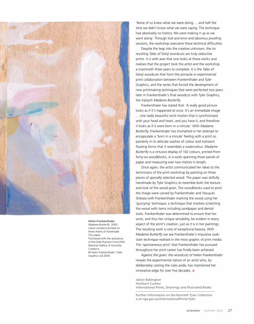
the triptych Madame Butterfly.
Frankenthaler has stated that: ‘A really good picture
looks as if it’s happened at once. It’s an immediate image
… one really beautiful wrist motion that is synchronised
with your head and heart, and you have it, and therefore
it looks as if it were born in a minute.’ With Madame
Butterfly, Frankenthaler has triumphed in her attempt to
encapsulate a ‘born in a minute’ feeling with a print so
painterly in its delicate washes of colour and transient
floating forms that it resembles a watercolour. Madame
Butterfly is a virtuoso display of 102 colours, printed from
forty-six woodblocks, in a work spanning three panels of
paper and measuring over two metres in length.
Once again, the artist communicated her ideas to the
technicians of the print workshop by painting on three
pieces of specially selected wood. The paper was skilfully
handmade by Tyler Graphics to resemble both the texture
and look of the wood grain. The woodblocks used to print
the image were carved by Frankenthaler and Yasuyuki
Shibata with Frankenthaler marking the wood using her
‘guzzying’ technique, a technique that involves scratching
the wood with items including sandpaper and dental
tools. Frankenthaler was determined to ensure that her
wrist, and thus her unique sensibility, be evident in every
aspect of the print’s creation, just as it is in her paintings.
The resulting work is one of exceptional beauty. With
Madame Butterfly we see Frankenthaler’s impulsive soak-
stain technique realised in the most graphic of print media.
The ‘spontaneous print’ that Frankenthaler has pursued
throughout her print career has finally been achieved.
Against the grain: the woodcuts of Helen Frankenthaler
reveals the experimental nature of an artist who, by
deliberately casting the rules aside, has maintained her
innovative edge for over five decades.
Jaklyn Babington Assistant Curator International Prints, Drawings and Illustrated Books
Further information on the Kenneth Tyler Collection is at nga.gov.au/InternationalPrints/Tyler
a
Helen Frankenthaler Madame Butterfly 2000 colour woodcut printed on three sheets of handmade TGL paper Purchased with the assistance of the Orde Poynton Fund 2002 National Gallery of Australia, Canberra © Helen Frankenthaler / Tyler Graphics Ltd 2000
28 national gallery of australia
You want to know why we’re doing a Constable show?
Constable lived around 200 years ago – the time of Jane
Austen, William Wordsworth and mad bad Byron. He
died just before Queen Victoria came to the throne. My
great-great-grandfather George Bonamy was still living in
England then. Indeed, Constable was born twelve years
before Captain Arthur Phillip and the First Fleet arrived in
Sydney Cove; but during Constable’s lifetime settlements
were established in Hobart, Brisbane, Perth, Melbourne
and Adelaide.
You might think Constable’s art belongs to another
place, another time, just like that of Austen and all those
others. But we – or at least some of us – love to read
Austen, see Emma Thomson’s movie version of Sense
and sensibility or watch the BBC version of Pride and
prejudice with Colin Firth as Mr Darcy (or the recent film
version). We enjoy looking at a people living in a time when
things seemed a lot simpler – but also many of Austen’s
people seem just like us and people we know, and their
predicaments are similar to those we experience. (Bridget
Jones’s diary makes just this point.)
Discovering Constable: rediscovering nature
If you think Constable’s art belongs to the past, then
I encourage you to come to our exhibition, and look and
look again. Because I believe if you take the time to absorb
yourself in his art you’ll be transported into a place of
great joy – you’ll discover a world full of air and light and
atmosphere. You’ll feel the wind in your hair, and sense
the delights of being in touch with nature. And you’ll look
at clouds like you’ve never seen them before.
I remember the Tate’s Constable exhibition of 1991,
when I was amazed at the energy of his paint surfaces.
Then I saw the British Council show in Paris in 2003 – the
one that Lucian Freud selected and my co-curator John
Gage worked on. French artists such as Géricault and
Delacroix were inspired by Constable back in the 1820s. The
English-born French art critic PG Hamerton wrote in 1866
that Constable ‘did not see lines, but spaces, and in the
spaces’ he saw ‘an immense variety of differently coloured
sparkles and spots’. He added, ‘all the best modern French
landscape is due to the hints he gave’. The French saw the
importance of Constable’s work back then, and the French
Anna Gray, Assistant Director, Australian Art, explains why the Gallery is working on a major new exhibition of the work of John Constable for 2006.
for thcoming exhibition
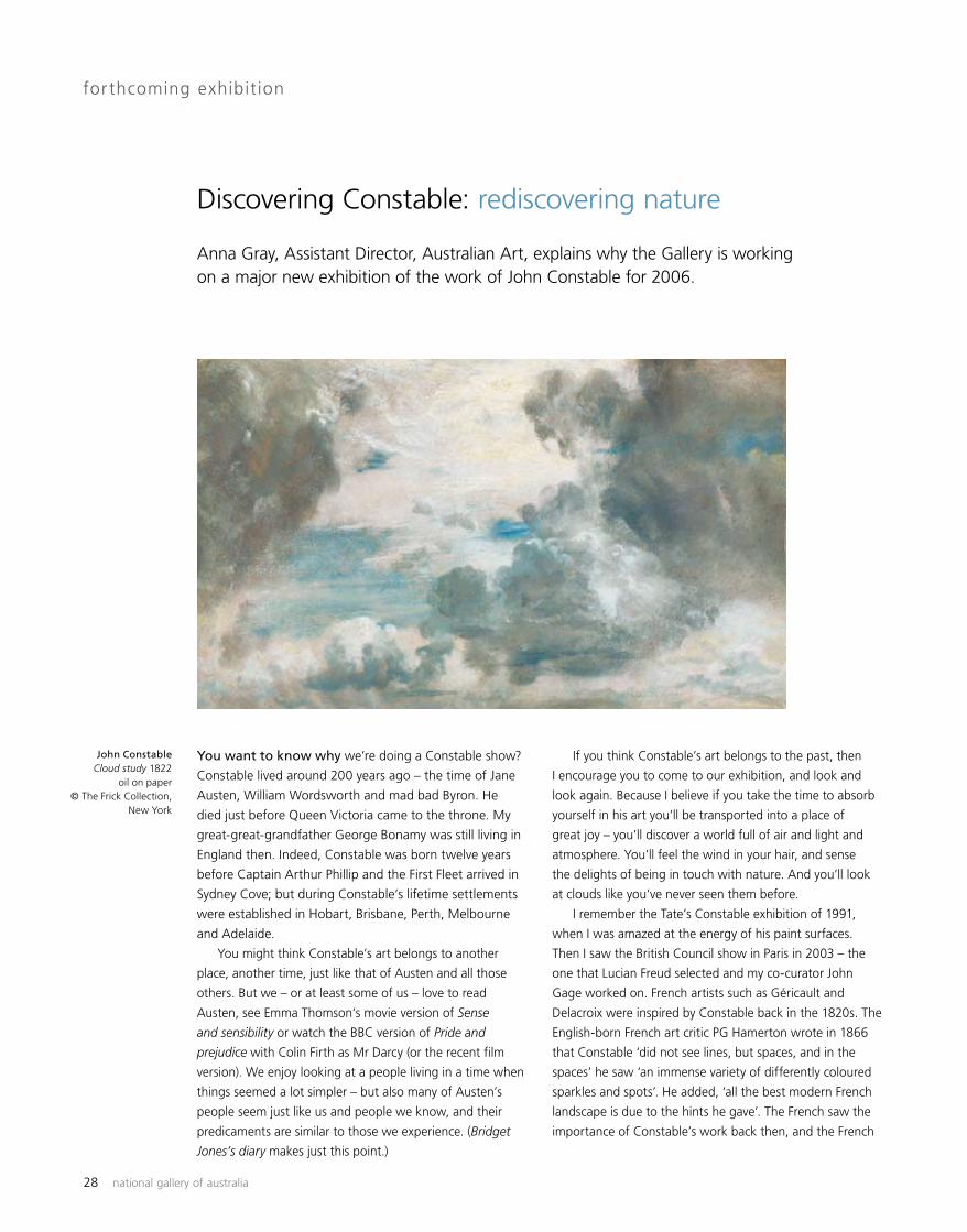
John Constable Cloud study 1822
oil on paper © The Frick Collection,
New York

artonview summer 2005 29
appreciated him in 2003. The Grand Palais exhibition was
a huge success. People loved the big canvases and the way
Constable had painted the full-scale studies for them with
so much energy, but they adored the small impressions
painted en plein air. These were still as fresh as the day they
were painted.
The Paris exhibition inspired us to think about bringing
Constable to Australia. It was about ten years since the
Gallery presented the magnificent Turner exhibition curated
by Michael Lloyd; and there had not been a Constable
exhibition in Australia for thirty years. It was time to show
his work again. So we asked Constable expert John Gage
– who had worked on the Paris exhibition – to join us in
preparing a Constable show for Australia, and the Gallery’s
exhibition manager and designer Adam Worrall and I
began to discuss the scope of the exhibition with John.
We agreed we would focus on Constable as an artist, a
maker of pictures, and select works which emphasised
this. We would select one of his six large paintings of the
Stour Valley and show this in depth – show two versions of
the one work, and other works related to it. The obvious
example was A boat passing a lock 1826; it was the painting
Constable selected to give to the Royal Academy as his
Diploma picture when he was elected Royal Academician
in 1829 – and there was another version of it in the National
Gallery of Victoria. We would look at a number of his plein
air sketches which were so full of life and contributed to
the freshness of his work. We would have a focus on his
innovative cloud studies. We would also look at some of the
copies he made of Claude and Ruisdael and others – as well
as some of the works which Constable painted under the
inspiration of these artists, such as the magnificent Vale of
Dedham 1827–28 from the National Gallery of Scotland, a
work that Constable considered to be one of his best. We
would also look at the mezzotints and how David Lucas
translated Constable’s paintings into mezzotint. At this time
we also discussed how a number of Australian artists had
been influenced by Constable and how we should have a
small accompanying exhibition showing a group of works
by Australian artists which reflected this influence.
John Constable Salisbury Cathedral from the Bishop’s Grounds 1822–23 oil on canvas Victoria & Albert Museum, London

30 national gallery of australia
By pure chance John and I were going to be in London at the same time and we would be able to spend a week together visiting galleries, talking to colleagues about our exhibition and possible loans. We began with the Tate, where John particularly urged the cause of a small painting, Branch Hill Pond, Hampstead Heath, with boy sitting on a bank c. 1825, because it had a similar sky to that which Constable painted in the two horizontal versions of A boat passing a lock. At the Victoria & Albert Museum we argued the case for a large group of works including their magnificent Salisbury Cathedral from the Bishop’s Grounds 1822–23, with the cathedral enclosed within a sylvan vista, and Old Sarum 1834, one of Constable’s rare large exhibition watercolours. John had taught at Cambridge Âfor some years, and knew the Fitzwilliam and its staff well. We wanted to borrow their masterly drawing for A boat passing a lock, and examples from their mezzotint collection – some with annotations by Constable which showed his process of working with his printmaker, Lucas. At the Royal Academy we asked for A boat passing a lock – his large six-foot Diploma picture, which would be the keynote of our exhibition – as well as one of Constable’s small gems, his spectacular sketch Rainstorm over the sea 1824–28. Our colleagues in the various British institutions could not have been more helpful, and after a week of talks we began to think that the exhibition was a real possibility. Back in Australia we refined the list of works which we would request for loan. I began to prepare for my next Constable adventure – a trip to the United States for a month at the Yale Center for British Art on a Fellowship. It was wonderful to meet up again with former Art Gallery of South Australia curator Angus Trumble, who is now Curator of Paintings and Sculpture there. What was particularly
valuable about working with their collection was being able to look at a broad range of Constable’s work in one place – from small intimate plein air sketches to large six-foot paintings. They have country house portraits such as Malvern Hall: the entrance front c. 1820 and images of rural harmony like Ploughing scene in Suffolk (A summerland) 1825; and they have a large group of drawings which includes Landscape with trees and deer, after Claude 1825. Among the many works I looked at, and fell in love with, I think my favourite was Stormy sea, Brighton, 20 July 1828 – a work Constable painted just four months before his wife died from pulmonary tuberculosis on 28 November. It is a small sketch, but huge in its emotion. It is full of energy and vigour, with thickly and quickly applied paint capturing the stormy weather Constable experienced at Brighton, and his own personal turmoil. While in the United States I visited colleagues at the Philadelphia Museum of Fine Art to talk with them about our exhibition. Their paintings include a small early sketch, View towards the rectory, East Bergholt, 30 September 1810, with the red morning sun glowing over and through the fields at East Bergholt. This painting was included in an exhibition of the work of the Barbizon painters a few years ago – to reflect how these artists had admired and been inspired by Constable, and to show how innovative his work was. On my one day in New York en route back to Australia, I visited the Frick Collection where the curatorial staff kindly arranged to show me their two magical cloud studies. Constable’s sky studies are wonderfully observed, recording the time of day, date, wind direction and weather conditions under which they were painted. After viewing these works I went into some of the public rooms there and sat looking at their Constables and thought about what lay behind the magic of his work. Various scholars express a range of views – but for me the answer that afternoon was that Constable managed to capture the air, in a way that no one else has done. People talk about the way in which he captured atmosphere, the dew, the dampness. I think he went even further to convey the air and the breeze. He doesn’t just paint light – although he does magically capture light in the sky, on the ground, glistening on water, and in the trees – he goes further and paints the light and the air in between the leaves, behind the trees. Constable animates the landscape and makes you feel it is alive, and in doing so makes you feel alive. Constable may have lived some time ago in another country, and the world may have changed in many ways – but the clouds still float on high, daffodils still flutter in the breeze, and our hearts can still delight at what we see.
Constable: impressions of land, sea and sky opens Â3 March 2006 in Canberra. Organised by the National Gallery of Australia in partnership with the Museum Âof New Zealand Te Papa Tongarewa. Further information at nga.gov.au/Constable
a
John Constable ÂThe Vale of Dedham 1827–28
oil on canvas © The National Gallery of
Scotland

artonview summer 2005 31
John Mawurndjul is Australia’s foremost bark painter and
also widely acknowledged as one of the country’s leading
contemporary artists, which was confirmed when he was
awarded the prestigious Clemenger Contemporary Art Prize
at the National Gallery of Victoria in 2003.
Mawurndjul’s people are the Kuninjku in western
Arnhem Land, Northern Territory. A member of the
Kurulk clan, Dhuwa/Duwa moiety, Balang subsection,
Mawurndjul has been living and working in his traditional
country at Milmilngkan, an outstation near the larger
settlement of Maningrida since the early 1990s.
Mawurndjul’s early paintings were highly figurative
with representations of Ngalyod, the Rainbow Serpent,
Yawkyawk spirits, animals and ancestral beings, but also
including many more schematic visual references to the
culturally sacred Mardayin ceremonial design. Mardayin
designs were originally painted on young initiates bodies
to indicate their connections to their ancestral homelands,
mapping their country in physical form. As Mawurndjul’s
recent bark paintings and larrikitj [hollow funeral poles]
have become more refined in their intricate detailing, the
Mardayin designs have come to dominate his oeuvre. Still
embedded within these increasingly abstracted Mardayin
forms and gracile lines are sacred stories of law.
The mesmerising visual effect of the thin and delicate
rarrk, uniformly maintained across the whole length
of the bark, is hypnotic and suggests the incredible
ancestral power inherent in Mawurndjul’s art. It reiterates
the power of the ancestral beings who inhabit western
Arnhem Land, demonstrated by Mawurndjul’s masterful
and dynamic arrangement of rarrk [cross-hatching] within
prismatic grids.
Far from settling into a simple signature style his
painting has consistently evolved, showing an immense
degree of innovation. Mawurndjul considers himself to be
an international artist, and wants to see his work exhibited
alongside his peers in major public institutions.
Brenda L Croft Senior Curator, Aboriginal and Torres Strait Islander Art
John MawurndjulKuninjku people, Kurulk clan, Dhuwa/Duwa moiety, Balang subsectionMardayin 2004natural pigments on eucalyptus bark National Gallery of Australia, Canberra
new acquisition Aboriginal and Torres Strait Islander Art
John Mawurndjul Mardayin
a

32 national gallery of australia
When he was three years old Sambandar sat hungry and
crying outside a temple dedicated to the Hindu god Shiva
while his father took a ritual bath. Looking down and
feeling compassion for the child, Shiva’s consort Uma
[Parvati] offered him a bowl of milk from her breast.
On returning, Sambandar’s father was surprised to see
milk dripping from his contented son’s chin, and a golden
bowl beside him. When questioned, Sambandar simply
pointed to an image of Uma and Shiva on the outside
of the temple and began singing their praises.
From that moment Sambandar was devoted to worship.
One of sixty-three Shaivite saints, he spent his life wandering
Tamil Nadu in southern India singing and dancing in honour
of Shiva and Uma. He is credited with composing thousands
of hymns, many of which are still sung.
Sambandar, who lived in the seventh century, was
only eighteen years old when he died and is almost
always depicted as a child. In this sculpture, he is shown
dancing on a lotus base with his right hand raised
towards the source of the heavenly milk.
Images of the child saint are found in most Tamil
temples devoted to Shiva. Portrayed here laden with
jewellery and with his hair elaborately styled, Sambandar
can also be represented as a simply adorned standing
child, an example of which was acquired by the Gallery in
1989. Both Sambandar figures are from the Chola period
(9th–13th century) and were cast in bronze using the lost
wax technique.
From the tenth century, deities were obliged to
participate in public life in much the same way as
human royalty and bronze sculptures, such as this
dancing Sambandar, were periodically paraded through
the streets dressed in rich cloth and draped with floral
garlands.
Melanie EastburnCurator, Asian Art
new acquisition Asian Art
The child-saint Sambandar
Chola dynasty (9th–13th century) Tamil Nadu, India The child-saint Sambandar 12th century bronze National Gallery of Australia, Canberra

artonview summer 2005 33
Pratyangira is a fierce Hindu goddess with the head and
mane of a lion and the voluptuous body of a woman. She
protects her followers from evil forces and is worshipped
in the pursuit of magical powers rather than as an act
of devout spirituality. The goddess has the ability to
grant her devotees victory, can eliminate illness, and is
considered a protector of armies. She can also bestow
the power of flight, as well as the capacity to change size,
read and control minds and create rain. When enraged,
however, she can inflict hardship, destitution, disease
and even death.
Represented here with four arms, Pratyangira has
her right foot raised and appears to wear a garland of
skulls. She beats the rhythm for her dance on the small
drum in her upper right hand while her lower right hand
holds a trident, its prongs unusually pointing towards the
ground. The trident and drum are attributes associated
with the god Shiva and with manifestations of the great
Hindu goddesses, in particular the ferocious goddess
Kali. Pratyangira’s downward-pointing trident suggests
a tantric or mystical origin for the sculpture. In keeping
with this cosmic aspect, the missing lower left hand of
the sculpture would probably have held a severed head
or a bowl made from a skull, into which could be poured
blood or other libations.
Carved from a single block of stone, this sculpture
of Pratyangira was made in the twelfth century in Tamil
Nadu, southern India. Images of the goddess, who flings
the stars into chaos when she shakes her mane, are
extremely rare and the Gallery is delighted to welcome
this impressive sculpture of Pratyangira into the collection.
Melanie EastburnCurator, Asian Art
new acquisition Asian Art
Goddess Pratyangira
Chola dynasty (9th–13th century) Tamil Nadu, India Goddess Pratyangira 12th century stone National Gallery of Australia, Canberra
Chola dynasty (9th–13th century) Tamil Nadu, India Goddess Pratyangira 12th century stone National Gallery of Australia, Canberra
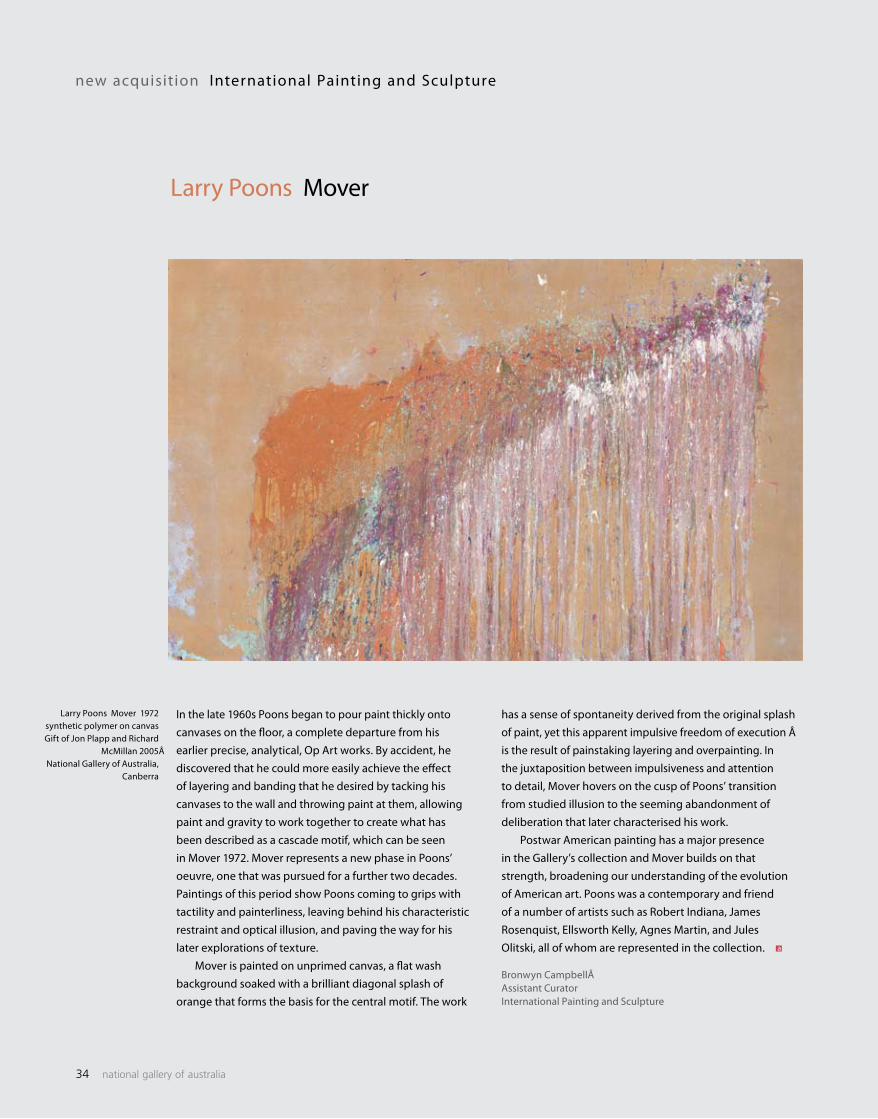
34 national gallery of australia
In the late 1960s Poons began to pour paint thickly onto canvases on the floor, a complete departure from his earlier precise, analytical, Op Art works. By accident, he discovered that he could more easily achieve the effect of layering and banding that he desired by tacking his canvases to the wall and throwing paint at them, allowing paint and gravity to work together to create what has been described as a cascade motif, which can be seen in Mover 1972. Mover represents a new phase in Poons’ oeuvre, one that was pursued for a further two decades. Paintings of this period show Poons coming to grips with tactility and painterliness, leaving behind his characteristic restraint and optical illusion, and paving the way for his later explorations of texture. Mover is painted on unprimed canvas, a flat wash background soaked with a brilliant diagonal splash of orange that forms the basis for the central motif. The work
new acquisition International Painting and Sculpture
Larry Poons Mover
Larry Poons Mover 1972 synthetic polymer on canvas Gift of Jon Plapp and Richard
McMillan 2005 ÂNational Gallery of Australia,
Canberra
has a sense of spontaneity derived from the original splash of paint, yet this apparent impulsive freedom of execution Âis the result of painstaking layering and overpainting. In the juxtaposition between impulsiveness and attention to detail, Mover hovers on the cusp of Poons’ transition from studied illusion to the seeming abandonment of deliberation that later characterised his work. Postwar American painting has a major presence in the Gallery’s collection and Mover builds on that strength, broadening our understanding of the evolution of American art. Poons was a contemporary and friend of a number of artists such as Robert Indiana, James Rosenquist, Ellsworth Kelly, Agnes Martin, and Jules Olitski, all of whom are represented in the collection.
Bronwyn CampbellÂAssistant CuratorInternational Painting and Sculpture
a

artonview summer 2005 35
Bernard Villemot began his professional career as a student at Paul Colin’s graphic design school in Paris and from the 1930s onwards established a reputation as a premier poster designer. Villemot produced some of the most iconic commercial images in the period following the second World War for clients that included the French mineral water Perrier, the shoe manufacturer Bally and, of course, Orangina. He went on to win many major graphic design awards throughout his working life, including the prestigious Martini Prize Gold Medal award, and continued to make posters right up until his death in 1989. Villemot came out of a generation of French graphic designers all of whom were influenced by the great Parisian poster designer Leonetto Cappiello (1875–1942). Cappiello is generally recognised as the father of modern advertising. His revolutionary insight into the art of advertising was built around the psychological phenomenon of image association. We can see this insight playing a central role in many of Villemot’s
new acquisition International Prints, Drawings and Il lustrated Book s
Bernard Villemot Orangina
designs, including Orangina 1983. In an ironic, witty way it also refers to the development of modern painting, in particular the School of Paris, by directly drawing on Matisse’s famous painting La dance 1909–10. Orangina 1983 is one of many designs Villemot produced for this manufacturer. Made from crushed oranges, Orangina was first presented to the world at the Marseille Fair of 1936 by a Spanish chemist named Dr Trigo. Initially marketed in Algeria under the name of Naranjina, the commercial rights to the product were bought by Léon Beton who re-named it Orangina. The drink and its characteristic squat little bottle soon became famous throughout France. Villemot produced his first design for the product in 1952 in an alliance that would last up until his death in 1989. Orangina 1983 is one of Villemot’s most famous works.
Mark Henshaw and Gwen Horsfield (Intern)International Prints, Drawings and Illustrated Books
Bernard Villemot Orangina 1983 lithograph The Poynton Bequest National Gallery of Australia, Canberra
a
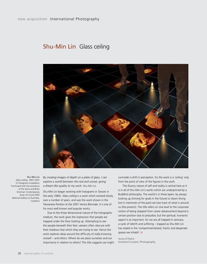
36 national gallery of australia
By creating images of depth on a plate of glass, I can
explore a world between the real and unreal, giving
a dream-like quality to my work. Shu-Min Lin
Shu-Min Lin began working with holograms in Taiwan in
the early 1980s. Glass ceiling is a work which evolved slowly
over a number of years, and was the work shown in the
Taiwanese Pavilion at the 2001 Venice Biennale. It is one of
his most well-known and popular works.
Due to the three-dimensional nature of the holographic
medium, the work gives the impression that people are
trapped under the floor looking up. Attempting to see
the people beneath their feet, viewers often obscure with
their shadows that which they are trying to see. Hence the
work explores ideas around the difficulty of really knowing
oneself – and others. Where do we place ourselves and our
importance in relation to others? The title suggests we might
new acquisition International Photography
Shu-Min Lin Glass ceiling
Shu-Min Lin Glass ceiling 1997–2001 12 holograms installation
Purchased with the assistance of the Gene and Brian
Sherman Contemporary Asian Art Fund 2005
National Gallery of Australia, Canberra
connsider a shift in perception, for the work is a ‘ceiling’ only
from the point of view of the figures in the work.
The illusory nature of self and reality is central here as it
is in all of Shu-Min Lin’s works which are underpinned by a
Buddhist philosophy. The world is in three layers: by always
looking up (striving for goals in the future) or down (living
lost in memories of the past) we lose track of what is around
us (the present). The title refers on one level to the corporate
notion of being stopped from career advancement beyond a
certain position due to prejudice; but the spiritual, humanist
aspect is as important, for we are all trapped in samsara,
a cycle of rebirth and suffering – trapped as Shu-Min Lin
has stated in the ‘compartmentalized, frantic and desperate
spaces we inhabit’.
Anne O’HehirAssistant Curator, Photography
a

artonview summer 2005 37
Photojournalist Robert McFarlane is best known as the
doyen of film and theatre stills photography in Australia
and as a photography critic and writer. Over the past
year he has been reviewing his documentary archive and
Dawn service is from a group of works recently acquired
by the Gallery from the 1960s–70s. Looking through
the images in McFarlane’s archive it was noticeable how
he returned again and again to Anzac Day marches
and subjects that evoked an ‘older’ simpler Australia.
McFarlane has commented that his literate and musical
parents had a strong sense of family and extended
community which translates in his own work to an
empathy with their generation. Yet McFarlane has also
sensitively documented the subcultures of the younger
generation and his own contemporaries, amongst a
new acquisition Australian Photography
Robert McFarlane Dawn service, Anzac Day, Thirroul, NSW
Robert McFarlane Dawn service, Anzac Day, Thirroul, NSW 1978 gelatin silver photograph National Gallery of Australia, Canberra
broader platform of social issues such as a focus on
Indigenous leaders and communities.
Dawn service was a self-elected assignment of
special significance for McFarlane for while he had
photographed many Anzac Days marches he had never
made it to a Dawn service. He was, however, intrigued
by the association with Thirroul on the south coast and
British writer DH Lawrence who spent time in Australia
in a cottage in the seaside hamlet in 1922.
Perhaps it was McFarlane’s own love of words and
writing that made him stay up all night so he wouldn’t miss
the gathering of local veterans on 25th April 1978.
Gael NewtonSenior Curator, Photography
a
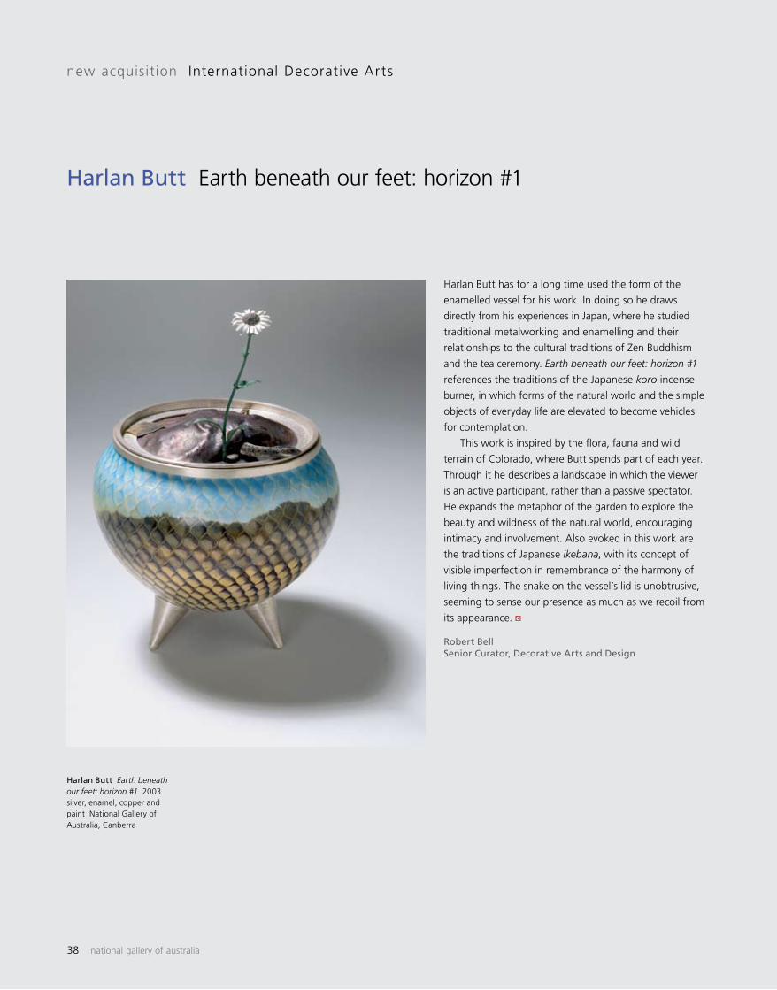
38 national gallery of australia
Harlan Butt has for a long time used the form of the
enamelled vessel for his work. In doing so he draws
directly from his experiences in Japan, where he studied
traditional metalworking and enamelling and their
relationships to the cultural traditions of Zen Buddhism
and the tea ceremony. Earth beneath our feet: horizon #1
references the traditions of the Japanese koro incense
burner, in which forms of the natural world and the simple
objects of everyday life are elevated to become vehicles
for contemplation.
This work is inspired by the flora, fauna and wild
terrain of Colorado, where Butt spends part of each year.
Through it he describes a landscape in which the viewer
is an active participant, rather than a passive spectator.
He expands the metaphor of the garden to explore the
beauty and wildness of the natural world, encouraging
intimacy and involvement. Also evoked in this work are
the traditions of Japanese ikebana, with its concept of
visible imperfection in remembrance of the harmony of
living things. The snake on the vessel’s lid is unobtrusive,
seeming to sense our presence as much as we recoil from
its appearance.
Robert BellSenior Curator, Decorative Arts and Design
new acquisition International Decorative Arts
Harlan Butt Earth beneath our feet: horizon #1
Harlan Butt Earth beneath our feet: horizon #1 2003 silver, enamel, copper and paint National Gallery of Australia, Canberra
a

artonview summer 2005 39
The quizzical looks exchanged by the two central figures
in Bern Emmerichs’ ceramic work Who are you? provide
a humorous insight into the complex history of relations
between Indigenous Australians and Europeans. Both
the title and the semi-naive depiction of the figures
inject an immediacy into historical events, the apparently
light-hearted treatment of which belies the serious
repercussions that are still being felt today.
This imagery captures the early days of contact, before
curiosity turned into mistrust and violence. Emmerichs
depicts the coming together of two very different worlds
by representing these divergent cultures as a collection of
artefacts: the man-made environment populated by grand
residences crowned by flags of ownership on one side; the
didgeridoo, boomerang, spear and sacred places marked
by natural landmarks (Uluru) on the other.
The central figures also characterise these differences:
the wide eyes and questioning face of the Aboriginal is
juxtaposed with the sharp, pale features of the European.
Bern Emmerichs Who are you? 2003 earthenware with underglaze painted decoration National Gallery of Australia, Canberra
new acquisition Australian Decorative Arts
Bern Emmerichs Who are you?
The latter’s bright blue eyes are firmly, though almost
secretly angled towards his neighbour, who in turn stares
into the distance, perhaps trying to discern the future.
It is telling that neither figure looks directly at the other,
leaving each of them to covertly wonder, imagine, and
speculate rather than approach each other openly.
The form is reminiscent of a large meat platter,
commonly exported to Australia from Britain during the
mid-nineteenth century in the early days of the colony.
Along the rim a different kind of history is evoked by
combining animated action figures that recall ancient
Greek vases alongside figures that resemble those
from medieval English tapestries. It is this multiplicity
of references, rendered in Emmerichs’ characteristically
vibrant palette, that have produced an engaging work
which depicts serious themes with a lightness of touch.
Sarah EdgeCuratorial Assistant, Decorative Arts and Design
a
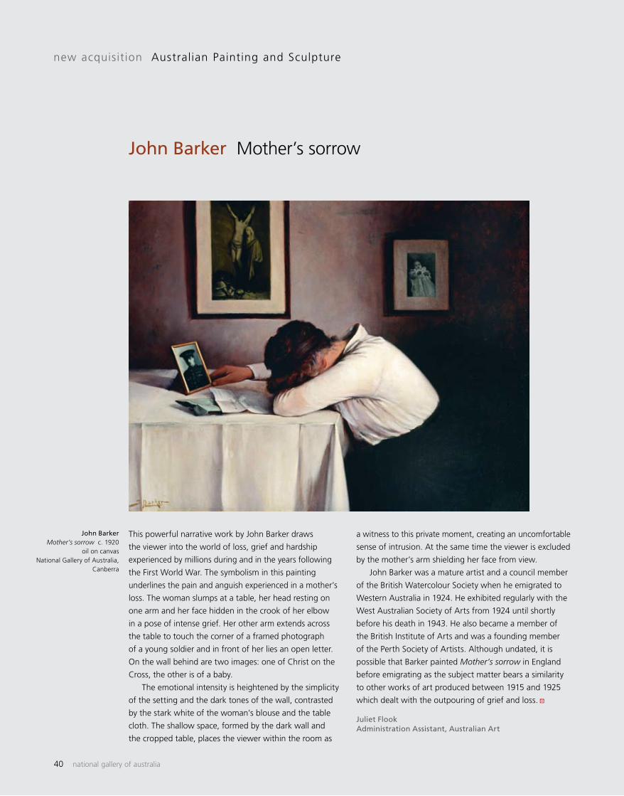
40 national gallery of australia
This powerful narrative work by John Barker draws
the viewer into the world of loss, grief and hardship
experienced by millions during and in the years following
the First World War. The symbolism in this painting
underlines the pain and anguish experienced in a mother’s
loss. The woman slumps at a table, her head resting on
one arm and her face hidden in the crook of her elbow
in a pose of intense grief. Her other arm extends across
the table to touch the corner of a framed photograph
of a young soldier and in front of her lies an open letter.
On the wall behind are two images: one of Christ on the
Cross, the other is of a baby.
The emotional intensity is heightened by the simplicity
of the setting and the dark tones of the wall, contrasted
by the stark white of the woman’s blouse and the table
cloth. The shallow space, formed by the dark wall and
the cropped table, places the viewer within the room as
new acquisition Australian Painting and Sculpture
John Barker Mother’s sorrow
John Barker Mother’s sorrow c. 1920
oil on canvas National Gallery of Australia,
Canberra
a witness to this private moment, creating an uncomfortable
sense of intrusion. At the same time the viewer is excluded
by the mother’s arm shielding her face from view.
John Barker was a mature artist and a council member
of the British Watercolour Society when he emigrated to
Western Australia in 1924. He exhibited regularly with the
West Australian Society of Arts from 1924 until shortly
before his death in 1943. He also became a member of
the British Institute of Arts and was a founding member
of the Perth Society of Artists. Although undated, it is
possible that Barker painted Mother’s sorrow in England
before emigrating as the subject matter bears a similarity
to other works of art produced between 1915 and 1925
which dealt with the outpouring of grief and loss.
Juliet FlookAdministration Assistant, Australian Art
a
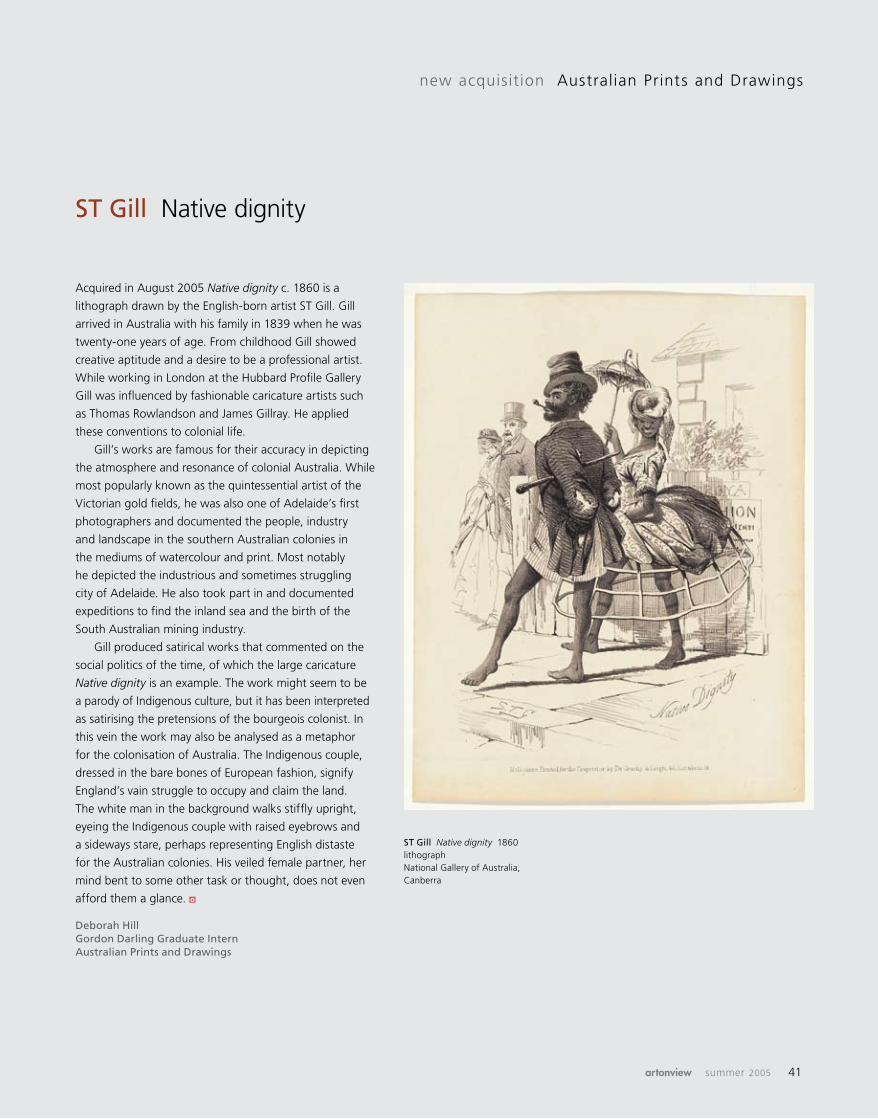
artonview summer 2005 41
Acquired in August 2005 Native dignity c. 1860 is a
lithograph drawn by the English-born artist ST Gill. Gill
arrived in Australia with his family in 1839 when he was
twenty-one years of age. From childhood Gill showed
creative aptitude and a desire to be a professional artist.
While working in London at the Hubbard Profile Gallery
Gill was influenced by fashionable caricature artists such
as Thomas Rowlandson and James Gillray. He applied
these conventions to colonial life.
Gill’s works are famous for their accuracy in depicting
the atmosphere and resonance of colonial Australia. While
most popularly known as the quintessential artist of the
Victorian gold fields, he was also one of Adelaide’s first
photographers and documented the people, industry
and landscape in the southern Australian colonies in
the mediums of watercolour and print. Most notably
he depicted the industrious and sometimes struggling
city of Adelaide. He also took part in and documented
expeditions to find the inland sea and the birth of the
South Australian mining industry.
Gill produced satirical works that commented on the
social politics of the time, of which the large caricature
Native dignity is an example. The work might seem to be
a parody of Indigenous culture, but it has been interpreted
as satirising the pretensions of the bourgeois colonist. In
this vein the work may also be analysed as a metaphor
for the colonisation of Australia. The Indigenous couple,
dressed in the bare bones of European fashion, signify
England’s vain struggle to occupy and claim the land.
The white man in the background walks stiffly upright,
eyeing the Indigenous couple with raised eyebrows and
a sideways stare, perhaps representing English distaste
for the Australian colonies. His veiled female partner, her
mind bent to some other task or thought, does not even
afford them a glance.
Deborah HillGordon Darling Graduate InternAustralian Prints and Drawings
new acquisition Australian Prints and Drawings
ST Gill Native dignity
ST Gill Native dignity 1860 lithograph National Gallery of Australia, Canberra
a

42 national gallery of australia
In our busy twenty-first century lives, it is not surprising
that the idea of slowing things down is deeply appealing.
In the search for greater meaning in our lives, art has the
capacity to slow us down in our tracks if we are open to
its enchantments. If we contemplate a number of new
contemporary acquisitions currently on display in the
Australian galleries we will come to discover a sense of
space and time – and indeed enchantment – that is not
only experiential for the viewer but imbedded in the works
themselves.
Take, for example, Savanhdary Vongpoothorn’s major
recent work Incantation 2005 painted on perforated
canvas. In this work, delicate red threads of paint weave
and loop around hundreds of perforations and across veils
and bands of luminous green and yellow. The piercings,
The magic of slow time: contemporary works on display in the Australian galleries
collection focus
methodically applied over the surface, are as important
as the marks themselves: they create a sense of air, of
transparency and lightness, in tandem with the fluidity
of the inscriptions. The cumulative effect of the rhythmic
patterns is akin to a chant – at once meditative and
mesmerising.
The idea of chanting and repetition is integral to
Vongpoothorn’s Incantation, which is not hurried in its
physical making or in its conception. As an artist who
was born in Laos in 1971, migrating with her parents to
Australia at the age of eight, Vongpoothorn has a rich
cultural heritage to draw upon. The artist points out that
for her home is not about nostalgia for a geographical
place but instead about her connection with family in
Australia. In Incantation the emphasis on repetition and
Savanhdary Vongpoothorn Incantation 2005
synthetic polymer paint on perforated canvas
National Gallery of Australia, Canberra
Courtesy Martin Browne Fine Art
Brent Harris Plato’s cave: painting no. 4
2005 oil on linen
National Gallery of Australia, Canberra
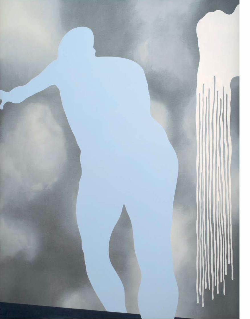
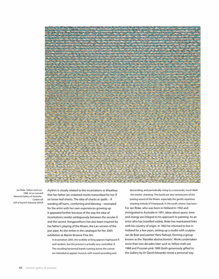
44 national gallery of australia
rhythm is closely related to the incantations or khaathaa that her father (an ordained monk) transcribed for her Âon loose-leaf sheets. The idea of chants or spells – Âwarding off harm, comforting and blessing – resonated for the artist with her own experiences growing up. It appealed further because of the way the idea of incantations resides ambiguously between the secular Âand the sacred. Vongpoothorn has also been inspired by her father’s playing of the Khaen, the Lao version of the pan pipe. As she writes in the catalogue for her 2005 exhibition at Martin Browne Fine Art:
In Incantation 2005, the scribbly writing appears haphazard Â
and random, but the process is actually very controlled. Â
The receding horizontal bands running across the canvas
are intended to appear musical, with sound ascending and
descending, and periodically rising to a crescendo, much likeÂ
the monks’ chanting. The bands are also reminiscent of the
pulsing sound of the Khaen, especially the gentle repetitive
chanting melody of Champasak, in the south, where I was born.
For Jan Riske, who was born in Holland in 1932 and immigrated to Australia in 1951, ideas about space, time and energy are integral to his approach to painting. As an artist who has travelled widely, Riske has maintained links with his country of origin. In 1962 he returned to live in Holland for a few years, setting up a studio with sculptor Jan de Baat and painter Hans Nahuijs, forming a group known as the ‘Barokke abstractionists’. Works undertaken more than two decades later such as Yellow melt out 1988 and Prussian pink 1989 (both generously gifted to the Gallery by Dr David Edwards) reveal a personal way
Jan Riske Yellow melt out 1988 oil on canvas Â
National Gallery of Australia, CanberraÂ
Gift of David K Edwards 2005Â
artonview summer 2005 45
of working: sumptuous in their richly textured, layered surfaces; rigorous in their meticulous construction; open to interpretation. For Riske, the works have evolved in part through his contemplation of the energy underlying all things and his feeling for precision within the apparent randomness of the world. As he notes on his website:
We are living in a technically complex world … I realise that
basically I am a particle painter. I see everything as particles;
everything’s atomic anyway … When you look at the
painting you feel that energy: every particle is in just the right
place. The composition has to be completely exact … Every
particle I put down is done just once, nothing is repeated.
When my brush dips into the paint, the colour has to be
graded, so therefore I have to start from a fixed point of
departure … My paintings not only refer to energy but also
to different layers of perception.
While Riske believes that the Impressionists revealed new ways of perceiving the world through fragmented light and colour, and while his works recall the precision of Pointillism and the abstract rigour of the De Stijl group, he is less concerned with ‘isms’ than with finding ways of working that correspond with his own experiences of the world. In a sense, his perception is guided as much by nature as by the particles and units of the ‘computer age’. As we take the time to contemplate the works we may think of flickering pixilated screens or abstract patterns made by formations of flocks of birds seen from a distance swirling from dark to light. Alternatively, we may consider the archaeological layers of the paintings that could almost be relief sculptures, or we may delight in the artist’s sensitivity to colour in Yellow melt out, with its subtle unfolding gradations, and Prussian pink which shifts from deep tonalities to shimmering luminosity. In contrast to the richly textured surfaces of Riske’s works, Brent Harris’s Plato’s cave: painting no. 4 2005 has a seamlessness that looks as smooth as a pebble washed time and again by the tides. Yet both artists work in ways that are contemplative and attuned to the need for unhurried time. Both have evolved a highly personal, philosophical approach. For while Harris’s earlier work has been informed by Colin McCahon and American abstract artists such as Barnett Newman, he has gradually developed distinctive ways of working that have come through personal experience. Born in New Zealand in 1956, Harris came to Australia in 1981. painting no. 4 is part of a series titled Plato’s cave, begun while the artist was undertaking a residency in Singapore with the Tyler Print Institute. As he said: ‘Several works I was working on contained images that suggest shadows … When I was back in Melbourne thinking about a new series of paintings, the thought of shadows
resurfaced.’ This led him back to a series of drawings that he had undertaken of the model drawn from life. Another springboard was the text Allegory of the cave from Plato’s Republic, although the artist points out that the images in the series are not intended to illustrate the title. Instead, the text and imagery evoked ideas about the nature of perception and the way that a shadow or silhouette can stand in for the figure but carries only limited information about its source. Plato’s cave: painting no. 4 is an immensely subtle, thought-provoking work in which the shadow of a male figure, rendered in a pale almost translucent blue, rises up and appears to be on the verge of walking out of the picture frame. The ground on which this shadow-man is located is among the most numinous of any of the artist’s works – a cloud-like mass against a dark velvety black that adds to the floating, dream-like feel of the whole. Against the precision of the outlines is a contradictory spill: forms moving out, trailing down, casting a shimmer. The distortion of the figure is deliberate, recalling the ambiguous nature of cast shadows, allowing the viewer to project their own imaginings onto the work. The figure emerged two years after Harris painted the background. As he wrote in notes accompanying his 2005 exhibition at Tolarno Galleries:
So after nearly a two-year wait this massive figure now
appeared set for this canvas … The large hip appears to me
to be of an older body, I like this. He is moving into the space
… at this point I added the wedge at the bottom. I felt the
figure needed anchoring, to accentuate the movement and
… balance … moving into the void.
These intriguing works by Brent Harris, Jan Riske and Savanhdary Vongpoothorn represent striking recent acquisitions currently on display. They have been created with care and consideration and in turn require and reward time from the viewer to observe and contemplate. By taking time out to slow down with these works, it is possible to enter into the subtle layers of perception and evocative associations that each of the artists have offered us in their distinctive ways. We may, for example, recall the rhythmic chanting of Buddhist monks in Vongpoothorn’s Incantation; the vibrating interactions between the microcosm and the macrocosm in Riske’s precise, densely layered paintings; the interplay between substance and shadow in the enchanting ambiguities of Harris’s Plato’s cave: painting no. 4. ÂTake the time and enjoy.
Deborah HartSenior Curator, Australian Painting and Sculpture
a
46 national gallery of australia
Darwin Art-port
In November this year the first major retrospective
exhibition of Aboriginal artist David Malangi opened
in Darwin, the capital of the Northern Territory. Its
presence is surely a sign of the beauty, depth, diversity,
and resilience of Aboriginal culture’s many forms that are
engrained in Darwin’s history. There is an irony possibly
lost on colonial bureaucrats in the naming of this northern
outpost after the author of ‘the survival of the fittest’,
Charles Darwin, on the land of one of the oldest surviving
races in the world. Darwin the town, built on the land
owned by the Larrakia people, a place where cultures
have met, clashed, recoiled, intermingled and blended
within a vibrant Aboriginal subculture, is marked by the
crossings of this black–white divide. Darwin has always
been a port for many exotic things – pearls, fish, buffalo
hides, crocodile skins, beef, and minerals of all kinds – but
who would have thought it would become an export site
for Aboriginal culture, ideas, and intellectual and spiritual
property?
I met Jack Mirritji [dec.] and some other men at Gumugumuk on
Cape Stewart and I went with them to Darwin by foot for the
second time … In Darwin I stayed with my friends at Bagot like
Ray Munyal [dec.]. I worked with Ray at Qantas under a Balanda
called Frank Astiville (?). Yeah, we living together at Bagot
compound then we shifting from Bagot to Berimah where there
was a compound. Bulany Gaykamangu [dec.], artist
While still young and single, Malangi came and lived here
in the 1950s. Although numbers of Aboriginal people,
who are now called Arnhem Land Yolngu, spent time here
before the Second World War it was during the war period
and into the 1950s that Darwin became ‘downtown
From Darwin they go, to Adelaide, to Sydney, everywhere, even America. They travel all over the world these bark paintings from Arnhem Land. Brian Nyinawanga, artist
Djon Mundine, independent Aboriginal curator, writer and former art advisor in central Arnhem Land during the 1980s and 1990s, writes about the place of Aboriginal art in Darwin on the occasion of the return of one of its most notable art exports in the exhibition No ordinary place: the art of David Malangi, currently showing at the Museum and Art Gallery of the Northern Territory.
central’ for Aboriginal people from right across the top
of the Northern Territory. Here they experienced the best
and worst of both cultures. Many had been moved there
or just outside the town during the war; so many that in
1949, in order to slow down this migration and return
stranded Yolngu, patrol officer Syd Kyle-Little arranged
voluntary boat return for people of the Liverpool River
area. Here he set up a ‘trading post’ to entice them to
remain. A stream of others, mainly young men, made the
sojourn of searching and discovery. Travelling with few
or no possessions and no clear aims, they survived by
various means including government rations and itinerant
work – a struggle between personal dignity and just plain
survival. Darwin was the place where the regional ‘stolen
generation’ were sent and where Aboriginal lepers were
quarantined. For visitors, it was a place for court, for
hospital, to die, to escape, for drink, for church, for school,
for meetings, for football, for exhibition, for adventure,
and a place to live.
One day I got hurt off a horse and went to Darwin to hospital.
I got a job at Qantas then the airport in Darwin. Me and Wally
[dec.] and Brian [Nyinawanga] and Jacky [a Kunwinjku man]
– we bin working there – a lot of people [from] Milingimbi,
Maningrida. Some worked at the Air Force getting training,
some at Qantas. I was living near the airport, near Bagot
[Aboriginal Reserve]. Jimmy Moduk, artist
When cultures collide, traditions can be swept away,
languages lost and laws challenged; but they can also be
clung to with a tenacity that is just short of miraculous. For
Yolngu it was a curious life here; by day mixing with white
Australians and living in their world and by night carrying
travelling exhibitions
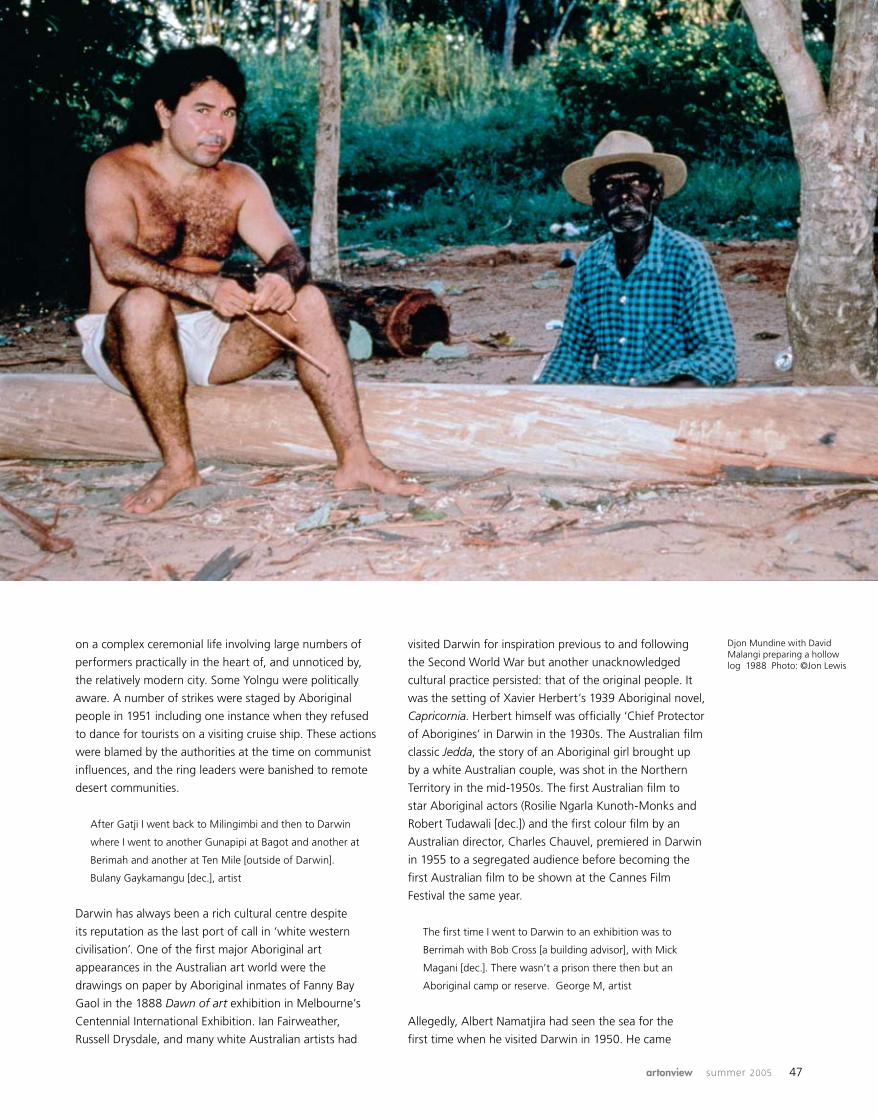
artonview summer 2005 47
on a complex ceremonial life involving large numbers of
performers practically in the heart of, and unnoticed by,
the relatively modern city. Some Yolngu were politically
aware. A number of strikes were staged by Aboriginal
people in 1951 including one instance when they refused
to dance for tourists on a visiting cruise ship. These actions
were blamed by the authorities at the time on communist
influences, and the ring leaders were banished to remote
desert communities.
After Gatji I went back to Milingimbi and then to Darwin
where I went to another Gunapipi at Bagot and another at
Berimah and another at Ten Mile [outside of Darwin].
Bulany Gaykamangu [dec.], artist
Darwin has always been a rich cultural centre despite
its reputation as the last port of call in ‘white western
civilisation’. One of the first major Aboriginal art
appearances in the Australian art world were the
drawings on paper by Aboriginal inmates of Fanny Bay
Gaol in the 1888 Dawn of art exhibition in Melbourne’s
Centennial International Exhibition. Ian Fairweather,
Russell Drysdale, and many white Australian artists had
visited Darwin for inspiration previous to and following
the Second World War but another unacknowledged
cultural practice persisted: that of the original people. It
was the setting of Xavier Herbert’s 1939 Aboriginal novel,
Capricornia. Herbert himself was officially ‘Chief Protector
of Aborigines’ in Darwin in the 1930s. The Australian film
classic Jedda, the story of an Aboriginal girl brought up
by a white Australian couple, was shot in the Northern
Territory in the mid-1950s. The first Australian film to
star Aboriginal actors (Rosilie Ngarla Kunoth-Monks and
Robert Tudawali [dec.]) and the first colour film by an
Australian director, Charles Chauvel, premiered in Darwin
in 1955 to a segregated audience before becoming the
first Australian film to be shown at the Cannes Film
Festival the same year.
The first time I went to Darwin to an exhibition was to
Berrimah with Bob Cross [a building advisor], with Mick
Magani [dec.]. There wasn’t a prison there then but an
Aboriginal camp or reserve. George M, artist
Allegedly, Albert Namatjira had seen the sea for the
first time when he visited Darwin in 1950. He came
Djon Mundine with David Malangi preparing a hollow log 1988 Photo: ©Jon Lewis
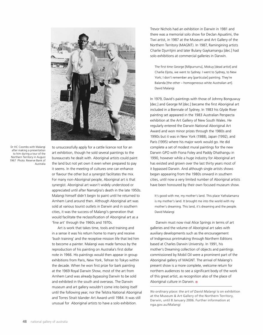
48 national gallery of australia
to unsuccessfully apply for a cattle licence not for an
art exhibition, though he sold several paintings to the
bureaucrats he dealt with. Aboriginal artists could paint
the land but not yet own it even when prepared to pay
it seems. In the meeting of cultures one can enhance
or flavour the other but a synergist facilitates the mix.
For many non-Aboriginal people, Aboriginal art is that
synergist. Aboriginal art wasn’t widely understood or
appreciated until after Namatjira’s death in the late 1950s.
Malangi himself didn’t begin to paint until he returned to
Arnhem Land around then. Although Aboriginal art was
sold at various tourist outlets in Darwin and in southern
cities, it was the success of Malangi’s generation that
would facilitate the reclassification of Aboriginal art as a
‘fine art’ through the 1960s and 1970s.
Art is work that takes time, tools and training and
in a sense it was his return home to marry and receive
‘bush training’ and the receptive mission life that led him
to become a painter. Malangi was made famous by the
reproduction of his painting on Australia’s first dollar
note in 1966. His paintings would then appear in group
exhibitions from Paris, New York, Tehran to Tokyo within
the decade. When he won first prize for bark painting
at the 1969 Royal Darwin Show, most of the art from
Arnhem Land was already bypassing Darwin to be sold
and exhibited in the south and overseas. The Darwin
museum and art gallery wouldn’t come into being itself
until the following year, nor the Telstra National Aboriginal
and Torres Strait Islander Art Award until 1984. It was still
unusual for Aboriginal artists to have a solo exhibition.
Trevor Nichols had an exhibition in Darwin in 1981 and
there was a memorial solo show for Declan Apuatimi, the
Tiwi artist, in 1987 at the Museum and Art Gallery of the
Northern Territory (MAGNT). In 1987, Ramingining artists
Charlie Djurritjini and later Bulany Gaykamangu [dec.] had
solo exhibitions at commercial galleries in Darwin.
The first time George [Milpurrurru], Mokuy [dead artist] and
Charlie Djota, we went to Sydney. I went to Sydney, to New
York; I don’t remember any [particular] painting. They’re
Balanda [the other – homogeneous white Australian art].
David Malangi
In 1979, David’s paintings with those of Johnny Bonguwuy
[dec.] and George M [dec.] became the first Aboriginal art
included in a Biennale of Sydney. In 1983 his Glyde River
painting set appeared in the 1983 Australian Perspecta
exhibition at the Art Gallery of New South Wales. He
regularly entered the Darwin National Aboriginal Art
Award and won minor prizes through the 1980s and
1990s but it was in New York (1988), Japan (1992), and
Paris (1995) where his major work would go. He did
complete a set of modest mural paintings for the new
Darwin GPO with Fiona Foley and Paddy Dhathangu in
1990, however while a huge industry for Aboriginal art
has existed and grown over the last thirty years most of
it bypassed Darwin. And although single artists shows
began appearing from the 1980s onward in southern
cities, until now a very limited number of Aboriginal artists
have been honoured by their own focused museum show.
It’s good with me, my mother’s land. This place Yathalamarra
is my mother’s land. It brought me into the world with my
mother’s dreaming. This land, it’s dreaming and the people.
David Malangi
Darwin must now rival Alice Springs in terms of art
galleries and the volume of Aboriginal art sales with
auxiliary developments such as the encouragement
of Indigenous printmaking through Northern Editions
based at Charles Darwin University. In 1991, his
mother’s Dreaming collection of objects and paintings
commissioned by Mobil Oil were a prominent part of the
Aboriginal gallery of MAGNT. The arrival of Malangi’s
present show is a more complete, welcome return for
northern audiences to see a significant body of the work
of this great artist, as recognition also of the place of
Aboriginal culture in Darwin.
No ordinary place: the art of David Malangi is on exhibition at the Museum & Art Gallery of the Northern Territory, Darwin, until 8 January 2006. Further information at nga.gov.au/Malangi
Dr HC Coombs with Malangi after making a presentation to him during a tour of the
Northern Territory in August 1967 Photo: Reserve Bank of
Australia
a
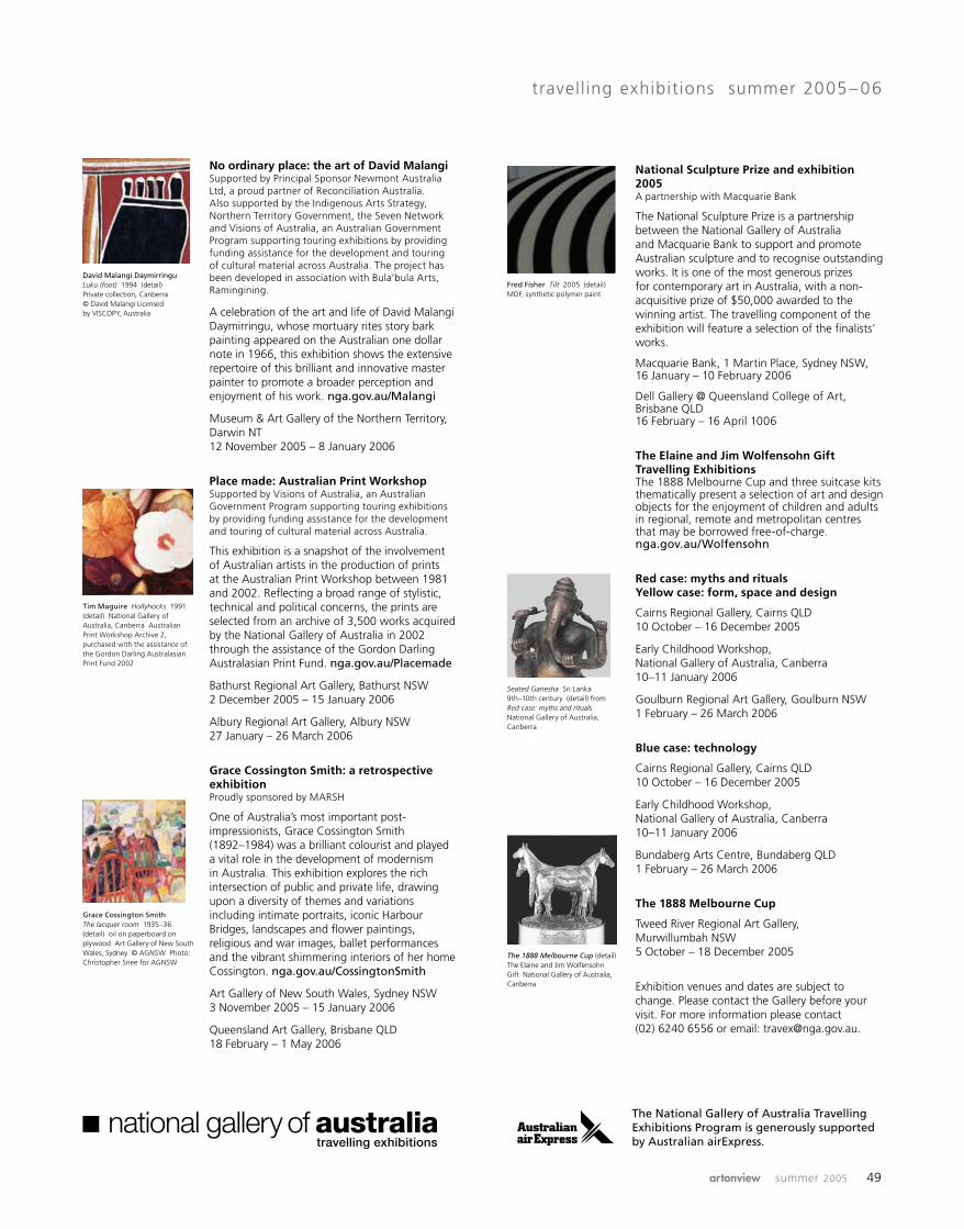
artonview summer 2005 49
No ordinary place: the art of David Malangi Supported by Principal Sponsor Newmont Australia Ltd, a proud partner of Reconciliation Australia. Also supported by the Indigenous Arts Strategy, Northern Territory Government, the Seven Network and Visions of Australia, an Australian Government Program supporting touring exhibitions by providing funding assistance for the development and touring of cultural material across Australia. The project has been developed in association with Bula’bula Arts, Ramingining.
A celebration of the art and life of David Malangi Daymirringu, whose mortuary rites story bark painting appeared on the Australian one dollar note in 1966, this exhibition shows the extensive repertoire of this brilliant and innovative master painter to promote a broader perception and enjoyment of his work. nga.gov.au/Malangi
Museum & Art Gallery of the Northern Territory, Darwin NT 12 November 2005 – 8 January 2006
Place made: Australian Print Workshop Supported by Visions of Australia, an Australian Government Program supporting touring exhibitions by providing funding assistance for the development and touring of cultural material across Australia.
This exhibition is a snapshot of the involvement of Australian artists in the production of prints at the Australian Print Workshop between 1981 and 2002. Reflecting a broad range of stylistic, technical and political concerns, the prints are selected from an archive of 3,500 works acquired by the National Gallery of Australia in 2002 through the assistance of the Gordon Darling Australasian Print Fund. nga.gov.au/Placemade
Bathurst Regional Art Gallery, Bathurst NSW 2 December 2005 – 15 January 2006
Albury Regional Art Gallery, Albury NSW 27 January – 26 March 2006
Grace Cossington Smith: a retrospective exhibition Proudly sponsored by MARSH
One of Australia’s most important post-impressionists, Grace Cossington Smith (1892–1984) was a brilliant colourist and played a vital role in the development of modernism in Australia. This exhibition explores the rich intersection of public and private life, drawing upon a diversity of themes and variations including intimate portraits, iconic Harbour Bridges, landscapes and flower paintings, religious and war images, ballet performances and the vibrant shimmering interiors of her home Cossington. nga.gov.au/CossingtonSmith
Art Gallery of New South Wales, Sydney NSW 3 November 2005 – 15 January 2006
Queensland Art Gallery, Brisbane QLD 18 February – 1 May 2006
travelling exhibitions summer 2005– 06
National Sculpture Prize and exhibition 2005 A partnership with Macquarie Bank
The National Sculpture Prize is a partnership between the National Gallery of Australia and Macquarie Bank to support and promote Australian sculpture and to recognise outstanding works. It is one of the most generous prizes for contemporary art in Australia, with a non-acquisitive prize of $50,000 awarded to the winning artist. The travelling component of the exhibition will feature a selection of the finalists’ works.
Macquarie Bank, 1 Martin Place, Sydney NSW, 16 January – 10 February 2006
Dell Gallery @ Queensland College of Art, Brisbane QLD 16 February – 16 April 1006
The Elaine and Jim Wolfensohn Gift Travelling Exhibitions The 1888 Melbourne Cup and three suitcase kits thematically present a selection of art and design objects for the enjoyment of children and adults in regional, remote and metropolitan centres that may be borrowed free-of-charge. nga.gov.au/Wolfensohn
Red case: myths and rituals Yellow case: form, space and design
Cairns Regional Gallery, Cairns QLD 10 October – 16 December 2005
Early Childhood Workshop, National Gallery of Australia, Canberra 10–11 January 2006
Goulburn Regional Art Gallery, Goulburn NSW 1 February – 26 March 2006
Blue case: technology
Cairns Regional Gallery, Cairns QLD 10 October – 16 December 2005
Early Childhood Workshop, National Gallery of Australia, Canberra 10–11 January 2006
Bundaberg Arts Centre, Bundaberg QLD 1 February – 26 March 2006
The 1888 Melbourne Cup
Tweed River Regional Art Gallery, Murwillumbah NSW 5 October – 18 December 2005
Exhibition venues and dates are subject to change. Please contact the Gallery before your visit. For more information please contact (02) 6240 6556 or email: [email protected].
Tim Maguire Hollyhocks 1991 (detail) National Gallery of Australia, Canberra Australian Print Workshop Archive 2, purchased with the assistance of the Gordon Darling Australasian Print Fund 2002
David Malangi Daymirringu Luku (foot) 1994 (detail) Private collection, Canberra © David Malangi Licensed by VISCOPY, Australia
Grace Cossington Smith The lacquer room 1935–36 (detail) oil on paperboard on plywood Art Gallery of New South Wales, Sydney © AGNSW Photo: Christopher Snee for AGNSW
Seated Ganesha Sri Lanka 9th–10th century (detail) from Red case: myths and rituals National Gallery of Australia, Canberra
The 1888 Melbourne Cup (detail) The Elaine and Jim Wolfensohn Gift National Gallery of Australia, Canberra
Fred Fisher Tilt 2005 (detail) MDF, synthetic polymer paint
The National Gallery of Australia Travelling Exhibitions Program is generously supported by Australian airExpress.
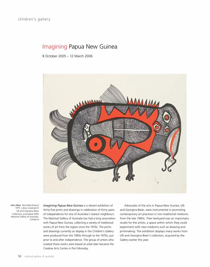
50 national gallery of australia
Imagining Papua New Guinea is a vibrant exhibition of
thirty-five prints and drawings in celebration of thirty years
of independence for one of Australia’s nearest neighbours.
The National Gallery of Australia has had a long association
with Papua New Guinea, collecting a variety of traditional
works of art from the region since the 1970s. The prints
and drawings currently on display in the Children’s Gallery
were produced from the 1960s through to the 1970s, just
prior to and after independence. The group of artists who
created these works were based at what later became the
Creative Arts Centre in Port Moresby.
children’s gallery
Imagining Papua New Guinea
Advocates of the arts in Papua New Guinea, Ulli
and Georgina Beier, were instrumental in promoting
contemporary art practices in non-traditional mediums
from the late 1960s. Their backyard was an impromptu
studio for the artists, a space within which they could
experiment with new mediums such as drawing and
printmaking. The exhibition displays many works from
Ulli and Georgina Beier’s collection, acquired by the
Gallery earlier this year.
8 October 2005 – 12 March 2006
John Man Not titled [Insect] 1975 colour screenprint Ulli and Georgina Beier
Collection, purchased 2005 National Gallery of Australia,
Canberra
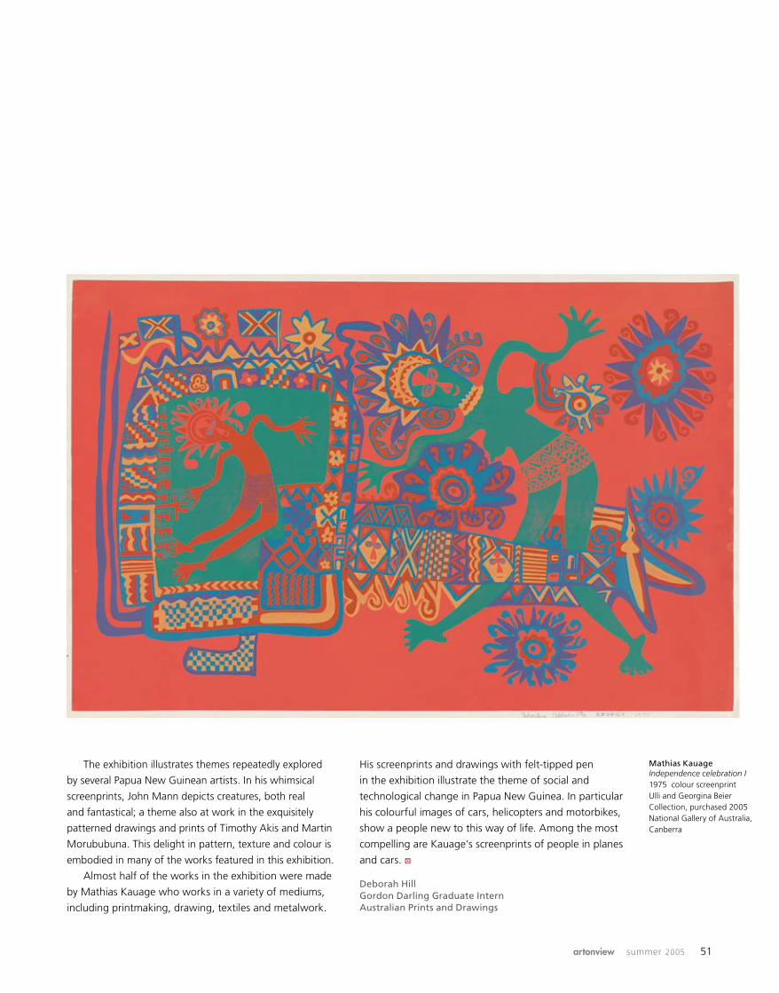
artonview summer 2005 51
Mathias Kauage Independence celebration I 1975 colour screenprint Ulli and Georgina Beier Collection, purchased 2005 National Gallery of Australia, Canberra
The exhibition illustrates themes repeatedly explored
by several Papua New Guinean artists. In his whimsical
screenprints, John Mann depicts creatures, both real
and fantastical; a theme also at work in the exquisitely
patterned drawings and prints of Timothy Akis and Martin
Morububuna. This delight in pattern, texture and colour is
embodied in many of the works featured in this exhibition.
Almost half of the works in the exhibition were made
by Mathias Kauage who works in a variety of mediums,
including printmaking, drawing, textiles and metalwork.
His screenprints and drawings with felt-tipped pen
in the exhibition illustrate the theme of social and
technological change in Papua New Guinea. In particular
his colourful images of cars, helicopters and motorbikes,
show a people new to this way of life. Among the most
compelling are Kauage’s screenprints of people in planes
and cars.
Deborah HillGordon Darling Graduate InternAustralian Prints and Drawings
a

52 national gallery of australia
By 1999, the era of the ‘collectable’ photograph had
arrived, resulting in record prices of $100,000 or even
one million dollars for a photograph. Despite years of
great support from the Philip Morris Arts Grant, Kodak
Australasia, and Nikon, it was clear that the Gallery
needed to call on a wider range of corporate and
private benefactors. To this end, the National Gallery
of Australia Photography Fund was established with a
donation of $250,000 from photography collector Dr
Peter Farrell, the Australian founder and CEO of ResMed,
with its headquarters in San Diego, California. The
launch event was held in Paddington in August 1999
at the photography gallery of Sandra Byron who had
effected the introduction to Dr Farrell – one of her clients.
Founding donations were received from Bryce and Benita
Courtenay, Maria Cutufia, Ian Dodd, Dr Ruth Edwards,
Michael Harris, Tim Hixson, Ann Lewis AM, Robert
McFarlane, Matthew May, Kim Yow, Marg Thorne and
Michael Stephenson.
Dr Farrell served as a National Gallery of Australia
council member from 2001–04 and provided further
support for the David Moore retrospective in 2003 as well
as other Gallery programs and painting acquisitions. He
recently described his approach to collecting as ‘pretty
eclectic, really … I’m a collector of what I like and I like
photography in particular’. And how he got started was:
I was living in Japan and got introduced to woodblocks
and silkscreens in 1984 and, over a period of a year,
bought several good examples of each. When I returned to
The National Gallery of Australia Foundation
The National Gallery of Australia Photography Fund
Sydney in 1985 I caught up with Peter Elliston [a landscape
photographer, whose work is represented in the Gallery’s
collection] … and told him I wanted to get some good
wall hangings; he introduced me to photography and I was
hooked. I bought quite a few from Peter and then ended
up with the largest private collection of his work. But I have
amassed a reasonable collection from Karsh, Penn, Leonard,
Doisneau, Adams, Cunningham, Weston, Sugimoto, Brandt,
Cartier-Bresson, Struth, Horst, Dora Maar, Brecht to Uelsmann
and so on. And I have a McFarlane with another to come and,
of course, Moores, Dupains (Max and Rex), Levers, Mili and
so on as well as some California photographers, like Robert
Turner and Watanabe.
The first targets for Farrell Family Foundation funds
were three mid-nineteenth-century photographs –
‘mammoth’ plates from negatives over 17 x 19 inches –
by American landscape photographer Carleton Watkins,
French architectural photographer Edouard-Dennis Baldus
and British travel photographer Francis Frith. At the other
end of the scale we also acquired a number of exquisite
mid-nineteenth-century daguerreotype and ambrotype
portraits.
Farrell funds were used to acquire several advertising
photographs and a modernist form study by Anton Bruehl,
an pioneer in advertising and colour photography working
Dr Peter Farrell AM and Fiona Tudor with Council Chairman
Harold Mitchell AO at the Gallery in September 2001.
Farrell Family Foundation donation acquisitions are on
display on the wall behind
Anton Bruehl Porgy and Bess 1942
Gasparcol silver-dye bleach photograph Purchased 2000 National Gallery of Australia
Photography Fund: Farrell Family Foundation Donation
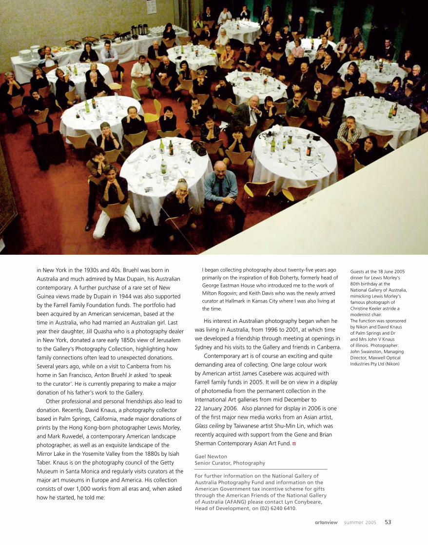
artonview summer 2005 53
in New York in the 1930s and 40s. Bruehl was born in
Australia and much admired by Max Dupain, his Australian
contemporary. A further purchase of a rare set of New
Guinea views made by Dupain in 1944 was also supported
by the Farrell Family Foundation funds. The portfolio had
been acquired by an American serviceman, based at the
time in Australia, who had married an Australian girl. Last
year their daughter, Jill Quasha who is a photography dealer
in New York, donated a rare early 1850s view of Jerusalem
to the Gallery’s Photography Collection, highlighting how
family connections often lead to unexpected donations.
Several years ago, while on a visit to Canberra from his
home in San Francisco, Anton Bruehl Jr asked ‘to speak
to the curator’. He is currently preparing to make a major
donation of his father’s work to the Gallery.
Other professional and personal friendships also lead to
donation. Recently, David Knaus, a photography collector
based in Palm Springs, California, made major donations of
prints by the Hong Kong-born photographer Lewis Morley,
and Mark Ruwedel, a contemporary American landscape
photographer, as well as an exquisite landscape of the
Mirror Lake in the Yosemite Valley from the 1880s by Isiah
Taber. Knaus is on the photography council of the Getty
Museum in Santa Monica and regularly visits curators at the
major art museums in Europe and America. His collection
consists of over 1,000 works from all eras and, when asked
how he started, he told me:
I began collecting photography about twenty-five years ago
primarily on the inspiration of Bob Doherty, formerly head of
George Eastman House who introduced me to the work of
Milton Rogovin; and Keith Davis who was the newly arrived
curator at Hallmark in Kansas City where I was also living at
the time.
His interest in Australian photography began when he
was living in Australia, from 1996 to 2001, at which time
we developed a friendship through meeting at openings in
Sydney and his visits to the Gallery and friends in Canberra.
Contemporary art is of course an exciting and quite
demanding area of collecting. One large colour work
by American artist James Casebere was acquired with
Farrell family funds in 2005. It will be on view in a display
of photomedia from the permanent collection in the
International Art galleries from mid December to
22 January 2006. Also planned for display in 2006 is one
of the first major new media works from an Asian artist,
Glass ceiling by Taiwanese artist Shu-Min Lin, which was
recently acquired with support from the Gene and Brian
Sherman Contemporary Asian Art Fund.
Gael Newton Senior Curator, Photography
For further information on the National Gallery of Australia Photography Fund and information on the American Government tax incentive scheme for gifts through the American Friends of the National Gallery of Australia (AFANG) please contact Lyn Conybeare, Head of Development, on (02) 6240 6410.
Guests at the 18 June 2005 dinner for Lewis Morley’s 80th birthday at the National Gallery of Australia, mimicking Lewis Morley’s famous photograph of Christine Keeler astride a modernist chair. The function was sponsored by Nikon and David Knaus of Palm Springs and Dr and Mrs John V Knaus of Illinois. Photographer: John Swainston, Managing Director, Maxwell Optical Industries Pty Ltd (Nikon)
a

54 national gallery of australia
Part of a conservator’s job at the National Gallery of
Australia is to help small regional museums and the public
with advice on conservation and appropriate methods of
displaying works of art. It is not often that we get called
to help a major institution such as the Art Gallery of
Western Australia, but our assistance was requested to
prepare textiles from the collection of the State Russian
Museum, St Petersburg, and the St Petersburg State
Museum of Theatre and Music for display in the exhibition
St Petersburg 1900.
The National Gallery of Australia’s textile conservation
department has built up a significant field of expertise in
the conservation, preparation and installation of Russian
theatre costumes in the exhibitions Studio to stage,
From Russia with love and, most recently, Working for
Diaghilev in Groningen, the Netherlands. The Gallery is
the custodian of one of the largest and most magnificant
Ballet Russes collections in the world.
Due to AGWA having no textile conservators of
their own and a current national shortage of textile
conservators in Australia, I was asked to head the team
to condition check and prepare for display fourteen
costumes and seven textile items for the exhibition. This
was not going to be an easy task as the costumes were
known to be in fragile condition and were arriving without
conservation
Behind the scenes: installing St Petersburg 1900
any display forms. The complete manufacture of the
mannequins was out of the question, as there were only
two-and-a-half weeks to unpack and install the show,
so AGWA borrowed similar-shaped mannequins from the
Gallery. The approximate size and style of each costume
was worked out from photographs and drawings that
provided basic measurements, and suitable mannequins
were packed in boxes and shipped over ahead of the
exhibition’s arrival in Perth.
The costumes from the State Museum of Theatre and
Music arrived wrapped in tissue and packed in cardboard
trays. The museum has a very large collection, very little
funding and very few textile conservators to look after
these culturally valuable artworks so the couriers were
happy for any conservation work to be done to stabilise
them for display. Along with the theatre costumes are
beautiful examples of traditional peasant costumes and
headdresses, scarves and other apparel reflecting more
affluent lifestyles. These belong to the State Russian
Museum, St Petersburg.
One costume that required conservation was for the
character Boris Gudonov from the opera by Mussorgsky
performed at the Marinsky Theatre in 1911. A series of
photographs in the exhibition show Fyodor Chaliapin,
the famous Russian bass, wearing this coat to promote
Costumes on display at the Art Gallery of Western Australia from a design by Alexander
Golovin for the romantic drama Masquerade

artonview summer 2005 55
the opera. The luxurious costume is a coat of a heavy
black silk/cotton satin and gold thread brocade, lined
with bright red satin. The cuffs and the upright collar
are decorated with paste jewels and pearls and metallic
thread embroidery. The brocade was very fragile and had
been mended with various adhesive and crude sewing
techniques across the front and arms. These may have
been original theatre repairs or possible attempts to save
the very important costume over the years. Unfortunately,
it arrived with several large tears or splits in the brocade
due to the brittleness and fragility of the silk fibres and
was not able to go up on display until these had been
stabilised. Permission was given to repair them, but
only using sewing techniques. This was successful but
presented a challenge as most were in difficult areas to
access and there was the added complication of the lining
which could be caught in the stitching repair.
Working closely with these costumes brought to
light their histories through the evidence of inscriptions,
darning mends and patches. Many fascinating stories
were told by the staff of the St Petersburg State Museum
of Theatre and Music, including one about the cloak for
Aurora in Sleeping beauty which had formerly belonged
to the royal family. The magnificent plush red silk velvet,
heavily embroidered with gold thread and foil, was the
skirt train of one of the Grand Duchesses’ robes worn for
state occasions and was later given to the theatre.
The human aspect of these costumes is further evident
in the different body shapes which are quite unlike the
performers of today, demonstrated through the examples
of the children (much smaller) and the large-chested,
corsetted opera singers. Fitting mannequins to these
costumes became quite an anatomy lesson as they were
altered to best support any weak seams or heavy draping
of jewel-encrusted fabrics.
Two magnificent costumes from a design by Alexander
Golovin for the romantic drama Masquerade epitomise the
hard life on the stage. They are a complex mix of delicate
silks, silk velvets and cotton fabric which have in-ground
dirt along the trains and hems, and repairs where one
imagines strenuous gestures or hurried costume changes
have caused splits and tears along seams as they moved
across the stage. Incredibly, this performance is said to
have opened with gunfire going off in the streets on the
night the Russian Revolution began.
Micheline Ford Senior Textile Conservator
St Petersburg 1900 is on exhibition at the Art Gallery of Western Australia until 23 October 2005.
a
Conservation treatment being carried out on costume for Boris Gudonov
Costume from the drama Masquerade being unpacked from travelling tray
Costume for Boris Gudonov from a design by Alexander Golovin for the opera Boris Gudonov performed at the Marinsky Theatre in 1911

56 national gallery of australia
membership
We have a wonderful program of summer events and exhibitions in this season’s calendar. I hope you enjoy the new format of the calendar, with more information and easy-to-reference pages sorted by event category to make it easier to participate in the broad range of the Gallery’s programs. We have included a number of member’s exclusive exhibition previews, and remember you receive discounted entry to all the National Gallery of Australia’s pay events. We are busy preparing for next year to bring you an even better program of exhibitions and events, beginning in March with the opening of Constable: impressions of land, sea and sky. Look out for more information on our Christmas blockbuster of Egyptian antiquities from the Louvre Museum. Next year will definitely be a year when you will surely get value out of your membership. If you have not had a chance to visit the Members’ Lounge recently, you won’t have met our new caterers, Trippas White, who are providing a superb dining experience for our members and their guests. Thankyou to all those members who completed the membership survey – we have had an overwhelming response, and the message in relation to artonview magazine is clear – you love it. We are currently evaluating the thousands of responses and will give you the results soon. With Christmas upon us, this is a great time to offer a National Gallery of Australia gift membership. In addition to all the regular benefits, new members also receive a free ticket to be used at any pay exhibition in the next twelve months.
Adam WorrallAssistant DirectorAccess Services
The Membership team host a lunch to celebrate
the Melbourne Cup in the Members’ Lounge.
membershipAs a member of the National Gallery of Australia you will enjoy the following benefits:
• Free subscription to the Gallery’s quarterly magazine artonview and the Calendar of events
• Discounted admission to ticketed exhibitions
• Advance notice, preferential bookings and discounts for other programs including children’s events
• Discounts of 10% in the Gallery Shop the Gallery Cafe and the Sculpture Garden Restaurant
• Exclusive use of the Members’ Lounge. Refreshments are available for members and a maximum of three guests
• Reciprocal membership benefits at nominated Australian galleries
Further information at nga.gov.au. Freecall 1800 020068, phone 02 6240 6528 or email [email protected]

delicious food
professional service
memorable events
trippas white cateringnew to the national gallery of australia
B A R T O N
The Brassey of CanberraBelmore Gardens and Macquarie Street, Barton ACT 2600
Telephone: 02 6273 3766 • Facsimile: 02 6273 2791Toll Free Telephone: 1800 659 191
Email: [email protected] http: //www.brassey.net.auCANBERRAN OWNED AND OPERATED
• Canberra’s Premier Boutique Heritage Hotel (est 1927)
• 4 Star Property
• Located within the Parliamentary Triangle
• Close to All Major Attractions
• Bar & Licensed Restaurant
• Foxtel (Heritage Rooms only)
• 24 Hour reception
National GalleryMember Rate $149.00
per nightTwin share / double
Includes a full buffet breakfast,Morning newspaper, free parking & complimentary
tickets To Old Parliament House
The National Galleryis a short Walk away.

58 national gallery of australia
On Saturday 7 October 2005 the National Gallery of
Australia opened its doors early for a private viewing
and tour of the National Sculpture Prize and exhibition for
carers. This was the fifth special event for carers since the
private viewing of the exhibition French paintings from the
Musée Fabre, Montpellier in December 2003. Over the
past two years, literally hundreds of carers have enjoyed
Saturday guided tours of major exhibitions such as The
Edwardians: secrets and desires, Vivienne Westwood: 34
years of fashion, Grace Cossington Smith: a retrospective
exhibition and the National Sculpture Prize and exhibition.
Since 2004 a carers’ art appreciation group has also
met each month to explore the Gallery collection and
temporary exhibitions, guided by enthusiastic voluntary
guides, on-call educators and curatorial staff. Lively
discussions are often continued over a coffee in the
Gallery’s brasserie.
So why is this initiative so important? There are over
43,000 carers in the ACT taking responsibility for a family
member or friend who has a disability, is frail or has a
physical or mental illness. Very often these are forgotten
and isolated members of our community. Working in
special access programs
the art of caring
partnership with Carers ACT, who provide respite care
and transport for many carers, the Gallery has been
able to provide ‘time out’ for carers and stimulate an
understanding and pleasure of the visual arts. Jan Agnew,
a counsellor with Carers ACT, feels that an important
and affirming aspect of this partnership is that ‘it shows
a major institution in the ACT has a carers’ focus, and is
thinking about us’.
From John Glover and the colonial picturesque, Surface
beauty: photographic reflections on glass and china to Bill
Viola: the Passions, every visit has been diverse, engaging
and interactive. Particularly memorable was a drawing tour
in the Sculpture Garden with artist/educator Tess Horwitz,
which was as hilarious as it was challenging.
The feedback from carers themselves – their enormous
appreciation for the warmth and encouragement of the
voluntary guides and staff, and gratitude to the Gallery
for its continued support in making these events free
– highlights the value of access to the Gallery.
Annette TappOn-call Educator Special Access Programs
a
Voluntary guides Catherine Sykes, Penny Moyes and
Kerin Cox discuss Manta Ray 2003 by James Angus with
their groups of visitors at the National Sculpture Prize
private viewing for carers
Margaret Enfield, voluntary guide (centre), and visitors
to the exhibition enjoy Moth 2003 by Richard Goodwin
MAKING BUSINESSSENSE
SydneyMelbourne
Brisbane Perth
Canberra Gold Coast
For more information please contact
Tom Brennan, PartnerTel: 02 6276 5500Canberra House
40 Marcus Clarke StreetCanberra ACT 2600
EVERYONE HAS AN
OPINION ABOUT ART,
EVEN US.
PARTICULARLYWHEN IT’S ACOPYRIGHT
DISPUTE.Corrs Chambers Westgarth is one
of Australia's leading law firms.We act for a wide range of
corporate, commercial andgovernment clients. From
construction to international law,trade practices to intellectual
property, our clients turn to us forquality legal advice that reflects
business insight and createscommercial results.
Reward your senses with Musica Viva’s inspirational performances.
Our 2006 season includes the legendary Borodin Quartet; music from the golden age of the Spanish Renaissance by the Harp Consort; violin mastery from Julian Rachlin; even Beethoven’s Moonlight Sonata performed by British piano virtuoso, Paul Lewis. Andreas Scholl, who possesses ‘a vocal perfection near supernatural’ also makes his much anticipated return to Australia.
These and more great artists are yours to experience from Musica Viva in 2006.†
† Not all artists perform in all capital cities *CD subject to availability
Media Partner Principal Sponsor
For your FREE CD* and subscription brochure call 1800 688 482 or visit www.musicaviva.com.au

• Overnight accommodation
• Full buffet breakfast
• Walking distance to Manuka Shopping Village
• $65 per person twin share
• Telephone 1800 676 372
• Email [email protected]
30 NATIONAL CIRCUIT FORREST ACT 2603PHONE: 02 6295 3433 - FAX: 02 6295 2119 - www.forrestinn.com.au
FORREST INN & APPARTMENTS
Exibitions to vist while in Canberra: At the National Library of Australia - National Treasures from Australia’s Great Libraries (3rd December 2005 to 12 February 2006)At the National Gallery of Australia - Transformations: The Language of Craft (11th November 2005 to 29th January 2006)
Against the Grain: Helen Frankenthaler woodcuts (26th November 2005 - 5th February 2006)
Michael Leunig’s Street Football, Collection of the StateLibrary of Victoria Ned Kelly’s helmet, Collection of the
State Library of VictoriaHenry Lawson’s pen, Collection of the National
Library of Australia

62 national gallery of australia
1
2
4
5
6
7
9
10
8
3
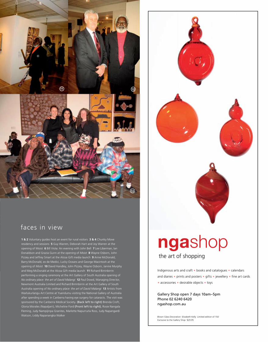
the art of shopping
ngashop
Gallery Shop open 7 days 10am–5pm Phone 02 6240 6420 ngashop.com.au
Indigenous arts and craft * books and catalogues * calendars
and diaries * prints and posters * gifts * jewellery * fine art cards
* accessories * desirable objects * toys
Blown Glass Decoration Elizabeth Kelly Limited edition of 150
Exclusive to the Gallery Shop $29.95
1 & 2 Voluntary guides host an event for rural visitors 3 & 4 Chunky Move
residency and sessions 5 Guy Warren, Deborah Hart and Joy Warren at the
opening of Moist 6 Bill Viola: An evening with John Bell 7 Lee Liberman, Ian
Donaldson and Grazia Gunn at the opening of Moist 8 Wayne Osborn, John
Pizzey and Jeffrey Smart at the Alcoa Gift media launch 9 Anne McDonald,
Barry McDonald, ex de Medici, Lucky Oceans and George Macintosh at the
opening of Moist 10 David Handley, John Pizzey, Wayne Osborn, Janine Murphy
and Meg McDonald at the Alcoa Gift media launch 11 Richard Birrinbirrin
performing a singing ceremony at the Art Gallery of South Australia opening of
No ordinary place: the art of David Malangi 12 Paul Dowd, Managing Director,
Newmont Australia Limited and Richard Birrinbirrin at the Art Gallery of South
Australia opening of No ordinary place: the art of David Malangi 13 Artists from
Warlukurlangu Art Centre at Yuendumu visiting the National Gallery of Australia
after spending a week in Canberra having eye surgery for cataracts. The visit was
sponsored by the Canberra Medical Society. (Back left to right) Brenda Croft,
Gloria Morales (Napaljarri), Micheline Ford (Front left to right), Rosie Nangala
Fleming, Judy Nampijinpa Granites, Marlette Napurrurla Ross, Judy Napangardi
Watson, Liddy Napanangka Walker
11 12
faces in view
13

64 national gallery of australia
You’ll find works by artists such as Arthur
Streeton, Clifton Pugh, Norman Lindsay ,
William Dobell, Fred Williams and Jeffrey
Smart housed in the galleries of Victoria’s
Goldfields. The work of contemporary and
indigenous Australian artists will also vie for
your attention in this cultural hub. As will
the grand Victorian architecture, and the
myriad of bric-a-brac stores, restaurants and
wineries that this region has to offer . For a
free Victoria’s Goldfields brochure phone
132 842 or visitvictoria.com/goldfields
MM
VIG
0008
/GA
L/SL
Castlemaine Art Gallery
Koori Art Designs AvocaCastlemaine Art Gallery
Bendigo Fine Art Gallery
Bendigo Fine Art Gallery
Castlemaine Art Gallery
Ballarat Fine Art Gallery
Ballarat Fine Art Gallery
Convent Gallery Daylesford
YOU’RE SURE TO STRIKE GOLD IN THE VILLAGES AROUND BALLARAT AND BENDIGO
MMVIG0008_79946_SL Page 1 5/10/05 11:10 AM

T h e W A T E R F R O N T
C A N B E R R A ’ S M O S T A N T I C I P A T E D O P E N F O R I N S P E C T I O N
The time has finally arrived. You are invited to make Canberra’s most exclusive address your home.
The Waterfront offers superb, north-facing apartments on the banks of Lake Burley Griffin. Here you
can experience a superb level of l iving, complete with the most stunning views imaginable.
The Waterfront features iconic architecture by leading architects PTW, in conjunction with the Stockland
Design Team, which is eloquently complemented by sumptuous interiors and expressive seasonal
landscaping.
At home on the Kingston Foreshore you will experience a lifestyle like no other with arts, cafés, dining
and entertainment just beyond your door.
This is an exceptional opportunity to acquire one of Canberra’s finest apartments. Luxury
two and three bedroom apartments and penthouses are now available.
WE I N V I T E YO U TO V I S I T T H E WAT E R F R O N T M A R K E T I N G S U I T E & D I S P L AY A PA R T M E N T , O P E N 7 D AY S
F R O M 1 P M - 5 P M . M U N D A R I N G D R I V E , K I N G S T O N F O R E S H O R E . A LT E R N AT I V E LY , P L E A S E C A L L
1 8 0 0 0 9 8 8 3 1 O R V I S I T W W W . T H E - W A T E R F R O N T . C O M . A U F O R F U R T H E R I N F O R M A T I O N .
4709
_4
26 November 2005 – 5 February 2006
Helen Frankenthaler Tales of Genji VI 1998 colour woodcut and stencil Purchased with the assistance of the Orde Poynton Fund 2002 National Gallery of Australia, Canberra

TransformaTions • helen frankenThaler
is
sU
e
no
.4
4
su
mm
er
2
00
5–
06
artonview
IS
SU
E N
o.4
4 S
Um
mE
r 2
00
5–
06
NA
TIO
NA
L
GA
LL
Er
Y O
F
AU
ST
rA
LIA


