double page spread
TRANSCRIPT

DOUBLE PAGE SPREAD
By Hannah Edwards
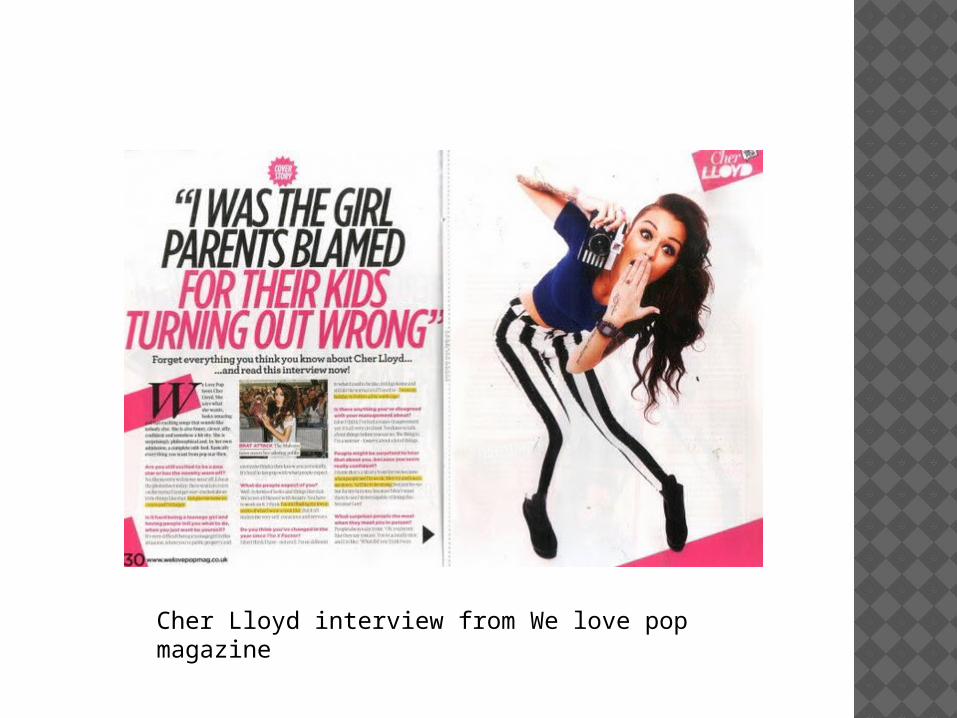
Cher Lloyd interview from We love pop magazine

HEADLINE
Colours: black and pink
The title gives the impression that Cher Lloyd, who is being interviewed, is a bad girl. She isn’t the good girl we all thought she was. Also having the title as a drop quote means the reader wants to find out which part of the text mentions this quote so they find out why Cher ‘was the girl parents blamed for their kids turning out wrong’.
Having pink and black as the colours for this title makes the reader think ‘punk’ because the punk style is often associated with pink and black. This is important because the punk style is seen as rebellious and the title suggests Cher Lloyd is rebellious
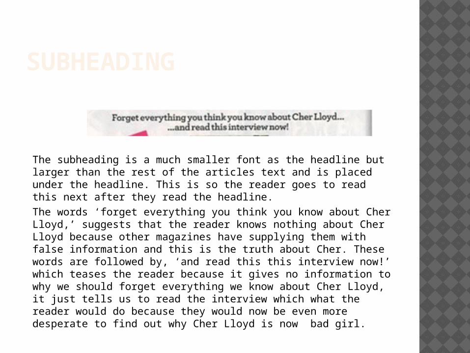
SUBHEADING
The subheading is a much smaller font as the headline but larger than the rest of the articles text and is placed under the headline. This is so the reader goes to read this next after they read the headline. The words ‘forget everything you think you know about Cher Lloyd,’ suggests that the reader knows nothing about Cher Lloyd because other magazines have supplying them with false information and this is the truth about Cher. These words are followed by, ‘and read this this interview now!’ which teases the reader because it gives no information to why we should forget everything we know about Cher Lloyd, it just tells us to read the interview which what the reader would do because they would now be even more desperate to find out why Cher Lloyd is now bad girl.

COLUMNS AND GUTTER SPACE
The questions are in pink.
The columns are set out in three columns so that it is easy for the readers to follow the path of the text but also because it looks more professional. The magazine has also highlighted key points in the interview so that the reader is drawn to read those parts of the interview. There is very little gutter space in this article, the space is either taken up by pictures or text. The questions are pink
so they stand out against the rest of the
text.

IMAGES
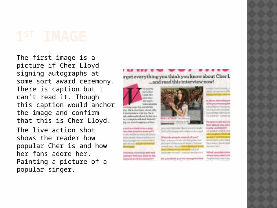
1ST IMAGEThe first image is a picture if Cher Lloyd signing autographs at some sort award ceremony. There is caption but I can’t read it. Though this caption would anchor the image and confirm that this is Cher Lloyd. The live action shot shows the reader how popular Cher is and how her fans adore her. Painting a picture of a popular singer.
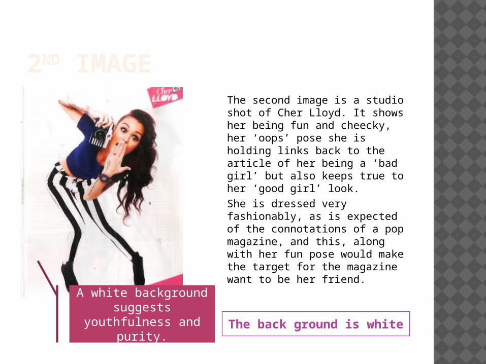
2ND IMAGE
The back ground is white
The second image is a studio shot of Cher Lloyd. It shows her being fun and cheecky, her ‘oops’ pose she is holding links back to the article of her being a ‘bad girl’ but also keeps true to her ‘good girl’ look.She is dressed very fashionably, as is expected of the connotations of a pop magazine, and this, along with her fun pose would make the target for the magazine want to be her friend.
A white background suggests
youthfulness and purity.

THE END