dissertation write up draft 2
TRANSCRIPT

Running head: REDDIT USABILITY AND ASSOCIATED UX
Word count: 7,000
M.Sc. PROJECT REPORT
2015
A study on the usability and user experiences associated with the
Reddit social networking and news aggregate website and
proposed design alterations.
JACK NICHOLSON FANTHAM
Project report submitted in part-fulfilment of the requirements
for the postgraduate degree in Human Factors/Ergonomics.
© Loughborough University
and
Jack Nicholson Fantham (ID: B415617)

REDDIT USABILITY AND ASSOCIATED UX
1
Abstract
Objectives:
To evaluate the usability and user experiences associated with the existing Reddit
interface and to develop design alternatives, which retain positive experience aspects, in the
form of a low fidelity wireframe prototype.
Methods:
Task-oriented usability trials were carried out with 12 participants who were self-
proclaimed novice Reddit users. Data collected consisted of results from noted observations,
noted participant comments (through think-aloud protocol), recorded time taken per scenario,
a prompt count per scenario, semi-structured interviews, and ratings of cognitive processing
load. 3 of these participants were also included in eye tracking iterations of the trials.
A focus group of 3 users with at least some prior experience in using Reddit was also
used. Data collected consisted of results from a semi-structured discussion, a screen
generation exercise, and a card sorting exercise.
Results:
The usability trials provided summative data, such as median time taken per scenario
and a mean cognitive processing load of 2.29, which show that the existing Reddit interface
generally has poor usability among novice users.
User experience for both novice and experienced users consisted of a mix of positive
and negative comments. The focus group card sorting activity results saw 86 Reddit
functions split under headings of “Important”, “Mix”, and “Not Important”.
Proposed design changes were justified through various combinations of results,
allowing for core issues to be addressed through a form of triangulation.
Conclusions:
The results of this study support the use of the adopted evaluation methods, chosen as
a result of a systematic review. However, some aspects of the methods and metrics were
more successful than others. For instance, eye tracking could have been used more
effectively if applied differently. Overall, this study serves as a useful step towards
improving the Reddit interface and provides a basis on which an iterative design process
could develop.

REDDIT USABILITY AND ASSOCIATED UX
2
Acknowledgements
I would like to extend my gratitude to the participants, whose cooperation and input made
this project possible. I would also like to thank the Loughborough Design School for
allowing me the opportunities that I have had as a result of this year. Finally, my most
sincere thanks must be given to my supervisor, Martin Maguire, whose approachability,
knowledgeability and advice has been exemplary.
Disclaimer
The views expressed in this report are not necessarily those of Loughborough University.
REDDIT USABILITY AND ASSOCIATED UX
3
Report table of contents
Abstract 1
Acknowledgements 2
Disclaimer 2
Report table of contents 3
Figures table of contents 4
Tables table of contents 5
Appendices table of contents 6
1. Introduction 7
2. Aims and objectives 8
3. Methods 8
3.1. Methodology 8
3.2. Usability trials 9
3.3. Focus group 12
4. Results 14
4.1. Usability trials 14
4.2. Focus group 19
5. Redesign overview 21
6. Discussion 25
7. Conclusion 30
8. References 31
9. Appendices 33

REDDIT USABILITY AND ASSOCIATED UX
4
Figures table of contents
Figure 1 17
Figure 2 18
Figure 3 19
Figure 4 20
Figure 5 20
Figure 6 22
Figure 7 23
Figure 8 23
Figure 9 24
Figure 10 24
Figure 11 25

REDDIT USABILITY AND ASSOCIATED UX
5
Tables table of contents
Table 1 11
Table 2 15
Table 3 15
Table 4 16
Table 5 16

REDDIT USABILITY AND ASSOCIATED UX
6
Appendices table of contents
Appendix A 33
Appendix B 60
Appendix C 63
Appendix D 64
Appendix E 66
Appendix F 67
Appendix G 73
Appendix H 84
Appendix I 85
Appendix J 89
Appendix K 90
Appendix L 91
Appendix M 93
Appendix N 94
Appendix O 96
Appendix P 99
Appendix Q 101
Appendix R 105
Appendix S 107
Appendix T 111
Appendix U 113
Appendix V 117
Appendix W 118
Word Count: 7,000

REDDIT USABILITY AND ASSOCIATED UX
7
1. Introduction
Reddit, a forum and social networking website, describes itself as “the front page of
the internet”, serving over 3.5 million registered users across 9,000 active communities,
known as subreddits, over the last month alone (Reddit, 2015). The site is an aggregator of
user-submitted content, which is either “upvoted” or “downvoted” as being of interest or not
by other users (Lerman, 2006). This allows ranked content to be displayed in a list format.
Approximately six percent of internet-using adults are believed to actively visit Reddit
(Duggan & Smith, 2013).
Although there is a limited amount of academic research surrounding Reddit,
particularly from a usability and user experience perspective, evidence suggests that, since
first being registered as a domain name in 2005, the Reddit community is always evolving
and that content and predominant uses are shown to reflect the ever-diversifying user base
(Singer, Flöck, Meinhart, Zeitfogel, & Strohmaier, 2014). Despite this assertion, the
interface with which users are faced has not changed significantly since 2008, when the user
capacity to create and moderate subreddits was added (Reddit, 2015). It is a reasonable
assumption to state, even if the design was previously befitting to user experience in 2008,
that this may now have changed. A review of literature on website design development
methods failed to turn up any previous research on Reddit’s current or past interfaces and
their associated usability and user experiences (see Appendix A for the full systematic
review).
However, much of the research brought up a wealth of methods, a combination of
which can be expected to provide insight into a website’s usability and associated user
experiences while providing an element of guidance regarding the direction of any design
changes. In turn, this highlights a valid means by which this gap in academic knowledge can
be addressed and, importantly, exploited to explore potential alternatives to existing design
aspects of the Reddit interface.
To ensure that this knowledge gap is thoroughly investigated, a methodical and well-
designed research structure must be used. Once the aims have been established, the
justification for the data collection methods will be made with the support of Appendix A.
As the method will largely reflect a mixed-method design, the results will comprise of both
quantitative and qualitative data. A prototype, created through Axure RP Pro 7, will consist
of any design changes deemed appropriate by the results. Where possible, multiple result

REDDIT USABILITY AND ASSOCIATED UX
8
types will be used to triangulate a design opportunity. Lastly, the discussion and conclusion
will critically evaluate the study’s data collection methods and there ultimate usefulness in
achieving the study aims and objectives. From this, future opportunities for research and
design will be discussed.
2. Aims and objectives
The aim of this study is to firstly use two primary research questions:
1) Generally, how successful is the current Reddit user interface in terms of usability amongst
novice and experienced users?
2) What user experience factors, either positive or negative, are perceived by novice and
experienced users?
Exploring these two questions will accompany the core objective of using appropriate
research methods to better understand perceptions of the Reddit interface. The fundamental
aim is to then use what has been learned to support proposed design alternatives while
attempting to retain positive aspects of definitive Reddit user experiences.
3. Method
3.1. Methodology
The methods used to evaluate Reddit’s usability and associated user experiences were
decided upon by reviewing the literature review (Appendix A). Most importantly, a mixed-
method design was developed that incorporated both summative and formative data
collection methods. This means that results consist of both objective and subjective measure.
The literature review highlights the importance of this when a key project aim is to improve
website design, potentially in an iterative process (Becker & Yannotta, 2013; Rama &
Dhanraj, 2014). Objective measures provide evidence of improvement while subjective data
provides tools to guide further design iterations. Items for the cognitive processing load scale
were drawn from previous studies (Palmer, 2002; Fang, Hu, Chau, Hu, Yang, & Sheng,
2012).
REDDIT USABILITY AND ASSOCIATED UX
9
3.2. Usability trials
Participants
12 participants, of which 3 were female, were recruited for the first website usability
assessment. 3 were further analysed with eye tracking equipment. The mean age of
participants was 25.17 years (2dp) with a standard deviation of 4.00 years. As no statistical
tests reliant on significance evaluation were to be carried out on the results, this number of
participants was deemed reliable and valid to allow for an investigation and comparison of
objective website usability measures whilst also allowing for a manageable amount of
formative qualitative data to be generated for use in the redesign phase. Participants were
recruited through opportunity sampling. A social networking proficiency evaluation
(Appendix D) was also devised and allowed a score to be given to each participant based on
the number of social networking websites that they used and the frequency with which they
used each. The median score was 11.00 (IQR=11.25) with a maximum score of 25 and a
minimum of 4. All were satisfied with their existing experiences with social networking
websites. A pilot study of 2 participants was used to test the methods.
Apparatus and equipment
A PC running a Windows system was used for every trial. For each trial, a browser
and subsequent private window was opened to standardise the neutral state of a browser
across trials.
The pages displayed on the PC screen and user comments were recorded via a
Panasonic HDS-SD10 high definition camera recorder on a tripod.
A stopwatch on a Sony Xperia M2 smartphone running Android 4.4.4 was used to
time the participant’s route to completing each scenario.
Participants allocated to eye tracking evaluation followed the same set up but were
required to sit in front of a display with attached infrared cameras connected to a laptop
running SensoMotoric Instruments’ (SMI) IVIEW at a frequency of 120 Hertz. A 5-point
calibration was used.
A subreddit entitled ‘ldsassessment’ was set up by the experimenter on the actual
Reddit website and typical material was posted under the name ‘LDS_experimenter’.
Another account named ‘LDS_friend’ was created for use in scenario 8. Each participant
REDDIT USABILITY AND ASSOCIATED UX
10
created an account named ‘ldsparticipant’ with a number. For instance, the first participant
was ‘ldsparticipant1’, the second ‘ldsparticipant2’, and so forth.
Materials and design
A participant information form (Appendix B) served to inform participants of the
aims of the session, what participants were being asked to do, and their right to withdraw
from the study.
A consent form (Appendix C) was created in order to establish that the participant felt
informed to continue with the experiment.
Following on from the consent form, a demographic questionnaire, also consisting of
screening questions, was devised (Appendix D). Demographic information, such as age and
gender, was requested. This form also aimed to garner an idea of participant proficiency in
social network use by providing a list of the ten most visited social networking sites of June
2015 (eBiz, 2015) so that participants could identify which they used and with what
frequency.
The experimenter used a schedule form (Appendix E), which aimed to ensure that a
trial had been successfully set up and ensured each session was structured in the same
manner.
The most essential material was the participant record form (Appendix F), which was
structured into three sections. The first section allowed for participant comments and actions
to be noted and had each scenario stated clearly. The scenarios themselves can be seen in
Appendix G along with exemplar action maps. This also allowed for a prompt count, a
prompt marking a point when experimenter intervention was requested, to be kept and for a
time value to be inserted for each scenario.
Initially, there was intent to keep track of slip and omission errors. However, the pilot
study quickly emphasised that these counts were likely to provide unreliable results due to the
variation in participant approach to navigation. Some participants are content to make many
errors in a short space of time, while others will navigate through fewer pages and ponder
each action.
The second section consisted of a short, semi-structured interview schedule which
allowed for key notes to be made. The third and final section consisted of eight seven-point
Likert-scale statements aimed at assessing perceived cognitive processing load.

REDDIT USABILITY AND ASSOCIATED UX
11
Procedure
In each trial, the participant was given the information forms and the aims of the study
were explained with any participant questions being answered. Once the participant had
agreed to continue with the session, a consent form was provided and the points explained.
Once consent had been given by the participant, he or she was provided with the
demographic form. Upon completion, the experimenter checked the forms to ensure that the
participant a) had not used Reddit before and b) typically had internet at home. The
experimenter then went through the trial preparation checklist to ensure that all measures
could be taken. In the sessions in which eye tracking was employed as an additional method,
it was at this point that the program was verified as being ready for use. Upon confirmation
with the participant that they had the right to withdraw, and were aware that, when unable to
proceed, that they could ask for a prompt, the trials would begin when ‘record’ was pressed
on the camera.
The experimenter then went through each scenario, reading it out clearly and
repeating if necessary. During each scenario, the experimenter kept track of the number of
prompts, wrote comments based on the thoughts of the participant, and noted the time taken
on each scenario. Once each scenario had been completed, the interview was carried out.
For eye tracking trials, it was at this point that the recording ended. Four main questions
were used but points of interest were probed and participant ideas noted. Finally, the
participant was asked to complete the eight seven-point Likert scales provided. Although a
seven-point scale was used, participants were asked to reserve a neutral ‘four’ for statements
with which they truly had no opinion. The session ended once these scales had been filled in.
Later, the proficiency of a participant was calculated. By adding scores allocated to each
‘level’ of use frequency for each website used (see Table 1 for the scoring system) an ordinal
proficiency score was determined to “map” the sample population’s proficiency.
Level Score
Daily use 4
Weekly use 3
Monthly use 2
Less often use 1
Not used 0
Table 1. Proficiency scoring system.
REDDIT USABILITY AND ASSOCIATED UX
12
3.2. Focus group
Participants
3 participants, one female, were recruited through opportunistic sampling for
involvement in the focus group. However, it was clearly stated by the experimenter that
experience with Reddit was desired. The mean age of participants was 25.00 years (SD =
1.73 years). One participant was a ‘regular’ user, estimated to use Reddit at least 6 days per
week, while the remaining two identified as occasional and rare users. Participants were
required to have carried out the pre-session task.
Apparatus and equipment
A 52 inch 1080p high definition screen running Windows 7 was used to allow the
participants to navigate Reddit on Internet Explorer. A Panasonic HDS-SD10 high definition
camera recorder mounted on a tripod was set up to record the session and the screen.
Materials and design
Participants were sent a pre-session (Appendix H) task via e-mail. This task consisted
of simple exploration exercise and the identification of up to five “good” and five “bad”
aspects of the Reddit experience and service as they saw it.
At the start of the session, a participant information form (Appendix I) served to
inform participants of the aims of the session and overall project, what participants were
being asked to do, and their right to withdraw from the study at any time.
A consent form (Appendix J) was created in order to establish that the participant felt
informed and willing to continue.
In a similar fashion to the usability trials, the participants were then given
demographic information forms (Appendix K) aiming to collect basic data such as age and
gender. It was this form that allowed identification of “regular” users – defined as someone
who used Reddit at least 6 days a week.
A session schedule (Appendix L) was devised for the experimenter to use and was
split into four key activities or sections. The first section, a semi-structured discussion,
included a scripted session introduction. The discussion aimed to define typical Reddit user
experiences and typical Reddit uses and explore the service that it provides. Probes into the
REDDIT USABILITY AND ASSOCIATED UX
13
value of the Reddit service and the ways in which individuals might use Reddit were
incorporated.
The second section guided the experimenter to elicit examples of typical Reddit use
from the participants. There was emphasis on the fact that the participants should base these
on their own experiences.
The third session activity was a generative screen design exercise, during which the
participants were to be given freedom to design screens that would provide the necessary
service or services for the generated scenarios to be delivered effectively. Blank A4 template
pages were used as “screens”.
The final focus group activity was a card sorting exercise. 86 individual functions
available through Reddit were printed on flash cards (Appendix M) to be given to the
participants. The exercise was to take these cards and organise them into groups based on
importance to typical Reddit experiences. A suggestion of three categories – ‘most
important’, ‘sometimes important’ and ‘not important’ to the user’s experience of Reddit –
was included in the schedule. Blank cards were also created to allow any further functions to
be added by the participants themselves.
Procedure
The experimenter sent out the pre-session task to prospective participants in an e-mail
at least three days in advance of the booked focus group session. At the start of the actual
session, the participants were provided with the forms for information, consent, and
demographic data collection. The participants were asked if they had any questions. Once
these forms had been read and completed, the video camera and computer screen were set up.
The session began when ‘record’ was pressed on the camera. The scripted introduction was
read out by the experimenter. From this point, the session schedule was followed. Pre-
scripted probes were used as well as situation-specific probes, triggered by what was deemed
a relevant or interesting point. Throughout the discussion, the experimenter made notes that
would later be analysed.
Once the semi-structured discussion was completed, the scenario generation exercise
was carried out. The scenarios generated were then used to guide the generative screen
design activity, during which time Reddit was removed from the screen. The experimenter
largely worked to observe the participants as they worked to design the screens together.

REDDIT USABILITY AND ASSOCIATED UX
14
The final card sorting activity was then carried out and, again, the experimenter
largely took on the role of an observer and allowed the participants to work amongst
themselves until they were satisfied with the outcome.
Once all four activities had been completed, the end of the session was announced and
the participants were thanked for their time. The camera was switched off at this point.
3.3. Ethical approval
This project has been approved by Loughborough University Ethics committee.
4. Results
4.1. Usability trial results
As the usability trials consisted of a mixed methods design, there are both quantitative
and qualitative results. It is important to note that the quantitative results are not formative,
providing only a benchmark by which future design iterations could be compared for an
objective comparison. This comparison can be made in three domains; prompt count per
scenario, time taken per scenario, and perceived cognitive processing load. For tests of
normality, a Shapiro-Wilk test was implemented with an alpha value of .05. The qualitative
results, stemming from the think aloud protocol employed during the trials and the semi-
structured interviews immediately after.
Firstly, the prompt counts per scenario were compiled to give twelve counts per
scenario. Tests of normality revealed that the distribution of only the eighth scenario results
could be treated as not significantly differing from a normal distribution (p=.35) as its p value
exceeded the alpha of .05 (see Table 2). Scenarios 1 and 5 were constant and not valid for a
Shapiro-Wilk test. Therefore, the median prompt count of each scenario was calculated and
can be viewed in Table 3 along with interquartile range (IQR) values.

REDDIT USABILITY AND ASSOCIATED UX
15
Shapiro-Wilk tests of normality
for prompt count by scenario (p
values)
Scenario 1 n/a
Scenario 2 .00
Scenario 3 .00
Scenario 4 .00
Scenario 5 n/a
Scenario 6 .00
Scenario 7 .02
Scenario 8 .35
Scenario 9 .00
Scenario 10 .00
Median prompt count by
scenario
Scenario 1 .00 (IQR=.00)
Scenario 2 .00 (IQR=.00)
Scenario 3 .00 (IQR=.00)
Scenario 4 .00 (IQR=1.00)
Scenario 5 .00 (IQR=.00)
Scenario 6 .00 (IQR=.50)
Scenario 7 1.00 (IQR=3.00)
Scenario 8 2.00 (IQR=2.00)
Scenario 9 .00 (IQR=1.00)
Scenario 10 .00 (IQR=.00)
The times taken per scenario were compiled and the data converted to a measure in
seconds. Tests of normality revealed that six of the scenarios had p values exceeding .05,
indicating that they could be regarded as not significantly differing from a normal distribution
curve. However, scenario 9 was marginally higher and the remaining four scenarios had p-
values supporting the alternate hypothesis that they were not reflective of a normal
Table 2. Prompt count normality values.
Table 3. Median prompt counts.
REDDIT USABILITY AND ASSOCIATED UX
16
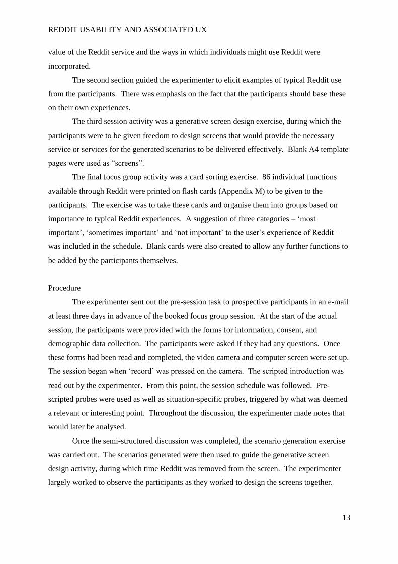
distribution curve (see Table 4). Therefore, the median time taken in each scenario was
calculated.
Shapiro-Wilk tests of normality for
time taken by scenario (p values)
Scenario 1 .022
Scenario 2 .037
Scenario 3 .413
Scenario 4 .001
Scenario 5 .184
Scenario 6 .195
Scenario 7 .353
Scenario 8 .665
Scenario 9 .088
Scenario 10 .024
A summary of the median time taken in each scenario can be seen in Table 5, values and the
data distribution can be seen in box-plot format in Figure 1. Note that scenario 1 recorded an
outlier in case 12 and that scenario 4 recorded outliers in cases 6 and 12.
Median time taken (seconds) count
by scenario
Scenario 1 61.50 (IQR=32.25)
Scenario 2 84.50 (IQR=96.50)
Scenario 3 59.50 (IQR=54.00)
Scenario 4 119.00 (IQR=63.50)
Scenario 5 56.50 (IQR=62.50)
Scenario 6 152.50 (IQR=66.00)
Scenario 7 286.50 (IQR=193.50)
Scenario 8 270.00 (IQR=211.00)
Scenario 9 94.00 (IQR=95.25)
Scenario 10 123.50 (IQR=172.00)
Table 4. Normality values for times.
Table 5. Median time per scenario.
REDDIT USABILITY AND ASSOCIATED UX
17
The cognitive processing load scores of each participant were calculated by compiling
the scores for each of the eight Likert scale items. Items 1 and 2 were reverse coded. This
score was created by calculating the mean rating across the eight items (Fang et al, 2014). A
low score represents a low level of ease and navigability and a high cognitive processing load
and vice versa is represented by a high score. A test for normality was conducted on the
newly computed cognitive load scores and a p value of .74 was found, indicating that the data
distribution could be treated as not significantly differing from that of a normal distribution.
For this reason, a mean cognitive processing load score or 2.29 (SD = .75) can be determined.
A mean of 2.29 reflects a low level of perceived ease of use and navigation. Cognitive
processing load is high. The raw SPSS output thus far can be found in Appendix N.
The formative results consist of experimenter observation notes and notes made in
response to comments made by participants as they thought aloud. Further notes were made
during the semi-structured interview. These notes have been compiled into a summary table
(Appendix O) and coded for themes, the overview of which can be found in Appendix P.
Four key themes were found within the raw data.
Firstly, many codes fell under a theme of ‘poor navigation’. Examples of this include
instances of participant comments of disorientation and of action paths that made “no sense”.
A theme of ‘overly complicated’ also became apparent. Participants found functions to be
poorly explained and defined and aspects such as the advanced search functions were not
Figure 1. Box-plot diagrams for median time taken in each scenario.

REDDIT USABILITY AND ASSOCIATED UX
18
intuitive. This related to the third theme, ‘low clarity’. Functions such as those allowing
users to view the full subreddit list were inconspicuous and participants felt that such
important features should have bigger buttons. Lastly, there was a clear theme of
‘expectation’. Participants appeared to attempt to apply knowledge from other websites, such
as the use of a search bar to find users (available on Facebook but not Reddit). It was also
common for participants to click a post title and unintentionally find themselves leaving the
website.
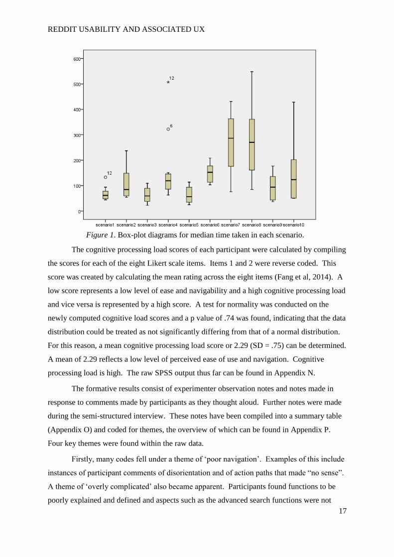
For participants who had been included in the eye tracking sample, scan paths, heat
maps and areas of interest (AOIs) were captured as a further means of diagnosis for issues
outlined in the think-aloud protocol and interviews. A good example of this can be found in
that of case 3 (with a proficiency score slightly above the median at 12). As part of the
themes ‘poor navigation’ and ‘low clarity’, it has been mentioned that participants generally
felt that there was too much information on each page and that important functions did not
stand out a lot of the time. A scan path (Figure 2), in which lines represent saccades and
circles represent fixes (larger circles implying a longer fix period), of the first page visited
supports these opinions. When asked to create an account, the initial scan for the ‘create an
account’ button (located in the top right of the page) is eccentric and incorrect clicks (red
diamonds) are made. A heat map (Figure 3) further substantiates this evidence by
highlighting that the most fixed upon point of the screen was in fact the neutral centre,. Full
screenshots with all eye tracking data can be viewed on the accompanying flash drive.
Figure 2. An example of a scan path diagram.
REDDIT USABILITY AND ASSOCIATED UX
19
4.2. Focus group results
The first section, the semi-structured discussion, was designed to address the first
three aims outlined by the experimenter. The raw, compiled notes can be viewed in
Appendix Q. Furthermore, Appendix R outlines these aims and provides an insight into each.
The fourth aim of the focus group was to discuss typical situations in which Reddit
would be used and think more about the core services in play and the way in which they
should be delivered. The group then worked to generate screens reflecting the scenarios
discussed.
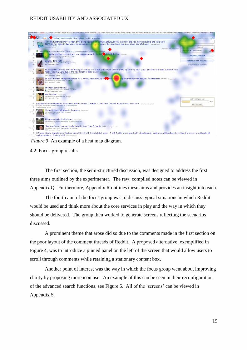
A prominent theme that arose did so due to the comments made in the first section on
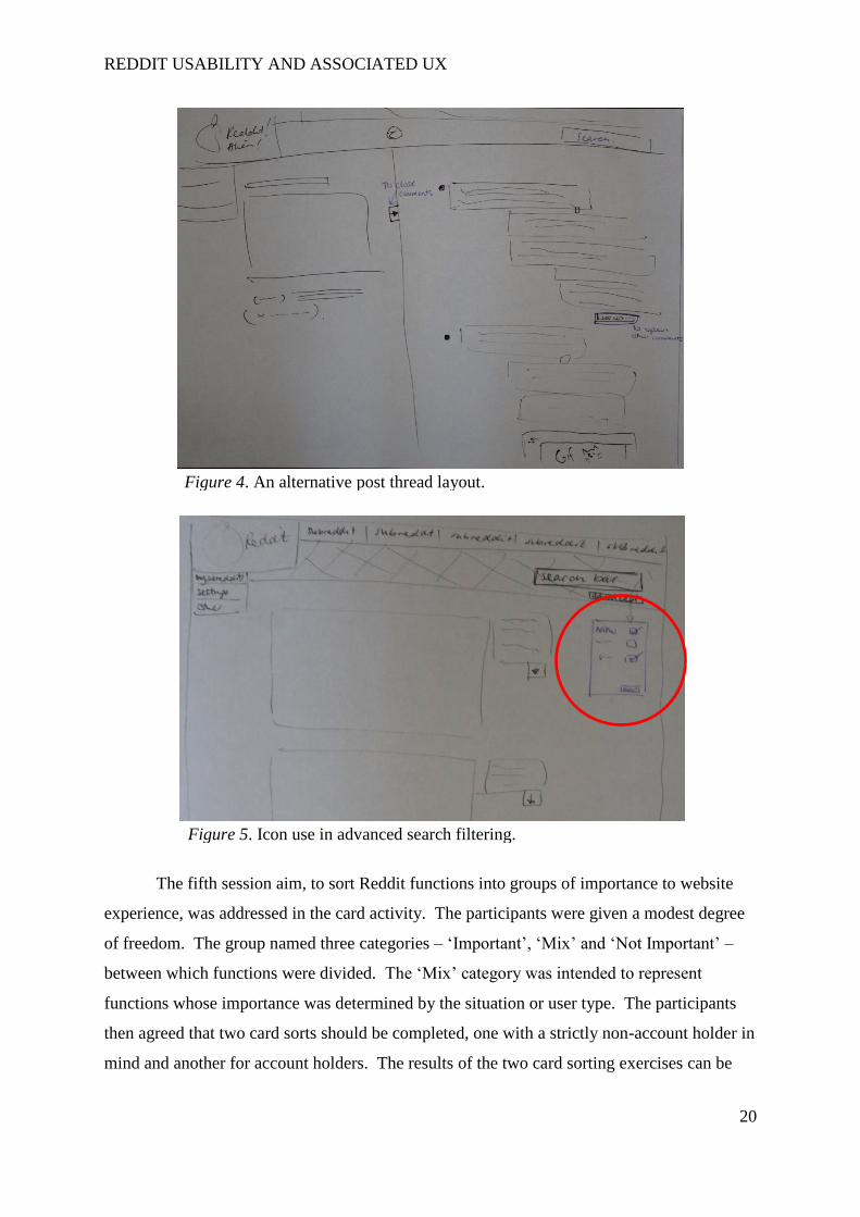
the poor layout of the comment threads of Reddit. A proposed alternative, exemplified in
Figure 4, was to introduce a pinned panel on the left of the screen that would allow users to
scroll through comments while retaining a stationary content box.
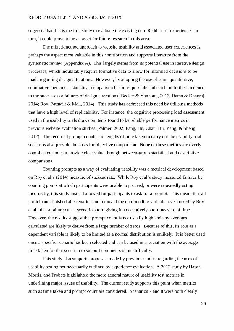
Another point of interest was the way in which the focus group went about improving
clarity by proposing more icon use. An example of this can be seen in their reconfiguration
of the advanced search functions, see Figure 5. All of the ‘screens’ can be viewed in
Appendix S.
Figure 3. An example of a heat map diagram.
REDDIT USABILITY AND ASSOCIATED UX
20
The fifth session aim, to sort Reddit functions into groups of importance to website
experience, was addressed in the card activity. The participants were given a modest degree
of freedom. The group named three categories – ‘Important’, ‘Mix’ and ‘Not Important’ –
between which functions were divided. The ‘Mix’ category was intended to represent
functions whose importance was determined by the situation or user type. The participants
then agreed that two card sorts should be completed, one with a strictly non-account holder in
mind and another for account holders. The results of the two card sorting exercises can be
Figure 4. An alternative post thread layout.
Figure 5. Icon use in advanced search filtering.

REDDIT USABILITY AND ASSOCIATED UX
21
reviewed in Appendix T. Note that non-account users are thought to perceive importance of
core functions in the same way as account users.
5. Redesign overview
A semi-interactive low fidelity wireframe was created with Axure RP Pro 7.0 to
attempt to address the issues highlighted by the usability trials and focus group. A full table
of significant design alterations, considerations, and justifications can be seen in Appendix U.
What follows are sample design proposals that reflect many of the more general alterations.
The introduction of a fixed header that is consistent across all pages of Reddit is the
suggestion most expected to improve Reddit’s usability and associated user experiences.
This comes down to the multiple issues that it aims to address and improve, if not remove. In
some ways, the proposed header, see Figure 6, draws on elements of the existing Reddit front
page. The user can still navigate their multireddits and elect to view saved posts, for
example. It is worth noting that these functions were deemed “important” in the focus group
card sort. The fixed header also exemplifies the potential uses of icons, identified by the
focus group discussion as being something that could help to reduce the feeling of “too much
information”.
In response to comments made by usability trial participants and the importance of
setting adjustment functions seen through the focus group card sort, ‘preferences’ has also
been renamed ‘settings’ to better meet the expectations of users. The card sort showed that
users regard subreddit-related functions as “important”, therefore it would make practical
sense to ensure that such functions remain on every page. This is further supported by the
navigation troubles observed during usability trial participants’ attempts to open their list of
subreddits. The scenario holding this function had a median time higher than any other,
286.5 seconds. Described as out of the way and easy to miss, this is now in the left hand
sidebar.
The benefit, highlighted by participants in the usability trials, of having a logo link in
the top left of the page that brings the user back to the front page was noted and led to the
decision to retain this feature in the header. The existing Reddit front page “header” can be
viewed for comparison in Appendix V.

REDDIT USABILITY AND ASSOCIATED UX
22
Figure 6. The proposed header.

REDDIT USABILITY AND ASSOCIATED UX
23
The new header also hosts a proposed search bar alternative. As the search function
features so prominently in Reddit activity and, as the card sort showed, has scenario-specific
functions, the alternative aims to make switching between advanced search functions easier.
Functions deemed by the card sort to be “not important”, such as searching for text excerpts
within a post, can be removed. The existing search panel can be viewed in Figure 7 and is a
fine example of an aspect of Reddit found to be low in clarity and symptomatic of poor
navigation and over complexity as it requires the user to read a lot of instructions and type in
code.
The proposed alternative, which can be seen in Figure 8, is clear and uses tick-boxes to allow
the user to filter results. This design choice is supported by the screens drawn in the focus
group screen generation activity.
Figure 7. The current ‘advanced search’ panel.
Figure 8. Redesigned search panel.

REDDIT USABILITY AND ASSOCIATED UX
24
The proposed search panel also introduces the capacity to search for other users,
something repeatedly attempted by usability trial participants apparently due to expected
parallels with social networking websites such as Facebook. The function of adding a friend
took a median time of 270 seconds in the usability trials, with a median prompt count of 2.
Comments made by participants, both in the usability trial and the focus group, allude to the
action path (refer to scenario 8 action map, Appendix G) being unintuitive and poorly
designed. The fact that this scenario was one of those that took participants longest in the
usability trial is not acceptable when the focus group card sort identified adding a friend as
“important”.
An overhaul of the actions is therefore suggested. In the wireframe prototype, the
user now only needs to search for a user by ensuring that only the filter ‘username’ is
selected. He or she will then be provided a list of users, each of which will be presented on a
panel structured in a way reminiscent of Figure 9. To add the user as a friend, the individual
need only click the darkened symbol on the right. This symbol has been selected as it is
common place on social networking sites as the ‘add friend’ button.
Numerous alterations have also been proposed for default layouts of certain panels,
while maintaining the overall aesthetic of those already in use on Reddit. For instance, the
configuration of posts as they are seen in the list can be altered to improve clarity and reduce
the amount of written information. A comparison can be viewed in Figure 10. The use of
commonly used icons, such as the established floppy disk ‘save’ button, has been exploited.
Figure 9. Introducing a proposed panel for listing users found through search.
Figure 10. Comparison between the current (top) and proposed (bottom) post label design

REDDIT USABILITY AND ASSOCIATED UX
25
A final example of ways in which the proposed redesign aspires to maintain positive
Reddit experiences and reduce the negative experiences can be found in the reorganised post
pages. The focus group discussion highlighted that it was annoying to read comments on a
post’s content, refer to that content, and then lose their place on the comment thread. To
rectify this, influences have been drawn from the screen generation exercise, in which the
content is pinned in place on the left side of the page while the comment section, on the right,
can be scrolled through (see Figure 11). This should also address issues with navigation
highlighted in the usability trials, in which participants sometimes struggled to determine
what was the post and what was a comment on a post, in turn addressing issues of ‘low
clarity’.
The prototype redesign can be found at http://t5j1l3.axshare.com/#c=2. The password
is ‘reddit’. The ‘semi-interactive’ descriptor reflects the fact that its interactivity is confined
to a set of scenarios similar to those used in the usability trials, see Appendix W.
6. Discussion
Generally, this study has succeeded in accomplishing the overall project aims and
objectives; to evaluate usability and user experiences associated with Reddit and to propose a
design alternative supported by reliable data from appropriate methods. Extensive research
Figure 11. The new post content-comment layout.
REDDIT USABILITY AND ASSOCIATED UX
26
suggests that this is the first study to evaluate the existing core Reddit user experience. In
turn, it could prove to be an asset for future research in this area.
The mixed-method approach to website usability and associated user experiences is
perhaps the aspect most valuable in this contribution and supports literature from the
systematic review (Appendix A). This largely stems from its potential use in iterative design
processes, which indubitably require formative data to allow for informed decisions to be
made regarding design alterations. However, by adopting the use of some quantitative,
summative methods, a statistical comparison becomes possible and can lend further credence
to the successes or failures of design alterations (Becker & Yannotta, 2013; Rama & Dhanraj,
2014; Roy, Pattnaik & Mall, 2014). This study has addressed this need by utilising methods
that have a high level of replicability. For instance, the cognitive processing load assessment
used in the usability trials draws on items found to be reliable performance metrics in
previous website evaluation studies (Palmer, 2002; Fang, Hu, Chau, Hu, Yang, & Sheng,
2012). The recorded prompt counts and lengths of time taken to carry out the usability trial
scenarios also provide the basis for objective comparison. None of these metrics are overly
complicated and can provide clear value through between-group statistical and descriptive
comparisons.
Counting prompts as a way of evaluating usability was a metrical development based
on Roy et al’s (2014) measure of success rate. While Roy et al’s study measured failures by
counting points at which participants were unable to proceed, or were repeatedly acting
incorrectly, this study instead allowed for participants to ask for a prompt. This meant that all
participants finished all scenarios and removed the confounding variable, overlooked by Roy
et al., that a failure cuts a scenario short, giving it a deceptively short measure of time.
However, the results suggest that prompt count is not usually high and any averages
calculated are likely to derive from a large number of zeros. Because of this, its role as a
dependent variable is likely to be limited as a normal distribution is unlikely. It is better used
once a specific scenario has been selected and can be used in association with the average
time taken for that scenario to support comments on its difficulty.
This study also supports proposals made by previous studies regarding the uses of
usability testing not necessarily outlined by experience evaluation. A 2012 study by Hasan,
Morris, and Probets highlighted the more general nature of usability test metrics in
underlining major issues of usability. The current study supports this point when metrics
such as time taken and prompt count are considered. Scenarios 7 and 8 were both clearly

REDDIT USABILITY AND ASSOCIATED UX
27
suffering from significant usability issues with median time and prompt counts both visibly
being much higher than those for other scenarios. It could be argued that the scenarios
themselves may have been more complex but the scenario action maps (Appendix G) suggest
that this is unlikely. Notably, the process of adding a friend (scenario 8) takes a total of four
actions, the least of any scenario, to complete; of which three are literally button clicks.
Furthermore, the first of these buttons is visible in the same position on every single page of
Reddit. Yet, this scenario took a median of 270 seconds to finish – a mean of just over a
minute for each action. This observation also shows the effectiveness of the use of time as a
measure of overall usability, a point alluded to in previous studies (Nicolson, Knapp,
Gardner, & Raynor, 2011).
The effectiveness of using multiple results in this study to simultaneously justify and
triangulate on decisions regarding design improvements also serves to support previous
studies with a diagnostic element (Ibid.). For example, the development of the proposed
header, which would be consistent across all Reddit pages, drew on summative evidence of
poor usability – the long time it generally took to locate the subreddit drop-down menu – and
also benefited from formative evidence. The header design was particularly justified by
comments from the focus group outlining the annoyance, to the Reddit experience, of
inconsistency across pages. Furthermore, the card sorting activity helped to prioritise and
justify decisions regarding which functions would be placed on the new header. This user
input was vital as functions such as the ‘view saved posts’ function would likely have been
removed for the sake of clarity but, as it was categorised as “important”, it was ultimately
kept.
The usefulness of the screen generation activity within the focus group was also
substantiated, with direct influences being taken from the drawings created and incorporated
into the design prototype. The results highlight that this particular method is one way of
developing on the key concepts within previous studies highlighting the usefulness of ‘user
group triangulation’ (Wilson, 2006). By using multiple user groups, the current experiment
drawing on data from a novice user group and an experienced user group, points of
convergence can be seen in the data. Comments on negative user experience aspects, such as
the low clarity of Reddit and poor navigation, can be found in the results of both the usability
trials and the focus group and strongly direct any design proposals to address them.
However, the extent to which the positive attributes of the Reddit experience would
be retained would be at the discretion of the designer, who would aim to emulate what would
REDDIT USABILITY AND ASSOCIATED UX
28
appear to be the positive experience attributes. The screen generation exercise instead allows
a visual guide of user-suggested changes that can be assumed to be acceptable and not
detrimental to the positive attributes of their user experience. This can improve the
consistency in delivering user requirements and reduce the chances of a design change
causing significant unrest in the existing community while addressing issues for novice users
newly navigating the website (Chou, 2002).
Although there is much that can be regarded as successful, this project and its
potential use in further developments is, in some ways, limited. One practice that would have
allowed a more pragmatic approach concerning the redesign process would have been to
incorporate some sort method that would allow for usability issues to be prioritised. This
stems from an oversight in the literature review (Appendix A), which focused too heavily on
ways in which diagnostic methods inform and measure success of design decisions and
overlooked critical evaluation of the redesign process itself. Previous studies using usability
and experience evaluations to improve interaction design benefit from this practice and can
weigh up the importance of applying different design alterations before considering others
(Bevan, 1997; Hornbaek & Stage, 2006). Measures, such as time taken, may allude to more
problematic scenarios but there is no basis for an assumption that the user is feeling more
stressed or devoting more effort. The methods used to achieve the Reddit redesign prototype,
though informative, simply did not adequately fulfil this need.
A straightforward way to address this issue in future trials would be to include a
method that would allow users to rate the perceived severity of an issue they have outlined or
to include measures of stress or effort after each scenario (Hassenzahl, 2000; Hornbaek &
Stage, 2006). Considering that the current methodology included the use of a cognitive
processing load scale as a summative measure to allow for overall comparisons with later
design iterations, it would not be a massive adjustment to move this to the end of each
scenario. This would allow for an average processing load to be determined for each
scenario. In turn, this would provide a basis for ranking scenarios before redesigning begins,
the most effort-demanding ones being prioritised.
The role of eye tracking in a mixed-methods design such as that used in this
experiment also needs to be reconsidered as its effectiveness in this study has been limited
and its inclusion, to a degree, superfluous. While previous studies have made use of
comparing eye tracking data between two population samples using the same website
REDDIT USABILITY AND ASSOCIATED UX
29
(Djamasbi, Siegel, Skorinko, & Tullis, 2011), this study aimed to use it as a diagnostic
element. Potential uses would have included determining areas to which users are prone to
looking and exploiting these “points of interest” (Masciocchi & Still, 2013) with relevant
function placement. This would have been effective if the eye tracking had instead been
carried out on isolated screens with one specific action requirement. An evaluation could
then have been carried out reviewing attention allocation trends. The current study lacked
this rigidity and standardisation of action, making such comparison difficult. Instead, only
general behaviour could be reviewed and rarely added notably to what was found through the
remaining methods.
Acknowledgement must also be paid to the fact that the methods used cannot be
assumed to be exhaustive of all issues with Reddit’s usability and user experience. For
instance, the ten scenarios used are just that – they are ten potential scenarios revolving
around common functions. To further address usability, more scenarios would be required.
The creation of these scenarios could draw on task analysis exercises carried out on Reddit
users browsing as they would normally.
There are also some potential issues with the population sample used in the usability
trials. Despite tests for normality being carried out and used to determine both the form of
average used to describe the data and whether or not parametric tests would be possible to
compare the results of this study with those of a future study, the number of participants
places limits on the validity of doing so in any way other than descriptive. Part of the reason
for this stems from the mixed method design used, which relied on qualitative data evaluation
as well. Were this study to be replicated, one way to overcome this and provide a stronger
statistical base with which to make statistical comparisons would be to increase the number
of participants doing usability trials but refrain from carrying out qualitative analysis on all,
avoiding data saturation and needless time expenditure.
It cannot be assumed that the sample populations, in both the usability trials and the
focus group, are representative of the current Reddit user base. This is largely the result of a
lack of available literature on the demographic distribution of Reddit users. In order to
improve upon this in future research, a survey could be developed and distributed through
Reddit itself so that any future trials may more accurately reflect the true user demographic.
Despite these weaknesses, much of the procedure and content of this project provides
a valid point from which development can be made. The implications of the results and
redesign include allowing for an iterative design process to potentially follow. Aside from
REDDIT USABILITY AND ASSOCIATED UX
30
this, this project has provided a valuable insight into the quintessential Reddit experience for
both novice and experienced users.
7. Conclusion
The aims and objectives of this study were two-fold. The first aim was to gain an
understanding of the Reddit user experience and perceived usability. The second aim was to
use the results to guide appropriate design changes.
These aims have been achieved. It has been established that usability issues and
negative user experiences are perceived by both novice and experienced users and that even
experienced users differ based on whether an account is used or not. Moreover, a benchmark
of summative data has been created with which the success of future design iterations can be
compared in an objective manner.
The successes of this study were not without areas of weakness and methodological
enhancement, such as a systematic approach to prioritising areas in need of improvement,
would likely improve the integrity of results and of the redesign process in general.
Regardless, this project may yet have a role to play in an iterative design process. If
not, it provides insight into the usability and user experiences associated with Reddit, which
in itself has been found to be significantly under-investigated.
REDDIT USABILITY AND ASSOCIATED UX
31
8. References
Becker, D. A., & Yannotta, L. (2013). Modeling a Library Web Site Redesign Process:
Developing a User-Centered Web Site Through Usability Testing. Information Technology
and Libraries, 32(1), 6-22.
Bevan, N. (1997). Usability issues in web site design. HCI (2), 803-806.
Chou, E. (2002). Redesigning a large and complex website: how to begin, and a method for
success. In Proceedings of the 30th annual ACM SIGUCCS conference on User services (pp.
22-28). ACM.
Djamasbi, S., Siegel, M., Skorinko, J., & Tullis, T. (2011). Online viewing and aesthetic
preferences of generation y and the baby boom generation: Testing user web site experience
through eye tracking. International Journal of Electronic Commerce, 15(4), 121-158.
Duggan, M., & Smith, A. (2013). 6% of online adults are reddit users. Pew Internet &
American Life Project, 3.
eBiz. 2015, Top 15 most popular social networking sites | June 2011. Accessed 24/06/2015.
[online].
Fang, X., Hu, P. J. H., Chau, M., Hu, H. F., Yang, Z., & Sheng, O. R. L. (2012). A data-
driven approach to measure web site navigability. Journal of Management Information
Systems, 29(2), 173-212.
Hasan, L., Morris, A., & Probets, S. (2012). A comparison of usability evaluation methods
for evaluating e-commerce websites. Behaviour & Information Technology, 31(7), 707-737.
Hassenzahl, M. (2000). Prioritizing usability problems: Data-driven and judgement-driven
severity estimates. Behaviour & Information Technology, 19(1), 29-42.
Hornbaek, K., & Stage, J. (2006). The interplay between usability evaluation and user
interaction design. International Journal of Human-Computer Interaction, 21(2), 117-123.
Lerman, K. (2006). Social networks and social information filtering on digg. arXiv preprint
cs/0612046.
Masciocchi, C. M., & Still, J. D. (2013). Alternatives to eye tracking for predicting stimulus-
driven attentional selection within interfaces. Human–Computer Interaction, 28(5), 417-441.
Nicolson, D. J., Knapp, P., Gardner, P., & Raynor, D. K. (2011). Combining concurrent and
sequential methods to examine the usability and readability of websites with information
about medicines. Journal of Mixed Methods Research, 5(1), 25-51.
Palmer, J. W. (2002). Web site usability, design, and performance metrics. Information
systems research, 13(2), 151-167.

REDDIT USABILITY AND ASSOCIATED UX
32
Rama, A., & Dhanraj, S. V. (2014). Web Usability Testing Technique Using Clear
Methodology. Middle-East Journal of Scientific Research, 20(4), 475-478.
Reddit. 2015, About Reddit. https://www.reddit.com/about, Accessed 20/08/2015. [online].
Roy, S., Pattnaik, P. K., & Mall, R. (2014). A quantitative approach to evaluate usability of
academic websites based on human perception. Egyptian Informatics Journal, 15(3), 159-167.
Singer, P., Flöck, F., Meinhart, C., Zeitfogel, E., & Strohmaier, M. (2014). Evolution of
reddit: from the front page of the internet to a self-referential community?. In Proceedings of
the companion publication of the 23rd international conference on World wide web
companion (pp. 517-522). International World Wide Web Conferences Steering Committee.
Wilson, C. E. (2006). Triangulation: the explicit use of multiple methods, measures, and
approaches for determining core issues in product development. interactions, 13(6), 46-63.
REDDIT USABILITY AND ASSOCIATED UX
33
9. Appendices
Appendix A. A copy of the systematic review of website evaluation methods.
A systematic review of methodological approaches to usability and user experience
evaluation and their implications in evaluating and improving the ‘Reddit’ website
interface.
Jack Nicholson Fantham
Student ID: B415617
Module: 14DSP100 (Literature Review)
Loughborough University
Final word count: 3 000
REDDIT USABILITY AND ASSOCIATED UX
34
Table of Contents
Abstract……………………………………………………………………………………..2
Introduction………………………………………………………………………….……….3
Method………………………………………………………………………………………4
Results………………………………………………………………………………………..5
Discussion……………………………………………………………………………………9
References………………………………………………………………………...……..13
Appendices……………………………………………………………………………….15

REDDIT USABILITY AND ASSOCIATED UX
35
Abstract
Reddit is a news aggregate and entertainment website that runs entirely on user-
submitted content that is voted upon by the community. The existence of
enhancement programs shows that not all users find the existing website interface
very user-friendly. With the ultimate aim to evaluate the website and redesign it, a
systematic review was conducted to evaluate potential methods and to consider their
role in guiding the redesign phase. Through the use of a search strategy and a set
of inclusion and exclusion criteria, 16 studies were included in the review. Results
indicated that a mixed methods design, despite some limitations, was most likely to
triangulate issues. The review also allowed for a development of regarding usability
as a set of components that are not always examined equally, bringing into question
the efficiency of different mixed method designs.
REDDIT USABILITY AND ASSOCIATED UX
36
A systematic review of methodological approaches to usability and user experience
evaluation and their implications in evaluating and improving the ‘Reddit’ website
interface.
Introduction
Reddit is a website that was founded in 2005 and claims itself to be “the front
page of the internet”. This reflects its function as an entertainment, news and social
networking website that consists predominantly of user-submitted content. The
content itself is either voted up or down by users who decide for themselves whether
the content is worth reading, viewing or discussing. Submissions are made within
categories of Reddit, such as ‘worldnews’ and ‘music’, to which users can subscribe.
These categories are known as “subreddits” and the most popular content in a given
user’s subscriptions forms what he or she sees as their front page. On top of this
core function, users are able to search Reddit, message each other, view profiles,
set up subreddits and comment on content.
While the user interface is an achievement in making access to vast quantities
of information possible with fewer issues than a standard forum adopting a classic
bulletin-board design, there exist a number of tools that seek to optimise the original
website and make it more user-friendly, such as the Reddit Enhancement Suite.
This in itself highlights that the original Reddit website falls short on aspects both in
terms of usability and user experience and would potentially benefit from an
improved design.
In order to achieve the ultimate goal of redesigning the Reddit interface to
become more user-friendly, a systematic review will be carried out in order to
achieve two key aims:
1) To evaluate and review studies and the methods used to evaluate website
usability and user experience.
2) To examine potential methodical options that will guide a redesign of the
Reddit interface.
REDDIT USABILITY AND ASSOCIATED UX
37
Method
Search strategy
Upon examining numerous databases, EbscoHOST and Scopus proved best
in providing relevant results. In order to address the primary aims of the literature
review, these databases were searched for keywords related to website usability and
the methods used to assess it. Phrases such as ‘social networking’ and ‘news
aggregate websites’ were included but it became clear that the results were impeded
due to over-specificity. Phrases such as ‘website usability’ and synonymous phrases
as ‘website usability testing’ were used to identify relevant studies.
Inclusion and exclusion criteria
Inclusion criteria were used in order to gain a modern perspective on current
website evaluation methods. Studies deemed suitable for inclusion in the review
needed to either evaluate the usability of a website, or its features, with a clearly
outlined quantitative or qualitative method and rationale, or assess usability and
experience evaluation tools themselves. It was preferred, but not essential, that the
website being evaluated should contain functions shared with Reddit, such as news
presentation or search functions. Studies on website usability also needed to have
identified, within reason, website usability as the ease with which a website could be
used correctly. The focus of studies also needed to be on website access from a
Personal Computer (PC), not from portable technology such as laptops or tablets. A
degree of subjective evaluation was required to apply the inclusion criteria.
Regarding a specific exclusion criteria, a more objective design was created.
Studies that were not sourced from academic journals or had been published prior to
January of 2010 were excluded from the search results. This was done in order to
ensure that the methods being reviewed were being used on contemporary websites
and that their participants, if they indeed constituted part of the method, would have
been living in a society similar in internet experience to those that would be recruited
today. In order to provide studies for review that were as credible as objectively
possible, those that were not peer reviewed were also excluded and deemed
ineligible for review. Lastly, articles that were not published in English were
automatically excluded.
Critical appraisal
REDDIT USABILITY AND ASSOCIATED UX
38
In order to adequately appraise the literature collected, and the broad range of
methods expected to have been adopted within the studies, the Mixed Method
Appraisal Tool (MMAT) was decided as best at providing an appraisal checklist
(Pluye et al., 2011). This checklist, when tested by third parties, has proven to
warrant a moderate to perfect level of agreement among researchers. This means
that a set of researchers appraising the same set of literature likely score them
similarly (Pace et al., 2012). The MMAT was also selected due to the nature of its
scoring criteria, which does not score a study’s coherence or fluency, allowing a
highly objective score to be allocated for the method that was used.
Scores are provided using a star-based system from one (low-quality) to four
(high-quality), shown as ‘*’, ‘**’, ‘***’ and ‘****’. For a mixed methods study, the
overall score cannot be higher than the lowest component score. For instance, a
score of *** for the qualitative aspects of the method design will be inhibited if a
score of * is awarded to the quantitative aspects of the design and overall score will
be marked as *. The checklist template and its sectional breakdown can be viewed
in Appendix A.
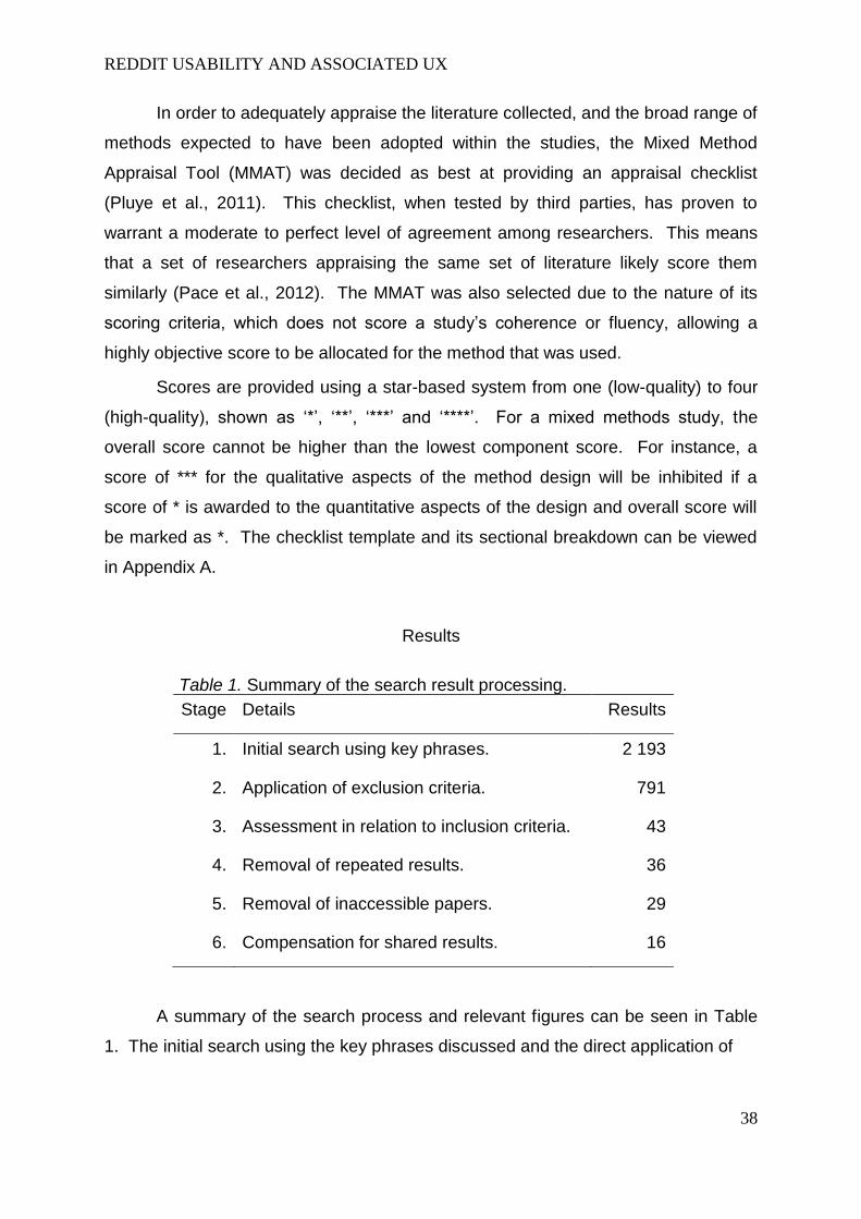
Results
Stage Details Results
1. Initial search using key phrases. 2 193
2. Application of exclusion criteria. 791
3. Assessment in relation to inclusion criteria. 43
4. Removal of repeated results. 36
5. Removal of inaccessible papers. 29
6. Compensation for shared results. 16
A summary of the search process and relevant figures can be seen in Table
1. The initial search using the key phrases discussed and the direct application of
Table 1. Summary of the search result processing.
REDDIT USABILITY AND ASSOCIATED UX
39
the exclusion criteria provided 791 items for potential inclusion in the review –
318 in EbscoHOST’s database and 473 in that of Scopus. However, once these
results were examined with the inclusion criteria, this number quickly fell. Repeated
results were also removed. Subscription limitations and access restrictions also led
to the ineligibility of studies. This left 15 and 14 results from EbscoHOST and
Scopus respectively. Of these 29, 13 were actually in both databases, leaving a final
count of 16 individual studies most appropriate for inclusion in the review.
Summary of studies
The studies reviewed have been numbered and summarised in Appendix B
and the methods and measures used within them have been noted. This allows
them to be referred to be Item number. The appraisal score for each item has also
been included. In turn, common method design aspects have been tabulated in
Table 2 to visually represent what main methods combinations were used most
frequently.
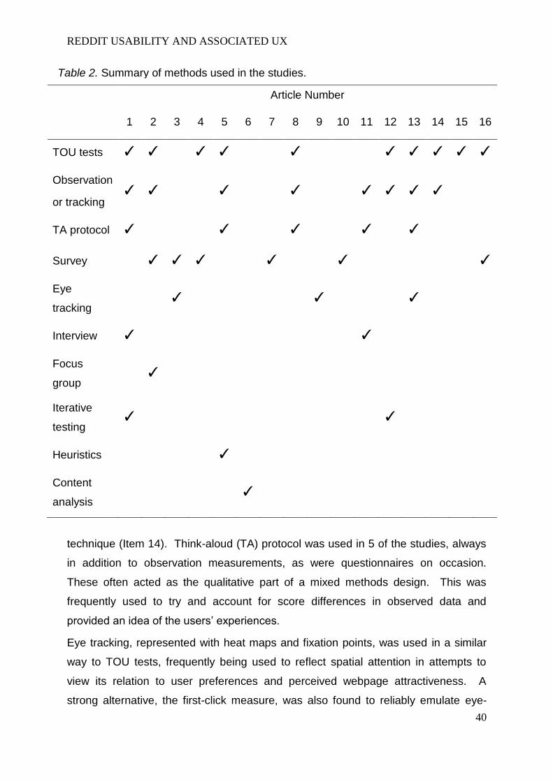
Measures of website usability and user experience
In the interest of addressing the primary review aim: to review the methods
used to judge website usability, methods were addressed across all 16 studies, the
most common being task-oriented usability (TOU) tests. Of the 10 studies that
incorporated this task structure into their methodology, 7 also used concurrent
participant observation or tracking techniques. In most studies, these were used to
determine aspects such as website navigability or efficiency. Outcome measures
such as ‘error rate’ and ‘accuracy’ allowed researchers to quickly assess the usability
of a website and, in designs such as that used in Item 14, allowed for comparisons to
be made between websites.
However, the results of the review also highlight that TOU tests in conjunction
with observation or tracking measurements often formed only a part of the data
collection phase in studies. In fact, only one study failed to employ at least one more
REDDIT USABILITY AND ASSOCIATED UX
40
Article Number
1 2 3 4 5 6 7 8 9 10 11 12 13 14 15 16
TOU tests ✓ ✓ ✓ ✓ ✓ ✓ ✓ ✓ ✓ ✓
Observation
or tracking ✓ ✓ ✓ ✓ ✓ ✓ ✓ ✓
TA protocol ✓ ✓ ✓ ✓ ✓
Survey ✓ ✓ ✓ ✓ ✓ ✓
Eye
tracking ✓ ✓ ✓
Interview ✓ ✓
Focus
group ✓
Iterative
testing ✓ ✓
Heuristics ✓
Content
analysis ✓
technique (Item 14). Think-aloud (TA) protocol was used in 5 of the studies, always
in addition to observation measurements, as were questionnaires on occasion.
These often acted as the qualitative part of a mixed methods design. This was
frequently used to try and account for score differences in observed data and
provided an idea of the users’ experiences.
Eye tracking, represented with heat maps and fixation points, was used in a similar
way to TOU tests, frequently being used to reflect spatial attention in attempts to
view its relation to user preferences and perceived webpage attractiveness. A
strong alternative, the first-click measure, was also found to reliably emulate eye-
Table 2. Summary of methods used in the studies.

REDDIT USABILITY AND ASSOCIATED UX
41
tracking. This measure involved participants clicking the first 5 things they wished to
on being shown a webpage.
Approach to design improvement
The review highlighted that usability trials and user experience measurements
were used to identify a website as having poor or good usability. Moreover, usability
was frequently composed of usability constructs or factors, such as ‘navigability’ and
‘learnability’. Item 7, for example, isolates these factors and uses them to highlight
their importance on behaviours. Yet, as with most of the studies reviewed, little can
be said on identifying what is causing low usability scores, making the effectiveness
of potential design improvements more difficult to satisfactorily predict.
This emphasises strengths in a mixed methods approach, which can be used
to triangulate vital usability issues. Although most of the studies did not focus on a
website redesign, as this project hopes to do with the Reddit interface, this review
has highlighted how combined methods can allow inferences to be made. Item 11 is
a good example of this. The methods of activity tracking, TA protocol and interviews
were combined and made issues easier for the researchers to identify.
Heuristic evaluation, involving an evaluation of factors associated usability
and user experience, was investigated in Item 5. Its potential value in identifying
minor issues was shown. However, user-based trials were found to be stronger in
identifying areas of severe usability issues.
Critical appraisal
While the application of the MMAT proved useful in rating the methodological
integrity of the studies, it is actually the attached comments that proved most useful.
While appraising the items, it became clear that a significant number did not fully
elaborate on their sample populations, if indeed there were a trial, and frequently
seemed to assume they represented the general population. Item 8 (Martin et al,
2014) exemplifies the limitations of some studies. While a method is clearly outlined,
almost no detail is given to the sample population. In this way, the critical appraisal
quickly highlighted the difficulty with which certain studies could be replicated. Item
11 (Nicolson et al., 2011), on the other hand, provided an example of a highly
replicable study that provided depth into the limitations of the study and accounted
for its sample recruitment process.
REDDIT USABILITY AND ASSOCIATED UX
42
Discussion
Exercising concurrent measures of usability
The primary aim of this review was to review and evaluate the methods used
in studies to evaluate and judge website usability and user experience issues. The
results of the search highlight that this aim has certainly been achieved and have
identified a wide variety of methodological techniques currently used by researchers.
Overall, the validity of many of these methods often appears strong and it is valid to
state that the independent variables being measured do reflect usability and user
experience.
Despite this, the reviewed studies show that issues of practicality can prevent
a cocktail of all the optimum tools from being used. The two studies (1 and 12) that
at least included elements addressing iterative testing reflect this and the
compromises involved in electing to use task-oriented usability tests. These tests
were used across most studies. This largely stems from the fact that they
standardise participant goals and make comparisons easier between groups. In an
iterative process, this is valuable as it provides a quick means by which initial signs
of improvements can be seen. Furthermore, they allow for multiple methods to be
carried out concurrently, such as think-aloud protocol, eye tracking and error rate
counts.
Yet there are limitations. There is no way to deny that a laboratory, and
consequently a synthetic, environment is necessary in order to evaluate usability and
user experience in this way. Item 8 highlights that remote usability testing can offer
advantageous results and allows users to carry out the trials in their own home,
therefore providing an environment more able to reflect natural use. Therefore,
should concurrent, standardised methods, be important, these advantages are lost.
This compromise may be necessary, however, if areas of improvement wish
to be more detailed. Remote testing may succeed to finding more usability issues
but it is limited in providing guidance on how these issues can be improved. This is
where concurrent laboratory-based qualitative and quantitative methods prove their
use and justify the compromise in location.
REDDIT USABILITY AND ASSOCIATED UX
43
Guiding design improvement
This leads into the secondary aim of this review, to review ways to manipulate
website design to improve on identified usability and user experience issues. The
review results actually highlighted inherent weaknesses, even within these
laboratory-based investigations, that could reduce efficiency of iteration design
processes. The methods used by many of the studies, even revolving around a
mixed design, did not necessarily provide the strongest basis on which design
improvements can be efficiently made.
Most items involved observed or otherwise quantitative scalar data to be
collected on participants’ actions. Concurrent measures of reported issues or
preferences to do with usability or experience were often recorded. In turn, themes
in the sample populations’ perceptions of websites could be used in coordination
with the scalar data collected on their actions, providing a means by which to more
extensively discuss issues.
This highlighted a consistent flaw in laboratory-based studies attempting to
improve a website’s design as they relied on an unstated assumption that self-
reported, and therefore conscious, perception could be used to explain the
“symptoms” of poor usability, i.e. low accuracy and high error rates in actions. Item
12 shows that this connection is not entirely reliable through the concurrent use of
eye tracking, used as a way of mapping attention and elements of unconscious
perception, in its experiments. Conscious perception, a contributory factor to user
experience, was measured through surveys and think-aloud protocol and the
satisfaction of younger versus older users was measured. Satisfaction did not differ
significantly between the two populations. However, the way in which the two
groups attended to webpages led to unconscious visual behaviours and perceptions
that did differ and appeared to affect measured aspects of action, such as speed and
accuracy. Had attention not been investigated, it would have been very difficult to
pinpoint and outline usability shortcomings and propose ways to improve upon them.
However, by investigating attention and visual perception, website developers can
use the results to try and better cater to an older demographic.

REDDIT USABILITY AND ASSOCIATED UX
44
Relevance to redesigning the Reddit website interface
The review results contribute to considerations that must be made in what will
be a investigation of the Reddit interface intended on giving a clear indication on how
to improve the design in further iterations. Figure 1 emphasises the usefulness of
regarding usability as a culmination of the various symptoms and conscious and
subconscious processes measured by studies in the review. If each of these
aspects is reliably measured, direction for improvements could essentially be more
specific and less risky. This could be seen as an extension, and intended
improvement, on a form of triangulation of issues similar to that of Item 11, which
used quantitative and qualitative methods to evaluate action and conscious
perception but did not investigate attention or unconscious perception.
Although this approach is arguably the most likely to address an array of
usability issues, the review results highlight areas that require caution and contribute
toward outlining limitations of a various methodological components. The
importance of a degree of consistency across sample populations on iterations is
one example. If the nature of attention allocation to websites varies in relation to
age, for instance, the distribution of participant age in the sample population must
not vary significantly between iterations in order for comparisons to maintain validity.
At the same time, the critical appraisal of studies has highlighted the fact that
none of the studies suffered from high withdrawal or a poor follow-up cohort. This
Figure 1. A simple representation of the defining variables of usability..
REDDIT USABILITY AND ASSOCIATED UX
45
may largely stem from the fact that the nature of assessing website usability does
not require invasive or ethically questionable methods.
Evaluation of review and conclusion
Overall, the search this review was suitable in providing a wealth of studies
sporting different methods, all with the goal of evaluating website usability or
comparing evaluation methods themselves. This helped to highlight the importance
of a mixed method approach to measuring usability in a way that can be construed
as fruitful and contributory to later iterations of the same website. Consequently, a
well-informed structure can develop in terms of assessing and improving upon
Reddit’s website interface.
However, the method was not without faults. For instance, the review was
carried out in order to inform an approach to assessing the Reddit website’s usability
and associated user experience and improving upon it. The primary aim served to
accomplish this and, to an extent, succeeded. However, the primary aim did not
lead to criteria that excluded studies aiming to assess for the presence of usability
issues but not their nature. This particularly affected the extent to which methods
such as heuristic evaluation (Item 5) were represented. Instead, the review served
only to highlight heuristic evaluation as better at finding minor issues over severe
usability issues. While this is useful to consider moving onward into an experiment
phase, there is no way to discern if the nature of minor issues, found through
heuristic evaluation, differ to that of minor issues in laboratory-based tests.
Despite these shortcomings, a good review of knowledge and current
methodological designs was established. Further research could also benefit from
the results of this review by selecting certain methods and further expanding on
aspects such as the quantitative structure of measure usability constructs and the
way in which they are deemed comparable.
Word count: 3 000

REDDIT USABILITY AND ASSOCIATED UX
46
References
(Including reviewed studies)
Bertot, J. C., Berube, K., Devereaux, P., Dhakal, K., Powers, S., & Ray, J. (2012). Assessing the usability of WorldCat Local: findings and considerations. The Library, 82(2).
Djamasbi, S., Siegel, M., Skorinko, J., & Tullis, T. (2011). Online viewing and
aesthetic preferences of generation y and the baby boom generation: Testing user
web site experience through eye tracking. International Journal of Electronic
Commerce, 15(4), 121-158.
Fang, X., Hu, P. J. H., Chau, M., Hu, H. F., Yang, Z., & Sheng, O. R. L. (2012). A data-driven approach to measure web site navigability. Journal of Management Information Systems, 29(2), 173-212.
Hasan, L., Morris, A., & Probets, S. (2012). A comparison of usability evaluation methods for evaluating e-commerce websites. Behaviour & Information Technology, 31(7), 707-737.
Huang, Z., & Cappel, J. J. (2012). A Comparative Study of Web Site Usability Practices of Fortune 500 Versus INC. 500 Companies. Information Systems Management, 29(2), 112-122.
Lee, Y., & Kozar, K. A. (2012). Understanding of website usability: Specifying and measuring constructs and their relationships. Decision Support Systems, 52(2), 450-463.
Martin, R., Al Shamari, M., Seliaman, M. E., & Mayhew, P. (2014). Remote Asynchronous Testing: A Cost-Effective Alternative for Website Usability Evaluation. International Journal of Computer and Information Technology, 3(1), 99-104.
Masciocchi, C. M., & Still, J. D. (2013). Alternatives to eye tracking for predicting stimulus-driven attentional selection within interfaces. Human–Computer Interaction, 28(5), 417-441.
Nathan, R. J., & Yeow, P. H. (2011). Crucial web usability factors of 36 industries for students: a large-scale empirical study. Electronic Commerce Research, 11(2), 151-180.
Nicolson, D. J., Knapp, P., Gardner, P., & Raynor, D. K. (2011). Combining concurrent and sequential methods to examine the usability and readability of

REDDIT USABILITY AND ASSOCIATED UX
47
websites with information about medicines. Journal of Mixed Methods Research, 5(1), 25-51.
Pace, R., Pluye, P., Bartlett, G., Macaulay, A. C., Salsberg, J., Jagosh, J., & Seller,
R. (2012). Testing the reliability and efficiency of the pilot Mixed Methods Appraisal
Tool (MMAT) for systematic mixed studies review. International journal of nursing
studies, 49(1), 47-53.
Pluye, P., Robert, E., Cargo, M., Bartlett, G., O’Cathain, A., Griffiths, F., Boardman,
F., Gagnon, M.P., & Rousseau, M.C. (2011). Proposal: A mixed methods appraisal
tool for systematic mixed studies reviews. Retrieved on [date] from
http://mixedmethodsappraisaltoolpublic.pbworks.com. Archived by WebCite ® at
http://www.webcitation.org/5tTRTc9yJ
Rama, A., & Dhanraj, S. V. (2014). Web Usability Testing Technique Using Clear Methodology. Middle-East Journal of Scientific Research, 20(4), 475-478.
Romano Bergstrom, J. C., Olmsted-Hawala, E. L., & Jans, M. E. (2013). Age-related differences in eye tracking and usability performance: website usability for older adults. International Journal of Human-Computer Interaction, 29(8), 541-548.
Roy, S., Pattnaik, P. K., & Mall, R. (2014). A quantitative approach to evaluate usability of academic websites based on human perception. Egyptian Informatics Journal, 15(3), 159-167.
Tezza, R., Bornia, A. C., & De Andrade, D. F. (2011). Measuring web usability using item response theory: Principles, features and opportunities. Interacting with Computers, 23(2), 167-175.
Westerman, S. J., Shaerf, S., Tuck, G. C., & Gardner, P. H. (2012). Structuring Users' Self-Report Responses to Website Designs. International Journal of Human-Computer Interaction, 28(7), 456-471.
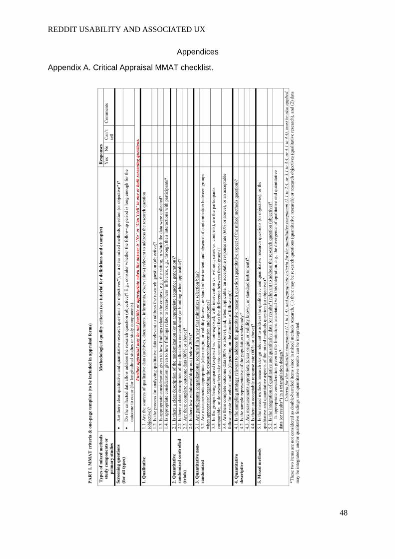
REDDIT USABILITY AND ASSOCIATED UX
48
Appendices
Appendix A. Critical Appraisal MMAT checklist.

REDDIT USABILITY AND ASSOCIATED UX
49

REDDIT USABILITY AND ASSOCIATED UX
50
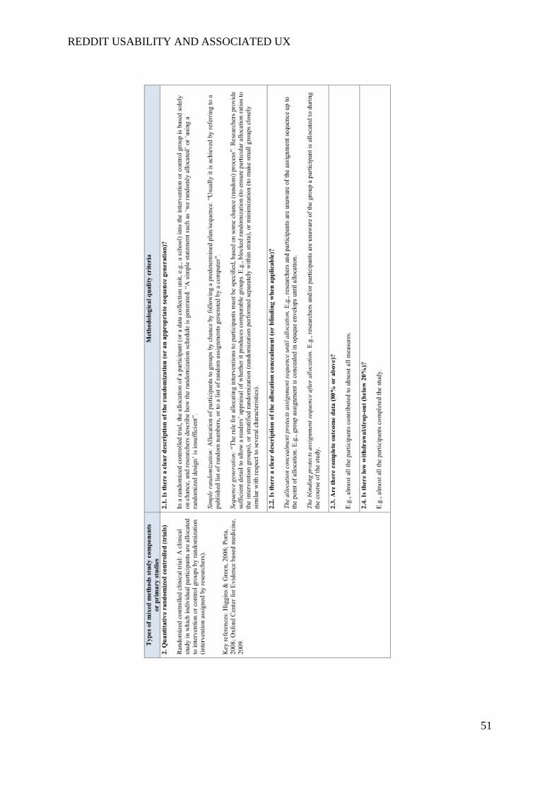
REDDIT USABILITY AND ASSOCIATED UX
51
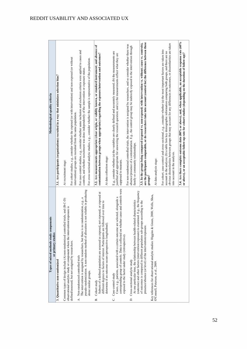
REDDIT USABILITY AND ASSOCIATED UX
52
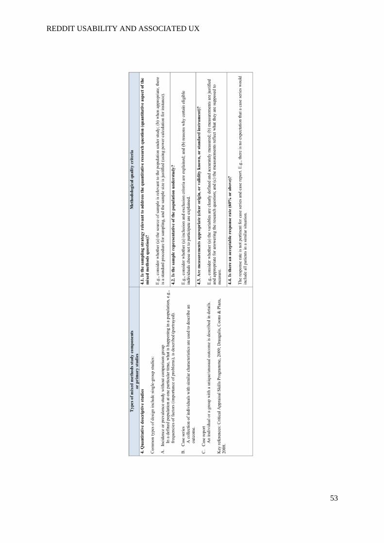
REDDIT USABILITY AND ASSOCIATED UX
53
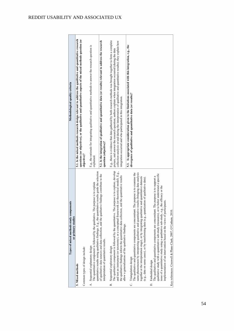
REDDIT USABILITY AND ASSOCIATED UX
54
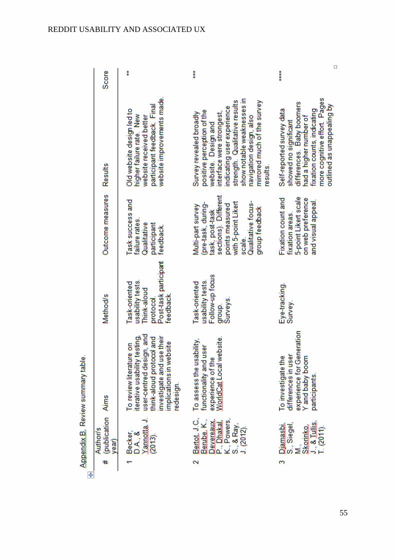
REDDIT USABILITY AND ASSOCIATED UX
55
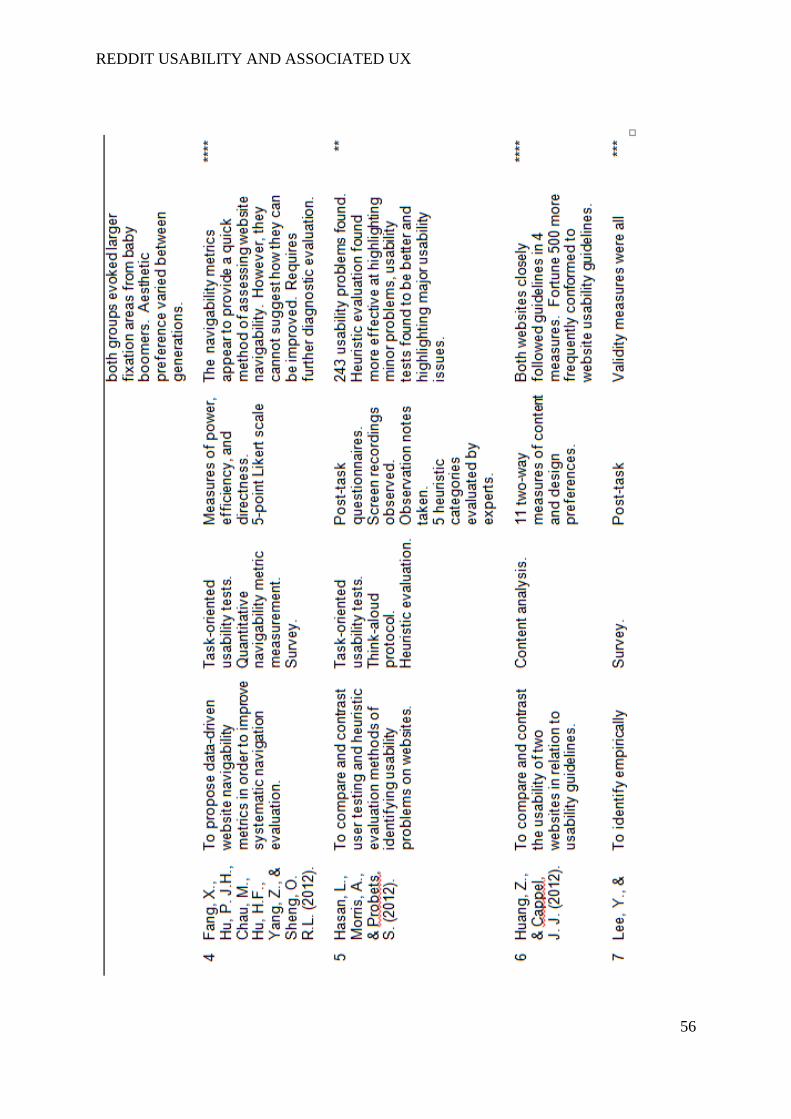
REDDIT USABILITY AND ASSOCIATED UX
56

REDDIT USABILITY AND ASSOCIATED UX
57
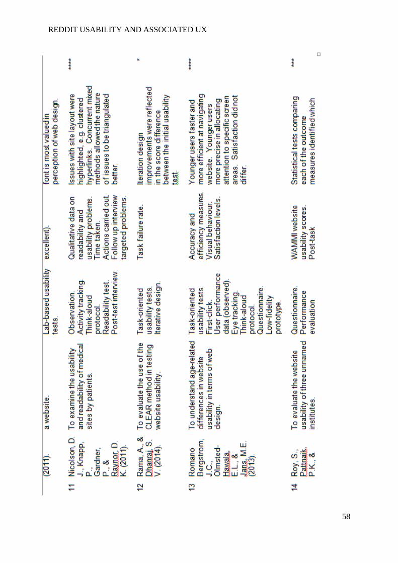
REDDIT USABILITY AND ASSOCIATED UX
58
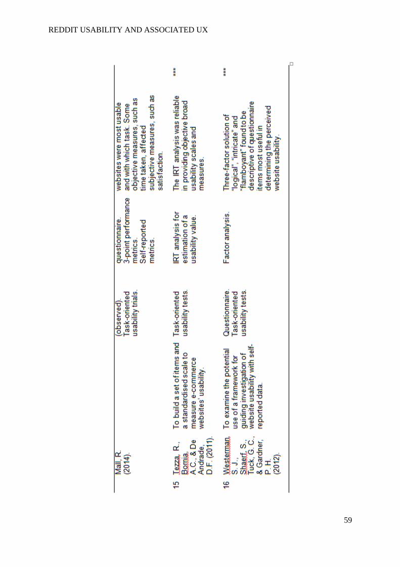
REDDIT USABILITY AND ASSOCIATED UX
59

REDDIT USABILITY AND ASSOCIATED UX
60
Appendix B. Usability trial participant information.
An evaluation of the usability and user experiences of the original 'Reddit' website
interface and its proposed redesign.
Participant Information Sheet for First Usability Trials
Investigator: Jack Nicholson Fantham
Supervisor: Martin Maguire
Project contact details:
Postal address:
Loughborough Design School,
Loughborough University,
Loughborough,
LE11 3TU.
Contact number:
01509 226900
E-mail address:
What is the purpose of the study?
Reddit is a news aggregate and entertainment website consisting entirely of user-submitted
content. Despite its broad user population, evidence suggests that the usability of the website
is not as good as it could be. This project aims to evaluate the problems associated with the
website’s usability and its associated user experience to guide a redesign of the website’s
default interface.
Who is doing this research and why?

REDDIT USABILITY AND ASSOCIATED UX
61
The study that will take place is supported by Loughborough University. The investigator,
Jack Fantham, is a postgraduate student undertaking a Master’s in Ergonomics and Human
Factors and this study serves as his dissertation project. This project is under the supervision
of Dr Martin Maguire.
Are there any exclusion criteria?
For the usability trials, participants must be over 18 years of age and identify as non-users of
Reddit.
What will I be asked to do?
Once you have provided a signed consent form, you will be asked to answer some
preliminary questions on your use of social networking websites. After this, you will be
asked to carry out ten scenarios on the existing Reddit website during which you should
verbalise your thought processes. At the end, there will be a short semi-structured interview
and some statements with which you will be asked to identify as agreeable or not.
Once I take part, can I change my mind?
Yes. After you have read this information and asked any questions you may have we will ask
you to complete an Informed Consent Form, however if at any time, before, during or after
the sessions you wish to withdraw from the study please just contact the main investigator.
You can withdraw at any time, for any reason and you will not be asked to explain your
reasons for withdrawing.
However, once the results of the study are aggregated and the dissertation has been submitted
(expected to be by 28th
August, 2015), it will not be possible to withdraw your individual data
from the research. Please remember that, though this will be the case, your results will
remain anonymous throughout the entire process and it will not be possible to identify
individual participants in the published version.
Will I be required to attend any sessions and where will these be?
You will not be required to take part in any follow-up sessions.
How long will it take?
The session should take around 30 to 40 minutes.
What personal information will be required from me?

REDDIT USABILITY AND ASSOCIATED UX
62
You will be required to provide some basic demographic details, such as your age and
gender. You will also need to provide some information on your usage of social networking
sites.
Are there any risks in participating?
Your participation will not expose you to any health risks.
Will my taking part in this study be kept confidential?
In the interest of maintaining participant anonymity, your name will not be linked to your
data in any way and it will not be possible to trace your precise results through reading the
final study. Please also be assured that throughout the investigation process, your data will
be kept in security-protected folders.
I have some more questions; who should I contact?
Please do not hesitate to contact the investigator or the Loughborough Design School with
any questions you may have.
What will happen to the results of the study?
The results of the study will used to assess the success of the study. The raw data collected
will be destroyed once the project has been submitted.
What if I am not happy with how the research was conducted?
If you are not happy with how the research was conducted, please contact Ms Jackie Green,
the Secretary for the University’s Ethics Approvals (Human Participants) Sub-Committee:
Ms J Green, Research Office, Hazlerigg Building, Loughborough University, Epinal Way,
Loughborough, LE11 3TU. Tel: 01509 222423. Email: [email protected]
The University also has a policy relating to Research Misconduct and Whistle Blowing which
is available online at http://www.lboro.ac.uk/committees/ethics-approvals-human-
participants/additionalinformation/codesofpractice/ .
REDDIT USABILITY AND ASSOCIATED UX
63
Appendix C. Usability trials consent form.
An evaluation of the usability and user experiences of the original 'Reddit' website
interface and its proposed redesign.
FIRST USABILITY TRIALS
INFORMED CONSENT FORM
(to be completed after Participant Information Sheet has been read)
The purpose and details of this study have been explained to me. I
understand that this study is designed to further scientific knowledge
and that all procedures have been approved by the Loughborough
University Ethics Approvals (Human Participants) Sub-Committee.
Yes
No
I have read and understood the information sheet and this consent
form.
Yes No
I have had an opportunity to ask questions about my participation. Yes No
I understand that I am under no obligation to take part in the study. Yes No
I understand that I have the right to withdraw from this study at any
stage for any reason, and that I will not be required to explain my
reasons for withdrawing.
Yes
No
I understand that all the information I provide will be treated in strict
confidence and will be kept anonymous and confidential to the
researchers unless (under the statutory obligations of the agencies
which the researchers are working with), it is judged that
confidentiality will have to be breached for the safety of the participant
or others.
Yes
No
I agree to participate in this study. Yes
No
Your name
________________________________
Your signature
________________________________
Signature of investigator
________________________________
Date ________________________________
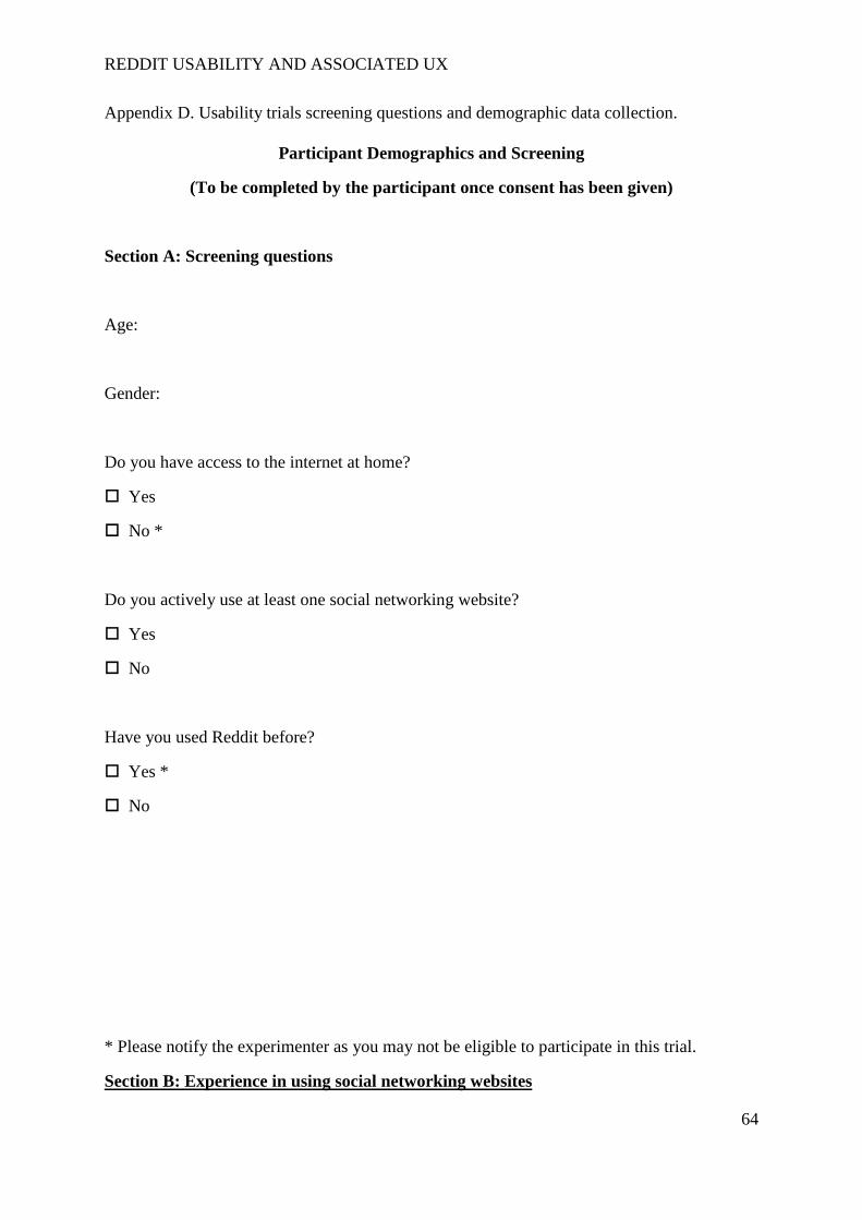
REDDIT USABILITY AND ASSOCIATED UX
64
Appendix D. Usability trials screening questions and demographic data collection.
Participant Demographics and Screening
(To be completed by the participant once consent has been given)
Section A: Screening questions
Age:
Gender:
Do you have access to the internet at home?
Yes
No *
Do you actively use at least one social networking website?
Yes
No
Have you used Reddit before?
Yes *
No
* Please notify the experimenter as you may not be eligible to participate in this trial.
Section B: Experience in using social networking websites
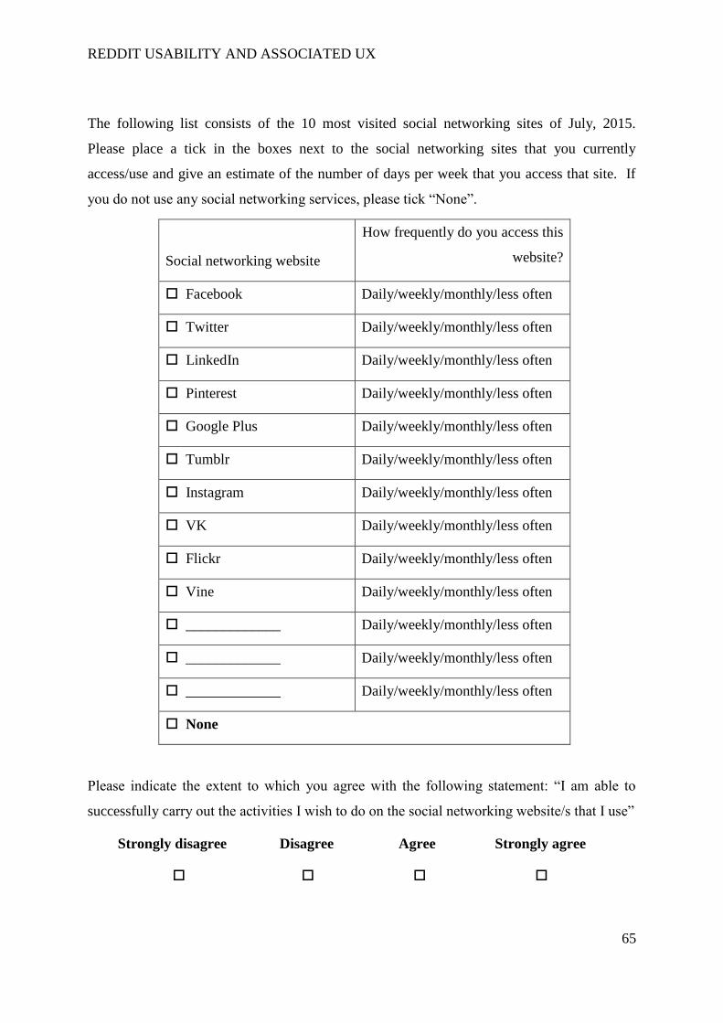
REDDIT USABILITY AND ASSOCIATED UX
65
The following list consists of the 10 most visited social networking sites of July, 2015.
Please place a tick in the boxes next to the social networking sites that you currently
access/use and give an estimate of the number of days per week that you access that site. If
you do not use any social networking services, please tick “None”.
Social networking website
How frequently do you access this
website?
Facebook Daily/weekly/monthly/less often
Twitter Daily/weekly/monthly/less often
LinkedIn Daily/weekly/monthly/less often
Pinterest Daily/weekly/monthly/less often
Google Plus Daily/weekly/monthly/less often
Tumblr Daily/weekly/monthly/less often
Instagram Daily/weekly/monthly/less often
VK Daily/weekly/monthly/less often
Flickr Daily/weekly/monthly/less often
Vine Daily/weekly/monthly/less often
_____________ Daily/weekly/monthly/less often
_____________ Daily/weekly/monthly/less often
_____________ Daily/weekly/monthly/less often
None
Please indicate the extent to which you agree with the following statement: “I am able to
successfully carry out the activities I wish to do on the social networking website/s that I use”
Strongly disagree Disagree Agree Strongly agree
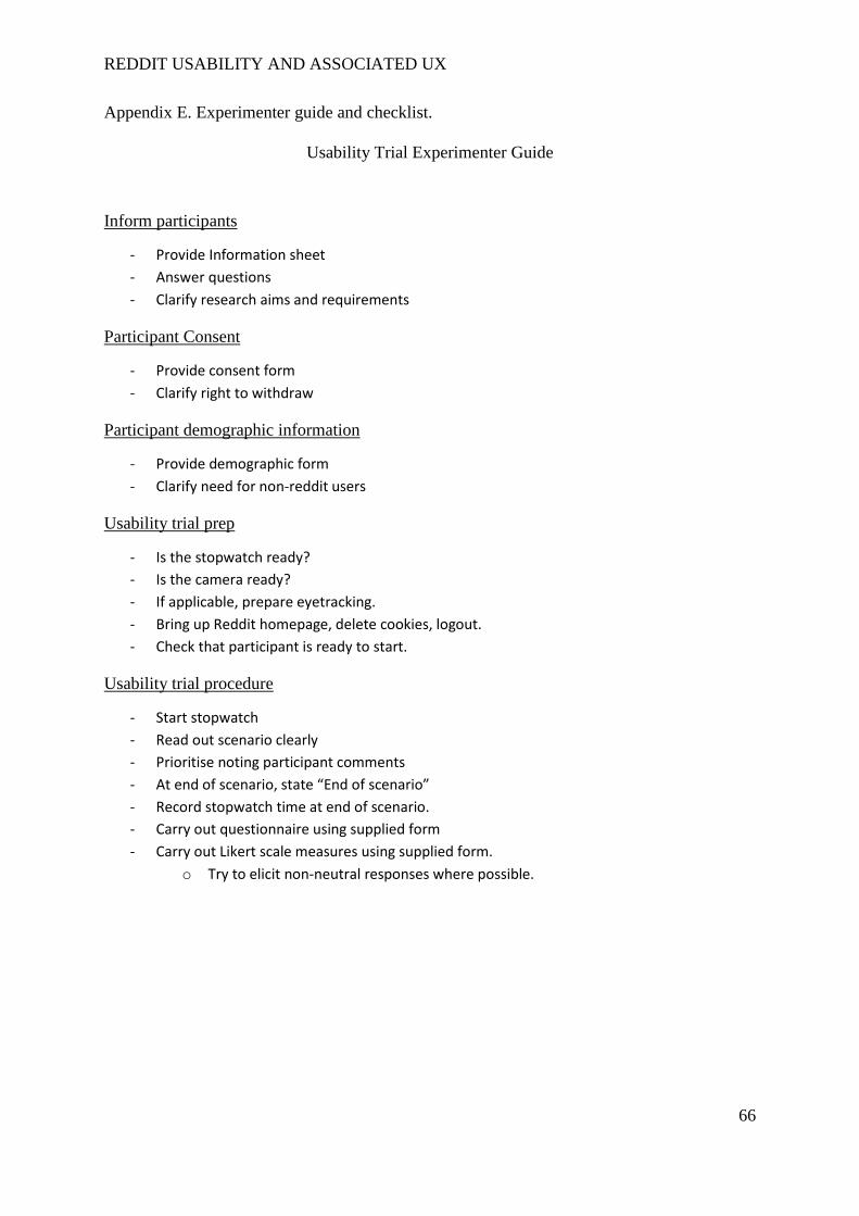
REDDIT USABILITY AND ASSOCIATED UX
66
Appendix E. Experimenter guide and checklist.
Usability Trial Experimenter Guide
Inform participants
- Provide Information sheet
- Answer questions
- Clarify research aims and requirements
Participant Consent
- Provide consent form
- Clarify right to withdraw
Participant demographic information
- Provide demographic form
- Clarify need for non-reddit users
Usability trial prep
- Is the stopwatch ready?
- Is the camera ready?
- If applicable, prepare eyetracking.
- Bring up Reddit homepage, delete cookies, logout.
- Check that participant is ready to start.
Usability trial procedure
- Start stopwatch
- Read out scenario clearly
- Prioritise noting participant comments
- At end of scenario, state “End of scenario”
- Record stopwatch time at end of scenario.
- Carry out questionnaire using supplied form
- Carry out Likert scale measures using supplied form.
o Try to elicit non-neutral responses where possible.
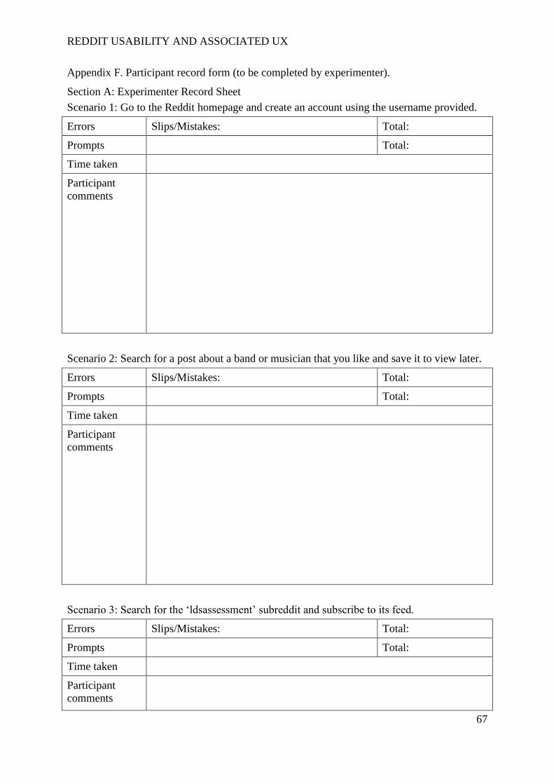
REDDIT USABILITY AND ASSOCIATED UX
67
Appendix F. Participant record form (to be completed by experimenter).
Section A: Experimenter Record Sheet
Scenario 1: Go to the Reddit homepage and create an account using the username provided.
Errors Slips/Mistakes: Total:
Prompts Total:
Time taken
Participant
comments
Scenario 2: Search for a post about a band or musician that you like and save it to view later.
Errors Slips/Mistakes: Total:
Prompts Total:
Time taken
Participant
comments
Scenario 3: Search for the ‘ldsassessment’ subreddit and subscribe to its feed.
Errors Slips/Mistakes: Total:
Prompts Total:
Time taken
Participant
comments

REDDIT USABILITY AND ASSOCIATED UX
68
Scenario 4: Post a link on the ‘ldsassessment’ subreddit to www.google.co.uk.
Errors Slips/Mistakes: Total:
Prompts Total:
Time taken
Participant
comments
Scenario 5: Open the comment thread to an existing post on the ‘ldsasessment’ subreddit and
post a comment of your own.
Errors Slips/Mistakes: Total:
Prompts Total:
Time taken
Participant
comments

REDDIT USABILITY AND ASSOCIATED UX
69
Scenario 6: From the Reddit front page, create a multireddit entitled ‘sports’ and add
subreddits related to four different sports to it.
Errors Slips/Mistakes: Total:
Prompts Total:
Time taken
Participant
comments
Scenario 7: Find the full list of subreddits to which you are subscribed and upvote a post that
interests you in one of them.
Errors Slips/Mistakes: Total:
Prompts Total:
Time taken
Participant
comments
Scenario 8: From your location, search for the user ‘LDS_friend’ and send them a friend
request.
Errors Slips/Mistakes: Total:
Prompts Total:
Time taken
Participant
comments
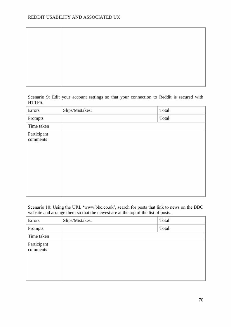
REDDIT USABILITY AND ASSOCIATED UX
70
Scenario 9: Edit your account settings so that your connection to Reddit is secured with
HTTPS.
Errors Slips/Mistakes: Total:
Prompts Total:
Time taken
Participant
comments
Scenario 10: Using the URL ‘www.bbc.co.uk’, search for posts that link to news on the BBC
website and arrange them so that the newest are at the top of the list of posts.
Errors Slips/Mistakes: Total:
Prompts Total:
Time taken
Participant
comments

REDDIT USABILITY AND ASSOCIATED UX
71
Section B: Interview Questions
What did you think of the overall Reddit website’s ease of use?
Was there anything you found particularly easy?
Was there anything you found particularly hard?
If you were to carry out these tasks again, what would you change about the website to
improve your experience?
Section C: Cognitive processing load
To what extent do you agree with these statements (circle a number for each)?
1. “Generally, finding out how to carry out each task took more effort than I think was necessary”
Strongly
disagree
1 2 3 4 5 6 7
Strongly
agree
2. “I needed to think a lot when deciding how to navigate from the page I was on to the target page or function”
Strongly
disagree
1 2 3 4 5 6 7
Strongly
agree
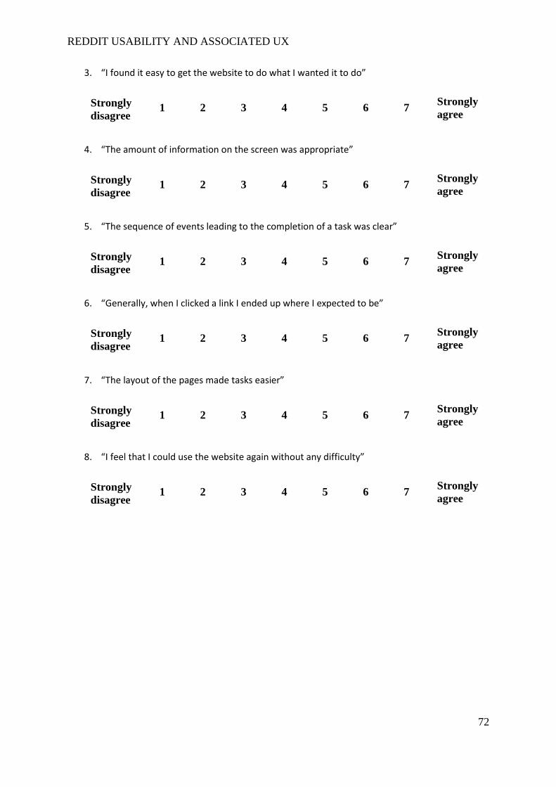
REDDIT USABILITY AND ASSOCIATED UX
72
3. “I found it easy to get the website to do what I wanted it to do”
Strongly
disagree
1 2 3 4 5 6 7
Strongly
agree
4. “The amount of information on the screen was appropriate”
Strongly
disagree
1 2 3 4 5 6 7
Strongly
agree
5. “The sequence of events leading to the completion of a task was clear”
Strongly
disagree
1 2 3 4 5 6 7
Strongly
agree
6. “Generally, when I clicked a link I ended up where I expected to be”
Strongly
disagree
1 2 3 4 5 6 7
Strongly
agree
7. “The layout of the pages made tasks easier”
Strongly
disagree
1 2 3 4 5 6 7
Strongly
agree
8. “I feel that I could use the website again without any difficulty”
Strongly
disagree
1 2 3 4 5 6 7
Strongly
agree

REDDIT USABILITY AND ASSOCIATED UX
73
Appendix G. Usability trial scenarios and action maps.
Scenario 1 Go to the Reddit homepage and create an account using the username
provided.
Scenario 2 Search for a post about a band or musician that you like and save it to view
later.
Scenario 3 Search for the ‘ldsassessment’ subreddit and subscribe to its feed.
Scenario 4 Post a link on the ‘ldsassessment’ subreddit to www.google.co.uk.
Scenario 5 Open the comment thread to an existing post on the ‘ldsasessment’ subreddit
and post a comment of your own.
Scenario 6 From the Reddit front page, create a multireddit entitled ‘sports’ and add
subreddits related to four different sports to it.
Scenario 7 Find the full list of subreddits to which you are subscribed and upvote a post
that interests you in one of them.
Scenario 8 From your location, search for the user ‘LDS_friend’ and send them a friend
request.
Scenario 9 Edit your account settings so that your connection to Reddit is secured with
HTTPS.
Scenario 10 Using the URL ‘www.bbc.co.uk’, search for posts that link to news on the
BBC website and arrange them so that the newest are at the top of the list of
posts.
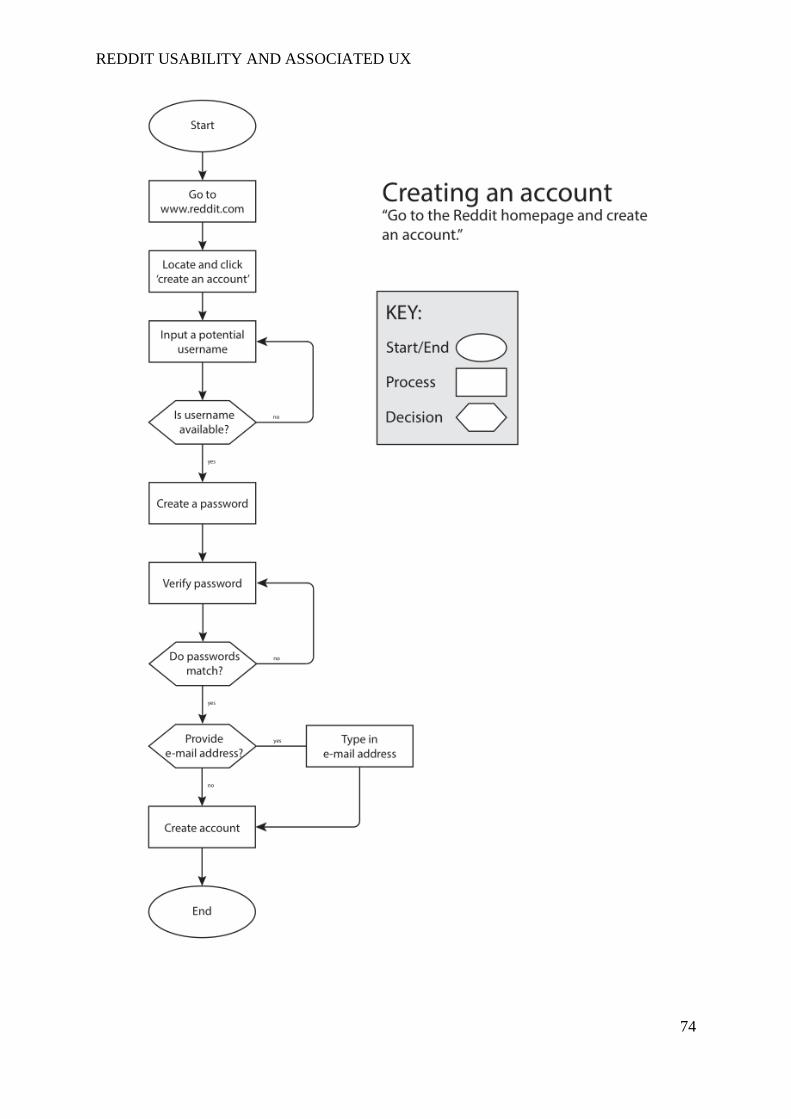
REDDIT USABILITY AND ASSOCIATED UX
74

REDDIT USABILITY AND ASSOCIATED UX
75

REDDIT USABILITY AND ASSOCIATED UX
76
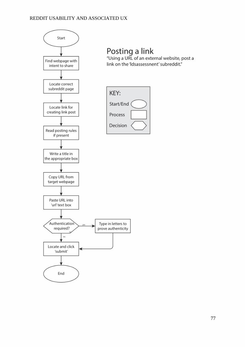
REDDIT USABILITY AND ASSOCIATED UX
77

REDDIT USABILITY AND ASSOCIATED UX
78

REDDIT USABILITY AND ASSOCIATED UX
79
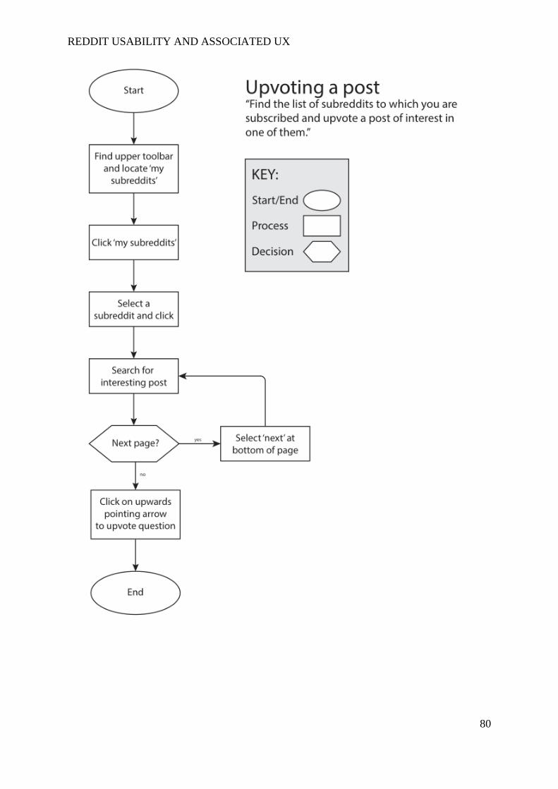
REDDIT USABILITY AND ASSOCIATED UX
80
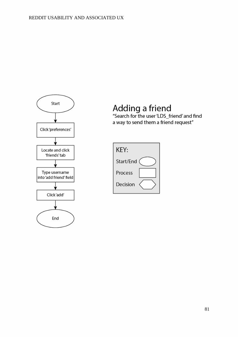
REDDIT USABILITY AND ASSOCIATED UX
81
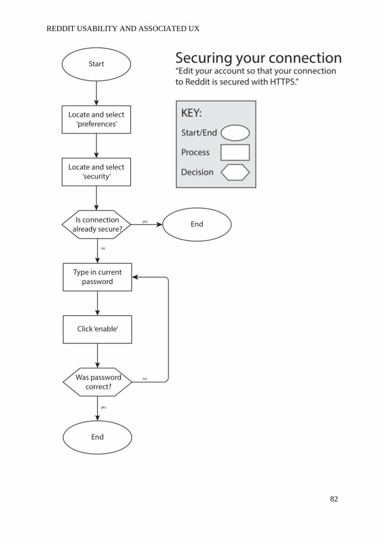
REDDIT USABILITY AND ASSOCIATED UX
82

REDDIT USABILITY AND ASSOCIATED UX
83

REDDIT USABILITY AND ASSOCIATED UX
84
Appendix H. Focus group pre-session task sent to prospective participants.
Pre-session task
Task:
Before the focus group session, it would be helpful if participants could spend time on Reddit
as they would normally while considering the experience in terms of usability. In order for
the focus group to provide best results, I would like to ask participants to make some notes on
around three to five aspects of the site design or structure that negatively affect your site use
or experience. At the same time, it would also be useful for participants to make a note of
three to five positive aspects of the site.
Please bring your notes with you to the focus group session as they will prove useful in the
initial discussion.
Some things to think about:
- How easy is it to carry out specific functions?
- What do you think about the page layouts?
- Are you avoiding certain functions? If so, why?
- Are your needs for a fully functioning experience being met?

REDDIT USABILITY AND ASSOCIATED UX
85
Appendix I. Focus group participant information.
An evaluation of the usability and user experiences of the original 'Reddit' website
interface and its proposed redesign.
Participant Information Sheet for Formative Focus Group Session
Investigator: Jack Nicholson Fantham
Supervisor: Martin Maguire
Project contact details:
Postal address:
Loughborough Design School,
Loughborough University,
Loughborough,
LE11 3TU.
Contact number:
01509 226900
E-mail address:
What is the purpose of the study?
Reddit is a news aggregate and entertainment website consisting entirely of user-submitted
content. Despite its broad user population, evidence suggests that the usability of the website
is not as good as it could be. This project aims to evaluate the problems associated with the
website’s usability and its associated user experience to guide a redesign of the website’s
default interface.
Who is doing this research and why?
The study that will take place is supported by Loughborough University. The investigator,
Jack Fantham, is a postgraduate student undertaking a Master’s in Ergonomics and Human
REDDIT USABILITY AND ASSOCIATED UX
86
Factors and this study serves as his dissertation project. This project is under the supervision
of Dr Martin Maguire.
Are there any exclusion criteria?
For the focus group session, participants must be over 18 years of age.
What will I be asked to do?
You should already have received information regarding a pre-session task. This material
will be used in conjunction with several discussion questions to evaluate the Reddit website’s
user experience. You will then be asked to work with the other group members to generate
typical scenarios in which individuals may use Reddit and create a speculative design of how
you would deliver the associated services. Lastly, you will be asked to carry out a simple
card sorting exercise arranging Reddit functions into groups based on perceived importance
to your Reddit experience.
Once I take part, can I change my mind?
Yes. After you have read this information and asked any questions you may have we will ask
you to complete an Informed Consent Form, however if at any time, before, during or after
the sessions you wish to withdraw from the study please just contact the main investigator.
You can withdraw at any time, for any reason and you will not be asked to explain your
reasons for withdrawing.
However, once the results of the study are aggregated and the dissertation has been submitted
(expected to be by 28th
August, 2015), it will not be possible to withdraw your individual data
from the research. Please remember that, though this will be the case, your results will
remain anonymous throughout the entire process and it will not be possible to identify
individual participants in the published version.
Will I be required to attend any sessions and where will these be?
You will not be required to take part in any follow-up sessions.
How long will it take?
The session should last up to two hours.
What personal information will be required from me?
You will be required to provide some basic demographic details, such as your age and
gender. You will also need to provide some information on your usage of Reddit. The
session will be recorded with a video camera but any reference to names or personal details

REDDIT USABILITY AND ASSOCIATED UX
87
will not be included in the report body. The video exists only so that the experimenter can
review the session and, where needed, update notes taken at the time.
Are there any risks in participating?
Your participation will not expose you to any health risks.
Will my taking part in this study be kept confidential?
In the interest of maintaining participant anonymity, your name will not be linked to your
data in any way and it will not be possible to trace your precise results through reading the
final study. Please also be assured that throughout the investigation process, your data will
be kept in security-protected folders. The video footage created will be deleted upon the
completion of this project.
Is there anything I need to do before the sessions?
You will be asked to sign a consent form and provide some basic demographic details prior to
starting your session. You should also have carried out the pre-session task.
Is there anything I need to bring with me?
Yes, you should have notes connected to the pre-session task.
I have some more questions; who should I contact?
Please do not hesitate to contact the investigator or the Loughborough Design School with
any questions you may have.
What will happen to the results of the study?
The results of the study will used to assess the success of the study. The raw data collected
will be destroyed once the project has been submitted.
What if I am not happy with how the research was conducted?
If you are not happy with how the research was conducted, please contact Ms Jackie Green,
the Secretary for the University’s Ethics Approvals (Human Participants) Sub-Committee:
Ms J Green, Research Office, Hazlerigg Building, Loughborough University, Epinal Way,
Loughborough, LE11 3TU. Tel: 01509 222423. Email: [email protected]
REDDIT USABILITY AND ASSOCIATED UX
88
The University also has a policy relating to Research Misconduct and Whistle Blowing which
is available online at http://www.lboro.ac.uk/committees/ethics-approvals-human-
participants/additionalinformation/codesofpractice/ .
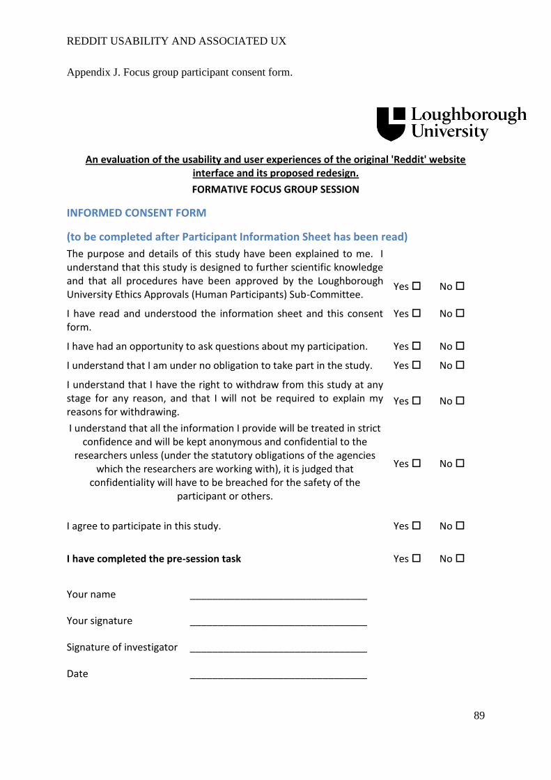
REDDIT USABILITY AND ASSOCIATED UX
89
Appendix J. Focus group participant consent form.
An evaluation of the usability and user experiences of the original 'Reddit' website interface and its proposed redesign.
FORMATIVE FOCUS GROUP SESSION
INFORMED CONSENT FORM
(to be completed after Participant Information Sheet has been read)
The purpose and details of this study have been explained to me. I understand that this study is designed to further scientific knowledge and that all procedures have been approved by the Loughborough University Ethics Approvals (Human Participants) Sub-Committee.
Yes
No
I have read and understood the information sheet and this consent form.
Yes No
I have had an opportunity to ask questions about my participation. Yes No
I understand that I am under no obligation to take part in the study. Yes No
I understand that I have the right to withdraw from this study at any stage for any reason, and that I will not be required to explain my reasons for withdrawing.
Yes
No
I understand that all the information I provide will be treated in strict confidence and will be kept anonymous and confidential to the
researchers unless (under the statutory obligations of the agencies which the researchers are working with), it is judged that
confidentiality will have to be breached for the safety of the participant or others.
Yes
No
I agree to participate in this study.
I have completed the pre-session task
Yes
Yes
No
No
Your name
________________________________
Your signature
________________________________
Signature of investigator
________________________________
Date ________________________________
REDDIT USABILITY AND ASSOCIATED UX
90
Appendix K. Focus group participant demographic form.
Participant Demographics
(To be completed by the participant once consent has been given)
Age:
Gender:
Do you have a Reddit account (please note that you will not be required to disclose your
username):
Yes
No
During a normal week, on approximately how many days do you access Reddit at some
point?
0-2
3-5
6-7
REDDIT USABILITY AND ASSOCIATED UX
91
Appendix L. Focus group session and discussion schedule.
Experimenter Guide for Formative Focus Group
* Set up camera to record
* Use HDMI cable to put Reddit on the big screen (use private window for blank experience)
* Provide participants with information form, consent form and demographic slip.
* Do not start without notebook.
Introduction:
- I’m very grateful to you all for sparing time to talk about the Reddit experience this morning.
Today we will be breaking down Reddit and talking about the experiences of its users and
the service or services that are involved in typical Reddit usage.
Aims of today:
1. To discuss typical Reddit users and the experiences that we can expect them to have when
they use Reddit.
2. To evaluate the current Reddit experience.
3. To generate examples of ways in which Reddit will typically be used. Is it always leisure?
4. After generating some typical uses for Reddit, we will try to forget about how Reddit looks
and instead think about the service it provides users. How would you deliver it?
5. Lastly, we will discuss the functions currently available on Reddit and, using what has been
discussed across previous tasks, sort these functions into groups of perceived importance to
the Reddit experience.
Opening discussion
1. Introductions
a. Ask the participants to introduce themselves and perhaps try and think about a
subreddit that they like.
2. Who are the typical users of Reddit?
a. Probe: Are their professional uses to be had as well as leisurely?
3. Reddit clearly provides some sort of service, both leisurely and not, what is it that keeps users
returning?
a. Probe: think about the uses – browsing, searching, discussion, specific subreddits,
communities, etc. Is it always for fun?
b. Probe: Try to have participants discuss how their own experience might depend on
the way in which they are using Reddit.
c. Explore: explore the context behind uses of Reddit, different types of leisure,
hobbies, learning. Allow participants to interact with the site on the screen to clarify
points.
4. What do you think Reddit offers that makes it a unique service?
REDDIT USABILITY AND ASSOCIATED UX
92
a. How valuable is this service?
b. What is important to the success of this service?
5. What aspects of the Reddit experience are good/bad?
a. Using the notes from the pre-session task
b. Explore: Try and relate points back to how they enhance/impede the service toward
and experience of the user. Allow participants to clarify with website on screen.
c. Explore: How does the design of the site affect user experience?
d. Probe: Start getting the participants to think about how they think the experience
should be.
Typical scenario generation
- Develop 3 or 4 examples of scenarios when Reddit might be used, you can base it on your
own experiences and/or use examples based on the typical users and services/uses that you
have discussed.
o Guidance if participants are having trouble
Think about leisure use (e.g. browsing, no aim in particular, hobby-based
searching), professional use (e.g. research or even data collection)
Screen design
- We have your scenarios, now as a group think about what purpose Reddit is serving in each
case and also think about how the user in each scenario may expect to experience that
service (maybe other website influences?). You can even think about your own similar
experiences.
- I have blank sheets (or “screens”) for you to draw out ideas, try to forget what Reddit looks
like and think about what you think the user should see as they use Reddit in each scenario.
o It might be easier to start with a home page for each scenario. Don’t worry too
much about consistency if one scenario looks very different to another.
o Probe: Organisation of the page? How should content be organised/filtered/ranked.
Card Sort
- Here I have 86 functions that are currently used on the Reddit website. However, is it likely
that all are used an equal amount? By thinking about the various points about service and
experience that we have discussed today how would you categorise these in terms of
importance to the way in which Reddit services are experienced?
- If you have any other ideas, there are blank cards for you to use and rank accordingly.
- Could be organise into “not important”, “sometimes important”, “always important” but it is
up to you how you arrange them, just ensure it is to do with importance.
- Explore: What are the reasons behind the categorisation of functions? Listen carefully for
justifications. What functions, if any, triggered most debate?

REDDIT USABILITY AND ASSOCIATED UX
93
Appendix M. Focus group – functions that were written on the flash cards.
Hide comments Search for text in a post Access site FAQs
Search link posts exclusively Sign up Enable/disable HTTPS
connection to Reddit
Order/sort post comments Report post Contact Reddit team
Open comment permalink Enable beta testing Search for text in post bodies
Open comments Select page filter Search for a specific website
Change default interface
settings
Explore multireddits Read about Reddit
Include/exclude NSFW posts
from the page
General search Add/change subreddit flair
Change interface language Hide post View your hidden posts
Open post Mark comment/post as spam Search text posts exclusively
Reply to a message Search for a subreddit Open blocked user list
Delete comment/post Ban users from subreddit Create a multireddit
Write a comment Create a multireddit Access subreddit traffic
statistics
Write a private message Open friend list Access reddiquette page
Open inbox Filter inbox messages Edit subreddit stylesheet
Change account password Delete account Donate to Reddit
View submitted comments Explore suggested posts Open third party web content
Reply to a comment Remove a friend Moderate subreddit posts
Unsubscribe from a subreddit Edit subreddit settings Advertise with Reddit
Delete your subreddit Submit a link Add another user as a subreddit
moderator
Update e-mail Give gold to another user Authorise third party protection
View your account Organise your subscriptions Open thread context
Verify account with e-mail Mark a message as “unread” Save thread
Subscribe to a subreddit View your gilded posts Open thread related to a
comment
View tour submitted posts Buy Reddit gold Submit a text post
View your saved posts Search for another user View karma scores
Upvote/downvote View posts that you have
upvoted/downvoted
Add a friend
Access private RSS feeds of
Reddit pages
Log out Edit account preferences
REDDIT USABILITY AND ASSOCIATED UX
94
Appendix N. Usability trials raw SPSS output and proficiency scores.
Prompt count data
Tests of Normalityb,d
Kolmogorov-Smirnova Shapiro-Wilk
Statistic df Sig. Statistic df Sig.
scenario2 .499 12 .000 .465 12 .000
scenario3 .530 12 .000 .327 12 .000
scenario4 .446 12 .000 .592 12 .000
scenario6 .460 12 .000 .552 12 .000
sceanrio7 .239 12 .057 .823 12 .017
scenario8 .167 12 .200* .927 12 .354
scenario9 .417 12 .000 .608 12 .000
scenario10 .499 12 .000 .465 12 .000
*. This is a lower bound of the true significance.
a. Lilliefors Significance Correction
b. scenario5 is constant. It has been omitted.
d. scenario1 is constant. It has been omitted.
Time taken data
Tests of Normality
Kolmogorov-Smirnova Shapiro-Wilk
Statistic df Sig. Statistic df Sig.
scenario1 .229 12 .082 .832 12 .022
scenario2 .223 12 .103 .850 12 .037
scenario3 .159 12 .200* .933 12 .413
scenario4 .357 12 .000 .690 12 .001
scenario5 .202 12 .189 .905 12 .184
scenario6 .202 12 .191 .907 12 .195
scenario7 .191 12 .200* .927 12 .353
scenario8 .131 12 .200* .952 12 .665
scenario9 .241 12 .052 .880 12 .088
scenario10 .226 12 .093 .835 12 .024
*. This is a lower bound of the true significance.
a. Lilliefors Significance Correction
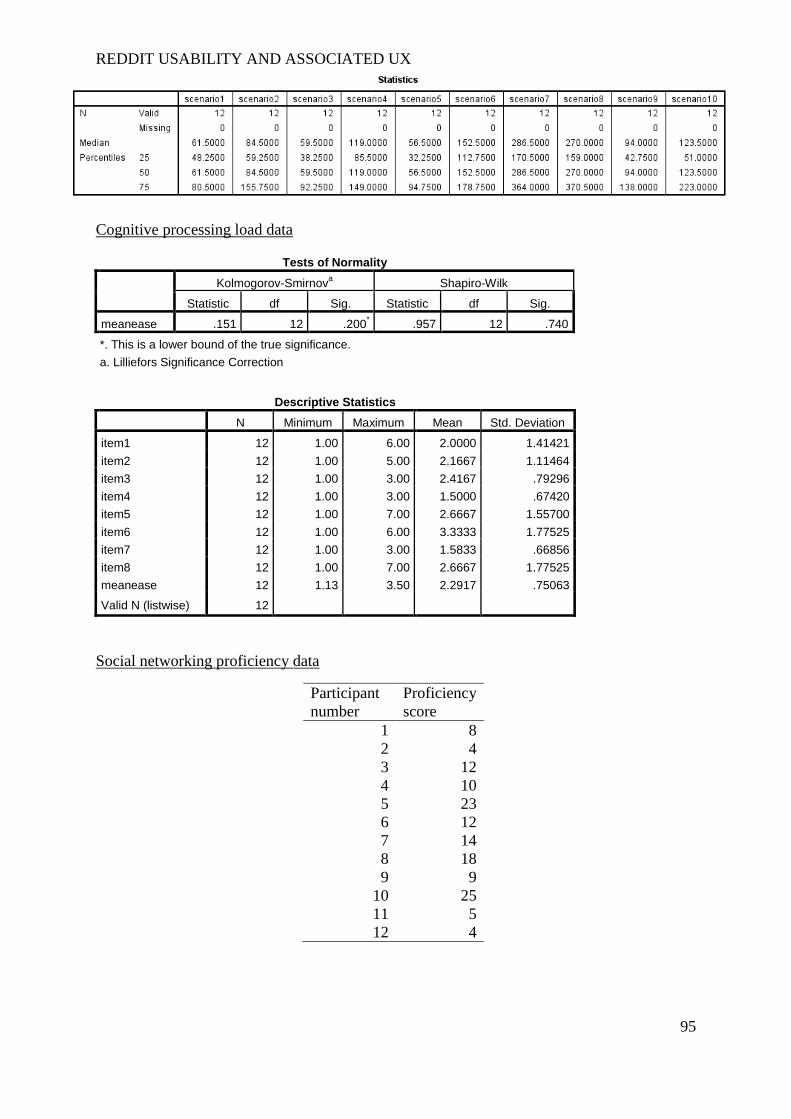
REDDIT USABILITY AND ASSOCIATED UX
95
Cognitive processing load data
Tests of Normality
Kolmogorov-Smirnova Shapiro-Wilk
Statistic df Sig. Statistic df Sig.
meanease .151 12 .200* .957 12 .740
*. This is a lower bound of the true significance.
a. Lilliefors Significance Correction
Descriptive Statistics
N Minimum Maximum Mean Std. Deviation
item1 12 1.00 6.00 2.0000 1.41421
item2 12 1.00 5.00 2.1667 1.11464
item3 12 1.00 3.00 2.4167 .79296
item4 12 1.00 3.00 1.5000 .67420
item5 12 1.00 7.00 2.6667 1.55700
item6 12 1.00 6.00 3.3333 1.77525
item7 12 1.00 3.00 1.5833 .66856
item8 12 1.00 7.00 2.6667 1.77525
meanease 12 1.13 3.50 2.2917 .75063
Valid N (listwise) 12
Social networking proficiency data
Participant
number
Proficiency
score
1 8
2 4
3 12
4 10
5 23
6 12
7 14
8 18
9 9
10 25
11 5
12 4
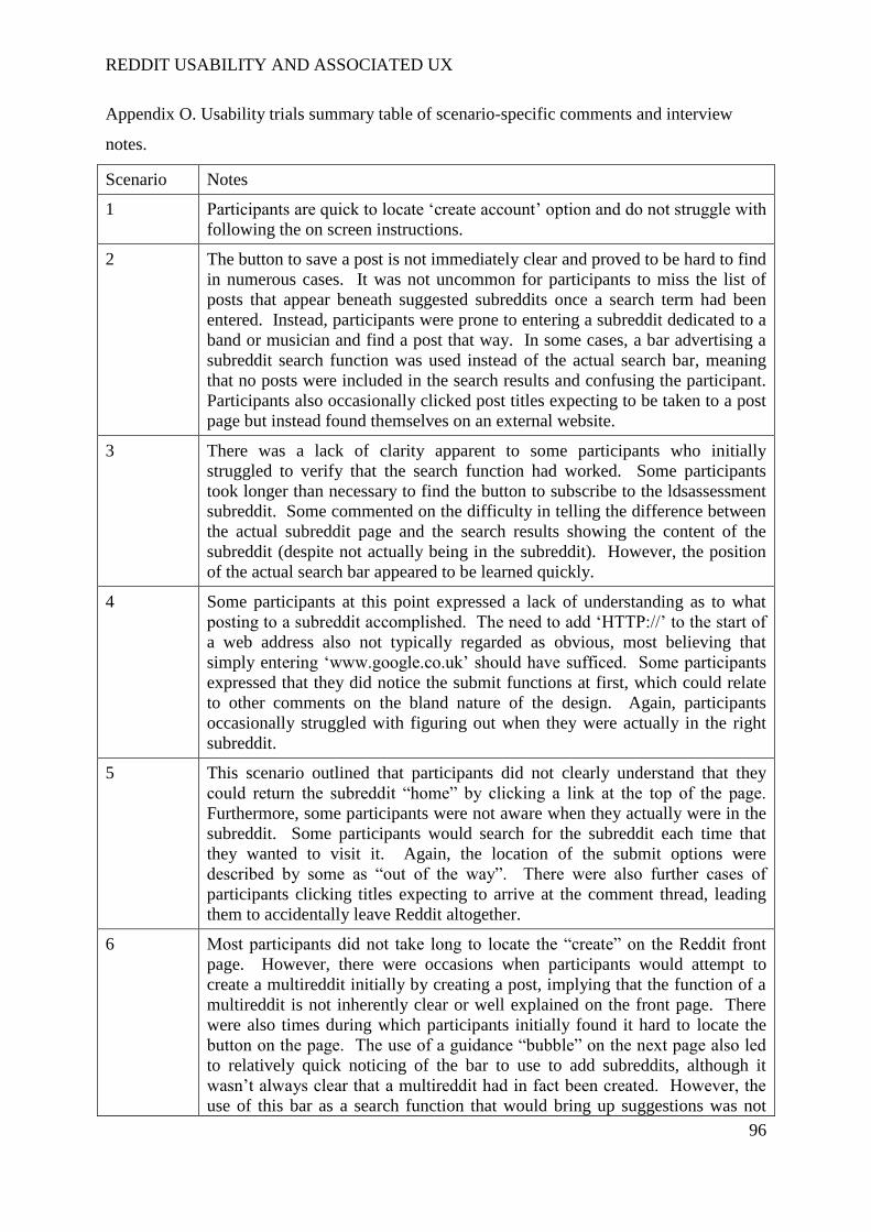
REDDIT USABILITY AND ASSOCIATED UX
96
Appendix O. Usability trials summary table of scenario-specific comments and interview
notes.
Scenario Notes
1 Participants are quick to locate ‘create account’ option and do not struggle with
following the on screen instructions.
2 The button to save a post is not immediately clear and proved to be hard to find
in numerous cases. It was not uncommon for participants to miss the list of
posts that appear beneath suggested subreddits once a search term had been
entered. Instead, participants were prone to entering a subreddit dedicated to a
band or musician and find a post that way. In some cases, a bar advertising a
subreddit search function was used instead of the actual search bar, meaning
that no posts were included in the search results and confusing the participant.
Participants also occasionally clicked post titles expecting to be taken to a post
page but instead found themselves on an external website.
3 There was a lack of clarity apparent to some participants who initially
struggled to verify that the search function had worked. Some participants
took longer than necessary to find the button to subscribe to the ldsassessment
subreddit. Some commented on the difficulty in telling the difference between
the actual subreddit page and the search results showing the content of the
subreddit (despite not actually being in the subreddit). However, the position
of the actual search bar appeared to be learned quickly.
4 Some participants at this point expressed a lack of understanding as to what
posting to a subreddit accomplished. The need to add ‘HTTP://’ to the start of
a web address also not typically regarded as obvious, most believing that
simply entering ‘www.google.co.uk’ should have sufficed. Some participants
expressed that they did notice the submit functions at first, which could relate
to other comments on the bland nature of the design. Again, participants
occasionally struggled with figuring out when they were actually in the right
subreddit.
5 This scenario outlined that participants did not clearly understand that they
could return the subreddit “home” by clicking a link at the top of the page.
Furthermore, some participants were not aware when they actually were in the
subreddit. Some participants would search for the subreddit each time that
they wanted to visit it. Again, the location of the submit options were
described by some as “out of the way”. There were also further cases of
participants clicking titles expecting to arrive at the comment thread, leading
them to accidentally leave Reddit altogether.
6 Most participants did not take long to locate the “create” on the Reddit front
page. However, there were occasions when participants would attempt to
create a multireddit initially by creating a post, implying that the function of a
multireddit is not inherently clear or well explained on the front page. There
were also times during which participants initially found it hard to locate the
button on the page. The use of a guidance “bubble” on the next page also led
to relatively quick noticing of the bar to use to add subreddits, although it
wasn’t always clear that a multireddit had in fact been created. However, the
use of this bar as a search function that would bring up suggestions was not

REDDIT USABILITY AND ASSOCIATED UX
97
entirely clear to all users. There was also an issue with consistency, as one
participants left the creation page with only two subreddits added and then
returned to find that the multireddit had reset and erased his choices. It is
worth noting that participants regularly pointed out and made use of the logo in
the top left of every screen, which provided a quick and easy route back to the
front page. This was compared to the same function offered on YouTube.
7 This scenario frequently saw participants struggle a lot to locate their list of
subreddits. This appears to have resulted from a number of aspects. For
instance, the first page itself was frequently regarded as a list of subreddits,
even though it was later learned that it was a list of posts from subreddits. This
misconception arose from the use of the word “subscribed” in a tab on the left
side of the screen. Many participants also expressed a lack of awareness that
the Reddit website automatically subscribes new users to a large number of
subreddits. Therefore, it was common for participants to open their sports
multireddit again and believe that the four sport subreddits within constituted
their full list. Moreover, some participants actually opened their full list of
subreddits and then regarded it as an incorrect action as they expected to see
only the four they themselves had subscribed to. A suggestion that users
should have the option to sign up to their own subreddits on creating an
account was first mentioned at this stage. A major complaint during this task
was the inconspicuous nature of the top toolbar on every page, which holds the
necessary button to open the full list of subreddits. Many participants
highlighted that this toolbar blended in with the browser toolbar and was
disproportionately small in terms of its important function, making it easy to
disregard. It was also not uncommon for participants to then have trouble with
the upvote function, frequently symbolised with an arrow pointing upwards.
Most users initially believed this function to be along the same line of buttons
that they had previously used to save a post. There was also a belief that the
upvote button did not look clickable.
8 A very prominent comment regarding the execution of this scenario
highlighted that it was highly unintuitive for the ‘add friend’ function to be in
the ‘preferences’ section of the website. In fact it was not uncommon for
participants to enter the preference section and then leave without realising that
the ‘friends’ tab had been there. Furthermore, there was a common assumption
that the search bar present on many pages would allow the user to search for
other usernames, which is not the case. Some participants also commented
that, on adding a friend, there is no clarity or feedback that confirms that the
user added even exists. It was also expressed that the way to add a friend
should be obvious like on Facebook. Frequently, it was noted that a process of
elimination led to the completion of this task. There also an expectation that
some sort of friend list would be available through the participant’s account
page.
9 Generally, participants seemed to realise that the preferences section of their
account would contain the security options and, as they were already in
preferences, participants were generally quick at locating and exploiting the
‘security’ tab. However, some still believed that clicking one’s account name
should take the user to their account settings. There was also some question
over what exactly HTTPS was.

REDDIT USABILITY AND ASSOCIATED UX
98
10 A continuing theme in this task was that some participants still failed to
initially scroll down once they had entered a search term, instead finding
themselves browsing subreddits that were unrelated to the task. Some
participants also struggled to locate the ‘sort by’ button.
Exploring the experience of a novice Reddit user
o Finding things (page, subreddits) is difficult
o It easy to return to the home page and reset
o Things are located strangely
o Search bar located in a relatively common location
o Too much information on the pages
o Location of friends tab in preferences makes no sense
o You have to remember where things are after finding them once
o Have to look for too long to find things
o Creating an account was easy
o Better use of colour, it is very bland currently
o Functions are poorly explained and hard to infer.
o More guidance bubbles like in the multireddit task
Introductory guide
o Participants think the search should allow you to search for specific users like on
o The advanced search design is bad, should be more like twitter filters
o Ability to subscribe to subreddits on sign up would make it clearer what subreddits
are and mean that users are not stuck with default subreddits
o Small buttons should be clearer, e.g. ‘my subreddits’.
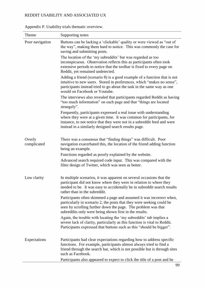
REDDIT USABILITY AND ASSOCIATED UX
99
Appendix P. Usability trials thematic overview.
Theme Supporting notes
Poor navigation Buttons can be lacking a ‘clickable’ quality or were viewed as “out of
the way”, making them hard to notice. This was commonly the case for
saving and submitting posts.
The location of the ‘my subreddits’ bar was regarded as too
inconspicuous. Observation reflects this as participants often took
extensive periods to notice that the toolbar is fixed to every page on
Reddit, yet remained undetected.
Adding a friend (scenario 8) is a good example of a function that is not
intuitive to new users. Stored in preferences, which “makes no sense”,
participants instead tried to go about the task in the same way as one
would on Facebook or Youtube.
The interviews also revealed that participants regarded Reddit as having
“too much information” on each page and that “things are located
strangely”.
Frequently, participants expressed a real issue with understanding
where they were at a given time. It was common for participants, for
instance, to not notice that they were not in a subreddit feed and were
instead in a similarly designed search results page.
Overly
complicated
There was a consensus that “finding things” was difficult. Poor
navigation exacerbated this, the location of the friend adding function
being an example.
Functions regarded as poorly explained by the website.
Advanced search required code input. This was compared with the
filter design of Twitter, which was seen as better.
Low clarity In multiple scenarios, it was apparent on several occasions that the
participant did not know where they were in relation to where they
needed to be. It was easy to accidentally be in subreddit search results
rather than in the subreddit.
Participants often skimmed a page and assumed it was incorrect when,
particularly in scenario 2, the posts that they were seeking could be
seen by scrolling further down the page. The problem was that
subreddits only were being shown first in the results.
Again, the trouble with locating the ‘my subreddits’ tab implies a
severe lack of clarity, particularly as this function is vital to Reddit.
Participants expressed that buttons such as this “should be bigger”.
Expectations Participants had clear expectations regarding how to address specific
functions. For example, participants almost always tried to find a
friend through the search bar, which is not possible but is through sites
such as Facebook.
Participants also appeared to expect to click the title of a post and be

REDDIT USABILITY AND ASSOCIATED UX
100
taken to the comment thread. It was not expected that they would be
taken immediately to another website to view the content.
There was an expectation that clicking the logo, consistently present in
the top right of the screen, would take the user home (resetting the
scenario). This was commented on as being the “same as Youtube”.
Many participants expected to be able to adjust account settings on their
account page, which is not the case.
The location of the search bar was generally regarded as being in a
“common location”.
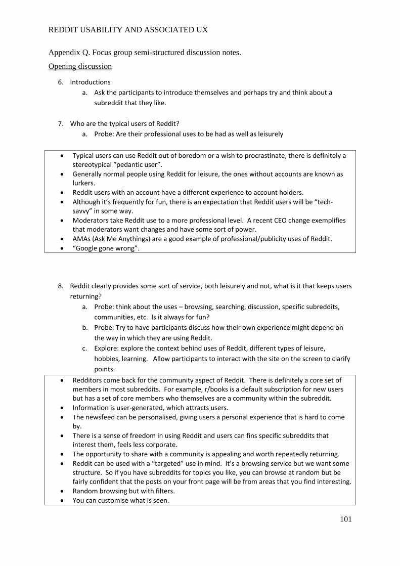
REDDIT USABILITY AND ASSOCIATED UX
101
Appendix Q. Focus group semi-structured discussion notes.
Opening discussion
6. Introductions
a. Ask the participants to introduce themselves and perhaps try and think about a
subreddit that they like.
7. Who are the typical users of Reddit?
a. Probe: Are their professional uses to be had as well as leisurely
Typical users can use Reddit out of boredom or a wish to procrastinate, there is definitely a stereotypical “pedantic user”.
Generally normal people using Reddit for leisure, the ones without accounts are known as lurkers.
Reddit users with an account have a different experience to account holders.
Although it’s frequently for fun, there is an expectation that Reddit users will be “tech-savvy” in some way.
Moderators take Reddit use to a more professional level. A recent CEO change exemplifies that moderators want changes and have some sort of power.
AMAs (Ask Me Anythings) are a good example of professional/publicity uses of Reddit.
“Google gone wrong”.
8. Reddit clearly provides some sort of service, both leisurely and not, what is it that keeps users
returning?
a. Probe: think about the uses – browsing, searching, discussion, specific subreddits,
communities, etc. Is it always for fun?
b. Probe: Try to have participants discuss how their own experience might depend on
the way in which they are using Reddit.
c. Explore: explore the context behind uses of Reddit, different types of leisure,
hobbies, learning. Allow participants to interact with the site on the screen to clarify
points.
Redditors come back for the community aspect of Reddit. There is definitely a core set of members in most subreddits. For example, r/books is a default subscription for new users but has a set of core members who themselves are a community within the subreddit.
Information is user-generated, which attracts users.
The newsfeed can be personalised, giving users a personal experience that is hard to come by.
There is a sense of freedom in using Reddit and users can fins specific subreddits that interest them, feels less corporate.
The opportunity to share with a community is appealing and worth repeatedly returning.
Reddit can be used with a “targeted” use in mind. It’s a browsing service but we want some structure. So if you have subreddits for topics you like, you can browse at random but be fairly confident that the posts on your front page will be from areas that you find interesting.
Random browsing but with filters.
You can customise what is seen.

REDDIT USABILITY AND ASSOCIATED UX
102
A controlled browse.
Community services are fun, like the secret Santa each year. There’s a group mentality.
Being able to remain anonymous is appealing and lets users have freedom.
9. What do you think Reddit offers that makes it a unique service?
a. How valuable is this service?
b. What is important to the success of this service?
Constantly changing content that comes down to the users and what they want to put on Reddit. Everything relies on the user base.
Success is in the users.
Procrastinator’s dream.
You never know what you’re going to get thanks to the entirely user-submitted content.
Quirky dynamics and a community aspect.
Gift exchange is a good example of the community being quirky.
Reddit has its own drama which users like to get involved in. Users can feel involved in something big.
There is an opportunity to engage.
The ability to upvote and downvote provides a feeling of control of one’s own experience.
Gradual change.
Don’t forget about the non-users who still like to browse. They might not contribute directly but there is still freedom for non-users to use Reddit’s services.
Pinterest is like a more visual Reddit thing.
There is a division between “lurkers” and registered users.
Reddit Gold can bring people back, exclusive club services.
There are two service groups before we even think about experience.
10. What aspects of the Reddit experience are good/bad?
a. Using the notes from the pre-session task
b. Explore: Try and relate points back to how they enhance/impede the service toward
and experience of the user. Allow participants to clarify with website on screen.
c. Explore: How does the design of the site affect user experience?
d. Probe: Start getting the participants to think about how they think the experience
should be.
Bad
Comment section s confusing and when you leave a comment “string” to look at the post content for reference, it’s hard to relocate where you were.
Clicking the title does different things depending on the post type. It should just take you to the comments and, if it’s an image or video, that content should be on the same page as the comments like on 9gag.
Advanced search function is ridiculous and useless. It’s hard to find. Everything is hard to find!
It would be better to scroll through comments while working.
A novice user has a really hard time at first.

REDDIT USABILITY AND ASSOCIATED UX
103
If I’m already in a subreddit and I go to search, I only want to search the subreddit I’m already in. Instead it searches the whole of Reddit.
It feels like old architecture.
There are no page numbers so you don’t know how many pages of content you have gone through.
Reddit Enhancement Suite (RES) should not be required for a less hassling experience.
Commands are robust, buttons fail but the code is not easy to use at first.
Icons are underused in favour of too much text on each page.
Consistency across pages is terrible. For example, the subreddit list across the top changes all the time so nothing can be learned in terms of location on that bar.
It gets in the way of its own learnability.
Usability could be improved by trying to standardise the layout a little more.
It is not intuitive to use.
Comment thread should have more cascade options so that it’s less confusing. Some more colour would be good too.
Some symbol showing that a new comment string has started should be used, at the moment it’s very easy to scroll past and not realise.
Navigation of comments is bad.
New pages on other websites should open in another tab rather than replace the Reddit age you are on.
Good
Subreddits are good to be individual.
It’s easy to return to the homepage.
Reddit is robust and feels bullet-proof.
Expandable functions are usefull.
There is a list design aspect that is consistent.
Shortcut keys should be used more, RES has them so actual Reddit should have them.
Typical scenario generation
- Develop 3 or 4 examples of scenarios when Reddit might be used, you can base it on your
own experiences and/or use examples based on the typical users and services/uses that you
have discussed.
o Guidance if participants are having trouble
Think about leisure use (e.g. browsing, no aim in particular, hobby-based
searching), professional use (e.g. research or even data collection)
Scenario 1: Topical discussion. Go online and see the comments made on a post.
Scenario 2: Basic submission. To submit an image set onto r/arts.
Scenario 3: Basic browsing. Non-specific. *NB: group discussion revealed that this scenario
is intended to represent non-targeted browsing carried out by a user without an account.
Screen design
REDDIT USABILITY AND ASSOCIATED UX
104
- We have your scenarios, now as a group think about what purpose Reddit is serving in each
case and also think about how the user in each scenario may expect to experience that
service (maybe other website influences?). You can even think about your own similar
experiences.
- I have blank sheets (or “screens”) for you to draw out ideas, try to forget what Reddit looks
like and think about what you think the user should see as they use Reddit in each scenario.
o It might be easier to start with a home page for each scenario. Don’t worry too
much about consistency if one scenario looks very different to another.
o Probe: Organisation of the page? How should content be organised/filtered/ranked.
- Influences from Facebook in comment structure seems to be preferable to users in the focus group. So there are key comments with a number of replies stated and made available to expand should the user wish to see them.
- Consensus for 2-sided screen with stationary content on the left and a scrollable comment side. Allows, for example, video viewing while simultaneously viewing comments. No longer either or.
- Option for live content, new comments constantly shown. - User aims dictate the way the screen looks. If not interested in comments, the comment
side can be reduced and the left side can grow into the space.
Card Sort
- Here I have 86 functions that are currently used on the Reddit website. However, is it likely
that all are used an equal amount? By thinking about the various points about service and
experience that we have discussed today how would you categorise these in terms of
importance to the way in which Reddit services are experienced?
- If you have any other ideas, there are blank cards for you to use and rank accordingly.
- Could be organise into “not important”, “sometimes important”, “always important” but it is
up to you how you arrange them, just ensure it is to do with importance.
- Explore: What are the reasons behind the categorisation of functions? Listen carefully for
justifications. What functions, if any, triggered most debate?
- Participants explained that they first wanted to sort the functions without those that would be used by account holders. They then brought in the account holder functions and added them to three columns entitled ‘not important’, ‘sometimes important’ and ‘always important’.

REDDIT USABILITY AND ASSOCIATED UX
105
Appendix R. Focus group first three session aims and supporting data from Appendix R.
Aim Notes
1 To discuss typical
Reddit users and the
experiences that we can
expect them to have
when they use Reddit.
Typical uses for Reddit stem from boredom and procrastination,
although Reddit use is a fun way to spend time.
Redditors can elect to remain totally anonymous.
Redditors are generally assumed to be “tech-savvy”.
Redditors expect a community-bound experience.
The experiences of redditors (account holders) are different to
the experiences of those who do not have an account.
Voluntary moderators bring Reddit to a “professional level”.
Users can expect to filter content down to what they want to see.
However, users can expect to randomly browse in a “targeted”
way.
2 To evaluate the current
Reddit experience.
“You never know what you are going to get”. Reddit runs on
user-submitted content that “comes down to the users and what
they want to put on Reddit”.
“Sense of freedom”
Dedicated redditors stay for the community aspect.
Customisable content is important to the experience.
Reddit retains a certain quirkiness, e.g. “fun” community
services, like the secret Santa each year.
There is a group mentality, “users can feel involved in
something big”.
There are two groups receiving two different services: there are
lurkers (non-account holders) and redditors (account holders).
Lurkers are likely to enjoy the freedom of browsing Reddit,
particularly as a form of procrastination. Redditors contribute to
the community and, while they may enjoy browsing in the same
way as lurkers, they enjoy partaking in discussion.
a) Positive influences. Individual subreddits are good.
Returning to your front page is very easy to accomplish.
Reddit feels robust and “bullet-proof”.
Many expandable functions are useful.
The ‘list’ design of posts is consistent and easy to understand.
b) Negative influences. Following a discussion in a string of comments is confusing and
it easy to lose your place if you refer to the post content and
then try to relocate where you just were.
Advanced search function is “ridiculous” and hard to find.
Clicking the post title does different things depending on the
nature of the post so you end up leaving Reddit altogether

REDDIT USABILITY AND ASSOCIATED UX
106
instead of opening comments.
“It feels like old architecture”.
Icons are underused and this leads to there being too much text
on each page.
The layout is not standardised enough, learnability is impeded
as users cannot learn the location of a button that moves around:
“it gets in the way of its own learnability”.
3 To generate examples
of ways in which
Reddit will typically be
used.
Scenario 1: A topical discussion. The user goes online and
views comments made on a post.
Scenario 2: Basic submissions. The user submits content to
Reddit. The participants suggested the idea of submitting an
image to the ‘arts’ subreddit.
Scenario 3: Basic browsing. This non-specific action can be
carried out by a non-user and reflects “non-targeted browsing”.

REDDIT USABILITY AND ASSOCIATED UX
107
Appendix S. Focus group; screens generated by participants.

REDDIT USABILITY AND ASSOCIATED UX
108
REDDIT USABILITY AND ASSOCIATED UX
109

REDDIT USABILITY AND ASSOCIATED UX
110
REDDIT USABILITY AND ASSOCIATED UX
111
Appendix T. Focus group; tables representing the card sorting exercise results.
Non-user card sort
Important Mix Not Important
Hide comments Search for text in a post Access site FAQs
Search link posts exclusively Sign up Enable/disable HTTPS
connection to Reddit
Order/sort post comments Report post Contact Reddit team
Open comment permalink Enable beta testing Search for text in post bodies
Open comments Select page filter Search for a specific website
Change default interface
settings
Explore multireddits Read about Reddit
Include/exclude NSFW posts
from the page
General search
Change interface language Hide post
Open post Mark comment/post as spam
Search for a subreddit
User card sort
Important Mix Not Important
Hide comments Search for text in a post Access site FAQs
Search link posts exclusively Sign up Enable/disable HTTPS
connection to Reddit
Order/sort post comments Report post Contact Reddit team
Open comment permalink Enable beta testing Search for text in post bodies
Open comments Select page filter Search for a specific website
Change default interface
settings
Explore multireddits Read about Reddit
Include/exclude NSFW posts
from the page
General search Add/change subreddit flair
Change interface language Hide post View your hidden posts
Open post Mark comment/post as spam Search text posts exclusively
Reply to a message Search for a subreddit Open blocked user list
Delete comment/post Ban users from subreddit Create a multireddit
Write a comment Create a multireddit Access subreddit traffic
statistics
Write a private message Open friend list Access reddiquette page
Open inbox Filter inbox messages Edit subreddit stylesheet
Change account password Delete account Donate to Reddit
View submitted comments Explore suggested posts Open third party web content
Reply to a comment Remove a friend Moderate subreddit posts
Unsubscribe from a subreddit Edit subreddit settings Advertise with Reddit
Delete your subreddit Submit a link Add another user as a
subreddit moderator
Update e-mail Give gold to another user

REDDIT USABILITY AND ASSOCIATED UX
112
View your account Organise your subscriptions
Verify account with e-mail Mark a message as “unread”
Subscribe to a subreddit View your gilded posts
View tour submitted posts Buy Reddit gold
View your saved posts Search for another user
Upvote/downvote View posts that you have
upvoted/downvoted
Access private RSS feeds of
Reddit pages
Authorise third party
protection
Open thread context
Save thread
Open thread related to a
comment
Submit a text post
View karma scores
Add a friend
Edit account preferences
Log out
REDDIT USABILITY AND ASSOCIATED UX
113
Appendix U. Design alterations, associated functions and justifications.
Design feature Functions/page
links
Justification and significant notes
Create a header
consisting of
toolbars that are the
same on every page
of Reddit.
‘my front page’ The focus group discussion revealed that a major
annoyance when using Reddit is the
inconsistency across pages. Therefore, creating a
header that is the same on every page would
improve consistency and would address issues
found in the themes from the usability trial
comments.
Scenario 7 of the usability trials involved finding
the full list of subreddits and was generally a
participant’s slowest task with a median time
taken of 286.5 seconds – almost 5 minutes.
Observation and comments reveal that many
failed to notice it, despite the button being on
every Reddit page, because it blended in to the
browser toolbar. The focus group card sort also
reveals that many subreddit-related functions fall
into the ‘Important’ category. Therefore, moving
the function to a prominent position on a fixed
header that is on every page is justified.
Functions such as viewing saved posts were
marked as “important” in the focus group card
sorting activity, justifying the decision to keep
such functions available on the front page.
However, to address issues of ‘low clarity’, the
front page, multireddits and subreddits functions
have been grouped separately. It was also
decided that moving recently viewed posts to this
grouping would lend weight to the notion of an
activity-tracking “zone”.
‘Preferences’ button has been relabelled
‘settings’. This stems from comments made by
participants during the usability trials about the
counter intuitiveness of adding a friend or
changing privacy settings through ‘preferences’,
the expectation exists for ‘settings’. The
importance of meeting this expectation is
supported by the focus group card sorting results,
which place setting functions such as ‘change the
interface language’ as “important”.
Note that the ‘trending subreddits’ window above
the first post was also removed as it frequently
led to confusion in the usability trials due to the
‘my subreddits’
‘my multireddits’
‘saved posts’
‘recently viewed’
‘explore reddit’
Search bar
Home page link
Inbox
Settings
Link to account
page
Log out

REDDIT USABILITY AND ASSOCIATED UX
114
fact that it provided a search function
immediately next to the actual search box.
Participants commented on the benefit of an easy
“reset” available by clicking the logo. The focus
group also revealed that this is consistent with
websites such as Facebook and Youtube. This
function will therefore remain the same.
Redistribute and
adjust the function
layout in post labels
(i.e. what the user
sees in a list of
posts)
Open posts
Open comments
Upvote/downvote
Go to subreddit
Go to submitter
Save post
Share post
Hide post
Report post
Functions such as saving a post or opening a post
and its comments were marked as “important” in
the focus group card sorting activity, while hiding
or reporting a post was a more situation-specific
“mix” function. To address usability trial
comments that there is “too much information”
on the page, the latter two functions can be added
to a drop-down menu, allowing more space for
more important functions to be “bigger”- another
point alluded to in the usability trial comments on
‘low clarity’. To further reduce complexity, a
point made in the focus group discussion
regarding Reddit’s current aversion to icon use
was exploited. Functions such as ‘save’ and
‘share’ can be represented by icons that have
become common knowledge. This should also
address issues with “too much information”
alluded to in the usability trials while retaining an
important function.
Complexity is also reduced by removing text
such as the website domain name, visible when
the post is opened.
The association made by the usability trial
participants of navigation problems and
inconsistent design comments (supported by the
focus group discussion), have also been
addressed by giving all posts a thumbnail. If the
post has a thumbnail that is a speech bubble, it is
a discussion post.
The ‘subscribed’ thumbnail was also renamed to
‘my front page’ to reduce the chances of users
confusing it with the ‘my subreddits’ button,
which was a common occurrence in the usability
trials.
The function of opening a post also differs to that
on the existing Reddit site. The usability trials
and focus group both alluded to inconsistency in
navigating post content. Clicking a post title

REDDIT USABILITY AND ASSOCIATED UX
115
would either take the user to an external website
domain or open the comment thread. The
reconfigured ‘open post’ function takes the user
to the content in a comment thread, which was
deemed preferable in the focus group discussion.
Reconfigure the
search function and
filters.
General search
Subreddit search
Post content
search
Username search
Although the focus group card sort identified a
general search as a scenario-dependent function
with regard to its importance, it became apparent
during the usability trials that the learnability of
the advanced search functions is not acceptable.
In order to rectify this issue, the advanced search
function should be modified. Functions such as
searching for specific text within posts were
found to be thought of as “not important” by the
focus group card sort, therefore an iteration
without them should be attempted.
By removing these functions, it would be
possible to instead employ the use of tickboxes
that can be selected in order to allow users to
more easily dictate the nature of their search
results.
In contrast, a new function was added to the
advanced search capabilities of the website in the
interest of allowing users to more easily search
for the accounts of other users. Please refer to the
overhaul of the ‘add friend’ action path.
Adjust the layout of
post
content/comment
pages.
Save post
Share post
Hide post
Report post
Comment
Reply to comment
Upvote/downvote
Follow thread
Go to user account
Open content
The focus group discussion highlighted
experience issues within post pages, most notably
the nature of the comments section. Users
highlighted that they would read comments about
the content, refer back to the content, and then
look for the comment thread that they had been
following. Relocating the comment thread was
said to be difficult and irritating while browsing.
The focus group screen generation exercise
proved to be a useful insight into how actual
Reddit users would consider changing the design
of post content pages to better deliver their
desired experience. The suggested alteration is to
pin the content in a left hand panel so that
scrolling does not affect its position. In turn, the
comments in a right hand panel can retain their
dynamic nature but allow for easy reference back
to the original content.
Overhaul of the
‘add friend’ action
path.
Add a friend Scenario 8 of the usability trials revolved around
the function of adding another Reddit user as a
friend. The usability highlighted that this
scenario took second longest to complete, with a
REDDIT USABILITY AND ASSOCIATED UX
116
median time of 270 seconds and a median prompt
count of 2, a score higher than in any other
scenario. The observations made by the
experimenter and the comments made by the
participants indicate that the action path required
to complete the scenario was highly unintuitive.
Many participants alluded to the oddness of
putting the ‘add friend’ function in a tab within
‘preferences’
Most participants also first attempted to find the
target user through the search bar, later indicating
that this would work on other social networking
websites such as Facebook. As has been
discussed, the advanced search functions were
reconfigured to allow for this use to take place as
it appears to be an intuitive step to social network
users.
Streamlining the
adding of
subreddits to a
multireddit
Create a
multireddit
Amid comments over the lack of clarity of what a
subreddit was and what exactly the content was
appearing before them, this confusing aspect was
removed altogether to allow a clear and simple
‘add subreddit’ function. In the interest of
consistency, the text fields were places in a
similar vicinity to those on post creation pages.
Reconfigure the
security tab
Secure account
with HTTPS
The usability trials highlighted that, once in the
preferences, the security tab was generally quite
noticeable. Therefore, the issues with
expectations and using preferences to adjust
security settings were addressed in the proposed
header design. A series of drop-down menus
now appear and allow a less cluttered look while
sifting through settings, addressing the overall
themes of ‘low clarity’ and comments of “too
much information”.
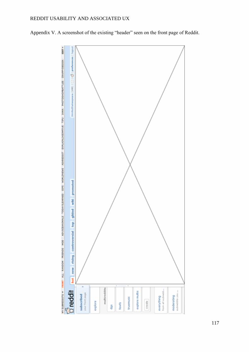
REDDIT USABILITY AND ASSOCIATED UX
117
Appendix V. A screenshot of the existing “header” seen on the front page of Reddit.
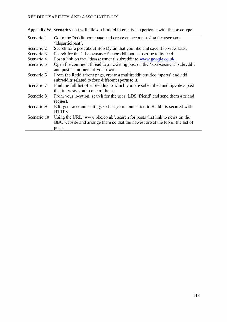
REDDIT USABILITY AND ASSOCIATED UX
118
Appendix W. Scenarios that will allow a limited interactive experience with the prototype.
Scenario 1 Go to the Reddit homepage and create an account using the username
‘ldsparticipant’.
Scenario 2 Search for a post about Bob Dylan that you like and save it to view later.
Scenario 3 Search for the ‘ldsassessment’ subreddit and subscribe to its feed.
Scenario 4 Post a link on the ‘ldsassessment’ subreddit to www.google.co.uk.
Scenario 5 Open the comment thread to an existing post on the ‘ldsasessment’ subreddit
and post a comment of your own.
Scenario 6 From the Reddit front page, create a multireddit entitled ‘sports’ and add
subreddits related to four different sports to it.
Scenario 7 Find the full list of subreddits to which you are subscribed and upvote a post
that interests you in one of them.
Scenario 8 From your location, search for the user ‘LDS_friend’ and send them a friend
request.
Scenario 9 Edit your account settings so that your connection to Reddit is secured with
HTTPS.
Scenario 10 Using the URL ‘www.bbc.co.uk’, search for posts that link to news on the
BBC website and arrange them so that the newest are at the top of the list of
posts.