digital design is like painting, except the paint never dries
TRANSCRIPT

Digital design is like painting, except the paint never dries.Neville BrodyEnglish graphic designer, typographer & art director.“

www.jacquelyntrowell.com
cercottawa.caVIEW WEBSITE:
. 0 1 W E B D E S I G N
C E R C O T TAWA | Website Redesign | Wordpress
Refresh of the old site, which was very cluttered and unorganized making it very diffi cult for the end user to navigate and fi nd resources. New site design and build had to follow all government and AODA guidelines.

www.jacquelyntrowell.com
prosar.comVIEW WEBSITE:
. 0 2 W E B D E S I G N
P R O S A R I N B O U N D | Website Redesign | Wordpress
Request for a simple one page navigation web page that strongly refl ected the brand. Upon approval, all fi les and instructions were supplied to the developer to build in Wordpress.

www.jacquelyntrowell.com
timmermansorganization.comVIEW WEBSITE:
. 0 3 W E B D E S I G N
T I M M E R M A N ’ S B L E A C H E R R E N TA L | Website Design | Wordpress
Logo and website development for the Timmerman’s Organization, an umbrella brand. This project included determining the brand colours, logo, site design/function and custom icons. The goal was to consolidate all Timmerman’s identities and services in one central location that is easy to navigate and clearly communicate information.

www.jacquelyntrowell.com
bleacherrentals.comVIEW WEBSITE:
. 0 4 W E B D E S I G N
T I M M E R M A N ’ S B L E A C H E R R E N TA L | Website Design | Wordpress
Logo and website development for Timmerman’s Bleacher Rental – a sub-identity of the Timmerman’s Organization. This project included determining the brand colours, logo, site design/function and custom icons.

www.jacquelyntrowell.com
. 0 5 L A Y O U T D E S I G N
O T TAWA R E G I O N A L C A N C E R F O U N D AT I O N | Multi page layout
Creation of an 8 page donor report that made emphasis on how the donations were dispersed for the year, what the various programs supplied and the background of the staff/doctors that are involved. The foundation runs on limited funds, so I needed to design this in such a way the admin staff could edit the text as needed via Acrobat.

www.jacquelyntrowell.com
A Cancer Coaching ad design for the Ottawa Regional Cancer Foundation that would be published in the Ottawa Citizen. The design needed to fall within the set ad space parameters and colours adjusted to translate to newsprint.
The Ottawa Regional Cancer Foundation 14 page Sponsorship Report.
Ot tawa Reg iona l Cancer Foundat ion | cont inued

www.jacquelyntrowell.com
. 0 6 B R A N D I N G
T H E FA R M B O Y B U T C H E R S H O P | A ceiling to shelf redesign of the entire department
ORIGINAL MEAT DEPARTMENT BRANDING
While at Farm Boy I was tasked with a head-to-toe re-branding of the meat department, starting with the Rideau Centre location.
THE OBJECTIVE:To update the visual branding of the meat department, bringing it more on trend with what we are seeing in the marketplace in both large scale and small boutique retailers.
THE GOAL:To create new visuals as well as update current visuals to maintain brand recognition of the department. The new design should better communicate:
• Commitment to Canadian products• Positive customer experience• Quality products

www.jacquelyntrowell.com
F a r m B o y B u t c h e r S h o p | c o n t i n u e d
Meeting with executives and marketing directors, we discussed the re-brand and landed on the name The Butcher Shop (previously named ‘The Meat Shop’) because it has more of an artisan, timeless sound to it. With this new name established, I was able to sketch out several new logo options and create mood boards to capture the look I envisioned. Farm Boy stores use lots of warm colours and wood textures in their interior designs and signage, so I introduced a white brick texture and a monochromatic colour palette (shown above) in order to differentiate the department from its surroundings.
New identifi er, produced in separate sections. The main brick shape, ribbon and text in ribbon are produced as one piece and “The Farm Boy Butcher Shop” text is output as raised lettering.
This Identifi er is used when the bulkhead space is not large enough to place the full version of the identifi er.

www.jacquelyntrowell.com
Vinyl bulkhead backdrop word art created with a white brick texture to convey the quality of the product offered in the department.
With so much of the signage being heavily text based, the font selections for the new look were extremely important because they would be so dominant. These fonts would need to work not only for the logo and bulkhead design but also for all the signage underneath and the labels on the products.
Service counter vinyl decals with dynamic call out messaging. The stark contrast of the black and white colour scheme draws immediate attention to the counter full of quality products.
These ‘talking signs’ were cut into custom cutting board shapes to make them stand out. Filled with messages conveying the unique selling points of each product and the different services the department offers—they were designed to make customers linger and to pique their curiosity!
F a r m B o y B u t c h e r S h o p | c o n t i n u e d

www.jacquelyntrowell.com
F a r m B o y B u t c h e r S h o p | c o n t i n u e d
For the main typeface I selected a sans serif with several weights and variations to keep the designs clean and legible. To offset this and tie into the Farm Boy personality, I used a folksy hand written font as an accent and to create more visual interest.

www.jacquelyntrowell.com
. 0 7 B R A N D I N G
N O H Y P E D I G I TA L | Newly established digital start-up in need of a full brand identity
When I joined the NOHYPE team, I was trusted to spearhead the entire branding process. Originally called NOHYPE Media, the Ottawa based startup had a logo but no brand standard. NOHYPE Digital was a more accurate name since the company’s focus is web based automatons and CRM. At the beginning of the process I met with key staff members and stake holders to talk to them about the company goals and what makes them unique. Armed with this knowledge, I streamlined the core messages I received to hone in on the personality of the brand and create a vision, mission statement and core values. From there, I was able to derive the visual aspects of the brand. This included typography guidelines (typefaces, weights, colours, and treatments for body copy, and headers), the DO’s and DON’Ts for logo usage (colour, sizing, placement), an icon set that matches the brand, and templates for presentations.

www.jacquelyntrowell.com
N o h y p e D i g i t a l | c o n t i n u e d
On-boarding gift box
NOHYPE desired a way to introduce themselves to new clients that would really stand out of the crowd. The answer? Branded welcome packages! This elegant box with touches of spot varnish contained NOHYPE branded items for a truly memorable take away for clients.
What’s in the box?
[A] Branded cork top water bottle with a black powder-coat fi nish. [B] Branded USB containing informative marketing webinars from the company CEO. [C] Branded black powder coat fi nish ball point pen.[D] Informative booklet introducing the company, culture, work ethic, and services.
[A] [C] [D]
[D][B]

www.jacquelyntrowell.com
. 0 8 B R A N D I N G
L O G H R I N G R O U P | Newly established start-up in need of a full brand identity
The Loghrin Group founder needed a professional, but not to ridged, logo. To fulfi ll this request, I used a rounded, stylized font combined with well know corporate colours that refl ect trust and professionalism. Once the logo and colours were determined, we moved on to business cards, letterhead, email signatures, newsletters, presentation templates and website. During the website build, we established the type of imagery that would refl ect the brand direction.
loghringroup.caVIEW WEBSITE:

www.jacquelyntrowell.com
. 0 9 B R A N D I N G
C R AT E E S C A P E | logo and identity package
Crate Escape started as a small dog walking business with an Instagram account. To kick start her business and boost credibility, the owner needed a brand. I designed a logo and visual identity around her love of animals, using her own French Bulldog as a mascot. The desaturated blue was chosen as a primary brand colour to signify trust and professionalism. The sans serif font is strong and legible but still feels fun beside the grinning pup. I designed this logo with the intention of keeping it fl exible, so that the dog could be used as a stand alone icon. These visuals were applied to business cards, fl yer’s, vinyl car decals, and t-shirts for employees to wear while out and about to promote the business. Three months after we fi nished the branding suite, the owner called to thank me and informed me that she saw an amazing increase in brand recognition and amount of booked clients.

www.jacquelyntrowell.com
. 1 0 B R A N D I N G
D R A G O N F LY S T U D I O | Logo and identity design for a local artist.
Logo and identity design for a local artist. The name, Dragonfl y Studio has a deep rooted meaning to the artist as her mother passed away from ovarian cancer and the dragonfl y was her totem. The dragonfl y signifi es birth and regeneration, which plays into her beginnings as an artist - using her grief as a channel to give her love of art a fresh start. The logo uses blue and green, which make teal when they are combined, the same colour as the ribbon for ovarian cancer. The typeface has a slight serif which adds fl air while remaining timeless. The letter ‘Y’ has been stylized to seamlessly blend into the dragonfl y emblem which ties everything together.
dragonfl ystudio.caVIEW WEBSITE:
www.jacquelyntrowell.com
. 1 1 L O G O D E S I G N
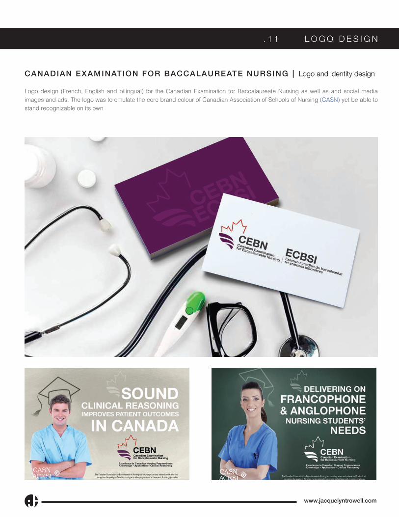
CANADIAN EXAMINATION FOR BACCALAUREATE NURSING | Logo and identity design
Logo design (French, English and bilingual) for the Canadian Examination for Baccalaureate Nursing as well as and social media images and ads. The logo was to emulate the core brand colour of Canadian Association of Schools of Nursing (CASN) yet be able to stand recognizable on its own

www.jacquelyntrowell.com
. 1 2 I D E N T I T Y
FA R M B O Y C O U P O N B O O K
Design and layout the annual charity coupon book along with all promotional collateral.
The scope of this project was in-depth as there are many elements to this annual campaign beyond the book. Once the initial cover designs and colours were approved, I had to move on to all the other marketing aspects of the book. For almost all of these deliverables, regional variations had to be created as well to represent the 10 hospitals that would benefi t from the proceeds. Having this many graphics to produce meant that I had to stay extremely organized and coordinate with several other people to make sure every hospital got what they needed.

www.jacquelyntrowell.com
F a r m B o y C o u p o n B o o k | c o n t i n u e d
FARM BOY COUPON BOOK
Just a few of the campaign components.
[A} Social media post graphics. [B] Website landing page. [C] Employee incentive poster. [D] Sales progress poster. [E] POS signs. [F] E-newsletter banners. [Not pictured: Web site sliders, Store signage, sidewalk signs, boosted social posts, web banners]
[A]
[B] [C] [D]
[E] [F]

www.jacquelyntrowell.com
. 1 3 I L L U S T R A T I O N | D I G I T A L
VA R I O U S D I G I TA L R E N D E R S
Examples of digitally rendered illustrations using either Illustrator CC, Wacom tablet or iPad Pro.
[A] Farm Boy welcome murals that represent points of interest in the surrounding area of the store location (including concept sketch). [B] Trailica Trailers mascot illustration to be used on various seasonal advertisements for equipment such as ATV’s, RV’s, camping, snowmobiles, and fi shing. [C] Lyrical dance illustration. [D] Curling Canada - HIT DRAW TAP program t-shirt [E] Equestrian illustration.
[B]
[C] [D] [E]
[A]
[E]

www.jacquelyntrowell.com
. 1 4 I L L U S T R A T I O N | T R A D I T I O N A L
T R A D I T I O N A L A R T
Illustrative work rendered by hand.
[A] Pen, oil and watercolour piece which is part of a Zodiac series for a calendar. [B] Pen caricature commission. [C] Watercolour portrait. [D] Pen and watercolour illustration of the Aberdeen Pavilion in Ottawa Ontario. [E] Pen, watercolour and oil paint pet portrait.
[A] [B]
[D] [E]
[C]

613-219-8039 • [email protected] • jacquelyntrowell.com
“The vision can come from one, but it takes a team to make it happen”