digital analytics: dashboards, visualizations, and lying with data (lectures 7&8)
TRANSCRIPT
Information Technology Program
Aalto University, 2015
Dr. Joni Salminen
[email protected], tel. +358 44 06 36 468
DIGITAL ANALYTICS
1
Contents
• some dashboarding best practices / no-no’s
• some visualization best practices / no-no’s
• lying with data / stats / charts
1
Hm, interesting.

There are some general principles of do’s
and don’ts. Let’s explore them…
2

”One dashboard to rule them all”
3
… n

Simple and comprehensive – contradictio in
adjecto
• fast overlook means a ”helicopter view” of overall
situation, it does not tell why channels and
campaigns perform as they do
• deep insight requires going into different platforms,
finding the appropriate metrics (given platform rules
& business goals), and optimizing for them
• integration can still be used to draw data from
various platforms where APIs enable access
• data breakdowns are an essential part of
discoveries (e.g. Facebook ads)
4

Data breakdowns
• [JONI SHOWS, FACEBOOK ADS]
5

Dashboards & optimization
• one dashboard for optimization does not work
• (“impossible”, says Tommi.)
• why?
– different platforms, different metrics (availability)
– too few metrics & data rows → if you increase, you
lose simplicity
– dashboards are meant for reporting, not optimizing
6

Charts + tables = dashboard
7
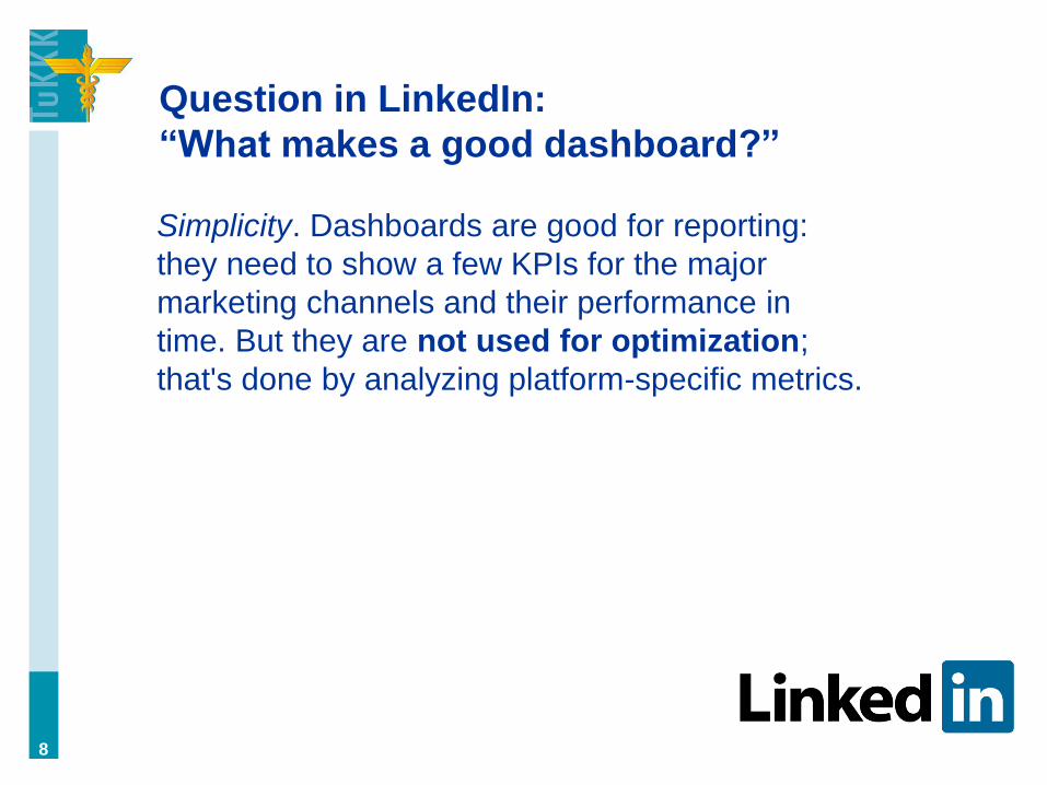
Question in LinkedIn:
“What makes a good dashboard?”
Simplicity. Dashboards are good for reporting:
they need to show a few KPIs for the major
marketing channels and their performance in
time. But they are not used for optimization;
that's done by analyzing platform-specific metrics.
8

Pitfalls in dashboard design (Few, 2006)
1. Exceeding a single screen (i.e., too much data)
2. Inadequate context (remember the FB video!
(context enables drilling down))
3. Too much data (in the single screen) (clutter, over-
precision)
4. Choosing the wrong chart type
5. Meaningless variety (e.g., no true relationships, or
“story”; or many chart types)
6. Not highlighting what’s important (e.g., colorless)
7. “Useless decoration”
8. Misusing or overusing color (contrast, etc.)
9
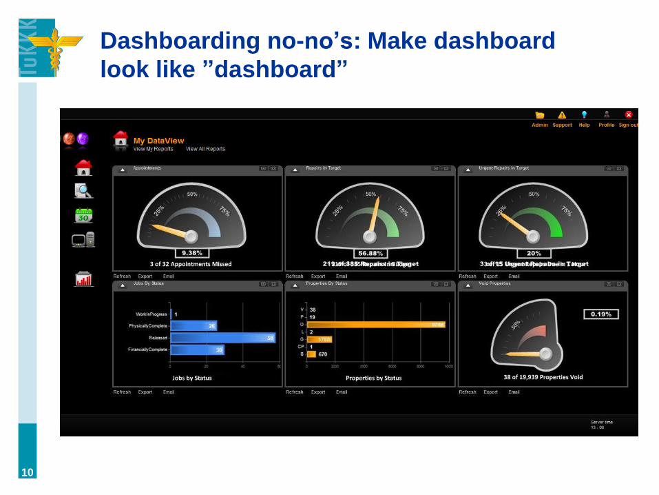
Dashboarding no-no’s: Make dashboard
look like ”dashboard”
10

…but, on the other hand: you don’t want to
make it ugly either!
”Colourful, clear, easy-to-read charts, graphs and dials
make important data jump out from the background
noise. And people like them. There’s no excuse for ugly
dashboards any more.” (Salesforce, 2013)
There needs to be a balance over form and
functionality. Design is not about “nice colors” and
pretty shapes, it’s about accessibility.
11

Very simple rule of thumb: every time the
looks of the dashboard take attention away
from the contents, it’s bad design. The good
design you’re not paying attention to.
12

Remember: data → chart type.
Which one is better? (Underwood, 2013)
13

Revisiting tree map (Perceptual Edge, 2015)
”The following chart, entitled ‘The Billion Pound-O-Gram’
was created by David McCandless for the Guardian to
help readers understand the size of the British budget
deficit (the black rectangle) by comparing it to other
large sums of money that are familiar.”
14
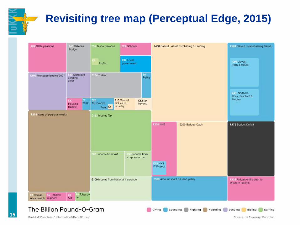
Revisiting tree map (Perceptual Edge, 2015)
15
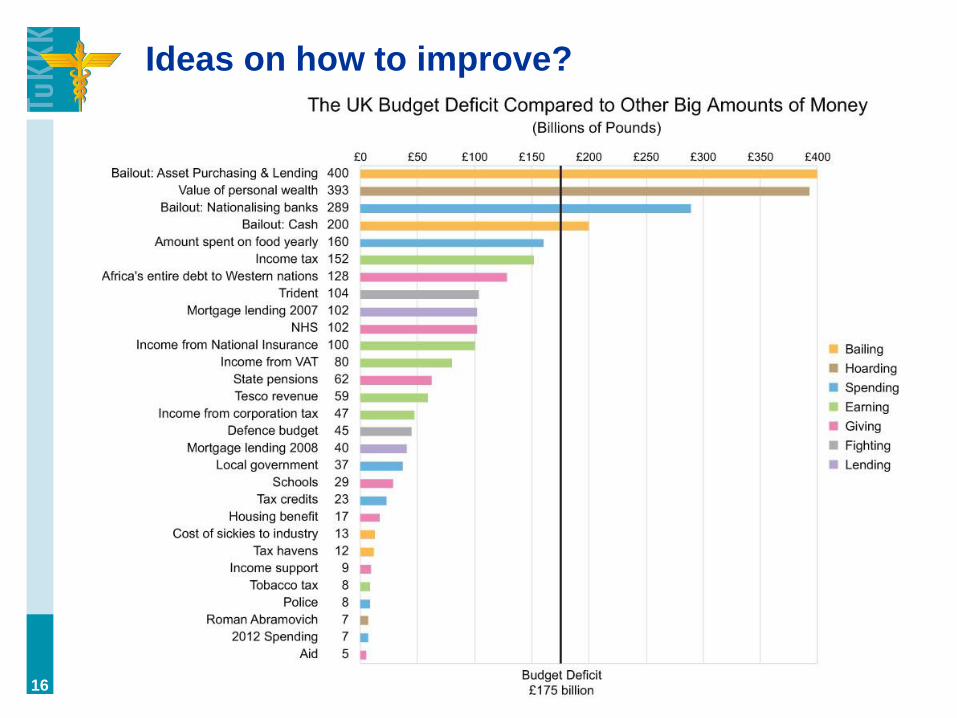
Ideas on how to improve?
16

Showing details, not the ”big picture”
(Few, 2006)
17
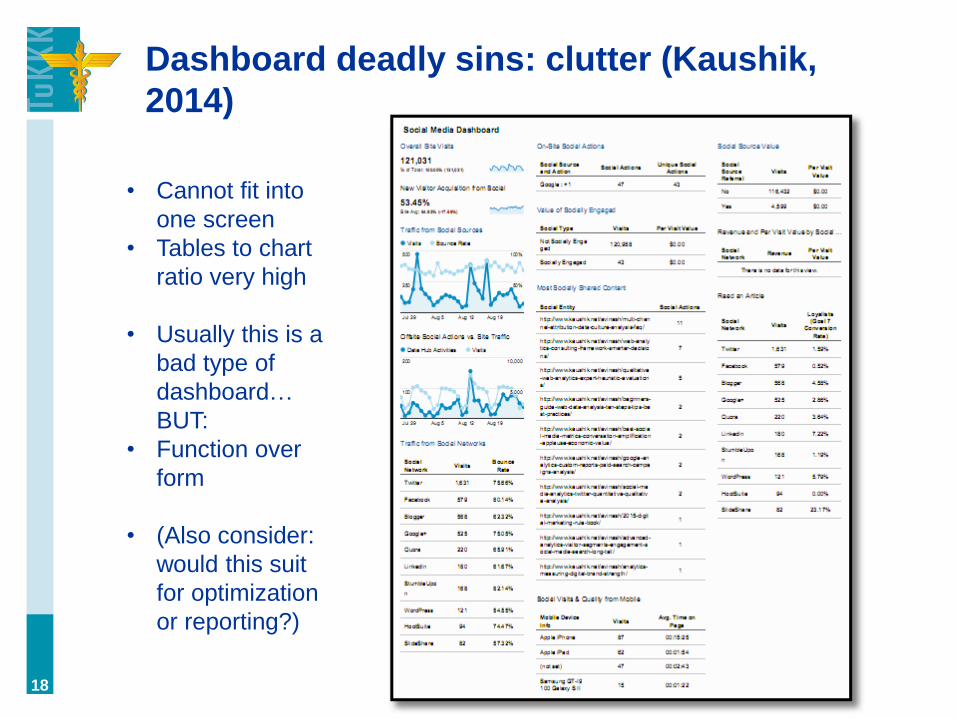
Dashboard deadly sins: clutter (Kaushik,
2014)
18
• Cannot fit into
one screen
• Tables to chart
ratio very high
• Usually this is a
bad type of
dashboard…
BUT:
• Function over
form
• (Also consider:
would this suit
for optimization
or reporting?)

The problem of clutter (=too much data) also
applies to individual charts
19
(Tableau, 2015)

Solve it by reducing data through
aggregation or omission (sometimes, you
have to lose some details…)
20
(Tableau, 2015)

…another solution is a Trellis chart
e.g., you could use it to portray performance of
Facebook ads in various demographic segments. Or
different AdWords campaigns. 21
(Trellischarts.
com)

Dashboards vs. reports
The more data there is, the more you require cognitive
processing from the recipient. Interpretation of a
dashboard should be simple. For more thorough
analyses, use reports.
With dashboards, you’re leading the thought process
more than by just displaying all data. With reports, the
person has more information and can apply more
judgment.
Simplicity is both the advantage and the weakness
of dashboards.
22

The quality of data matters, too. Imagine
you work in a big company driven on data –
false data would risk all the hundreds, if not
thousands, of people running to the wrong
direction! Preferably use real-time data from
original sources. (Real-time is a huge
advantage of interconnected digital
systems.)
23

Making dashboards meaningful
(Salesforce, 2013)
24

Showing goals: a bullet chart (Tableau,
2015)
25

If you have set goals, wouldn’t it be great to
present their accomplishment in the
dashboard?
26
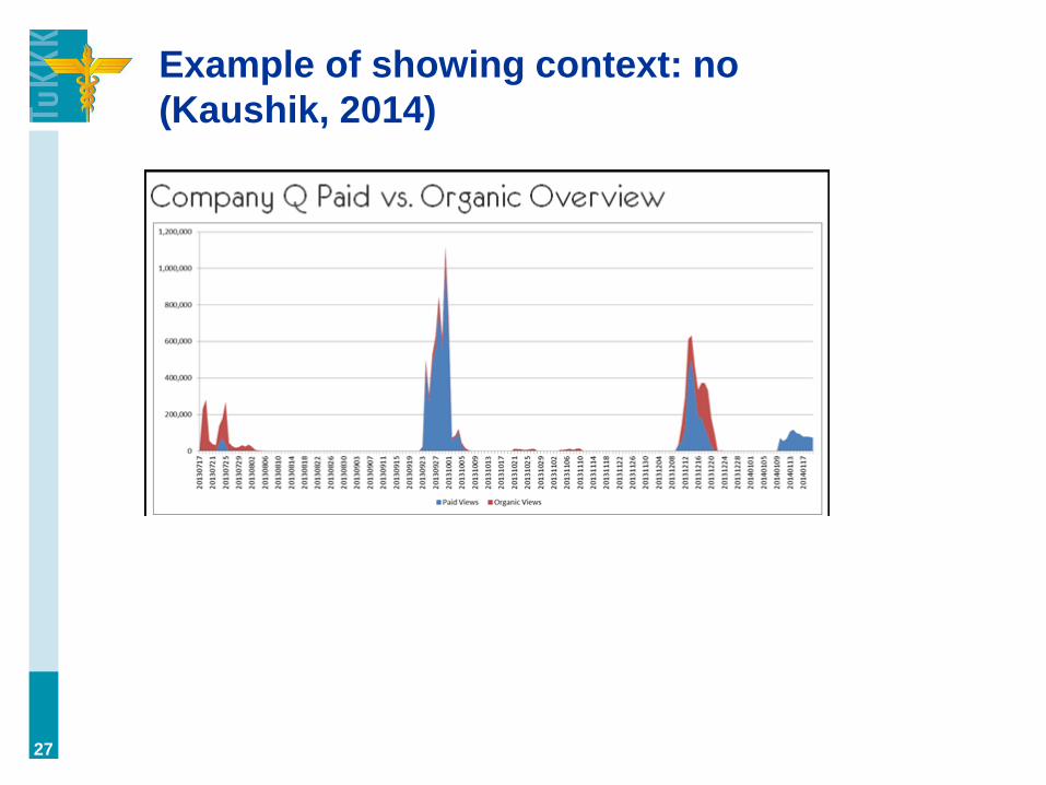
Example of showing context: no
(Kaushik, 2014)
27

Example of showing context: yes
(Kaushik, 2014)
28

“We’ve never seen a great dashboard that
was great in its first incarnation.”
“The idea is to get one out there, live with it a while, get
feedback from the people using it, and improve it over
and over again. Soon, everyone has the dashboard
experience they really want.” (Salesforce, 2013)
29
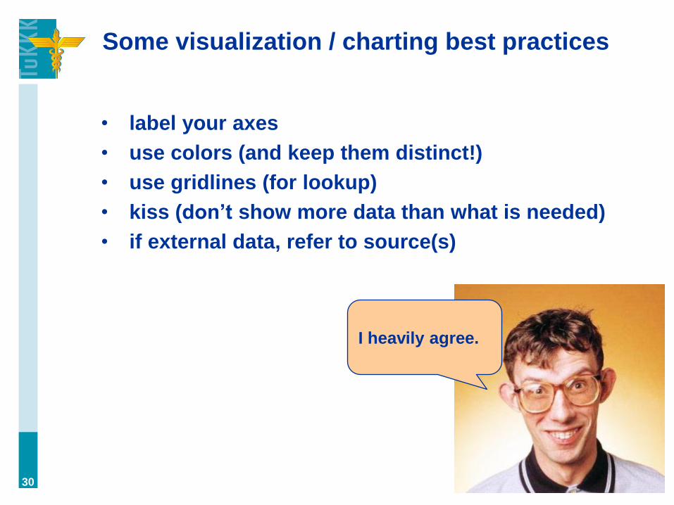
Some visualization / charting best practices
• label your axes
• use colors (and keep them distinct!)
• use gridlines (for lookup)
• kiss (don’t show more data than what is needed)
• if external data, refer to source(s)
30
I heavily agree.

From good to great:
31

From good to great:
32
What changed? • colors
• grid lines
• data labels
• legend
• formatting of y axis
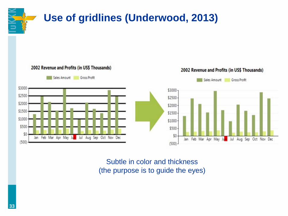
Use of gridlines (Underwood, 2013)
33
Subtle in color and thickness
(the purpose is to guide the eyes)
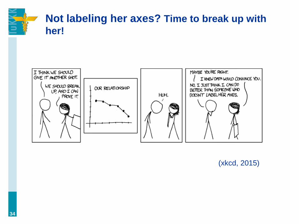
Not labeling her axes? Time to break up with
her!
34
(xkcd, 2015)

About colors
• symbolic meanings (e.g. black = death, red
= love, pink = lady GaGa)
• cultural meanings (the above can vary from
one culture to another)
• color blindness (accessability)
35

About colors: REMEMBER CONTRAST
36
Low contrast High contrast
JONI IS BEST
JONI IS BEST
(High contrast is always more legible; even
some designers tend to forget this…)
Best contrast = black on white (or vice versa)
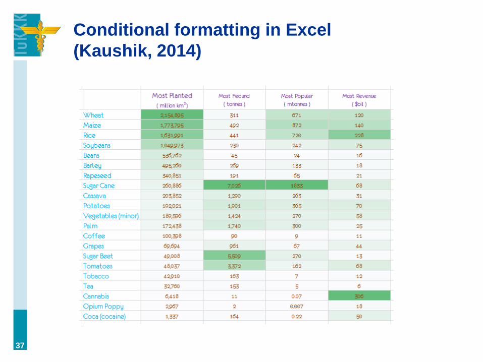
Conditional formatting in Excel
(Kaushik, 2014)
37

What to highlight? (Jones, 2013)
• key trends (last month, last year (year-to-year))
• comparisons (to competitors, to goals, between
objects (channels, individuals))
• exceptions (outliers, from average)
38
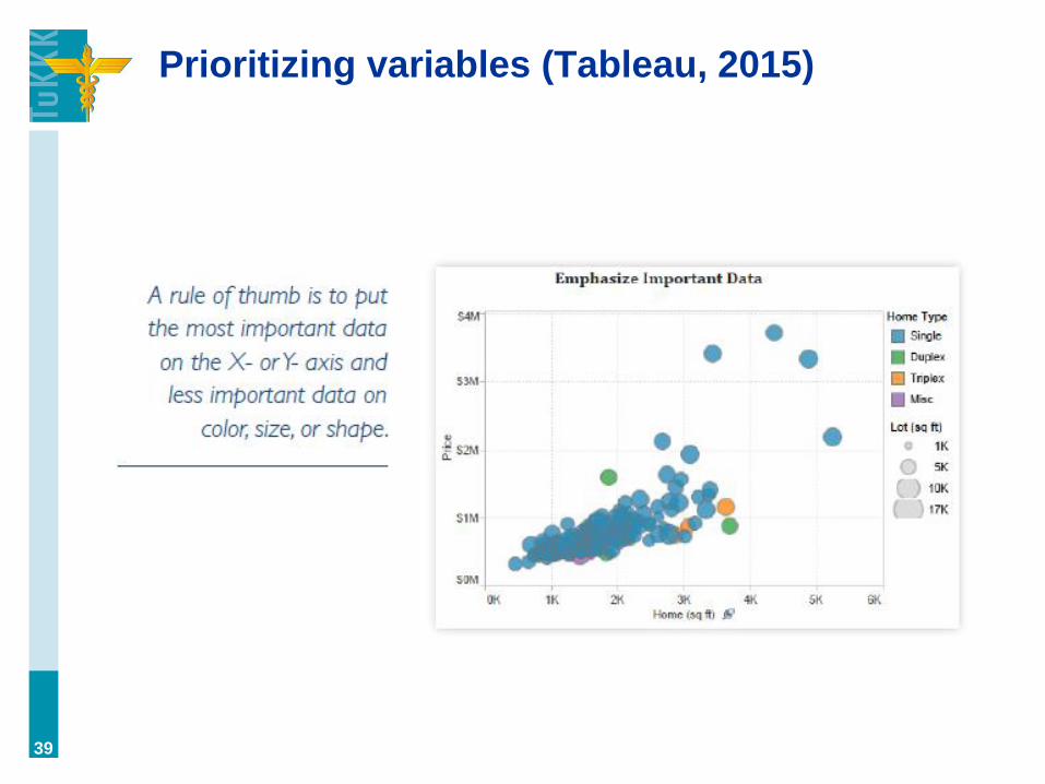
Prioritizing variables (Tableau, 2015)
39

Best practice: Refer to data source for
credibility (Huff, 1993)
40
increases credibility

KISS KISS KISS!
41
What are we
interested in?
• signups
• activation
• cancellation

KISS KISS KISS!
42
What are we
interested in?
• signups
• activation
• cancellation
• missing:
cancellation rate

Keep it Simple (Kaushik, 2014b)
43
Is it necessary
to present the
data in four
tables?

Keep it Simple (Kaushik, 2014b)
44
1
2
3
4
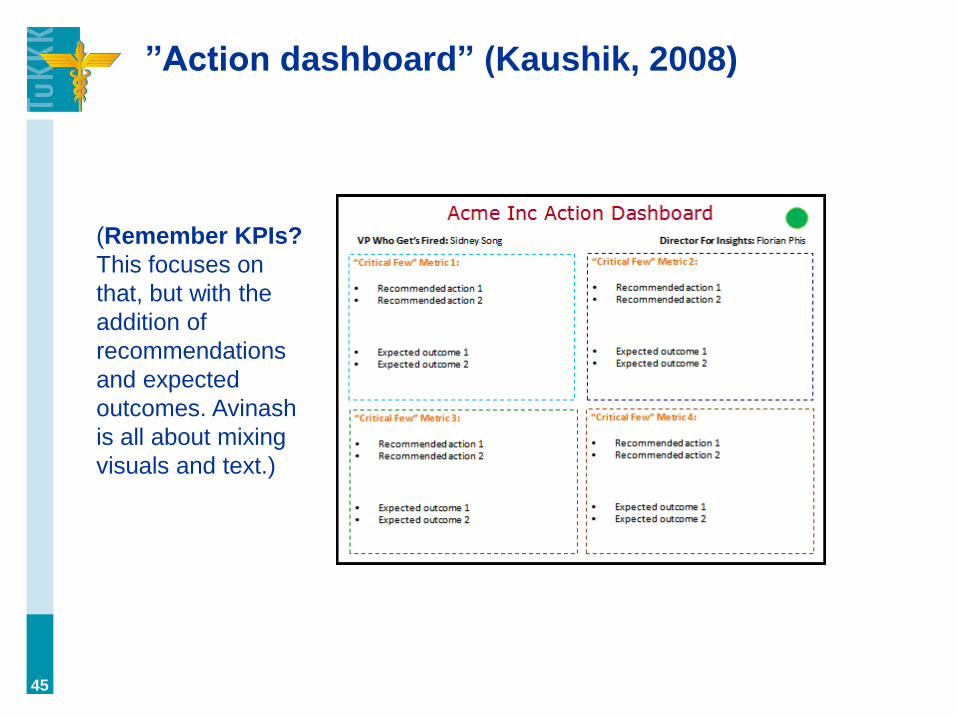
”Action dashboard” (Kaushik, 2008)
45
(Remember KPIs?
This focuses on
that, but with the
addition of
recommendations
and expected
outcomes. Avinash
is all about mixing
visuals and text.)

How to lie with statistics
+
How to lie with charts
=
How to lie with data
46

There are two books…
47
(1954) (1995)

Can we trust statistics?
• “There are three kinds of lies: lies, damned lies,
and, statistics” – Disraeli
• …statistics are under doubt, because
a. it requires the kind of sophistication to understand
them that most people don’t have
b. I’d say for any argument you can find data (which
one is “better”?)
48

How to lie with data?
• aggregate problem
• correlation does not equal causality
• problem of the mean
• sampling bias
• false/broken scales
• hiding differences (scale manipulation /
cumulative data)
• splitting data into many charts
• selective selection of data (”cherry-picking”)
• omitting data
49
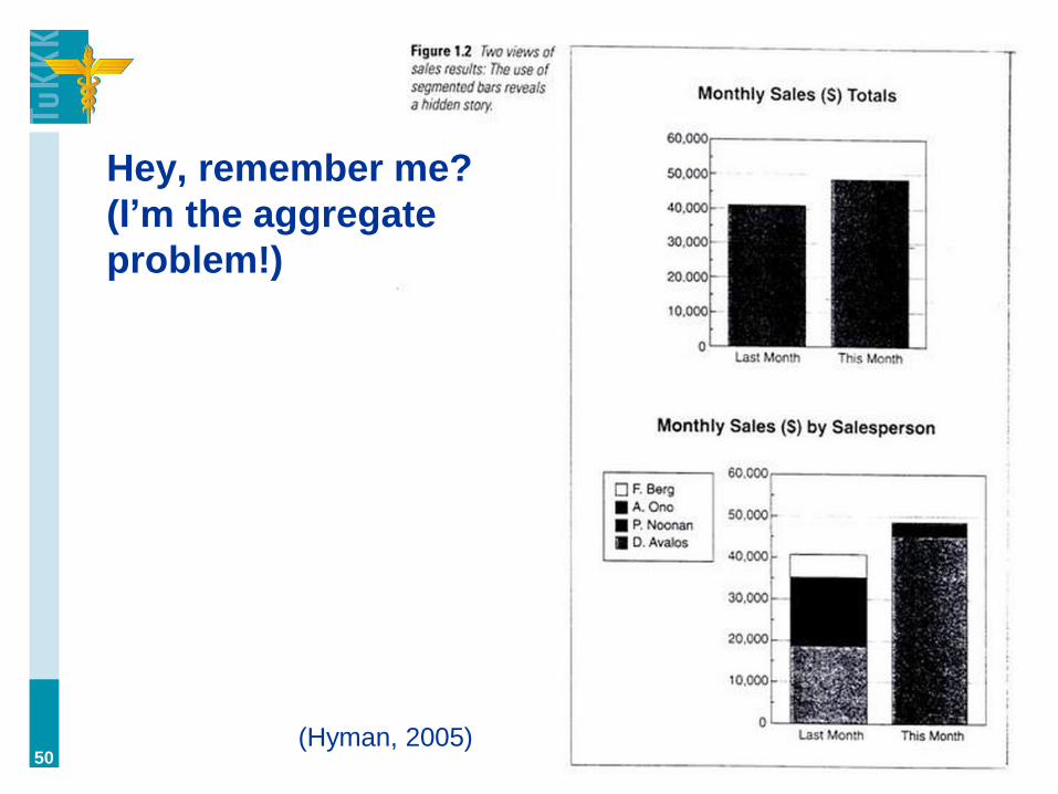
Hey, remember me?
(I’m the aggregate
problem!)
50 (Hyman, 2005)
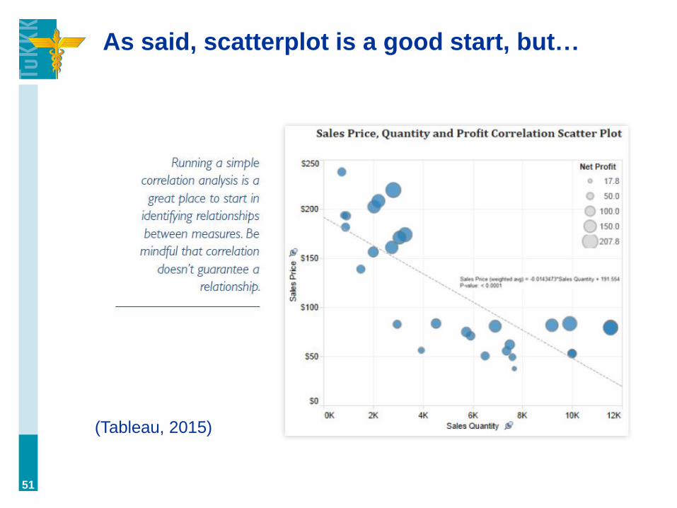
As said, scatterplot is a good start, but…
51
(Tableau, 2015)
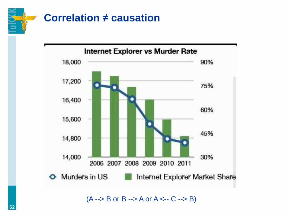
Correlation ≠ causation
52
(A --> B or B --> A or A <-- C --> B)

That’s an example of the gestalt principles
”When two or more lines appear together in a chart, and
they look similar to each other, we have the tendency
to assume they are related. The red line in this chart
represents suicide rates while the green line represents
spending on science and technology—two completely
independent sets of data. But on first glance, we tend to
ask ourselves whether there could, in fact, be a causal
correlation.” (Cudmore, 2014)
53
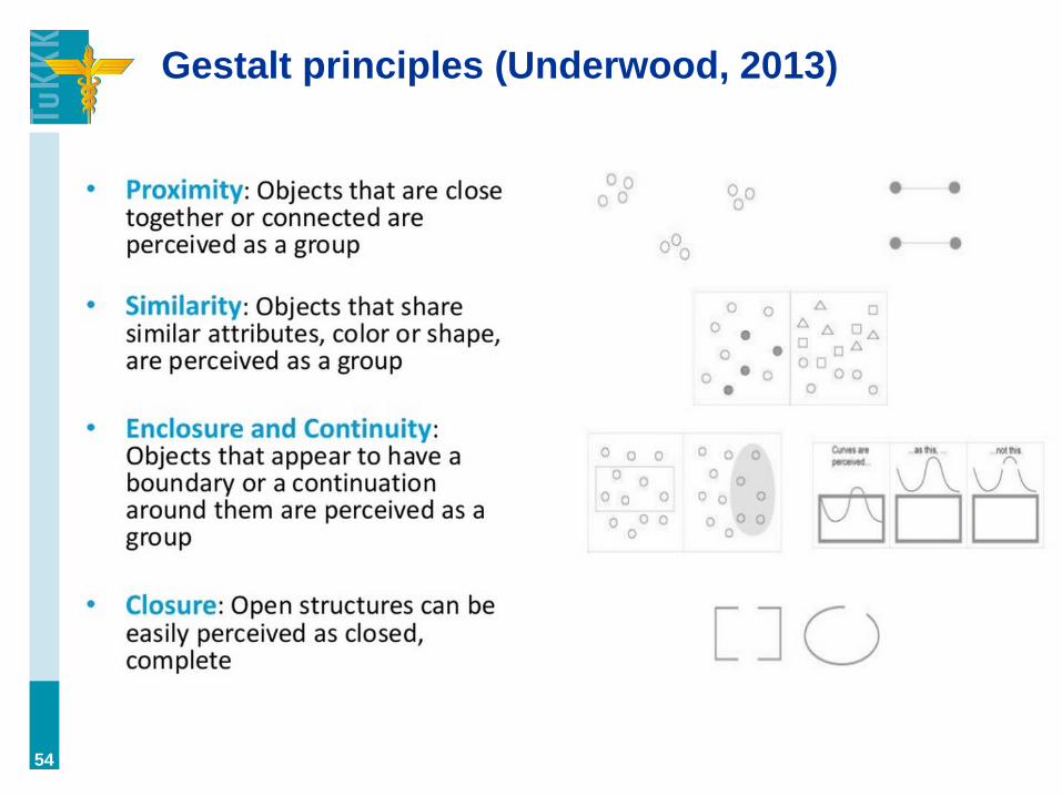
Gestalt principles (Underwood, 2013)
54

Sometimes, there are interesting
explanations…
55

Sometimes, there are interesting
explanations…
A. ”The more money spent on space, science, and
technology, the more grad-students and post-docs
there are. Grad-students and post-docs hate life and
commit suicide.”
B. “Easy! Grad-students and post-docs can't stop
talking about themselves driving friends and
neighbors insane, and summarily over the cliff.”
C. “As more scientists receive funding, they are
increasingly able to afford to assassinate their
enemies. Eventually, faced with the overwhelming
weight of their guilt, some commit suicide. Pretty
obvious.”
D. Plus, they make the assassinations look like
suicides.” 56

…but some nerds didn’t get the joke!
• ”Interesting hypothesis, but it would
certainly not have an immediate effect.
An increase in the money spent on
R&D would not have a negative
impact on blue-collar for many years
(if ever).”
• “Its good to have hypotheses, but you
cannot say that there is a causation
when observing correlational data.
You are listing possible external
variables, mediator variables, or
moderator variables.”
57
I STRONGLY
DISAGREE
WITH YOUR
HYPOTHESIS.

Flying Spaghetti Monster
58

Problem of the mean (Vembunarayanan, 2014)
59
When there are outliers to one
direction or other, the mean is
misleading. Median or mode are
better in this case.
”Bush administration came out with a
plan for tax cuts. They claimed that if
their plans were implemented then
American families would get an
average tax reduction of $1,083. But
more than 50% of the American
families would not even get $100 in tax
cuts. Did the Bush administration lie?
No. They used mean for arriving at
$1,083 and it is distorted by outliers
and hence this figure was not
applicable to majority of the families.
The median figure is less than $100.”
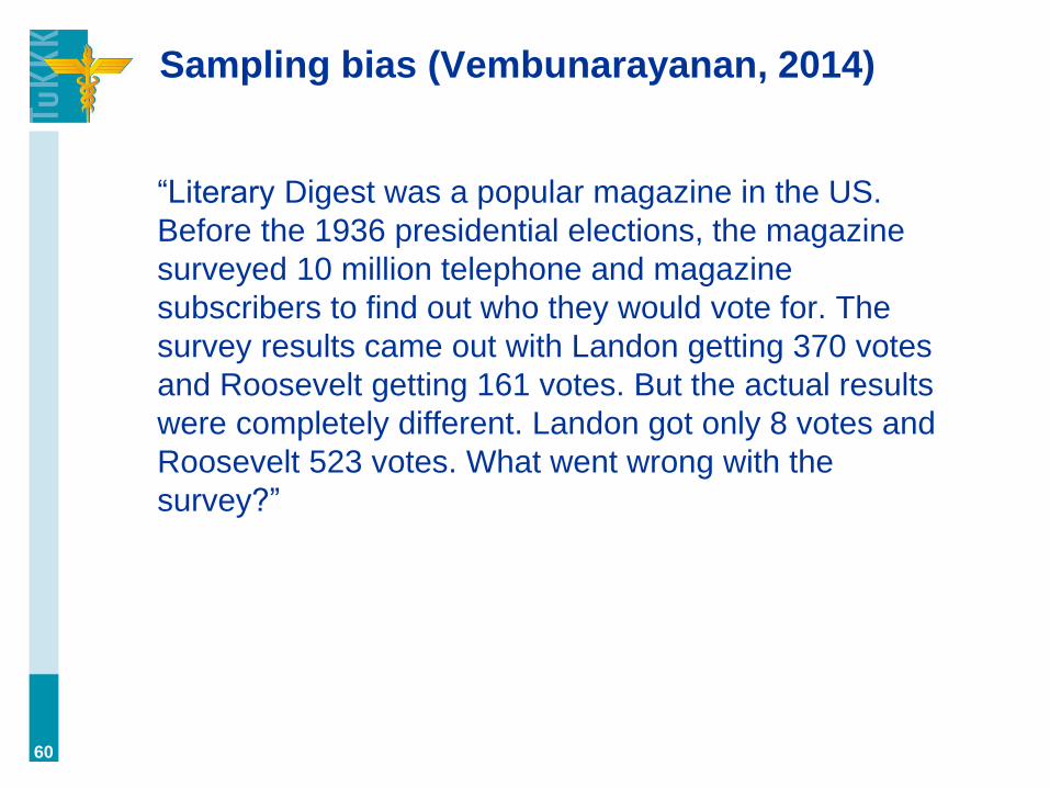
Sampling bias (Vembunarayanan, 2014)
“Literary Digest was a popular magazine in the US.
Before the 1936 presidential elections, the magazine
surveyed 10 million telephone and magazine
subscribers to find out who they would vote for. The
survey results came out with Landon getting 370 votes
and Roosevelt getting 161 votes. But the actual results
were completely different. Landon got only 8 votes and
Roosevelt 523 votes. What went wrong with the
survey?”
60

Sampling bias (Vembunarayanan, 2014)
“Literary Digest was a popular magazine in the US.
Before the 1936 presidential elections, the magazine
surveyed 10 million telephone and magazine
subscribers to find out who they would vote for. The
survey results came out with Landon getting 370 votes
and Roosevelt getting 161 votes. But the actual results
were completely different. Landon got only 8 votes and
Roosevelt 523 votes. What went wrong with the survey?
In those days only wealthy people had telephones
and they favored Landon as he was a republican.
The sample chosen was not representative of the
entire US population. It was biased.”
61

George Gallup (1901–1984)
A sample has predictive power, when
a. it’s taken randomly
b. it represents the whole population
c. (obviously, it satisfies sample size
requirements)
62

”There’s no evidence of that” (Bones)
• ”Is the company trying to cover up the murder?”
• ”There’s no evidence of that!”
• There is no evidence, because the matter has not
been considered. Since it’s a novel hypothesis, it has
to be tested (or evaluated). In other words, lack of
evidence is not a lack of evidence until evidence has
been sought after (a priori, a posteriori).
63

False scales (Jones, 2006)
64
change the axis
range, and tell a
different story

”We’re so good!” (Huff, 1993)
65
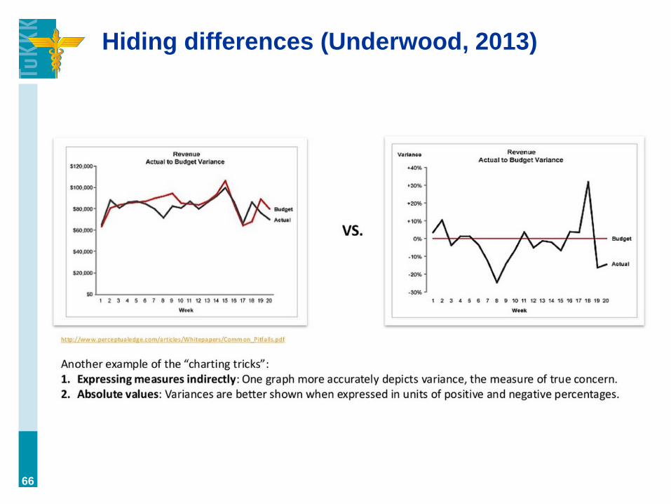
Hiding differences (Underwood, 2013)
66

Using cumulative figures (HBR, 2014)
67
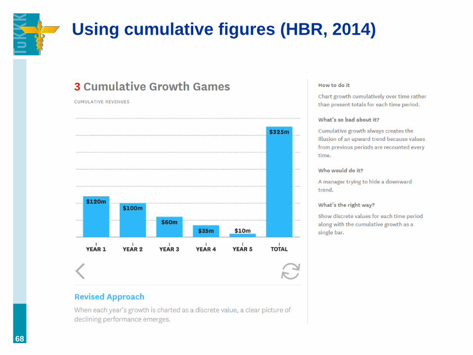
Using cumulative figures (HBR, 2014)
68
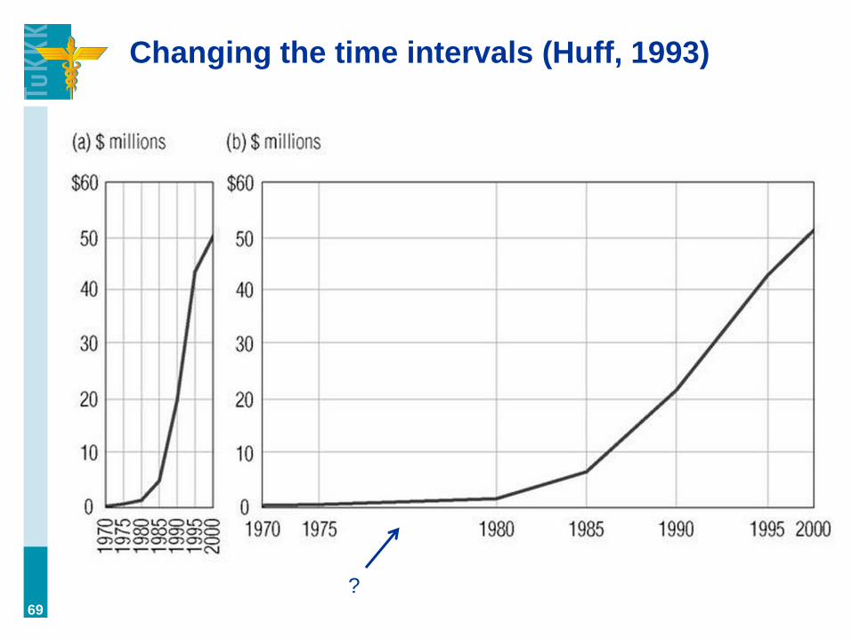
Changing the time intervals (Huff, 1993)
69
?

Stretching the scales (Huff, 1993)
70

Different scales, one picture (Brown, 2013)
71
”You can easily take any move in the market and with a bit of
manipulation, create a chart as you see above. The key in
this case is the two different scales, the S&P on the left,
Nasdaq on the right. Had the charts been produced using
the same scale, they’d show no resemblance to each other.”
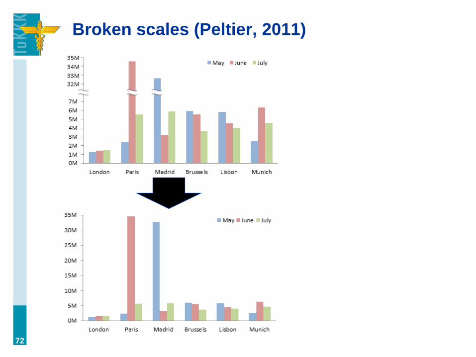
Broken scales (Peltier, 2011)
72
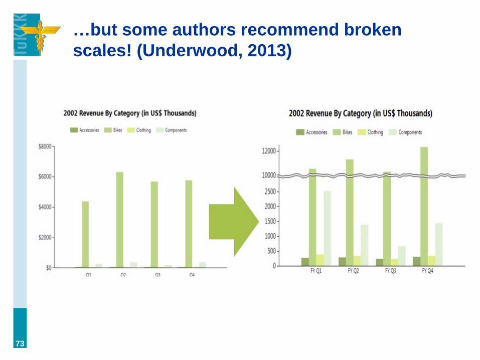
…but some authors recommend broken
scales! (Underwood, 2013)
73

How to fix the outlier problem?
• log-transformation
• broken scales
• → both give misleading representation
• Joni’s suggestion: present two graphs, one with
outliers and one without them
74

A log scale hides exponential change
(Huff, 1993)
75

Splitting the data into many charts
(Kaushik, 2014b)
76
Slide 1

Splitting the data into many charts
(Kaushik, 2014b)
77
Slide 2
!
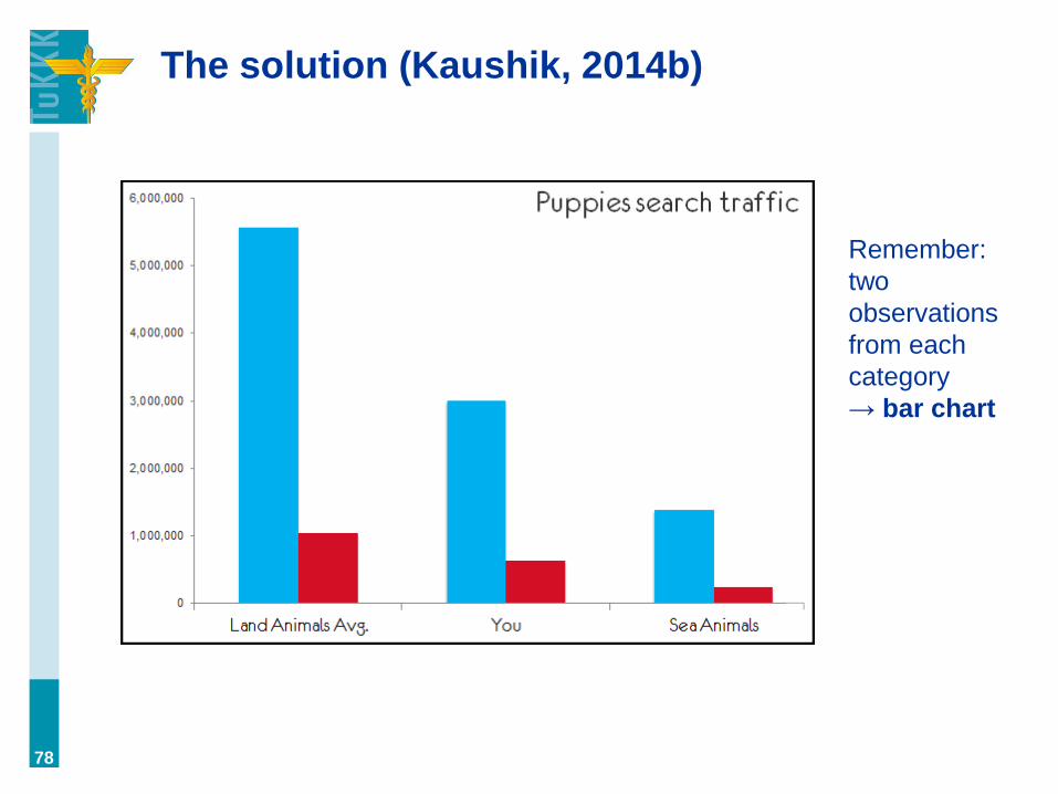
The solution (Kaushik, 2014b)
78
Remember:
two
observations
from each
category
→ bar chart

Building two opposite stories (Cudmore,
2014)
79
”A classic way to lie with a chart is to introduce
irrelevant information. In the chart on the right, the
only relevant property is cone height. But, while the
cone volume is irrelevant, it is also very difficult to
ignore, encouraging us to assign a greater value to
the larger part of the cone.”
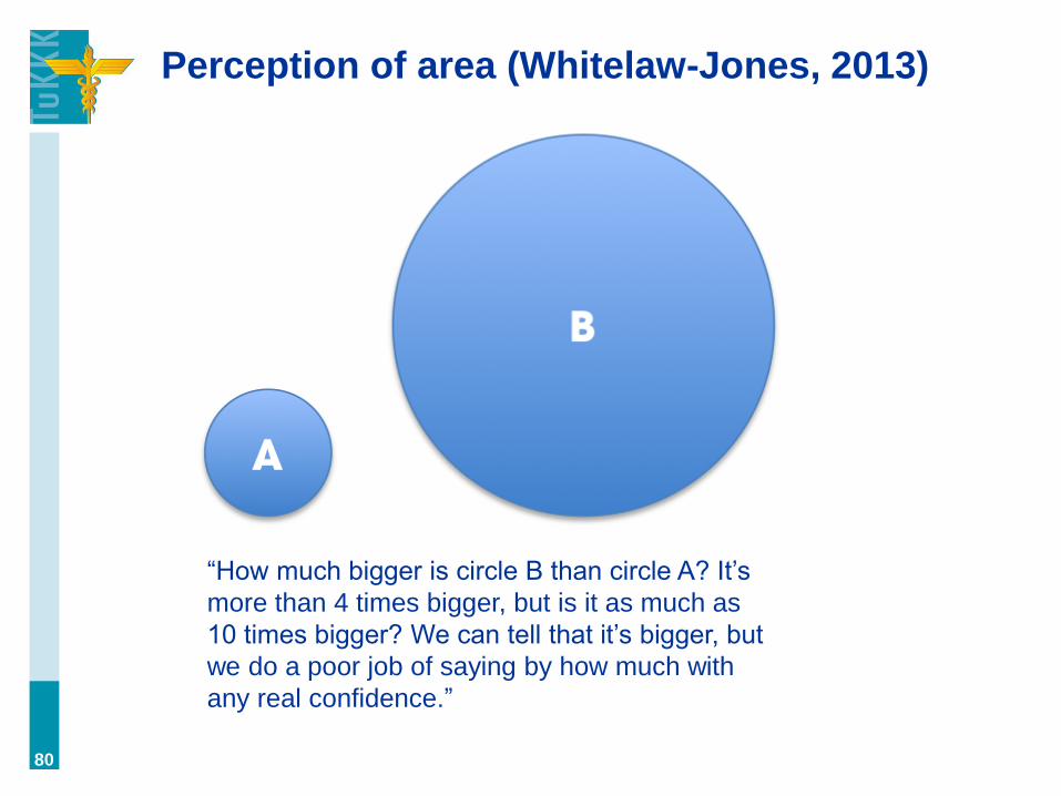
Perception of area (Whitelaw-Jones, 2013)
80
“How much bigger is circle B than circle A? It’s
more than 4 times bigger, but is it as much as
10 times bigger? We can tell that it’s bigger, but
we do a poor job of saying by how much with
any real confidence.”
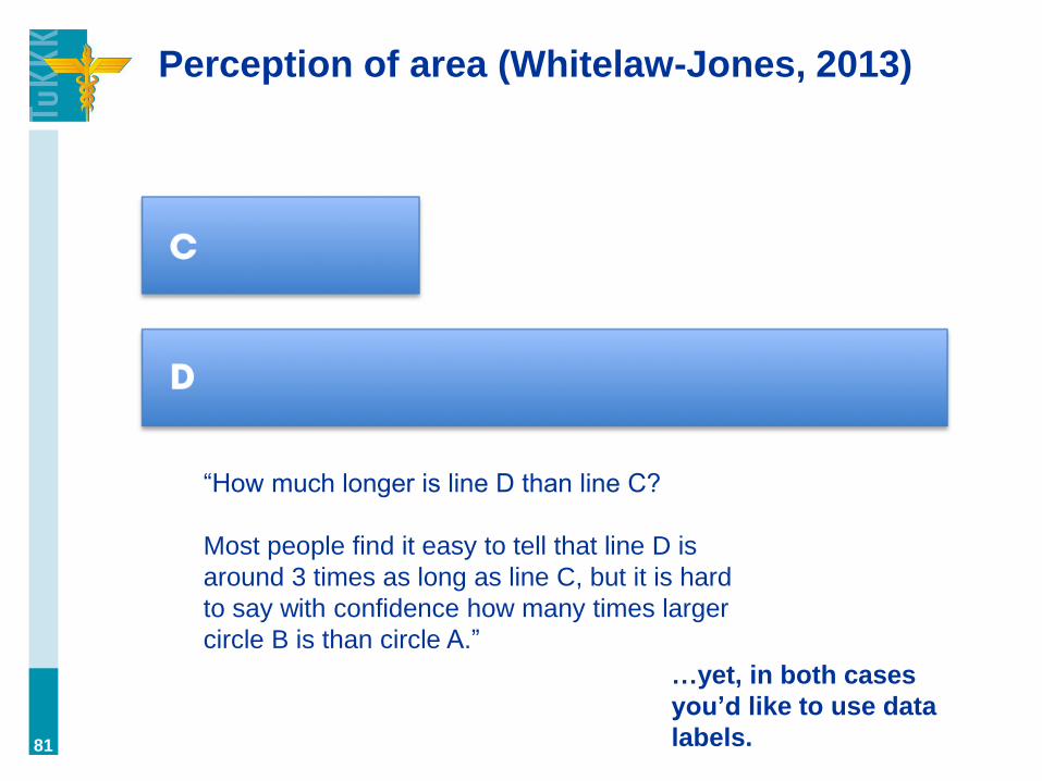
Perception of area (Whitelaw-Jones, 2013)
81
“How much longer is line D than line C?
Most people find it easy to tell that line D is
around 3 times as long as line C, but it is hard
to say with confidence how many times larger
circle B is than circle A.”
…yet, in both cases
you’d like to use data
labels.

Using 3D to give ”optical illusion”
(Cudmore, 2014)
82
Solution: Don’t use 3D. Why
would you even need it?

Using size as a false indicator (HBR, 2014)
83

Using size as a false indicator (HBR, 2014)
84
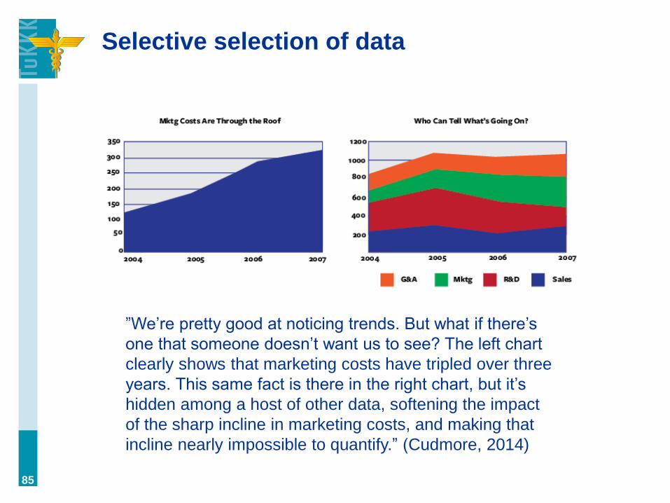
Selective selection of data
85
”We’re pretty good at noticing trends. But what if there’s
one that someone doesn’t want us to see? The left chart
clearly shows that marketing costs have tripled over three
years. This same fact is there in the right chart, but it’s
hidden among a host of other data, softening the impact
of the sharp incline in marketing costs, and making that
incline nearly impossible to quantify.” (Cudmore, 2014)
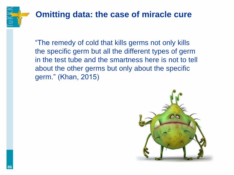
Omitting data: the case of miracle cure
“The remedy of cold that kills germs not only kills
the specific germ but all the different types of germ
in the test tube and the smartness here is not to tell
about the other germs but only about the specific
germ.” (Khan, 2015)
86

Omitting of data (but still presenting it!)
87

”Evil” politicians (Underwood, 2013)
88

”Politizing” data (Vembunarayanan, 2014)
89
average (median) weekly wage of carpenters (the key is width)

The grapher’s dilemma
• How to abstract enough for the data to become
useful (actionable) to decision-markers without
reducing its accuracy, as in its relationship to
reality?
• Because visualization has a relationship in reality
(i.e., people will act based on the information given,
which actions will shape reality), this is very
important. (It’s also a key to propaganda, but we’re
not learning about that now.)
90
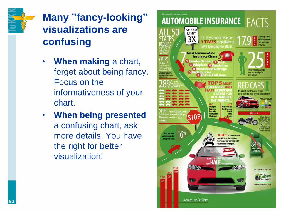
Many ”fancy-looking”
visualizations are
confusing
• When making a chart,
forget about being fancy.
Focus on the
informativeness of your
chart.
• When being presented
a confusing chart, ask
more details. You have
the right for better
visualization!
91
Everyone wants to influence you. But the
biggest danger is not the data. What is it?
• EMOTIONS.
• The biggest risk for rational decision-making is
emotions. Cognitive dissonance, rationalization, etc.
You know what’s right, but you don’t want to do it.
Therefore you find the data to justify your wants, or
interpret it the way it suits your needs, or simply
ignore it.
92

How to see through ”lying with statistics”
(Huff, 1993)
Ask four questions…
1. Who says so? Who is the one publishing the result? Do
they have anything to gain from it?
2. How do they know? How did they measure this result?
3. What is missing? Is some key information left out?
4. Does it make sense? Can you explain the results?
93

Data is power, and visualization is use of
power. Therefore, don’t let yourself be
fooled (remember ”Dilbert’s pie”). If most
people let themselves be fooled by data
representations, you can be smarter and
question it. The curse of quantitative
matters is, in fact, that they can almost
always be questioned! (…and argued
against with some other data -- ah, what a
beautiful world it is :)
94
Joni’s manifesto for ITP students

Always be doubting!
95
(xkcd, 2015)
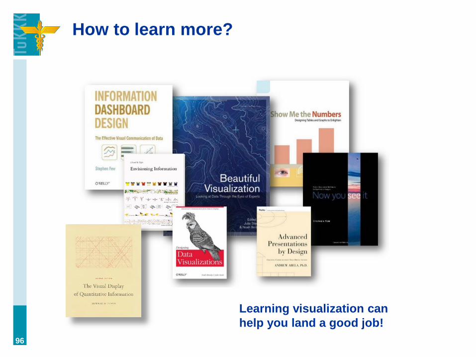
How to learn more?
96
Learning visualization can
help you land a good job!

(I swear that guy looks just like me!)
97