digipak analysis
DESCRIPTION
analysis of threee digipaksTRANSCRIPT

Digipak AnalysisRihanna- Loud (2010 Def Jam)
The album cover is a close up of the artist Rihanna’s face. Her name is not a main feature but it not necessary as she will be recognized straight away. There is no setting or graphics used therefore the attention goes straight to the artist. The album cover is simple and gives clues as to what kind of songs are featured on the album possibly personal songs because of how focused on her the main image is. Her eyes are closed, perhaps suggesting that she is holding onto something or thinking of a loved one. It also shows a vulnerable and insecure side to her but with her tattoo on her neck featured it tells the fans that the bold and feisty Rihanna is still featured on the album.
My digipak will do the same in the sense that because it is an urban genre the pictures will be
taken in urban surroundings such as a city and the band will look confident and fearless as
that is what the song is about.
The digipak for Rihanna’s Loud album uses a lot of the contrasting colour red. The colour white is also used on the album cover and this is an immediate contrast to red and makes it stand out more. It comes off as a loud colour, which suits well as the name of the album is Loud and the artist is known for having a loud kind of personality. The digipak continues use of the colour red when the artist is pictured lying on a bed of roses. The background is dark and she is wearing white, therefore the colour of her hair and the roses stands out very well. Red also is the common colour of love which most of her songs are predominantly about so it gives the audience an idea of what they are investing in.
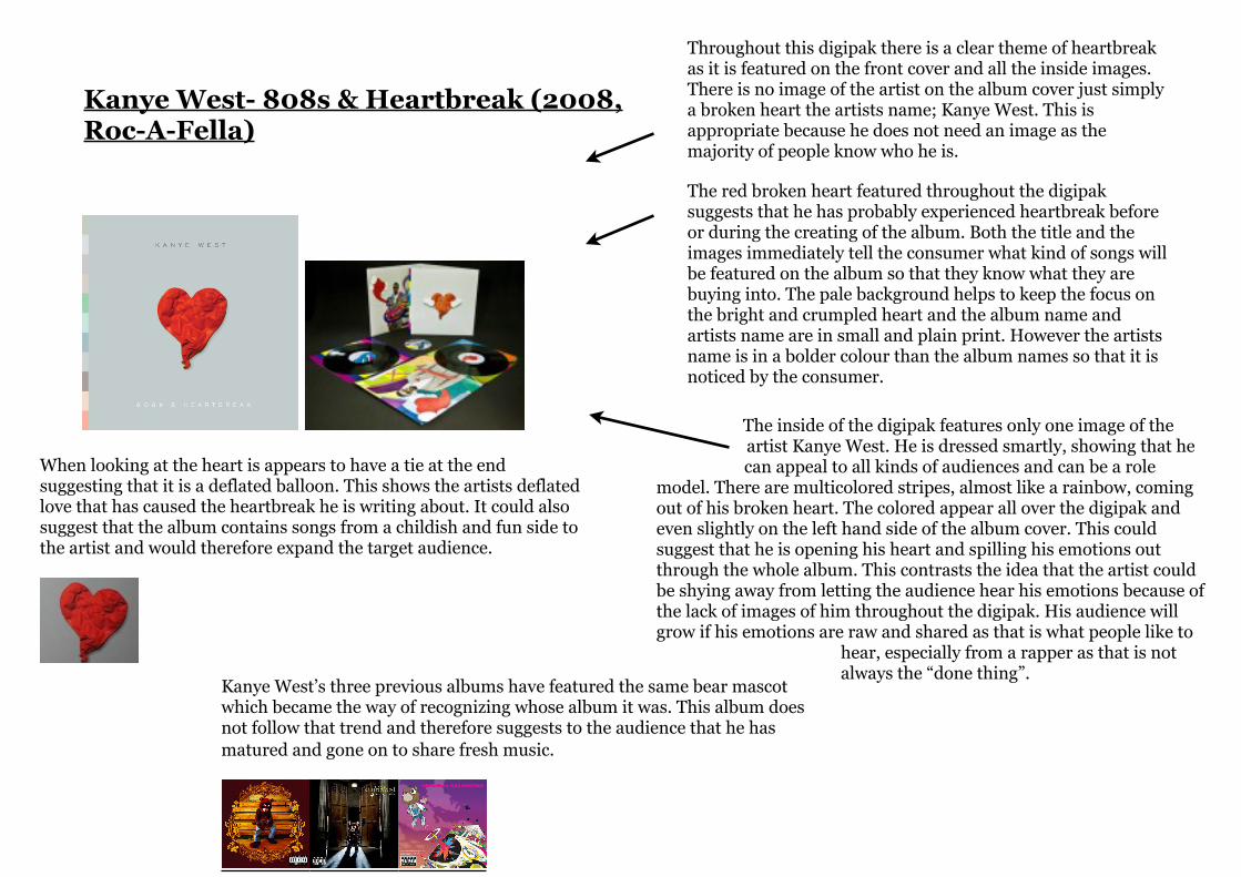
Kanye West- 808s & Heartbreak (2008, Roc-A-Fella)
Throughout this digipak there is a clear theme of heartbreak as it is featured on the front cover and all the inside images. There is no image of the artist on the album cover just simply a broken heart the artists name; Kanye West. This is appropriate because he does not need an image as the majority of people know who he is.
The red broken heart featured throughout the digipak suggests that he has probably experienced heartbreak before or during the creating of the album. Both the title and the images immediately tell the consumer what kind of songs will be featured on the album so that they know what they are buying into. The pale background helps to keep the focus on the bright and crumpled heart and the album name and artists name are in small and plain print. However the artists name is in a bolder colour than the album names so that it is noticed by the consumer.
When looking at the heart is appears to have a tie at the end suggesting that it is a deflated balloon. This shows the artists deflated love that has caused the heartbreak he is writing about. It could also suggest that the album contains songs from a childish and fun side to the artist and would therefore expand the target audience.
The inside of the digipak features only one image of the artist Kanye West. He is dressed smartly, showing that he can appeal to all kinds of audiences and can be a role
model. There are multicolored stripes, almost like a rainbow, coming out of his broken heart. The colored appear all over the digipak and even slightly on the left hand side of the album cover. This could suggest that he is opening his heart and spilling his emotions out through the whole album. This contrasts the idea that the artist could be shying away from letting the audience hear his emotions because of the lack of images of him throughout the digipak. His audience will grow if his emotions are raw and shared as that is what people like to
hear, especially from a rapper as that is not always the “done thing”.
Kanye West’s three previous albums have featured the same bear mascot which became the way of recognizing whose album it was. This album does not follow that trend and therefore suggests to the audience that he has matured and gone on to share fresh music.

Christina Aguilera- Bionic (2010, RCA Records)
The images inside are promiscuous and raunchy and the artists body is being used to attract people, there are no big effects or costumes and this works. It will therefore appeal to women and men of the late-teen to early twenty age as women will want to look like her and men will want to be with her and will therefore invest in this product. The colour scheme is also mixed gender, to save losing audience members if the colours pink or blue had been used. Many males find the lips a very attractive part of the female body and Christina Aguilera’s lips are featured on almost every side to the digipak and are painted a seductive colour.
Immediately from looking at the album cover the audience knows that they are investing in an explicit album. The image is strong and powerful and there is a parental advisory label which certifies that the album is Although a strange image is still keeps the black, white and red colour scheme that is continued throughout the digipak on both her normal side and her Bionic side. This works well and has given me the idea of using a colour scheme for my digipak.
The main image is centre, this suggests that the album is all about her and surrounds her life. the white background draws attention to her and it remains there.
The word ‘Bi-on-ic’ is featured on the side of her bionic face, the definition of bionic is “Having anatomical structures or physiological processes that are replaced or enhanced by electronic or mechanical components.” The artists lips however are covering both halves of her face. This could suggest that her natural side will still be shown through the new and futuristic side of her music. her hair is also styles in a futuristic style, as is her costume.
The hand written “Thank you” stands out and shows the sincerity and importance of it. It makes the album personal and her strong and constant fan base will appreciate that.