developing effective powerpoint presentations effective powerpoint presentations excited by...
TRANSCRIPT

DEVELOPING EFFECTIVE POWERPOINT PRESENTATIONS

Effective PowerPoint presentations
Excited
By
Animations, sound
and
Clip art
In PowerPoint?
You
Are
?
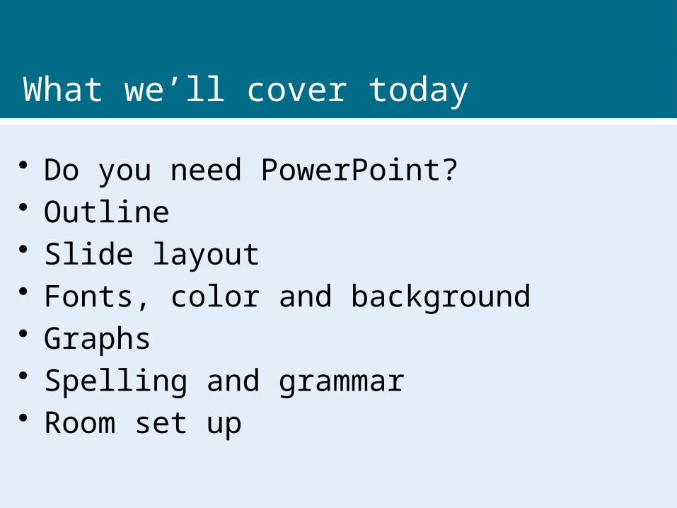
What we’ll cover today
• Do you need PowerPoint?• Outline• Slide layout• Fonts, color and background• Graphs• Spelling and grammar• Room set up

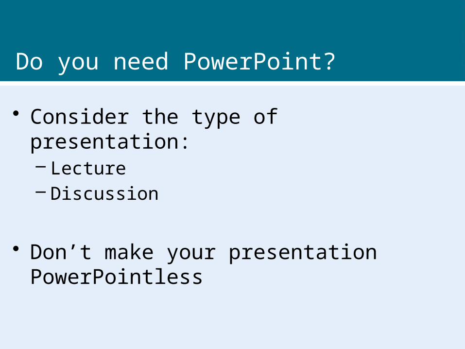
Do you need PowerPoint?
…then he said, “I can’t feel my legs” and then I said, “Stay with me Joe!” But it was too late. He was gone. It was the PowerPoint.
Do you need PowerPoint?
• Consider the type of presentation:– Lecture– Discussion
• Don’t make your presentation PowerPointless

The outline
• 1st or 2nd slide should give an Agenda or Outline
• Follow outline for your presentation
• Place main points on outline slide

Slide layout
• Use point form, not complete sentences
• Maximum of six points per slide
• Avoid wordiness: key words only

Slide layout
This page contains too many words for a presentation slide. It is not written in point form, making it difficult both for your audience to read and for you to present each point. Although there are exactly the same number of points on this slide as the previous slide, it looks much more complicated. In short, your audience will spend too much time trying to read this paragraph instead of listening to you.

Slide layout
• Showing one point at a time will:
– focus attention on one point
– prevent reading ahead
– help keep your presentation focused

Slide layout
• Do not use distracting animation
• Do not go overboard with the animation
• Use consistent animation

Slide layout
• Slide transitions should not be distracting
• Be consistent with transitions – never Random
• Worst effects –
‘Checkerboard or Comb’
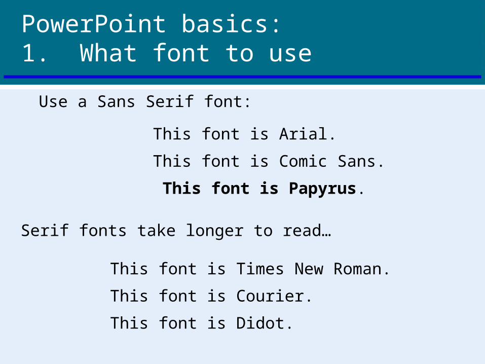
PowerPoint basics:1. What font to use
This font is Arial.
This font is Comic Sans.
This font is Papyrus.
This font is Times New Roman.
This font is Courier.
This font is Didot.
Serif fonts take longer to read…
Use a Sans Serif font:

PowerPoint basics:1. What font to use
Some fonts look really good in boldface:
Arial vs. Arial bold
Comic Sans vs. Comic Sans bold
Papyrus vs. Papryus bold

PowerPoint basics:1. What font to use
Type size should be 18 points or larger:
18 point
20 point
24 point
28 point
36 point
* References can be in 14 point font

PowerPoint basics:1. What font to use
AVOID USING ALL CAPITAL LETTERS BECAUSE IT’S REALLY HARD TO READ!

PowerPoint basics:2. Color
Dark letters against a light background work.

PowerPoint basics:2. Color
Light letters against a dark background also work.
PowerPoint basics:2. Color
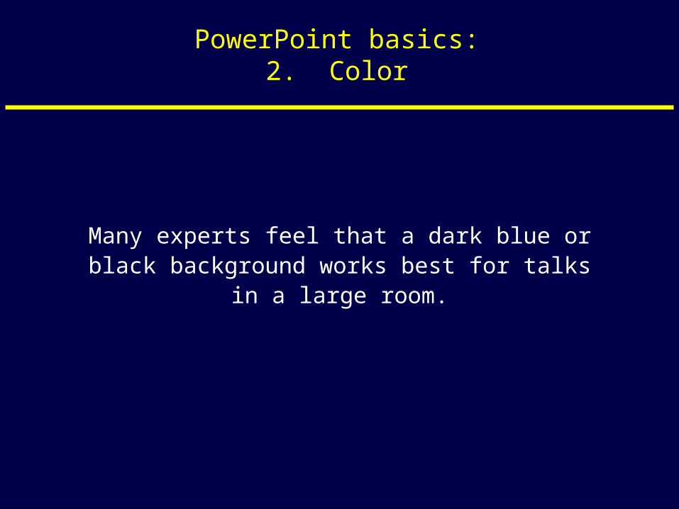
Many experts feel that a dark blue or black background works best for talks in a large
room.

PowerPoint basics:2. Color
Dark letters against a light background are best for smaller rooms and for teaching.

PowerPoint basics:2. Color
Avoid red-green combinations because a significant fraction of the human population is red-
green colorblind.

PowerPoint basics:2. Color
Avoid red-green combinations because a large fraction of the human population is red-green
colorblind.
Lots of people can’t read this –and even if they could, it makes your eyes hurt.

PowerPoint basics:2. Color
Other color combinations can be equally bad:
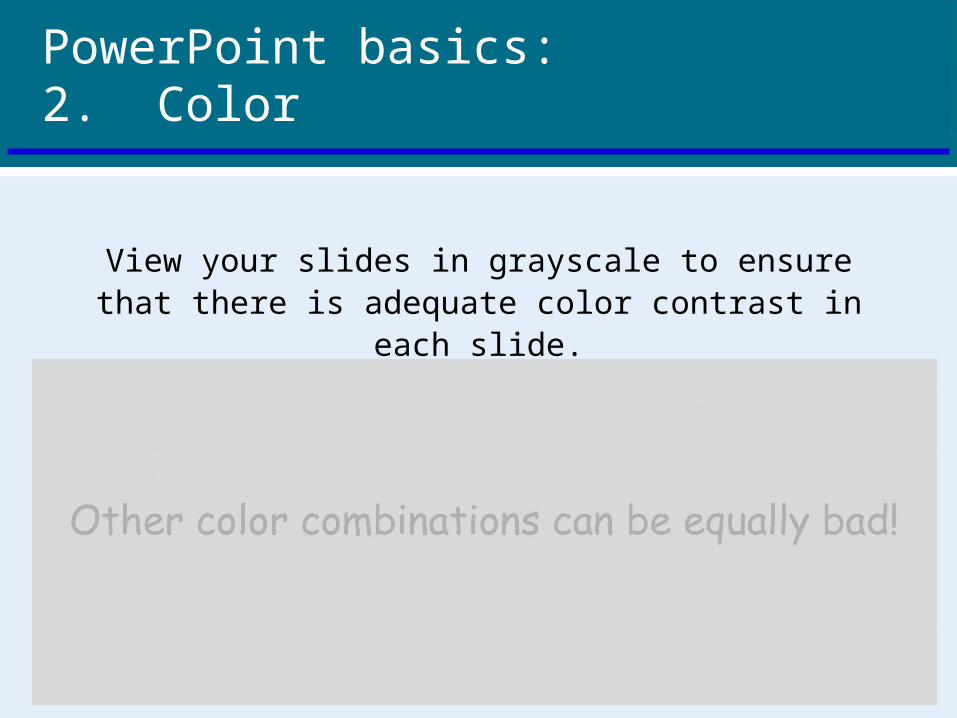
PowerPoint basics:2. Color
View your slides in grayscale to ensure that there is adequate color contrast in each slide.
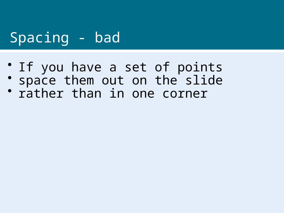
Spacing - bad
• If you have a set of points• space them out on the slide• rather than in one corner

Spacing - good
• If you have a set of points
• space them out on the slide
• rather than in one corner

Graphs
• Use graphs rather than just charts and words– Data in graphs is easier to comprehend and
retain than raw data– Trends are easier to visualise in graph form
• Always title your graphs

Graphs

Graphs – Easy to Read
January February March April0
10
20
30
40
50
60
70
80
90
100
Widgets Sold in First Quarter of 2014
Purple
Blue

Graphs – Difficult to Read

Other features
• choose pictures
that highlight your
point
• use a screen
capture if
appropriate

Spelling and Grammar
• Proof your slides for:– speling mistakes– the use of of repeated words– grammatical errors you might have make
• Have someone check your presentation

On the day
• Get there early• Handouts• Does everything work?• Can your audience read the slides?• Keep an eye on the time• Don’t read directly from the slides

Conclusion slide
• Use an effective and strong closing
• Use a conclusion slide

Conclusion
• Structure your presentation• Keep it simple (background, font, color)• Minimal content on slides - 6/6• Avoid pointless animations• Only use pictures if they assist• Ensure accuracy with content and
equipment

Questions?
• End your presentation with a simple
question slide to:
– Invite your audience to ask questions
– Provide a visual aid during question period
– Avoid ending a presentation abruptly