design patterns for user interface for mobile applications
TRANSCRIPT

Advances in Engineering Software 40 (2009) 1318–1328
Contents lists available at ScienceDirect
Advances in Engineering Software
journal homepage: www.elsevier .com/locate /advengsoft
Design patterns for user interface for mobile applications
Erik G. Nilsson *
SINTEF ICT, Postboks 124, Blindern, N-0314 Oslo, Norway
a r t i c l e i n f o
Article history:Received 22 September 2008Received in revised form 19 November 2008Accepted 19 January 2009Available online 25 April 2009
Keywords:User interface design patternsUser interfaces for mobile applicationsPatterns collectionMobilityDesign guidelines
0965-9978/$ - see front matter � 2009 Elsevier Ltd. Adoi:10.1016/j.advengsoft.2009.01.017
* Tel.: +47 22 06 73 00; fax: +47 22 06 73 50.E-mail address: [email protected]
a b s t r a c t
The topic of this paper is a collection of user interface (UI) design patterns for mobile applications. In thepaper we present the structure of the patterns collection – the patterns are suggested solutions to prob-lems that are grouped into a set of problem areas that are further grouped into three main problem areas– a structure which is valuable both as an index to identifying patterns to use, and it gives a fairly com-prehensive overview of issues when designing user interfaces for mobile applications. To show thebreadth of the patterns collection we present six individual problems with connected design patternsin some detail – each coming from different problem areas. They represent important and relevant prob-lems, and are on different levels of abstraction, thus showing how patterns may be used to present prob-lems and solutions on different levels of detail. To show the relevance and usefulness of the patternscollection for usability professionals with a mixed background, we present some relevant findings froma validation of the patterns collection. In addition to verifying the relevance and usefulness of the pat-terns collection, it also shows both expected and surprising correlations between background and per-ceived relevance and usefulness. One important finding from the validation is an indication that thepatterns collection is best suited for experienced UI developers wanting to start developing mobile UIs.Using a patterns collection for documenting design knowledge and experience has been a mixed experi-ence, so we discuss pros and cons of this. Finally, we present related work and future research.
� 2009 Elsevier Ltd. All rights reserved.
1. Introduction
In the UMBRA and FLAMINCO projects, we have developed a setof design guidelines to aid developing more user-friendly applica-tions on mobile devices (PDAs/SmartPhones), giving practical ad-vices for how to solve various problems that arise whendesigning user interfaces on mobile devices. The main part of thesedesign guidelines is a collection of user interface design patternsfor mobile applications [8] (the patterns collection is available athttp://www.flaminco.net).
The patterns collection suggests solutions to a number of prob-lems that may occur when designing such solutions. These prob-lems are grouped in three main problem areas
1. Utilizing screen space.2. Interaction mechanisms.3. Design at large.
Each problem is presented using a design pattern approach[6,1,18] where the problem itself, general guidelines for solvingthe problem and a number of relevant design patterns arediscussed. In the presentation of possible solutions and design
ll rights reserved.
patterns, pros and cons of different solutions are discussed, andexamples of good solutions are given where appropriate. The‘‘sources” for the contents of the patterns collection are problemsidentified in the requirements elicitation phase of the UMBRAand FLAMINCO projects. The problems stem from the pilot projectsconducted by the project partners, from general experience gath-ered by the project participants when developing mobile applica-tions, from literature surveys [17,13,14], and from experienceswith using different applications on mobile devices. The problemspresented in the patterns collection tries to span both the mostcommon problems when designing mobile UIs today, and futurechallenges like multimodal (including use of gestures) as well ascontextual and adaptive UIs. Despite this, the main focus of thepatterns collection is professional application in general andforms-based UIs in particular. The patterns collection is constantlybeing refined and further developed, especially into future chal-lenges and new types of UIs.
2. Main problem areas
The design patterns presented in this document follow a givenstructure. On the top level, they are grouped into the three mainproblem areas mentioned in the introduction. Within each of thesethree main problem areas, a small number of problem areas are de-fined. In Table 1, a brief description of the main problem areas and
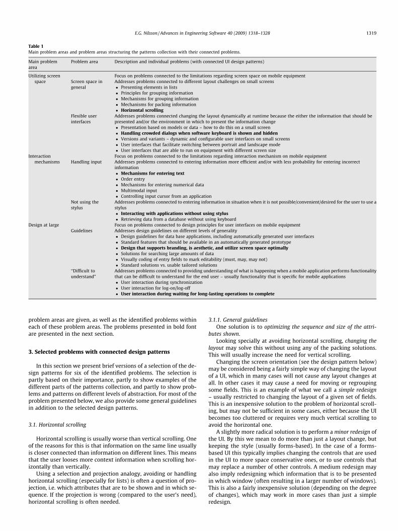
Table 1Main problem areas and problem areas structuring the patterns collection with their connected problems.
Main problemarea
Problem area Description and individual problems (with connected UI design patterns)
Utilizing screenspace
Focus on problems connected to the limitations regarding screen space on mobile equipmentScreen space ingeneral
Addresses problems connected to different layout challenges on small screens� Presenting elements in lists� Principles for grouping information� Mechanisms for grouping information� Mechanisms for packing information� Horizontal scrolling
Flexible userinterfaces
Addresses problems connected changing the layout dynamically at runtime because the either the information that should bepresented and/or the environment in which to present the information change� Presentation based on models or data – how to do this on a small screen� Handling crowded dialogs when software keyboard is shown and hidden� Versions and variants – dynamic and configurable user interfaces on small screens� User interfaces that facilitate switching between portrait and landscape mode� User interfaces that are able to run on equipment with different screen size
Interactionmechanisms
Focus on problems connected to the limitations regarding interaction mechanism on mobile equipmentHandling input Addresses problems connected to entering information more efficient and/or with less probability for entering incorrect
information� Mechanisms for entering text� Order entry� Mechanisms for entering numerical data� Multimodal input� Controlling input cursor from an application
Not using thestylus
Addresses problems connected to entering information in situation when it is not possible/convenient/desired for the user to use astylus� Interacting with applications without using stylus� Retrieving data from a database without using keyboard
Design at large Focus on problems connected to design principles for user interfaces on mobile equipmentGuidelines Addresses design guidelines on different levels of generality
� Design guidelines for data base applications, including automatically generated user interfaces� Standard features that should be available in an automatically generated prototype� Design that supports branding, is aesthetic, and utilize screen space optimally� Solutions for searching large amounts of data� Visually coding of entry fields to mark editability (must, may, may not)� Standard solutions vs. usable tailored solutions
‘‘Difficult tounderstand”
Addresses problems connected to providing understanding of what is happening when a mobile application performs functionalitythat can be difficult to understand for the end user – usually functionality that is specific for mobile applications� User interaction during synchronization� User interaction for log-on/log-off� User interaction during waiting for long-lasting operations to complete
E.G. Nilsson / Advances in Engineering Software 40 (2009) 1318–1328 1319
problem areas are given, as well as the identified problems withineach of these problem areas. The problems presented in bold fontare presented in the next section.
3. Selected problems with connected design patterns
In this section we present brief versions of a selection of the de-sign patterns for six of the identified problems. The selection ispartly based on their importance, partly to show examples of thedifferent parts of the patterns collection, and partly to show prob-lems and patterns on different levels of abstraction. For most of theproblem presented below, we also provide some general guidelinesin addition to the selected design patterns.
3.1. Horizontal scrolling
Horizontal scrolling is usually worse than vertical scrolling. Oneof the reasons for this is that information on the same line usuallyis closer connected than information on different lines. This meansthat the user looses more context information when scrolling hor-izontally than vertically.
Using a selection and projection analogy, avoiding or handlinghorizontal scrolling (especially for lists) is often a question of pro-jection, i.e. which attributes that are to be shown and in which se-quence. If the projection is wrong (compared to the user’s need),horizontal scrolling is often needed.
3.1.1. General guidelinesOne solution is to optimizing the sequence and size of the attri-
butes shown.Looking specially at avoiding horizontal scrolling, changing the
layout may solve this without using any of the packing solutions.This will usually increase the need for vertical scrolling.
Changing the screen orientation (see the design pattern below)may be considered being a fairly simple way of changing the layoutof a UI, which in many cases will not cause any layout changes atall. In other cases it may cause a need for moving or regroupingsome fields. This is an example of what we call a simple redesign– usually restricted to changing the layout of a given set of fields.This is an inexpensive solution to the problem of horizontal scroll-ing, but may not be sufficient in some cases, either because the UIbecomes too cluttered or requires very much vertical scrolling toavoid the horizontal one.
A slightly more radical solution is to perform a minor redesign ofthe UI. By this we mean to do more than just a layout change, butkeeping the style (usually forms-based). In the case of a forms-based UI this typically implies changing the controls that are usedin the UI to more space conservative ones, or to use controls thatmay replace a number of other controls. A medium redesign mayalso imply redesigning which information that is to be presentedin which window (often resulting in a larger number of windows).This is also a fairly inexpensive solution (depending on the degreeof changes), which may work in more cases than just a simpleredesign.

1320 E.G. Nilsson / Advances in Engineering Software 40 (2009) 1318–1328
The most radical solution is to perform a major redesign of theUI. By this we mean to change the style of the UI, e.g. from aforms-based UI to one using a more visual metaphor. This is usu-ally more difficult and may be much more expensive than a simpleor medium redesign, but may also result in a much more user-friendly solution. Such changes may not only reduce the need forhorizontal scrolling in a single window, it may reduce the totalnumber of windows in the application.
3.1.2. Design pattern: Change the screen orientation3.1.2.1. Use when. If this is an option on the platform, it will by de-fault reduce the need for horizontal (and increase the need for ver-tical) scrolling, as illustrated in Fig. 1. An important choice if thissolution is used is whether the user should be given the opportu-nity to switch between landscape and portrait, or if only landscapeshould be available. The first choice imposes a number of newproblems. The latter choice is easier to realize, but offers less flex-ibility for the user, and may reduce which devices/versions of theoperating system that may be used to run the application.
3.1.2.2. How. Provide a version of the UI in landscape format, aloneor in addition to a version in portrait format.
3.1.2.3. Why. Horizontal scrolling should be avoided in all UIs, butis probably worse on mobile devices than on larger displays, partlybecause the amount of context information is larger when thescreen is larger. Also, on a larger screen, it is usually possible tomake the window larger to decrease the need for horizontal scroll-ing. And even worse, because the screen is smaller, the need forhorizontal scrolling occurs more often.
3.2. Handling crowded dialogs when software keyboard is shown andhidden
On PDAs without keyboard, a common solution for entering textis to show a software keyboard on the bottom of the screen wherethe user can enter text using the stylus. The area in which the key-board is shown may already be used by the application. This meansthat the application have less room for its ‘‘normal” interaction.
The main problem when designing a user interface that shouldbe able to handle that the software keyboard comes and goes ishow to resize the dialogs. Resizing may just imply adding/adjust-ing a scroll bar, but often some other adjustments are needed toavoid some parts of the dialogs becoming invisible.
The severity of this problem is depending on the type/style ofthe user interface. If the UI only contains an arbitrary text, addingor adjusting the scrollbar is a sufficient solution. A forms-based UImay be much more difficult to resize. The same may be the case fora more visual presentation, depending on whether the visualiza-
Fig. 1. Changing screen orientation to reduce horizontal scrolling.
tion is tailored for the screen size or not. Handling tab foldersand buttons that are placed on the bottom of the screen is also achallenge.
The design patterns presented in this problem focus on forms-based UIs, because it is mainly for this type of UIs that this problemoccurs.
3.2.1. General guidelinesA buffer solution (see design patterns below) may also be used
with two or more large UI controls sharing the amount of sizereduction to be applied. Generalized, this solution ends up as dy-namic resizing of the controls in the UI. This may be done usingtwo different approaches. The first is to decide a resizing rule foreach window and apply that as tailored code for each window.The second is to have a general layout adjustment algorithm doingit for all windows.
3.2.2. Design pattern: Add or adjust scroll barsAn obvious and simple solution to this problem is to add or ad-
just scroll bars when the keyboard appears, as illustrated in Fig. 2.The other solutions presented below are solutions where the needfor adding scroll bars are removed or reduced.
3.2.2.1. Use when. This solutions should be used when a simple andinexpensive solution is sought, or when none of the other patternsare useful.
3.2.2.2. How. Provide two sizes of the view for the dialog.
3.2.2.3. Why. The solution is simple and inexpensive, yet easy tounderstand.
3.2.3. Design pattern: Let the keyboard cover part of the UIHow ‘‘bad” this solution depends on what is placed on the part
of the screen that will be covered by the keyboard, as illustrated inFig. 3.
3.2.3.1. Use when. If this part is occupied by output fields, the solu-tion may work fine as long as the keyboard is removed when notneeded. If this part of the screen contains important input fieldsor tab folders the solution is useless.
3.2.3.2. How. This solution is in essence ‘‘doing nothing”.
3.2.3.3. Why. The solution is simple and inexpensive, though not al-ways very user friendly.
Fig. 2. Adding scroll bar when keyboard is shown.

Fig. 3. Keyboard covers part of UI.
Fig. 5. List box control that shrinks when keyboard is added.
Fig. 6. Keyboard as part of layout of an application.
E.G. Nilsson / Advances in Engineering Software 40 (2009) 1318–1328 1321
3.2.4. Design pattern: Only use the part of the screen that will not becovered by the keyboard
In practice, what this solution does is to reduce the size of thepart of the screen that may be exploited.
3.2.4.1. Use when. This solution may be OK for dialog boxes as illus-trated in Fig. 4, but is seldom practical for normal windows.
3.2.4.2. How. Restrict the amount of information in the dialog.
3.2.4.3. Why. The solution is simple and inexpensive.
3.2.5. Design pattern: Use one large UI control as a bufferBy this we mean that when the keyboard is added, one of the
controls is reduced vertically to be just as much smaller as the sizeof the keyboard, as illustrated with the list box control in Fig. 5.
3.2.5.1. Use when. The solution is relevant when the UI containsone or more controls that may be used as a buffer.
3.2.5.2. How. General controls that may be used for this are primar-ily list boxes and multi line text boxes.
3.2.5.3. Why. The solution is simple and inexpensive, yet it usuallydoes not confuse the user.
3.2.6. Design pattern: Keyboard as part of layoutInstead of using a built-in software keyboard that the applica-
tion have to adjust to, it is also possible to have an application spe-cific keyboard that is designed to be part of the layout, asillustrated in Fig. 6.
3.2.6.1. Use when. The solution is most appropriate in mass marketproducts where the extra costs for designing application specifickeyboards will pay off, or when such solutions are supported bythe OS (like on the iPhone platform).
Fig. 4. Dialog box which leaves room for keyboard.
3.2.6.2. How. An application specific keyboard must be developed.
3.2.6.3. Why. The solution may provide both very efficient, and user– as well as finger–friendly UIs.
3.3. Mechanisms for entering text
The main mechanisms for entering text on PDAs are SW key-boards, small physical keyboard and stokes-based input. Commonfor all built-in physical keyboards is that they are so small that theuser must enter text with one or two finger. Common for most SWkeyboards and all strokes-based input is that it is difficult to oper-ate them without using the stylus.
When designing a PDA application where the user must entersome text, there are two related problems to solve: how to avoidthat the user must enter text and how to make it easier for the userto enter text. The main goal is often to avoid having to use the gen-eric text entering mechanisms.
3.3.1. General guidelinesA different type of solution than the design patterns presented
below is to collect data from some other source than user interac-tion, usually by exploiting contextual data [7,12]. This principle isbased on an assumption that the context in which a mobile useroperates changes more rapidly than it does for a stationary userand that this knowledge may be used to make the application moreuser friendly, i.e. obtaining data that the user would have had toenter if the application did not have this ability. An example of thisis using an RF-ID sensor to identify a piece of equipment that is tobe inspected so that the user is relieved from entering a long andcryptic equipment id. A related alternative to exploiting contextualdata is to use multimodal input [16].

Fig. 9. Using clock and spinners for adjusting the time.
1322 E.G. Nilsson / Advances in Engineering Software 40 (2009) 1318–1328
3.3.2. Design pattern: Auto completeThis is a mechanism that tries to guess what the user is about to
write and suggests this by filling in the suggested text ahead of thewriting of the user, as illustrated in Fig. 7.
3.3.2.1. Use when. The solution is relevant when there are somepatterns in what the user writes that are repeated over time.
3.3.2.2. How. On the Windows Mobile platform an adaptive autocomplete mechanism is included in all the generic input mecha-nisms. Specialized applications specific auto complete mechanismsin certain field are usually more efficient. This is common whenwriting an URL in most web browsers and when writing namesin an email client. Common for such solutions is that they usethe history of values used earlier to suggest the new ones.
3.3.2.3. Why. The solution reduces the amount of repetitive typing.
3.3.3. Design pattern: Predefined valuesBy this we mean having a list of all (or the most common) texts
to enter in a field.
3.3.3.1. Use when. The solution is relevant when there is a small setof words or phrases that are used more often than others.
3.3.3.2. How. The list of values may be accessed from a menu orfrom a combo box, as illustrated in Fig. 8. The values in the listmay also be dynamic based on user behaviour.
3.3.3.3. Why. The solution reduces the need for typing commonlyused words and phrases.
3.3.4. Design pattern: Alternative input mechanismsBy this we mean using UI controls that are operated directly on
the screen as an alternative to keyboard, as illustrated in Fig. 9.
Fig. 7. Auto-complete in a notes application.
Fig. 8. Using predefined answer alternatives in a messaging application.
3.3.4.1. Use when. Most of the relevant mechanisms require thatthere is some sort of restrictions on the domain of the attributesthat should be entered through the mechanism.
3.3.4.2. How. In addition to radio buttons, combo and check boxes,spinners, sliders, and menus are the most common controls forthis.
3.3.4.3. Why. Direct manipulation is usually more efficient and eas-ier to perform than typing.
3.3.5. Design pattern: Specialized input mechanismsBy this we mean using (a combination of) existing controls in a
new way to implement a creative solution.
3.3.5.1. Use when. The solution is appropriate in most situations,specially when other patterns are not relevant.
3.3.5.2. How. An example of this approach is the mechanism usedin an application for service technicians, where the user may writecommon fault description in a natural language like syntax bychoosing from a set of drop down list with commonly used nouns,verbs and preposition expressions.
3.3.5.3. Why. Having a restricted number of values in each drop-down list still facilitates entering a very large number of possiblesentences in a simple way.
3.4. Interacting with applications without using stylus
This problem is only applicable for devices that are designed tobe used both with and without a stylus (not for devices that onlycan be controlled using HW keys).
For some users it is not practical to use the stylus. This couldbe because the user wears gloves, because it too cold to fumblewith the stylus, because the user has only one hand available, be-cause the user has lost the stylus, or because the user prefers notusing it.
The most obvious problem that occurs when using the finger in-stead of a stylus to control a PDA is that the precision when point-ing is coarser. Combined with the fact that a finger conceals largerparts of a UI than a stylus does, makes it even more difficult to hitsmall details using a finger than with a stylus. This problem gets
E.G. Nilsson / Advances in Engineering Software 40 (2009) 1318–1328 1323
even worse if the user uses gloves of some kind. The most obvioussolution, i.e. making the controls bigger easily increase screenspace problems.
3.4.1. General guidelinesControlling the PDA using a finger instead of a stylus is partly a
question of choosing, partly a question of adapting and partly aquestion of making UI components (controls). These three levelsof solving the problem are proportional regarding cost vs. potentialbenefits.
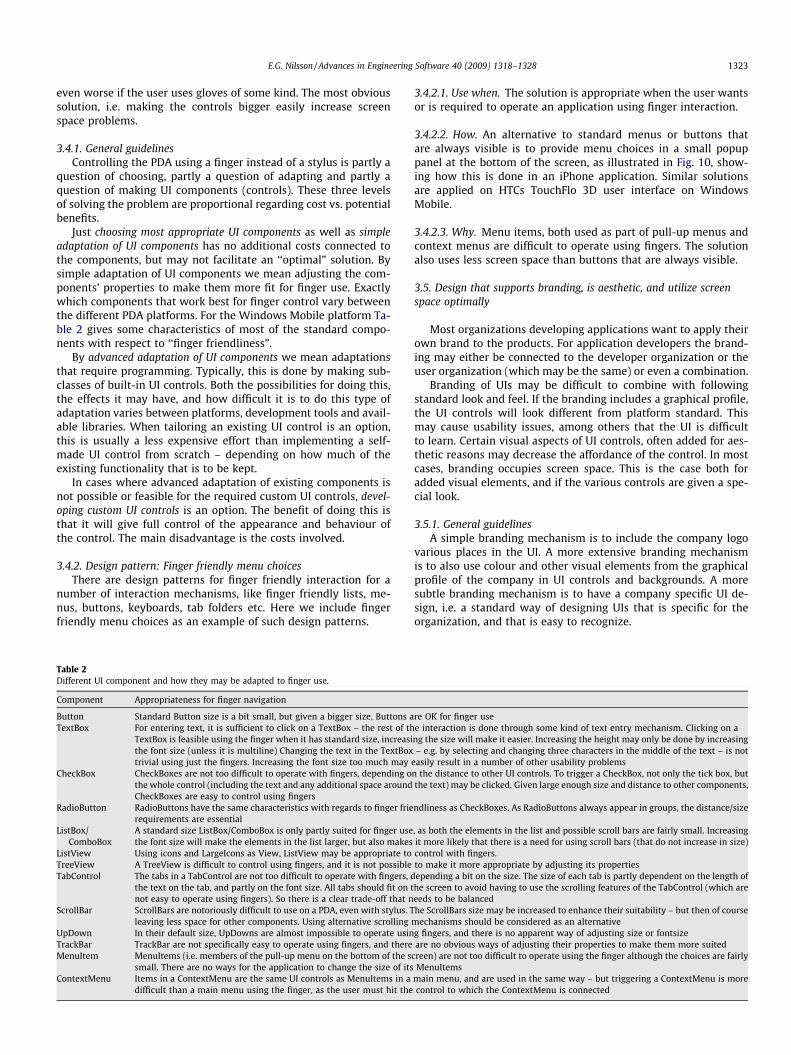
Just choosing most appropriate UI components as well as simpleadaptation of UI components has no additional costs connected tothe components, but may not facilitate an ‘‘optimal” solution. Bysimple adaptation of UI components we mean adjusting the com-ponents’ properties to make them more fit for finger use. Exactlywhich components that work best for finger control vary betweenthe different PDA platforms. For the Windows Mobile platform Ta-ble 2 gives some characteristics of most of the standard compo-nents with respect to ‘‘finger friendliness”.
By advanced adaptation of UI components we mean adaptationsthat require programming. Typically, this is done by making sub-classes of built-in UI controls. Both the possibilities for doing this,the effects it may have, and how difficult it is to do this type ofadaptation varies between platforms, development tools and avail-able libraries. When tailoring an existing UI control is an option,this is usually a less expensive effort than implementing a self-made UI control from scratch – depending on how much of theexisting functionality that is to be kept.
In cases where advanced adaptation of existing components isnot possible or feasible for the required custom UI controls, devel-oping custom UI controls is an option. The benefit of doing this isthat it will give full control of the appearance and behaviour ofthe control. The main disadvantage is the costs involved.
3.4.2. Design pattern: Finger friendly menu choicesThere are design patterns for finger friendly interaction for a
number of interaction mechanisms, like finger friendly lists, me-nus, buttons, keyboards, tab folders etc. Here we include fingerfriendly menu choices as an example of such design patterns.
Table 2Different UI component and how they may be adapted to finger use.
Component Appropriateness for finger navigation
Button Standard Button size is a bit small, but given a bigger size, Buttons aTextBox For entering text, it is sufficient to click on a TextBox – the rest of th
TextBox is feasible using the finger when it has standard size, increasithe font size (unless it is multiline) Changing the text in the TextBoxtrivial using just the fingers. Increasing the font size too much may
CheckBox CheckBoxes are not too difficult to operate with fingers, depending othe whole control (including the text and any additional space aroundCheckBoxes are easy to control using fingers
RadioButton RadioButtons have the same characteristics with regards to finger frierequirements are essential
ListBox/ComboBox
A standard size ListBox/ComboBox is only partly suited for finger usethe font size will make the elements in the list larger, but also makes
ListView Using icons and LargeIcons as View, ListView may be appropriate toTreeView A TreeView is difficult to control using fingers, and it is not possibleTabControl The tabs in a TabControl are not too difficult to operate with fingers, d
the text on the tab, and partly on the font size. All tabs should fit on tnot easy to operate using fingers). So there is a clear trade-off that n
ScrollBar ScrollBars are notoriously difficult to use on a PDA, even with stylus. Tleaving less space for other components. Using alternative scrolling
UpDown In their default size, UpDowns are almost impossible to operate usinTrackBar TrackBar are not specifically easy to operate using fingers, and thereMenuItem MenuItems (i.e. members of the pull-up menu on the bottom of the s
small. There are no ways for the application to change the size of itsContextMenu Items in a ContextMenu are the same UI controls as MenuItems in a
difficult than a main menu using the finger, as the user must hit the
3.4.2.1. Use when. The solution is appropriate when the user wantsor is required to operate an application using finger interaction.
3.4.2.2. How. An alternative to standard menus or buttons thatare always visible is to provide menu choices in a small popuppanel at the bottom of the screen, as illustrated in Fig. 10, show-ing how this is done in an iPhone application. Similar solutionsare applied on HTCs TouchFlo 3D user interface on WindowsMobile.
3.4.2.3. Why. Menu items, both used as part of pull-up menus andcontext menus are difficult to operate using fingers. The solutionalso uses less screen space than buttons that are always visible.
3.5. Design that supports branding, is aesthetic, and utilize screenspace optimally
Most organizations developing applications want to apply theirown brand to the products. For application developers the brand-ing may either be connected to the developer organization or theuser organization (which may be the same) or even a combination.
Branding of UIs may be difficult to combine with followingstandard look and feel. If the branding includes a graphical profile,the UI controls will look different from platform standard. Thismay cause usability issues, among others that the UI is difficultto learn. Certain visual aspects of UI controls, often added for aes-thetic reasons may decrease the affordance of the control. In mostcases, branding occupies screen space. This is the case both foradded visual elements, and if the various controls are given a spe-cial look.
3.5.1. General guidelinesA simple branding mechanism is to include the company logo
various places in the UI. A more extensive branding mechanismis to also use colour and other visual elements from the graphicalprofile of the company in UI controls and backgrounds. A moresubtle branding mechanism is to have a company specific UI de-sign, i.e. a standard way of designing UIs that is specific for theorganization, and that is easy to recognize.
re OK for finger usee interaction is done through some kind of text entry mechanism. Clicking on ang the size will make it easier. Increasing the height may only be done by increasing– e.g. by selecting and changing three characters in the middle of the text – is not
easily result in a number of other usability problemsn the distance to other UI controls. To trigger a CheckBox, not only the tick box, butthe text) may be clicked. Given large enough size and distance to other components,
ndliness as CheckBoxes. As RadioButtons always appear in groups, the distance/size
, as both the elements in the list and possible scroll bars are fairly small. Increasingit more likely that there is a need for using scroll bars (that do not increase in size)control with fingers.to make it more appropriate by adjusting its propertiesepending a bit on the size. The size of each tab is partly dependent on the length ofhe screen to avoid having to use the scrolling features of the TabControl (which areeeds to be balancedhe ScrollBars size may be increased to enhance their suitability – but then of course
mechanisms should be considered as an alternativeg fingers, and there is no apparent way of adjusting size or fontsizeare no obvious ways of adjusting their properties to make them more suited
creen) are not too difficult to operate using the finger although the choices are fairlyMenuItems
main menu, and are used in the same way – but triggering a ContextMenu is morecontrol to which the ContextMenu is connected

Fig. 10. Finger friendly menu in photo application on iPhone.
1324 E.G. Nilsson / Advances in Engineering Software 40 (2009) 1318–1328
3.5.2. Design pattern: Brand the standardBy this we mean adding branding elements to the platform
standard instead for building the elements that make up a brandfrom scratch, as illustrated in Fig. 11.
3.5.2.1. Use when. The solution is appropriate when both brandingand compliance to standards are needed.
3.5.2.2. How. This should be done using subtle means, like chang-ing background colours or adding a pattern or an abstract imageas part of controls and/or backgrounds. Also, using a specific fontmay be a good branding mechanism. The main problem withthis solution is that the branding may be difficult to recognize.On the other hand, implementing it does not need to be toocostly.
Fig. 11. Adding branding elements within a standard UI.
3.5.2.3. Why. The solution combines having controls that are closeto platform standards with branding.
3.5.3. Design pattern: Branding the controlsBy this we mean generalizing the principle to also cover brand-
ing that is further from the standards, as illustrated in Fig. 12.
3.5.3.1. Use when. The solution is appropriate when branding ismore important than compliance to standards.
3.5.3.2. How. Specialized controls need to be developed.
3.5.3.3. Why. This will usually take up less screen space than add-ing additional purely visual elements (like icons and advanced bor-ders) as the main branding means. Doing more ‘‘radical” brandingof UI controls may be quite expensive to implement. Using purelyvisual elements as branding means is less expensive to implement.
3.6. User interaction during waiting for long-lasting operations tocomplete
One of the things that make this problem special on a mobiledevice is that the necessary information for showing a reasonableprogress indication may not be available on the device. A relatedissue is that it may be more difficult to predict the duration, e.g.when data is transported using a wireless connection with varyingbandwidth. Also, obtaining the necessary information for showingprogress – and partly also the process of showing it – may requiremore overhead on a mobile device than on a PC. As it usually isimpossible, difficult or inconvenient to use other applications thanthe one performing the long-lasting operation on the device, long-lasting operations will probably make mobile users more impa-tient than a PC user. This increases the need for good feedbacksolutions.
The issues just presented may make it difficult to use the estab-lished mechanisms for showing progress for long-lasting opera-tions. Sometimes it may be a trade-off between givinginformation and not delaying the long-lasting operation evenmore. Balancing this trade-off is probably the main problem whentrying to find an optimal solution for user feedback during long-lasting operations.
3.6.1. General guidelinesWhen faced with a problem like the current where there are no
optimal solutions, a possible approach is to try to eliminate theproblem instead of solving it. In this case it means trying to avoid
Fig. 12. Compact RSS client with branded controls.

E.G. Nilsson / Advances in Engineering Software 40 (2009) 1318–1328 1325
or bypass the long-lasting operation. There are of course lots of situ-ations where this is not possible, because an operation requirestransferring large amounts of data or very much computation. Still,trying to find smart implementations may speed up the applica-tion. When there is a need to transfer large amounts of data, asmart caching solution both pre-fetching data that the user maystart working with before it is asked for, and continuing to transferdata while the user works with it – even with reduced performance– may be a much better solution for the user than waiting. If thereis a need for a very demanding computation involving modestamounts of data, doing the computation on a server computer in-stead of on the device may enhance performance significantly. Thisis of course only possible if the application is on-line.
Given that it indeed is not avoidable that the user has to wait,information may be given on three levels. The normal way of doingthis is providing a wait cursor, preferably supplied with a messagesaying ‘‘please wait. . .”. A more advanced solution is to inform theuser that something is happening, and indicate progress. This isnormally done with a counter and/or a slider/gauge that showsthe percentage of time spent. If it in addition is possible to estimatein actual time values the time left, this is a benefit for the user. Thethird level is presented as a pattern below.
3.6.2. Design pattern: Inform the user about what is happeningInforming the user about what is happing (in addition to indi-
cating progress).
3.6.2.1. Use when. The solution is appropriate when this level ofinformation is required or easily obtained.
3.6.2.2. How. This may be done as a scrolling text that the user canbrowse back in, just a small list showing the latest events, or as sin-gle text changing as events happen, as illustrated in Fig. 13. Inde-pendent of how the information is shown, it should be presentedin a way that is comprehensible by the user – i.e. related to userconcepts and user tasks.
3.6.2.3. Why. Providing information about level of progress as wellas what is happening will make the user more patient.
4. Validation
The patterns collection was presented in half day tutorials atthe HCI International conference in 2007 [9] and at the IASTEDHCI conference in 2008 [10]. At the tutorials, the structure of the
Fig. 13. Informing the user what is happening.
patterns collection was presented, and all problems were pre-sented at a very brief level. Then, 11 or 12 of the 26 problems werepresented in more detail. Partly, the problems considered mostgeneral was chosen, but the selection included problems from allthe problem areas (and thus also all the main problem areas). Dur-ing the presentation, the participants were asked to fill inn a ques-tionnaire. In addition to background information, the participantsscored the relevance of the main problem areas (based on the briefpresentation of all patterns), the relevance and usefulness of eachof the presented problems, and finally the relevance and usefulnessof the patterns collection and such as well as their expectations forfuture use of the patterns collection. Relevance, usefulness and fu-ture use were scored on a scale from 1 to 6, where 1 = Not relevantat all/Not useful at all and 6 = Highly relevant/Very useful.
4.1. Respondents
Forty-eight of the participants at the tutorials handed in thequestionnaire. There was a small majority of male, age varied from25 to 50, most being around 30 years old. Geographically, the larg-est group had their origin in Asia, followed by Europeans. All con-tinents are represented among the participants. Looking ateducational level, most participants were on master level, closelyfollowed by Ph.D. holders. There were relatively few undergradu-ates. A majority had a technical educational background. UI devel-opment experience varied from 0 to 20 years, the majority having5 years or less experience. Experience in developing mobile solu-tions varied from 0 to 6 years, the majority having 1 year or lessexperience. Regarding device class, the largest respondent grouphaving a preference was focusing on SmartPhones. Respondentshaving a preferred main platform were equally spread betweenWindows Mobile and other platforms.
4.2. Results
Scores on the main problem areas – based on a brief presenta-tion of all the problems – shows an average score on relevance of5.0 for Utilizing screen space, on 5.2 for Interaction mechanisms,and 4.7 for Design at large. Scores on the patterns collection assuch – given after everything was presented – shows an averagescore on relevance of 4.8, on usefulness of 4.4 and on future useof the patterns collection of 4.3. All these scores verify that the pat-terns collection both addresses relevant problems and gives usefuland practical advices on how to solve these problems. Regardingsubjects scoring usefulness higher than future use, they may knowmany of the solutions in beforehand, and thus find the solutionsuseful, but do not need to consult the patterns collection to be ableto utilize the solutions.
Looking at the scores for the individual problems that were pre-sented in more detail, the scores vary a bit, but are still fairly high.Fig. 14 shows the average scores for relevance and usefulness forthe 11 problems presented at both tutorials (names marked withasterisks indicate the problems presented above), sorted descend-ing on sum of the scores for relevance and usefulness.
As for the patterns collection as such, the average scores for rel-evance are higher than the corresponding scores for usefulness forall problems but one. This is not surprising, as it is usually easier toagree with a problem description than a proposed solution.
Looking a bit more into the connection between relevance andusefulness, making a scatter plot of the values for each problemmay be used as a way to categorize the different problems. Thusa problem with high score for both relevance and usefulness areexcellent problems/design patterns. Problems with low scores forboth relevance and usefulness should be considered removed fromthe collection. Problems with high relevance but low usefulnessneed to be improved. The last combination (low relevance and high

0
1
2
3
4
5
6
* Mec
hanis
ms for
enter
ing te
xt
Mecha
nisms f
or pa
cking
Multi m
odal
intera
ction
Numeri
cal k
eybo
ard
List e
lemen
ts
Mecha
nisms f
or gro
uping
* Sho
w and h
ide SW ke
yboa
rd
* Lon
g las
ting o
perat
ions
* Styl
us fre
e inte
ractio
n
* Horr
isonta
l scro
lling
* Bran
ding
RelevanceUsefulness
Fig. 14. Average scores for relevance and usefulness.
1326 E.G. Nilsson / Advances in Engineering Software 40 (2009) 1318–1328
usefulness) is difficult to interpret, but as all but one problem scorehigher on relevance than usefulness, and this problem scores highon both, no problems fall into this combination. If we interprethigh score to be on the top half of the scale, all problems but onefall into the excellent category. If we adjust high scores to mean4 or above, some extra problems fall into the category ‘‘needsimprovement” (like the problems on branding, horizontal scrollingand stylus free interaction presented above). Even with this adjust-ment, no problems are candidates of exclusion from the collection.In addition to the problems with scores below 4 for usefulness, alsothe problems where the difference between relevance score andusefulness scores are highest are candidates for further work onfinding new and better solutions.
It may also be noted that correlation analyses show that thescores for relevance and usefulness correlates on the 0.01 levelfor 9 of the 11 problems. The problems not correlating on thisare Mechanisms for entering text and Branding. Also, the scoresfor relevance for the collection as such, usefulness for the patternscollection as such and future use of the patterns collection all cor-relate pairwise on the 0.01 level. Furthermore, the scores seemsconsistent in the way that both relevance scores and usefulnessscores correlate on the 0.01 or 0.05 level with the relevance andusefulness scores for the collection as such. The same is the casefor average relevance and usefulness score correlated respectivelywith the relevance and usefulness scores for the collection as such.
Analyses of variance (ANOVA) show some patterns for five ofthe six problems presented in this paper. Usefulness scores forMechanisms for entering text are significantly higher (0.05 level)for subjects coming from Asia. This may be explained by the extrachallenges related to entering text in many Asian languages. Fur-thermore, subjects working with applications for personal produc-tivity and professional application score usefulness significantlyhigher (0.05 level) for the same problem. This is not surprising asthe patterns collection draws much of its background from thistype of applications, and because it focus much on professional
applications in general and forms-based UIs in particular. Useful-ness scores for the problem Show and hide SW keyboard are signif-icantly higher (0.05 level) for subjects with 0–1 years of mobiledevelopment experience than for subjects with longer experience.This problem may thus be considered fairly obvious for developershaving worked with mobile UIs for some time. The same is proba-bly the case for the scores for usefulness for the problem Horizon-tal scrolling, that are significantly higher (0.01 level) for subjectswith 0–1 years of mobile development experience than for subjectswith longer experience. The same effect may also explain that theusefulness score for the same problem is significantly higher (0.05level) for devices classes other than SmartPhones. The relevancescore for the problem Long lasting operations, scores significantlyhigher (linear on 0.05 level) for subjects with longer UI develop-ment experience. This shows that this problem pinpoint an issuethat developers may need some experience to realize the impor-tance of. A more surprising finding is that both relevance and use-fulness scores for the problem Stylus free interaction receivessignificantly higher scores from female than from male subjects.One could speculate that a technical device like a stylus appealsmore to male than female users, or that finger navigation is moresuitable for users with smaller fingers, but both explanations aredubious. Relevance scores for the same problem shows that sub-jects with non-technical educational background have higherscores than subjects with technical background. This may be ex-plained by the special layout and esthetical challenges posed byfinger friendly mobile UIs.
For the whole collection, there are a number of general pat-terns. The most significant ones are for the independent variablesgender, mobile development experience and main device class.The collection seems to appeal more to female than to male par-ticipants, the patterns are considered more useful to participantswith little mobile development experience than participants withmore such experience, and the collection appeals most to partic-ipants focusing on other device types than SmartPhone. The find-

1 http://www.developer.yahoo.com/ypatterns/.2 http://www.designinginterfaces.com/.3 http://www.visi.com/~snowfall/InteractionPatterns.html.4 http://www.welie.com/patterns/.5 http://www.deyalexander.com/resources/design-patterns.html.6 http://www.gibbert.net/DPWiki (in German).7 http://www.patterns.littlespringsdesign.com/~newlsdpatterns/index.php
Main_Page.
E.G. Nilsson / Advances in Engineering Software 40 (2009) 1318–1328 1327
ing regarding gender is difficult to explain. The finding regardingexperience is interesting compared to an other (less significant)finding showing generally higher scores for subjects with longerUI development experience. This combination indicates that thepatterns collection is best suited for experienced UI developerswanting to start developing mobile UIs. This is not a bad targetgroup for such a patterns collection. The finding regarding devicetypes is a bit surprising as the patterns collection use manyexamples from Windows Mobile and SmartPhones. The findingmay be explained by a presumption that the patterns collectioncontains more ‘‘news” for the participants without experiencewith Windows Mobile and SmartPhones.
5. Using patterns format to document design knowledge
In this section we take a closer look at the appropriateness ofusing design patterns to document user interface design knowl-edge. The chosen patterns approach is in many ways well suited,as it captures the essential aspects of a problem and gives bothgeneral guidelines and more specific solutions through the pat-terns. Also, as design patterns may be on different abstraction lev-els they can be used to describe problems of different ‘‘sizes”, asshown in the examples above. Furthermore, dividing a problemfield into a limited number of well defined problems makes it pos-sible to handle a set of manageable problems separately. Finally,having a patterns collection makes it possible to combine the justmentioned ‘‘divide and rule” principle with having an overallstructure.
Despite these pros, there are also a number of problems withusing patterns in this way. As the patterns format use its ownstructure, it is difficult to combine this with a rich problem struc-ture without ending up with too deep hierarchies. In our case, wechoose to present the problem structure separately, and with thisas a basis present the individual problems and design patterns sep-arately in a flat structure. This challenge is a general one for pat-terns collections handling more than just a very small number ofproblems, as using the collection will be very difficult without astructure grouping the problems in it.
The biggest challenge we have had using the patterns formatis the connection between problems and solutions. Very oftenthis is a many to many connection, i.e. in addition to havingmany solutions to one problem, a given solution may apply tomore than one problem. An example of the latter occurs in theproblem area ‘‘flexible user interfaces” in the main problem area‘‘Utilizing screen space”. The problems addressed in this problemarea may together be solved with a set of techniques for han-dling adaptive and adaptable UIs both at design and especiallyat run time [12], but the solution for each pair of problems onlypartly overlap.
Presenting the same or very similar solutions to a number ofproblems, either causes a lot of cross-references between theindividual patterns, or large amounts of repetition. Cross-refer-encing reduces the readability of the descriptions, while largeamounts of repetition make the collection difficult to maintain.In prior versions of the patterns collection [11] we chose to usecross-references, as is being done in other patterns collections[4]. Recently, we have restructured the patterns collection so thateach pattern represents either one solution or a unique combina-tion of one problem and one solution. This has reduced the needfor cross-referencing, but it has increase the number of patterns,thus making it more difficult to get an overview of the patternscollection. This is one of the reasons we have kept the labelledproblem as part of the problem structure (and not replaced itwith design pattern), and also kept some of the solution descrip-tions (i.e. the general guidelines) independent of the individualdesign patterns.
6. Related work
There are a number of patterns collections and even collections ofpatterns collections on the web,1,2,3,4,5 see also [3] for an assessmentof such collections. There are also a few collections of patterns for mo-bile user interfaces, like The Design Pattern Wiki6 and Little Springsmobile UI design patterns.7 The latter overlaps with two of our mainproblem areas. The patterns presented in [15], although focusing onmobile interaction, are much wider in its scope than our collection,with only two user interface patterns. [4,5] present a design patternscollection for ubiquitous computing that is fairly large, but has abroader scope with patterns that are on a higher abstraction leveland/or are less comprehensive in the suggested set of solutions thanour patterns. Also [2] presents a patterns collection for ubiquitouscomputing, though on a preliminary stage, presenting a set of whatthe authors call pre-patterns because they are not in common use.
7. Conclusions and future work
In this paper we have presented a structured collection of userinterface design patterns for mobile applications. The structure isvaluable both as an index to identifying patterns to use, and givesa fairly comprehensive overview of the problems that needs to beaddressed when designing user interfaces for mobile applications.We have presented six individual problems with connected designpatterns in some detail (but still abbreviated versions of the origi-nal problem and design patterns descriptions, as well as the num-ber of design patterns included for each problem). In addition torepresenting important and relevant problems, they also act asexamples of problems in all the three main problem areas, and thusshow the breath of the patterns collection. The patterns are also ondifferent levels of abstraction, showing how patterns may be usedto present problems and solutions on different levels of detail.
The patterns collection has been validated using a questionnaireat two different tutorials. This validation shows that both the indi-vidual patterns assessed and the whole collection were perceivedas relevant and useful by the participants, and that it is likely thatthey will use the collection in future work. It also identifies pat-terns that need more work.
Finally, we have discussed pros and cons of using a patterns col-lection for documenting design knowledge. The main pro being theability to divide a large problem area into a structured set of man-ageable problems, the main con being that the same solution mayapply to a number of problems, causing a lot of cross-references.
To manage this better, we have currently restructured the pat-terns collection. Furthermore, the collection is continuously beingimproved and enhanced, e.g. in the areas of multimodal interactionand exploiting context.
Acknowledgments
The work on which this paper is based is supported by the UM-BRA and FLAMINCO projects funded by the Norwegian ResearchCouncil and the industry partners in these projects, that have alsogiven contributions to the contents of the patterns collection. Iwould also like to thank my colleagues Asbjørn Følstad and JanHeim for contributions to designing the questionnaire used for
/

1328 E.G. Nilsson / Advances in Engineering Software 40 (2009) 1318–1328
the validation and in analysing the results, and Mike Stiso for con-tributions to the structure and presentation of the patterns collec-tion online.
References
[1] Borchers J. A pattern approach to interaction design. John Wiley & Sons; 2001.ISBN:0471498289.
[2] Chung ES, Hong JI, et al. Development and evaluation of emerging designpatterns for ubiquitous computing. DIS2004, ACM, Cambridge (Massachusetts,USA); 2004.
[3] Deng J et al. Managing UI pattern collections. In: Proceedings of the 6th ACMSIGCHI New Zealand chapter’s international conference on computer–humaninteraction; 2005.
[4] Van Duyne DK, Landay JA. Design patterns, course documentation; 2004.[5] Landay JA, Borriello G. Design patterns for ubiquitous computing. In: IEEE
computer; August 2003.[6] Gamma E, Helm R, Johnson R, Vlissides J. Design patterns – elements of
reusable object-oriented software. Addison-Wesley; 1995.[7] Nilsson EG, Rahlff O-W. Mobile and stationary user interfaces – differences and
similarities based on two examples. In: Proceedings of HCI international; 2003.
[8] Nilsson EG. Design guidelines for mobile applications. SINTEF Report STF90A06003; 2005. ISBN:82-14-03820-0.
[9] Nilsson EG. Design patterns for user interfaces on mobile equipment. Tutorialdocumentation, HCI international; 2007.
[10] Nilsson EG. Design patterns for user interfaces on mobile equipment. Tutorialdocumentation, IASTED HCI; 2008.
[11] Nilsson EG. Design patterns for user interface for mobile applications. In:Proceedings of 7th international conference on computer-aided design of userinterfaces (CADUI); 2008.
[12] Nilsson EG, Floch J, et al. Model-based user interface adaptation. ComputGraph 2006;30(5):692–701.
[13] Rahlff O-W. State of the art in using context in mobile information systems.SINTEF report A2299; 2007. ISBN:978-82-14-04069-2.
[14] Rolfsen RK. State of the art in form-based mobile user interface design andconfiguration. SINTEF report A2300; 2007. ISBN:978-82-14-04070-8.
[15] Roth J. Patterns of mobile interaction. Person Ubiquit Comput 2002;6(4).[16] Vraalsen F, Holter T, et al. A multimodal context aware mobile maintenance
terminal for noisy environments. IFIP mobile information systems (MOBIS‘04).
[17] Vraalsen F. State of the art in design of mobile user interfaces. SINTEF reportSTF90 A05014; 2005. ISBN:82-14-03648-8.
[18] van Welie M, van der Veer GC. Pattern languages in interaction design:structure and organization. In: Proceedings of interact; 2003.