design and evaluation of a mobile health application for ... · application for adult patients with...
TRANSCRIPT

Design and Evaluation of a Mobile Health
Application for Adult Patients with
Type 1 Diabetes Mellitus
by
Lisa Min
A thesis submitted in conformity with the requirements
for the degree of Master of Applied Science
Graduate Department of Mechanical & Industrial Engineering
University of Toronto
Copyright by Lisa Min (2013)

ii
Design and Evaluation of a Mobile Health Application for Adult Patients with Type 1 Diabetes Mellitus Master of Applied Science, 2013 Lisa Min Mechanical and Industrial Engineering University of Toronto
Abstract
In this study, a user-centred design approach was used to develop a mobile health
application designed to support adult T1DM patients with their self-management routine.
In the requirements gathering phase, an observational study of a diabetes clinic and
patient interviews were conducted. An analysis of the data collected from this phase
helped identify the functional design requirements used to guide the design. Using a
rapid prototyping approach, data visualizations, game-based elements, carb-counting and
social networking features were explored. The final prototype developed in this research
was evaluated for its ease of use and perceived usefulness. The design was found to be
generally easy to use. With respect to data visualizations, participants preferred the
scatter plot view of their blood glucose readings to a bar chart. In addition, it was found
that all participants wanted a way to track their HbA1c on a regular basis.

iii
Acknowledgement
First and foremost, thank you Professor Mark Chignell for this opportunity and for
encouraging me to pursue my interests. I will be forever grateful for your guidance,
support, optimism, and confidence in me.
A special thank you to Dr. Joseph Cafazzo and his esteemed colleagues at The Centre for
Global eHealth Innovation for providing the space, knowledge, and relationships that
made this research possible. Also, thank you to Dr. Mark Palmert and Holly Tschirhart
RN for your never-ending enthusiasm and expertise.
Big thanks to my lab mates. I am lucky to have worked alongside your brilliant minds.
Thank you for sharing your experiences, giving great advice, and for providing the type
of support only lab mates can provide.
To my family, thank you for always encouraging me to do what I believe in. I would be
lost without you. And last but certainly not least, thank you Raphael for your advice,
patience, and for always believing in me.

iv
Table of Contents
Abstract ............................................................................................................................... ii
Acknowledgement ............................................................................................................. iii
Table of Contents ............................................................................................................... iv
List of Tables ..................................................................................................................... vi
List of Figures ................................................................................................................... vii
List of Appendices ............................................................................................................. ix
1.0 Introduction ................................................................................................................ 1
2.0 Literature Review ....................................................................................................... 3
2.1 Food Photography and Diabetes Logs ...................................................................... 4
2.2 Diabetes Self-Management Applications ................................................................. 5
2.3 Gamification ............................................................................................................. 9
2.4 Data Visualization ................................................................................................... 11
2.5 Summary ................................................................................................................. 13
3.0 Requirements Gathering and Analysis ..................................................................... 14
3.1 Observation ............................................................................................................. 15
3.1.1 Clinic Shadowing ............................................................................................. 15
3.1.2 Carbohydrate Counting Class .......................................................................... 18
3.2 Pilot Data Review & Brainstorming ....................................................................... 19
3.3 Semi-Structured Interviews .................................................................................... 21
3.4 Qualitative Data Analysis ....................................................................................... 22
3.4.1 Affinity Diagrams ............................................................................................ 23
3.5 User Requirements .................................................................................................. 27
4.0 Prototype Development ........................................................................................... 30
4.1 Storyboards ............................................................................................................. 30
4.2 Prototype Evolution ................................................................................................ 32
4.2.1. Home Screen ................................................................................................... 34
v
4.2.2 bant Book ......................................................................................................... 38
4.2.3 Trends .............................................................................................................. 39
4.2.4 Challenges ........................................................................................................ 42
4.2.5 Food Database .................................................................................................. 45
4.3 Final Prototype ........................................................................................................ 46
5.0 Usability Testing ......................................................................................................... 49
5.1 Methodology ........................................................................................................... 49
5.2 Scenarios ................................................................................................................. 50
5.2 Questionnaires ......................................................................................................... 52
5.3 Participant Demographics ....................................................................................... 53
5.4 Results ..................................................................................................................... 54
5.4.1 By Scenario ...................................................................................................... 54
5.4.2 By Feature - Ease of Use ................................................................................. 56
5.4.3 Scenario Relevancy .......................................................................................... 59
6.0 Conclusions .............................................................................................................. 61
6.1 Contributions .......................................................................................................... 61
6.1.1 Design Contribution ......................................................................................... 61
6.1.2 User Research Contribution ............................................................................. 62
6.2 Limitations & Challenges ....................................................................................... 63
6.3 Future Research ...................................................................................................... 65
Glossary ............................................................................................................................ 67
References ......................................................................................................................... 68

vi
List of Tables
Table 1: Summary of key findings of research conducted on mobile phone dietary and
food photography applications ............................................................................................ 9
Table 2: Semi-structured interview questions ................................................................... 22
Table 3: Summary of Findings and Design Principles ..................................................... 29
Table 4: Design Principles ->User Tasks ......................................................................... 31
Table 5: Usability Testing – User Tasks & Scenarios ...................................................... 51
Table 6: Usability Study – Participant Demographics ...................................................... 54
Table 7: SUS Scores ......................................................................................................... 57
Table 8: Scenario relevancy .............................................................................................. 60

vii
List of Figures
Figure 1: Ethnography and User Centered Design ........................................................... 14
Figure 2: Design Approach ............................................................................................... 15
Figure 3: Diabetes logbook layout .................................................................................... 17
Figure 4: Common factors that effect blood glucose (adolescents) .................................. 17
Figure 5 – Affinity diagraming with members of the Interactive Media Lab .................. 23
Figure 6 –Affinity Diagram: Information Sharing ........................................................... 24
Figure 7 - Affinity Diagram: Data Visualization .............................................................. 25
Figure 8 –Affinity Diagram: Design Elements ................................................................. 26
Figure 9 – Affinity Diagram: Rewards/Motivation .......................................................... 27
Figure 10: bant Storyboard ............................................................................................... 32
Figure 11: Bottom navigation bar – Iteration 1 ................................................................ 33
Figure 12: Bottom navigation bar – Iteration 2 ................................................................ 33
Figure 13: Share icon ........................................................................................................ 34
Figure 14: Home Screen – Iteration 1 ............................................................................... 35
Figure 15 – Visual Representation of carbs (b), insulin (c), activity (d), and feeling (e) . 36
Figure 16: Home Screen – Iteration 2 ............................................................................... 36
Figure 17: Reading Details Screens .................................................................................. 37
Figure 18: bant Book screens ............................................................................................ 38
Figure 19: Trends Screen – Iteration 1 ............................................................................. 40
Figure 20: Trends Screen – Iteration 2 ............................................................................. 41
Figure 21: Challenges Screen – Iteration 1 ....................................................................... 43
Figure 22: Challenges Screen – Iteration 2a ..................................................................... 44
Figure 23: Challenges Screen – Iteration 2b ..................................................................... 45
viii
Figure 24: Food Screen ..................................................................................................... 46
Figure 25: Final Prototype - Information Architecture ..................................................... 47
Figure 26: Percent of participants who successfully completed each scenario ................ 55
Figure 27: Different levels of task success ....................................................................... 55
Figure 28: Design Issues 1 ................................................................................................ 56
Figure 29: Ease of use by design feature .......................................................................... 57
Figure 30: Design Issues 2 ................................................................................................ 58
Figure 31: Design Issues 3 ................................................................................................ 59
Figure 32: Google Maps ................................................................................................... 65
ix
List of Appendices
Appendix A – Sample Clinic Observation Notes ............................................................. 74
Appendix B: Preliminary Sketches & Screenshots ........................................................... 77
Appendix C – Interview Data Analysis ............................................................................ 79
Appendix D: User Input & Challenge Screens ................................................................. 82
Appendix E – Usability Testing Protocol ......................................................................... 84
Appendix F – Usability Test Raw Data ............................................................................ 93

1
1.0 Introduction
There were approximately 3 million Americans living with Type 1 Diabetes Mellitus
(T1DM) in 2011 of which an estimated 85% were adults (JDRF, 2011). The cause of the
disease is unknown as of this writing and a cure has yet to be discovered. However, with
the discovery of insulin (extraction and purification) in 1920 by Dr. Frederick Banting
and Charles Best, T1DM has become a manageable chronic disease. Patients worked
with their diabetes care team to develop a self-management plan that works best for their
individual needs. A plan typically involved performing regular blood glucose (BG)
measurements and taking the appropriate amount of insulin either via multiple daily
injections or a pump. As a result, paper logbooks used to track BG, insulin, and
carbohydrate intake became a standard tool for T1DM patients to use on a daily basis.
With the increasing popularity of mobile devices, it was a natural transition to develop
mobile electronic versions of these logbooks. Unfortunately, the majority of these
applications did not offer anything more than simple logging features and did not utilize
the powerful computing power and unique interface that mobile devices provide. To
address this issue, the Centre for Global eHealth Innovation developed a mobile
application named bant, targeted to T1DM adolescents that leveraged game-based
designs, unique visualizations, and rewards (Cafazzo et al, 2012). The success of this
application lead to further research in the mobile design space for various diabetes
demographics, which resulted in the name bant becoming an umbrella brand for all
research related to diabetes self-management mobile application development. The brand
includes: Type 1 adolescents, Type 1 adults, Type 2, and patients with an artificial
pancreas.
This research was conducted in collaboration with the Centre for Global eHealth
Innovation. Therefore, the purpose of this research is to design and develop a mobile
application (bant for adults) that can help adult T1DM patients better manage their
disease. A user-centred design process was followed, with an emphasis on features

2
involving data visualization, social communities, and game-based design (gamification).
The following questions motivated the research:
1. What is an effective and meaningful way to represent diabetes related information
using a mobile interface?
2. What aspects of an online community are useful/helpful in supporting patients
with their self-management?
3. What motivates users to remain engaged with mobile apps? And what motivates
patients to maintain good health?
In summary, this design-oriented thesis used a user-centred design approach to design an
application that would help people living with T1DM self-manage their disease.
3
2.0 Literature Review The purpose of this literature review was to investigate existing diabetes self-
management applications and explore research performed on various mobile platform
design elements such as food photography, gamification (ie. Game based designs), and
data visualizations. The majority of the studies focused on designing and developing apps
for adolescents because T1DM is predominantly diagnosed at a young age. The
overarching goal across studies was to design an application that T1DM patients would
find useful in their day-to-day management.
Food photography was investigated for two reasons. Firstly, diet has always played an
important role in the self-management of T1DM. Several studies have demonstrated that
diabetes patients who adhere to dietary requirements are also likely to have better
glycemic control (Patton et al, 2007) (Delhanty, 1993). However, it has also been shown
that adolescents with T1DM lack accuracy when estimating carbohydrate counts of
commonly consumed food (Bishop et al, 2009). This occurs despite being trained by a
diabetes care team (ie. nutritionist, diabetes educator, nurse, etc.) on nutrition and
carbohydrate counting, which demonstrates a need for an improved method for diet
tracking and/or education amongst the T1DM population. Secondly, cameras have
become a standard feature on present day mobile devices, making food photography an
accessible tool to use when keeping a photo journal. Section 2.1 below reviews the
research literature on the use of food photography in diabetes self-management.
Several mobile tools have been developed to aid in the self-management of diabetes,
including applications that incorporate some aspect of carbohydrate counting (Rossi et al,
2009) (Charpentier et al, 2011). However, one of the challenges with these tools is that it
is difficult to keep patients engaged in continual use. A potential solution to this problem
is to introduce game-like aspects (ie. gamification) into the mobile application, which has
been an increasing trend over the last several years in ehealth (Howell, 2005). Therefore,
another subgoal of this literature review was to examine how gamification can be used in
the design of a mobile diabetes self-management tool to engage patients in regular use.

4
Finally, T1DM patients using electronic tools to record large amounts of data related to
their self-management such as blood glucose, insulin, activity, and carbohydrate intake,
need a way to review this data in a meaningful way. In this review, various data
visualization methods and their impact on health indicators such as blood glucose were
explored.
2.1 Food Photography and Diabetes Logs Many adults prefer to communicate and think visually (Ouellette, 2000), meaning food
photography may be a useful tool for T1DM patients to contemplate their food intake; an
element of their care they are required to constantly consider. In an exploratory study, a
sample of T1DM adolescents was provided with cameras in order to capture photos of
what healthy means to them (Hanna et al, 1995). By examining the collection of photos,
four themes were discovered: nutritious food, exercise, studying and sleeping. There are
two important findings from this study that are relevant to this review. The first;
photography appears to be an effective means for T1DM patients to communicate, and
second; they see nutritious foods as a benefit to their health. In addition to this, a study
that examined the role of pictures in improving health communication found that photos
could help the user with comprehension (Houts et al, 2006). In particular, when a picture
demonstrates a relationship among facts a patient already knows, it can facilitate a deeper
understanding of the idea being represented. These studies motivate the use of food
photography to improve the self-management of diabetes.
Taking pictures has been shown to have a positive effect on diabetes self-management.
For example, there are two key studies that have investigated the impact digital
photography has on self-management behaviours when used in conjunction with a
conventional diabetes log. In one study, a photographic food diary was compared to a
traditional written log through a pilot study that ran for three months with T2DM adult
patients (Yusuf, 2007). The results were positive; HbA1c dropped in both groups.
However it’s important to note that the group assigned to complete the photographic log

5
had a larger decrease in HbA1c and also experienced weight loss (the group was
overweight). In a qualitative study by Smith et al (2006), a visualization system that
linked digital photographs with blood glucose readings was developed and tested with six
T1DM undergraduate students. In interviews with the users, diet/nutrition was found to
be the most common theme when reviewing and discussing the photographs. Also, from
a design perspective, the usability issues that were identified mostly related to the lack of
an integrated device; participants had to carry both a glucometer and digital camera.
Related to this was the issue of synchronizing the data on the devices. These problems
can be addressed by implementing a solution that utilizes a mobile phone that has the
capability to take photos and record other relevant data. In the following section, the
state of mobile diabetes self-management applications in the diabetes research
community is assessed.
2.2 Diabetes Self-Management Applications With the emergence of various mobile technology platforms and the need to make
diabetes logs more accessible, several forms of diabetes self-management applications
have been developed. These range from a straight translation of conventional paper logs
into an electronic form, to unique designs that strive to achieve positive health behaviour
changes in patients (Cafazzo et al, 2012). In fact, in a review of various T1DM and
T2DM telemedicine solutions, three main types were identified: phone consultations (ie.
SMS support), medical data transfer/sharing systems, and general mobile assistants
(Franc et al, 2011). The review concluded that successful T1DM systems incorporate an
easy to use system that facilitates easy interaction with the care team, and also provides
timely feedback of BG readings and questions.
In one study, a mobile food record for assessing dietary intake was evaluated with adults
and adolescents (Daugherty et al, 2012). The goal was to gage user capabilities and
perceptions towards the food record. Not surprisingly, adolescents were more eager than
adults to use the mobile phone to take pictures, and both groups noted that the software
was easy to use. However, adolescents were less likely than adults to agree that taking

6
pictures before and after meals would be easy. This may have been due to a requirement
of the study for a fiducial marker to be included in each picture, which meant that each
user had to carry an item in addition to the mobile phone. The usability concern of
carrying multiple devices is a common theme among diabetes patients because they
already need to carry several items on a daily basis (ie. glucometer, BG test strips,
medication, log book etc) (Smith et al, 2006). Therefore, it is important, if a photography
log feature is included in the application, that it be well integrated into the design and
does not require the support of any external devices.
In a study by Rollo et al (2011) of Nutricam, a mobile phone method for recording
dietary intake, another usability concern was brought forward. This was the inability to
go back in time to capture a photo of what was consumed earlier in the day. As a result,
users underreported their dietary intake using Nutricam versus the paper log (users were
asked to use both over a 3 day period). This highlights a design need to ensure that users
have the flexibility, with the photography feature, to go back and add in notes about what
was consumed earlier in the day. The details of this and others relevant studies have been
summarized in Table 1 below. All involve some form of mobile self-management
technology; the first two listed focus on carb/insulin ratios, the following five focus on
food photography, and the last study investigates the impact that gamification and food
photography have on health behaviours.

7
Researchers Intervention Description Key Findings
Rossi (2009)
Diabetes Interactive Diary (DID)
• Several features included with the ability to count carbs, calculate insulin dose and also guide diet through a food exchange • 2 pilot studies were
conducted; one to investigate feasibility & acceptability, the second to investigate effectiveness on metabolic control • 50 diabetes patients for pilot
1 and 41 for pilot 2
• When features were ranked by usefulness, carb counting, insulin bolus calc, and food diary were the top 3 in order • 63% of patient stated that
using the DID changed their eating habits due to greater knowledge of food, BG, and insulin
Charpentier (2011)
Diabeo • smartphone software with bolus calculator taking into count carb intake • 6 month parallel-group
study with 180 adult T1DM patients • 3 groups: quarterly visits,
Diabeo + quarterly visits, Diabeo + 2 week teleconsultation
• Showed a significant improvement in HbA1c with Diabeo use • Main advantage of systems
was the correct interpretation of data and accurate insulin dose recommendation
Arsand (2008)
The Food Photo Moblog
• Smartphone & PC interfaces • Used by patients in
collaboration with care team • Photos blogging of meals
which can be annotated with carb estimate • Feedback on ‘moblog’ can
be provided by anyone granted access permissions • Type 1 & 2 diabetes
participants, 18-65 years old
• Participants stated that the act of taking photos of their food intake was inherently motivating • The mobile capture
approach was noted as not being suitable for routine use but rather for occasional recording of unfamiliar meals • Concluded that further
development of mobile dietary and nutritional support for diabetes patients is justified

8
Researchers Intervention Description Key Findings
Daugherty (2012)
Mobile Telephone Food Record
• Images of food are captured before and after eating
• A fiducial marker was to be included in each photo
• Usability tested with adults and adolescents to determine skills and user preferences
• Adolescents were quicker to learn how to capture appropriate pictures but were less likely to agree that capturing pictures before and after eating were easy
Rollo (2011)
Nutricam • Captures a food photograph prior to consumption
• Stores a voice recoding describing the contents
• Sends data to a dietitian for analysis
• Target user group was T2DM patients
• Intake was significantly underreported using nutricam over the written log book • The software was well
received with users favouring the Nutricam method over pen and paper
Fonda (2010)
Personal Health Application (PHA)
• Photography of food is one of many features provided
• Photos are not analyzed for nutrition
• User can capture food data from an external source
• Not tested but going through an iterative design process
• Feedback so far indicate that users can be overwhelmed by too much choice in the PHA
Froisland (2012)
Diamob • Target communication between patient and care team
• Photographic documentation of foods consumed
• Physical activity recorded by selecting the most relevant pictogram
• Integrated onto a mobile phone that also communicated via Bluetooth with the glucometer
• Target user group was T1DM patients
• Appreciated the picture based tool over a paper and SMS based solutions • Reported that reviewing
pictures of their own food gave a visual understanding of their own unhealthy diet • Connecting to the mobile
browser was cumbersome • Statistically no significant
change in HbA1c • SUS score of 73

9
Researchers Intervention Description Key Findings
Pollak (2010)
Time to eat! • Mobile phone based virtual-pet game designed for adolescents to improve eating behaviour
• Incorporated food photography, gamification, and social community in the design
• iPhones given to 53 grade 7 & 8 students for one month
• Kids who played ‘Time to eat!’ chose a healthier breakfast more often than those who didn’t play (52% vs 20%)
Table 1: Summary of key findings of research conducted on mobile phone dietary and food photography
applications
Overall, mobile self-management applications that incorporated a photography feature
were well received by users. Adolescents preferred a picture diary over paper based
systems, which highlighted the importance of dietary intake in their self-management
routine (Frøisland et al, 2012). This supports the need for further research to develop a
well designed and well integrated food photography feature. However, adults were less
likely to take photos of their food than adolescents. In the following section, the
implementation of gamification in design and how this may encourage patients to
regularly use a mobile app to support their self-management is examined.
2.3 Gamification Gamification is an informal term used to describe how game-design features are applied
in non-gaming contexts (Deterding, 2011). In the context of T1DM self-management in
adolescents, gamified design has been used to encourage patients to adhere to their care
regime. For example, Cafazzo et al. (2012) awarded users points for loading blood
glucose (BG) values from a Bluetooth connected glucometer. Once a sufficient number
of points were accumulated, the user was able to redeem the points for an iTunes reward.
The results were positive, in that the number of BG readings significantly increased in
comparison to the period prior to the pilot; however, HbA1c values did not improve.

10
Thus there is a need to engage patients in positive health behaviours, in addition to
frequent BG monitoring.
In a usability study on food registration design concepts outlined in Section 2.2 (Arsand
et al, 2008) it was found that the act of recording eating habits was inherently rewarding,
but the authors noted that in order to sustain this action, external forms of rewards at the
point of data entry may be required. This again presents an opportunity to combine
gamified design with features that promote healthy behaviours, in order to improve self-
management adherence and potentially healthy outcomes as well.
With the exception of ‘Time to eat!’ (Pollak et al, 2010), a virtual pet game designed to
encourage healthy eating behaviours in adolescents, there have not been many mobile
apps that have integrated the use of game-like design with food photography. However,
there has been one study of an integrated gaming paradigm for sustainable diabetes
management that focused on exercise and self reported food intake (Kahol, 2011). In this
design, patients used an iPhone and wore sensors that collected movement data, which
then allowed them to progress through different stages of a virtual game. This is a
relatively new form of game design in a mobile self-management application and it has
yet to be validated for usability, compliance and effectiveness.
What guidelines currently exist for gamification in health design, and how have fields
other than healthcare implemented gamified design? In a paper that discussed games for
health, a couple of T1DM related educational video games were analyzed to identify
concepts that health games should aim to achieve (Howell, 2005). These have been listed
below:
• Enhance the players’ self-awareness through the use of avatars
• Improve self efficacy
• Increase knowledge
• Include communication and social support

11
Although these are not explicit design guidelines, they do outline key factors to consider
when designing gamified applications. In this case, game-based design features were
used in the hope of increasing knowledge and improving learning.
The prevalence of E-Learning has been increasing with the rise of distance and online
courses being offered. Though there has been a lack of empirical evidence to support
whether the application of gamification in learning has been successful (Freitas, 2011),
there have been several researchers who have delved into what makes games appealing
and how gamification can be applied to learning. In particular, aspects of game-design
elements and how they can be used to further engage students have been evaluated. There
has been a book chapter (Freitas, 2011) and a paper (Muntean, 2011) that have attempted
to do this, and several common themes have emerged. For example, both papers predict
the adoption of avatar-driven approaches for distributed learning. Muntean emphasizes a
need for rewards, leaderboards, and a clear means to portray progression. This, in
essence, is a means to improve self-efficacy through rewards, and communication
through sharing leaderboards for competition and/or social support. However, what is
lacking in the literature is a clear mapping between appropriate game-design features and
corresponding design goals. Thus in designing mobile health applications, research is
needed to determine what kinds of motivational tools (e.g., badges, levels, points,
rewards, etc) should be used to achieve the desired behaviors in various contexts.
2.4 Data Visualization Since T1DM is a life long disease, data collected for an individual patient can be massive
and difficult to interpret (Bellazzi, 2009). However, it is important for patients and their
health care providers to regularly survey this data to maintain a good understanding of
how the disease is being managed. The paper logbook, although helpful with tracking
data, does not provide the patient with useful information at a glance when filled out.
Electronic tools can provide a means for turning this data into rich visualizations. For
example, insulin pumps collect data over extended periods of time on behalf of a patient.

12
When uploaded into a computer, a series of reports are displayed to the patient; these
reports tend to be complex and difficult to understand. Kerr (2010) argues that regardless
of whether a patient uses a pump or multiple daily injections (MDI), patients need to be
adept at handling numbers in order for them to be able to properly understand the
nuances of glucose monitoring.
Several researchers have attempted to address this issue. Frost and Smith (2003)
conducted a preliminary study looking at how associating photographs to visualizations
of blood glucose over time would impact patients and their understanding. The blood
glucose visualization was essentially a chart with each column representing a day and
each row representing an hour; coloured boxes were used to indicate whether a reading
was low, high, or acceptable. Upon review with diabetics and medical professionals, it
was confirmed that the visualization allowed them to easily inspect blood sugar trends.
However, this type of visualization may be too detailed to view easily on a mobile
device.
Harris et al (2010) extended a web-based system to a mobile platform and tested tabular
and graphical feedback of blood glucose meter uploads for desirability. Patients found
value in the feedback and preferred the graphs to tables; however one participant felt the
graphs were too small to read on the phone. Skrøvseth et al (2012) conducted a study
with 30 participants by providing mobile phones with the Few Touch Application loaded.
Participants were encouraged to record BG, insulin, dietary info, activity, and T1DM
symptoms. It was found that patients required training to understand the visual feedback.
It was recommended that, when trends would be presented to the user, they should only
be shown in real time with properties that are currently relevant. Overall, these studies
have found that providing visualizations of collected data to patients is valuable.
However, an appropriate means to do this on a mobile device that is easy to understand
has not yet been developed.

13
2.5 Summary T1DM patients are encouraged to collect a significant amount of data from the day they
are diagnosed. This information has typically been recorded in a paper logbook or kept
stored in a glucose meter only to be reviewed when prompted either by a loved one or a
member of their care team. With the increasing popularity of mobile devices, it seemed
the next logical step would be to develop mobile applications that can help support
patients in their data collecting endeavours and also utilize computing technology to
provide useful feedback.
In this chapter, several mobile applications were reviewed with a focus on exploring
specific design features. There has been some benefit demonstrated in studies that have
attempted to include a form of photographic log in mobile self-management tools.
However, an adult user may need more encouragement to take photos. Gamification may
be the solution to continued user engagement but there have been few, if any, empirical
studies on what game designs work best to meet certain design goals. Finally,
visualizing the collected data was found to be useful, but there is a need to create designs
that are easy to understand and are appropriate for a mobile interface.
14
3.0 Requirements Gathering and Analysis
Qualitative research was carried out in order to develop a deeper understanding of adult
T1DM patients. The main goal was to understand their culture and to generate a theory
about what their needs would be for a mobile self-management support application
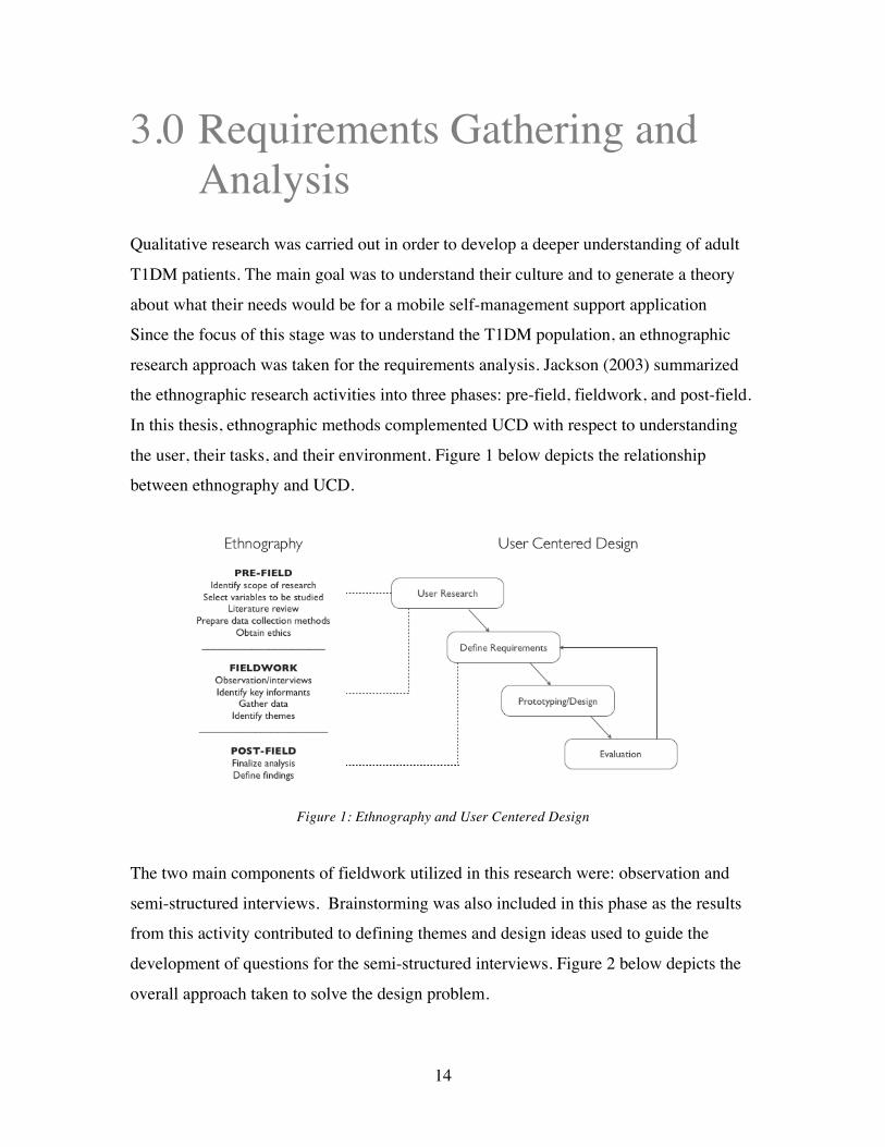
Since the focus of this stage was to understand the T1DM population, an ethnographic
research approach was taken for the requirements analysis. Jackson (2003) summarized
the ethnographic research activities into three phases: pre-field, fieldwork, and post-field.
In this thesis, ethnographic methods complemented UCD with respect to understanding
the user, their tasks, and their environment. Figure 1 below depicts the relationship
between ethnography and UCD.
Figure 1: Ethnography and User Centered Design
The two main components of fieldwork utilized in this research were: observation and
semi-structured interviews. Brainstorming was also included in this phase as the results
from this activity contributed to defining themes and design ideas used to guide the
development of questions for the semi-structured interviews. Figure 2 below depicts the
overall approach taken to solve the design problem.

15
Figure 2: Design Approach
The following sections describe the methodology and subsequent analysis in detail.
3.1 Observation
3.1.1 Clinic Shadowing Due to the work being conducted in parallel on an adolescent version of a mobile self-
management application (bant for adolescents), the opportunity to shadow at the Diabetes
Clinic in the Hospital for Sick Children (REB 1000017742) was presented. Although the
patient age range (infant to 18) at this clinic does not match that of the target population
for this research, observing the interaction between patient and physician at a routine visit
still proved to be valuable in understanding the disease and the impact it has on an
individual.
A total of 5 patient visits were observed. Prior to observing any appointments, patients
and their parents/guardian were first asked for permission by their healthcare provider.
Although a visit to the clinic may take approximately 2-3 hours total for the patient,
direct interaction with the clinician lasts approximately 10-30 minutes depending on the
case. Visits often take longer than anticipated due to scheduling of blood work,
physicals, and other clinic related activities such as pump information sessions etc. These
visits are routinely scheduled every three months.

16
Patients were asked to provide their blood glucose (BG) monitor or pump, from which all
of their readings taken over the last 30 days were imported into the clinic computer and
printed out for review. The only data a typical BG monitor provides is the BG
measurement, date, and time of day the reading was taken. Pumps will also include
insulin bolus/basal rates. For additional information, the clinician would often request to
review a handwritten logbook. These logs would typically include additional information
such as carbohydrate counts, level of activity, and the amount of insulin taken. This data
was then used to cross reference readings in order to better understand out of range BG
measurements and identify the root cause of trends. The physician would then work with
the patient to recommend appropriate changes to help regulate BG levels. Changes
would either be made to insulin basal or bolus dosage, diet, and activity levels. For raw
notes collected from the observations, please refer to Appendix A.
To elaborate further on logbooks, the majority of glucometer or pump providers have
created their own versions. Although the size and format of these logbooks vary slightly
from one to the next, the layout of data is fairly consistent. It was important to take note
of this, as the majority of T1DM patients either use a paper log on a regular basis or have
been encouraged to use a log book at some point from someone within their circle of
care. Figure 3 below depicts what the standard logbook layout looks like. Columns are
organized by context (blue box); users are encouraged to log their blood glucose
according to the context of each reading. These are typically defined as meals:
breakfast, snack, lunch, and dinner. Each row (pink box) represents a day of the week.
The format for recording data (green box) varies but users are encouraged to record their
blood glucose before and after a meal, as well as track the number of carbs consumed and
units of insulin taken.

17
Figure 3: Diabetes logbook layout
Overall, the main point of discussion for all appointments was blood glucose and how
best to regulate and keep it within target range. In addition, a lot of emphasis was placed
on the HbA1C measurement, a measure of average plasma blood glucose over extended
periods of time. Figure 4 below summarizes the common factors discussed that
contribute to fluctuations in blood glucose.
Figure 4: Common factors that effect blood glucose (adolescents)
Shadowing at the Hospital for Sick Children (HSC) Diabetes Clinic was extremely
helpful in developing a deeper understanding of T1DM patients. It was valuable to
observe patients first hand and learn more about what was expected of them from a self-
management perspective.

18
3.1.2 Carbohydrate Counting Class In order to develop a deeper understanding of what self-management involves for adult
T1DM patients, I attended a carbohydrate counting seminar offered by the Toronto
General Hospital Diabetes Clinic. The seminar is offered to anyone interested and is
recommended to newly diagnosed patients and/or patients considering switching from
multiple daily injections (MDI) to an insulin pump. The session is mandatory for pump
users because pumps require a precise carbohydrate count in order to calculate the correct
bolus. A qualified diabetes dietician facilitates the interactive one-hour session with the
use of slides and various measurement tools.
The seminar began with a round of introductions, followed by a reflection activity that
involved listing everything that was consumed the day before. This was an effective
method to raise immediate awareness around diet and food consumption. This activity
was followed by a series of slides outlining the importance of carbohydrate counting and
what it involves. More specifically, there were discussions around how to read labels
properly, what a portion size looks like, and a review on how to calculate the insulin to
carb ratio. There were two additional activities built into the session:
1. Self-Assessment: A quiz that tests how knowledgeable the patient is on carb
counting tools, sources of carbohydrates, and glycemic index.
2. Bolus Insulin Worksheet: This form consists of three scenarios where the patient
was asked to determine how much insulin to take based on the information
provided.
To conclude the seminar, a sample meal was provided on a tray and participants were
encouraged to work together to estimate the total carbohydrate count using the scales and
various tools (ie. books and calculators) provided. Each food item was provided on a
‘Carb Counting Worksheet’ and the goal was to determine the portion size and grams of
carbs for each portion.

19
Observing this session confirmed many of the findings from shadowing at the HSC
diabetes clinic and highlighted some of the challenges that patients face when estimating
their carbohydrate intake. Dining out and trying unfamiliar foods were identified as the
most difficult situations for everyone who participated in the session. Also, two
additional factors that impact blood glucose in adults were highlighted: alcohol
consumption and pregnancy. Although alcohol consumption can technically be
categorized into diet, it is identified as a unique factor due to the special impact it has on
glucose absorption. It is important to note that although attending this session was
helpful in deepening my understanding of adult T1DM, the information collected was
focused primarily on techniques used for carb counting (as expected). As the design of
the mobile application will be focused on how to effectively present data to users, this
session highlights the need to allow users to record their carb counts in relation to their
blood glucose measurements.
3.2 Pilot Data Review & Brainstorming As noted previously, this research was conducted in parallel with the re-design of the
adolescent version of a mobile self-management app: bant. This version was developed
with a user centred design method and had undergone a mini-pilot study in 2010. There
were several key findings from the results of that study, the most impressive being a
significant increase in the number of BG measurements taken daily (Cafazzo, 2012).
Unfortunately, exit interviews with the pilot users were not conducted. As a result, the
Centre for Global eHealth Innovation hosted a brainstorming session to review the data
collected and determine what design changes need to be made in order to address the
issues with the application uncovered from the pilot. The group included engineers
(Masters & PhD’s), human factors experts, software engineers, and a person with Type 1
diabetes.
Although brainstorming is not typically considered a means for collecting and defining
user requirements, it is an effective tool to develop and collect many design ideas in a
group setting (Osborn, 1953). The session was approximately an hour in duration and

20
topics ranging from software design to hardware elements were discussed. Following a
brief review of the findings from the pilot, any and all ideas were welcomed. As a result
of the session, the following four design features were listed as ‘most wanted’:
1. Leaderboard: This feature would display a list of ‘leaders’ in the community who
have accumulated the highest number of points. The purpose of the leaderboard
would be to introduce a competitive element to the mobile app with the goal of
motivating users to become a leader on the board.
2. Community Statistic: A community statistic would display how the community is
performing as a whole with respect to blood glucose readings. In other words,
this feature would display the average community blood glucose whenever a user
is uploading their reading(s).
3. Progress/Status Bar: The purpose of this feature would be to display information
regarding a user’s overall ‘status’ for the day. Also, since the application
leverages points to encourage certain behaviours, letting the user know how far
they are from achieving their next reward is important.
4. Updated Points Algorithm: The version of the app used for the pilot rewards a
user for uploading a reading. The purpose of this feature would be to reward
other positive behaviours such as loading a reading within range or resolving a
negative trend (defined as 3 consecutive readings out-of-range)
Although this feature discussion was specific to the adolescent version of the app, it
provided a good starting point for beginning to map out and visualize the adult version.
This also helped guide the questions for the semi-structured interviews regarding whether
specific design features would be appropriate for a more mature user.

21
3.3 Semi-Structured Interviews The next stage of requirements gathering involved conducting interviews with adult
T1DM patients (REB 12-5578, U of T 28496). The recruitment inclusion criteria were:
any English-speaking adult (19 and older) who had been diagnosed with T1DM for a
minimum of a year, and who was willing to provide consent to participate in the study. A
total of 8 participants were recruited from the Toronto General Hospital Diabetes clinic;
half were pump users and half used multiple daily injections (MDI) of insulin.
Interviews were conducted at the Centre for Global eHealth Innovation and were
approximately one-hour each in duration. Data collected through the literature review,
observational research, and brainstorming session helped guide the development of the
semi-structured interview questions. Particular areas of interest include effective data
tracking and visualization, social community interaction, and motivational design
techniques (ie. reward mechanisms). The list of questions used to guide the interviews
are outlined in Table 3 below.
Social Community
• Who do you typically share your blood glucose information with? When? How frequently?
• What type of information do you typically share? With whom? What motivates you to share that information with others?
• How often do you communicate about your diabetes with others?
• How does sharing information help you? • Overall, what do you like most about your current
information sharing practices? What would you like to improve or change?
Data Visualization
• How do you currently track and record information related to your diabetes management? What information do you record and why? How often?
• How and when do you review and interpret your blood glucose results? What tools do you employ?
• Do you ever look back through your logs? If so, how far back do you go and why?
• When you do make changes to your routine, what do you base your decisions on and why?

22
• Overall, what works well in your current information capture and review practices? What would you like to change?
Rewards &
Motivation
• What keeps you motivated to stay on track with your self-management practices?
• Do you ever set goals relating to your self-management practices or overall health? If so, how do you set out to achieve them?
• Do you currently play any mobile games? If so, what keeps you interested in the app?
Table 2: Semi-structured interview questions
In addition to being asked questions, participants were shown and encouraged to provide
feedback on rough paper sketches and high fidelity screenshots of preliminary design
ideas. To review these screenshots, please refer to Appendix B. Before concluding each
session, participants were asked to interact with the existing adolescent bant application.
The purpose of this activity was to collect preliminary design feedback and to determine
which design features, if any, would be appropriate for adult use as well. The following
section outlines the analysis performed on the data collected from these patient
interviews.
3.4 Qualitative Data Analysis An affinity diagram was used to analyze the data collected from the interviews. This
method was created as a means to sort many ideas into useful groups or themes. It
involves four steps: label making, grouping, charting, and written or verbal explanation
(Scupin, 1997). In this case, the goal was to take the identified groupings and translate
them into user requirements.
Each of the eight participant interviews was transcribed. Maintaining anonymity,
participant statements were printed and mounted onto cards (label making) for easy
grouping. The next step involved organizing the statements into groups. In order to
avoid bias, it is best that this step be carried out with a group of people rather than an

23
individual. It is for this reason that members of the Interactive Media Lab (Figure 5
below) were recruited to group related statement cards together.
Figure 5 – Affinity diagraming with members of the Interactive Media Lab
Due to the large number of statements, the cards were classified by interview category:
information sharing, data visualization, design elements (comments on preliminary
sketches), and rewards/motivation. The statements could have been categorized one level
further into answers for each question; however in order to allow for original ideas to
diverge, the cards remained in the larger groups of categories.
The lab members worked together to sort cards, and once agreed upon, the sub-groups
were finalized. Appropriate titles were determined and statement cards were charted
accordingly. The following section outlines the resulting affinity diagrams for each
category. The final step of the method written explanation, is outlined in section 3.5 User
Requirements.
3.4.1 Affinity Diagrams The resulting affinity diagrams from the grouping activity are outlined below. Figure 6
depicts the chart of statements for the information sharing category.

24
Figure 6 –Affinity Diagram: Information Sharing
There were a total of seven sub categories identified:
• Motivation: The motivation behind sharing diabetes related information with
others.
• Online: Opinions and behaviours towards online information sharing practices.
• Recipient (who): The individuals who are likely to be the recipient of the
information shared.
• Content: A cross-section of the type of information that patients choose to share.
• Frequency: The frequency of which information is shared with others.
• Community: Participation in diabetes communities either online or in person.
• Questions: How to handle diabetes related questions between clinic visits.
The affinity diagram for data visualization was rich in data (Figure 7 below). This was
expected due to the number of questions asked under this category. Also, collecting data
is a task that is required for the majority of persons with diabetes and as a result, people
had lots of opinions on how to present and visualize that information.

25
Figure 7 - Affinity Diagram: Data Visualization
There were a total of 6 sub-categories identified:
• Reflection Period: How far back patients look through data collected.
• Data Loads (Frequency): The frequency with which BG readings and other
information are recorded or loaded.
• Data Tracked: The information that is actually tracked.
• Tools Used: A summary of the various tools used to assist with data tracking.
• Making Decisions: Insights into how decisions related to diabetes self-
management are made.
• Making Changes (Frequency): How often changes are made to self-management
routines.
When participants were shown the sketches and preliminary screen shots, the interviews
shifted from a question/answer format to an open discussion around thoughts and
opinions on the drawings. The resulting affinity diagram (Figure 8 below) may help
indicate what areas of the design participants found most interesting and helpful.

26
Figure 8 –Affinity Diagram: Design Elements
Five sub-categories were identified and are described briefly below:
• Historical Data: How far back participants looked through data.
• Important Statistics: The numbers and figures that participants found most
interesting and helpful.
• Desired Features: Features that participants look for in a mobile application.
• Data Organization: The preferred way to view data.
• Colour Meaning: Colours associated with high and low BG readings.
The final affinity diagram (Figure 9) summarizes the data collected on what keeps
patients motivated to stay healthy and the types of rewards adults find appropriate. As a
result, two of the three sub-categories were motivation and rewards. The third, goals,
provides an understanding of what type of data participants use to set goals.

27
Figure 9 – Affinity Diagram: Rewards/Motivation
Each step in the process of creating these affinity diagrams was an opportunity to become
more familiar with the data collected from the interviews. This exercise was useful in
identifying sub-categories of ideas that would not have otherwise been extracted from
looking strictly at the data as simply answers to questions. Also, the involvement of
individuals external to the process provided a means to approach the data with a different
perspective.
3.5 User Requirements With the data from the interviews organized into category and sub-category, the next
stage of the process was to translate the groupings into user requirements. Table 4 below
summarizes the findings identified from the affinity diagrams and relates them to design
principles that were used to the guide prototype development.
Design principles were classified into firm and flexible user requirements. Firm
requirements were identified as design principles that must be included in the app. These
have been shaded blue in Table 4. These requirements form the basis of the application,
which means without them, the app will not be able to function. This includes input
related requirements such as recording information, as well as basic output requirements

28
such as displaying collected data intelligently to the user. Flexible requirements were
design principles identified as important elements to help guide the design but are not
mandatory to include. In other words, these features are ‘nice to have’ but are not crucial
to developing a functional application. These have been shaded orange in Table 4 above.
Category Finding Design Principle
Information Sharing Practices
Patients share diabetes related information with close family members and significant others on a monthly basis and are not interested in sharing with an online community.
The app should provide users with a means to occasionally (1/month) share information related to their diabetes with close family and friends. Sharing information helps patients
to better understand T1DM and their bodies. The majority of patients have an online presence (ie. Twitter, Facebook, etc.), but do not use them as a means to discuss diabetes.
The app should not link into a pre-existing online social community.
Patients would be interested in seeing and contributing to a published community blood glucose and believe it would be a motivating factor in maintaining a healthy BG.
The app should clearly display the community BG on a screen that is frequently accessed by the user.
Data Visualization
Patients most frequently track and record the following information: carbohydrates, blood glucose, insulin, and activities.
The app should allow users to record and track their blood glucose, carbohydrate intake, insulin, and activities.
Patients make adjustments to their self-management routine based on how they are feeling (physically/emotionally), BG lows and highs, as well as on insulin and carbohydrate intake.
The app should allow users to keep track of and review their physical and emotional well being; this data should be displayed with other recorded data.
Logs are typically reviewed a week to one month back.
The app should present data in one-week increments as far back as one month.
Recording information is time consuming. Patients reported recording regularly only in anticipation of a clinic visit.
The act of recording data into the app should be fast, easy, and straightforward.

29
Design Elements
Being aware of average blood glucose and the percent of readings in and out of range is helpful to know.
The app should clearly display the users average BG and the percent of readings that are in and out of range.
Reviewing a summary of data by day (time on the x-axis) is more clear and valuable than seeing data summarized by context.
The app should provide a summary of collected data by day.
Patients associate the colour green with being in range. However, there is no consensus on a colour code for low and high readings (blue vs red).
The colour green should be used to indicate in range readings and red to indicate out of range readings regardless of whether the values are high or low (as red is commonly known to represent ‘danger’).
Rewards/ Motivation
Fear of future T1DM related complications motivate patients to stay on track. The app should highlight or
emphasize the use of good health and feeling well to motivate the user to stay on track.
General good health and feeling well motivates patients to stay on track with self-management practices. Patients set a goal to achieve or maintain an in-range A1C and also set goals related to general health.
The app should have a place where users can track and review their A1C for goal setting purposes.
Table 3: Summary of Findings and Design Principles
For a detailed breakdown of patient statements by category, please refer to Appendix C.
The following section describes the prototyping process and outlines how these design
principles were met.

30
4.0 Prototype Development
Designing from data requires taking a creative leap. There are no set rules that outline
how to translate user requirements into specific design features. However, there are tools
that can be used to help guide the process. In this section, the steps used to develop the
prototype and the final design prepared for usability testing are described in detail.
4.1 Storyboards Storyboarding is a technique that was derived from the film industry and has now been
commonly applied to developing system designs. Bayer and Holtzblatt (1998) describe
storyboards as a means to demonstrate how specific tasks will be accomplished in the
new world. In this case, storyboarding was used to identify what tasks an adult T1DM
will attempt to complete using the mobile application and what the expected system
response would be to accommodate the action. Therefore, when the design principles
were reviewed and organized by similarity: the following five user tasks were identified:
Design Principle User Task
The app should allow users to record and track their blood glucose, carbohydrate intake, insulin, and activities.
Record Data The app should allow users to keep track of and review their physical and emotional well-being and should be displayed with other recorded data. The act of recording data into the app should be fast, easy, and straightforward. The app should provide a summary of collected data by day.
Review Recent Data The app should clearly display the community BG on a screen that is frequently accessed by the user.

31
The app should present data in one-week increments as far back as one month.
Review Historical Data The app should clearly display the users average BG and the percent of readings that are in and out of range. The app should provide users with a means to occasionally (1/month) share information related to their diabetes with close family and friends. Share Data
The app will not link into a pre-existing online social community. The app should highlight or emphasize the use of good health and feeling well to motivate the user to stay on track.
Look for Motivation The app should have a place where users can track and review their A1C for goal setting purposes. The colour green should be used to indicate in range readings and red to indicate out of range readings regardless of whether the values are high or low.
Miscellaneous Design Guideline (Not a user task)
Table 4: Design Principles ->User Tasks
Upon review of these user tasks, it is evident that the main purpose of the application is to
record information. Without collecting day-to-day data, the app will not be able to
provide the user with a representation of recent or historical data, or the ability to share
this information with others. If we consider the findings from observing T1DM patients,
there are several factors that typically need to be tracked. This helped drive the
storyboarding process and resulted in Figure 10 below.

32
Figure 10: bant Storyboard
This storyboard does not address all of the identified design principles, however the
thinking process behind creating the above figure was useful in determining an initial
user workflow. In other words, the act of thinking through how a user may approach the
mobile application was helpful in determining what the user might expect to see and be
able to do. The following section outlines the iterative approach taken to develop the
prototype.
4.2 Prototype Evolution With an understanding of how users are expected to interact with the mobile application,
a formative usability approach was applied to design and develop the initial prototype for
testing (see Section 5.0). Formative usability is defined as a method that is iterative in
nature, which means that evaluation, problem diagnosis/identification, recommendations,

33
and changes to the design occur in a cyclical fashion (Tullis & Albert, 2008). With
support from the Interactive Media Lab and the Centre for Global eHealth Innovation,
several iterations of formative usability occurred prior to finalizing the prototype for
usability testing with patients.
The initial version of the prototype was developed using the design guidelines identified
from the results of the requirements gathering phase. The design was also partially
influenced by the existing adolescent version of bant with respect to the number of tabs
and the layout of the bottom navigation bar. The navigation bar was used as a starting
point to guide the design with the expectation that it would iterate and change as the
prototyping process moved forward.
In the first iteration of design, there were five tabs in the application: trends, bant book,
readings (home), challenges, and a social network depicted from left to right in Figure 11
below.
Figure 11: Bottom navigation bar – Iteration 1
Although sharing personal experiences in a community, whether in person or online, was
noted to be healing and educational (according to the data collected from the patient
interviews), the majority claimed they were not interested or willing to share diabetes
information with an existing online community. As a result, the social network tab was
later removed and was replaced with a food database as shown in the updated menu bar
below.
Figure 12: Bottom navigation bar – Iteration 2

34
As a result, in the screenshots that follow, depending on the iteration being discussed, the
rightmost icon in the menu bar will shifted from a social networking tab to a food
database tab. However, since users typically share information with close family and
friends, a ‘Share’ icon has been included on each screen. This will allow the user to send
a pre-formatted email or SMS of the content on a specific screen of interest.
Figure 13: Share icon
The designs use colour coding to align readings by context. For example, all breakfast
readings and data associated with them will be coded the colour blue. Therefore, the
design assumes users have adequate color vision. The following five sub-sections
describe in detail the designs for each tab and what changes were made with each
iteration.
4.2.1. Home Screen When the application is first launched, it opens to the home screen. This page acts as a
dashboard that summarizes the data collected throughout the day and it is also the
gateway for users to enter self-measured data. As the system will allow the user to record
their blood glucose, carbohydrate intake, insulin dose, activity levels, and emotion, it is
important to display this data in a meaningful way to the user. Figures 14a and 14b
below depict the first iteration of the home page design.

35
14a 14b
Figure 14: Home Screen – Iteration 1
The screen is divided into three sections. The top portion is a mini dashboard that
displays in the top left corner the community blood glucose (the average blood glucose of
all users of the app at the current time), and in the top right corner, the individual user
blood glucose. Figure 14a depicts the screen before the user inputs their most recent BG
measurement and other related information. The middle portion is a graph of the blood
glucose measurements taken throughout the day with the time on the x-axis and mmol/l
on the y-axis. The light green band through the middle indicates the target blood glucose
range. This target range can be changed in the settings to accommodate individual needs.
Note from figure a to b, the line extends by one reading. The bottom portion is a
summary of all the other data collected organized by reading. The readings are colour
coordinated by context, which can be set by the user.
In an early evaluation of this design, it became clear that the tabular representation of the
data in the bottom portion of the screen would not quickly convey useful information to
the user. It would take time to read through each line item, which is not ideal,
particularly for mobile use. As a result, the bottom portion of the design changed in the
second iteration to a more visual representation. A menu was introduced with the option
for the user to toggle through their carbohydrate estimates, insulin boluses, level of
activity, and how they were feeling throughout the day. This has been depicted from left

36
to right below in figures 15a to 15e. Each BG reading in the top graph aligns vertically
and is colour coded to match the carb and insulin bar graphs below.
15a 15b 15c 15d 15e
Figure 15 – Visual Representation of carbs (b), insulin (c), activity (d), and feeling (e)
Upon review of the home screen and the user requirements, an additional field was added
to the top portion of the home screen: the ability to log HbA1C. The decision to add this
was driven by the fact that the majority of patients interviewed set goals around achieving
an A1C within the target range. As a result, a third item was introduced on the left had
side of the top mini dashboard (Figure 16). Also, text to direct the user to ‘click through’
the menu was added to the bottom portion of the screen.
Figure 16: Home Screen – Iteration 2

37
The act of logging a reading occurs within the home screen. When the user clicks on the
circle below ‘Log my recent BG’ in the top right corner, they will be directed to a new
screen (Figure 17a) that will allow them to log their BG and other related information.
This screen will automatically default to the meal or other context that is most relevant to
the time of day the application is being used. In other words, if it’s 7am, the large circle
at the top centre of the screen would have defaulted to blue and the text left of the circle
would indicate that it’s a breakfast reading. If the user would like to change the context
of the reading, they can simply drag and drop the desired circle from the top menu bar
onto the large circle below.
17a 17b 17c
Figure 17: Reading Details Screens
Each of the grey circles represents a piece of data that can be collected by the app. These
correspond with the requirements, allowing the user to record and track how many carbs
they are consuming (carbs), how many units of insulin they are taking (bolus), the type of
activity/exercise they have participated in (activity), how they are feeling (emotion), and
their basal dose (basal). The decision to record emotions was based on the data collected
through requirements gathering. In interviews, some patients stated that they relate their
BG readings to how they were feeling emotionally. For example, a bad emotional day
may be related to difficulties with controlling BG, therefore collecting and displaying this

38
information would be helpful for future self-management planning. Also, through
feedback collected through an iteration of design discussion, it was suggested that
‘Emotion’ may be a more appropriate label for capturing how a user feels than ‘Feeling’
due to the input being a selection of emoticons (faces that depict emotions such as happy
and sad). The input screens that enable the user to record their data have been included in
Appendix D for reference.
4.2.2 bant Book The purpose of the bant Book is to provide the user with a place that is familiar to them
within the app. Therefore, this section was designed based on the paper logbooks that are
often provided either by their clinic or packaged with their BG meter or pump. However,
as one focus of the app was to represent data in a visually rich and meaningful way, a
unique calendar feature was designed (Figure 18)
18a 18b
Figure 18: bant Book screens
The purpose of this calendar was to show the user at a glance what their BG readings
look like over the course of a month. The idea is that a heat map would be generated
based on the number of readings taken and whether those readings are in or out of range.
As there wasn’t a consensus on what colour represents high or low readings, any days
39
that are out-of-range would be a shade of red and an in-range day would be coloured a
shade of green. Red was selected to depict out-of-range values because it is the colour
most associated with danger. The depth of the colour would indicate how many readings
were taken and the average value of those readings would determine the colour. For
example, a day with five in-range readings would be a darker green than a day with just
two in-range readings. Similarly, a day with five out-of-range readings would be a
deeper red than a day with a single out-of-range reading. The difficulty arises on days
where several readings were taken but the average is only slightly out of range.
According to the given algorithm, this would result in the day being shaded a dark red
which would not be an accurate representation of the users overall blood glucose that
day. The alternative would be to colour the days based on BG average only. This is an
area that was explored in the subsequent user testing.
The bant Book will default to the current day (Figure 18a above), which is indicated by
the bold box surrounding the day (May 1). The user can navigate to any other day by
touching the desired date. This interaction is consistent with calendar applications on
various mobile devices. It is important to note that when a day is selected the BG
average for the date is displayed near the centre of the screen with a list of the readings
taken that day below it. Users will be able to access the details of each of their readings
by tapping on the arrow to the right of the BG value(s). This will bring them to a screen
that will look like Figure 17c above.
4.2.3 Trends The trends section was designed to address the lack of useful and clear visual
representations of blood glucose data that exist in diabetes mobile applications currently
available. The purpose was to provide at a glance where a user is experiencing difficulty
with regulating their blood glucose. Early iterations attempted to include carbs counts and
insulin; however in order to simplify the design and place emphasis on BG, they were
removed. The emotions data were also excluded in this section for the same reason.
Trends proved to be the most challenging section and as a result, the designs went

40
through several iterations. The first version of the trends screen followed the theme of
using context circles to represent data; three variations on the design were mocked up.
19a 19b 19c
Figure 19: Trends Screen – Iteration 1
In figure 19a above, the screen is divided into sections by context with the average BG on
the left, the percent of readings in-range in the centre, and the percent of readings out-of-
range on the right hand side. The size of the circle changes proportional to the percent
value that it is depicting. The user will also be able to toggle through data by number of
weeks (1 to 3). Figure 19b follows a similar concept; however rather than showing every
context on the screen at once, the user would be able to select the context and the number
of weeks of data.
In an early design review, it became apparent that showing both the percent in and out-of-
range was redundant and the screen space could be better utilized. Therefore, the percent
out-of-range circles were removed and replaced with additional information such as
average carbohydrates consumed by context (right hand side of figure 19c). However,
upon further review, a more important flaw in this design was uncovered. When looking
at the screens above, attention will likely be drawn most to the largest circle, which
represents when the user has the highest percentage of readings in-range. This is
problematic because one of the goals of this section is to draw the users attention to areas

41
where they may be struggling with maintaining healthy blood glucose. For example, in
Figure 18c, it is significantly easier to notice the large green circle showing that 80% of
BG readings at snack time are in-range over the small orange circle showing that 15% of
lunchtime readings are in-range.
The next iteration of trends changed drastically from the first. The ability to toggle
through by week remains; however the circles concept was abandoned and a more
traditional graphing theme was adopted. Figure 20a shows a scatterplot of every reading
taken by context with the plot of all reading shown at the top. The parallel lines indicate
the upper and lower limit of the readings, similar to the green band on the home page.
Figure 20b shows a horizontally stacked bar chart that indicates by percentage the
number of readings that run low (red), in-range (green), and high (blue). As this did not
follow the requirement that any out-of-range readings be coloured red, the screen evolved
to the one shown in figure 20c with the high readings also shown in red. Also, through a
review, it was highlighted that the percentages would be more meaningful if the user was
made aware of the number of readings taken for each context. As a result, this was
displayed in brackets next to the title of each context.
20a 20b 20c
Figure 20: Trends Screen – Iteration 2

42
We hypothesized that these revised screens were easier to understand than the screens
from the first iteration. For example, by looking at figure 20c, it is clear at a glance that
the user has better BG control when having a snack than at breakfast time. Due to both
20a and 20c being favoured through review, it was decided that both views would be
included for usability testing. Users would be able to navigate from one view to the next
by swiping to the left and then swiping to the right to return to the previous screen. The
two dots below the top menu bar and above all reading in figure 19c indicate that there
are two views. The shading of the dots would indicate what screen the user is on (black)
and which way to swipe to access a different view (grey).
4.2.4 Challenges From the identified requirements, it was clear that users set personal goals that relate to
overall health and well being. The goals section of the mobile app was named
‘Challenges’ in order to stay aligned with the game-based design theme. The aim of the
challenges portion of this application was to incorporate these types of personal goals and
incorporate them with challenges that would encourage the user to remain engaged in the
app. In the first iteration of the design, the challenges were kept to a single screen
(Figure 21). Along the top were three items: the ability to log A1C, review how many
challenges were achieved, and also how many more challenges remain in the app.
Underneath the circles, a challenge in progress is displayed; this can be changed by
tapping on any of the challenges listed below. These challenges range from encouraging
more physical activity to working towards increasing the number of BG readings in
range. In the bottom right hand corner, there is a box labeled ‘Create my own…”. The
idea behind this was to allow users to build their own personal challenges within the app.

43
Figure 21: Challenges Screen – Iteration 1
Upon review of this screen, it was discussed that the title ‘Achievements’ was not
appropriate given that the majority of the screen was dedicated to listing out current
challenges. As a result, in the next iteration, the title was updated to ‘Challenges’. Also,
although these challenges may be relevant, they were not well integrated into the
application. The user would have to navigate to this tab to review their progress and the
challenges they were working on. The next iteration of design took a more integrative
approach with challenges being built right into each screen through the use of a pull out
tray. The concept of a pull out tray is gaining popularity in the design of mobile
application design.
On every screen with a challenge, a small tab on the right hand side indicates the
existence of a tray. When the little tab on the right side of the reading input screen
(Figure 22a) is pulled out, a list of challenges that relate to that screen are displayed. In
other words, the list of challenges in the tray will change dependent on what screen the
user is working on. With each challenge, a progress bar is shown (where appropriate) to
demonstrate how far the user is from completing the challenge. Each time one is
completed, the graphic of blue circles grows by the number of challenges. Though
difficult to depict on paper, imagine a brief animation that transforms the completed
challenge into a circle that travels up and attaches to the collection above. Figure 22d

44
shows how the graphic would look with two completed challenges. Additional challenge
screens have been included for reference in Appendix D.
22a 22b 22c 22d
Figure 22: Challenges Screen – Iteration 2a
With the challenges moved to individual trays, this freed up screen space on the
challenges tab. This allowed for the introduction of a new feature; the use of points. The
idea is that as users complete challenges, they will accumulate points and can visit the
challenges tab (Figure 23 below) to review how many they have completed to date and to
also see how they are performing compared to other users of the app. This can be done
using a leaderboard. Although there isn’t a social community for users to directly share
information, a leaderboard can provide another means to connect users with one another
in a more private manner. This means that rather than sharing personal diabetes or health
related information, the only data a leaderboard shares is the number of points the user
has accumulated. The graphic of circles on the top portion of this screen is interactive,
meaning that users can tap each circle to find out what challenge they completed to
obtain it. This provides the ability for users to review their accomplishments over time.

45
Figure 23: Challenges Screen – Iteration 2b
Review of the updated challenges section revealed that the design may be too complex
and could prove to be confusing with the content of the challenges tray changing from
screen to screen. This was included in usability testing to determine whether this was in
fact true.
4.2.5 Food Database The decision to include a food database in the application was not necessarily driven by
the requirements. In fact, what was drawn from the requirements was the need to keep
track of how many carbs are being consumed, not a tool to help determine the amount.
Though participants didn’t explicitly state they would want a food database in a diabetes
app, they did mention that they used other food databases available either by book or via
another mobile app; the three most popular being MyFitnessPal, LoseIt, and CalorieKing.
It is important to note that none of these popular applications have been designed
specifically for a Type 1 Diabetic patient to use. The idea is that an integrated food
database would make it easier for the patient to estimate their carbohydrate intake.
Therefore this screen (Figure 24) has been included as a means to measure the demand
for such a feature in a diabetes app through usability testing.

46
Figure 24: Food Screen
If this were to be incorporated fully into the app, it would have to be well integrated.
However, since the focus of this research was to explore various data visualization
techniques, this portion of the design was not fully prototyped.
4.3 Final Prototype The prototype finalized for usability testing was feature rich with an emphasis on data
visualization. It had a total of five main sections, three of which are directly related to
BG readings and different methods of representing the collected data. The remaining two
sections were dedicated to the challenges/leaderboard and a food database. The
information architecture of the final prototype has been drawn below in Figure 25.

47
Figure 25: Final Prototype - Information Architecture
The arrows stemming from the menu bar indicate how the screens are linked together and
demonstrate how a user could navigate through the application. To reiterate, the menu bar
icons from left to right are: Trends, bant Book, Home, Challenges, and Food. The goal
was to keep the flow as straightforward as possible; this was accomplished by
minimizing the depth to which a user can navigate within each section. Generally, the
number of screens was limited to three per tab, including the ‘Challenges’ tray as a
screen.
Beginning at the left side of the flow diagram, the ‘Trends’ section has 3 main screens.
By touching the ‘Trends’ icon, the scatter plot view of blood glucose readings by context
opens. By swiping to the left, the bar chart view of trends will be revealed. Finally,
when the tab on the right hand side is pulled out, the Challenges tray appears on the

48
screen. Within the two chart views of trends, the user can toggle between views of the
data: 1-week, 2-weeks, 3-weeks, and All (all data collected).
The ‘bant Book’ section will always default to the view of the current day. The user can
go as far back as they wish in the calendar to access their log summary and BG average
for any given day. Again, if the user wishes to engage with the challenges built into the
app, they pull out the tray using the tab on the right hand side at any time.
Although the ‘Home’ page appears to have several screens, when the user toggles
through the centre menu bar, the layout on the top half of the screen remains consistent
and the data along the bottom portion changes to represent carbs, insulin, activity, and
emotions (4 screens on the bottom right). Each section within the app is fairly
independent; the only cross section link exists between the ‘bant Book’ and ‘Home’ page.
Users are able to drill down on a specific reading from the ‘bant Book’ by tapping on the
arrow next to the reading of interest. This action will bring the user directly to the
reading ‘Details’ page.
The ‘Challenges’ screen summarizes the number of challenges completed using a graphic
of blue circles at the top, with a leaderboard showing the user how many points they have
collected in comparison to their peers. This section is a single page deep; there are no
additional screens for the user to drill down to. Similarly, the ‘Food’ section is only a
single page. If this feature were to be completely mocked-up, there would be several
screens and possibly a link into the reading ‘Details’ screen that would allow users to log
a food with a BG reading. The goal was to collect opinions through testing regarding
how useful a ‘Food’ database would be to potential users.
In the next phase of this research, usability tests were conducted using this finalized
prototype. The goals, methodology, and results from testing are outlined in Chapter 5.

49
5.0 Usability Testing
Usability testing is an important part of user centred design, it uncovers design flaws and
also validates good design features. A separate ethics submission (13-5975) was
prepared for this phase, as the content of questions and style of interviewing patients was
different from that of Phase 1 – Requirements Gathering. The following sections outline
the methodology, the tools used to measure the usability of the application, and a
summary of the results.
5.1 Methodology Usability testing was carried out at The Centre for Global eHealth Innovation in the
usability laboratories. Nielsen (1994) recommended 3 to 5 participants for a talk-out loud
study. Therefore, recruiting for participants closed when a total of 6 participants were
reached. Potential participants were contacted initially by an RN in their circle of care
either in person or via a recruitment letter sent through email. Interested participants
were encouraged to contact the Research Coordinator to schedule a time to participate in
a user test either by phone or email. In order to participate, patients had to be fluent in
English in order to comfortably read scenarios and provide written feedback in
questionnaires. Also, it was preferred to recruit patients who had been diagnosed with
T1DM for at least one year. This was to ensure that patients were reasonably
comfortable with their self-management routine. Finally, patients had to be an adult
(>19) as the application was designed to support a mature user.
The session was no up to 1-hour in duration. Upon arrival, participants were provided
with a copy of the consent form, walked through the document, and given as much time
as needed to review and ask questions regarding the study. Following a brief
introduction regarding the purpose of the session and the mobile application, participants
were asked to fill out a pre-test questionnaire to gather background information on the
patient. Upon completion, participants were briefed on the testing method and the

50
prototype. At the end, participants were asked to complete two questionnaires and were
debriefed on design features that may have been missed during the test. For a detailed
outline of the usability study protocol, please refer to Appendix E.
To elaborate further on the method of testing, participants were asked to complete a total
of eight scenarios by interacting with a paper prototype of the mobile application. Paper
prototyping is a widely used method in user-centered design because it is fast, cost
effective, and encourages creativity (Snyder, 2003). In addition, when a user interacts
with a high-fidelity prototype, they are more likely to become frustrated if the testing
device is slow or certain links or buttons don’t function as expected. Using a paper
prototype frees the participant from these expectations and also allows for more open
discussion as the facilitator works through each paper screenshot.
5.2 Scenarios Scenarios were used as the method to guide the user through the paper prototype. They
were developed using the tasks that were identified through storyboarding (Section 4.1).
The idea was that these scenarios would be representative of actual tasks that a T1DM
patient would want to complete using a mobile application that supports them with their
self-management routine. Table 6 below summarizes each scenario and categorizes them
by user task.
Task Scenario
Record Data
It’s dinnertime (8pm) on May 1, 2013 and you want to record your most recent BG reading along with other related information. Open the app and record the info in the following order: BG – 5.0 mmol/l Carb Count – 20 grams Insulin Bolus – 3.5 units Activity – Yoga Emotion - Happy You’ve had your doctor’s visit earlier in the day. Since your goal is to keep your A1C (8.1) in range, you’d like to record it in the app to keep as a reminder.

51
Review Recent Data Since it’s the end of the day, you want to have a look through your carbs, insulin, activity, and how you felt throughout the day.
Review Historical
Data
It’s the first day of May and you want to see how your blood sugars looked the month before (April). Have a look through your bant log book to see how you did. In particular, you want to see what happened on April 23rd. You’ve made a mental note that your readings before breakfast have been a bit out of range lately. You’re curious what your average blood glucose at breakfast has been for the past week. Use the bant app to find out. Now that you’ve had a glance through what your readings looked like for the past week, you want to know the percent of times you’ve been in and out of range as well
Look for Motivation
Comment on the community blood glucose. You’re interested in completing some of the challenges that are built into the app. Explore the various challenges for each tab and find out how far you are from achieving them. Now that you’ve had a look through some of the challenges, you’re wondering how many you’ve completed to date in total. You’re also curious how you’re doing in comparison to others using the app; find out where you are on the leaderboard.
Share Data You remember you wanted to share some information with your sister since she’s been bugging you for updates lately. Email her the details of your day from within the app.
Table 5: Usability Testing – User Tasks & Scenarios
As the emphasis of this research was to explore different data visualizations, nearly half
of the scenarios are related to reviewing data. The prototype has four different ways of
representing information: on the home page, bant book, and two views on the trends
page. It’s important for the user to be exposed to each version in order to determine
which visualization is preferred.
An additional scenario regarding the food database was included and reads as follows:
“It’s a special occasion and you’re trying a food you’ve never had before; BiBimBop (a
Korean dish of rice with mixed vegetables). Have a look through the food database in the
app to try and get an idea of the carb estimate for this new dish.”
52
The food-based feature was included in the prototype but was not fully functional. In the
scenarios outlined in the table, participants were encouraged to log their carbohydrate
intake but any additional functionality such as logging a photo of the food or in-depth
browsing through a food database was not included. Therefore, the purpose of including a
scenario dedicated to this feature was to encourage discussion, gauge interest, and
determine whether it would be an area for future research.
For the actual usability testing session, scenarios were ordered to allow for a flow of
events that would make sense to the user: recording data followed by reviewing past data.
As participants worked through completing each scenario, they were asked to ‘talk out
loud’ and voice any opinions they have on the design, the scenario, and also share their
thought process regarding their navigation choices. If an issue was encountered, or the
participant was stuck, the scenario was ended and the session proceeded to the following
scenario. As participants worked through each scenario, the number of ‘clicks’ off the
critical path and overall task success were recorded. Once a participant had completed
the usability test, they were asked to fill in two questionnaires after which they were
debriefed on any screens and scenarios they had trouble with.
5.2 Questionnaires Participants were presented with questionnaires at the beginning and end of the usability
testing session. The purpose of the pre-test questionnaire was to collect background
information on participants regarding their self-management routine and level of comfort
interacting with mobile devices. There were two post-test questionnaires both focused
around measuring the usability of the design; the system usability scale (SUS) was issued
first, followed by a general post-session questionnaire.
The SUS (Brooke, 1996) consists of ten usability related statements, half of which are
positively worded and the other half negatively worded. Using a 5-point Likert scale,
participants were asked whether they agreed or disagreed with the system. The score is
calculated by following these steps:

53
1. For positive items (1, 3, 5, 7, 9), take the scale position minus 1
2. For negative items (2, 4, 6, 8, 10), take 5 minus the scale position (reversing the
score)
3. Sum all scores
4. Multiply the total by 2.5 resulting in a SUS score out of 100
The SUS score provides a usability measure of the mobile application as a whole but
does not provide feedback for specific design features. Therefore, an additional post-test
questionnaire was created that consisted of four components. The first section breaks
down each feature and asks the participant to rate on a 5-point scale how easy it was to
understand or use the features. The second section asks the participant whether they are
likely to use the app and provides space to list their top three most and least liked
features. The section following focused less on usability but more on the relevance of
each scenario; users were asked to rank on a scale from one to five, how realistic each of
the scenarios was to them. Finally, participants were given the opportunity to provide
open-ended feedback.
5.3 Participant Demographics A total of seven participants were recruited from the Toronto General Hospital Diabetes
Clinic. Participants had varying levels of comfort with mobile devices and less than half
had used diabetes related mobile applications in the past. Of those that participated, one
was eliminated from the results due to a learning disability that hindered their ability to
read and comprehend the scenarios accurately. As a result, the analysis was conducted
using a total of six participants. Table 7 summarizes the demographic profile of the
participants where MDI stands for multiple daily injection and the 4-point comfort with
mobile devices scale was represented as follows: NC – Not comfortable, SC – Somewhat
comfortable, C – Comfortable, VC – Very comfortable.

54
Question P1 P2 P3 P4 P5 P6 Age <25 <25 <25 45-54 <25 55-64 Gender M M M F F M Years with T1DM 0.5 12 15 1.5 2.5 36 Management routine MDI MDI MDI Pump Pump MDI Comfort with mobile devices VC C SC VC VC C Owns a mobile device Y Y Y Y Y N Uses a diabetes app N N N Y Y N
Table 6: Usability Study – Participant Demographics
The two participants that used mobile applications to help support their self-management
needs had listed them out on their questionnaires. Of the seven listed, two were designed
specifically for diabetes patients (Diabetes GPS, Glycemic Index), and all but one were
focused on carbohydrate counting. Even the two diabetes apps were solely focused on
carbohydrate counting and did not focus on helping the patient understand or visualize
their blood glucose readings.
5.4 Results The data collected from usability testing was analyzed in detail, beginning with assessing
how participant performed overall by scenario and assessed feedback collected for each
design feature.
5.4.1 By Scenario There were two metrics recorded as users worked their way through completing each
scenario: task success and the number of taps or gestures taken off of the critical path.
The time to complete each task was not recorded because participants were encouraged to
talk out loud which directly impacts this metric and would have resulted in inaccurate
data. Figure 26 below depicts the percent of participants who successfully completed
each scenario.

55
Figure 26: Percent of participants who successfully completed each scenario
It is apparent that participants struggled quite a bit with scenarios seven and eight, and
also with scenarios three and six but slightly less so. To provide context, scenario seven
was related to the alternate trends view and scenario eight was the challenges task. To
develop a deeper understanding of task success, the number of taps/gestures off the
critical path to complete a scenario was taken into consideration. In other words, any
participant that completed a task using more taps than necessary was categorized as a
success with errors. Figure 27 below depicts the percent of participants that completed
scenarios with no problems (green), with errors (blue), and failures (red).
Green – No problem Blue – Some problem Red – Failure/Quit
Figure 27: Different levels of task success
0% 20% 40% 60% 80% 100%
S1 S2 S3 S4 S5 S6 S7 S8 S9 S10
Part
icip
ants
Scenario
Task Success
0% 20% 40% 60% 80% 100%
S1 S2 S3 S4 S5 S6 S7 S8 S9 S10
Perc
ent o
f Par
ticip
ants
Scenario
Levels of Success

56
It appears as though participants experienced difficulty with the first scenario since many
taps were made off of the critical path to complete the task. However, this was due to
participants exploring the application (visiting other tabs) as it was their first exposure
and they were encouraged to interact freely with the paper prototype. The failures for
scenario three were attributed to a minor design flaw in the home page. Some
participants failed to read the message circled in red in Figure 28 below. For a future
iteration of this design, it would be recommended that the home page eliminate this
message and default to the screen on the right.
Figure 28: Design Issues 1
The errors and failures experienced with scenarios six to eight relate to the ‘Trends’ and
‘Challenges’ features of the mobile application. These issues are better explained in the
following section that discusses the results and findings collected through the post- test
questionnaires.
5.4.2 By Feature - Ease of Use In the post-test questionnaire, participants were asked whether they would use this
application to complement their daily self-management routine. Of the six participants,
one indicated that they were ‘very likely’ to use the app, while the remaining five said
that they would ‘likely’ use the application. In addition, the SUS scores for each
participant were generally quite high, with scores 80 or higher (Table 8 below). Average

57
satisfaction scores are typically between 65 and 70 (Bailey, 2006) meaning participants
were highly satisfied with the usability of the mobile application.
P1 P2 P3 P4 P5 P6 SUS Score 82.5 90 82.5 80 92.5 90
Table 7: SUS Scores
Overall, this was positive feedback but in order to determine why the majority of the
participants weren’t entirely convinced to use the application (selecting ‘likely’ over
‘very likely), each feature was examined in further detail. As part of the questionnaire,
participants were asked to indicate how easy it was to use or understand each major
feature of the mobile application. Figure 29 below summarizes the average rating by
feature of all participants: 1 - very difficult to 5 - very easy.
Figure 29: Ease of use by design feature
It is clear that the ‘Trends - %in/out’ and ‘Challenges’ features were the most difficult to
use/understand. By reviewing the comments of the things participants liked least about
the mobile app, it was revealed that finding and navigating to these features was what
made them hard to use. By revisiting the screenshot below (Figure 30), the source of
these difficulties can be narrowed down. Both features required the use of a more
complex gesture; rather than tapping on an icon/button the user was meant to either
0 1 2 3 4 5
Ease of Use
Design Feature
Ease of Use -‐ Features

58
‘swipe’ or ‘pull’ to access different content. This is consistent with the large number of
failures for scenarios 7 and 8, which were for ‘Trends - %in/out’ and ‘Challenges’ related
tasks respectively.
Figure 30: Design Issues 2
There were also minor ease of use issues with the ‘bant Book’, ‘Trends – Scatter’, and
‘Information Sharing’, each having an average ease of use score of around four out of
five. Upon reviewing the user testing recordings and notes provided by participants on
the questionnaire, it was apparent that the issue was with understanding what the icons
represent. The icons have been revisited below in Figure 30; note the ‘Trends’ icon on
the far left and the ‘bant Book’ just to the right of it. It was suggested that the ‘bant
Book’ icon should look more like a calendar than a booklet, as the tabs main feature is a
heat map calendar. Also, the ‘Trends’ icon wasn’t obvious to some users. In Figure 30,
below the navigation bar, note the ‘Share’ icon. This icon was hand drawn using
Keynote and as a result, it didn’t appear exactly as users would have expected which
caused problems. However, it is important to note that the ‘Sharing’ feature was listed in
the top 3 most liked features of the application by four of the six participants.

59
Figure 31: Design Issues 3
The remaining features: ‘Logging a BG’, ‘Day view’, ‘Leaderboad’, and ‘Food Database’
were all rated fairly easy to use. In fact, by reviewing the top three things participants
most liked about the app, the ease of logging information was listed by four of six
participants. The ‘Day view’ summary, in particular the graphics, community blood
glucose, and A1C logging feature were noted as ‘most liked’ as well. The ‘Food
Database’ was never listed in most liked, in fact, only one participant commented on this
feature and requested to have a sliding scale for carb counts. Finally, the ‘Leaderboard’
wasn’t listed on either list, which is important when considering gamification type design
features for the adult T1DM population. The goal in this case was to leverage this feature
as means to create a competitive element. However it seems the community BG
(displayed on the day view) was a more effective way of doing this since half of the
participants listed it as one of the features they most liked in the app.
5.4.3 Scenario Relevancy The last section of the post-test questionnaire asked participants to rank how
realistic/relevant the scenarios were to them on a scale of 1 to 5: 1 - not realistic and 5 -
very realistic. Table 9 below summarizes the results with realistic to very realistic
represented by a deepening shade of green. Anything below three has been indicated
with a shade of red with the darkest red representing ‘not realistic’.

60
Scenario P1 P2 P3 P4 P5 P6
1 – Logging 4 4 5 5 5 5 2 – A1C 5 5 5 5 5 5 3 – Review day summary 2 3 5 5 3 5 4 – Share data 4 1 4 1 4 4 5 – bant Book calendar 5 4 4 3 3 5 6 – Trends (scatter plot) 5 4 5 5 5 5 7 – Trends (% in/out) 5 5 2 5 4 3 8 – Participate in challenges 2 5 2 3 4 2 9 – Review leaderboard 2 4 3 1 5 2 10 – Use food database 3 4 4 5 5 3
Table 8: Scenario relevancy
The purpose of this piece was to confirm what aspects of the design an adult T1DM
patient might be most interested in using. The most realistic scenario for all participants
was the feature that allows users to log their HbA1c. Some participants commented that
seeing their A1C daily would be a helpful reminder to stay on track with their self-
management routine. Logging information and the scatter plot view of trends were also
rated as fairly realistic scenarios.
In comparison, participating in challenges and reviewing the leaderboard were rated
fairly low across participants, with only one individual (for each feature) indicating that
the scenarios were very realistic. It’s also interesting to note that sharing data was quite
polarized, either a participant found the scenario to be not realistic or really realistic. The
middle of the road features rated as ‘realistic’, were the bant Book and the food database.
Finally, reviewing the day summary and the % in/out view of blood glucose trends were
rated between realistic to very realistic by some but not all.
These findings, as well as the ease of use results, will help guide the discussion around
the contributions this research has made to the T1DM mobile application design space.

61
6.0 Conclusions
Type 1 diabetes mellitus (T1DM) is a complex disease that requires constant monitoring
and active patient participation in the development and maintenance of their daily self-
management routine. Every individual is unique and has varying needs which makes
designing a mobile application to provide support to these individuals a challenging
project. This research involved exploring existing diabetes mobile applications and
design features, developing a better understanding of user requirements, translating those
requirements into a paper prototype, and collecting feedback on the final design.
6.1 Contributions
6.1.1 Design Contribution The primary contribution of this research is the design of several different and unique
methods of visualizing the data that is typically collected and tracked by T1DM patients.
In the final design, there were four different ways to review blood glucose and other
collected information. The home page of the application provided a visually rich
representation of the current day while the bant Book and Trends tab provided alternate
views of data over extended periods of time ranging from one week to a month. Through
usability testing, feedback was gathered to determine which visual representations were
the most easily understood. The scatter plot view of blood glucose data was found to be
the favoured design both with respect to ease of use and relevancy. This screen clearly
displayed the target range by context with each blood glucose reading taken for a context
overlaid on top resulting in several mini scatter plots (ie. Breakfast, lunch, snack etc).
The user would be able to select how many days of data they want displayed on the
screen; by increasing the number of days, more dots of blood glucose readings would be
added to each plot. By looking at this screen, in a glance a T1DM user would be able to
tell at what time of day they were having trouble maintaining in-range blood glucose.
This screen also includes the blood glucose average to the left of each mini scatter plot.

62
It was uncovered through requirements gathering that this value is a number that many
T1DM patients are interested in being aware of.
6.1.2 User Research Contribution
Through conducting requirements analysis and usability testing with adult T1DM
patients, this research helped to develop a deeper understanding of the patient population
and their expectations and attitudes towards mobile applications. Therefore, the
secondary contributions of this research are the findings related to understanding T1DM
user needs. There were three key findings related to social networks, frequency of
reviewing data, and motivation.
The first finding, related to online social networks, found that although T1DM patients
were connected to various social networking sites such as Facebook and Twitter, they
rarely used them as avenues to communicate any diabetes related information. However,
they did share their health information often with family members and close friends
either in person or over the phone. This helped to shape the design of the ‘share’ feature
of the mobile app in an important way. Rather than having a separate tab to house a social
network where users could share publically with an online community, users would be
able to share any information in the app privately using the ‘share’ button accessible from
almost every page in the app. Tapping on this share icon allows users to either email or
SMS info directly to someone they intend to share with. Interestingly, the majority of
patients were interested in having access to the community blood glucose. This figure
would display to the user the average blood glucose measurement for all users throughout
the day when the user is logged in. This meant that although patients weren’t willing to
share detailed personal info, they were happy to contribute to a figure that wouldn’t
identify them independently.
Another finding from requirements gathering was that patients were generally interested
in their most recent blood glucose information only. They really only wanted up to a
63
month of data; anything past that wasn’t considered to be very helpful. This helped guide
the design of the app since the data visualization of trends really only needed to support a
week or two worth of BG readings and other related info. The other key finding was that
patients looked for motivation to stay on track with their self-management by being
aware of how they were feeling (general health). Related to this, patients also mentioned
that keeping or getting their A1C in range was an important motivating factor. This
guided the challenges side of the design; some of the challenges were focused on health
related goals. In addition, the A1C was included on the home page, which can be seen by
the user every time they open the app. It’s important to note that from usability testing, it
was found logging and being able to easily view the A1C was the only feature of the app
that was very relevant for all users.
To summarize, throughout the user-centred design process, copious user feedback was
collected which contributed to the understanding of adult T1DM patients and helped
guide the design of novel data visualizations. These visualizations were tested and
validated by the user. The feedback was positive and overall, the patients enjoyed the
experience of using the mobile app. The hope is that applications like this can help to
lower the burden of care on diabetes patients.
6.2 Limitations & Challenges Several challenges and limitations were faced throughout the course of this research. In
the requirements gathering phase, interviews with potential users were conducted. There
are inherent flaws with using this method to collect data. No matter how well trained or
prepared, the interviewer may unintentionally guide the interviewee with certain
behaviours and social cues in an unrelated direction (Opdennaker, 2006). Also, because
the interview was semi-structured with some fixed and some open-ended questions,
participants might have felt as though they needed their answers to fit within certain
categories (Ziniel). This could have led interviewees to provide answers that they
thought the interviewer wanted to hear. In fact, upon reviewing the collected interview
data, several contradictory statements were discovered. To provide an example, one

64
participant stated they didn’t use a logbook, but when asked later in the interview how far
back they looked through their logs, the participant then stated they had a logbook and
looked through it at the end of each week. In addition, the design was based on what
people said in these interviews versus what they might actually do which may have
limited the design in some ways.
Designing for a mobile interface presented a different set of challenges. With the many
different sizes of mobile device screens, selecting an appropriate device and designing for
a single screen size can be a limiting success factor in the event the design were to go
live. Since Apple iPhones were kindly provided by the Centre for Global eHealth
Innovation to conduct research with, it was selected as the device of choice when
designing the prototype. In addition, there are a limited number of mobile design
guidelines currently available and there exists a lack of consistency of design elements
between various mobile applications. For example, by looking at two popular apps
currently available on the iPhone: ‘Google Maps’ and ‘Facebook’, they both use a pull
out tray for the user to access additional functionality. However, ‘Google maps’ clearly
indicates that a tray is available by using a small tab in the bottom right hand corner of
the screen (Figure 32 below). The Facebook app, on the other hand, doesn’t have a clear
marker; the only way the user would know that there is a tray with more info is through
accidental discovery or if another user shows them.

65
Figure 32: Google Maps
There are also limitations with using a paper prototype for usability testing. Although
participants were encouraged to use their imagination and interact with the prototype as
though it was an actual mobile device, the actual mobile interaction experience can’t
actually be created. This may have impacted the willingness for participants to attempt
different gestures such as ‘swipe’ or ‘pull’. Tapping an icon is a relatively common
interaction, however swiping across the screen or pulling out a tray are unique and
specific to mobile device screens, therefore a user may only think to try these when using
an actual mobile device. Using the paper prototype may have also affected participant
ratings with respect to ease of data entry. However since inputting data is a feature more
of the device and/or operating system than the prototype itself, data entry wasn’t
evaluated when testing.
Lastly, there were also limitations of the usability procedures applied in this research.
Every participant followed the scenarios in the same order, which may have influenced
the results due to learning, novelty, and exploration. As noted in the results, participants
clicked through more of the app during the first scenario and this was attributed to
exploration. The reason for the set order was two fold: first, participants were given the
scenarios in the order in which the interactions would typically occur when using the
application (ie. Load reading and then review the data). Second, using a paper prototype
made it difficult to allow for randomized scenarios because the number of potential
screenshots and flows would increase significantly. This would have negatively
impacted the testing experience, as the facilitator would have been spending a lot of time
shuffling through the screenshots.
6.3 Future Research This research is the first iteration of an ongoing design process. Future research should
include another iteration of design making changes using the feedback collected from
usability testing. More specifically, changes should be made to account for issues users

66
faced when interacting with the paper prototype. Features such as the ‘Challenges’ pull
out tray and swiping to access another view of trends should be tested using a high
fidelity prototype where the interaction would mimic what it would actually be like using
a mobile device. With a high fidelity prototype, the design could be further tested with a
pilot study with potential users to determine whether using the app can impact real health
outcomes such as improving blood glucose readings over time.
In addition, the food database portion of the app was not fully developed. This was done
intentionally to act as a preliminary investigation into a food/carbohydrate related feature.
The feedback collected from participants could now be used as a basis for future work in
this area. Measuring and tracking carbohydrate intake can be an onerous task for many
T1DM patients making this an area where creative research can be quite helpful. Overall,
it was found that patients currently use apps focused on diet and weight loss to measure
and track their carbs. Therefor, it would be extremely helpful for them to have an
integrated tool built into an app designed specifically for T1DM users.
Related to future research on a food database was the concept of a photo journal; this was
also explored briefly in the literature review. The idea was to encourage users to log
photos of their food along with their carbohydrate estimates. The hope would be that this
would raise self-awareness of what is being consumed and also help keep track of portion
sizes. To take this a step further, if users are taking photos of food, a future design of the
app could leverage a social network and crowd source the carb count to measure accuracy
of the users estimate. Ultimately, since the focus of this research was on creating rich
data visualizations, a carbohydrate counting/food photography feature was left out of the
design.
To conclude, the need for creative solutions to help support Type 1 diabetes patients is
endless. It is the hope that this research can inspire new and fresh ideas for future
researchers to build from.

67
Glossary
A1C – See HbA1c below.
bant – Originally, bant was the name of the mobile application designed and developed
by the Centre for Global eHealth Innovation. As research in diabetes applications
continued to expand, the name ‘bant’ was extended to be the umbrella term for all mobile
applications developed for persons with diabetes.
Basal – Used to describe slow-acting insulin; a continuous dosage of insulin intended to
cover the glucose output of the liver.
Bolus – The administration of a drug (insulin in the context of diabetes) that raises the
concentration of it in blood to an effective level.
Gamification – The use of game based designs and thinking in non-game based
applications.
HbA1c – Glycated hemoglobin. This is a form of hemoglobin that is used to measure
average blood glucose over a prolonged period of time. It is primarily measured at each
doctor/clinic visit.
MDI – Multiple daily injections: a manual method for administering insulin.
T1DM – An acronym for Type 1 Diabetes Mellitus.

68
References
Arsand, E., Tufano, J. T., Ralston, J. D., & Hjortdahl, P. (2008). Designing mobile
dietary management support technologies for people with diabetes. Journal of
telemedicine and telecare, 14(7), 329–32. doi:10.1258/jtt.2008.007001
Bailey, B. (2006). Getting the Complete Picture with Usability Testing. Usability.gov.
Retrieved from: http://www.usability.gov/articles/newsletter/pubs/030106news.html
Bishop, F., Maahs, D., Spiegel, G., Owen, D., Klingensmit, G., Bortsov, A., Thomas, J.,
et al. (2009). The Carbohydrate Counting in Adolescents With Type 1 Diabetes Study.
Diabetes Spectrum, 22(1).
Bellazzi, R., & Abu-Hanna, A. (2009). Data mining technologies for blood glucose and
diabetes management. Journal of diabetes science and technology, 3(3), 603–12.
Retrieved from
http://www.pubmedcentral.nih.gov/articlerender.fcgi?artid=2769885&tool=pmcentrez&r
endertype=abstract
Beyer, H., & Holtzblatt, K. (1998). Contextual Design: Defining Customer-Centered
Systems. P 287. San Francisco, CA: Morgan Kaufmann Publishers.
Brooke, J. (1996). SUS: A quick and dirty usability scale. In P. W. Jordan, D. Thomas, B.
A. Weerdmeester, & I. I. McClelland. Usability Evaluation in Industry. London: Taylor
& Francis.
Cafazzo, J. A, Casselman, M., Hamming, N., Katzman, D. K., & Palmert, M. R. (2012).
Design of an mHealth app for the self-management of adolescent type 1 diabetes: a pilot
study. Journal of medical Internet research, 14(3), e70. doi:10.2196/jmir.2058

69
Charpentier, G., Benhamou, P.-Y., Dardari, D., Clergeot, A., Franc, S., Schaepelynck-
Belicar, P., Catargi, B., et al. (2011). The Diabeo Software Enabling Individualized
Insulin Dose Adjustments Combined with Telemedicine Support Improves HbA1c in
Poorly Controlled Type 1 Diabetic Patients. Diabetes Care, 34, 533–539.
Daugherty, B. L., Schap, T. E., Ettienne-Gittens, R., Zhu, F. M., Bosch, M., Delp, E. J.,
Ebert, D. S., et al. (2012). Novel technologies for assessing dietary intake: evaluating the
usability of a mobile telephone food record among adults and adolescents. Journal of
medical Internet research, 14(2), e58. doi:10.2196/jmir.1967
Delhanty, L., & Halford, B. (1993). The Role of Diet Behaviors in Achieving Improved
Glycemic Control in Intensively Treated Patients in the Diabetes Control and
Complications Trial. Diabetes Care, 16(11), 1453–1458.
Deterding, S., Sicart, M., Nacke, L., O’Hara, K., & Dixon, D. (2011). Gamification.
using game-design elements in non-gaming contexts. Proceedings of the 2011 annual
conference extended abstracts on Human factors in computing systems - CHI EA ’11,
2425. doi:10.1145/1979742.1979575
Fonda, S. J., Kedziora, R. J., Vigersky, R. a, & Bursell, S.-E. (2010). Evolution of a web-
based, prototype Personal Health Application for diabetes self-management. Journal of
biomedical informatics, 43(5 Suppl), S17–21. doi:10.1016/j.jbi.2010.05.006
Franc, S., Daoudi, a, Mounier, S., Boucherie, B., Dardari, D., Laroye, H., Neraud, B., et
al. (2011). Telemedicine and diabetes: achievements and prospects. Diabetes &
metabolism, 37(6), 463–76. doi:10.1016/j.diabet.2011.06.006
Freitas, S. D., & Liarokapis, F. (2011). Serious Games and Edutainment Applications. In
M. Ma, A. Oikonomou, & L. C. Jain (Eds.), Critical Pedagogy (pp. 9–23). London:
Springer London. doi:10.1007/978-1-4471-2161-9

70
Frøisland, D. H., Arsand, E., & Skårderud, F. (2012). Improving diabetes care for young
people with type 1 diabetes through visual learning on mobile phones: mixed-methods
study. Journal of medical Internet research, 14(4), e111. doi:10.2196/jmir.2155
Hanna, K. M., Jacobs, P. M., & Guthrie, D. (1995). Exploring the concept of health
among adolescents with diabetes using photography. Journal of pediatric nursing, 10(5),
321–7. doi:10.1016/S0882-5963(05)80050-8
Harris, L. T., Tufano, J., Le, T., Rees, C., Lewis, G. a, Evert, A. B., Flowers, J., et al.
(2010). Designing mobile support for glycemic control in patients with diabetes. Journal
of biomedical informatics, 43(5 Suppl), S37–40. doi:10.1016/j.jbi.2010.05.004
Houts, P. S., Doak, C. C., Doak, L. G., & Loscalzo, M. J. (2006). The role of pictures in
improving health communication: a review of research on attention, comprehension,
recall, and adherence. Patient education and counseling, 61(2), 173–90.
doi:10.1016/j.pec.2005.05.004
Howell, K. (2005). Games for health conference 2004: issues, trends, and needs unique to
games for health. Cyberpsychology & behavior : the impact of the Internet, multimedia
and virtual reality on behavior and society, 8(2), 103–9. doi:10.1089/cpb.2005.8.103
Jackson, Winston. (2003). Methods: Doing Social Research. Toronto On. Pearson
Education Inc.
Kahol, K. (2011, March). Integrative gaming: a framework for sustainable game-based
diabetes management. Journal of diabetes science and technology.
Kerr, D. (2010). Poor numeracy: the elephant in the diabetes technology room. Journal of
diabetes science and technology, 4(6), 1284–7. Retrieved from
http://www.pubmedcentral.nih.gov/articlerender.fcgi?artid=3005037&tool=pmcentrez&r
endertype=abstract

71
Muntean, C. I. (2011). Raising engagement in e-learning through gamification.
Proceedings of the 2011 6th International Conference on Virtual Learning (ICVL).
Nielsen J. (1994). Estimating the number of subjects needed for a thinking aloud test.
International Journal of Human-Computer Studies, 41:385-397.
Opdenakker, R. (2006). Advantages and Disadvantages of Four Interview Techniques in
QualitativeResearch. Forum: Qualitative Social Research. Volume 7, No 4. doi:
http://www.qualitative-research.net/index.php/fqs/article/view/175/391#g21
Osborne, Alex F. (1953). Applied Imagination: Principles and Procedures of Creative
Problem Solving. New York, NY: Charles Scribner’s Sons.
Ouellette, R. (2000). Learning Styles in Adult Education [Presentation]. Retrieved from:
http://polaris.umuc.edu/~rouellet/learnstyle/learnstyle.htm
Patton, S. R., Dolan, L. M., & Powers, S. W. (2007). Dietary adherence and associated
glycemic control in families of young children with type 1 diabetes. Journal of the
American Dietetic Association, 107(1), 46–52. doi:10.1016/j.jada.2006.10.012
Pollak, J., Gay, G., Byrne, S., Wagner, E., Retelny, D., & Humphreys, L. (2010). It’s
Time to Eat! Using Mobile Games to Promote Healthy Eating. IEEE Pervasive
Computing, 9(3), 21–27. doi:10.1109/MPRV.2010.41
Rollo, M. E., Ash, S., Lyons-Wall, P., & Russell, A. (2011). Trial of a mobile phone
method for recording dietary intake in adults with type 2 diabetes: evaluation and
implications for future applications. Journal of telemedicine and telecare, 17(6), 318–23.
doi:10.1258/jtt.2011.100906

72
Rossi, M. C. E., Nicolucci, A., Pellegrini, F., Bruttomesso, D., Bartolo, P. D., Marelli, G.,
Dal Pos, M., et al. (2009). Interactive diary for diabetes: A useful and easy-to-use new
telemedicine system to support the decision-making process in type 1 diabetes. Diabetes
technology & therapeutics, 11(1), 19–24. doi:10.1089/dia.2008.0020
Scupin, R. (1997). The KJ Method: A Technique for Analyzing Data Derived from
Japanese Ethnology. Human Organization, 56(2), 233–237.
Skrøvseth, S. O., Arsand, E., Godtliebsen, F., & Hartvigsen, G. (2012). Mobile Phone-
Based Pattern Recognition and Data Analysis for Patients with Type 1 Diabetes. Diabetes
technology & therapeutics, 14(12), 1098–1104. doi:10.1089/dia.2012.0160
Smith, B. K., Frost, J., Albayrak, M., & Sudhakar, R. (2006). Integrating glucometers and
digital photography as experience capture tools to enhance patient understanding and
communication of diabetes self-management practices. Personal and Ubiquitous
Computing, 11(4), 273–286. doi:10.1007/s00779-006-0087-2
Synder, C. (2003). Paper Prototyping: The Fast Easy Way to Design and Refine User
Interfaces. San Francisco, CA. Morgan Kaufmann Publishers.
Type 1 Diabetes, 2010; Prime Group for JDRF, Mar. 2011
Tullus, A., & Albert, B. (2008). Measuring the User Experience: Collecting, Analyzing,
and Presenting Usability Metrics. Burlington, MA: Morgan Kaufmann Publishers.
Yusuf, M., Roche, J. & Smith, A. (2007). Pilot study to investigate the potential of a
photographic food diary to improve glycaemic control in type 2 diabetes.

73
Ziniel, S. Avoiding Bias in a Research Interview (powerpoint slides). Harvard Medical
School. Retrieved from:
http://www.childrenshospital.org/cfapps/research/data_admin/Site2846/Documents/Avoi
ding%20Bias%20in%20the%20Research%20Interview.pdf

74
Appendices Appendix A – Sample Clinic Observation Notes
Notes from Observation (Sept 17, 2012)
Two patients today: Grade 10 and Grade 8 both male
Grade 10 patient: Traveled to Bulgaria for the summer. had a lot of morning and lunch
time highs. Physician tried to create awareness over the lunch time highs. Asked what he
usually eats for breakfast. Patient seemed uncertain in his response: Sandwiches was the
only thing he mentioned. Difficult to remember all the foods he ate. The father often
spoke up on his behalf by defending the challenges he faced over the summer with
control. The father also seemed hesitant to make any changes to his insulin regimen,
especially concerned about going low overnight. (Pump patient). In this visit, the patient
was much more interactive with their log readings, often referring to the chart with the
patient. Made changes to the pump meter on his own without help from the doctor.
Wasn’t overly involved with the decision making of changing the insulin dosage. When
asked, he would just agree and program the changes in the pump. It seemed the Dad was
more in control of the care. Patient was not given his HbA1c due to the slow system,
historically runs high and was expected to be >8.
Grade 8 patient: Divorced parents. Mom kept talking about how much food he’s been
eating, thought he was going through a growth spurt. Physician didn’t seem that
interested in relating food to readings. Mom kept bringing it up saying how he eats
stacks of packaged cold cuts as a bread-less sandwich, does the same with cheese.
Numbers were all over but still had an in-range HbA1c value (<7). Waking up with
morning highs, doc upped the overnight insulin and also increased the carb ratio since the
patient had so many high readings. Suggested putting him on a 24 hour blood glucose
reader for 3 days to get a better idea of what’s happening with blood sugars since the
highs/lows didn’t match with the in-range HbA1c. (Injections patient). The patient in
this case did not interact with the log at all and when asked about awareness of

75
highs/lows, the patient did not seem to know when he was experiencing either. Mom
noted that when he was high, he was grumpy and when he’s low, he stops making sense.
Overall observations, doctors always refer to the printout provided by either the pump or
glucometer. The pump patient brought in a paper based log (loose leaf sheets) as well
that appeared to have more readings on it than the pump itself. The injections patient
also brought in a paper log, maintained by the mother, in the form of a small blue
booklet. She had recorded the readings and written the out of range ones in red to make
them easily distinguishable from the rest. The pump patient was asked to share the log
while the injection patient wasn’t asked to show it, but was shared by the mom
voluntarily. The physician didn’t really give much notice/time to the paper log. In both
cases, both physicians placed greater emphasis on the printed out log from the meter.
Notes from Observation (Sept 27 2012)
Grade 10 male HbA1c 8, visit with mother, went to summer camp, had Ok control and a
bad high at camp with vomiting etc. Talked about amount of food being consumed due
to really high carb estimates and accompanied bolus. Said that he was taking a course on
nutrition and healthy eating and was trying to make healthier choices as a result.
Admitting to having really large portions of food. High nighttime readings. Ate
Wendy’s and ice cream the night before the visit to the clinic. Had better control at camp
than he does at home which could be due to the transition from summer to school. Used
the blue log book, appears to be managed by mom.
Grade 10 male HbA1c 8.5, avid hockey player (daily) and visited with father. Having a
hard time keeping BG’s in range and typically runs high. Does not carb count but was
encouraged to do so as he has expressed interest in switching to the pump. When he’s
low, he typically drinks milk and/or keeps other snacks in his bag (granola bar) to fix the
problem. Usually low at night due to physical activity. Takes at least 4 readings a day
but skips his lunch reading due to timing at school and still has problems with BG
control. Uses the blue log book to keep track of readings. Almost entirely self-sufficient
when it comes to care. Referred to the paper print out of BG reading for the entire
appointment.
76
13 yo female HbA1c 8 (down from 8.5), avid dancer (4 days a week), divorced parents.
Food not the focus of the conversation though some discussion around the timing of
snacks and number of meals taken per day was asked. . Have poor-ish control with
trouble dealing with lows now that dance has started. Used meter print out to guide the
discussion, no paper based log was shared by patient/parents.
Overall notes: Doctor expressed interest in having an app tied into bant that would
provide a means for patients to enter foods eaten and calculate carb estimates.

77
Appendix B: Preliminary Sketches & Screenshots

78

79
Appendix C – Interview Data Analysis
Information Sharing Practices
Theme Sub-Themes # Of Comments
Motivation
Sharing information and helping others with diabetes makes patients feel good and helps them develop a better understanding of the disease and their bodies.
7
Patients share information because they want to help others emotionally, and to raise awareness. 5
Information is only shared when prompted. 3 Sharing information doesn’t help in any way. 1
Recipient (Who)
Share information with parents and significant others 9 Share the majority of information with caregivers 2 Share experiences with support groups 1 Don’t share information with strangers 1
Frequency Information is shared approximately once a month 3 Information is shared a couple times a week 1
Community
Displaying the community BG average, or setting other community goals can be motivating 7
Face-to-face interaction in the form of mentorship programs, camps, etc is preferred 3
Not interested in a social community for support; don’t want to know how others are doing 2
Questions
Use Google, or ask someone (i.e. Friend, Nurse etc) to answer questions about diabetes between scheduled doctors visits
2
Hold questions until the scheduled doctors appointment 1
Online
Have an online presence (i.e. Twitter, Facebook, Blog, etc) but don’t use it to communicate diabetes related information 5
Don’t feel the need to participate in online communities 3 Contribute regularly to online communities 1
Content Share BG readings, experiences, and activities 4
Data Visualization
Theme Sub-Themes # Of Comments
Tools
Don’t use any tools to support self-management practices 5 Use a hand written log of BG, activities, insulin, and nutrition 4
Use a mobile app such as ‘Lose it’ or ‘My Fitness Pal’ to track foods consumed 2
Use an online tool that comes with the pump 3
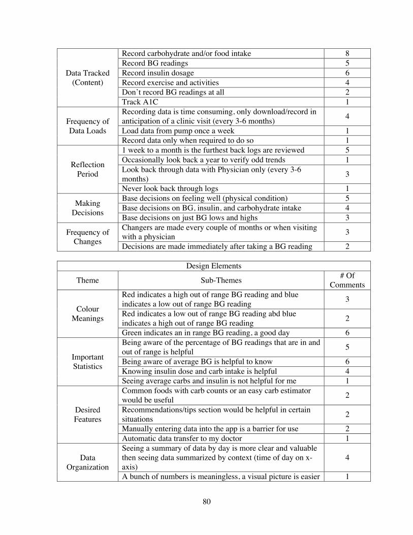
80
Data Tracked (Content)
Record carbohydrate and/or food intake 8 Record BG readings 5 Record insulin dosage 6 Record exercise and activities 4 Don’t record BG readings at all 2 Track A1C 1
Frequency of Data Loads
Recording data is time consuming, only download/record in anticipation of a clinic visit (every 3-6 months) 4
Load data from pump once a week 1 Record data only when required to do so 1
Reflection Period
1 week to a month is the furthest back logs are reviewed 5 Occasionally look back a year to verify odd trends 1 Look back through data with Physician only (every 3-6 months) 3
Never look back through logs 1
Making Decisions
Base decisions on feeling well (physical condition) 5 Base decisions on BG, insulin, and carbohydrate intake 4 Base decisions on just BG lows and highs 3
Frequency of Changes
Changers are made every couple of months or when visiting with a physician 3
Decisions are made immediately after taking a BG reading 2
Design Elements
Theme Sub-Themes # Of Comments
Colour Meanings
Red indicates a high out of range BG reading and blue indicates a low out of range BG reading 3
Red indicates a low out of range BG reading abd blue indicates a high out of range BG reading 2
Green indicates an in range BG reading, a good day 6
Important Statistics
Being aware of the percentage of BG readings that are in and out of range is helpful 5
Being aware of average BG is helpful to know 6 Knowing insulin dose and carb intake is helpful 4 Seeing average carbs and insulin is not helpful for me 1
Desired Features
Common foods with carb counts or an easy carb estimator would be useful 2
Recommendations/tips section would be helpful in certain situations 2
Manually entering data into the app is a barrier for use 2 Automatic data transfer to my doctor 1
Data Organization
Seeing a summary of data by day is more clear and valuable then seeing data summarized by context (time of day on x-axis)
4
A bunch of numbers is meaningless, a visual picture is easier 1

81
to interpret Monthly view of readings isn’t helpful, however, drilling down to outliers is helpful 2
Historical Data Looking at data past a month is not useful; 7,14, and 21 days is all that is required 3
Going as far back as 90 is important 1
Rewards and Motivation
Theme Sub-Themes # Of Comments
Motivation
Fear of future complications motivates patients to stay on track with self-management practices 5
General good health and feeling good motivates patients to stay on track with self-management practices 4
Goals Set goals around A1C 4 Set goals around general health (i.e. being active, maintain good health, etc.) and aim to meet them 4
Rewards Receiving rewards would help keep patients stay on track 3 Immediate positive feedback would be motivational 1

82
Appendix D: User Input & Challenge Screens

83

84
Appendix E – Usability Testing Protocol
Introduction
Hi, my name is Lisa. I’d like to thank you for participating today. We’re in the process
of designing a mobile diabetes self-management application and we would like to get
some input from you. I’ll be presenting you with several scenarios that I’d like you to
complete using a paper prototype. There are no right or wrong answers. Feel free to ask
questions for clarification. Your comments are very important and they will help us
understand your experiences. As outlined in the consent form, this session will be
recorded so we can clearly record your comments.
Before we get started, please fill out this brief pre-study questionnaire.
<Provide a copy of the questionnaire for the participant to complete>

85
Part 1 - Pre-Study Questionnaire
1. In what age range do you belong?
<25 years 25-34 years 35-44 years 45-54 years 55-64 years >65 years
2. Are you?
Female Male
3. How long ago were you diagnosed with Type 1 Diabetes? ______________________
4. How are you currently managing your diabetes?
Pump Subcutaneous Injections Other: _______________________
5. How comfortable are you with using mobile devices and/or mobile applications?
Not Somewhat Comfortable Very Comfortable Comfortable Comfortable
6. Do you currently own a mobile device (ie. Cell phone, iPod touch etc.)?
Yes No
7. If yes, do you currently use mobile apps to help you manage your diabetes?
Yes No
8. If yes, please list the app(s) below:

86
Part 2 - Scenarios
Bant Description
The purpose of this mobile health application is to provide support for adult T1DM
patients. It is to be used multiple times per day to track various diabetes health measures
such as blood glucose, carbohydrate intake, insulin etc. Additional features in the app are
to be used to support self-management related decision-making and provide motivation to
maintain overall good health and wellbeing.
Scenarios
1. It’s dinner time (8pm) on May 1, 2013 and you want to record your most recent BG
reading along with other related information. Open the app and record the info in the
following order:
BG – 5.0 mmol/l
Carb Count – 20 grams
Insulin Bolus – 3.5 units
Activity – Yoga
Emotion - Happy
2. You’ve had your doctor’s visit earlier in the day. Since your goal is to keep your A1C
(8.1) in range, you’d like to record it in the app to keep as a reminder.

87
3. Since it’s the end of the day, you want to have a look through your carbs, insulin,
activity, and how you felt throughout the day. Also, comment on the community blood
glucose.
4. You remember you wanted to share some information with your sister since she’s been
bugging you for updates lately. Email her the details of your day from within the app.
5. It’s the first day of May and you want to see how your blood sugars looked the month
before (April). Have a look through your bant log book to see how you did. In particular,
you want to see what happened on April 23rd.
6a. You’ve made a mental note that your readings before breakfast have been a bit out of
range lately. You’re curious what your average blood glucose at breakfast has been for
the past week. Use the bant app to find out.
6b. Now that you’ve had a glance through what your readings looked like for the past
week, you want to know the percent of times you’ve been in and out of range as well

88
7a . You’re interested in completing some of the challenges that are built into the app.
Explore the various challenges for each tab and find out how far you are from achieving
them.
7b. Now that you’ve had a look through some of the challenges, you’re wondering how
many you’ve completed to date in total. You’re also curious how you’re doing in
comparison to others using the app; find out where you are on the leaderboard.
8. It’s a special occasion and you’re trying a food you’ve never had before; BiBimBop (a
Korean dish of rice with mixed vegetables). Have a look through the food database in the
app to try and get an idea of the carb estimate for this new dish.

89
Part 3 - System Usability Scale
Strongly Strongly Disagree Agree I think that I would like 1 2 3 4 5 to use this system frequently I found the system 1 2 3 4 5 unnecessarily complex I thought the system was 1 2 3 4 5 easy to use I think that I would need the support of a technical person to 1 2 3 4 5 be able to use this system I found the various functions 1 2 3 4 5 in this system were well integrated I thought there was too much 1 2 3 4 5 inconsistency in this system I would imagine that most people would learn to use this system 1 2 3 4 5 very quickly I found the system very 1 2 3 4 5 cumbersome to use I felt very confident using 1 2 3 4 5 the system I needed to learn a lot of things before I could get going 1 2 3 4 5 with this system
(Brooke, 1996)

90
Part 4 – Post Test Questionnaire
1. Please indicate how easy it was to use/understand the following features of the mobile
application:
Feature Very Difficult Difficult Normal Easy Very
Easy Logging a BG & related info Day View Summary bant Book – Calendar view Trends – Scatter plot view Trends – % in/out view Challenges Leaderboard Information Sharing Food/Carb Feature
2. Would you use this application to complement your daily self-management routine?
Not Likely Somewhat likely Likely Very Likely
3. Please list 3 things you liked most about the mobile application:
_____________________________________________________________
_____________________________________________________________
_____________________________________________________________

91
4. Please list 3 things you liked least (found most frustrating) about the mobile
application:
_____________________________________________________________
_____________________________________________________________
_____________________________________________________________

92
5. Please rate the scenarios below on a scale of 1 to 5 for how realistic they are to you:
1 – Not realistic 3 - Realistic 5 – Very realistic
It’s dinner time (8pm) on May 1, 2013 and you want to record your most recent BG reading along with other related information. Open the app and record the info in the following order: BG – 5.0 mmol/l Carb Count – 20 grams Insulin Bolus – 3.5 units Activity – Yoga Emotion - Happy
You’ve had your doctor’s visit earlier in the day. Since your goal is to keep your A1C (8.1) in range, you’d like to record it in the app as a reminder.
Since it’s the end of the day, you want to have a look through your carbs, insulin, activity, and how you felt throughout the day. Also, comment on the community A1C.
You remember you wanted to share some information with your sister since she’s been bugging you for updates lately. Email her the details of your day from within the app.
It’s the first day of May and you want to see how your blood sugars looked the month before (April). Have a look through your bant log book to see how you did. In particular, you want to see what happened on April 23rd.
You’ve made a mental note that your readings before breakfast have been a bit out of range lately. You’re curious what your average blood glucose at breakfast has been for the past week. Use the bant app to find out.
Now that you’ve had a glance through what your readings looked like for the past week, you want to know the percent of times you’ve been in and out of range as well.
You’re interested in completing some of the challenges that are built into the app. Explore the various challenges and find out how far you are from achieving them.
Now that you’ve had a look through some of the challenges, you’re wondering how many you’ve completed to date in total. You’re also curious how you’re doing in comparison to others using the app; find out where you are on the leaderboard.
It’s a special occasion and you’re trying a food you’ve never had before; BiBimBop (a Korean dish of rice with mixed vegetables). Have a look through the food database in the app to try and get an idea of the carb estimate for this new dish.
6. Please share any other comments in the space provided below:

93
Appendix F – Usability Test Raw Data
Feature P1 P2 P3 P4 P5 P6 Logging a BG & related info E VE VE E VE VE Day view summary VE VE VE E VE E bant Book – Calendar view VE N VE N VE E Trends – Scatter plot view VE N VE D VE E Trends - % in/out view N E VD N D N Challenges D VD D N D VE Leaderboard VE VE VE E VE VE Information sharing VE VE N N VE E Food database VE VE E E VE E