demonstrating the analytical utility of gis for police operations: a
TRANSCRIPT

DemonstratingThe Analytical Utility
ofGIS for Police Operations
A Final report
by
James L. LeBeau, Ph.D.Southern Illinois University at Carbondale
Grant: NIJ 97-LB-VX-K010
NCJ 187104
i
Table of Contents
Table of Contents i
Acknowledgements ii
Disclaimers iii
Overview 1
Safe Streets 2Visualization: Seeing Things Differently 2Mapping Out Drug Arrests 10Conclusions 25
Mapping Out Hazardous Space for Police Work 27Introduction 27The Density Model 28
Procedures 30Results 33
The Poisson Probability-SaTScan Model 48 Description of the Model 48
Conclusions 62
Mapping Out Special Events 65Introduction 65Calls For Service, Density, and Contours 66Cross Beat Dispatching 71Calls For Service in the Flood Plain 75Conclusions 77
Summary and Conclusions 79
References 81
Appendix A: Code for Origin & Destination Script 83
ii
Acknowledgements
This project could not have been undertaken without the cooperationand assistance of many fine people associated with the Charlotte-Mecklenburg Police Department, NIJ’s Crime Mapping Research Center,and Southern Illinois University at Carbondale.
I would like to give special thanks to Chief Darrel Stephens andformer Chief Dennis Nowicki of the Charlotte-Mecklenburg PoliceDepartment for their support of this project. I wish to thank Dr. RichardLumb, and CMPD’s excellent Crime Mappers: Monica A. Nguyen, SteveEudy, and Carl Walters (now with the Boston Police Department). Specialthanks is accorded to John Couchell, one of the excellent Crime Mappers,for his assistance and support.
Acknowledgements are also given to my NIJ project director Ms.Cynthia Mamalian, Dr. Nancy LaVigne, Ms. Elizabeth Groff, and Mr. EricJeffris of the Crime Mapping Research Center.
I owe a great deal to the SIUC students that worked on this projectand contributed to this report. KyuWon Park, Blaine Ray, LindsayRobertson, and Steve Schnebly – Thank You! I would like to thank Dr.Dave Bennett former SIUC colleague now on the faculty of the Departmentof Geography at the University of Iowa for his help and guidance.
I would like to thank Pat and Paul Brantingham, Phil Canter, KeithHarries, Bob Langworthy, Andreas Olligschlaeger, George Rengert, andKim Rossmo for their friendship, support, and ideas.
Finally, I want to thank my wife, Gwen LeBeau, for being so patientand supportive.

iii
Disclaimer
This project was supported by Grant No. 97-LB-VX-K010 awardedby the National Institute of Justice, Office of Justice Programs, U.S.Department of Justice. Points of view in this document are those of theauthor and do not necessarily represent the official position or policies of theU.S. Department of Justice.

iv
Disclaimer
Points of view in this document are those of the author and do notnecessarily represent the official position or policies of the Charlotte-Mecklenburg Police Department.
1
Demonstrating the Analytical Utilityof
Geographic Information Systems for Police Operations
Overview
This is the final report of a project involving a partnership between the Charlotte-
Mecklenburg, North Carolina Police Department and Southern Illinois University at
Carbondale. Three modules or projects are discussed.
The first involves a different manner for visualizing the distribution and change of
crime and calls for service by altering the size and/or color of street segments according
to their intensity of crime and/or calls for service. This is called the Safe Streets
approach. The second involves two models for assessing, analyzing, and mapping
Hazardous Space for police work. The third involves using GIS and non-police external
data for analyzing the police response to Special Events or, in this example, a natural
disaster like a flash flood.
Caveats placed on the project by the P.I. were that all the techniques must be
simple and easily understood by future users. Moreover, no exotic hardware or software
must be used. Both must be standard off-the-self items or easily accessed through the
Internet.
2
Safe Streets
Visualization: Seeing Things Differently
This module is concerned with demonstrating how GIS and cartographic design
are used for visualizing and assessing the changes of crime and specific calls for service
across time and urban space. Intoxicated pedestrians and drug arrests are the two
problems examined in this module.
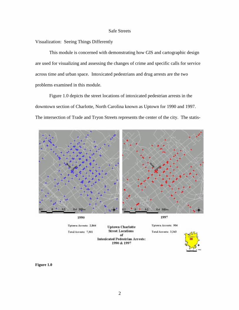
Figure 1.0 depicts the street locations of intoxicated pedestrian arrests in the
downtown section of Charlotte, North Carolina known as Uptown for 1990 and 1997.
The intersection of Trade and Tryon Streets represents the center of the city. The statis-
Figure 1.0
3
tical information indicates a tremendous decrease in the number of arrests between the
two years. Jurisdiction wide, the number of arrests decreased by 54 percent. Uptown’s
arrests decreased by 68 percent. Moreover, Uptown’s proportion of the total arrests
decreased from 38 percent to 27 percent. The numerical evidence suggests profound
differences between the years. Likewise, comparing the maps for the two years suggest a
profound geographical change (Figure 1.0).
There are fewer dots or arrest locations during 1990 over 1997. An area of six
square blocks immediately north of the intersection of Trade and Tryon produces no
arrests during 1997, while during 1990, this area was infested with arrests. Figure 1.0 is
an example of basic mapping and analysis whereby the street-block addresses of crimes
or calls are geocoded and icons or dots are used to mark the locations of these events with
the analysis involving a visual inspection and interpretation of the maps.
These maps, because of their designs, do not impart as much information about
the geographical change of intoxicated pedestrians arrests in the Uptown area. The point
locations are not accurate. The algorithm for geocoding an address from Tiger Street
files involves taking the block number of the address and interpolating its position
between a beginning and ending block range for the street segment regardless of the
actual spacing between and among the addresses and parcels on a segment (U.S. Census,
1997 ; Harries, 1999). An alternative is to match address locations with a file of the
coordinate pairs for property parcels. Hot spots and repeat addresses can be ascertained
with spatial statistical software and visually represented with techniques like graduated
symbol mapping. Yet, the volume and propinquity of the incidents may hamper the
production of a map that is not too cluttered or noisy.
4
A common practice has been to aggregate the point locations into larger areal
units such as census block, groups, tracts or police districts. Such aggregations might be
more convenient and meaningful for managers and produce simpler maps for
interpretation but two properties associated with the modifiable areal unit problem
(MAUP) handicap this practice (Openshaw, 1983). The first, known as the scale problem,
predicts that the same variables analyzed at different levels of aggregation will produce
varying results. This problem has serious implications for long term planning, policy,
and causal analysis. The second, known as the zonation problem, is concerned with the
varying results when point locations are allocated into larger areal units of the same scale
in different ways (Green and Flowerdew, 1996). Monmonier (1996) demonstrated this
problem by allocating the point locations of Dr. Snow’s cholera victims in London during
1854 into three different areal configurations at the same scale (See, Tufte, 1997: 27-37).
Each configuration yielded a different geographical pattern of the cholera problem.
Therefore, with the zonation problem, it is possible to place point locations into larger
geographical units and completely hide, distort, or define problem areas (See,
Monmonier, 1996: 158). Overcoming these problems require a visualization solution
which simultaneously allows one to assess the magnitude and fluctuation of a crime
problem without overly distorting its location.
The solution to this problem involves aggregating the point locations to a feature
that is smaller than the usual areal units such as census tracts or police districts. The
definition of this feature should be uniformly understood. For example, the definitions
and dimensions of police districts, beats, or response areas vary from jurisdiction to
jurisdiction. Features like street segments and intersections, because they are the daily

5
navigational aids for patrol officers, are more uniformly understood. The street segment
or intersection as the unit of analysis was used in the pioneering work on policing drug
hots spots (Weisburd and Green, 1994 & 1995). However, this project augments the
earlier work by providing a more precise method for mapping.
Intoxicated pedestrian arrests are usually outdoor incidents. The recorded
locations for the arrests are usually street block locations, however, many incidents use
street intersections as a spatial reference. The intersection often may be the default
location recorded because an individual is arrested some where along the street but not
near a readily identifiable specific address. The point locations in this demonstration will
be aggregated into street intersections and segments. The attribute for mapping will be
the number of intoxicated pedestrian arrests for each intersection or street segment.
There are two steps in this procedure. The first involves address matching all the
arrests recorded at intersections. The X,Y coordinates for each incident are retrieved by
using the View.AddXYCoordToFTab script. Unique intersections are identified by
truncating the coordinates into whole numbers and concatenating the whole numbers for
the X,Y coordinates into a single number. Thus, creating a unique identifier for each
intersection. The intersections are summarized by identifier creating a new coverage
with the total number of arrests for each intersection.
The second step is related to the common point-in-polygon procedure in
ArcView. Instead of measuring the number of points within a polygon or areal unit, a
point-on-line match is conducted measuring the number of arrests on each street segment.
The latter procedure, which we call Safe Streets, has been used in other applications. We
are trying to expand its use in crime mapping.

6
Figure 2.0 depicts the spatial distribution of intoxicated pedestrians during 1990
in Uptown Charlotte. This is a graduated symbol map with intersection size varying with
the frequency of arrests. This representation technique is fairly common, however,
varying the size of the street segments according to arrest frequency is not common.
Graduating the sizes of the intersections and streets allows one to easily ascertain where
intoxicated pedestrian problems are more prevalent. Moreover, it is just as informative to
be able to see the intersections and street segments that do not experience arrests.
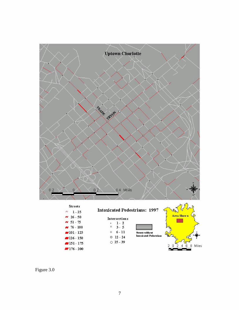
Figure 3.0 depicts the spatial distribution of intoxicated pedestrians during 1997
in Uptown Charlotte. The same techniques used in Figure 2.0 are employed.
Furthermore, both maps used the same legend and scale in order to facilitate compari-
sons.
Comparing Figures 2.0 and 3.0 reveals a dramatic decrease in arrests during 1997.
While Tryon Street and the intersections along it are recording the highest number of
arrests during 1997, the intensity is not as great as 1990. As indicated in Figure 1.0, it
appears that the area north of the intersection of Trade and Tyron streets has experienced
a dramatic decline in arrests.
Changes between the years can be more easily assessed through the production of
a single map. This is possible because the frequencies of intoxicated pedestrian arrests
for two different years are recorded as attributes for each street segment and intersection.
Figure 2.0
7
Figure 3.0

8
It is possible to create a difference map by subtracting one map from the other. Thus,
creating Figure 4.0, which is the Change in Intoxicated Pedestrians: 1990-1997.
Exhibiting the spatial distribution of change complicates the visualization
representation. First, in order to make comparisons across the years, the same legends
are used for calibrating the frequencies of arrests in intersections and street segments.
Second, mapping out the totality of change requires not only mapping out the increases
and decreases of arrests on streets and in intersections, but depicting those features which
had the same number of arrests during both years and those that did not have any arrests.
Finally, the changes have to be represented by colors that easily communicate the
direction of the change to the map-reader.
In Figure 4.0, the streets and intersections are graduated in size in order to
represent the magnitude of change. The color scheme represents the type or direction of
change. Red, because the color is a metaphor for fire or hot temperatures, represents an
increase. Blue, as a metaphor cooling or colder, represents a decrease. Yellow represents
the features that experienced the same number of arrests between the years. Streets and
intersections that did not have any arrests are represented in light gray.
Figure 4.0 confirms what was gleaned from comparing Figures 2.0 and 3.0.
There is a dramatic decline in intoxicated pedestrian arrests along the segments and
intersections of Tryon and West Trade Streets. The majority of intersections and
segments experiencing arrest increases are to the south, east, and west of this major
intersection. For example, the large increasing street segment on E Trade St between two
decreasing intersections and contiguous to a street segment reporting the same number of
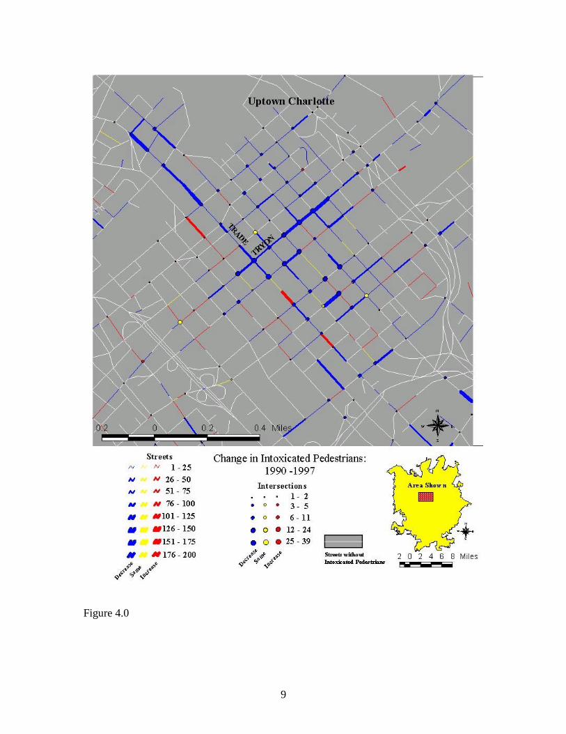
9
Figure 4.0
10
arrests is the Charlotte Transportation Center, which is the major hub for the city’s public
bus system. It is difficult to assess the factors that are responsible for the dramatic
reduction in intoxicated pedestrian arrests. Several factors are possible including new
construction removing the places for intoxicated pedestrians to linger and CMPD
enforcing an open bottle ordinances.
Mapping out intoxicated pedestrian arrests may not be an important call for
service to examine but this mundane problem was excellent for demonstrating the
visualization technique. The next discussion applies the Safe Streets technique to the
more frequent and serious problem of drug arrests
Mapping Out Drug Arrests
Drug arrests during 1997 and 1998 are mapped using the Safe Streets technique.
This illustration is divided into three parts. The first is similar to the discussion of
intoxicated pedestrians and focuses on the annual depictions of the counts of drug arrests
across street segments and the difference between the years. The second uses a different
metric for mapping drug arrests. Instead of counts or frequencies, drug arrests are
expressed as arrests per street segment mile. A change or difference map between the
years and a second map depicting change in terms of standard deviational units have
been constructed. The final portion discusses this type of mapping as a graphical
technique for measuring and visualizing displacement. Specific neighboring street
segments registering opposite extreme changes are nominated as examples of spatial
displacement.

11
During 1997 and 1998, there are 5,056, and 5,211 drug arrests respectively.
Viewed in another way: out of the 34,463 street segments in Charlotte-Mecklenburg
County, 2,056 had at least one drug arrest during 1997. The number of drug arrest
segments increases to 2,158 during 1998. These simple statistics imply that drug arrests
increased and moved from 1997 to 1998. Mapping drug arrests with the Safe Streets
technique helps one to see the geographic distribution and change in drug arrests.
Figure 5.0 is the number of drug arrests by street segments during 1997. The
segments experiencing arrests are in red and the number of arrests graduates the width of
the segment. The area depicted in the maps has experienced the majority of the drug
arrest for both years. This area includes the Uptown section examined in the previous
discussion of intoxicated pedestrians and other neighborhoods of the Charlotte central
core.
The inset shows the area depicted in relation to the total jurisdiction of the
Charlotte-Mecklenburg Police Department. The blue lines and yellow letters are the
boundaries and designation of the Bureau-District-Response areas (BDR). Patrol
operations are organized along four Bureaus (see map inset). These are divided into
approximately 12 districts with each district divided into 4 to 9 response areas.
Therefore, D12, means that the polygon is David Bureau’s District 1, Response Area 2.
According to Figure 5.0, there are many street segments with drug arrests, during
1997, however, some standout more than others. The wide street on the west side of
BDR D32 is Willis Street which runs through the Piedmont Courts Public Housing
Project. There were 48 arrests during 1997. Another anomaly appears in D11. The large
street southwest of the label is Fourth Street and the address generating 76 drug arrests is
12
the Mecklenburg County Jail. These arrests were made elsewhere but the jail address
was used as the default address. Therefore, this is a false hot spot. There are many street
segments in Figure 5.0 experiencing drug arrests.
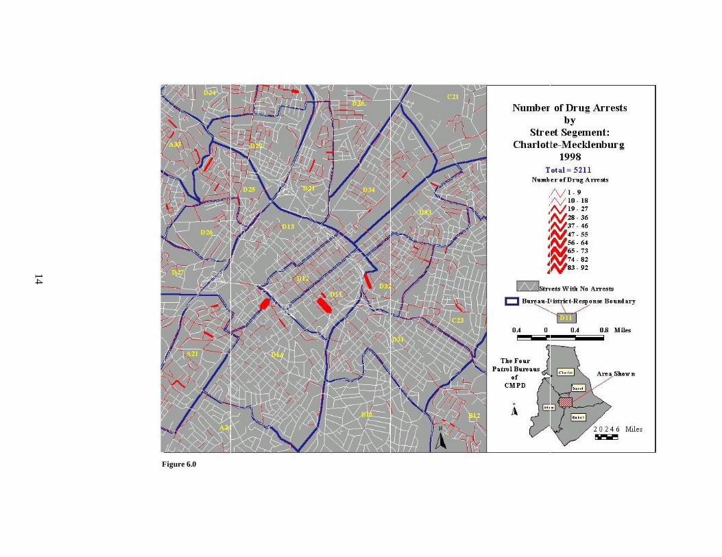
Figure 6.0 depicts drug arrests during 1998. The legends and data scales are the
same as Figure 5.0. Therefore, it is easier to compare changes in the geographic
distribution of drug arrests. The anomalies appearing during 1997 are similar during
1998, however, there are other segments which have emerged with higher frequencies.
Most conspicuous is the segment on the border between BDRs D14 and D13 in the west
central portion of the map. Moreover, other segments have increased in other BDR’s
(e.g., A21 and D25). Figures 5.0 & 6.0 are clearer pictures of the spatial variation of
drug arrests for each year. Constructing a difference or change map provides a more
precise visualization of changes.
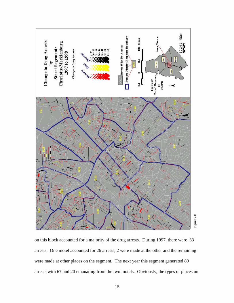
Figure 7.0 depicts the segment changes in drug arrests between the two years.
Again red indicates an arrest increase; yellow the same numbers of arrests between the
years; while black depicts a decrease. Obviously, because this is a change or difference
map, the high frequency arrest segments for each year are not presented. Using Figures
5.0 and 6.0 as baselines, Figure 7.0 shows the magnitude and direction of change across
the segments.
The previously discussed Piedmont Courts area in D32 records an arrest decrease.
The Mecklenberg County Jail in D11 exhibits a moderate increase, while the street
segment on the border between D13 and D14 indicates a tremendous increase. This
segment is the 1000 –1098 block of South Tryon Street and two lower scale motels on

13
Figure 5.0
14
Figure 6.0
15
Fig
ure
7.0
on this block accounted for a majority of the drug arrests. During 1997, there were 33
arrests. One motel accounted for 26 arrests, 2 were made at the other and the remaining
were made at other places on the segment. The next year this segment generated 89
arrests with 67 and 20 emanating from the two motels. Obviously, the types of places on
16
this segment and their management were attractive to drug trade businesspersons and
their clients.
Across Figure 7.0 one can observe other BDRs with segments experiencing
extreme increases in drug arrests (e.g, A21) and others showing extreme decreases (e.,g
D27). Still, it is important to observe how interconnected streets can have segments
alternating with increases, decreases, and static arrests. For example, returning to BDR
D32 in the southwest corner, there is subnet of segments showing decreases. Directly
northeast there is another subnet of segments most of which experienced arrest increases;
and further northeast is another subnet of segments with a mixture of arrest activities.
The point is this BDR is heavy with drug activities and the mixture of street segments in
such a small space with different arrest activities implies there might be displacement-
taking place. An increase of police activities (i.e., arrests) on some segments may move
drug activities to other streets. However, this notion of displacement infers that the
problem may disappear from one place and pop-up in another. What is occurring in BDR
D32 may not be displacement but drug activity circulation. Circulation whereby a
specific segment may oscillate through three time periods going from high activities –to
low activity- and then back to high activity
These discussions have pertained to expressing the frequencies or counts of
intoxicated pedestrians or drug arrests by street segment. Another mode for viewing and
analyzing crime and calls for service is to express the variable in a ratio unit which
standardizes interpretation. The following discussions reexamine drug arrests between
1997 and 1998. This time, instead of using counts or frequencies of arrests for each
segment, the new metric will be the number of drug arrests per street segment mile. This
17
metric controls for the differential length of street segments, but does not incorporate
street types and widths.
The procedure for calculating this new variable or attribute is very straight-
forward. First, in the street file, the user needs to be certain that the segment length is in
the desirable measure (miles or kilometers). After the number of arrests have been deter-
mined for each segment, the attribute table is put into edit mode and a new field is
created. The new field will be arrests/mile(kilometers) and is simply the number of
arrests divided by the segment length.
During 1997, the 5,056 drug arrests across Charlotte-Mecklenburg’s 3,990.74
miles of streets yields an average of 1.53 arrests per mile. This number increased to 1.6
during 1998, with its 5,211 drug arrests. However, out of Charlotte-Mecklenburg’s
34,463 street segments, only 2,056 and 2,158 during 1997 and 1998 respectively
experienced drugs arrests. Despite the increase in segments and arrests between the years,
the number of arrests/mile remained fairly static at 25.64 arrests/mile during 1997 and
25.61 during 1998.
Using this new measure creates a different map compared with the those showing
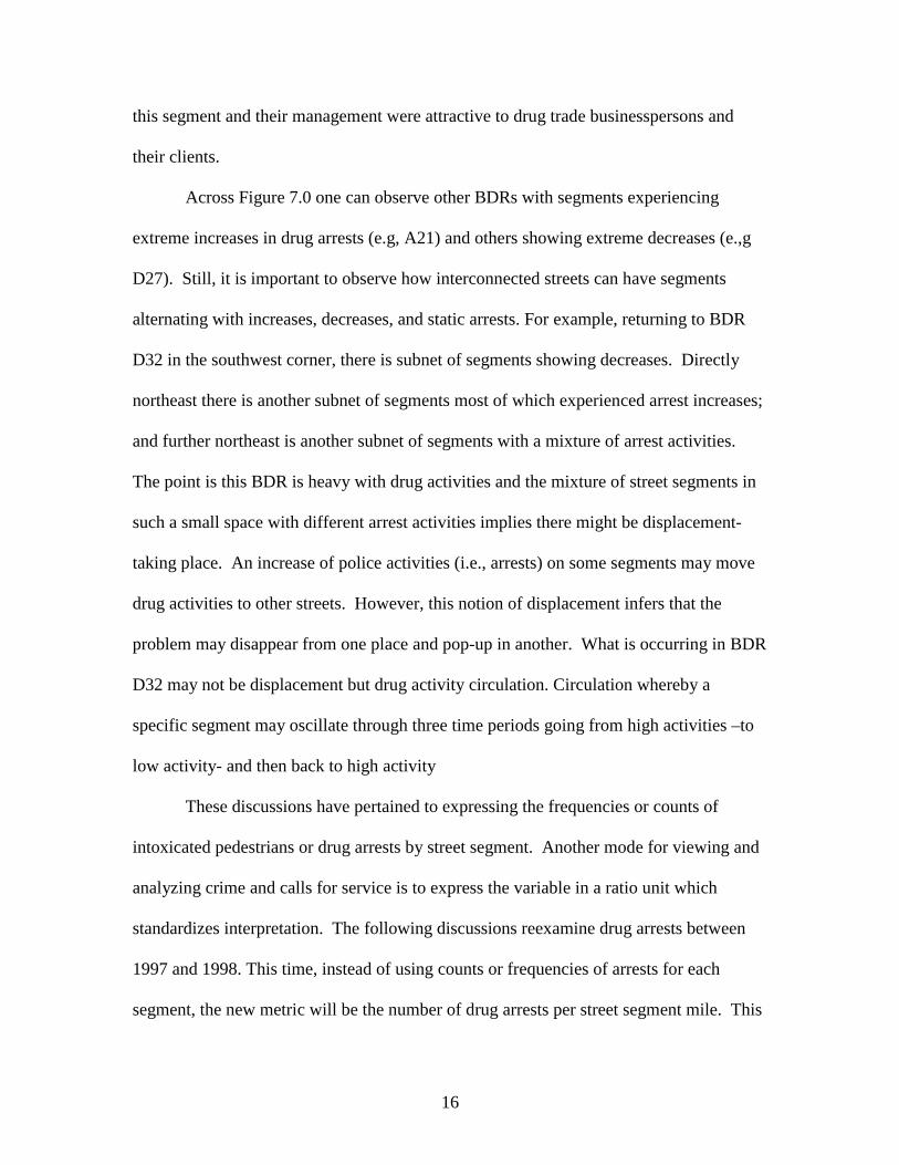
only frequencies. Figure 8.0 depicts the drug arrests/mile during 1997. This measure
accentuates the arrest activities. Most BDRs have many segments with a number of
arrests per mile. For example, the boundary between D21 and D35 (Statesville Avenue)
in the northern portion of Figure 8.0 reveals interconnected segments with high rates of
arrests. Using the frequency counts only by segment obscured this problem (See Figure
8.0).
18
Figure 8.0
19
Fig
ure
9.0
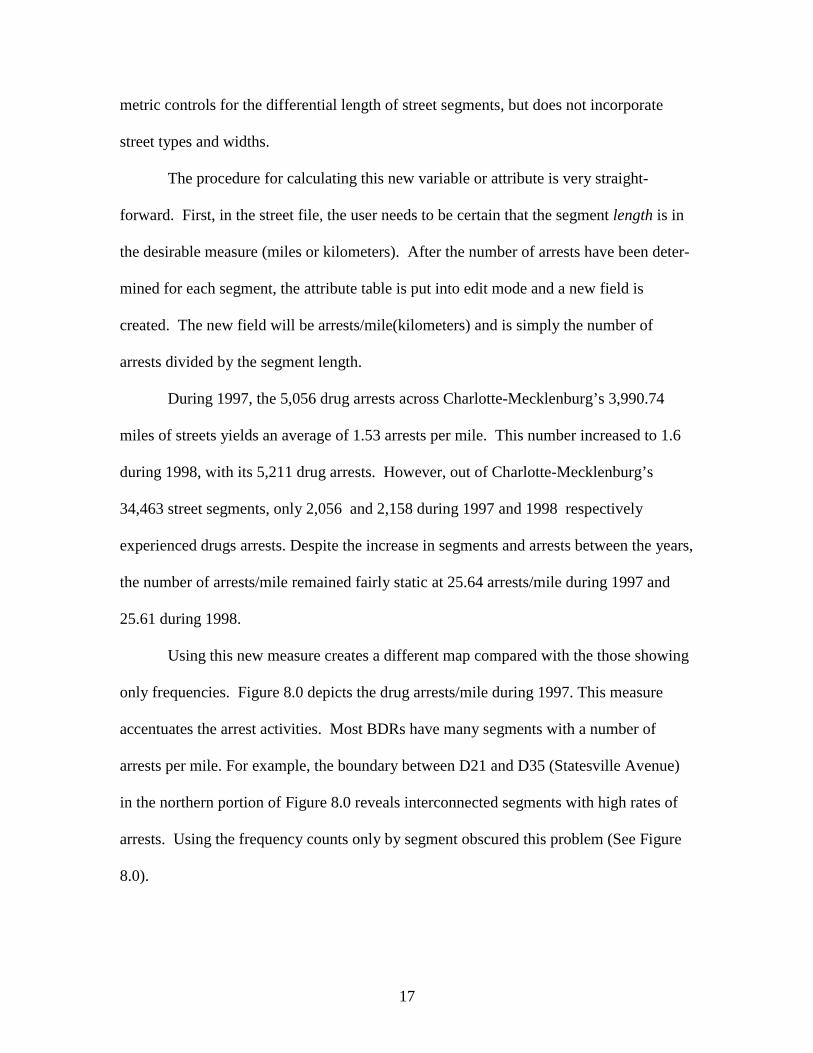
Figure 9.0 depicts drug arrests/mile during 1998. Like the previous figure, this
one accentuates the drug arrest problems by street segment. This measure reveals a very
20
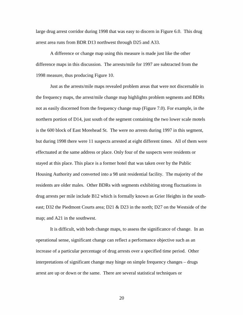
large drug arrest corridor during 1998 that was easy to discern in Figure 6.0. This drug
arrest area runs from BDR D13 northwest through D25 and A33.
A difference or change map using this measure is made just like the other
difference maps in this discussion. The arrests/mile for 1997 are subtracted from the
1998 measure, thus producing Figure 10.
Just as the arrests/mile maps revealed problem areas that were not discernable in
the frequency maps, the arrest/mile change map highlights problem segments and BDRs
not as easily discerned from the frequency change map (Figure 7.0). For example, in the
northern portion of D14, just south of the segment containing the two lower scale motels
is the 600 block of East Morehead St. The were no arrests during 1997 in this segment,
but during 1998 there were 11 suspects arrested at eight different times. All of them were
effectuated at the same address or place. Only four of the suspects were residents or
stayed at this place. This place is a former hotel that was taken over by the Public
Housing Authority and converted into a 98 unit residential facility. The majority of the
residents are older males. Other BDRs with segments exhibiting strong fluctuations in
drug arrests per mile include B12 which is formally known as Grier Heights in the south-
east; D32 the Piedmont Courts area; D21 & D23 in the north; D27 on the Westside of the
map; and A21 in the southwest.
It is difficult, with both change maps, to assess the significance of change. In an
operational sense, significant change can reflect a performance objective such as an
increase of a particular percentage of drug arrests over a specified time period. Other
interpretations of significant change may hinge on simple frequency changes – drugs
arrest are up or down or the same. There are several statistical techniques or
21
Fig
ure
10.0
measures that can be used to assess the significance of change. The simplest one is to
examine the standard deviation of change within the normal curve.

22
Figure 11.0 shows the standard deviational change of drug arrests per mile
between 1997 and 1998. The average change was an increase of 1 drug arrest per mile.
The standard deviation was 42 arrests per mile. The red graduated streets represents
increases of drug arrests while the black represents decreases. Therefore, 1 standard
deviation is an increase or decrease of 42 drug arrests/mile; 2 is 84; 3 is 128.
Statistically, an increase or decrease of 2 or more standard deviations corresponds to the
95 percent of the area under the normal curve. Presumably, there is a 5% chance that the
changes observed are random and not systematic. There is a major drawback with using
the normal distribution. Often attributes or variables like those used in this study are not
normally distributed, thus making it necessary to transform the data. Fortunately, this
was not the case with Figure 11.0, but it was with many of the others.
Figure 11.0 is a map that seems to be less noisy than the other maps, so it is easier
to detect significantly changing street segments. Segments beyond 2 standard deviations
are considered significant change. Significant increases and decreases are revealed in
BDRs B12, A21, D27, D25, D23, D21 and D32. Furthermore, the segments on S Tryon
and E Morehead St in D14, previously discussed, register as being significant. This
visualization technique allows one to examine the possible occurrence of displacement.
BDR David 27 (D27) located in the western portion of Figure 11.0 is highlighted
in Figure 12.0. Segments of two major arterial streets are of importance in this
illustration. W. Morehead Street, which is about .19 miles, is bordered on the north by
commercial land use and on the south by light industrial use. Wilkinson Blvd, which
.187 miles, is surrounded by commercial land use. According to the 1990 Census, 75%
of the 2,120 people residing in the two-census block groups that comprise D27 are

23
Fig
ure
11.0
African American. The majority of the households are renters with over 142 Section 8
properties in D27. This area is located in an older part of the city. Wilkinson Blvd used
to be the main artery on the city’s westside, but it’s prominence diminished over the years

24
Figure 12.0
because of interstate highway development and more rapid growth in other parts of the
city.
25
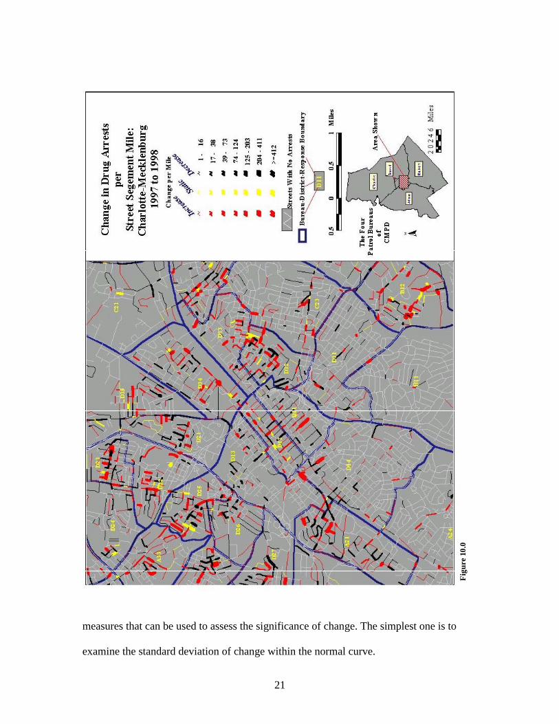
During 1997 and 1998, there were 120 and 102 drug arrests respectively in D27.
Each year over a third of the arrests emanated from one of the two segments. During
1997, 42 arrests were made on W Morehead St and five during 1998. Wilkinson Blvd had
the opposite experience with 9 during 1997 then 42 during 1998. A lower scale motel -
boarding house on W. Morehead St accounted for 36 of the 42 arrests during 1997. Two
similar types of places on Wilkinson Blvd accounted for 35 of the 42 arrests during 1998.
The inference being made is that the arrests made on W. Morehead St displaced drug
activities to similar types of venues or places on Wilkinson Blvd, thus this segment
generated the larger number of arrests during 1998. Three of the people arrested on W.
Morehead St during 1997 were arrested again on Wilkinson Blvd during 1998. The three
factors of proximity, similarity of venues, and the same actors or suspects strongly point
to displacement as the process creating this spatial pattern.
Conclusions
The Safe Streets technique provides an intermediate aggregation process between
small point locations and large areal units. The new unit of analysis is the street segment,
which is a valid and easily understood geographic feature. By aggregating crimes and
calls for service to the street segment, it is easier to visualize and interpret maps instead
of having to wade through a mass of dots or icons indicating events at a location. The
point location information can be used in tandem with the street segments. This method,
coupled with techniques in cartographic design, allows one to produce maps examining
the changes in crime frequencies or crimes per mile per street segment between different
time periods.

26
This technique provides flexibility for the user. Cartographically, graduating
street color instead of size is another way for visualizing a problem. Statistically and
analytically, the X,Y coordinates of the segment’s midpoint can be extracted with a script
and used as the unit of analysis for interpolation and other spatial analytic techniques.
There are many other applications for this technique including: using the street
segment as the unit of analysis for crime maps or registered sex offender maps intended
for public consumption and providing a visual record of the amount of officer time or
departmental resources spent on special projects on a particular street segment.
Moreover, this technique has been used in maps of robbery and burglary in Baltimore
County, Maryland and drunk driving in Phoenix, Arizona. Informal reactions from crime
analysts from both police departments have been very favorable. One crime analyst felt
that the Safe Streets technique with the intersections would be excellent for describing,
assessing, and analyzing traffic accident patterns.
Another major benefit of this technique is that it is simple to do. There are three
essential components: ArcView, a street file, and an incident file. The fourth essential
component would be an analyst with some cartographic skills.

27
Mapping Out Hazardous Space For Police Work
Introduction
Geographic information systems, automated mapping, and spatial analysis are
becoming valuable tools for policing. These tools have been mainly employed in crime
analysis and are functionally linked with police computer aided dispatch and records
management systems. These systems routinely capture a wealth of data about the
specifics of crimes and calls for service including precise information about location.
This mass of data contains useful information for crime analysis, but from this
information we can also find out about the details and locations of incidents or calls
where police officers are injured, use force, request immediate help, and are dispatched to
potentially dangerous situations. The commonality among these different types of
incidents is that they are dangerous or hazardous situations. Combining these hazardous
incidents and mapping out their geographic attributes allows one to visualize the spatial
variation of hazardous incidents. The following is a discussion on using GIS and spatial
models for delineating and visualizing hazardous spaces for police work. Two methods
are discussed. The first examines the densities of hazardous incidents and creates a
composite map of hazardous space. The second, is a Poisson probability based model
that is used to assess risk rates for each of the different types of hazardous incidents.
28
The Density Model
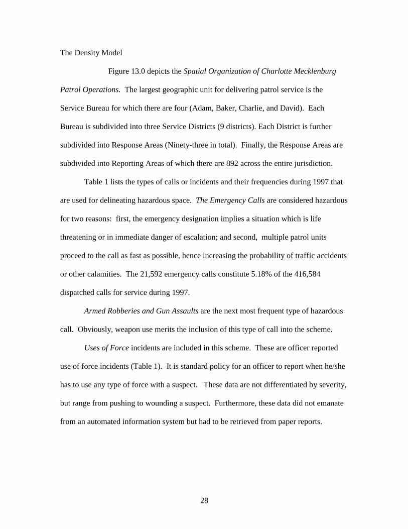
Figure 13.0 depicts the Spatial Organization of Charlotte Mecklenburg
Patrol Operations. The largest geographic unit for delivering patrol service is the
Service Bureau for which there are four (Adam, Baker, Charlie, and David). Each
Bureau is subdivided into three Service Districts (9 districts). Each District is further
subdivided into Response Areas (Ninety-three in total). Finally, the Response Areas are
subdivided into Reporting Areas of which there are 892 across the entire jurisdiction.
Table 1 lists the types of calls or incidents and their frequencies during 1997 that
are used for delineating hazardous space. The Emergency Calls are considered hazardous
for two reasons: first, the emergency designation implies a situation which is life
threatening or in immediate danger of escalation; and second, multiple patrol units
proceed to the call as fast as possible, hence increasing the probability of traffic accidents
or other calamities. The 21,592 emergency calls constitute 5.18% of the 416,584
dispatched calls for service during 1997.
Armed Robberies and Gun Assaults are the next most frequent type of hazardous
call. Obviously, weapon use merits the inclusion of this type of call into the scheme.
Uses of Force incidents are included in this scheme. These are officer reported
use of force incidents (Table 1). It is standard policy for an officer to report when he/she
has to use any type of force with a suspect. These data are not differentiated by severity,
but range from pushing to wounding a suspect. Furthermore, these data did not emanate
from an automated information system but had to be retrieved from paper reports.

29
Figure 13.0

30
Table 1: Hazardous Incidents & Calls 1997
Calls-Incident Types NumberEmergency Calls For Service 21,592Armed Robberies and Gun Assaults 3,523Use of Force Incidents 410Injuries to Officers 245Help Me Quick Calls 44
Injuries to Officers is another type of hazardous incident or call that had to be
retrieved from paper reports. These data include all injuries to sworn police officers in
the field. Eliminated from these data are injuries received during training and injuries to
civilians and officers in an office setting. Like the Use of Force, the injury data are not
differentiated by severity.
The last type of call is the least frequent, but in many respects is the most
hazardous. The Help Me Quick Call is one where an officer is in the field and becomes
involved in a situation where he or she requires immediate assistance or backup. As
revealed in Table 1 there were 44 such incidents during 1997. This type of call generates
a rapid response from numerous patrol units. During 1997, a total of 245 patrol units
responded to the 44 calls. This is an average of 5.5 units per call with a maximum of 35
patrol units responding to one call.
Procedures
Three interrelated pieces of software are used for this analysis. ESRI’s ArcView
GIS software and its Spatial Analyst extension are used for managing and analyzing data

31
and producing maps.1 The Crimestat’s nearest neighbor analysis routine is the third piece
of software (Levine, 1999).
The rationales and justifications will be discussed later, but there are seven basic
steps in the analysis: 1) the point coordinates for the street block addresses of the
incidents/calls are acquired through address matching; 2) using Spatial Analyst a ½ mile
grid coverage is constructed for Charlotte-Mecklenburg ; 3) five grids are constructed
measuring the density of the specific types of calls or incidents per square mile; 4)
frequency histograms of the grid densities are constructed for each incident/call; 5)
extreme significant thresholds levels for each density grid are selected from inspecting
the histograms and descriptive statistics; 6) new threshold integer maps are constructed
with grids meeting or exceeding the thresholds determined in step 5 receiving a score of 1
while other grids set to 0; and 7) the five threshold maps are added together with grids
recording a score of 5 being the most hazardous.
The rationale and justification for the ½ mile grids is a bit involved. There are
numerous rationales or rules of thumbs for selecting the grid size and a search radius for
smoothing the data if one were to use kernel methods (See, Williamson, D., et al, 1999).
The purpose of this analysis is to show the spatial co-variation of five phenomena, but the
spatial properties for each vary greatly. This conclusion was reached after examining the
average first, fifth, and tenth order nearest neighbor statistics for each incident or call
type (Table 2) (See, Bailey and Gatrell, 1995: pp. 88-90; and Levine, 1999; pp. 137-
142). The average nearest neighbor distances are too dissimilar, so as an alternative a ½
mile grid cell size and search radius are used because a ½ mile (2640 feet) is about the
1 Environmental Systems Research Incorporated (ESRI) is based in Redlands, California, and developedArcView and its Spatial Analyst extension.
32
average first order nearest neighbor distance between and among the centroids of the 892
reporting areas.2 This procedure produced a grid of 4118 cells.
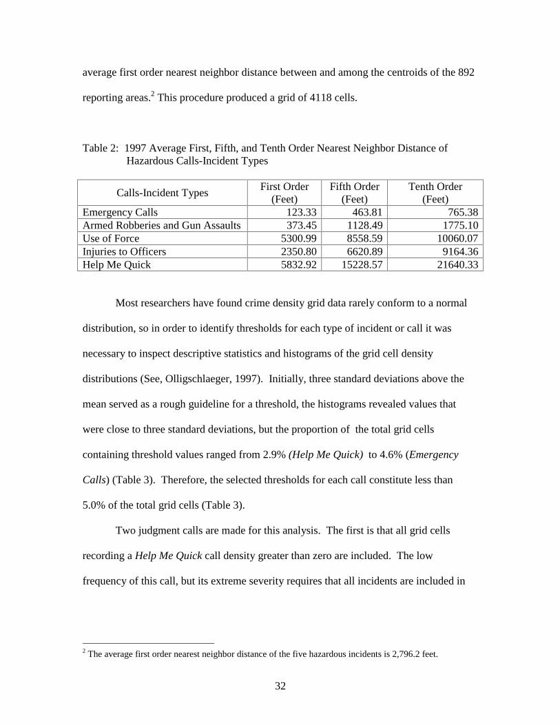
Table 2: 1997 Average First, Fifth, and Tenth Order Nearest Neighbor Distance of Hazardous Calls-Incident Types
Calls-Incident TypesFirst Order
(Feet)Fifth Order
(Feet)Tenth Order
(Feet)Emergency Calls 123.33 463.81 765.38Armed Robberies and Gun Assaults 373.45 1128.49 1775.10Use of Force 5300.99 8558.59 10060.07Injuries to Officers 2350.80 6620.89 9164.36Help Me Quick 5832.92 15228.57 21640.33
Most researchers have found crime density grid data rarely conform to a normal
distribution, so in order to identify thresholds for each type of incident or call it was
necessary to inspect descriptive statistics and histograms of the grid cell density
distributions (See, Olligschlaeger, 1997). Initially, three standard deviations above the
mean served as a rough guideline for a threshold, the histograms revealed values that
were close to three standard deviations, but the proportion of the total grid cells
containing threshold values ranged from 2.9% (Help Me Quick) to 4.6% (Emergency
Calls) (Table 3). Therefore, the selected thresholds for each call constitute less than
5.0% of the total grid cells (Table 3).
Two judgment calls are made for this analysis. The first is that all grid cells
recording a Help Me Quick call density greater than zero are included. The low
frequency of this call, but its extreme severity requires that all incidents are included in
2 The average first order nearest neighbor distance of the five hazardous incidents is 2,796.2 feet.

33
delineating hazardous areas. The second pertains to the issue of the intercorrelation
between and among the different incidents and calls. The fact of the matter is that there
is significant intercorrelation, but including the redundant information weights the grid
cell. A Help Quick Me Call is an emergency; it can involve an armed robbery or gun
assault, injuries to officers, or the use of force.
Table 3: Thresholds For Hazardous Incidents & Calls 1997
Incident & Call Types Threshold/Sq.Mi.
N Grid Cells % ofTotal Cells
Emergency Calls For Service
> 145.89 193 4.60
Armed Robberies and Gun Assaults
> 27.82 189 4.58
Use of Force Incidents> 3.77 162 3.93
Injuries to Officers> 2.34 159 3.86
Help Me Quick Calls> 0.00 123 2.90
Finally, another caveat that needs to be mentioned is that this analysis is focused
on defining hazardous space by identifying the spatial co-occurrence of high densities of
the five incident-call types. Thus, risk rates are not assessed or produced in this analysis.
Results
Figure 14.1 shows the Emergency Calls/Sq. Mile during 1997. The highest
emergency call densities are mainly confined to the central portion of the map within the
David Patrol Bureau (compare Figures 13.0 and 14.1). This patrol bureau has the greatest
opportunities for generating large volumes of emergency calls because the Central
Business District is a majority of the bureau. This area is the focus or hub of a majority
of the daily commuting activity for work, business, and entertainment. Moreover, this
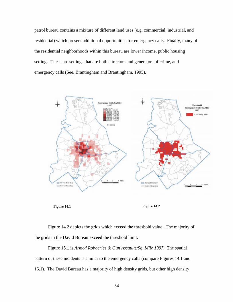
34
patrol bureau contains a mixture of different land uses (e.g, commercial, industrial, and
residential) which present additional opportunities for emergency calls. Finally, many of
the residential neighborhoods within this bureau are lower income, public housing
settings. These are settings that are both attractors and generators of crime, and
emergency calls (See, Brantingham and Brantingham, 1995).
Figure 14.1 Figure 14.2
Figure 14.2 depicts the grids which exceed the threshold value. The majority of
the grids in the David Bureau exceed the threshold limit.
Figure 15.1 is Armed Robberies & Gun Assaults/Sq. Mile 1997. The spatial
pattern of these incidents is similar to the emergency calls (compare Figures 14.1 and
15.1). The David Bureau has a majority of high density grids, but other high density
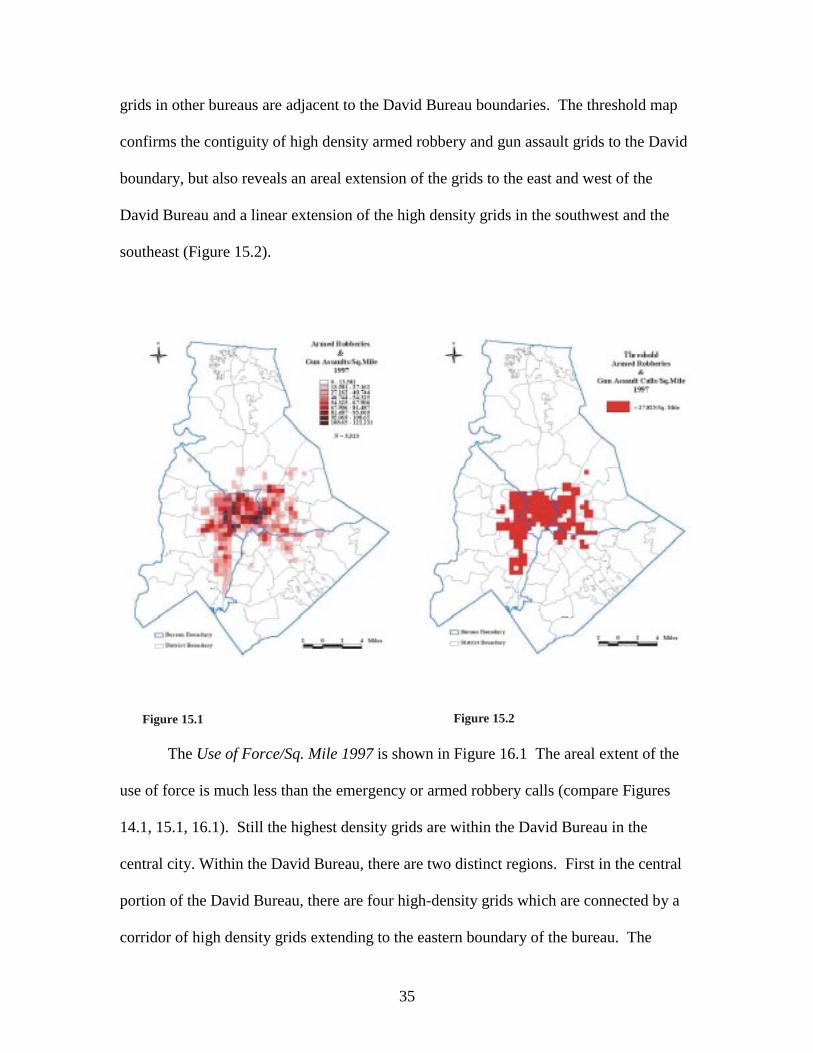
35
grids in other bureaus are adjacent to the David Bureau boundaries. The threshold map
confirms the contiguity of high density armed robbery and gun assault grids to the David
boundary, but also reveals an areal extension of the grids to the east and west of the
David Bureau and a linear extension of the high density grids in the southwest and the
southeast (Figure 15.2).
Figure 15.1 Figure 15.2
The Use of Force/Sq. Mile 1997 is shown in Figure 16.1 The areal extent of the
use of force is much less than the emergency or armed robbery calls (compare Figures
14.1, 15.1, 16.1). Still the highest density grids are within the David Bureau in the
central city. Within the David Bureau, there are two distinct regions. First in the central
portion of the David Bureau, there are four high-density grids which are connected by a
corridor of high density grids extending to the eastern boundary of the bureau. The
36
second lies in the west and northwest portions of The David Bureau adjacent to high
density Use of Force grids in the Adam Bureau. The former region encompasses the
heart of the downtown and to its east are lower income public housing residential areas.
The latter region incorporates similar residential neighborhoods but also has a large mix
of commercial and industrial land use. The threshold map (Figure 16.2) indicates the
threshold Use of Force grids are mainly contiguous. However, there is not the
contiguous linear extension of grids in the southwest and the southeast. There are,
however, isolated small clusters of grids or islands of the use of force in the outlying
areas.
Figure 16.1 Figure 16.2
Figure 17.1 depicts Injuries/Sq. Mile 1997. The frequency of this type of incident
is lower than the previously discussed incidents; hence the areal extent is less. The David
Bureau contains the highest densities of officers’ injuries. The injury patterns within the

37
David Bureau are similar to the use of force patterns. The threshold map (Figure 1 7.2)
indicates that the David Bureau has the largest concentration of high-density injury grids.
While there are isolated clusters or islands in the outlying areas, one can clearly discern
three corridors or linear patterns of high injuries. The first is due east of the David
Bureau in the Charlie Bureau. The second is due south of the first lying on the boundary
between the Charlie and the Baker Bureaus. The third lies southwest of the David
Bureau in the Adam Bureau.
Figure 17.1 Figure 17.2
Figure 18.0 is Help Me Quick (10-33) Calls/Sq. Mile 1997. This map also serves
as the threshold map since all of the Help Me Quick calls are used in this analysis. Like
the other calls and incidents these have their highest concentrations in the central part of
the city in the David Bureau. This would be expected, however, there are numerous grids
or islands outside the central concentration recording a high density of calls. The paucity

38
of Help Me Quick calls would make any generalizations about their spatial persistence
short lived if one mapped out similar calls for other years. For example, during other
years, there would still be the central concentration of calls but the locations of the
outlying calls might vary from year-to-year or be spatially random. Nevertheless, as
previously stated, the severity of these calls requires that they all are included in the
delineation of hazardous space.
The sum of the five threshold maps is presented in Figure 19.0. Grids receiving a

39
score of five are presented in red, thus having the highest density of all five hazardous
calls or incidents. Only 39 grids or .95% of the total 4,118 grids record the highest
hazard level (Table 4). Viewed another way, less than 8 % of the grids constituting
Charlotte - Mecklenburg contain any level of hazard whatsoever.
Table 4 : Areal Extent of Hazard Levels 1997
HazardLevel N Grids % of Total
0 3793 92.111 109 2.652 69 1.683 54 1.314 54 1.315 39 0.95
The spatial pattern of the hazardous areas should not be a surprise given the
review of the five threshold maps (Figure 19.0). The general impression of the
geographic distribution of hazardous areas throughout Charlotte-Mecklenburg is that
there is a distance decay effect. The greater the distance from the central part of the city
and the David Bureau the lower the hazardousness. This effect is not uniform in all
directions there is directional bias. For example, east and southeast of the David Bureau,
there is a large contiguous mass of hazardous grids of varying levels. A similar pattern
appears in the west and southwest. Conspicuously inactive or missing are hazardous
grids immediately north and south of the David Bureau. An important question to be
answered through examining similar data from several time periods is: are the outlying
lower level hazardous areas likely to increase through time?
Figure 20.0 focuses on the Bureau-District-Response Areas in the David Bureau
and the immediate neighbors in other Bureau-District-Response Areas. While the David
40
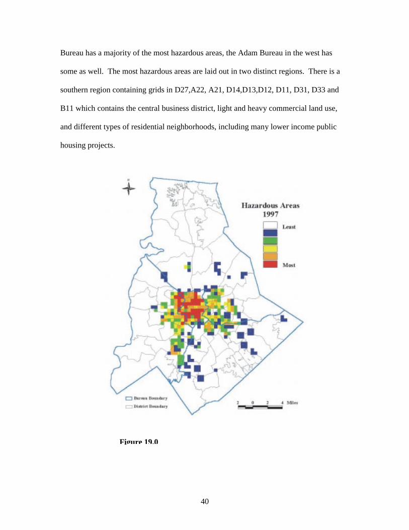
Bureau has a majority of the most hazardous areas, the Adam Bureau in the west has
some as well. The most hazardous areas are laid out in two distinct regions. There is a
southern region containing grids in D27,A22, A21, D14,D13,D12, D11, D31, D33 and
B11 which contains the central business district, light and heavy commercial land use,
and different types of residential neighborhoods, including many lower income public
housing projects.
Figure 19.0Figure 19.0

41
The northern region has grids in A35,A33, A32, D24, D25, D26, D22, D21, D34, D35
and corresponds with lower income residential areas situated among light and heavy
industrial land uses with some light commercial and institutional land uses. The bridge
between the regions is the most hazardous areas in D27. There is a clear buffer or
transition zone of less hazardous areas between the two regions. Another important
feature revealed in Figure 20.0 is how different bureaus, districts, and response areas
share the same hazard levels along their common boundaries (e.g., D27 and A32). This
is a graphic display of how problems are not confined to one geographical or, in this
context, organizational unit.
Figure 20.0
42
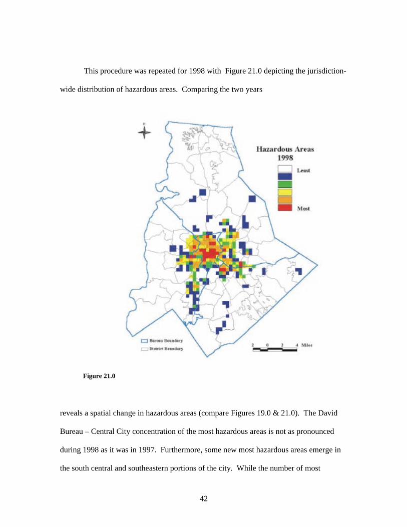
This procedure was repeated for 1998 with Figure 21.0 depicting the jurisdiction-
wide distribution of hazardous areas. Comparing the two years
Figure 21.0
Figure 19.0Figure 21.0
reveals a spatial change in hazardous areas (compare Figures 19.0 & 21.0). The David
Bureau – Central City concentration of the most hazardous areas is not as pronounced
during 1998 as it was in 1997. Furthermore, some new most hazardous areas emerge in
the south central and southeastern portions of the city. While the number of most

43
hazardous grids decreased between 1997 and 1998 (compare Tables 4 and 5) there
remains a large contiguous block of most hazardous areas in the central city (Figure
22.1).
Table 5 : Areal Extent of Hazard Levels 1998HazardLevel N Grids % of Total
0 3820 92.761 115 2.792 44 1.073 55 1.344 59 1.435 25 0.61
Comparing Figures 22.1 and 22.2 gives a better idea of the changes in hazardous areas in
the central part of the city. The greatest difference between the two years is that the
northern region of most hazardous areas very conspicuous during 1997 (Figure 22.2) is
no longer visible because a majority of the grids yield lower hazard levels during 1998
(Figure 22.1).
The large southern region of most hazardous grids during 1997 had its spatial
configuration change during 1998 (compare Figures 22.2 and 22.2). In general, this
region contracted from the west, southwest and south, but expanded north by three most
hazardous grids on a line running east to west from D26 to D33. Expansion occurred
with most hazardous grids appearing in the east in C23 and in the southeast in B12.
Finally, possible displacement has taken place. Examining the western portion of Figure
22.2 we see a corridor configuration of most hazardous areas emanating from D12 west
to D27. During 1998, this corridor effect disappears (Figure 22.1). Two previously red
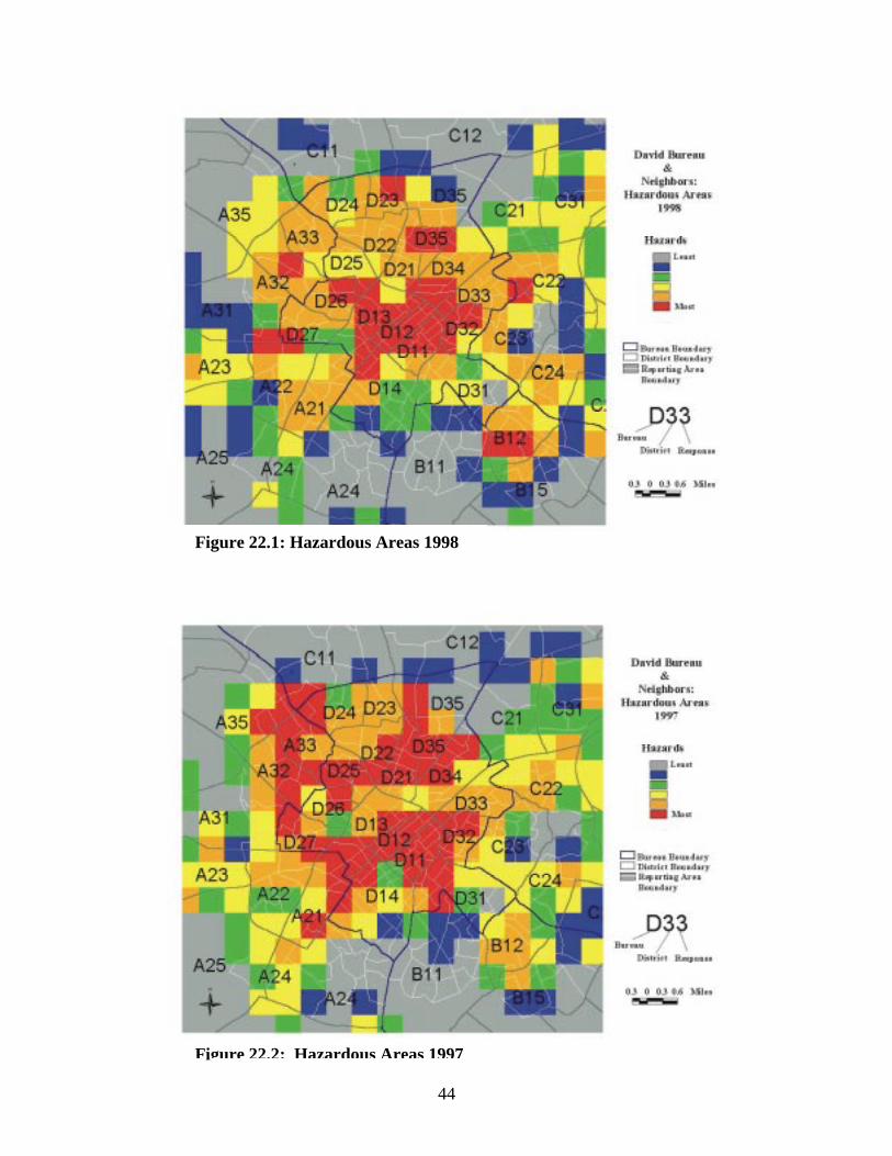
44
Figure 22.1: Hazardous Areas 1998
Figure 22.2: Hazardous Areas 1997

45
areas during 1997 decrease to green during 1998, but two most hazardous areas emerge
in the west in areas previously yellow and orange. These maps imply that some sort
displacement process may have taken place.
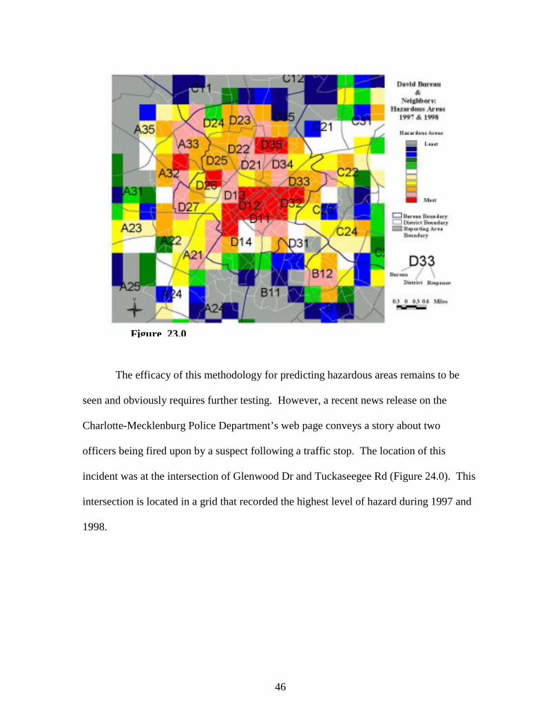
The hazardous space grids for 1997 and 1998 were added together to assess a two
year level of hazardousness. According to Table 6, less than 10 percent of the grids in
Table 6: Areal Extent of Hazard Levels 1997 & 1998
HazardLevel N Grids % of Total
0 3725 90.451 144 3.492 36 0.873 26 0.634 30 0.725 32 0.776 21 0.507 34 0.828 32 0.779 25 0.60
10 13 0.31
Charlotte-Mecklenburg during 1997 and 1999 recorded any level of hazard. Moreover,
only 13 grids or .31 percent of the total are the most hazardous. All of these grids appear
in Figure 23.0 and are in the same portion of the jurisdiction that has been the major
focus of this discussion. The David Bureau in the central business district and its
immediate environs has the most hazardous areas for police work across the two years.
46
The efficacy of this methodology for predicting hazardous areas remains to be
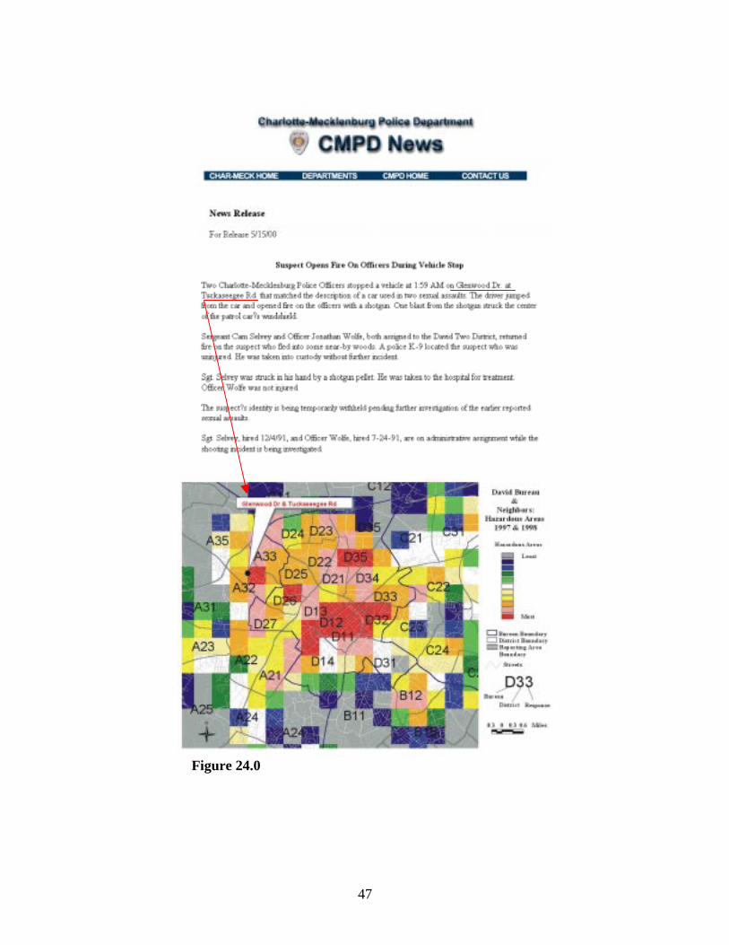
seen and obviously requires further testing. However, a recent news release on the
Charlotte-Mecklenburg Police Department’s web page conveys a story about two
officers being fired upon by a suspect following a traffic stop. The location of this
incident was at the intersection of Glenwood Dr and Tuckaseegee Rd (Figure 24.0). This
intersection is located in a grid that recorded the highest level of hazard during 1997 and
1998.
Figure 23.0
47
Figure 24.0
48
The Poisson Probability- SaTScan Model3
SaTScan is a spatial scanning model developed by the National Cancer Institute
for the purpose of finding statistically significant clusters of cancer (See, Kulldorf, et al,
1997). This technique has been sparingly applied for assessing clusters of crimes (See,
Jefferis, et al, 1998). This discussion is about applying SaTScan to four of the five
hazardous incidents previously discussed for 1997 and 1998 for the purposes of
assessing, analyzing, and visualizing high risk areas for each type of incident. The
incidents not included are the Help Me Quick calls because of their low frequencies
(Table 7).
Table 7: Hazardous Incidents & Calls 1997 & 1998
Calls-Incident Types 1997 1998Emergency Calls For Service 21,592 24,064Armed Robberies and Gun Assaults 3,523 3,190Use of Force Incidents 410 426Injuries to Officers 245 210Help Me Quick Calls 44 42Dispatched Calls For Service 416,584 426,601
Description of The Model
SaTScan examines rate based variables that are assumed to conform to a Poisson
distribution across geographic areas. The null hypothesis is that rates of the variable are
the same across all geographic units. An expected rate is calculated for all the geographic
areas and then circular windows of varying size are projected over the centroids of the
geographic units. For each window, the method tests the null hypothesis against the
alternative hypothesis that the rate of the variable is higher within compared with outside
the window (Kulldorff, et al, 1997: 162). Therefore, a log-likelihood ratio is calculated
3 Software available from the National Cancer Institute at http://dcp.nci.nih.gov/BB/SaTScan.html
49
and maximized over the different clusters to indicate the most likely clusters. Statistical
significance is acquired through multiple testing with Monte Carlo simulations
(Kulldorff, 1997; and Kulldorff, et al, 1997). The model delineates a primary cluster of
the variable in question and secondary clusters. The determination of the type of cluster
is dependent upon the magnitude of the log likelihood ratio and the significance level.
The previously mentioned hazardous incidents for 1997 and 1998 are used in the
SaTScan model. This model uses the 892 reporting areas for the geographic units of
analysis. The denominator for the rates is the total number of calls for service recorded
for each reporting area during 1997 and 1998.
Results
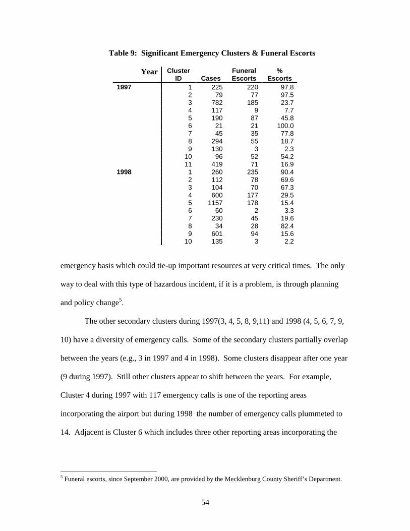
Emergency Calls For Service are the first incidents to be submitted to the
SaTScan model. Table 8 presents the pertinent statistics for the two years. The first two
columns are self-explanatory. Cluster ID is the number assigned to identify particular
clusters. All primary clusters receive the ID of 1. Type is whether a cluster is primary or
secondary. N of Reporting Areas is the number of reporting areas in the cluster. Cases is
the frequency of the specific incident in the cluster. Cluster 1, the Primary cluster during
1997 which consisted of 1 reporting area, had 225 emergency calls where 25.24 were
Expected. The Relative Risk for this cluster was 8.914 emergency calls per 1000 calls for
service. The large magnitude of the Log-Likelihood Ratio and the P-Value indicate why
during 1997 this was a primary cluster (Table 8). Moreover, only clusters significant at
the .05 level are included in this analysis
As presented in Table 8, during 1997 there were 10 secondary clusters in addition
to the primary cluster while 1998 produced nine secondary clusters. These clusters are
50
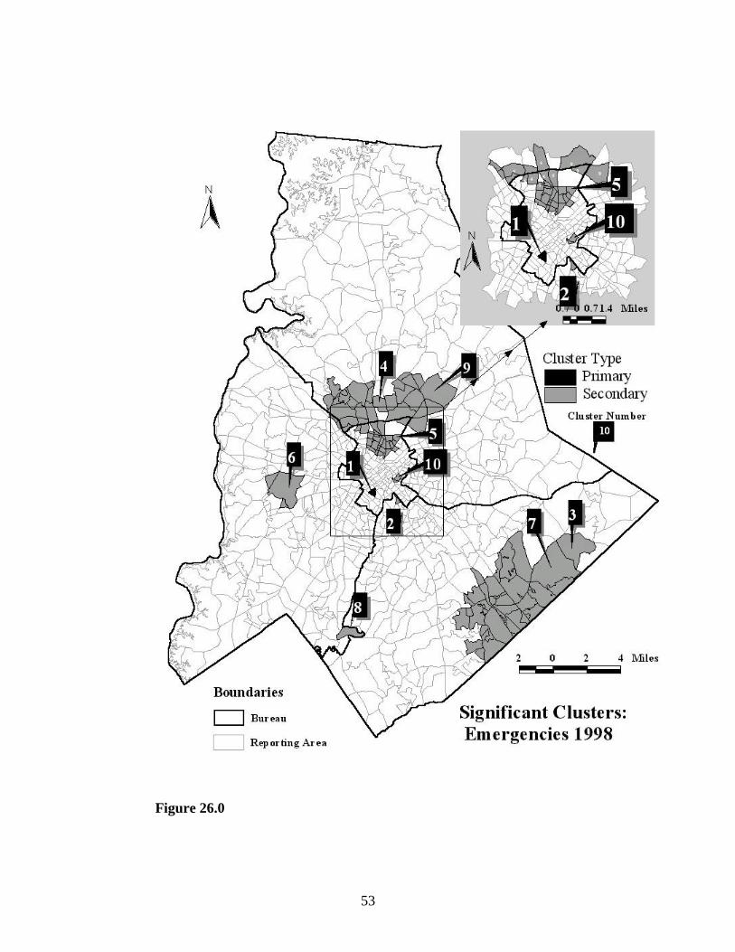
mapped out in Figures 25.0 and 26.0.4 At the onset one would review Figures 25.0, 26.0
and Table 8 and believe that single reporting area clusters must contain an overabundance
of the factors that generate emergency calls for service. One could imagine many hot
spots and repeat address calls for service in a small space. As a matter of fact, the
primary clusters(1) during 1997 and 1998 have similar characteristics to secondary
Clusters 2, 6, 7, and 10 during 1997 and 2, 3, and 8 during 1998. In other words, the same
conditions creating the high emergency risk rates in the primary clusters are the same in
the aforementioned secondary clusters. The majority of the emergency calls for service
in these clusters are the same in nature. Moreover, the majority of emergency calls
emanate from the same types of places all of which are repeat address generators of calls.
This is because all these places generating emergency calls are funeral homes. The
emergency designation, by policy, is given to requests from funeral homes for police
escorts. Funeral escorts account for less than one-half percent of the total dispatched calls
for service and less that nine percent of the emergency calls. Yet both of the primary
clusters, four of the secondary clusters during 1997, and three of the secondary clusters
during 1998 recorded funeral escorts as a vast majority of their cases or emergency calls
(Table 9). While funerals are not emergencies, providing escorts is an important service
function. However, the funerals do require the expenditure of police resources on an
4 as noted by Jefferis et al (1998) SaTScan is not designed to be an extension or add-on for any particularGIS or automated mapping program. So managing the data for use in a GIS can be arduous.

51
Table 8: SaTScan Statistics - Emergency Calls
Incident/Hazard Year
ClusterID Type
N of ReportingAreas Cases Expected
RelativeRisk
Log-Likelihood
RatioP- Value
Emergency 1997 1 Primary 1 225 25.24 8.914 293.37 .0011997 2 Secondary 1 79 16.12 4.899 62.75 .0011997 3 Secondary 31 782 530.33 1.475 53.50 .0011997 4 Secondary 1 117 41.47 2.821 45.95 .0011997 5 Secondary 32 190 98.96 1.920 33.08 .0011997 6 Secondary 2 21 1.84 11.38 31.93 .0011997 7 Secondary 1 45 13.96 3.223 21.64 .0011997 8 Secondary 8 294 218.63 1.345 11.84 .0061997 9 Secondary 28 130 84.52 1.538 10.53 .0201997 10 Secondary 2 96 58.12 1.650 10.32 .0271997 11 Secondary 7 419 334.93 1.251 9.92 .038
Emergency 1998 1 Primary 1 260 37.57 6.921 281.58 .0011998 2 Secondary 1 112 31.76 3.527 61.05 .0011998 3 Secondary 1 104 28.03 3.710 60.49 .0011998 4 Secondary 20 600 372.62 1.610 59.53 .0011998 5 Secondary 26 1157 903.40 1.281 34.05 .0011998 6 Secondary 3 60 20.19 2.971 25.56 .0011998 7 Secondary 48 230 141.69 1.623 23.27 .0011998 8 Secondary 1 34 8.01 4.245 23.17 .0011998 9 Secondary 13 601 465.80 1.290 18.34 .0011998 10 Secondary 2 135 88.05 1.533 10.79 .019

52
Figure 25.0
53
Figure 26.0
54
Table 9: Significant Emergency Clusters & Funeral Escorts
Year ClusterID Cases
FuneralEscorts
%Escorts
1997 1 225 220 97.82 79 77 97.53 782 185 23.74 117 9 7.75 190 87 45.86 21 21 100.07 45 35 77.88 294 55 18.79 130 3 2.3
10 96 52 54.211 419 71 16.9
1998 1 260 235 90.42 112 78 69.63 104 70 67.34 600 177 29.55 1157 178 15.46 60 2 3.37 230 45 19.68 34 28 82.49 601 94 15.6
10 135 3 2.2
emergency basis which could tie-up important resources at very critical times. The only
way to deal with this type of hazardous incident, if it is a problem, is through planning
and policy change5.
The other secondary clusters during 1997(3, 4, 5, 8, 9,11) and 1998 (4, 5, 6, 7, 9,
10) have a diversity of emergency calls. Some of the secondary clusters partially overlap
between the years (e.g., 3 in 1997 and 4 in 1998). Some clusters disappear after one year
(9 during 1997). Still other clusters appear to shift between the years. For example,
Cluster 4 during 1997 with 117 emergency calls is one of the reporting areas
incorporating the airport but during 1998 the number of emergency calls plummeted to
14. Adjacent is Cluster 6 which includes three other reporting areas incorporating the
5 Funeral escorts, since September 2000, are provided by the Mecklenburg County Sheriff’s Department.
55
airport. This cluster had 60 emergency calls during 1998, but only 7 during 1997. The
abrupt changes in the data are inexplicable.
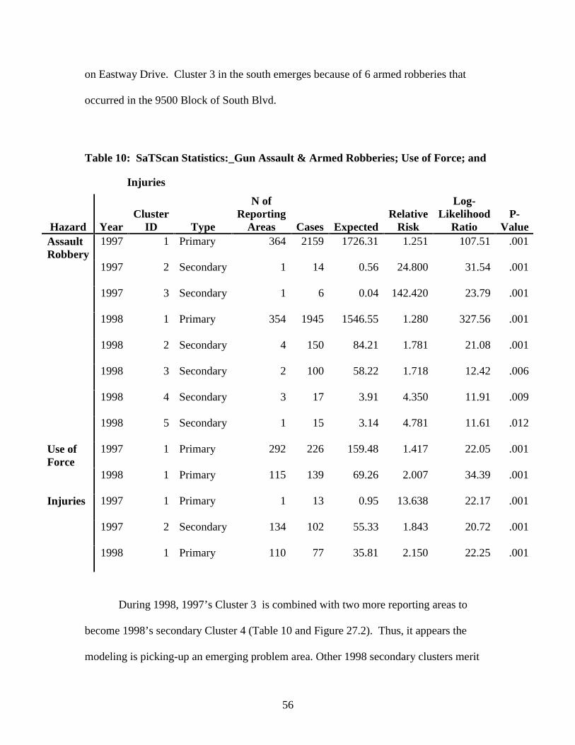
Table 10 displays the SaTScan statistics for Gun Assaults & Armed Robberies,
Use of Force, and Injuries. Having lower counts than the emergency calls for service is
one reason why there are fewer secondary areas for these incidents. As a matter of fact,
there are only primary clusters for the use of force (Table 10).
The clusters for Gun Assaults and Armed Robberies are portrayed in Figures 27.1
and 27.2. The primary cluster for both years overlap but the 1997 cluster has a greater
areal extent to the west, northwest, north, and northeast. The 1998 cluster, although
much smaller than 1997, has greater southern coverage. The similarity between the two
is that they encompass 61 percent (1997) and 60.9 percent (1998) of each year’s Gun
Assaults and Armed Robberies. Both clusters encompass the central city. The difference
between the primary clusters is that during 1997 there were a few incidents committed in
reporting areas generating lower levels of calls for service, thus creating high rates in
reporting areas that are adjacent or near reporting areas generating high volumes of calls
for service and gun assaults-armed robberies. The result is that the rates among the
reporting areas are similar yielding the large cluster during 1997. The 1998 primary
cluster is such because the outer reporting areas did not experience the rare events as they
did during 1997.
The secondary clusters of Gun Assaults and Armed Robberies are important.
During 1997, SaTScan isolated two single reporting area secondary clusters (Figure
27.1). Cluster 2 refers to gun assaults that occurred in and around an apartment complex
56
on Eastway Drive. Cluster 3 in the south emerges because of 6 armed robberies that
occurred in the 9500 Block of South Blvd.
Table 10: SaTScan Statistics:_Gun Assault & Armed Robberies; Use of Force; and
Injuries
Hazard YearCluster
ID Type
N ofReporting
Areas Cases ExpectedRelative
Risk
Log-Likelihood
RatioP-
ValueAssaultRobbery
1997 1 Primary 364 2159 1726.31 1.251 107.51 .001
1997 2 Secondary 1 14 0.56 24.800 31.54 .001
1997 3 Secondary 1 6 0.04 142.420 23.79 .001
1998 1 Primary 354 1945 1546.55 1.280 327.56 .001
1998 2 Secondary 4 150 84.21 1.781 21.08 .001
1998 3 Secondary 2 100 58.22 1.718 12.42 .006
1998 4 Secondary 3 17 3.91 4.350 11.91 .009
1998 5 Secondary 1 15 3.14 4.781 11.61 .012
Use ofForce
1997 1 Primary 292 226 159.48 1.417 22.05 .001
1998 1 Primary 115 139 69.26 2.007 34.39 .001
Injuries 1997 1 Primary 1 13 0.95 13.638 22.17 .001
1997 2 Secondary 134 102 55.33 1.843 20.72 .001
1998 1 Primary 110 77 35.81 2.150 22.25 .001
During 1998, 1997’s Cluster 3 is combined with two more reporting areas to
become 1998’s secondary Cluster 4 (Table 10 and Figure 27.2). Thus, it appears the
modeling is picking-up an emerging problem area. Other 1998 secondary clusters merit
57
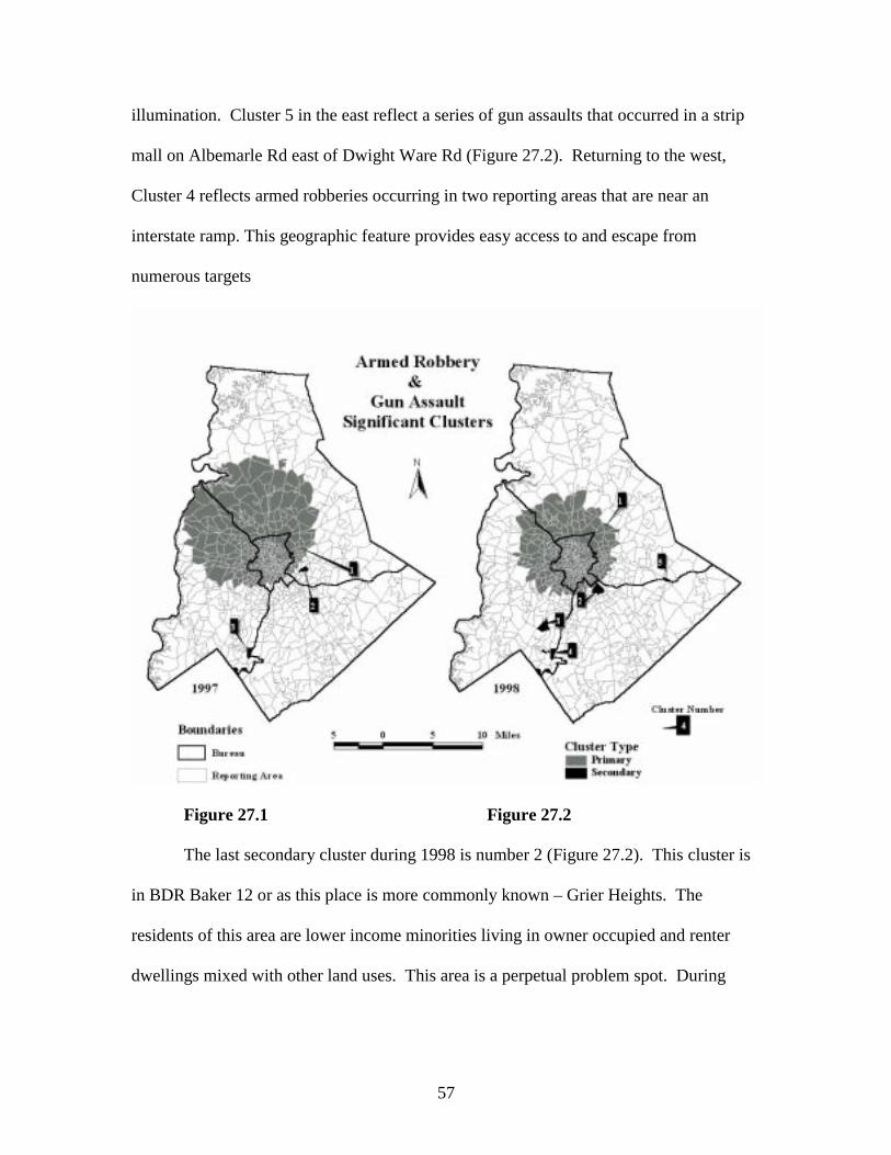
illumination. Cluster 5 in the east reflect a series of gun assaults that occurred in a strip
mall on Albemarle Rd east of Dwight Ware Rd (Figure 27.2). Returning to the west,
Cluster 4 reflects armed robberies occurring in two reporting areas that are near an
interstate ramp. This geographic feature provides easy access to and escape from
numerous targets
Figure 27.1 Figure 27.2
The last secondary cluster during 1998 is number 2 (Figure 27.2). This cluster is
in BDR Baker 12 or as this place is more commonly known – Grier Heights. The
residents of this area are lower income minorities living in owner occupied and renter
dwellings mixed with other land uses. This area is a perpetual problem spot. During
58
1998, Grier Heights emerged as the most significant secondary cluster for gun assaults
and armed robberies.
Figure 28.0

59
So far, SaTScan has been very proficient in isolating large contiguous areas with
similar rates and isolating very small areas with very high rates.
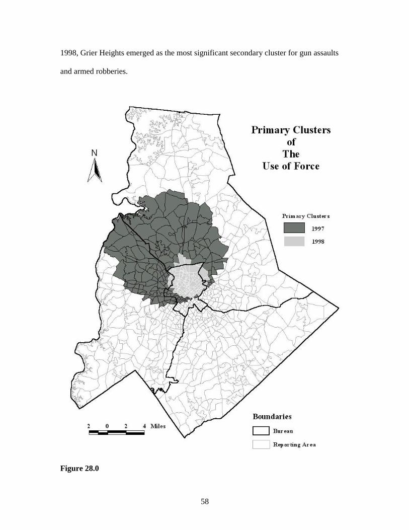
Figure 28.0 depicts the primary clusters for the Use of Force for both years.
The reason for the large Use of Force cluster during 1997 is the same as the large cluster
for Armed Robberies and Gun Assaults during 1997. There were just a few of these
events in reporting areas that do not generate large volumes of calls for service, thus
producing high rates. Over 55 percent of the Use of Force incidents during 1997 are in
the primary cluster. The primary cluster contracted during 1998 to include only 32
percent of the total incidents, yet the risk rates and the log likelihood ratios are higher.
The areal extent of the 1998 cluster is confined to the older portion of the city and the
central business district in the David Bureau.
The Injury clusters are depicted in Figures 29.1 and 29.2. At the onset it seems a
bit odd that the secondary cluster during 1997, with over 41.6 percent of all the injuries
across 134 response areas is not the primary cluster. The reason for this is due south of
the 1997 secondary cluster where one encounters the primary cluster (Table 10 and
Figure 29.1). The primary cluster records 13 injuries, but what has made this single
reporting area so statistically prominent is the that eight of the injuries occurred when
eight police officers went into a burning apartment to rescue its residents, hence the eight
officers were treated for smoke inhalation and singed hair. Otherwise the major foci of
injuries to officers are the 1997 secondary cluster and the 1998 primary cluster with the
latter accounting for 36.6 percent of all the injuries.
Figure 30.0 depicts the reporting areas that are only in the 1997 secondary
cluster; reporting areas that are only in the 1998 primary cluster; and reporting areas that

60
are part of both clusters. By now the reader should be familiar with the area depicted in
Figure 30.0 because it has been the prominent space for other hazards, incidents, and
calls for service. The injuries, in this area during both years, run the gamut of causes
ranging from an officer slipping on wet grass during a foot pursuit to injuries received
from an automobile accident to an officer being wounded by a suspect.
This model has identified high-risk injury areas that are spatially consistent across
two years, although additional research is in order to assess if the risk areas are diffusing
from the southwest to the northeast (Figure 30.0). In an organizational context,
Figure 29.1 Figure 29.2
it is important to note that Figure 30.0 illustrates that the majority of the high injury risk
areas are confined to one organizational unit mainly the David Patrol Bureau. This type
of analysis could be done on a routine basis in order to monitor the nature,
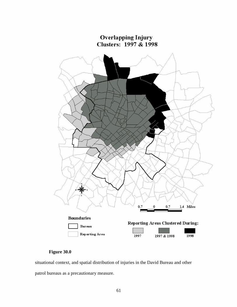
61
Figure 30.0
situational context, and spatial distribution of injuries in the David Bureau and other
patrol bureaus as a precautionary measure.
62
Conclusions
Two methods for using GIS and spatial analysis software for delineating
hazardous space for police work have been discussed. The first method classified urban
space based on the combined densities of hazardous incidents. The second method
employs the SaTScan spatial scanning software for clustering high risk reporting areas.
This approach involved calculating risk rates by using the total number of calls for
service for each reporting area as the denominator. The results from both approaches are
encouraging, but are suggestive rather than definitive. The models have shared and
individual constraints or obstacles.
Using density and probability, both approaches have empirically defined
hazardous and high-risk areas relative to Charlotte-Mecklenburg, but we do not know
how Charlotte-Mecklenburg compares with other jurisdictions across the country. In
reality, Charlotte-Mecklenburg may well be one of the safest places for one to be
involved in the policing profession. Therefore, a baseline needs to be established by
employing the hazardous space models across multiple jurisdictions. Just as Wilson
(1968) found Varieties of Police Behaviors, it is just as likely that there are varieties of
police officer safety.
The major constraint with the density model is determining the grid size because
different sizes can over and under estimate the density of hazardousness. While this issue
is further examined, it might be best not to rely on one map of hazardous areas, but rather
multiple maps employing different grid sizes might be more prudent ( See, Monmonier,
1993: 96-97).
63
The SaTScan model requires additional testing including the use of different
denominators for calculating risk rates. For example, many of the Help Me Quick calls
emanated from police officers who were working off-duty. Thus, a valid rate would
include a denominator measuring the average or number of police officers working
off duty. Another example pertains to injuries. One of the common injuries experienced
by police officers is being sprayed in the eyes with pepper spray during a scuffle with a
suspect. The source of the spray is not the suspect, but other police officers who
accidentally spray an officer. Thus, a proper denominator for this type of injury should
be the number incidents involving pepper spray. The point is that more research needs to
be pursued searching for valid and reliable denominators. Finally, the impending release
of Census 2000 information will provide another set of denominators for assessing risk
areas.
There has been little discussion about the geography of the hazardous spaces such
as isolating the spatial processes, interactions, and the contents of places that generate the
hazardous circumstances. Sparingly, I have alluded to possible independent
variables and circumstances, but this is another matter for additional research. However,
altering any ecological or demographic variables causally related to hazards would
involve a long-term process. Changing these conditions may significantly and positively
change a range of societal ills.
Presently, for the short-term, reducing hazards and ensuring safety for police
officers has emanated from training and enacting policy. The short-term approach could
be greatly enhanced by employing geographic information systems and examining

64
important variables related to hazards that could be modified by policy intervention. For
example, officer fatigue has long been a positive correlate of accidents and injuries.
Recent research suggests there are policy means for reducing the probability of
officer fatigue through work shift design and compressed scheduling (Vila, 2000). Using
GIS it would be possible to delineate and visualize the fatigue and hazardous spaces and
assess the relationships between the two.
65
Mapping Out Special Events
Introduction
The third part of this project involves using GIS for mappingpolice activities during special events. Normally we think of specialevents as being the human-made social constructions for which time andactivities are allocated. Holidays are special events and often the policemay have special plans for delivering services. Accidents are specialevents for which the police have contingency plans (e.g., airliner crash;hazardous material spills; massive traffic pileups). Moreover, the policehave other contingency plans and policies for dealing withdemonstrations and unruly mob behavior emanating from specialevents like protest demonstrations and celebrations of the achievementsof athletic teams. The special event of interest in this research is nothuman-made but it is of natural origin. Specially, we are examiningflash flooding emanating from rainfall.
Flash floods are important to examine for two reasons. First, they are costly in terms of
loss of life and property. On July 23, 1997, Charlotte, Mecklenburg experienced a 100 year
flood where the amount of rainfall during a 24 hour period exceeded 11.0 inches. Rainfall of
7.09 inches for a 24 hour period is expected every 100 years(Robinson, et al, 1998: p. 3). Large
portions of Charlotte-Mecklenburg exceeded this amount by almost 4 inches. As a result, three
people were killed and property damage exceeded $60 million. (Robinson, et al, 1998). Second,
events like these are becoming more frequent. Previously, in August 1995, Charlotte-
Mecklenburg experienced a 100-year flood with no loss of life and $4 million in flood insurance
claims and another $1 million dollars issued in loans to repair damage (Robinson, et al, 1998).
Morever, meteorologists and climatologists have noted that across the contiguous United States
extreme-intense precipitation events, like those passing through Charlotte-Mecklenburg, are
increasing(Karl and Knight, 1998). The point is that many parts of the country have and will
continue to experience more of these damaging events. Thus, this portion of the research
examines, graphically, how the Flash Flood of July 23, 1997 impacted the CMPD.
66
Essentially, three themes or areas are examined. The first uses a digital elevation
model(DEM) data from the United States Geological Survey(USGS) in order to match calls
forservice with their elevations or contours instead of a street address location. Density grids of
calls are matched to contours in order to examine the relationship between elevation and calls
during the flood. The second theme graphically demonstrates cross beat dispatching during the
flood. Specifically, mapping out where patrol units came from to respond to calls outside their
assigned response areas. Highlighted is one call where the result was one of the three fatalities
during the flood. Finally, the standard GIS procedure of point-in-polygon matching is used to
locate calls within the flood plain. This allows one to visualize how distinctive the events were
on July 23.
Calls For Service, Density, and Contours
On Wednesday, July 23, 1997, severe thunderstorms and flooding struck Charlotte-
Mecklenburg, North Carolina. The CMPD received and processed 2,156 calls for service, which
were responded to by 2,658 patrol units. The week before on the July 16, 1,712 calls were
received and responded to by 2,191 patrol units. Comparing the two Wednesdays, July 23
represented an increase of 444 calls and responses by another 467 patrol units. Clearly this
volume of work was unexpected.
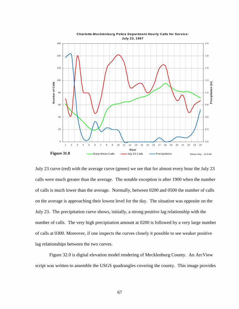
Figure 31.0 is an hourly graph of the number of calls on 23 July, the annual average
number of calls for service, and the average precipitation for each hour. Comparing the
67
Charlotte-M ecklenburg Police Department Hourly Calls for Service:July 23, 1997
0
20
40
60
80
100
120
140
160
1 2 3 4 5 6 7 8 9 10 11 12 13 14 15 16 17 18 19 20 21 22 23 24
Hour
Nu
mb
er
of
Ca
lls
0.0
0.3
0.5
0.8
1.0
1.3
1.5
1.8
2.0
Pre
cip
ita
tio
n (
in)
Daily Mean Calls July 23 Calls Precipitation Series5Blaine Ray - 10-9-98Figure 31.0
July 23 curve (red) with the average curve (green) we see that for almost every hour the July 23
calls were much greater than the average. The notable exception is after 1900 when the number
of calls is much lower than the average. Normally, between 0200 and 0500 the number of calls
on the average is approaching their lowest level for the day. The situation was opposite on the
July 23. The precipitation curve shows, initially, a strong positive lag relationship with the
number of calls. The very high precipitation amount at 0200 is followed by a very large number
of calls at 0300. Moreover, if one inspects the curves closely it possible to see weaker positive
lag relationships between the two curves.
Figure 32.0 is digital elevation model rendering of Mecklenburg County. An ArcView
script was written to assemble the USGS quadrangles covering the county. This image provides

68
an indication of the topography of the county its slope, aspect, elevation and
1H[W��$�'LJLWDO�(OHYDWLRQ�0RGHO�IRU�0HFNOHQEXUJ &RXQW\�ZDV�EXLOW�IURP�HLJKWHHQ�TXDGUDQJOHV�REWDLQHG�IURP�86*6�YLD�WKH�LQWHUQHW�
%HIRUH�$UF9LHZ�FRXOG�UHDG�WKH�GDWD��HDFK�TXDG�KDG�WR�EH�FRQYHUWHG�IURP�WKH�6'76�IRUPDW�XVHG�E\�86*6�WR�WKH�$6&,,�JULG�IRUPDW���7KLV�FDQ�EH�DFKLHYHG�WKURXJKWKH�LPSOHPHQWDWLRQ�RI�WKH�IUHHZDUH�SURJUDP�´VGWVJULG�µ�FUHDWHG�E\�6RO�.DW]�
$IWHU�LPSRUWLQJ�HDFK�QHZO\�FRQYHUWHG�JULG�LQWR�$UF9LHZ��WKH\�PHUJHG�WRJHWKHU�DQG�FOLSSHG�WR�ILW�WKH�FRXQW\�ERXQGDU\��
Figure 32.0
hydrography. The DEM allows one to take calls for service information that has been address
matched and match the calls with the contours indicating elevation. Therefore, this enables one
to measure the elevation of the calls.
The numbers and types of calls for service for the 16th and the 23rd were compared with
the 23rd having many more accident or traffic related calls than the 16th. The accident related
calls for both days were address matched. The point locations were then matched against the
elevations and contours emanating from the DEM. Figure 33.0 is a graph of the percentage of
the accident calls for both days plotted by their elevation. At some elevations, the percentage
calls are parallel (e.g., 635) while at others the relationship or trend between the two days is
negative – one increases while the other decreases (e.g., 680 or 695).
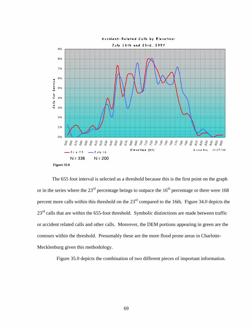
69
$ F F LG H Q W � 5 H OD W H G �& D O OV � E \ �( OH Y D W LR Q �
- X O\ �� � W K � D Q G �� � U G � �� � � �
0%
1%
2%
3%
4%
5%
6%
7%
8%
9%
55
05
60
57
05
80
59
06
00
61
06
20
63
0
64
06
50
66
06
70
68
06
90
70
07
10
72
07
30
74
07
50
76
07
70
78
07
90
80
0
81
08
20
83
08
40
85
08
60
( OH Y D W LR Q � � I W �
&DOOV�IRU�6HUYLFH
- X O\ �� � - X O\ � � �% O D LQ H �5 D \ � � � � � � � � � � �
1� ���� 1� ����Figure 33.0
The 655 foot interval is selected as a threshold because this is the first point on the graph
or in the series where the 23rd percentage beings to outpace the 16th percentage or there were 168
percent more calls within this threshold on the 23rd compared to the 16th. Figure 34.0 depicts the
23rd calls that are within the 655-foot threshold. Symbolic distinctions are made between traffic
or accident related calls and other calls. Moreover, the DEM portions appearing in green are the
contours within the threshold. Presumably these are the more flood prone areas in Charlotte-
Mecklenburg given this methodology.
Figure 35.0 depicts the combination of two different pieces of important information.

70
2Q�-XO\���������RI�WKH�������WRWDO�FDOOV�IRU�VHUYLFH�ZHUH�ZLWKLQ�WKH�����IW�FRQWRXU�WKUHVKROG�
2I�WKHVH�FDOOV��������������ZHUH�UHTXHVWV�WR�DVVLVW�PRWRULVWV��GLUHFW�WUDIILF��RU�DVVLVW�ZLWK�DFFLGHQWV���
7KHUH�ZHUH������PRUH�FDOOVIRU�VHUYLFH�ZLWKLQ�WKLV�WKUHVKROGRQ�-XO\����WKDQ�RQ�WKH���WK�
Figure 34.0
7R�ILQG�DUHDV�RI�WKH�FRXQW\�OLNHO\�WR�EH�DIIHFWHG�E\�IORRGLQJ��VLPSO\�FRPELQH�GDWD�OD\HUV�REWDLQHG�IURP�SUHYLRXV�VWHSV�LQWR�RQH�RYHUOD\�PDS�
Figure 35.0

71
The first is a density grid which represents the difference in the densities of the calls for service
for the 16th and the 23rd. Basically two density grids were constructed and then subtracted to
create a third map that is the difference between the grids. The results presented in Figure 35.0
are the red areas that had an unusually high density of calls on the 23rd compared with the 16th
with the blue areas having a unusually low density of calls on the 23rd. Viewed another way, the
blue represents areas that had an extremely high density of calls on the 16th compared with the
23rd. The second piece of information portrayed is the threshold areas in green suggesting highly
flood prone areas. Overlaying this information produces a map showing that a majority of the
high call density areas on the 23rd of July were in or around flood zones.
Cross Beat Dispatching
The second area that was examined with GIS is cross beat dispatching during the July 23
flood. Cross beat dispatching is basically when a patrol unit is called out of its assigned area to
respond to a call in another area. This issue is of particular concern to police patrol managers
who are interested equalizing workloads among patrol areas and assessing the efficacy of shift
schedules.
An ArcView script was written for this analysis. This origin and destination script takes a
geocoded file of points and draws lines or vectors between the origin of the patrol unit and its
destination. Moreover, the script allows one to aggregate the geographic units of analysis.
Hence it is possible to examine and map vectors between a point and its destination area or
between areas.
Figure 36.0 utilizes this script and plots out the interaction between response areas during
the 16th and 23rd of July. This Figure does not differentiate between origin and destination, just

72
the interactions between response areas. Furthermore, the vectors or lines between the response
areas are graduated according to the number of interactions. Distinctive differences between the
two days are quite conspicuous.
Assuming July 16 is a normal or average day, we see around the periphery of the county
frequent and long distance interactions between response areas. Towards the center of the
jurisdiction, we see several clusters of high frequency short distance interactions. Most of these
movements are primarily local or intra-bureau or intra-district. The picture changes dramatically
on July 23. First the number of interactions has increased. Secondly, finding distinct small
clusters of interaction is difficult because the central part of the jurisdiction is totally obscured by
cross beat dispatching. Finally, it is possible to see that a majority of the interactions or move-
ments are inter-bureau and inter-district.
Figure 37.0 provides another view of the movement during July 23. In this visualization
it is possible to ascertain directionality, origin, and destination. The large yellow circles are
centroids of response areas while the smaller orange circles are the locations of the calls for
service. Highlighted in Figure 37.0 is a particularly tragic call for service. A young child went
outside to play in the rushing water and was swept away and found days later downstream
drown. Twenty-five patrol units were dispatched to this call. Using graduated symbols it is
possible to see the number of units emanating from specific response areas. Tabular materials in
the form of interactions matrices can augment this or any graphic of cross-beat dispatching.

73
Figure 36.0
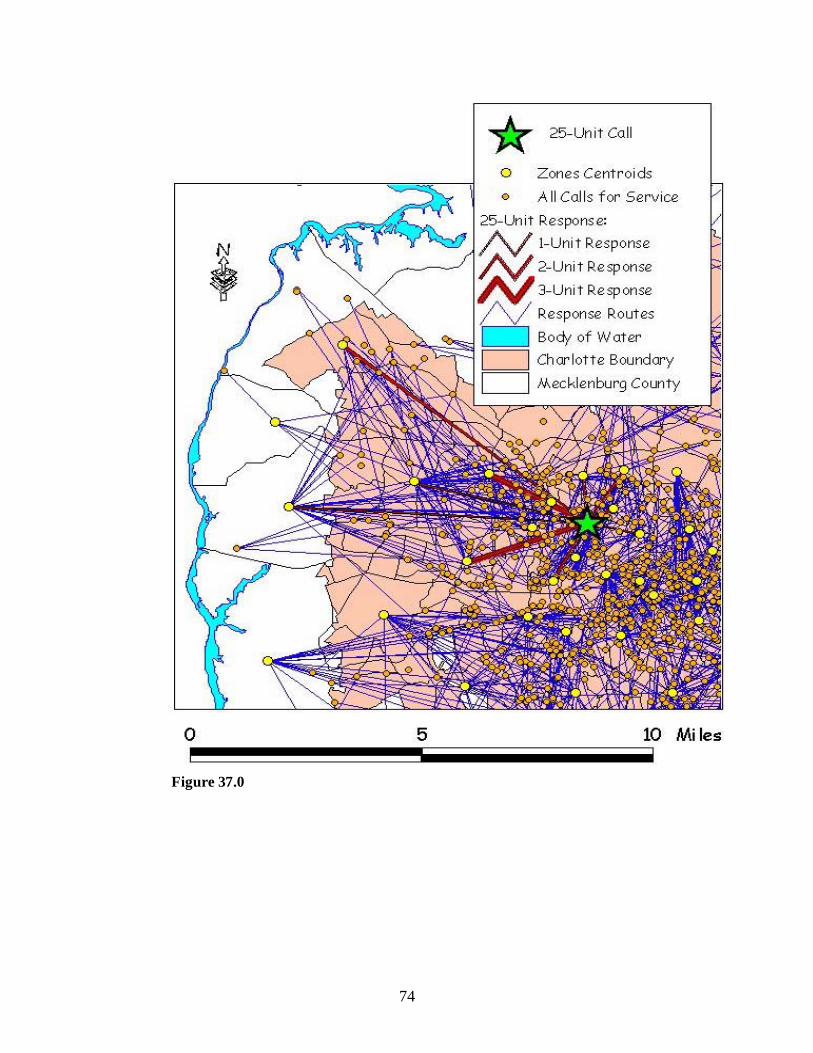
74
Figure 37.0
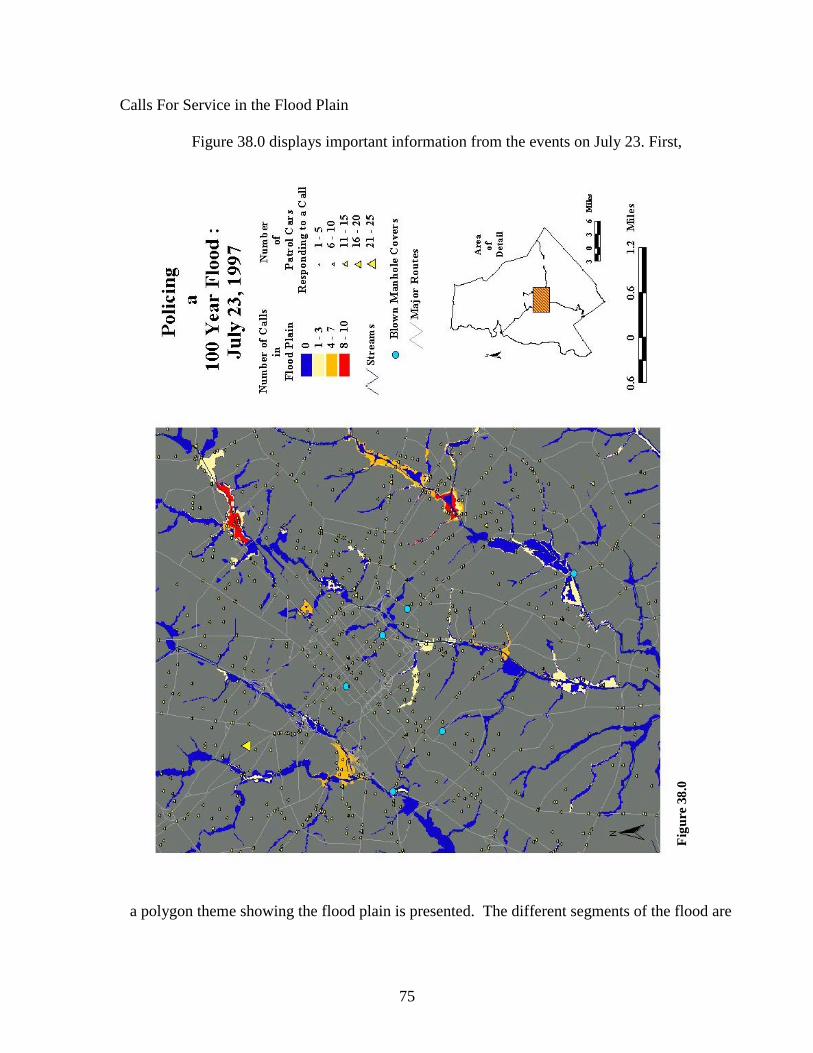
75
Calls For Service in the Flood Plain
Figure 38.0 displays important information from the events on July 23. First,
Fig
ure
38.0
a polygon theme showing the flood plain is presented. The different segments of the flood are

76
Table 10: Percentage of Calls in the Flood Plain
Date Day N of CallsN in Flood
Plain% in
Flood Plain2/16/97 Sunday 1063 26 2.452/19/97 Wednesday 1241 50 4.034/22/97 Tuesday 1233 52 4.225/4/97 Sunday 1195 18 1.51
5/11/97 Sunday 1214 35 2.886/16/97 Monday 1274 32 2.517/10/97 Thursday 1348 29 2.157/15/97 Tuesday 1273 43 3.387/16/97 Wednesday 1712 49 2.877/23/97 Wednesday 2156 155 7.198/5/97 Tuesday 1257 46 3.66
8/23/97 Saturday 1371 40 2.929/8/97 Monday 1217 27 2.22
9/15/97 Monday 1219 34 2.7910/5/97 Sunday 1220 22 1.80
10/31/97 Friday 1431 36 2.5211/10/97 Monday 1190 36 3.0312/1/97 Monday 1259 24 1.91
12/23/97 Tuesday 1281 29 2.2612/31/97 Wednesday 1286 35 2.72
Average 1322 40.9 2.95
are choroplethed or shaded according to the number of calls occurring within the flood plain.
This is achieved by doing a point-in-polygon match of the geocoded calls for service with the
flood plain coverage. Second, the locations of the calls are presented with a graduated symbol
map (yellow triangle) based on the number of patrol units responding to the call. Third, the
linear features of streams and major transportation routes are presented. Finally, a search of the
dispatch records for that day uncovered six reports of manhole covers on the streets being
blown. This is where the flow of water through the storm drain is so tremendous that pressure
causes the manhole covers to pop or blow off into the street. The locations of the six blown
manhole covers are depicted in Figure 38.0 with round cyan symbols, which are not exactly to
scale. If they were, it would be impossible to see them.
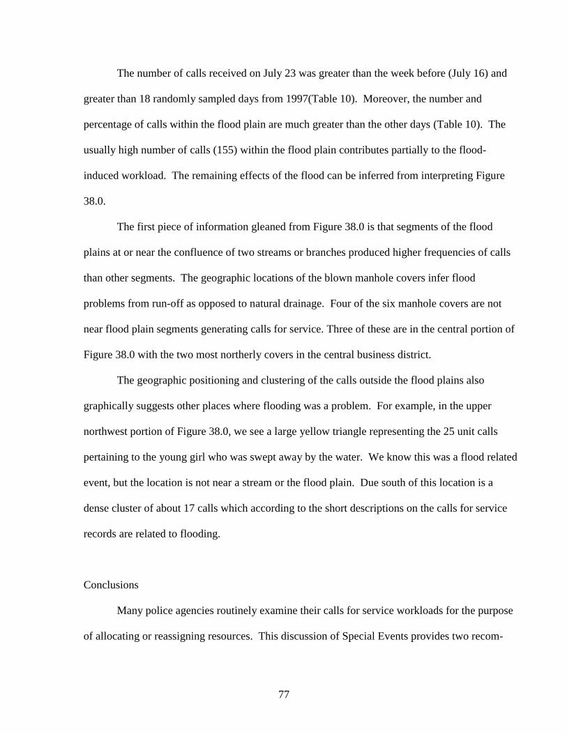
77
The number of calls received on July 23 was greater than the week before (July 16) and
greater than 18 randomly sampled days from 1997(Table 10). Moreover, the number and
percentage of calls within the flood plain are much greater than the other days (Table 10). The
usually high number of calls (155) within the flood plain contributes partially to the flood-
induced workload. The remaining effects of the flood can be inferred from interpreting Figure
38.0.
The first piece of information gleaned from Figure 38.0 is that segments of the flood
plains at or near the confluence of two streams or branches produced higher frequencies of calls
than other segments. The geographic locations of the blown manhole covers infer flood
problems from run-off as opposed to natural drainage. Four of the six manhole covers are not
near flood plain segments generating calls for service. Three of these are in the central portion of
Figure 38.0 with the two most northerly covers in the central business district.
The geographic positioning and clustering of the calls outside the flood plains also
graphically suggests other places where flooding was a problem. For example, in the upper
northwest portion of Figure 38.0, we see a large yellow triangle representing the 25 unit calls
pertaining to the young girl who was swept away by the water. We know this was a flood related
event, but the location is not near a stream or the flood plain. Due south of this location is a
dense cluster of about 17 calls which according to the short descriptions on the calls for service
records are related to flooding.
Conclusions
Many police agencies routinely examine their calls for service workloads for the purpose
of allocating or reassigning resources. This discussion of Special Events provides two recom-

78
mendations for those engaged in this process. First, the script for measuring and visualizing
cross beat dispatching during the flood can be used in workload analysis for assessing shift
schedules and geographic assignments.6 Second, departments should engage in evaluating how
special events of any type alter or change their operations. Moreover, these evaluations should
be communicated and shared with other agencies.
6 The code for this script is in Appendix A.
79
Summary and Conclusions
This project has demonstrated three different modules that require additional
research and development. This is not because they could not be more fully addressed in
this project, but rather they are evolving issues in the collaboration between policing and
spatial analysis technology.
If maps are going to be useful, they have to be composed so that they effectively
communicate their meaning to the user or reader (Monmonier, 1993). The status quo for
visualizing the distribution of crime and calls for service is simply to display their point
locations on a map or to aggregate points into larger areal units. Too often the latter over
generalizes the distribution, while in order to make sense out of the former, other spatial
techniques are needed to cluster and organize the point locations. The Safe Streets
approach visualizes the magnitude and fluctuation of crime and calls by altering a feature
of the urban landscape that police officers are intimately familiar with. Essentially this
involves altering and mapping the size and color of street segments according to their
intensity of a problem. The street segment is the basic unit of navigation for police
officers.
GIS and spatial analysis are involved in the obvious application of analyzing the
distribution of crime. This project has taken a different direction by applying the
technology and methodology to the problem of identifying, analyzing, and mapping
Hazardous Space for police work. Occupational safety is the primary focus here. More
research needs to be conducted in this area to include both quantitative and qualitative
assessments of safety and hazards.
80
It has long been known that the police do more than manage and control crime.
The police, along with their firefighting and paramedic colleagues, are the first line of
defense between the public and accidents, catastrophes, violent weather, and other
Special Events. This project, combining non-police data with police data, demonstrates
some mapping techniques for analyzing how a Special Event like a flash flood effects a
city and police operations. This flash flood in Charlotte is like the killer tornado that
swept through Oklahoma in May 1999 or the lethal heat wave that swept through
Chicago during the Summer of 1995. The police had to respond, sometimes very
quickly, to a range of non-routine circumstances. This research suggests new research
partnership need to be formed between the police and those responsible for monitoring
the environment.
81
References
Bailey, T.C., and Gatrell, A.C. (1995) Interactive Spatial Data Analysis. Essex,England: Longman Group Limited.
Brantingham, P.L., and Brantingham, P.J., (1995) Criminality of place: CrimeGenerators and Crime Attractors. European Journal on Criminal Policyand Research: Crime Environments and Situational Prevention, 3(3), pp.5-26.
Eck, J., and Weisburd, D. (eds) (1995) Crime and Place. Crime PreventionStudies Vol. 4. Monsey, N.Y: Criminal Justice Press.
Green, M. and Flowerdew, R. (1996) New Evidence on The Modifiable ArealUnit Problem in P. Longley and M. Batty (eds) Spatial Analysis: Model-ling in a GIS Environment. Cambridge, U.K.: GeoInformationInternational, pp. 41-54.
Harries, K.D. (1999) MAPPING CRIME Principle and Practice. Washington D.C.: U.S. Department of Justice.
Jefferis, E.S., et al. (1998) A Multi-Method Exploration of Crime Hot Spots:SaTScan Software Findings. Paper presented at the Annual Meeting ofthe Academy of Criminal Justice Sciences, Albuquerque, New Mexico.
Karl. T.R. and Knight, R.W. (1998) Secular Trends of Precipitation Amount,Frequency, and Intensity in the United States. Bulletin of the AmericanMeteorological Society, Vol. 79, No. 2: pp. 230 – 241.
Kulldorff M.(1997)A spatial scan statistic. Communications in Statistics: Theory and Methods, 26:1481-1496.
Kulldorff M., Feuer, E.J., Miller, B.A., and Freedman, L.S.(1997) Breast CancerClusters in the Northeast Unites States: A Geographic Analysis.American Journal of Epidemiology, Vol. 146, No. 2, pp. 161-170.
Levine, N. (1999) CrimeStat: A Spatial Statistics Program for the Analysis ofCrime Incident Locations. Washington, D.C.: National Institute ofJustice.
Monmonier, M., (1996) How to Lie with Maps Second Edition. Chicago, IL:University of Chicago Press.
Monmonier, M., (1993) Mapping It Out: Expository Cartography for the Humanities and Social Sciences. Chicago, IL: University of Chicago
Press.

82
Olligschlaeger, A.M. (1997) Artificial Neural Networks and Crime Mapping inD. Weisburd and T. McEwen (eds) Crime Mapping and CrimePrevention. Monsey, NY: Criminal Justice Press, pp. 313-347.
Openshaw,S. (1983) The Modifiable Areal Unit Problem. Concepts and Tech-niques in Modern Geography No. 38. Norwich, U.K.: Geo Books.
Robinson, J.B., Hazell, W.F. (1998) Effects of August 1995 and July 1997 StormsIn The City of Charlotte and Mecklenburg County, North Carolina: U.S.Geological Survey Fact Sheet FS-036-98.
Tufte, E.R. (1997) Visual Explanations. Cheshire, CT: Graphics Press.
U.S. Census Bureau (1997) 1997 Tiger Line Files technical Information.Washington, D.C.: U.S. Census Bureau.
Vila, B. (2000) Tired Cops: The Prevalence of Fatigue Among Patrol Officers,And Some Indications of Its Effects on Performance, Health, and Safety.Washington, D.C.: Police Executive Research Forum
Weisburd, D. and Green, L. (1995) Policing Drug Hot Spots: The Jersey CityDrug Market Analysis Experiment . Justice Quarterly, Vol. 12, No. 4,pp. 711-735.
Weisburd, D. and Green, L. (1994) Defining the Drug Market: The Case of theJersey DMA System. In D.L.Mackenzie and C. Uchida (eds.), Drugs andCrime: Evaluating Public Policy Initiatives. Newbury Park, CA: Sage,pp. 61-76.
Williamson, D., McLafferty, S., McGuire, P., Goldsmith, V., and Mollenkopf, J.(1999) A Better Method to Smooth Crime Incidence Data. ArcUser,Redlands, CA: ESRI, January.
Wilson. J.Q. (1968) Varieties of Police Behavior: The Management of Law andOrder in Eight Communities. Cambridge, MA: Harvard University Press.

83
Appendix A: Code for Origin & Destination Script.
Name : ordestbr.ave’’ Purpose : Displays origin-destination lines from:’ (1) Zone centroids to other zone centroids, or’ (2) Points to other points.’’ Input : Requires three themes:’ (1) A point theme representing a list of origin points,’ (2) A point theme representing a list of destination points’ **IMPORTANT** Both themes have to be ordered and have thesame’ number of records in each (the first record of the origintheme corresponds’ to the first record of the destination theme).’ (3) A polygon theme of zones that overlay ALL points in the twoaforementioned themes.’’ Output : A new line theme with lines that originate at zone centroidsand terminate at’ each destination point. The attribute table of this theme willhave seven fields:’ (1) A "shape" field’ (2) A "length" field of values in the specified units for theprojection.’ (3) A "origzone" field that contains the string for the line’sorigin zone.’ (4) A "destzone" field that contains the string for the line’sdestination zone.’ (5) A "count" field for the number of interactions from "origzone"to "destzone."’ (6) A "revcount" field for the number of interactions from"destzone" to origzone."’ (7) A "totalcount" field for the total number of interactionsbetween "origzone" and destzone."’’’ Author : Blaine Ray
theview = av.getactivedocthethemes = theview.getthemesp = MsgBox.choice(thethemes, "Select The (Polygon) District Theme.","District")if (p = nil) then exit endo = MsgBox.choice(thethemes, "Select The (Point) Origin Theme.","Origin")if (o = nil) then exit endd = MsgBox.choice(thethemes, "Select The (Point) Destination Theme.","Destination")if (d = nil) then exit endtypeflag = MsgBox.YesNoCancel("Select YES for point to pointanalysis."+NL+"Select NO for polygon to polygon analysis." , "SelectThe Type Of Analysis To Be Performed" , nil)if (typeflag = nil) then exit end
84
statestable = theview.FindTheme(p.AsString)statesftab = statestable.getftabstatesshpfield = statesftab.findfield("shape")pshapeType = statesshpfield.GetTypelist1 = list.makelist2 = list.makelist3 = list.makelist4 = list.makelist5 = list.makelist6 = list.makeTd = theview.FindTheme(d.AsString)To = theview.FindTheme(o.AsString)Proj = theview.GetProjectionTdFTab = Td.GetFTabToFTab = To.GetFTabShpFldd = Td.GetFTab.FindField("Shape")ShpFldo = To.GetFTab.FindField("Shape")oshapeType = ShpFldo.GetTypedshapeType = ShpFldd.GetTypecountstates = statesftab.getnumrecordsif (tdftab.getnumrecords <> toftab.getnumrecords) then MsgBox.Error("The Origin And Destination Tables Must Have The SameNumber Of Records.", "Tables Don’t Match.") exitendif (pshapeType <> #FIELD_SHAPEPOLY) then MsgBox.Error("You Entered The Wrong District Theme.", "Not A PolygonTheme.") exitendif (oshapeType <> #FIELD_SHAPEPOINT) then MsgBox.Error("You Entered The Wrong Origin Theme.", "Not A PointTheme.") exitendif (dshapeType <> #FIELD_SHAPEPOINT) then MsgBox.Error("You Entered The Wrong Destination Theme.", "Not A PointTheme.") exitendfieldsp = statesftab.getfieldszonep = statesftab.FindField("zone")if (zonep = NIL) then zonep = MsgBox.choice(fieldsp, "Select The Zones Field", "DistrictTheme")endif (zonep = NIL) then exit end
’Create lists for a polyline field, a count field, an origin zonefield,’ and a destination zone field. Also set up the status bar.
domore = av.setstatus(0)av.showstopbutton
For each rec in statesftab progress = ((rec + 1)/countstates)*100
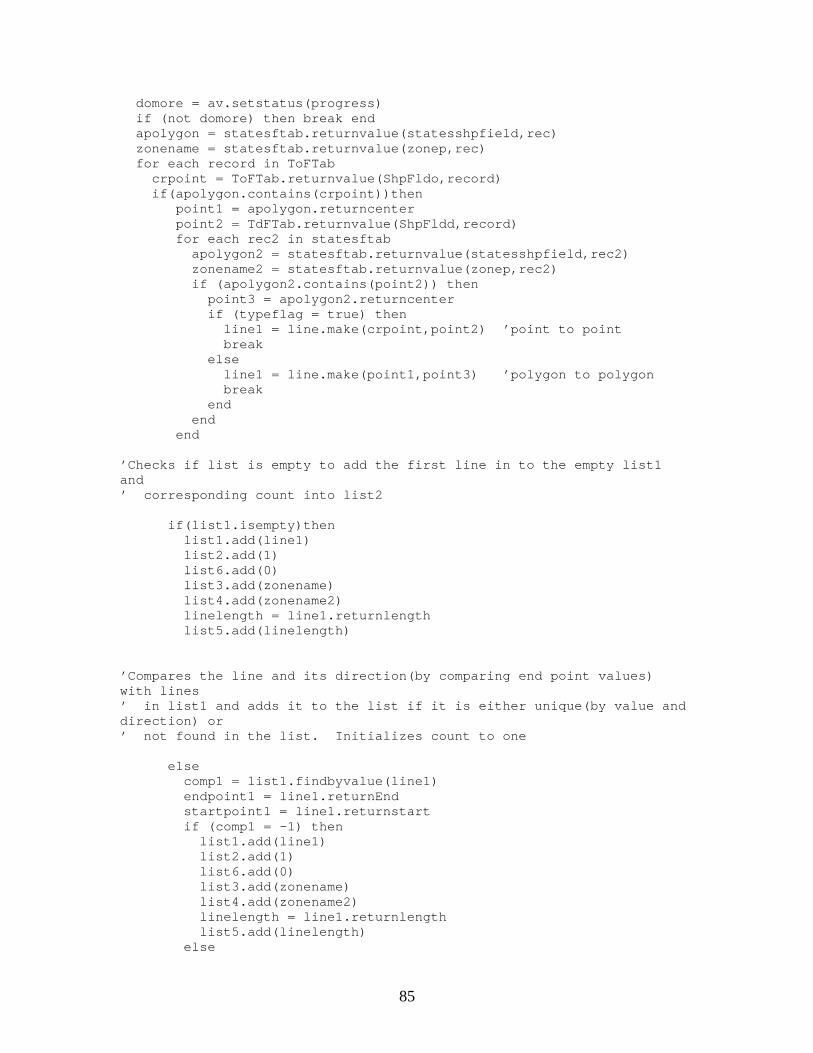
85
domore = av.setstatus(progress) if (not domore) then break end apolygon = statesftab.returnvalue(statesshpfield,rec) zonename = statesftab.returnvalue(zonep,rec) for each record in ToFTab crpoint = ToFTab.returnvalue(ShpFldo,record) if(apolygon.contains(crpoint))then point1 = apolygon.returncenter point2 = TdFTab.returnvalue(ShpFldd,record) for each rec2 in statesftab apolygon2 = statesftab.returnvalue(statesshpfield,rec2) zonename2 = statesftab.returnvalue(zonep,rec2) if (apolygon2.contains(point2)) then point3 = apolygon2.returncenter if (typeflag = true) then line1 = line.make(crpoint,point2) ’point to point break else line1 = line.make(point1,point3) ’polygon to polygon break end end end
’Checks if list is empty to add the first line in to the empty list1and’ corresponding count into list2
if(list1.isempty)then list1.add(line1) list2.add(1) list6.add(0) list3.add(zonename) list4.add(zonename2) linelength = line1.returnlength list5.add(linelength)
’Compares the line and its direction(by comparing end point values)with lines’ in list1 and adds it to the list if it is either unique(by value anddirection) or’ not found in the list. Initializes count to one
else comp1 = list1.findbyvalue(line1) endpoint1 = line1.returnEnd startpoint1 = line1.returnstart if (comp1 = -1) then list1.add(line1) list2.add(1) list6.add(0) list3.add(zonename) list4.add(zonename2) linelength = line1.returnlength list5.add(linelength) else
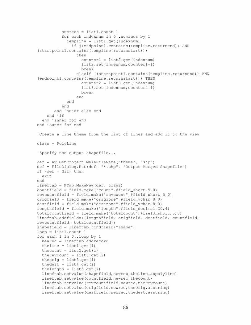
86
numrecs = list1.count-1 for each indexnum in 0..numrecs by 1 templine = list1.get(indexnum) if ((endpoint1.contains(templine.returnend)) AND(startpoint1.contains(templine.returnstart))) then counter1 = list2.get(indexnum) list2.set(indexnum,counter1+1) break elseif ((startpoint1.contains(templine.returnend)) AND(endpoint1.contains(templine.returnstart))) THEN counter2 = list6.get(indexnum) list6.set(indexnum,counter2+1) break end end end end ’outer else end end ’if end ’inner for endend ’outer for end
’Create a line theme from the list of lines and add it to the view
class = PolyLine
’Specify the output shapefile...
def = av.GetProject.MakeFileName("theme", "shp")def = FileDialog.Put(def, "*.shp", "Output Merged Shapefile")if (def = Nil) then exitendlineftab = FTab.MakeNew(def, class)countfield = field.make("count",#field_short,5,0)revcountfield = field.make("revcount",#field_short,5,0)origfield = field.make("origzone",#field_vchar,8,0)destfield = field.make("destzone",#field_vchar,8,0)lengthfield = field.make("length",#field_decimal,20,4)totalcountfield = field.make("totalcount",#field_short,5,0)lineftab.addfields({lengthfield, origfield, destfield, countfield,revcountfield, totalcountfield})shapefield = lineftab.findfield("shape")loop = list1.count-1for each i in 0..loop by 1 newrec = lineftab.addrecord theline = list1.get(i) thecount = list2.get(i) therevcount = list6.get(i) theorig = list3.get(i) thedest = list4.get(i) thelength = list5.get(i) lineftab.setvalue(shapefield,newrec,theline.aspolyline) lineftab.setvalue(countfield,newrec,thecount) lineftab.setvalue(revcountfield,newrec,therevcount) lineftab.setvalue(origfield,newrec,theorig.asstring) lineftab.setvalue(destfield,newrec,thedest.asstring)
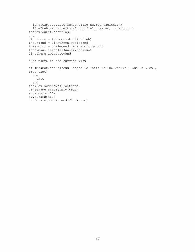
87
lineftab.setvalue(lengthfield,newrec,thelength) lineftab.setvalue(totalcountfield,newrec, (thecount +therevcount).asstring)endlinetheme = ftheme.make(lineftab)thelegend = linetheme.getlegendthesymbol = thelegend.getsymbols.get(0)thesymbol.setcolor(color.getblue)linetheme.updatelegend
’Add theme to the current view
if (MsgBox.YesNo("Add Shapefile Theme To The View?", "Add To View",true).Not) then exit endtheview.addtheme(linetheme)linetheme.setvisible(true)av.showmsg("")av.clearstatusav.GetProject.SetModified(true)