deconstruction reserach media
TRANSCRIPT

DeconstructionDeconstruction is the way that the layout on a magazine works, this involves the positions and placement of information and images on a magazine page and what effects that can have on the reader and how it can have symbolism and attract an audience to purchase it, this involves a number of techniques that the creator uses as well as how each of the pages done in terms of layout and formula which magazine companies use, it also includes how the creator uses them and what they bring to the table that is different or more effective than other companies, the magazine genre that I will be researching on when it comes to this will be the music magazines and how they layout there magazines more importantly Kerrang and what formulas they strongly lye heavily on, the types of magazine pages I will be looking at will be the front cover, content page and double page spreads and how each one is different from the other type, I will also look into the features and how I can use them for my own target audience.
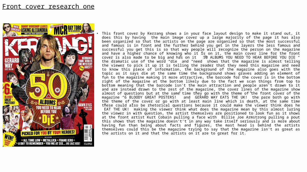
Front cover research one
• This front cover by Kerrang shows a in your face layout design to make it stand out, it does this by having the main image cover up a large majority of the page it has also been organized so that the artists on the page are organized so that the most successful and famous is in front and the further behind you get in the layers the less famous and successful you get this is so that way people will recognize the person on the magazine and have a higher chance of knowing who it is on it, the main cover line for the front cover is also made to be big and has on it ” 50 ALBUMS YOU NEED TO HEAR BEFORE YOU DIE “ the dramatic use of the word “die” and “need” shows that the magazine is almost telling the viewer to pick it up it is telling the reader that they need this magazine and need to know this piece of information, the background of the magazine also goes with the topic as it says die at the same time the background shows graves adding an element of fun to the magazine making it more attractive, the barcode for the cover is in the bottom right of the magazine at the bottom likely due to the fact we scan things from top to bottom meaning that the barcode isn't the main attraction and people aren't drawn to it and are instead drawn to the rest of the magazine, the cover lines of the magazine show almost of questions but at the same time they go with the theme of the front cover of the magazine “6 BLOODY GREAT POSTERS!” and ”GERARD WAY EATS THE UK!” the pare both go with the theme of the cover or go with at least main line which is death, at the same time these could also be rhetorical questions because it could make the viewer think does he ”EAT THE UK!” making the viewer think what does the magazine mean by this almost luring the viewer in with question, the artist themselves are positioned to look fun as it shows at the front artist Kurt Cobain pulling a face with Billie Joe Armstrong pulling a pout this shows that the magazine doesn't ’t in any way take itself seriously and is more about having fun than being about facts and figures, the mast head is behind the artists themselves could this be the magazine trying to say that the magazine isn't as great as the artists on it and that the artists on it are to great for it.
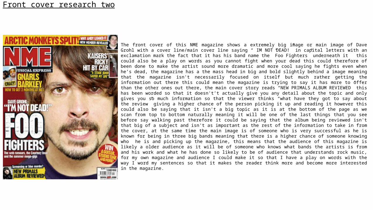
Front cover research two
The front cover of this NME magazine shows a extremely big image or main image of Dave Grohl with a cover line/main cover line saying “ IM NOT DEAD!” in capital letters with an exclamation mark the fact that it has his band name the ”Foo Fighters” underneath it this could also be a play on words as you cannot fight when your dead this could therefore of been done to make the artist sound more dramatic and more cool saying he fights even when he’s dead, the magazine has a the mass head in big and bold slightly behind a image meaning that the magazine isn't necessarily focused on itself but much rather getting the information out there this could mean the magazine is trying to say it has more to offer than the other ones out there, the main cover story reads “NEW PRIMALS ALBUM REVIEWED” this has been worded so that it doesn't’t actually give you any detail about the topic and only gives you so much information so that the viewer thinks “what have they got to say about the review” giving a higher chance of the person picking it up and reading it however this could also be saying that it isn't a big topic as it is at the bottom of the page as we scan from top to bottom naturally meaning it will be one of the last things that you see before say walking past therefore it could be saying that the album being reviewed isn't that big of a subject and isn't as important as the rest of the information to take in from the cover, at the same time the main image is of someone who is very successful as he is known for being in three big bands meaning that there is a higher chance of someone knowing who he is and picking up the magazine, this means that the audience of this magazine is likely a older audience as it will be of someone who knows what bands the artists is from and his work and what he has done so likely to be of audience that understands rock music, for my own magazine and audience I could make it so that I have a play on words with the way I word my sentences so that it makes the reader think more and become more interested in the magazine.
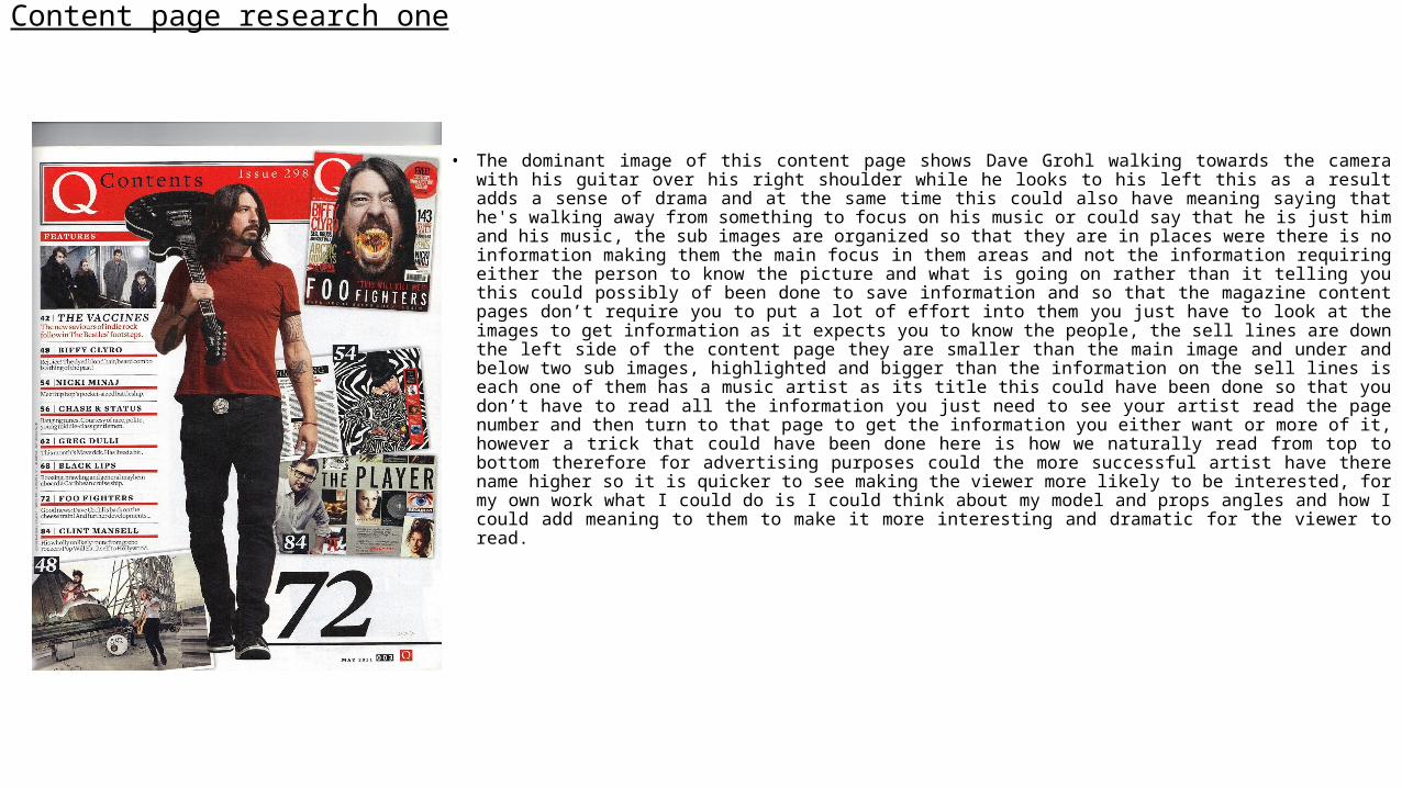
Content page research one
• The dominant image of this content page shows Dave Grohl walking towards the camera with his guitar over his right shoulder while he looks to his left this as a result adds a sense of drama and at the same time this could also have meaning saying that he's walking away from something to focus on his music or could say that he is just him and his music, the sub images are organized so that they are in places were there is no information making them the main focus in them areas and not the information requiring either the person to know the picture and what is going on rather than it telling you this could possibly of been done to save information and so that the magazine content pages don’t require you to put a lot of effort into them you just have to look at the images to get information as it expects you to know the people, the sell lines are down the left side of the content page they are smaller than the main image and under and below two sub images, highlighted and bigger than the information on the sell lines is each one of them has a music artist as its title this could have been done so that you don ’t have to read all the information you just need to see your artist read the page number and then turn to that page to get the information you either want or more of it, however a trick that could have been done here is how we naturally read from top to bottom therefore for advertising purposes could the more successful artist have there name higher so it is quicker to see making the viewer more likely to be interested, for my own work what I could do is I could think about my model and props angles and how I could add meaning to them to make it more interesting and dramatic for the viewer to read.
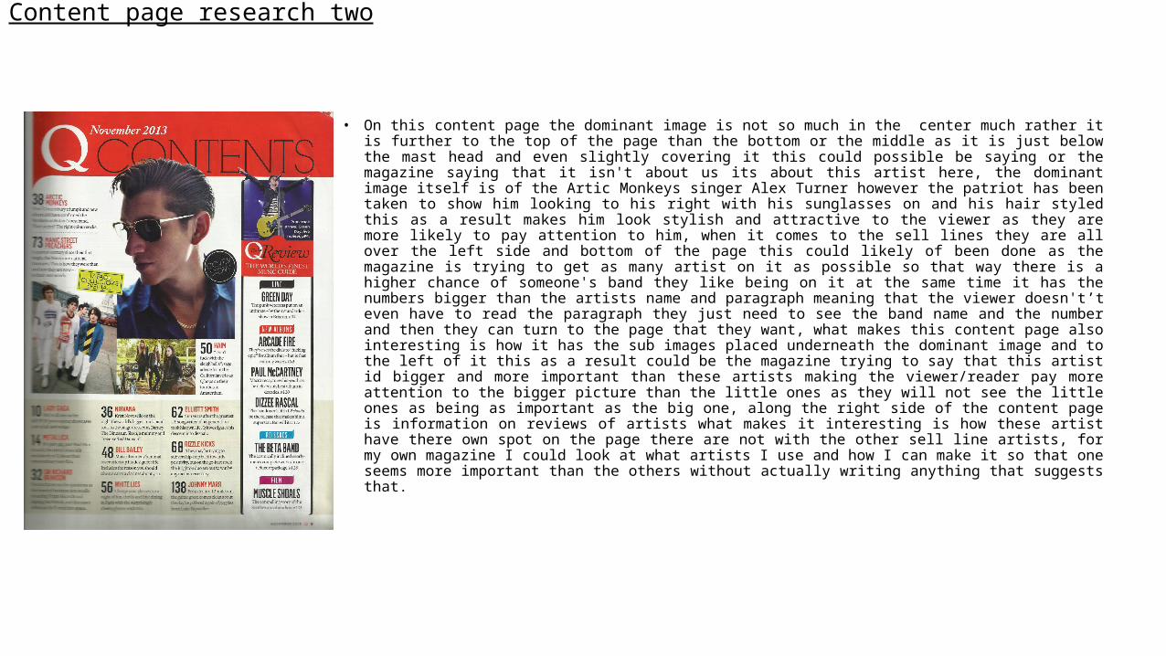
Content page research two
• On this content page the dominant image is not so much in the center much rather it is further to the top of the page than the bottom or the middle as it is just below the mast head and even slightly covering it this could possible be saying or the magazine saying that it isn't about us its about this artist here, the dominant image itself is of the Artic Monkeys singer Alex Turner however the patriot has been taken to show him looking to his right with his sunglasses on and his hair styled this as a result makes him look stylish and attractive to the viewer as they are more likely to pay attention to him, when it comes to the sell lines they are all over the left side and bottom of the page this could likely of been done as the magazine is trying to get as many artist on it as possible so that way there is a higher chance of someone's band they like being on it at the same time it has the numbers bigger than the artists name and paragraph meaning that the viewer doesn't ’t even have to read the paragraph they just need to see the band name and the number and then they can turn to the page that they want, what makes this content page also interesting is how it has the sub images placed underneath the dominant image and to the left of it this as a result could be the magazine trying to say that this artist id bigger and more important than these artists making the viewer/reader pay more attention to the bigger picture than the little ones as they will not see the little ones as being as important as the big one, along the right side of the content page is information on reviews of artists what makes it interesting is how these artist have there own spot on the page there are not with the other sell line artists, for my own magazine I could look at what artists I use and how I can make it so that one seems more important than the others without actually writing anything that suggests that.
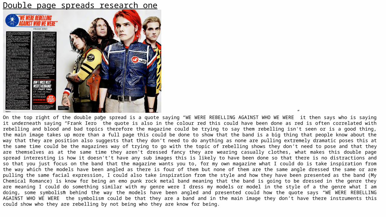
Double page spreads research one
On the top right of the double page spread is a quote saying “WE WERE REBELLING AGAINST WHO WE WERE” it then says who is saying it underneath saying “Frank Iero” the quote is also in the colour red this could have been done as red is often correlated with rebelling and blood and bad topics therefore the magazine could be trying to say them rebelling isn't seen or is a good thing, the main image takes up more than a full page this could be done to show that the band is a big thing that people know about the way that they are position also suggests that they don’t need to do anything as none are pulling extremely dramatic poses this at the same time could be the magazines way of trying to go with the topic of rebelling shows they don ’t need to pose and that they are themselves as at the same time they aren't dressed fancy they are wearing casually clothes, what makes this double page spread interesting is how it doesn't ’t have any sub images this is likely to have been done so that there is no distractions and so that you just focus on the band that the magazine wants you to, for my own magazine what I could do is take inspiration from the way which the models have been angled as there is four of them but none of them are the same angle dressed the same or are pulling the same facial expression, I could also take inspiration from the style and how they have been presented as the band (My Chemical Romance) is know for being an emo punk rock metal band meaning that the band is going to be dressed in the genre they are meaning I could do something similar with my genre were I dress my models or model in the style of a the genre what I am doing, some symbolism behind the way the models have been angled and presented could how the quote says “WE WERE REBELLING AGAINST WHO WE WERE” the symbolism could be that they are a band and in the main image they don’t have there instruments this could show who they are rebelling by not being who they are know for being.
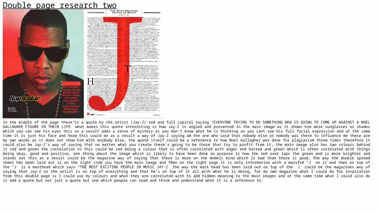
Double page research two
In the middle of the page there is a quote by the artist (Jay-Z) red and full capital saying “EVERYONE TRYING TO DO SOMETHING NEW IS GOING TO COME UP AGAINST A NOEL GALLAGHER FIGURE IN THEIR LIFE” what makes this quote interesting is how Jay-Z is angled and presented in the main image as it shows him were sunglasses or shades which you can see his eyes this as a result adds a sense of mystery as you don’t know what he is thinking as you cant see his full facial expression and at the same time it is just his face and head this could be as a result a way of Jay-Z saying am the one who said that nobody else or nobody was there to influence me these are my own words as it does not show him with anybody else, the quote itself could be a reference to how Noel Gallagher was done for plagiarism three times therefore it could also be Jay-Z’s way of saying that no matter what you create there's going to be those that try to profit from it, the main image also has two colours behind it red and green the correlation to this could be red being a colour that is often correlated with anger and hatred and green which is often correlated with things being okay, good and positive, one thing about the image which is likely to have been done on purpose is how the red over laps the green and is more brighter and stands out this as a result could be the magazine way of saying that there is more on the models mind which is bad than there is good, the way the double spread sheet has been laid out is on the right side you have the main image and then on the right page it is only information with a massive “J” on it and then on top of the “J” is a masthead which says “THE MOST EXCITING PEOPLE IN MUSIC JAY-Z” the way the mast head has been laid out on top of the ”J” could be the magazines way of saying that Jay-Z or the artist is on top of everything and that he’s on top of it all with what he is doing, for my own magazine what I could do for inspiration from this double page is I could use my colours and what they are correlated with to add hidden meaning to the main images and at the same time what I could also do is add a quote but not just a quote but one which people can read and think and understand what it is a reference to.