de-fine me
DESCRIPTION
Fall 2012 Process Book for studio 451TRANSCRIPT

de- fine me

Rachel Elise
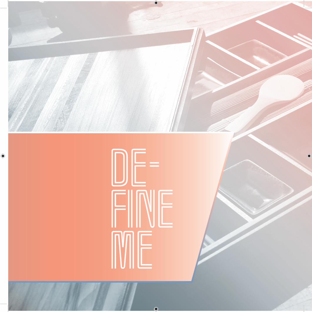
de- fine me

Fall 2012University of
TennesseeGraphic DesignProcess Book
ProducedWritten
PhotographedIllustrated &
Constructed by:
Rachel Elise MArch, Interior Architecture &
Product Design ‘09
you know that feeling when you pay a parking ticket?
...I get that same feeling when I’m
The goal here? Well...to de-”fine” and definebuying art supplies. Like you’re being fined...
Where we’ll end up? Nobody knows...

de- fine me
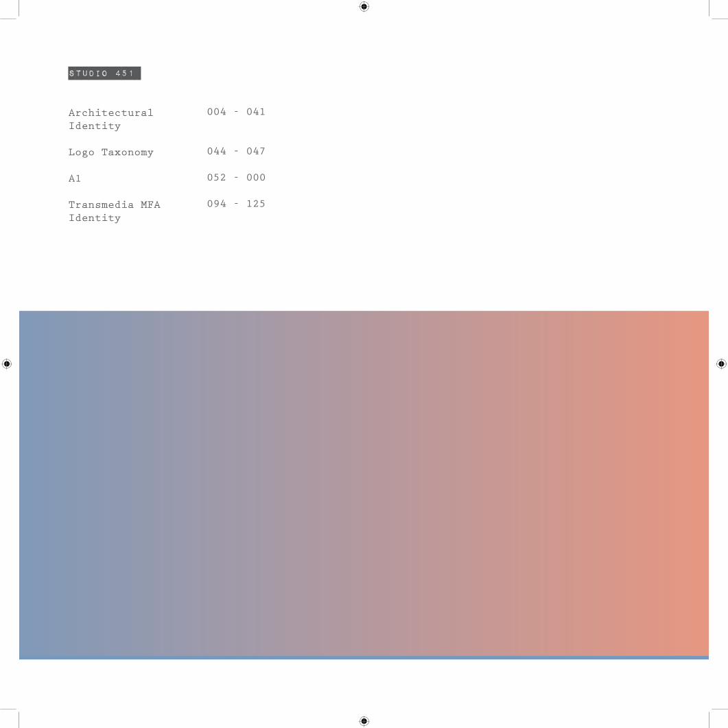
Studio 451
Architectural Identity Logo Taxonomy
A1 Transmedia MFA Identity
004 - 041
044 - 047
052 - 000 094 - 125

Con- tents
ummmm...looks like you opened Pandora’s Freakin Box...
maybe...well? oh, what if you- ....nevermind...
where is that list?!?
first comps
dues wednesd
ay. K, guys?
have you taken the downtown greenway yet?
did they
steal t
he power
strip a
gain?!?
Do you have a dongle?
ya, good luck with that...
thaaaaaaaattts right...jenga master jedi!
WHAT AM I DOING!!!!!
Studio 451 //
002

Studio 451
Studio 451 //
003
Studio 451 //
HOW’S THAT FOR A TWIST ON HISTORICAL RESTORATION?!?!
GET YOUR SWAGNEY AT MAGNEY...HA HA, JAKE!
BIOCLIMATIC...HUH?
THIS IS WAY MORE FUN THAN PLAYING THE CAD MONKEY ALL DAY.
funny...I leave architecture for graphics and the fist project is none other than architecture...
004

arch. id
Studio 451 //
005
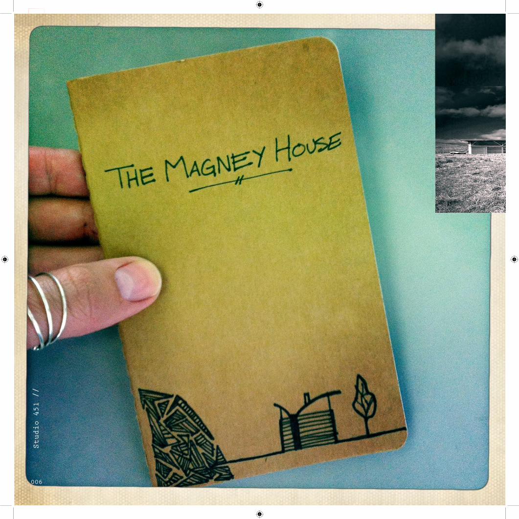
Studio 451 //
006

<< This project is a combination of architectural, ty-
pographical, and identity design as well as exploring
visual culture. You’ll see a progression in stages of
creativity and innovation that bridle a new identity
system to a selected building...which turned out to
the Magney House by Glen Murcutt.
Studio 451 //
007

>> Figuring out the archi-
tects intent...this is
where I began to appreciate
my degree in Architecture
...thank you systems class.
Studio 451 //
008

Studio 451 //
009

Studio 451 //
010

<< Needless to say this is
my technical and more prag-
matic side setting up the
foundation for
ideation...I love those wee
little sketchbooks...they
make me feel smart :-)
Studio 451 //
011

>> Architecture knowledge
that came in handy...pretty
much all the environmental
stuff that people think is
boring. You know... wind
direction, stack or cross
ventilation, climate, site
position, etc. That kind
of “stuff”.
Studio 451 //
012

<< Taking a look at the
systems Mercutt inte-
grated into the house were
instrumental in initial
ideation...simple shapes,
that’s where it’s at...
Studio 451 //
013

Studio 451 //
014

<< For a more interesting
communication of the tech-
nical information...and to
add value to my place in
the class...visual aids
were necessary.
Just don’t expect
Fedex to perform a simple
job without error...aiaiai!
Studio 451 //
015

>> Timeout for a few case
studies on identity systems
and their designers...form,
function, application, etc.
Studio 451 //
016

Studio 451 //
017

Studio 451 //
018

STEP 2: Come up with ideas that you think are good, but are
not so good...some are fairly ugly..FUGLY...
Studio 451 //
019

<< Lettering workshop
...creating type to
inspire ideation
Studio 451 //
020

<< This is a good example of how jumping ships from an
initial, well founded, reasoning or concept can produce
shallow ineffective forms. Forms that fail to cele-
brate even the obvious. I did find a place of appreci-
ation for the fenestration of louvres in this here.
Studio 451 //
021

Studio 451 //
022
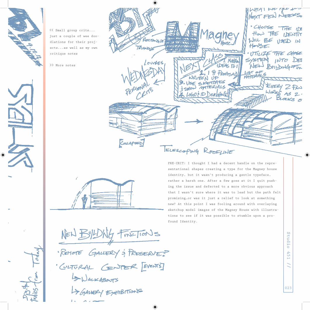
<< Small group crits...
just a couple of wee doo-
dlations for their proj-
ects...as well as my own
critique notes
>> More notes
PRE-CRIT: I thought I had a decent handle on the repre-
sentational shapes creating a type for the Magney house
identity, but it wasn’t producing a gentle typeface,
rather a harsh one. After a few goes at it I quit push-
ing the issue and defected to a more obvious approach
that I wasn’t sure where it was to lead but the path felt
promising…or was it just a relief to look at something
new? At this point I was fooling around with overlaying
sketchup model images of the Magney House with illustra-
tions to see if it was possible to stumble upon a pro-
found Identity.
Studio 451 //
023

Studio 451 //
024

STEP 3: NOw...Come up with ideas that are good...Then Execute them.
Studio 451 //
025
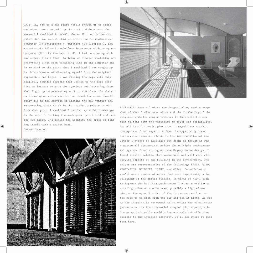
CRIT: OK, off to a bad start here…I showed up to class
and when I went to pull up the work I’d done over the
weekend I realized it wasn’t there. Not on my new com-
puter that is. Amidst this project I had to replace my
computer (Go Speedracer!), purchase CS6 (Yippee!!), and
transfer the files I needed/was in process with to my new
computer (Not the fun part ). SO, I had to come up with
and engage plan B ASAP. In doing so I began sketching out
everything I had been tinkering with in the computer and
in my mind to the point that I realized I was caught up
in this sickness of divorcing myself from the original
approach I had begun. I was filling the page with only
shallowly founded designs that looked to the mere roof-
line or louvres to give the typeface and lettering form.
When I got up to present my work to the class (in sketch-
es blown up on xerox machine, no less) the class immedi-
ately did me the service of dashing the new venture and
reinstating their faith in the original work…se le vie!
From that point I realized I had let my stubbornness get
in the way of letting the work grow upon itself and take
its own shape. I’d denied the identity the grace of find-
ing itself with a guided hand.
Lesson learned.
POST-CRIT: Have a look at the images below, each a snap-
shot of what I discussed above and the furthering of the
original symbolic shapes venture. In this effort I may
need to tone down the variation of color for readability,
but all in all I am happier that I purged back to this
concept and found ways to soften the type using trans-
parency and rounding edges. In the juxtaposition of each
letter I strove to make each one seems as though it was
a system all its own…not unlike the multiple environmen-
tal systems found throughout the Magney House design. I
found a color palette that works well and will work with
varying aspects of the building in its environment. The
colors are representative of the following: EARTH, WIND,
VEGETATION, WILDLIFE, LIGHT, and OCEAN. On each board
you’ll see a number of notes, but more importantly a de-
velopment of the shapes concept. In terms of how I plan
to improve the building environment I plan to utilize a
rotating print on the louvres, possibly a lighted ver-
sion on the opposite side of the louvres as well as on
the roof to be seen from the air and sea at night. As far
as the interior is concerned color coding the circulation
patterns on the floor material coupled with super graph-
ics on certain walls would bring a simple but effective
element to the interior identity. We’ll see where it goes
from here…
Studio 451 //
026

>> A color palette devised
to speak to the nature sur-
rounding the Magney House.
Studio 451 //
027

>> From lettering to push-
ing those shapes into
a mark here are multiple
iterations of the mark
Studio 451 //
028

Studio 451 //
029

Studio 451 //
030

STEP 3: NOw...Come up with ideas that are good...Then Execute them.
Studio 451 //
031

[magney house]
Studio 451 //
032

>> LED lighting on the
building louvres light up
the coast with information,
events, and of ocurse the
Magney identity.
>> The Magney Logo as a
vehicle decal to spread
awareness of the regional
cutural center
>> Men and Women’s apparel
to be sold in the Magney
House cultural center shop
Studio 451 //
033
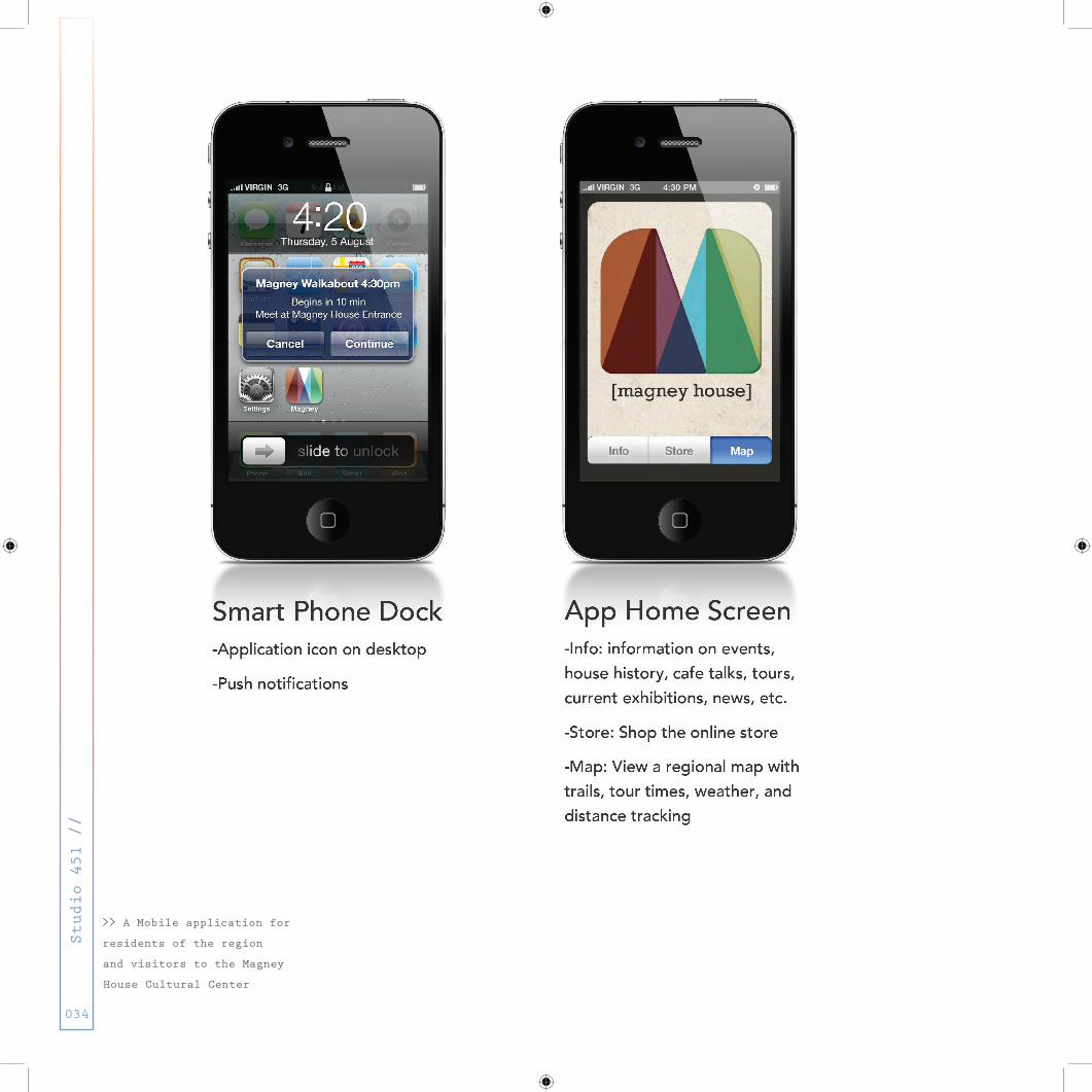
>> A Mobile application for
residents of the region
and visitors to the Magney
House Cultural Center
Studio 451 //
034
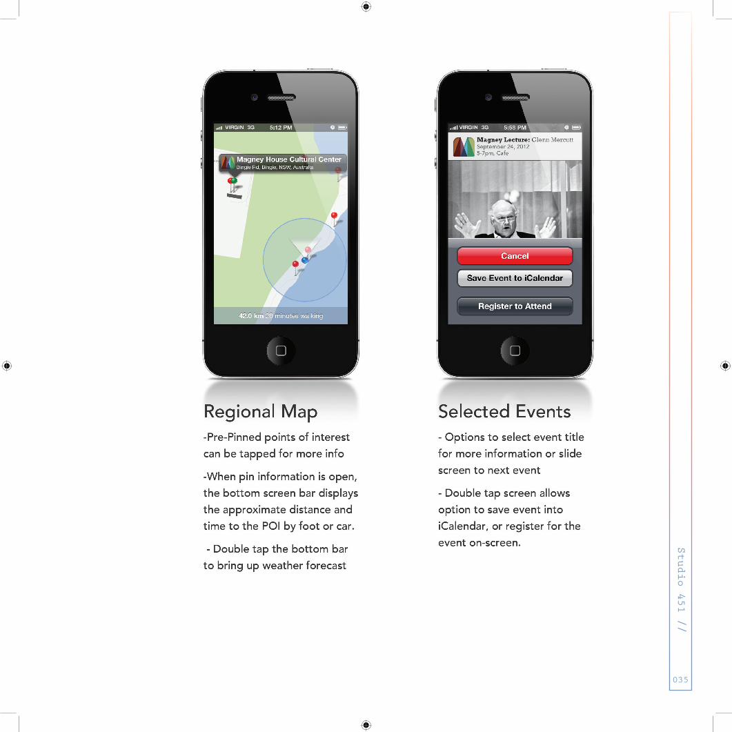
Studio 451 //
035

Studio 451 //
036

>> All elements of the new
Magney House identity as an
Australian cultural center.
<< Regional promotional
poster for the Magney House
Cultural Center.
Studio 451 //
037

Studio 451 //
038

STEP 4: Reflect on where to go from here...whats the next move?
Nothing is ever perfect to everyone...
now figure out how to make it better
Studio 451 //
039

So going into Crits I elected to pursue an identity that
uses people as the primary vehicle for external expo-
sure. On the first poster you’ll see the final logo form
clipped with images of the Magney House, sans the grey
horizontal bar that was previously spanning the mark hor-
izontally. While departing from that aspect of the pre-
vious form I found that the shapes became more readable
and the outer vertical rectangles, with a filleted top,
mimicked the roofline and walls of the building itself.
All in all after looking at it for so long the new ver-
sion could breathe more than the old. The type below the
mark was shortened and changed to Rockwell…it just seemed
to emulate the essence of the building’s architectural
language. As for this promo poster the idea is that it
would be hung in local community venues, campus halls,
rec centers, schools, etc. I tried letting the logo and
type sit free of any borders, frames, etc. but in further
iterations it felt like there needed to be a grounding
plane and texture.
When looking at the second poster it’s essent-
ially the outline of the identity components:
Logo, LED Louvre Signage, Vehicle Decal, Mobile Applica-
tion, and Apparel
In terms of where I go from here? Well, I am happy to see
a lot of improvements in my work across the board. BUT,
grasping the idea that, unlike architecture, graphics
often flow from form to function is more trying than I
ever would’ve thought. While drinking out of a proverbi-
al fire hose this semester the other tool in my shop that
needs considerable work is typography. I’m a far cry from
what atrocious things I produced less than a year ago
this semester undertaking typography while implementing
it in everything feels like I’m running the 3ooM hurdles…
the hell race. It’s rough going though I’ve got a lot of
training, but I’ll be so glad when the race ends and I
can begin the warm down…if you prefer another metaphor–
it’s like learning a new language.
-Onward I go…
Studio 451 //
040

Studio 451 //
041

Studio 451 //
042

Studio 451 //
043
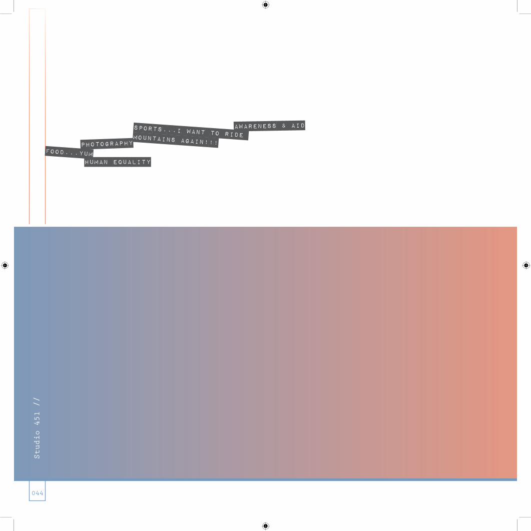
Sports...I want to ride mountains again!!!photographyFOOD...YUM
Human Equality
Awareness & aid
Studio 451 //
044
Logo Taxo- nomy
Studio 451 //
045

LOGO TAXONO“ME” RACHEL ELISE 09 05 2012
PHOTOGRAPHY FOOD
AWARENESS & AID
SPORTS
HUMAN EQUALITY
Studio 451 //
046
LOGO TAXONO“ME” RACHEL ELISE 09 05 2012
PHOTOGRAPHY FOOD
AWARENESS & AID
SPORTS
HUMAN EQUALITY LOGO TAXONO“ME” RACHEL ELISE 09 05 2012
PHOTOGRAPHY FOOD
AWARENESS & AID
SPORTS
HUMAN EQUALITY
LOGO TAXONO“ME” RACHEL ELISE 09 05 2012
PHOTOGRAPHY FOOD
AWARENESS & AID
SPORTS
HUMAN EQUALITY

LOGO TAXONO“ME” RACHEL ELISE 09 05 2012
PHOTOGRAPHY FOOD
AWARENESS & AID
SPORTS
HUMAN EQUALITY
<< In this exercise the
instruction was to collect
no less than 30 logos that
we have recently been ex-
posed to and break down the
lot of then into a taxonomy
of categories. Here’s what
I’ve been looking at…well,
since summer.
Studio 451 //
047
LOGO TAXONO“ME” RACHEL ELISE 09 05 2012
PHOTOGRAPHY FOOD
AWARENESS & AID
SPORTS
HUMAN EQUALITY
LOGO TAXONO“ME” RACHEL ELISE 09 05 2012
PHOTOGRAPHY FOOD
AWARENESS & AID
SPORTS
HUMAN EQUALITY
Nothing matters at all but the craft... ...and maybe a paycheck.Studio 451 //
048

Nothing matters at all but the craft... ...and maybe a paycheck.
“Okay, so life right now is best described as:
I am drinking out of a firehose…
wtf was I thinking?!?!?
Maybe it’s a bit melodramatic, but the innate first born
child desires to please others rather than myself have
overtaken…prioritization is my number one project and the
shark of time is thrashing me from one side to anoth-
er. It’s currently 2am on Monday morning, mind you this
is meant to be after what some people thought would be
called fall break…more like fall [it will] break [you].
The trial of taking so many studios has certainly put
my midwest work ethic to the test, and here the rivers
have merged. While I’m meant to be writing a book on what
brings people together [yep, no where near enough re-
search done for the rough draft to be written for wednes-
day], completing the never ending yet infamous type ex-
ercises [finished that 2 hours ago...seriously], and of
course the fun project…this A1 project [the one I really
wanted to be working on].
So….I am fully aware of every due date and each assign-
ment but given my circumstance for returning to Uni,
let’s raise our glasses to doing it for yourself, NOT for
the grade or the due date. YES, pens will diagram, copy
will be written, illustrator will illustrate, work will
be done and not for the utopian idea of how most people
think design gets done [by pulling it out of our rears].
The quasi-OCD side of me will be tempered once more as I
reluctantly remind myself to to what is humanly possi-
ble in the given 24hrs in a day, all while ignoring the
incessant urging of my roomies [the parents] to go to bed
because everyone needs rest. With that said, here’s to
just one more all nighter I’ll have pulled for design,
and please excuse the sparseness of this page while real
life is going on behind the screen…Cheers [thanks for
your patience]”
<< Blog post after Fall Break
Studio 451 //
049
...slight freak out moment induced
by sleep depravity

Studio 451 //
050

Studio 451 //
051

adventurous
resilient
equipped
relise
REALLY? A WOLF...I...I JUST THINK THEY ARE SCARY AND MEAN. BUT I DON’T SEE YOU THAT WAY...
HA, HA, HAAA...DID YOU SEE JARED’S??? GOT MY MIND ON MY MONEY!
AND MY MONEY ON MY MIND!
Studio 451 //
052
REALLY? A WOLF...I...I JUST THINK THEY ARE SCARY AND MEAN. BUT I DON’T SEE YOU THAT WAY...
HA, HA, HAAA...DID YOU SEE JARED’S??? GOT MY MIND ON MY MONEY!
a1
Studio 451 //
053

Studio 451 //
054
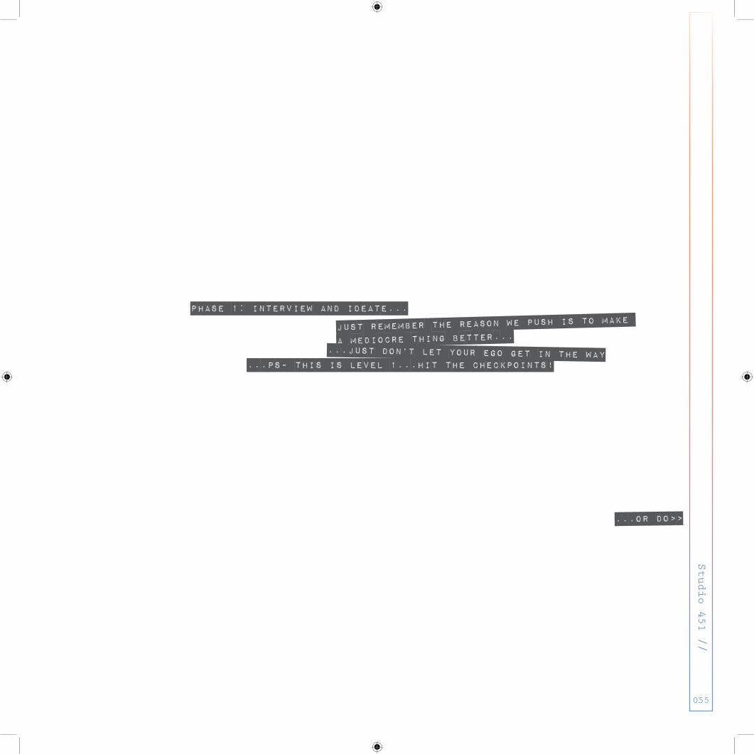
PHASE 1: interview and ideate...
just remember the reason we push is to make
a mediocre thing better...
Studio 451 //
055
...just don’t let your ego get in the way
...or do>>
...ps- this is level 1...hit the checkpoints!
Studio 451 //
056
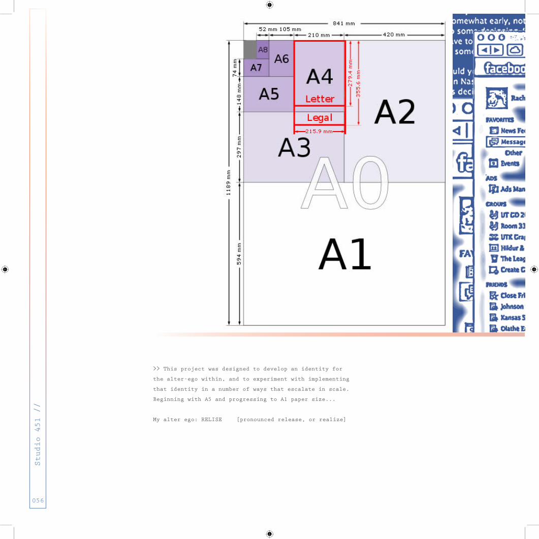
>> This project was designed to develop an identity for
the alter-ego within, and to experiment with implementing
that identity in a number of ways that escalate in scale.
Beginning with A5 and progressing to A1 paper size...
My alter ego: RELISE [pronounced release, or realize]

Studio 451 //
057
<< A5 Interview with
Emily Gilles conducted via
Facebook messaging...

>> A5 Interviw >> A5 Grid >> A3 Self Portrait
>> A4 Mark
>> This is the breakdown of
how various aspects of the
project relate to
one another.
Studio 451 //
058

>> A2 Tourguide
Studio 451 //
059

Studio 451 //
060

PHASE 2: MAKE A MARk...and make it a4...ps- this is level 2...don’t fail...
Studio 451 //
061

Studio 451 //
062
>> Mind mapping the possi-
bilities of an Alter Ego
named Relise.

Studio 451 //
063
>> Taking the mind mapping
a step further to establish
related visuals...

>> experimenting with hand
drawn images that the visu-
als mind map generated...
3 Words the mark for RELISE
must represent and embody
>>>>>>>>>>>>>>>>>>>>>>>>>>
>> ADVENTUROUS
>> EQUIPPED
>> RESILIENT
Studio 451 //
064
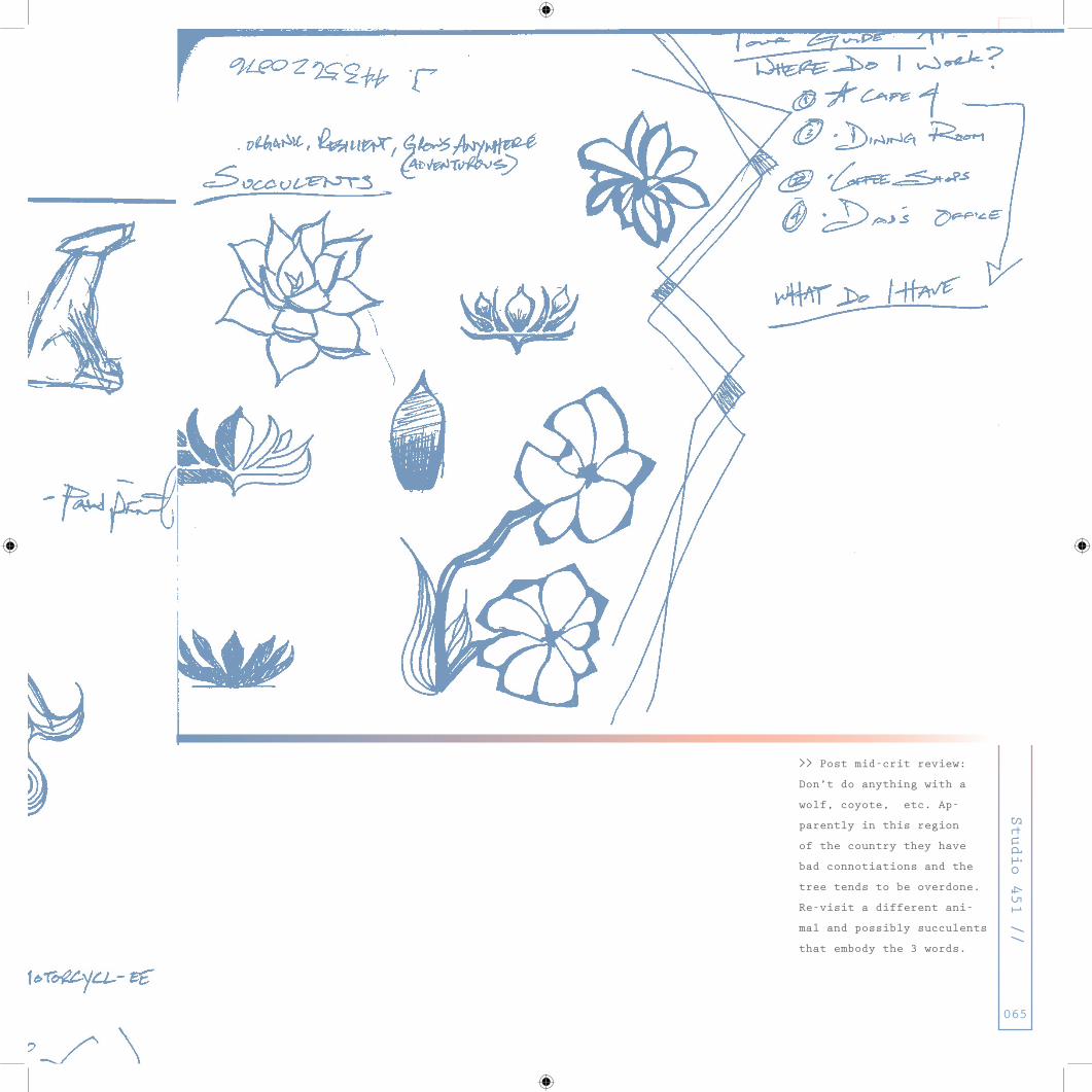
>> Post mid-crit review:
Don’t do anything with a
wolf, coyote, etc. Ap-
parently in this region
of the country they have
bad connotiations and the
tree tends to be overdone.
Re-visit a different ani-
mal and possibly succulents
that embody the 3 words.
Studio 451 //
065
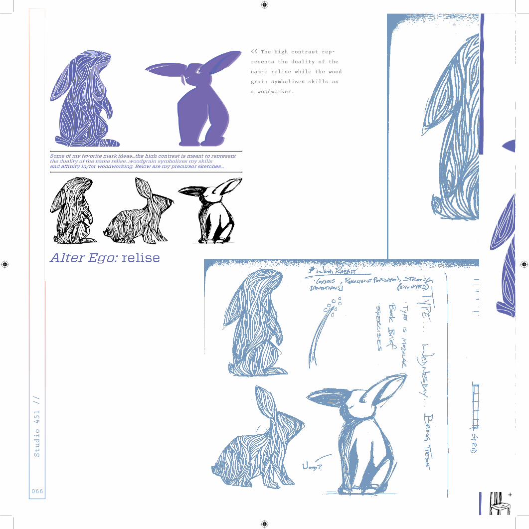
<< The high contrast rep-
resents the duality of the
namre relise while the wood
grain symbolizes skills as
a woodworker.
Studio 451 //
066
Studio 451 //
067

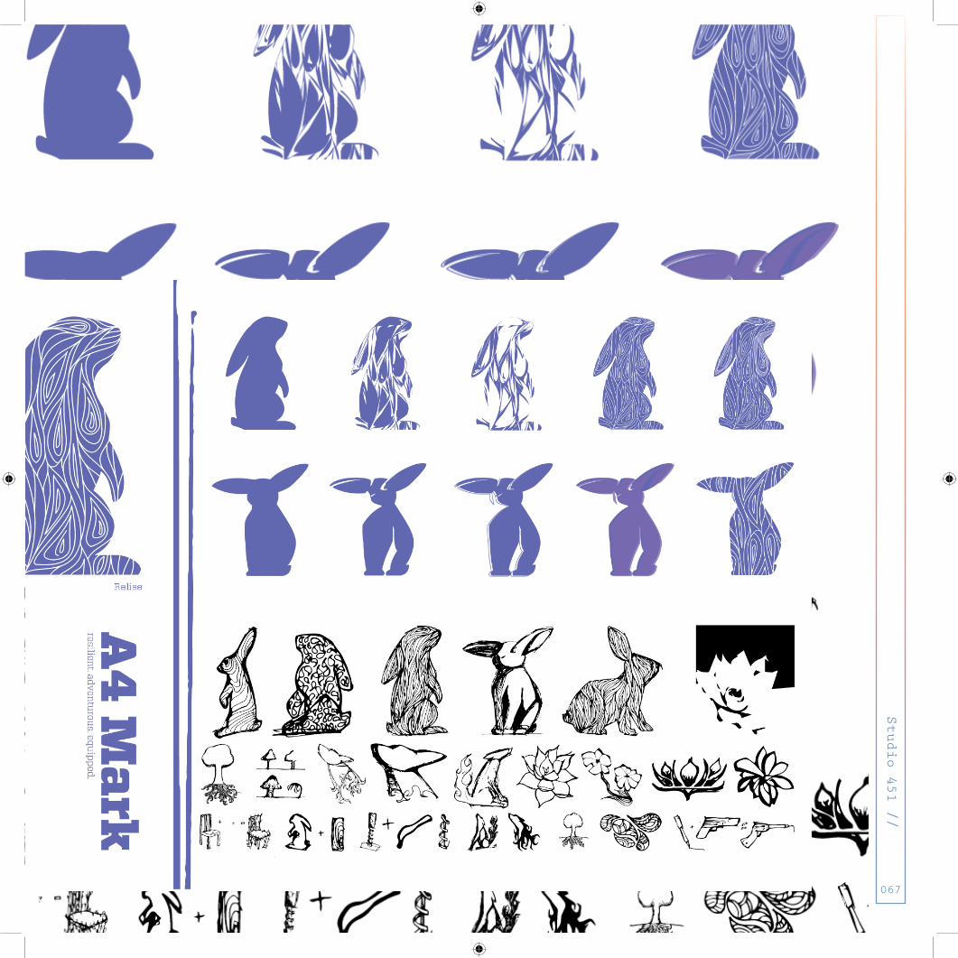
>> The final mark... the
hand drawn quality, though
cleaned up in the computer,
alludes to the many tech-
nical and fine art skills
relise comes equipped with.
Studio 451 //
068

Studio 451 //
069

Studio 451 //
070

PHASE 3: Create a Self Portrait...and make it a3...ps- this is level 3...Who are you...
Studio 451 //
071

>> The self portrait be-
gan as a literal expression
using another skill I’ve
become equipped with...
oil painting.
Studio 451 //
072

Studio 451 //
073
>> Though the self portrait
began as an oil painting,
I reintroduced the hand
drawing into the final
iteration of the image...
in the hair I incorporated
elements that were part of
the the process of
this project.
Studio 451 //
074

Studio 451 //
075

Studio 451 //
076

PHASE 4: MAKE A Tourguide...and make it a2...ps- this is level 4...don’t get lost...
Studio 451 //
077

Studio 451 //
078
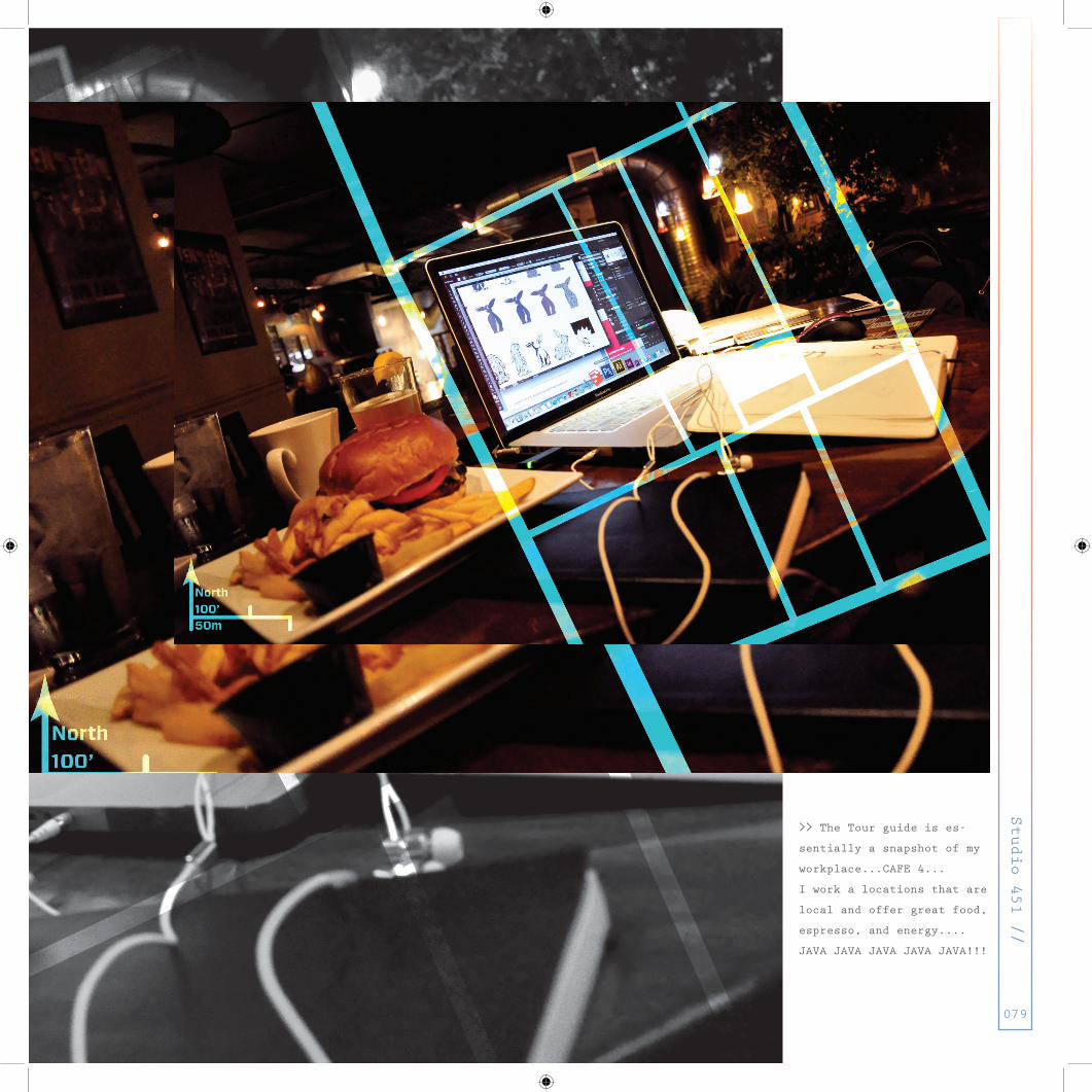
>> The Tour guide is es-
sentially a snapshot of my
workplace...CAFE 4...
I work a locations that are
local and offer great food,
espresso, and energy....
JAVA JAVA JAVA JAVA JAVA!!!
Studio 451 //
079

Studio 451 //
080

Studio 451 //
081

>> The final tour guide...
reduced and refined.
Studio 451 //
082

Studio 451 //
083

Studio 451 //
084
PHASE 5: Put it all together...and make it a1...ps- this is level 5...Mission nearly complete...
Studio 451 //
085

>> A few open iterations
that really didn’t feel
right ...so naturally I
tried again...
Studio 451 //
086
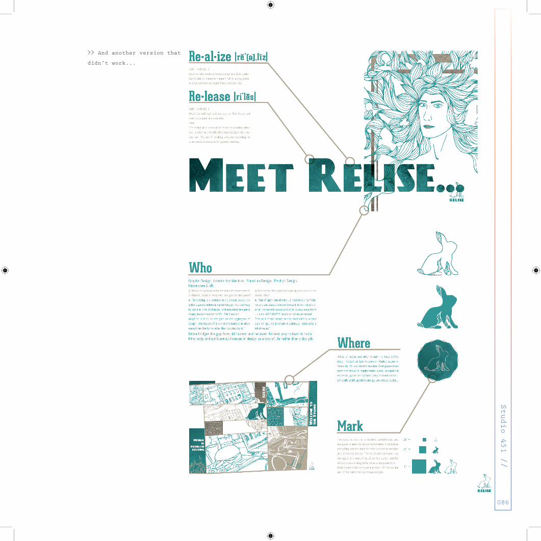
>> And another version that
didn’t work...
Studio 451 //
086

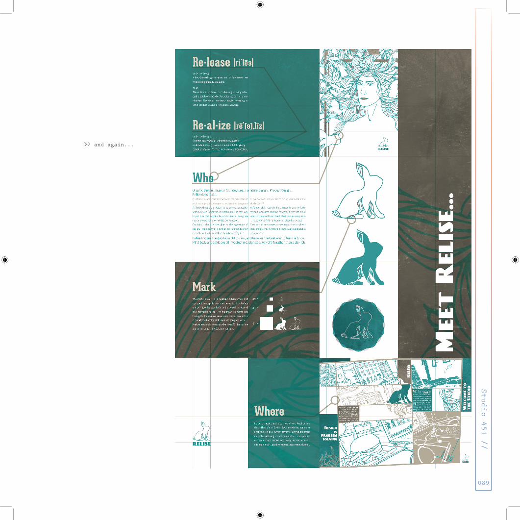
>> and again...
Studio 451 //
088
>> and again...
Studio 451 //
089

Studio 451 //
090

>> Final Critiques for the
A1 poster
Studio 451 //
091

>> and again...but it
worked this time...
Studio 451 //
092

Studio 451 //
093

What is FLUX?
We don’t exactly know how this os going to work
Centripetal Force
Geeze this is so what I’ve had to learn on my owndo an experiment...
does it work?
put it in a box and there you go...
take a stab at it...but it might need some help
what about application???
Studio 451 //
094

trans- media id
Studio 451 //
095

Studio 451 //
002
Studio 451 //
096
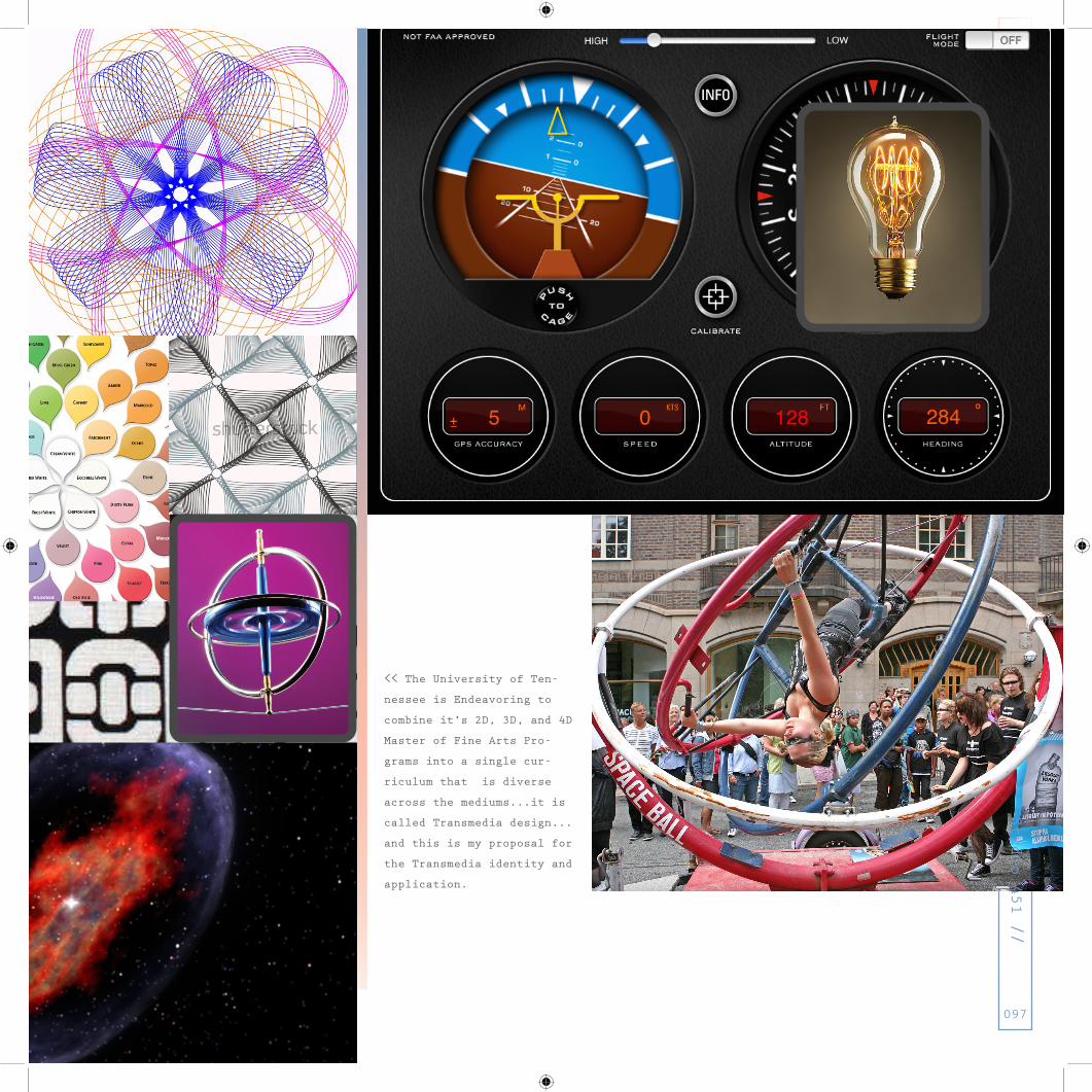
<< The University of Ten-
nessee is Endeavoring to
combine it’s 2D, 3D, and 4D
Master of Fine Arts Pro-
grams into a single cur-
riculum that is diverse
across the mediums...it is
called Transmedia design...
and this is my proposal for
the Transmedia identity and
application.
Studio 451 //
097

Studio 451 //
098

Studio 451 //
099
<< Here we are taking the
idea of Flux and defining
it in a number of ways and
experiments gave context to
the possibilities of the
flexible identity that the
Transmedia design program
will employ

>> More Experiments...
and fun
Studio 451 //
100

Studio 451 //
101

Studio 451 //
102

Studio 451 //
103
Mission 1: Take the experiments and create
visuals

Studio 451 //
104
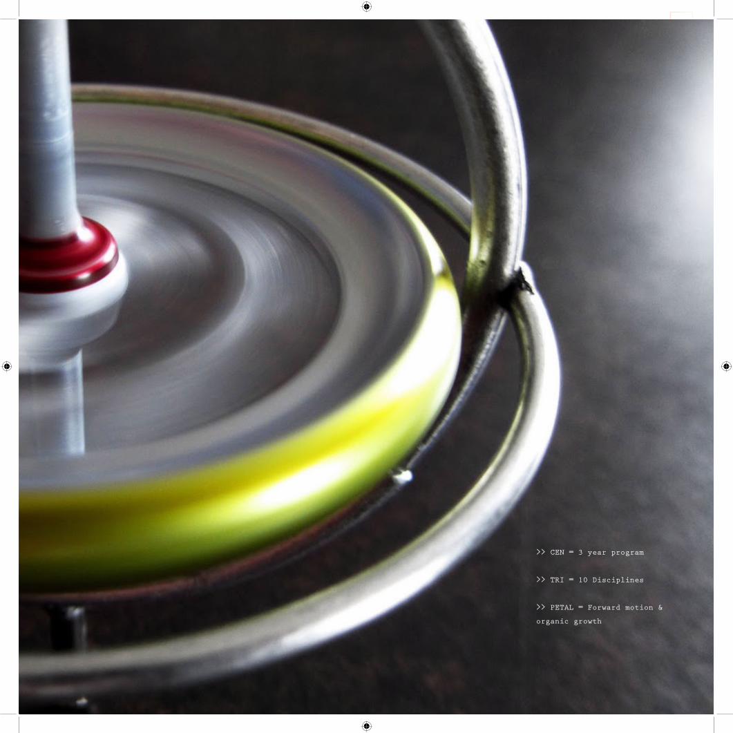
>> CENTRIPETAL FORCE...
say that 5x fast...
Studio 451 //
105
>> CEN = 3 year program
>> TRI = 10 Disciplines
>> PETAL = Forward motion &
organic growth

Studio 451 //
106

Studio 451 //
107
<< variations of the ap-
plication of this flexible
identity...Version 1

Studio 451 //
108

Studio 451 //
109
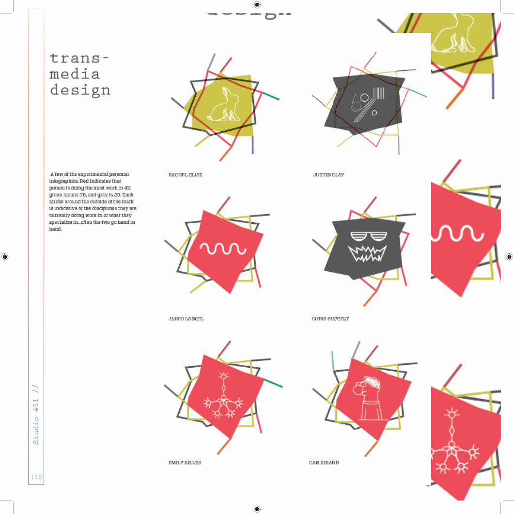
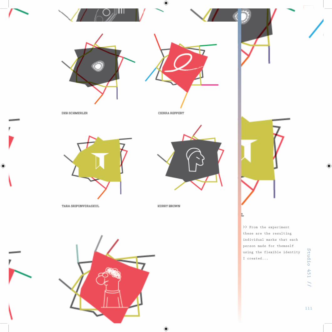
>> Experimentation with
personalization...Version 2
Studio 451 //
110
Studio 451 //
111
>> From the experiment
these are the resulting
individual marks that each
person made for themself
using the flexible identity
I created...

Studio 451 //
112
Studio 451 //
113
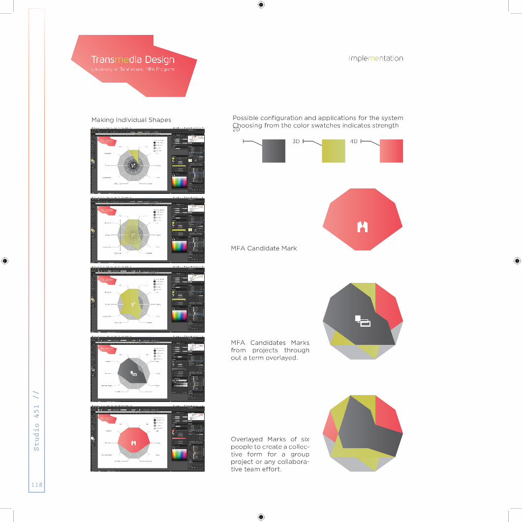
Mission 2: Refine the system and make the
identity work
...in real life that is...not just in your head

trans-mediadesignLevel of capability within the respective discipline
industrial
exhibition
business
research
Digital
2D3D
4D
environmental
self designed student logo or TMD text
Studio 451 //
114

Studio 451 //
115

>> This version...Version 3
is a reduction and refine-
ment of the experiments
Studio 451 //
116

Studio 451 //
117
Studio 451 //
118

Studio 451 //
119
Studio 451 //
120

As we were aiming to define what Transmedia means, how
it works, and the way UT’s new program would function I
found that my own path would be a significant source to
draw on. One way or another the purpose of endeavoring
in a Masters degree program is to enrich the foundation
upon which a student has built to this point, whether it
be an academic or commercial motivation. This idea that
Transmedia design is meant to incorporate a fluid way of
thinking and moving among multiple mediums is best facil-
itated by pushing experimentation in a number of courses
and environments not specific to one field or medium,
and in a way that by the end of study student has learned
to function successfully across the fields in an adapt-
able way. Nothing is ever perfect, and while beauty is in
the eye of the beholder it’s important to understand
that “pretty” does not fix problems. Form and Function
are not often finite and it’s the genius of the designer
that produces a methodology, system, or solution to
address any number of issues resolved by design.
Commercial needs for designers are changing constantly
as of late, and the ability to work as a “Jack/Jane of
All Trades” is becoming increasingly requested and sought
out by employers. For those seeking to remain in academia
beyond their study in Transmedia design it is critical
they are able to guide a future generation of designers
who can tackle thinking in a number of dimension, field,
and have the technical skill to support the granduer of
highly conceptual ideas. Design is essentially
problem solving.
In terms of my own path I have spent the last eight years
in design; six in architecture; four in product/indus-
trial design; and approaching one year in graphic de-
sign. Muddled between those classes in my undergraduate
study were a number of business, marketing, and economics
courses...just a few hours short of a minor. In may of
2009 I completed a Masters Degree in Interior Architec-
ture & Product Design with a focus in Furniture Design.
With such an intense six year study in learning how to
design virtually the whole 3D environment from large to
small scale I assumed I would immediately find employment
and begin a 8-5 job. Now I’m grateful that didn’t happen.
I came to realize through a series of layoffs, sales po-
sitions, and freelance work, that to be successful (not
necessarily financially) Iad to change my mindset from
designing as a part of work to designing and problem
solving as a way of life. So many experimental failures,
exposures new crafts and mediums, extensive traveling, as
well as the useful business principles I’d learned forced
me outside of my comfort zone and enriched my proverbi-
al toolbox. It created a paradigm that made the fear of
trying/learning new things fall to the background because
the return on my investments would benefit me in some
future project or endeavor. More recently that 3D form
of thinking has been flipped on its head with the expo-
sure to Graphic design...mostly because you can ride the
conceptual train far longer. The point is focusing on one
medium tends to pidgeon hole designers, but challenging
them to take the skills and principles of problem solv-
ing and apply those to a new problem or medium constantly
teaches the designer’s mind to be a dynamic, adaptable,
teachable, and an ever expanding toolbox...in any medium.
Below is how I would imagine exposure to the Transmedia
way of thinking to be facilitated...surely this could be
improved upon in a number of ways: A Final Solution is in
the works...To be continued...
<< Curriculum Proposal
Studio 451 //
121

Studio 451 //
122
Mission 3: Produce a refined Final Solutio
n
...although what is ever final since nothing is perfect?
TO BE CONTIINUED...
Studio 451 //
123

>> Just keep going...
just make something...
trust yourself...
just do it...
Studio 451 //
124

Studio 451 //
125