data8 uc berkeley
DESCRIPTION
data sciecne uc berkeleyTRANSCRIPT
pdfcrowd.comopen in browser PRO version Are you a developer? Try out the HTML to PDF API
Chapter 3
Is There a Difference?
Iteration
INTERACT
pdfcrowd.comopen in browser PRO version Are you a developer? Try out the HTML to PDF API
We've seen how data is represented as a sequence of values. What if we want to do
something once for each value in the sequence? For instance, maybe we want to
compute the sum of a sequence of numbers. How can we do that? The answer is to
use iteration: in particular, we use a Python construct called a -loop. Check it out:for
tbl = Table([[2,3,10]], ['num'])
tbl
num
2
3
10
tbl['num']
array([ 2, 3, 10])
OK, so that gives us a sequence of numbers (the sequence 5, 6, 11).
total = 0
pdfcrowd.comopen in browser PRO version Are you a developer? Try out the HTML to PDF API
for i in tbl['num']:
total = total + i
total
15
Notice how this works. We start out by setting to hold the number 0. Then, we
go through the sequence, one by one. For each number in the sequence, we
temporarily set to hold that number, and then we execute the statement
. This statement replaces the previous value of with . In
other words, it adds to the current running total. Once we've gone through the
entire sequence, holds the sum of all of the numbers in the sequence.
total
i total =
total + i total total + i
i
total
In short, a -loop lets you do something once for each item in a sequence. It
through the sequence, examining each value one at a time, and does
something for each.
for
iterates
In this case, we could have accomplished the same task without a -loop: there is
a function we could have used ( ) to do this for us. That's not unusual;
it's not unusual that there might be multiple ways to accomplish the same task. But
for
numpy np.sum
pdfcrowd.comopen in browser PRO version Are you a developer? Try out the HTML to PDF API
sometimes there is no existing Python function that does exactly what we want, and
that's when it is good to have tools we can use to do what we want.
Repetition¶A special case of iteration is where we want to do some simple task multiple times:
say, 10 times. You could copy-paste the code 10 times, but that gets a little tedious,
and if you wanted to do it a thousand times (or a million times), forget it. Also, copy-
pasting code is usually a bad idea: what if you realize you want to change some piece
of it? Then you'll need to laboriously change each copy of it. Boooring!
A better solution is to use a -loop for this purpose. The trick is to choose a
sequence of length 10, and then iterate over the sequence: do the task once for each
item in the sequence. It doesn't really matter what we put in the sequence; any
sequence will do.
for
However, there is a standard idiom for what to put in the sequence. The typical
solution is to create a sequence of consecutive integers, starting at 0, and iterate over
pdfcrowd.comopen in browser PRO version Are you a developer? Try out the HTML to PDF API
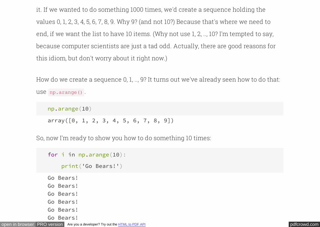
it. If we wanted to do something 1000 times, we'd create a sequence holding the
values 0, 1, 2, 3, 4, 5, 6, 7, 8, 9. Why 9? (and not 10?) Because that's where we need to
end, if we want the list to have 10 items. (Why not use 1, 2, .., 10? I'm tempted to say,
because computer scientists are just a tad odd. Actually, there are good reasons for
this idiom, but don't worry about it right now.)
How do we create a sequence 0, 1, .., 9? It turns out we've already seen how to do that:
use .np.arange()
np.arange(10)
array([0, 1, 2, 3, 4, 5, 6, 7, 8, 9])
So, now I'm ready to show you how to do something 10 times:
for i in np.arange(10):
print('Go Bears!')
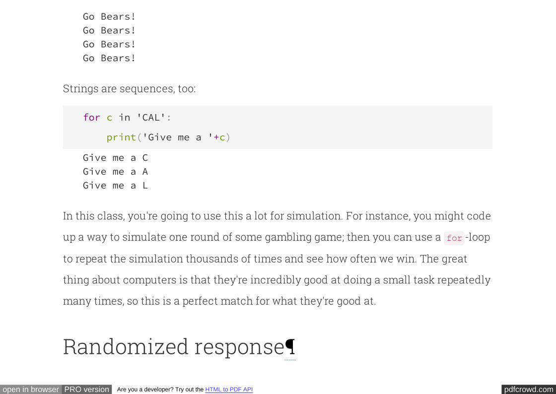
Go Bears!Go Bears!Go Bears!Go Bears!Go Bears!Go Bears!
pdfcrowd.comopen in browser PRO version Are you a developer? Try out the HTML to PDF API
Go Bears!Go Bears!Go Bears!Go Bears!
Strings are sequences, too:
for c in 'CAL':
print('Give me a '+c)
Give me a CGive me a AGive me a L
In this class, you're going to use this a lot for simulation. For instance, you might code
up a way to simulate one round of some gambling game; then you can use a -loop
to repeat the simulation thousands of times and see how often we win. The great
thing about computers is that they're incredibly good at doing a small task repeatedly
many times, so this is a perfect match for what they're good at.
for
Randomized response

pdfcrowd.comopen in browser PRO version Are you a developer? Try out the HTML to PDF API
Next, we'll look at a technique that was designed several decades ago to help conduct
surveys of sensitive subjects. Researchers wanted to ask participants a few questions:
Have you ever had an affair? Do you secretly think you are gay? Have you ever
shoplifted? Have you ever sung a Justin Bieber song in the shower? They figured that
some people might not respond honestly, because of the social stigma associated
with answering "yes". So, they came up with a clever way to estimate the fraction of
the population who are in the "yes" camp, without violating anyone's privacy.
Here's the idea. We'll instruct the respondent to roll a fair 6-sided die, secretly, where
no one else can see it. If the die comes up 1, 2, 3, or 4, then respondent is supposed to
answer honestly. If it comes up 5 or 6, the respondent is supposed to answer the
of what their true answer would be. But, they shouldn't reveal what came up
on their die.
opposite
Notice how clever this is. Even if the person says "yes", that doesn't necessarily mean
their true answer is "yes" -- they might very well have just rolled a 5 or 6. So the
responses to the survey don't reveal any one individual's true answer. Yet, in
aggregate, the responses give enough information that we can get a pretty good
pdfcrowd.comopen in browser PRO version Are you a developer? Try out the HTML to PDF API
estimate of the fraction of people whose true answer is "yes".
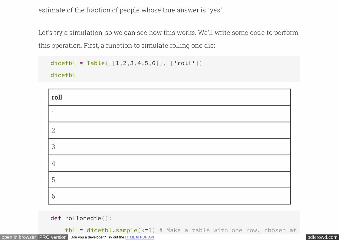
Let's try a simulation, so we can see how this works. We'll write some code to perform
this operation. First, a function to simulate rolling one die:
dicetbl = Table([[1,2,3,4,5,6]], ['roll'])
dicetbl
roll
1
2
3
4
5
6
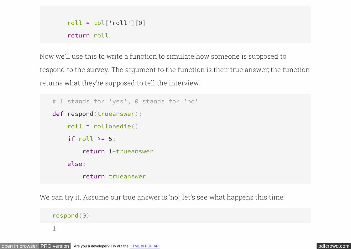
def rollonedie():
tbl = dicetbl.sample(k=1) # Make a table with one row, chosen at random from dicetbl
pdfcrowd.comopen in browser PRO version Are you a developer? Try out the HTML to PDF API
roll = tbl['roll'][0]
return roll
Now we'll use this to write a function to simulate how someone is supposed to
respond to the survey. The argument to the function is their true answer; the function
returns what they're supposed to tell the interview.
# 1 stands for 'yes', 0 stands for 'no'
def respond(trueanswer):
roll = rollonedie()
if roll >= 5:
return 1-trueanswer
else:
return trueanswer
We can try it. Assume our true answer is 'no'; let's see what happens this time:
respond(0)
1
pdfcrowd.comopen in browser PRO version Are you a developer? Try out the HTML to PDF API
Of course, if you were to run it again, you might get a different result next time.
respond(0)
0
respond(0)
1
respond(0)
0
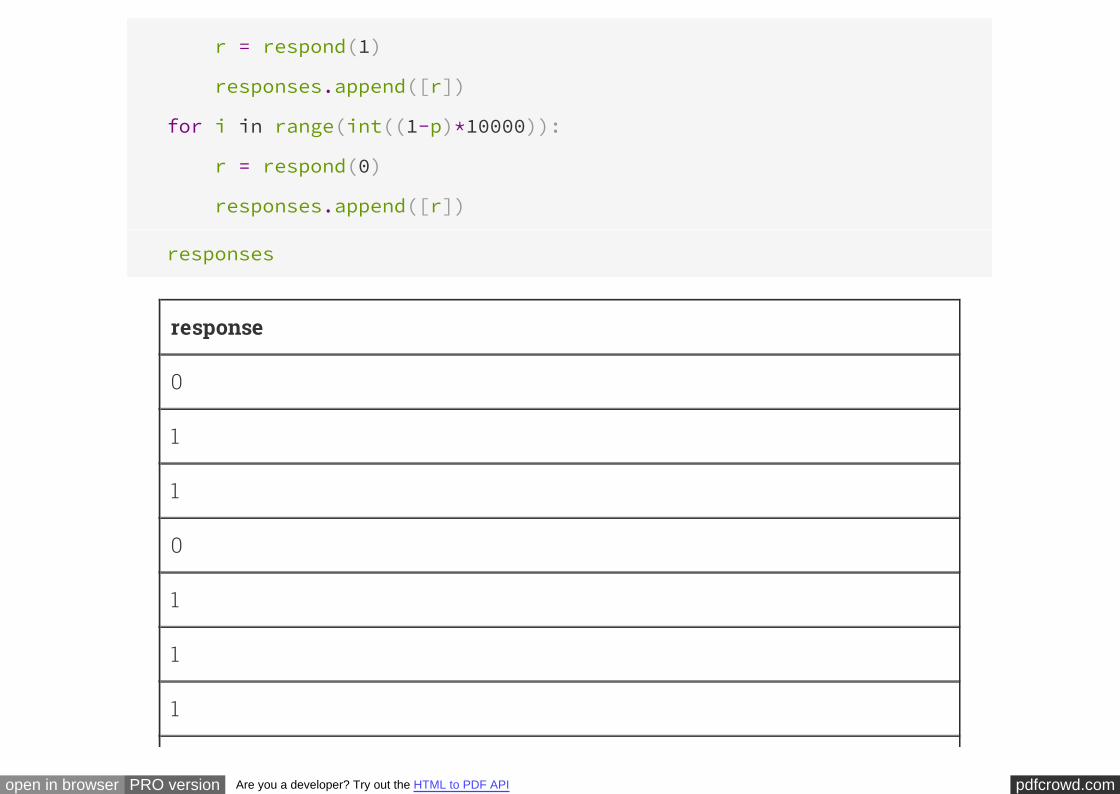
OK, so this lets us simulate the behavior of one participant, using randomized
response. Let's simulate what happens if we do this with 10,000 respondents. We're
going to imagine asking 10,000 people whether they've ever sung a Justin Bieber song
in teh shower. We'll imagine there are people whose true answer is "yes"
and whose true answer is "no", so we'll use one -loop to simulate
the behavior each of the first people, and a second -loop to simulate
the behavior of the remaining . We'll collect all the responses in a table,
appending each response to the table as we receive it.
10000 * p
10000 * (1-p) for
10000 * p for
10000 * (1-p)
responses = Table([[]], ['response'])
for i in range(int(p*10000)):
pdfcrowd.comopen in browser PRO version Are you a developer? Try out the HTML to PDF API
for i in range(int(p*10000)):
r = respond(1)
responses.append([r])
for i in range(int((1-p)*10000)):
r = respond(0)
responses.append([r])
responses
response
0
1
1
0
1
1
1
pdfcrowd.comopen in browser PRO version Are you a developer? Try out the HTML to PDF API
1
0
1
... (9990 rows omitted)
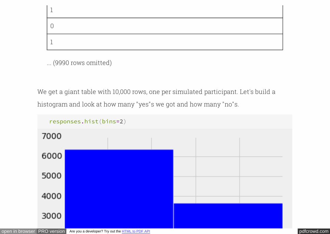
We get a giant table with 10,000 rows, one per simulated participant. Let's build a
histogram and look at how many "yes"s we got and how many "no"s.
responses.hist(bins=2)

pdfcrowd.comopen in browser PRO version Are you a developer? Try out the HTML to PDF API
responses.where('response', 0).num_rows
6345
responses.where('response', 1).num_rows
3655
So we polled 10,000 people, and got back 3644 yes responses.
Based on these results, approximately what fraction of the
population has truly sung a Justin Bieber song in the shower?
Exercise for you:
Take a moment with your partner and work out the answer.
pdfcrowd.comopen in browser PRO version Are you a developer? Try out the HTML to PDF API
Summing up¶This method is called "randomized response". It is one way to poll people about
sensitive subjects, while still protecting their privacy. You can see how it is a nice
example of randomness at work.
It turns out that randomized response has beautiful generalizations. For instance,
your Chrome web browser uses it to anonymously report feedback to Google, in a way
that won't violate your privacy. That's all we'll say about it for this semester, but if you
take an upper-division course, maybe you'll get to see some generalizations of this
beautiful technique.
Distributions
INTERACT
pdfcrowd.comopen in browser PRO version Are you a developer? Try out the HTML to PDF API
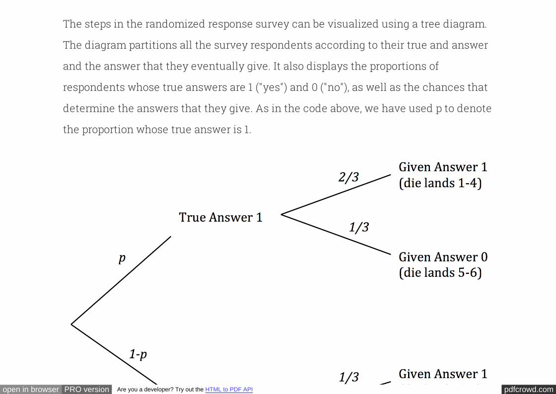
The steps in the randomized response survey can be visualized using a .
The diagram partitions all the survey respondents according to their true and answer
and the answer that they eventually give. It also displays the proportions of
respondents whose true answers are 1 ("yes") and 0 ("no"), as well as the chances that
determine the answers that they give. As in the code above, we have used to denote
the proportion whose true answer is 1.
tree diagram
p

pdfcrowd.comopen in browser PRO version Are you a developer? Try out the HTML to PDF API
The respondents who answer 1 split into two groups. The first group consists of the
respondents whose true answer and given answers are both 1. If the number of
respondents is large, the proportion in this group is likely to be about 2/3 of . The
second group consists of the respondents whose true answer is 0 and given answer is
1. This proportion in this group is likely to be about 1/3 of .
p
1-p
We can observed $p^*$, the proportion of 1's among the given answers. Thus
≈ × p + × (1 − p)p∗ 23
13
This allows us to solve for an approximate value of :p
p ≈ 3 − 1p∗
pdfcrowd.comopen in browser PRO version Are you a developer? Try out the HTML to PDF API
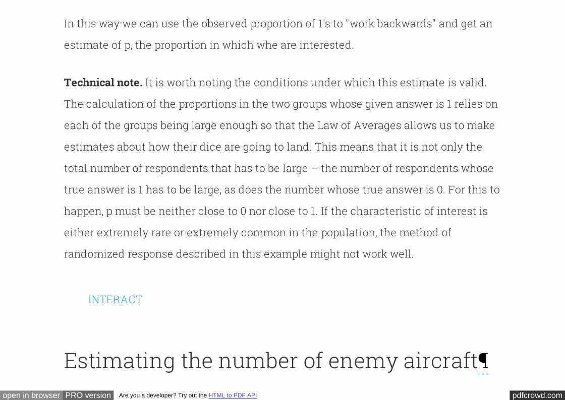
In this way we can use the observed proportion of 1's to "work backwards" and get an
estimate of , the proportion in which whe are interested.p
It is worth noting the conditions under which this estimate is valid.
The calculation of the proportions in the two groups whose given answer is 1 relies on
being large enough so that the Law of Averages allows us to make
estimates about how their dice are going to land. This means that it is not only the
total number of respondents that has to be large – the number of respondents whose
true answer is 1 has to be large, as does the number whose true answer is 0. For this to
happen, must be neither close to 0 nor close to 1. If the characteristic of interest is
either extremely rare or extremely common in the population, the method of
randomized response described in this example might not work well.
Technical note.
each of the groups
p
INTERACT
Estimating the number of enemy aircraft
pdfcrowd.comopen in browser PRO version Are you a developer? Try out the HTML to PDF API
In World War II, data analysts working for the Allies were tasked with estimating the
number of German warplanes. The data included the serial numbers of the German
planes that had been observed by Allied forces. These serial numbers gave the data
analysts a way to come up with an answer.
To create an estimate of the total number of warplanes, the data analysts had to
make some assumptions about the serial numbers. Here are two such assumptions,
greatly simplified to make our calculations easier.
1. There are N planes, numbered $1, 2, ... , N$.
2. The observed planes are drawn uniformly at random with replacement from the
$N$ planes.
The goal is to estimate the number $N$.
Suppose you observe some planes and note down their serial numbers. How might
you use the data to guess the value of $N$? A natural and straightforward method
would be to simply use the .largest serial number observed
pdfcrowd.comopen in browser PRO version Are you a developer? Try out the HTML to PDF API
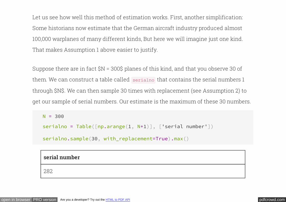
Let us see how well this method of estimation works. First, another simplification:
Some historians now estimate that the German aircraft industry produced almost
100,000 warplanes of many different kinds, But here we will imagine just one kind.
That makes Assumption 1 above easier to justify.
Suppose there are in fact $N = 300$ planes of this kind, and that you observe 30 of
them. We can construct a table called that contains the serial numbers 1
through $N$. We can then sample 30 times with replacement (see Assumption 2) to
get our sample of serial numbers. Our estimate is the maximum of these 30 numbers.
serialno
N = 300
serialno = Table([np.arange(1, N+1)], ['serial number'])
serialno.sample(30, with_replacement=True).max()
serial number
282
pdfcrowd.comopen in browser PRO version Are you a developer? Try out the HTML to PDF API
As with all code involving random sampling, run it a few times to see the variation.
You will observe that even with just 30 observations from among 300, the largest
serial number is typically in the 250-300 range.
In principle, the largest serial number could be as small as 1, if you were unlucky
enough to see Plane Number 1 all 30 times. And it could be as large as 300 if you
observe Plane Number 300 at least once. But usually, it seems to be in the very high
200's. It appears that if you use the largest observed serial number as your estimate of
the total, you will not be very far wrong.
Let us generate some data to see if we can confirm this. We will use to
repeat the sampling procedure numerous times, each time noting the largest serial
number observed. These would be our estimates of $N$ from all the numerous
samples. We will then draw a histogram of all these estimates, and examine by how
much they differ from $N = 300$.
iteration
In the code below, we will run 750 repetitions of the following process: Sample 30
times at random with replacement from 1 through 300 and note the largest number
pdfcrowd.comopen in browser PRO version Are you a developer? Try out the HTML to PDF API
observed.
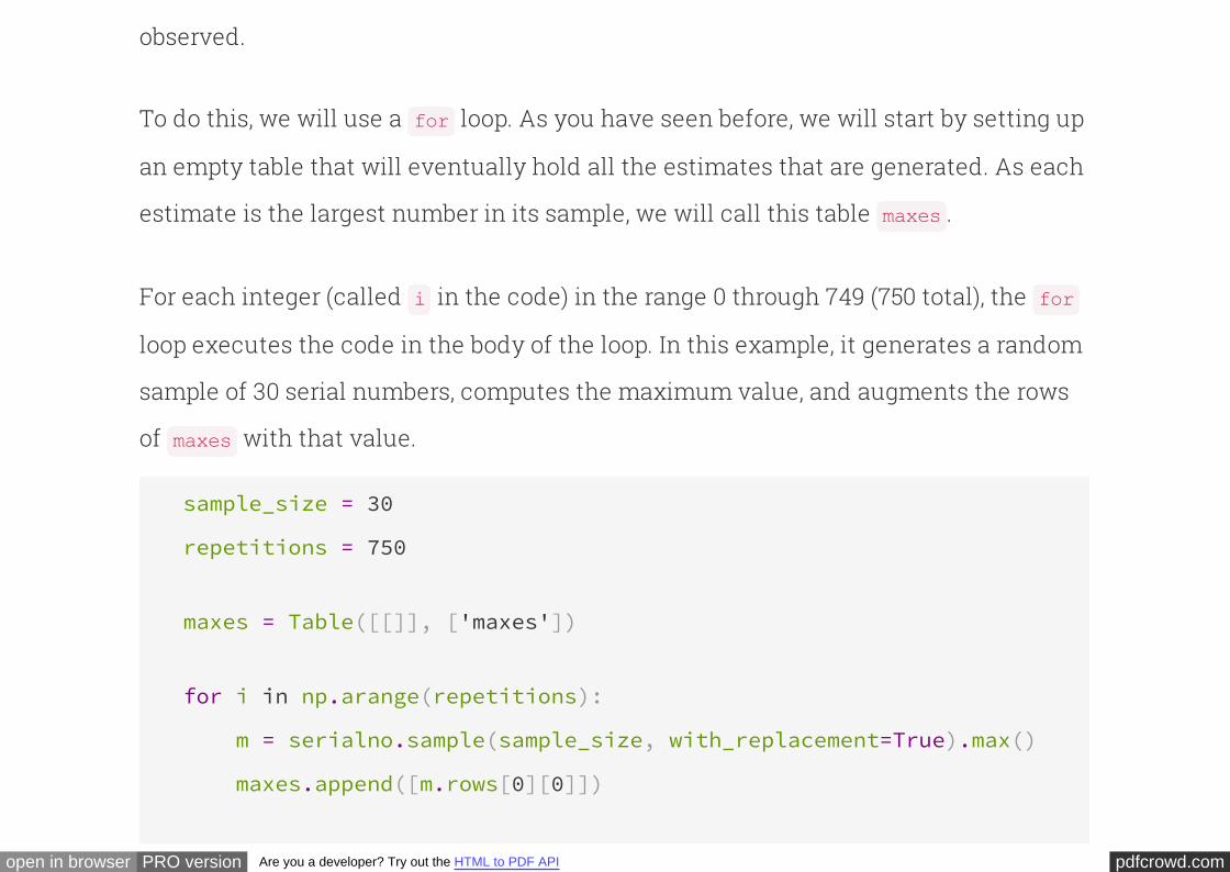
To do this, we will use a loop. As you have seen before, we will start by setting up
an empty table that will eventually hold all the estimates that are generated. As each
estimate is the largest number in its sample, we will call this table .
for
maxes
For each integer (called in the code) in the range 0 through 749 (750 total), the
loop executes the code in the body of the loop. In this example, it generates a random
sample of 30 serial numbers, computes the maximum value, and augments the rows
of with that value.
i for
maxes
sample_size = 30
repetitions = 750
maxes = Table([[]], ['maxes'])
for i in np.arange(repetitions):
m = serialno.sample(sample_size, with_replacement=True).max()
maxes.append([m.rows[0][0]])
pdfcrowd.comopen in browser PRO version Are you a developer? Try out the HTML to PDF API
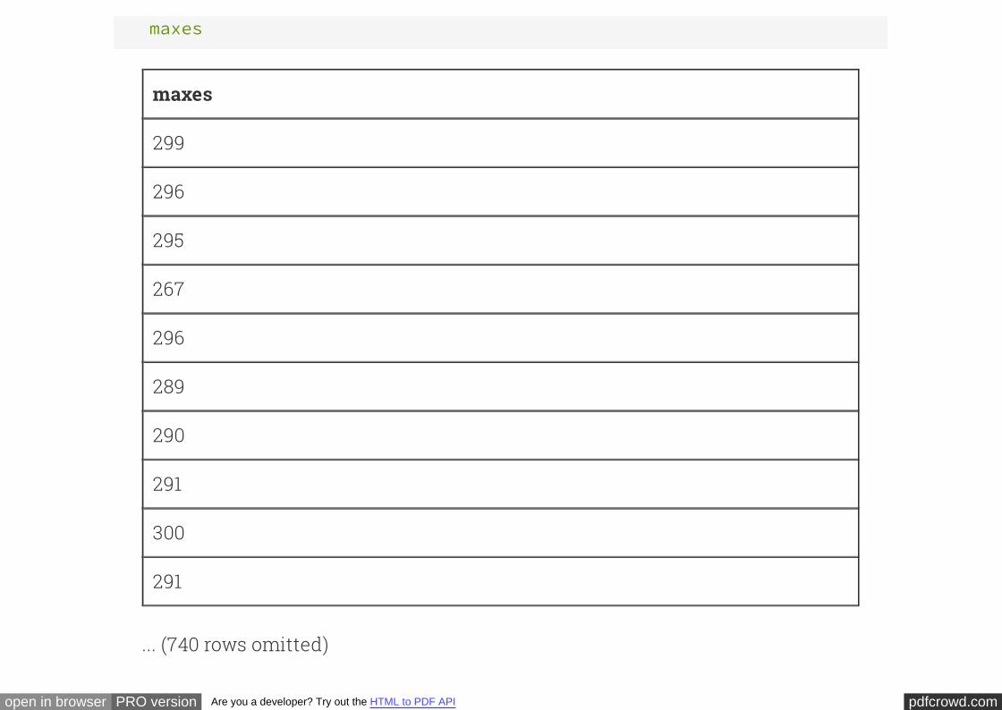
maxes
maxes
299
296
295
267
296
289
290
291
300
291
... (740 rows omitted)
pdfcrowd.comopen in browser PRO version Are you a developer? Try out the HTML to PDF API
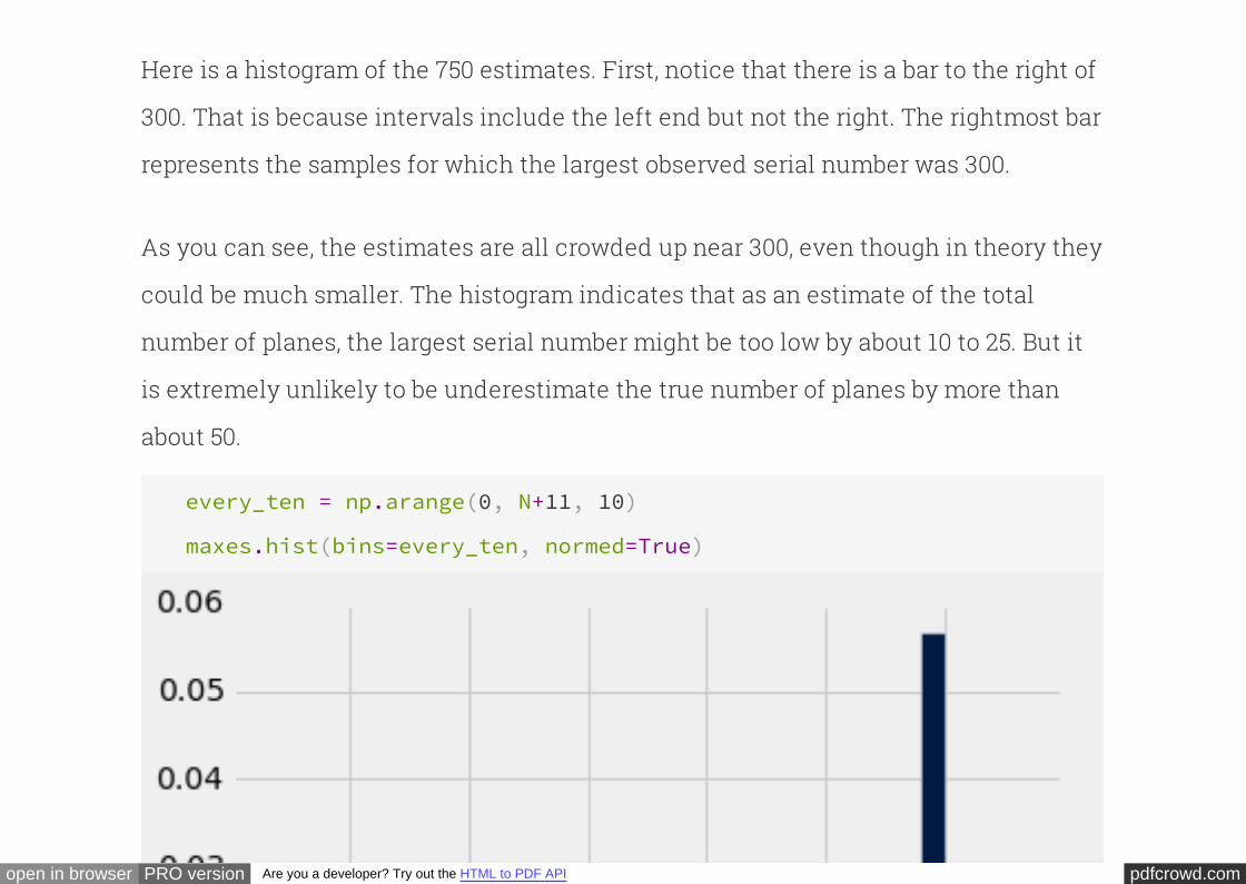
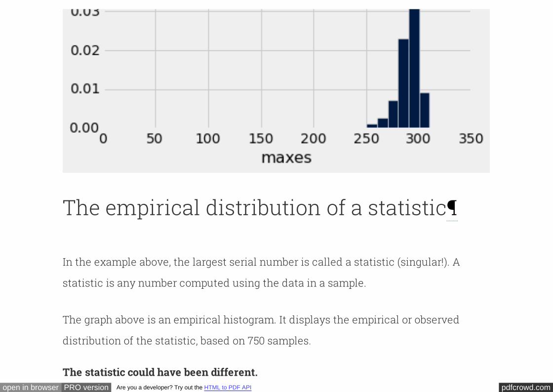
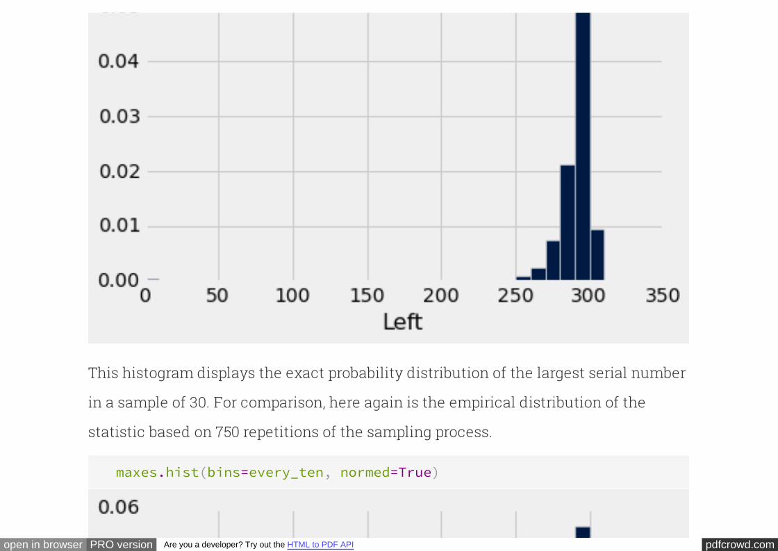
Here is a histogram of the 750 estimates. First, notice that there is a bar to the right of
300. That is because intervals include the left end but not the right. The rightmost bar
represents the samples for which the largest observed serial number was 300.
As you can see, the estimates are all crowded up near 300, even though in theory they
could be much smaller. The histogram indicates that as an estimate of the total
number of planes, the largest serial number might be too low by about 10 to 25. But it
is extremely unlikely to be underestimate the true number of planes by more than
about 50.
every_ten = np.arange(0, N+11, 10)
maxes.hist(bins=every_ten, normed=True)
pdfcrowd.comopen in browser PRO version Are you a developer? Try out the HTML to PDF API
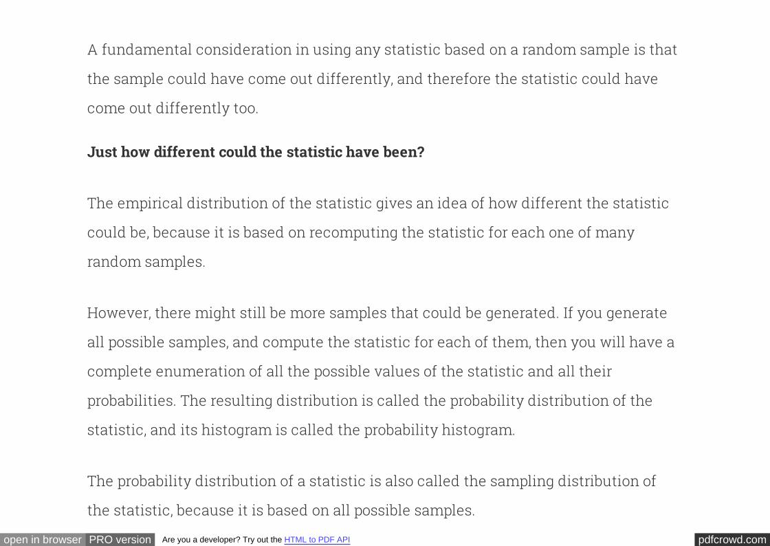
The empirical distribution of a statistic
In the example above, the largest serial number is called a (singular!). A
is any number computed using the data in a sample.
statistic
statistic
The graph above is an empirical histogram. It displays the empirical or observed
distribution of the statistic, based on 750 samples.
The statistic could have been different.
pdfcrowd.comopen in browser PRO version Are you a developer? Try out the HTML to PDF API
A fundamental consideration in using any statistic based on a random sample is that
, and therefore the statistic could have
come out differently too.
the sample could have come out differently
Just how different could the statistic have been?
The empirical distribution of the statistic gives an idea of how different the statistic
could be, because it is based on recomputing the statistic for each one of many
random samples.
However, there might still be more samples that could be generated. If you generate
possible samples, and compute the statistic for each of them, then you will have a
complete enumeration of all the possible values of the statistic and all their
probabilities. The resulting distribution is called the of the
statistic, and its histogram is called the .
all
probability distribution
probability histogram
The probability distribution of a statistic is also called the of
the statistic, because it is based on all possible samples.
sampling distribution
pdfcrowd.comopen in browser PRO version Are you a developer? Try out the HTML to PDF API
The probability distribution of a statistic contains more accurate information about
the statistic than an empirical distribution does. So it is good to compute the
probability distribution exactly when feasible. This becomes easier with some
expertise in probability theory. In the case of the largest serial number in a random
sample, we can calculate the probability distribution by methods used earlier in this
class.
The probability distribution of the largestserial number
For ease of comparison with the proportions in the empirical histogram above, we will
calculate the probability that the statistic falls in each of the following bins: 0 to 250,
250 to 260, 260 to 270, 270 to 280, 280 to 290, and 290 to 300. To be consistent with the
binning convention of , we will work with intervals that include the left endpoint
but not the right. Therefore we will also calculate the probability in the interval 300 to
310, noting that the only way the statistic can be in that interval is if it is exactly 300.
hist
pdfcrowd.comopen in browser PRO version Are you a developer? Try out the HTML to PDF API
Let us start with the left-most interval. What is the chance that the largest serial
number is less than 250? That is the chance that all the serial numbers are less than
250:
We can express this quantity in terms of our population size (300) and
(30).
≈ 0.00374( )249300
30
N sample_size
(249/N)**sample_size
0.003735448655171771
Similar reasoning gives us the chance that the largest serial number is in the interval
250 to 260, not including the right end. For this event to happen, the largest serial
number must be less than 260 and less than 250. In other words, all 30 serial
numbers must be less than 290, and all serial numbers must be less than 280. The
chance of this is
not
not
30 30
pdfcrowd.comopen in browser PRO version Are you a developer? Try out the HTML to PDF API
− ≈ 0.0084( )259300
30 ( )249300
30
(259/N)**sample_size - (249/N)**sample_size
0.008436364606449389
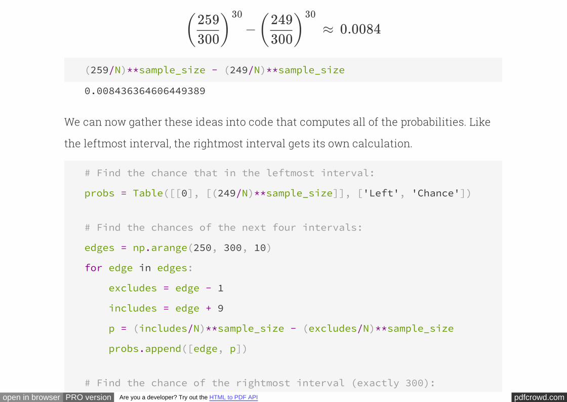
We can now gather these ideas into code that computes all of the probabilities. Like
the leftmost interval, the rightmost interval gets its own calculation.
# Find the chance that in the leftmost interval:
probs = Table([[0], [(249/N)**sample_size]], ['Left', 'Chance'])
# Find the chances of the next four intervals:
edges = np.arange(250, 300, 10)
for edge in edges:
excludes = edge - 1
includes = edge + 9
p = (includes/N)**sample_size - (excludes/N)**sample_size
probs.append([edge, p])
# Find the chance of the rightmost interval (exactly 300):
pdfcrowd.comopen in browser PRO version Are you a developer? Try out the HTML to PDF API
probs.append([300, 1 - (299/N)**sample_size])
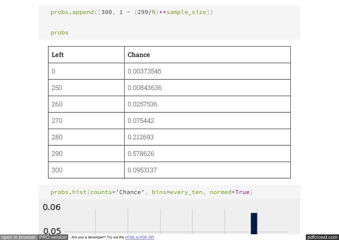
probs
Left Chance
0 0.00373545
250 0.00843636
260 0.0257536
270 0.075442
280 0.212693
290 0.578626
300 0.0953137
probs.hist(counts='Chance', bins=every_ten, normed=True)
pdfcrowd.comopen in browser PRO version Are you a developer? Try out the HTML to PDF API
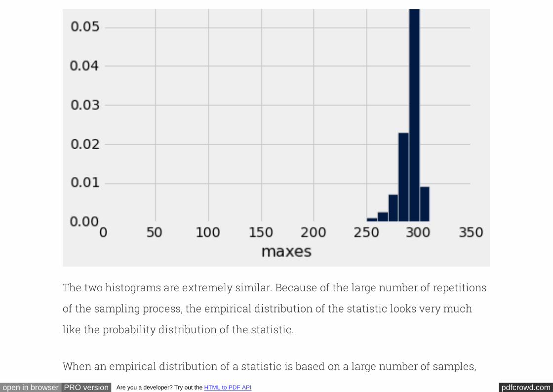
This histogram displays the exact probability distribution of the largest serial number
in a sample of 30. For comparison, here again is the empirical distribution of the
statistic based on 750 repetitions of the sampling process.
maxes.hist(bins=every_ten, normed=True)
pdfcrowd.comopen in browser PRO version Are you a developer? Try out the HTML to PDF API
The two histograms are extremely similar. Because of the large number of repetitions
of the sampling process, the empirical distribution of the statistic looks very much
like the probability distribution of the statistic.
When an empirical distribution of a statistic is based on a large number of samples,
pdfcrowd.comopen in browser PRO version Are you a developer? Try out the HTML to PDF API
then it is likely to be a good approximation to the probability distribution of the
statistic. This is of great practical importance, because the probability distribution of
a statistic can sometimes be complicated to calculate exactly.
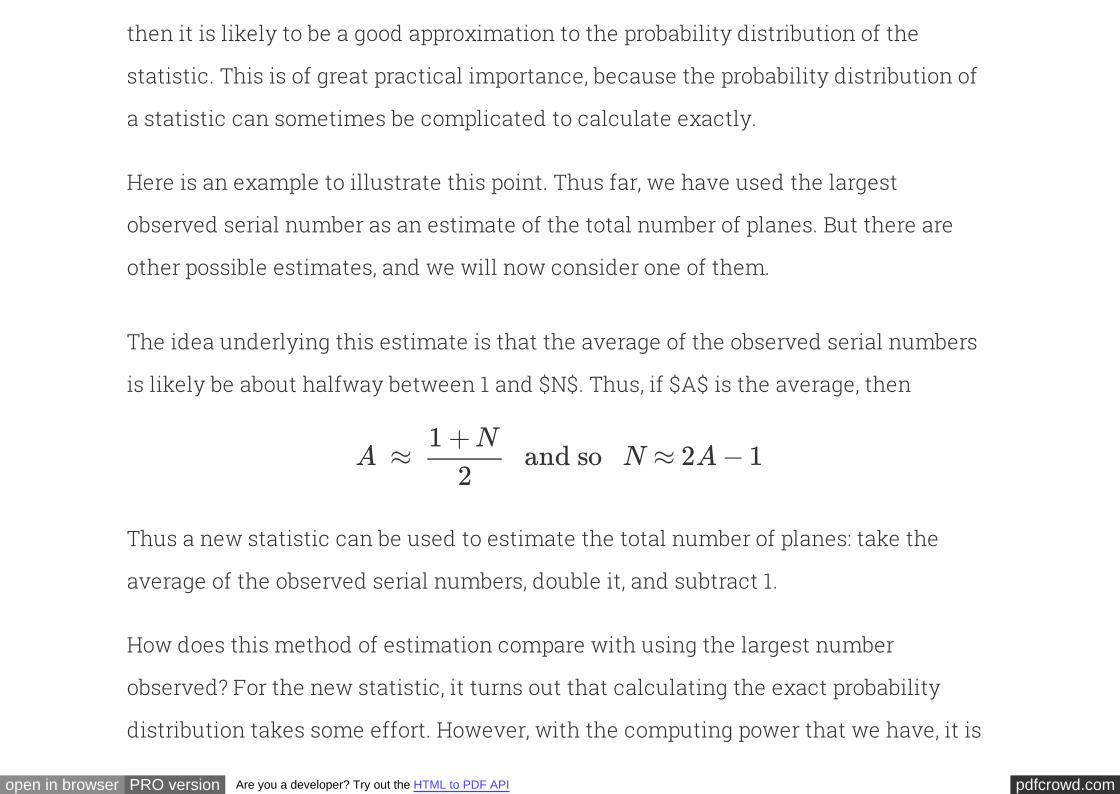
Here is an example to illustrate this point. Thus far, we have used the largest
observed serial number as an estimate of the total number of planes. But there are
other possible estimates, and we will now consider one of them.
The idea underlying this estimate is that the of the observed serial numbers
is likely be about halfway between 1 and $N$. Thus, if $A$ is the average, then
average
A ≈ and so N ≈ 2A − 11 +N
2
Thus a new statistic can be used to estimate the total number of planes: take the
average of the observed serial numbers, double it, and subtract 1.
How does this method of estimation compare with using the largest number
observed? For the new statistic, it turns out that calculating the exact probability
distribution takes some effort. However, with the computing power that we have, it is

pdfcrowd.comopen in browser PRO version Are you a developer? Try out the HTML to PDF API
easy to generate an empirical distribution based on repeated sampling.
So let us construct an empirical distribution of our new estimate, based on 750
repetitions of the sampling process. The number of repetitions is chosen to be the
same as it was for the earlier estimate. This will allow us to compare the two
empirical distributions.
sample_size = 30
repetitions = 750
new_est = Table([[]], ['new estimates'])
for i in np.arange(repetitions):
m = serialno.sample(sample_size, with_replacement=True).mean()
new_est.append([2*(m.rows[0][0])-1])
new_est.hist(bins=np.arange(0, 2*N+1, 10), normed=True)
pdfcrowd.comopen in browser PRO version Are you a developer? Try out the HTML to PDF API
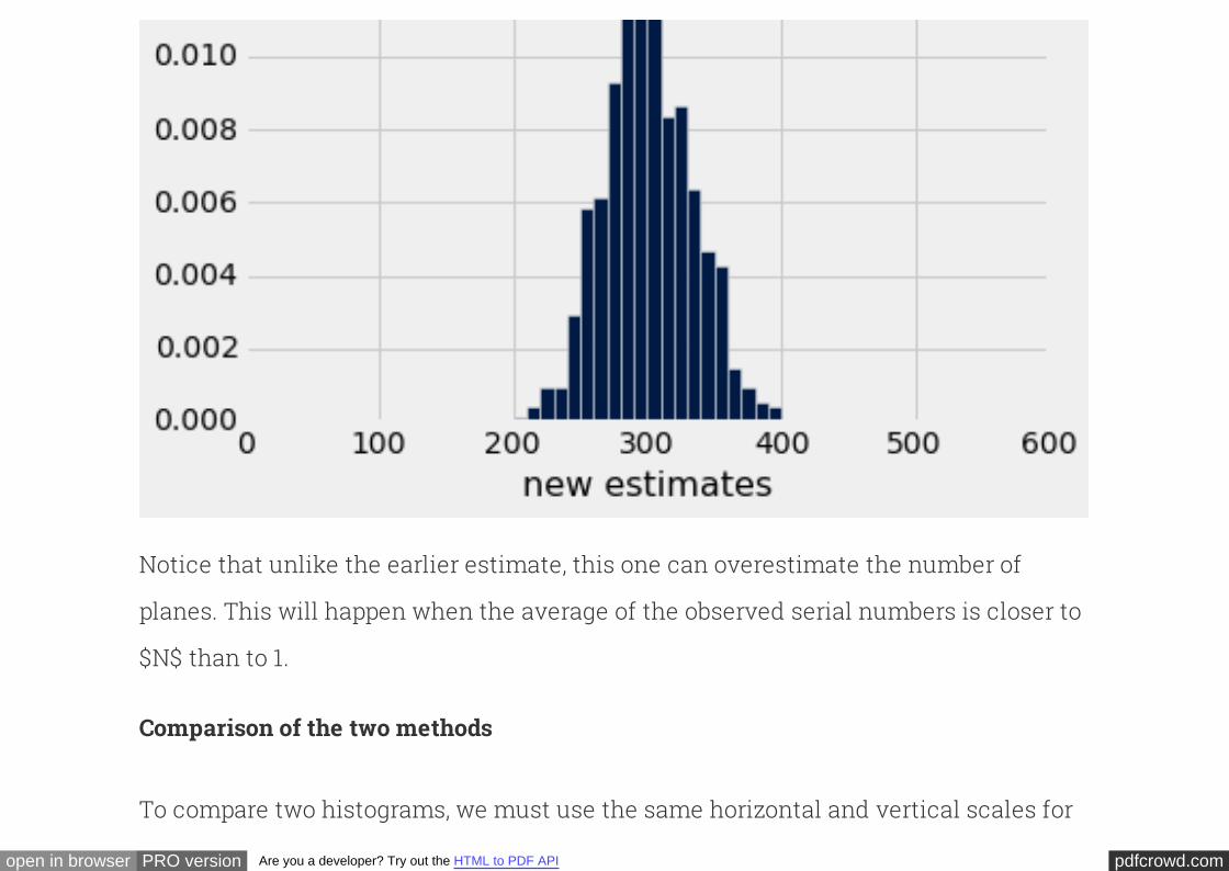
Notice that unlike the earlier estimate, this one can overestimate the number of
planes. This will happen when the average of the observed serial numbers is closer to
$N$ than to 1.
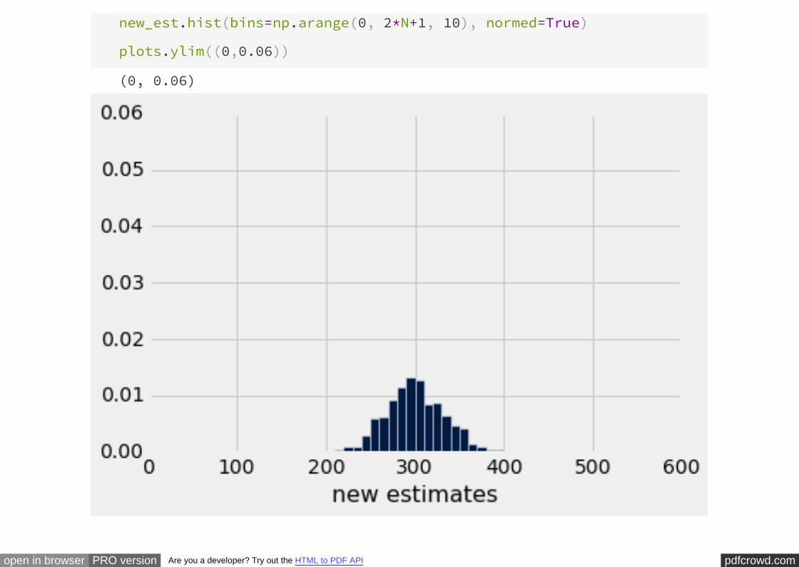
Comparison of the two methods
To compare two histograms, we must use the same horizontal and vertical scales for
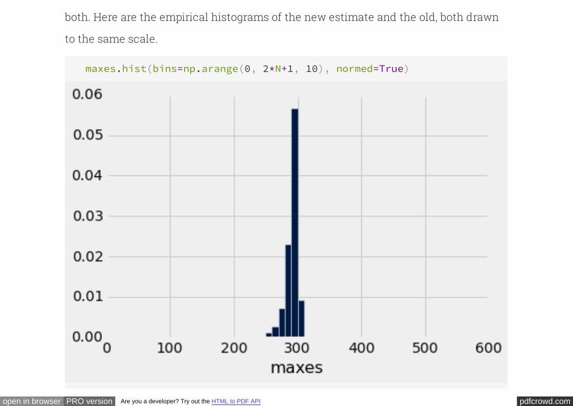
pdfcrowd.comopen in browser PRO version Are you a developer? Try out the HTML to PDF API
both. Here are the empirical histograms of the new estimate and the old, both drawn
to the same scale.
maxes.hist(bins=np.arange(0, 2*N+1, 10), normed=True)
pdfcrowd.comopen in browser PRO version Are you a developer? Try out the HTML to PDF API
new_est.hist(bins=np.arange(0, 2*N+1, 10), normed=True)
plots.ylim((0,0.06))
(0, 0.06)
pdfcrowd.comopen in browser PRO version Are you a developer? Try out the HTML to PDF API
You can see that the old method almost always underestimates; formally, we say that
it is . But it has low variability, and is highly likely to be close to the true total
number of planes.
biased
The new method overestimates about as often as it underestimates, and thus is
called on average in the long run. However, it is more variable than the old
estimate, and thus is prone to larger absolute errors.
unbiased
This is an instance of a that is not uncommon among
competing estimates. Which estimate you decide to use will depend on the kinds of
errors that matter the most to you. In the case of enemy warplanes, underestimating
the total number might have grim consequences, in which case you might choose to
use the more variable method that overestimates about half the time. On the other
hand, if overestimation leads to needlessly high costs of guarding against planes that
don't exist, you might be satisfied with the method that underestimates by a modest
amount.
bias-variance tradeoff
pdfcrowd.comopen in browser PRO version Are you a developer? Try out the HTML to PDF API
How close are twodistributions?
INTERACT
By now we have seen many examples of situations in which one distribution appears
to be quite close to another. The goal of this section is to quantify the difference
between two distributions. This will allow our analyses to be based on more than the
assessements that we are able to make by eye.
For this, we need a measure of the distance between two distributions. We will
develop such a measure in the context of a conducted in 2010 by the Americal
Civil Liberties Union (ACLU) of Northern California.
study
The focus of the study was the racial composition of jury panels in Alameda County.
pdfcrowd.comopen in browser PRO version Are you a developer? Try out the HTML to PDF API
A jury panel is a group of people chosen to be prospective jurors; the final trial jury is
selected from among them. Jury panels can consist of a few dozen people or several
thousand, depending on the trial. By law, a jury panel is supposed to be representative
of the community in which the trial is taking place. Section 197 of California's Code of
Civil Procedure says, "All persons selected for jury service shall be selected at
random, from a source or sources inclusive of a representative cross section of the
population of the area served by the court."
The final jury is selected from the panel by deliberate inclusion or exclusion: the law
allows potential jurors to be excused for medical reasons; lawyers on both sides may
strike a certain number of potential jurors from the list in what are called "peremptory
challenges"; the trial judge might make a selection based on questionnaires filled out
by the panel; and so on. But the initial panel is supposed to resemble a random
sample of the population of eligible jurors.
The ACLU of Northern California compiled data on the racial composition of the jury
panels in 11 felony trials in Alameda County in the years 2009 and 2010. In those
panels, the total number of poeple who reported for jury service was 1453. The ACLU
pdfcrowd.comopen in browser PRO version Are you a developer? Try out the HTML to PDF API
gathered demographic data on all of these prosepctive jurors, and compared those
data with the composition of all eligible jurors in the county.
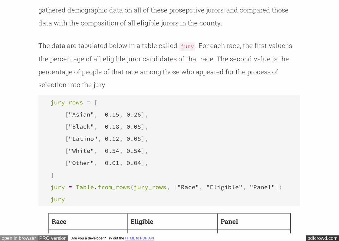
The data are tabulated below in a table called . For each race, the first value is
the percentage of all eligible juror candidates of that race. The second value is the
percentage of people of that race among those who appeared for the process of
selection into the jury.
jury
jury_rows = [
["Asian", 0.15, 0.26],
["Black", 0.18, 0.08],
["Latino", 0.12, 0.08],
["White", 0.54, 0.54],
["Other", 0.01, 0.04],
]
jury = Table.from_rows(jury_rows, ["Race", "Eligible", "Panel"])
jury
Race Eligible Panel
pdfcrowd.comopen in browser PRO version Are you a developer? Try out the HTML to PDF API
Asian 0.15 0.26
Black 0.18 0.08
Latino 0.12 0.08
White 0.54 0.54
Other 0.01 0.04
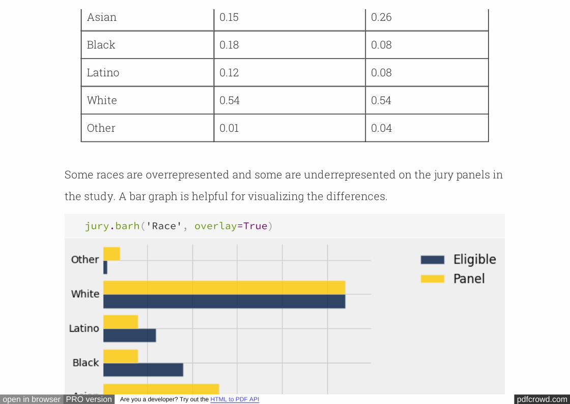
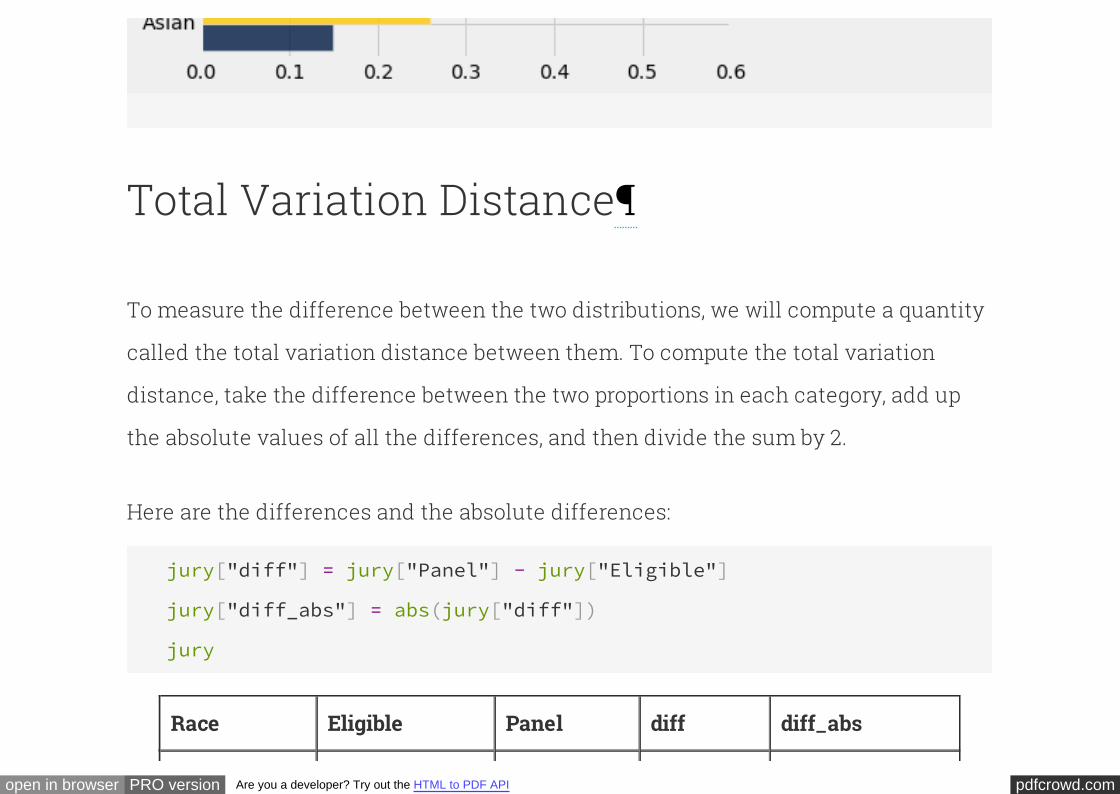
Some races are overrepresented and some are underrepresented on the jury panels in
the study. A bar graph is helpful for visualizing the differences.
jury.barh('Race', overlay=True)
pdfcrowd.comopen in browser PRO version Are you a developer? Try out the HTML to PDF API
Total Variation Distance
To measure the difference between the two distributions, we will compute a quantity
called the between them. To compute the total variation
distance, take the difference between the two proportions in each category, add up
the absolute values of all the differences, and then divide the sum by 2.
total variation distance
Here are the differences and the absolute differences:
jury["diff"] = jury["Panel"] - jury["Eligible"]
jury["diff_abs"] = abs(jury["diff"])
jury
Race Eligible Panel diff diff_abs
pdfcrowd.comopen in browser PRO version Are you a developer? Try out the HTML to PDF API
Asian 0.15 0.26 0.11 0.11
Black 0.18 0.08 -0.1 0.1
Latino 0.12 0.08 -0.04 0.04
White 0.54 0.54 0 0
Other 0.01 0.04 0.03 0.03
And here is the sum of the absolute differences, divided by 2:
sum(jury['diff_abs'])*0.5
0.14000000000000001
The total variation distance between the distribution of eligible jurors and the
distribution of the panels is 0.14. Before we examine the numercial value, let us
examine the reasons behind the steps in the calculation.
It is quite natural to compute the difference between the proportions in each
category. Now take a look at the column and notice that the sum of its entries is
0: the positive entries add up to 0.14, exactly canceling the total of the negative
diff
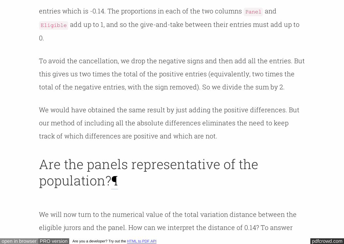
pdfcrowd.comopen in browser PRO version Are you a developer? Try out the HTML to PDF API
entries which is -0.14. The proportions in each of the two columns and
add up to 1, and so the give-and-take between their entries must add up to
0.
Panel
Eligible
To avoid the cancellation, we drop the negative signs and then add all the entries. But
this gives us two times the total of the positive entries (equivalently, two times the
total of the negative entries, with the sign removed). So we divide the sum by 2.
We would have obtained the same result by just adding the positive differences. But
our method of including all the absolute differences eliminates the need to keep
track of which differences are positive and which are not.
Are the panels representative of thepopulation?
We will now turn to the numerical value of the total variation distance between the
eligible jurors and the panel. How can we interpret the distance of 0.14? To answer
pdfcrowd.comopen in browser PRO version Are you a developer? Try out the HTML to PDF API
this, let us recall that the panels are supposed to be selected at random. It will
therefore be informative to compare the value of 0.14 with the total variation distance
between the eligible jurors and a randomly selected panel.
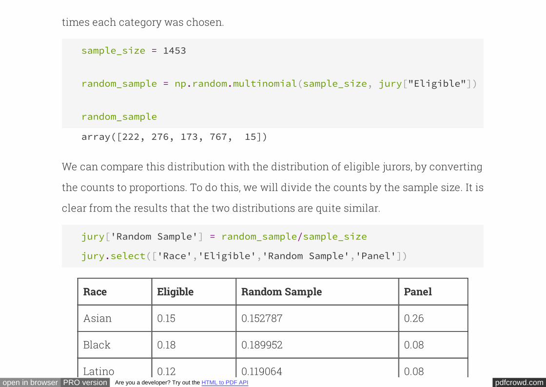
To do this, we will employ our skills at simulation. There were 1453 prosepective
jurors in the panels in the study. So let us take a random sample of size 1453 from the
population of eligible jurors.
[ Random samples of prospective jurors would be selected without
replacement. However, when the size of a sample is small relative to the size of the
population, sampling without replacement resembles sampling with replacement; the
proportions in the population don't change much between draws. The population of
eligible jurors in Alameda County is over a million, and compared to that, a sample
size of about 1500 is quite small. We will therefore sample with replacement.]
Technical note.
The function draws a random sample uniformly with
replacement from a population whose distribution is categorical. Specifically,
takes as its input a sample size and an array consisting of the
probabilities of choosing different categories. It returns the count of the number of
np.random.multinomial
np.random.multinomial
pdfcrowd.comopen in browser PRO version Are you a developer? Try out the HTML to PDF API
times each category was chosen.
sample_size = 1453
random_sample = np.random.multinomial(sample_size, jury["Eligible"])
random_sample
array([222, 276, 173, 767, 15])
We can compare this distribution with the distribution of eligible jurors, by converting
the counts to proportions. To do this, we will divide the counts by the sample size. It is
clear from the results that the two distributions are quite similar.
jury['Random Sample'] = random_sample/sample_size
jury.select(['Race','Eligible','Random Sample','Panel'])
Race Eligible Random Sample Panel
Asian 0.15 0.152787 0.26
Black 0.18 0.189952 0.08
Latino 0.12 0.119064 0.08
pdfcrowd.comopen in browser PRO version Are you a developer? Try out the HTML to PDF API
Latino 0.12 0.119064 0.08
White 0.54 0.527873 0.54
Other 0.01 0.0103235 0.04
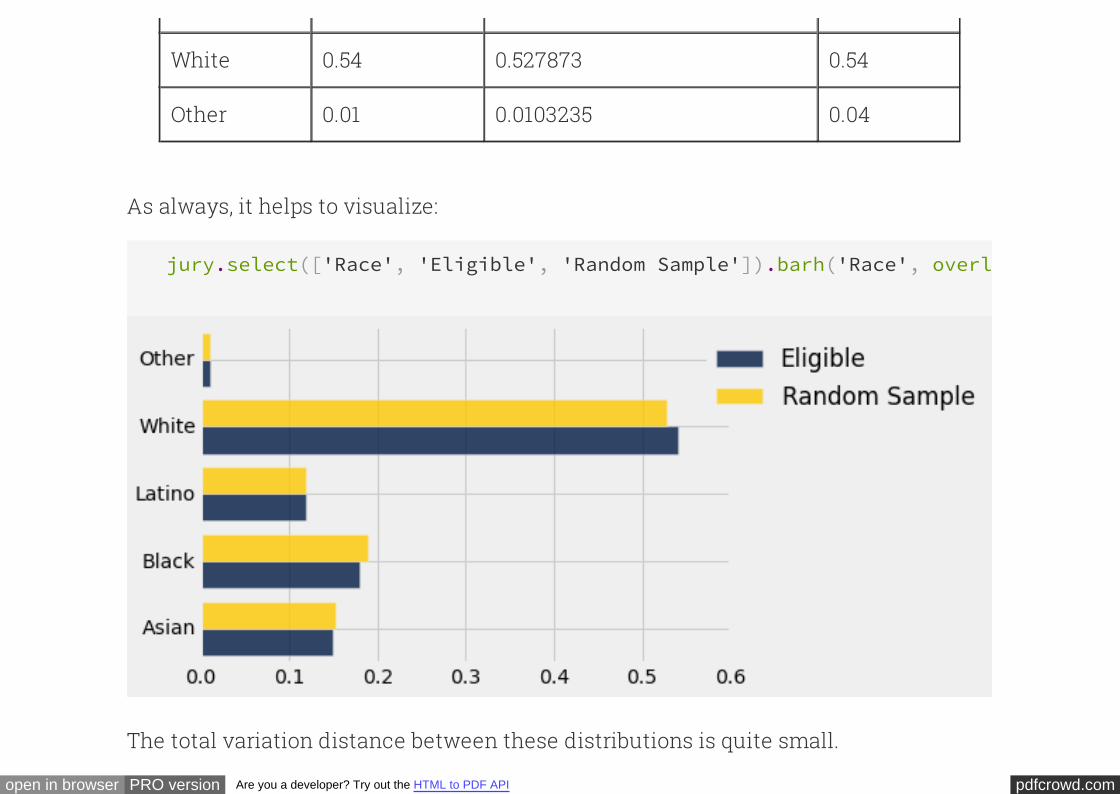
As always, it helps to visualize:
jury.select(['Race', 'Eligible', 'Random Sample']).barh('Race', overlay
The total variation distance between these distributions is quite small.
pdfcrowd.comopen in browser PRO version Are you a developer? Try out the HTML to PDF API
0.5*sum(abs(jury['Eligible']-jury['Random Sample']))
0.013062629043358601
Comparing this to the distance of 0.14 for the panel quantifies our observation that
the random sample is closer to the distribution of eligible jurors than the panel is.
However, the distance between the random sample and the eligible jurors depends on
the sample; sampling again might give a different result.
How would random samples behave?
The total variation distance between the distribution of the random sample and the
distribution of the eligible jurors is the statistic that we are using to measure the
distance between the two distributions. By repeating the process of sampling, we can
measure how much the statistic varies across different random samples. The code
below computes the empirical distribution of the statistic based on a large number of
replications of the sampling process.
# Compute empirical distribution of TVDs
pdfcrowd.comopen in browser PRO version Are you a developer? Try out the HTML to PDF API
sample_size = 1453
repetitions = 1000
eligible = jury["Eligible"]
tvd_from_sample = Table([[]], ["TVD from a random sample"])
for i in np.arange(repetitions):
sample = np.random.multinomial(sample_size, eligible)/sample_size
tvd = 0.5*sum(abs(sample - eligible))
tvd_from_sample.append([tvd])
tvd_from_sample
TVD from a random sample
0.0102478
0.0123193
0.0116311
0.0267309
pdfcrowd.comopen in browser PRO version Are you a developer? Try out the HTML to PDF API
0.00860977
0.0193393
0.0294838
0.0129663
0.0113696
0.0176462
... (990 rows omitted)
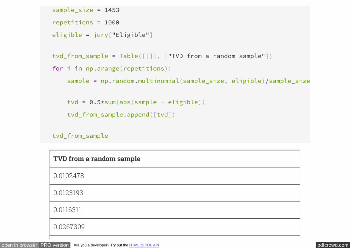
Each row of the column above contains the total variation distance between a
random sample and the population of eligible jurors.
The histogram of this column shows that drawing 1453 jurors at random from the pool
of eligible candidates results in a distribution that rarely deviates from the eligible
jurors' race distribution by more than 0.05.
tvd_from_sample.hist(bins=np.arange(0, 0.2, 0.005), normed=True)

pdfcrowd.comopen in browser PRO version Are you a developer? Try out the HTML to PDF API
How do the panels compare with random samples?
The panels in the study, however, were not quite so similar to the eligible population.
pdfcrowd.comopen in browser PRO version Are you a developer? Try out the HTML to PDF API
The total variation distance between the panels and the population was 0.14, which is
far out in the tail of the histogram above. It does not look like a typical distance
between a random sample and the eligible population.
Our analysis supports the ACLU's conclusion that the panels were not representative
of the population. The ACLU report discusses several reasons for the discrepancies.
For example, some minority groups were underrepresented on the records of voter
registration and of the Department of Motor Vehicles, the two main sources from
which jurors are selected; at the time of the study, the county did not have an
effective process for following up on prospective jurors who had been called but had
failed to appear; and so on. Whatever the reasons, it seems clear that the composition
of the jury panels was different from what we would have expected in a random
sample.
A Classical Interlude: the Chi-SquaredStatistic
pdfcrowd.comopen in browser PRO version Are you a developer? Try out the HTML to PDF API
"Do the data look like a random sample?" is a question that has been asked in many
contexts for many years. In classical data analysis, the statistic most commonly used
in answering this question is called the $\chi^2$ ("chi squared") statistic, and is
calculated as follows:
For each category, define the "expected count" as follows:
This is the count that you would expect in that category, in a randomly chosen
sample.
Step 1.
expected count = sample size × proportion in population
For each category, computeStep 2.
(observed count - expected count)2
expected count
Add up all the numbers computed in Step 2.Step 3.
A little algebra shows that this is equivalent to:
pdfcrowd.comopen in browser PRO version Are you a developer? Try out the HTML to PDF API
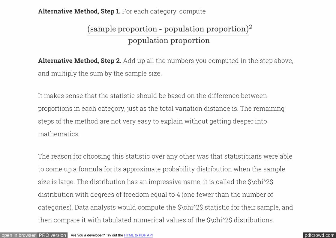
For each category, computeAlternative Method, Step 1.
(sample proportion - population proportion)2
population proportion
Add up all the numbers you computed in the step above,
and multiply the sum by the sample size.
Alternative Method, Step 2.
It makes sense that the statistic should be based on the difference between
proportions in each category, just as the total variation distance is. The remaining
steps of the method are not very easy to explain without getting deeper into
mathematics.
The reason for choosing this statistic over any other was that statisticians were able
to come up a formula for its approximate probability distribution when the sample
size is large. The distribution has an impressive name: it is called the
(one fewer than the number of
categories). Data analysts would compute the $\chi^2$ statistic for their sample, and
then compare it with tabulated numerical values of the $\chi^2$ distributions.
$\chi^2$
distribution with degrees of freedom equal to 4
pdfcrowd.comopen in browser PRO version Are you a developer? Try out the HTML to PDF API
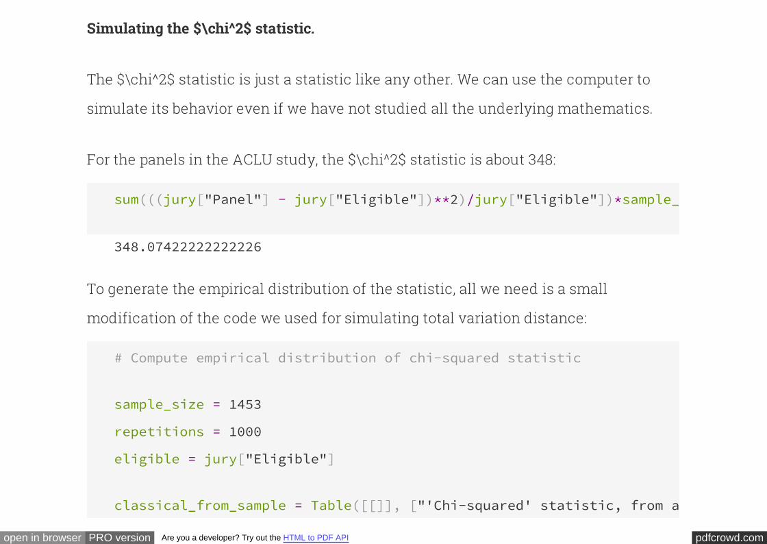
Simulating the $\chi^2$ statistic.
The $\chi^2$ statistic is just a statistic like any other. We can use the computer to
simulate its behavior even if we have not studied all the underlying mathematics.
For the panels in the ACLU study, the $\chi^2$ statistic is about 348:
sum(((jury["Panel"] - jury["Eligible"])**2)/jury["Eligible"])*sample_size
348.07422222222226
To generate the empirical distribution of the statistic, all we need is a small
modification of the code we used for simulating total variation distance:
# Compute empirical distribution of chi-squared statistic
sample_size = 1453
repetitions = 1000
eligible = jury["Eligible"]
classical_from_sample = Table([[]], ["'Chi-squared' statistic, from a random sample"
pdfcrowd.comopen in browser PRO version Are you a developer? Try out the HTML to PDF API
for i in np.arange(repetitions):
sample = np.random.multinomial(sample_size, eligible)/sample_size
chisq = sum(((sample - eligible)**2)/eligible)*sample_size
classical_from_sample.append([chisq])
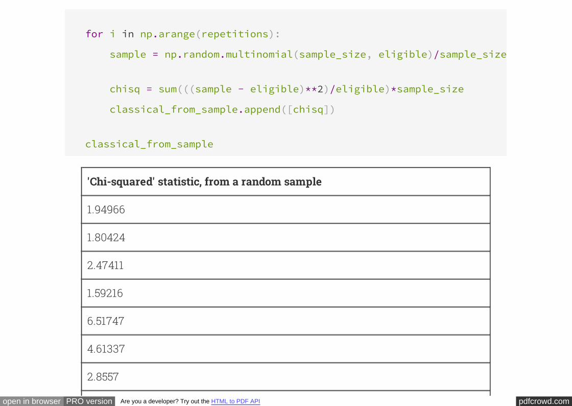
classical_from_sample
'Chi-squared' statistic, from a random sample
1.94966
1.80424
2.47411
1.59216
6.51747
4.61337
2.8557
pdfcrowd.comopen in browser PRO version Are you a developer? Try out the HTML to PDF API
8.36971
1.94125
4.87451
... (990 rows omitted)
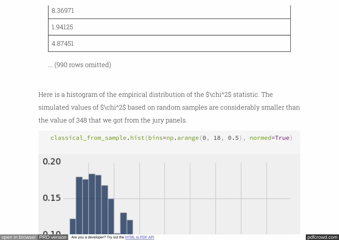
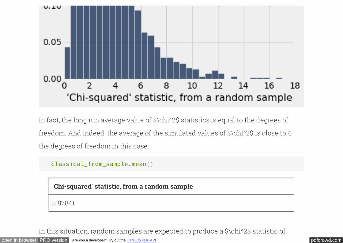
Here is a histogram of the empirical distribution of the $\chi^2$ statistic. The
simulated values of $\chi^2$ based on random samples are considerably smaller than
the value of 348 that we got from the jury panels.
classical_from_sample.hist(bins=np.arange(0, 18, 0.5), normed=True)
pdfcrowd.comopen in browser PRO version Are you a developer? Try out the HTML to PDF API
In fact, the long run average value of $\chi^2$ statistics is equal to the degrees of
freedom. And indeed, the average of the simulated values of $\chi^2$ is close to 4,
the degrees of freedom in this case.
classical_from_sample.mean()
'Chi-squared' statistic, from a random sample
3.87841
In this situation, random samples are expected to produce a $\chi^2$ statistic of
pdfcrowd.comopen in browser PRO version Are you a developer? Try out the HTML to PDF API
about 4. The panels, on the other hand, produced a $\chi^2$ statistic of 348. This is yet
more confirmation of the conclusion that the panels do not resemble a random
sample from the population of eligible jurors.
INTERACT
U.S. Supreme Court, 1965: Swain vs.Alabama
In the early 1960's, in Talladega County in Alabama, a black man called Robert Swain
was convicted of raping a white woman and was sentenced to death. He appealed his
sentence, citing among other factors the all-white jury. At the time, only men aged 21
or older were allowed to serve on juries in Talladega County. In the county, 26% of the
eligible jurors were black, but there were only 8 black men among the 100 selected for
the jury panel in Swain's trial. No black man was selected for the trial jury.
pdfcrowd.comopen in browser PRO version Are you a developer? Try out the HTML to PDF API
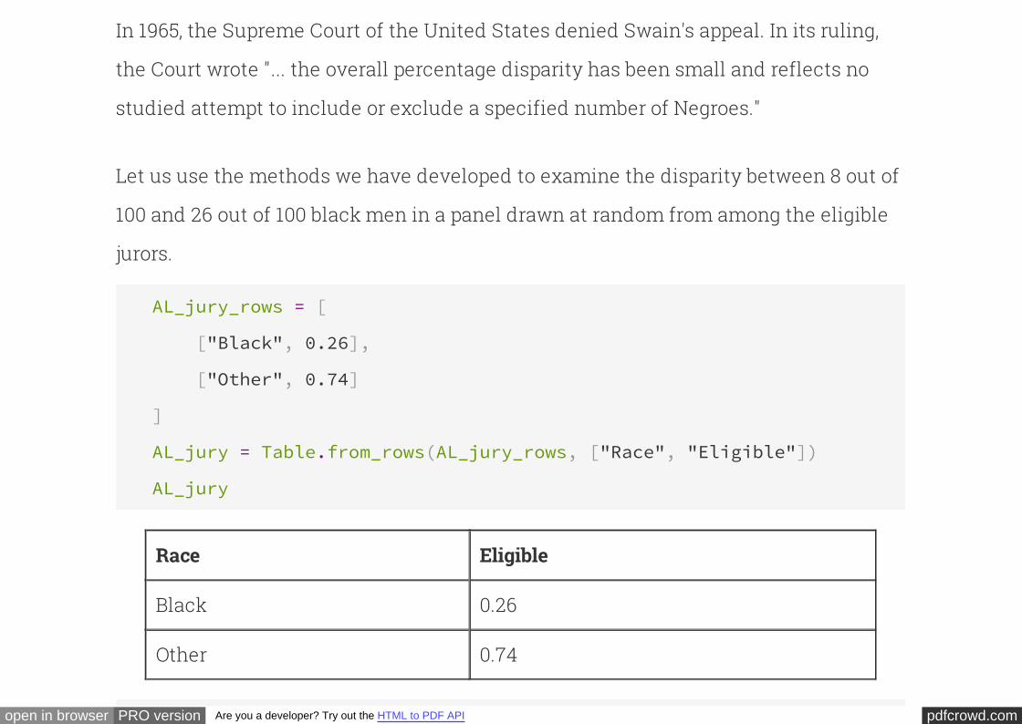
In 1965, the Supreme Court of the United States denied Swain's appeal. In its ruling,
the Court wrote "... the overall percentage disparity has been small and reflects no
studied attempt to include or exclude a specified number of Negroes."
Let us use the methods we have developed to examine the disparity between 8 out of
100 and 26 out of 100 black men in a panel drawn at random from among the eligible
jurors.
AL_jury_rows = [
["Black", 0.26],
["Other", 0.74]
]
AL_jury = Table.from_rows(AL_jury_rows, ["Race", "Eligible"])
AL_jury
Race Eligible
Black 0.26
Other 0.74
pdfcrowd.comopen in browser PRO version Are you a developer? Try out the HTML to PDF API
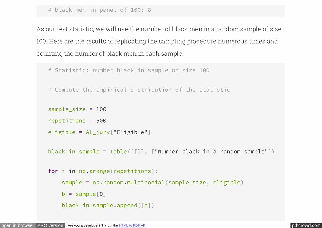
# black men in panel of 100: 8
As our test statistic, we will use the number of black men in a random sample of size
100. Here are the results of replicating the sampling procedure numerous times and
counting the number of black men in each sample.
# Statistic: number black in sample of size 100
# Compute the empirical distribution of the statistic
sample_size = 100
repetitions = 500
eligible = AL_jury["Eligible"]
black_in_sample = Table([[]], ["Number black in a random sample"])
for i in np.arange(repetitions):
sample = np.random.multinomial(sample_size, eligible)
b = sample[0]
black_in_sample.append([b])
pdfcrowd.comopen in browser PRO version Are you a developer? Try out the HTML to PDF API
black_in_sample
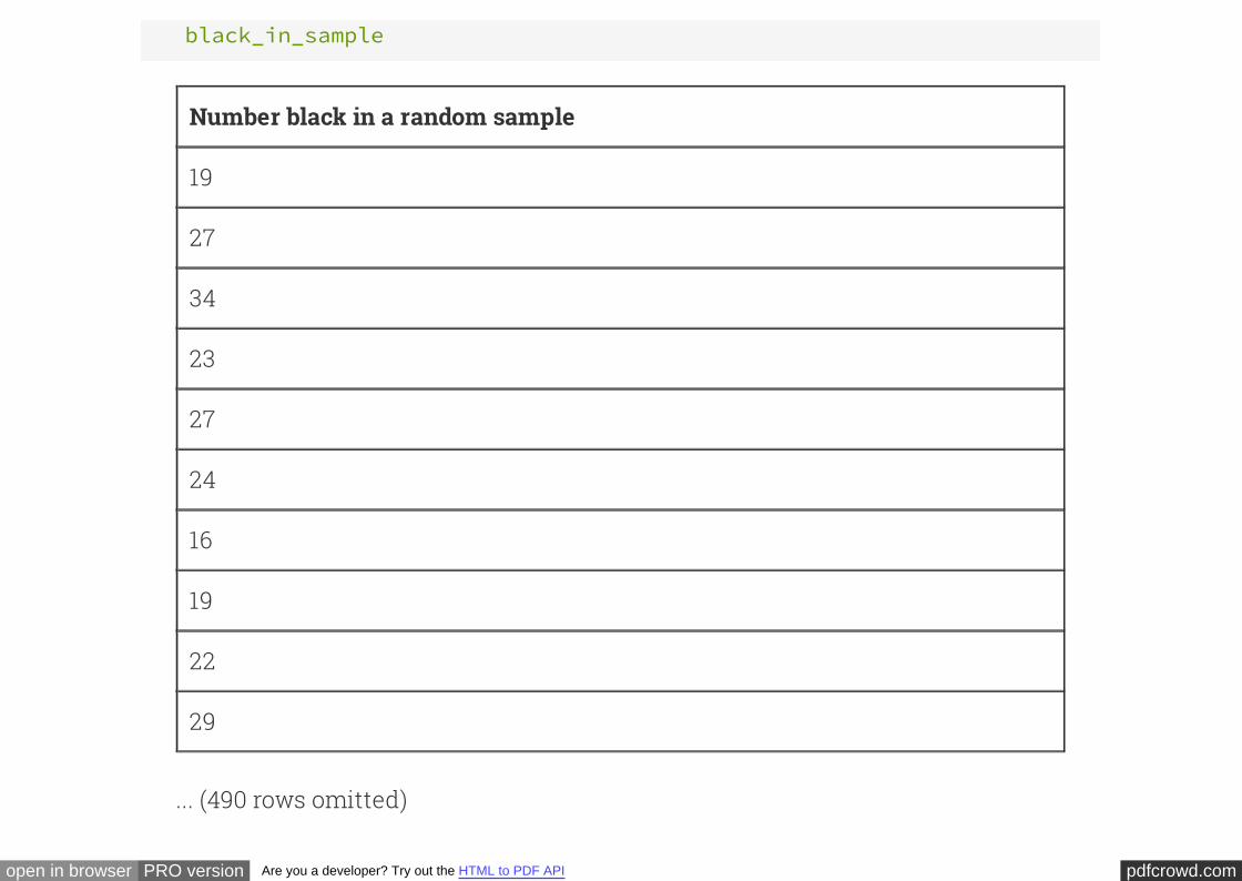
Number black in a random sample
19
27
34
23
27
24
16
19
22
29
... (490 rows omitted)
pdfcrowd.comopen in browser PRO version Are you a developer? Try out the HTML to PDF API
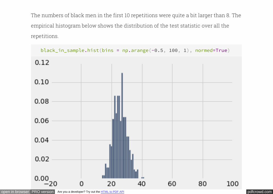
The numbers of black men in the first 10 repetitions were quite a bit larger than 8. The
empirical histogram below shows the distribution of the test statistic over all the
repetitions.
black_in_sample.hist(bins = np.arange(-0.5, 100, 1), normed=True)
pdfcrowd.comopen in browser PRO version Are you a developer? Try out the HTML to PDF API
If the 100 men in Swain's jury panel had been chosen at random, it would have been
extremely unlikely for the number of black men on the panel to be as small as 8. We
must conclude that the percentage disparity was larger than the disparity expected
due to chance variation.
Method and Terminology of StatisticalTests of Hypotheses
We have developed some of the fundamental concepts of statistical tests of
hypotheses, in the context of examples about jury selection. Using statistical tests as
a way of making decisions is standard in many fields and has a standard
terminology. Here is the sequence of the steps in most statistical tests, along with
some terminology and examples.
STEP 1: THE HYPOTHESES

pdfcrowd.comopen in browser PRO version Are you a developer? Try out the HTML to PDF API
All statistical tests attempt to choose between two views of how the data were
generated. These two views are called .hypotheses
This says that the data were generated at random under clearly
specified assumptions that make it possible to compute chances. The word "null"
reinforces the idea that if the data look different from what the null hypothesis
predicts, the difference is due to nothing but chance.
The null hypothesis.
In both of our examples about jury selection, the null hypothesis is that the panels
were selected at random from the population of eligible jurors. Though the racial
composition of the panels was different from that of the populations of eligible jurors,
there was no reason for the difference other than chance variation.
This says that some reason other than chance made the
data differ from what was predicted by the null hypothesis. Informally, the alternative
hypothesis says that the observed difference is "real."
The alternative hypothesis.
In both of our examples about jury selection, the alternative hypothesis is that the
pdfcrowd.comopen in browser PRO version Are you a developer? Try out the HTML to PDF API
panels were not selected at random. Something other than chance led to the
differences between the racial composition of the panels and the racial composition
of the populations of eligible jurors.
STEP 2: THE TEST STATISTIC
In order to decide between the two hypothesis, we must choose a statistic upon
which we will base our decision. This is called the .test statistic
In the example about jury panels in Alameda County, the test statistic we used was
the total variation distance between the racial distributions in the panels and in the
population of eligible jurors. In the example about Swain versus the State of Alabama,
the test statistic was the number of black men on the jury panel.
Calculating the observed value of the test statistic is often the first computational
step in a statistical test. In the case of jury panels in Alameda County, the observed
value of the total variation distance between the distributions in the panels and the
population was 0.14. In the example about Swain, the number of black men on his jury
panel was 8.

pdfcrowd.comopen in browser PRO version Are you a developer? Try out the HTML to PDF API
STEP 3: THE PROBABILITY DISTRIBUTION OF THE TEST STATISTIC, UNDER THE
NULL HYPOTHESIS
This step sets aside the observed value of the test statistic, and instead focuses on
. Under the null hypothesis,
the sample could have come out differently due to chance. So the test statistic could
have come out differently. This step consists of figuring out all possible values of the
test statistic and all their probabilities, under the null hypothesis of randomness.
what the value might be if the null hypothesis were true
In other words, in this step we calculate the probability distribution of the test
statistic pretending that the null hypothesis is true. For many test statistics, this can
be a daunting task both mathematically and computationally. Therefore, we
approximate the probability distribution of the test statistic by the empirical
distribution of the statistic based on a large number of repetitions of the sampling
procedure.
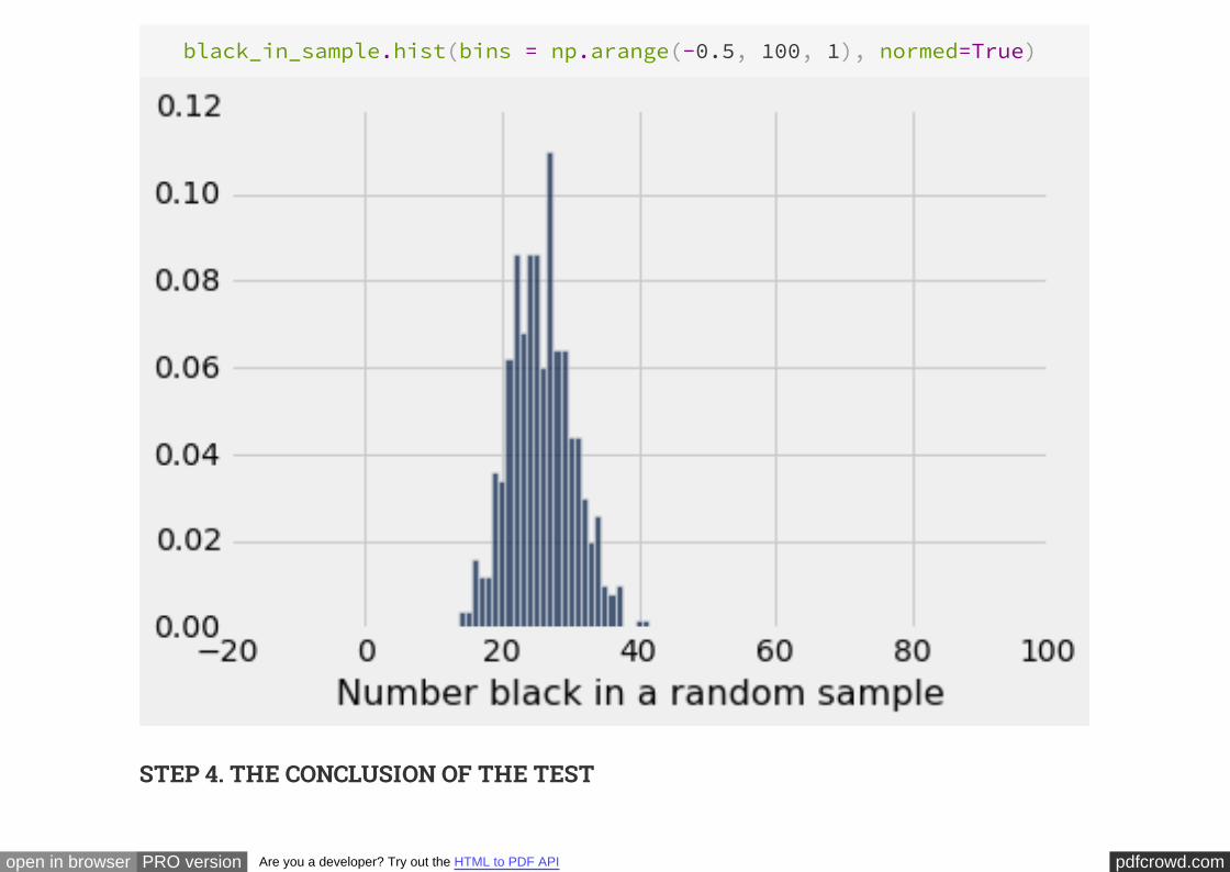
This was the empirical distribution of the test statistic – the number of black men on
the jury panel – in the example about Swain and the Supreme Court:
pdfcrowd.comopen in browser PRO version Are you a developer? Try out the HTML to PDF API
black_in_sample.hist(bins = np.arange(-0.5, 100, 1), normed=True)
STEP 4. THE CONCLUSION OF THE TEST
pdfcrowd.comopen in browser PRO version Are you a developer? Try out the HTML to PDF API
The choice between the null and alternative hypotheses depends on the comparison
between the results of Steps 2 and 3: the observed test statistic and its distribution as
predicted by the null hypothesis.
If the two are consistent with each other, then the observed test statistic is in line
with what the null hypothesis predicts. In other words, the test does not point towards
the alternative hypothesis; the null hypothesis is better supported by the data.
But if the two are not consistent with each other, as is the case in both of our
examples about jury panels, then the data do not support the null hypothesis. In both
our examples we concluded that the jury panels were not selected at random.
Something other than chance affected their composition.
Whether the observed test statistic is consistent with its
predicted distribution under the null hypothesis is a matter of judgment. We
recommend that you provide your judgment along with the value of the test statistic
and a graph of its predicted distribution. That will allow your reader to make his or
her own judgment about whether the two are consistent.
How is "consistent" defined?
pdfcrowd.comopen in browser PRO version Are you a developer? Try out the HTML to PDF API
If you do not want to make your own judgment, there are conventions that you can
follow. These conventions are based on what is called the
or for short. The P-value is a chance computed using the probability
distribution of the test statistic, and can be approximated by using the empirical
distribution in Step 3.
observed significance level
P-value
Place the observed test statistic on the
horizontal axis of the histogram, and find the proportion in the tail starting at that
point. That's the P-value.
Practical note on P-values and conventions.
If the P-value is small, the data support the alternative hypothesis. The conventions
for what is "small":
If the P-value is less than 5%, the result is called "statistically significant."
If the P-value is even smaller – less than 1% – the result is called "highly
statistically significant."
The P-value is the chance, under the nullMore formal definition of P-value.

pdfcrowd.comopen in browser PRO version Are you a developer? Try out the HTML to PDF API
hypothesis, that the test statistic is equal to the value that was observed or is even
further in the direction of the alternative.
The P-value is based on comparing the observed test statistic and what the null
hypothesis predicts. A small P-value implies that under the null hypothesis, the value
of the test statistic is unlikely to be near the one we observed. When a hypothesis and
the data are not in accord, the hypothesis has to go. That is why we reject the null
hypothesis if the P-value is small.
HISTORICAL NOTE ON THE CONVENTIONS
The determination of statistical significance, as defined above, has become standard
in statistical analyses in all fields of application. When a convention is so universally
followed, it is interesting to examine how it arose.
The method of statistical testing – choosing between hypotheses based on data in
random samples – was developed by Sir Ronald Fisher in the early 20th century. Sir
Ronald might have set the convention for statistical significance somewhat
unwittingly, in the following statement in his 1925 book Statistical Methods for
pdfcrowd.comopen in browser PRO version Are you a developer? Try out the HTML to PDF API
. About the 5% level, he wrote, "It is convenient to take this point as
a limit in judging whether a deviation is to be considered significant or not."
Research Workers
What was "convenient" for Sir Ronald became a cutoff that has acquired the status of
a universal constant. No matter that Sir Ronald himself made the point that the value
was his personal choice from among many: in an article in 1926, he wrote, "If one in
twenty does not seem high enough odds, we may, if we prefer it draw the line at one
in fifty (the 2 percent point), or one in a hundred (the 1 percent point). Personally, the
author prefers to set a low standard of significance at the 5 percent point ..."
Fisher knew that "low" is a matter of judgment and has no unique definition. We
suggest that you follow his excellent example. Provide your data, make your
judgment, and explain why you made it.
Permutation Tests

pdfcrowd.comopen in browser PRO version Are you a developer? Try out the HTML to PDF API
INTERACT
Comparing Two Groups
The examples above investigate whether a sample appears to be chosen randomly
from an underlying population. A similar line of reasoning can be used to determine
whether two parts of a population are different. In particular, given two groups that
differ in some distinguishing characteristic, we can investigate whether they are the
same or different in another aspect.
Example: Married Couples and Umarried Partners
The methods that we have developed allow us to think inferentially about data from a
variety of sources. Our next example is based on a study conducted in 2010 under the
auspices of the National Center for Family and Marriage Research.
pdfcrowd.comopen in browser PRO version Are you a developer? Try out the HTML to PDF API
In the United States, the proportion of couples who live together but are not married
has been rising in recent decades. The study involved a national random sample of
over 1,000 heterosexual couples who were either married or living together but
unmarried. One of the goals of the study was to compare the attitudes and
experiences of the married and umarried couples.
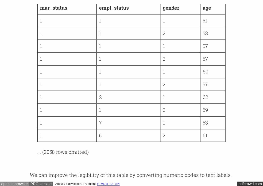
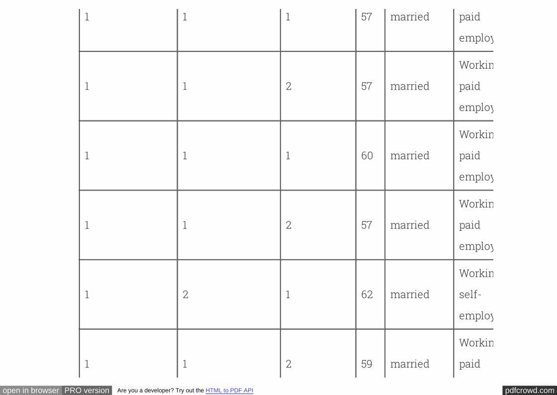
The table below shows a subset of the data collected in the study. Each row
corresponds to one person. The variables that we will examine in this section are:
mar_status: 1=married, 2=unmarried
empl_status: employment status; categories described below
gender: 1=male, 2=female
age: Age in years
columns = ['mar_status', 'empl_status', 'gender', 'age', ]
couples = Table.read_table('married_couples.csv').select(columns)
couples
pdfcrowd.comopen in browser PRO version Are you a developer? Try out the HTML to PDF API
mar_status empl_status gender age
1 1 1 51
1 1 2 53
1 1 1 57
1 1 2 57
1 1 1 60
1 1 2 57
1 2 1 62
1 1 2 59
1 7 1 53
1 5 2 61
... (2058 rows omitted)
We can improve the legibility of this table by converting numeric codes to text labels.
pdfcrowd.comopen in browser PRO version Are you a developer? Try out the HTML to PDF API
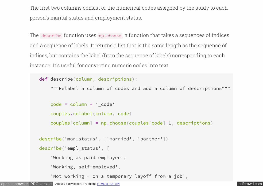
The first two columns consist of the numerical codes assigned by the study to each
person's marital status and employment status.
The function uses , a function that takes a sequences of indices
and a sequence of labels. It returns a list that is the same length as the sequence of
indices, but contains the label (from the sequence of labels) corresponding to each
instance. It's useful for converting numeric codes into text.
describe np.choose
def describe(column, descriptions):
"""Relabel a column of codes and add a column of descriptions"""
code = column + '_code'
couples.relabel(column, code)
couples[column] = np.choose(couples[code]-1, descriptions)
describe('mar_status', ['married', 'partner'])
describe('empl_status', [
'Working as paid employee',
'Working, self-employed',
'Not working - on a temporary layoff from a job',
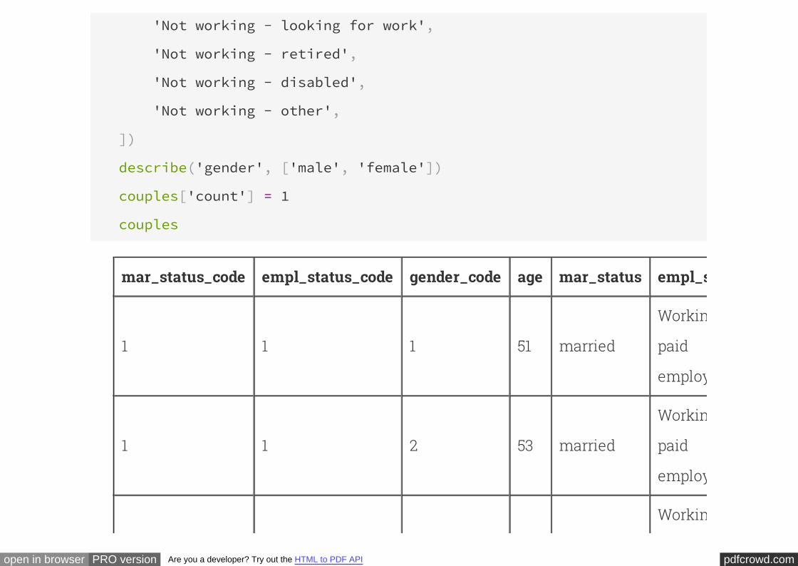
pdfcrowd.comopen in browser PRO version Are you a developer? Try out the HTML to PDF API
'Not working - looking for work',
'Not working - retired',
'Not working - disabled',
'Not working - other',
])
describe('gender', ['male', 'female'])
couples['count'] = 1
couples
mar_status_code empl_status_code gender_code age mar_status empl_status
1 1 1 51 married
Working as
paid
employee
1 1 2 53 married
Working as
paid
employee
Working as
pdfcrowd.comopen in browser PRO version Are you a developer? Try out the HTML to PDF API
1 1 1 57 married paid
employee
1 1 2 57 married
Working as
paid
employee
1 1 1 60 married
Working as
paid
employee
1 1 2 57 married
Working as
paid
employee
1 2 1 62 married
Working,
self-
employed
1 1 2 59 married
Working as
paid
pdfcrowd.comopen in browser PRO version Are you a developer? Try out the HTML to PDF API
employee
1 7 1 53 marriedNot working
- other
1 5 2 61 marriedNot working
- retired
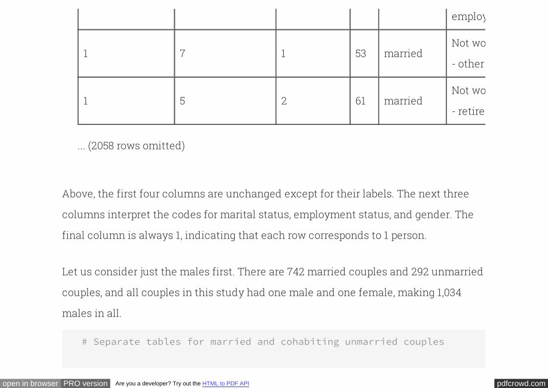
... (2058 rows omitted)
Above, the first four columns are unchanged except for their labels. The next three
columns interpret the codes for marital status, employment status, and gender. The
final column is always 1, indicating that each row corresponds to 1 person.
Let us consider just the males first. There are 742 married couples and 292 unmarried
couples, and all couples in this study had one male and one female, making 1,034
males in all.
# Separate tables for married and cohabiting unmarried couples
pdfcrowd.comopen in browser PRO version Are you a developer? Try out the HTML to PDF API
married = couples.where('gender', 'male').where('mar_status', 'married'
partner = couples.where('gender', 'male').where('mar_status', 'partner'
married.num_rows
742
partner.num_rows
292
Societal norms have changed over the decades, and there has been a gradual
acceptance of couples living together without being married. Thus it is natural to
expect that unmarried couples will in general consist of younger people than married
couples. The histograms of the ages of the married and unmarried men show that this
is indeed the case:
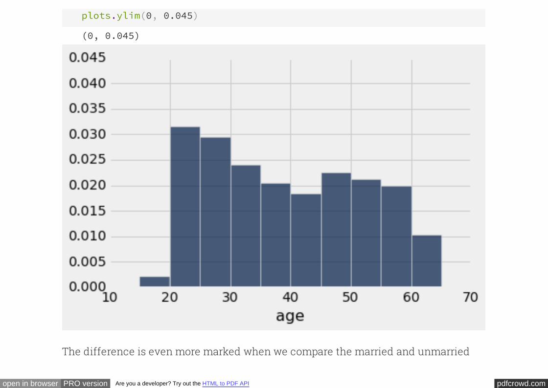
# Ages of married men
married.select('age').hist(bins=np.arange(15,70,5), normed=True)
plots.ylim(0, 0.045) # Set the lower and upper bounds of the vertical axis
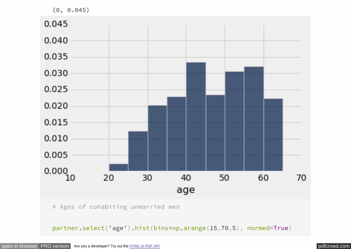
pdfcrowd.comopen in browser PRO version Are you a developer? Try out the HTML to PDF API
(0, 0.045)
# Ages of cohabiting unmarried men
partner.select('age').hist(bins=np.arange(15,70,5), normed=True)
pdfcrowd.comopen in browser PRO version Are you a developer? Try out the HTML to PDF API
plots.ylim(0, 0.045)
(0, 0.045)
The difference is even more marked when we compare the married and unmarried
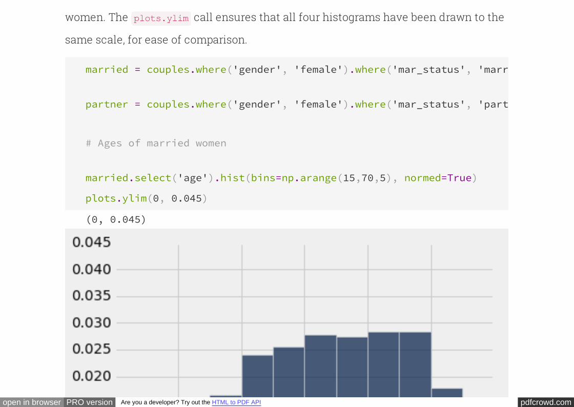
pdfcrowd.comopen in browser PRO version Are you a developer? Try out the HTML to PDF API
women. The call ensures that all four histograms have been drawn to the
same scale, for ease of comparison.
plots.ylim
married = couples.where('gender', 'female').where('mar_status', 'married'
partner = couples.where('gender', 'female').where('mar_status', 'partner'
# Ages of married women
married.select('age').hist(bins=np.arange(15,70,5), normed=True)
plots.ylim(0, 0.045)
(0, 0.045)
pdfcrowd.comopen in browser PRO version Are you a developer? Try out the HTML to PDF API
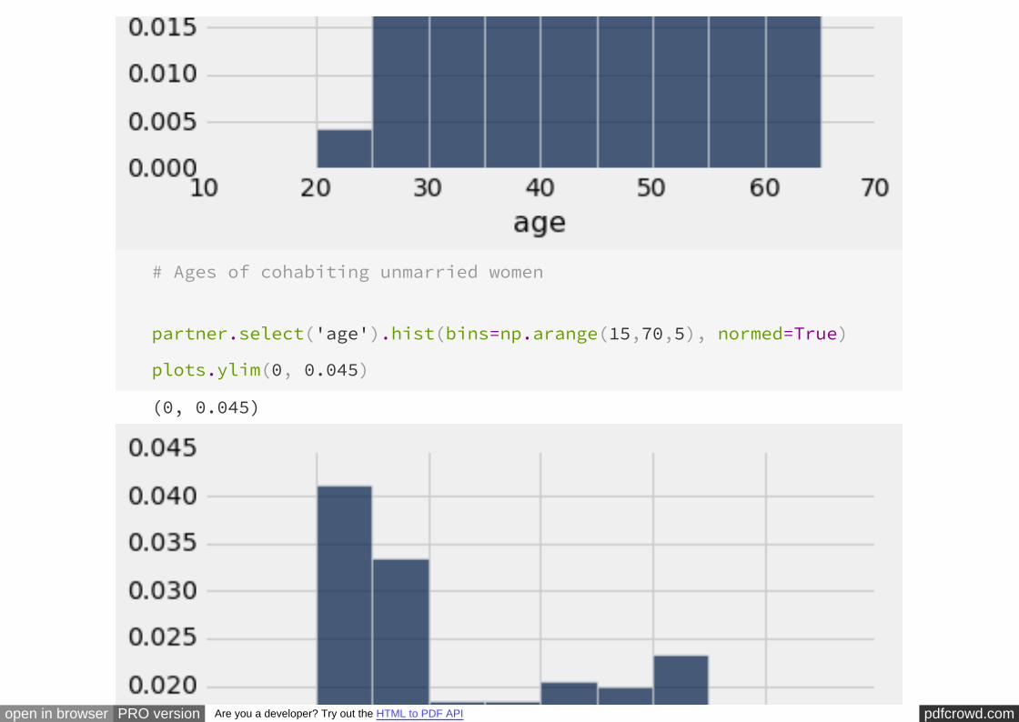
# Ages of cohabiting unmarried women
partner.select('age').hist(bins=np.arange(15,70,5), normed=True)
plots.ylim(0, 0.045)
(0, 0.045)
pdfcrowd.comopen in browser PRO version Are you a developer? Try out the HTML to PDF API
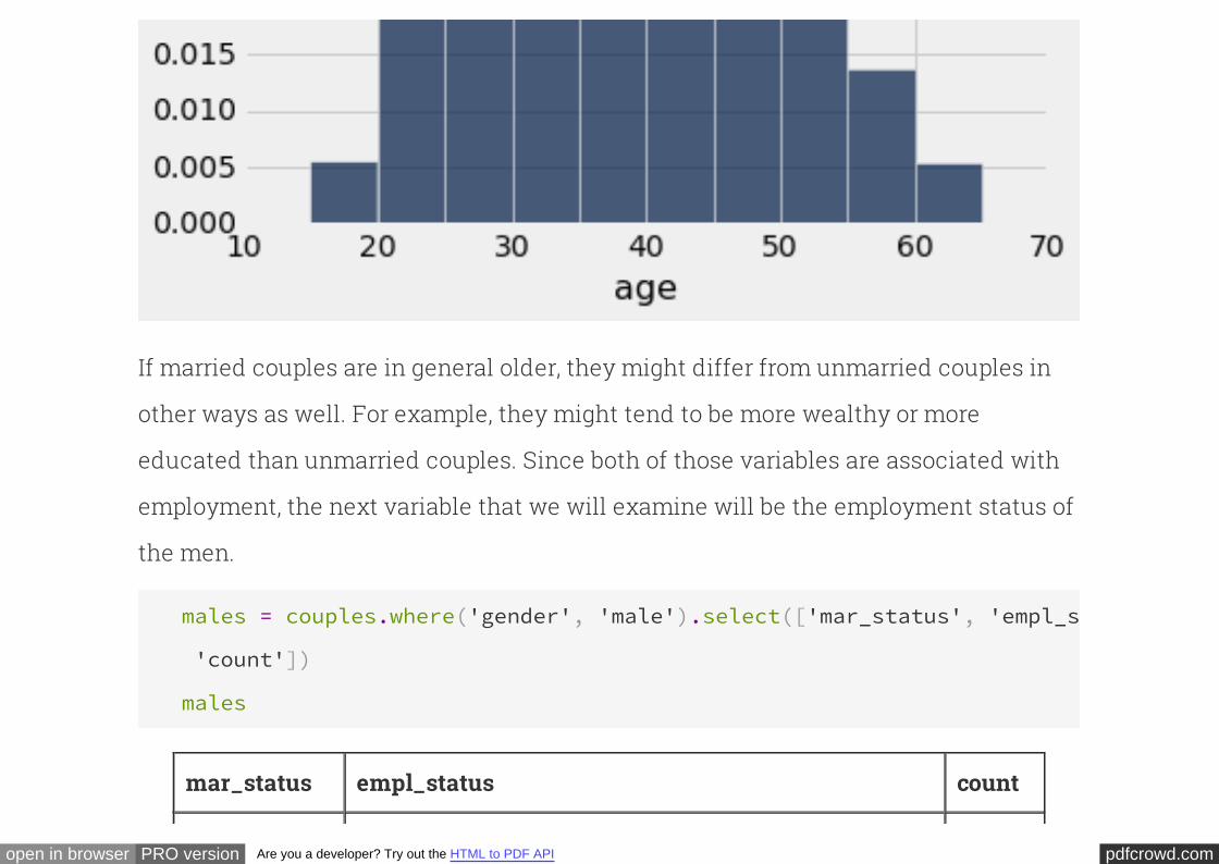
If married couples are in general older, they might differ from unmarried couples in
other ways as well. For example, they might tend to be more wealthy or more
educated than unmarried couples. Since both of those variables are associated with
employment, the next variable that we will examine will be the employment status of
the men.
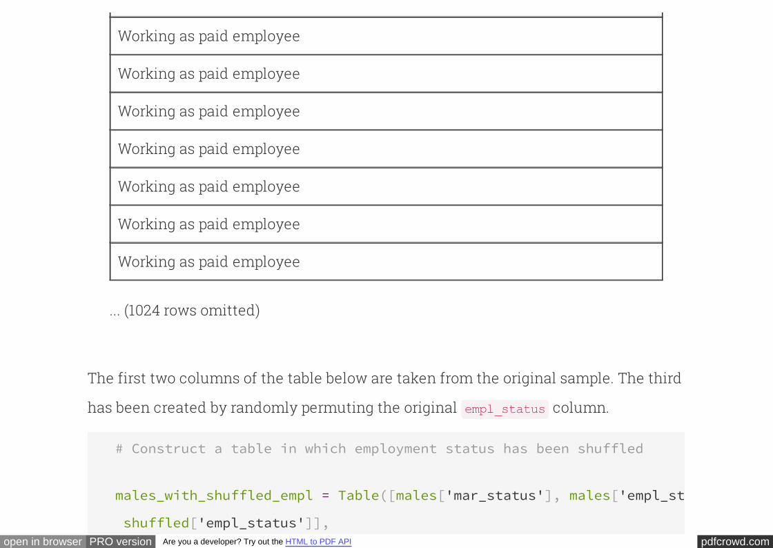
males = couples.where('gender', 'male').select(['mar_status', 'empl_status'
'count'])
males
mar_status empl_status count
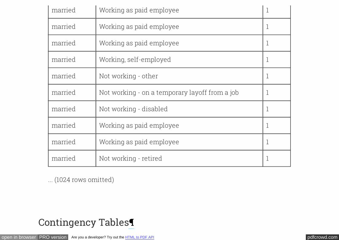
pdfcrowd.comopen in browser PRO version Are you a developer? Try out the HTML to PDF API
married Working as paid employee 1
married Working as paid employee 1
married Working as paid employee 1
married Working, self-employed 1
married Not working - other 1
married Not working - on a temporary layoff from a job 1
married Not working - disabled 1
married Working as paid employee 1
married Working as paid employee 1
married Not working - retired 1
... (1024 rows omitted)
Contingency Tables
pdfcrowd.comopen in browser PRO version Are you a developer? Try out the HTML to PDF API
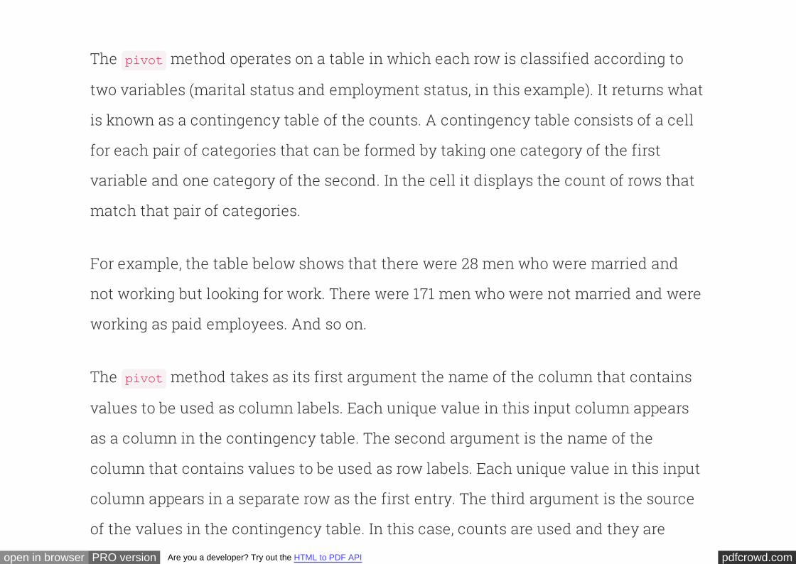
The method operates on a table in which each row is classified according to
two variables (marital status and employment status, in this example). It returns what
is known as a of the counts. A contingency table consists of a cell
for each pair of categories that can be formed by taking one category of the first
variable and one category of the second. In the cell it displays the count of rows that
match that pair of categories.
pivot
contingency table
For example, the table below shows that there were 28 men who were married and
not working but looking for work. There were 171 men who were not married and were
working as paid employees. And so on.
The method takes as its first argument the name of the column that contains
values to be used as column labels. Each unique value in this input column appears
as a column in the contingency table. The second argument is the name of the
column that contains values to be used as row labels. Each unique value in this input
column appears in a separate row as the first entry. The third argument is the source
of the values in the contingency table. In this case, counts are used and they are
pivot
pdfcrowd.comopen in browser PRO version Are you a developer? Try out the HTML to PDF API
aggregated by summing.
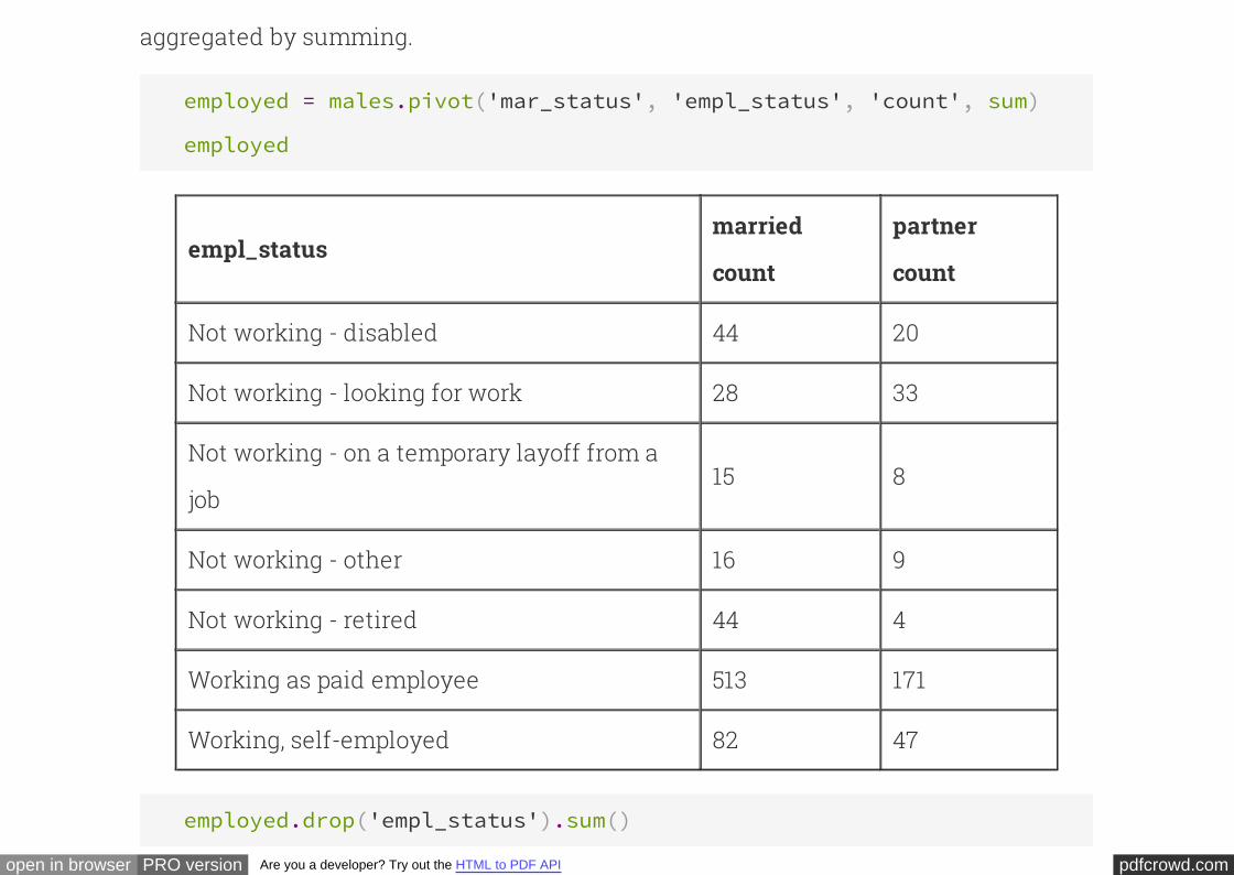
employed = males.pivot('mar_status', 'empl_status', 'count', sum)
employed
empl_statusmarried
count
partner
count
Not working - disabled 44 20
Not working - looking for work 28 33
Not working - on a temporary layoff from a
job15 8
Not working - other 16 9
Not working - retired 44 4
Working as paid employee 513 171
Working, self-employed 82 47
employed.drop('empl_status').sum()
pdfcrowd.comopen in browser PRO version Are you a developer? Try out the HTML to PDF API
married count partner count
742 292
Because the total number of married couples in the sample is greater than the
number of unmarried couples, the counts in the different categories are not directly
comparable. So we convert them into proportions, displayed in the last two columns
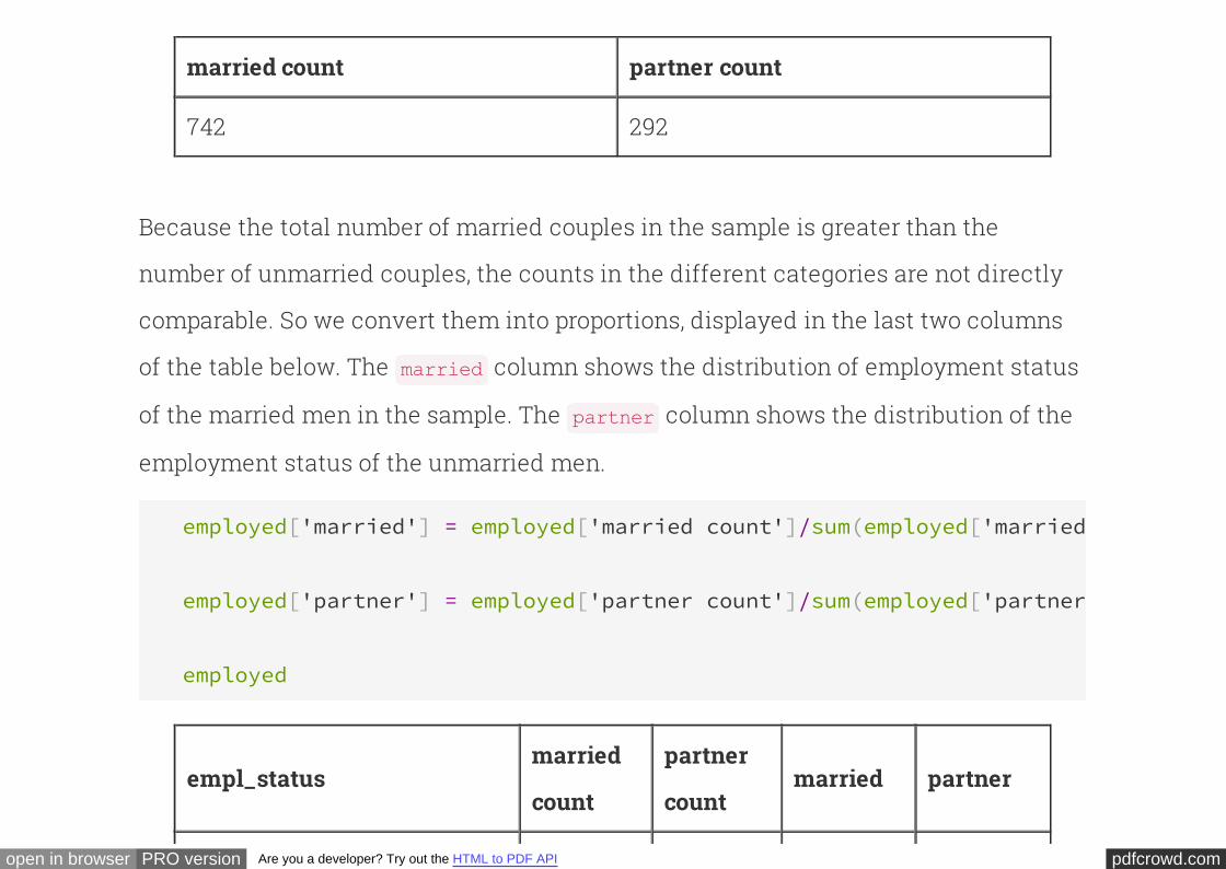
of the table below. The column shows the distribution of employment status
of the married men in the sample. The column shows the distribution of the
employment status of the unmarried men.
married
partner
employed['married'] = employed['married count']/sum(employed['married count'
employed['partner'] = employed['partner count']/sum(employed['partner count'
employed
empl_statusmarried
count
partner
countmarried partner
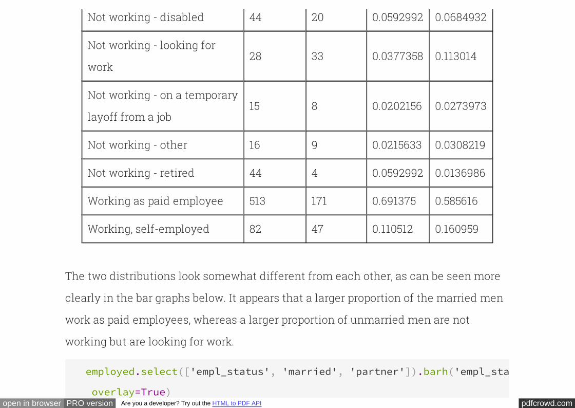
pdfcrowd.comopen in browser PRO version Are you a developer? Try out the HTML to PDF API
Not working - disabled 44 20 0.0592992 0.0684932
Not working - looking for
work28 33 0.0377358 0.113014
Not working - on a temporary
layoff from a job15 8 0.0202156 0.0273973
Not working - other 16 9 0.0215633 0.0308219
Not working - retired 44 4 0.0592992 0.0136986
Working as paid employee 513 171 0.691375 0.585616
Working, self-employed 82 47 0.110512 0.160959
The two distributions look somewhat different from each other, as can be seen more
clearly in the bar graphs below. It appears that a larger proportion of the married men
work as paid employees, whereas a larger proportion of unmarried men are not
working but are looking for work.
employed.select(['empl_status', 'married', 'partner']).barh('empl_status'
overlay=True)
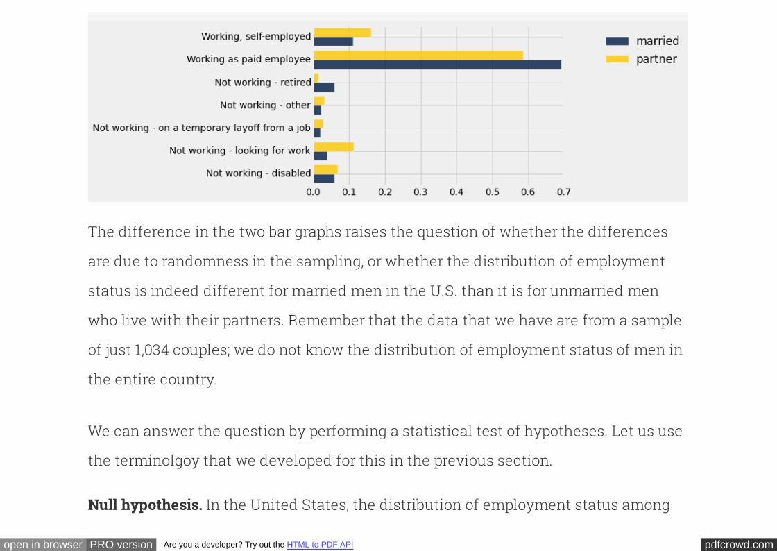
pdfcrowd.comopen in browser PRO version Are you a developer? Try out the HTML to PDF API
overlay=True)
The difference in the two bar graphs raises the question of whether the differences
are due to randomness in the sampling, or whether the distribution of employment
status is indeed different for married men in the U.S. than it is for unmarried men
who live with their partners. Remember that the data that we have are from a sample
of just 1,034 couples; we do not know the distribution of employment status of men in
the entire country.
We can answer the question by performing a statistical test of hypotheses. Let us use
the terminolgoy that we developed for this in the previous section.
In the United States, the distribution of employment status amongNull hypothesis.
pdfcrowd.comopen in browser PRO version Are you a developer? Try out the HTML to PDF API
married men is the same as among unmarried men who live with their partners. The
difference between the two samples is due to chance.
In the United States, the distributions of the employment
status of the two groups of men are different.
Alternative hypothesis.
As our , we will use the total variation distance between the two
distributions. Because employment status is a categorical variable, there is no
question of computing summary statistics such as means. By using the total variation
distance, we can compare the entire distributions, not just summaries.
test statistic
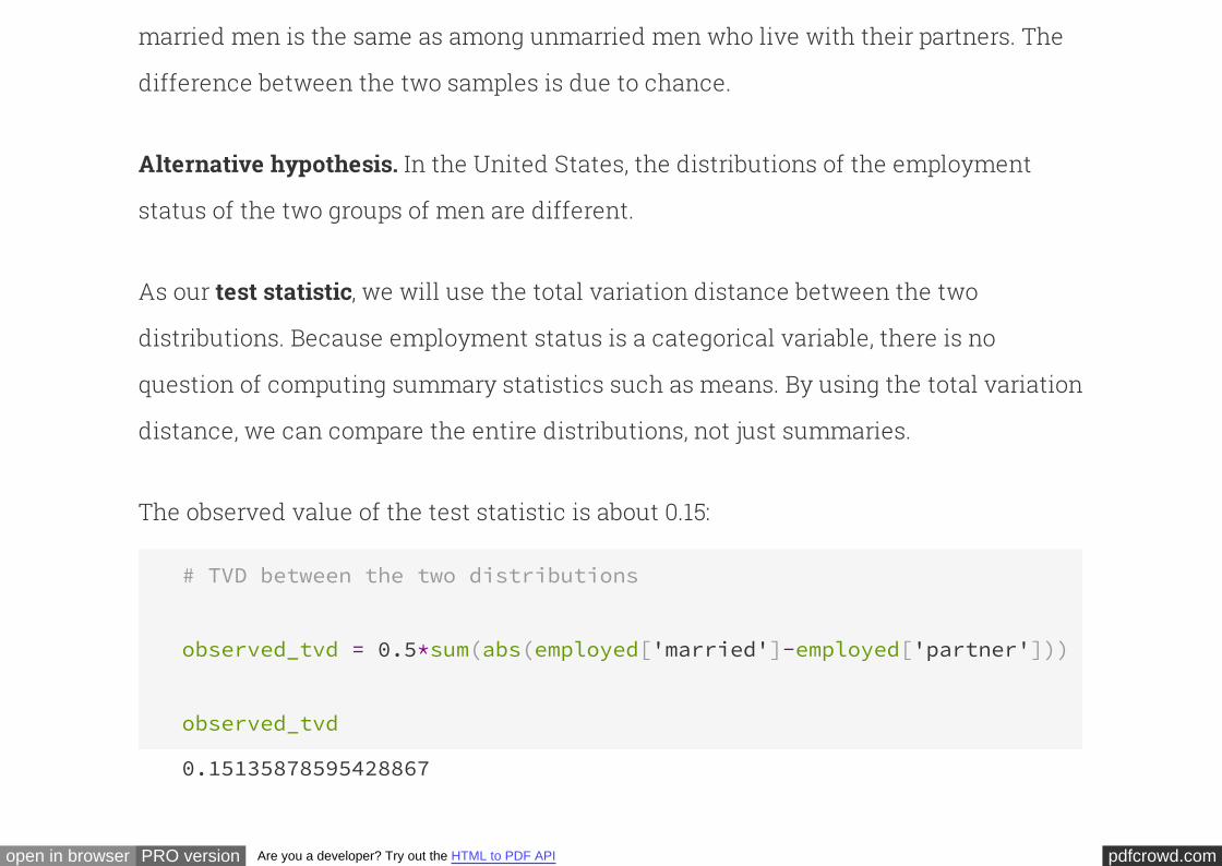
The observed value of the test statistic is about 0.15:
# TVD between the two distributions
observed_tvd = 0.5*sum(abs(employed['married']-employed['partner']))
observed_tvd
0.15135878595428867
pdfcrowd.comopen in browser PRO version Are you a developer? Try out the HTML to PDF API
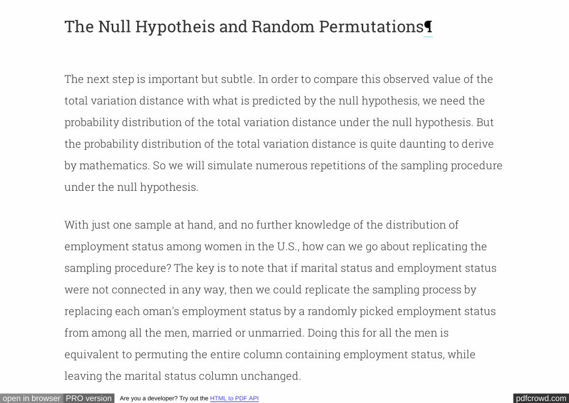
The Null Hypotheis and Random Permutations
The next step is important but subtle. In order to compare this observed value of the
total variation distance with what is predicted by the null hypothesis, we need the
probability distribution of the total variation distance under the null hypothesis. But
the probability distribution of the total variation distance is quite daunting to derive
by mathematics. So we will simulate numerous repetitions of the sampling procedure
under the null hypothesis.
With just one sample at hand, and no further knowledge of the distribution of
employment status among women in the U.S., how can we go about replicating the
sampling procedure? The key is to note that marital status and employment status
were not connected in any way, then we could replicate the sampling process by
replacing each oman's employment status by a randomly picked employment status
from among all the men, married or unmarried. Doing this for all the men is
equivalent to permuting the entire column containing employment status, while
leaving the marital status column unchanged.
if

pdfcrowd.comopen in browser PRO version Are you a developer? Try out the HTML to PDF API
Thus, under the null hypothesis, we can replicate the sampling process by assigning
to each married man an employment status chosen at random without replacement
from the entries in . Since the first 742 rows of correspond to the
married men, we can do the replication by simply permuting the entire
column and leaving everything else unchanged.
empl_status males
empl_status
Let's implement this plan. First, we will shuffle the column using the
method, which just shuffles all rows when provided with no arguments.
empl_status
sample
# Randomly permute the employment status of all men
shuffled = males.select('empl_status').sample()
shuffled
empl_status
Working as paid employee
Working as paid employee
Working as paid employee
pdfcrowd.comopen in browser PRO version Are you a developer? Try out the HTML to PDF API
Working as paid employee
Working as paid employee
Working as paid employee
Working as paid employee
Working as paid employee
Working as paid employee
Working as paid employee
... (1024 rows omitted)
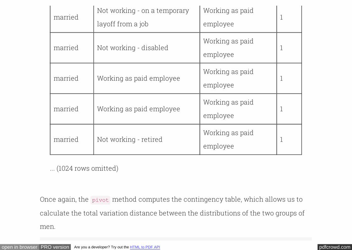
The first two columns of the table below are taken from the original sample. The third
has been created by randomly permuting the original column.empl_status
# Construct a table in which employment status has been shuffled
males_with_shuffled_empl = Table([males['mar_status'], males['empl_status'
shuffled['empl_status']],
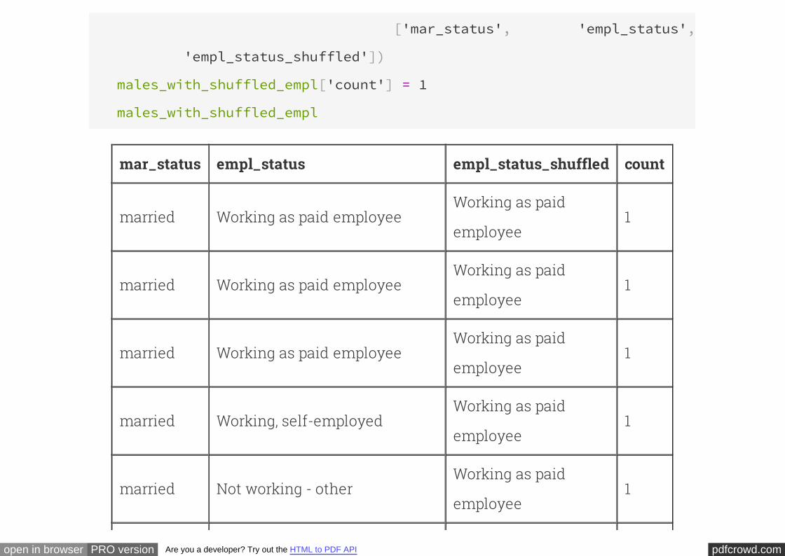
pdfcrowd.comopen in browser PRO version Are you a developer? Try out the HTML to PDF API
['mar_status', 'empl_status',
'empl_status_shuffled'])
males_with_shuffled_empl['count'] = 1
males_with_shuffled_empl
mar_status empl_status empl_status_shuffled count
married Working as paid employeeWorking as paid
employee1
married Working as paid employeeWorking as paid
employee1
married Working as paid employeeWorking as paid
employee1
married Working, self-employedWorking as paid
employee1
married Not working - otherWorking as paid
employee1
pdfcrowd.comopen in browser PRO version Are you a developer? Try out the HTML to PDF API
marriedNot working - on a temporary
layoff from a job
Working as paid
employee1
married Not working - disabledWorking as paid
employee1
married Working as paid employeeWorking as paid
employee1
married Working as paid employeeWorking as paid
employee1
married Not working - retiredWorking as paid
employee1
... (1024 rows omitted)
Once again, the method computes the contingency table, which allows us to
calculate the total variation distance between the distributions of the two groups of
men.
pivot
pdfcrowd.comopen in browser PRO version Are you a developer? Try out the HTML to PDF API
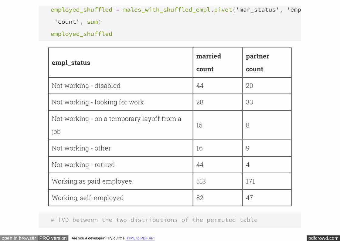
employed_shuffled = males_with_shuffled_empl.pivot('mar_status', 'empl_status'
'count', sum)
employed_shuffled
empl_statusmarried
count
partner
count
Not working - disabled 44 20
Not working - looking for work 28 33
Not working - on a temporary layoff from a
job15 8
Not working - other 16 9
Not working - retired 44 4
Working as paid employee 513 171
Working, self-employed 82 47
# TVD between the two distributions of the permuted table
pdfcrowd.comopen in browser PRO version Are you a developer? Try out the HTML to PDF API
married = employed_shuffled['married count']
partner = employed_shuffled['partner count']
0.5*sum(abs(married/sum(married)-partner/sum(partner)))
0.15135878595428867
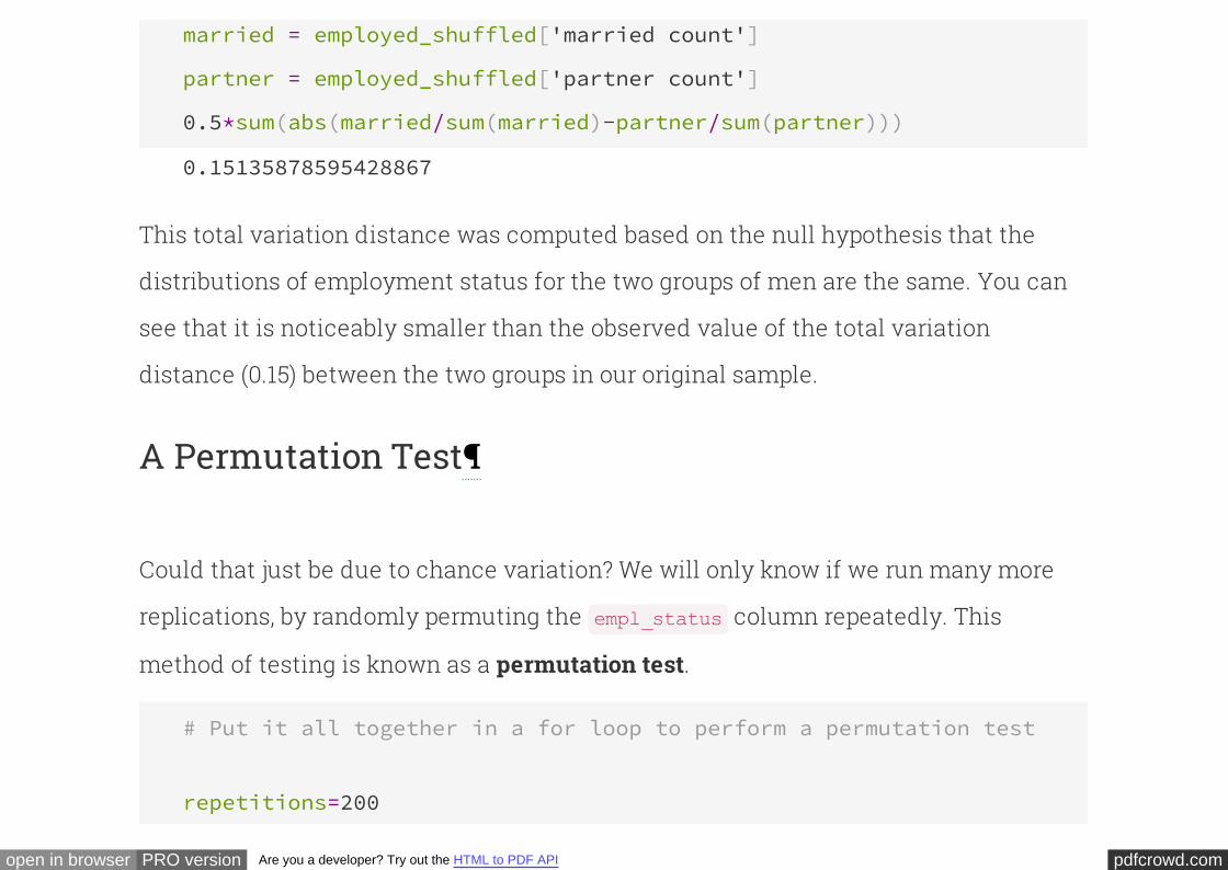
This total variation distance was computed based on the null hypothesis that the
distributions of employment status for the two groups of men are the same. You can
see that it is noticeably smaller than the observed value of the total variation
distance (0.15) between the two groups in our original sample.
A Permutation Test
Could that just be due to chance variation? We will only know if we run many more
replications, by randomly permuting the column repeatedly. This
method of testing is known as a .
empl_status
permutation test
# Put it all together in a for loop to perform a permutation test
repetitions=200
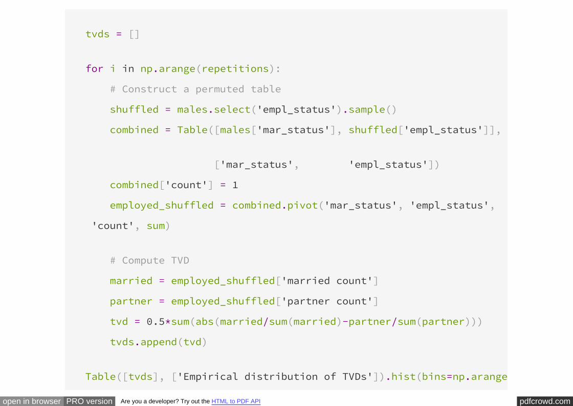
pdfcrowd.comopen in browser PRO version Are you a developer? Try out the HTML to PDF API
tvds = []
for i in np.arange(repetitions):
# Construct a permuted table
shuffled = males.select('empl_status').sample()
combined = Table([males['mar_status'], shuffled['empl_status']],
['mar_status', 'empl_status'])
combined['count'] = 1
employed_shuffled = combined.pivot('mar_status', 'empl_status',
'count', sum)
# Compute TVD
married = employed_shuffled['married count']
partner = employed_shuffled['partner count']
tvd = 0.5*sum(abs(married/sum(married)-partner/sum(partner)))
tvds.append(tvd)
Table([tvds], ['Empirical distribution of TVDs']).hist(bins=np.arange
pdfcrowd.comopen in browser PRO version Are you a developer? Try out the HTML to PDF API
0.2, 0.01),normed=True)
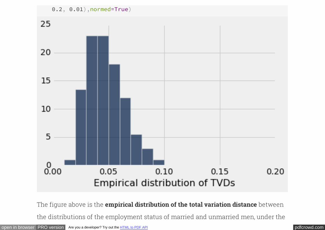
The figure above is the between
the distributions of the employment status of married and unmarried men, under the
empirical distribution of the total variation distance
pdfcrowd.comopen in browser PRO version Are you a developer? Try out the HTML to PDF API
null hypothesis.
.
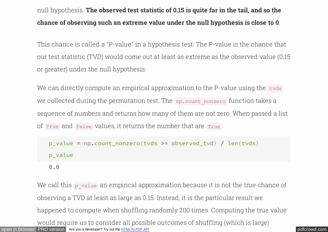
The observed test statistic of 0.15 is quite far in the tail, and so the
chance of observing such an extreme value under the null hypothesis is close to 0
This chance is called a "P-value" in a hypothesis test. The P-value is the chance that
our test statistic (TVD) would come out at least as extreme as the observed value (0.15
or greater) under the null hypothesis.
We can directly compute an empirical approximation to the P-value using the
we collected during the permutation test. The function takes a
sequence of numbers and returns how many of them are not zero. When passed a list
of and values, it returns the number that are .
tvds
np.count_nonzero
True False True
p_value = np.count_nonzero(tvds >= observed_tvd) / len(tvds)
p_value
0.0
We call this an empirical approximation because it is not the true chance of
observing a TVD at least as large as 0.15. Instead, it is the particular result we
happened to compute when shuffling randomly 200 times. Computing the true value
would require us to consider all possible outcomes of shuffling (which is large)
p_value
pdfcrowd.comopen in browser PRO version Are you a developer? Try out the HTML to PDF API
would require us to consider all possible outcomes of shuffling (which is large)
instead of just 200 random shuffles. Were we to consider all cases, there would be
some with a more extreme TVD, and so the true P-value is greater than zero but not by
much.
A low P-value constitutes . The data
support the hypothesis that in the United States, the distribution of the employment
status of married men is not the same as that of unmarried men who live with their
partners.
evidence in favor of the alternative hypothesis
In this example, our empirical estimate from sampling tells us all the information we
need to draw conclusions from the data; the observed statistic is very unlikely under
the null hypothesis. Precisely how unlikely often doesn't matter. Permutation tests of
this form are indeed quite common in practice because they make few assumptions
about the underlying population and are straightforward to perform and interpret.
Generalizing Our Hypothesis Test
pdfcrowd.comopen in browser PRO version Are you a developer? Try out the HTML to PDF API
The example above includes a substantial amount of code in order to investigate the
relationship between two characteristics (marital status and employment status) for
a particular subset of the surveyed population (males). Suppose we would like to
investigate different characteristics or a different population. How can we reuse the
code we have written so far in order to explore more relationships?
Functions allow us to generalize both the statistics we compute and the
computational process of performing a permutation test. We can begin with a
generalized computation of total variation distance between the distribution of any
column of values (such as employment status) when separated into any two
conditions (such as marital status) for a collection of data described by any table. Our
implementation includes the same statements as we used above, but uses generic
names that are specified by the final function call.
# TVD between any two conditions
def tvd(t, conditions, values):
"""Compute the total variation distance between counts of values under two conditions.
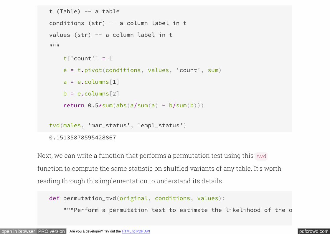
pdfcrowd.comopen in browser PRO version Are you a developer? Try out the HTML to PDF API
t (Table) -- a table
conditions (str) -- a column label in t
values (str) -- a column label in t
"""
t['count'] = 1
e = t.pivot(conditions, values, 'count', sum)
a = e.columns[1]
b = e.columns[2]
return 0.5*sum(abs(a/sum(a) - b/sum(b)))
tvd(males, 'mar_status', 'empl_status')
0.15135878595428867
Next, we can write a function that performs a permutation test using this
function to compute the same statistic on shuffled variants of any table. It's worth
reading through this implementation to understand its details.
tvd
def permutation_tvd(original, conditions, values):
"""Perform a permutation test to estimate the likelihood of the observed

pdfcrowd.comopen in browser PRO version Are you a developer? Try out the HTML to PDF API
total variation distance (our test statistic) between counts of values
under the null hypothesis that the distribution of values for two
conditions is the same.
"""
repetitions=200
stats = []
for i in np.arange(repetitions):
shuffled = original.sample()
combined = Table([original[conditions], shuffled[values]],
[conditions, values])
stats.append(tvd(combined, conditions, values))
observation = tvd(original, conditions, values)
p_value = np.count_nonzero(stats >= observation) / repetitions
print("Observation:", observation)
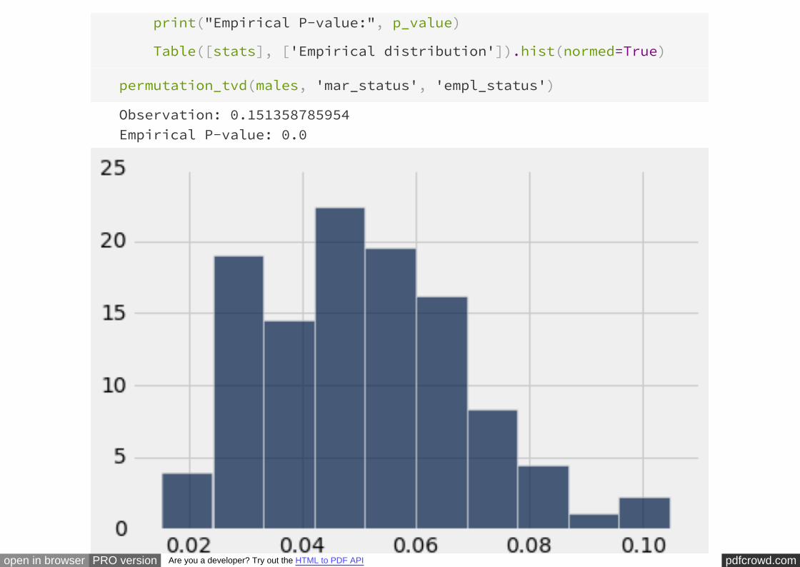
pdfcrowd.comopen in browser PRO version Are you a developer? Try out the HTML to PDF API
print("Empirical P-value:", p_value)
Table([stats], ['Empirical distribution']).hist(normed=True)
permutation_tvd(males, 'mar_status', 'empl_status')
Observation: 0.151358785954Empirical P-value: 0.0
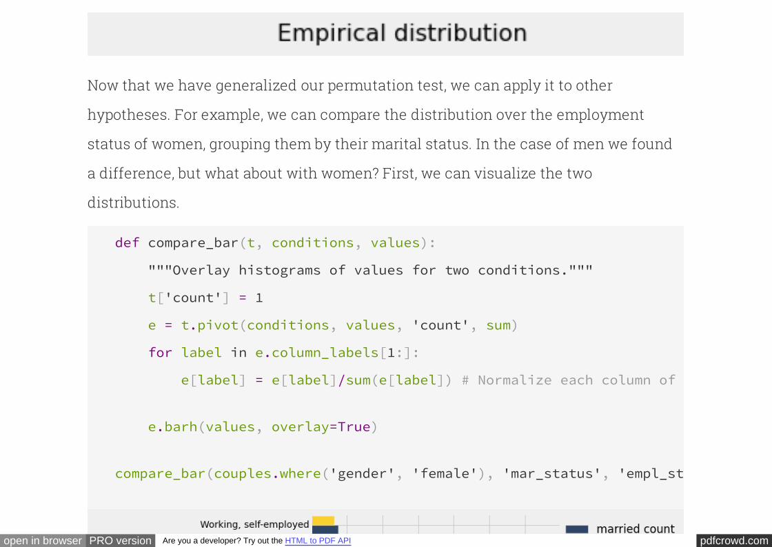
pdfcrowd.comopen in browser PRO version Are you a developer? Try out the HTML to PDF API
Now that we have generalized our permutation test, we can apply it to other
hypotheses. For example, we can compare the distribution over the employment
status of women, grouping them by their marital status. In the case of men we found
a difference, but what about with women? First, we can visualize the two
distributions.
def compare_bar(t, conditions, values):
"""Overlay histograms of values for two conditions."""
t['count'] = 1
e = t.pivot(conditions, values, 'count', sum)
for label in e.column_labels[1:]:
e[label] = e[label]/sum(e[label]) # Normalize each column of counts
e.barh(values, overlay=True)
compare_bar(couples.where('gender', 'female'), 'mar_status', 'empl_status'
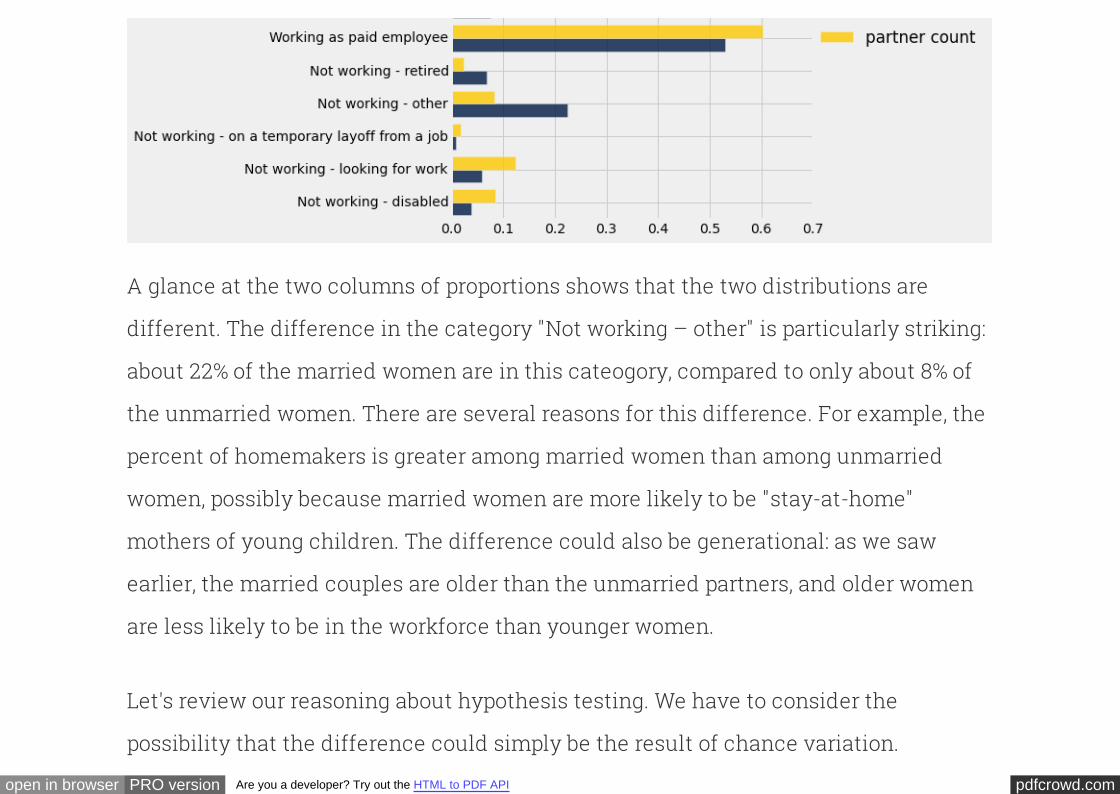
pdfcrowd.comopen in browser PRO version Are you a developer? Try out the HTML to PDF API
A glance at the two columns of proportions shows that the two distributions are
different. The difference in the category "Not working – other" is particularly striking:
about 22% of the married women are in this cateogory, compared to only about 8% of
the unmarried women. There are several reasons for this difference. For example, the
percent of homemakers is greater among married women than among unmarried
women, possibly because married women are more likely to be "stay-at-home"
mothers of young children. The difference could also be generational: as we saw
earlier, the married couples are older than the unmarried partners, and older women
are less likely to be in the workforce than younger women.
Let's review our reasoning about hypothesis testing. We have to consider the
possibility that the difference could simply be the result of chance variation.
pdfcrowd.comopen in browser PRO version Are you a developer? Try out the HTML to PDF API
Remember that our data are only from a random sample of couples. We do not have
data for all the couples in the United States.
To test this, we set up null and alternative hypotheses. When setting up a hypothesis,
the null in particular, it is important to be clear: exactly what are the unknowns about
which you hypothesizing? In our example, the sample is entirely known, and the
distributions of employment status in the two groups of women are simply different –
the difference is visible in the data. The unknowns are the distributions of
employment status among married and unmarried women , the
population from which the sample was drawn. It is those distributions, in the
population, about which we will form the competing hypotheses.
in the United States
: In the U.S., the distribution of employment status is the same for
married women as for unmarried women living with their partners. The difference in
the sample is due to chance.
Null hypothesis
: In the U.S., the distributions of employment status among
married and unmarried cohabitating women are different.
Alternative hypothesis
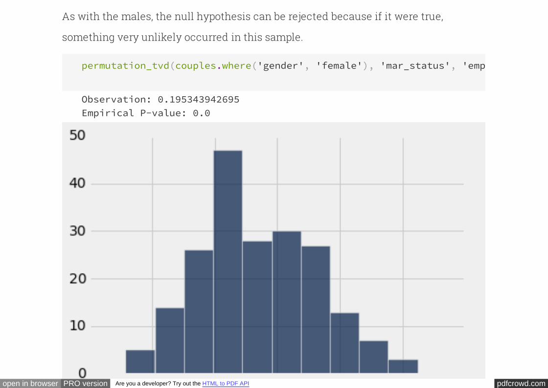
pdfcrowd.comopen in browser PRO version Are you a developer? Try out the HTML to PDF API
As with the males, the null hypothesis can be rejected because if it were true,
something very unlikely occurred in this sample.
permutation_tvd(couples.where('gender', 'female'), 'mar_status', 'empl_status'
Observation: 0.195343942695Empirical P-value: 0.0
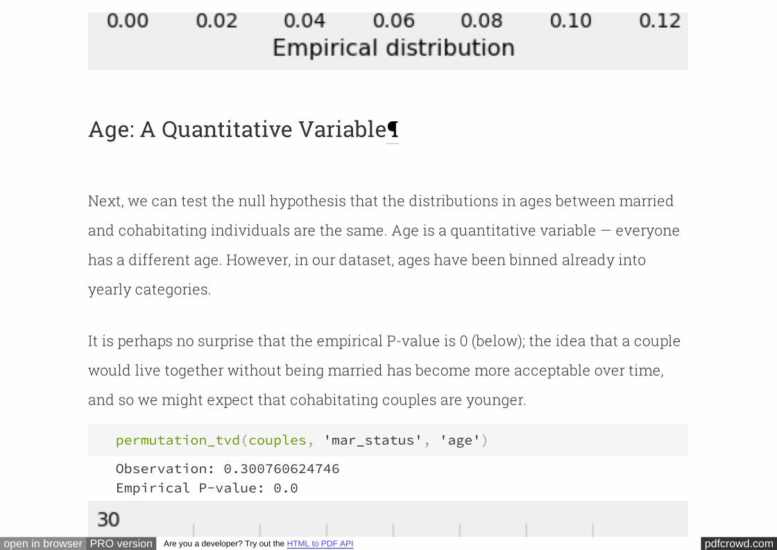
pdfcrowd.comopen in browser PRO version Are you a developer? Try out the HTML to PDF API
Age: A Quantitative Variable
Next, we can test the null hypothesis that the distributions in ages between married
and cohabitating individuals are the same. Age is a quantitative variable — everyone
has a different age. However, in our dataset, ages have been binned already into
yearly categories.
It is perhaps no surprise that the empirical P-value is 0 (below); the idea that a couple
would live together without being married has become more acceptable over time,
and so we might expect that cohabitating couples are younger.
permutation_tvd(couples, 'mar_status', 'age')
Observation: 0.300760624746Empirical P-value: 0.0
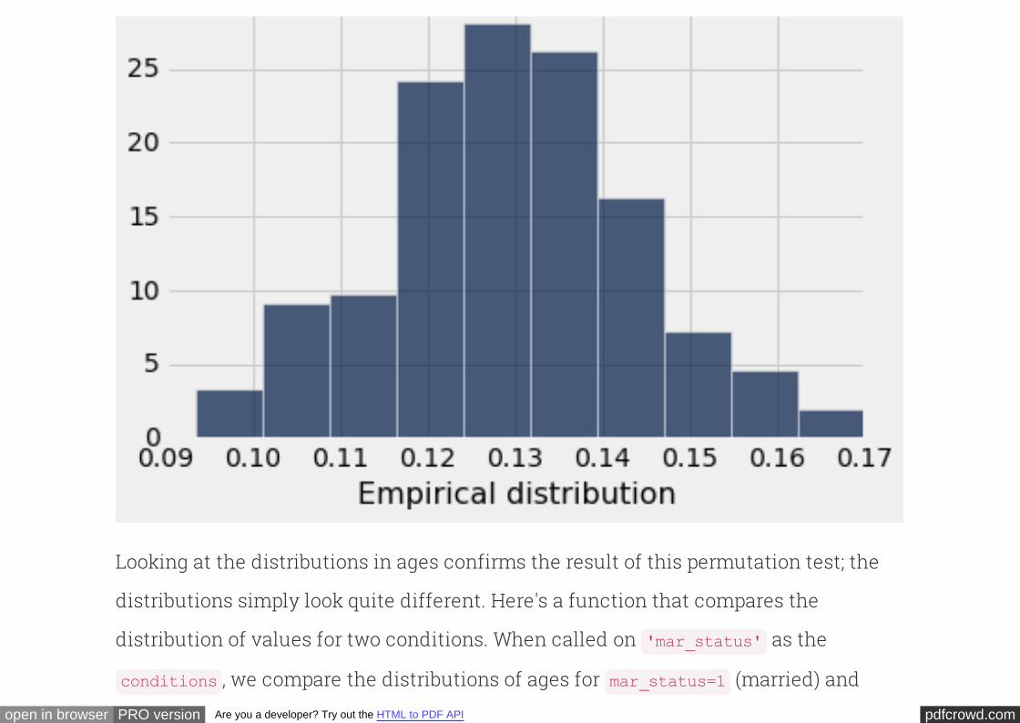
pdfcrowd.comopen in browser PRO version Are you a developer? Try out the HTML to PDF API
Looking at the distributions in ages confirms the result of this permutation test; the
distributions simply look quite different. Here's a function that compares the
distribution of values for two conditions. When called on as the
, we compare the distributions of ages for (married) and
'mar_status'
conditions mar_status=1
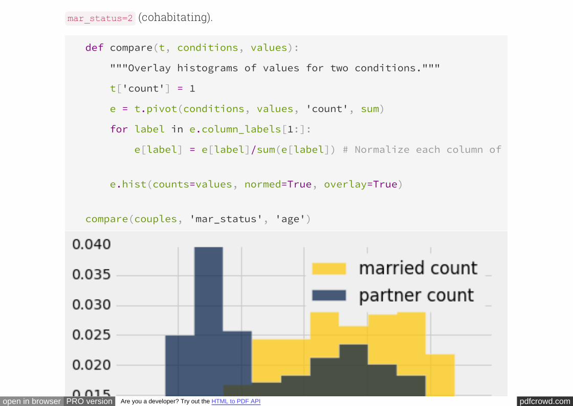
pdfcrowd.comopen in browser PRO version Are you a developer? Try out the HTML to PDF API
(cohabitating).mar_status=2
def compare(t, conditions, values):
"""Overlay histograms of values for two conditions."""
t['count'] = 1
e = t.pivot(conditions, values, 'count', sum)
for label in e.column_labels[1:]:
e[label] = e[label]/sum(e[label]) # Normalize each column of counts
e.hist(counts=values, normed=True, overlay=True)
compare(couples, 'mar_status', 'age')
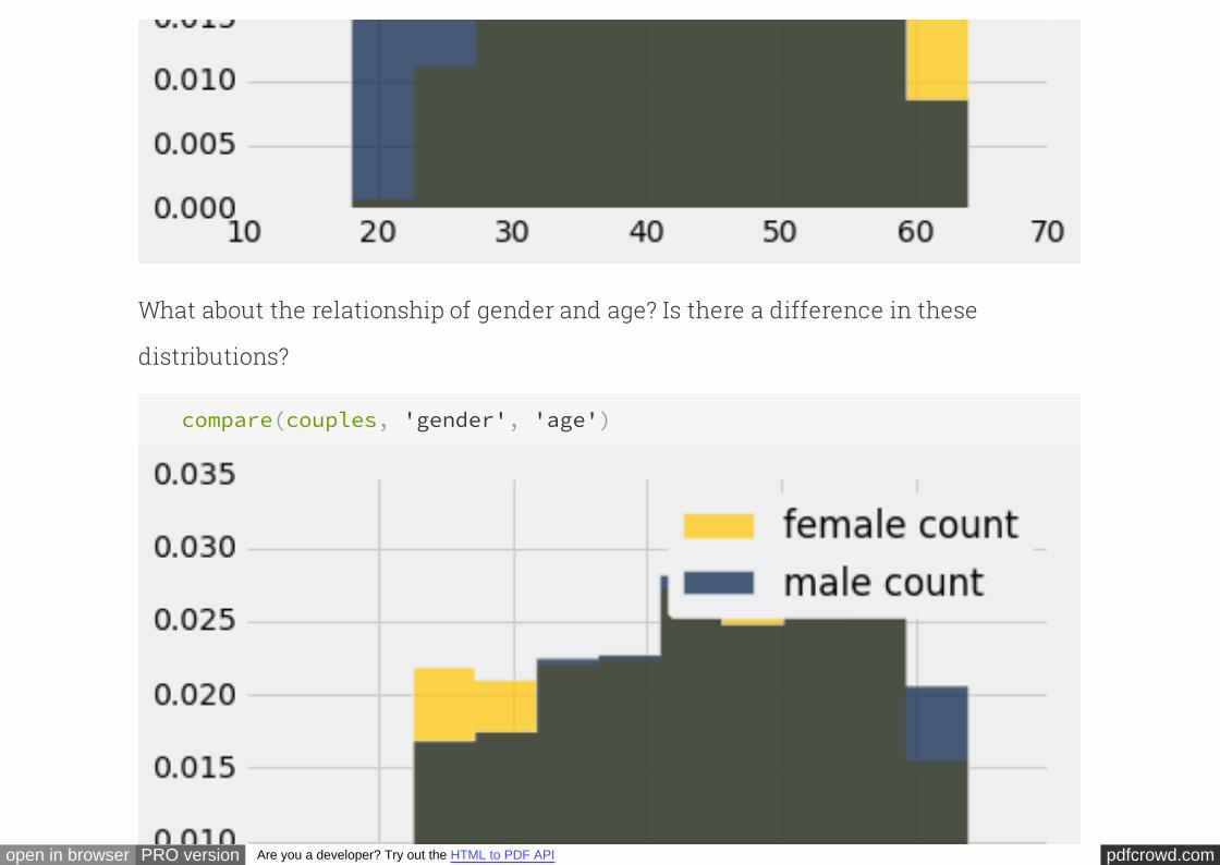
pdfcrowd.comopen in browser PRO version Are you a developer? Try out the HTML to PDF API
What about the relationship of gender and age? Is there a difference in these
distributions?
compare(couples, 'gender', 'age')

pdfcrowd.comopen in browser PRO version Are you a developer? Try out the HTML to PDF API
In this case, the women (gender=2) in the surveyed population of couples have an age
distribution that skews a bit younger. Would this observed difference be a typical
result of sampling if both the distributions of men and women in couples were in fact
the same? According to our test, the total variation distance
between ages of these two groups is quite typical.
permutation_tvd
permutation_tvd(couples, 'gender', 'age')
Observation: 0.115087040619Empirical P-value: 0.545
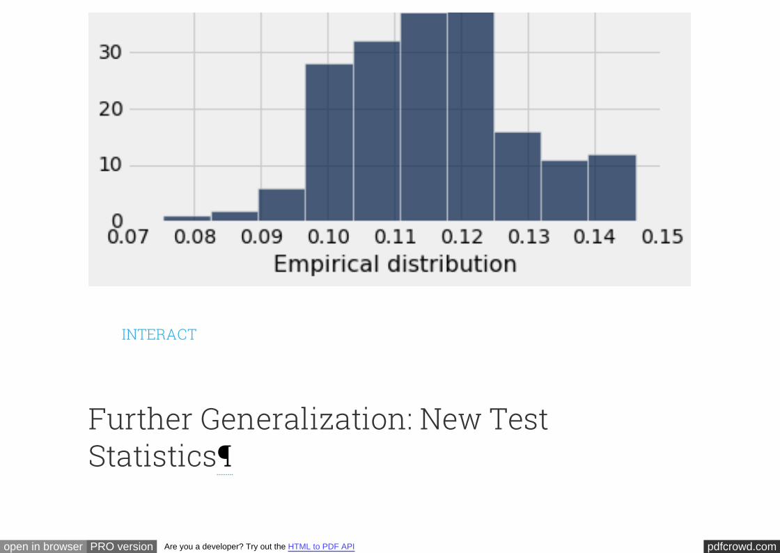
pdfcrowd.comopen in browser PRO version Are you a developer? Try out the HTML to PDF API
INTERACT
Further Generalization: New TestStatistics
pdfcrowd.comopen in browser PRO version Are you a developer? Try out the HTML to PDF API
Thus far, we have been looking at entire distributions, whether the variable is
categorical, such as employment status, or quantitative, such as age. When we
analyze quantitative variables, we can summarize the distributions by using
measures such as the median and the average. These measures can be useful as test
statistics – sometimes, working with them can be more efficient than working with
the whole distribution. We will now generalize our methods of testing so that we can
replace the total variation distance between distributions by other test statistics of
our choice.
As part of the survey we have been studying, the sampled people were asked to rate
their satisfaction with their spouse or partner. One of the questions they answered
was, "Every relationship has its ups and downs. Taking all things together, how
satisfied are you with your relationship with your spouse or partner?"
The question was in a multiple choice format, with the following possible answers:
1: very satisfied
2: somewhat satisfied
pdfcrowd.comopen in browser PRO version Are you a developer? Try out the HTML to PDF API
3: neither satisfied nor dissatisfied
4: somewhat dissatisfied
5: very dissatisfied
The answers given by the sampled people are in the column of the table
. More than 63% of the sampled people gave their satisfaction the highest
possible rating:
rel_rating
couples
columns = ['mar_status', 'gender', 'rel_rating', 'age']
couples = Table.read_table('married_couples.csv').select(columns)
def describe(column, descriptions):
"""Relabel a column of codes and add a column of descriptions"""
code = column + '_code'
couples.relabel(column, code)
couples[column] = np.choose(couples[code]-1, descriptions)
describe('mar_status', ['married', 'partner'])
describe('gender', ['male', 'female'])
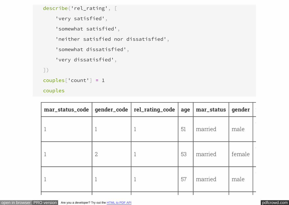
pdfcrowd.comopen in browser PRO version Are you a developer? Try out the HTML to PDF API
describe('rel_rating', [
'very satisfied',
'somewhat satisfied',
'neither satisfied nor dissatisfied',
'somewhat dissatisfied',
'very dissatisfied',
])
couples['count'] = 1
couples
mar_status_code gender_code rel_rating_code age mar_status gender rel_rating
1 1 1 51 married malevery
satisfied
1 2 1 53 married femalevery
satisfied
1 1 1 57 married malevery
satisfied
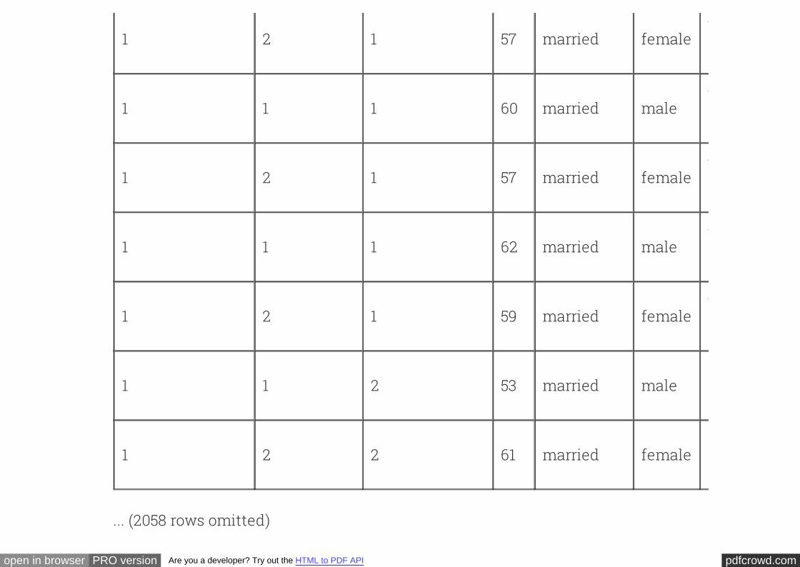
pdfcrowd.comopen in browser PRO version Are you a developer? Try out the HTML to PDF API
1 2 1 57 married femalevery
satisfied
1 1 1 60 married malevery
satisfied
1 2 1 57 married femalevery
satisfied
1 1 1 62 married malevery
satisfied
1 2 1 59 married femalevery
satisfied
1 1 2 53 married malesomewhat
satisfied
1 2 2 61 married femalesomewhat
satisfied
... (2058 rows omitted)
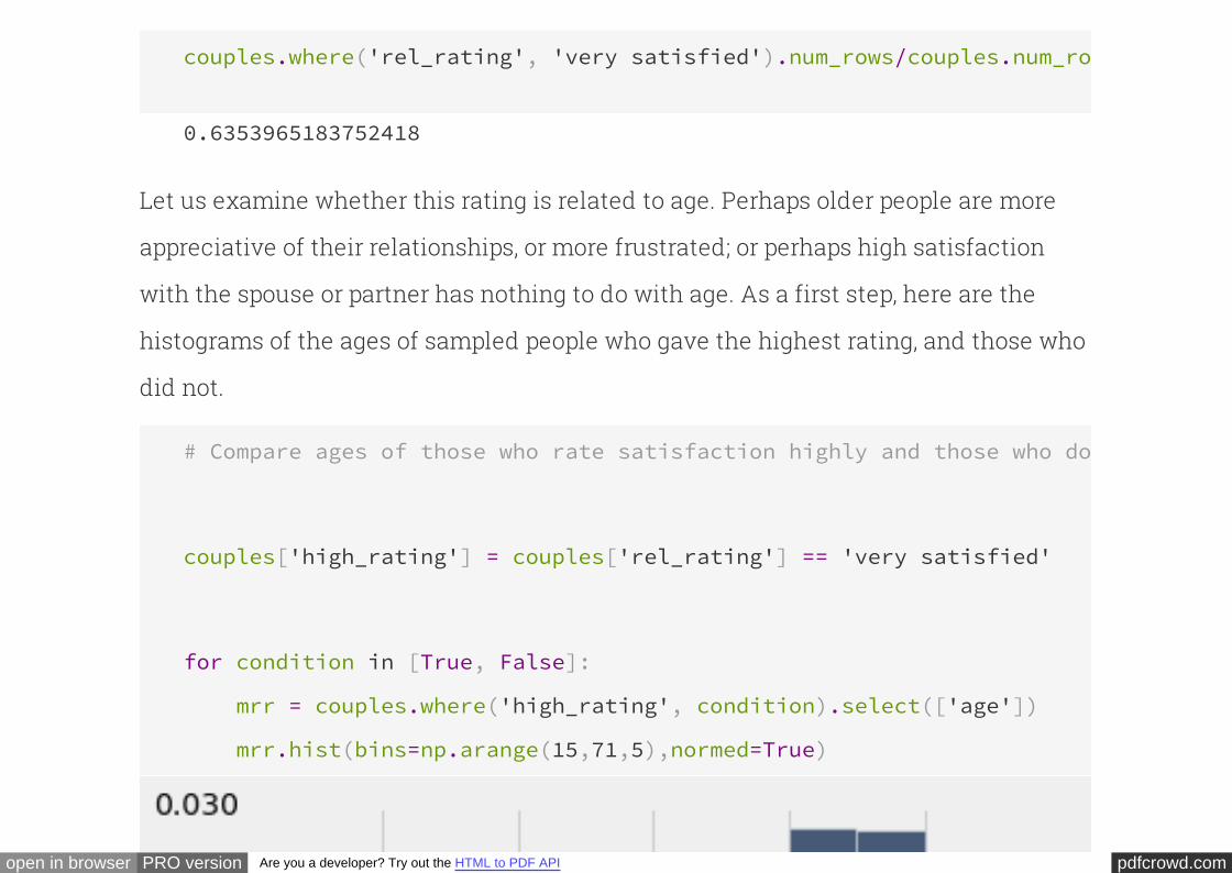
pdfcrowd.comopen in browser PRO version Are you a developer? Try out the HTML to PDF API
couples.where('rel_rating', 'very satisfied').num_rows/couples.num_rows
0.6353965183752418
Let us examine whether this rating is related to age. Perhaps older people are more
appreciative of their relationships, or more frustrated; or perhaps high satisfaction
with the spouse or partner has nothing to do with age. As a first step, here are the
histograms of the ages of sampled people who gave the highest rating, and those who
did not.
# Compare ages of those who rate satisfaction highly and those who don't
couples['high_rating'] = couples['rel_rating'] == 'very satisfied'
for condition in [True, False]:
mrr = couples.where('high_rating', condition).select(['age'])
mrr.hist(bins=np.arange(15,71,5),normed=True)
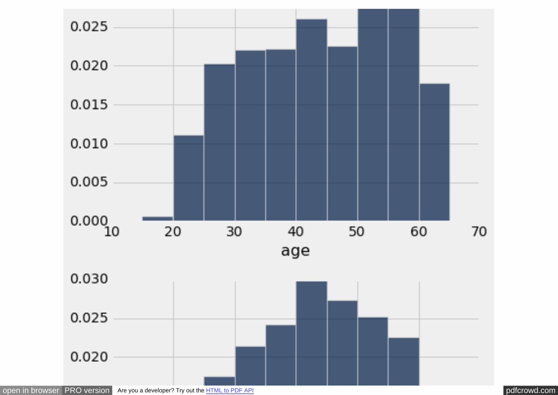
pdfcrowd.comopen in browser PRO version Are you a developer? Try out the HTML to PDF API
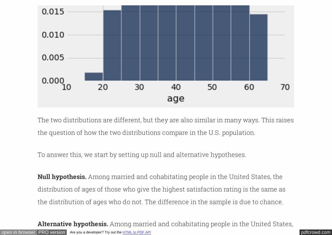
pdfcrowd.comopen in browser PRO version Are you a developer? Try out the HTML to PDF API
The two distributions are different, but they are also similar in many ways. This raises
the question of how the two distributions compare in the U.S. population.
To answer this, we start by setting up null and alternative hypotheses.
Among married and cohabitating people in the United States, the
distribution of ages of those who give the highest satisfaction rating is the same as
the distribution of ages who do not. The difference in the sample is due to chance.
Null hypothesis.
Among married and cohabitating people in the United States,Alternative hypothesis.

pdfcrowd.comopen in browser PRO version Are you a developer? Try out the HTML to PDF API
the distribution of ages of those who give the highest satisfaction rating is different
from the distribution of ages who do not.
Let us see if we can answer the question by just comparing the medians of the two
distributions in the sample. As our test statistic, we will measure how far apart the
two medians are.
Formally, the will be the absolute difference between the medians of the
ages of the two groups.
test statistic
np.median(couples.where('high_rating', True)['age'])
44.0
np.median(couples.where('high_rating', False)['age'])
43.0
The median age of those who gave the highest rating is one year more than the
median of those who did not. The observed value of our test statistic is therefore 1.
To see how this statistic could vary under the null hypothesis, we will perform a
pdfcrowd.comopen in browser PRO version Are you a developer? Try out the HTML to PDF API
permutation test. The test will involve repeatedly generating permuted samples of
ages of the two groups, and calculating the test statistic for each of those samples. So
it is useful to define a function that computes the test statistic – the absolute
differeence between the medians – for every generated sample.
Like the function , the function takes as its arguments the
table of data, the name of a column of conditions that come in two categories, and
the name of the column of values to be compared. It returns the absolute difference
between the median values under the two conditions. By applying this function to the
original sample, we can see that it returns the observed value of our test statistic.
tvd abs_diff_in_medians
def abs_diff_in_medians(t, conditions, values):
"""Compute the difference in the median of values for conditions 1 & 2."""
a = t.where(conditions, True)[values]
b = t.where(conditions, False)[values]
return abs(np.median(a)-np.median(b))
abs_diff_in_medians(couples, 'high_rating', 'age')
1.0
pdfcrowd.comopen in browser PRO version Are you a developer? Try out the HTML to PDF API
To run the permutation test, we will define a function that is
similar to except that it takes a fourth argument. This argument is
the name of a function that computes the test statistic. The code is the same as for
apart from the number of repetitions and the replacement of by
the generic function .
permutation_stat
permutation_ tvd
permutation_tvd tvd
stat
Because takes a function as an argument, it is called a
.
permutation_test higher order
function
def permutation_stat(original, conditions, values, stat):
repetitions=1600
test_stats = []
for i in np.arange(repetitions):
shuffled = original.sample()
combined = Table([original[conditions], shuffled[values]],
[conditions, values])
test_stats.append(stat(combined, conditions, values))
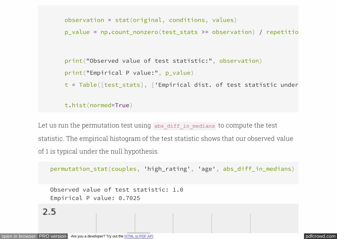
pdfcrowd.comopen in browser PRO version Are you a developer? Try out the HTML to PDF API
observation = stat(original, conditions, values)
p_value = np.count_nonzero(test_stats >= observation) / repetitions
print("Observed value of test statistic:", observation)
print("Empirical P value:", p_value)
t = Table([test_stats], ['Empirical dist. of test statistic under null'
t.hist(normed=True)
Let us run the permutation test using to compute the test
statistic. The empirical histogram of the test statistic shows that our observed value
of 1 is typical under the null hypothesis.
abs_diff_in_medians
permutation_stat(couples, 'high_rating', 'age', abs_diff_in_medians)
Observed value of test statistic: 1.0Empirical P value: 0.7025
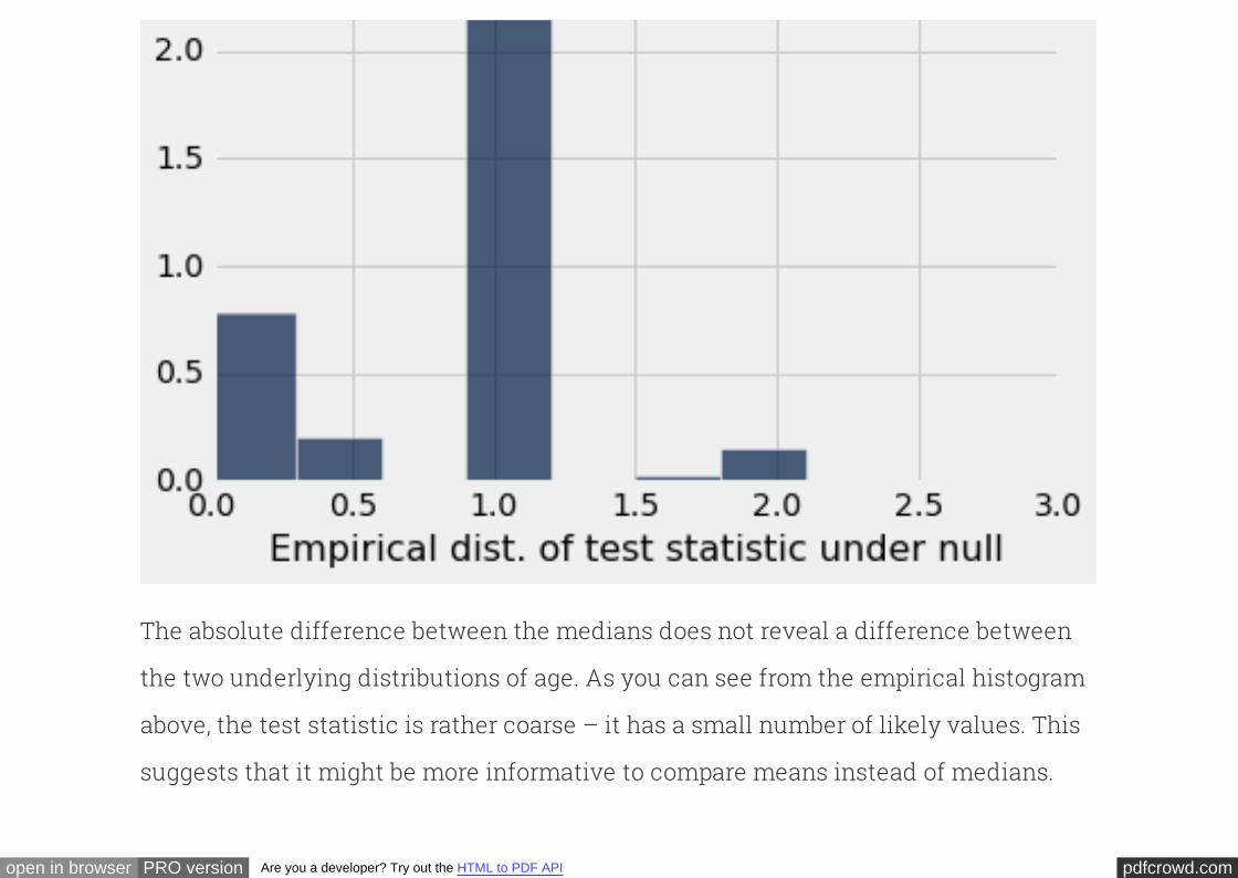
pdfcrowd.comopen in browser PRO version Are you a developer? Try out the HTML to PDF API
The absolute difference between the medians does not reveal a difference between
the two underlying distributions of age. As you can see from the empirical histogram
above, the test statistic is rather coarse – it has a small number of likely values. This
suggests that it might be more informative to compare means instead of medians.
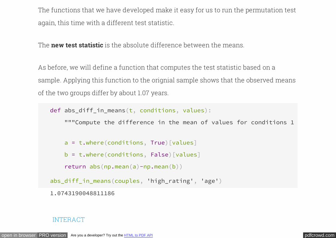
pdfcrowd.comopen in browser PRO version Are you a developer? Try out the HTML to PDF API
The functions that we have developed make it easy for us to run the permutation test
again, this time with a different test statistic.
The is the absolute difference between the means.new test statistic
As before, we will define a function that computes the test statistic based on a
sample. Applying this function to the orignial sample shows that the observed means
of the two groups differ by about 1.07 years.
def abs_diff_in_means(t, conditions, values):
"""Compute the difference in the mean of values for conditions 1 & 2."""
a = t.where(conditions, True)[values]
b = t.where(conditions, False)[values]
return abs(np.mean(a)-np.mean(b))
abs_diff_in_means(couples, 'high_rating', 'age')
1.0743190048811186
INTERACT
pdfcrowd.comopen in browser PRO version Are you a developer? Try out the HTML to PDF API
mar_status_code gender_code rel_rating_code age mar_status gender rel_rating
1 1 1 51 married malevery
satisfied
1 2 1 53 married femalevery
satisfied
1 1 1 57 married malevery
satisfied
1 2 1 57 married femalevery
satisfied
1 1 1 60 married malevery
satisfied
1 2 1 57 married femalevery
satisfied
1 1 1 62 married malevery
satisfied
pdfcrowd.comopen in browser PRO version Are you a developer? Try out the HTML to PDF API
1 2 1 59 married femalevery
satisfied
1 1 2 53 married malesomewhat
satisfied
1 2 2 61 married femalesomewhat
satisfied
... (2058 rows omitted)
The function performs the test, this time using
to compute the test statistic. The empirical P-value is in the 4% to 6% range. It is
reasonable to conclude that the test gives no clear signal about whether the two
underlying distributions are different; in such a situation, the conservative
conclusion is that there is not enough justification to reject the null hypothesis in
favor of the alternative.
permutation_stat abs_diff_in_means
What the test does reveal, however, is that the empirical distribution of the test
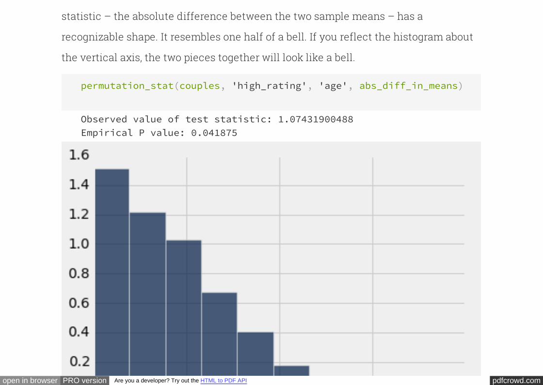
pdfcrowd.comopen in browser PRO version Are you a developer? Try out the HTML to PDF API
statistic – the absolute difference between the two sample means – has a
recognizable shape. It resembles one half of a bell. If you reflect the histogram about
the vertical axis, the two pieces together will look like a bell.
permutation_stat(couples, 'high_rating', 'age', abs_diff_in_means)
Observed value of test statistic: 1.07431900488Empirical P value: 0.041875
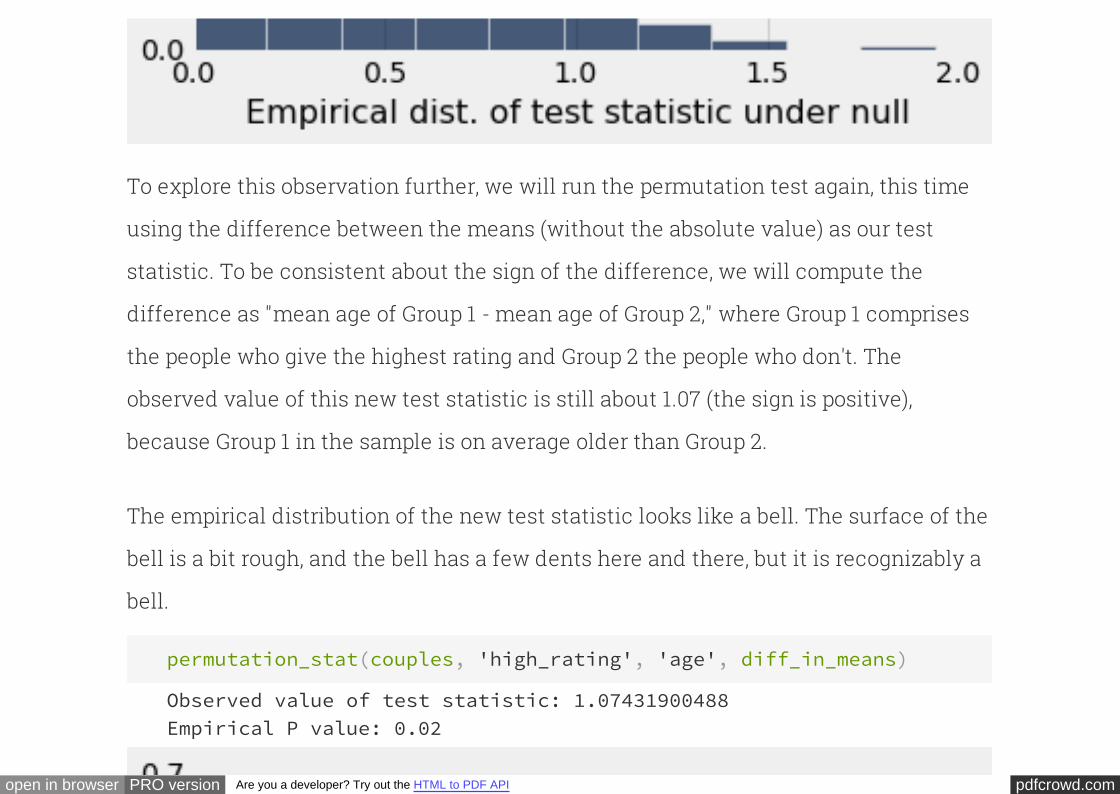
pdfcrowd.comopen in browser PRO version Are you a developer? Try out the HTML to PDF API
To explore this observation further, we will run the permutation test again, this time
using the difference between the means (without the absolute value) as our test
statistic. To be consistent about the sign of the difference, we will compute the
difference as "mean age of Group 1 - mean age of Group 2," where Group 1 comprises
the people who give the highest rating and Group 2 the people who don't. The
observed value of this new test statistic is still about 1.07 (the sign is positive),
because Group 1 in the sample is on average older than Group 2.
The empirical distribution of the new test statistic looks like a bell. The surface of the
bell is a bit rough, and the bell has a few dents here and there, but it is recognizably a
bell.
permutation_stat(couples, 'high_rating', 'age', diff_in_means)
Observed value of test statistic: 1.07431900488Empirical P value: 0.02
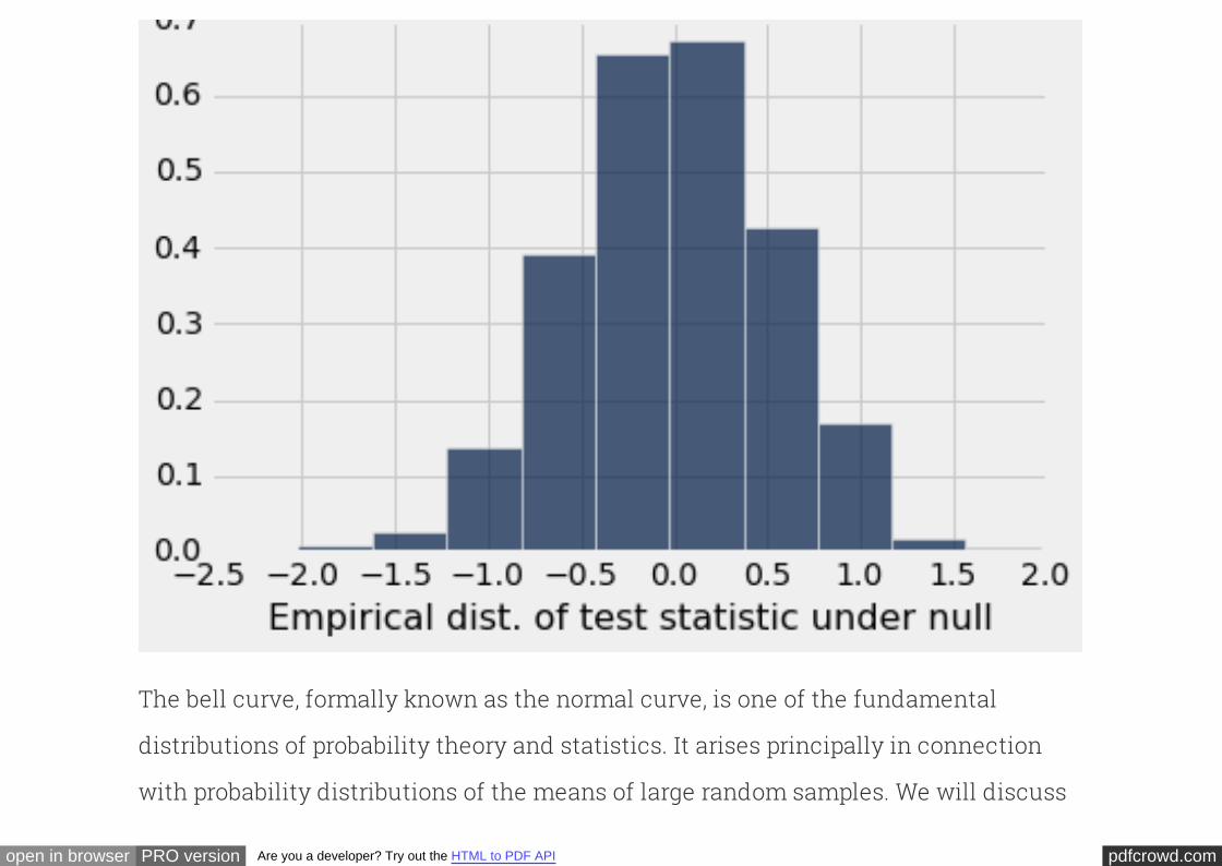
pdfcrowd.comopen in browser PRO version Are you a developer? Try out the HTML to PDF API
The bell curve, formally known as the , is one of the fundamental
distributions of probability theory and statistics. It arises principally in connection
with probability distributions of the means of large random samples. We will discuss
normal curve
pdfcrowd.comopen in browser PRO version Are you a developer? Try out the HTML to PDF API
this more fully in later sections.
For now, observe that because the empirical distribution of the difference in means is
roughly symmetric, the proportion to the right of 1.07 is about the same as the
proportion to the left of -1.07. Therefore, multiplying the P-value by 2 gives an answer
that is very close to the P-value of the previous test – the one that used the absolute
difference in means as its test statistic. Indeed, if you fold the bell about the vertical
axis and stack each bar above its reflection, you will get a histogram that looks very
much like the tall "half bell" of the previous test.
One-tailed and two-tailed tests.
In classical statistics, tests of hypotheses using sample means typically involve
calculating P-values using the bell shaped curve rather than the "folded over"
version. If you read a classical analysis, you might see the term "one-tailed test" used
to describe the situation in which the P-value is computed as the proportion in one
tail of the bell. A "two-tailed test" uses the total proportion in two equal tails, and is
thus equivalent to the test we conducted using the folded-over bell.
pdfcrowd.comopen in browser PRO version Are you a developer? Try out the HTML to PDF API
But as you have seen, in practical terms the tests are essentially equivalent. If you
know the P-value of one, you can calculate the P-value of the other. Just be aware
that sometimes, as in our examples above, the one-tailed test might give a
statistically significant result while the two-tailed test does not. Such results are not
contradictory – they merely point out a difficulty in rigid adherence to a fixed cutoff
determining "small" values of P.
The Probability Distribution of a SampleMean
Means of large random samples have a wonderful property that is at the heart of
much statistical inference: their probability distributions are roughly bell shaped.
This property allows us to determine how variable a random sample mean could be,
, without any simulation at all.based on just one sample
To see why this is important, consider the basis on which we have been conducting
our simulations of repeated sampling.
pdfcrowd.comopen in browser PRO version Are you a developer? Try out the HTML to PDF API
For repeated sampling to be feasible, we need to know what to resample from. The
null hypothesis specifies the chance model. In the jury panel examples, the
populations of eligible jurors were known, and the null hypothesis said that the panels
were drawn at random. So we simulated random sampling from the known
distributions of eligible jurors. In the case of marital status and employment status,
the null hypothesis allowed us to compare married and unmarried people by
randomizing them into the different employment categories.
But what if the situation does not allow either of these two options? For example,
suppose we have just one random sample of California households this year, and are
trying to see whether the average annual household income in California exceeds
$61,000, which was roughly the average annual income in California last year. How
can we replicate the sampling procedure? The underlying distribution of the
population is unknown (indeed, its mean is what we're trying to get at), and there is no
other sample to which we can compare ours.
One way to solve this problem is to avoid replication entirely, and use other methods
pdfcrowd.comopen in browser PRO version Are you a developer? Try out the HTML to PDF API
to approximate the probability distribution of the test statistic. If the test statistic is a
sample mean, the theory of probability and statistics tells us that its probability
distribution will be roughly bell shaped if the sample is large, no matter what the
distribution of the underlying population looks like. This powerful result not only
allows us to make inferences when replication is not straightforward, it also
illuminates some important general properties of large random samples.
This chapter will help us understand all of this better. We will start by examining
some fundamental properties of means.
Properties of the mean
: The or of a list of numbers is the sum of all the numbers in
the list, divided by the number of entries in the list.
Definition average mean
In this course, we will use the words "average" and "mean" interchangeably.
: We have computed means in two different ways. One is the TableComputation
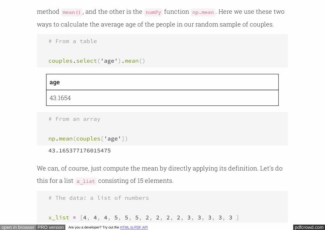
pdfcrowd.comopen in browser PRO version Are you a developer? Try out the HTML to PDF API
method , and the other is the function . Here we use these two
ways to calculate the average age of the people in our random sample of couples.
mean() numPy np.mean
# From a table
couples.select('age').mean()
age
43.1654
# From an array
np.mean(couples['age'])
43.165377176015475
We can, of course, just compute the mean by directly applying its definition. Let's do
this for a list consisting of 15 elements.x_list
# The data: a list of numbers
x_list = [4, 4, 4, 5, 5, 5, 2, 2, 2, 2, 3, 3, 3, 3, 3 ]
pdfcrowd.comopen in browser PRO version Are you a developer? Try out the HTML to PDF API
# The average, computed from the list
sum(x_list)/len(x_list)
3.3333333333333335
The calculation shows that the average of is $3 \frac{1}{3}$. But it also makes
us wonder whether the calculation can be simplified by using the fact that there are
only four distinct values in the list: 4, 5, 2, and 3. When we add up all the entries to get
the numerator of the average, we can collect all the terms correpsonding to each
distinct value, and save ourselves some addition:
x_list
(4*3 + 5*3 + 2*4 + 3*5)/15
3.3333333333333335
Distributing the division by 15 across all the terms in the numerator shows that we
can calculate the average in terms of the distinct values and the proportions in which
they appear:
4*(3/15) + 5*(3/15) + 2*(4/15) + 3*(5/15)
3.3333333333333335
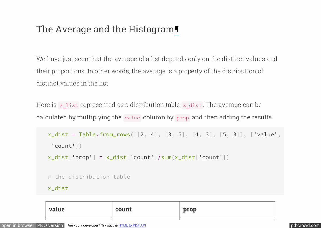
pdfcrowd.comopen in browser PRO version Are you a developer? Try out the HTML to PDF API
The Average and the Histogram
We have just seen that the average of a list depends only on the distinct values and
their proportions. In other words, the average is a property of the distribution of
distinct values in the list.
Here is represented as a distribution table . The average can be
calculated by multiplying the column by and then adding the results.
x_list x_dist
value prop
x_dist = Table.from_rows([[2, 4], [3, 5], [4, 3], [5, 3]], ['value',
'count'])
x_dist['prop'] = x_dist['count']/sum(x_dist['count'])
# the distribution table
x_dist
value count prop
pdfcrowd.comopen in browser PRO version Are you a developer? Try out the HTML to PDF API
2 4 0.266667
3 5 0.333333
4 3 0.2
5 3 0.2
sum(x_dist['value']*x_dist['prop'])
3.333333333333333
. The mean of a list is the average of
the values, where the in which those values
appear.
Another way to think about the mean weighted
distinct weights are the proportions
Physically, this implies that . Here is
the histogram of the distribution. Imagine that it is made out of cardboard and that
you are trying to balance the cardboard figure at a point on the horizontal axis. The
average of $3 \frac{1}{3}$ is where the figure will balance.
the average is the balance point of the histogram
To understand why that is, you will have to study some physics. Balance points, or
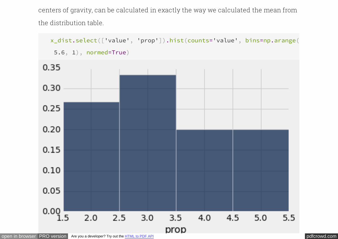
pdfcrowd.comopen in browser PRO version Are you a developer? Try out the HTML to PDF API
centers of gravity, can be calculated in exactly the way we calculated the mean from
the distribution table.
x_dist.select(['value', 'prop']).hist(counts='value', bins=np.arange(
5.6, 1), normed=True)
pdfcrowd.comopen in browser PRO version Are you a developer? Try out the HTML to PDF API
Summary of Basic Properties of the Mean
These properties follow from the calculation; we have observed most of them in our
examples above.
The mean has the same units as the list.
The mean is somewhere in between the smallest and largest value on the list.
The mean depends only on the distribution (distinct values and proportions), not
on the number of entries in the list.
The mean is the balance point of the histogram.
The Average and the Median
Now that we know that the mean is the balance point of the histogram, it is
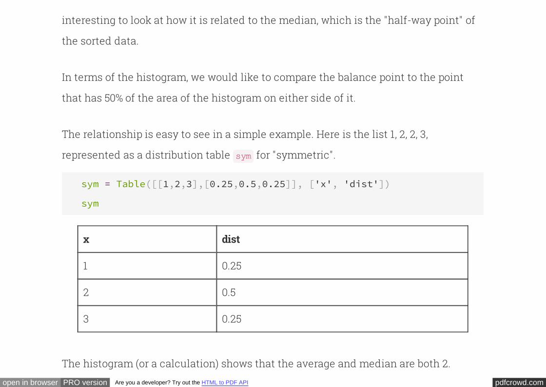
pdfcrowd.comopen in browser PRO version Are you a developer? Try out the HTML to PDF API
interesting to look at how it is related to the median, which is the "half-way point" of
the sorted data.
In terms of the histogram, we would like to compare the balance point to the point
that has 50% of the area of the histogram on either side of it.
The relationship is easy to see in a simple example. Here is the list 1, 2, 2, 3,
represented as a distribution table for "symmetric".sym
sym = Table([[1,2,3],[0.25,0.5,0.25]], ['x', 'dist'])
sym
x dist
1 0.25
2 0.5
3 0.25
The histogram (or a calculation) shows that the average and median are both 2.
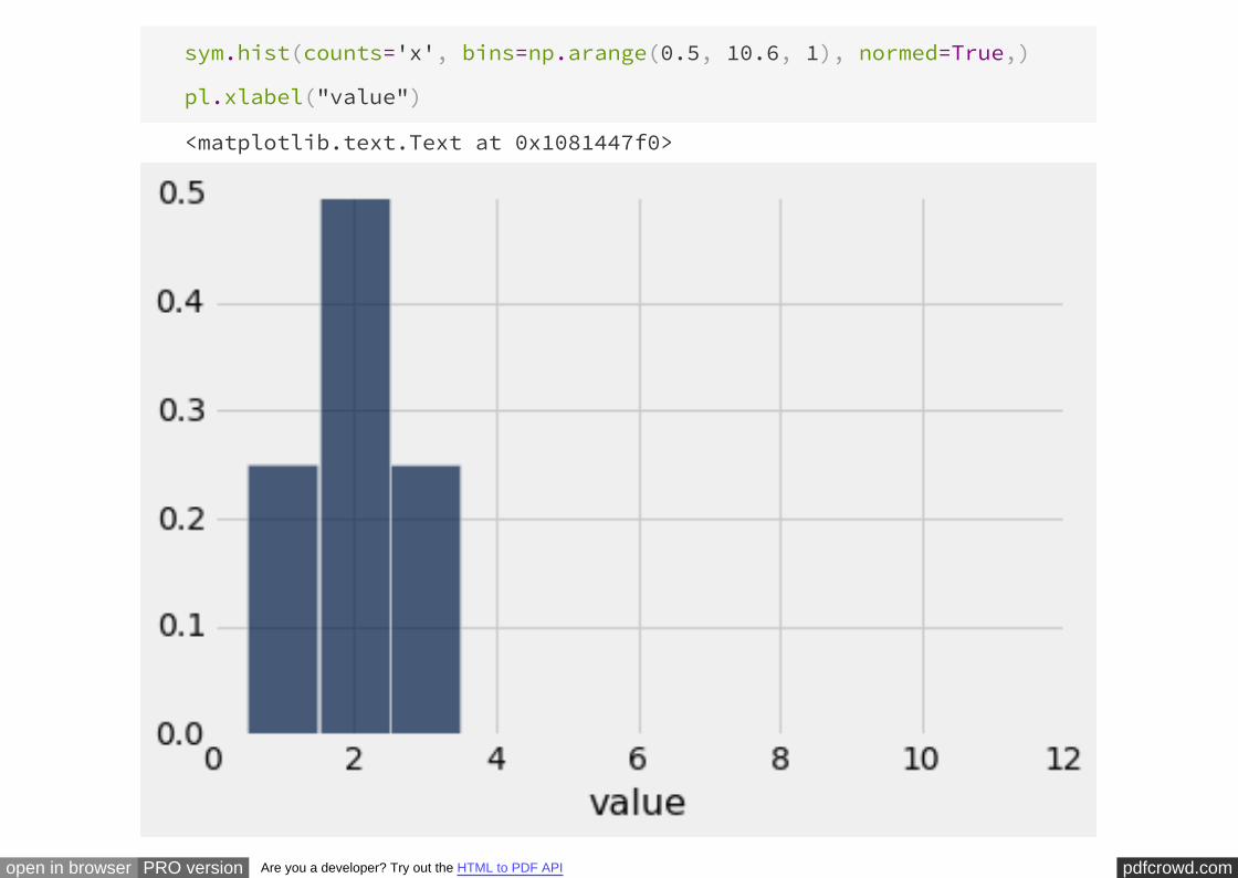
pdfcrowd.comopen in browser PRO version Are you a developer? Try out the HTML to PDF API
sym.hist(counts='x', bins=np.arange(0.5, 10.6, 1), normed=True,)
pl.xlabel("value")
<matplotlib.text.Text at 0x1081447f0>
pdfcrowd.comopen in browser PRO version Are you a developer? Try out the HTML to PDF API
In general, for , the mean and the median are equal.symmetric distributions
What if the distribution is not symmetric? We will explore this by making a change in
the histogram above: we will take the bar at the value 3 and slide it over to the value
10.
# Average versus median:
# Balance point versus 50% point
slide = Table([[1,2,3,10], [0.25, 0.5, 0.25, 0], [0.25, 0.5, 0, 0.25]],
['x', 'dist1', 'dist2'])
slide
x dist1 dist2
1 0.25 0.25
2 0.5 0.5
3 0.25 0
pdfcrowd.comopen in browser PRO version Are you a developer? Try out the HTML to PDF API
10 0 0.25
slide.hist(counts='x', overlay=True, bins=np.arange(0.5, 10.6, 1),
normed=True)
pdfcrowd.comopen in browser PRO version Are you a developer? Try out the HTML to PDF API
The yellow histogram represents the original distribution; the blue histogram starts
out the same as the yellow at the left end, but its rightmost bar has slid over to the
value 10.
The median and mean of the yellow distribution are both equal to 2. The median of
the blue distribution is also equal to 2; the area on either side of 2 is still 50%, though
the right half is distributed differently from the left.
But the mean of the blue distribution is not 2: the blue histogram would not balance
at 2. The balance point has shifted to the right:
sum(slide['x']*slide['dist2'])
3.75
In general, if the (the formal term is "skewed"), then
the mean is pulled away from the median in the direction of the tail.
histogram has a tail on one side
We have seen an example of a distribution with a right-hand tail: the box office gross
receipts (in millions of dollars) of the highest grossing movies over the past couple of
decades:
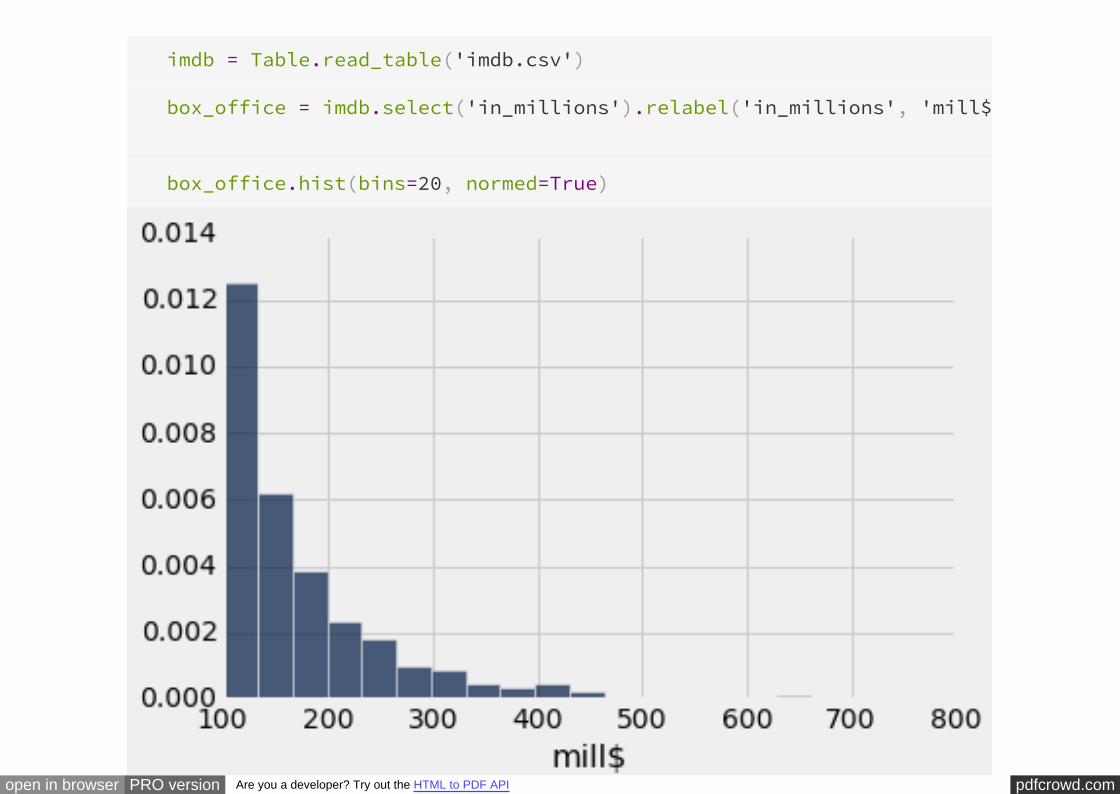
pdfcrowd.comopen in browser PRO version Are you a developer? Try out the HTML to PDF API
imdb = Table.read_table('imdb.csv')
box_office = imdb.select('in_millions').relabel('in_millions', 'mill$'
box_office.hist(bins=20, normed=True)
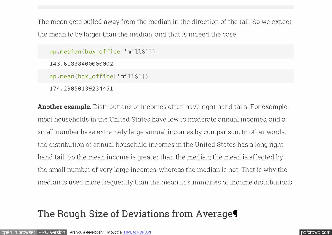
pdfcrowd.comopen in browser PRO version Are you a developer? Try out the HTML to PDF API
The mean gets pulled away from the median in the direction of the tail. So we expect
the mean to be larger than the median, and that is indeed the case:
np.median(box_office['mill$'])
143.61838400000002
np.mean(box_office['mill$'])
174.29050139234451
Distributions of incomes often have right hand tails. For example,
most households in the United States have low to moderate annual incomes, and a
small number have extremely large annual incomes by comparison. In other words,
the distribution of annual household incomes in the United States has a long right
hand tail. So the mean income is greater than the median; the mean is affected by
the small number of very large incomes, whereas the median is not. That is why the
median is used more frequently than the mean in summaries of income distributions.
Another example.
The Rough Size of Deviations from Average
pdfcrowd.comopen in browser PRO version Are you a developer? Try out the HTML to PDF API
As we have seen, inferences based on test statistics depend on how those statistics
vary across samples. It is therefore important to be able to quantify the variability in
any list of numbers. One way is to create a measure of the difference between the
values on a list and the average of the list.
We will start by defining such a measure in the context of a simple list of just four
numbers.
toy = Table([[1, 2, 2, 10]], ['values'])
toy
values
1
2
2
10
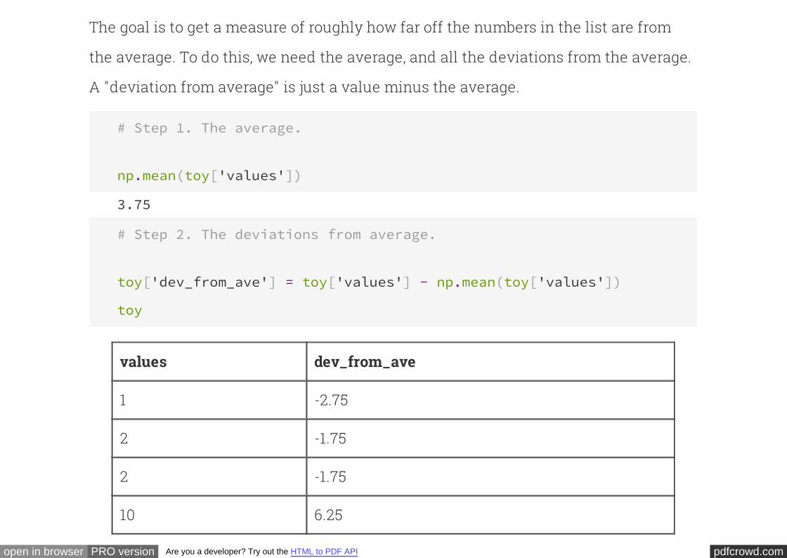
pdfcrowd.comopen in browser PRO version Are you a developer? Try out the HTML to PDF API
The goal is to get a measure of roughly how far off the numbers in the list are from
the average. To do this, we need the average, and all the deviations from the average.
A "deviation from average" is just a value minus the average.
# Step 1. The average.
np.mean(toy['values'])
3.75
# Step 2. The deviations from average.
toy['dev_from_ave'] = toy['values'] - np.mean(toy['values'])
toy
values dev_from_ave
1 -2.75
2 -1.75
2 -1.75
10 6.25
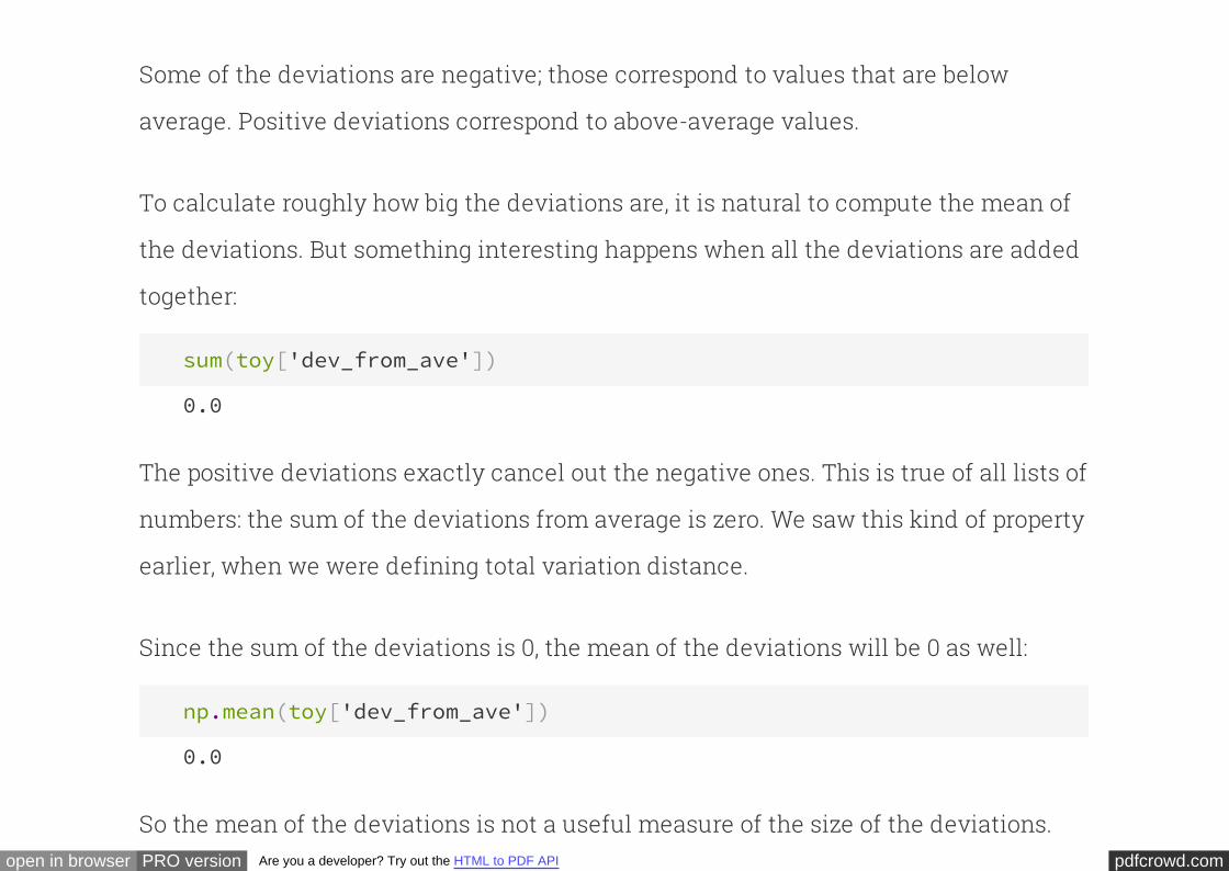
pdfcrowd.comopen in browser PRO version Are you a developer? Try out the HTML to PDF API
Some of the deviations are negative; those correspond to values that are below
average. Positive deviations correspond to above-average values.
To calculate roughly how big the deviations are, it is natural to compute the mean of
the deviations. But something interesting happens when all the deviations are added
together:
sum(toy['dev_from_ave'])
0.0
The positive deviations exactly cancel out the negative ones. This is true of all lists of
numbers: the sum of the deviations from average is zero. We saw this kind of property
earlier, when we were defining total variation distance.
Since the sum of the deviations is 0, the mean of the deviations will be 0 as well:
np.mean(toy['dev_from_ave'])
0.0
So the mean of the deviations is not a useful measure of the size of the deviations.
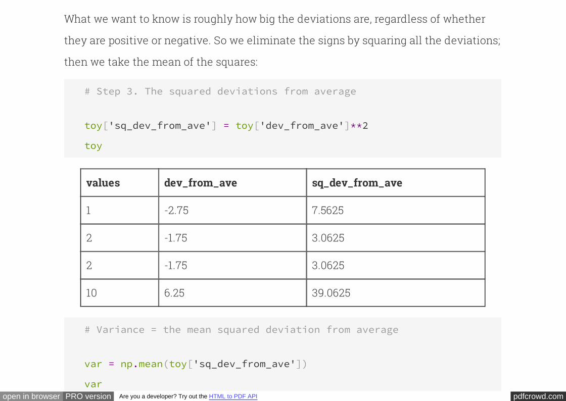
pdfcrowd.comopen in browser PRO version Are you a developer? Try out the HTML to PDF API
What we want to know is roughly how big the deviations are, regardless of whether
they are positive or negative. So we eliminate the signs by squaring all the deviations;
then we take the mean of the squares:
# Step 3. The squared deviations from average
toy['sq_dev_from_ave'] = toy['dev_from_ave']**2
toy
values dev_from_ave sq_dev_from_ave
1 -2.75 7.5625
2 -1.75 3.0625
2 -1.75 3.0625
10 6.25 39.0625
# Variance = the mean squared deviation from average
var = np.mean(toy['sq_dev_from_ave'])
var
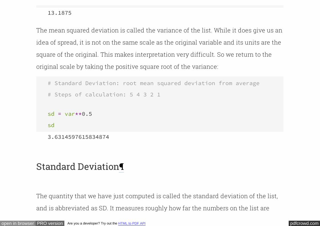
pdfcrowd.comopen in browser PRO version Are you a developer? Try out the HTML to PDF API
13.1875
The mean squared deviation is called the of the list. While it does give us an
idea of spread, it is not on the same scale as the original variable and its units are the
square of the original. This makes interpretation very difficult. So we return to the
original scale by taking the positive square root of the variance:
variance
# Standard Deviation: root mean squared deviation from average
# Steps of calculation: 5 4 3 2 1
sd = var**0.5
sd
3.6314597615834874
Standard Deviation
The quantity that we have just computed is called the of the list,
and is abbreviated as SD. It measures roughly how far the numbers on the list are
standard deviation
pdfcrowd.comopen in browser PRO version Are you a developer? Try out the HTML to PDF API
from their average.
The SD of a list is defined as the
. That's a mouthful. But read it from right to left and you have the sequence of
steps in the calculation.
Definition. root mean square of deviations from
average
The function computes the SD of values in an array:Computation. numPy np.std
np.std(toy['values'])
3.6314597615834874
Why use the SD instead of some other measure ofspread? Answer #1.
There are a few primary reasons the SD is used more than any other measure of
spread. Here is one of them.
If you know the average of a list, typically you can't infer much else about the spread
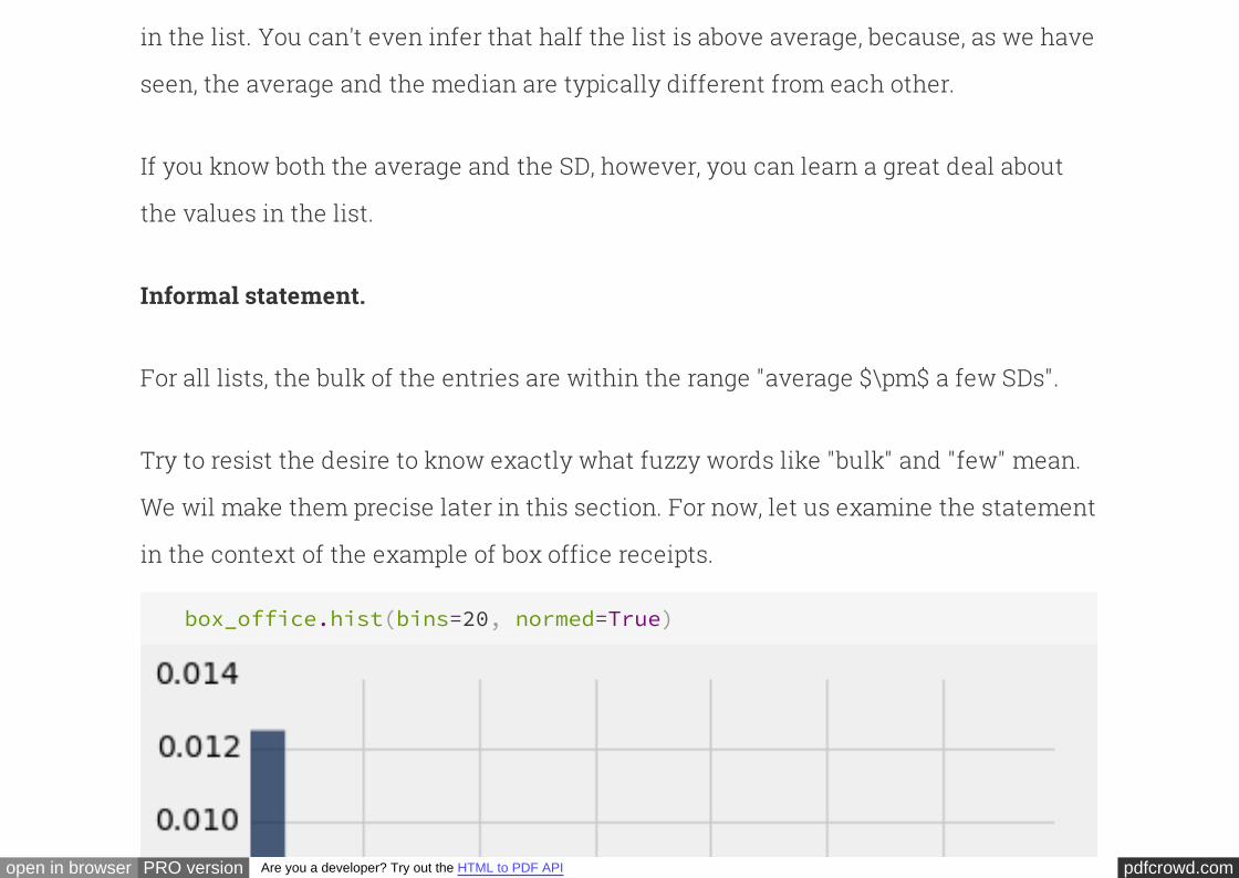
pdfcrowd.comopen in browser PRO version Are you a developer? Try out the HTML to PDF API
in the list. You can't even infer that half the list is above average, because, as we have
seen, the average and the median are typically different from each other.
If you know both the average and the SD, however, you can learn a great deal about
the values in the list.
Informal statement.
For all lists, the bulk of the entries are within the range "average $\pm$ a few SDs".
Try to resist the desire to know exactly what fuzzy words like "bulk" and "few" mean.
We wil make them precise later in this section. For now, let us examine the statement
in the context of the example of box office receipts.
box_office.hist(bins=20, normed=True)
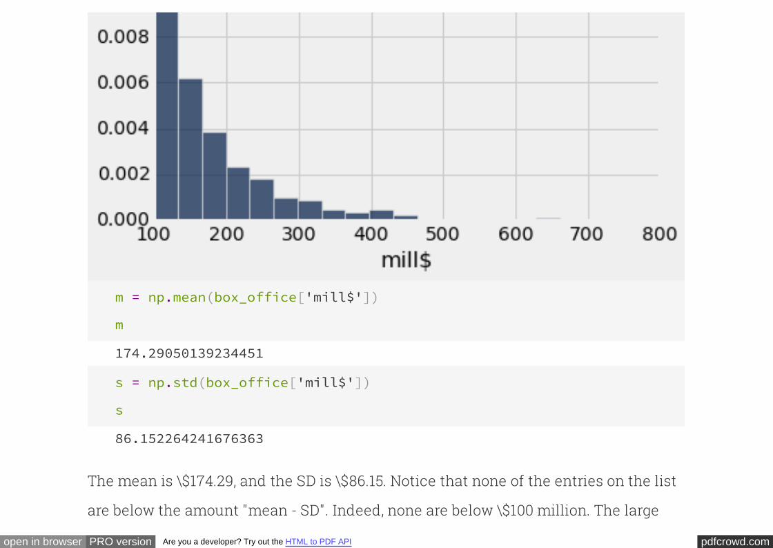
pdfcrowd.comopen in browser PRO version Are you a developer? Try out the HTML to PDF API
m = np.mean(box_office['mill$'])
m
174.29050139234451
s = np.std(box_office['mill$'])
s
86.152264241676363
The mean is \$174.29, and the SD is \$86.15. Notice that none of the entries on the list
are below the amount "mean - SD". Indeed, none are below \$100 million. The large
pdfcrowd.comopen in browser PRO version Are you a developer? Try out the HTML to PDF API
spread is due to the large positive deviations in the right hand tail.
In the analysis of distributions, specially those that have been represented in a
histogram, it is often useful to think of the average as the origin, and distances in
units of SDs. For example, here is the interval "mean $\pm one SD"; about 87.5% of the
movies have box office receipts in this range.
m-s
88.138237150668147
m+s
260.44276563402087
np.count_nonzero((m-s < box_office['mill$']) & (box_office['mill$']
< m+s) )/box_office.num_rows
0.8755980861244019
The table below contains intervals of the form "mean $\pm$ a few SD", and the
proportions of entries in that range. The column quantifies the expression "a few".
As you can see, once is about 4 or so, the interval "average $\pm z$ SD" contains
almost all of the data.
z
z
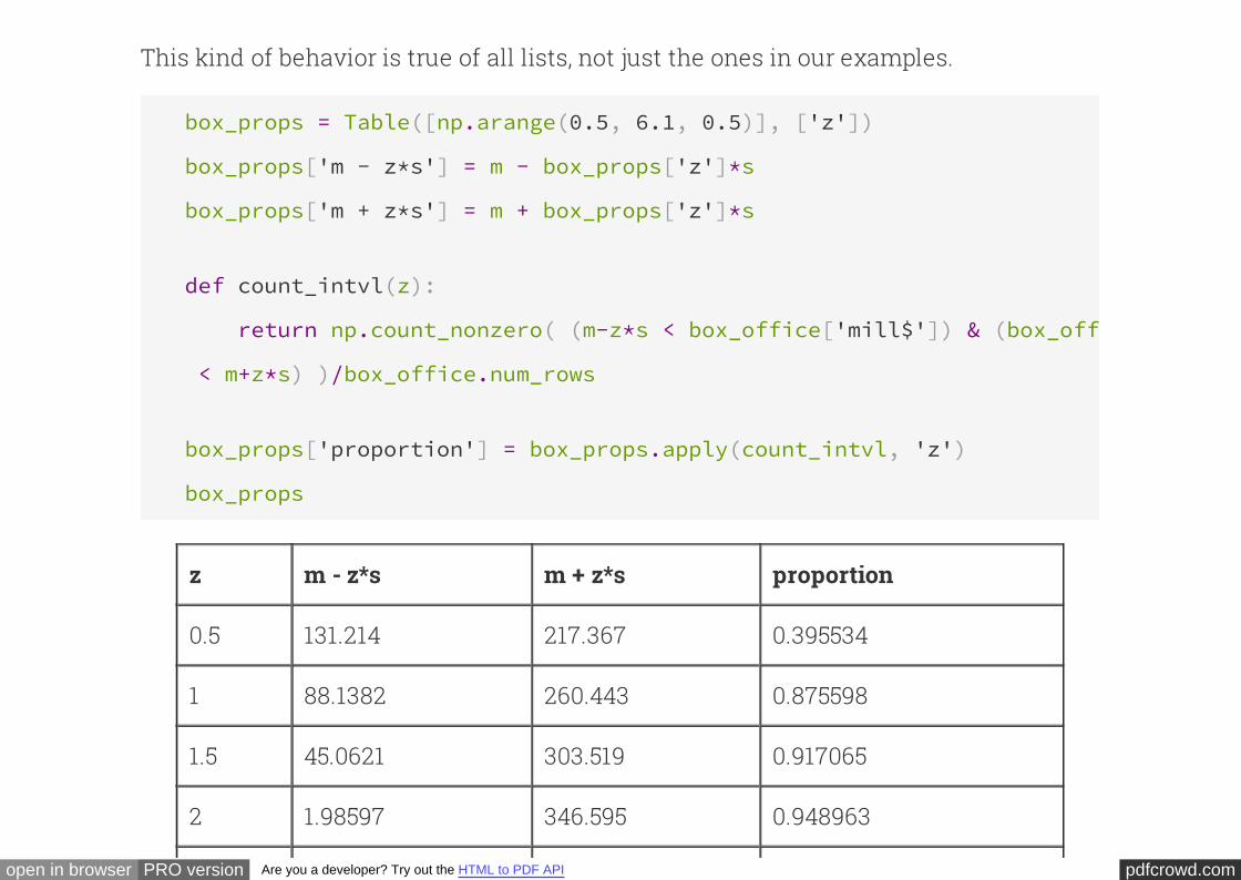
pdfcrowd.comopen in browser PRO version Are you a developer? Try out the HTML to PDF API
This kind of behavior is true of all lists, not just the ones in our examples.
box_props = Table([np.arange(0.5, 6.1, 0.5)], ['z'])
box_props['m - z*s'] = m - box_props['z']*s
box_props['m + z*s'] = m + box_props['z']*s
def count_intvl(z):
return np.count_nonzero( (m-z*s < box_office['mill$']) & (box_office
< m+z*s) )/box_office.num_rows
box_props['proportion'] = box_props.apply(count_intvl, 'z')
box_props
z m - z*s m + z*s proportion
0.5 131.214 217.367 0.395534
1 88.1382 260.443 0.875598
1.5 45.0621 303.519 0.917065
2 1.98597 346.595 0.948963

pdfcrowd.comopen in browser PRO version Are you a developer? Try out the HTML to PDF API
2.5 -41.0902 389.671 0.966507
3 -84.1663 432.747 0.982456
3.5 -127.242 475.823 0.992026
4 -170.319 518.9 0.992026
4.5 -213.395 561.976 0.99362
5 -256.471 605.052 0.99362
... (2 rows omitted)
Chebychev's inequality
This is the of our rough statement above:formal version
For all lists, and all positive numbers , the proportion of entries that are in the range
"average $\pm z$ SDs" is $1 - \frac{1}{z^2}$.
z
at least
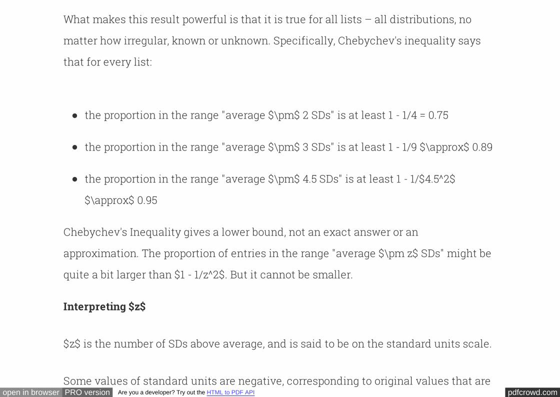
pdfcrowd.comopen in browser PRO version Are you a developer? Try out the HTML to PDF API
What makes this result powerful is that it is true for all lists – all distributions, no
matter how irregular, known or unknown. Specifically, Chebychev's inequality says
that for every list:
the proportion in the range "average $\pm$ 2 SDs" is at least 1 - 1/4 = 0.75
the proportion in the range "average $\pm$ 3 SDs" is at least 1 - 1/9 $\approx$ 0.89
the proportion in the range "average $\pm$ 4.5 SDs" is at least 1 - 1/$4.5^2$
$\approx$ 0.95
Chebychev's Inequality gives a lower bound, not an exact answer or an
approximation. The proportion of entries in the range "average $\pm z$ SDs" might be
quite a bit larger than $1 - 1/z^2$. But it cannot be smaller.
Interpreting $z$
$z$ is the number of SDs above average, and is said to be on the scale.standard units
Some values of standard units are negative, corresponding to original values that are
pdfcrowd.comopen in browser PRO version Are you a developer? Try out the HTML to PDF API
Some values of standard units are negative, corresponding to original values that are
below average. Other values of standard units are positive. But no matter what the
distribution of the list looks like, Chebychev's Inequality says that standard units will
typically be in the (-5, 5) range.
Here are some examples of moving back and forth between the original scale and the
standard units scale. Recall that the average box office amounts of our list of movies
is $m = \$174.29$ and the SD is $s = \$86.15$.
The calculation is
straightforward if you remember that $z$ answers the question, "How many SDs
above average is the original value?"
Examples of converting from standard units to the original units.
If $z = 2.4$, then the movie made $z*s + m = 2.4*86.15 + 174.29 = 381.05$ million
dollars.
If $z = -0.3$, then the movie made $z*s + m = (-0.3)*86.15 + 174.29 = 148.45$ million
dollars.
First find how farExamples of converting from the original units to standard units.

pdfcrowd.comopen in browser PRO version Are you a developer? Try out the HTML to PDF API
above average the value is on the original scale, then compare the difference with the
SD.
If the movie made 220 million dollars, then $z = (220 - 174.29)/86.15 = 0.53$.
If the movie made 120 million dollars, then $z = (120 - 174.29)/86.15 = -0.63$.
In probability and statistics, $z$ is standard notation for values on the standard units
scale. Converting to standard units is also known as "finding the $z$-score".
Further Reading