data visualization (dsc 530/cis 602-02) - computer and...
TRANSCRIPT
Data Visualization (DSC 530/CIS 602-02)
Tabular Data
Dr. David Koop
D. Koop, DSC 530, Spring 2017
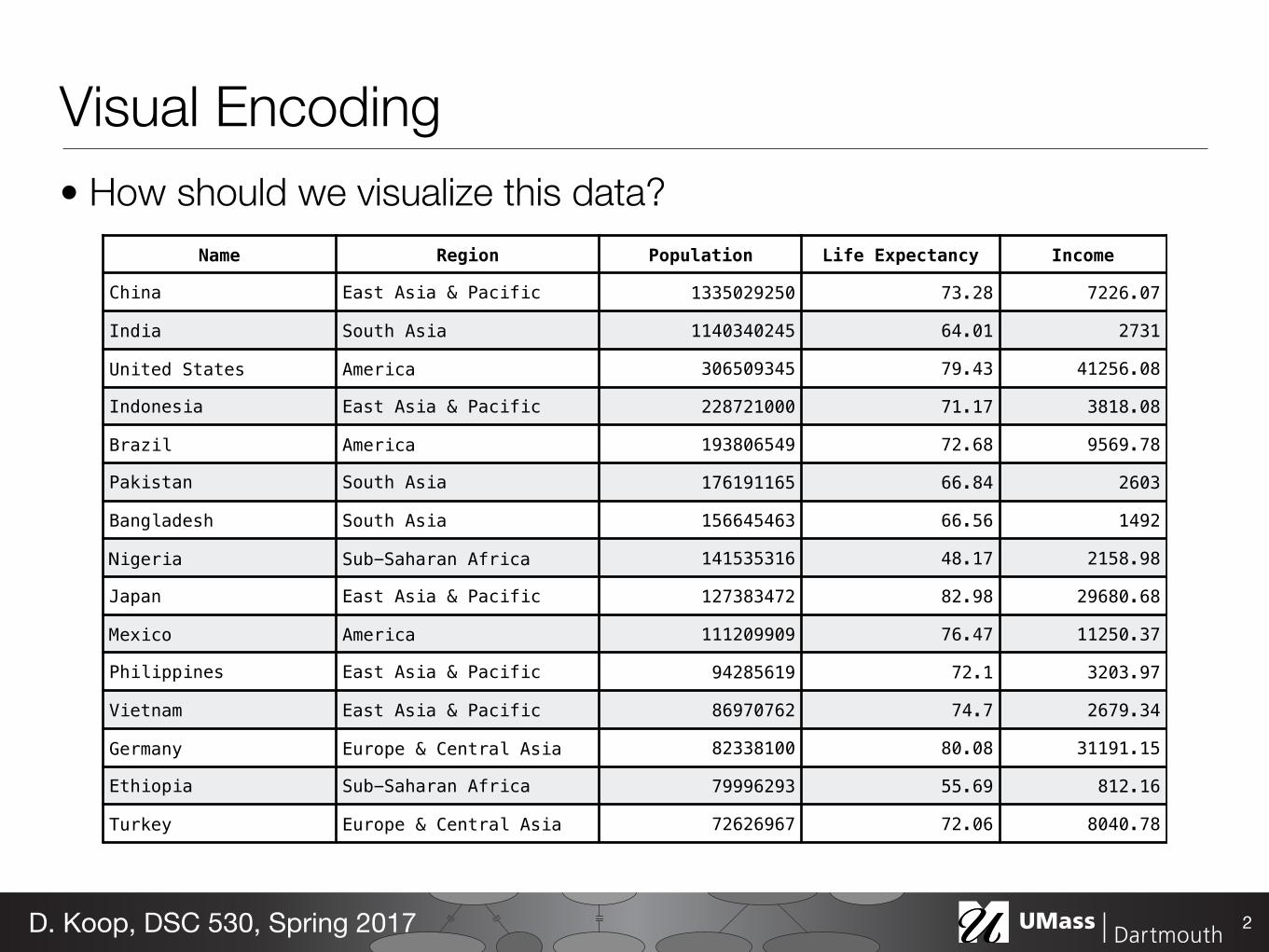
Visual Encoding• How should we visualize this data?
2D. Koop, DSC 530, Spring 2017
Name Region Population Life Expectancy Income
China East Asia & Pacific 1335029250 73.28 7226.07
India South Asia 1140340245 64.01 2731
United States America 306509345 79.43 41256.08
Indonesia East Asia & Pacific 228721000 71.17 3818.08
Brazil America 193806549 72.68 9569.78
Pakistan South Asia 176191165 66.84 2603
Bangladesh South Asia 156645463 66.56 1492
Nigeria Sub-Saharan Africa 141535316 48.17 2158.98
Japan East Asia & Pacific 127383472 82.98 29680.68
Mexico America 111209909 76.47 11250.37
Philippines East Asia & Pacific 94285619 72.1 3203.97
Vietnam East Asia & Pacific 86970762 74.7 2679.34
Germany Europe & Central Asia 82338100 80.08 31191.15
Ethiopia Sub-Saharan Africa 79996293 55.69 812.16
Turkey Europe & Central Asia 72626967 72.06 8040.78
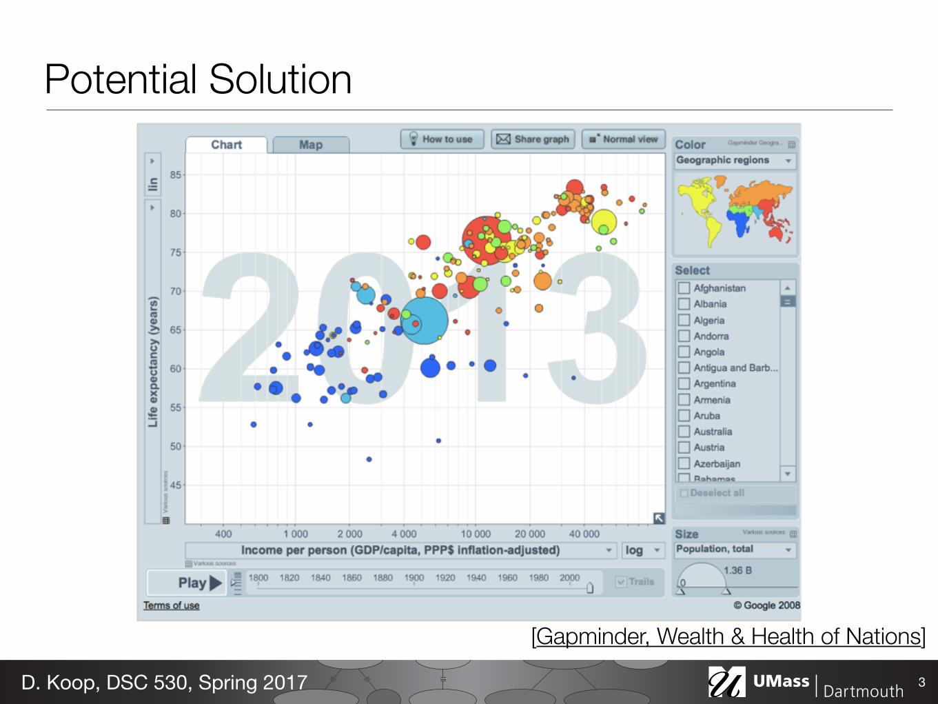
Potential Solution
3D. Koop, DSC 530, Spring 2017
[Gapminder, Wealth & Health of Nations]
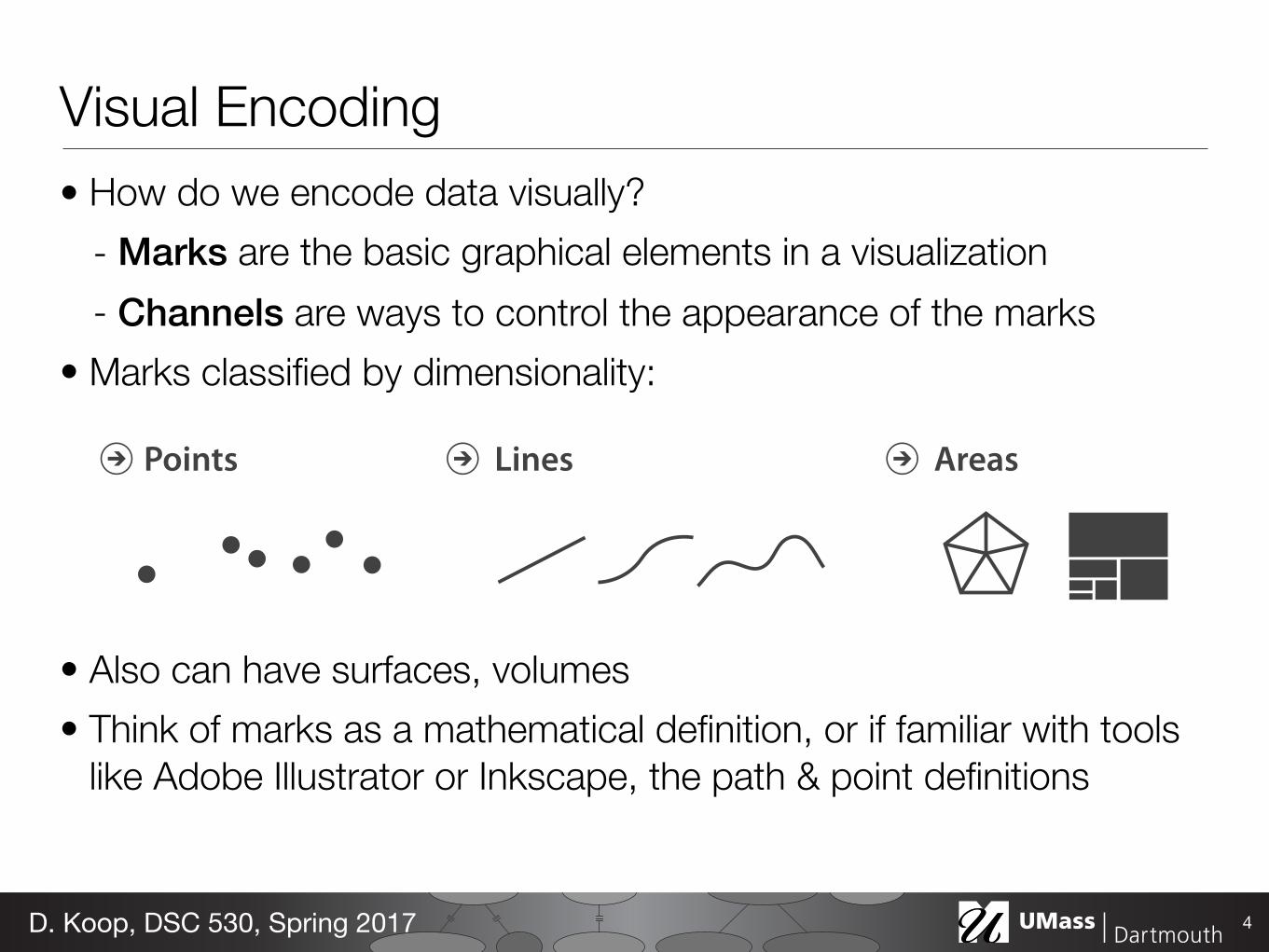
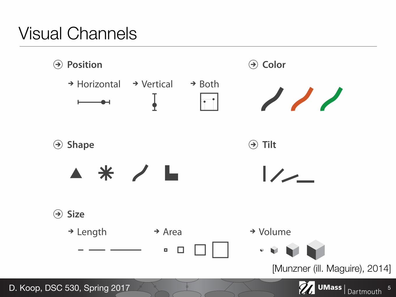
Visual Encoding• How do we encode data visually?
- Marks are the basic graphical elements in a visualization - Channels are ways to control the appearance of the marks
• Marks classified by dimensionality:
• Also can have surfaces, volumes • Think of marks as a mathematical definition, or if familiar with tools
like Adobe Illustrator or Inkscape, the path & point definitions
4D. Koop, DSC 530, Spring 2017
Points Lines Areas
Horizontal
Position
Vertical Both
Color
Shape Tilt
Size
Length Area Volume
Visual Channels
5D. Koop, DSC 530, Spring 2017
[Munzner (ill. Maguire), 2014]
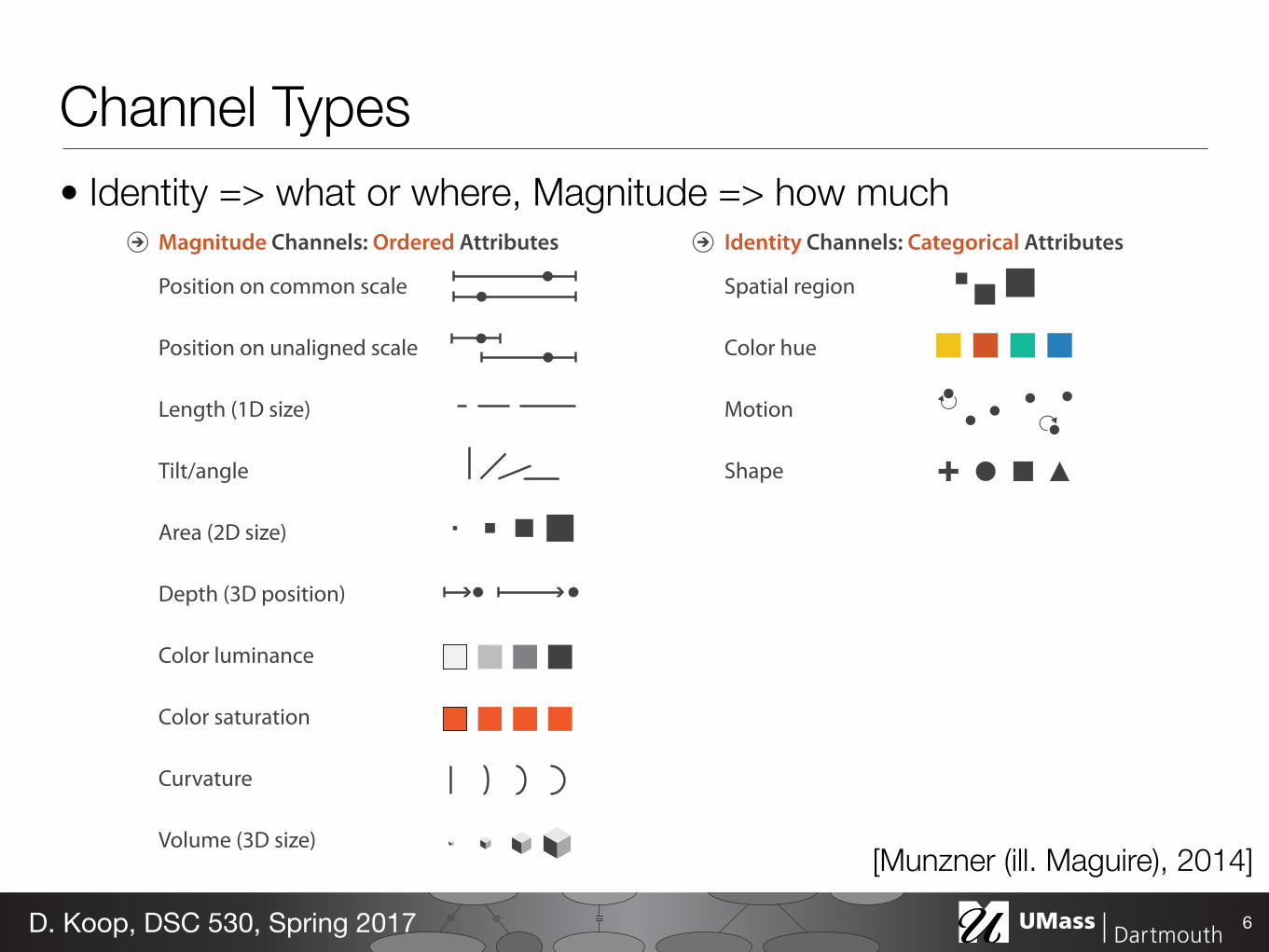
Channel Types• Identity => what or where, Magnitude => how much
6D. Koop, DSC 530, Spring 2017
Magnitude Channels: Ordered Attributes Identity Channels: Categorical Attributes
Spatial region
Color hue
Motion
Shape
Position on common scale
Position on unaligned scale
Length (1D size)
Tilt/angle
Area (2D size)
Depth (3D position)
Color luminance
Color saturation
Curvature
Volume (3D size)[Munzner (ill. Maguire), 2014]
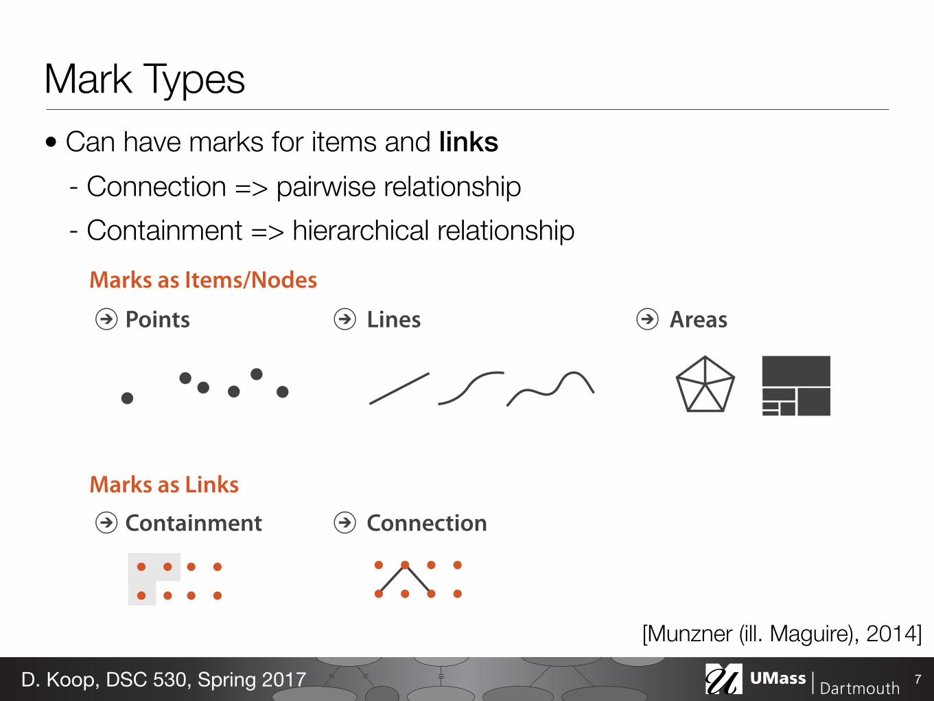
Mark Types• Can have marks for items and links
- Connection => pairwise relationship - Containment => hierarchical relationship
7D. Koop, DSC 530, Spring 2017
Marks as Items/Nodes
Marks as Links
Points Lines Areas
Containment Connection
[Munzner (ill. Maguire), 2014]
Expressiveness and Effectiveness• Expressiveness Principle: all data from the dataset and nothing
more should be shown - Do encode ordered data in an ordered fashion - Don’t encode categorical data in a way that implies an ordering
• Effectiveness Principle: the most important attributes should be the most salient - Saliency: how noticeable something is - How do the channels we have discussed measure up? - How was this determined?
8D. Koop, DSC 530, Spring 2017
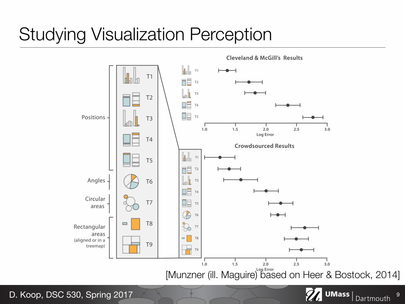
Positions
Rectangular areas
(aligned or in a treemap)
Angles
Circular areas
Cleveland & McGill’s Results
Crowdsourced Results
1.0 3.01.5 2.52.0Log Error
1.0 3.01.5 2.52.0Log Error
Studying Visualization Perception
9D. Koop, DSC 530, Spring 2017
[Munzner (ill. Maguire) based on Heer & Bostock, 2014]
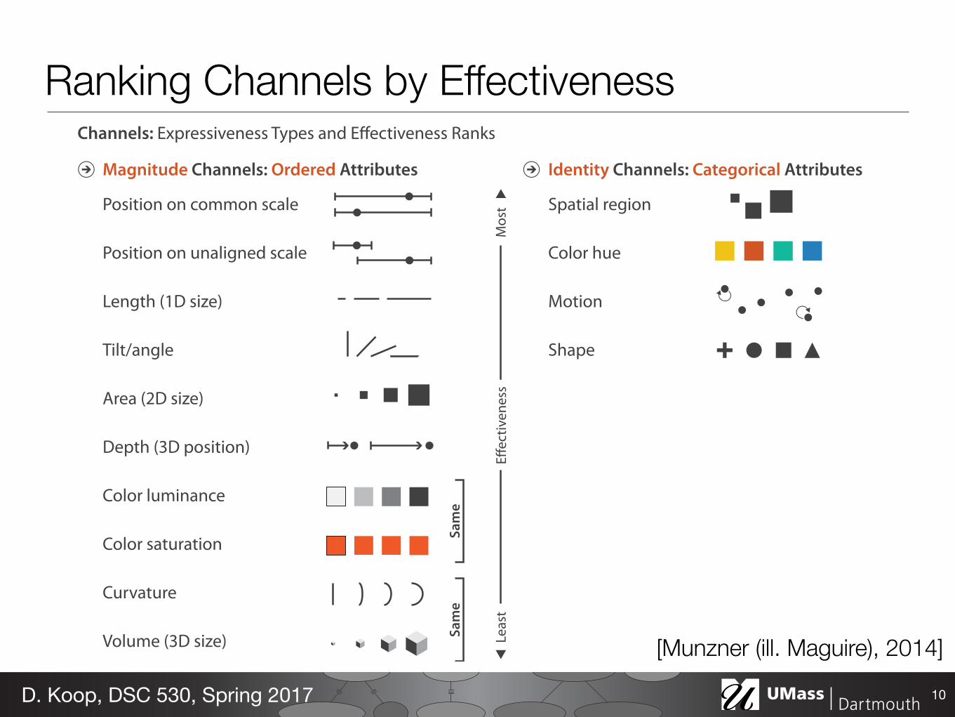
Magnitude Channels: Ordered Attributes Identity Channels: Categorical Attributes
Spatial region
Color hue
Motion
Shape
Position on common scale
Position on unaligned scale
Length (1D size)
Tilt/angle
Area (2D size)
Depth (3D position)
Color luminance
Color saturation
Curvature
Volume (3D size)
Channels: Expressiveness Types and Effectiveness Ranks
Ranking Channels by Effectiveness
10D. Koop, DSC 530, Spring 2017
[Munzner (ill. Maguire), 2014]
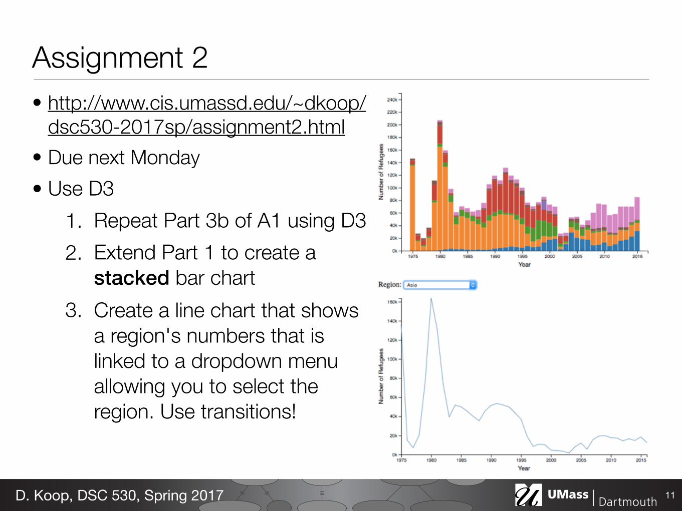
Assignment 2• http://www.cis.umassd.edu/~dkoop/
dsc530-2017sp/assignment2.html • Due next Monday • Use D3
1. Repeat Part 3b of A1 using D3 2. Extend Part 1 to create a
stacked bar chart 3. Create a line chart that shows
a region's numbers that is linked to a dropdown menu allowing you to select the region. Use transitions!
11D. Koop, DSC 530, Spring 2017
PythonSource
vtkDataSetReader
vtkDataSetMapper
vtkActor
vtkLODActor
vtkRenderer
VTKCell
vtkScalarBarActor
vtkColorTransferFunction
vtkLookupTable
vtkImageClip
vtkImageDataGeometryFilter
vtkImageResample
vtkImageReslice
vtkWarpScalar
PythonSourcevtkElevationFilter
vtkOutlineFilter
vtkPolyDataMapper
vtkActor
vtkProperty
vtkCubeAxesActor2D
vtkCamera
File
vtkPolyDataNormals
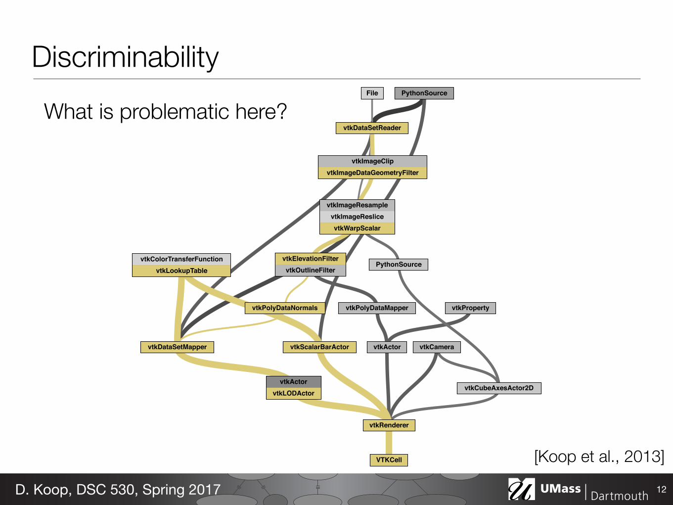
Discriminability
12D. Koop, DSC 530, Spring 2017
[Koop et al., 2013]
What is problematic here?
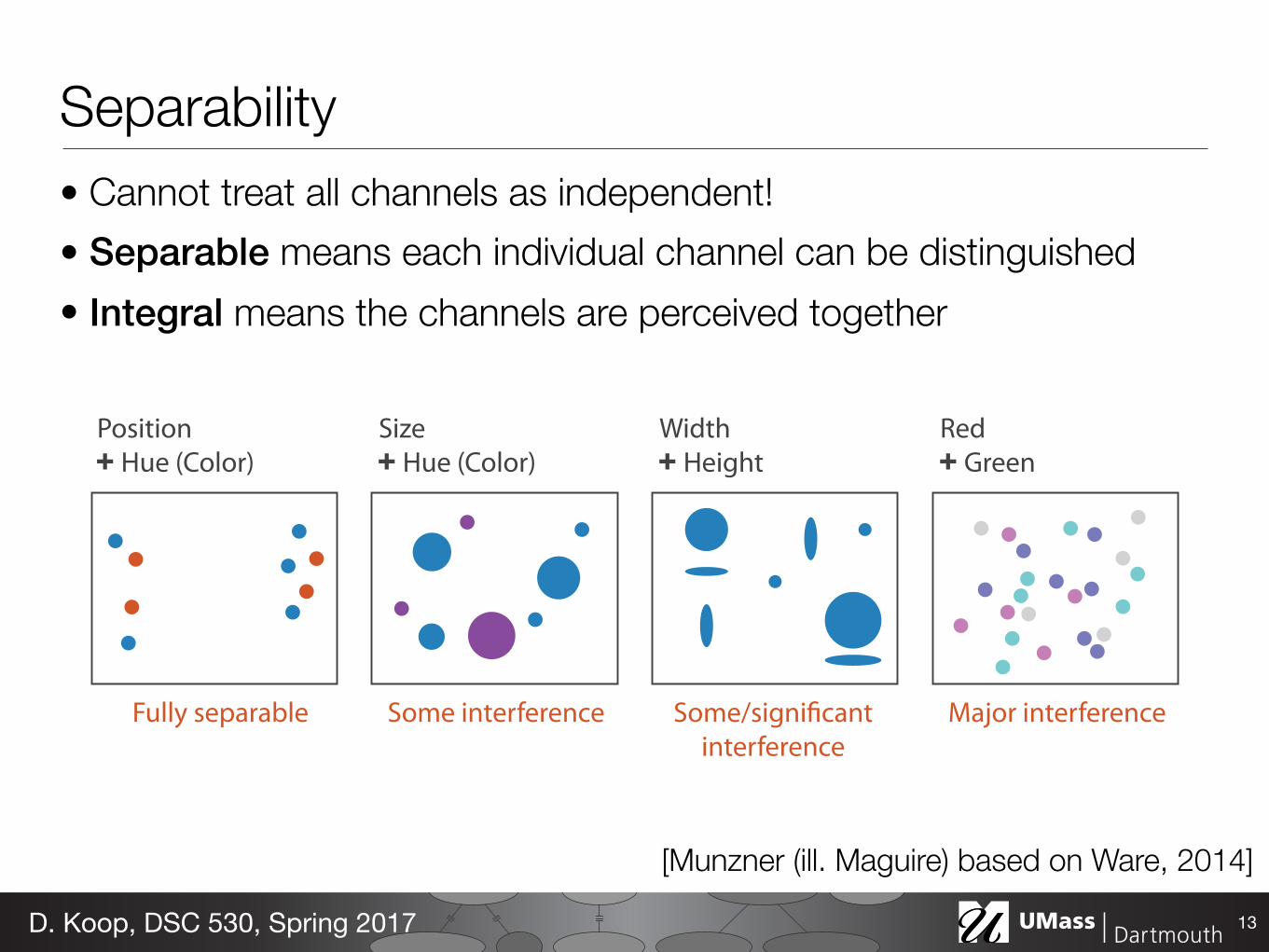
Separability• Cannot treat all channels as independent! • Separable means each individual channel can be distinguished • Integral means the channels are perceived together
13D. Koop, DSC 530, Spring 2017
Position Hue (Color)
Size Hue (Color)
Width Height
Red Green
Fully separable Some interference Some/significant interference
Major interference
[Munzner (ill. Maguire) based on Ware, 2014]
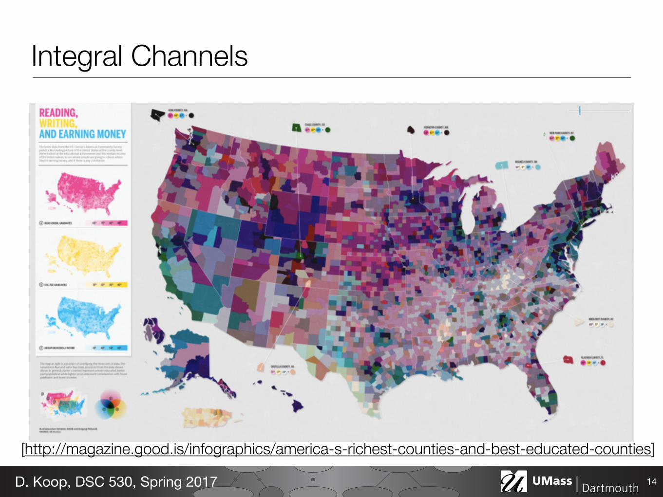
Integral Channels
14D. Koop, DSC 530, Spring 2017
[http://magazine.good.is/infographics/america-s-richest-counties-and-best-educated-counties]
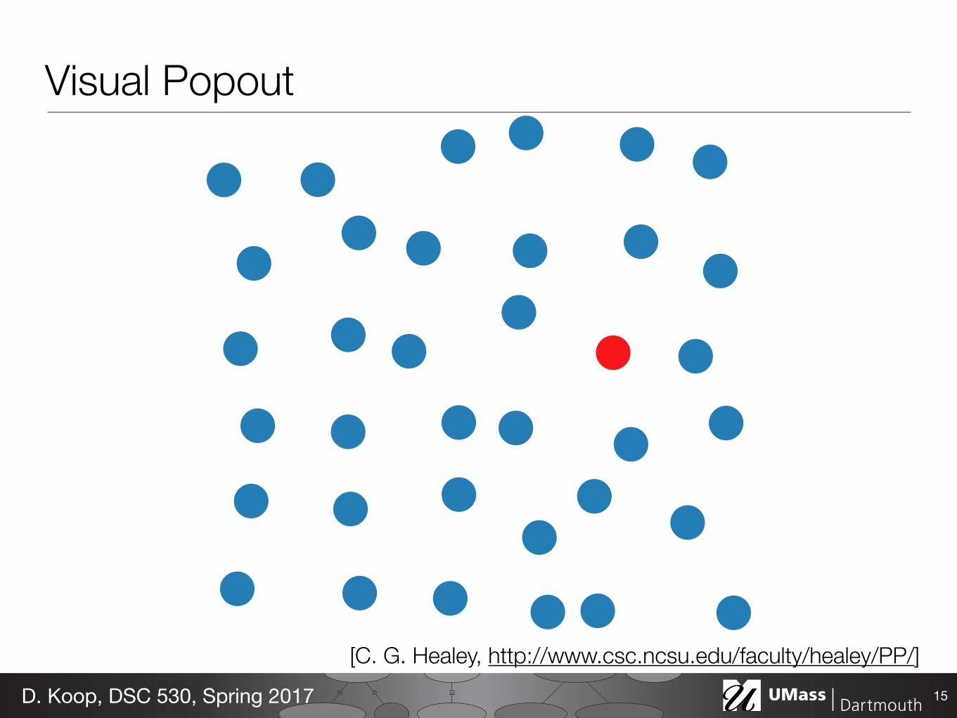
Visual Popout
15D. Koop, DSC 530, Spring 2017
[C. G. Healey, http://www.csc.ncsu.edu/faculty/healey/PP/]
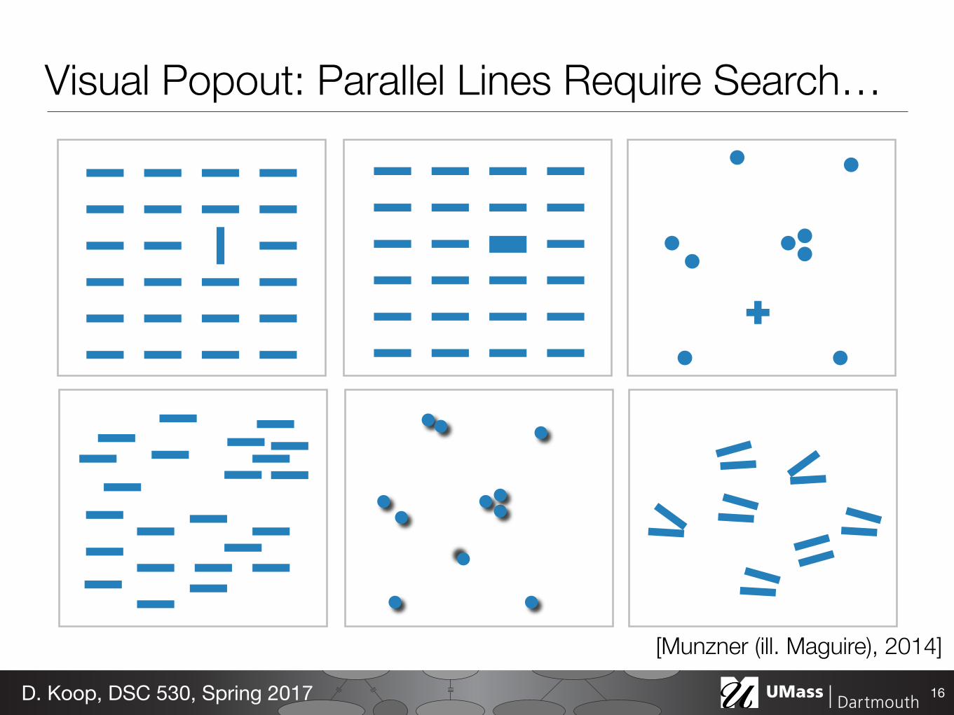
Visual Popout: Parallel Lines Require Search…
16D. Koop, DSC 530, Spring 2017
[Munzner (ill. Maguire), 2014]
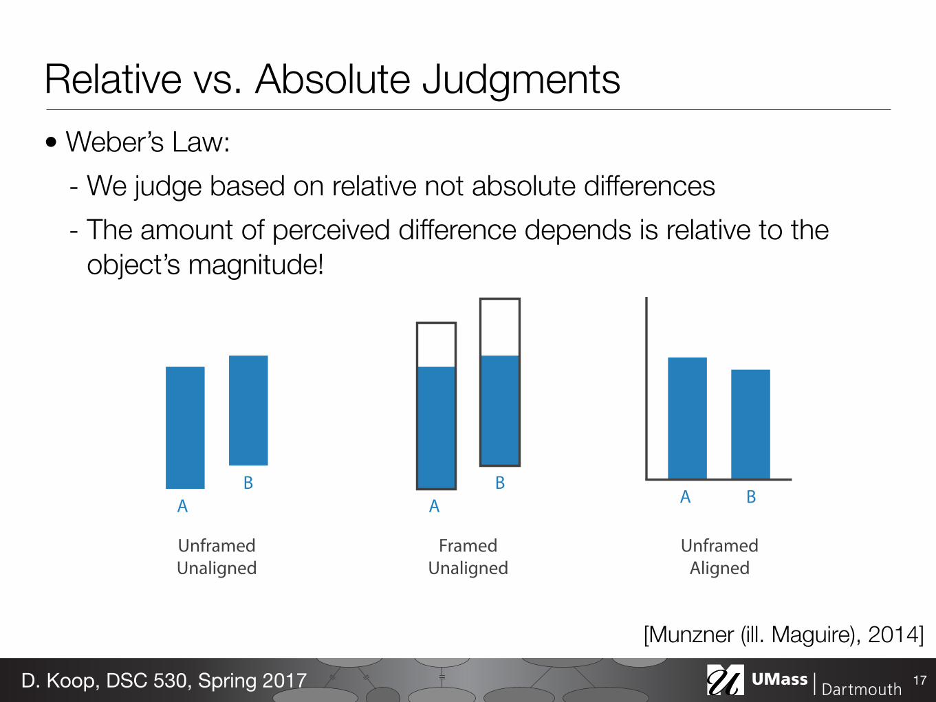
Relative vs. Absolute Judgments• Weber’s Law:
- We judge based on relative not absolute differences - The amount of perceived difference depends is relative to the
object’s magnitude!
17D. Koop, DSC 530, Spring 2017
A B
Unframed Aligned
Framed Unaligned
AB
AB
Unframed Unaligned
[Munzner (ill. Maguire), 2014]
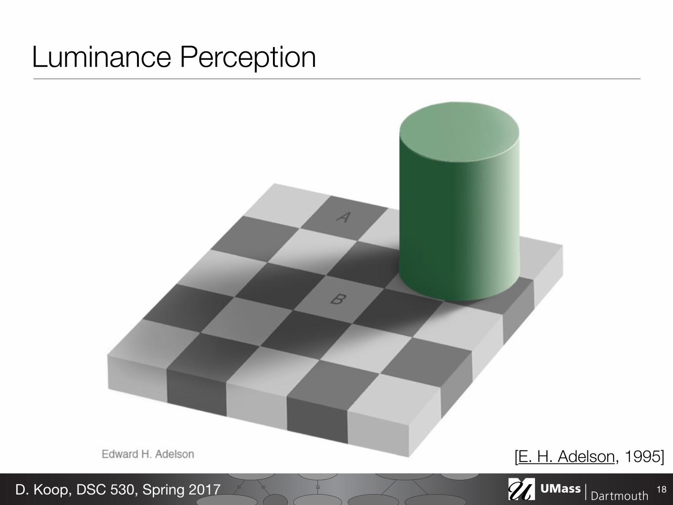
Luminance Perception
18D. Koop, DSC 530, Spring 2017
[E. H. Adelson, 1995]
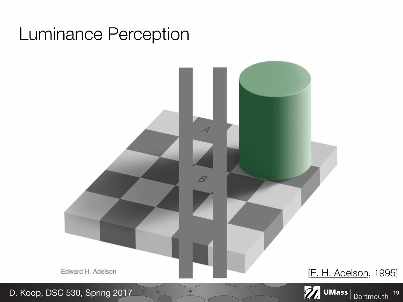
Luminance Perception
19D. Koop, DSC 530, Spring 2017
[E. H. Adelson, 1995]
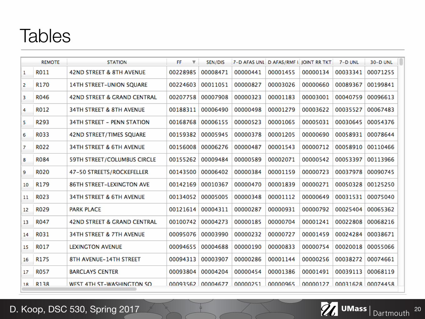
Tables
20D. Koop, DSC 530, Spring 2017
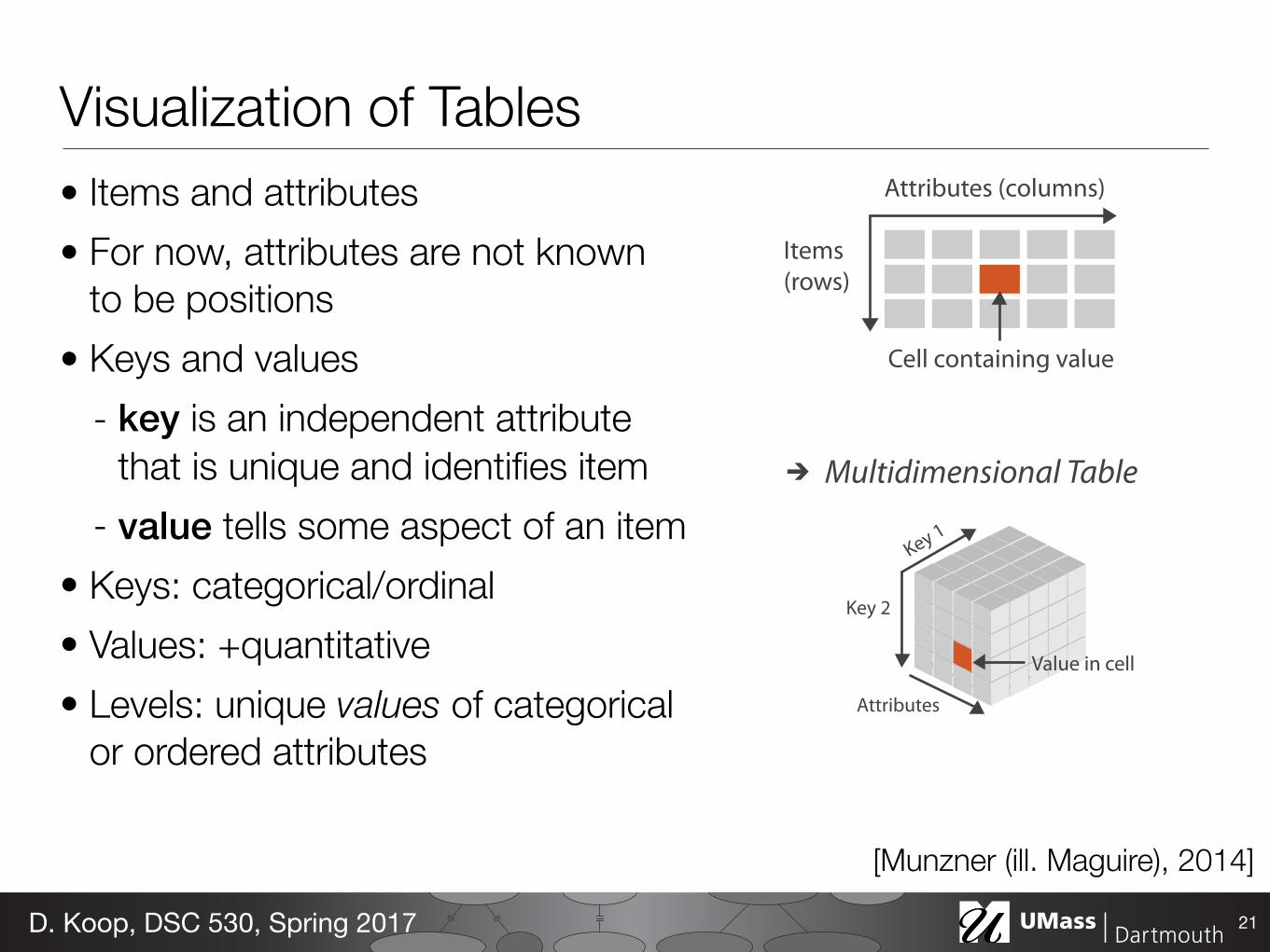
Attributes (columns)
Items (rows)
Cell containing value
Multidimensional Table
Value in cell
Visualization of Tables• Items and attributes • For now, attributes are not known
to be positions • Keys and values
- key is an independent attribute that is unique and identifies item
- value tells some aspect of an item • Keys: categorical/ordinal • Values: +quantitative • Levels: unique values of categorical
or ordered attributes
21D. Koop, DSC 530, Spring 2017
[Munzner (ill. Maguire), 2014]
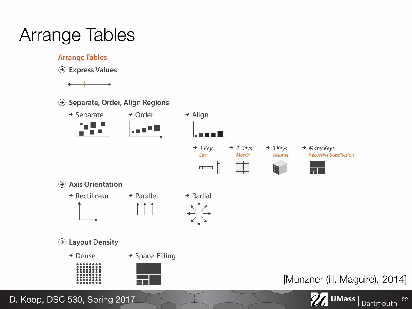
Arrange Tables
Express Values
Separate, Order, Align Regions
Axis Orientation
Layout Density
Dense Space-Filling
Separate Order Align
1 Key 2 Keys 3 Keys Many KeysList Recursive SubdivisionVolumeMatrix
Rectilinear Parallel Radial
Arrange Tables
22D. Koop, DSC 530, Spring 2017
[Munzner (ill. Maguire), 2014]
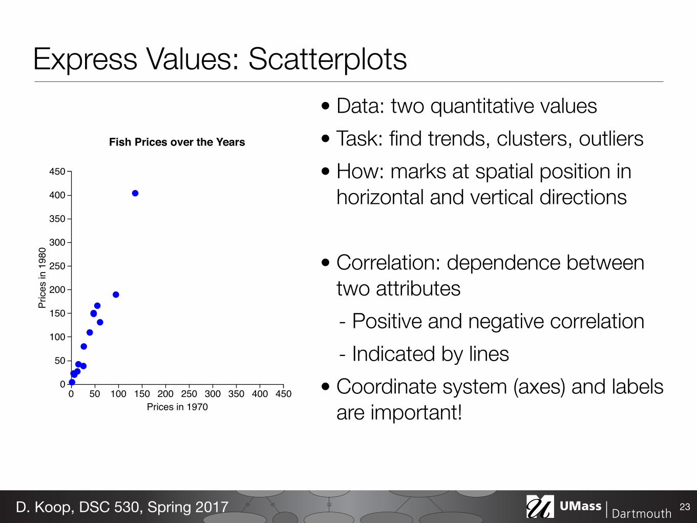
Express Values: Scatterplots• Data: two quantitative values • Task: find trends, clusters, outliers • How: marks at spatial position in
horizontal and vertical directions
• Correlation: dependence between two attributes - Positive and negative correlation - Indicated by lines
• Coordinate system (axes) and labels are important!
23D. Koop, DSC 530, Spring 2017
0 50 100 150 200 250 300 350 400 4500
50
100
150
200
250
300
350
400
450
Prices in 1970
Pric
es in
198
0
Fish Prices over the Years
Journal of Statistical Software 19
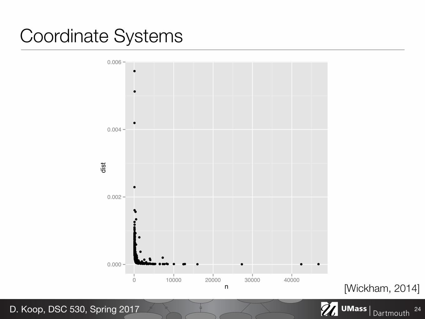
variability decreases with sample size. But on the log-log scale, Figure 2(b), there is a clearpattern. This is particularly easy to see the pattern when we add the line of best fit from arobust linear model.
R> ggplot(data = devi, aes(x = n, y = dist) + geom_point()
R>
R> last_plot() +
R> scale_x_log10() +
R> scale_y_log10() +
R> geom_smooth(method = "rlm", se = F)
●
●
●
●
●
●
●
●●
●
●
●
●●
●●
●
●●
●●
●
●
●●●
●●●
●
●●
●
●
●
●
●
●●● ●
●●
●
●●
●●●
●●●
●
●
●
●●
●
●
●
●
●●
●
●
●
●
●
●
●●●
●●●
●
●● ●●●●
●
●
●
●●
●
●
●
●
●
●
●
●
●
●
●
●
●
●●●
●
●●
● ●● ●
●
●●
●
●● ●●●
●
●
● ●
●
●
●●
●●
●
●
●●
●
●
●
●●
●●
●
●●
●
●
●●
●●
●●
●
●
●
●●●●●
●
●●
●●●
●●
●
●
●
●●
●
●
●● ●●
● ●●
● ● ●●
●
●
●
●
●
●●
●●●●
●
●●
●
●
●
●
●
●
●
● ● ●●●
●
●●
●
●
●●
●●
●
●
●
● ●
●
●
●●●●●●●●
●●●
●
●●
●●●
●
●
●●
●
●
●
● ●●●●●
●●●
●
●
●
●
●
●
●
●
●
●
●
●●
●●
●
●
●●●
●
●
●
●
●
●
●
●
●
●
●●●
● ●●
●●
●●
●
●
●
●
●●●
●
●●
●
●
●
●
● ●●●
●●●
●●
●
●
●
●
●
●
●●
●●
●
●
●
●●
●
●
●●
●●
●
●
●
●
●●●●
●
●
●
●
●
●
●
●
●●
●
●●
●
●
●
●
● ●
●●
●
●
●
●
●
●
●●
●●
●
●
●
●
●
●
● ●
●
●●●●●
●
●
●
●
●
●
●
●
●
●●
●
●
●
●
●
●
●
●
●
●●
●
●
●
●●
●●●
●
●
●
●
●
●
●
●
●
●
●
●
●
●●
●
●
●
●●
0.000
0.002
0.004
0.006
0 10000 20000 30000 40000n
dist
(a) Linear scales
●
●
●
●
●
●
●
●●
●
●
●
●
●
●
●
●
●
●
●
●
●
●
●
●
●
●●
●
●
●
●
●
●
●
●
●
●
●
●
●
●
●
●
●●
●
●
●
●●
●
●
●
●
●
●
●
●
●
●
●
●
●
●
●
●
●
●
●
●
●
●
●
●
●
●●
●●
● ●
●
●
●
●
●
●
●
●
●
●
●
●
●
●
●
●
●
●
●
●●
●
●●
●
●
●
●
●
● ●
●
●
●
●
●
●
●
●
●
●
●
●
●
●
●●
●
●
●
●
●
●
●
●●
●●
●
●
●
●
●
●
●
● ●
●
●
●
●
●
●
●
●●
●
●
●
●
●
●
●
●
●
●
●
●
●
●
●
●
●
●
●
●
●
●
●
●
●●
●
●
●
●
●
●
●
●
●
●
●
●
●
● ●
●
●
●
●
●
●
●
●
●
●
●
●
●
● ●
●
●
●
●
●
●
●
●
●
●
●
●
●
●
●
●
●
●
●
●●
●
●
●
●
●
●
●
●
●
●
●
●
●
●
●
●
●
●
●
●
●●
●
●
●
●
●
●
●
●
●
●
●
●
●
●
●
●
●●
●
●
●
●
●
●
●
●
●
●
●
●
●
●
●
●
●
●
●
●
●
●
●
●
●
●
●
●
●
●
●
●
●
●
●
●
●
●
●
●
●
●
●
● ●●
●●
●
●
●
●
●
●
● ●
● ●
●
●
●
●
●
●
●
●●
●
●
●
●
●
●
●●
●●
●
●
●
●
●
●
●
●
●
●
●
●
●
●
●
●
●
●
●
●
●
●
●
●
●
●
●
●
●
●●
●
●
●
●
●
●
●●
●
●
●
●
●
●
●
●
●
●
●
●
●●
●
●
●
●
●
●
●
●
●
●
●
●
●
●
●
●
●
●●
●
●
●
●
●
●
●
●
●
●
●
●
●
●
●
●
●
●
●
●
●
●
●
0.001
0.0001
0.00001
100 1000 10000n
dist
(b) Log scales
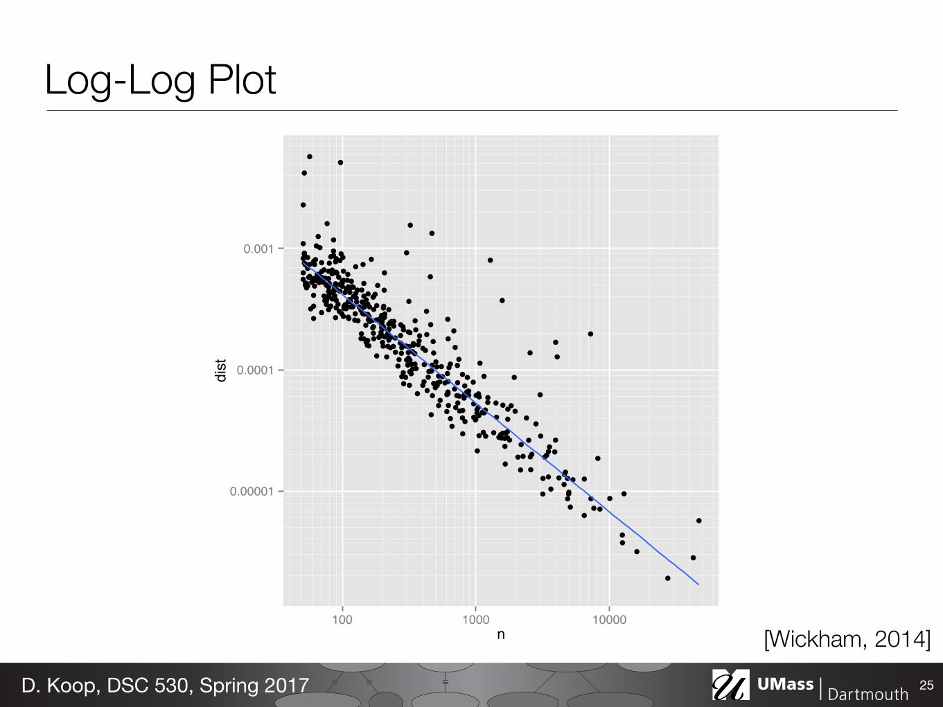
Figure 2: (a) Plot of n vs deviation. Variability of deviation is dominated by sample size: smallsamples have large variability. (b) Log-log plot makes it easy to see the pattern of variation as well asunusually high values. The blue line is a robust line of best fit.
We are interested in points that have high y-values, relative to their x-neighbours. Controllingfor the number of deaths, these points represent the diseases which depart the most from theoverall pattern.
To find these unusual points, we fit a robust linear model and plot the residuals, Figure 3.The plot shows an empty region around a residual of 1.5. So somewhat arbitrarily, we’ll selectthose diseases with a residual greater than 1.5. We do this in two steps: first, we select theappropriate rows from devi (one row per disease), and then we find the matching temporalcourse information from the original summary dataset (24 rows per disease).
R> devi$resid <- resid(rlm(log(dist) ~ log(n), data = devi))
R> unusual <- subset(devi, resid > 1.5)
R> hod_unusual <- match_df(hod2, unusual)
Coordinate Systems
24D. Koop, DSC 530, Spring 2017
[Wickham, 2014]
Journal of Statistical Software 19
variability decreases with sample size. But on the log-log scale, Figure 2(b), there is a clearpattern. This is particularly easy to see the pattern when we add the line of best fit from arobust linear model.
R> ggplot(data = devi, aes(x = n, y = dist) + geom_point()
R>
R> last_plot() +
R> scale_x_log10() +
R> scale_y_log10() +
R> geom_smooth(method = "rlm", se = F)
●
●
●
●
●
●
●
●●
●
●
●
●●
●●
●
●●
●●
●
●
●●●
●●●
●
●●
●
●
●
●
●
●●● ●
●●
●
●●
●●●
●●●
●
●
●
●●
●
●
●
●
●●
●
●
●
●
●
●
●●●
●●●
●
●● ●●●●
●
●
●
●●
●
●
●
●
●
●
●
●
●
●
●
●
●
●●●
●
●●
● ●● ●
●
●●
●
●● ●●●
●
●
● ●
●
●
●●
●●
●
●
●●
●
●
●
●●
●●
●
●●
●
●
●●
●●
●●
●
●
●
●●●●●
●
●●
●●●
●●
●
●
●
●●
●
●
●● ●●
● ●●
● ● ●●
●
●
●
●
●
●●
●●●●
●
●●
●
●
●
●
●
●
●
● ● ●●●
●
●●
●
●
●●
●●
●
●
●
● ●
●
●
●●●●●●●●
●●●
●
●●
●●●
●
●
●●
●
●
●
● ●●●●●
●●●
●
●
●
●
●
●
●
●
●
●
●
●●
●●
●
●
●●●
●
●
●
●
●
●
●
●
●
●
●●●
● ●●
●●
●●
●
●
●
●
●●●
●
●●
●
●
●
●
● ●●●
●●●
●●
●
●
●
●
●
●
●●
●●
●
●
●
●●
●
●
●●
●●
●
●
●
●
●●●●
●
●
●
●
●
●
●
●
●●
●
●●
●
●
●
●
● ●
●●
●
●
●
●
●
●
●●
●●
●
●
●
●
●
●
● ●
●
●●●●●
●
●
●
●
●
●
●
●
●
●●
●
●
●
●
●
●
●
●
●
●●
●
●
●
●●
●●●
●
●
●
●
●
●
●
●
●
●
●
●
●
●●
●
●
●
●●
0.000
0.002
0.004
0.006
0 10000 20000 30000 40000n
dist
(a) Linear scales
●
●
●
●
●
●
●
●●
●
●
●
●
●
●
●
●
●
●
●
●
●
●
●
●
●
●●
●
●
●
●
●
●
●
●
●
●
●
●
●
●
●
●
●●
●
●
●
●●
●
●
●
●
●
●
●
●
●
●
●
●
●
●
●
●
●
●
●
●
●
●
●
●
●
●●
●●
● ●
●
●
●
●
●
●
●
●
●
●
●
●
●
●
●
●
●
●
●
●●
●
●●
●
●
●
●
●
● ●
●
●
●
●
●
●
●
●
●
●
●
●
●
●
●●
●
●
●
●
●
●
●
●●
●●
●
●
●
●
●
●
●
● ●
●
●
●
●
●
●
●
●●
●
●
●
●
●
●
●
●
●
●
●
●
●
●
●
●
●
●
●
●
●
●
●
●
●●
●
●
●
●
●
●
●
●
●
●
●
●
●
● ●
●
●
●
●
●
●
●
●
●
●
●
●
●
● ●
●
●
●
●
●
●
●
●
●
●
●
●
●
●
●
●
●
●
●
●●
●
●
●
●
●
●
●
●
●
●
●
●
●
●
●
●
●
●
●
●
●●
●
●
●
●
●
●
●
●
●
●
●
●
●
●
●
●
●●
●
●
●
●
●
●
●
●
●
●
●
●
●
●
●
●
●
●
●
●
●
●
●
●
●
●
●
●
●
●
●
●
●
●
●
●
●
●
●
●
●
●
●
● ●●
●●
●
●
●
●
●
●
● ●
● ●
●
●
●
●
●
●
●
●●
●
●
●
●
●
●
●●
●●
●
●
●
●
●
●
●
●
●
●
●
●
●
●
●
●
●
●
●
●
●
●
●
●
●
●
●
●
●
●●
●
●
●
●
●
●
●●
●
●
●
●
●
●
●
●
●
●
●
●
●●
●
●
●
●
●
●
●
●
●
●
●
●
●
●
●
●
●
●●
●
●
●
●
●
●
●
●
●
●
●
●
●
●
●
●
●
●
●
●
●
●
●
0.001
0.0001
0.00001
100 1000 10000n
dist
(b) Log scales
Figure 2: (a) Plot of n vs deviation. Variability of deviation is dominated by sample size: smallsamples have large variability. (b) Log-log plot makes it easy to see the pattern of variation as well asunusually high values. The blue line is a robust line of best fit.
We are interested in points that have high y-values, relative to their x-neighbours. Controllingfor the number of deaths, these points represent the diseases which depart the most from theoverall pattern.
To find these unusual points, we fit a robust linear model and plot the residuals, Figure 3.The plot shows an empty region around a residual of 1.5. So somewhat arbitrarily, we’ll selectthose diseases with a residual greater than 1.5. We do this in two steps: first, we select theappropriate rows from devi (one row per disease), and then we find the matching temporalcourse information from the original summary dataset (24 rows per disease).
R> devi$resid <- resid(rlm(log(dist) ~ log(n), data = devi))
R> unusual <- subset(devi, resid > 1.5)
R> hod_unusual <- match_df(hod2, unusual)
Log-Log Plot
25D. Koop, DSC 530, Spring 2017
[Wickham, 2014]
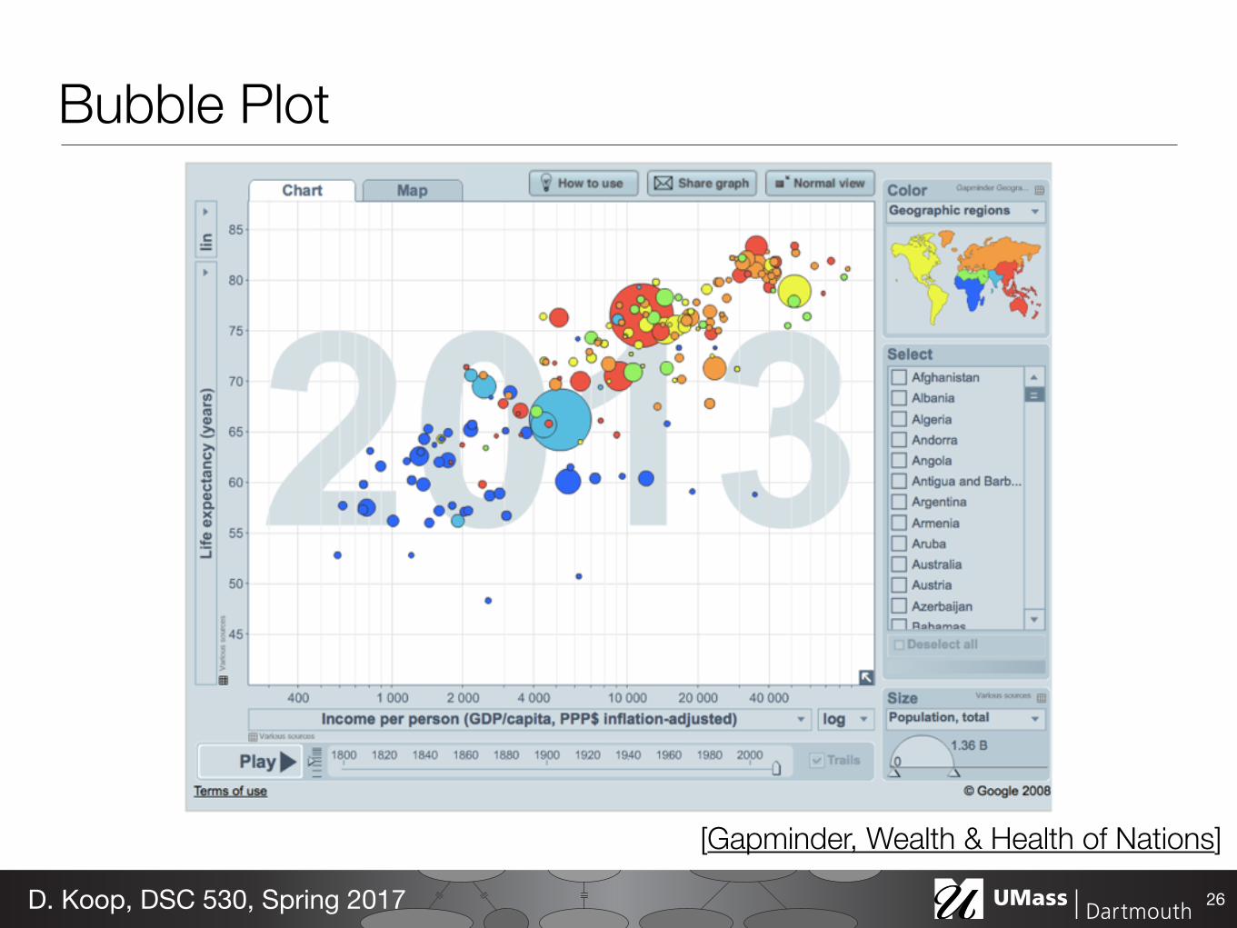
Bubble Plot
26D. Koop, DSC 530, Spring 2017
[Gapminder, Wealth & Health of Nations]
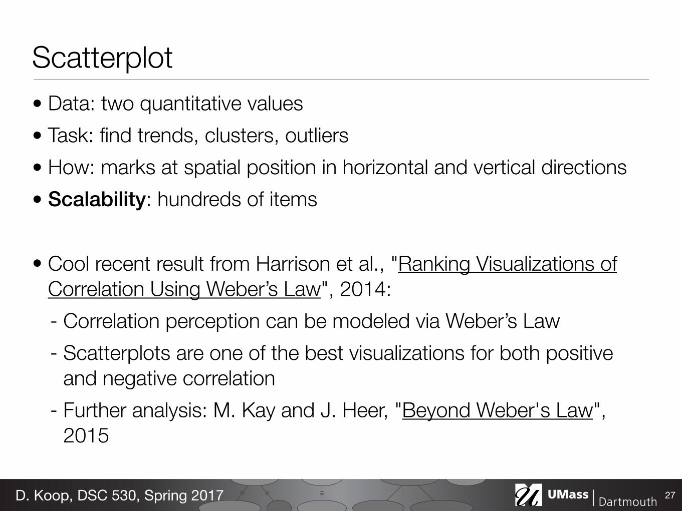
Scatterplot• Data: two quantitative values • Task: find trends, clusters, outliers • How: marks at spatial position in horizontal and vertical directions • Scalability: hundreds of items
• Cool recent result from Harrison et al., "Ranking Visualizations of Correlation Using Weber’s Law", 2014: - Correlation perception can be modeled via Weber’s Law - Scatterplots are one of the best visualizations for both positive
and negative correlation - Further analysis: M. Kay and J. Heer, "Beyond Weber's Law",
2015
27D. Koop, DSC 530, Spring 2017
Separate, Order, and Align: Categorical Regions• Categorical: =, != • Spatial position can be used for categorical attributes • Use regions, distinct contiguous bounded areas, to encode
categorical attributes • Three operations on the regions:
- Separate (use categorical attribute) - Align - Order
• Alignment and order can use same or different attribute
28D. Koop, DSC 530, Spring 2017
(use some other ordered attribute)
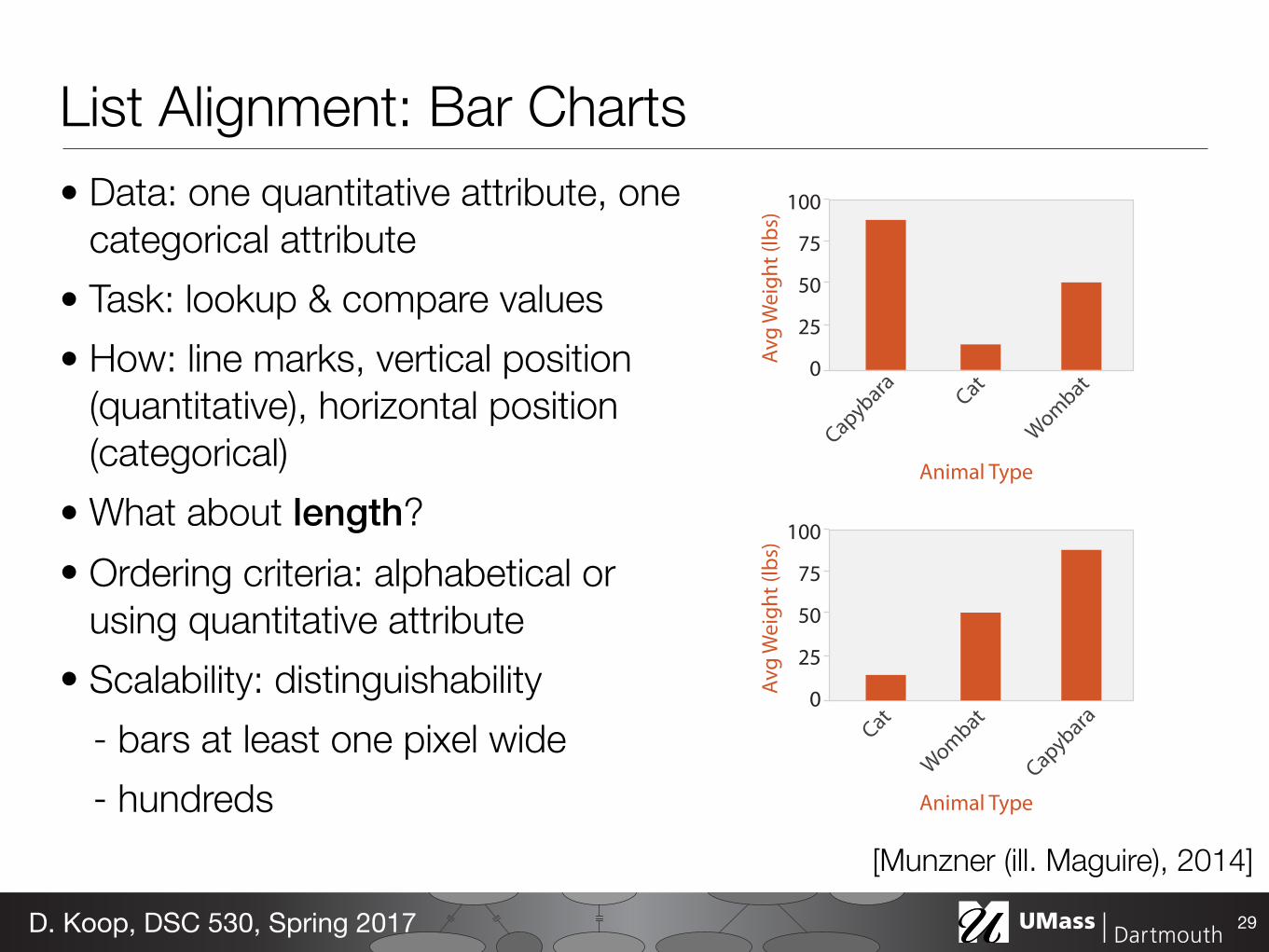
List Alignment: Bar Charts• Data: one quantitative attribute, one
categorical attribute • Task: lookup & compare values • How: line marks, vertical position
(quantitative), horizontal position (categorical)
• What about length? • Ordering criteria: alphabetical or
using quantitative attribute • Scalability: distinguishability
- bars at least one pixel wide - hundreds
29D. Koop, DSC 530, Spring 2017
100
75
50
25
0
Animal Type
100
75
50
25
0
Animal Type
[Munzner (ill. Maguire), 2014]
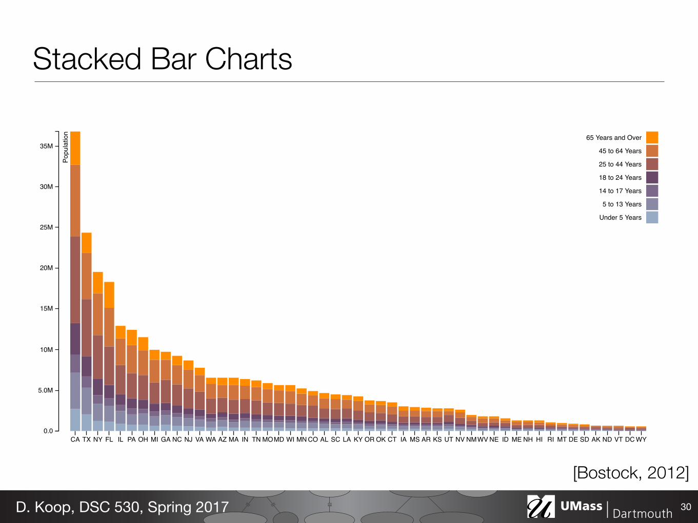
CA TX NY FL IL PA OH MI GA NC NJ VA WA AZ MA IN TN MOMD WI MN CO AL SC LA KY OR OK CT IA MS AR KS UT NV NMWV NE ID ME NH HI RI MT DE SD AK ND VT DC WY0.0
5.0M
10M
15M
20M
25M
30M
35M
Popu
latio
n 65 Years and Over
45 to 64 Years
25 to 44 Years
18 to 24 Years
14 to 17 Years
5 to 13 Years
Under 5 Years
Stacked Bar Charts
30D. Koop, DSC 530, Spring 2017
[Bostock, 2012]
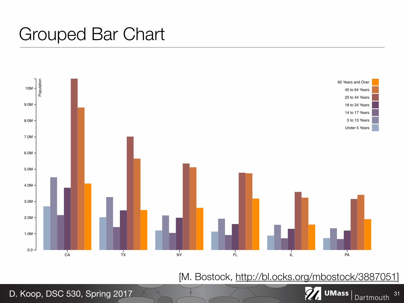
CA TX NY FL IL PA0.0
1.0M
2.0M
3.0M
4.0M
5.0M
6.0M
7.0M
8.0M
9.0M
10M
Popu
latio
n 65 Years and Over
45 to 64 Years
25 to 44 Years
18 to 24 Years
14 to 17 Years
5 to 13 Years
Under 5 Years
Grouped Bar Chart
31D. Koop, DSC 530, Spring 2017
[M. Bostock, http://bl.ocks.org/mbostock/3887051]
Stacked Bar Charts• Data: multidimensional table: one quantitative, two categorical • Task: lookup values, part-to-whole relationship, trends • How: line marks: position (both horizontal & vertical),
subcomponent line marks: length, color • Scalability: main axis (hundreds like bar chart), bar classes (<12)
• Orientation: vertical or horizontal (swap how horizontal and vertical position are used.
32D. Koop, DSC 530, Spring 2017
than 6,000 data sets at once. While the layout method of the Name-Voyager was not novel—it used a standard stacked graph layout, with some level-of-detail calculations—the popular response to the applet suggested that stacked graphs have the ability to engage mass audiences.
A follow-up design to the NameVoyager, described in [20], showed hierarchical time series. That is, it used interactivity and color to display time series that were arranged into categories and subcategories. In the Many Eyes system [17], this technique was made broadly available on the web.
A final related work is the Revisionist [7] visualization of changes in source code over time. While not technically a stacked graph, the geometry is related since each line of code is represented by a curved stripe. Revisionist minimizes visual distortion by having a curved baseline that allows the visualization to roughly align identical lines of code between releases.
3 LAST.FM AND THE NEW YORK TIMES
3.1 Listening History - Last.fm
Listening History was created by the first author for a class project at Carnegie Mellon University. The six-week assignment was to collect and display a data set in an interesting and novel way. As described in the introduction, Listening History [4] visualizes trends in an individual’s music listening, as derived from data in the last.fm service. The x-axis represents time and each stripe represents an artist. The thickness of a stripe shows the number of times that songs from the artist were listened to in a given week. The color, as detailed in section 5, encodes two dimensions: the saturation is determined by the overall number of times an artist is listened, and the hue is related to the earliest date at which one of the artist’s songs were heard.
A critical design goal for this visualization was to create a graphic that did not look scientific or mathematical, but rather felt organic and emotionally pleasing. In section 5 we will see that, ironically, achieving this goal relied on significant computation. A side effect of the algorithm is the signature asymmetry between the top and bottom curves which form the organic shape and, as discussed later, minimizes internal distortion.
At the end of the course, a few large-scale posters, some over 12 feet long, were printed as holiday gifts. The reaction of the recipients provides evidence, if anecdotal, that the graphic succeeded in elicit-ing strong emotional reactions when people saw their own listening history. People often remarked at the ability to see critical life events reflected in their music listening habits.
One pointed to the beginning and end of three separate relation-ships, and how his listening trends changed dramatically. Another noted the moment when her dog had died, and the resulting impact on the next month of listening. A third pointed out his dramatic differ-ences between summer and winter listening trends. As in the Themail system of Viégas et al. [18], the visualization of historical and per-sonal data seemed effective at eliciting reflective storytelling.
After Listening History was made public, there was high demand for personalized versions of these graphics by other last.fm members. In fact this demand was so strong that a number of imita-tors emerged, including Maya’s Extra Stats [12] and Godwin’s Last Graph [13] Interestingly, these services and other imitators use the simpler ThemeRiver layout and a simpler color scheme.
The popularity of these imitators (Last Graph has created visu-alizations for more than 24,000 users) suggests the hypothesis that stacked graphs have an ability to communicate large amounts of data to the general public in an intriguing and satisfactory way.
3.2 New York Times - Box Office Revenue
The Box Office Revenue graph, created by the first author and the graphics department of the Times [2,6] highlighted the dichotomy between box office hits and Oscar nominations, discussed in the orig-inal article. The printed graphic ran vertically to best use the avail-able space, time running top to bottom; the online version ran left to right. To allow a quick reading of the graph, coloring was much simpler than in Listening History: a discrete palette signified ranges of overall revenue. Furthermore, stroke lines were added because of issues with print registration.
The online response to these graphics was intense and rapid. Many blogs and social websites featured long lists of comments dis-cussing data-points shown in the graph. As with the NameVoyager, blog posters and their commenters engaged in a social style of data analysis and critique of the new visual form. What follows are anec-dotes discussing these visualizations, which provide a rough sense of the breadth and intensity of the online response.
Individual bloggers often found particular discoveries and pointed them out to their readers. For example, one said:
C1: note the double spike on ‘Harry Potter an the Order of the Phoenix’. And the long hump on ‘Alvin and the Chipmunks’. ‘Juno’ also has an interesting curve as it did almost nothing for a month before popping out later in it’s run. Though that may be because it was released in just enough theaters to become Oscars fig 1 – section from Listening History of primary author
fig 2 – films from the summer of 2007
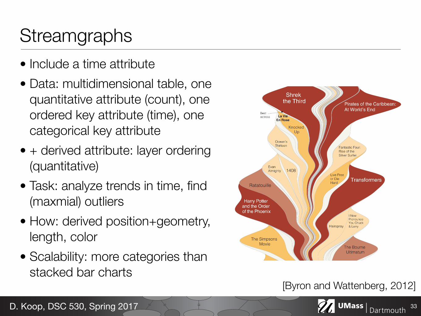
Streamgraphs• Include a time attribute • Data: multidimensional table, one
quantitative attribute (count), one ordered key attribute (time), one categorical key attribute
• + derived attribute: layer ordering (quantitative)
• Task: analyze trends in time, find (maxmial) outliers
• How: derived position+geometry, length, color
• Scalability: more categories than stacked bar charts
33D. Koop, DSC 530, Spring 2017
[Byron and Wattenberg, 2012]
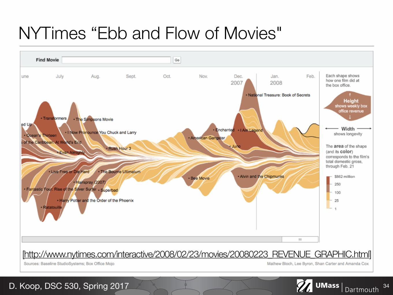
NYTimes “Ebb and Flow of Movies"
34D. Koop, DSC 530, Spring 2017
[http://www.nytimes.com/interactive/2008/02/23/movies/20080223_REVENUE_GRAPHIC.html]
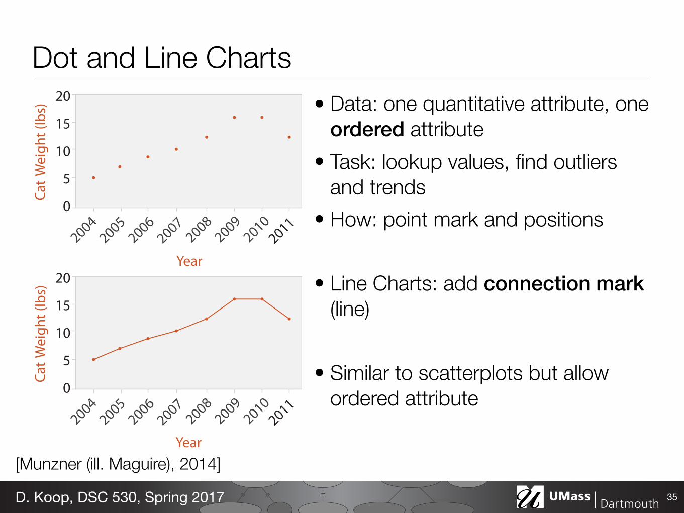
Dot and Line Charts• Data: one quantitative attribute, one
ordered attribute • Task: lookup values, find outliers
and trends • How: point mark and positions
• Line Charts: add connection mark (line)
• Similar to scatterplots but allow ordered attribute
35D. Koop, DSC 530, Spring 2017
20
15
10
5
0
Year20
15
10
5
0
Year[Munzner (ill. Maguire), 2014]
Female Male
60
50
40
30
20
10
0 Female Male
60
50
40
30
20
10
0
10-year-olds 12-year-olds
60
50
40
30
20
10
0
60
50
40
30
20
10
0 10-year-olds 12-year-olds
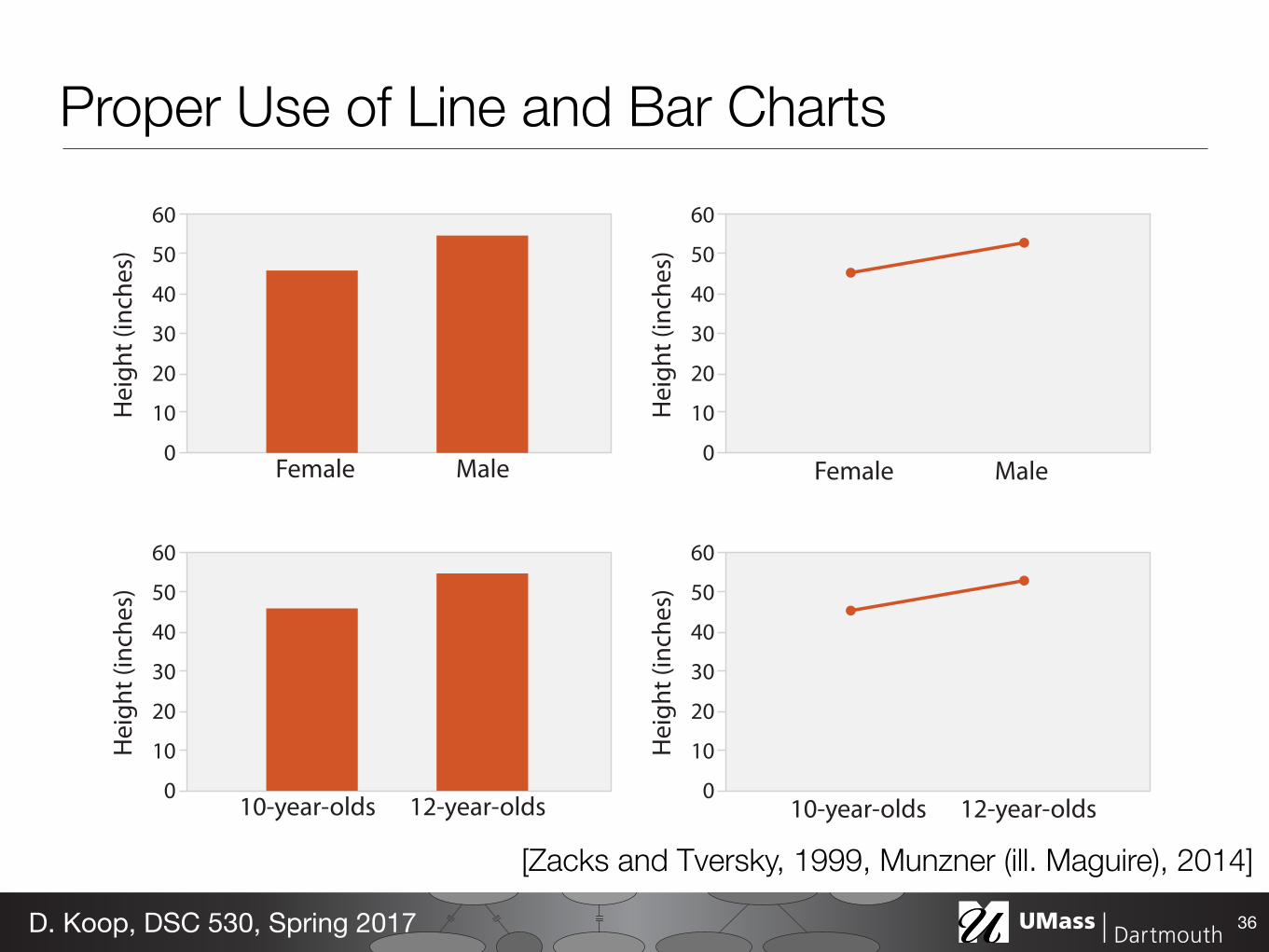
Proper Use of Line and Bar Charts
36D. Koop, DSC 530, Spring 2017
[Zacks and Tversky, 1999, Munzner (ill. Maguire), 2014]
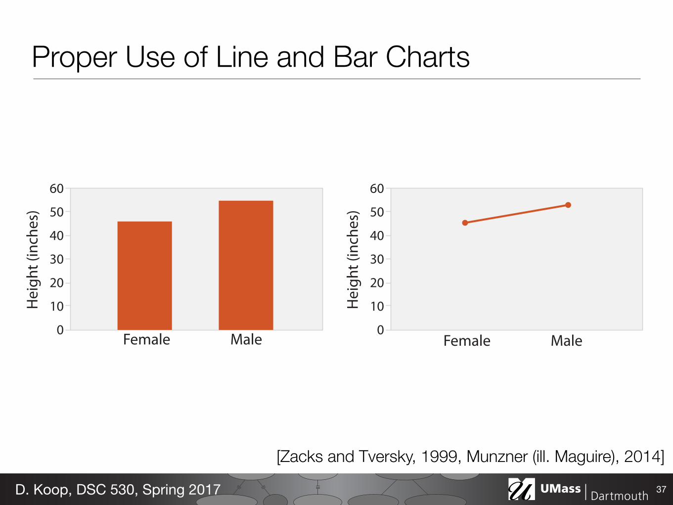
Proper Use of Line and Bar Charts
37D. Koop, DSC 530, Spring 2017
Female Male
60
50
40
30
20
10
0 Female Male
60
50
40
30
20
10
0
[Zacks and Tversky, 1999, Munzner (ill. Maguire), 2014]
Aspect Ratio• Trends in line charts are more apparent because we are using angle
as a channel • Perception of angle (and the relative difference between angles) is
important • Initial experiments found people best judge differences in slope
when angles are around 45 degrees (Cleveland et al., 1988, 1993)
38D. Koop, DSC 530, Spring 2017
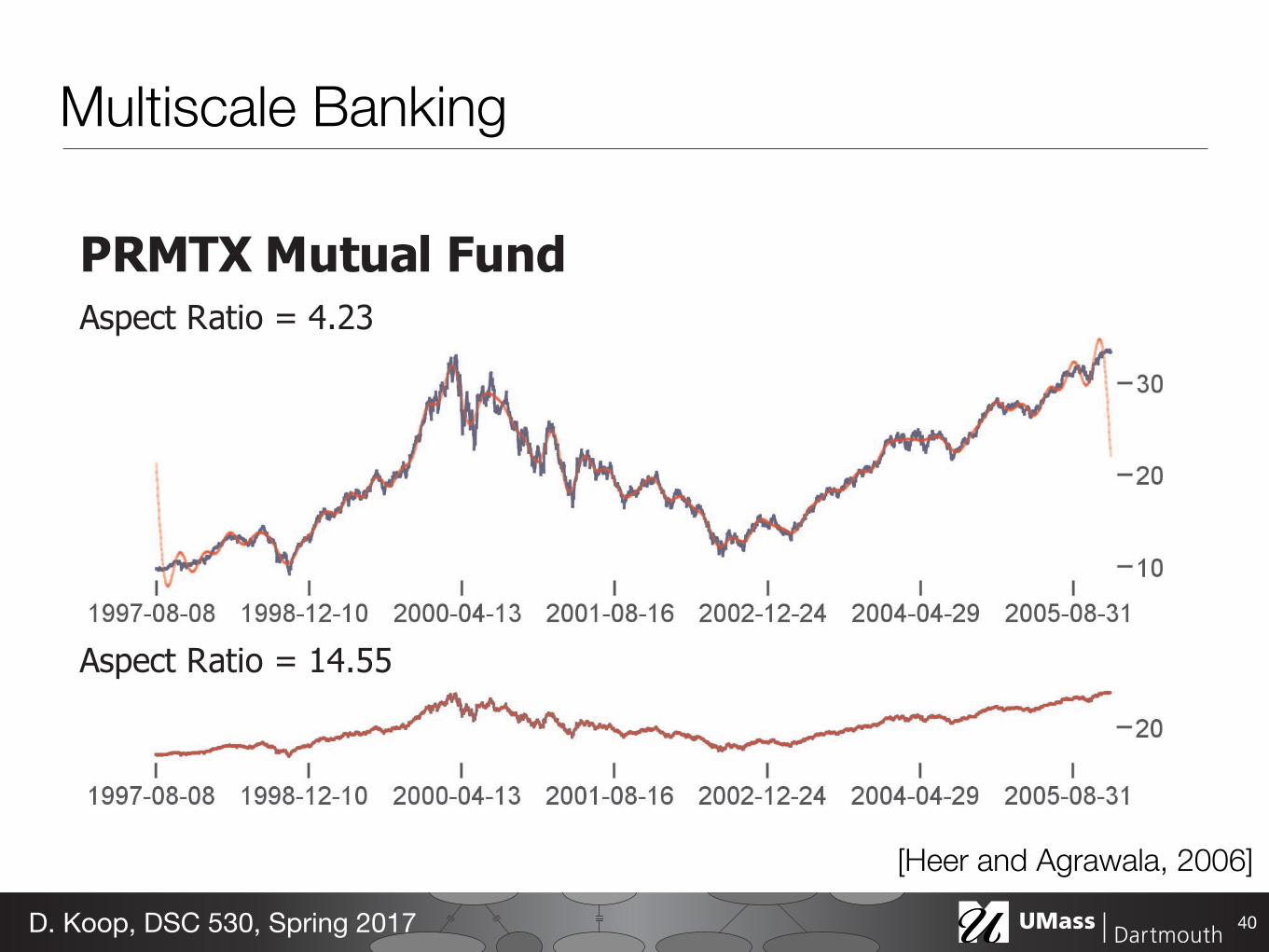
IEEE TRANSACTIONS ON VISUALIZATION AND COMPUTER GRAPHICS, VOL. 12, NO. 5, SEPTEMBER/OCTOBER 2006
Sunspot Cycles Aspect Ratio = 3.96
Aspect Ratio = 22.35
Power Spectrum
Aspect Ratios
Figure 5. Sunspot observations, 1700-1987. The first plot shows low-frequency oscillations in the maximum values of sunspot cycles. The second plot brings the individual cycles into greater relief. Carbon Dioxide Measurements Aspect Ratio = 1.17
Aspect Ratio = 7.87
Power Spectrum
Aspect Ratios
Figure 6. Monthly atmospheric CO2 measurements. The first plot shows a baseline trend of increasing values, with a slight inflection. The second plot more clearly communicates the yearly oscillations. Figures 5-8 show the results of applying multi-scale banking to real-world data sets. Data sets are plotted at each computed aspect ratio, with banked trend lines shown in red. The power spectrum plot shows a frequency-domain representation of the data, annotated with potential scales of interest. The aspect ratio plot shows the banked aspect ratios for each possible lowpass filtering of the data, annotated with the final aspect ratios returned by the algorithm.
PRMTX Mutual FundAspect Ratio = 4.23
Aspect Ratio = 14.55
Power Spectrum
Aspect Ratios
Figure 7. PRMTX mutual fund performance, 1997-2006. The first plot shows the boom and bust of the “dot-com” bubble and subsequent recovery. Tthe second plot affords closer consideration of short-term variations. Downloads of the prefuse toolkit Aspect Ratio = 1.44
Aspect Ratio = 2.89
Aspect Ratio = 8.81
Power Spectrum
Aspect Ratios
Figure 8. Daily download counts of the prefuse visualization toolkit. The first plot shows a general increase in downloads. The second plot shows weekly variations, including reduced downloads on the weekends. The third plot enables closer inspection of day-to-day spikes and decays.
706Multiscale Banking
39D. Koop, DSC 530, Spring 2017
[Heer and Agrawala, 2006]
IEEE TRANSACTIONS ON VISUALIZATION AND COMPUTER GRAPHICS, VOL. 12, NO. 5, SEPTEMBER/OCTOBER 2006
Sunspot Cycles Aspect Ratio = 3.96
Aspect Ratio = 22.35
Power Spectrum
Aspect Ratios
Figure 5. Sunspot observations, 1700-1987. The first plot shows low-frequency oscillations in the maximum values of sunspot cycles. The second plot brings the individual cycles into greater relief. Carbon Dioxide Measurements Aspect Ratio = 1.17
Aspect Ratio = 7.87
Power Spectrum
Aspect Ratios
Figure 6. Monthly atmospheric CO2 measurements. The first plot shows a baseline trend of increasing values, with a slight inflection. The second plot more clearly communicates the yearly oscillations. Figures 5-8 show the results of applying multi-scale banking to real-world data sets. Data sets are plotted at each computed aspect ratio, with banked trend lines shown in red. The power spectrum plot shows a frequency-domain representation of the data, annotated with potential scales of interest. The aspect ratio plot shows the banked aspect ratios for each possible lowpass filtering of the data, annotated with the final aspect ratios returned by the algorithm.
PRMTX Mutual FundAspect Ratio = 4.23
Aspect Ratio = 14.55
Power Spectrum
Aspect Ratios
Figure 7. PRMTX mutual fund performance, 1997-2006. The first plot shows the boom and bust of the “dot-com” bubble and subsequent recovery. Tthe second plot affords closer consideration of short-term variations. Downloads of the prefuse toolkit Aspect Ratio = 1.44
Aspect Ratio = 2.89
Aspect Ratio = 8.81
Power Spectrum
Aspect Ratios
Figure 8. Daily download counts of the prefuse visualization toolkit. The first plot shows a general increase in downloads. The second plot shows weekly variations, including reduced downloads on the weekends. The third plot enables closer inspection of day-to-day spikes and decays.
706 Multiscale Banking
40D. Koop, DSC 530, Spring 2017
[Heer and Agrawala, 2006]
As far as we can tell, there is no other work in perception on sloperatio estimation. However, there is substantial work on related percep-tual estimation problems that might provide insight. Fisher [9] foundthat people under and over estimated the orientation of a single 2D lineby as much as 3 degrees. The effect was largest for orientations near45°. Kennedy et al. [13] showed that angle perception is biased by thelengths of the angle’s legs. The effect was as large as 15 degrees forextremely scalene angles. Recent work on 2D angle perception haveexplained the traditional effect that small angles are overestimated andbig angles are underestimated as a result of a cognitive process that at-tempts to perceive the angles in 3D instead of 2D. The distribution ofangles that occur in the real-world bias this cognitive process to under-or overestimate 2D angles [14, 12]. The effect is up to 2 degrees and islargest for angles near 20°. Fermuller and Malm proposed a unifyingimage processing-based explanation for many types of illusions [7].
2.2 Aspect Ratio Algorithms
Banking to 45° has led to the design of automated algorithms for pick-ing good aspect ratios. Since it is not clear how to extend the Cleve-land et al. experimental results from plots with two line segments toplots with many line segments, multiple algorithms have been recom-mended. In the original paper, it was suggested that the aspect ratioof plots should be chosen such that the median segment slope was 1,an approach they called median absolute slope (MS). Cleveland latersuggested an alternative method, length-weighted average orientation(AWO), that sets the length-weighted average of the absolute segmentorientations (the angle made with the horizontal) to 45° [3]. Later,Heer and Agrawala [10] proposed the global orientation resolution(GOR) method that selects the aspect ratio by maximizing the sum ofsquares of the angles between all pairs of segments in the plot. A com-putationally cheaper approach is to only consider the angles betweenadjacent pairs of segments. Heer and Agrawala called this approachthe local orientation resolution (LOR). Recently, Talbot et al. [15] rec-ommended an approach based on minimizing the arc length of the datacurve and demonstrated that this approach is more robust than previ-ous work.
2.3 Line Chart Visualization
Beattie and Jones [1] examine business graphics in light of the sloperatio hypothesis and conclude that viewer perception of business per-formance is more accurate when graphs are banked to 45°. Best [2]compare how extrapolation of visual trends varied across a number ofdifferent chart types including line charts and find that the error de-pended upon the trend’s functional form. Correll et al. [6] explorehow aggregate comparisons are made in line charts and suggest analternate visualization based on a color encoding to make these com-parisons easier. Horizon plots [8, 11] permit compressing the verticalaxis of a line chart without changing the aspect ratio by overlayinghorizontal slices of the plot.
3 RESEARCH GOALS AND METHODS
Our objective is to better understand the theory behind aspect ratioselection. To do this, we revisit the question raised in the originalCleveland et al. study: how does slope ratio estimation accuracy de-pend on the true slope ratio and on the aspect ratio of the line segments(expressed as the mid-angle between the segments)? Our approach toanswering this question is twofold:
1. Based on insights gained from a series of pilot studies (Sec-tion 4), we develop an empirical model of human slope ratiojudgments (Section 5).
2. Then, through two formal experiments, we demonstrate that themodel fits observed data well and we provide a perceptual inter-pretation of its components (Sections 6 and 7).
In our model building process and in our experiments we follow thehigh-level design of the original study. However, we modify the studydesign to address two major limitations of their work.
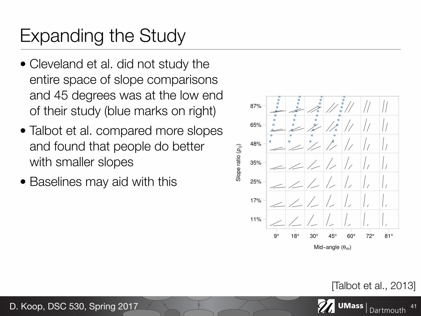
11%
17%
25%
35%
48%
65%
87%
9° 18° 30° 45° 60° 72° 81°
Mid−angle (θm)
Slo
pe r
atio
(p
ij)
Fig. 2. Space of line comparisons parameterized by mid-angle and anon-linear transformation of the true slope ratio. Line pairs used in thisstudy are plotted here. The spacing on the x-axis is not linear due to achange in our preferred parameterization during post-experiment dataanalysis. Line pairs used in Cleveland et al. are indicated with bluepoints.
First, the original design only covers a small portion of the spaceof slope pairs. In our work, we sample a much larger portion of thespace. The range of line pairs studied in our experiment is shown inFigure 2 parameterized by the mid-angle, θm, the angle halfway be-tween the line segments, and by the slope ratio (expressed as a per-centage), pi j, between two segments i and j. (Due to a change inparameterization part way through our analysis, our mid-angle sam-ples are spaced slightly unevenly.) In comparison, the set of line pairsstudied in Cleveland et al., shown with blue points in Figure 2, spans amuch smaller range. To keep the sample count manageable, we sampleless frequently along the slope ratio-axis than Cleveland et al; however,our pilot studies and Figure 6 in Cleveland and McGill [5] indicate thatthe slope estimation error function changes slowly in this direction soa lower sampling rate makes better use of limited subject time.
Second, in the Cleveland et al. design, subjects were explicitly in-structed to make their slope estimates by comparing the heights (y-extent) of both lines. This approach is exactly correct if the x-extent ofboth lines is the same. However, we wonder if this is how most visu-alization users would naturally approach the slope estimation task. Toexplore how users make slope comparisons in practice, we omit thisinstruction in our studies, instead allowing subjects to use their ownapproach to the problem.
4 PILOT STUDIES
To help us better understand the slope ratio estimation task, we ran aseries of 11 pilot studies on Amazon Turk. We used these informal,rapid studies to quickly iterate on our experimental design and to ex-plore a variety of model possibilities.
For example, in early iterations we used a study design with 100distinct slope comparison tasks (the product of 10 mid-angles and 10slope ratios), but found that this resolution was unnecessary since theshape of the response function was relatively smooth. In later itera-tions, we settled on the design shown in Figure 2 with 49 (7×7) slopecomparisons, allowing us to run double the number of replications atthe same cost. We also found that linear sampling of the slope ratioresulted in many line pairs that were visually indistinguishable. So wemodified our design to vary the true slope ratio nonlinearly making thechange in the visual angle between line segments equal.
Expanding the Study• Cleveland et al. did not study the
entire space of slope comparisons and 45 degrees was at the low end of their study (blue marks on right)
• Talbot et al. compared more slopes and found that people do better with smaller slopes
• Baselines may aid with this
41D. Koop, DSC 530, Spring 2017
[Talbot et al., 2013]
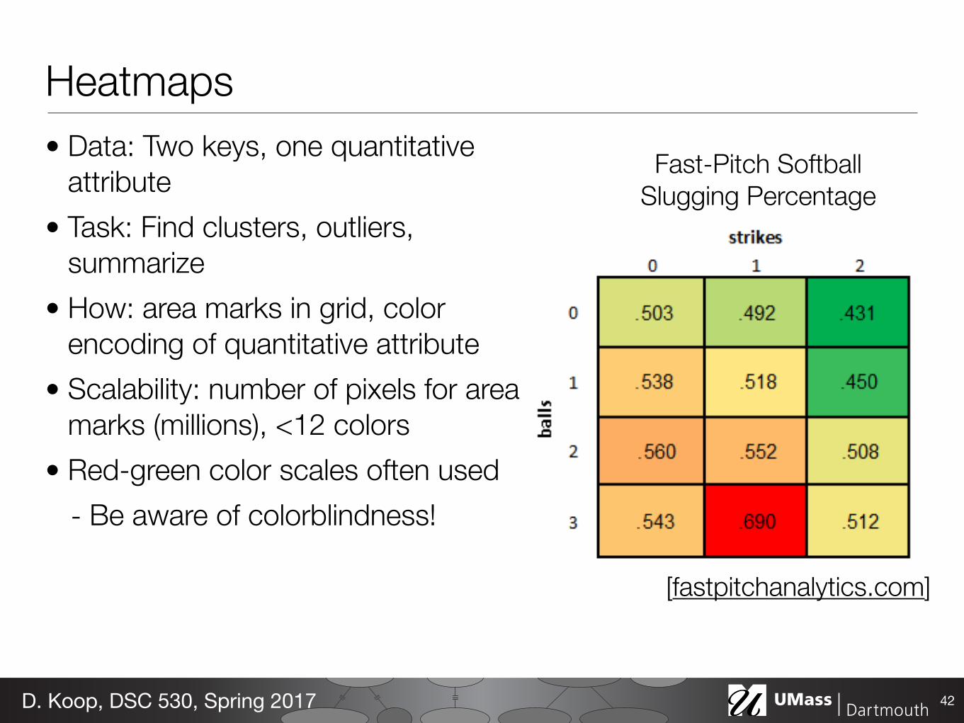
Heatmaps• Data: Two keys, one quantitative
attribute • Task: Find clusters, outliers,
summarize • How: area marks in grid, color
encoding of quantitative attribute • Scalability: number of pixels for area
marks (millions), <12 colors • Red-green color scales often used
- Be aware of colorblindness!
42D. Koop, DSC 530, Spring 2017
[fastpitchanalytics.com]
Fast-Pitch Softball Slugging Percentage

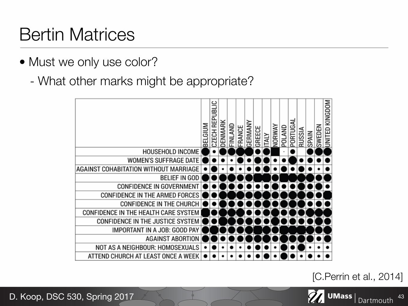
Bertin Matrices• Must we only use color?
- What other marks might be appropriate?
43D. Koop, DSC 530, Spring 2017
[C.Perrin et al., 2014]
Bertin Matrices• Must we only use color?
- What other marks might be appropriate?
43D. Koop, DSC 530, Spring 2017
[C.Perrin et al., 2014]
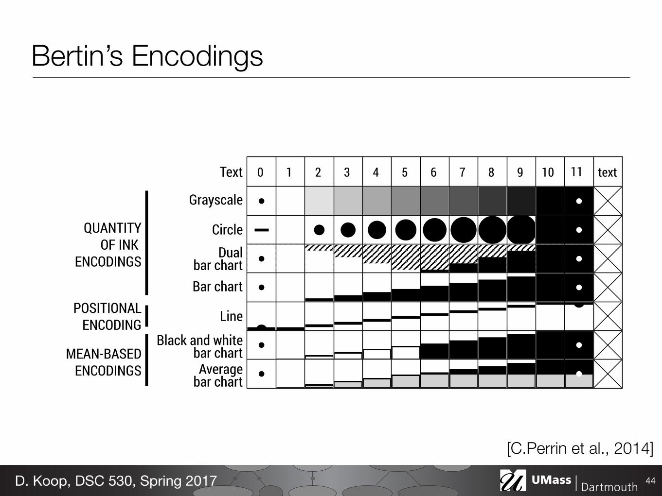
Fig. 6. Using a crosset to adjust the range of three rows at a time.
Figure 6). Compared to standard spreadsheet interactions for resizingrows or columns, the resizing crosset does not require the selectionto be specified in advance. Since this operation impacts the layout ofcrossets, the tool only shows a partial preview. The same is true forseparator adjustment tools and the automatic reordering tool.
By supporting crossing-based interactions, BERTIFIER makes it pos-sible to quickly change arbitrary groups of adjacent rows and columns,which is useful in many cases, including for automatically reorder-ing rows or columns within identified groups. Crossing all rows orcolumns allows users to apply operations to the entire table in a quasi-instantaneous manner, provided the table fits the screen. All theseinteractions remain consistent across all tools.
Crossets extend previous work on crossing-based interfaces in sev-eral ways [1, 2, 5]. One problem with such interfaces is that they requiresteering, a slow motor task [1]. Crossets do not have this problem sincethe command is selected on mouse press, after which the user is allowedto freely deviate from a straight trajectory. As far as we know, crossinggestures have never been applied to manipulate multiple sliders at once,and have never been used to interact with tables.
4.3 Human-Assisted ReorderingHuman-Assisted reordering is supported both through manual reorder-ing interactions and through automatic visual reordering.
4.3.1 Manual Reordering Interactions
As in previous implementations [14, 45, 46, 49], we support columnand row reordering by drag and drop. This is the first level of integra-tion between automatic and manual reordering, and allows to tweakthe results of automatic reordering [33]. Following previous findingsthat reordering rows and columns concurrently can be confusing tousers [49], we lock the reordering on the row or column based onthe initial dragging direction. To help users understand changes, weperform animated transitions during the dragging operation.
Following previous recommendations [49–51], we also support drag-ging on sets of rows and columns. We provide a tool that lets users“glue” several rows or columns together (Figure 5 bottom right). Sincewe distinguish between groups used for concurrent manipulation andvisual groups (i.e., separators), we avoided the ambiguous term “group”.Our automatic reordering algorithm preserves rows and columns gluedtogether by the user, thus providing a second level of integration.
4.3.2 Automatic Visual Reordering
The principle of automatic visual reodering is that rows and columnsare reordered not according to the underlying data, but according totheir visual similarity. We believe this principle is easier to understandfor users not familiar with data analysis. Visual reordering is only auser interface metaphor that does not have to accurately capture whatthe system is doing, but which is meant to elicit a simple and “goodenough” mental model of the system to allow for easy tuning.
The implementation of this metaphor is fairly simple and relies ontwo basic principles: i) the reordering algorithm should take as inputthe data after it has been conditioned and normalized (e.g., betwewn0 and 1), and ii) the visual encodings used should ensure that visualdifferences are roughly proportional to numerical differences. Fromthis it follows that the automatic reordering algorithm will behave as ifit were operating visually. Next we discuss to what extent the conditionii) is fulfilled by the visual encodings implemented in BERTIFIER.
0 1 2 3 4 5 6 7 8 9 10 11 textText
Grayscale
Circle
Line
Bar chart
Black and whitebar chartAverage
bar chart
Dualbar chart
QUANTITYOF INK
ENCODINGS
POSITIONALENCODING
MEAN-BASEDENCODINGS
Fig. 7. Encodings in BERTIFIER. The range of each row is set to [1, 10]. 0and 11 are beyond the range. Crosses encode N/A values.
4.3.3 Visual Encodings
BERTIFIER implements eight types of visual encodings (Figure 7). Forthe sake of generality, we consider text as being one type of encoding.Automatic reordering is however disabled on text to reinforce the visualreordering metaphor. All encodings except grayscale have been eitherexplicitly mentioned in Bertin’s book [10] or were used by him. Thesoftware can be easily extended with other types of encodings.
The black and white bar charts and average bar charts are particularin that they encode summary statistics in addition to value: valueslower than the mean are shown in white or gray, while values above themean are shown in black. The line encoding is also different in that ituses a positional encoding. These three encodings have been only usedoccasionally and are not implemented in any of the physical matrices.
The remaining encodings are more common and all roughly followthe rule that the quantity of ink—the average pixel darkness—is propor-tional to the normalized data value. We enforced this rule to make theencodings consistent with the visual reordering metaphor. For example,the dual bar chart encodes the values from white to black, with a fullyhatched cell corresponding to the mean value of the row. In this case,we use a 50% hatching to respect the rule of proportionality. Thus forthese four encodings, computing a numerical difference between cellsis equivalent to computing the difference in their average shading. Therule of proportionality is challenging to implement for the “circle” en-coding, since the circle is clipped and progressively turns into a square.We chose to replicate Bertin’s original encoding although previouswork described an optimal scale for symbol size discrimination [38].Deriving the correct circle radius is a geometrical problem without anyanalytic solution, but we found the following good approximation:
r =
(D = 2
pv/⇡ if v ⇡
412 (t+ t6)(
p2� 1) + 1 with t = D�1
2/⇡�1 if v > ⇡4
with v being the cell value and r the (unclipped) circle radius.
4.3.4 Interactive Data Conditioning
Although users can pre-process their data in their spreadsheet as partof step S1, BERTIFIER provides tools for performing further dataconditioning of rows on-the-fly (the “Adjust” toolbar in Figure 5).Slider crossets are provided for i) adjusting the data range and clippingthe values accordingly, ii) reducing the maximum value of the data(which has the effect of making all cells look brighter or disappear),iii) turning values into discrete steps. In addition, users can iv) invertrow or columns values. i), iii) and iv) have been recommended byBertin [12] and i), ii) and iii) are implemented in CHART [7].
These operations change the matrix visually in a similar way asphoto retouching tools. Since the automatic reordering is performedon post-processed values, these controls provide a way of fine-tuningthe reordering algorithm without explicitly tuning any of its internalparameters. Specifically, rows that are made brighter will be given alower weight by the reordering algorithm. Rows that are made entirelywhite will be ignored. A specific case of this is making all rows whiteexcept one, which enables a regular sorting operation.
Sometimes it is useful to provide custom ranges (e. g., for applying auniform range to all rows). To achieve this, users can specify the rangeof each row in the initial spreadsheet, using special header names. Acrosset in BERTIFIER allows to enable or disable this custom range.
Bertin’s Encodings
44D. Koop, DSC 530, Spring 2017
[C.Perrin et al., 2014]
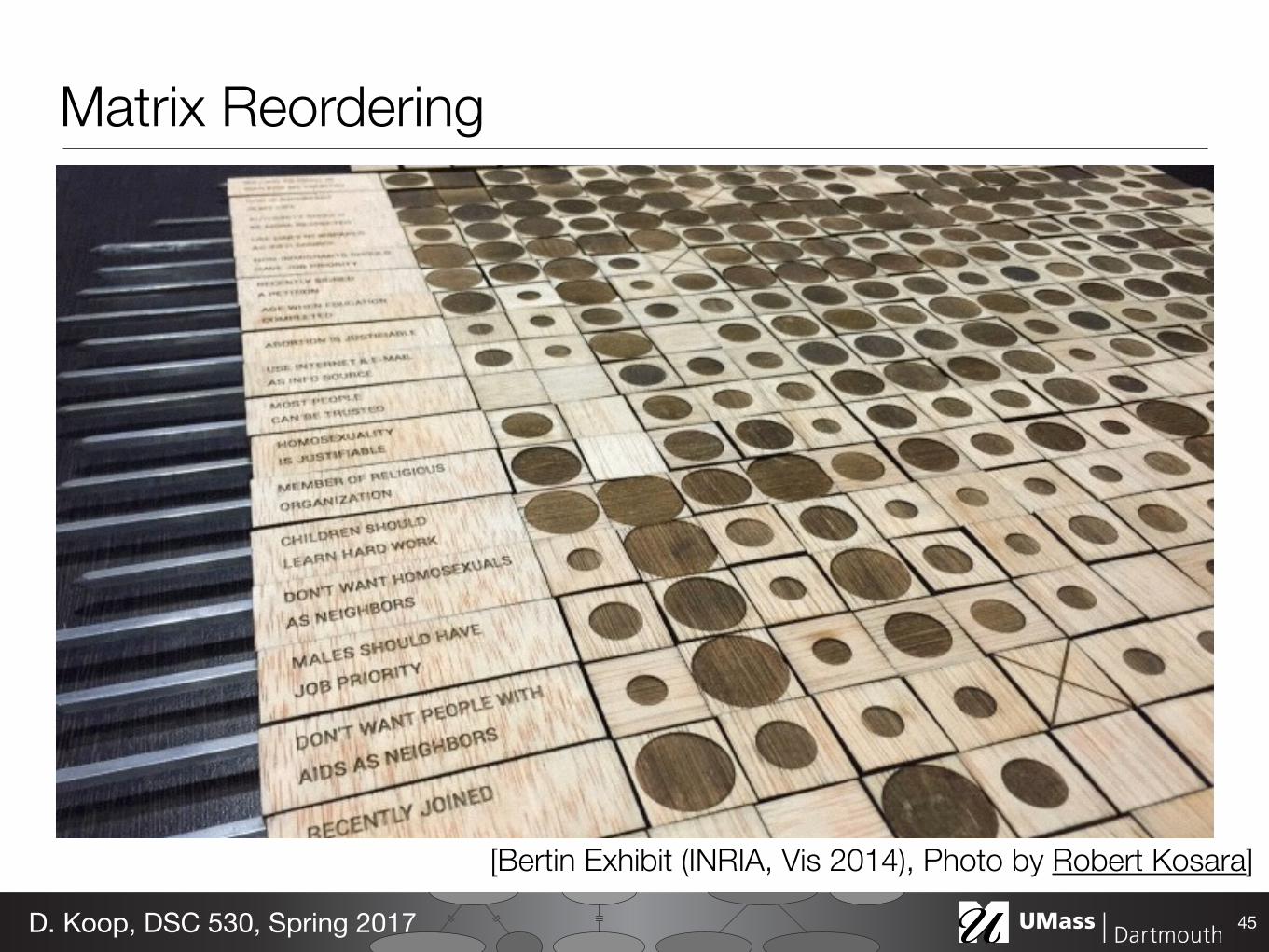
Matrix Reordering
45D. Koop, DSC 530, Spring 2017
[Bertin Exhibit (INRIA, Vis 2014), Photo by Robert Kosara]
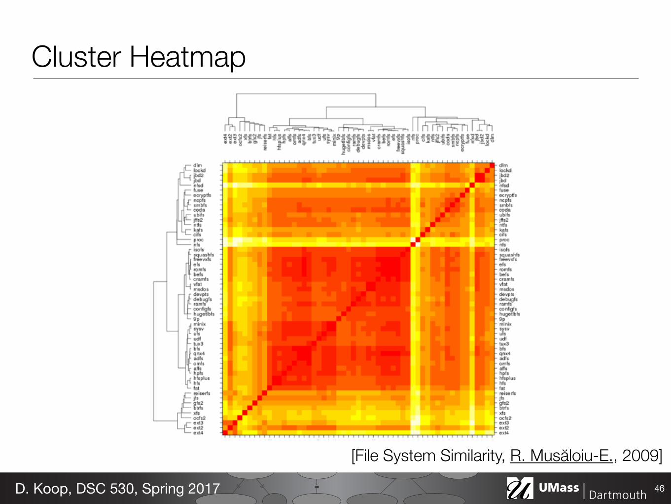
Cluster Heatmap
46D. Koop, DSC 530, Spring 2017
[File System Similarity, R. Musăloiu-E., 2009]
Cluster Heatmap• Data & Task: Same as Heatmap • How: Area marks but matrix is ordered by cluster hierarchies • Scalability: limited by the cluster dendrogram
• Dendrogram: a visual encoding of tree data with leaves aligned
47D. Koop, DSC 530, Spring 2017
Sepal.Length
2.0 3.0 4.0
●●
●●
●
●
●
●
●
●
●
●●
●
● ●●
●
●
●●
●
●
●●
● ●●●
●●
●●●
●●
●
●
●
●●
● ●
● ●●
●
●
●●
●
●
●
●
●
●
●
●
●
●●
●● ●
●
●
●●
●
●●
●●
●●●
● ●
●●
●●●●
●
●
●
●
●●●
●●
●
● ●●
●
●
●
●
●
●
●●
●
●
●
●
●
●●
●
● ●
●●
●●
●
●
●
●
●
●
●
● ●●
●●
●
●●●
●
●●
●
●●●
●
●●●
●●
●●
●●●●
●
●
●
●
●
●
●
●●
●
●●●●
●
●●
●
●
●●
●●●●
●●
●●●
●●
●
●
●
●●
●●
●●●●
●
●●
●
●
●
●
●
●
●
●
●
●●
●●●
●
●
●●
●
●●
●●
●●●
●●
●●●●●
●
●
●
●
●
●●●
●●
●
●●●
●
●
●
●
●
●
●●
●
●
●
●
●
●●
●
●●
●●
●●
●
●
●
●
●
●
●
●●●
●●
●
●●●
●
●●
●
●●
●
●
●●●
●●●
●
0.5 1.5 2.5
4.5
5.5
6.5
7.5
●●●●
●
●
●
●
●
●
●
●●
●
● ●●
●
●
●●
●
●
●●● ●●●
●●
●●●
●●
●
●
●
●●
●●
●●●
●
●
●●
●
●
●
●
●
●
●
●
●
●●
●● ●
●
●
●●
●
●●
●●
●●●● ●
●●●●●
●
●
●
●
●
●●●
●●
●
●●●
●
●
●
●
●
●
●●
●
●
●
●
●
●●
●
● ●
●●
●●
●
●
●
●
●
●
●
●●●
●●
●
●●●
●
●●
●
●●
●
●
● ●●
●●
●●
2.0
3.0
4.0
●
●●●
●
●
● ●
●●
●
●
●●
●
●
●
●
●●
●
●●
●●
●
●●●
●●
●
●●
●●
●●
●
●●
●
●
●
●
●
●
●
●
●●●●
●
●●
●
●
●●
●
●
●
●●●
●
●
●
●
●
●
●
●●●●●
●
●●●
●●
●
●
●
●
●
●●
●
●
●
●
●● ●
●
●
●
●
●●● ●
●
●
●
●
●
●
●
●
●
●●
●
●
●
●
● ●●
●●
●●
●●●
●
●●●
●
●
●●
●●●
●
●●
●
●
●
●
●Sepal.Width
●
●●●
●
●
●●
●●
●
●
●●
●
●
●
●
●●
●
●●
●●
●
●●●●●
●
●●
●●
●●
●
●●
●
●
●
●
●
●
●
●
●●●●
●
●●
●
●
●●
●
●
●
●●●●
●
●
●
●
●
●
●●●
●●
●
●●●
● ●
●
●
●
●
●
●●
●
●
●
●
●●●
●
●
●
●
●●● ●
●
●
●
●
●
●
●
●
●
●●
●
●
●
●
● ●●
●●
●●
●●●
●
●●●
●
●
●●
●●●
●
●●
●
●
●
●
●
●
●●●
●
●
●●
●●
●
●
●●
●
●
●
●
●●
●
●●
●●
●
●●●●●
●
●●
●●
●●
●
●●
●
●
●
●
●
●
●
●
●●●●
●
●●
●
●
●●
●
●
●
●●●●
●
●
●
●
●
●
●●●●
●●
●●●
● ●
●
●
●
●
●
●●
●
●
●
●
●●●
●
●
●
●
●●
●●
●
●
●
●
●
●
●
●
●
●●
●
●
●
●
●●●
●●
●●
●●
●
●
●●●
●
●
●●
● ●●
●
●●
●
●
●
●
●
●●●● ●●
● ●● ● ●●●● ●
●●●●● ●●
●
●●●●●●●● ●● ●●● ●●● ●●●●●●
● ●● ●●
●●●
●
●● ●
●
●
●●
●●
●
●
●●●
●
●
●
●
●●●●
●●●
●●● ●
●
● ● ●●
●●● ●
●
●
●●● ●
●
●
●
●
●●●
●
●
●●
●
●●●
●●●●
●●
●
●
●
●
●
●●
●●
● ●●
●
●●
●●
●●
●
●●●●
●●●●●●
●
●● ●● ●●
●●● ● ●●●● ●
●●●●●● ●
●
●●● ●●●●● ● ●●●● ●●● ●●● ●
●●
● ●● ●●
●●●
●
●● ●
●
●
●●
●●
●
●
●●●
●
●
●
●
● ●●●
● ●●
●●● ●
●
● ●●●
●●● ●
●
●
● ●●●
●
●
●
●
●●●
●
●
●●
●
●● ●● ● ●●
●●
●
●
●
●
●
●●
● ●
● ●●
●
●●
●●
●●
●
●●●●
●●●● ● ●●
Petal.Length
12
34
56
7
●●●●●●
●●●●●●●●●
●●●●●● ●
●
●●● ●●●●● ●●●●●●●●●●●●
●●
●●●●●
●●●
●
●● ●
●
●
●●
●●
●
●
●●●
●
●
●
●
●●●●● ●●
●●● ●
●
●●●●●●
● ●
●
●
●●●●
●
●
●
●
●● ●
●
●
●●
●
●●●
● ●●●
●●
●
●
●
●
●
●●
●●
●●●●
●●
●●●●
●
● ●●●
● ●●●●●
●
4.5 5.5 6.5 7.5
0.5
1.5
2.5
●●●● ●●
●●●●
●●●●
●●●
● ●●●
●●
●
●●●●●●●●
●●●● ●
●● ●
●●●
●●
●●● ●●
●● ●
●●
●
●
●
●●
●
●
●
●●
●●
●
●
●
●
●●
●●●●
●●
●●●
●
●●
●●
●●●●
●●
●
●●● ●
●●
●
●●
●
●●
●●●
●
●●
●●
●●
●
●●
●
●
● ●●
●
●●●
●
●
●●
●
●●
●●
●●
●
●●
●
●●●
●●
●
●
●● ●● ●●
●●●
●●●
●●●
●●● ●●
●●
●
●
●●●●●●●
●
●●●● ●
●● ●
●●●
●●
●●● ●●
●●●
●●●
●
●
●●
●
●
●
●●
●●
●
●
●
●
●●
●●●●
●●
●●●
●
●●
●●
● ●●●
●●
●
●●
●●●
●
●
●●
●
●●
●●●
●
●●
●●
●●
●
●●
●
●
●●●
●
●● ●
●
●
●●
●
●●
●●
●●
●
●●
●
●●
●
●●
●
●
1 2 3 4 5 6 7
●●●●●●
●●●●●●●●
●●●●●●●
●●
●
●●●●●●●●
●●●●●●●●●●●
●●
●●●●●
●●●
●●●
●
●
●●
●
●
●
●●
●●
●
●
●
●
●●
●●●●
●●
●●●●
●●●●
●●●●●
●●
●●●●
●●
●
●●
●
●●
●●●
●
●●●
●
●●
●
●●
●
●
● ●●
●
●●●
●
●
●●
●
●●
●●
●●
●
●●
●
●●
●
●●
●
●
Petal.Width
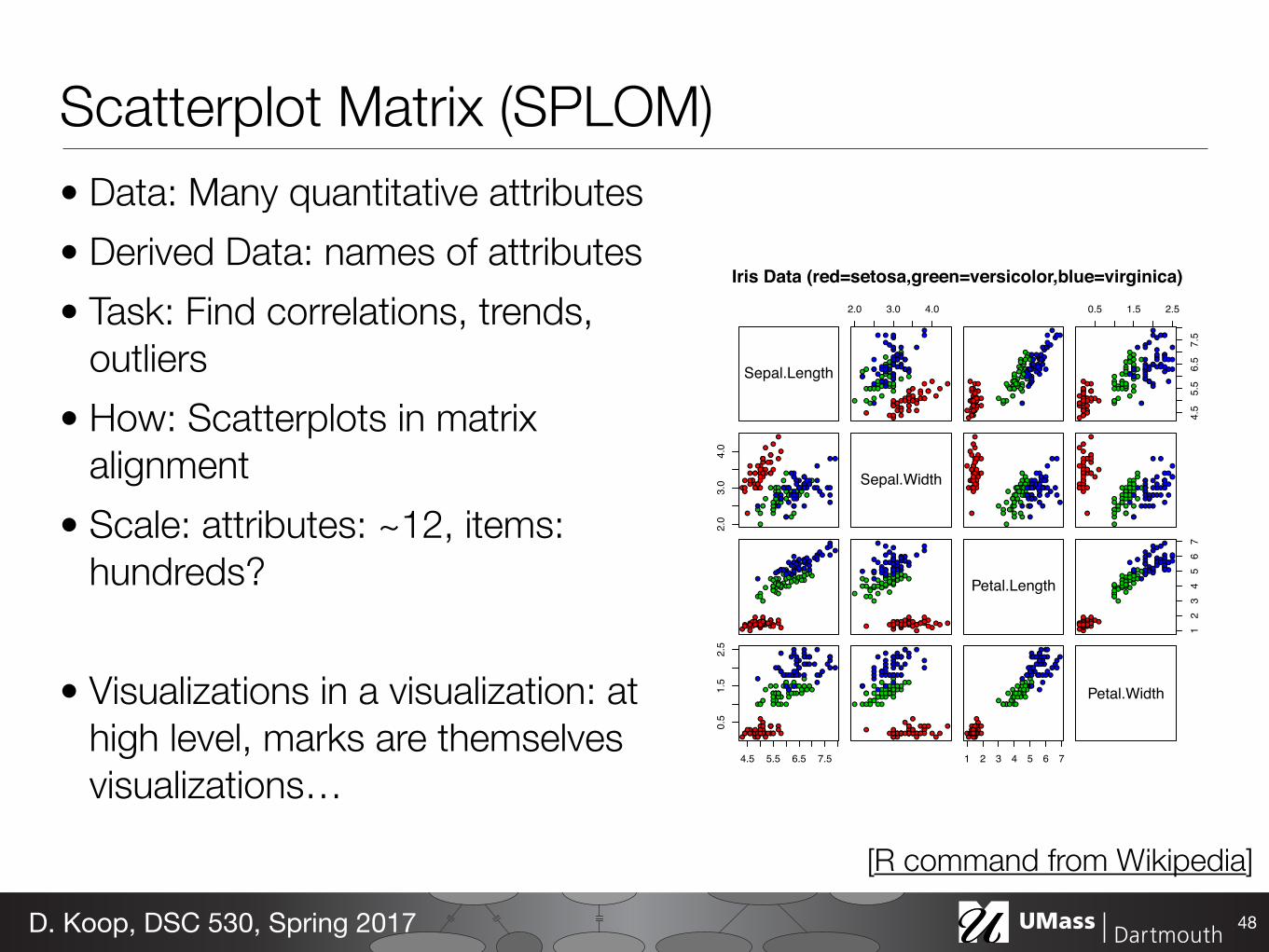
Iris Data (red=setosa,green=versicolor,blue=virginica)
Scatterplot Matrix (SPLOM)• Data: Many quantitative attributes • Derived Data: names of attributes • Task: Find correlations, trends,
outliers • How: Scatterplots in matrix
alignment • Scale: attributes: ~12, items:
hundreds?
• Visualizations in a visualization: at high level, marks are themselves visualizations…
48D. Koop, DSC 530, Spring 2017
[R command from Wikipedia]
Spatial Axis Orientation• So far, we have seen the vertical
and horizontal axes (a rectilinear layout) used to encode almost everything
• What other possibilities are there for axes?
49D. Koop, DSC 530, Spring 2017
[Munzner (ill. Maguire), 2014]
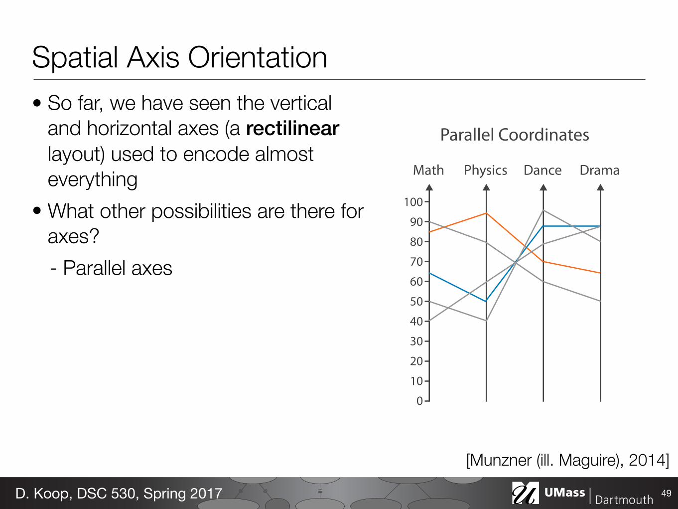
Math Physics Dance Drama
1009080706050 40302010
0
Parallel Coordinates
Spatial Axis Orientation• So far, we have seen the vertical
and horizontal axes (a rectilinear layout) used to encode almost everything
• What other possibilities are there for axes?- Parallel axes
49D. Koop, DSC 530, Spring 2017
[Munzner (ill. Maguire), 2014]
Math Physics Dance Drama
1009080706050 40302010
0
Parallel Coordinates
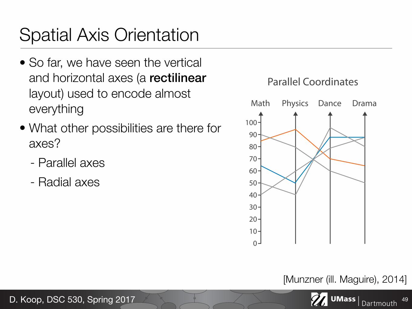
Spatial Axis Orientation• So far, we have seen the vertical
and horizontal axes (a rectilinear layout) used to encode almost everything
• What other possibilities are there for axes?- Parallel axes- Radial axes
49D. Koop, DSC 530, Spring 2017
[Munzner (ill. Maguire), 2014]
90°60°
30°
0°
330°
300°270°
240°
210°
180°
150°
120°
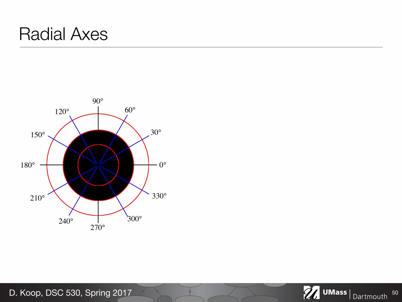
Radial Axes
50D. Koop, DSC 530, Spring 2017
90°60°
30°
0°
330°
300°270°
240°
210°
180°
150°
120°
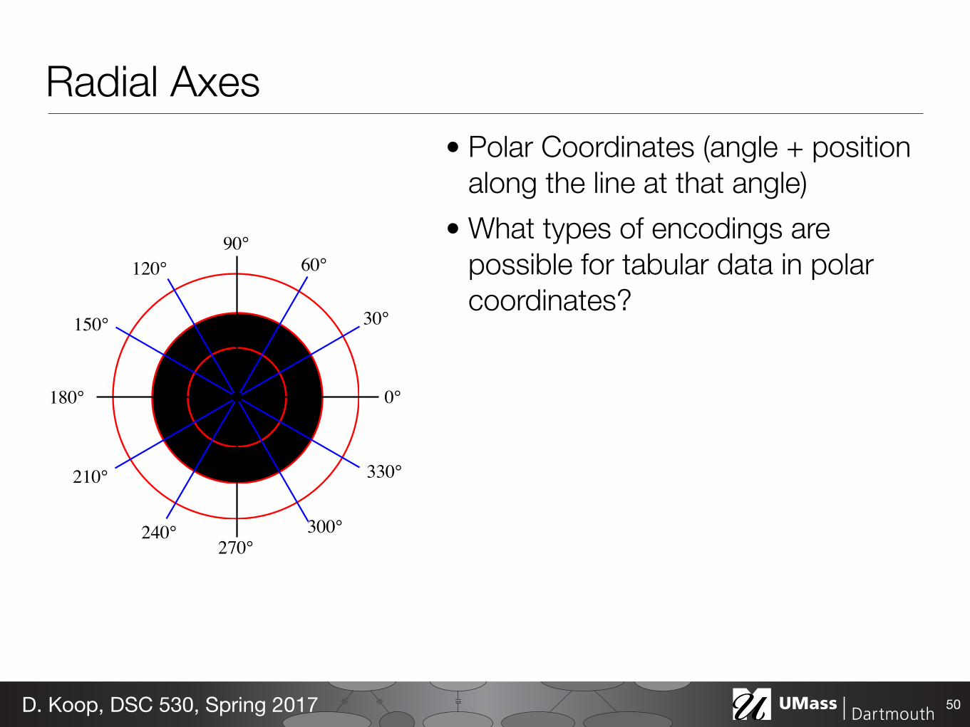
Radial Axes• Polar Coordinates (angle + position
along the line at that angle)• What types of encodings are
possible for tabular data in polar coordinates?
50D. Koop, DSC 530, Spring 2017
90°60°
30°
0°
330°
300°270°
240°
210°
180°
150°
120°
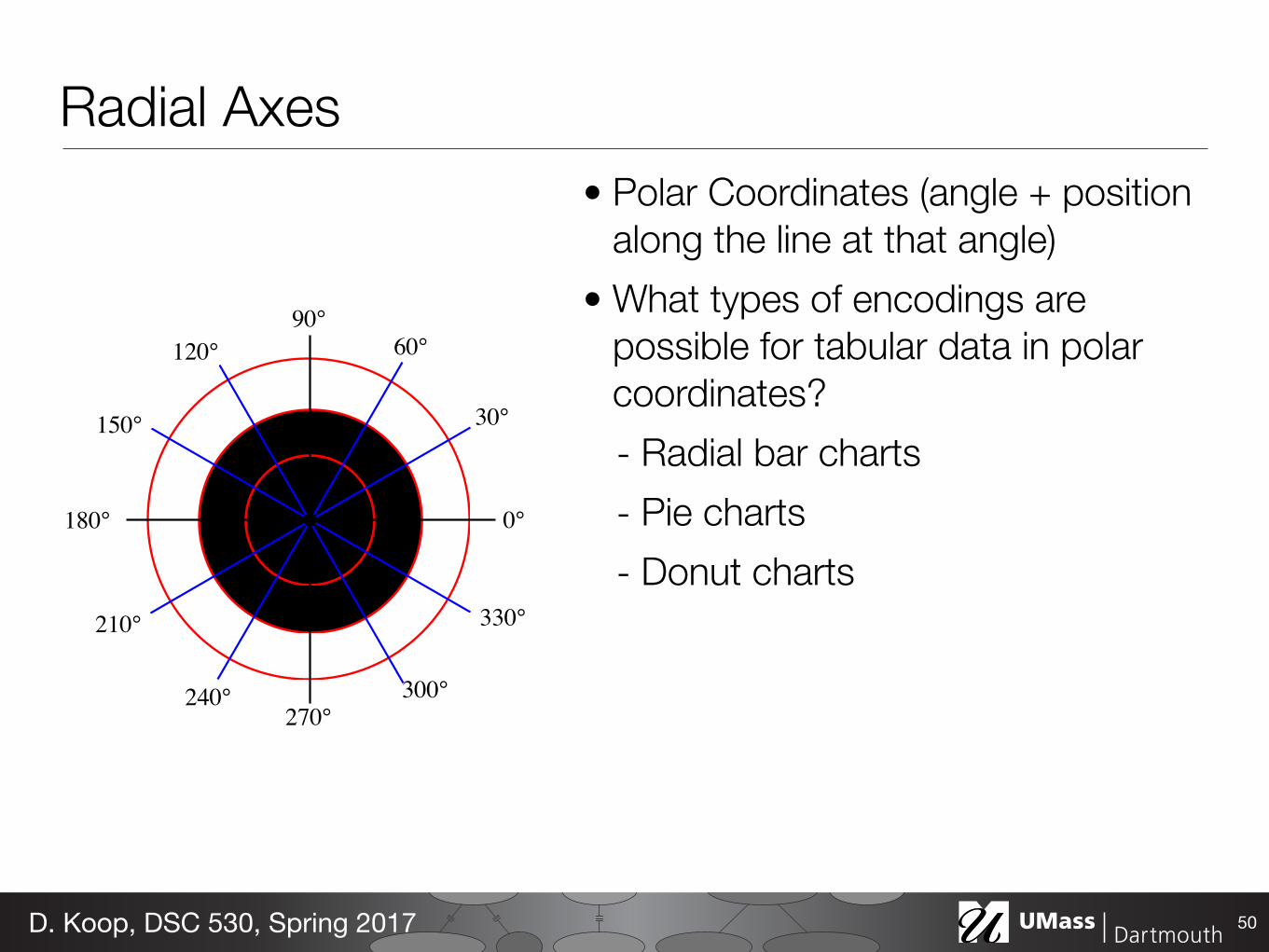
Radial Axes• Polar Coordinates (angle + position
along the line at that angle)• What types of encodings are
possible for tabular data in polar coordinates?- Radial bar charts- Pie charts- Donut charts
50D. Koop, DSC 530, Spring 2017
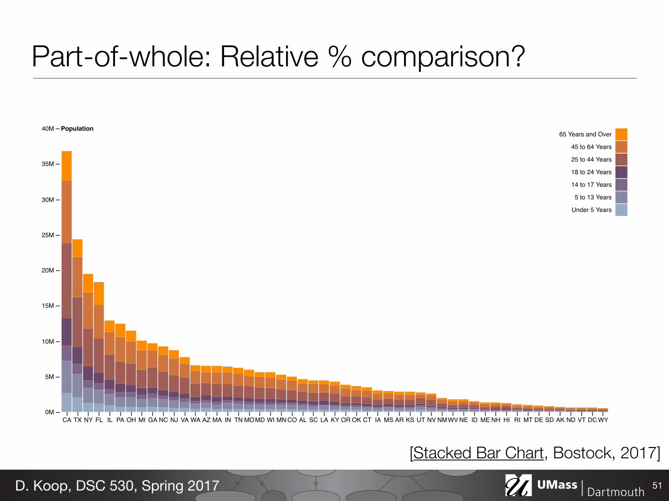
CA TX NY FL IL PA OH MI GA NC NJ VA WA AZ MA IN TN MOMD WI MN CO AL SC LA KY OR OK CT IA MS AR KS UT NV NMWV NE ID ME NH HI RI MT DE SD AK ND VT DC WY0M
5M
10M
15M
20M
25M
30M
35M
40M Population65 Years and Over
45 to 64 Years
25 to 44 Years
18 to 24 Years
14 to 17 Years
5 to 13 Years
Under 5 Years
Part-of-whole: Relative % comparison?
51D. Koop, DSC 530, Spring 2017
[Stacked Bar Chart, Bostock, 2017]
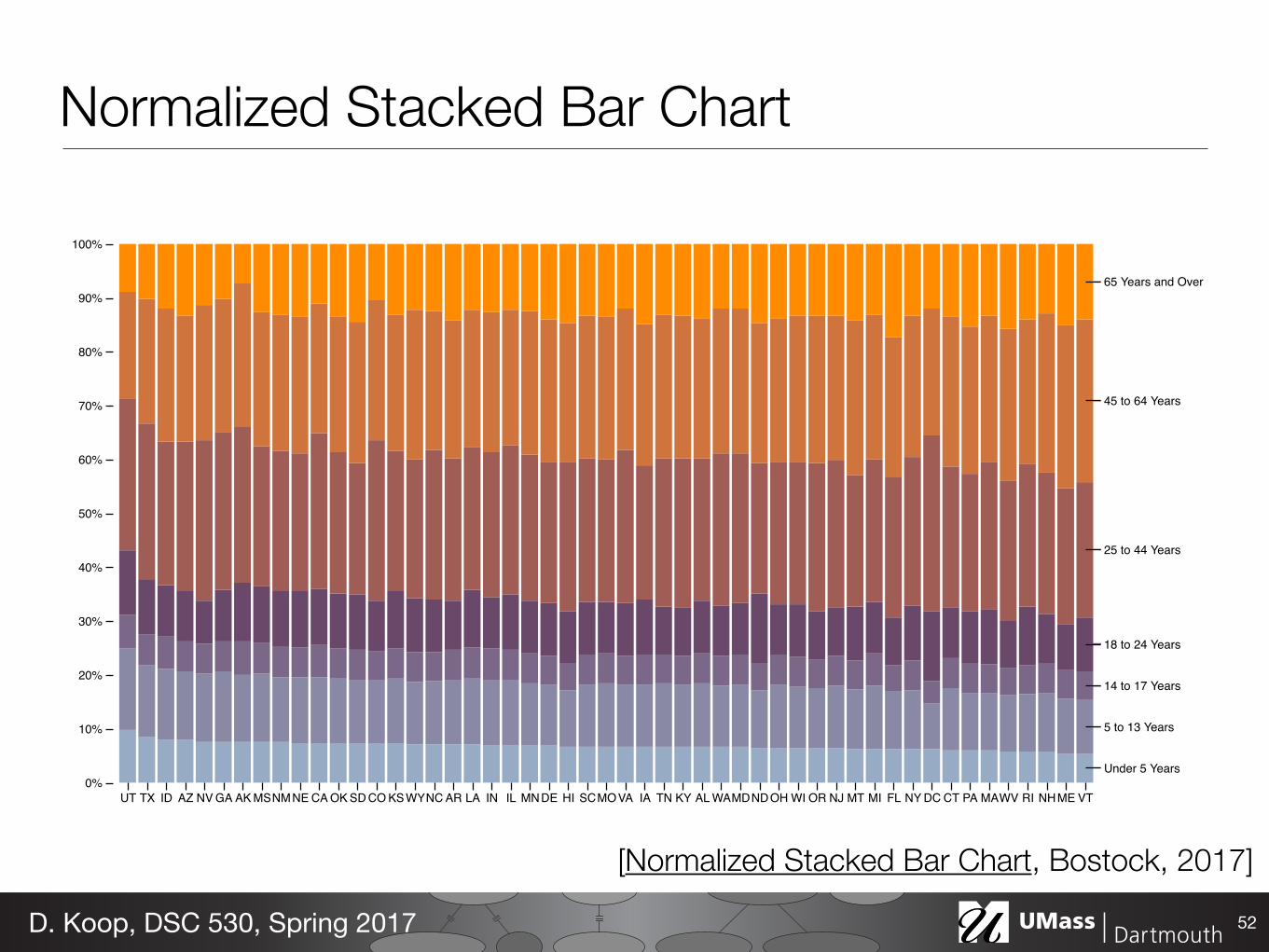
Under 5 Years
5 to 13 Years
14 to 17 Years
18 to 24 Years
25 to 44 Years
45 to 64 Years
65 Years and Over
UT TX ID AZ NV GA AK MSNMNE CA OK SD CO KSWYNC AR LA IN IL MNDE HI SCMOVA IA TN KY AL WAMDNDOH WI OR NJ MT MI FL NY DC CT PA MAWV RI NHME VT0%
10%
20%
30%
40%
50%
60%
70%
80%
90%
100%
Normalized Stacked Bar Chart
52D. Koop, DSC 530, Spring 2017
[Normalized Stacked Bar Chart, Bostock, 2017]
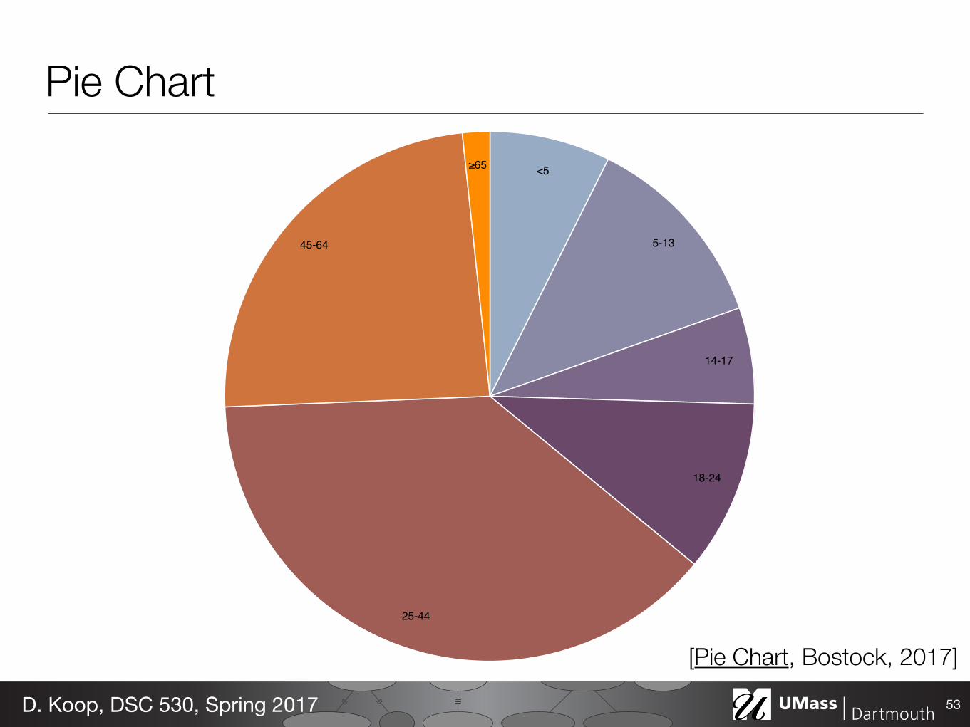
<5
5-13
14-17
18-24
25-44
45-64
65
Pie Chart
53D. Koop, DSC 530, Spring 2017
[Pie Chart, Bostock, 2017]
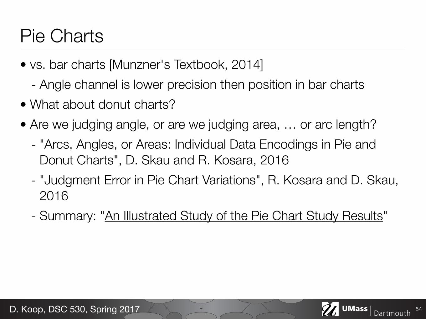
Pie Charts• vs. bar charts [Munzner's Textbook, 2014]
- Angle channel is lower precision then position in bar charts • What about donut charts? • Are we judging angle, or are we judging area, … or arc length?
- "Arcs, Angles, or Areas: Individual Data Encodings in Pie and Donut Charts", D. Skau and R. Kosara, 2016
- "Judgment Error in Pie Chart Variations", R. Kosara and D. Skau, 2016
- Summary: "An Illustrated Study of the Pie Chart Study Results"
54D. Koop, DSC 530, Spring 2017
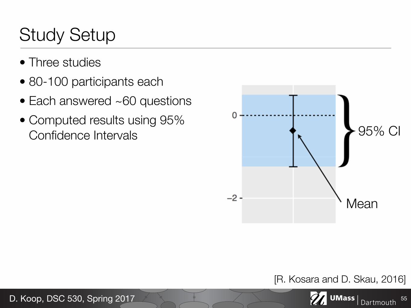
Study Setup• Three studies • 80-100 participants each • Each answered ~60 questions • Computed results using 95%
Confidence Intervals
55D. Koop, DSC 530, Spring 2017
95% CI
Mean
[R. Kosara and D. Skau, 2016]
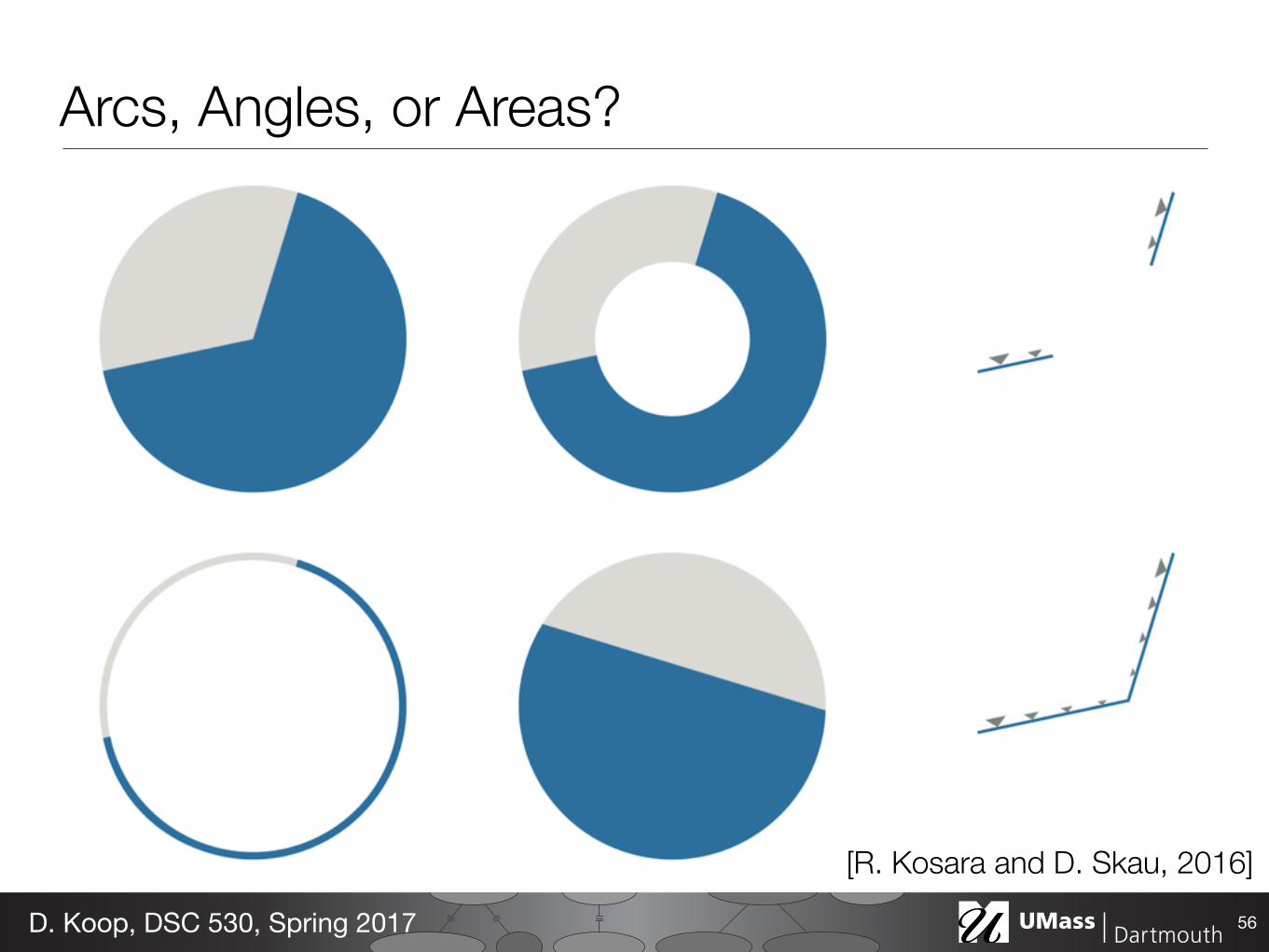
Arcs, Angles, or Areas?
56D. Koop, DSC 530, Spring 2017
[R. Kosara and D. Skau, 2016]
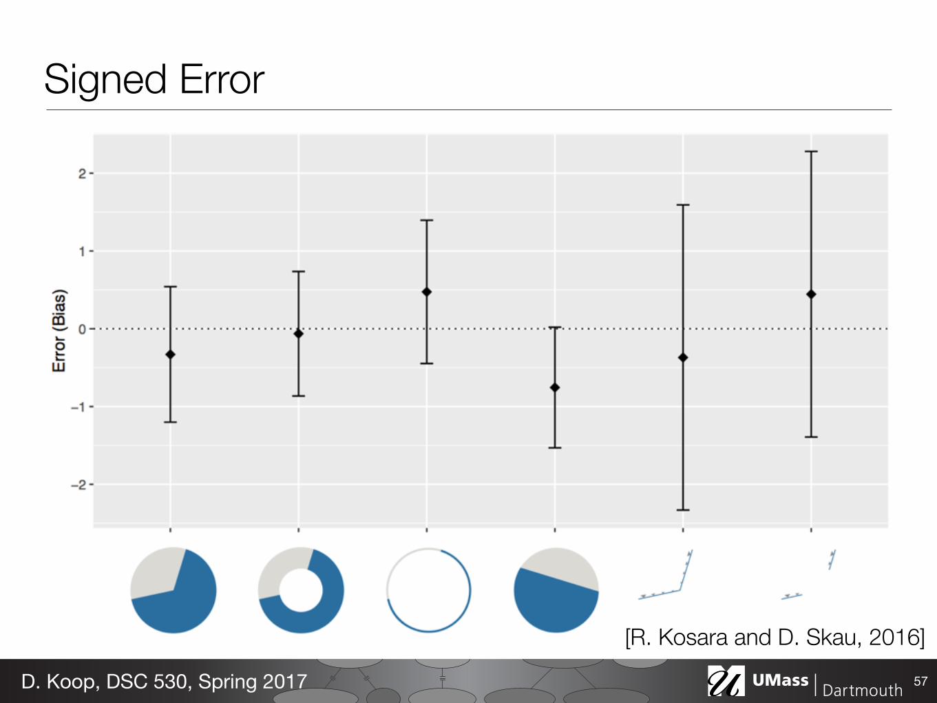
Signed Error
57D. Koop, DSC 530, Spring 2017
[R. Kosara and D. Skau, 2016]
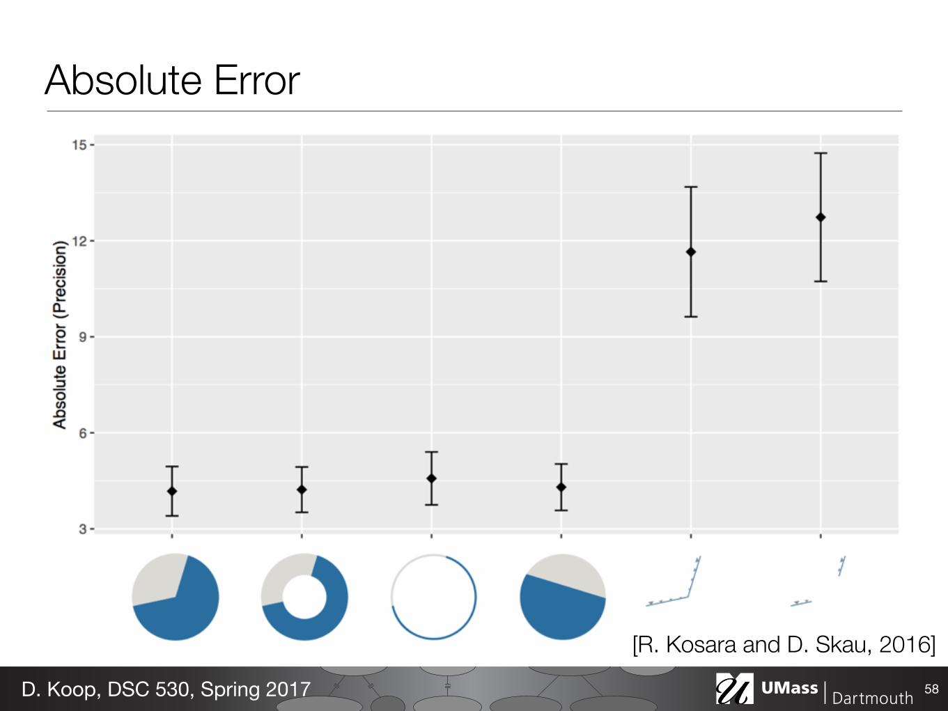
Absolute Error
58D. Koop, DSC 530, Spring 2017
[R. Kosara and D. Skau, 2016]
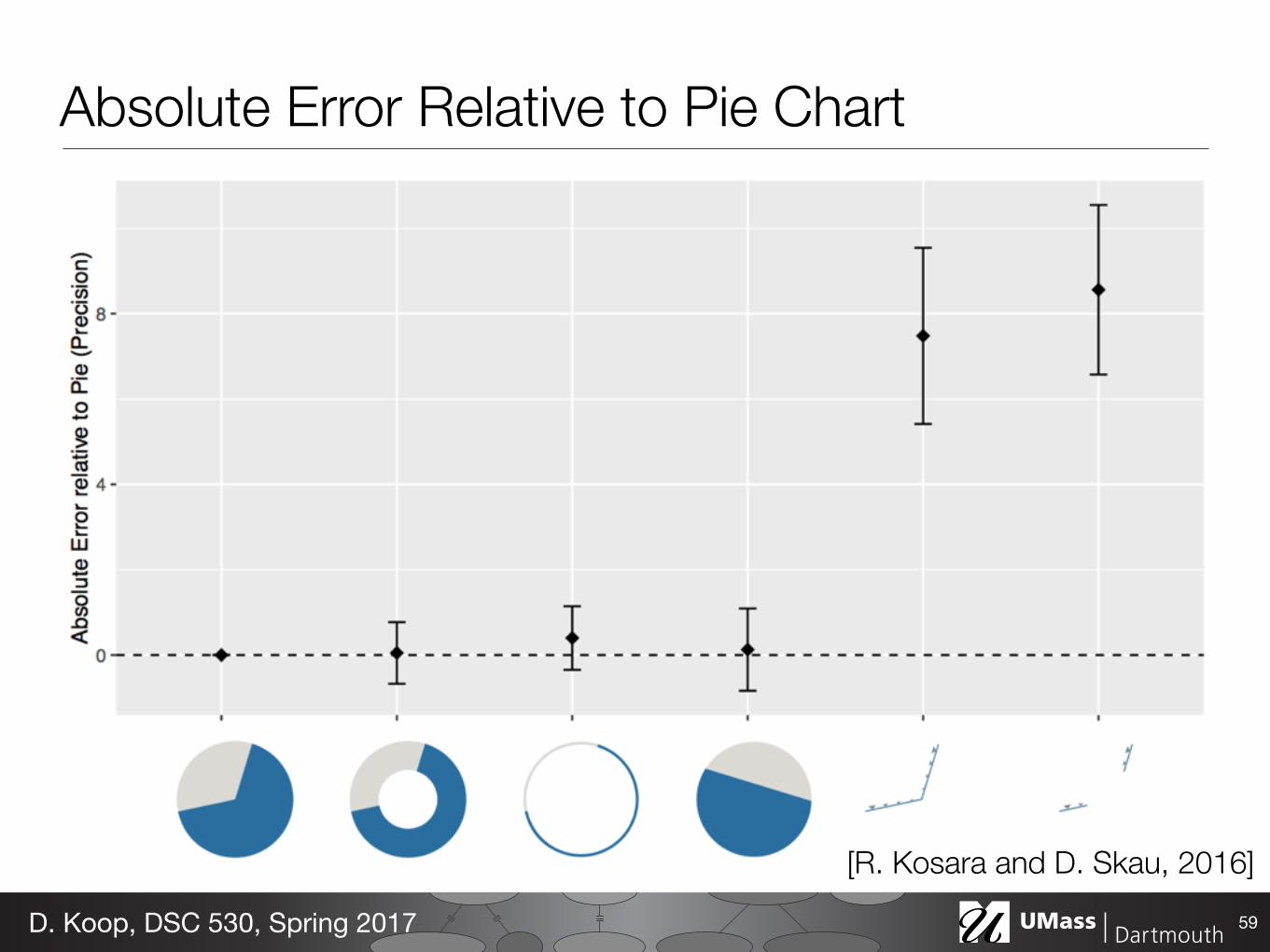
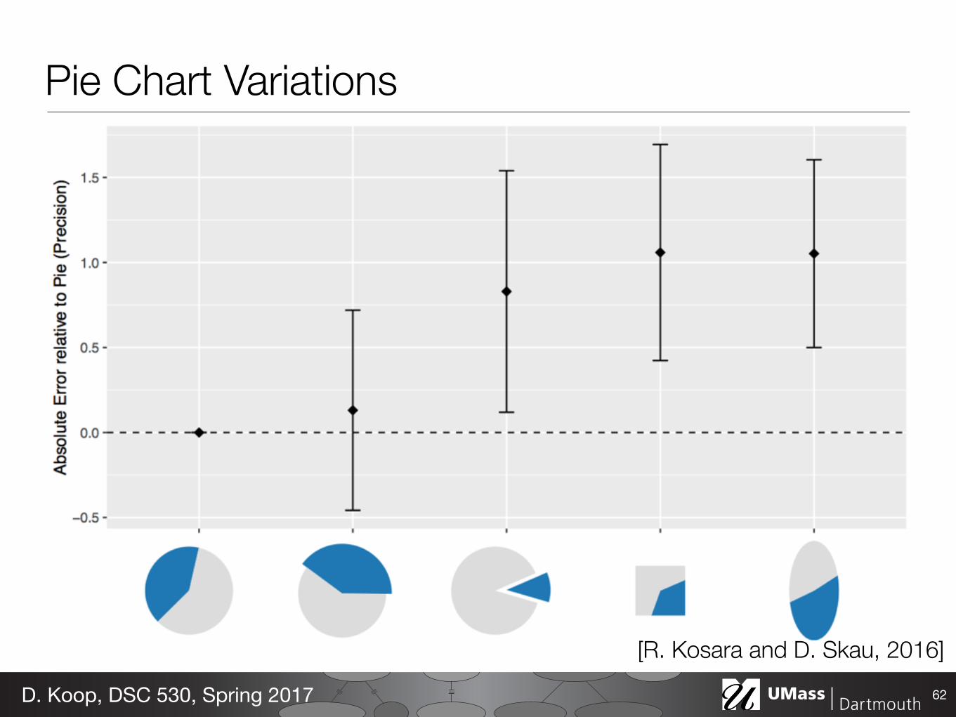
Absolute Error Relative to Pie Chart
59D. Koop, DSC 530, Spring 2017
[R. Kosara and D. Skau, 2016]
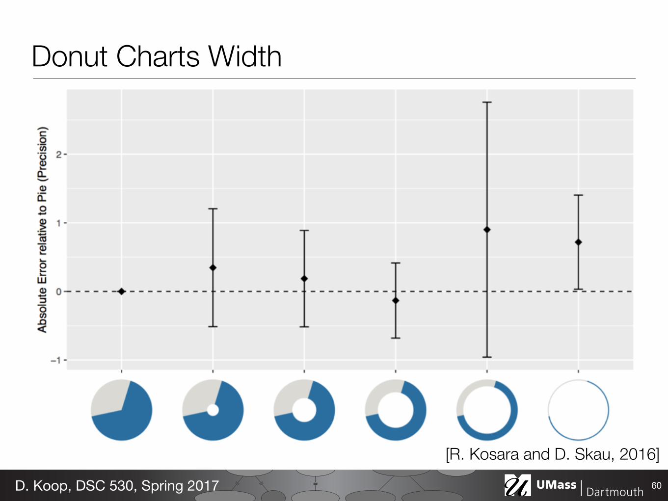
Donut Charts Width
60D. Koop, DSC 530, Spring 2017
[R. Kosara and D. Skau, 2016]
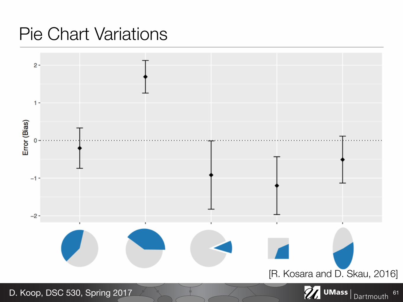
Pie Chart Variations
61D. Koop, DSC 530, Spring 2017
[R. Kosara and D. Skau, 2016]
Pie Chart Variations
62D. Koop, DSC 530, Spring 2017
[R. Kosara and D. Skau, 2016]
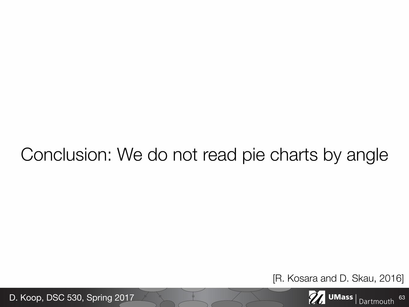
Conclusion: We do not read pie charts by angle
63D. Koop, DSC 530, Spring 2017
[R. Kosara and D. Skau, 2016]
Pies vs. Bars• …but area is still harder to judge than position • Screens are usually not round
64D. Koop, DSC 530, Spring 2017