data report 2012/13 trends and performance analysis · data report 2012/13: trends and performance...
TRANSCRIPT

Sickle Cell and Thalassaemia
Data Report 2012/13 Trends and performance analysis
Sickle Cell and Thalassaemia Screening Programme
sct.screening.nhs.uk

Data Report 2012/13: Trends and performance analysis
2
Acknowledgements The programme would like to thank all those who have provided data for inclusion in this report for all their hard work. In particular we would like to thank the antenatal, prenatal diagnostic and newborn laboratories, as well as the maternity units.
NHS Sickle Cell and Thalassaemia Screening Programme sct.screening.nhs.uk www.gov.uk/phe Prepared by: Matthew Charlton, Data Manager, Infectious Diseases in Pregnancy/Newborn Blood Spot/Sickle Cell and Thalassaemia Screening Programmes For queries relating to this document, please contact: [email protected]
© Crown Copyright 2014 You may re-use this information (excluding logos) free of charge in any format or medium, under the terms of the Open Government Licence v2.0. To view this licence, visit OGL or email [email protected]. Where we have identified any third party copyright information you will need to obtain permission from the copyright holders concerned.
Published April 2014 PHE publications gateway number: 2013549

Data Report 2012/13: Trends and performance analysis
3
Contents
Contents ........................................................................................................... 3
Executive summary ................................................................................................... 4
Abbreviations ........................................................................................................... 5
Glossary ........................................................................................................... 6
List of charts and tables ........................................................................................... 7
Antenatal Screening ............................................................................................................................ 7 Prenatal Diagnostic Testing ................................................................................................................. 8 Newborn Screening ............................................................................................................................. 9
1. Introduction ....................................................................................................... 10
1.1. About the NHS Sickle Cell and Thalassaemia Screening Programme .................................. 10 1.2. Methods .................................................................................................................................. 10
2. Overview of national screening figures .......................................................... 11
3. Antenatal screening data ................................................................................. 12
3.1. Data quality and methods of data collection ........................................................................... 12 3.2. Numbers screened and detected ........................................................................................... 13 3.3. Bookings tested by 10 weeks ................................................................................................. 15 3.4. Samples with FOQ attached ................................................................................................... 19 3.5. Tests not performed due to a known previous result ............................................................. 24 3.6. Declined screening tests......................................................................................................... 26 3.7. Testing of the baby’s father .................................................................................................... 28
4. Prenatal diagnostic (PND) testing data ........................................................... 32
4.1. Data quality and methods of data collection ........................................................................... 32 4.2. Numbers tested and detected ................................................................................................ 32 4.3. Gestation data ........................................................................................................................ 34 4.4. Results by ethnicity ................................................................................................................. 36 4.5. Pregnancy outcomes .............................................................................................................. 37
5. Newborn screening data .................................................................................. 40
5.1. Data quality and methods of data collection ........................................................................... 40 5.2. Numbers screened ................................................................................................................. 40 5.3. Newborn screening results ..................................................................................................... 41 5.4. Results by ethnicity ................................................................................................................. 49 5.5. Declined screening tests......................................................................................................... 51 5.6. Post-transfusion testing .......................................................................................................... 51 5.7. Timeliness of reporting results ................................................................................................ 54
6. Key Performance Indicators ............................................................................ 55
7. Appendices ....................................................................................................... 57
Appendix One: UK Newborn Blood Spot data report 2012/13: Executive Summary ........................ 57 Appendix Two: Antenatal data return form part two - Breakdown of screen positive women ........... 58

Data Report 2012/13: Trends and performance analysis
4
Executive summary
In England approximately 720,000 pregnant women were screened for sickle cell and thalassaemia, of whom approximately 15,000 (approximately 2%) were identified as screen positive. There were 398 prenatal diagnostic (PND) tests performed of which 21% had an affected result, 54% had a carrier result, and 24% had a ‘no abnormality detected’ result.
There were approximately 685,000 newborn babies screened, of whom 312 (0.46 per 1000 babies screened) were identified with a significant condition and 9,368 (13.67 per 1000 babies screened) were identified with a carrier result.
There has been an increase in the number of sites meeting the 50% acceptable standard for screening offer by 10 weeks of gestation. Nationally the rate is 46%, compared to 44% in 2011/12.
The proportion of samples with a Family Origin Questionnaire (FOQ) attached has increased in both high and low prevalence areas, and high prevalence areas are now close to the 90% acceptable standard.
In clinical practice, use of the FOQ has achieved cost savings by ensuring that high risk women are not missed for screening, reducing unnecessary re-screening of women with inconclusive results and allowing more accurate father screening.
There has been an increase in the proportion of fathers offered testing for whom a sample is received by the laboratory, and is now at approximately 63%.
The number of PND tests performed accounts for approximately half of the number of ‘high risk’ pregnancies identified in antenatal screening. Trend data covering the five-year period 2008–2013 shows that approximately 66% of parents of babies affected by sickle cell disease, and 80% of parents affected by beta thalassaemia, choose not to continue the pregnancy.
The standard for 50% of PND tests performed before 12 weeks and 6 days of pregnancy is being met, but 31% of PND tests performed are taking place at 15 weeks gestation or later. Data suggests that more parents opted to terminate in cases where testing occurred earlier in the pregnancy.
In newborn screening, the rates of post-transfusion samples being taken has declined due to the policy of taking a pre-transfusion sample in babies on admission to specialist units. In the four years since implementation of this policy, rates have been steady, ranging between 2.1 per 1000 babies screened and 2.4 per 1000 babies screened. It is therefore important that the policy for DNA testing for transfused babies continues and that staff are reminded of the requirement for pre-transfusion samples so that levels of DNA testing are kept low.
The executive summary from the Newborn Blood Spot Screening Programme is included in Appendix One and covers the whole of the United Kingdom.

Data Report 2012/13: Trends and performance analysis
5
Abbreviations
AN Antenatal
FOQ Family Origin Questionnaire
Hb Haemoglobin – see glossary for haemoglobin variants
HES Hospital Episodes Statistics
HP High Prevalence
HPFH Hereditary Persistence of Fetal Haemoglobin
KPI Key Performance Indicator
LP Low Prevalence
MCH Mean cell haemoglobin
NAD No abnormality detected
NB Newborn
NBBS Newborn Blood Spot
NICE National Institute for Health and Clinical Excellence
NIGB National Information Governance Board
ONS Office for National Statistics
PCT Primary Care Trust
PHE Public Health England
PND Prenatal Diagnosis
SCD Sickle Cell Disease
SCT Sickle Cell and Thalassaemia
SHA Strategic Health Authority
UKNSC United Kingdom National Screening Committee

Data Report 2012/13: Trends and performance analysis
6
Glossary
Alpha plus thalassaemia (-α/αα or -α/-α): This is
found in all ethnic groups, with a high carrier frequency in populations in some parts of Africa, in Afro-Caribbeans and in South and Southeast Asia. Even if both partners are carriers, there is no risk to the fetus. Homozygous alpha plus thalassaemia is not a clinically significant disorder with respect to genetic or obstetric complications, but can cause diagnostic confusion with carriers of alpha zero thalassaemia or iron deficiency. Alpha thalassaemia major, or Hb Barts hydrops fetalis (--/--): A severe anaemia that affects the
fetus. No normal fetal haemoglobin is produced and this leads to stillbirth or neonatal death. Alpha zero thalassaemia (--/αα): This carries the
potential for a clinically significant disorder if both parents are carriers. If both parents are carriers of alpha zero thalassaemia, there is a risk of having a fetus with alpha thalassaemia major and the mother runs the risk of obstetric complications, particularly in the third trimester of pregnancy. The mutations are almost always due to a gene deletion. If one partner carries alpha zero thalassaemia and the other alpha plus thalassaemia, then there is a risk of having a child with Hb H disease. Prenatal diagnosis is not usually indicated for Hb H disease. ‘At risk’ couples: Pregnancies identified with a
potential risk of an affected baby, based on antenatal screening results for both parents. Cases where the father is not available for testing or where father results cannot be linked to mother results are also considered to be ‘at risk’ for an affected pregnancy. The number of ‘at risk’ couples includes ‘high risk’ couples (see below). Beta thalassaemia major: A severe anaemia
caused by inheritance of two beta thalassaemia genes, resulting in a lack of normal haemoglobin production. Treatment by regular blood transfusions and drugs to remove excess iron leads to long-term survival. Some affected children can be ‘cured’ by bone marrow transplantation. Carrier (also referred to as trait): An individual
who carries a single altered gene where two altered genes are required for an individual to be affected with a condition that may require treatment. The carrier can pass on the gene to their offspring. The most common haemoglobin carrier states in the UK are Hb S, C, D, E and beta thalassaemia. Family origins: A term used to describe a person’s
ancestry.
Haemoglobin: The substance in our blood that
carries oxygen around the body. Hb A is normal adult haemoglobin, and Hb F is fetal haemoglobin. Haemoglobin disease: Mild or serious diseases
that can occur in people who have inherited two haemoglobin gene variants. The most common haemoglobin diseases are sickle cell diseases and thalassaemia disorders, also called haemoglobinopathies. Haemoglobin variants include: Hb S – Sickle haemoglobin Hb C – Haemoglobin C Hb D – Haemoglobin D Hb E – Haemoglobin E Examples of newborn screening results include FS (baby with fetal and sickle haemoglobins – probable sickle cell disease) and FAS (baby with fetal, adult, and sickle haemoglobins – probable sickle cell carrier). ‘High risk’ couples: Pregnancies that are identified
as having a high risk of an affected baby. These are identified based on the combinations of mother and father antenatal test results which are considered to indicate a high risk of an affected baby (represented by the dark orange boxes on the antenatal data return, see Appendix Two). Prevalence: The proportion of people in a
population who have an attribute or a given disease. Sickle cell disease: A group of inherited diseases
that are characterised by sickling of red blood cells when there is a shortage of oxygen. The most common sickle cell diseases are sickle cell anaemia (Hb SS), haemoglobin SC disease, and haemoglobin S/beta thalassaemia. Sickle cell diseases can cause episodes of acute pain (crisis), anaemia, increased risk of infections, and chest problems. They can be life-threatening, particularly for young children. Thalassaemia major: A group of inherited
conditions caused by a reduction in the amount of haemoglobin produced. People with a thalassaemia condition have various degrees of severe anaemia. Variant: A change from the usual, for example, in a
gene or protein. A variant haemoglobin gene may result in sickle or another type of haemoglobin in the body.

Data Report 2012/13: Trends and performance analysis
7
List of charts and tables
Antenatal Screening
Table AN-1. Antenatal screening results by region, 2012/13: England ....................................... 13
Table AN-2. Antenatal screening results by region, 2012/13: High prevalence areas ................ 14
Table AN-3. Antenatal screening results by region, 2012/13: Low prevalence areas ................ 15
Figure AN-1. Percentage of antenatal booking bloods tested by 10 weeks by laboratory, 2011-13: England by prevalence ...................................................... 16
Figure AN-2. Percentage of antenatal booking bloods tested by 10 weeks, 2012/13: High and low prevalence areas ................................................................ 17
Table AN-4. First antenatal assessments by 10 weeks and by 12 weeks gestation, 2012/13: England by region .................................................................... 18
Figure AN-3. First antenatal assessments by 10 weeks and by 12 weeks gestation, 2009-13: England ................................................................................... 18
Figure AN-4. Percentage of first antenatal assessments within 10 weeks gestation, 2011/12 and 2012/13: England by Trust ................................................ 19
Table AN-5. Use of the FOQ in determining women at high risk of being alpha zero carriers, 2008-13: England .................................................................... 20
Table AN-6. Use of the FOQ in determining women at high risk of being alpha zero carriers, 2008-13: High prevalence areas ............................................. 20
Table AN-7. Use of the FOQ in determining women at high risk of being alpha zero carriers, 2008-13: Low prevalence areas .............................................. 20
Figure AN-5. Booking bloods received with a FOQ attached, 2007-13: England by prevalence ............................................................................. 21
Table AN-8. Booking bloods received with a FOQ attached by region, 2010-13: England ........ 22
Figure AN-6. Booking bloods received with a FOQ attached, 2007-13: Low prevalence areas by region .............................................................. 22
Figure AN-7. Percentage of antenatal booking bloods with a FOQ attached, 2012/13: England by laboratory .............................................................. 23
Table AN-9. Pregnant women where testing was not indicated due to a known previous result, 2010-13: England by region ........................................ 24
Figure AN-8. Percentage of pregnant women where testing was not indicated due to a known previous test result, 2007-13: England by prevalence .......................... 25
Figure AN-9. Percentage of pregnant women where testing was not indicated due to a known previous result, 2011-13: England by laboratory .................................. 25
Table AN-10. Declined tests by region, 2010-13: England ........................................................... 26
Figure AN-10. Declined tests as a percentage of booking bloods received, 2007-13: England by prevalence ............................................................. 27
Figure AN-11. Percentage of women that declined testing, 2011-13: England by laboratory ........ 27
Table AN-11. Uptake of father testing 2012/13: England by region .............................................. 28
Table AN-12. Uptake of father testing, 2010-13: England by region ............................................. 29
Figure AN-12. Uptake of father testing, 2007-13: England by prevalence ..................................... 30
Table AN-13. Breakdown of pregnancy risk for screen positive women, 2012/13: England ........ 31

Data Report 2012/13: Trends and performance analysis
8
Prenatal Diagnostic Testing
Table PND-1. Number of PNDs performed, 2004-13: England by laboratory ............................... 32
Table PND-2. Number of PNDs performed, 2007-13: England by region ..................................... 33
Table PND-3. PND fetal results, 2007-13: England ....................................................................... 33
Table PND-4. Breakdown of PND fetal results by condition, 2007-13: England ........................... 34
Table PND-5. Gestation at sample for PND, 2007-13: England .................................................... 34
Figure PND-1. Percentage of PND tests performed by gestation and year, 2007-13: England ........................................................................................... 35
Table PND-6. Number of PND tests by mother's ethnicity, 2007-13: England .............................. 36
Table PND-7. Number of PND tests with affected results by outcome, 2008-13: England .................................................................................... 37
Table PND-8. Outcomes for pregnancies with affected fetal diagnoses at PND, 2008-13: England by condition ...................................................................... 37
Figure PND-2. Outcomes for pregnancies with affected fetus diagnosis at PND, 2008-13: England by condition ...................................................................... 38
Table PND-9. Gestation at PND for affected results with a known outcome, 2008-13: England .................................................................................... 38
Figure PND-3. Percentage of affected results where parents opted to terminate, by gestation at PND for known pregnancy outcomes, 2008-13 ................................... 39
Figure PND-4. Comparison of early PND testing, terminations for affected results and affected results in newborn screening, 2008-13: England ............................... 39

Data Report 2012/13: Trends and performance analysis
9
Newborn Screening
Table NB-1. Comparison of ONS birth figures and number of babies screened reported by newborn screening laboratories, 2012/13: England by region ........................... 40
Table NB-2. Trends in the number of babies identified with significant conditions, 2010-13: England by region .................................................................. 41
Figure NB-1. Babies identified with a significant condition per 1000 babies screened, 2012/13: England by region.................................................................... 42
Figure NB-2. Trends in babies identified with a significant condition, 2005-13: England by region .................................................................... 43
Figure NB-3. Trends in babies identified with a significant condition, 2005-13: London and the rest of England ............................................................... 43
Table NB-3. Trends in the number of babies identified with carrier results, 2005-13: England by region ........................................................................ 44
Figure NB-4. Babies identified with a carrier result per 1000 babies screened, 2012/13: England by region.................................................................... 45
Figure NB-5. Trends in babies identified as carriers, 2012/13: England by region ...................... 46
Figure NB-6. Trends in babies identified as carriers, 2005-13: London sectors (pre-2006 SHAs) ......................................................................................... 46
Figure NB-7. Trends in babies identified as carriers, 2005-13: England by region (excluding London) ....................................................................................... 47
Figure NB-8. Trends in babies identified as carriers, 2005-13: London and the rest of England ........................................................................................... 47
Table NB-4. Babies screened and newborn screening results, 2012/13: England by region ........................................................................ 48
Table NB-5. Numbers of babies identified with significant conditions, 2010-13: England by ethnicity ............................................................... 49
Table NB-6. Numbers of babies identified with carrier results, 2010-13: England by ethnicity .................................................................... 50
Figure NB-9. Declined screening for sickle cell disease, 2005-13: England ................................ 51
Table NB-7. Post-transfusion samples, number and rate per 1000 babies screened, 2010-13: England by region ............................................... 52
Figure NB-10. Post-transfusion samples, rate per 1000 babies screened, 2005-13: England ................................................................................... 52
Table NB-8. Numbers detected through DNA testing for transfused babies, 2009-13 ..................................................................................... 53
Table NB-9. Timeliness of reporting affected newborn results, 2012/13: England by laboratory .................................................................. 54

Data Report 2012/13: Trends and performance analysis
10
1. Introduction
1.1. About the NHS Sickle Cell and Thalassaemia Screening
Programme
The NHS Sickle Cell and Thalassaemia Screening Programme was set up in England in 2001 following a Government commitment in the NHS Plan in 2000 and is the world’s first linked antenatal and newborn screening programme. Our mission statement is to develop a linked programme of high quality screening and care in order to:
Support people to make informed choices during pregnancy and before conception
Improve infant health through prompt identification of affected babies
Provide high quality and accessible care throughout England
Promote greater understanding and awareness of the disorders and the value of screening
The UK National Screening Committee and NHS Screening Programmes are part of Public Health England (PHE), an executive agency of the Department of Health. PHE was established on 1 April 2013 to bring together public health specialists from more than 70 organisations into a single public health service.
1.2. Methods
Timely annual data returns are required from all screening laboratories in accordance with the laboratory guidance. Data are collated by the laboratories and submitted to the Sickle Cell and Thalassaemia Screening Programme via spreadsheet-based data return templates. On receipt, the data are checked for any discrepancies or aspects that would benefit from clarification and if needed followed up with the relevant laboratory. For the antenatal laboratories in particular, we recognise the difficulty of data collection in the absence of standardised data collection tools and IT systems. We try to ask for limited data and work hard to justify all data requests, ensuring there are no gaps and no duplication across the screening pathway and between screening programmes. PND data are requested several months after the requests for data are sent to the antenatal and newborn laboratories. This is to allow time for complete gestation in all pregnancies in order to give a more complete set of data on pregnancy outcomes following PND testing. The newborn data received by the Programme sometimes include data for areas outside of England. These are excluded in our analysis. Prevalence data by region and by ethnicity are compared and laboratories contacted for clarification if inconsistencies are found. Current versions of the antenatal and newborn data returns can be found at sct.screening.nhs.uk/datacollection.

Data Report 2012/13: Trends and performance analysis
11
2. Overview of national screening figures
Note: These figures represent total numbers reported and numbers may differ from those where exclusions could be made based on missing or unavailable data. *‘Screen positive’ in antenatal screening includes both sickle cell haemoglobin variants and thalassaemia results. †‘Significant conditions’ in newborn screening comprises FS, FSC, FS Other and FE. ‡‘Carrier results’ in newborn screening comprises FAS, FAC, FAD, FAE and other carriers. ** ‘High risk’ comprises cases where both parents are carriers or affected and there is a high risk that the baby will be affected by a significant condition. This number excludes low risk cases and cases where the father was not available for testing.
Total number of antenatal samples screened 718,810
Number of mothers identified as ‘screen positive’* 14,515
Number of fathers offered screening for ‘at risk’ couple assessment
13,691
Number of fathers tested for ‘at risk’ couple assessment for this pregnancy
8,728 (60% of ‘screen positive’)
Number of ‘high risk’** couples detected 858
Antenatal screening
Number of PNDs performed 398
(Nearly half of ‘high risk’ couples)
Number of ‘affected’ fetal
results
85 (21% of total
PNDs performed)
Number of ‘carrier’ fetal
results 213
(54% of total PNDs
performed)
Number PNDs with ‘NAD’
results
96 (24% of total
PNDs performed)
Number of pregnancy outcomes known
53 (62% of affected
results)
Number of outcomes not known
32 (38% of affected
results)
PND testing
Total number of newborn samples screened
685,438
Number of ‘screen positive’ newborn results for
significant condition† 312
(0.46 per 1000 screened)
Number of carrier results‡ 9,368
(13.67 per 1000 screened)
Newborn screening

Data Report 2012/13: Trends and performance analysis
12
3. Antenatal screening data
3.1. Data quality and methods of data collection
Response rate:
In England 143 data returns out of 145 were received. Data were not received for Newham University Hospital or for Whipps Cross Hospital. These laboratories (both within Barts Health NHS Trust) have merged with the Royal London and were unable to provide figures for these sites for this year. We have been informed that it should be possible to provide data for the whole Trust in the future.
Data quality:
A total of 718,810 booking bloods were reported. As in previous years there were some gaps in the data provided where some laboratories were unable to provide data for certain data fields. To reduce bias when reporting rates, exclusions have been made where data were missing. This means that some figures may differ when comparing charts and tables. Where exclusions have been made, these are specified in the relevant footnotes. There were fewer exclusions made compared to last year for the data fields for booking bloods tested by 10 weeks gestation and for booking bloods with a FOQ attached. However more exclusions were made for data on those not tested due to previous tests. The number of exclusions made for those not tested due to declines, and for father uptake, was the same as in 2011/12. A higher proportion of screen positive women was included in the breakdown data (93% in 2012/13 compared to 90% in 2011/12), but a lower proportion of high risk couples (85% in 2012/13 compared to 88% in 2011/12). Figures on booking bloods tested by 10 weeks are often dependent on completion of the FOQ to obtain gestational information. This means that these figures offer a base rate, but actual proportions may be higher. The number of father specimens received may not include cases where the father was tested previously and not re-tested in this pregnancy, and so the rates for father uptake may in fact be higher than those shown. Some laboratories are unable to match mother results to father results and so can’t provide the number of high risk couples. As a result, the actual number of high risk couples is likely to be higher than that reported. Some laboratories use figures that are provided by maternity units to determine the number of booking bloods received as they are unable to distinguish between antenatal and non-antenatal specimens. This may distort the figures slightly as maternity units may refer samples to more than one laboratory and so the number of booking bloods received may appear higher than it actually is. The data presented in this report represent the data provided by the antenatal laboratories. We are aware that figures may differ from those from other data sources.
Some laboratories cover more than one hospital and we ask for separate data returns for each hospital covered. As a result, the number of laboratories represented where data are broken down to this level may be higher than the actual number of laboratories that provide screening for sickle cell and thalassaemia. We are aware that the number of screen positive and screen negative women, plus pending results does not add up to the number of booking bloods received. This is due to the way that data are provided by some laboratories. The difference may be accounted for to a degree by the inclusion of other haemoglobinopathy variants which would not be considered to be screen positive for sickle cell or thalassaemia.

Data Report 2012/13: Trends and performance analysis
13
3.2. Numbers screened and detected
National:
Table AN-1 shows the antenatal screening figures by region for England in 2012/13. There are no exclusions made based on missing or incomplete data in this table. In 2012/13 a total of 718,810 antenatal samples were identified in the annual laboratory data returns. Of these, 14,515 women (one in 50 women screened) were identified as carriers for sickle cell disease or for thalassaemia. The number of screen positive women includes cases where the woman had a known previous screen positive result and cases where a donor egg was used (requiring testing of the baby’s father). ‘High risk’ couples comprise pregnancies where both parents are identified as either carriers or as affected and there is a high risk that the baby will be affected by a significant condition. In 2012/13 there were 858 pregnancies (one in 17 screen positive women) identified as at high risk for these conditions. This figure excludes cases where the father was not available for testing, or where the father’s result cannot be matched with the mother’s result to determine the risk, and so we estimate that the actual number of high risk pregnancies is higher. We would expect the number of high risk couples in antenatal screening to be approximately four times the number of newborn screen positive for significant conditions (FS, FSC, FS-Other and FE results) plus four times the number of babies with an F-only newborn result (which are potential beta thalassaemia affected results), plus terminations, giving an estimate of approximately 1,400 high risk pregnancies. It should be noted that some high prevalence laboratories provide screening services for low prevalence maternity services. While we request that data from laboratories are provided separately by site, some laboratories cannot differentiate between samples received, which could affect the figures.
Table AN-1. Antenatal screening results by region, 2012/13: England
Booking
bloods
received
(BBs)
Region
n n% of
BBsn
% of
BBsn
% of
BBsn
% of
BBsn
% of
BBsn
% of
screen
'positive
women
East of England 17 / 17 78,123 28,223 36.13 75,433 96.56 1,010 1.29 66,534 85.17 * 0.00 59 5.84
East Midlands 8 / 8 53,016 32,242 60.82 52,238 98.53 677 1.28 49,137 92.68 * 0.00 28 4.14
London 24 / 26 138,588 35,965 25.95 105,123 75.85 6,817 4.92 127,362 91.90 29 0.02 447 6.56
North East 10 / 10 33,288 17,048 51.21 32,799 98.53 259 0.78 32,977 99.07 3 0.01 12 4.63
North West 19 / 19 91,004 29,817 32.76 86,892 95.48 1,221 1.34 84,081 92.39 19 0.02 63 5.16
South Central 11 / 11 51,803 23,882 46.10 48,351 93.34 788 1.52 49,614 95.77 39 0.08 48 6.09
South East Coast 10 / 10 57,885 7,486 12.93 56,366 97.38 724 1.25 52,448 90.61 23 0.04 42 5.80
South West 17 / 17 65,570 24,888 37.96 64,458 98.30 440 0.67 59,805 91.21 6 0.01 21 4.77
West Midlands 15 / 15 77,760 25,207 32.42 70,691 90.91 1,663 2.14 68,646 88.28 * 0.00 82 4.93
Yorkshire and
The Humber12 / 12 71,773 36,956 51.49 68,751 95.79 916 1.28 68,415 95.32 9 0.01 56 6.11
Total England 143 / 145 718,810 261,714 36.41 661,102 91.97 14,515 2.02 659,019 91.68 132 0.02 858 5.91
*Numbers less than 3 have been suppressed
High risk
couples
identified
Submitted/
Total Labs
No. of
Labs
Booking
bloods tested
by 10 wks
FOQ Attached
Screen
'positive'
women
Screen
'negative'
women
Result
pending

Data Report 2012/13: Trends and performance analysis
14
High prevalence areas:
Table AN-2 shows the antenatal screening figures for high prevalence areas for 2012/13 as reported by the antenatal laboratories. In 2012/13 a total of 381,531 antenatal samples were identified. Of these, 11,963 women (one in 32 women screened) were identified as carriers for sickle cell disease or for thalassaemia, including women with a known previous result. In high prevalence areas 756 pregnancies (one in 16 screen positive women) were identified as being at high risk for these conditions.
Table AN-2. Antenatal screening results by region, 2012/13: High prevalence areas
Booking
bloods
received
(BBs)
Region
n n% of
BBsn
% of
BBsn
% of
BBsn
% of
BBsn
% of
BBsn
% of
screen
'positive
w omen
East of England 5 / 5 25,707 6,279 24.43 24,339 94.68 573 2.23 24,921 96.94 * 0.00 42 7.33
East Midlands 4 / 4 31,587 18,886 59.79 31,146 98.60 535 1.69 30,981 98.08 0 0.00 22 4.11
London 24 / 26 138,588 35,965 25.95 105,123 75.85 6,817 4.92 127,362 91.90 29 0.02 447 6.56
North East 1 / 1 6,944 3,997 57.56 6,583 94.80 115 1.66 6,708 96.60 0 0.00 7 6.09
North West 7 / 7 50,893 16,598 32.61 47,720 93.77 1,014 1.99 47,784 93.89 12 0.02 52 5.13
South Central 6 / 6 30,761 14,488 47.10 27,743 90.19 614 2.00 30,114 97.90 18 0.06 42 6.84
South East Coast 2 / 2 10,796 2,973 27.54 10,530 97.54 198 1.83 10,462 96.91 0 0.00 17 8.59
South West 2 / 2 11,585 4,025 34.74 11,500 99.27 164 1.42 11,219 96.84 0 0.00 11 6.71
West Midlands 7 / 7 46,588 11,597 24.89 40,213 86.32 1,410 3.03 40,740 87.45 * 0.00 77 5.46
Yorkshire and
The Humber3 / 3 28,082 10,701 38.11 25,255 89.93 523 1.86 25,739 91.66 6 0.02 39 7.46
Total England 61 / 63 381,531 125,509 32.90 330,152 86.53 11,963 3.14 356,030 93.32 68 0.02 756 6.32
*Numbers less than 3 have been suppressed
High risk
couples
identified
Submitted/
Total Labs
No. of
Labs
Booking bloods
tested by 10
wks
FOQ Attached
Screen
'positive'
women
Screen
'negative'
women
Result
pending
Low prevalence areas:
Table AN-3 shows the antenatal screening figures by region for low prevalence areas for 2012/13 as reported by the antenatal laboratories. In 2012/13 a total of 337,279 antenatal samples were identified. Of these, 2,552 women (one in 132 women screened) were identified as carriers, including those with a known previous screen positive test result. In low prevalence areas 107 pregnancies (one in 25 screen positive women) were identified as being at high risk for these conditions.

Data Report 2012/13: Trends and performance analysis
15
Table AN-3. Antenatal screening results by region, 2012/13: Low prevalence areas
Booking
bloods
received
(BBs)
Region
n n% of
BBsn
% of
BBsn
% of
BBsn
% of
BBsn
% of
BBsn
% of
screen
'positive
w omen
East of England 12 / 12 52,416 21,944 41.87 51,094 97.48 437 0.83 41,613 79.39 0 0.00 17 3.89
East Midlands 4 / 4 21,429 13,356 62.33 21,092 98.43 142 0.66 18,156 84.73 * 0.00 6 4.23
London 0 / 0 - - - - - - - - - - - - -
North East 9 / 9 26,344 13,051 49.54 26,216 99.51 144 0.55 26,269 99.72 3 0.01 5 3.47
North West 12 / 12 40,111 13,219 32.96 39,172 97.66 207 0.52 36,297 90.49 7 0.02 11 5.31
South Central 5 / 5 21,042 9,394 44.64 20,608 97.94 174 0.83 19,500 92.67 21 0.10 6 3.45
South East Coast 8 / 8 47,089 4,513 9.58 45,836 97.34 526 1.12 41,986 89.16 23 0.05 25 4.75
South West 15 / 15 53,985 20,863 38.65 52,958 98.10 276 0.51 48,586 90.00 6 0.01 10 3.62
West Midlands 8 / 8 31,172 13,610 43.66 30,478 97.77 253 0.81 27,906 89.52 0 0.00 5 1.98
Yorkshire and
The Humber9 / 9 43,691 26,255 60.09 43,496 99.55 393 0.90 42,676 97.68 3 0.01 17 4.33
Total England 82 / 82 337,279 136,205 40.38 330,950 98.12 2,552 0.76 302,989 89.83 64 0.02 102 4.00
*Numbers less than 3 have been suppressed
High risk
couples
identified
Submitted/
Total Labs
No. of
Labs
Booking bloods
tested by 10
wks
FOQ Attached
Screen
'positive'
women
Screen
'negative'
women
Result
pending
3.3. Bookings tested by 10 weeks
The target for antenatal testing is an offer of testing by 10 weeks gestation. To offer informed choice, a series of tests may be required: for the mother, the father and, if required, on the unborn baby. If tests show that the baby is at risk of inheriting a major haemoglobin disorder then the parents need time to receive counselling and consider their options, with a target for all tests to be completed by 12 weeks and six days of gestation. The proportion of booking bloods tested by 10 weeks of gestation links to KPI ST2 (timeliness of testing) and with Programme standard AP1. It is important to note that standard AP1 specifies an offer by 10 weeks, whereas these data identify samples actually tested by 10 weeks. This means that these figures are using a stricter measure than that identified in the programme standards, as it is not currently possible for maternity services to collect data on the offer of test. National figures (without any exclusions where data were missing or incomplete) are shown in Table AN-1, Table AN-2, and Table AN-3. Across the whole of England, without exclusions, approximately 36% of samples were tested by 10 weeks of gestation, while in high and low prevalence areas this figure was 33% and 40% respectively. Figure AN-1 shows a breakdown of the proportion of booking bloods tested by 10 weeks for high and low prevalence areas for 2011/12 and 2012/13. This chart excludes 27 data returns for 2012/13 and 36 data returns for 2011/12 where data on booking bloods tested by 10 weeks or the total number of booking bloods received were missing or unavailable. More laboratories appear to be meeting the acceptable level for standard AP1 compared to last year. With exclusions made for missing or unavailable data, the national proportion of booking bloods tested by 10 weeks was 46% in 2012/13, compared to 44% in 2011/12.

Data Report 2012/13: Trends and performance analysis
16
Figure AN-1. Percentage of antenatal booking bloods tested by 10 weeks by laboratory, 2011-
13: England by prevalence
Figure AN-2 shows a breakdown of the percentage of samples tested by 10 weeks by laboratory and by region across England. This chart also excludes 27 data returns as in Figure AN-1. Of the laboratories that are able to provide information on both the number of samples tested by 10 weeks and the total number of booking bloods, there is variation in performance between Trusts within regions, between regions, and between high and low prevalence areas. Figures on booking bloods tested by 10 weeks are often dependent on completion of the FOQ to obtain gestational information. This means that these figures offer a base rate, but actual proportions may be higher.
0
10
20
30
40
50
60
70
80
90
100
%
Standard AP1
2012/13: HighPrevalence
2012/13: LowPrevalence
2011/12: HighPrevalence
2011/12: LowPrevalence
Each marker represents one laboratory. The reference line represents the 50% acceptable level for Programme standard AP1. The rate for the whole of England was 37% in 2010/11, was 44% in 2011/12, and was 46% in 2012/13. 2012/13 data excludes 27 laboratories, 2011/12 data excludes 36 laboratories and 2010/11 data excludes 62 laboratories based on missing or unavailable data.

Data Report 2012/13: Trends and performance analysis
17
Figure AN-2. Percentage of antenatal booking bloods tested by 10 weeks, 2012/13: High and
low prevalence areas
Hospital Episodes Statistics (HES) contain details of all admissions to NHS hospitals in England and offers another source of gestation at booking. Table AN-4 shows HES figures for first antenatal assessments carried out by 10 weeks of gestation for 2012/13. These figures show that where gestation was known, 36% of women in England had their first antenatal assessment by 10 weeks gestation. This compares with 35% in 2011/12, 32% in 2010/11 and 29% in 2009/10, indicating a year-on-year increase in earlier testing.
Figure AN-3 shows the proportion of first antenatal assessments by 10+0 weeks and by 12+0 weeks over a four-year period, showing this increase each year.
0
10
20
30
40
50
60
70
80
90
100
EastMidlands
(8/8)
East ofEngland(14/17)
London (HPonly)
(18/24)
North East(9/10)
North West(14/19)
SouthCentral(11/11)
South EastCoast(4/10)
South West(14/17)
WestMidlands(12/15)
Yorkshireand TheHumber(12/12)
% o
f b
oo
kin
g b
loo
ds
teste
d b
y 1
0 w
eeks
Each bar represents one laboratory. Red bars represent high prevalence areas and blue bars represent low prevalence areas. The reference line represents the 50% acceptable level for Programme Standard AP1. The rate for the whole of England is 46% The numbers below the region represents how many of those Trusts for which data returns were received were able to provide complete data on booking bloods tested by 10 weeks, e.g. "4/10" shows that of the 10 returns received, 4 included complete data for both fields. Excludes 27 laboratories where data on booking bloods tested by 10 weeks or the total number of booking was missing or unavailable.

Data Report 2012/13: Trends and performance analysis
18
Table AN-4. First antenatal assessments by 10 weeks and by 12 weeks gestation, 2012/13:
England by region
Total pregnancy
episodes
(incl. unknown
gestations)
Region
n% of know n
gestationsn
% of know n
gestationsn
% of
pregnancy
episodes
n
East Midlands 17,103 42 27,242 67 40,615 86 47,016
East of England 25,460 47 39,304 73 54,058 77 70,183
London 24,355 25 52,876 54 97,305 72 135,108
North East 13,762 47 20,756 71 29,128 94 31,094
North West 24,204 35 42,632 62 68,755 77 89,149
South Central 15,028 39 27,720 71 38,949 81 47,945
South East Coast 10,684 33 20,269 63 32,161 59 54,755
South West 21,774 47 34,767 75 46,392 78 59,746
West Midlands 12,686 34 20,993 57 37,077 51 73,141
Yorkshire and The Humber 12,883 28 22,476 49 45,979 73 63,118
England 177,939 36 309,035 63 490,419 73 671,255
Source: Hospital Episode Statistics (HES), The Health and Social Care Information Centre.
By 10 weeks+0 days By 12 weeks+0 daysTotal known
gestations
Figure AN-3. First antenatal assessments by 10 weeks and by 12 weeks gestation, 2009-13:
England
29.1
32.3
35.1 36.3
52.8
57.5
61.0 63.0
0
10
20
30
40
50
60
70
2009/10 2010/11 2011/12 2012/13
%
By 10 weeks+0 days
By 12 weeks+0 days
Source: Hospital Episode Statistics (HES), The Health and Social Care Information Centre.

Data Report 2012/13: Trends and performance analysis
19
Figure AN-4 shows the percentage of first antenatal assessments by 10 weeks by Trust for both 2011/12 and 2012/13. On the whole an improvement can be seen, with more Trusts achieving the 50% acceptable level for standard AP1. There are fewer Trusts included for 2012/13 compared to the previous year which may in part account for the appearance of lower performance levels for those below the 20% line.
Figure AN-4. Percentage of first antenatal assessments within 10 weeks gestation, 2011/12 and
2012/13: England by Trust
3.4. Samples with FOQ attached
The family origin questionnaire (FOQ) is used as a screening tool in both high and low prevalence areas. The proportion of booking bloods received with a FOQ attached links to programme standard AO1aiii and KPI ST3 (completion of FOQ). Table AN-5 shows the usage of the FOQ in identifying potential carriers of alpha zero thalassaemia for the whole of England for 2008-13. Data returns are excluded where data on booking bloods received, FOQ attached, MCH <25pg or the number of high risk alpha zero cases was missing or unavailable. These figures are broken down for high and low risk areas in Table AN-6 and Table AN-7. In high prevalence areas close to 90% of booking bloods had a FOQ attached in 2012/13, compared to 98% in low prevalence areas. The proportion for the whole of England was 94%. Cases where the MCH is less than 25pg are potentially carriers of alpha zero thalassaemia. If the FOQ shows that the woman has a high risk family origin they are considered to be at high risk of being carriers of alpha zero thalassaemia.
0
10
20
30
40
50
60
70
80
% o
f fi
rst
an
ten
ata
l assessm
en
ts b
y 1
0 w
eeks
2012/13
2011/12
Standard AP1
The reference line represents the 50% acceptable level for Programme Standard AP1. Source: Hospital Episode Statistics (HES), The Health and Social Care Information Centre.

Data Report 2012/13: Trends and performance analysis
20
Table AN-5. Use of the FOQ in determining women at high risk of being alpha zero carriers,
2008-13: England
Booking bloods
received (BBs)
Year n n % of BBs n
% of FOQ
attached n % of BBs
2008/09 554,216 317,009 57.20 17,826 5.62 4,817 0.87
2009/10 526,343 393,606 74.78 16,344 4.15 2,075 0.39
2010/11 659,060 574,641 87.19 20,557 3.58 3,532 0.54
2011/12 692,845 634,051 91.51 21,247 3.35 3,212 0.46
2012/13 691,310 647,252 93.63 23,881 3.69 2,834 0.41
Total for four year period 3,123,774 2,566,559 82.16 99,855 3.89 16,470 0.53
FOQ attached
MCH < 25pg
(potential alpha0
carrier)
High risk alpha0
(High risk of carrying
alpha0)
Exclusions based on missing or unavailable data for the data fields shown: 2008/09: 29; 2009/10: 28; 2010/11: 11; 2011/12: 9;
2012/13: 7.
Table AN-6. Use of the FOQ in determining women at high risk of being alpha zero carriers,
2008-13: High prevalence areas
Booking bloods
received (BBs)
Year n n % of BBs n
% of FOQ
attached n % of BBs
2008/09 271,815 51,375 18.90 12,937 25.18 4,031 1.48
2009/10 236,843 119,305 50.37 11,463 9.61 1,179 0.50
2010/11 328,967 255,854 77.77 14,861 5.81 2,185 0.66
2011/12 369,639 317,377 85.86 15,589 4.91 1,911 0.52
2012/13 364,656 326,730 89.60 17,522 5.36 2,089 0.57
Total for four year period 1,571,920 1,070,641 68.11 72,372 6.76 11,395 0.72
FOQ attached
MCH < 25pg
(potential alpha0
carrier)
High risk alpha0
(High risk of carrying
alpha0)
Exclusions based on missing or unavailable data for the data fields shown: 2008/09: 21; 2009/10: 22; 2010/11: 7; 2011/12: 4; 2012/13: 3.
Table AN-7. Use of the FOQ in determining women at high risk of being alpha zero carriers,
2008-13: Low prevalence areas
Booking bloods
received (BBs)
Year n n % of BBs n
% of FOQ
attached n % of BBs
2008/09 282,401 265,634 94.06 4,889 1.84 786 0.28
2009/10 289,500 274,301 94.75 4,881 1.78 896 0.31
2010/11 330,093 318,787 96.57 5,696 1.79 1,347 0.41
2011/12 323,206 316,674 97.98 5,658 1.79 1,301 0.40
2012/13 326,654 320,522 98.12 6,359 1.98 745 0.23
Total for four year period 1,551,854 1,495,918 96.40 27,483 1.84 5,075 0.33
Exclusions based on missing or unavailable data for the data fields shown: 2008/09: 8; 2009/10: 6; 2010/11: 4; 2011/12: 5; 2012/13: 4.
FOQ attached
MCH < 25pg
(potential alpha0
carrier)
High risk alpha0
(High risk of carrying
alpha0)

Data Report 2012/13: Trends and performance analysis
21
Figure AN-5 shows the proportion of booking bloods received with a FOQ attached in both high and low prevalence areas across England between 2007 and 2013. Exclusions are made where data on the number of booking bloods received or the number of samples received with a FOQ attached were missing or unavailable. The number of exclusions made has reduced each year, indicating an improvement in data quality. The proportion of booking bloods with a FOQ attached has continued to improve in both high and low prevalence areas, and for the first time high prevalence areas as a whole are close to the 90% acceptable standard for programme standard AO1aiii.
Figure AN-5. Booking bloods received with a FOQ attached, 2007-13: England by prevalence
Table AN-8 shows the numbers and rates of samples received with a FOQ attached by region between 2010 and 2013 for the whole of England (both high and low prevalence areas). Exclusions are made for each year where data on the number of booking bloods received or the number of samples with a FOQ attached were missing or unavailable so as to not bias the rates.
0
10
20
30
40
50
60
70
80
90
100
2007/08 2008/09 2009/10 2010/11 2011/12 2012/13
%
High PrevalenceAreas
Low PrevalenceAreas
England Total
Exclusions based on missing or unavailable data for the data fields shown: 2007/08: 36; 2008/09: 23; 2009/10: 19; 2010/11: 8; 2011/12: 1; 2012/13: 2.

Data Report 2012/13: Trends and performance analysis
22
Table AN-8. Booking bloods received with a FOQ attached by region, 2010-13: England
Region
Booking
Bloods (BBs)
FOQ
attached
% of
BBs
Booking
Bloods (BBs)
FOQ
attached
% of
BBs
Booking
Bloods (BBs)
FOQ
attached
% of
BBs
East Midlands 54,224 46,307 85.4 55,195 53,653 97.2 53,016 52,238 98.5
East of England 80,942 75,460 93.2 81,767 79,752 97.5 78,123 75,433 96.6
London 112,262 78,564 70.0 142,595 117,395 82.3 125,135 105,123 84.0
North East 34,920 33,961 97.3 34,319 33,697 98.2 33,288 32,799 98.5
North West 90,093 83,296 92.5 90,653 82,461 91.0 91,004 86,892 95.5
South Central 49,516 42,572 86.0 54,676 50,710 92.7 51,803 48,351 93.3
South East Coast 43,879 41,709 95.1 44,716 43,508 97.3 57,885 56,366 97.4
South West 64,254 61,942 96.4 67,534 66,452 98.4 65,570 64,458 98.3
West Midlands 74,301 65,808 88.6 79,565 66,029 83.0 77,760 70,691 90.9
Yorkshire and
The Humber63,187 53,160 84.1 72,381 66,270 91.6 71,773 68,751 95.8
England Total 667,578 582,779 87.3 723,401 659,927 91.2 705,357 661,102 93.7
2010/11 2011/12 2012/13
Exclusions based on missing or unavailable data for the data fields shown: 2010/11: 8; 2011/12: 1; 2012/13: 2. Figure AN-6 shows these rates for low prevalence laboratories only, showing trends for each region. Whilst there is some variation between years within regions, an overall increase in booking bloods with a FOQ attached can be seen in each region.
Figure AN-6. Booking bloods received with a FOQ attached, 2007-13: Low prevalence areas by
region
0
10
20
30
40
50
60
70
80
90
100
EastMidlands
East ofEngland
North East North West SouthCentral
South EastCoast
South West WestMidlands
Yorkshireand TheHumber
2007/08
2008/09
2009/10
2010/11
2011/12
2012/13
Exclusions based on missing or unavailable data for the data fields shown: 2007/08: 5; 2008/09: 5; 2009/10: 5; 2010/11: 2; 2011/12: 1; 2012/13: 0.
Data Report 2012/13: Trends and performance analysis
23
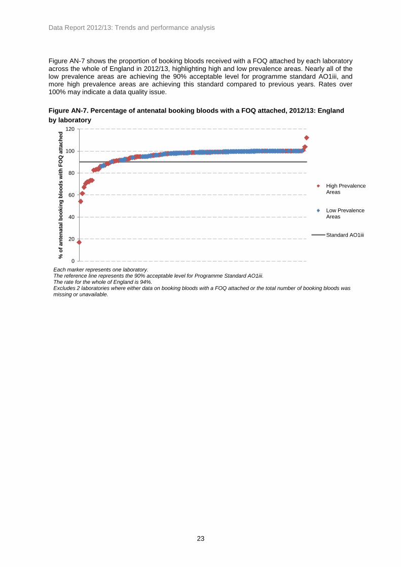
Figure AN-7 shows the proportion of booking bloods received with a FOQ attached by each laboratory across the whole of England in 2012/13, highlighting high and low prevalence areas. Nearly all of the low prevalence areas are achieving the 90% acceptable level for programme standard AO1iii, and more high prevalence areas are achieving this standard compared to previous years. Rates over 100% may indicate a data quality issue.
Figure AN-7. Percentage of antenatal booking bloods with a FOQ attached, 2012/13: England
by laboratory
0
20
40
60
80
100
120
% o
f an
ten
ata
l b
oo
kin
g b
loo
ds
wit
h F
OQ
att
ach
ed
High PrevalenceAreas
Low PrevalenceAreas
Standard AO1iii
Each marker represents one laboratory. The reference line represents the 90% acceptable level for Programme Standard AO1iii. The rate for the whole of England is 94%. Excludes 2 laboratories where either data on booking bloods with a FOQ attached or the total number of booking bloods was missing or unavailable.

Data Report 2012/13: Trends and performance analysis
24
3.5. Tests not performed due to a known previous result
Table AN-9 shows the number and rates of pregnant women who were not tested due to a known previous test result in England by region. These figures combine previous screen positive and negative results and exclude data returns where both of these fields were missing or unavailable. In 2012/13 approximately 6% of women screened had a known previous result, or one in 16 women screened.
Table AN-9. Pregnant women where testing was not indicated due to a known previous result,
2010-13: England by region
Region
Booking
bloods
received
(BBs)
Know n
previous
results
% of BBs
Booking
bloods
received
(BBs)
Know n
previous
results
% of BBs
Booking
bloods
received
(BBs)
Know n
previous
results
% of BBs
East Midlands 38,118 6,029 15.82 49,991 6,492 12.99 40,763 6,191 15.19
East of England 76,474 1,981 2.59 76,421 2,508 3.28 72,604 2,332 3.21
London 101,977 11,056 10.84 100,504 9,016 8.97 79,069 3,006 3.80
North East 33,113 2,365 7.14 29,059 2,680 9.22 33,288 2,882 8.66
North West 59,407 2,570 4.33 53,813 3,024 5.62 71,164 2,730 3.84
South Central 45,779 6,056 13.23 54,676 10,353 18.94 44,986 4,033 8.97
South East Coast 24,761 801 3.23 38,166 1,224 3.21 45,054 1,277 2.83
South West 44,133 642 1.45 54,831 1,256 2.29 53,555 791 1.48
West Midlands 60,450 5,949 9.84 72,422 6,728 9.29 68,040 8,298 12.20
Yorkshire and
The Humber48,909 4,055 8.29 68,503 4,249 6.20 50,528 2,832 5.60
England Total 533,121 41,504 7.79 598,386 47,530 7.94 559,051 34,372 6.15
2010/11 2011/12 2012/13
Exclusions based on missing or unknown data on number of booking bloods received or where data on both previous screen
positive and previous screen negative were missing or unavailable: 2010/11: 33; 2011/12: 27; 2012/13: 31.
Figure AN-8 shows trends in the proportion with a previously known test result by prevalence and for the whole of England. Rates are consistently higher in high prevalence areas than in low prevalence areas. Nationally there appears to have been a decline in the proportion of booking bloods with a previously known result compared to previous years. There appears to have been a decline in high prevalence areas, whereas rates have been rising in low prevalence areas.

Data Report 2012/13: Trends and performance analysis
25
Figure AN-8. Percentage of pregnant women where testing was not indicated due to a known
previous test result, 2007-13: England by prevalence
Figure AN-9 shows the distribution of known previous test results across laboratories and by prevalence. The decline shown in Figure AN-8 can also be seen here. Rates are generally higher in high prevalence areas than in low prevalence areas, accounting for nearly all of those above 10%. A number of laboratories show zero per cent of mothers as having a known previous test result, which could be an indication of laboratories not linking up (or not being able to link) their data to identify previous test results.
Figure AN-9. Percentage of pregnant women where testing was not indicated due to a known
previous result, 2011-13: England by laboratory
6.0
11.0
13.8
14.8
13.3
10.1
0.5 0.9
1.4 1.7 2.3 2.2
3.3
6.0
8.0 7.8 7.9
6.1
0
2
4
6
8
10
12
14
16
2007/08 2008/09 2009/10 2010/11 2011/12 2012/13
%
High PrevalenceAreas
Low PrevalenceAreas
England
Exclusions based on missing or unknown data on booking bloods received or where data on both previous screen positive and previous screen negative were missing or unavailable: 2007/08: 35; 2008/09: 50; 2009/10: 45; 2010/11: 33; 2011/12: 27; 2012/13: 31.
0
10
20
30
40
50
60
70
%
2011/12: HighPrevalenceAreas
2011/12: LowPrevalenceAreas
2012/13: HighPrevalenceAreas
2012/13: LowPrevalenceAreas
Exclusions where data on mothers not tested due to a previous test or the total number of booking bloods were missing or unavailable: 2011/12: 27; 2012/13: 31.

Data Report 2012/13: Trends and performance analysis
26
3.6. Declined screening tests
Table AN-10 shows the number and rates of pregnant women who declined antenatal screening by region, covering the whole of England between 2010 and 2013. These figures exclude data from laboratories where data on the number of booking bloods received or tests that were declined missing or unavailable. In 2012/13 approximately 0.6% of booking bloods received were identified as having declined testing for sickle cell disease and thalassaemia. The rates vary by region, ranging between 0.07% in London and 1.32% in the South West.
Table AN-10. Declined tests by region, 2010-13: England
Region
Booking
bloods
received
(BBS)
Declined
testing% of BBs
Booking
bloods
received
(BBS)
Declined
testing% of BBs
Booking
bloods
received
(BBS)
Declined
testing% of BBs
East Midlands 54,224 259 0.48 55,195 164 0.30 53,016 210 0.40
East of England 80,942 1,866 2.31 81,767 844 1.03 78,123 580 0.74
London 92,786 204 0.22 102,155 184 0.18 103,108 76 0.07
North East 34,920 757 2.17 34,319 385 1.12 33,288 317 0.95
North West 75,933 2,159 2.84 75,842 477 0.63 75,294 555 0.74
South Central 45,779 297 0.65 50,484 225 0.45 47,740 80 0.17
South East Coast 58,491 28 0.05 54,925 109 0.20 52,783 258 0.49
South West 55,360 1,103 1.99 58,273 860 1.48 61,527 810 1.32
West Midlands 65,740 285 0.43 74,944 449 0.60 73,336 191 0.26
Yorkshire and
The Humber70,597 1,340 1.90 72,381 604 0.83 71,773 571 0.80
England Total 634,772 8,298 1.31 660,285 4,301 0.65 649,988 3,648 0.56
Exclusions based on missing or unavailable data: 2010/11: 17; 2011/12: 14; 2012/13: 14.
2010/11 2011/12 2012/13
Figure AN-10 shows trends in the proportion of booking bloods received where testing was declined between 2007/08 and 2012/13. The proportion of declined tests appears to have declined each year since 2009/10, and has been consistently lower in high prevalence areas than in low prevalence areas.

Data Report 2012/13: Trends and performance analysis
27
Figure AN-10. Declined tests as a percentage of booking bloods received, 2007-13: England by
prevalence
Figure AN-11 shows the percentage of pregnant women who declined testing for sickle cell disease and thalassaemia by laboratory and by prevalence for 2011/12 and 2012/13. There appear to be a few laboratories that had higher rates of declined testing compared to other laboratories.
Figure AN-11. Percentage of women that declined testing, 2011-13: England by laboratory
0.0
0.5
1.0
1.5
2.0
2.5
3.0
3.5
2007/08 2008/09 2009/10 2010/11 2011/12 2012/13
%
High PrevalenceAreas
Low PrevalenceAreas
England
Exclusions based on missing or unavailable data: 2007/08: 40; 2008/09: 47; 2009/10: 32; 2010/11: 17; 2011/12: 14; 2012/13: 14.
0
1
2
3
4
5
6
7
8
9
%
2011/12: HighPrevalence Areas
2011/12: Low PrevalenceAreas
2012/13: HighPrevalence Areas
2012/13: Low PrevalenceAreas
Each marker represents one laboratory.

Data Report 2012/13: Trends and performance analysis
28
3.7. Testing of the baby’s father
Programme standard AP2ii requires that all fathers of carrier women’s babies are to be offered information about counselling and testing. Table AN-11 shows the uptake of father testing by region and across England in 2012/13. There are eight exclusions made where data on the number of booking bloods received, number of screen positive women, data on father specimens requested or received, or the number of ‘high risk’ couples were missing or unavailable. In some regions the number of father specimens requested is greater than the number of screen positive women. This could be due to local variation in policy for father testing. In some cases it may also be the case that midwives may collect specimens from both parents if they are both available at the initial booking, before the mother’s haemoglobinopathy status is known. Another explanation may be that in cases where the mother’s results are inconclusive a specimen is requested from the baby’s father. It is possible that the number of father specimens requested for some laboratories does not include cases where father testing was not indicated due to a known previous result.
Table AN-11. Uptake of father testing 2012/13: England by region
Booking
bloods
received
(BBs)
Region n n % of BBs n
% of
screen
positive
w omen n
% of
fathers
requested n
% of
fathers
received
East Midlands 53,016 677 1.28 713 105.32 555 77.84 28 5.05
East of England 78,123 1,010 1.29 1,057 104.65 693 65.56 59 8.51
London 125,172 5,981 4.78 6,218 103.96 3,154 50.72 404 12.81
North East 33,288 259 0.78 256 98.84 208 81.25 12 5.77
North West 79,353 1,039 1.31 890 85.66 681 76.52 63 9.25
South Central 51,803 788 1.52 836 106.09 631 75.48 48 7.61
South East Coast 57,885 724 1.25 725 100.14 543 74.90 42 7.73
South West 63,395 437 0.69 430 98.40 338 78.60 21 6.21
West Midlands 67,846 1,529 2.25 1,417 92.67 925 65.28 82 8.86
Yorkshire and
The Humber71,773 916 1.28 890 97.16 688 77.30 56 8.14
England total 681,654 13,360 1.96 13,432 100.54 8,416 62.66 815 9.68
Screen positive
women
Father specimens
requested
Father specimens
receivedHigh risk' couples
Excludes 8 laboratories where data on the number of booking bloods received, number of screen positive women, data on
father specimens requested or received, or the number of 'high risk' couples was missing or unavailable.

Data Report 2012/13: Trends and performance analysis
29
Across England 13,432 father specimens were requested, which equates approximately (allowing for regional variation, including those greater than 100%) to the number of screen positive women identified. Of these, laboratories reported that 8,416 samples were received, or approximately 63% of those requested. Of the father specimens received, 815 (approximately 10%) were identified as being carriers and the pregnancies at high risk for a sickle cell disease or thalassaemia affected baby. Father test uptake varies between regions, between approximately 51% in London and approximately 81% in the North East. It is not possible to assess the father’s risk status in cases where he was not available for testing, and so the pregnancy will be deemed ‘at risk’. These cases are not included in the number of ‘high risk’ couples, but account for approximately 37% of screen positive women (calculated from the number of screen positive women minus the number of father specimens received). As a result, the actual number of ‘high risk’ pregnancies is likely to be higher than the figures shown in these data. Table AN-12 shows the number and rates of father uptake from 2010/11 to 2012/13 by region. Exclusions are made where data on the number of booking bloods received, the number of father specimens requested, or the number of father specimens received, were missing or unavailable.
Table AN-12. Uptake of father testing, 2010-13: England by region
SHA
Fathers
requested
Fathers
received% uptake
Fathers
requested
Fathers
received% uptake
Fathers
requested
Fathers
received% uptake
East Midlands 671 421 62.74 721 577 80.03 713 555 77.84
East of England 1,110 701 63.15 1,027 694 67.58 1,057 693 65.56
London 8,774 4,218 48.07 8,296 4,290 51.71 6,218 3,154 50.72
North East 254 218 85.83 214 187 87.38 256 208 81.25
North West 822 592 72.02 826 583 70.58 996 740 74.30
South Central 785 618 78.73 997 735 73.72 836 631 75.48
South East Coast 763 546 71.56 577 443 76.78 725 543 74.90
South West 480 366 76.25 458 338 73.80 430 338 78.60
West Midlands 1,499 770 51.37 1,521 872 57.33 1,434 942 65.69
Yorkshire and
The Humber641 577 90.02 859 746 86.85 890 688 77.30
England total 15,799 9,027 57.14 15,496 9,465 61.08 13,555 8,492 62.65
Exclusions based on missing or unavailable data: 2010/11: 1; 2011/12: 3; 2012/13: 3.
2010/11 2011/12 2012/13
Figure AN-12 shows the national rates for father uptake between 2007/08 and 2012/13 by prevalence. Across England the percentage of father uptake appears to have increased since 2008/09, from approximately 55% to approximately 63% uptake. In high prevalence areas father uptake has ranged between approximately 55% – 58%, while in low prevalence areas it has ranged between approximately 75% – 85% uptake.

Data Report 2012/13: Trends and performance analysis
30
Figure AN-12. Uptake of father testing, 2007-13: England by prevalence
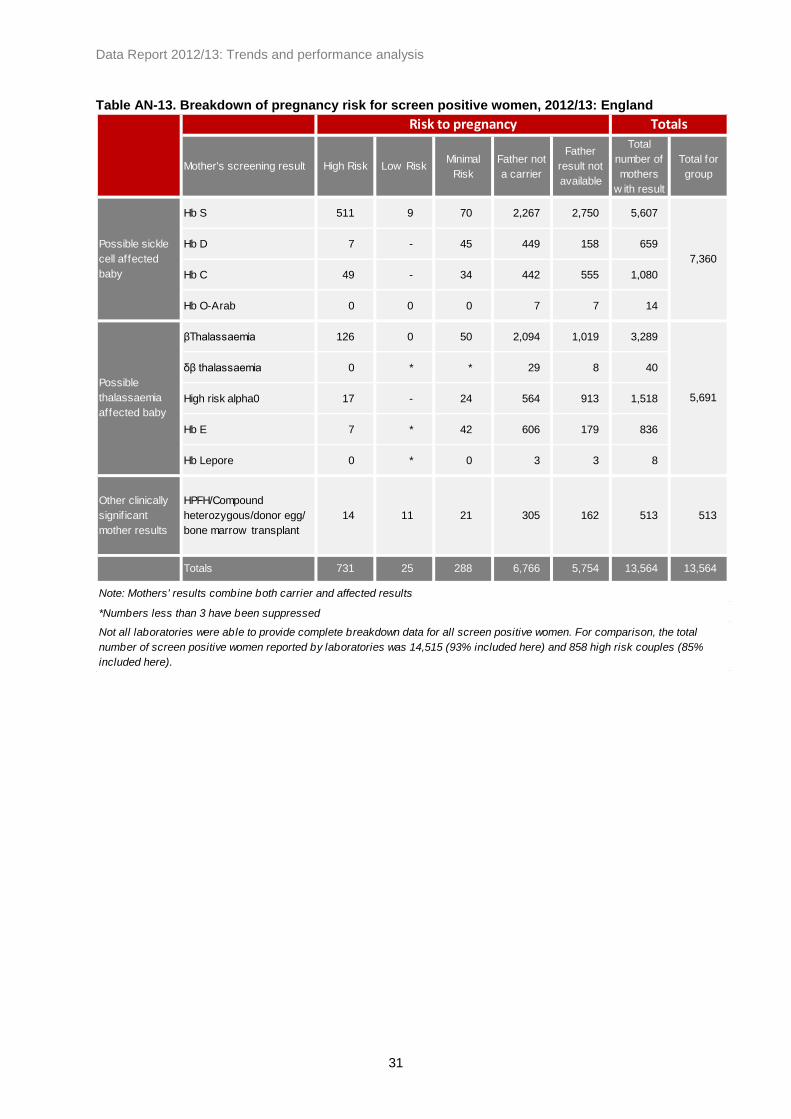
The Programme requests breakdown data on mother and father results to identify the specific risk of an affected pregnancy. Table AN-13 shows the risk status of pregnancies for antenatal screening by the mother’s results for 2012/13. Not all laboratories have been able to provide these data or to provide complete data, which means that this breakdown does not include all screening encounters in this period. However, of the 14,515 screen positive women identified in antenatal screening, 13,564 (93%) are included in this breakdown, and of the 858 ‘high risk’ couples identified, 731 (85%) are included here. Of the 13,564 screen positive women included in the breakdown, 7,360 (54%) had clinically significant haemoglobin variants where there was a risk of a baby with sickle cell disease (comprising HbS, HbD, HbC, and HbO
Arab). There were 5,691 screen positive women (42%) identified with results that could
lead to a thalassaemia affected baby (comprising beta thalassaemia, delta beta thalassaemia, those at high risk of being carriers of alpha zero thalassaemia, HbE and Hb Lepore). The remaining 513 screen positive women (4%) were identified with compound heterozygous results including one or more of the above results, cases where a donor egg was used or where there was a bone marrow transplant, or identified with Hereditary Persistence of Fetal Haemoglobin (HPFH). High risk pregnancies are those that are represented by the dark orange boxes on the breakdown in Appendix Two. Low risk pregnancies are represented by the light orange boxes, and minimal risk pregnancies are represented by the white boxes in the breakdown.
0
10
20
30
40
50
60
70
80
90
100
2007/08 2008/09 2009/10 2010/11 2011/12 2012/13
%
High PrevalenceAreas
Low PrevalenceAreas
England Total
Exclusions based on missing or unavailable data: 2007/08: 19; 2008/09: 10; 2009/10: 7; 2010/11: 3; 2011/12: 6; 2012/13: 6.
Data Report 2012/13: Trends and performance analysis
31
Table AN-13. Breakdown of pregnancy risk for screen positive women, 2012/13: England
Mother's screening result High Risk Low RiskMinimal
Risk
Father not
a carrier
Father
result not
available
Total
number of
mothers
w ith result
Total for
group
Hb S 511 9 70 2,267 2,750 5,607
Hb D 7 - 45 449 158 659
Hb C 49 - 34 442 555 1,080
Hb O-Arab 0 0 0 7 7 14
βThalassaemia 126 0 50 2,094 1,019 3,289
δβ thalassaemia 0 * * 29 8 40
High risk alpha0 17 - 24 564 913 1,518
Hb E 7 * 42 606 179 836
Hb Lepore 0 * 0 3 3 8
Other clinically
signif icant
mother results
HPFH/Compound
heterozygous/donor egg/
bone marrow transplant
14 11 21 305 162 513 513
Totals 731 25 288 6,766 5,754 13,564 13,564
Note: Mothers' results combine both carrier and affected results
*Numbers less than 3 have been suppressed
Not all laboratories were able to provide complete breakdown data for all screen positive women. For comparison, the total
number of screen positive women reported by laboratories was 14,515 (93% included here) and 858 high risk couples (85%
included here).
Risk to pregnancy Totals
Possible sickle
cell affected
baby
7,360
Possible
thalassaemia
affected baby
5,691

Data Report 2012/13: Trends and performance analysis
32
4. Prenatal diagnostic (PND) testing data
4.1. Data quality and methods of data collection
Response rate:
Data were received from all three PND laboratories, including pregnancy outcome data, for the period 1
st April 2012 – 31
st March 2013. We would like to commend the PND laboratories for this excellent
response rate.
Data quality:
The proportion of PND tests where the gestation was missing or unknown has decreased, and in 2012/13 approximately 99% of PND tests performed had information on gestation at test. However, the proportion of tests performed where the outcome (i.e. whether the couple continued the pregnancy, miscarried, or opted for termination) was unknown has increased. In 2012/13, of all PND tests performed, 40% had a missing outcome, compared to 32% and 37% in 2010/11 and 2011/12 respectively. Of the affected pregnancies identified, outcome data were available for 62%, compared to 66% in 2011/12 and 80% in 2010/11.
4.2. Numbers tested and detected
Table PND-1 shows the numbers of PND tests performed by each PND laboratory by year since 2007.
Table PND-1. Number of PNDs performed, 2004-13: England by laboratory
PND laboratory 2007/08 2008/09 2009/10 2010/11 2011/12 2012/13
Kings College Hospital 86 101 119 141 134 125
Oxford 130 166 159 159 149 161
University College London Hospital 109 119 118 120 135 112
Total 325 386 396 420 418 398
Data Report 2012/13: Trends and performance analysis
33
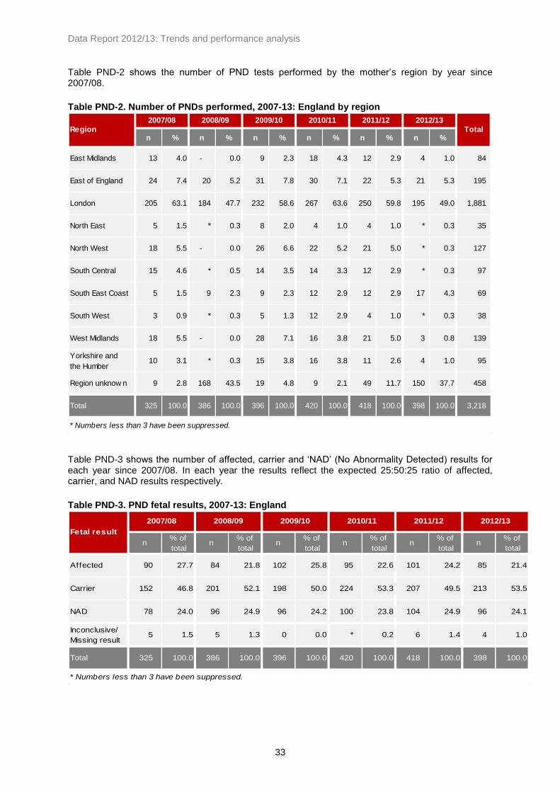
Table PND-2 shows the number of PND tests performed by the mother’s region by year since 2007/08.
Table PND-2. Number of PNDs performed, 2007-13: England by region
n % n % n % n % n % n %
East Midlands 13 4.0 - 0.0 9 2.3 18 4.3 12 2.9 4 1.0 84
East of England 24 7.4 20 5.2 31 7.8 30 7.1 22 5.3 21 5.3 195
London 205 63.1 184 47.7 232 58.6 267 63.6 250 59.8 195 49.0 1,881
North East 5 1.5 * 0.3 8 2.0 4 1.0 4 1.0 * 0.3 35
North West 18 5.5 - 0.0 26 6.6 22 5.2 21 5.0 * 0.3 127
South Central 15 4.6 * 0.5 14 3.5 14 3.3 12 2.9 * 0.3 97
South East Coast 5 1.5 9 2.3 9 2.3 12 2.9 12 2.9 17 4.3 69
South West 3 0.9 * 0.3 5 1.3 12 2.9 4 1.0 * 0.3 38
West Midlands 18 5.5 - 0.0 28 7.1 16 3.8 21 5.0 3 0.8 139
Yorkshire and
the Humber10 3.1 * 0.3 15 3.8 16 3.8 11 2.6 4 1.0 95
Region unknow n 9 2.8 168 43.5 19 4.8 9 2.1 49 11.7 150 37.7 458
Total 325 100.0 386 100.0 396 100.0 420 100.0 418 100.0 398 100.0 3,218
* Numbers less than 3 have been suppressed.
2011/12 2012/13
TotalRegion
2007/08 2008/09 2009/10 2010/11
Table PND-3 shows the number of affected, carrier and ‘NAD’ (No Abnormality Detected) results for each year since 2007/08. In each year the results reflect the expected 25:50:25 ratio of affected, carrier, and NAD results respectively.
Table PND-3. PND fetal results, 2007-13: England
n% of
totaln
% of
totaln
% of
totaln
% of
totaln
% of
totaln
% of
total
Affected 90 27.7 84 21.8 102 25.8 95 22.6 101 24.2 85 21.4
Carrier 152 46.8 201 52.1 198 50.0 224 53.3 207 49.5 213 53.5
NAD 78 24.0 96 24.9 96 24.2 100 23.8 104 24.9 96 24.1
Inconclusive/
Missing result5 1.5 5 1.3 0 0.0 * 0.2 6 1.4 4 1.0
Total 325 100.0 386 100.0 396 100.0 420 100.0 418 100.0 398 100.0
* Numbers less than 3 have been suppressed.
2009/10 2010/11 2011/12 2012/13
Fetal result
2007/08 2008/09

Data Report 2012/13: Trends and performance analysis
34
Table PND-4 provides a breakdown of these results by condition or risk between 2007/08 and 2012/13.
Table PND-4. Breakdown of PND fetal results by condition, 2007-13: England
Fetal result PND result/risk 2007/08 2008/09 2009/10 2010/11 2011/12 2012/13
Sickle Cell affected 66 60 79 66 85 68
Thalassaemia affected 24 24 23 29 15 17
Other 0 0 0 0 * 0
Sickle Cell carrier 110 150 152 174 154 169
Thalassaemia carrier 42 51 46 50 52 42
Other 0 0 0 0 * *
Risk for Sickle Cell 33 58 72 80 63 52
Risk for Thalassaemia 22 25 24 20 6 18
Risk not know n 23 13 0 0 35 26
Inconclusive† All risks 5 5 0 * 6 4
Total 325 386 396 420 418 398
* Numbers less than 3 have been suppressed.
Alpha and beta thalassaemia cases are grouped due to the small number of alpha thalassaemia cases.
Affected
Carrier
NAD
†Inconclusive results include both those declared as "inconclusive" in the data returns and those where the data was
not of a quality to determine a result with certainty.
4.3. Gestation data
Programme standard AO1b requires 50% of all prenatal diagnoses to be performed by 12 weeks and six days of gestation as a minimum standard, and 75% as an achievable standard. Table PND-5 shows the gestation at which PND tests were performed between 2007/08 and 2012/13.
Table PND-5. Gestation at sample for PND, 2007-13: England
n % n % n % n % n % n %
<12+6 w eeks 150 46.2 182 47.2 199 50.3 202 48.1 219 52.4 198 49.7
13+0 - 14+6 w eeks 49 15.1 65 16.8 76 19.2 105 25.0 93 22.2 71 17.8
≥15+0 w eeks 93 28.6 119 30.8 110 27.8 108 25.7 98 23.4 123 30.9
Unknow n gestation 33 10.2 20 5.2 11 2.8 5 1.2 8 1.9 6 1.5
Total 325 100.0 386 100.0 396 100.0 420 100.0 418 100.0 398 100.0
2009/10 2010/11 2011/12 2012/13Gestation
2007/08 2008/09
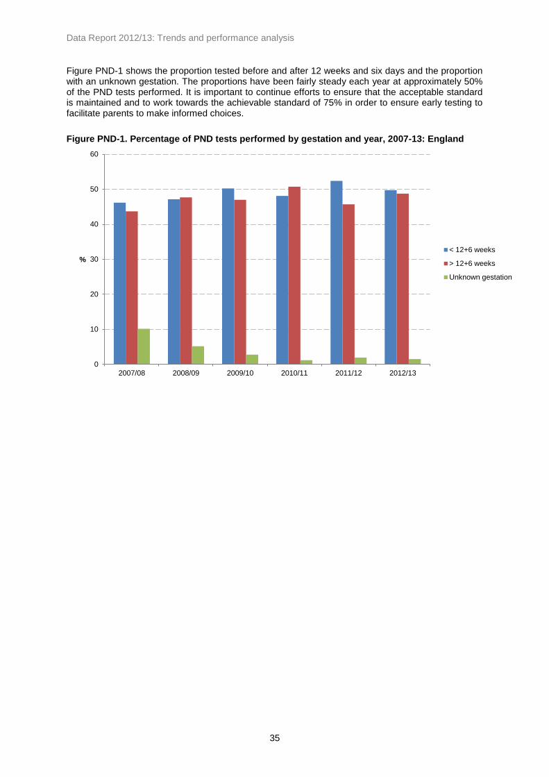
Data Report 2012/13: Trends and performance analysis
35
Figure PND-1 shows the proportion tested before and after 12 weeks and six days and the proportion with an unknown gestation. The proportions have been fairly steady each year at approximately 50% of the PND tests performed. It is important to continue efforts to ensure that the acceptable standard is maintained and to work towards the achievable standard of 75% in order to ensure early testing to facilitate parents to make informed choices.
Figure PND-1. Percentage of PND tests performed by gestation and year, 2007-13: England
0
10
20
30
40
50
60
2007/08 2008/09 2009/10 2010/11 2011/12 2012/13
%
< 12+6 weeks
> 12+6 weeks
Unknown gestation

Data Report 2012/13: Trends and performance analysis
36
4.4. Results by ethnicity
Table PND-6 shows the number of PND tests performed each year by mother’s ethnic grouping (as reported to the laboratories) between 2007/08 and 2012/13. In 2012/13 mothers from an African background accounted for nearly half of all PNDs performed and mothers from a Caribbean background accounted for approximately 4% of all PNDs performed in the year. Mothers from mixed or other ethnic backgrounds accounts for nearly 20% of PND tests performed. Mixed ethnicities can include combinations of ethnic groupings which prevents categorisation into these groups.
Table PND-6. Number of PND tests by mother's ethnicity, 2007-13: England
n% of
totaln
% of
totaln
% of
totaln
% of
totaln
% of
totaln
% of
total
African 158 48.6 184 47.7 212 53.5 240 57.1 211 50.5 180 45.2
Caribbean 15 4.6 22 5.7 22 5.6 23 5.5 12 2.9 14 3.5
Indian 18 5.5 9 2.3 14 3.5 16 3.8 9 2.2 9 2.3
Pakistani 16 4.9 13 3.4 16 4.0 19 4.5 * 0.5 * 0.5
Cypriot/Mixed
Cypriot10 3.1 10 2.6 10 2.5 11 2.6 7 1.7 4 1.0
Other Asian 15 4.6 22 5.7 23 5.8 16 3.8 50 12.0 16 4.0
Southern & Other
European6 1.8 6 1.6 6 1.5 5 1.2 3 0.7 8 2.0
Middle Eastern 10 3.1 9 2.3 12 3.0 5 1.2 4 1.0 4 1.0
Mixed/Other * 0.6 8 2.1 * 0.3 8 1.9 97 23.2 77 19.3
Not Know n 75 23.1 103 26.7 80 20.2 77 18.3 23 5.5 84 21.1
Total 325 100.0 386 100.0 396 100.0 420 100.0 418 100.0 398 100.0
*Numbers less than 3 have been suppressed
2009/10 2010/11 2011/12 2012/13Mother's ethnic
grouping
2007/08 2008/09

Data Report 2012/13: Trends and performance analysis
37
4.5. Pregnancy outcomes
The collection of data on pregnancy outcomes for PND tests began in 2008/09. Table PND-7 shows the total number of PND tests performed by pregnancy outcome where an affected baby was identified.
Table PND-7. Number of PND tests with affected results by outcome, 2008-13: England
n % n % n % n % n %
Continued 9 10.7 19 18.6 26 27.4 18 17.8 13 15.3
Terminated 27 32.1 41 40.2 50 52.6 48 47.5 38 44.7
Miscarriage * 1.2 0 0.0 0 0.0 * 1.0 * 2.4
Not Know n 47 56.0 42 41.2 19 20.0 34 33.7 32 37.6
Total 84 100.0 102 100.0 95 100.0 101 100.0 85 100.0
*Numbers less than 3 have been suppressed.
2012/13Outcome
2008/09 2009/10 2010/11 2011/12
Table PND-8 shows PND tests with affected results by pregnancy outcome for each condition as numbers and as a proportion of those identified with each condition.
Table PND-8. Outcomes for pregnancies with affected fetal diagnoses at PND, 2008-13:
England by condition
n
% of total
identif ied
w ith
condition n
% of total
identif ied
w ith
condition n
% of total
identif ied
w ith
condition n
% of total
identif ied
w ith
condition n
% of total
identif ied
w ith
condition
Continued 8 13.3 18 22.8 21 31.8 17 20.0 12 17.6
Terminated 17 28.3 30 38.0 31 47.0 38 44.7 28 41.2
Miscarried * 1.7 0 0.0 0 0.0 0 0.0 * 2.9
Not Know n 34 56.7 31 39.2 14 21.2 30 35.3 26 38.2
Continued 0 0.0 * 4.8 4 16.0 * 8.3 * 7.1
Terminated 8 38.1 9 42.9 17 68.0 8 66.7 8 57.1
Miscarried 0 0.0 0 0.0 0 0.0 * 8.3 0 0.0
Not Know n 13 61.9 11 52.4 4 16.0 * 16.7 5 35.7
Continued * 33.3 0 0.0 * 25.0 0 0.0 0 0.0
Terminated * 66.7 * 100.0 * 50.0 * 66.7 * 66.7
Miscarried 0 0.0 0 0.0 0 0.0 0 0.0 0 0.0
Not Know n 0 0.0 0 0.0 * 25.0 * 33.3 * 33.3
Total Affected 84 102 95 100 85
*Numbers less than 3 have been suppressed.
Affected results for other haemoglobinopathies have been excluded
2012/13
Sickle Cell
Beta
Thalassaemia
Alpha
Thalassaemia
Condition
Pregnancy
outcome
2008/09 2009/10 2010/11 2011/12

Data Report 2012/13: Trends and performance analysis
38
Figure PND-2 shows the proportion of PND tests with an affected result that opted to continue the pregnancy and opted to terminate the pregnancy in the period 2008/09 to 2012/13. This excludes alpha thalassaemia results and miscarriages as the numbers are low and cases where the pregnancy outcome was not known. Of the PND tests performed where an affected sickle cell result was identified and there was a known outcome, 65.5% opted to terminate the pregnancy and 34.5% opted to continue the pregnancy. Of the PND tests performed where an affected beta thalassaemia result was identified, 87.7% opted to terminate and 12.3% opted to continue the pregnancy.
Figure PND-2. Outcomes for pregnancies with affected fetus diagnosis at PND, 2008-13:
England by condition
Table PND-9 shows pregnancy outcomes by gestation at which the PND test was performed for affected sickle cell and beta thalassaemia results, combining figures for 2008/09 to 2012/13. For affected results for beta thalassaemia where the couple opted to terminate, the majority were tested by 12 weeks and six days of gestation (38 tested compared to 11 tested after this gestational period). For affected results for sickle cell where the couple opted to terminate, 65 were tested by 12 weeks and six days, compared to 76 tested after this gestational period.
Table PND-9. Gestation at PND for affected results with a known outcome, 2008-13: England
<12+6 weeks 13+0 - 14+6 weeks ≥15+0 wks
Condition Outcome n n n
Continued 23 15 36
Terminated 65 34 42
Continued 6 * 0
Terminated 38 7 4
*Numbers less than 3 have been suppressed.
Sickle Cell
Beta
Thalassaemia
Excludes affected PND tests where the outcome was unknown, where there was a miscarriage, or where
gestation at PND was unknown. Figure PND-3 shows the proportion of affected results where the parents opted to terminate the pregnancy, shown by gestation for all conditions combined with 95% confidence intervals shown. These data indicate that the later in pregnancy that PND tests are performed, the lower the percentage of parents that opt to terminate the pregnancy.
65.5
87.7
34.5
12.3
0
10
20
30
40
50
60
70
80
90
100
Sickle Cell* Beta Thalassaemia
%
Continued
Terminated
*"Sickle Cell" includes cases where the result was sickle cell and thalassaemia Excludes alpha thalassaemia cases, miscarriage outcomes, and 174 cases where pregnancy outcome was not known.

Data Report 2012/13: Trends and performance analysis
39
Figure PND-3. Percentage of affected results where parents opted to terminate, by gestation at
PND for known pregnancy outcomes, 2008-13
Figure PND-4 shows a comparison of the proportion of PND tests performed by 12 weeks and six days, the proportion of affected PND results where parents opted to terminate the pregnancy, and the proportion of affected babies identified in newborn screening. There appears to be a correlation between the percentage of PND tests performed by 12 weeks and six days and the proportion of affected results opting to terminate the pregnancy, which would indicate the benefits of early screening. However, there is not currently sufficient data to identify if there is a link between the proportion opting to terminate and the proportion of babies identified with a significant result in newborn screening.
Figure PND-4. Comparison of early PND testing, terminations for affected results and affected
results in newborn screening, 2008-13: England
77.5 71.7 55.3 0
10
20
30
40
50
60
70
80
90
100
<12+6 weeks 13+0 - 14+6 weeks ≥15+0 wks
%
Gestation
Excludes cases where the gestation at PND was unknown, and cases where the pregnancy outcome was unknown.
0.0
0.1
0.2
0.3
0.4
0.5
0.6
0.7
0
10
20
30
40
50
60
70
2008/09 2009/10 2010/11 2011/12 2012/13
Rate
/1000 b
ab
ies s
cre
en
ed
(n
ew
bo
rn s
cre
en
ing
)
% (
PN
D t
esti
ng
)
% of PND tests performedby 12+6 weeks
% opting to terminate afterPND affected result
Proportion of affectedbabies identified innewborn screening
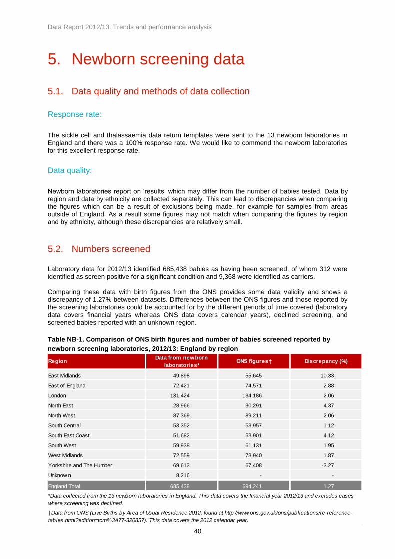
Data Report 2012/13: Trends and performance analysis
40
5. Newborn screening data
5.1. Data quality and methods of data collection
Response rate:
The sickle cell and thalassaemia data return templates were sent to the 13 newborn laboratories in England and there was a 100% response rate. We would like to commend the newborn laboratories for this excellent response rate.
Data quality:
Newborn laboratories report on ‘results’ which may differ from the number of babies tested. Data by region and data by ethnicity are collected separately. This can lead to discrepancies when comparing the figures which can be a result of exclusions being made, for example for samples from areas outside of England. As a result some figures may not match when comparing the figures by region and by ethnicity, although these discrepancies are relatively small.
5.2. Numbers screened
Laboratory data for 2012/13 identified 685,438 babies as having been screened, of whom 312 were identified as screen positive for a significant condition and 9,368 were identified as carriers. Comparing these data with birth figures from the ONS provides some data validity and shows a discrepancy of 1.27% between datasets. Differences between the ONS figures and those reported by the screening laboratories could be accounted for by the different periods of time covered (laboratory data covers financial years whereas ONS data covers calendar years), declined screening, and screened babies reported with an unknown region.
Table NB-1. Comparison of ONS birth figures and number of babies screened reported by
newborn screening laboratories, 2012/13: England by region
RegionData from newborn
laboratories*ONS figures† Discrepancy (%)
East Midlands 49,898 55,645 10.33
East of England 72,421 74,571 2.88
London 131,424 134,186 2.06
North East 28,966 30,291 4.37
North West 87,369 89,211 2.06
South Central 53,352 53,957 1.12
South East Coast 51,682 53,901 4.12
South West 59,938 61,131 1.95
West Midlands 72,559 73,940 1.87
Yorkshire and The Humber 69,613 67,408 -3.27
Unknow n 8,216 - -
England Total 685,438 694,241 1.27
†Data from ONS (Live Births by Area of Usual Residence 2012, found at http://www.ons.gov.uk/ons/publications/re-reference-
tables.html?edition=tcm%3A77-320857). This data covers the 2012 calendar year.
*Data collected from the 13 newborn laboratories in England. This data covers the financial year 2012/13 and excludes cases
where screening was declined.

Data Report 2012/13: Trends and performance analysis
41
The ‘unknown’ region category indicates cases where the laboratories provide figures as ‘out of region’ or ‘unknown PCT’ and so cannot be attributed to a specific region.
5.3. Newborn screening results
Significant conditions:
Significant conditions comprise FS, FSC, FS-Other and FE variants. Table NB-2 shows the number and rates of babies identified with a significant condition for each year between 2010 and 2013.
Table NB-2. Trends in the number of babies identified with significant conditions, 2010-13:
England by region
Regionn
Total
Screened
Rate/
1000n
Total
Screened
Rate/
1000n
Total
Screened
Rate/
1000
East Midlands 9 50,764 0.18 8 50,901 0.16 8 49,898 0.16
East of England 30 66,048 0.45 18 72,091 0.25 21 72,421 0.29
London 216 131,913 1.64 205 133,245 1.54 195 131,424 1.48
North East 3 28,560 0.11 * 28,122 0.07 * 28,966 0.03
North West 31 88,581 0.35 21 88,405 0.24 25 87,369 0.29
South Central 14 54,258 0.26 18 54,286 0.33 13 53,352 0.24
South East Coast 5 53,274 0.09 8 53,521 0.15 7 51,682 0.14
South West 10 59,399 0.17 4 60,811 0.07 7 59,938 0.12
West Midlands 26 72,404 0.36 21 72,970 0.29 21 72,559 0.29
Yorkshire and the Humber 14 69,382 0.20 10 69,457 0.14 11 69,613 0.16
Unknow n 0 13,731 0.00 5 9,469 0.53 3 8,216 0.37
England Total 358 688,314 0.52 320 693,278 0.46 312 685,438 0.46
*Numbers less than 3 have been suppressed
2010/11 2011/12 2012/13
In 2012/13 there were 312 babies identified with a significant condition, which equates to 0.46 per 1000 babies screened, or approximately one in 2,200 babies screened. Prior to 2011/12 there were approximately 360 babies identified with a significant condition through newborn screening each year. Across England rates range between 0.03 per 1000 babies screened (approximately one in 29,000 babies screened) in the North East and 1.48 per 1000 babies screened (approximately one in 674) in London. Babies born with a significant condition were identified in all regions, although approximately 63% of these babies were screened in London. Newborn screening does not specifically test for beta thalassaemia major. However, F-Only cases are likely beta thalassaemia cases and will require follow-up testing. The number of F-Only cases is approximately 20 each year and has ranged between 19 in 2010/11 and 25 in 2012/13. Figure NB-1 shows the geographical prevalence of babies identified with a significant condition per 1000 babies screened in 2012/13 by region.

Data Report 2012/13: Trends and performance analysis
42
Figure NB-1. Babies identified with a significant condition per 1000 babies screened, 2012/13:
England by region
Figure NB-2 shows the trends in rates of babies identified with a significant condition for England by region. Figure NB-3 compares the rates for London with those for the rest of England (including cases where the region is unknown). The rates for the whole of England appear steady at approximately 0.5 per 1000 babies screened over the eight-year period with slight variations between years. The rates in London are consistently higher than in other parts of England, but there is an indication of a continued decline in London and a slight increase in other parts of England, which could reflect population movements.
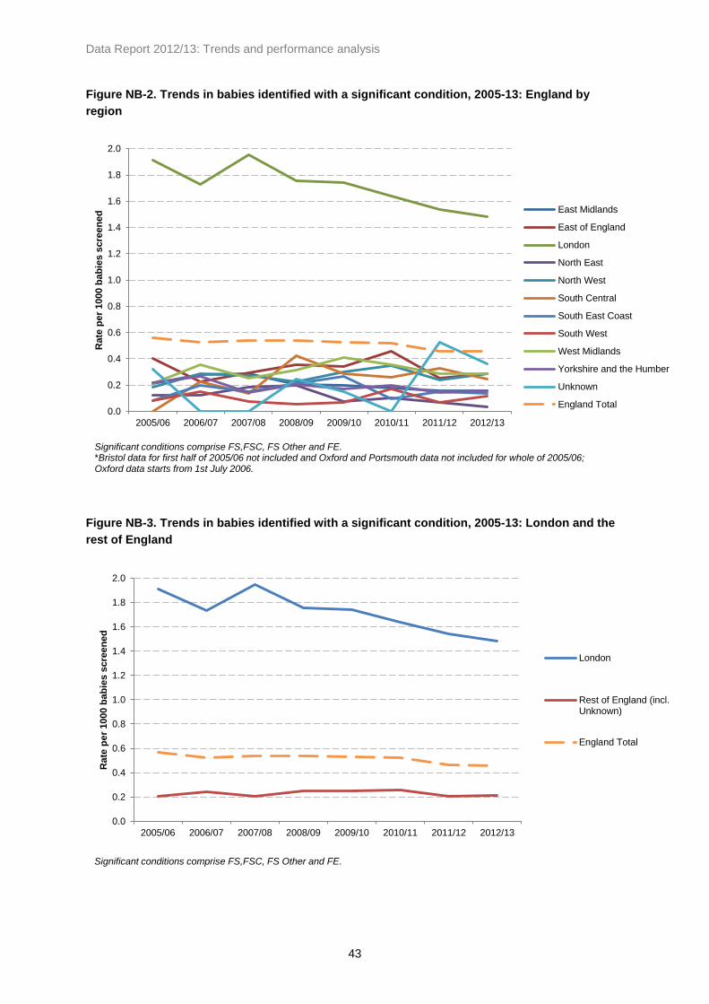
Data Report 2012/13: Trends and performance analysis
43
Figure NB-2. Trends in babies identified with a significant condition, 2005-13: England by
region
Figure NB-3. Trends in babies identified with a significant condition, 2005-13: London and the
rest of England
0.0
0.2
0.4
0.6
0.8
1.0
1.2
1.4
1.6
1.8
2.0
2005/06 2006/07 2007/08 2008/09 2009/10 2010/11 2011/12 2012/13
Rate
pe
r 1000 b
ab
ies s
cre
en
ed
East Midlands
East of England
London
North East
North West
South Central
South East Coast
South West
West Midlands
Yorkshire and the Humber
Unknown
England Total
Significant conditions comprise FS,FSC, FS Other and FE. *Bristol data for first half of 2005/06 not included and Oxford and Portsmouth data not included for whole of 2005/06; Oxford data starts from 1st July 2006.
0.0
0.2
0.4
0.6
0.8
1.0
1.2
1.4
1.6
1.8
2.0
2005/06 2006/07 2007/08 2008/09 2009/10 2010/11 2011/12 2012/13
Rate
pe
r 1000 b
ab
ies s
cre
en
ed
London
Rest of England (incl.Unknown)
England Total
Significant conditions comprise FS,FSC, FS Other and FE.

Data Report 2012/13: Trends and performance analysis
44
Carriers:
Carrier results comprise FAS, FAC, FAD, FAE and other carrier haemoglobin variants. Table NB-3 shows the number and rates of babies with a carrier result between 2005 and 2013. In 2012/13 there were 9,368 babies identified as carriers, which equates to approximately 14 per 1000 babies screened, or one in 73 babies screened. Across England the rates ranged between one in 186 in the South West and one in 28 in London.
Table NB-3. Trends in the number of babies identified with carrier results, 2005-13: England by
region
Regionn
Total
Screened
Rate/
1000n
Total
Screened
Rate/
1000n
Total
Screened
Rate/
1000
East Midlands 451 50,764 8.88 398 50,901 7.82 444 49,898 8.90
East of England 747 66,048 11.31 728 72,091 10.10 706 72,421 9.75
London 4,896 131,913 37.12 4,778 133,245 35.86 4,679 131,424 35.60
North East 150 28,560 5.25 122 28,122 4.34 157 28,966 5.42
North West 732 88,581 8.26 817 88,405 9.24 665 87,369 7.61
South Central 605 54,258 11.15 542 54,286 9.98 564 53,352 10.57
South East Coast 409 53,274 7.68 404 53,521 7.55 357 51,682 6.91
South West 286 59,399 4.81 351 60,811 5.77 323 59,938 5.39
West Midlands 935 72,404 12.91 939 72,970 12.87 900 72,559 12.40
Yorkshire and
The Humber557 69,382 8.03 529 69,457 7.62 477 69,613 6.85
Unknow n 62 13,731 4.52 110 9,469 11.62 96 8,216 11.68
England Total 9,830 688,314 14.28 9,718 693,278 14.02 9,368 685,438 13.67
2010/11 2011/12 2012/13

Data Report 2012/13: Trends and performance analysis
45
Figure NB-4 shows the geographical prevalence of babies identified with a carrier result per 1000 babies screened in 2012/13 by region.
Figure NB-4. Babies identified with a carrier result per 1000 babies screened, 2012/13: England
by region
Figure NB-5 shows the trends in rates of babies identified with a carrier result for England by region. Figure NB-6 shows these data for London only with a breakdown for London sectors (pre-2006 SHAs) and Figure NB-7 shows data for England excluding London and cases where the region is unknown. Figure NB-8 compares the rates for London with those for the rest of England (including cases where the region is unknown). Carrier numbers are higher than those for significant conditions, making the rates more reliable. As a result, carrier rates appear more stable across the eight-year period when compared to rates for babies identified with a significant condition. As with the figures for significant conditions, rates in London are consistently higher than in other parts of England. Carrier rates for the whole of England appear stable, but again there is some indication of a slight decline in London and an increase in other parts of England.

Data Report 2012/13: Trends and performance analysis
46
Figure NB-5. Trends in babies identified as carriers, 2012/13: England by region
Figure NB-6. Trends in babies identified as carriers, 2005-13: London sectors (pre-2006 SHAs)
0
5
10
15
20
25
30
35
40
45
2005/06 2006/07 2007/08 2008/09 2009/10 2010/11 2011/12 2012/13
Rate
pe
r 1000 b
ab
ies s
cre
en
ed
East Midlands
East of England
London
North East
North West
South Central
South East Coast
South West
West Midlands
Yorkshire and the Humber
Unknown
England Total
Carrier results comprise FAS, FAC, FAD, FAE and other carriers. *Bristol data for first half of 2005/06 not included and Oxford and Portsmouth data not included for whole of 2005/06; Oxford data starts from 1st July 2006.
0
10
20
30
40
50
60
70
2005/06 2006/07 2007/08 2008/09 2009/10 2010/11 2011/12 2012/13
Rate
pe
r 1000 b
ab
ies s
cre
en
ed
London NorthCentral
London North East
London North West
London South East
London South West
London Total
Carrier results comprise FAS, FAC, FAD, FAE and other carriers.

Data Report 2012/13: Trends and performance analysis
47
Figure NB-7. Trends in babies identified as carriers, 2005-13: England by region (excluding
London)
Figure NB-8. Trends in babies identified as carriers, 2005-13: London and the rest of England
Table NB-4 shows a breakdown of newborn screening results by haemoglobinopathy result for 2012/13 including both significant conditions and carrier results.
0
2
4
6
8
10
12
14
16
2005/06 2006/07 2007/08 2008/09 2009/10 2010/11 2011/12 2012/13
Rate
pe
r 1000 b
ab
ies s
cre
en
ed
East Midlands
East of England
North East
North West
South Central
South East Coast
South West
West Midlands
Yorkshire and the Humber
England Total(including London)
Carrier results comprise FAS, FAC, FAD, FAE and other carriers. *Bristol data for first half of 2005/06 not included and Oxford and Portsmouth data not included for whole of 2005/06; Oxford data starts from 1st July 2006.
0
5
10
15
20
25
30
35
40
45
2005/06 2006/07 2007/08 2008/09 2009/10 2010/11 2011/12 2012/13
Rate
pe
r 1000 b
ab
ies s
cre
en
ed
London
Rest of England (incl.Unknown)England Total
Carrier results comprise FAS, FAC, FAD, FAE and other carriers.
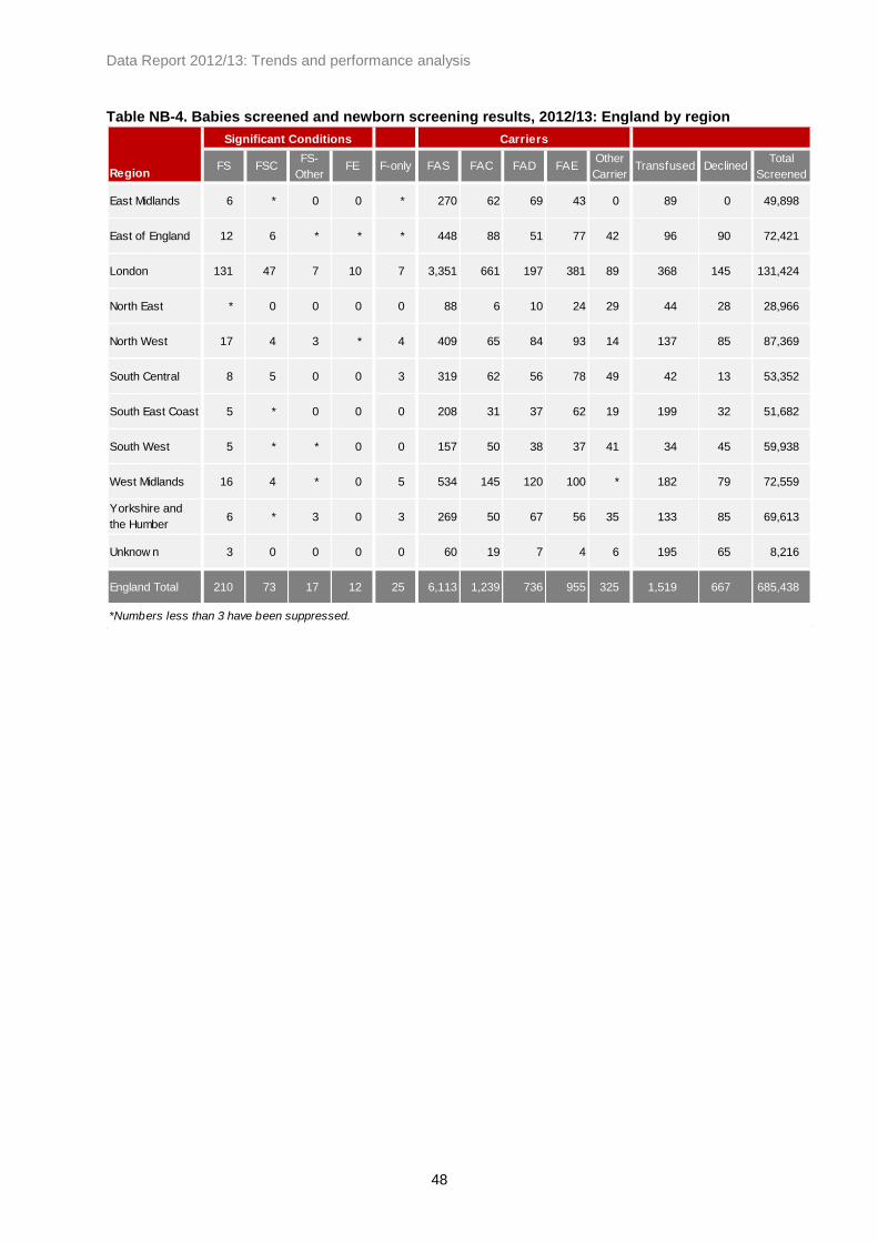
Data Report 2012/13: Trends and performance analysis
48
Table NB-4. Babies screened and newborn screening results, 2012/13: England by region
RegionFS FSC
FS-
Other FE F-only FAS FAC FAD FAE
Other
CarrierTransfused Declined
Total
Screened
East Midlands 6 * 0 0 * 270 62 69 43 0 89 0 49,898
East of England 12 6 * * * 448 88 51 77 42 96 90 72,421
London 131 47 7 10 7 3,351 661 197 381 89 368 145 131,424
North East * 0 0 0 0 88 6 10 24 29 44 28 28,966
North West 17 4 3 * 4 409 65 84 93 14 137 85 87,369
South Central 8 5 0 0 3 319 62 56 78 49 42 13 53,352
South East Coast 5 * 0 0 0 208 31 37 62 19 199 32 51,682
South West 5 * * 0 0 157 50 38 37 41 34 45 59,938
West Midlands 16 4 * 0 5 534 145 120 100 * 182 79 72,559
Yorkshire and
the Humber6 * 3 0 3 269 50 67 56 35 133 85 69,613
Unknow n 3 0 0 0 0 60 19 7 4 6 195 65 8,216
England Total 210 73 17 12 25 6,113 1,239 736 955 325 1,519 667 685,438
*Numbers less than 3 have been suppressed.
Significant Conditions Carriers

Data Report 2012/13: Trends and performance analysis
49
5.4. Results by ethnicity
Newborn screening figures by ethnicity differ slightly from the figures by region (see 5.1 - Data quality and methods of data collection). Table NB-5 shows the number and rates of babies identified with a significant condition in the three years since 2010/11, and Table NB-6 shows similar data for carrier results in the same period. Babies reported as Black African accounted for approximately 63% of significant conditions detected and approximately 37% of carrier results detected in 2012/13. While sickle cell disease is more common in the Black African, Black Caribbean and Any Other Black background ethnic categories, it is not confined to these groups and in 2012/13 1.6% of babies with significant conditions detected were declared as White British.
Table NB-5. Numbers of babies identified with significant conditions, 2010-13: England by
ethnicity
Ethnic Categoryn
Total
Screened
Rate/
1000n
Total
Screened
Rate/
1000n
Total
Screened
Rate/
1000
A - White British 4 443,856 0.01 3 443,448 0.01 5 434,514 0.01
B - White Irish 0 1,477 0.00 0 1,671 0.00 0 1,723 0.00
C - Any other White background 0 45,844 0.00 0 47,675 0.00 0 49,386 0.00
D - White and Black Caribbean 5 7,520 0.66 9 7,581 1.19 8 7,803 1.03
E - White and Black African * 4,414 0.45 6 4,407 1.36 3 4,348 0.69
F - White and Asian 0 7,859 0.00 0 8,056 0.00 0 10,495 0.00
G - Any other mixed background * 11,089 0.18 4 12,340 0.32 3 10,735 0.28
H - Indian 3 19,392 0.15 4 21,736 0.18 4 21,560 0.19
J - Pakistani * 27,259 0.04 * 27,262 0.04 0 27,855 0.00
K - Bangladeshi 14 9,153 1.53 7 9,096 0.77 9 9,856 0.91
L - Any other Asian background 4 9,970 0.40 3 9,869 0.30 * 8,078 0.25
M - Black Caribbean 40 7,234 5.53 38 6,668 5.70 30 7,402 4.05
N - Black African 233 25,353 9.19 195 24,294 8.03 196 22,244 8.81
P - Any other Black background 15 3,173 4.73 20 3,330 6.01 17 4,838 3.51
R - Chinese 0 3,757 0.00 0 3,687 0.00 0 3,951 0.00
S - Any other ethnic category 10 16,770 0.60 5 16,828 0.30 10 18,615 0.54
Z - Not stated 26 46,209 0.56 25 46,071 0.54 24 43,490 0.55
England Total 359 690,329 0.52 320 694,019 0.46 311 686,893 0.45
2010/11 2011/12 2012/13
*Numbers less than 3 have been suppressed.

Data Report 2012/13: Trends and performance analysis
50
Table NB-6. Numbers of babies identified with carrier results, 2010-13: England by ethnicity
Ethnic Categoryn
Total
Screened
Rate/
1000n
Total
Screened
Rate/
1000n
Total
Screened
Rate/
1000
A - White British 980 443,856 2.21 957 443,448 2.16 762 434,514 1.75
B - White Irish * 1,477 1.35 5 1,671 2.99 3 1,723 1.74
C - Any other White background 150 45,844 3.27 171 47,675 3.59 139 49,386 2.81
D - White and Black Caribbean 495 7,520 65.82 464 7,581 61.21 457 7,803 58.57
E - White and Black African 339 4,414 76.80 375 4,407 85.09 359 4,348 82.57
F - White and Asian 177 7,859 22.52 168 8,056 20.85 146 10,495 13.91
G - Any other mixed background 396 11,089 35.71 327 12,340 26.50 352 10,735 32.79
H - Indian 286 19,392 14.75 328 21,736 15.09 314 21,560 14.56
J - Pakistani 338 27,259 12.40 351 27,262 12.88 293 27,855 10.52
K - Bangladeshi 437 9,153 47.74 416 9,096 45.73 420 9,856 42.61
L - Any other Asian background 174 9,970 17.45 182 9,869 18.44 158 8,078 19.56
M - Black Caribbean 897 7,234 124.00 850 6,668 127.47 843 7,402 113.89
N - Black African 3,629 25,353 143.14 3,467 24,294 142.71 3,483 22,244 156.58
P - Any other Black background 349 3,173 109.99 396 3,330 118.92 412 4,838 85.16
R - Chinese 22 3,757 5.86 27 3,687 7.32 29 3,951 7.34
S - Any other ethnic category 406 16,770 24.21 401 16,828 23.83 495 18,615 26.59
Z - Not stated 773 46,209 16.73 838 46,071 18.19 746 43,490 17.15
England Total 9,850 690,329 14.27 9,723 694,019 14.01 9,411 686,893 13.70
*Numbers less than 3 have been suppressed.
2010/11 2011/12 2012/13

Data Report 2012/13: Trends and performance analysis
51
5.5. Declined screening tests
In 2012/13 there were a total of 667 declined tests across England, or 0.97 per 1000. Figure NB-9 shows the national rates for each year between 2005/06 and 2012/13, and indicates an increase in the number of cases where screening was declined since 2008/09.
Figure NB-9. Declined screening for sickle cell disease, 2005-13: England
5.6. Post-transfusion testing
Routine techniques are not suitable for testing samples from transfused babies as transfused red cells can survive up to 120 days in circulation. It is therefore important that pre-transfusion samples are taken in accordance with standards. Table NB-7 shows the number and rates of post-transfusion samples between 2010 and 2013 by region. In 2012/13 there were 1,519 post-transfusion samples received, or 2.2 per 1000 babies screened. The rates by region range between 0.57 per 1000 in the South West and 3.85 per 1000 in the South East Coast region. There were 195 post-transfusion samples where the region is unknown. Figure NB-10 shows the national rates for each year since 2005. Over this period there has been a steady decrease in the rate of post-transfusion samples for newborn screening which has been the result of much hard work. There was a small increase in this rate in 2011/12, but in 2012/13 the rate decreased to 2.2 per 1000 babies screened.
0.50 0.52
0.51
0.43
0.51
0.65
0.85
0.97
0.0
0.2
0.4
0.6
0.8
1.0
1.2
2005/06 2006/07 2007/08 2008/09 2009/10 2010/11 2011/12 2012/13
Rate
pe
r 1000 b
ab
ies s
cre
en
ed
Bristol data for first half of 2005/06 not included and Oxford and Portsmouth data not included for whole of 2005/06; Oxford data starts from 1st July 2006.

Data Report 2012/13: Trends and performance analysis
52
Table NB-7. Post-transfusion samples, number and rate per 1000 babies screened, 2010-13:
England by region
Regionn
Total
Screened
Rate/
1000n
Total
Screened
Rate/
1000n
Total
Screened
Rate/
1000
East Midlands 72 50,764 1.42 94 50,901 1.85 89 49,898 1.78
East of England 101 66,048 1.53 83 72,091 1.15 96 72,421 1.33
London 305 131,913 2.31 344 133,245 2.58 368 131,424 2.80
North East 57 28,560 2.00 35 28,122 1.24 44 28,966 1.52
North West 192 88,581 2.17 224 88,405 2.53 137 87,369 1.57
South Central 45 54,258 0.83 34 54,286 0.63 42 53,352 0.79
South East Coast 111 53,274 2.08 195 53,521 3.64 199 51,682 3.85
South West 81 59,399 1.36 42 60,811 0.69 34 59,938 0.57
West Midlands 216 72,404 2.98 213 72,970 2.92 182 72,559 2.51
Yorkshire and the Humber 47 69,382 0.68 145 69,457 2.09 133 69,613 1.91
Unknow n 200 13,731 14.57 229 9,469 24.18 195 8,216 23.73
England Total 1,427 688,314 2.07 1,638 693,278 2.36 1,519 685,438 2.22
2010/11 2011/12 2012/13
Figure NB-10. Post-transfusion samples, rate per 1000 babies screened, 2005-13: England
7.4
7.0
5.6
3.4
2.2 2.1 2.4
2.2
0
1
2
3
4
5
6
7
8
9
2005/06 2006/07 2007/08 2008/09 2009/10 2010/11 2011/12 2012/13
Rate
pe
r 1000 b
ab
ies s
cre
en
ed
Imple
menta
tio
n o
f pre
-tr
ansfu
sio
n p
olic
y

Data Report 2012/13: Trends and performance analysis
53
As a failsafe to ensure that transfused babies are offered appropriate screening and to mitigate the on-going risks of a missed baby, the Sickle Cell and Thalassaemia Screening Programme worked with the Newborn Blood Spot Screening Programme to introduce a pilot process of DNA testing for babies which was to run between November 2009 and March 2014, and some positive cases have been identified through this failsafe measure. Between November 2009 and March 2013 there were 5,030 samples tested at King’s College Hospital and Sheffield Children’s Hospital using DNA techniques, of which five were found to be screen positive for sickle cell disease (approximately one per 1000 babies screened using DNA techniques). Since the programme introduced a policy for pre-transfusion samples and DNA testing, there has been a reduction in the proportion of post-transfusion samples being received by the laboratories, and the rates have now levelled out at approximately 2.2 per 1000 babies screened. Future funding for DNA testing for transfused babies will be provided by NHS England. For more information on DNA testing for transfused babies, see sct.screening.nhs.uk/transfusedbabies.
Table NB-8. Numbers detected through DNA testing for transfused babies, 2009-13
Collection year
Quarter (financial) Q3 Q4 Q1 Q2 Q3 Q4 Q1 Q2 Q3 Q4 Q1 Q2 Q3 Q4
Total Specimens received per
Quarter143 350 371 457 455 391 358 351 390 421 333 366 315 329 5,030
Number of Negative results
(HbS not detected)139 344 366 454 446 384 350 341 387 419 330 357 310 322 4,949
Number of Positive
Heterozygotes4 6 5 3 9 7 8 9 3 * 3 7 4 7 76
Number of Positive
Homozygotes0 0 0 0 0 0 0 * 0 * 0 * * 0 5
Number of Results pending 0 0 0 0 0 0 0 0 0 0 0 0 0 0 0
Number rejected due to lack
of identif iers* 0 0 0 0 0 0 0 0 0 0 0 0 0 *
*Numbers less than 3 have been suppressed.
2009/10 2010/11 2011/12 2012/13Total for
period
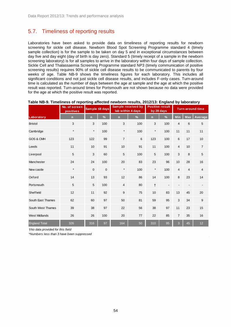
Data Report 2012/13: Trends and performance analysis
54
5.7. Timeliness of reporting results
Laboratories have been asked to provide data on timeliness of reporting results for newborn screening for sickle cell disease. Newborn Blood Spot Screening Programme standard 4 (timely sample collection) is for the sample to be taken on day 5 and in exceptional circumstances between day five and day eight (day of birth is day zero). Standard 5 (timely receipt of a sample in the newborn screening laboratory) is for all samples to arrive in the laboratory within four days of sample collection. Sickle Cell and Thalassaemia Screening Programme standard NP3 (timely communication of positive screening results) requires 90% of sickle cell disease results to be communicated to parents by four weeks of age. Table NB-9 shows the timeliness figures for each laboratory. This includes all significant conditions and not just sickle cell disease results, and includes F-only cases. Turn-around time is calculated as the number of days between the age at sample and the age at which the positive result was reported. Turn-around times for Portsmouth are not shown because no data were provided for the age at which the positive result was reported.
Table NB-9. Timeliness of reporting affected newborn results, 2012/13: England by laboratory
No. of screen
positives
Laboratory n n % n % n % Min Max Average
Bristol 3 3 100 3 100 3 100 4 6 5
Cambridge * * 100 * 100 * 100 11 11 11
GOS & CMH 123 122 99 7 6 123 100 6 17 10
Leeds 11 10 91 10 91 11 100 4 10 7
Liverpool 5 3 60 5 100 5 100 3 8 5
Manchester 24 24 100 20 83 23 96 10 28 16
New castle * 0 0 * 100 * 100 4 4 4
Oxford 14 13 93 12 86 14 100 8 23 14
Portsmouth 5 5 100 4 80 † - - - -
Sheffield 12 11 92 9 75 10 83 13 45 20
South East Thames 62 60 97 50 81 59 95 3 34 9
South West Thames 39 38 97 22 56 38 97 11 23 15
West Midlands 26 26 100 20 77 22 85 7 35 16
England Total 326 316 97 164 50 310 95 3 45 12
†No data provided for this field
*Numbers less than 3 have been suppressed
Sample ≤8 daysSample received by
lab within 4 days
Positive result
by 28 daysTurn-around time

Data Report 2012/13: Trends and performance analysis
55
6. Key Performance Indicators
Background to Key Performance Indicators Key Performance Indicators (KPIs) give a high level overview of the quality of screening programmes at key points on the screening pathway. They contribute to the quality assurance of screening programmes, but are not in themselves sufficient to quality assure or performance manage screening services. KPI data covering quarter 1 of 2013/14 (1 April to 30 June 2013) have been published and can be accessed at http://www.screening.nhs.uk/kpi/reports/2013-14. It is important to note that these data cover only one quarter and are in a different reporting year than the other data presented in this report. The Sickle Cell and Thalassaemia Screening Programme has three antenatal KPIs and shares one newborn KPI with the Newborn Blood Spot Screening Programme:
KPI Code
KPI Description
ST1 The proportion of pregnant women eligible for antenatal sickle cell and thalassaemia screening for whom a conclusive screening result is available at the day of report (the day on which data to support an audit or performance return are collated)
ST2 The proportion of women having antenatal sickle cell and thalassaemia screening for whom a conclusive screening result is available by 10 weeks’ gestation
ST3 The proportion of antenatal sickle cell and thalassaemia samples submitted to the laboratory which are supported by a completed Family Origin Questionnaire (FOQ)
NB3 The proportion of newborn blood spot screening results which are screen negative for all five conditions, available for communication to parents within six weeks of birth
Key findings In this quarter coverage for sickle cell and thalassaemia (ST1) was high at 98.2%.
The acceptable level for ST2 is 50%. The England average was 48.7%, with London (33.9%), West Midlands (39.5%), and North West (47.8%) reporting below 50% (see chart below).
The acceptable level for ST3 is 90%. Across England 128 Trusts out of 146 achieved this level and 14 did not, of which nine were in London. One Trust submitted data higher than 100%, three did not submit data and two Trusts withdrew data.
The report focus for NB3 is maternity service, but it is reported by old PCT boundaries and 24 organisations did not submit data or had data withdrawn. Of those that submitted data, performance was high with all organisations achieving greater than the acceptable level of 95% and 33 achieving 100%

Data Report 2012/13: Trends and performance analysis
56
20
25
30
35
40
45
50
55
60
65
70
Tim
eli
ne
ss io
f te
st
(%)
ST2 - Antenatal sickle cell and thalassaemia screening: Q1 2013/14
England (48.7%) Acceptable (50%)
The proportion of women having antenatal sickle cell and thalassaemia screening for whom a conclusive screening result is available by 10 weeks’ gestation.

Data Report 2012/13: Trends and performance analysis
57
7. Appendices
Appendix One: UK Newborn Blood Spot data report 2012/13: Executive
Summary
During the fiscal year of 2012-13 just over 810,000 babies had blood spot sample taken and of these, 1,442 babies had a positive screening result. A newborn screening study took place in 2012-13 in five areas (Yorkshire, the East Midlands, the West Midlands, the North West of England and some parts of London and the South East). Five additional rare disorders were included in the study: maple syrup urine disease, homocystinuria (pyridoxine unresponsive), isovaleric acidaemia, glutaric aciduria type 1 and long-chain hydroxyl acyl-CoA dehydrogenase deficiency. The study began with babies tested on or after 16th July 2012 and ended with those tested on or before 19th July 2013, and was subsequently extended to 31st September 2014. On the basis of this study, the UK National Screening Committee is consulting on its recommendation to expand the current newborn blood spot screening programme to include:
homocystinuria (HCU)
maple syrup urine disease (MSUD)
glutaric aciduria type 1 (GA1)
The NHS Newborn Blood Spot Screening Programme has continued to work with the Sickle Cell and Thalassaemia Screening Programme and awarded Northgate Information Solutions Ltd the contract to implement the Newborn Blood Spot Failsafe Solution. This will identify babies that may have missed newborn blood spot screening and possibly mothers and babies postnatal care. The project has won the Health Service Journal award for the ‘Efficiencies in Clinical Support Services’ category. Overall newborn screening performance continues to improve in general for use of the NHS number, bar coded label, timely collection and despatch of the blood spot sample. Although the number of avoidable repeat requests has decreased in some areas, this remains an area for concern and the blood spot programme is working to address the high number of samples repeated for avoidable reasons, which continues to cause unnecessary distress to families and waste NHS resources. Referral times and entry into care remain good for PKU, MCADD, CHT and CF babies screened positive on the first sample with 94% of babies within this meeting the national standards. Timeliness is less good for those screened on second sample and the programme aims to pinpoint where these delays are happening. For the first time, screening data has been mapped to the CF, MCADD and PKU protocols for the UK.
Unfortunately due to the varied TSH cut off levels used across laboratories, data was not able to be
mapped to the CHT protocol.

Data Report 2012/13: Trends and performance analysis
58
Appendix Two: Antenatal data return form part two - Breakdown of
screen positive women
Hb S βThal db thal Hb Lepore Hb D Hb C Hb E Hb O-Arab HPFHHigh risk
alpha0
Compound
Hetero-
zygous**
*OtherNot a
carrier
Father
result not
available
Hb S
βThal
db thal
Hb Lepore
Hb D
Hb C
Hb E
Hb O-Arab
HPFH
High risk alpha0
Compound
Heterozygous**
Egg donor/bone
marrow transplant
Father's test result
Moth
er's test re
sult

Data Report 2012/13: Trends and performance analysis
59

Data Report 2012/13: Trends and performance analysis
60