css fundamentals chapter 16: pp 273-296. project 1 project 1: design your own web page using xhtml...
Post on 19-Dec-2015
217 views
TRANSCRIPT

CSS Fundamentals
Chapter 16: pp 273-296

Project 1
Project 1: Design your own web page using XHTML and CSS.
• This is an individually graded project.
• This is due at the beginning of next lab.
• You and your partner can "consult" each other for help, but your web page has to be your own individual work.

Project 1: Link it!
• Put your web page in your team's projects subfolder. Give the page a meaningful file name, i.e., eric.html, kelly.html, etc. so that I will know who did the work.
• Link the page from your index.html file.– Add a link called "Eric's First Page" from the
project menu to eric.html.
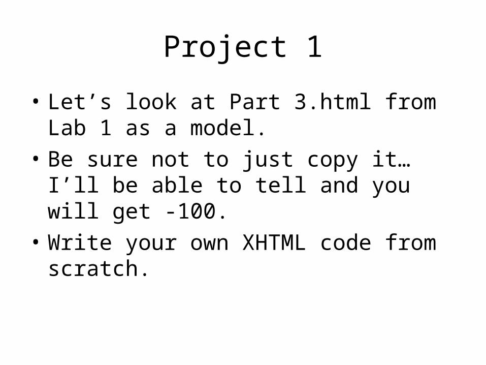
Project 1
• Let’s look at Part 3.html from Lab 1 as a model.
• Be sure not to just copy it…I’ll be able to tell and you will get -100.
• Write your own XHTML code from scratch.
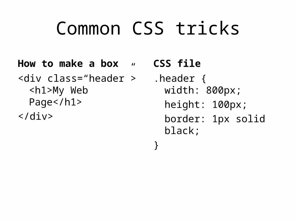
Common CSS tricks
How to make a box
<div class=“header”><h1>My Web Page</h1>
</div>
CSS file
.header {width: 800px;
height: 100px;
border: 1px solid black;
}
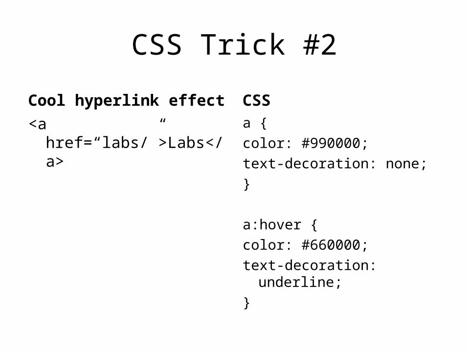
CSS Trick #2
Cool hyperlink effect
<a href=“labs/”>Labs</a>
CSS
a {
color: #990000;
text-decoration: none;
}
a:hover {
color: #660000;
text-decoration: underline;
}

CSS Trick #3
How to center stuff
<div id=“container”>
Lots of stuff
</div>
CSS
#container {
width: 790px;
margin: 0px auto;
}

CSS Trick #4
Remove annoying blank lines
<h1>Header</h1>
<p>
Some paragraph text.
</p>
CSS
h1, p {
margins: 0px;
}
Add an indent:
p {
text-indent: 10px;
}
Two rules could conflict
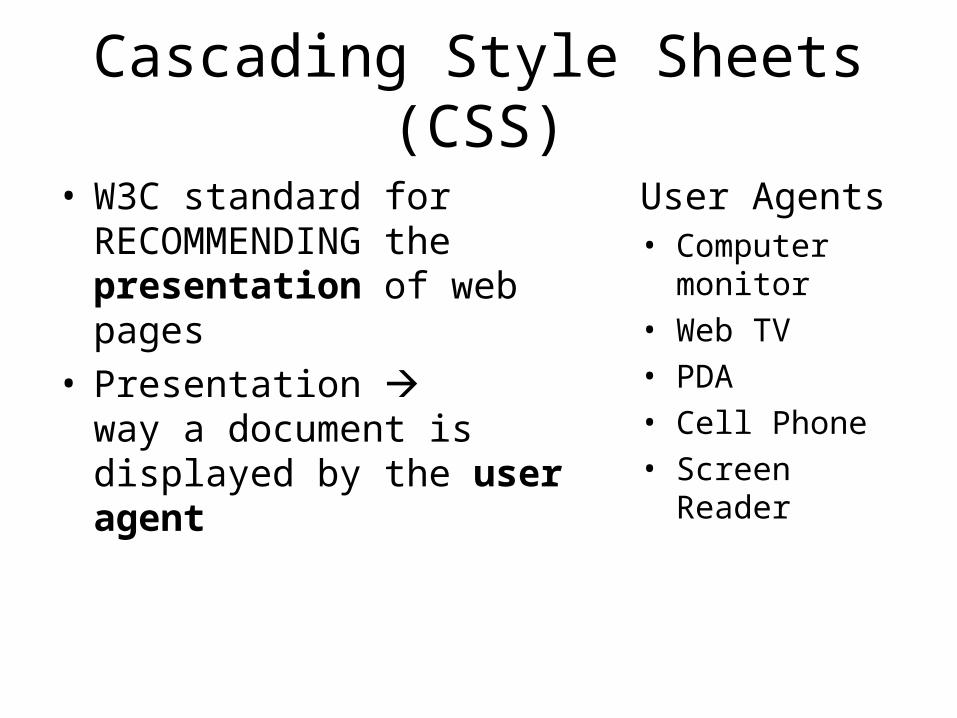
Cascading Style Sheets (CSS)
• W3C standard for RECOMMENDING the presentation of web pages
• Presentation way a document is displayed by the user agent
User Agents• Computer
monitor• Web TV• PDA• Cell Phone• Screen Reader

Visual Aspects of a Web Page
Aspects• Typography – fonts• Colors• Layout• Alignment• Images –
background, decorators, etc.
Depends on…• Device• Operating System• Browser• Screen Resolution• Display Options• Installed Fonts
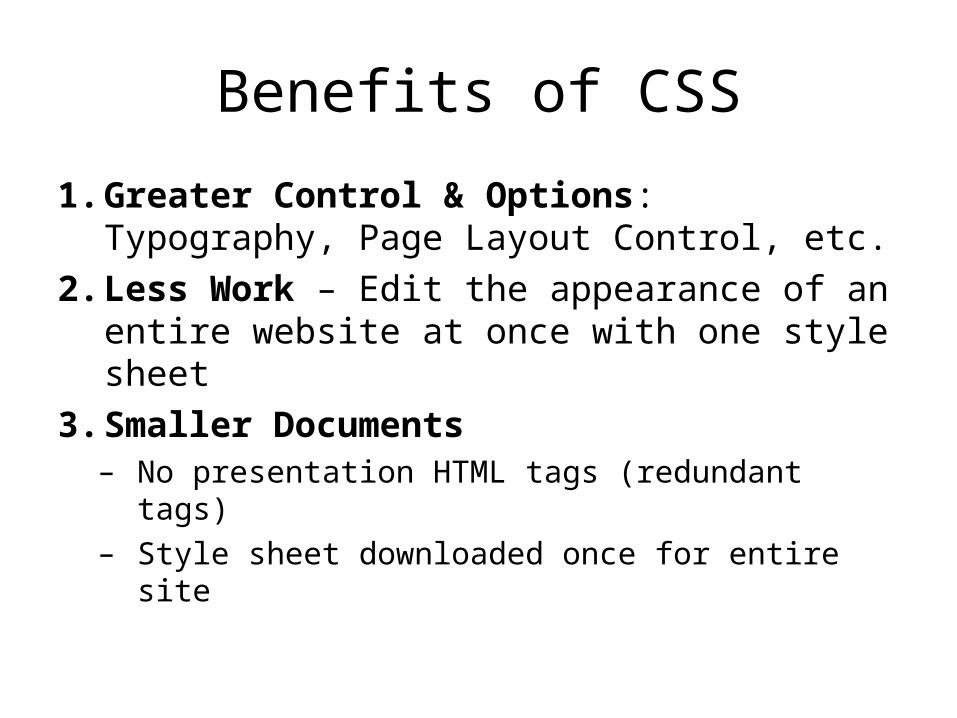
Benefits of CSS
1. Greater Control & Options: Typography, Page Layout Control, etc.
2. Less Work – Edit the appearance of an entire website at once with one style sheet
3. Smaller Documents– No presentation HTML tags (redundant tags)– Style sheet downloaded once for entire site

Benefits of CSS
4. More accessible – – easier to parse (semantic structure)– think about screen readers.
5. Presentational HTML is fundamentally flawed
6. Well-supported– All major browsers support CSS 1– Most support CSS 2.1

How CSS Works
1. Structural Layer: Start with an XHTML document with
• Logical structure• Meaningful (semantic) tags
2. Presentation Layer: Write style rules for each structural element/tag in a style sheet.
3. Attach style sheet to the XHTML document

Syntax
selector {property: value;property: value;..
}
Examples:
h1 {font-size: 14px; color: red;
}
.boxedpargraph {border: solid 1px black;margin: 10px ;float: left ;
}

Tags, classes and ids
<p>Paragraph</p>
<div class=“mystyle”>
My Style
</div>
<div id=“useonce”>This div can only be used once in a web page
</div>
p {margin: 0px;}
.mystyle {
margin: 0px;
}
#useonce {
margin: 0px;
}
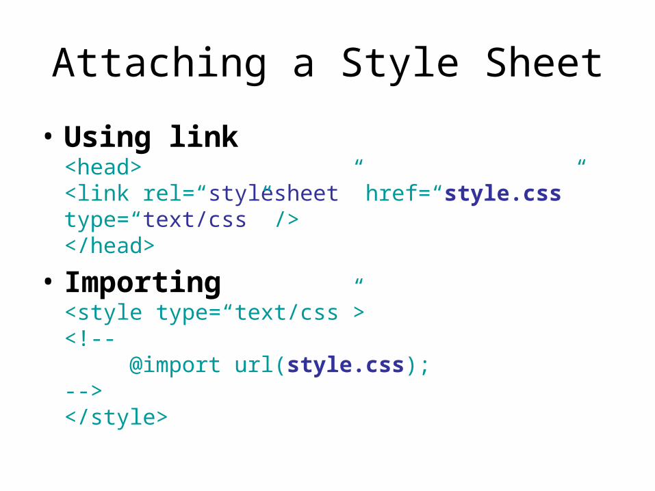
Attaching a Style Sheet
• Using link<head><link rel=“stylesheet” href=“style.css” type=“text/css” /></head>
• Importing<style type=“text/css”><!--
@import url(style.css);--></style>
Attaching a Style Sheet
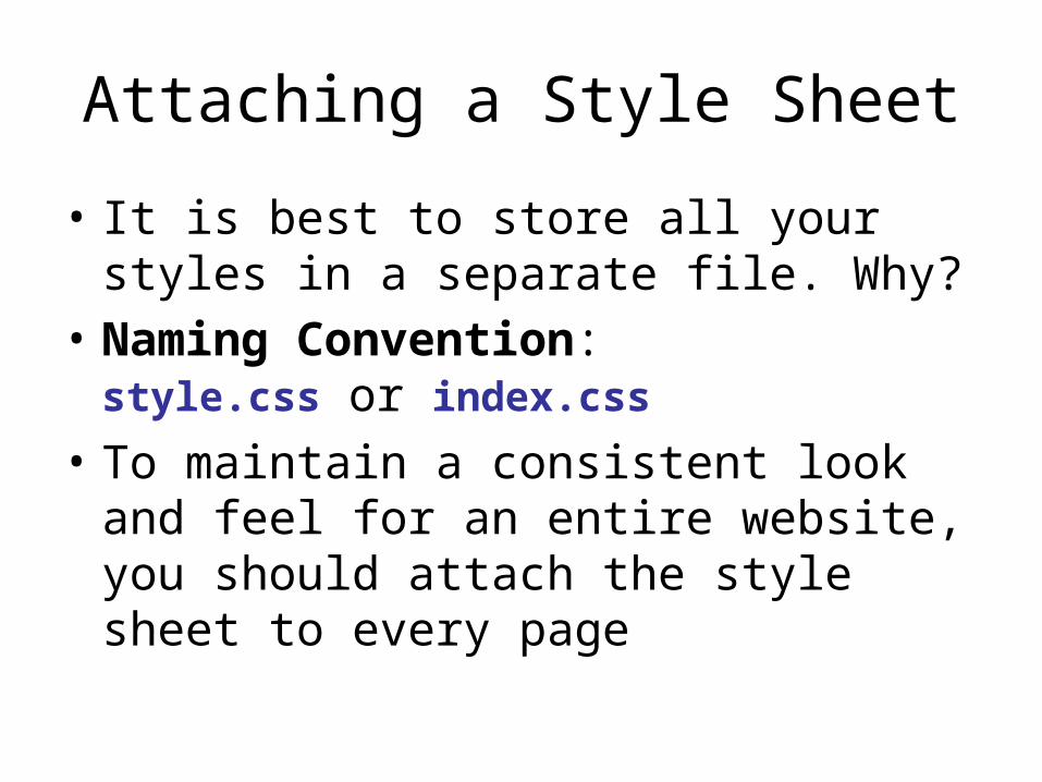
• It is best to store all your styles in a separate file. Why?
• Naming Convention: style.css or index.css
• To maintain a consistent look and feel for an entire website, you should attach the style sheet to every page

Attaching a Style Sheet
• Using the XHTML link tag is the standard way to include a style sheet
• The @import statement is usually used as a clever hack– Older browsers ignore @import – So use @import to fetch the CSS 2.1 style
sheet and link to fetch the CSS 1 style sheet.– Thus, older browsers will use CSS 1 and new
browsers will use CSS 2.1

Other methods
• Inline styles<div id="header" style="background:
url(pic.jpg) top no-repeat;">
• Embedded style sheets<head><style type=“text/css”>
h1 { color: red; }p { margin: 0px; }…
</style></head>
Other methods
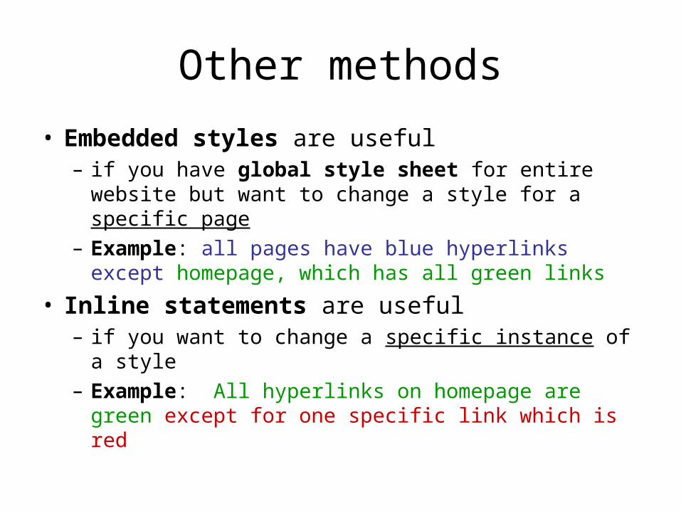
• Embedded styles are useful – if you have global style sheet for entire website but
want to change a style for a specific page– Example: all pages have blue hyperlinks except
homepage, which has all green links
• Inline statements are useful – if you want to change a specific instance of a style– Example: All hyperlinks on homepage are green
except for one specific link which is red

Alternate Style Sheets• True spirit of separation between content and style• Not supported by IE6
<head>
<link rel=“stylesheet” href=“style.css” type=“text/css” title=“Default Styles”/>
<link rel=“alternate stylesheet” href=“style.css” type=“text/css” title=“Large Font”/>
<link rel=“alternate stylesheet” href=“style.css” type=“text/css” title=“Minimal Styles”/>
</head>

Alternate Style Sheet Example
• http://www.cs.siena.edu/~ebreimer/
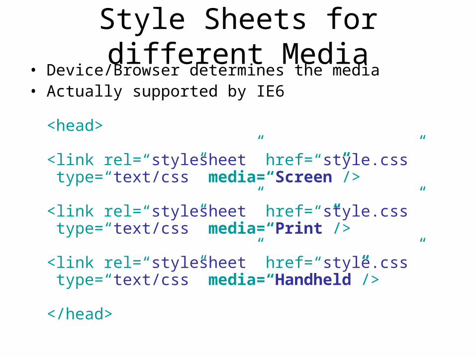
Style Sheets for different Media• Device/Browser determines the media• Actually supported by IE6
<head>
<link rel=“stylesheet” href=“style.css” type=“text/css” media=“Screen”/>
<link rel=“stylesheet” href=“style.css” type=“text/css” media=“Print”/>
<link rel=“stylesheet” href=“style.css” type=“text/css” media=“Handheld”/>
</head>

Style Sheets for different Media
• all – good for all Displays• Braille/embossed – for Braille printers• handheld – very low resolution, compact display• print – when printing on paper• projector – better color contrast, larger fonts• speech – screen readers for visually impaired• tty – teletype printers, very small, B&W• tv – low resolution, low pixel contrast
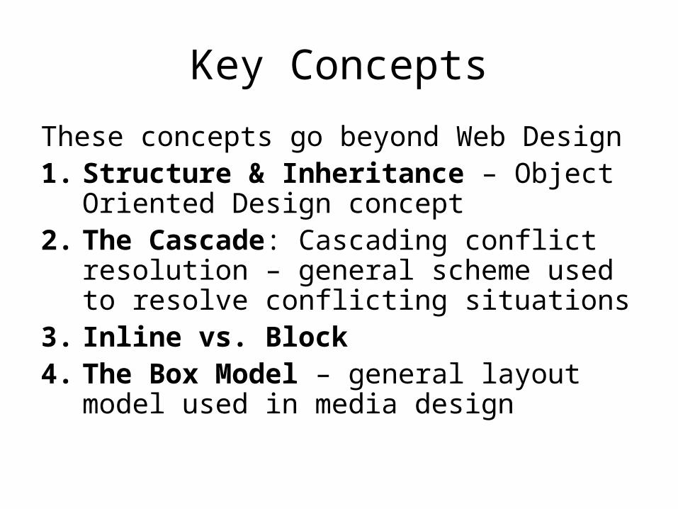
Key Concepts
These concepts go beyond Web Design1. Structure & Inheritance – Object
Oriented Design concept2. The Cascade: Cascading conflict
resolution – general scheme used to resolve conflicting situations
3. Inline vs. Block4. The Box Model – general layout model
used in media design

Important Reading
• Read pages 283-296 in detail
• Things to know:– Conflicting Style Rules: The Cascade– Memorize the rules.– Which rules have more weight
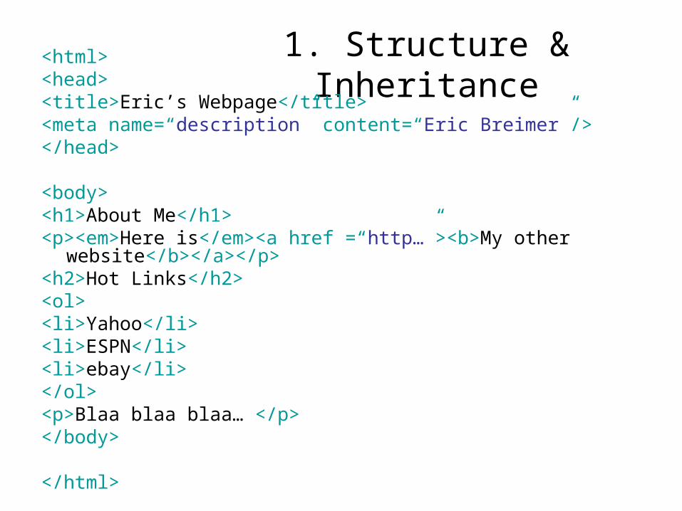
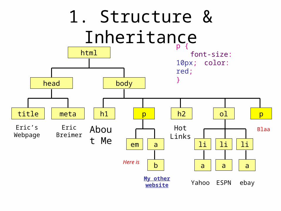
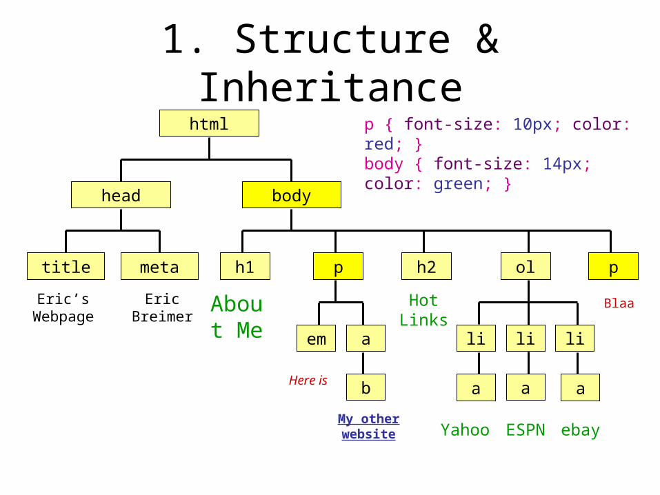
1. Structure & Inheritance<html><head><title>Eric’s Webpage</title><meta name=“description” content=“Eric Breimer”/></head>
<body><h1>About Me</h1><p><em>Here is</em><a href =“http…”><b>My other
website</b></a></p><h2>Hot Links</h2><ol><li>Yahoo</li><li>ESPN</li><li>ebay</li></ol><p>Blaa blaa blaa… </p></body>
</html>

1. Structure & Inheritancehtml
head body
title meta h1 p ol p
em a
b
li li li
Eric’s Webpage
Eric Breimer
About Me
Here is
My other website
h2
Hot Links
Yahoo ESPN ebay
a a a
Blaa
1. Structure & Inheritancehtml
head body
title meta h1 p ol p
em a
b
li li li
Eric’s Webpage
Eric Breimer
About Me
Here is
My other website
h2
Hot Links
Yahoo ESPN ebay
a a a
Blaa
p {font-size: 10px; color: red;
}
1. Structure & Inheritancehtml
head body
title meta h1 p ol p
em a
b
li li li
Eric’s Webpage
Eric Breimer
About Me
Here is
My other website
h2
Hot Links
Yahoo ESPN ebay
a a a
Blaa
p { font-size: 10px; color: red; }body { font-size: 14px; color: green; }

1. Structure & Inheritance
• Children/Descendants always inherit properties from their Parents/Ancestors,– unless they have their own defined properties
that override the parents
• Some elements/tags have default properties– Example: By default, the <a> tag will
underline text and it will be a set color (blue or purple).

1. Structure & Inheritance
Bad Way• Set the color of every
single element to blue except <li> and <ol>
• You’ll have to change about 25 tags that control text
Good Way• Set the color of the
<body> tag to blue• Thus, all descendants
will be blue• Set the color of <li>
and <ol> to balck
• Inheritance can save you tons of time
• Example: You want all text dark blue except list elements

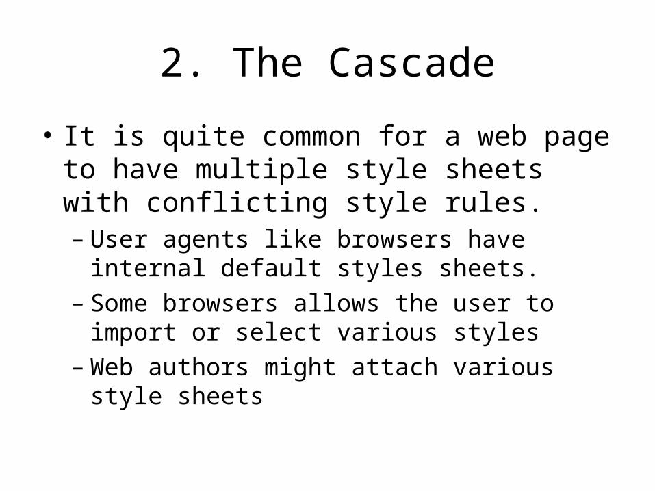
2. The Cascade
• It is quite common for a web page to have multiple style sheets with conflicting style rules.– User agents like browsers have internal
default styles sheets.– Some browsers allows the user to import or
select various styles– Web authors might attach various style sheets

2. The Cascade
Style Sheet Origin: 3. Browser style sheets (lowest priority) 2. Reader style sheets 1. Author style sheets (highest priority)
Exception: Reader styles that are marked !important override author styles, even author styles that are marked !important. Why?

2. The Cascade
• What if the author has attached several style sheets, each of which has different style rules for the <h1> tag; Which rule wins?
4. Ones attached using the link tag (lowest)
3. Ones attached using the @import tag
2. Embedded styles sheets
1. Inline style sheets (highest)
2. The Cascade
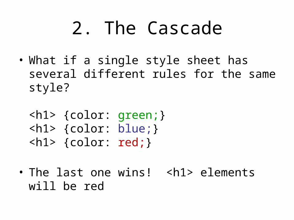
• What if a single style sheet has several different rules for the same style?
<h1> {color: green;}<h1> {color: blue;}<h1> {color: red;}
• The last one wins! <h1> elements will be red
2. The Cascade
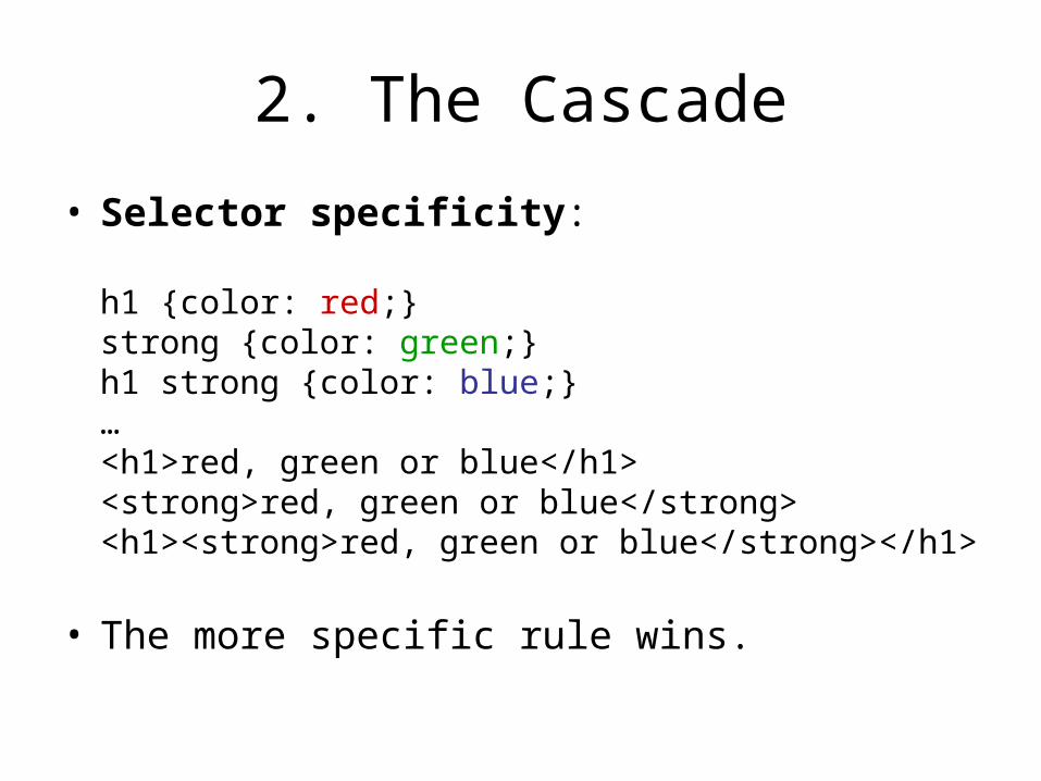
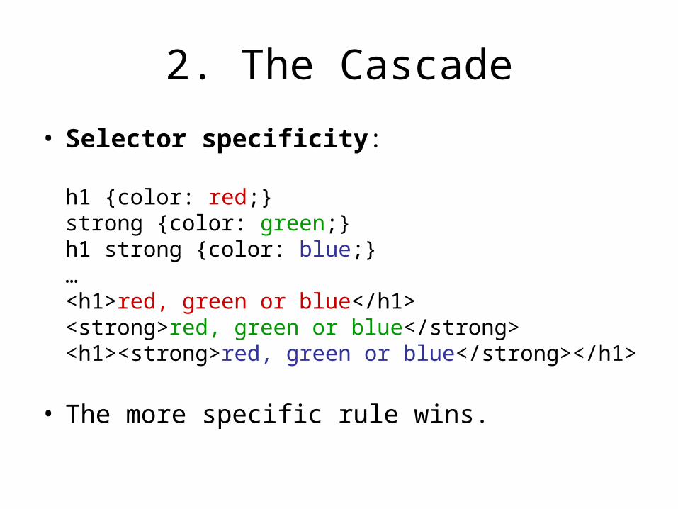
• Selector specificity:
h1 {color: red;}strong {color: green;}h1 strong {color: blue;}…<h1>red, green or blue</h1><strong>red, green or blue</strong><h1><strong>red, green or blue</strong></h1>
• The more specific rule wins.
2. The Cascade
• Selector specificity:
h1 {color: red;}strong {color: green;}h1 strong {color: blue;}…<h1>red, green or blue</h1><strong>red, green or blue</strong><h1><strong>red, green or blue</strong></h1>
• The more specific rule wins.

2. The Cascade
• Selector specificity:em {color: red;}em strong {color: green;}h1 strong em{color: blue;}
…<em>red, green or blue</em><strong><em> red, green or blue</em></strong><h1><em><strong>red, green or blue</strong></em></h1>
• The more specific rule wins, • But you need to make sure the rule applies.


3. Block vs. Inline• In general, block elements take up a whole line
and have blank lines above and below.– However, this really depends on the browser
• Formally, block elements– Generate a line break before and after– Fill the available horizontal space
Body
Block
Block
Inline Inline Inline
Inline Inline

3. Block vs. Inline• Formally, block elements
– Generate a line break before and after– Fill the available horizontal space, which may
not be an entire line• If the block element is inside a div with a
fixed width
Body
Div Div
Block
Block
Block
Inline Inline Inline
Inline
Inline Inline
3. Block vs. Inline
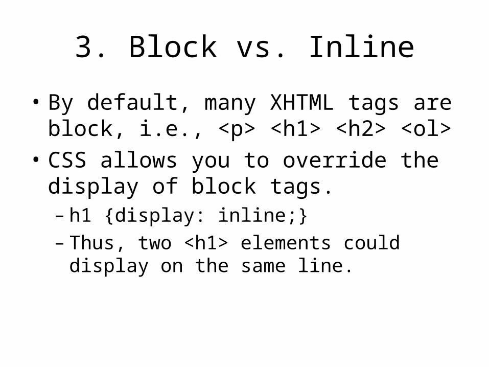
• By default, many XHTML tags are block, i.e., <p> <h1> <h2> <ol>
• CSS allows you to override the display of block tags.– h1 {display: inline;}– Thus, two <h1> elements could display on the
same line.

3. Block vs. Inline
• XHTML rules: block tags can NOT go inside inline tags.<b> <h1>Header</h1> <h1>Another</h1> </b>– This requirement makes it easier for standards-
compliant rendering engines to interpret code
• Even if you redefine <h1> to be inline, the syntax above is not XHTML compliant.
• Here is the complaint code:<h1><b>Header</b></h1><h1><b>Two</b></h1>

3. Block vs. Inline• A div tag is block by default, but you can make it
display inline– div {display: inline; width: 300px;}– Thus, two div’s can be on the same line.
• Both block and inline elements can be placed in the div since it is block by default
Body
Div Div
Block
Block
Block
Inline Inline Inline
Inline
Inline Inline

3. Block vs. Inline
• Golden Rule:Always create XHTML compliant code, i.e., block elements can not go inside inline elements– To achieve certain layouts you can redefine block
elements to display inline or vice versa
• But, never violate the golden rule for the sake of appearance.
• Almost every functional layout can be achieve with style sheets using XHTML compliant code.

4. Box Model
Headline
This is a paragraph. This is a paragraph. This is a paragraph. This is a paragraph. This is a paragraph. This is a paragraph. This is a paragraph. This is a paragraph. This is a paragraph.
List item
List item
List item
List item
body
h1
p
ul
li
em
strong

4. Box Model
Margin Area
Padding Area
This is some content that runs over two lines.
Outer edge
Inner edge
Border

Wrap Up
• Always write XHTML strict code.– Never put block tags inside inline tags
• Use link to attach a style sheet– Or use embedded styles for specific exceptions
• Use the structure of your document to save time (adding style globally)
• By very familiar (i.e., memorize) the conflict rules, i.e., the Cascade.
• Every XHTML element is in a box– Inline boxes can be side-by-side in the flow of paragraphs– Block boxes create line breaks and usually take up all the
horizontal space
More CSS tricks
Browse the Weasel Book pages 296-418
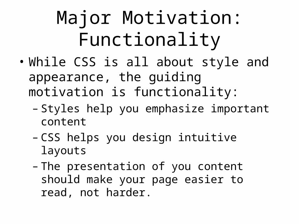
Major Motivation: Functionality
• While CSS is all about style and appearance, the guiding motivation is functionality:– Styles help you emphasize important content– CSS helps you design intuitive layouts– The presentation of you content should make
your page easier to read, not harder.
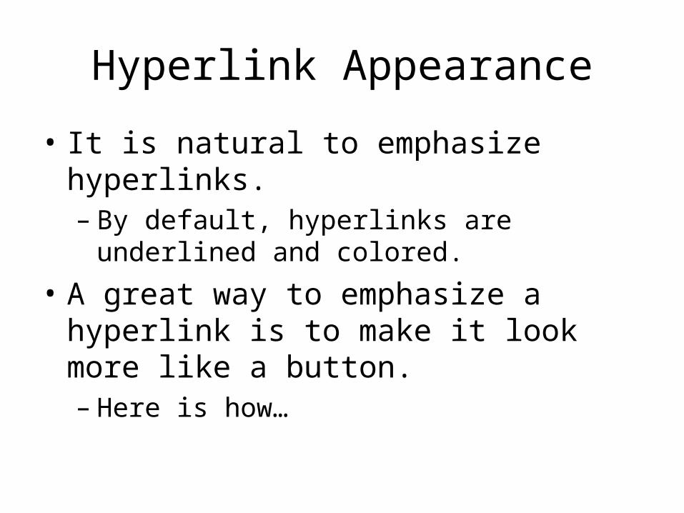
Hyperlink Appearance
• It is natural to emphasize hyperlinks.– By default, hyperlinks are underlined and
colored.
• A great way to emphasize a hyperlink is to make it look more like a button.– Here is how…

Hyperlink Appearance
a {float: right;font-weight: bold;padding: 2px 20px;background-color: #444488;color: #CCCCFF;text-decoration: none;
}
a:hover {
float: right;
font-weight: bold;
padding: 2px 20px;
background-color: #CCCCFF;
color: #444488;
text-decoration: underline;
}

Hyperlink Appearance
a {float: right; /* right, left, none, inherit */font-weight: bold; /* normal, bold, bolder, lighter…*/padding: 2px 20px; /* padding: top/bot left/right
padding: top left bot right padding: all */
background-color: /* #RRGGBB */#444488;color: #CCCCFF;text-decoration: none; /* underline, overline, line-through,
none, blink */}

Selector Specificity
• A big problem with redefining the <a> tag is that it may not look good in every situation.
• But, you can use selector specificity to control specific <a> tags
• li a { float: none; }– This will only affect <a> tags embedded inside
of <li> tags.
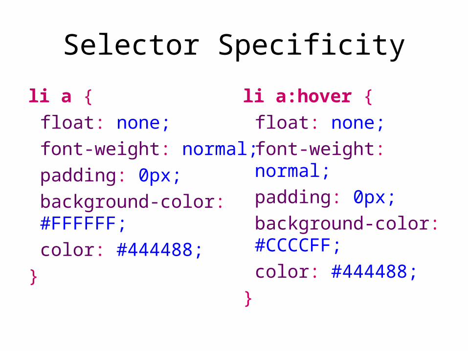
Selector Specificity
li a {
float: none;
font-weight: normal;
padding: 0px;
background-color: #FFFFFF;
color: #444488;
}
li a:hover {
float: none;
font-weight: normal;
padding: 0px;
background-color: #CCCCFF;
color: #444488;
}
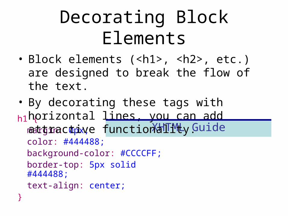
Decorating Block Elements
h1 {margin: 0px;color: #444488;background-color: #CCCCFF;border-top: 5px solid #444488;text-align: center;
}
XHTML Guide
• Block elements (<h1>, <h2>, etc.) are designed to break the flow of the text.
• By decorating these tags with horizontal lines, you can add attractive functionality.
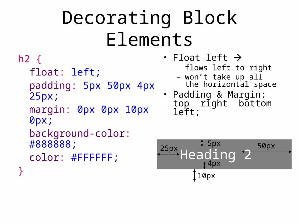
Decorating Block Elements
h2 {float: left;padding: 5px 50px 4px 25px;margin: 0px 0px 10px 0px;background-color: #888888;color: #FFFFFF;
}
• Float left – flows left to right– won’t take up all the
horizontal space• Padding & Margin:
top right bottom left;
Heading 2
10px
25px
4px
5px 50px
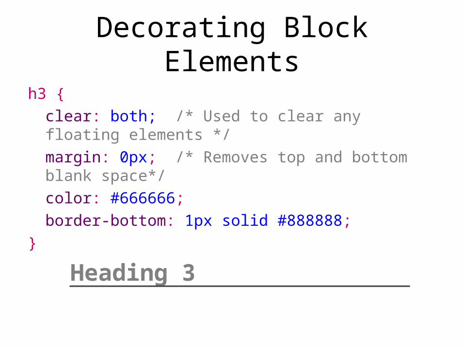
Decorating Block Elements
h3 {
clear: both; /* Used to clear any floating elements */
margin: 0px; /* Removes top and bottom blank space*/
color: #666666;
border-bottom: 1px solid #888888;
}
Heading 3
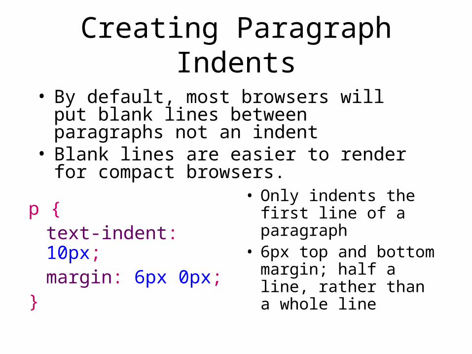
Creating Paragraph Indents
p {text-indent: 10px;margin: 6px 0px;
}
• Only indents the first line of a paragraph
• 6px top and bottom margin; half a line, rather than a whole line
• By default, most browsers will put blank lines between paragraphs not an indent
• Blank lines are easier to render for compact browsers.

Reducing List Indents
ul {margin: 0px;padding: 0px 0px 0px 16px; /* Instead of 32px */
}
• Margin: 0px removes top/bottom blank lines.• By default, most browsers implement 16px
top/bottom margin.• By default, lists (<ul> and <ol>) have 32px
indent; 16px before the bullet; 16px after
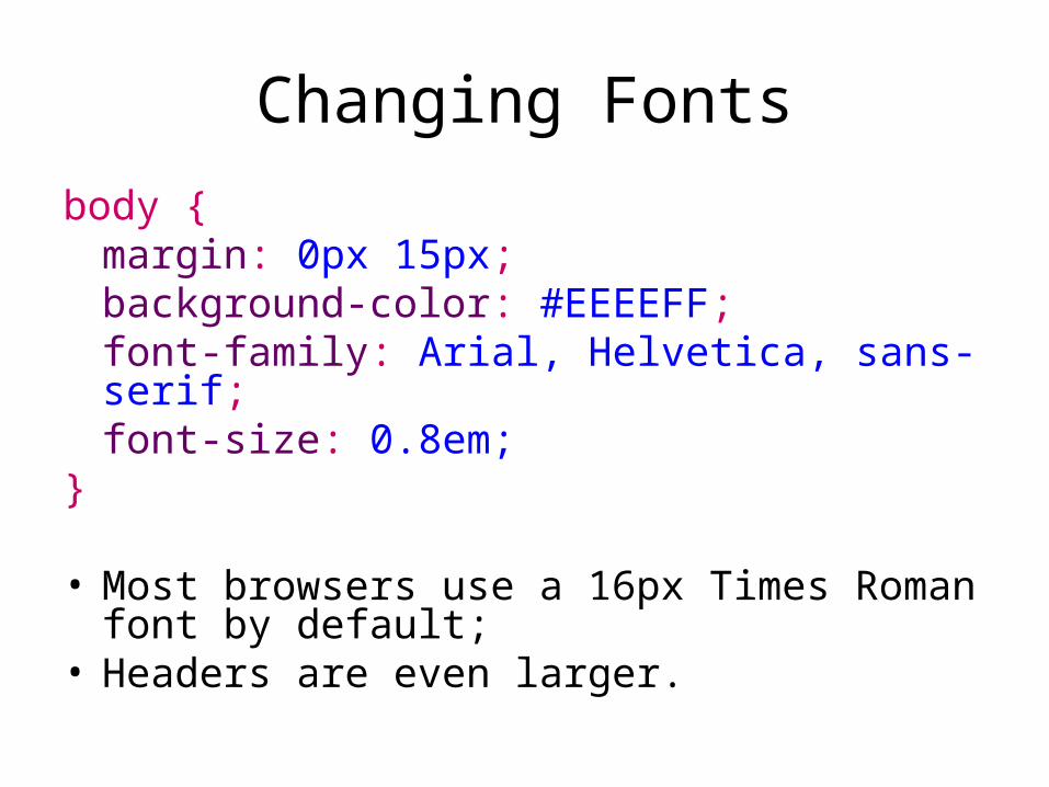
Changing Fonts
body {margin: 0px 15px;background-color: #EEEEFF;font-family: Arial, Helvetica, sans-serif;font-size: 0.8em;
}
• Most browsers use a 16px Times Roman font by default;
• Headers are even larger.
Layouts with CSS
Weasel pages 27-37 again
Weasel pages 419-436

Fixed Full Page Layouts
• 1024 width is still common– 800 width good for mobile– 1280 width is also common
1024
1004
964

Fixed Full Page Layouts
• Must account for browser scroll bar 20px• 10-20px side margins increase readability• Overall, you lose 40-60px of space
1024
964This is the actual content. This is the actual content. This is the actual content. This is the actual content. This is the actual content. This is the actual content. This is the actual content. This is the actual content. This is the actual content. This is the actual content. This is the actual..
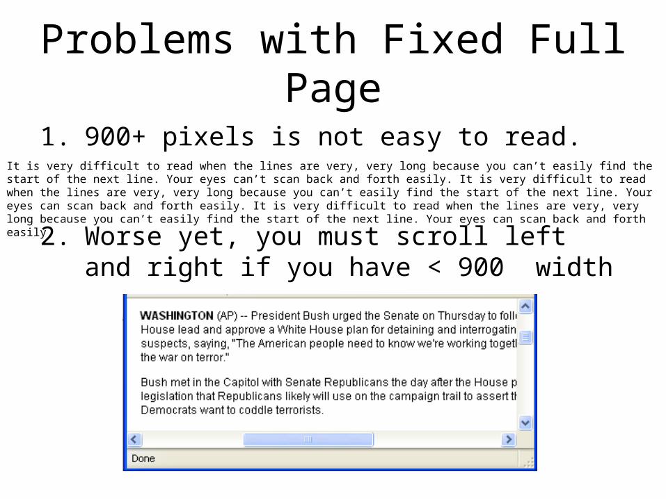
Problems with Fixed Full Page
1. 900+ pixels is not easy to read.
2. Worse yet, you must scroll left and right if you have < 900 width
It is very difficult to read when the lines are very, very long because you can’t easily find the start of the next line. Your eyes can’t scan back and forth easily. It is very difficult to read when the lines are very, very long because you can’t easily find the start of the next line. Your eyes can scan back and forth easily. It is very difficult to read when the lines are very, very long because you can’t easily find the start of the next line. Your eyes can scan back and forth easily.

Why 800 pixels wide?
• Still accommodates older computers
• Easier to read lines of text
• Problem: looks terrible on wide resolutions

Why Centering?
• Centering makes 800 wide layouts “look better” at 1024 and even 1280.

Fixed Container Layouts
• A centered 800px container is very common.
• Don’t forget:– Scroll bar 20px– Margins and padding– 700-780px range
• Looks good in 800px, 1024, and 1280.
• Still a problem for small devices.
<body><div id=“container”>
Contents here</div></body>
#container {width: 750px;margins: auto;
}
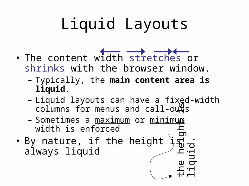
Liquid Layouts
• The content width stretches or shrinks with the browser window.– Typically, the main content area is liquid. – Liquid layouts can have a fixed-width
columns for menus and call-outs– Sometimes a maximum or minimum
width is enforced
• By nature, if the height is always liquid
the
heig
ht is
liqu
id.
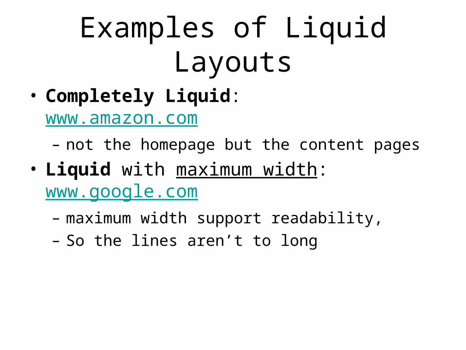
Examples of Liquid Layouts
• Completely Liquid: www.amazon.com– not the homepage but the content pages
• Liquid with maximum width: www.google.com – maximum width support readability,– So the lines aren’t to long

Fixed vs. Liquid
• Many experts argue that liquid is – More accessible– More user oriented
• Commercial and news sites tend to be fixed– consistency is important– Readability is key– Specific Ad positioning
is important
Site Fixed Width Liquid Width
Yahoo X Post 2005
Google X
MSN X Post 2006
Ebay Post 2007
MySpace X
Amazon X
Microsoft X
Blogger X Post 2008
BBC X
CNN X
AOL X
Go X
Craigslist X
IMDB X Post 2007
NY Times X
CNET X
About X
Weather X
MapQuest X
Match X
Macromedia X

Typical Layouts
• Left Menu
Site Title
Menu
100-200px
10-20px internal padding
Page Title
Main Content
400-600 or liquid
10-20px internal padding

Typical Layouts
• Right Menu (common with blogs)
Blog Title
Menu ItemMenu ItemMenu ItemMenu Item
Page Title
Main Content
Blaa blaa ba baa baaaa. Blaa blaa ba baa baaaa. Blaa blaa ba baa baaaa. Blaa blaa ba baa baaaa. Blaa blaa ba baa baaaa.
Typical Layouts
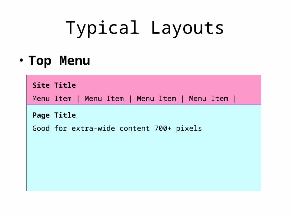
• Top Menu
Site Title
Menu Item | Menu Item | Menu Item | Menu Item |
Page Title
Good for extra-wide content 700+ pixels
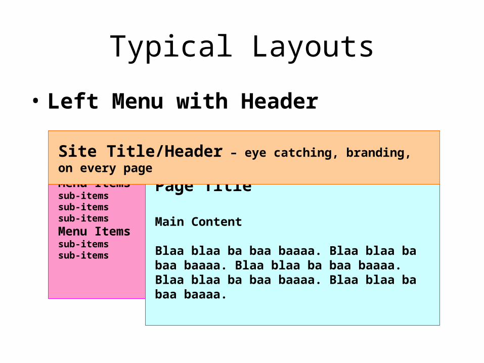
Typical Layouts
• Left Menu with Header
Menu Itemssub-itemssub-itemssub-items
Menu Itemssub-itemssub-items
Page Title
Main Content
Blaa blaa ba baa baaaa. Blaa blaa ba baa baaaa. Blaa blaa ba baa baaaa. Blaa blaa ba baa baaaa. Blaa blaa ba baa baaaa.
Site Title/Header – eye catching, branding, on every page
Typical Layouts
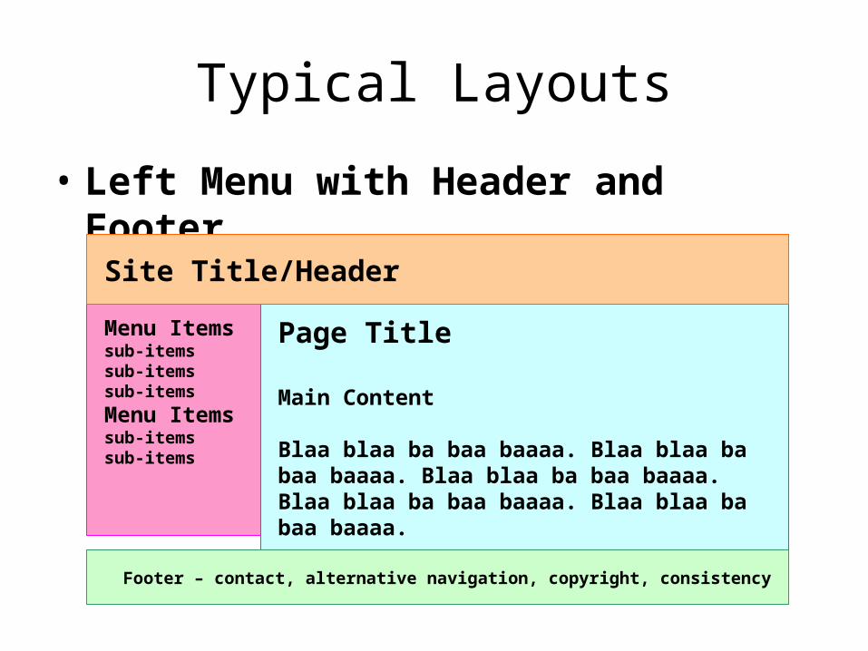
• Left Menu with Header and Footer
Menu Itemssub-itemssub-itemssub-items
Menu Itemssub-itemssub-items
Page Title
Main Content
Blaa blaa ba baa baaaa. Blaa blaa ba baa baaaa. Blaa blaa ba baa baaaa. Blaa blaa ba baa baaaa. Blaa blaa ba baa baaaa.
Site Title/Header
Footer – contact, alternative navigation, copyright, consistency
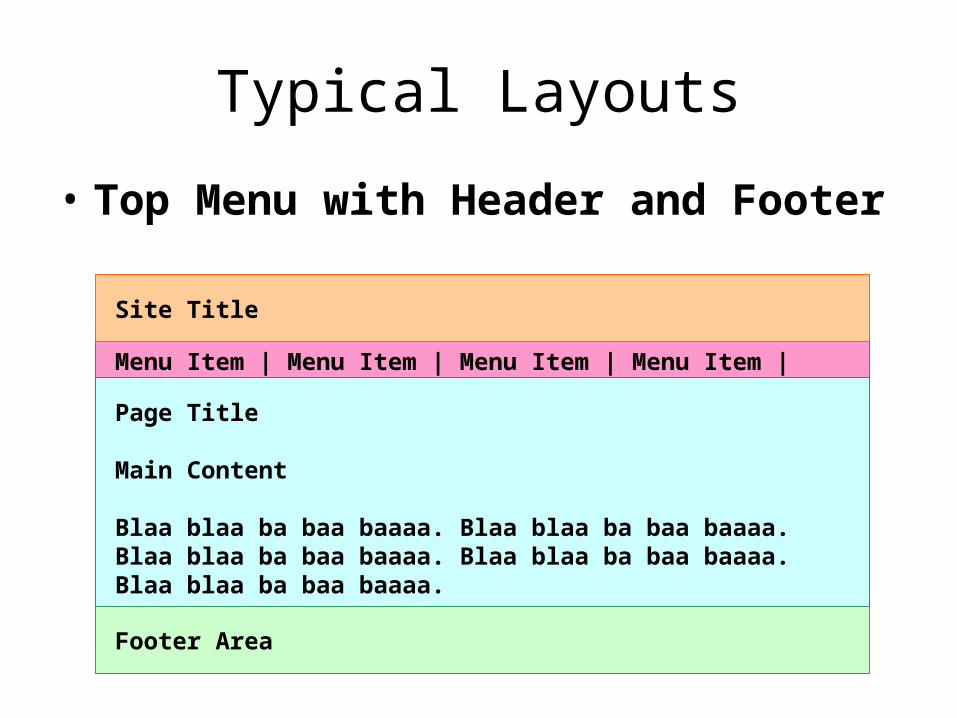
Typical Layouts
• Top Menu with Header and Footer
Menu Item | Menu Item | Menu Item | Menu Item |
Page Title
Main Content
Blaa blaa ba baa baaaa. Blaa blaa ba baa baaaa. Blaa blaa ba baa baaaa. Blaa blaa ba baa baaaa. Blaa blaa ba baa baaaa.
Site Title
Footer Area
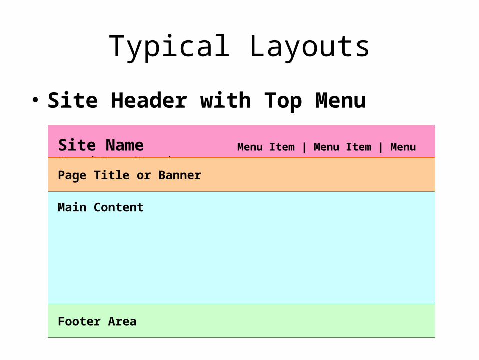
Typical Layouts
• Site Header with Top Menu
Site Name Menu Item | Menu Item | Menu Item | Menu Item |
Main Content
Page Title or Banner
Footer Area
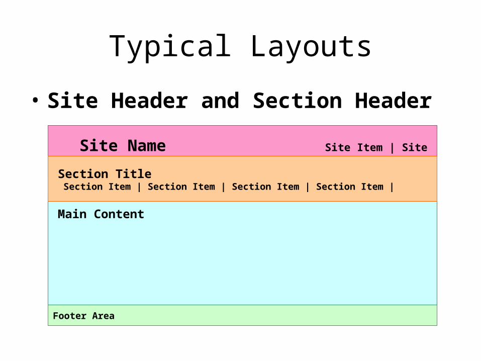
Typical Layouts
• Site Header and Section Header
Site Name Site Item | Site Item | Site Item | Site Item |
Main Content
Footer Area
Section Title Section Item | Section Item | Section Item | Section Item |
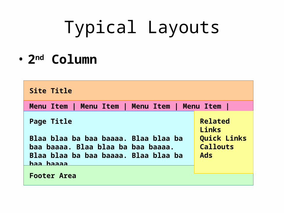
Typical Layouts
• 2nd Column
Menu Item | Menu Item | Menu Item | Menu Item |
Page Title
Blaa blaa ba baa baaaa. Blaa blaa ba baa baaaa. Blaa blaa ba baa baaaa. Blaa blaa ba baa baaaa. Blaa blaa ba baa baaaa.
Site Title
Footer Area
Related LinksQuick LinksCalloutsAds
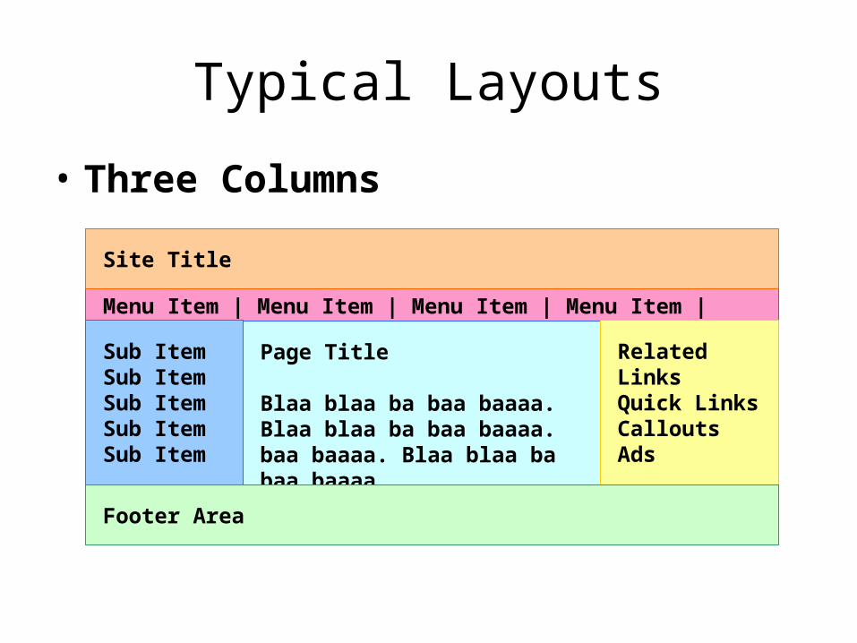
Typical Layouts
• Three Columns
Menu Item | Menu Item | Menu Item | Menu Item |
Page Title
Blaa blaa ba baa baaaa. Blaa blaa ba baa baaaa. baa baaaa. Blaa blaa ba baa baaaa.
Site Title
Related LinksQuick LinksCalloutsAds
Sub ItemSub ItemSub ItemSub ItemSub Item
Footer Area

Typical Layouts
• Three Columns – a variation
Menu Item | Menu Item | Menu Item | Menu Item |
Page Title
Blaa blaa ba baa baaaa. Blaa blaa ba baa baaaa. baa baaaa. Blaa blaa ba baa baaaa.
Site Title External Links
Ads
Ads
Ads
Sub ItemSub ItemSub ItemSub ItemSub Item
Footer Area

Typical Layouts
• Three Columns – a variation
Content TitleBlaa blaa ba baa baaaa. Blaa blaa ba baa baaaa. baa baaaa. Blaa blaa ba baa baaaa.
Area TitleSub ItemSub ItemSub ItemSub Item
Site Title Area Item | Area Item | Area Item | Area Item
Banner Ads
Content TitleBlaa blaa ba baa baaaa. Blaa blaa ba baa baaaa. baa baaaa. Blaa blaa ba baa baaaa.
Footer Area

Typical Layouts
• Popular CSS Layout
Fixed Width Content AreaArea TitleSub ItemSub ItemSub ItemSub Item
Footer
Header (liquid) Area Item | Area Item | Area Item | Area Item
Half-sized Content Area Half-sized Content Area