cost of living final2images.smh.com.au/file/2013/08/31/4708314/natsem...natsem working paper yr/no...
TRANSCRIPT
NATSEM Working Paper Yr/No
NATSEM HOUSEHOLD BUDGET
REPORT:
COST OF LIVING AND STANDARD OF
LIVING INDEXES FOR AUSTRALIA
June 2013
Ben Phillips
Principal Research Fellow
August 2013
3
About NATSEM
The National Centre for Social and Economic Modelling (NATSEM), a research centre at the
University of Canberra, is one of Australia’s leading economic and social policy research institutes,
and is regarded as one of the world’s foremost centres of excellence for microsimulation, economic
modelling and policy evaluation.
NATSEM undertakes independent and impartial research, and aims to be a key contributor to social
and economic policy debate and analysis in Australia and throughout the world through high quality
economic modelling, and supplying consultancy services to commercial, government and
not-for-profit clients. Our research is founded on rigorous empirical analysis conducted by staff with
specialist technical, policy and institutional knowledge.
Research findings are communicated to a wide audience, and receive extensive media and public
attention. Most publications are freely available and can be downloaded from the NATSEM website.
Acting Director: Professor Mark Evans
© NATSEM, University of Canberra 2013
National Centre for Social and Economic Modelling
University of Canberra ACT 2601 Australia
Phone + 61 2 6201 2780 Fax + 61 2 6201 2751
Email [email protected]
Website www.canberra.edu.au/centres/natsem/
Contents
1 Main Points for June 2013 report 6
2 Introduction 7
3 Methodology 8
4 Cost of Living Index 9
5 Standard of Living Index 13
6 Contributions to Cost of Living Changes 17
7 Capital City Cost of Living and Standard of Living Comparison 20
8 Conclusion 22
9 References 24
5
Author note
Ben Phillips is a Principal Research Fellow at NATSEM and leads the Income, Wealth and Housing
research team at NATSEM.
Acknowledgments
I would like to thank Marcia Keegan and Jinjing Li of NATSEM’s Income, Wealth and Housing team
for comments on earlier drafts of this paper and for their assistance in developing code to construct
the indexes.
This research was not commissioned and was self-funded by NATSEM, University of Canberra.
General caveat
NATSEM research findings are generally based on estimated characteristics of the population. Such
estimates are usually derived from the application of microsimulation modelling techniques to
microdata based on sample surveys.
These estimates may be different from the actual characteristics of the population because of
sampling and nonsampling errors in the microdata and because of the assumptions underlying the
modelling techniques.
The microdata do not contain any information that enables identification of the individuals or
families to which they refer.
The citation for this paper is: Phillips, B. (2013) NATSEM Household Budget Report: Cost of Living and
Standard of Living Indexes for Australia, June quarter 2013.
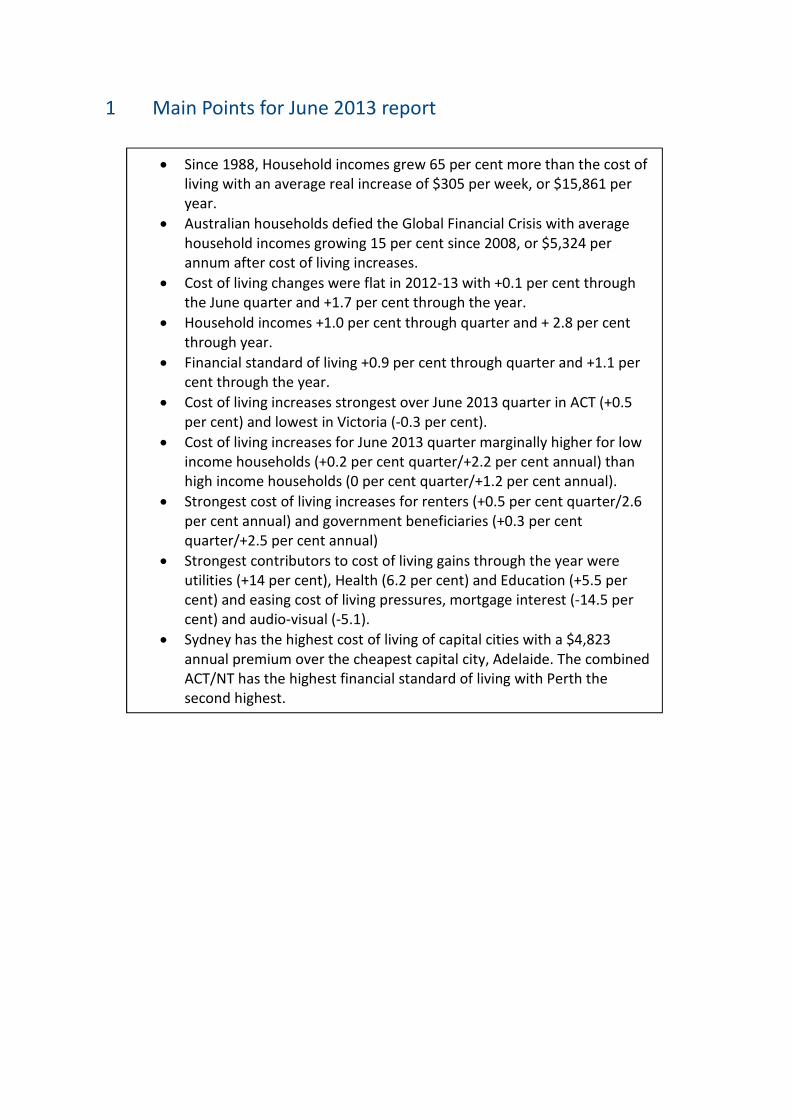
1 Main Points for June 2013 report
• Since 1988, Household incomes grew 65 per cent more than the cost of
living with an average real increase of $305 per week, or $15,861 per
year.
• Australian households defied the Global Financial Crisis with average
household incomes growing 15 per cent since 2008, or $5,324 per
annum after cost of living increases.
• Cost of living changes were flat in 2012-13 with +0.1 per cent through
the June quarter and +1.7 per cent through the year.
• Household incomes +1.0 per cent through quarter and + 2.8 per cent
through year.
• Financial standard of living +0.9 per cent through quarter and +1.1 per
cent through the year.
• Cost of living increases strongest over June 2013 quarter in ACT (+0.5
per cent) and lowest in Victoria (-0.3 per cent).
• Cost of living increases for June 2013 quarter marginally higher for low
income households (+0.2 per cent quarter/+2.2 per cent annual) than
high income households (0 per cent quarter/+1.2 per cent annual).
• Strongest cost of living increases for renters (+0.5 per cent quarter/2.6
per cent annual) and government beneficiaries (+0.3 per cent
quarter/+2.5 per cent annual)
• Strongest contributors to cost of living gains through the year were
utilities (+14 per cent), Health (6.2 per cent) and Education (+5.5 per
cent) and easing cost of living pressures, mortgage interest (-14.5 per
cent) and audio-visual (-5.1).
• Sydney has the highest cost of living of capital cities with a $4,823
annual premium over the cheapest capital city, Adelaide. The combined
ACT/NT has the highest financial standard of living with Perth the
second highest.
7
2 Introduction
In this report we provide a detailed investigation of the cost of living in Australia, an issue that
dominates political and social debate. It is often claimed that the cost of living in Australia is out of
control and that household incomes are falling behind that cost of living. In this report we consider both
the cost of living and incomes for a variety of Australian household types such as high and low income,
pensioners, renters, mortgagors and different type of families to determine their overall financial
standard of living.
NATSEM introduces new national economic measures of the cost of living and standard of living of
Australian households. This quarterly report provides a rich set of information on Australian households
since 1988.
NATSEM compiled these statistics based on official data sources from the Australian Bureau of Statistics
(ABS). Data includes all Household expenditure surveys dating back to 1988 and detailed capital city
based Consumer Price Index (CPI) data. The report provides an update and expansion of the
AMP.NATSEM Prices these days! publication which AMP and NATSEM released in May, 2012.
Methodologically, the cost of living index is based on the ABS Living Cost Index but expands the scope of
the index to all households, provides a longer time series, and much greater detail on different types of
households1.
The second half of the standard of living equation is income, or, the benefits of living. Incomes in this
report are based on ABS income and expenditure surveys combined with household information from
the ABS national accounts for the most up-to-date income data.
By comparing changes in the cost of living with changes in incomes we derive how the Australian
household financial standard of living changes through time for a range of household types.
1 Technically, the calculation of a true cost of living index is not feasible, however, the index provided here should be
considered a close approximation. Theoretically, living cost indexes such as the one presented in this paper, are an
over-estimate of the true cost of living due to the well-known ‘CPI bias’. For a full explanation see Diewert, E 1998.

3 Methodology
The NATSEM cost of living index is based on a similar methodology to the ABS living cost indexes for
selected households (ABS 2013). The NATSEM index is designed to measure the impact of price changes
to the out-of-pocket expenses of Australian households. The ABS living cost index is a quarterly
publication dating back to 1998 that is compiled for selected household types including government
beneficiaries, employees and the self-employed. The ABS index does not provide an ‘all’ households
measure and was principally developed for the purpose of indexing certain government payments, such
as the aged pension.
NATSEM generalises the ABS Living Cost Index providing an all households version and provides much
greater detail and a longer time-series of data on different household types.
The NATSEM index uses the same base data as that used by the ABS to compile their various measures
of consumer inflation and living costs. NATSEM borrows ABS price information from their Consumer
Price Index publication at the detailed expenditure class level (87 classes) and weights together the
observed price movements by their relative expenditure share. The expenditure shares are based on
the latest available ABS Household Expenditure Survey (HES). We take the same approach as the ABS
and update the weights according to the latest HES publication to ensure that the ‘basket of goods’ is
appropriate to the time point and therefore minimise any related bias from changes in consumption
patterns.
The NATSEM index consists of a ‘chain linked’ index for the periods between the five HES data sets2.
Each linked series is a Laspeyres price index, ��, as the price movements are weighted based on the
expenditure shares from the previous HES.
�� =���� �����,�
Where ��� is the expenditure share (or fixed weight) of the � ℎ expenditure class, �� is the price index
for the � ℎ expenditure class for period t and �� is the price index for the � ℎ expenditure class for the
base period.
The main point of difference between the ABS consumer price index and both the NATSEM cost of living
index and the ABS Living Cost Index is that the expenditure classes or ‘basket of goods and services’ are
2 1988-89, 1993-94, 1998-99, 2003-04 and 2009-10.
9
different. The latter indexes treat housing differently by using mortgage interest paid on the principal
place of residence in place of the CPI’s home purchase expenditure class which is largely based on the
purchase of new owner occupier dwellings (not the land component), which means that inflation in the
cost of land is not reflected in the ABS CPI. The latter indexes also remove financial services as they are
based on the outlays approach rather than the acquisitions approach adopted by the CPI. The latter
indexes also include a separate methodology for developing ‘price’ change for mortgage interest. The
NATSEM approach applies the Reserve Bank’s standard variable loan estimate to average housing loans
data from the ABS to calculate average quarterly loan interest repayments for owner-occupier housing.
An annual one per cent reduction is applied to this inflation measure to account for quality change (see
Abelson 2004). To account for the known under-reporting of alcohol and tobacco expenditure by survey
respondents the expenditure weights have been increased by around 66 per cent to match with known
weights in the ABS CPI for alcohol and tobacco.
In spite of the methodological differences between the CPI and the NATSEM cost of living index/ABS
living cost index both measures, over the longer term, should provide similar measures of price change.
Differences in the shorter term may be somewhat more significant from time to time3.
4 Cost of Living Index
Over the 2013 June quarter the cost of living for all households increased by just 0.1 per cent. Over the
previous 12 months this increase was a benign 1.7 per cent compared to the long run average of 2.9 per
cent. Figure 1 demonstrates that the cost of living changes remain below average over the past three
years.
3 Since the base of December 1988 the NATSEM cost of living index for Jun 2013 is 199.96 compared with the ABS CPI at
200.78. This represents only a 0.4 per cent difference through nearly 25 years.
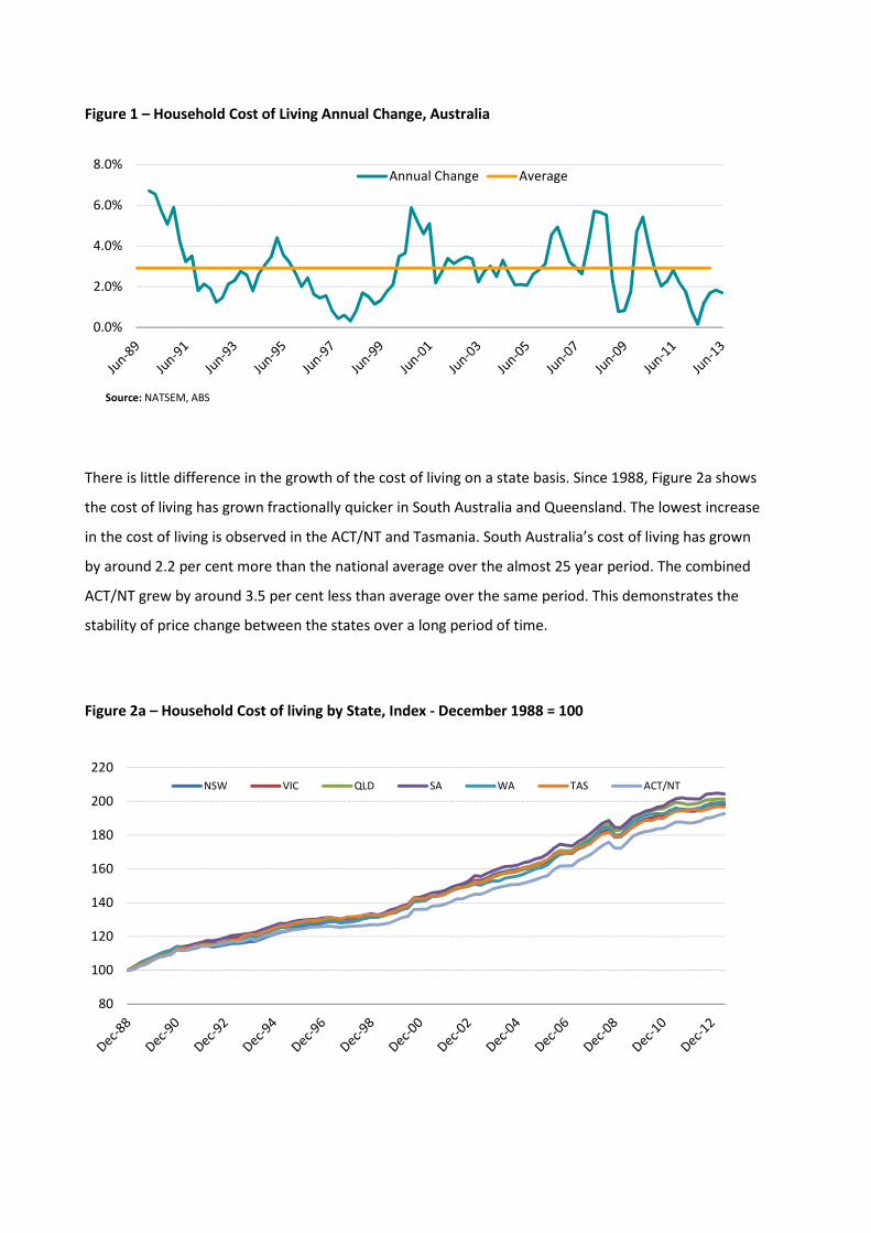
Figure 1 – Household Cost of Living Annual Change, Australia
Source: NATSEM, ABS
There is little difference in the growth of the cost of living on a state basis. Since 1988, Figure 2a shows
the cost of living has grown fractionally quicker in South Australia and Queensland. The lowest increase
in the cost of living is observed in the ACT/NT and Tasmania. South Australia’s cost of living has grown
by around 2.2 per cent more than the national average over the almost 25 year period. The combined
ACT/NT grew by around 3.5 per cent less than average over the same period. This demonstrates the
stability of price change between the states over a long period of time.
Figure 2a – Household Cost of living by State, Index - December 1988 = 100
0.0%
2.0%
4.0%
6.0%
8.0%Annual Change Average
80
100
120
140
160
180
200
220
NSW VIC QLD SA WA TAS ACT/NT
11
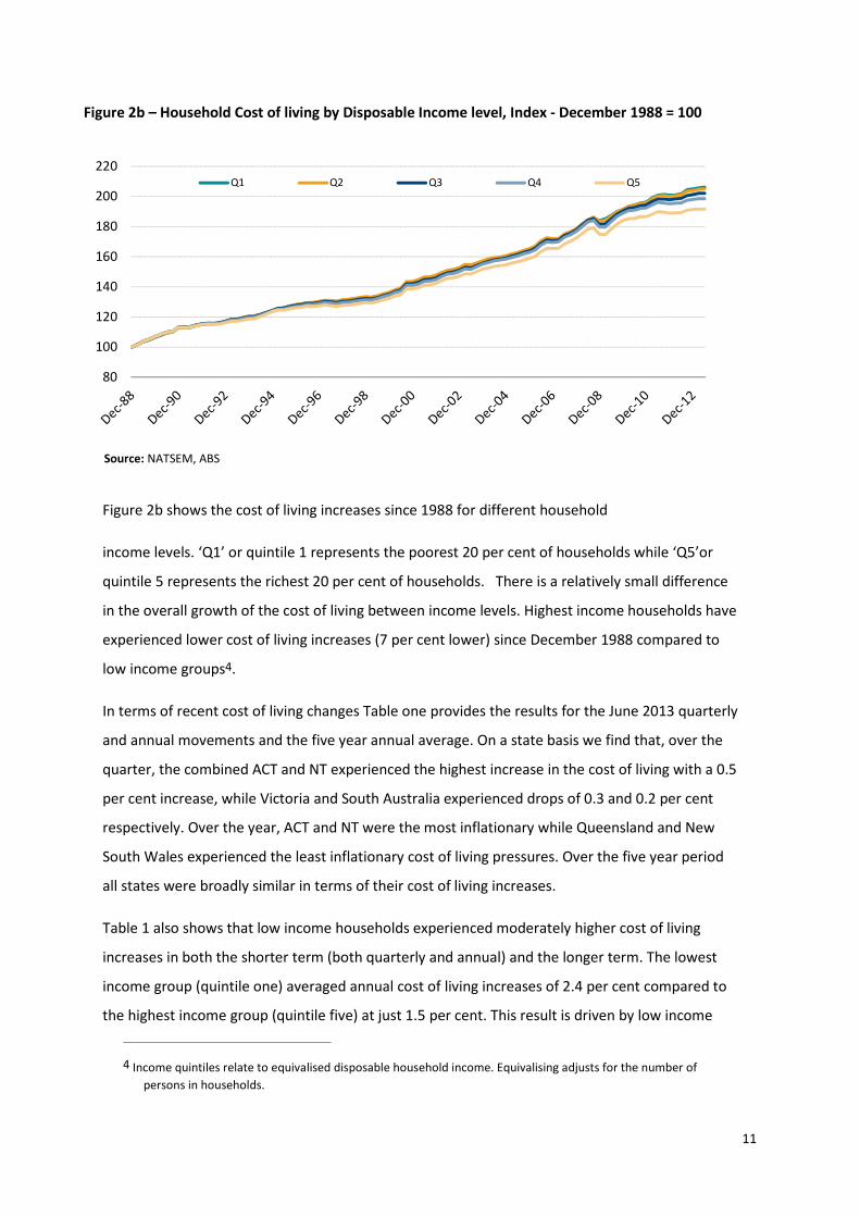
Figure 2b – Household Cost of living by Disposable Income level, Index - December 1988 = 100
Source: NATSEM, ABS
Figure 2b shows the cost of living increases since 1988 for different household
income levels. ‘Q1’ or quintile 1 represents the poorest 20 per cent of households while ‘Q5’or
quintile 5 represents the richest 20 per cent of households. There is a relatively small difference
in the overall growth of the cost of living between income levels. Highest income households have
experienced lower cost of living increases (7 per cent lower) since December 1988 compared to
low income groups4.
In terms of recent cost of living changes Table one provides the results for the June 2013 quarterly
and annual movements and the five year annual average. On a state basis we find that, over the
quarter, the combined ACT and NT experienced the highest increase in the cost of living with a 0.5
per cent increase, while Victoria and South Australia experienced drops of 0.3 and 0.2 per cent
respectively. Over the year, ACT and NT were the most inflationary while Queensland and New
South Wales experienced the least inflationary cost of living pressures. Over the five year period
all states were broadly similar in terms of their cost of living increases.
Table 1 also shows that low income households experienced moderately higher cost of living
increases in both the shorter term (both quarterly and annual) and the longer term. The lowest
income group (quintile one) averaged annual cost of living increases of 2.4 per cent compared to
the highest income group (quintile five) at just 1.5 per cent. This result is driven by low income
4 Income quintiles relate to equivalised disposable household income. Equivalising adjusts for the number of
persons in households.
80
100
120
140
160
180
200
220Q1 Q2 Q3 Q4 Q5

12
households devoting a greater share of their expenditure to the higher inflation essential items
such as rent, utilities and alcohol and tobacco when compared to the higher income households,
many of whom have benefited from near record low interest rates.
Table 1 – Cost of living changes by household type
Quarterly Annual
5 year
Average
State
NSW 0.2% 1.8% 1.8%
VIC -0.3% 1.2% 1.8%
QLD 0.0% 1.1% 1.7%
SA -0.2% 1.5% 1.8%
WA 0.2% 1.9% 1.6%
TAS -0.1% 1.2% 1.7%
ACT/NT 0.5% 2.4% 2.1%
AUST 0.1% 1.7% 1.9%
Income Level
Q1 0.2% 2.2% 2.4%
Q2 0.1% 2.0% 2.1%
Q3 0.0% 1.7% 1.9%
Q4 0.0% 1.4% 1.6%
Q5 0.0% 1.2% 1.5%
Tenure
Owner 0.2% 2.5% 2.3%
Purchaser -0.3% 0.5% 0.9%
Renter 0.5% 2.6% 2.8%
Other 0.2% 2.3% 2.2%
Main Income Source
Wages/Salaries 0.0% 1.4% 1.6%
Business 0.0% 1.5% 1.7%
Government 0.3% 2.5% 2.6%
Other 0.2% 2.2% 2.1%
Family Type
Couple/Kids -0.1% 1.4% 1.6%
Single Parent 0.2% 1.9% 2.1%
Couple Only 0.0% 1.5% 1.6%
Lone 0.2% 1.9% 2.1%
Other/Group 0.1% 1.9% 2.1% Source: NATSEM, ABS.
There is a significant difference between households who rent and those with a mortgage. Renter
households experienced cost of living increases of 2.6 per cent over the past 12 months compared
,
13
with mortgagor households at just 0.5 per cent. While rents have increased quite strongly over
the past 12 months mortgage interest bills have reduced as interest rates fell.
Households that rely on government payments experienced higher cost of living increases with an
annual increase of 2.5 per cent compared to salaried households of just 1.4 per cent. Again, the
government beneficiaries are unlikely to benefit from lower interest rates and devote a greater
share of their income to basic items that have increased more strongly in price than other goods
and services.
Lone persons and single parents have experienced higher annual cost of living pressures both over
the past year and over the five year period when compared to couples with or without children.
The latter group tend to be higher income families and often benefiting from lower interest rates.
Regardless of the small differences between certain household types all households types have
experienced only quite minor increases in their cost of living through the past year and over the
medium to longer term.
5 Standard of Living Index
While the cost of living debate usually centres on the cost of goods and services there is less
debate around the incomes that households receive to pay for these goods and services.
Presumably, if a household’s income increases more strongly than prices for the goods and
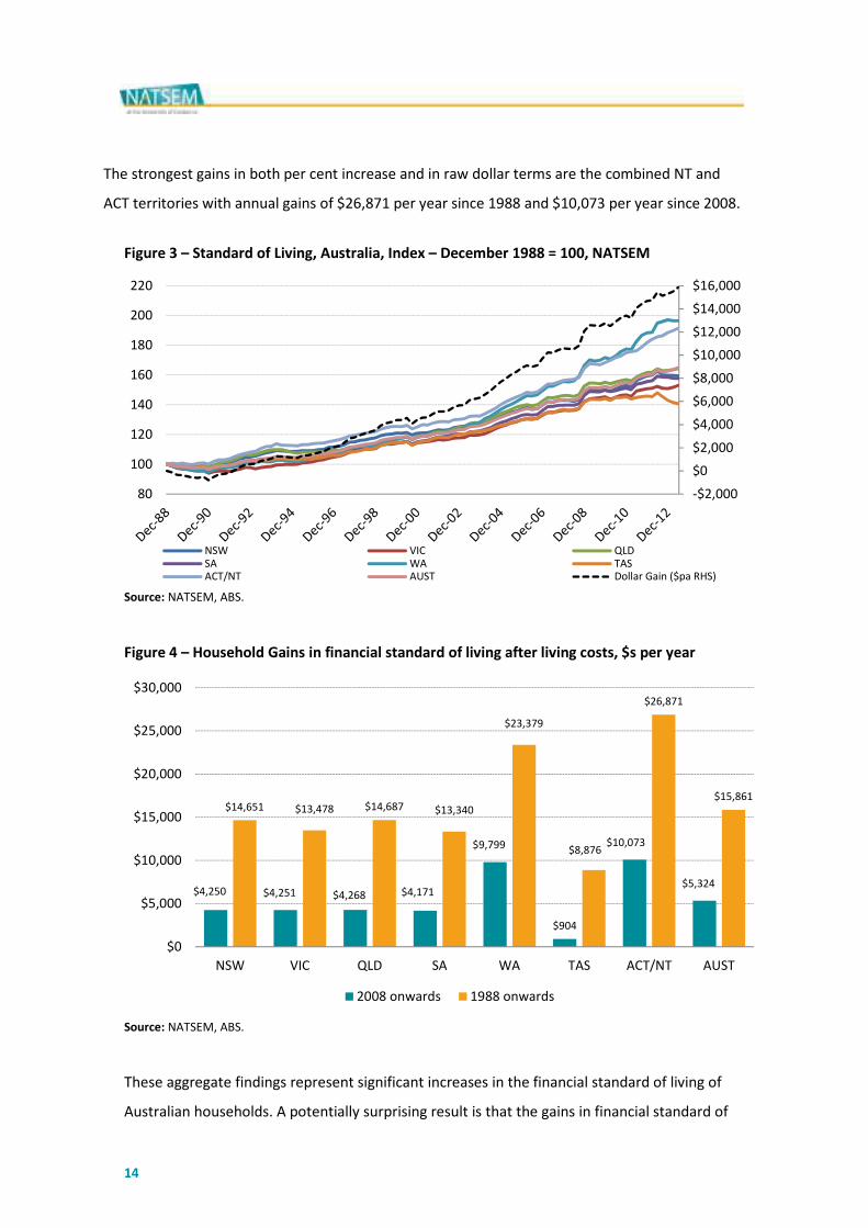
services they purchase then their financial standard of living is improving. Figure 3 shows a
dramatic increase in Australia’s financial standard of living over the past 25 years. Overall,
Australia’s financial standard of living has increased by 65 per cent. After accounting for cost of
living increases the average Australian household is ahead by around $305 per week or nearly
$16,000 per year.
Figure 4 provides the state-by-state financial standard of living estimates. Western Australia has
nearly doubled its financial standard of living over the past 25 years. WA households have almost
doubled their disposable incomes in this time and have an extra $23,379 per week in income after
their cost of living increases. The lowest growth state is Tasmania with an increase in their
standard of living of around 40 per cent, leaving average households ahead by $8,876 per year.
14
The strongest gains in both per cent increase and in raw dollar terms are the combined NT and
ACT territories with annual gains of $26,871 per year since 1988 and $10,073 per year since 2008.
Figure 3 – Standard of Living, Australia, Index – December 1988 = 100, NATSEM
Source: NATSEM, ABS.
Figure 4 – Household Gains in financial standard of living after living costs, $s per year
Source: NATSEM, ABS.
These aggregate findings represent significant increases in the financial standard of living of
Australian households. A potentially surprising result is that the gains in financial standard of
-$2,000
$0
$2,000
$4,000
$6,000
$8,000
$10,000
$12,000
$14,000
$16,000
80
100
120
140
160
180
200
220
NSW VIC QLDSA WA TASACT/NT AUST Dollar Gain ($pa RHS)
$4,250 $4,251 $4,268 $4,171
$9,799
$904
$10,073
$5,324
$14,651 $13,478 $14,687 $13,340
$23,379
$8,876
$26,871
$15,861
$0
$5,000
$10,000
$15,000
$20,000
$25,000
$30,000
NSW VIC QLD SA WA TAS ACT/NT AUST
2008 onwards 1988 onwards
,
15
living remain strong even through the global financial crisis that, in most other developed
nations, has actually reduced incomes in both nominal and real terms. Household incomes
increased across Australia by around 15 per cent after cost of living increases since 2008. WA
benefited mostly with an increase of over 25 per cent while each of the three largest states,
NSW, Victoria and Queensland gained by a more moderate, but still handsome, 12 per cent.
It is not realistic to determine the impact of government policy or expenditure on the cost of
living or the standard of living with any degree of precision. The impacts of government cannot
realistically be unpicked from broader social and economic change. While the NATSEM cost of
living and standard of living indexes don’t attempt to differentiate between the impacts of
government and broader social and economic forces we can measure the aggregate changes
to these measures that took place under the period for which each government led.
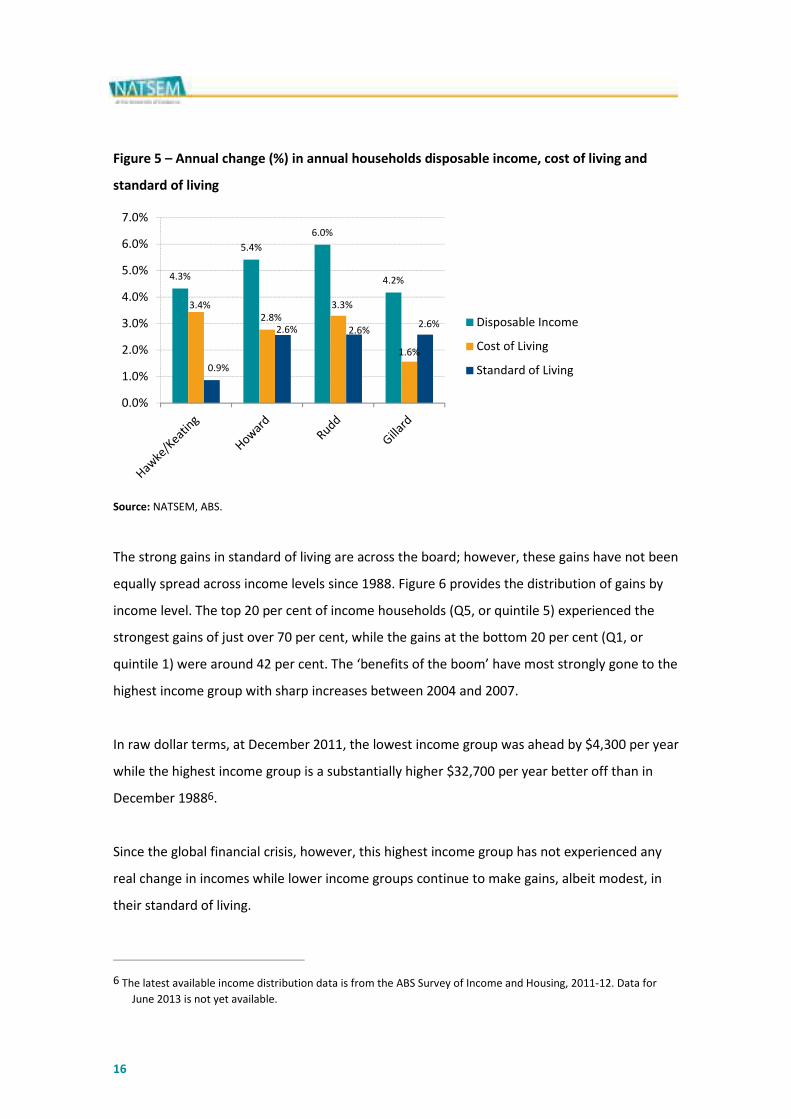
Figure 5 shows that the three most recent governments all presided over exactly the same
changes in standard of living – about 2.6 per cent per annum increases. The Hawke/Keating
governments presided over a deep and long recession that reduced the growth in the standard
of living during their period of government5. Disposable income increases were strongest
under the Rudd Government while cost of living increases were lowest under the Gillard
government.
5 Hawke/Keating period from December 1988 only. ABS GDP per capita figures suggest annual average growth of 3
per cent in the missing years from March 1983 to March 1988.
16
Figure 5 – Annual change (%) in annual households disposable income, cost of living and
standard of living
Source: NATSEM, ABS.
The strong gains in standard of living are across the board; however, these gains have not been
equally spread across income levels since 1988. Figure 6 provides the distribution of gains by
income level. The top 20 per cent of income households (Q5, or quintile 5) experienced the
strongest gains of just over 70 per cent, while the gains at the bottom 20 per cent (Q1, or
quintile 1) were around 42 per cent. The ‘benefits of the boom’ have most strongly gone to the
highest income group with sharp increases between 2004 and 2007.
In raw dollar terms, at December 2011, the lowest income group was ahead by $4,300 per year
while the highest income group is a substantially higher $32,700 per year better off than in
December 19886.
Since the global financial crisis, however, this highest income group has not experienced any
real change in incomes while lower income groups continue to make gains, albeit modest, in
their standard of living.
6 The latest available income distribution data is from the ABS Survey of Income and Housing, 2011-12. Data for
June 2013 is not yet available.
4.3%
5.4%
6.0%
4.2%
3.4%
2.8%
3.3%
1.6%
0.9%
2.6% 2.6%2.6%
0.0%
1.0%
2.0%
3.0%
4.0%
5.0%
6.0%
7.0%
Disposable Income
Cost of Living
Standard of Living
,
17
Figure 6 – Standard of Living, Income levels, NATSEM7
Source: NATSEM, ABS.
As the above analysis shows, when we consider both incomes and costs it is the growth in
incomes in different sections and regions of Australian society that differ the most, not
changes in cost. The financial standard of living increased dramatically over the past 25 years
with those gains most pronounced in the mining states of WA and NT and Australia’s most
affluent state or territory, the ACT. In terms of income gains, the highest income group,
quintile 5 (the top 20 per cent of household incomes) experienced exceptionally strong gains
last decade prior to the GFC in 2008.
6 Contributions to Cost of Living Changes
While the overall cost of living increase in the June quarter was effectively flat, and over the
previous 12 months only 1.7 per cent there was, as always, considerable variation amongst
different goods and services in the household basket. Figure 7 provides a more detailed view
of the price changes in the household basket of goods.
7 Q1 refers to Quintile 1, which is the bottom 20 per cent of household income households using equivalised
disposable income, Q2 refers to Quintile 2 which is percentiles 20 to 40 and so on up to Q5 which is the top 20
per cent of household incomes.
80
90
100
110
120
130
140
150
160
170
180
Q1 Q2 Q3 Q4 Q5

18
Over the last 12 months, the largest increase in consumer inflation was for utilities with a 14
per cent jump in prices. This strong increase mostly reflects recent increases in electricity and
gas prices partly due to the introduction of a carbon price and partly due to the continuation of
strong inflation inherent in these markets over recent years. Other strong contributors were
Health (+6.2 per cent) and education (+5.5 per cent). While these three groups have
experienced very strong inflation they make up around 14 per cent of our index in terms of
their ‘weight’ and so it is important to consider all the other elements of the basket of goods
and services.
Offsetting these increases was a drop in mortgage interest payments through the year of 14.5
per cent thanks to standard variable loans declining. Audio-visual equipment also dropped by
5.1 per cent while other groups including household goods and services, personal care,
transport, clothing and footwear and food all grew in price by no more than 1.1 per cent over
the year.
Figure 7 – Price change for Cost of Living detailed groups, NATSEM, ABS.
Source: NATSEM, ABS.
-5.1%
2.2%
5.5%
6.2%
1.2%
0.1%
-14.5%
0.2%
3.1%
3.4%
1.1%
4.2%
-0.4%
1.1%
3.3%
2.9%
14.0%
1.5%
-20.0% -15.0% -10.0% -5.0% 0.0% 5.0% 10.0% 15.0% 20.0%
Audio Visual
Communication
Education
Health
Holidays, Airfares
Household G&S
Mortgage
Personal Care
Recreation
Rent
Transport
Alcohol, Tobacco
Clothing, Footwear
Food
Housing other
Other
Utilities
Total
Ann Qtr
,
19
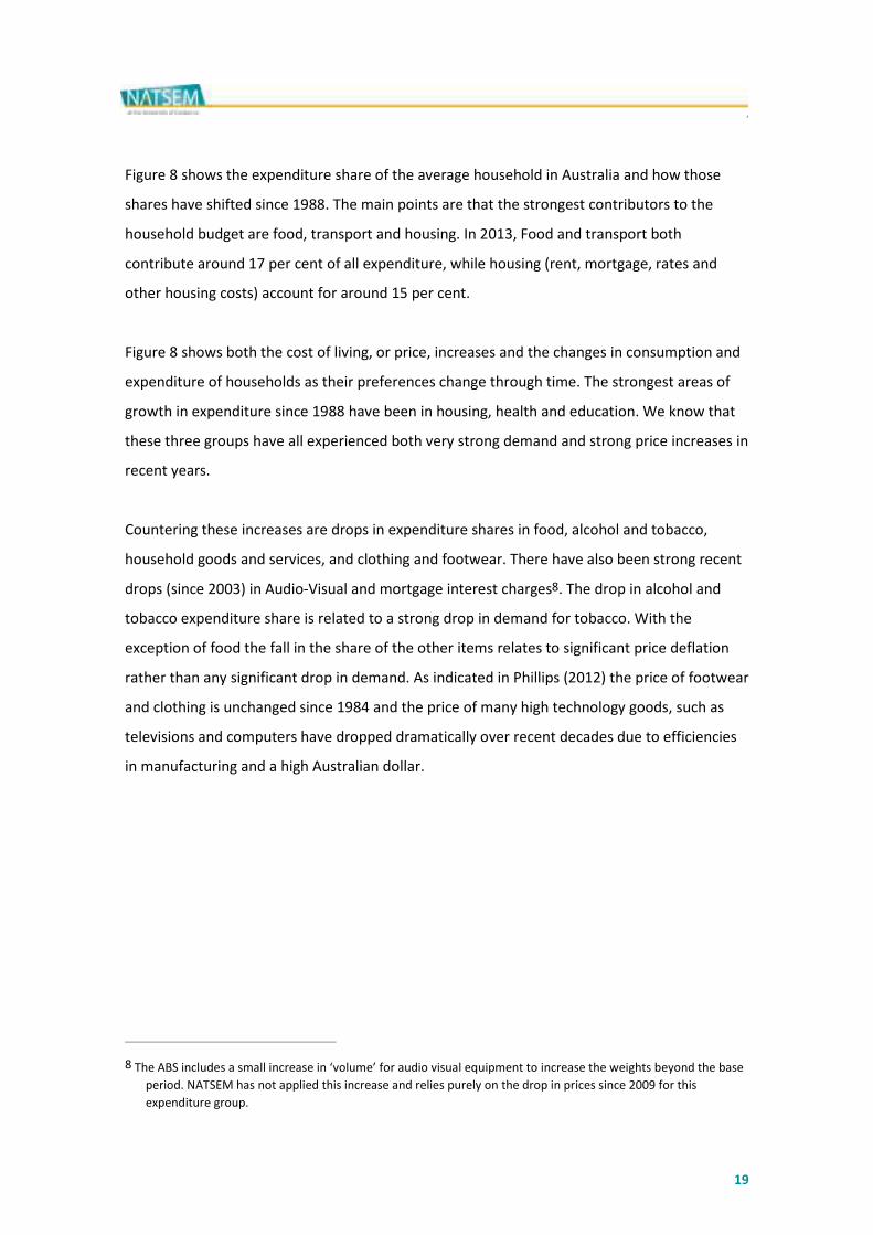
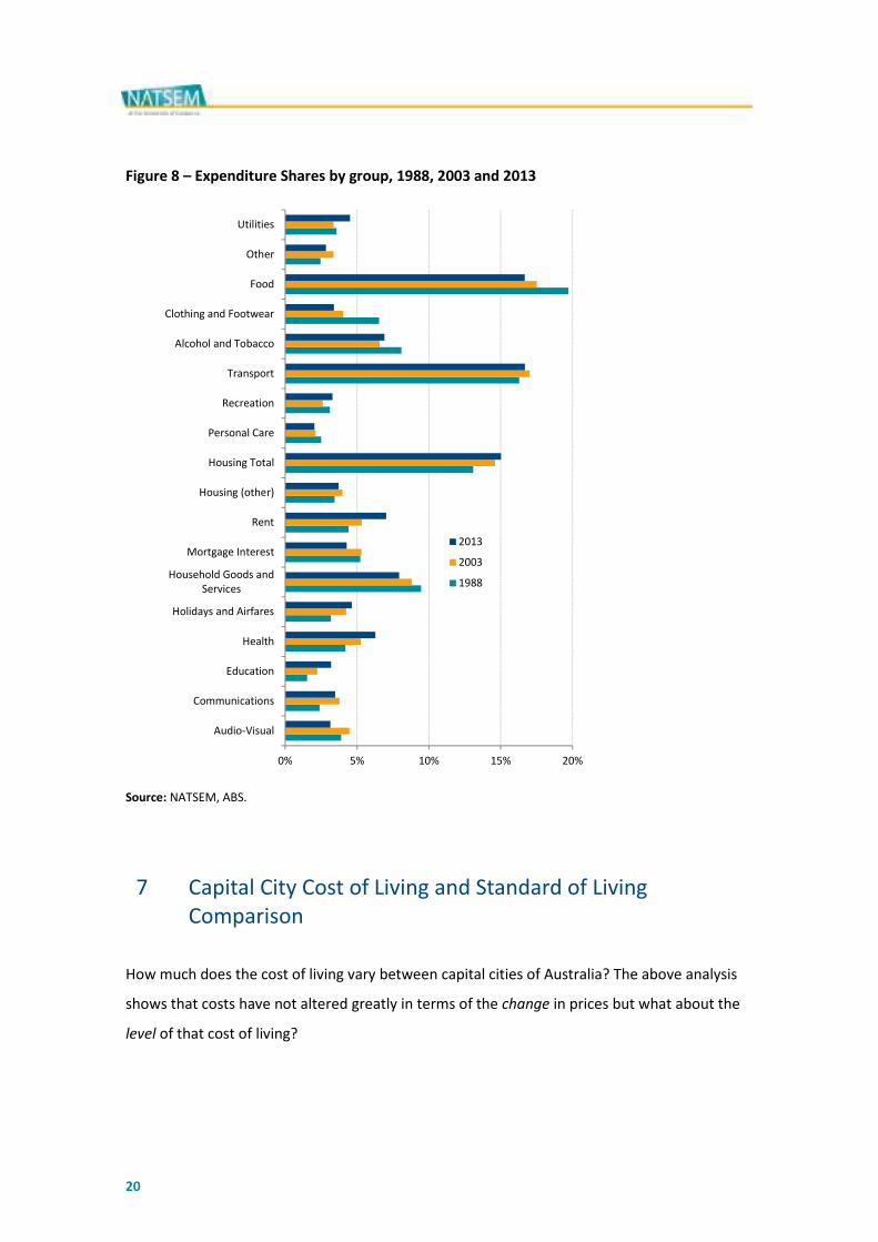
Figure 8 shows the expenditure share of the average household in Australia and how those
shares have shifted since 1988. The main points are that the strongest contributors to the
household budget are food, transport and housing. In 2013, Food and transport both
contribute around 17 per cent of all expenditure, while housing (rent, mortgage, rates and
other housing costs) account for around 15 per cent.
Figure 8 shows both the cost of living, or price, increases and the changes in consumption and
expenditure of households as their preferences change through time. The strongest areas of
growth in expenditure since 1988 have been in housing, health and education. We know that
these three groups have all experienced both very strong demand and strong price increases in
recent years.
Countering these increases are drops in expenditure shares in food, alcohol and tobacco,
household goods and services, and clothing and footwear. There have also been strong recent
drops (since 2003) in Audio-Visual and mortgage interest charges8. The drop in alcohol and
tobacco expenditure share is related to a strong drop in demand for tobacco. With the
exception of food the fall in the share of the other items relates to significant price deflation
rather than any significant drop in demand. As indicated in Phillips (2012) the price of footwear
and clothing is unchanged since 1984 and the price of many high technology goods, such as
televisions and computers have dropped dramatically over recent decades due to efficiencies
in manufacturing and a high Australian dollar.
8 The ABS includes a small increase in ‘volume’ for audio visual equipment to increase the weights beyond the base
period. NATSEM has not applied this increase and relies purely on the drop in prices since 2009 for this
expenditure group.
20
Figure 8 – Expenditure Shares by group, 1988, 2003 and 2013
Source: NATSEM, ABS.
7 Capital City Cost of Living and Standard of Living
Comparison
How much does the cost of living vary between capital cities of Australia? The above analysis
shows that costs have not altered greatly in terms of the change in prices but what about the
level of that cost of living?
0% 5% 10% 15% 20%
Audio-Visual
Communications
Education
Health
Holidays and Airfares
Household Goods and
Services
Mortgage Interest
Rent
Housing (other)
Housing Total
Personal Care
Recreation
Transport
Alcohol and Tobacco
Clothing and Footwear
Food
Other
Utilities
2013
2003
1988

,
21
Figure 9 provides estimates of the price of our typical basket of goods and services in Sydney,
and then repriced in each capital city of Australia9. Sydney is the most expensive capital city
with the typical basket of goods costing $72,914 per annum. Adelaide has the lowest cost of
living, cheaper by $4,823 per year compared to Sydney. Darwin and Canberra are similar to
Sydney with respect to their cost of living. Melbourne has a $2,721 discount compared to
Sydney. Hobart is the second cheapest capital city, only marginally more expensive than
Adelaide. Perth and Brisbane sit in the middle of the capital city cost of living comparison.
Figure 9 – Capital City Cost of Living Comparison to Sydney, June 2013, NATSEM, ABS
Source: NATSEM, ABS.
As emphasised throughout this report cost is only one part of the standard of living equation –
income is equally important. While Adelaide has the lowest cost of living it also has relatively
low average household incomes.
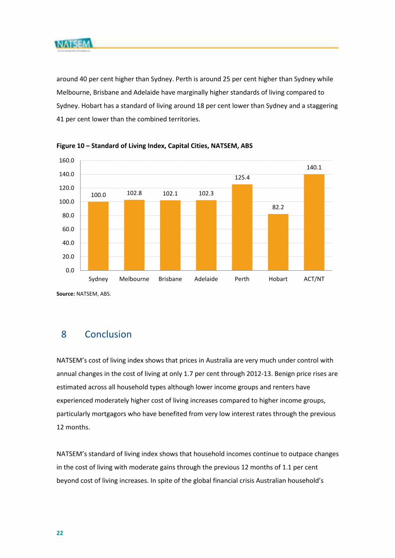
Using Sydney as the benchmark Figure 10 considers both the income and the cost of each
capital city compared to our benchmark city, Sydney. After accounting for both income and
cost we find that the combined territories of the ACT and NT have a financial standard of living
9 These estimates are based on ABS ‘experimental’ spatial price research with some data gaps overcome by
NATSEM and updating to the most recent ABS CPI release. The estimates remain experimental and should only
be considered as a guide and only relevant to the ‘average’ dwelling in Sydney. In some states it is likely that
expenditure patters will differ from Sydney. For example, Canberra households devote a larger share of
expenditure to gas and electricity than Sydney due to greater heating needs in winter. This analysis does not
account for such regional differences in ‘quantity’ of purchase.
$72,914
$70,193
$69,286
$68,092
$70,893
$68,615
$72,398 $72,266
$65,000
$66,000
$67,000
$68,000
$69,000
$70,000
$71,000
$72,000
$73,000
$74,000
Sydney Melbourne Brisbane Adelaide Perth Hobart Darwin Canberra
22
around 40 per cent higher than Sydney. Perth is around 25 per cent higher than Sydney while
Melbourne, Brisbane and Adelaide have marginally higher standards of living compared to
Sydney. Hobart has a standard of living around 18 per cent lower than Sydney and a staggering
41 per cent lower than the combined territories.
Figure 10 – Standard of Living Index, Capital Cities, NATSEM, ABS
Source: NATSEM, ABS.
8 Conclusion
NATSEM’s cost of living index shows that prices in Australia are very much under control with
annual changes in the cost of living at only 1.7 per cent through 2012-13. Benign price rises are
estimated across all household types although lower income groups and renters have
experienced moderately higher cost of living increases compared to higher income groups,
particularly mortgagors who have benefited from very low interest rates through the previous
12 months.
NATSEM’s standard of living index shows that household incomes continue to outpace changes
in the cost of living with moderate gains through the previous 12 months of 1.1 per cent
beyond cost of living increases. In spite of the global financial crisis Australian household’s
100.0 102.8 102.1 102.3
125.4
82.2
140.1
0.0
20.0
40.0
60.0
80.0
100.0
120.0
140.0
160.0
Sydney Melbourne Brisbane Adelaide Perth Hobart ACT/NT
,
23
financial standard of living jumped 15 per cent, or $5,300 per annum since 2008 and nearly
$16,000 per annum since 1988.
The gains since the GFC have not been spread evenly throughout the household income
spectrum with lower income households tending to do better than high income households.
This is in stark contrast with the longer-term picture, particularly last decade prior to the GFC
where high income households did much better than low income households.
There are certain services such as utilities, health and education that have risen much more
sharply than the general cost of living, however, these price increases have been offset by low
or negative price increases for mortgages, clothing and footwear and many imported high
technology goods such as audio-visual equipment and household goods and services.
Sydney remains Australia’s highest cost capital city, with a premium of over $4,800 per year
compared to the cheapest city, Adelaide. The combined Canberra and the NT have the highest
standard of living while Hobart has the lowest standard of living of the capital cities in
Australia. The main drivers of differences in the cost of living between cities relate to the high
cost of housing in Sydney. The higher standard of living in Canberra, NT and Perth relates to
significantly higher household incomes than other cities and regions of Australia.
The report shows that clearly, in spite of troubled economic times in much of the developed
world, Australia continues to enjoy a rising standard of living with higher incomes and very low
cost pressures. Cost of living pressures in Australia are shown to have little to do with rising
prices.
This report does not suggest that there are not families who face financial hardships; however,
it does show that most socioeconomic groups and regions are better placed financially than in
the past.
24
9 References
Australian Bureau of Statistics, (1988) Household Expenditure Survey, 6540.0 Microdata.
Australian Bureau of Statistics, (1993) Household Expenditure Survey, 6540.0 Microdata.
Australian Bureau of Statistics, (1998) Household Expenditure Survey, 6540.0 Microdata.
Australian Bureau of Statistics, (2003) Household Expenditure Survey and Survey of Income and
Housing, 6503.0 Microdata.
Australian Bureau of Statistics, (2003) Comparing Living Costs in Australian Capital Cities, 32nd
Conference of Economist.
Australian Bureau of Statistics, (2009) Household Expenditure Survey and Survey of Income and
Housing, 6503.0 Microdata.
Australian Bureau of Statistics, (2013) Selected Living Cost Indexes, Australia, Jun 2013.
Diewert, E (1998) Index Number Issues in the Consumer Price Index, Journal of Economic
Perspectives, V12, pp 47-58.
Phillips, B (2012). Prices these days! The Cost of Living in Australia.
More information
Further publications related to this topic can be found on
NATSEM’s website at www.natsem.canberra.edu.au. To learn more
about Income, Wealth and Housing research at NATSEM, contact:
Ben Phillips: Ph. +61 2 6201 2760

,
25