corporate style guide - derivan style guide 2009. 1 :: logos and branding the derivan logo the...
TRANSCRIPT
Corporate Style Guide2009
1 :: Logos and brandingThe Derivan logo
The Matisse logo
Rules regarding product logos
Unacceptable logo uses
The Derivan Slogan
The Matisse Slogan
2 :: ColourDerivan Blue
3 :: Guidelines for print
Fonts & sizes
Layouts, dimensions, and templates
Company address information
Contents
1
2
4
7
8
8
9
10
11
13
IIContents
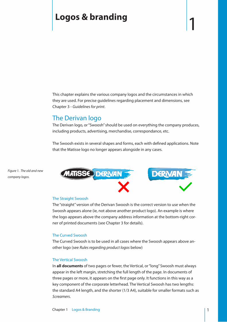
This chapter explains the various company logos and the circumstances in which they are used. For precise guidelines regarding placement and dimensions, see Chapter 3 - Guidelines for print.
The Derivan logoThe Derivan logo, or “Swoosh” should be used on everything the company produces, including products, advertising, merchandise, correspondance, etc.
The Swoosh exists in several shapes and forms, each with defined applications. Note that the Matisse logo no longer appears alongside in any cases.
The Straight SwooshThe “straight” version of the Derivan Swoosh is the correct version to use when the Swoosh appears alone (ie, not above another product logo). An example is where the logo appears above the company address information at the bottom-right cor-ner of printed documents (see Chapter 3 for details).
The Curved SwooshThe Curved Swoosh is to be used in all cases where the Swoosh appears above an-other logo (see Rules regarding product logos below)
The Vertical SwooshIn all documents of two pages or fewer, the Vertical, or “long” Swoosh must always appear in the left margin, stretching the full length of the page. In documents of three pages or more, it appears on the first page only. It functions in this way as a key component of the corporate letterhead. The Vertical Swoosh has two lengths: the standard A4 length, and the shorter (1/3 A4), suitable for smaller formats such as Screamers.
1Logos & branding
Figure 1. The old and new
company logos.
1Chapter 1 Logos & Branding
The Two Swooshes RuleAvoid having more than two Swooshes on a page at once. In practice this usually means that once you have the Vertical Swoosh in the left margin, you will only have either a Curved Swoosh above a featured product logo, or the Straight Swoosh above the address information (not both). The Curved Swoosh takes precedence when there is only one of them.
Definitive versionsOver the course of its evolution and wide applications, the Derivan Swoosh has un-dergone a number of variations in colour, tone, and gradient. Figure 3 below shows some different versions of the Curved Swoosh as an example. With all Swooshes, the 3D “paint-effect” version (furthest right) is the correct and most recent version. Exceptions apply in special cases, eg. where a two-colour version might be required for screen-printing. The 3D version is identifyable by a hint of black in the lower left corner of the logo.
The Matisse logoThe Matisse logo is no longer part of Derivan’s corporate identity, and now only appears on the Matisse range of products. For most purposes, it is treated like any other product logo. There is one exception, however, in how the Curved Swoosh ap-pears above it (see Rules regarding product logos, below).
AppearanceThe Matisse logo has changed recently in order to create a standard look across both print and packaging. While the black box background should be considered part of the Matisse visual identity, it can be omitted in cases where there is a reasonable design/aesthetic cause to do so.
2Chapter 1 Logos & Branding
Figure 3. From left to right:
2-colour version, gradient
version, and 3D version of
curved swoosh.
Figure 4. The new standard
Matisse logo.
Figure 2. The Straight
Swoosh (left), Curved
Swoosh (middle), and Verti-
cal Swoosh (right).
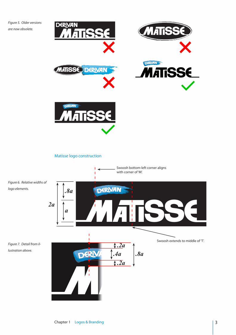
Matisse logo construction
3Chapter 1 Logos & Branding
Figure 5. Older versions
are now obsolete.
Figure 6. Relative widths of
logo elements.
Figure 7. Detail from il-
lustration above.
Swoosh bottom-left corner aligns with corner of ‘M’.
Swoosh extends to middle of ‘T’.
a
.8a
.8a.4a.2a
.2a
2a
4Chapter 1 Logos & Branding
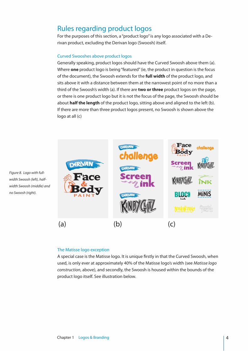
Rules regarding product logosFor the purposes of this section, a “product logo” is any logo associated with a De-rivan product, excluding the Derivan logo (Swoosh) itself.
Curved Swooshes above product logosGenerally speaking, product logos should have the Curved Swoosh above them (a). Where one product logo is being “featured” (ie, the product in question is the focus of the document), the Swoosh extends for the full width of the product logo, and sits above it with a distance between them at the narrowest point of no more than a third of the Swoosh’s width (a). If there are two or three product logos on the page, or there is one product logo but it is not the focus of the page, the Swoosh should be about half the length of the product logo, sitting above and aligned to the left (b). If there are more than three product logos present, no Swoosh is shown above the logo at all (c)
The Matisse logo exceptionA special case is the Matisse logo. It is unique firstly in that the Curved Swoosh, when used, is only ever at approximately 40% of the Matisse logo’s width (see Matisse logo construction, above), and secondly, the Swoosh is housed within the bounds of the product logo itself. See illustration below.
Figure 8. Logo with full-
width Swoosh (left), half-
width Swoosh (middle) and
no Swoosh (right).
(a) (b) (c)
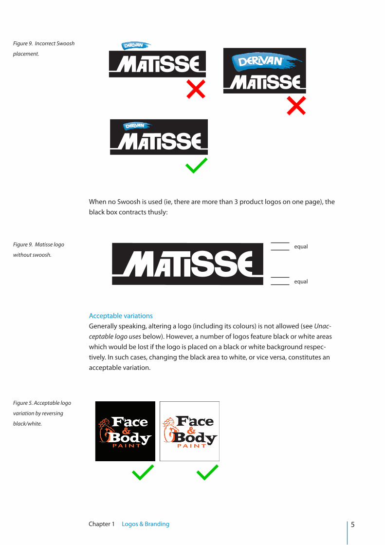
When no Swoosh is used (ie, there are more than 3 product logos on one page), the black box contracts thusly:
Acceptable variationsGenerally speaking, altering a logo (including its colours) is not allowed (see Unac-ceptable logo uses below). However, a number of logos feature black or white areas which would be lost if the logo is placed on a black or white background respec-tively. In such cases, changing the black area to white, or vice versa, constitutes an acceptable variation.
5Chapter 1 Logos & Branding
Figure 9. Incorrect Swoosh
placement.
Figure 9. Matisse logo
without swoosh.equal
equal
Figure 5. Acceptable logo
variation by reversing
black/white.
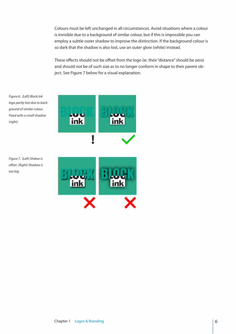
Colours must be left unchanged in all circumstances. Avoid situations where a colour is invisible due to a background of similar colour, but if this is impossible you can employ a subtle outer shadow to improve the distinction. If the background colour is so dark that the shadow is also lost, use an outer glow (white) instead.
These effects should not be offset from the logo (ie. their “distance” should be zero) and should not be of such size as to no longer conform in shape to their parent ob-ject. See Figure 7 below for a visual explanation.
6Chapter 1 Logos & Branding
Figure 7. (Left) Shdow is
offset. (Right) Shadow is
too big.
Figure 6. (Left) Block Ink
logo partly lost due to back-
ground of similar colour.
Fixed with a small shadow
(right).
!
7Chapter 1 Logos & Branding
Unacceptable logo uses
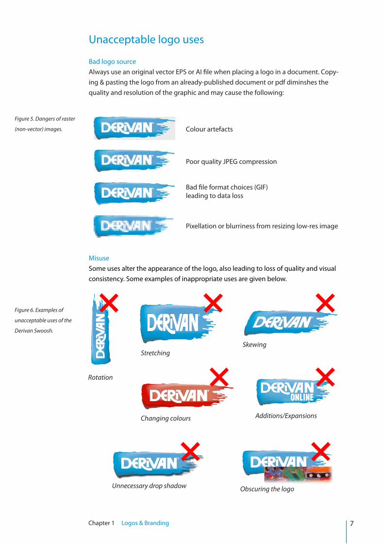
Bad logo sourceAlways use an original vector EPS or AI file when placing a logo in a document. Copy-ing & pasting the logo from an already-published document or pdf diminshes the quality and resolution of the graphic and may cause the following:
MisuseSome uses alter the appearance of the logo, also leading to loss of quality and visual consistency. Some examples of inappropriate uses are given below.
Colour artefacts
Poor quality JPEG compression
Bad file format choices (GIF)leading to data loss
Pixellation or blurriness from resizing low-res image
Rotation
StretchingSkewing
Additions/Expansions
Unnecessary drop shadow Obscuring the logo
Changing colours
Figure 5. Dangers of raster
(non-vector) images.
Figure 6. Examples of
unacceptable uses of the
Derivan Swoosh.
8Chapter 1 Logos & Branding
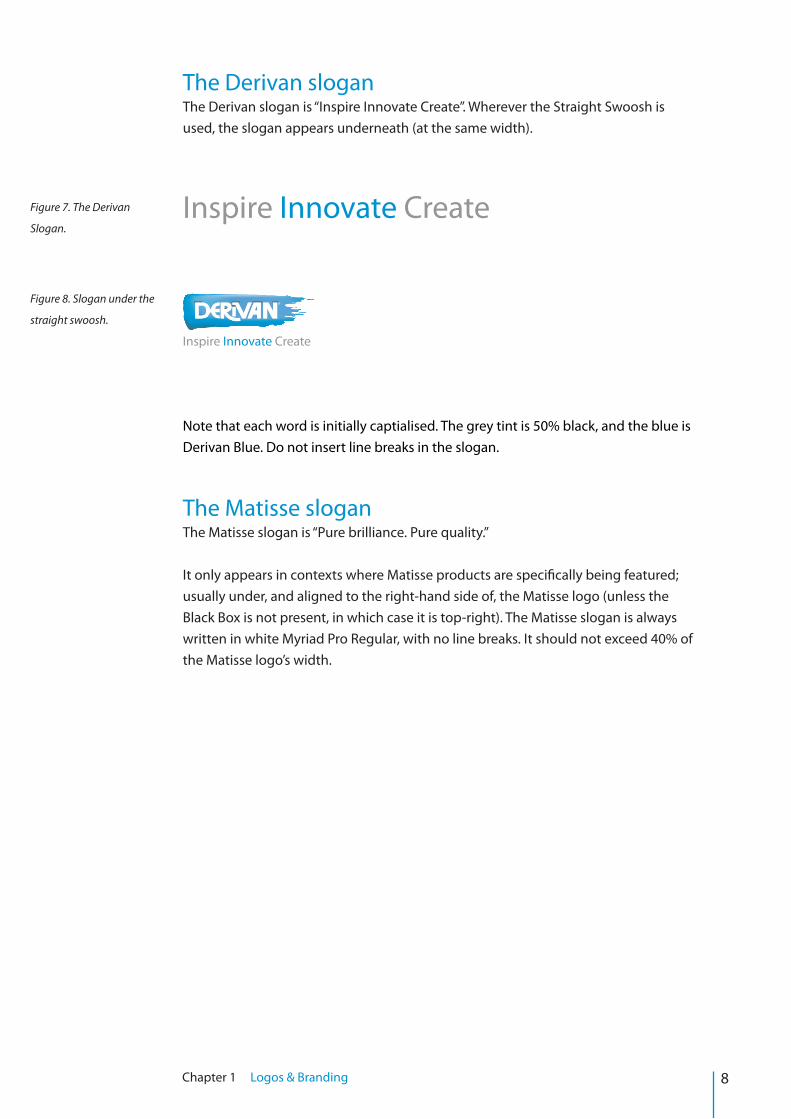
The Derivan sloganThe Derivan slogan is “Inspire Innovate Create”. Wherever the Straight Swoosh is used, the slogan appears underneath (at the same width).
Inspire Innovate Create
Inspire Innovate Create
Note that each word is initially captialised. The grey tint is 50% black, and the blue is Derivan Blue. Do not insert line breaks in the slogan.
The Matisse sloganThe Matisse slogan is “Pure brilliance. Pure quality.” It only appears in contexts where Matisse products are specifically being featured; usually under, and aligned to the right-hand side of, the Matisse logo (unless the Black Box is not present, in which case it is top-right). The Matisse slogan is always written in white Myriad Pro Regular, with no line breaks. It should not exceed 40% of the Matisse logo’s width.
Figure 7. The Derivan
Slogan.
Figure 8. Slogan under the
straight swoosh.
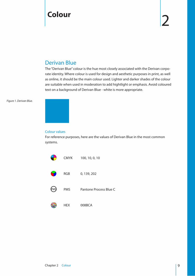
Derivan BlueThe “Derivan Blue” colour is the hue most closely associated with the Derivan corpo-rate identity. Where colour is used for design and aesthetic purposes in print, as well as online, it should be the main colour used. Lighter and darker shades of the colour are suitable when used in moderation to add hightlight or emphasis. Avoid coloured text on a background of Derivan Blue - white is more appropriate.
Colour valuesFor reference purposes, here are the values of Derivan Blue in the most common systems.
CMYK 100, 10, 0, 10
RGB 0, 139, 202
PMS Pantone Process Blue C
HEX 008BCA
2Colour
Figure 1. Derivan Blue.
9Chapter 2 Colour
PMS
Fonts & sizes
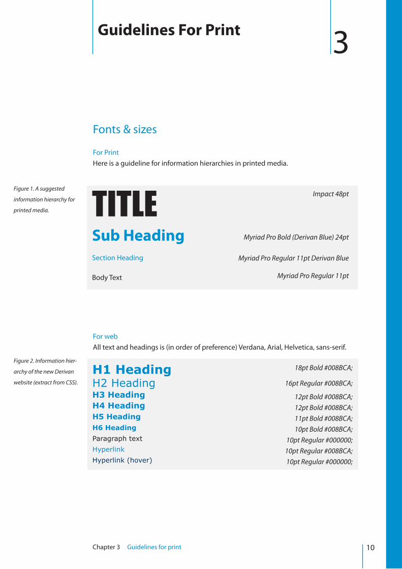
For PrintHere is a guideline for information hierarchies in printed media.
For webAll text and headings is (in order of preference) Verdana, Arial, Helvetica, sans-serif.
3Guidelines For Print
10Chapter 3 Guidelines for print
TITLESub Heading Section Heading
Body Text
Impact 48pt
Myriad Pro Bold (Derivan Blue) 24pt
Myriad Pro Regular 11pt Derivan Blue
Myriad Pro Regular 11pt
Figure 1. A suggested
information hierarchy for
printed media.
H1 HeadingH2 HeadingH3 HeadingH4 HeadingH5 HeadingH6 Heading Paragraph text Hyperlink Hyperlink (hover)
18pt Bold #008BCA;
16pt Regular #008BCA;
12pt Bold #008BCA;12pt Bold #008BCA;11pt Bold #008BCA;10pt Bold #008BCA;
10pt Regular #000000;10pt Regular #008BCA;10pt Regular #000000;
Figure 2. Information hier-
archy of the new Derivan
website (extract from CSS).
11Chapter 3 Guidelines for print
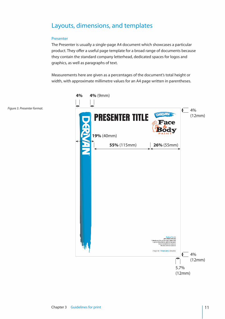
Layouts, dimensions, and templates
PresenterThe Presenter is usually a single-page A4 document which showcases a particular product. They offer a useful page template for a broad range of documents because they contain the standard company letterhead, dedicated spaces for logos and graphics, as well as paragraphs of text.
Measurements here are given as a percentages of the document’s total height or width, with approximate millimetre values for an A4 page written in parentheses.
4% (12mm)
4% (12mm)
5.7% (12mm)
4% 4% (9mm)
55% (115mm)
19% (40mm)
26% (55mm)
Figure 3. Presenter format.
12Chapter 3 Guidelines for print
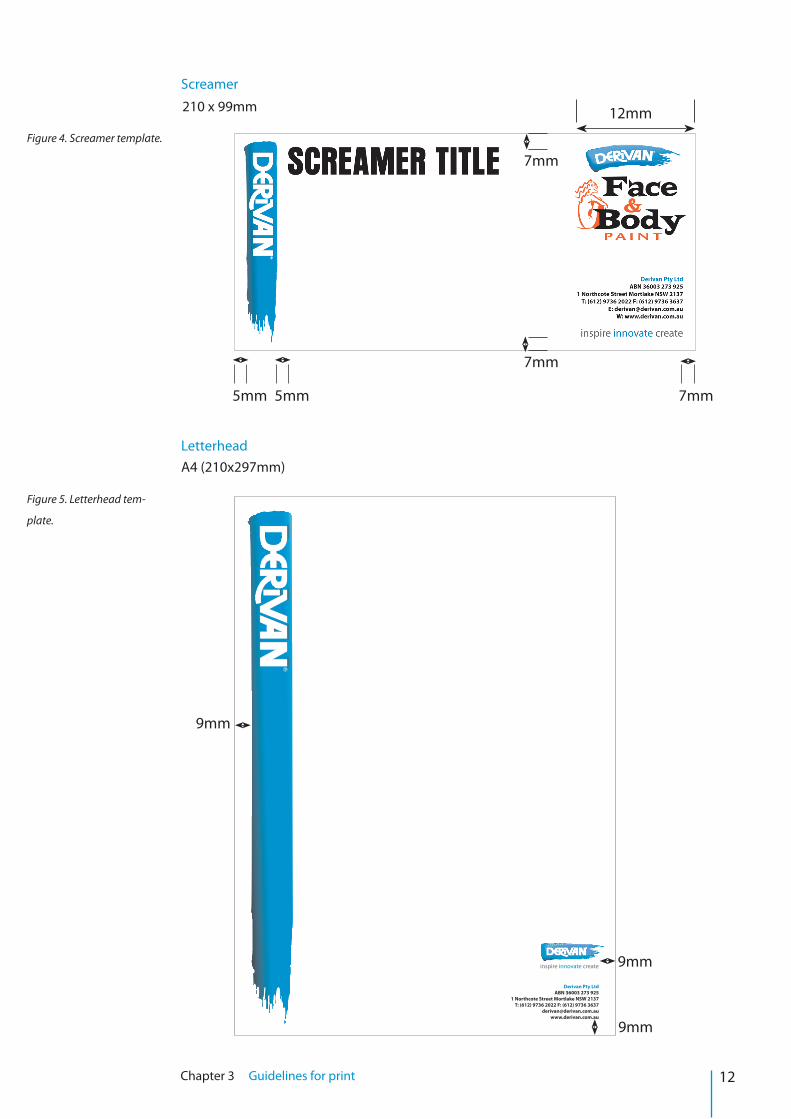
Screamer
LetterheadA4 (210x297mm)
210 x 99mm
Figure 4. Screamer template.
Figure 5. Letterhead tem-
plate.
5mm 5mm 7mm
7mm
7mm
12mm
Derivan Pty Ltd ABN 36003 273 925
1 Northcote Street Mortlake NSW 2137T: (612) 9736 2022 F: (612) 9736 3637
inspire innovate create
9mm
9mm
9mm
13Chapter 3 Guidelines for print
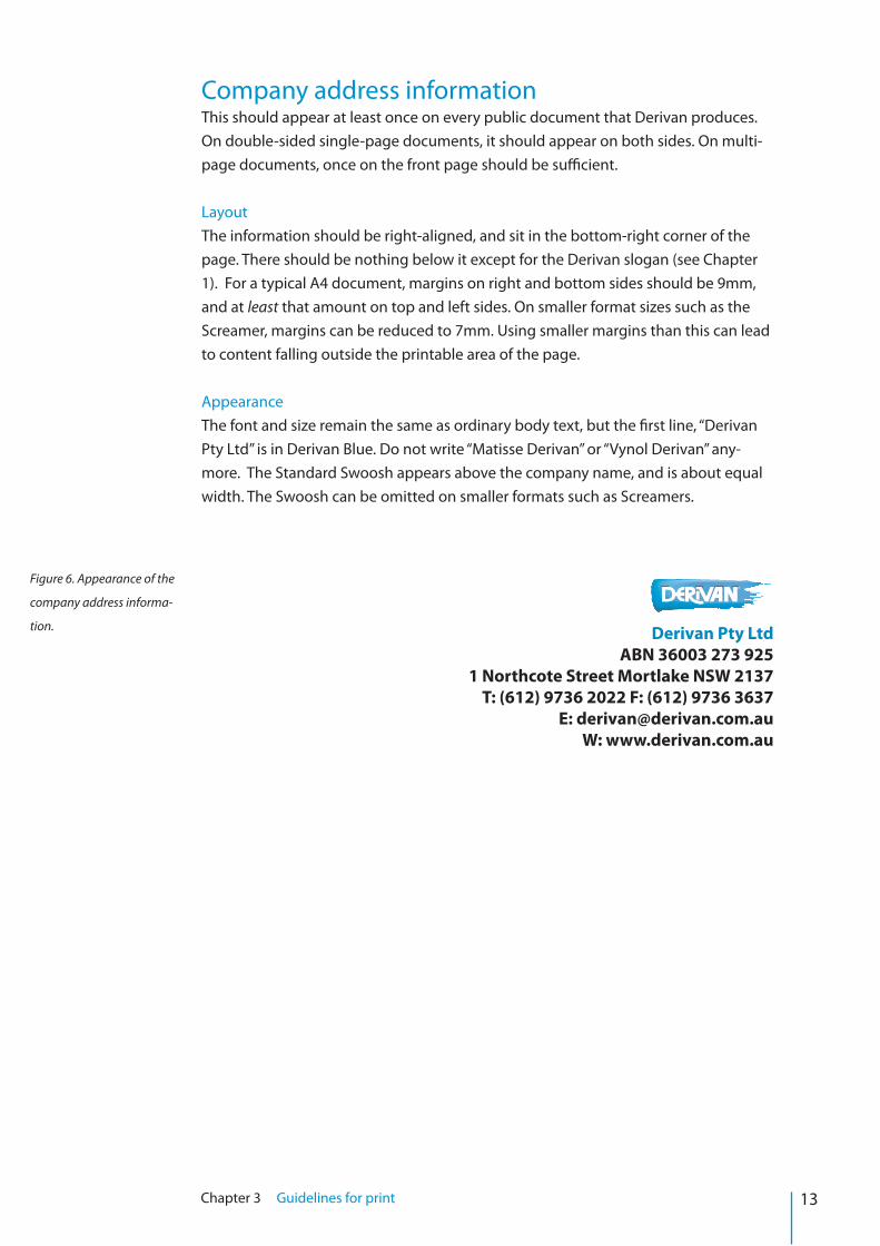
Company address informationThis should appear at least once on every public document that Derivan produces. On double-sided single-page documents, it should appear on both sides. On multi-page documents, once on the front page should be sufficient.
LayoutThe information should be right-aligned, and sit in the bottom-right corner of the page. There should be nothing below it except for the Derivan slogan (see Chapter 1). For a typical A4 document, margins on right and bottom sides should be 9mm, and at least that amount on top and left sides. On smaller format sizes such as the Screamer, margins can be reduced to 7mm. Using smaller margins than this can lead to content falling outside the printable area of the page.
AppearanceThe font and size remain the same as ordinary body text, but the first line, “Derivan Pty Ltd” is in Derivan Blue. Do not write “Matisse Derivan” or “Vynol Derivan” any-more. The Standard Swoosh appears above the company name, and is about equal width. The Swoosh can be omitted on smaller formats such as Screamers.
Derivan Pty Ltd ABN 36003 273 925
1 Northcote Street Mortlake NSW 2137T: (612) 9736 2022 F: (612) 9736 3637
E: [email protected]: www.derivan.com.au
Figure 6. Appearance of the
company address informa-
tion.