contents 7.2 applications of percentage in banking and 7.3 time-series graphs 7.4 interpreting and...
TRANSCRIPT

Contents
7.2 Applications of Percentage in Banking and
7.3 Time-series Graphs
7.4 Interpreting and Analysing Data Collected
7.1 Arithmetic and Geometric Means
7 Further Applications (3)
Finance
from Surveys
7.5 Determining the Relation between Two Variables

P. 2
Further Applications (3)7
Content
.0 if undefined
ismean geometric the
that Note . is ratio
common the, ,
, sequence in the while
;is ratiocommon the
, , , sequence the
In means. geometric are
and Both
ab
a
b
bab
aa
b
baba
abab
7.1 Arithmetic and Geometric Means
In between two numbers, arithmetic means are numbers inserted to form an arithmetic sequence. Similarly. Geometric means are numbers inserted to form a geometric sequence. However, if we add only one term x between two numbers, say, a and b, the sequence becomes
a, x, b.
2
2
bax
bax
axxb
To form an arithmetic sequence,
abx
abxa
x
x
b
2
To form a geometric sequence,
The value (s) of x can be calculated as follow.

P. 3
Further Applications (3)7
Content
7.2 Applications of Percentage in Banking and Finance
Suppose a person deposits $P in a bank account for n years and the
interest rate is r% per annum. The total amount he can get after n years
depends on whether the interest is calculated as simple interest or
compound interest.
1. For simple interest,
total amount = P (1 + r% n)
nrP %)1( amount total(a)
nr
P12
12
%1
amount total (b)
if the interest is compounded monthly.
if the interest is compounded yearly;
2. For compound interest,

P. 4
Further Applications (3)7
Content
7.2 Applications of Percentage in Banking and Finance
1%)1(
%%)1(
n
n
r
rrPQ
In general, if we want to fully repay a loan of $p with interest rate 12r% per annum in n months, then the amount of monthly instalments $Q can be calculated as follow:

P. 5
Further Applications (3)7
Content
A. Introduction
7.3 Time-series Graphs
Definition 7.1:
All the data in a time-series graph are connected by broken lines (or curves).
From the graph, we can observe the following features;
1. Trend --- it is the long-term movement of the data over a period of time.
A time-series graph is a graph that shows a sequence of observations (or a
group of data) over a period of time.
2. Seasonal variations --- it is the short-term fluctuations in recorded
values that are affected by different times of
a year, different days of a week or different
times of a day.

P. 6
Further Applications (3)7
Content
7.3 Time-series Graphs
B. Moving Average of a Series of Data
Definition 7.2:
For example, the closing prices of the stock of the Culture Company in the last ten transaction days are given below.
Date Price ($) Date Price ($)
1/12 2.8 8/12 3.8
2/12 2.6 9/12 4.4
3/12 3.5 10/12 4.0
4/12 3.2 11/12 4.5
5/12 3.6 12/12 4.5
The trend of the prices of a stock can be studied by the moving average method.
A moving average is the average value of a group of data over a fixed number of periods.
Table 7.6

P. 7
Further Applications (3)7
Content
Fig. 7.10 shows the time-series graph of the closing prices of the stock of the Culture Company.
7.3 Time-series Graphs
From the graph, the price moves up and down.
Fig. 7.10

P. 8
Further Applications (3)7
Content
7.3 Time-series Graphs
If we take the moving average of the price over a period of three consecutive days, we can get the following results:
The moving average shows that there is an upward trend in the stock price.
Date Price ($) Moving average ($)
1/12 2.8 -----
2/12 2.6 -----
3/12 3.5 2.97
4/12 3.2 3.1
5/12 3.6 3.43
8/12 3.8 3.53
9/12 4.4 3.93
10/12 4.0 4.07
11/12 4.5 4.3
12/12 4.5 4.33 Table 7.7

P. 9
Further Applications (3)7
Content
Different statistical diagrams may help to present the data in different ways.
For example, if we consider the types of cars involved in road accidents in a
city in a certain period, we can use different diagrams to present the data.
7.4 Interpreting and Analysing Data Collected from Surveys
From the bar chart, we can get the actual frequency and the order of magnitude. But from the pie chart, we notice that private cars were involved in almost 50% of the accidents, so, we may choose different statistical diagrams to fulfill different purposes.
Fig. 7.15
Fig. 7.16

P. 10
Further Applications (3)7
Content
7.4 Interpreting and Analysing Data Collected from Surveys
From the above two figures, we observe that the higher the level of investment, the more the number of people employed. But the number of people employed decreases from 1995 to 2005 with the same investment.
The following scatter diagrams show the data collected from a survey that was conducted to examine the relationship between the number of people employed and the amount of investment by ten factories in 1995 and 2005.
Fig. 7.17 Fig. 7.18
P. 11
Further Applications (3)7
Content
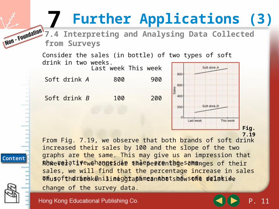
7.4 Interpreting and Analysing Data Collected from Surveys
Consider the sales (in bottle) of two types of soft drink in two weeks.
From Fig. 7.19, we observe that both brands of soft drink increased their sales by 100 and the slope of the two graphs are the same. This may give us an impression that the relative changes in sales are the same.
Last week This week
Soft drink A 800 900
Soft drink B 100 200
However, if we consider the percentage changes of their sales, we will find that the percentage increase in sales of soft drink B is eight times that of soft drink A.
Fig. 7.19
Thus, the broken line graph cannot show the relative change of the survey
data.

P. 12
Further Applications (3)7
Content
7.4 Interpreting and Analysing Data Collected from Surveys
If we are only interested in the absolutes changes in figures, then using the exact values of the data to plot a statistical graph is acceptable.
Year Price ($) log P
1 100.0 2.00
2 110.0 2.04
3 121.0 2.08
4 133.1 2.12
5 146.4 2.17
Suppose the price of a toy increases by 10% each year and its price is $100 at the first year.
If we consider the inflation rate, then the percentage increase in the prices will be more important than the increase in the actual prices.
Table 7.18

P. 13
Further Applications (3)7
Content
7.4 Interpreting and Analysing Data Collected from Surveys
The first graph (Fig. 7.20) shows the actual prices of the toy over the past five years, while the second graph (Fig. 7.21) shows the increase in the prices of the toy at a constant rate, that is, 10% each year.
Fig. 7.20 Fig. 7.21

P. 14
Further Applications (3)7
Content
7.5 Determining the Relation between Two Variables
A linear function f (x) is in the form
f (x) = ax + b,
while the equation of a straight line can be expressed as
y = mx + c,
For two variables x and y, we say they obey a linear law if y is a linear
function of x.
We observe that the form of a linear function is very similar to the equation
of a straight line. The graph of a linear function is also a straight line
where m is the slope of the line and c is the y-intercept.

P. 15
Further Applications (3)7
Content
7.5 Determining the Relation between Two Variables
then If ,310 xy
If the original values of the two variables do not obey a linear law, they may obey a linear law after making some transformation. For an index function or an exponential function, we may take logarithm on both sides of the equation to convert them into a linear function.
Fig. 7.27 shows the linear graph log y against x.
For example,
1)3(log
)3(log10log
)310log(log
x
x
y x
So , we say that log y and x obey a linear law.
Fig. 7.27

P. 16
Further Applications (3)7
Content
7.5 Determining the Relation between Two Variables
x 1 2 4 5 10
y 20 10 5 4 2
have we Consider ,20
xy
Fig. 7.28whose graph is a curve as shown in Fig. 7.28.
Table 7.28
law. linear aobey and that observe can wegraph, the Fromx
y1
2 4 5 101x
10 5 4 220y
0.10.20.250.51x
1
have wethen against of graph the plot weIf ,1
xy
Fig. 7.29
Table 7.27