connecting time-oriented data and information to a … time-oriented data and information to a...
TRANSCRIPT

Connecting Time-Oriented Data and Information to a Coherent Interactive Visualization
Ragnar Bade and Stefan Schlechtweg Otto-von-Guericke University of Magdeburg
Department of Simulation and Graphics Universitätsplatz 2, D-39106 Magdeburg {rbade|stefans}@isg.cs.uni-magdeburg.de
Silvia Miksch Vienna University of Technology
Institute of Software Technology and Interactive Systems Favoritenstrasse 9 - 11 / 188, A-1040 Vienna
Abstract In modern intensive care units (ICUs), the medical staff has to monitor a huge amount of high-dimensional and time-oriented data, which needs to be visualized user- and task-specifically to ease diagnosis and treatment planning. Available visual representations, like diagrams or charts neglect the implicit information as well as a-priory or associated knowledge about the data and its meaning (for example, 38.5°C (101.3°F) is moderate fever and 41°C (105.8°F) is critical fever). Another challenge is to provide appropriate interaction techniques to explore and navigate the data and its temporal dimensions. In this context one major challenge is to connect time-oriented data and infor-mation to a coherent interactive visualization. In this paper we present different interactive visualization techniques which enable the users to reveal the data at several levels of detail and abstraction, ranging from a broad overview to the fine structure. We will also introduce a time visualization and navigation technique that connects overview+detail, pan+zoom, and focus+context features to one powerful time-browser.
Categories & Subject Descriptors: H.5.m [Informa-tion Interfaces and Presentation]: Miscellaneous.
General Terms: Design, Human Factors.
Keywords: Visualization, health care, user interface design, information visualization, temporal data modeling and abstraction, medical application: intensive care units.
INTRODUCTION In medical domain, e.g., for treating patients in intensive care units (ICUs), the medical staff has to interpret and re-spond rapidly to a large number of clinical parameters and has to select an appropriate treatment for the patient among many different options and alternatives. According to the temporal dimension in medical applications, each data
point is defined by its value, occurrence time, valid time, measurement deviation tolerance and trustability. As one consequence, the almost overwhelming amount and the high-dimensional, time-oriented structure of this data need to be visualized user- and task-specifically to ease diag-nosis and treatment planning. Challenges are the visuali-zation of this n-dimensional data, in particular of its tem-poral-dimensions, since time and the temporal dimensions need to be treated differently than other features. For example, time cannot be reversed, data is linear as well as cyclical over time and the data is collected and expressed in different granularities of time (e.g., in days, hours, minutes, seconds and milliseconds). Abstraction of n-dimensional data into 2- or 3-dimensional visualizations is widely used but including time needs special treatment to capture the temporal properties. Conse-quently, new solutions are necessary to capture n-dimen-sional data and treating the temporal dimensions differently.
STATE OF THE ART During the last years various approaches have been devel-oped to visualize time-oriented data in general. Also in the medical field, different approaches were introduced to capture the complex representation of time-varying patients' data. Here several dimensions need to be visualized according to the medical problems, diagnoses, or treatment actions. One technique to visualize personal histories and other temporal data is the LifeLines approach [9,10]. Starting from an overview of the whole chronicle, zooming provides more details. One fundamental component of visualizing temporal data using LifeLines is the use of timelines [14], where colored horizontal bars are plotted over the required period of time of an assigned action or event. The length of those bars is derived from the duration time and the width/height from the significance of that action or event. In contrast discrete events are represented by icons. Color is used to visualize specific sections or relationships. In comparison to tabular representations LifeLines lead to faster response times, better first impressions of the data and higher recall rates [1]. However, there is a lack of visualizing continuous data over time (e.g., a fever curve).
Permission to make digital or hard copies of all or part of this work for personal or classroom use is granted without fee provided that copies are not made or distributed for profit or commercial advantage and that copies bear this notice and the full citation on the first page. To copy otherwise, or republish, to post on servers or to redistribute to lists, requires prior specific permission and/or a fee. CHI 2004, April 24–29, 2004, Vienna, Austria. Copyright 2004 ACM 1-58113-702-8/04/0004...$5.00.
BADE, Ragnar; SCHLECHTWEG, Stefan; MIKSCH, Silvia: “Connecting Time-Oriented Data and Information to a Coherent Interactive Visualization“ In: Proceedings of CHI’04, ACM Conference on Human Factors in Computing Systems, ACM Press, pp. 105-112, 2004.
Additional material can be found at: http://isgwww.cs.uni-magdeburg.de/~rbade/midgaard

The Graphical Summary of Patient Status by Powsner and Tufte [11] visualizes a lot of "fever curves" in small repeated graphs with identical formats. The data in these small multiples is scaled to five graphically same sized qualitative ranges (critically reduced, reduced, normal, elevated and critically elevated). Using scaled values simplifies rating and interpretation since big vertical displacement corresponds to clinical significance. Unfortu-nately, this visualization scales every qualitative level by a different amount. As a result the visual distance between two values in different quality levels is not proportional to the numerical distance. In addition to the qualitative scales used, the temporal focus+context visualization of the Graphical Summary of Patient Status is very convincing. Due to a non-linear time-scale, a graphical summary is achieved, compressing two years of data into a context for recent trends. Additional ideas concerning data summaries are presented by Shahar and Cheng [12]. They utilize derived temporal data abstractions to communicate complex data dependencies. Such focus+context techniques are visualization and inter-action methods adapted to the human visual perception and cognition. According to the human foveal vision and con-text-oriented cognition [15,4] rich detailed foci are dis-played in the context of bigger coarse parts. Comparative evaluations of focus+context, pan+zoom and over-view+detail techniques attest focus+context techniques a leading position [3,7,8] but also address disadvantages in respect of information scent [7,8].
OUR VISUALIZATION APPROACH In the next sections we will introduce our solutions for the visualization of high-dimensional, time-oriented data as well as our time visualization and navigation techniques.
Visualizing Time-Oriented Data The alternative visual representations of time-oriented data are closely connected to the available display space and the required information content. The information space and display space are tied by the complexity of the data to be visually explored and the tasks the users want to accom-plish. Therefore, we introduce different visualizations ordered by the required display space and automatically ordered by the attainable information content. Afterwards we explain the cooperation and interaction of these visuali-zation techniques.
Visualizing Qualitative Scales Two techniques are useful to visualize qualitative data or respectively to visualize qualitatively abstracted data. The first one "color-coded timelines" is similarly used in the LifeLines approach and the second one "height-coded timelines" has been developed as a descendant of the first. In the original LifeLines approach, colored horizontal bars are plotted over the required period of time of an assigned action or event. In that approach, color is used to visualize
specific fractions or relationships. In our case of visualizing data, color can be used to represent regions of different qualitative characteristics. As an example, critical fever values can be colored red, moderate fever yellow and nor-mal temperature green. In Figure 1 critical fever periods can be easily located. Such kind of color-coded timelines provides a fair amount of information by using only a minimum of display space. They can be minimized to a minimum of only one pixel of screen height by carrying the same amount of information. However, appropriate colors have to be found for the different qualitative levels in the data. To carry on with the fever example, now the question is how reduced and critically reduced temperature can intuitively be colored. Consequently, we developed height-coded timelines as a descendant of color-coded timelines. They can be used without assigning color to the qualitative levels of the data. Height-coded timelines represent different qualitative levels like bar-charts by using different heights of the timelines. Figure 2 shows the same fever data as Figure 1. As a result of using height-coded timelines the ordinal scale of the data is visualized. As you can see in Figure 3 this visual encoding allows to represent intuitively the full range from critically reduced temperature up to critical fever. To enhance height-coded timelines they can also be colored additionally. Thus, the alarming nature of red regions can be retained (see Figure 4). By using height, the amount of information content has been increased, but at the same time the required display space has also been increased slightly. To sum up height-coded timelines can be minimized to a minimum of n pixels (where n is the number of different qualitative levels) and they provide additional information about the ordinal scale of the data.
> 41.0>105.8
> 38.5>101.3
< 38.5<101.3
°C°F
Figure 1. Color-coded timeline representation of a fever curve.
>41.0 < 38.5°C<101.3>105.8°F
Figure 2. Height-coded timeline representation of the same fever curve as in Figure 1.
Figure 3. Height-coded timeline of critically elevated, elevated, normal, reduced and critically reduced qualitative levels.
>41.0 < 38.5°C<101.3>105.8°F >101.3
>38.5
Figure 4. Colored version of the height-coded timelinein Figure 2.

Qualitative - Quantitative Hybrids Hybrid techniques can combine intuitive and easily to interpret qualitative representations with more detailed quantitative representations. A quantitative data stream enhanced with color-coded qualitative regions is visualized in Figure 5. This visual representation eases the recognition of critical periods as well as of concrete fluctuations in the data. Especially flat data streams become more obvious since the colored regions aid the perception of the other-wise small variations in the data. The data stream can also be split in to its qualitative regions without using color, as illustrated in Figure 6. In this case, vertical lines divide the different parts from each other. In contrast to common verticall markings (like, using strokes starting at the y-axis to split different regions in a chart) the horizontal splitting used (by applying color regions or vertical lines) is more appropriate for visualizing flat data streams. Another hybrid approach, used in the Graphical Summary of Patient Status [11] was described above. As mentioned there, the data is scaled to graphically same sized qualitative ranges. Unfortunately, due to this scaling, the visual distance between two values in different quality levels is not proportional to the numerical distance. Our visualizations overcome these disadvantages.
Visualizing Quantitative Scales Quantitative scales offer the ability to read off exact values and relations from the data. Unfortunately, they do not automatically include the knowledge that is included in qualitative scales (e.g., is a particular value critical or not). A possible solution is to color the y-axis to visualize infor-mation about qualitative attributes. Additional horizontal
colored lines mark points, where the data values leave one qualitative level and enter another one. The used color is determined by the color of the leaving and entering level as you can see in Figure 7. Direct coloring the data trail as well as marking regions by coloring the background of the visualization is also used. Another challenge when visualizing quantitative data is the amount of attributes or dimensions assigned to each data point. Among them are the value, the occurrence time, the valid time, measurement deviation tolerances, and trusta-bility.
Visualizing Data Points and its Dimensions The occurrence time of a data point is marked at the corresponding point in time. According to the granularity of the specified point it is represented by a small mark or by an extended mark capturing the uncertainties as shown in Figure 8.
The valid time of a data point is represented by a horizontal line indicating a valid value over the specified period of time (Figure 8). The missing of a valid value is indicated by filling the whole region of time with a gray box (Figure 11). If data values suffer from measurement deviations (e.g. ± 1%) then the corresponding range of values is marked as illustrated in Figure 9.
The trustability of a data value is represented by the fill level of a green bar. This vertical bar is plotted right above the data value itself as can be seen in Figure 10.
It is not always the case that a data point possesses all these attributes. Nevertheless, the developed techniques can depict them all at the same time in the same visualization (Figure 11 bottom).
>41.0 < 38.5°C<101.3>105.8°F >101.3
>38.5
Figure 5. Flat quantitative data display with coloredqualitative regions.
>41.0 < 38.5°C<101.3>105.8°F >101.3
>38.5
Figure 6. Flat quantitative data display split into quali-tative regions without using color.
36.038.541.5
°C
Figure 7. Fever curve with a qualitative colored y-axis and marked qualitative level crossings.
Figure 8. Representation of a data point with a more coarse (left) and a more precise (right) occurrencetime than the actual timeline scale. Additionally a horizontal line indicates the valid time of the data point.
Figure 9. Visualization of measurement deviation by extending the representations as shown in Figure 8.
Figure 10. Trustability of data points represented by a green filled bar. (extending Figure 8).

Visualizing High-Frequency Data Data points can be connected by straight lines (as shown in Figure 11 bottom) or by interpolation to visualize a con-tiguous data curve (e.g. a fever curve). Unfortunately, those visualizations reach their limits when it comes to displaying high-frequency data. When displaying high-frequency data many data values have to be laid down on one and the same small display region (e.g. a pixel or a row of pixels). In that case, appropriate visualization techniques are necessary that abstract the data and nevertheless generate an expressive representation.
The common way of visualizing high-frequency data is to calculate and display statistical measures, like average value, median or standard deviation. Thereby information on minima, maxima and critical values, etc. are lost.
To minimize the amount of information loss and to expres-sively represent the data Information Murals [5] can be used (e.g., see Figure 12). Unfortunately, an Information Mural represents the distribution of the data very well but neglects information on minima and maxima as well. Addi-tionally, this information and other statistical values can be integrated. We have enhanced the Information Mural visualization by displaying minima, maxima, the median and the 25% and 75% percentile as you can see in Figure 13. Thus the data stream can be traced closely, the stray area of 50% of the data (interquartile distance, between the 25% and 75% percentile) as well as minima, maxima and the median can be read off.
Even though the information content is high, the resulting visualizations are rather complex and, hence, hard to inter-pret. Therefore, to get an even more abstract, but neverthe-less expressive representation of high-frequency data, we use a redesign (inspired by Tufte [14]) of Tukey box-plots (former known from statistical visualizations). In this re-design (see Figure 14) the space between the minimum and the maximum is filled light-colored at first. Then the space between the 25% and 75% percentile is filled a little bit darker and the median is marked black. Now, a lot of these small box-plot-bars can be connected to a full data stream representation (Figure 15).
In combination with the enhanced Information Murals and the common way of displaying the median only, the user is provided with multiple views on to the data and, doing so, new insights are granted.
Interacting with Data and Time In the sections above the visualization techniques have been described separately. In this section we show how they cooperate and how the user can interact with them.
The major tasks when exploring the data will be search-ing/browsing in the data (e.g. by filtering and zooming) and in time (e.g. by panning and zooming).
>160 >140 <140mmHg
115
172mmHg
>160>140 <140mmHg
Figure 11. Gray regions indicate missing of valid data values in any representation.
Figure 12. Information Mural representation of a high-
frequency data stream.
Figure 13. Extended Information Mural representation
with (1) maxima, (2) 75% percentile, (3) median, (4) 25% percentile and (5) minima.
Figure 14. Very slim redesign of a Tukey box-plot
inspired by Tufte [14].
Figure 15. Visualization of a data stream using the re-
designed box-plot of Figure 14. Connecting re-designed box-plots with an other (left) generates a data stream representation as shown right.
maximum 75% percentile
median
25% percentile
minimum
1 2 3 4
5
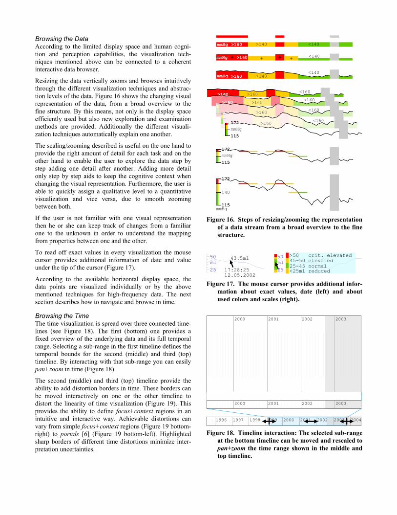
Browsing the Data According to the limited display space and human cogni-tion and perception capabilities, the visualization tech-niques mentioned above can be connected to a coherent interactive data browser.
Resizing the data vertically zooms and browses intuitively through the different visualization techniques and abstrac-tion levels of the data. Figure 16 shows the changing visual representation of the data, from a broad overview to the fine structure. By this means, not only is the display space efficiently used but also new exploration and examination methods are provided. Additionally the different visuali-zation techniques automatically explain one another.
The scaling/zooming described is useful on the one hand to provide the right amount of detail for each task and on the other hand to enable the user to explore the data step by step adding one detail after another. Adding more detail only step by step aids to keep the cognitive context when changing the visual representation. Furthermore, the user is able to quickly assign a qualitative level to a quantitative visualization and vice versa, due to smooth zooming between both.
If the user is not familiar with one visual representation then he or she can keep track of changes from a familiar one to the unknown in order to understand the mapping from properties between one and the other.
To read off exact values in every visualization the mouse cursor provides additional information of date and value under the tip of the cursor (Figure 17).
According to the available horizontal display space, the data points are visualized individually or by the above mentioned techniques for high-frequency data. The next section describes how to navigate and browse in time.
Browsing the Time The time visualization is spread over three connected time-lines (see Figure 18). The first (bottom) one provides a fixed overview of the underlying data and its full temporal range. Selecting a sub-range in the first timeline defines the temporal bounds for the second (middle) and third (top) timeline. By interacting with that sub-range you can easily pan+zoom in time (Figure 18).
The second (middle) and third (top) timeline provide the ability to add distortion borders in time. These borders can be moved interactively on one or the other timeline to distort the linearity of time visualization (Figure 19). This provides the ability to define focus+context regions in an intuitive and interactive way. Achievable distortions can vary from simple focus+context regions (Figure 19 bottom- right) to portals [6] (Figure 19 bottom-left). Highlighted sharp borders of different time distortions minimize inter-pretation uncertainties.
115
172
>160 >140 <140
>160 >140 <140
115
140
172
mmHg
mmHg
mmHg
mmHg
>160mmHg + + + + <140
115mmHg172
Figure 16. Steps of resizing/zooming the representation of a data stream from a broad overview to the fine structure.
ml50
25
43.5ml
17:28:2512.05.2002
ml50
25
>50 crit. elevated45-50 elevated25-45 normal<25ml reduced
Figure 17. The mouse cursor provides additional infor-mation about exact values, date (left) and about used colors and scales (right).
2000 2001 2002 2003
2000 2001 2002 200420031996 1997 1998 1999
2000 2001 2002 2003
Figure 18. Timeline interaction: The selected sub-range at the bottom timeline can be moved and rescaled to pan+zoom the time range shown in the middle and top timeline.

The whole temporal range of the data can be browsed by using both or only one technique. Additional over-view+detail is provided by displaying the same data at all three timelines at different abstraction levels according to the available display space.
A menu with selectable predefined layouts eases the use of and change between several common and preferred distor-tion configurations.
SCENARIO: PULMONARY EMBOLISM CARE This section illustrates the discussed techniques in context of an intensive care unit application and a pulmonary embolism case. Figure 20 shows a screenshot of the implemented prototype for intensive care patient treatment. In addition to the visualization of temporal data, treatment plans have also been included in the image.
Horizontal resizing of a treatment plan results in re-sizing/zooming of its data content. In doing so the used data visualization techniques change according to the available horizontal display size (as described above in "Browsing the Data")
In the screenshot a selected temporal range, from December 2002 to the middle of May 2003, can be seen at the bottom timeline. The patient was not at the ICU the whole period, but only after the admission to the hospital for one day. The first timeline (bottom) shows the whole period of the patient's case history, the second time line (middle) illustrates the period the patient is dealing with pulmonary embolism, and the third timeline (top) depicts the first week of therapeutic interventions in focus, and the remaining time as context. At the second timeline (middle) exact dates can already be seen from the selected region. At the third timeline (top) the first week is scaled to three
quarters of the display size and the remaining time of the selected temporal region is compressed to the remaining quarter.
Different visualization techniques are used to represent the temporal patient data. For example a colored hybrid tech-nique is used for the saturation of oxygen in blood (SpO2). Height-color-coded timelines as well as quantitative visu-alizations are also used in the screenshot.
Critical regions at the first day and a smooth stabilizing process over the rest of the week are easy to recognize. Due to the use of color-coding it is recognizable (even without medical knowledge) that the saturation of oxygen in blood (SpO2) and the partial thromboplastin time (PTT) were to low and the heart frequency (HF) were to high on the first day.
At the right side of the screenshot the actual patient status as well as information about treatment, involved physicians, etc. are displayed.
CONCLUSION In this paper we have presented a novel way of visualizing time-oriented data. We have developed several visuali-zation techniques which enhance the understanding of qualitative and quantitative characteristics of a given data stream. The challenges in that circumstance were to support the exploration tasks of users with different tasks in mind and to capture as much as possible temporal information on a limited display space without loss of overview and detail. In this context Shneidermann proposed the Visual Information Seeking Mantra: "Overview first, zoom and filter, then details-on-demand" [13]. The proposed solution enables those features by particular visualization and navigation techniques, which takes the temporal dimensions of the data into account.
We have shown, how these techniques can be used in the medical domain, in particular we have shown how to explore patients with pulmonary embolism. However, our proposed techniques are not only applicable in the medical field. The techniques are applicable to any applications, which meet the same problem characteristics (e.g. com-plexity of data, tasks, users). We have applied the tech-niques to the field of stock-exchange too [2].
ACKNOWLEDGEMENTS We want to acknowledge and thank Arno Krüger for hunting harts in this paper as well as all other colleges for their contributions.
REFERENCES [1] Alonso, Diane L.; Rose, Anne; Plaisant, Catherine.;
Norman, Kent L.: Viewing Personal History Records: A Comparison of Tabular Format and Graphical Presentation Using LifeLines. In Behaviour and Infor-mation Technology, 17(5), pp. 249-262, 1998.
2000 2001 2002 2003
2000 2001 2002 200420031996 1997 1998 1999
2000 2002 2003
2000 2001 2002 2003
2000 2001 2002 200420031996 1997 1998 1999
2000 2001 2002 2003
2000 2001 2002 2003
2000 2001 2002 200420031996 1997 1998 1999
2000 2001 2002 2003
2000 2001 2002 2003
2000 2001 2002 200420031996 1997 1998 1999
2000 2001 2002 2003
Figure 19. Interactive timeline distortion: (top-left) added distortion border, (top-right) distort timelineby simple dragging, (bottom-left) distort timeline bytwo distortion borders, (bottom-right) portal dis-tortion.

[2] Bade, Ragnar: Methoden zur Visualisierung von und Interaktion in zeitbasierten Patientendaten und Behandlungsplänen. Master thesis, Department of Simulation and Graphics, Faculty of Computer Science, University of Magdeburg, Germany, 2002.
[3] Baudisch, Patrick; Good, Nathaniel; Bellotti, Victoria; Schraedley, Pamela: Keeping Things in Context: A Comparative Evaluation of Focus Plus Context Screens, Overviews, and Zooming. In Proceedings of CHI 2002, ACM Conference on Human Factors in Computing Systems, ACM Press, pp. 259-266, 2002.
[4] Furnas, George W.: Generalized fisheye views. In Pro-ceedings of CHI'86, ACM Conference on Human Factors in Computing Systems, SIGCHI Bulletin, pp. 16-23, 1986.
[5] Jerding, Dean F.; Stasko, John T.: The Information Mural: A Technique for Displaying and Navigating Large Information Spaces. In IEEE Transactions on Visualization and Computer Graphics, 4(3), pp. 257-271, 1998.
[6] Perlin, Ken; Fox, David: Pad: An alternative approach to the computer interface. In Proceedings of SIGGRAPH'93, ACM Conference on Computer Graphics and Interactive Techniques, pp. 57-64, 1993.
[7] Pirolli, Peter; Card, Stuart K.; Van Der Wege, Mija M.: The Effect of Information Scent on Searching Information Visualizations of Large Tree Structures. In Proceedings of AVI 2000, ACM Conference on Advanced Visual Interfaces, ACM Press, pp. 161-172, 2000.
[8] Pirolli, Peter; Card, Stuart K.; Van Der Wege, Mija M.: Visual information foraging in a Focus+Context
visualization. In Proceedings of CHI 2001, ACM Conference on Human Factors in Computing Systems, 2001.
[9] Plaisant, Catherine; Milash, Brett; Rose, Anne; Widoff, Seth and Shneiderman, Ben: LifeLines: Visualizing Personal Histories. In Proceedings of CHI 96, ACM Conference on Human Factors in Computing Systems, volume 1 of PAPERS: Interactive Information Retrieval, ACM Press, pp. 221-227, 1996.
[10] Plaisant, Catherine, Mushlin, Richard, Snyder, Aaron, Li, Jia, Heller, Dan, Shneiderman, Ben: LifeLines: Using Visualization to Enhance Navigation and Analysis of Patient Records. Revised version in American Medical Informatic Association Annual Fall Symposium AMIA, pp. 76-80, 1998.
[11] Powsner, Seth M; Tufte, Edward R.: Graphical Summary of Patient Status. In The Lancet, 344, pp. 386-389, 1994.
[12] Shahar, Yuval; Cheng, Cleve: Model-Based Visuali-zation of Temporal Abstractions. In Computational Intelligence, 16(2), pp. 279-306, 2000.
[13] Shneiderman, Ben: The Eyes Have It: A Task by Data Type Taxonomy for Information Visualizations. Uni-versity of Maryland, Department of Computer Science, Human-Computer Interaction Laboratory and Institute for Systems Research, Maryland, USA, Technical Report, CS-TR-3665, ISR-TR-96-66, 1996.
[14] Tufte, Edward R.: The Visual Display of Quantitative Information. Graphics Press, Cheshire, CT, 1983.
[15] Wandmacher, Jens: Softwareergonomie - Mensch-Computer-Interaktion Grundwissen. Walter de Gruyter Verlag, Berlin, 1993.

Figure 20. Screenshot of the implemented prototype for intensive care and long term patient treatment.