conceptual models for visualizing contingency table data
TRANSCRIPT

Conceptual Models for Visualizing Contingency Table
Data
Michael Friendly∗
York University
1 Introduction
For some time I have wondered why graphical methods for categorical data are so poorlydeveloped and little used compared with methods for quantitative data. For quantitativedata, graphical methods are commonplace adjuncts to all aspects of statistical analysis, fromthe basic display of data in a scatterplot, to diagnostic methods for assessing assumptions andfinding transformations, to the final presentation of results. In contrast, graphical methodsfor categorical data are still in infancy. There are not many methods, and those that areavailable in the literature are not accessible in common statistical software; consequently,they are not widely used.
What has made this contrast puzzling is the fact that the statistical methods for cate-gorical data are in many respects discrete analogs of corresponding methods for quantitativedata: log-linear models and logistic regression, for example, are such close parallels of analy-sis of variance and regression models that they can all be seen as special cases of generalizedlinear models.
Several possible explanations for this apparent puzzle may be suggested. First, it mayjust be that those who have worked with and developed methods for categorical data aremore comfortable with tabular data, or that frequency tables, representing sums over allcases in a dataset, are more easily apprehended in tables than quantitative data. Second,it may be argued that graphical methods for quantitative data are easily generalized so, forexample, the scatterplot for two variables provides the basis for visualizing any number ofvariables in a scatterplot matrix; available graphical methods for categorical data tend tobe more specialized. However, a more fundamental reason may be, as I will try to showhere, that quantitative data display relies on e well-known natural visual mapping in whicha magnitude is depicted by length or position along a scale; for categorical data, it will beseen that a count is more naturally displayed by an area or by the visual density of an area.
∗Author’s address: Psychology Department, York University, Toronto, Ontario, Canada M3J 1P3. email:
1

2 SOME GRAPHICAL METHODS FOR CONTINGENCY TABLES 2
2 Some graphical methods for contingency tables
Several schemes for representing contingency tables graphically are based on the fact thatwhen the row and column variables are independent, the estimated expected frequencies,mij , are products of the row and column totals (divided by the grand total). Then each cellcan be represented by a rectangle whose area shows the cell frequency, nij , or deviation fromindependence.
2.1 Sieve diagrams
Table 1 shows data on the relation between hair color and eye color among 592 subjects(students in a statistics course) collected by Snee (1974). The Pearson χ2 for these data is138.3 with nine degrees of freedom, indicating substantial departure from independence. Thequestion is how to understand the nature of the association between hair and eye color.
[Table 1 about here.]
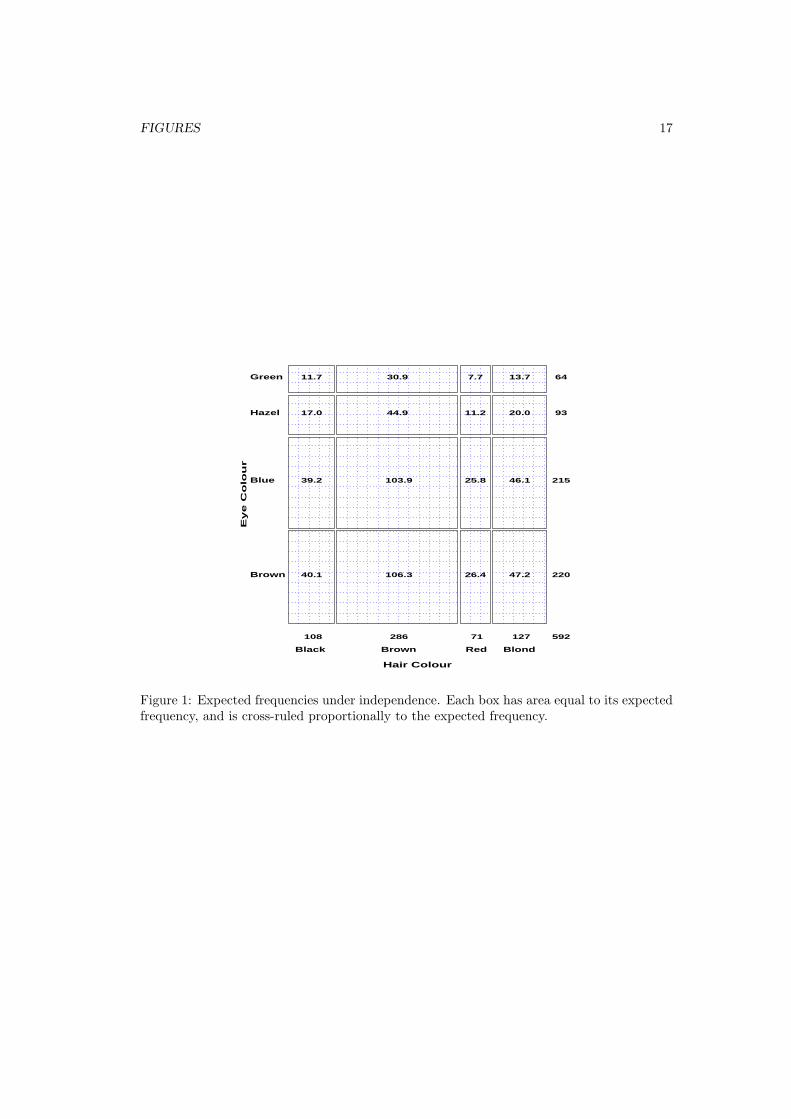
For any two-way table, the expected frequencies under independence can be representedby rectangles whose widths are proportional to the total frequency in each column, n+j , andwhose heights are proportional to the total frequency in each row, ni+; the area of eachrectangle is then proportional to mij . Figure 1 shows the expected frequencies for the hairand eye color data.
[Figure 1 about here.]
Riedwyl and Schupbach (1983, 1994) proposed a sieve diagram (later called a parquet
diagram) based on this principle. In this display the area of each rectangle is proportionalto the expected frequency and the observed frequency is shown by the number of squares ineach rectangle. Hence, the difference between observed and expected frequencies appears asthe density of shading, using color to indicate whether the deviation from independence ispositive or negative. (In monochrome versions, positive residuals are shown by solid lines,negative by broken lines.) The sieve diagram for hair color and eye color is shown in Figure 2.
[Figure 2 about here.]
2.2 Mosaic displays for n-way tables
The mosaic display, proposed by Hartigan & Kleiner (1981) and extended by Friendly (1994a),represents the counts in a contingency table directly by tiles whose area is proportional tothe cell frequency. This display generalizes readily to n-way tables and can be used to displaythe residuals from various log-linear models.
One form of this plot, called the condensed mosaic display, is similar to a dividedbar chart. The width of each column of tiles in Figure 3 is proportional to the marginalfrequency of hair colors; the height of each tile is determined by the conditional probabilitiesof eye color in each column. Again, the area of each box is proportional to the cell frequency,and complete independence is shown when the tiles in each row all have the same height.

2 SOME GRAPHICAL METHODS FOR CONTINGENCY TABLES 3
[Figure 3 about here.]
Enhanced mosaics
The enhanced mosaic display (Friendly, 1992b, 1994a) achieves greater visual impact by usingcolor and shading to reflect the size of the residual from independence and by reorderingrows and columns to make the pattern more coherent. The resulting display shows both theobserved frequencies and the pattern of deviations from a specified model.
Figure 4 gives the extended the mosaic plot, showing the standardized (Pearson) residualfrom independence, dij = (nij −mij)/
√mij by the color and shading of each rectangle: cells
with positive residuals are outlined with solid lines and filled with slanted lines; negativeresiduals are outlined with broken lines and filled with grayscale. The absolute value of theresidual is portrayed by shading density: cells with absolute values less than 2 are empty;cells with |dij | ≥ 2 are filled; those with |dij | ≥ 4 are filled with a darker pattern.1 Underthe assumption of independence, these values roughly correspond to two-tailed probabilitiesp < .05 and p < .0001 that a given value of |dij | exceeds 2 or 4. For exploratory purposes,we do not usually make adjustments (e.g., Bonferroni) for multiple tests because the goal isto display the pattern of residuals in the table as a whole. However, the number and valuesof these cutoffs can be easily set by the user.
[Figure 4 about here.]
When the row or column variables are unordered, we are also free to rearrange the corre-sponding categories in the plot to help show the nature of association. For example, in Figure4, the eye color categories have been permuted so that the residuals from independence havean opposite-corner pattern, with positive values running from bottom-left to top-right cor-ners, negative values along the opposite diagonal. Coupled with size and shading of the tiles,the excess in the black-brown and blond-blue cells, together with the underrepresentation ofbrown-eyed blonds and people with black hair and blue eyes is now quite apparent. Alhoughthe table was reordered on the basis of the dij values, both dimensions in Figure 4 are or-dered from dark to light, suggesting an explanation for the association. (In this example theeye-color categories could be reordered by inspection. A general method (Friendly, 1994a)uses category scores on the largest correspondence analysis dimension.)
Multi-way tables
Like the scatterplot matrix for quantitative data, the mosaic plot generalizes readily to thedisplay of multi-dimensional contingency tables. Imagine that each cell of the two-way tablefor hair and eye color is further classified by one or more additional variables–sex and levelof education, for example. Then each rectangle can be subdivided horizontally to showthe proportion of males and females in that cell, and each of those horizontal portions canbe subdivided vertically to show the proportions of people at each educational level in thehair-eye-sex group.
1Color versions use blue and red at varying lightness to portray both sign and magnitude of residuals.

2 SOME GRAPHICAL METHODS FOR CONTINGENCY TABLES 4
Fitting models
When three or more variables are represented in the mosaic, we can fit several differentmodels of independence and display the residuals from each model. We treat these modelsas null or baseline models, which may not fit the data particularly well. The deviations ofobserved frequencies from expected ones, displayed by shading, will often suggest terms tobe added to to an explanatory model that achieves a better fit.
• Complete independence: The model of complete independence asserts that all jointprobabilities are products of the one-way marginal probabilities:
πijk = πi++ π+j+ π++k (1)
for all i, j, k in a three-way table. This corresponds to the log-linear model [A] [B] [C].Fitting this model puts all higher terms, and hence all association among the variables,into the residuals.
• Joint independence: Another possibility is to fit the model in which variable C is jointlyindependent of variables A and B,
πijk = πij+ π++k. (2)
This corresponds to the log-linear model [AB] [C]. Residuals from this model show theextent to which variable C is related to the combinations of variables A and B but theydo not show any association between A and B.
For example, with the data from Table 1 broken down by sex, fitting the model [Hair-Eye][Sex] allows us to see the extent to which the joint distribution of hair-color and eye-coloris associated with sex. For this model, the likelihood-ratio G2 is 19.86 on 15 df (p = .178),indicating an acceptable overall fit. The three-way mosaic, shown in Figure 5, highlights twocells: among blue-eyed blonds, there are more females (and fewer males) than would be thecase if hair color and eye color were jointly independent of sex. Except for these cells haircolor and eye color appear unassociated with sex.
[Figure 5 about here.]
2.3 Fourfold Display
A third graphical method based on the use of area as the visual mapping of cell frequency isthe “fourfold display” (Friendly, 1994b, 1994c) designed for the display of 2×2 (or 2×2×k)tables. In this display the frequency nij in each cell of a fourfold table is shown by a quartercircle, whose radius is proportional to
√nij , so the area is proportional to the cell count.
For a single 2 × 2 table the fourfold display described here also shows the frequencies byarea, but scaled in a way that depicts the sample odds ratio, θ = (n11/n12)÷ (n21/n22). Anassociation between the variables (θ 6= 1) is shown by the tendency of diagonally oppositecells in one direction to differ in size from those in the opposite direction, and the displayuses color or shading to show this direction. Confidence rings for the observed θ allow a

2 SOME GRAPHICAL METHODS FOR CONTINGENCY TABLES 5
visual test of the hypothesis H0 : θ = 1. They have the property that the rings for adjacentquadrants overlap iff the observed counts are consistent with the null hypothesis.
As an example, Figure 6 shows aggregate data on applicants to graduate school at Berkeleyfor the six largest departments in 1973 classified by admission and sex. At issue is whetherthe data show evidence of sex bias in admission practices (Bickel et al., 1975). The figureshows the cell frequencies numerically in the corners of the display. Thus there were 2691male applicants, of whom 1193 (44.4%) were admitted, compared with 1855 female applicantsof whom 557 (30.0%) were admitted. Hence the sample odds ratio, Odds (Admit|Male) /(Admit|Female) is 1.84 indicating that males were almost twice as likely to be admitted.
[Figure 6 about here.]
The frequencies displayed graphically by shaded quadrants in Figure 6 are not the rawfrequencies. Instead, the frequencies have been standardized (by iterative proportional fit-ting) so that all table margins are equal, while preserving the odds ratio. Each quartercircle is then drawn to have an area proportional to this standardized cell frequency. Thismakes it easier to see the association between admission and sex without being influenced bythe overall admission rate or the differential tendency of males and females to apply. Withthis standardization the four quadrants will align when the odds ratio is 1, regardless of themarginal frequencies.
The shaded quadrants in Figure 6 do not align and the 99% confidence rings around eachquadrant do not overlap, indicating that the odds ratio differs significantly from 1. The widthof the confidence rings gives a visual indication of the precision of the data.
Multiple strata
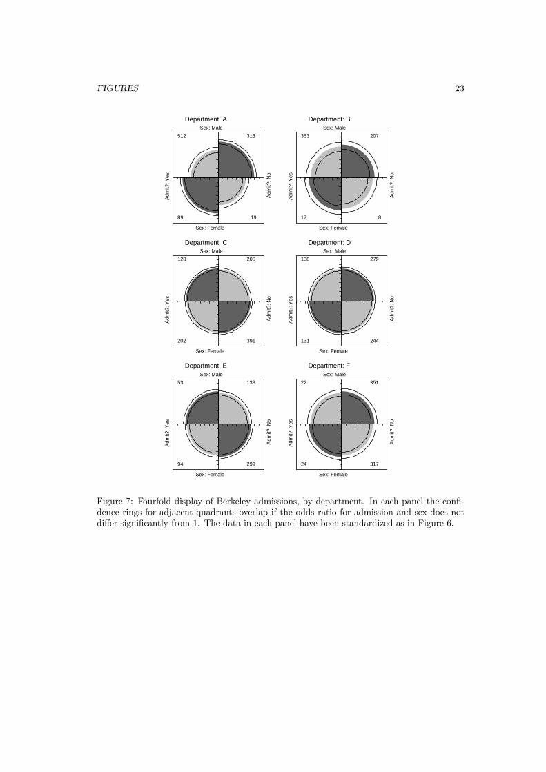
In the case of a 2 × 2 × k table, the last dimension typically corresponds to “strata” orpopulations, and it is typically of interest to see if the association between the first twovariables is homogeneous across strata. The fourfold display allows easy visual comparison ofthe pattern of association between two dichotomous variables across two or more populations.
For example, the admissions data shown in Figure 6 were obtained from a sample of sixdepartments; Figure 7 displays the data for each department. The departments are labeled sothat the overall acceptance rate is highest for Department A and decreases steadily to Depart-ment F. Again, each panel is standardized to equate the marginals for sex and admission.This standardization also equates for the differential total applicants across departments,facilitating visual comparison.
[Figure 7 about here.]
Figure 7 shows that, for five of the six departments, the odds of admission is approxi-mately the same for both men and women applicants. Department A appears to differs fromthe others, with women approximately 2.86 (= (313/19)/(512/89)) times as likely to gainadmission. This appearance is confirmed by the confidence rings, which in Figure 7 are joint99% intervals for θc, c = 1, . . . , k.
This result, which contradicts the display for the aggregate data in Figure 6, is a niceexample of Simpson’s paradox. The resolution of this contradiction can be found in the

3 CONCEPTUAL MODELS FOR VISUAL DISPLAYS 6
large differences in admission rates among departments. Men and women apply to differentdepartments differentially, and in these data women apply in larger numbers to departmentsthat have a low acceptance rate. The aggregate results are misleading because they falselyassume men and women are equally likely to apply in each field. (This explanation ignores thepossibility of structural bias against women, e.g., lack of resources allocated to departmentsthat attract women applicants.)
3 Conceptual Models for Visual Displays
Visual representation of data depends fundamentally on an appropriate visual scheme formapping numbers into graphic patterns (Bertin 1983). The widespread use of graphicalmethods for quantitative data relies on the availability of a natural visual mapping: magni-tude can be represented by length, as in a bar chart, or by position along a scale, as in dotcharts and scatterplots. One reason for the relative paucity of graphical methods for categor-ical data may be that a natural visual mapping for frequency data is not so apparent. And,as I have just shown, the mapping of frequency to area appears to work well for categoricaldata.
Closely associated with the idea of a visual metaphor is a conceptual model that helps youinterpret what is shown in a graph. A good conceptual model for a graphical display will havedeeper connections with underlying statistical ideas as well. In this section I will describeconceptual models for both quantitative and frequency data that have these properties andhelp to elucidate the differences between their graphical displays. The discussion borrowsfrom Sall (1991a, 1991b), Farebrother (1987) and Friendly (1995).
3.1 Quantitative Data
The simplest conceptual model for quantitative data is the balance beam, often used inintroductory statistics texts to illustrate the sample mean as the point along an axis wherethe positive and negative deviations balance.
Springs
A more powerful model (Sall, 1991a) likens observations to fixed points connected to a mov-able junction by springs of equal spring constant, k ∼ 1/σ. By this model, each observationexerts a force proportional to (X − µ)/σ on the junction, and the sample mean is seen asthe point which not only balances the forces, but also minimizes the total potential energyin the system.
The spring model is more powerful because it provides a basis for understanding a wideclass of both graphical displays and statistical principles for quantitative data. For example,least squares regression can be represented as shown in Figure 8, where the points are againfixed and attached to a movable rod by unit length, equally stiff springs. If the springs areconstrained to be kept vertical, the rod, when released, moves to the position of balance and

3 CONCEPTUAL MODELS FOR VISUAL DISPLAYS 7
minimum potential energy, the least square solution. The normal equations,
∑
ei =
n∑
i=1
(yi − a − bxi) = 0 (3)
∑
xi ei =n∑
i=1
(yi − a − bxi)xi = 0 (4)
are seen as conditions that the vertical forces balance (Eq. (3)), and the rotational momentsabout the intercept (0, a) balance (Eq. (4)). Letting X = [1, x], the normal equationsprovide the derivation X′ e = X′(y − Xb) = 0 ⇒ X′y = X′Xb ⇒ b = (X′X)−1X′y, butsprings get it right without inverting a matrix.
[Figure 8 about here.]
Neat explanations by springs
The appeal of the spring model lies in the intuitive explanations it provides for many statis-tical phenomena and the understanding it can bring to our perception of graphical displays.Without much explanation here (but see Sall, 1991a and Farebrother, 1987) I will simply listsome of these.
• least squares ↔ minimum energy
• orthogonality ↔ balancing of forces
• hypothesis testing: To test the hypothesis H0 : β = 0, simply force the rod tothe horizontal position, measuring the additional energy required to make it obey thehypothesis. This is the regression sum of squares, SSR (X).
• sample size and power: Adding more points (more springs) causes the position ofthe rod (and thus the coefficient estimates) to be held more tightly. It is thereforeeasier to reject the null hypothesis.
• error variance: The spring constant is inversely proportional to σ, so smaller errorvariance means stiffer springs, which require more force to impose the null hypothesis.
• outliers: Points far from the regression line pull the line towards themselves in pro-portion to the square of their vertical distance from the line.
• leverage: Observations exert a force on the regression line proportional to the squareof their horizontal distance from x. Influence is the product of the force of leverage andthe vertical force from the residual.
• multiple regression: With two (or more) predictors, fit a plane (or hyperplane) topoints with vertical springs.
• partial F tests: With two predictors, fit a plane to (X1,X2). How much more energyis required to make the plane flat in the x2 direction? This is the extra sum of squares,SSR(X2 |X1)

3 CONCEPTUAL MODELS FOR VISUAL DISPLAYS 8
• robust estimation: Use springs which deform (so they exert little or no force) whenstretched past some limit.
• smoothing splines: Make the “regression line” from a material which is flexible butstiff.
• principal components: If we relax the restriction that the springs are constrained toremain vertical, the rod moves to the position of the first principal component.
3.2 Categorical Data
For categorical data, we need a visual analog for the sample frequency in k mutually exclusiveand exhaustive categories. Consider first the one-way marginal frequencies of hair color fromTable 1.
Urn model
The simplest physical model represents the hair color categories by urns containing marblesrepresenting the observations (Figure 9). This model is sometimes used in texts to describemultinomial sampling, and provides a visual representation that equates the count ni withthe area filled in each urn, as in the familiar bar chart. (When the urns are of equal width,count is also reflected by height, but in the general case, count is proportional to area.)However, the urn model is a static one and provides no further insights. It does not relateto the concept of likelihood or to the constraint that the probabilities sum to 1.
[Figure 9 about here.]
Pressure and Energy
A dynamic model gives each observation a force (Figure 10). Consider the observations ina given category (red hair, say) as molecules of an ideal gas confined to a cylinder whosevolume can be varied with a movable piston (Sall, 1991b), set up so that a probability of 1.0corresponds to ambient pressure, with no force exerted on the piston. An actual probabilityof red hair equal to p means that the same number of observations are squeezed down to achamber of height p. By Boyle’s law (that pressure × volume is constant) the pressure isproportional to 1/p. In the figure, pressure is shown by observation density, the number ofobservations per unit area. Hence, the graphical metaphor is that a count can be representedvisually by observation density when the count is fixed and area is varied (or by area whenthe observation density is fixed as in Figure 9.)
The work done on the gas (or potential energy imparted to it) by compressing a smalldistance δy is the force on the piston times δy, which equals the pressure times the change
in volume. Hence, the potential energy of a gas at height=p is∫ 1
p(1/y) dy, which is − log(p),
so the energy in this model corresponds to negative log likelihood.
[Figure 10 about here.]

3 CONCEPTUAL MODELS FOR VISUAL DISPLAYS 9
Fitting probabilities: Minimum energy, balanced forces
Maximum likelihood estimation means literally finding the values, πi, of the parametersunder which the observed data would have the highest probability of occurrence. We takederivatives of the (log-) likelihood function with respect to the parameters, set these to zero,and solve:
∂ log L
∂πi
= 0 → n1
π1=
n2
π2= · · · =
nc
πc
→ πi =ni
n= pi
As with the spring model, setting derivatives to zero means minimizing the potentialenergy; the maximum likelihood solution simply sets parameter values equal to correspondingsample quantities, where the forces are also balanced.
In the mechanical model (Figure 11) this corresponds to stacking the gas containers withmovable partitions between them, with one end of the bottom and top containers fixed at0 and 1. The observations exert pressure on the partitions, the likelihood equations areprecisely the conditions for the forces to balance, and the partitions move so that eachchamber is of size pi = ni/n. Each chamber has potential energy of − log pi, and the totalenergy, −
∑c
i ni log pi is minimized. The constrained top and bottom force the probabilityestimates to sum to 1, and the number of movable partitions is literally and statistically thedegrees of freedom of the system.
[Figure 11 about here.]
Testing a hypothesis
This mechanical model also explains how we test hypotheses about the true probabilities(Figure 12). To test the hypothesis that the four hair color categories are equally probable,H0 : π1 = π2 = π3 = π4 = 1
4 simply force the partitions to move to the hypothesized valuesand measure how much energy is required to force the constraint. Some of the chambers willthen exert more pressure, some less than when the forces are allowed to balance without theseadditional restraints. The change in energy in each compartment is then −(log pi− log πi) =− log(pi/πi), the change in negative log-likelihood. Sum these up and multiply by 2 to getthe likelihood ratio G2.
[Figure 12 about here.]
The pressure model also provides simple explanations of other results. For example,increased sample size increases power, because more observations means more pressure ineach compartment, so it takes more energy to move the partitions and the test is sensitiveto smaller differences between observed and hypothesized probabilities.
Multi-way Tables
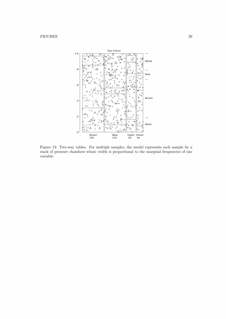
The dynamic pressure model extends readily to multi-way tables. For a two-way table of haircolor and eye color, partition the sample space according to the marginal proportions of eye

3 CONCEPTUAL MODELS FOR VISUAL DISPLAYS 10
color, and then partition the observations for each eye color according to hair color as before(Figure 13). Within each column the forces balance as before, so that the height of eachchamber is nij/ni+. Then the area of each cell is proportional to the maximum-likelihoodestimate (MLE) of the cell probabilities, (ni+/n) (nij/ni+) = nij/n = pij ,, which again isthe sample cell proportion.
[Figure 13 about here.]
For a three-way table, the physical model is a cube with its third dimension partitionedaccording to conditional frequencies of the third variable, given the first two. If the thirddimension is represented instead by partitioning a two-dimensional graph, the result is themosaic display.
Testing Independence
For a two-way table of size I × J independence is formally the same as the hypothesis thatconditional probabilities (of hair color) are the same in all strata (eye colors). To test thishypothesis, force the partitions to align and measure the total additional energy required toeffect the change (Figure 14). The degrees of freedom for the test is again the number ofmovable partitions, (I − 1)(J − 1).
[Figure 14 about here.]
Each log-linear model for three-way tables can be interpreted analogously. For example,the log-linear model [A] [B] [C] (complete independence), corresponds to the cube in whichall chambers are forced to conform to the one way marginals, πijk = πi++ π+j+ π++k forall i, j, k. G2 is again the total additional energy required to move the partitions from theirpositions in the saturated model in which the volume of each cell is pijk = nijk/n (so thepressures balance), to the positions where each cell is a cube of size πi++ × π+j+ × π++k.Other models have a similar representation in the pressure model.
Iterative Proportional Fitting
For three-way (and higher) tables some log-linear models have closed-form solutions for ex-pected cell frequencies. The cases in which direct estimates exist are analogous to the two-way case, where the estimates under the hypothesized model are products of the sufficientmarginals. Here we see that the partitions in the observation space can be moved directly inplanar slices to their positions under the hypothesis, so that iteration is unnecessary.
When direct estimates do not exist, the MLEs can be estimated by iterative proportionalfitting (IPF). This process simply matches the partitions corresponding to each of the suffi-cient marginals of the fitted frequencies to the same marginals of the data. For example, forthe log-linear model [AB] [BC] [AC], the sufficient statistics are nij+, ni+k, and n+jk. Theconditions that the fitted margins must equal these observed margins are
nij+
mij+=
ni+k
mi+k
=n+jk
m+jk
= 1, (5)

4 CONCLUSION 11
which is equivalent to balancing the forces in each fitted marginal. The steps in IPF followdirectly from Equation (5). For example, the first step in cycle t + 1 of IPF matches thefrequencies in the [AB] marginal table,
m(t+1)ijk = m
(t)ijk
(
nij+
m(t)ij+
)
, (6)
which makes the forces balance when Equation (6) is summed over variable C: m(t+1)ij+ = nij+.
The other steps in each cycle make the forces balance in the [BC], and [AC] margins.
The iterative process can be shown visually (Friendly, 1995), in a way that is graphicallyexact, by drawing chambers whose area is proportional to the fitted frequencies, mijk, andwhich are filled with a number of points equal to the observed nijk. Such a figure will thenshow equal densities of points in cells that are fit well, but relatively high or low densitieswhere nijk > mijk or nijk < mijk, respectively. The IPF algorithm can in fact be animated,by drawing one such frame for each step in the iterative process. When this is done, it isremarkable how quickly IPF converges, at least for small tables.
Likewise, numerical methods for minimizing the negative log likelihood directly can also beinterpreted in terms of the dynamic model (Farebrother, 1988; Friendly, 1995). For example,in steepest descent and Newton-Raphson iteration, the update step changes the estimatedmodel parameters β(t+1) in proportion to the score vector f (t) of derivatives of the likelihoodfunction, f (t) = ∂ log L/∂β = X′ (n−m(t)) to give β(t+1) = β(t) + λ f (t). But f (t) is just thevector of forces in the mechanical model attributed to the differences between n and m(t) asa function of the model parameters.
4 Conclusion
I began this paper with the puzzling contrast in use and generality between graphical methodsfor quantitative data and those for categorical data, despite strong formal similarities in theirunderlying methods. The explanation I believe I have demonstrated is that categorical datarequire a different graphic metaphor, and hence a different visual representation (count ∼area) from that which has been useful for quantitative data (magnitude ∼ position along ascale). The sieve diagram, mosaic, and the fourfold display all show frequencies in this way,and are valuable tools for both the analysis and presentation of categorical data.
In the second part of this paper I have outlined concrete, physical models for both quan-titative and categorical data and their graphic representation and have shown these to yielda wide range of interpretation for statistical principles and phenomena. Although the springand pressure models differ fundamentally in their mechanics, both can be understood interms of balancing of forces and the minimization of energy. The recognition of these con-ceptual models can make a graphical display a tool for thinking, as well as a tool for datasummarization and exposure.
Finally, as I look to the future development of graphical methods for categorical data,I see two areas where our report card, perhaps reflected in this volume, may be marked“needs improvement”: First, much of the power of graphical methods for quantitative data

REFERENCES 12
stems from the availability of tools that generalize readily to multivariable data and canmake important contributions to model building, model criticism, and model interpretation.The mosaic display possesses some of these properties, and other papers here attest to thewidespread utility of biplots and correspondence analysis. However, I believe there is needfor further development of such methods, particularly as tools for constructing models andcommunicating their import.
Second, I am reminded of the statement (Tukey, 1959, attributed to Churchill Eisenhart)that the practical power of any statistical tool is the product of its statistical power timesits probability of use. It follows that statistical and graphical methods are of practical valueto the extent that they are implemented in standard software, available, and easy to use.Statistical methods for categorical data analysis have nearly reached that point. Graphicalmethods still have some way to go.
About the Author
Michael Friendly is Associate Professor of Psychology and Coordinator of the Statistical Con-sulting Service at York University. He is an Associate Editor of the Journal of Computationaland Graphical Statistics, and has been working on the development of graphical methods forcategorical data. For further information, see http://www.math.yorku.ca/SCS/friendly.html.
References
[1] Bertin, J. (1983), Semiology of Graphics (trans. W. Berg). Madison, WI: University ofWisconsin Press.
[2] Bickel, P. J., Hammel, J. W. & O’Connell, J. W. (1975). Sex bias in graduate admis-sions: data from Berkeley. Science, 187, 398–403.
[3] Farebrother, R. W. (1987), “Mechanical representations of the L1 and L2 estimationproblems”, In Y. Dodge (ed.) Statistical data analysis based on the L1 norm and relatedmethods, Amsterdam: North-Holland., 455–464.
[4] Farebrother, R. W. (1988), “On an analogy between classical mechanics and maximumlikelihood estimation”, Osterrische Zeitschrift fur Statistik und Informatik, 18, 303–305.
[5] Friendly, M. (1992a), “Graphical methods for categorical data”. Proceedings of the SASUser’s Group International Conference, 17, 1367–1373.
[6] Friendly, M. (1992b), “Mosaic Displays for Loglinear Models”. American StatisticalAssociation, Proceedings of the Statistical Graphics Section, 61–68.
[7] Friendly, M. (1994a), Mosaic displays for multi-way contingency tables. Journal of theAmerican Statistical Association, 89, 190–200.

REFERENCES 13
[8] Friendly, M. (1994b), A fourfold display for 2 by 2 by k tables. Department of Psychol-ogy Reports, No. 217, York University.
[9] Friendly, M. (1994c). SAS/IML graphics for fourfold displays. Observations, 3(4), 47–56.
[10] Friendly, M. (1995). Conceptual and visual models for categorical data. AmericanStatistician, 1995, 49, 153–160.
[11] Hartigan, J. A., and Kleiner, B. (1981). Mosaics for contingency tables. In W. F. Eddy(Ed.), Computer Science and Statistics: Proceedings of the 13th Symposium on theInterface. New York: Springer-Verlag, 286–273.
[12] Riedwyl, H., & Schupbach, M. (1983). Siebdiagramme: Graphische Darstellung vonKontingenztafeln. Technical Report No. 12, Institute for Mathematical Statistics, Uni-versity of Bern, Bern, Switzerland.
[13] Riedwyl, H., and Schupbach, M. (1994). Parquet diagram to plot contingency tables. InSoftstat ’93: Advances in Statistical Software, F. Faulbaum (Ed.). New York: GustavFischer, 293–299.
[14] Sall, J. (1991a), “The conceptual model behind the picture”, ASA Statistical Comput-ing and Statistical Graphics Newsletter, 2 (April), 5–8.
[15] Sall, J. (1991b), “The conceptual model for categorical responses”, ASA StatisticalComputing and Statistical Graphics Newsletter, 3 (November), 33–36.
[16] Snee, R. D. (1974), “Graphical display of two-way contingency tables”, The AmericanStatistician, 28, 9–12.
[17] Tukey, J. W. (1959), “A quick, compact, two sample test to Duckworth’s specifica-tions”. Technometrics, 1, 31–48.

LIST OF TABLES 14
List of Tables
1 Hair-color eye-color data. . . . . . . . . . . . . . . . . . . . . . . . . . . . . . 15

TABLES 15
Table 1: Hair-color eye-color data.
Hair ColorEyeColor BLACK BROWN RED BLOND Total
Green 5 29 14 16 64Hazel 15 54 14 10 93Blue 20 84 17 94 215Brown 68 119 26 7 220
Total 108 286 71 127 592

TABLES 16
List of Figures
1 Expected frequencies under independence . . . . . . . . . . . . . . . . . . . . 17
2 Sieve diagram for hair-color, eye-color data . . . . . . . . . . . . . . . . . . . 18
3 Condensed mosaic for Hair-color, Eye-color data . . . . . . . . . . . . . . . . 19
4 Condensed mosaic, reordered and shaded . . . . . . . . . . . . . . . . . . . . 20
5 Three-way mosaic, joint independence . . . . . . . . . . . . . . . . . . . . . . 21
6 Four-fold display for Berkeley admissions . . . . . . . . . . . . . . . . . . . . 22
7 Fourfold display of Berkeley admissions, by department . . . . . . . . . . . . 23
8 Spring model for least squares regression . . . . . . . . . . . . . . . . . . . . . 24
9 Urn model for multinomial sampling . . . . . . . . . . . . . . . . . . . . . . . 25
10 Pressure model for categorical data . . . . . . . . . . . . . . . . . . . . . . . . 26
11 Fitting probabilities for a one-way table . . . . . . . . . . . . . . . . . . . . . 27
12 Testing a hypothesis . . . . . . . . . . . . . . . . . . . . . . . . . . . . . . . . 28
13 Two-way tables . . . . . . . . . . . . . . . . . . . . . . . . . . . . . . . . . . . 29
14 Testing independence . . . . . . . . . . . . . . . . . . . . . . . . . . . . . . . . 30
FIGURES 17
Green
Hazel
Blue
Brown
Black Brown Red Blond
Eye C
olo
ur
Hair Colour
11.7 30.9 7.7 13.7
17.0 44.9 11.2 20.0
39.2 103.9 25.8 46.1
40.1 106.3 26.4 47.2
64
93
215
220
108 286 71 127 592
Figure 1: Expected frequencies under independence. Each box has area equal to its expectedfrequency, and is cross-ruled proportionally to the expected frequency.

FIGURES 18
Green
Hazel
Blue
Brown
Black Brown Red Blond
Eye C
olo
ur
Hair Colour
Figure 2: Sieve diagram for hair-color, eye-color data. Observed frequencies are equal to thenumber squares in each cell, so departure from independence appears as variations in shadingdensity.

FIGURES 19
Black Brown Red Blond
Hair colour
Bro
wn
Blu
e
Hazel G
reen
Eye C
olo
ur
Figure 3: Condensed mosaic for Hair-color, Eye-color data. Each column is divided accordingto the conditional frequency of eye color given hair color. The area of each rectangle isproportional to observed frequency in that cell.

FIGURES 20
Black Brown Red Blond
Hair colour
Bro
wn
Hazel G
reen B
lue
Eye C
olo
ur
Sta
nd
ard
ize
dre
sid
ua
ls:
<
-4-4
:-2
-2:-
00
:22
:4>
4
Figure 4: Condensed mosaic, reordered and shaded. Deviations from independence areshown by color and shading. The two levels of shading density correspond to standardizeddeviations greater than 2 and 4 in absolute value. This form of the display generalizes readilyto multi-way tables.

FIGURES 21
Black Brown Red Blond
Bro
wn
Hazel G
reen B
lue
Eye C
olo
ur
M F M F M F M F
Sta
nd
ard
ize
dre
sid
ua
ls:
<
-4-4
:-2
-2:-
00
:22
:4>
4Figure 5: Three-way mosaic display for hair color, eye color, and sex. Residuals from themodel of joint independence, [HE] [S] are shown by shading. G2 = 19.86 on 15 df. The onlylack of fit is an overabundance of females among blue-eyed blonds.

FIGURES 22
Sex: Male
Adm
it?: Y
es
Sex: Female
Adm
it?: N
o
1198 1493
557 1278
Figure 6: Four-fold display for Berkeley admissions: Evidence for sex bias? The area ofeach shaded quadrant shows the frequency, standardized to equate the margins for sex andadmission. Circular arcs show the limits of a 99% confidence interval for the odds ratio.
FIGURES 23
Sex: Male
Adm
it?: Y
es
Sex: Female
Adm
it?: N
o
512 313
89 19
Department: A Sex: Male
Adm
it?: Y
es
Sex: Female
Adm
it?: N
o
353 207
17 8
Department: B
Sex: Male
Adm
it?: Y
es
Sex: Female
Adm
it?: N
o
120 205
202 391
Department: C Sex: Male
Adm
it?: Y
es
Sex: Female
Adm
it?: N
o
138 279
131 244
Department: D
Sex: Male
Adm
it?: Y
es
Sex: Female
Adm
it?: N
o
53 138
94 299
Department: E Sex: Male
Adm
it?: Y
es
Sex: Female
Adm
it?: N
o
22 351
24 317
Department: F
Figure 7: Fourfold display of Berkeley admissions, by department. In each panel the confi-dence rings for adjacent quadrants overlap if the odds ratio for admission and sex does notdiffer significantly from 1. The data in each panel have been standardized as in Figure 6.

FIGURES 24
22.5 25 27.5 30 32.5 35 37.5 40x
30
40
50
60
70
y
Figure 8: Spring model for least squares regression. Fixed data points are connected to amovable rod by springs constrained to remain vertical. The least squares line is the positionof balanced forces.

FIGURES 25
Black108
1
Brown286
2
Red 71
3
Blond127
4
Figure 9: Urn model for multinomial sampling. Each observation in Table 1 is representedby a token classified by hair color into the appropriate urn. This model provides a basis forthe bar chart, but does not yield any further insights.

FIGURES 26
.0
.2
.4
.6
.8
1.0 pressure(1) = 0
pressure(p) = ( 1 / p )
pressure(0) =
energy = 1 / height1
p
= - log( p )
pressure <-> obs. density
energy <-> -log likelihood
Figure 10: Pressure model for categorical data. Frequency of observations corresponds topressure of gas in a chamber, shown visually as observation density; negative log likelihoodcorresponds to the energy required to compress the gas to a height p.

FIGURES 27
.0
.2
.4
.6
.8
1.0
Black108
Brown286
Red 71
Blond127
df = # of movable
partitions
Figure 11: Fitting probabilities for a one-way table. The movable partitions naturally adjustto positions of balanced forces, which is the minimum energy configuration.

FIGURES 28
.0
.2
.4
.6
.8
1.0
Black108
Brown286
Red 71
Blond127
-68.1
376.8
-104.3
-38.9
165.6 = G 2
G components2
Figure 12: Testing a hypothesis. The likelihood ratio G2 measures how much energy isrequired to move the partitions to constrain the data to the hypothesized probabilities. Thecomponents of G2 indicate the degree to which each chamber has low or high pressure, relativeto the balanced state.
FIGURES 29
.0
.2
.4
.6
.8
1.0
Brown220
Blue 215
Hazel 93
Green 64
Eye Colour
Black
Brown
Red
Blond
Figure 13: Two-way tables. For multiple samples, the model represents each sample by astack of pressure chambers whose width is proportional to the marginal frequencies of onevariable.

FIGURES 30
.0
.2
.4
.6
.8
1.0
Brown220
Blue 215
Hazel 93
Green 64
Eye Colour
Black
Brown
Red
Blond
Figure 14: Testing independence. The chambers are forced to align with both sets of marginalfrequencies, and the likelihood ratio G2 again measures the additional energy required.