comp 690 data fusion matplotlib notes albert esterline fall 2008
TRANSCRIPT

COMP 690 Data FusionMatplotlib Notes
Albert Esterline
Fall 2008

Documentation Homepage
http://matplotlib.sourceforge.net/ Short descriptions of and links to documentation on all plotting functions
PyplotTutorial (8 pp.)
http://matplotlib.sourceforge.net/users/pyplot_tutorial.html Start here Pyplot is a collection of command style functions that make matplotlib work
like matlab User’s Guide
http://matplotlib.sourceforge.net/users_guide_0.98.3.pdf Refer to as needed
Cookbook / Matplotlib http://www.scipy.org/Cookbook/Matplotlib Lots of good examples Shows figure, link to page giving code and explanation

Examples
http://matplotlib.sourceforge.net/examples/
Just a directory listing, but subdirectory names are descriptive
The “What's new” page
http://matplotlib.sourceforge.net/users/whats_new.html
Every feature ever introduced into matplotlib is listed here under the version that introduced it
Often with a link to an example or documentation
Global Module Index
http://matplotlib.sourceforge.net/modindex.html Documentation on the various modules
This and the next are often the only places to find something
The Matplotlib API
http://matplotlib.sourceforge.net/api/
Documentation on the various packages
Matplotlib Backends See http://matplotlib.sourceforge.net/api/index_backend_api.html Matplotlib uses a backend to produce device-independent output (e.g., pdf,
ps, png)
For backends without a GUI, only output is an explicitly-saved image file
File
…\site-packages\matplotlib\mpl-data\matplotlibrc
sets the default backend with a line for the backend option
The Windows distribution has
backend : TkAgg Specifies the agg backend (for rendering) for Tkinter Tkinter is a Python binding to the Tk GUI toolkit
Still the most popular Python GUI toolkit Other toolkits: wxPython

Tk is an open source, cross-platform widget toolkit—library of basic elements for building a GUI
The antigrain geometry (Agg) library is a platform independent library
Provides efficient antialiased rendering with a vector model
Doesn't depend on a GUI framework Used in web application servers and for generating images in
batch scripts
Matplotlib includes its own copy of Agg
Aliasing is an effect that causes different continuous signals to become indistinguishable (aliases of one another) when sampled Also refers to the resulting distortion Anti-aliasing is the technique of minimizing this distortion
Used in digital photography, computer graphics, digital audio, etc.

matplotlib.pyplot vs. pylab Package matplotlib.pyplot provides a MATLAB-like plotting
framework
Package pylab combines pyplot with NumPy into a single namespace
Convenient for interactive work
For programming, it’s recommended that the namespaces be kept separate
See such things as
import pylab
Or
import matplotlib.pyplot as plt The standard alias
import numpy as np
The standard alias

Also
from pylab import *
Or
from matplotlib.pyplot import *
from numpy import *
We’ll use
from pylab import *
Some examples don’t show this—just assume it
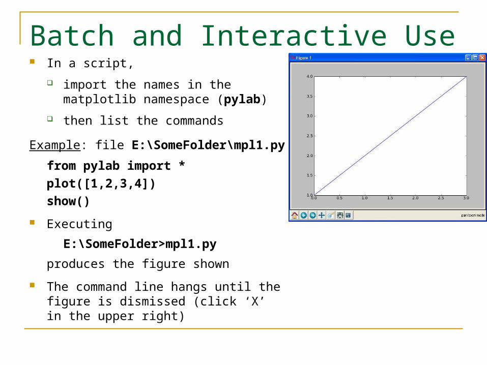
Batch and Interactive Use In a script,
import the names in the matplotlib namespace (pylab)
then list the commands
Example: file E:\SomeFolder\mpl1.py
from pylab import *
plot([1,2,3,4])
show()
Executing
E:\SomeFolder>mpl1.py
produces the figure shown
The command line hangs until the figure is dismissed (click ‘X’ in the upper right)

plot()
Given a single list or array, plot() assumes it’s a vector of y-values
Automatically generates an x vector of the same length with consecutive integers beginning with 0
Here [0,1,2,3]
To override default behavior, supply the x data: plot(x,y )
where x and y have equal lengths
show()
Should be called at most once per script
Last line of the script
Then the GUI takes control, rendering the figure
In place of show(), can save the figure to with, say,
savefig(‘fig1.png’)
Saved in the same folder as the script
Override this with a full pathname as argument—e.g.,
savefig('E:\\SomeOtherFolder\\fig1.png')
Supported formats: emf, eps, pdf, png, ps, raw, rgba, svg, svgz
If no extension specified, defaults to .png
With the TkAgg backend, can use matplotlib from an arbitrary python (interactive) shell
Supposedly requires the matplotlibrc file to have interactive set to True (as well as backend to TkAgg )
In the matplotlibrc file with the Windows distribution, the interactive setting (to False) is commented out
TkAgg sets interactive mode to True when show() or draw() executed
In batch mode (running scripts), interactive mode can be slow
Redraws the figure with each command.

Matplotlib from the Shell Using matplotlib in the shell, we see the objects produced
>>> from pylab import *
>>> plot([1,2,3,4])
[<matplotlib.lines.Line2D object at 0x01A3EF30>]
>>> show()
Hangs until the figure is dismissed or close() issued
show() clears the figure: issuing it again has no result
If you construct another figure, show() displays it without hanging
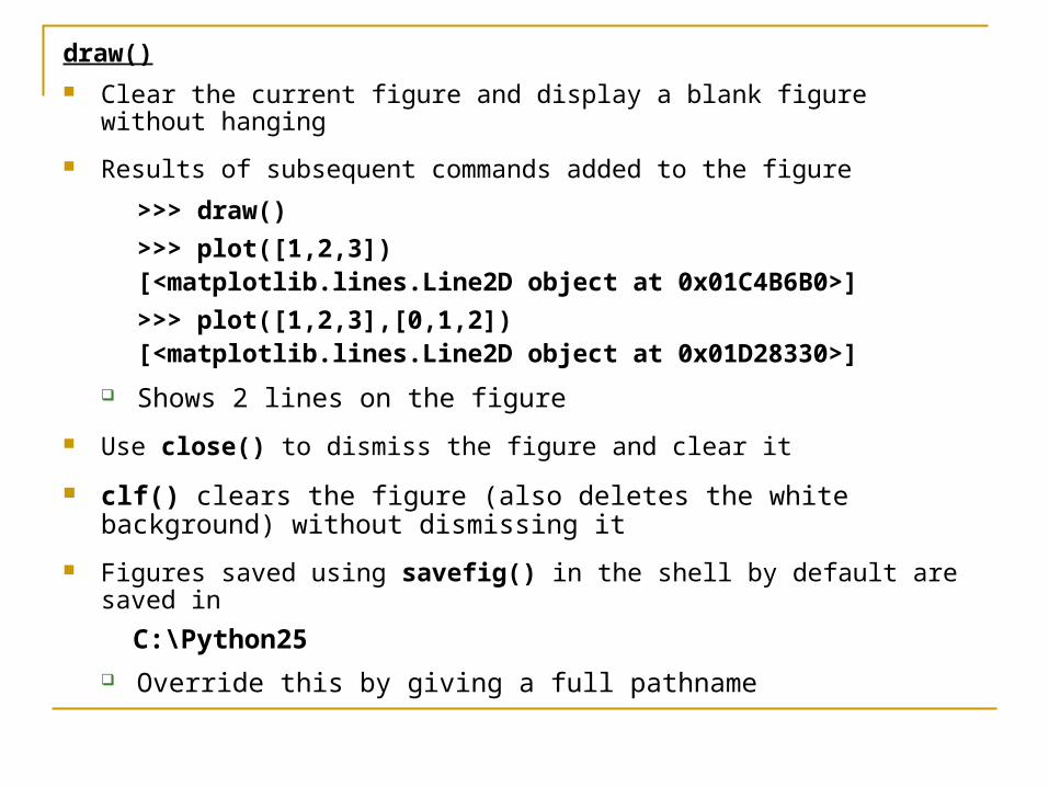
draw() Clear the current figure and display a blank figure without hanging
Results of subsequent commands added to the figure
>>> draw()
>>> plot([1,2,3])[<matplotlib.lines.Line2D object at 0x01C4B6B0>]
>>> plot([1,2,3],[0,1,2])[<matplotlib.lines.Line2D object at 0x01D28330>]
Shows 2 lines on the figure
Use close() to dismiss the figure and clear it
clf() clears the figure (also deletes the white background) without dismissing it
Figures saved using savefig() in the shell by default are saved in
C:\Python25 Override this by giving a full pathname
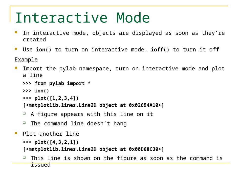
Interactive Mode In interactive mode, objects are displayed as soon as they’re created
Use ion() to turn on interactive mode, ioff() to turn it off
Example Import the pylab namespace, turn on interactive mode and plot a line
>>> from pylab import *
>>> ion()
>>> plot([1,2,3,4])
[<matplotlib.lines.Line2D object at 0x02694A10>]
A figure appears with this line on it
The command line doesn’t hang
Plot another line
>>> plot([4,3,2,1])
[<matplotlib.lines.Line2D object at 0x00D68C30>]
This line is shown on the figure as soon as the command is issued
Turn off interactive mode and plot another line
>>> ioff()
>>> plot([3,2.5,2,1.5])
[<matplotlib.lines.Line2D object at 0x00D09090>] The figure remains unchanged—no new line
Update the figure
>>> show()
The figure now has all 3 lines
The command line is hung until the figure is dismissed
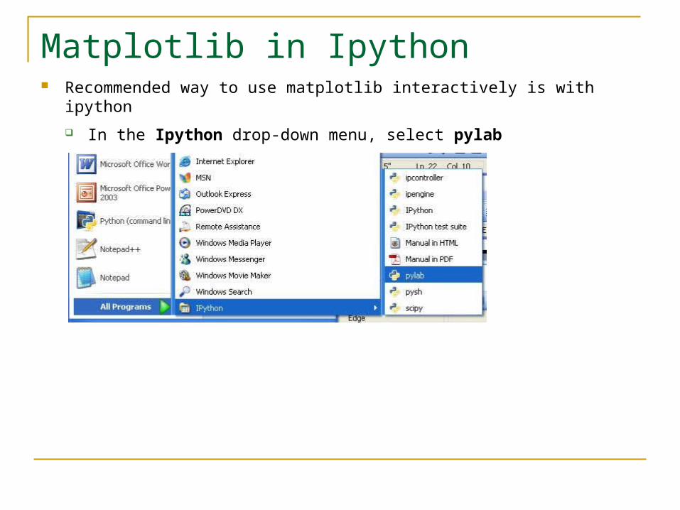
Matplotlib in Ipython Recommended way to use matplotlib interactively is with ipython
In the Ipython drop-down menu, select pylab
Ipython’s pylab mode detects the matplotlibrc file
Makes the right settings to run matplotlib with your GUI of choice in interactive mode using threading
Ipython in pylab mode knows enough about matplotlib internals to make all the right settings
Plots items as they’re produce without draw() or show()
Default folder for saving figures on file
C:\Documents and Settings\current user

Toolbar In interactive mode, at the bottom left of the figure
Not included when a figure is written to file
From right to left
Save: Launches a file save dialog, initially at
C:\Documents and Settings\current user with .png as default
All *Agg backends know how to save image types: PNG, PS, EPS, SVG
Subplot configuration
Adjust the left, bottom, right, or top margin of the figure
With text, control spacing
The Zoom to rectangle:
Define a rectangle by pressing the left mouse button to define one vertex and dragging out to the opposite vertex and releasing
Content of the rectangle occupies the entire space for the figure
The Pan/Zoom: 2 modes
Pan Mode Press the left mouse button, drag it to a new position The figure is pulled along within the frame
Extended by blank area if needed
Zoom Mode Press the right mouse button, drag it to a new position Figure is stretched proportional to the distance dragged in the direction
dragged up and to the right. Shrunk proportional to the distance dragged down and to the left
Use modifier keys x, y or Ctrl to constrain the zoom to the x or y axis or to preserve the aspect ratio preserve, resp.

Forward and Back.
Navigate back and forth between previously defined views
Analogous to forward and back buttons of a web browser
Home
Return to the first (default) view

More Curve Plotting plot() has a format string argument specifying the color and line type
Goes after the y argument (whether or not there’s an x argument)
Can specify one or the other or concatenate a color string with a line style string in either order
Default format string is 'b-' ( solid blue line)
Some color abbreviations
b (blue), g (green), r (red), k (black), c (cyan)
Can specify colors in many other ways (e.g., RGB triples)
Some line styles that fill in the line between the specified points
- (solid line), -- (dashed line), -. (dash-dot line), : (dotted line)
Some line styles that don’t fill in the line between the specified point
o (circles), + (plus symbols), x (crosses), D (diamond symbols)
For a complete list of line styles and format strings,
http://matplotlib.sourceforge.net/api/pyplot_api.html#module-matplotlib.pyplot Look under matplotlib.pyplot.plot()
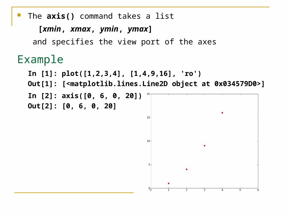
The axis() command takes a list
[xmin, xmax, ymin, ymax]
and specifies the view port of the axes
ExampleIn [1]: plot([1,2,3,4], [1,4,9,16], 'ro')
Out[1]: [<matplotlib.lines.Line2D object at 0x034579D0>]
In [2]: axis([0, 6, 0, 20])
Out[2]: [0, 6, 0, 20]
Other arguments for the axis() command
‘off’ turns off the axis lines and labels
‘equal’ changes the limits of the x and y axes so that equal increments of x and y have the same length
‘scaled’ achieves the same result as ‘equal’ by changing the dimensions of the plot box instead of the axis limit
‘tight’ changes the axis limits to show all the data and no more
‘image’ is scaled with the axis limits equal to the data limits
axis() with no argument returns the current axis limits,
[xmin, xmax, ymin, ymax]

Generally work with arrays, not lists All sequences are converted to NumPy arrays internally
plot() can draw more than one line at a time Put the (1-3) arguments for one line in the figure
Then the (1-3) arguments for the next line
And so on
Can’t have 2 lines in succession specified just by their y arguments
matplotlib couldn’t tell whether it’s a y then the next y or an x then the corresponding y
The example (next slide) illustrates plotting several lines with different format styles in one command using arrays

In [1]: t = arange(0.0, 5.2, 0.2)
In [2]: plot(t, t, t, t**2, 'rs', t, t**3, 'g^')
Out[2]:
[<matplotlib.lines.Line2D object at 0x02A6D410>,
<matplotlib.lines.Line2D object at 0x02A6D650>,
<matplotlib.lines.Line2D object at 0x02A6D8D0>]

If the y for plot() is 2-dimensional, then the columns are plotted—e.g.,
In [1]: a = linspace(0, 2*pi, 13)
In [2]: b_temp = array([sin(a), cos(a)])
In [3]: b = b_temp.transpose()
In [4]: plot(a, b)
Out[4]:
[<matplotlib.lines.Line2D object at 0x02A770D0>,
<matplotlib.lines.Line2D object at 0x02A77150>]
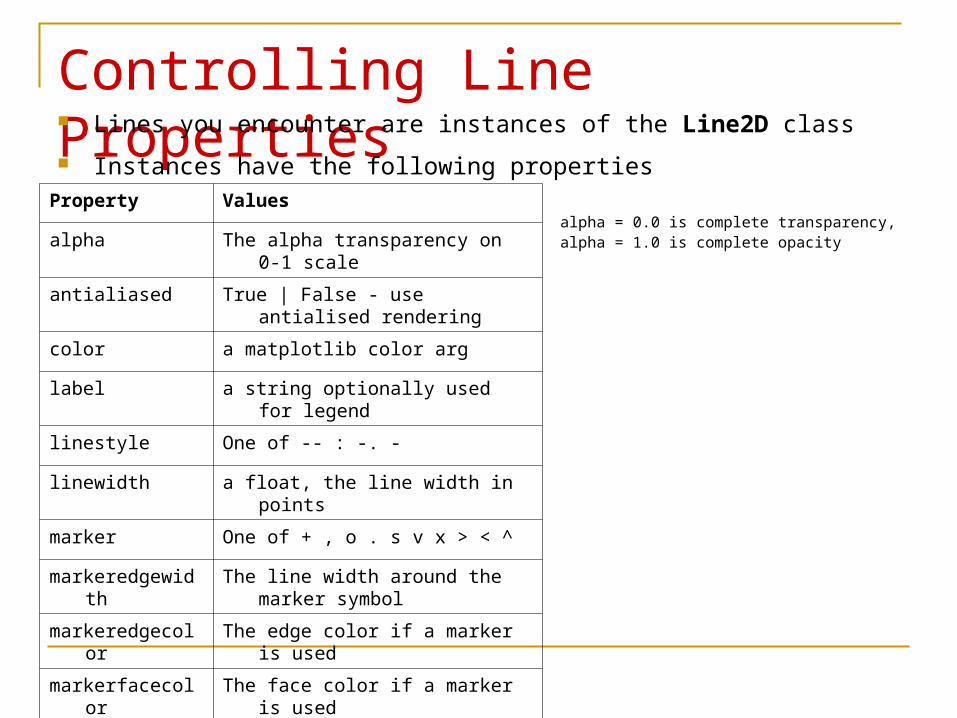
Controlling Line Properties Lines you encounter are instances of the Line2D class
Instances have the following propertiesProperty Values
alpha The alpha transparency on 0-1 scale
antialiased True | False - use antialised rendering
color a matplotlib color arg
label a string optionally used for legend
linestyle One of -- : -. -
linewidth a float, the line width in points
marker One of + , o . s v x > < ^
markeredgewidth The line width around the marker symbol
markeredgecolor The edge color if a marker is used
markerfacecolor The face color if a marker is used
markersize The size of the marker in points
alpha = 0.0 is complete transparency, alpha = 1.0 is complete opacity
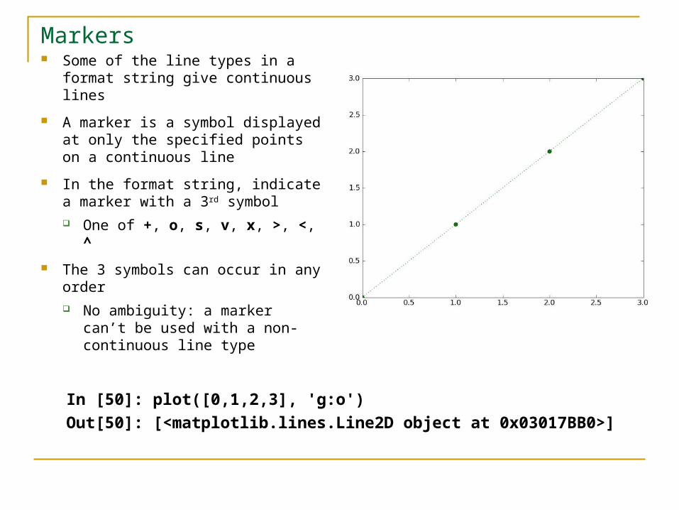
Markers Some of the line types in a format
string give continuous lines
A marker is a symbol displayed at only the specified points on a continuous line
In the format string, indicate a marker with a 3rd symbol One of +, o, s, v, x, >, <, ^
The 3 symbols can occur in any order No ambiguity: a marker can’t
be used with a non-continuous line type
In [50]: plot([0,1,2,3], 'g:o')
Out[50]: [<matplotlib.lines.Line2D object at 0x03017BB0>]

Three Ways to Set Line Properties One way: Use keyword line properties as keyword arguments—e.g.,
plot(x, y, linewidth=2.0)
Another way: Use the setter methods of the Line2D instance
For every property prop, there’s a set_prop() method that takes an update value for that property
To use this, note that plot() returns a list of lines—e.g.,
line1, line2 = plot(x1,y1,x2,x2)
The following example has 1 line with tuple unpacking
line, = plot(x, y, 'o')
line.set_antialiased(False)
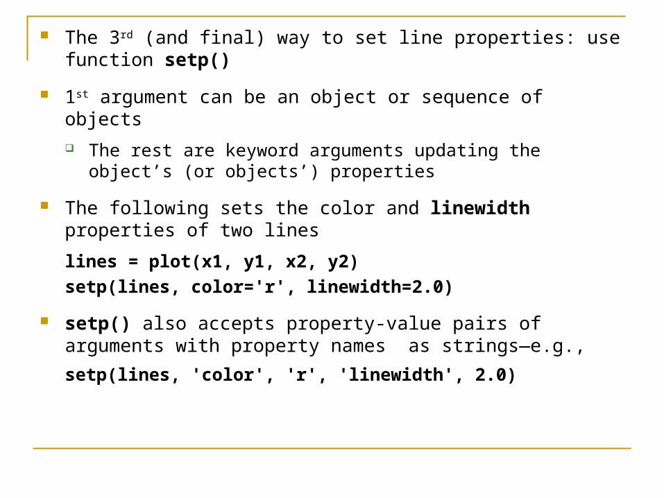
The 3rd (and final) way to set line properties: use function setp()
1st argument can be an object or sequence of objects
The rest are keyword arguments updating the object’s (or objects’) properties
The following sets the color and linewidth properties of two lines
lines = plot(x1, y1, x2, y2)
setp(lines, color='r', linewidth=2.0)
setp() also accepts property-value pairs of arguments with property names as strings—e.g.,
setp(lines, 'color', 'r', 'linewidth', 2.0)
When setp() has just an object and a property name as arguments, it lists all possible values for that propertyIn [38]: setp(l1, 'linestyle')
linestyle: [ '-' | '--' | '-.' | ':' | 'steps' | 'steps-pre' | 'steps-mid' | 'steps-post' | 'None' | ' ' | '' ]
When setp() has an object as its sole argument, it lists the names of the properties of that object
Multiple Figures and Axes Pylab has the concepts of the current figure and the current axes
An instance of class Figure contains all the plot elements
An instance of class Axes contains most of the figure elements:
instances of Axis, Tick, Line2D, Text, Polygon, …
But 1 figure may have multiple instances of Axes (“graphs”)
All plot and text label commands apply to the current axes
Function gca() returns the current axes as an Axes instance
Function gcf() returns the current figure as a Figure instance
Normally, all is taken care of behind the scenes

Function figure() returns an instance of Figure
Can take a number of arguments
Most have reasonable defaults set in the matplotlibrc file
Typically called with 1 (the figure number) or none
Called with none, the figure number is incremented and a new, current figure returned The figure number starts at 1 A Figure instance has a number property
Called with an integer argument,
if there’s a figure with that number, it becomes the current figure
If not, a new figure with that number is created

Example using multiple figures
figure(1)
plot([1,2,3])
figure(2)
plot([4,5,6])
figure(1) # make figure 1 current
title('Easy as 1,2,3')
In ipython, this opens 2 figure windows

Now consider close() more generally
Takes 1 or no argument; if the argument is
None, closes the current figure
A number, closes the figure with that number
A Figure instance, closes that figure
‘all’, closes all figures
Text The text commands are self-explanatory
xlabel() ylabel() title() text()
In simple cases, all but text() take just a string argument
text() needs at least 3 arguments:
x and y coordinates (as per the axes) and a string
All take optional keyword arguments or dictionaries to specify the font properties
They return instances of class Text
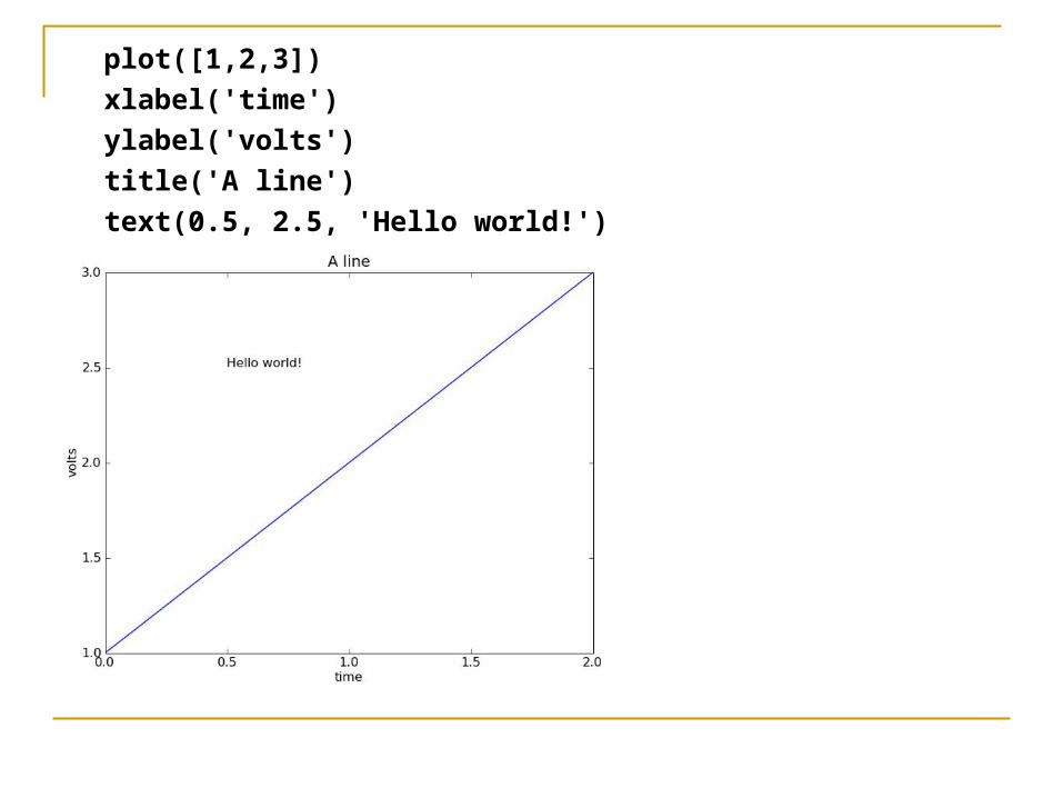
plot([1,2,3])
xlabel('time')
ylabel('volts')
title('A line')
text(0.5, 2.5, 'Hello world!')
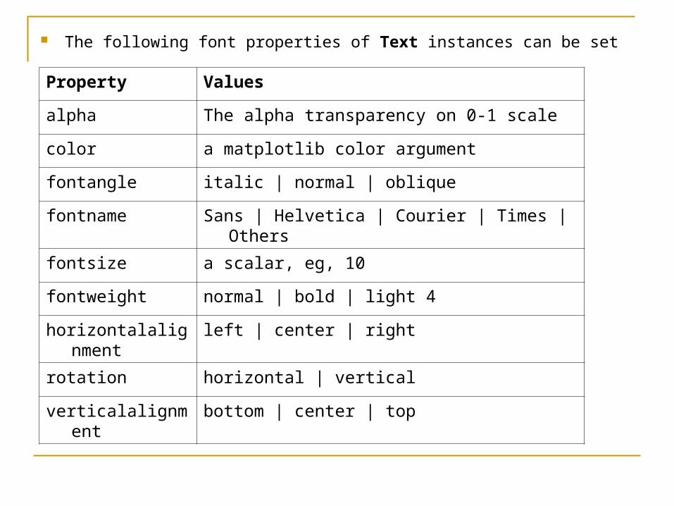
The following font properties of Text instances can be set
Property Values
alpha The alpha transparency on 0-1 scale
color a matplotlib color argument
fontangle italic | normal | oblique
fontname Sans | Helvetica | Courier | Times | Others
fontsize a scalar, eg, 10
fontweight normal | bold | light 4
horizontalalignment left | center | right
rotation horizontal | vertical
verticalalignment bottom | center | top

Three ways to specify font properties: using setp object oriented methods font dictionaries
Controlling Text Properties with setp Use setp to set any property
t = xlabel('time')
setp(t, color='r', fontweight='bold')
Also works with a list of text instances E.g., to change the properties of all the tick labels
labels = getp(gca(), 'xticklabels')
setp(labels, color='r', fontweight='bold')
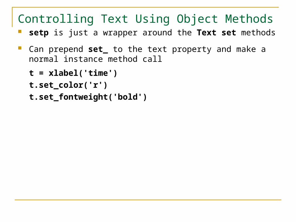
Controlling Text Using Object Methods setp is just a wrapper around the Text set methods
Can prepend set_ to the text property and make a normal instance method call
t = xlabel('time')
t.set_color('r')
t.set_fontweight('bold')

Controlling Text Using Keyword Arguments & Dictionaries
All text commands take an optional dictionary argument and keyword arguments to control font properties
E.g., to set a default font theme and override individual properties for given text commands
font = {'fontname' : 'Courier',
'color' : 'r',
'fontweight' : 'bold',
'fontsize' : 11}
plot([1,2,3])
title('A title', font, fontsize=12)
text(0.5, 2.5, 'a line', font, color='k')
xlabel('time (s)', font)
ylabel('voltage (mV)', font)

Legends A legend is a box (by default in upper right) associating labels with lines
(displayed as per their formats)
legend(lines, labels)
where lines is a tuple of lines, labels a tuple of corresponding strings
from pylab import *
lines = plot([1,2,3],'b-',[0,1,2],'r--')
legend(lines, ('First','Second'))
savefig('legend')
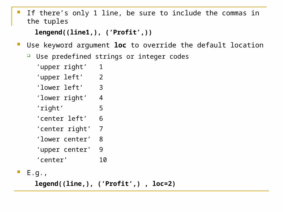
If there’s only 1 line, be sure to include the commas in the tuples
lengend((line1,), (‘Profit’,))
Use keyword argument loc to override the default location Use predefined strings or integer codes
‘upper right’ 1
‘upper left’ 2
‘lower left’ 3
‘lower right’ 4
‘right’ 5
‘center left’ 6
‘center right’ 7
‘lower center’ 8
‘upper center’ 9
‘center’ 10
E.g.,
legend((line,), (‘Profit’,) , loc=2)
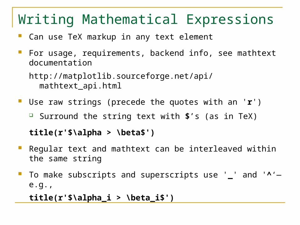
Writing Mathematical Expressions Can use TeX markup in any text element
For usage, requirements, backend info, see mathtext documentation
http://matplotlib.sourceforge.net/api/mathtext_api.html
Use raw strings (precede the quotes with an 'r')
Surround the string text with $’s (as in TeX)
title(r'$\alpha > \beta$')
Regular text and mathtext can be interleaved within the same string
To make subscripts and superscripts use '_' and '^‘—e.g.,
title(r'$\alpha_i > \beta_i$')

Can use many TeX symbols, e.g.,
\infty, \leftarrow, \sum, \int
The over/under subscript/superscript style is supported
E.g., to write the sum of xi, i from 0 to ,
text(1, -0.6, r'$\sum_{i=0}^\infty x_i$')
Default font is italics for mathematical symbols
To change fonts, e.g., to write “sin” in Roman, enclose the text in a font command—e.g.,
text(1,2, r's(t) = $\mathcal{A}\mathrm{sin}(2 \omega t)$')
Many commonly used function names typeset in a Roman font have shortcuts
The above could be written as
text(1,2, r's(t) = $\mathcal{A}\sin(2 \omega t)$')
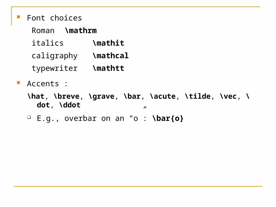
Font choices
Roman \mathrm
italics \mathit
caligraphy \mathcal
typewriter \mathtt
Accents :
\hat, \breve, \grave, \bar, \acute, \tilde, \vec, \dot, \ddot
E.g., overbar on an “o”: \bar{o}

from pylab import *
t = arange(0.0, 2.0, 0.01)
s = sin(2*pi*t)
plot(t,s)
title(r'$\alpha_i > \beta_i$', fontsize=20)
text(1, -0.6, r'$\sum_{i=0}^\infty x_i$', fontsize=20)
text(0.6, 0.6, r'$\mathcal{A}\mathrm{sin}(2 \omega t)$',
fontsize=20)
xlabel('time (s)')
ylabel('volts (mV)')
savefig('mathtext_tut', dpi=50)

Axes Properties There’s a current instance of Axes in the current figure
Contains all the graphical elements
gca() returns the current instance of Axes
cla() clears it
The following are a few get_ methods, all with no arguments
Most self-explanatory
get_legend()
get_lines()
get_title()

For the x axis
get_xlabel()
get_xbound() Returns the x-axis numerical bounds in the form of a tuple
(lbound, ubound)
get_xlim() Like get_xbound(), but returns an array
Similar get_ methods for the y axis
Corresponding commands for setting Axes properties
Use object methods (set_) or setp()
If a 2-element tuple or array is returned, method takes 2 corresponding arguments

Grids Use grid() function or grid() Axes method
With no arguments, gives a dotted black line at each tick on both axes
To suppress the grid, use grid(None)
Or simply grid() when there’s already a grid
Takes keyword arguments
grid(color='r', linestyle='-', linewidth=2)
Axes get_ methods
get_xgridlines()
get_ygridlines()
Corresponding set_ methods, or use setp()

Axis Scales Scale of either axis can be linear or log (default base 10)
Axes methods
set_xscale(s)
set_yscale(s) s either ‘linear’ or ‘log’
Corresponding set_ methods, or use setp()
from pylab import *
gca().set_yscale('log')
plot([1,10,100])
savefig('logscale')
Multiple Axes For control over axes placement, use function axes()
Can be initialized with a rectangle [left, bottom, width, height] in relative figure coordinates
(0, 0) is the bottom left of the of the figure canvas
Its width and height are 1
Several ways to use axes(); all return an Axes instance
axes()
Creates a default full window axis or returns the current Axes instance
axes([0.25, 0.25, 0.5, 0.5], axisbg=’g’)
Creates and displays a new axis offset by ¼ of the figure width and height on all sides
axes(ax)
where ax is an Axes instance, makes ax current

Allows multiple axes in the same figure
Objects are placed in the current Axes instance
from pylab import *
plot([0.2, 0.4, 0.6, 0.8, 3])
ax1 = gca()
ax2 = axes([0.25,0.45,0.25,0.25], axisbg='y')
axes(ax1)
plot([0.1,0.2,0.3,0.4,2], 'r--')
axes(ax2)
plot([1,2,3])
savefig('axes')
Multiple Subplots Functions axes() and subplot() both used to create axes
subplot() used more often
subplot(numRows, numCols, plotNum)
Creates axes in a regular grid of axes numRows by numCols
plotNum becomes the current subplot Subplots numbered top-down, left-to-right
1 is the 1st number
Commas can be omitted if all numbers are single digit
Subsequent subplot() calls must be consistent on the numbers or rows and columns
subplot() returns a Subplot instance
Subplot is derived from Axes
Can call subplot() and axes() in a subplot
E.g., have multiple axes in 1 subplot
See the Tutorial for subplots sharing axis tick labels

from pylab import *
subplot(221)
plot([1,2,3])
subplot(222)
plot([2,3,4])
subplot(223)
plot([1,2,3], 'r--')
subplot(224)
plot([2,3,4], 'r--')
subplot(221)
plot([3,2,1], 'r--')
savefig('subplot')
Event Handling All GUIs provide event handling to determine things like key
presses, mouse position, button clicks
matplotlib supports several GUIs
Provides an interface to the GUI event handling via the connect() and disconnect() methods of the pylab interface
matplotlib uses a callback event handling mechanism
Register an event that you want to listen for
The figure canvas calls a user defined function when that event occurs

E.g., to print to the console where the user clicks a mouse on your figure, define a function
def click(event):
print 'you clicked', event.x, event.y
Then register it with the event handler
connect('button_press_event', click)
When the user clicks in the figure canvas, the function is called and passed a MplEvent instance
The event instance has the attributes shown in the next slide
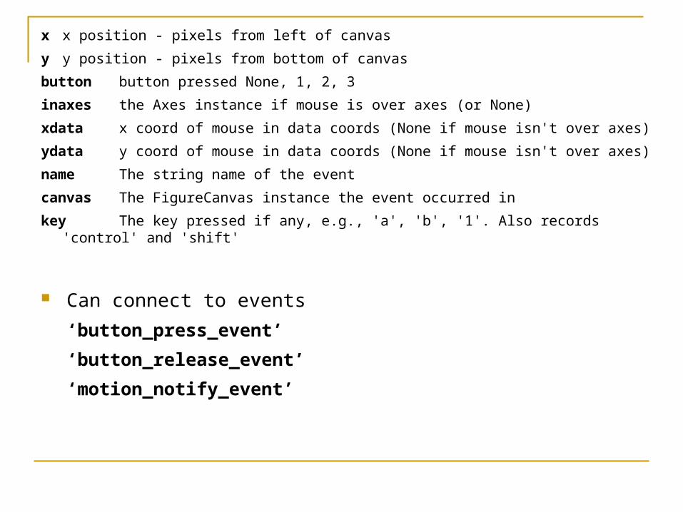
x x position - pixels from left of canvas
y y position - pixels from bottom of canvas
button button pressed None, 1, 2, 3
inaxes the Axes instance if mouse is over axes (or None)
xdata x coord of mouse in data coords (None if mouse isn't over axes)
ydata y coord of mouse in data coords (None if mouse isn't over axes)
name The string name of the event
canvas The FigureCanvas instance the event occurred in
key The key pressed if any, e.g., 'a', 'b', '1'. Also records 'control' and 'shift'
Can connect to events
‘button_press_event’
‘button_release_event’
‘motion_notify_event’

Complete example
from pylab import *
plot(arange(10))
def click(event):
if event.inaxes: print "(%-5.2f, %5.2f)" % (event.xdata, event.ydata)
connect('button_press_event', click)
show()
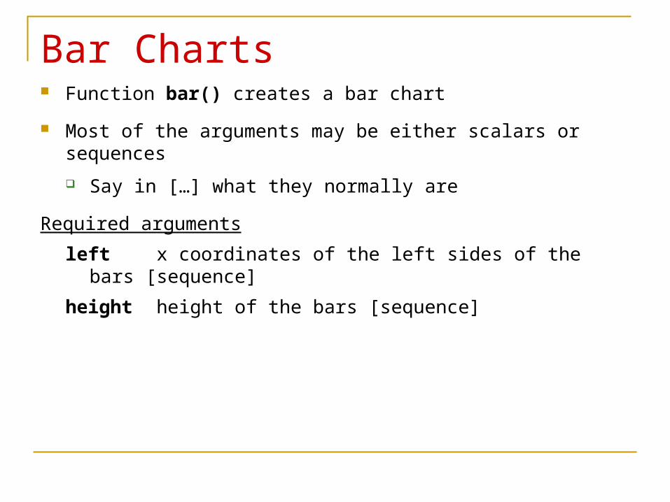
Bar Charts Function bar() creates a bar chart
Most of the arguments may be either scalars or sequences
Say in […] what they normally are
Required arguments
left x coordinates of the left sides of the bars [sequence]
height height of the bars [sequence]

Some optional keyword arguments
orientation orientation of the bars (‘vertical’ | ‘horizontal’)
width width of the bars [scalar]
color color of the bars [scalar]
xerr if not None,
generates error ticks on top the bars [sequence]
yerr if not None,
generates errorbars on top the bars [sequence]
ecolor color of any errorbar [scalar]
capsize length (in points) of errorbar caps (default 2) [scalar]
log False (default) leaves the orientation axis as is,
True sets it to log scale
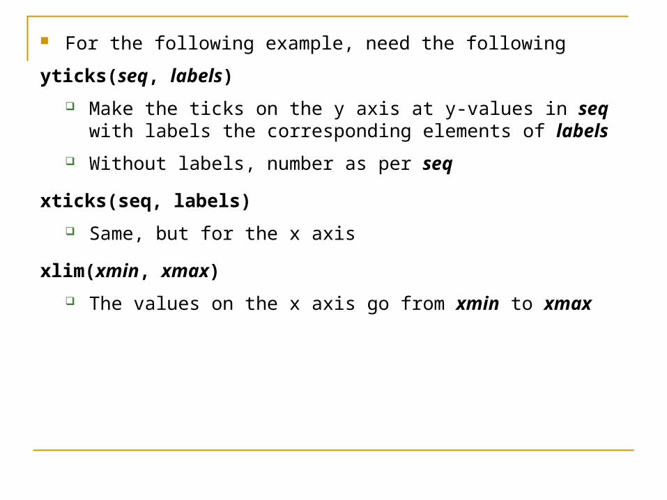
For the following example, need the following
yticks(seq, labels)
Make the ticks on the y axis at y-values in seq with labels the corresponding elements of labels
Without labels, number as per seq
xticks(seq, labels)
Same, but for the x axis
xlim(xmin, xmax)
The values on the x axis go from xmin to xmax

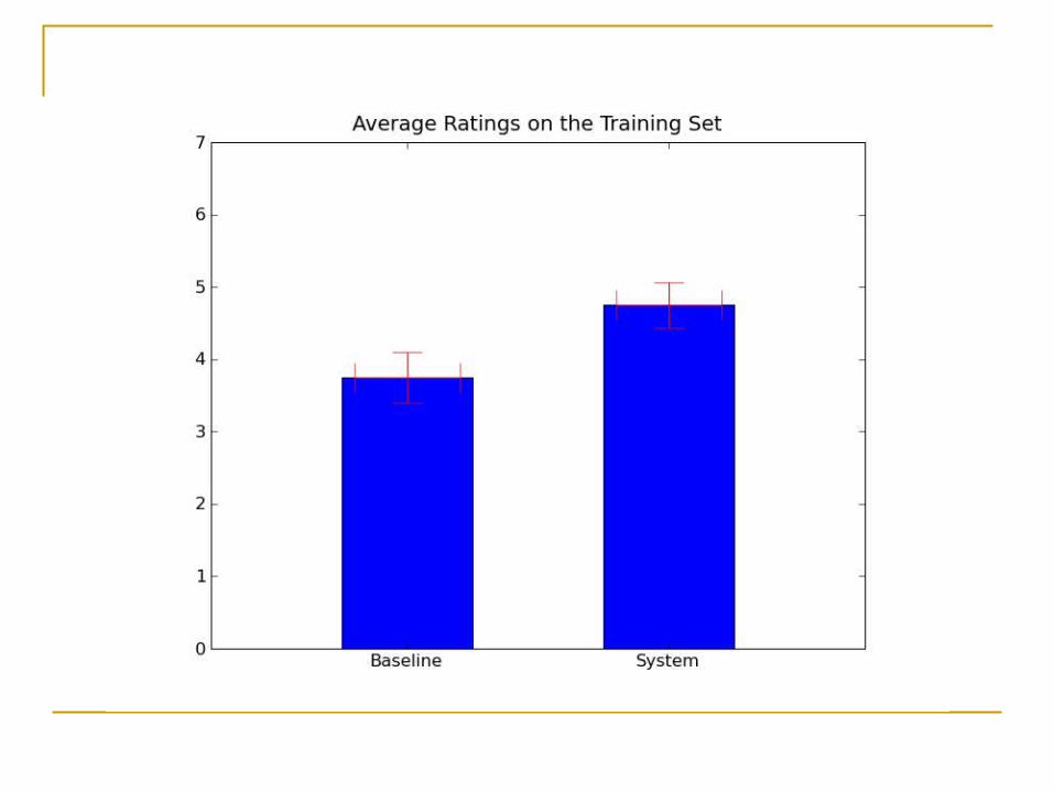
from pylab import *
labels = ["Baseline", "System"]
data = [3.75, 4.75]
yerror = [0.3497, 0.3108]
xerror = [0.2, 0.2]
xlocations = array(range(len(data)))+0.5
width = 0.5
csize = 10
ec = 'r'
bar(xlocations, data, yerr=yerror, width=width,
xerr=xerror, capsize=csize, ecolor=ec)
yticks(range(0, 8))
xticks(xlocations + width/2, labels)
xlim(0, xlocations[-1]+width*2)
title("Average Ratings on the Training Set")
savefig('bar')
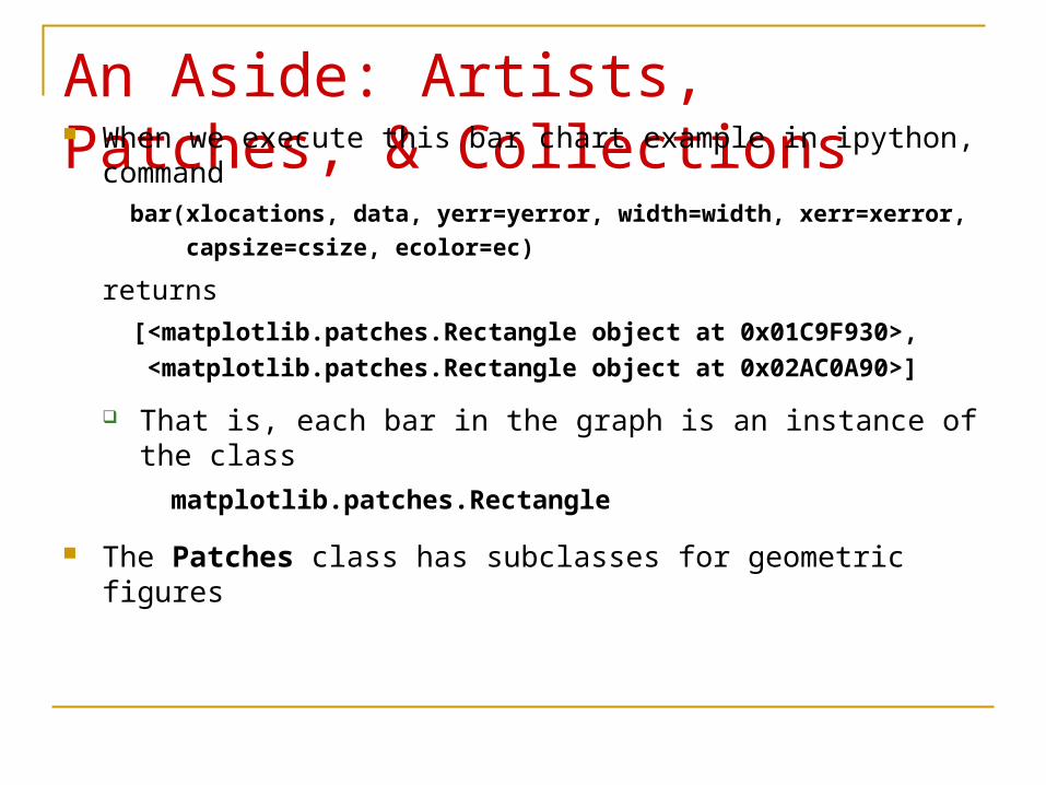
An Aside: Artists, Patches, & Collections When we execute this bar chart example in ipython, command
bar(xlocations, data, yerr=yerror, width=width, xerr=xerror,
capsize=csize, ecolor=ec)
returns
[<matplotlib.patches.Rectangle object at 0x01C9F930>,
<matplotlib.patches.Rectangle object at 0x02AC0A90>]
That is, each bar in the graph is an instance of the class
matplotlib.patches.Rectangle
The Patches class has subclasses for geometric figures
The 3 Conceptual Parts of the matplotlib Code The matplotlib code is divided conceptually into 3 parts:
1. the matlab interface
Module pylab is mainly code to manage the multiple figure windows across backends to provide a thin, procedural wrapper around the object oriented
plotting code
2. the matplotlib Artists
a series of classes that derive from matplotlib.artist.Artist
So named because they're the objects that actually draw into the figure
3. the backend renderers, each implementing a common drawing interface that actually puts the ink on the paper—e.g.,
create a postscript document
call the gtk drawing code

The matplotlib Artist hierarchy
The primitive Artists are classes Patch, Line2D, Text, AxesImage, FigureImage and Collection
All other artists are composites of these
E.g., a Tick is comprised of a Line2D instance (tick line) and a Text instance (tick label)

The Artist Containment Hierarchy
Attribute names in lower case Object type listed below in upper case
If the attribute is a sequence, the connecting edge is labeled 0. . .n the object type is in [..]
Some redundant information omitted—e.g.,
yaxis contains the equivalent objects that xaxis contains
minorTicks have same containment hierarchy as majorTicks
Some matplotlib.patches ClassesCircle(xy, radius, **kwargs) A circle of the given radius centered at xy, a tuple (x, y )
Some keyword arguments
edgecolor (or ec) any matplotlib color
facecolor (or fc) any matplotlib color
fill True | False
Rectangle(xy, width, height, **kwargs) A rectangle with lower left corner at xy of the given width and height
Same keyword arguments as Circle
Polygon(xys, **kwargs) xys is a NumPy array of shape N 2, where N is the number of vertices
Same keyword arguments as Circle
Keyword argument zorder Default drawing order (what’s on top of what) for axes is patches,
lines, text
Within same class, by default, what’s specified later is on top what’s drawn earlier
Override this with the zorder argument, with integer values
Higher z-orders are on top lower
zorder must be defined for all graphical objects for it to have an effect
Drawing Patches If p is a patch, it must be added to the axes with the Axes instance
method add_patch(p)
For patches to appear, must invoke draw()
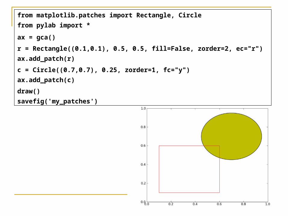
from matplotlib.patches import Rectangle, Circle
from pylab import *
ax = gca()
r = Rectangle((0.1,0.1), 0.5, 0.5, fill=False, zorder=2, ec="r")
ax.add_patch(r)
c = Circle((0.7,0.7), 0.25, zorder=1, fc="y")
ax.add_patch(c)
draw()
savefig('my_patches')
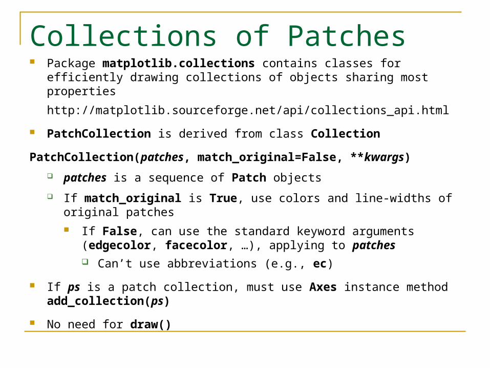
Collections of Patches Package matplotlib.collections contains classes for efficiently drawing
collections of objects sharing most properties
http://matplotlib.sourceforge.net/api/collections_api.html
PatchCollection is derived from class Collection
PatchCollection(patches, match_original=False, **kwargs)
patches is a sequence of Patch objects
If match_original is True, use colors and line-widths of original patches If False, can use the standard keyword arguments (edgecolor,
facecolor, …), applying to patches Can’t use abbreviations (e.g., ec)
If ps is a patch collection, must use Axes instance method add_collection(ps)
No need for draw()

from matplotlib.patches import Polygon
from matplotlib.collections import PatchCollection
from pylab import *
poly1 = Polygon([[0.4,0.4],[0.8,0.3],[0.9,0.9],[0.3,0.5]])
poly2 = Polygon([[0.1,0.1],[0.4,0.4],[0.1,0.4]])
ps = PatchCollection([poly1,poly2], edgecolor='b', facecolor='y')
gca().add_collection(ps)
savefig('my_patch_collection')
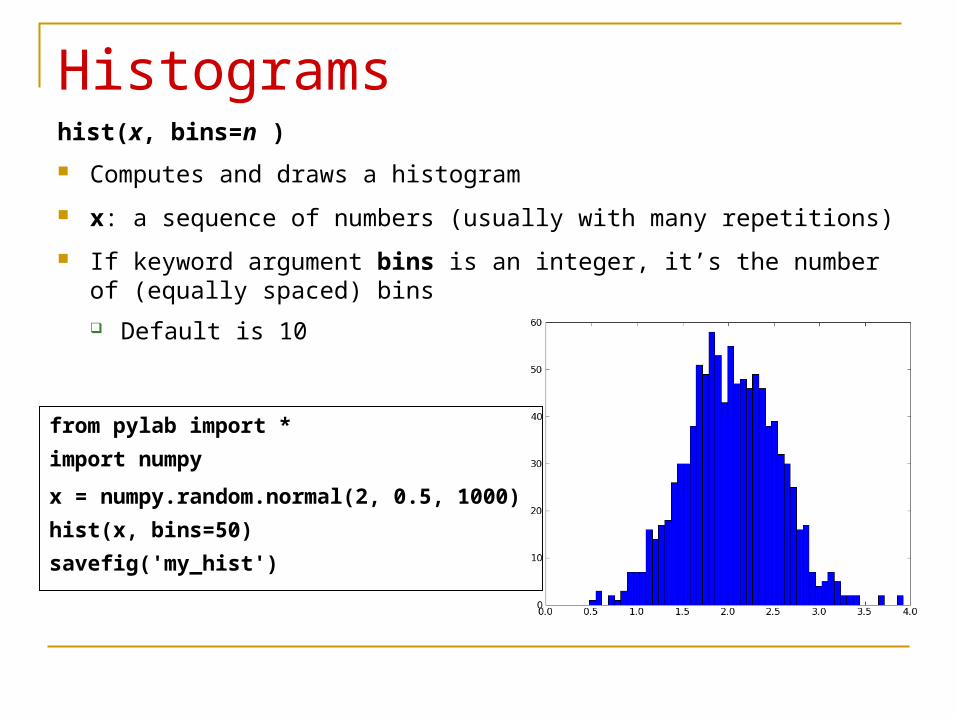
Histogramshist(x, bins=n )
Computes and draws a histogram
x: a sequence of numbers (usually with many repetitions)
If keyword argument bins is an integer, it’s the number of (equally spaced) bins
Default is 10
from pylab import *
import numpy
x = numpy.random.normal(2, 0.5, 1000)
hist(x, bins=50)
savefig('my_hist')

hist() returns a tuple (n, bins, patches ), where
n is an array of the bin values,
bins is an array of the bin limits, and
patches is an array of the rectangles plotted
In the shell (with x determined as above),
hist(x, bins=5)
returns
(array([ 1, 35, 406, 483, 75]), array([-0.34300571, 0.40693226, 1.15687024, 1.90680822,
2.65674619, 3.40668417]),
<a list of 5 Patch objects>)
bins can be a sequence of floating point numbers Each is the x valued of a bin edge
So the 1st bin is from bins[0] to bins[1], etc.
Allows for unequally spaced bin

Other Keyword Arguments range Lower and upper range of the bins,
No effect if bins is a sequence
Outliers ignored
normed If True, the array of bin values returned contains the counts
normalized to form a probability density (summing to 1)
cumulative If True, each bin gives the count for that bin plus all bins for smaller
values
histtype: the style drawn
‘bar’: traditional bar style
‘barstacked’: a bar style, multiple data stacked on top each other
‘step’: a line plot by default unfilled
‘stepfilled’: a line plot by default filled
align (values ‘left’, ‘mid’, ‘right’) Whether the bars are centered
on the left bin edges, between bin edges, or on the right bin edges
rwidth Relative width of bars as a fraction of bin width
If None, width automatically computed
Ignored if histtype=’step’

Log If True, axes have a log scale
Empty bins filtered out
Other usual keyword arguments: edgecolor (or ec), facecolor (or fc), fill, linewidth, etc.

NumPy Histogramshistogram (x, **kwargs)
x is as with matplotlib hist(x, **kwargs)
Returns a tuple (n, bins)
Just like the matplotlib function hist(x, **kwargs) returns a tuple (n, bins, patches)
But without the patches
Doesn’t draw a figure
Other keyword arguments:
range (default None)
normed (default 0, i.e., False)
Same as the hist() arguments of the same name

from pylab import *
import numpy
mu, sigma = 2, 0.5
# Vector of 10000 normal deviates with STD 0.5 and mean 2
v = numpy.random.normal(mu,sigma,10000)
hist(v, bins=50, normed=1) # matplotlib version (plot)
(n, bins) = numpy.histogram(v, bins=50, normed=1) # no plot
plot(bins, n, 'r', linewidth=2)
savefig('histnumpy')
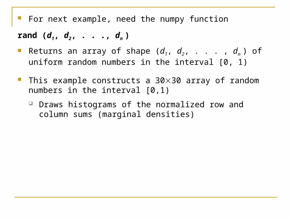
For next example, need the numpy function
rand (d1, d2, . . ., dn )
Returns an array of shape (d1, d2, . . . , dn ) of uniform random numbers in the interval [0, 1)
This example constructs a 3030 array of random numbers in the interval [0,1)
Draws histograms of the normalized row and column sums (marginal densities)
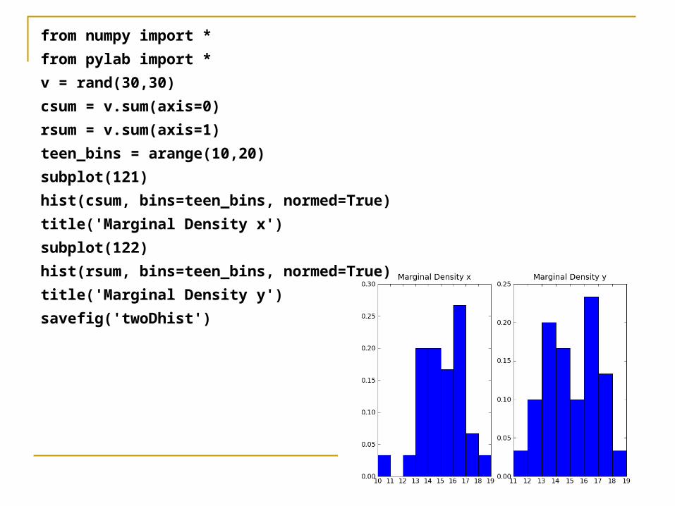
from numpy import *
from pylab import *
v = rand(30,30)
csum = v.sum(axis=0)
rsum = v.sum(axis=1)
teen_bins = arange(10,20)
subplot(121)
hist(csum, bins=teen_bins, normed=True)
title('Marginal Density x')
subplot(122)
hist(rsum, bins=teen_bins, normed=True)
title('Marginal Density y')
savefig('twoDhist')

histogram2d(x, y, **kwargs) Keywords arguments again are
bins (default 10)
range (default None)
normed (default False)
Returns a tuple (H, xedges, yedges )
xedges and yedges are arrays of floating point numbers Define the edges of the 2D bins at the x and y values, resp.
H is oriented such that H [i,j ] is the number of samples in binx[j] and biny[i] Associate x with j, y with i
With normed=True, get a density (not a bin-count)
Marginal densities got by summing rows or summing columns

>>> H, xedges, yedges = histogram2d(rand(100),rand(100),bins=5)
>>> print H.sum(axis=0)
[ 21. 26. 13. 20. 20.]
>>> print xedges
[ 0.01034873 0.20348935 0.39662997 0.58977059 0.7829112 0.97605182]
>>> print H.sum(axis=1)
[ 23. 15. 23. 24. 15.]
>>> print yedges
[ 2.86000121e-05 1.99003906e-01 3.97979212e-01 5.96954518e-01 7.95929824e-01 9.94905130e-01]
histogramdd([[x0,0, x0,1, …, x0,D-1], …, [xN-1,0, xN-1,1, …, xN-1,D-1]]), **kwargs)
Generalizes histogram2d()
The 1st argument is a length-N array of length-D arrays (samples)
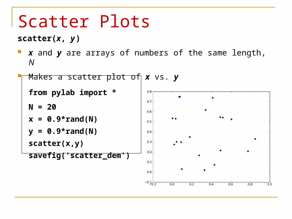
Scatter Plotsscatter(x, y )
x and y are arrays of numbers of the same length, N
Makes a scatter plot of x vs. y
from pylab import *
N = 20
x = 0.9*rand(N)
y = 0.9*rand(N)
scatter(x,y)
savefig('scatter_dem')

Keyword Argumentss If an integer, size of marks in points2 , i.e., area occupied (default 20)
If an array of length N, gives the sizes of the corresponding elements of x, y
marker Symbol marking the points (default = ‘o’)
Same options as for lines that don’t connect the dots And a few more
c A single color or a length-N sequence of colors
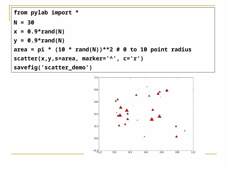
from pylab import *
N = 30
x = 0.9*rand(N)
y = 0.9*rand(N)
area = pi * (10 * rand(N))**2 # 0 to 10 point radius
scatter(x,y,s=area, marker='^', c='r')
savefig('scatter_demo')

Ticks A tick is a cross mark on an axis with an associated label
xticks (on the x axis) and yticks (on the y axis)
xticks() returns a tuple of
an array of tick locations (numbers) on the x axis
an array of corresponding tick labels (text)
yticks() is the same, but for the y axis
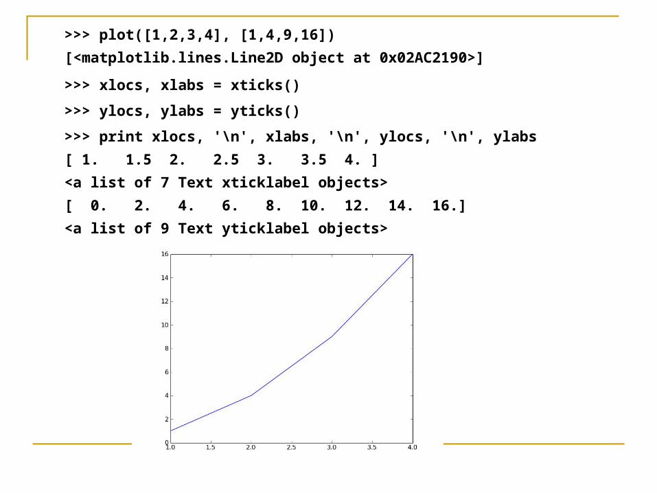
>>> plot([1,2,3,4], [1,4,9,16])
[<matplotlib.lines.Line2D object at 0x02AC2190>]
>>> xlocs, xlabs = xticks()
>>> ylocs, ylabs = yticks()
>>> print xlocs, '\n', xlabs, '\n', ylocs, '\n', ylabs
[ 1. 1.5 2. 2.5 3. 3.5 4. ]
<a list of 7 Text xticklabel objects>
[ 0. 2. 4. 6. 8. 10. 12. 14. 16.]
<a list of 9 Text yticklabel objects>

xticks() and yticks() can also take 1 or 2 (or more) arguments to set tick features
With 1 argument, it’s an array of new locations for the ticks—e.g.,
xticks( arange(6) )
With 2 arguments, they’re the locations (as with 1) and an array of corresponding labels—e.g.,
xticks([1, 2, 3], [‘Al’, ‘Ed’, ‘Ken’])
xticks() and yticks() can also take text keyword arguments
In all cases, xticks() and yticks() return a tuple of an array of locations and an array of labels

Some tick-related Axes instance methods Note: Minor ticks are the (usually smaller) ticks that occur
between the major ticks (the usual ticks)
get_xticklabels(),
get_xmajorticklabels()
get_xminorticklabels()
get_xticklabels(minor=False)
get_xticklines()
get_xticks(minor=False) Return the x ticks as a list of locations
Corresponding y methods
Corresponding set_ methods

>>> plot([1,2,3])
[<matplotlib.lines.Line2D object at 0x01C9C110>]
>>> gca().set_xticks([0.25, 0.75, 1.25, 1.75, 2.25, 2.75], minor=True)
[<matplotlib.axis.XTick object at 0x00B3B770>,
<matplotlib.axis.XTick object at 0x02AC9C10>,
<matplotlib.axis.XTick object at 0x02AC9F90>,
<matplotlib.axis.XTick object at 0x02AC9FF0>,
<matplotlib.axis.XTick object at 0x02AD4390>,
<matplotlib.axis.XTick object at 0x02AD47B0>]
>>> draw()
Note the small ticks on the x axis
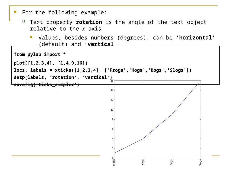
For the following example:
Text property rotation is the angle of the text object relative to the x axis Values, besides numbers (degrees), can be ‘horizontal’ (default)
and ‘vertical”
from pylab import *
plot([1,2,3,4], [1,4,9,16])
locs, labels = xticks([1,2,3,4], ['Frogs','Hogs','Bogs','Slogs'])
setp(labels, 'rotation', 'vertical')
savefig('ticks_simpler')

Tick Locators and Formatters Module matplotlib.ticker has 2 bases classes: Locator,
Formatter
Each axis (xaxis or yaxis) has
a major and minor tick locator and
The default minor tick locators return the empty list By default, no minor ticks
a major and minor tick formatter
Each can be set independently
A user can create and plug-in a custom tick locator or formatter
Locators handle
autoscaling of the view limits based on the data limits
choosing the tick locations

Class MultipleLocator
Most generally useful tick locator
Initialize it with a base
It picks axis limits and ticks that are multiples of the base
Class AutoLocator
Contains a MultipleLocator instance
Dynamically (& intelligently) updates it based on the data & zoom limits
Class Summary
NullLocator No ticks
IndexLocator Locator for index plots (e.g., where x = range(len(y))
LinearLocator Evenly spaced ticks from min to max
LogLocator Logarithmically ticks from min to max
MultipleLocator Ticks and range are a multiple of base; either integer or float
AutoLocator Choose a MultipleLocator and dynamically reassign
The Basic Tick Locators
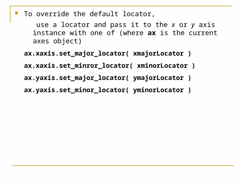
To override the default locator,
use a locator and pass it to the x or y axis instance with one of (where ax is the current axes object)
ax.xaxis.set_major_locator( xmajorLocator )
ax.xaxis.set_minror_locator( xminorLocator )
ax.yaxis.set_major_locator( ymajorLocator )
ax.yaxis.set_minor_locator( yminorLocator )
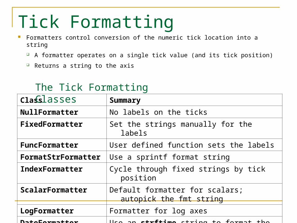
Tick Formatting Formatters control conversion of the numeric tick location into a string
A formatter operates on a single tick value (and its tick position)
Returns a string to the axis
Class Summary
NullFormatter No labels on the ticks
FixedFormatter Set the strings manually for the labels
FuncFormatter User defined function sets the labels
FormatStrFormatter Use a sprintf format string
IndexFormatter Cycle through fixed strings by tick position
ScalarFormatter Default formatter for scalars; autopick the fmt string
LogFormatter Formatter for log axes
DateFormatter Use an strftime string to format the date
The Tick Formatting Classes

To control the major and minor tick label formats,
use one of the following (where ax is an Axes instance)
ax.xaxis.set_major_Formatter( xmajorFormatter )
ax.xaxis.set_minor_Formatter( xminorFormatter )
ax.yaxis.set_major_Formatter( ymajorFormatter )
ax.yaxis.set_minor_Formatter( yminroFormatter )

from pylab import *
# import the tick locator and formatter class
from matplotlib.ticker import MultipleLocator, FormatStrFormatter
majorLocator = MultipleLocator(21) # multiples of 21
majorFormatter = FormatStrFormatter('*%d*')
minorLocator = MultipleLocator(7) # multiples of 7
minorFormatter = FormatStrFormatter('%d')
t = arange(0.0, 100.0, 0.1)
s = sin(0.1*pi*t)*exp(-t*0.01)
plot(t, s)
ax = gca()
ax.xaxis.set_major_locator(majorLocator)
ax.xaxis.set_major_formatter(majorFormatter)
ax.xaxis.set_minor_locator(minorLocator)
ax.xaxis.set_minor_formatter(minorFormatter)
grid(True)
savefig('ticks_simple')

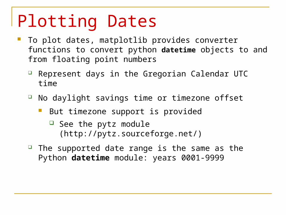
Plotting Dates To plot dates, matplotlib provides converter functions to convert
python datetime objects to and from floating point numbers
Represent days in the Gregorian Calendar UTC time
No daylight savings time or timezone offset
But timezone support is provided See the pytz module (http://pytz.sourceforge.net/)
The supported date range is the same as the Python datetime module: years 0001-9999
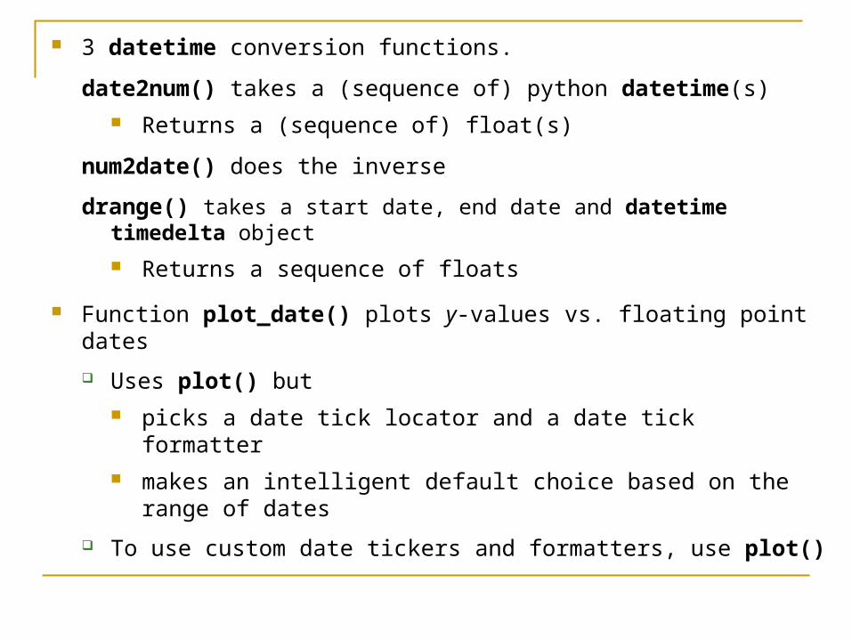
3 datetime conversion functions.
date2num() takes a (sequence of) python datetime(s) Returns a (sequence of) float(s)
num2date() does the inverse
drange() takes a start date, end date and datetime timedelta object
Returns a sequence of floats
Function plot_date() plots y-values vs. floating point dates
Uses plot() but picks a date tick locator and a date tick formatter makes an intelligent default choice based on the range of dates
To use custom date tickers and formatters, use plot()
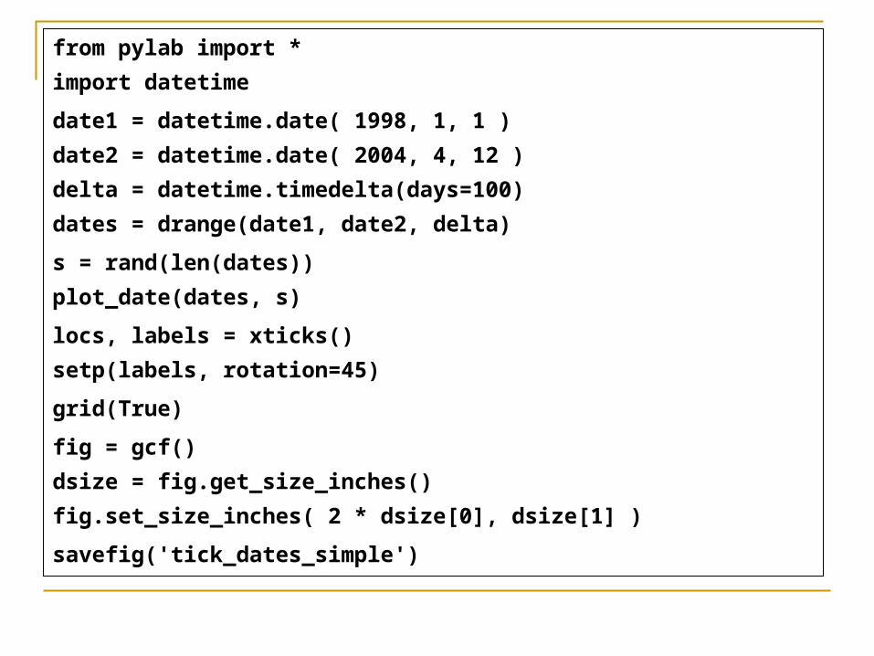
from pylab import *
import datetime
date1 = datetime.date( 1998, 1, 1 )
date2 = datetime.date( 2004, 4, 12 )
delta = datetime.timedelta(days=100)
dates = drange(date1, date2, delta)
s = rand(len(dates))
plot_date(dates, s)
locs, labels = xticks()
setp(labels, rotation=45)
grid(True)
fig = gcf()
dsize = fig.get_size_inches()
fig.set_size_inches( 2 * dsize[0], dsize[1] )
savefig('tick_dates_simple')

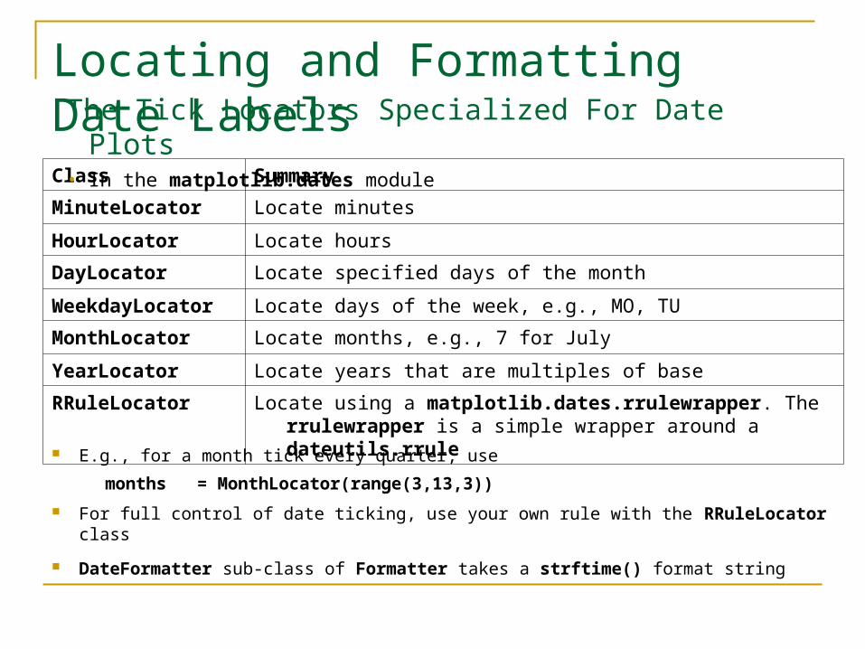
Locating and Formatting Date LabelsClass Summary
MinuteLocator Locate minutes
HourLocator Locate hours
DayLocator Locate specified days of the month
WeekdayLocator Locate days of the week, e.g., MO, TU
MonthLocator Locate months, e.g., 7 for July
YearLocator Locate years that are multiples of base
RRuleLocator Locate using a matplotlib.dates.rrulewrapper. The rrulewrapper is a simple wrapper around a dateutils.rrule
The Tick Locators Specialized For Date Plots • In the matplotlib.dates module
E.g., for a month tick every quarter, use
months = MonthLocator(range(3,13,3))
For full control of date ticking, use your own rule with the RRuleLocator class
DateFormatter sub-class of Formatter takes a strftime() format string

from pylab import *
import datetime
years = YearLocator(2) # every 2 years
months = MonthLocator(range(3,13,3)) # every quarter
yearsFmt = DateFormatter('%y') # only last 2 digits
ax = gca()
ax.xaxis.set_major_locator(years)
ax.xaxis.set_major_formatter(yearsFmt)
ax.xaxis.set_minor_locator(months)
date1 = datetime.date( 1998, 1, 1 )
date2 = datetime.date( 2004, 4, 12 )
delta = datetime.timedelta(days=100)
dates = drange(date1, date2, delta)
s = rand(len(dates))
plot_date(dates, s)Continued
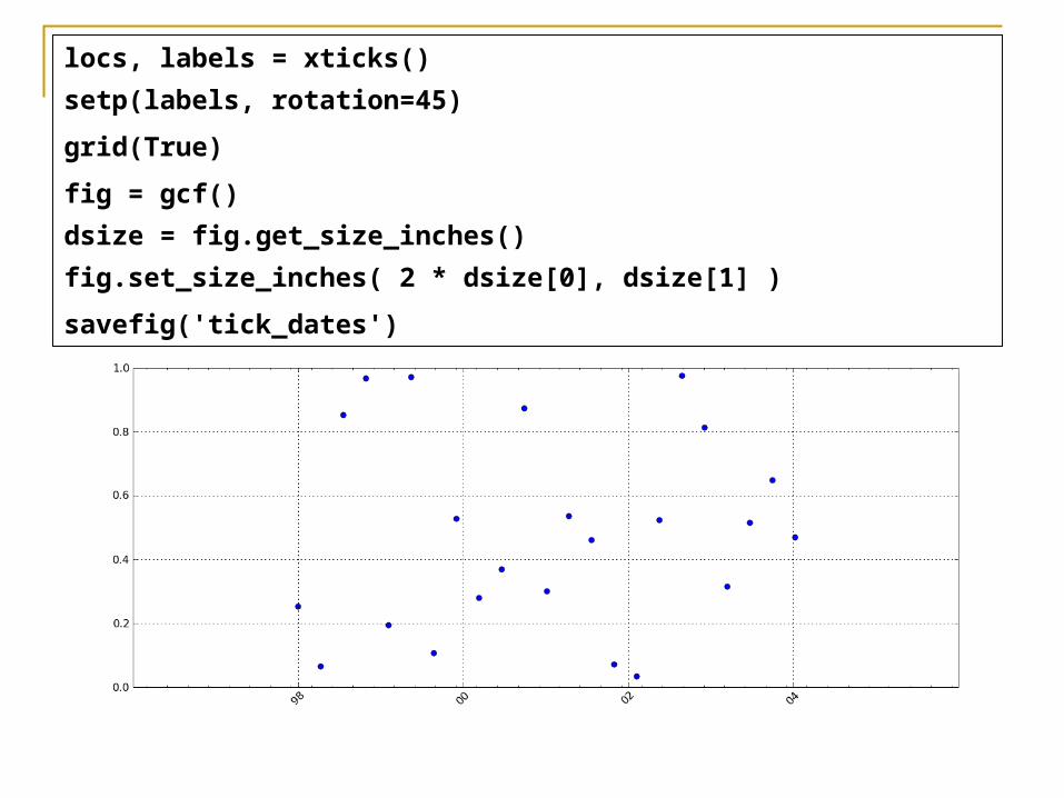
locs, labels = xticks()
setp(labels, rotation=45)
grid(True)
fig = gcf()
dsize = fig.get_size_inches()
fig.set_size_inches( 2 * dsize[0], dsize[1] )
savefig('tick_dates')
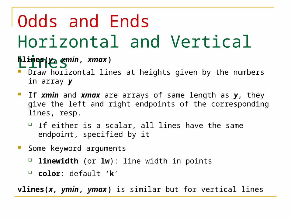
Odds and EndsHorizontal and Vertical Lineshlines(y, xmin, xmax )
Draw horizontal lines at heights given by the numbers in array y
If xmin and xmax are arrays of same length as y, they give the left and right endpoints of the corresponding lines, resp.
If either is a scalar, all lines have the same endpoint, specified by it
Some keyword arguments
linewidth (or lw): line width in points
color: default ‘k’
vlines(x, ymin, ymax ) is similar but for vertical lines
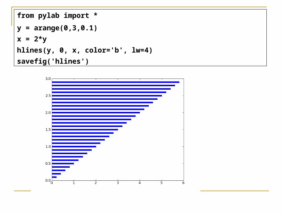
from pylab import *
y = arange(0,3,0.1)
x = 2*y
hlines(y, 0, x, color='b', lw=4)
savefig('hlines')
Axis Lines axhline() draws a line on the x axis spanning the horizontal
extent of the axes
axhline(y ) draws such a line parallel to the x axis at height y
Some keyword arguments
color: default ‘b’
label
linewidth in points
axvline() is similar but w.r.t. the y axis
Grid Lines grid(True) produces grid lines at the tick coordinates
grid(None) suppresses the grid
grid() toggles the presence of the grid
Some keyword arguments
color: default ‘k’
linestyle: default ‘:’
linewidth
Some Axes instance methods
get_xgridlines()
get_ygridlines()
Example:
setp(gca().get_xgridlines(), color='r')
Resizing the Figure Often should make the figure wider or higher so objects aren’t cramped
Use Figure instance methods get_size_inches() and set_size_inches()
To get an array of the 2 dimensions in inches (width then height):
fig = gcf()
dsize = fig.get_size_inches()
E.g., to double the width
fig.set_size_inches( 2 * dsize[0], dsize[1] )
See the example in the SciPy Cookbook
http://www.scipy.org/Cookbook/Matplotlib/AdjustingImageSize
3D Matplotlib: mplot3d See http://matplotlib.org/mpl_toolkits/mplot3d/tutorial.html
An Axes3D object is created like any other axes, but using the projection='3d' keyword
Create a new matplotlib.figure.Figure and add to it a new axes of type Axes3D
import matplotlib.pyplot as plt
from mpl_toolkits.mplot3d import Axes3D
fig = plt.figure()
ax = fig.add_subplot(111, projection='3d')
Example: Line PlotsAxes3D.plot(xs, ys, *args, **kwargs)
Plot 2D or 3D data
xs, ys are the arrays of x, y coordinates of vertices
zs is the z value(s), either 1 for all points or (as array) 1 for each point
zdir gives which direction to use as z (‘x’, ‘y’ or ‘z’) when plotting a 2D set
Other arguments are passed on to plot()

Example
import matplotlib as mpl
from mpl_toolkits.mplot3d import Axes3D
import numpy as np
import matplotlib.pyplot as plt
mpl.rcParams['legend.fontsize'] = 10
fig = plt.figure()
ax = fig.gca(projection='3d')
theta = np.linspace(-4 * np.pi, 4 * np.pi, 100)
z = np.linspace(-2, 2, 100)
r = z**2 + 1
x = r * np.sin(theta)
y = r * np.cos(theta)
ax.plot(x, y, z, \ label='parametric curve')
ax.legend()
plt.show()

AnimationThe Old Way To take an animated plot and turn it into a movie,
save a series of image files (e.g., PNG) and
use an external tool to convert them to a movie
Can use mencoder, part of the mplayer suite
See http://www.mplayerhq.hu/design7/news.html
Can download binaries for Windows
Or use ImageMagick’s convert (“the Swiss army knife of image tools”)
See http://www.imagemagick.org/script/convert.php

Matplotlib Animation Matplotlib Animation Tutorial
http://jakevdp.github.com/blog/2012/08/18/matplotlib-animation-tutorial/
Matplotlib animation documentation
http://matplotlib.org/api/animation_api.html
Matplotlib animation examples
http://matplotlib.org/examples/animation/
Official and good, but documentation limited to meager program comments The tutorial (above) goes through several of these
Alias http://matplotlib.sourceforge.net/examples/animation/index.html
This replaces the Cookbook examples
http://www.scipy.org/Cookbook/Matplotlib/Animations