college magazine evaluation
TRANSCRIPT

College Magazine
EVALUATIONBY JONATHAN HEAP

My College Magazine

In what way does your media
product use, develop or challenge
forms and conventions of real media
products?

Conventions
of a
magazine.A Traditional Magazine will include:
• Masthead
• Strap line
• Puff
• Sell lines
• Cover lines
• Left third
• Pull Quote
• Price Line
• Date Line
• Bar Code
• Main Image
• Banner
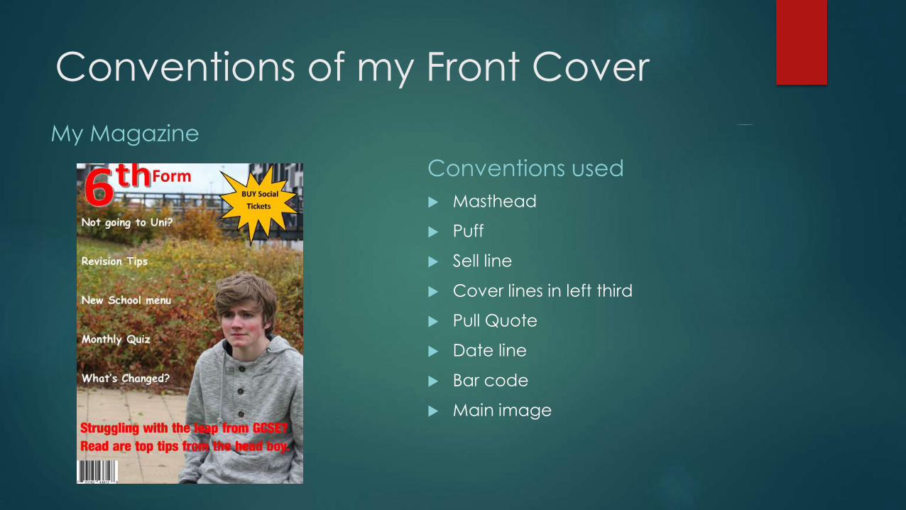
Conventions of my Front Cover
My Magazine
Conventions used
Masthead
Puff
Sell line
Cover lines in left third
Pull Quote
Date line
Bar code
Main image

Developing and challenging
conventions of a traditional
magazine.

The masthead isn’t like a traditional college
magazine as it isn’t just a bold font right
across the top of the magazine, and it’s just
placed in the top left hand corner of the
magazine like the Q magazine does. In my
college magazine I have decided to blend
the two so have a big bold 6TH and then
have form next to it. So it goes across like
empire using letters like empire but at the
same time is very much fixed in the top
corner and the 6Th is the main masthead
and the bit saying form is almost like a
strapline to the right of it.
Masthead

The Puff
The puff used on the college magazine of mine
(top left) is quite bold with its jagged edge and
colour and really jumps out to the audience.
This challenges most magazine puffs as they
tend to just be a circle and want the
information with in it to stand out more, but still
are their to be noticed. Mountain Biking UK
magazines puff (top right) is the closest to mine
as it is jagged and stands out. However the kit it
is showing, so the suspension, bag and gears
stand out even more. So I believe this is the
best example of a puff I’ve seen as it really
jumped out at me. Therefore if I were doing this
magazine again I would possibly have images
with in the puff linked to what it was saying so
tickets or textbooks.

The Main image The main image used is good quality and focused well in my
magazine (top left). It also in composites techniques like rule
of thirds. However due to the colours of leaves in the
background it made it difficult finding a colour that could go
on top and be read easily. A bit like the yellow and white at
the bottom of NME (bottom left) as it isn’t the easiest of
themes to read off and follow. However if I came across this
problem again in future magazines the technique used in
empire (top right) of having a coloured strip right across like a
banner is good as it makes any text clear as well and adding
further emphasis for the audience. Part of this I think is down
to the equipment I had available as the image used is straight
off a camera and all the others have been edited some way
or another by professionals and lots of time and money has
been put into creating them. But this also goes with the other
types of genres of magazines as empire and total film are the
biggest film magazines out their and try to create a scene on
their main cover and are probably done in a studio or
cropped and photo shopped in. Also like the who in NME will
have had the cover done in a photo-shoot in a studio so all
lighting and background was un-natural but what they
wanted.

Traditional Conventions usedAlthough my magazine has incorporated many new styles of
tradition conventions or even just used the traditional
conventions as many you cannot change as a sell line and a pull
quote will always be a sell line and a pull quote no matter what
font, size and colours you use to make them stand out. However
the puff isn’t just a plain traditional circle and looks more like an
explosion to make it stand out again. But things like the masthead
and main image you can change and work with to make a top
quality magazine cover that the audience see and want to
purchase.

Contents page
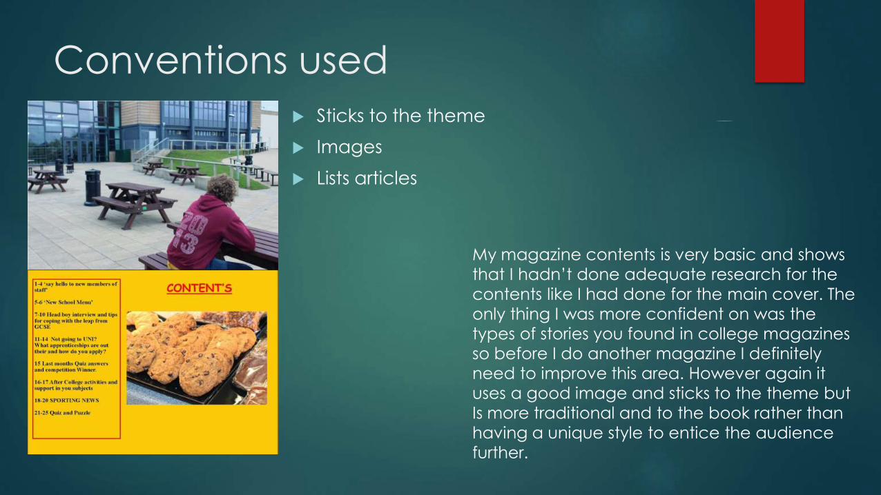
Conventions used
Sticks to the theme
Images
Lists articles
My magazine contents is very basic and shows
that I hadn’t done adequate research for the
contents like I had done for the main cover. The
only thing I was more confident on was the
types of stories you found in college magazines
so before I do another magazine I definitely
need to improve this area. However again it
uses a good image and sticks to the theme but
Is more traditional and to the book rather than
having a unique style to entice the audience
further.

How does your media
product represent particular
social groups?

Images
My magazine shows a sixth form student both on the
cover as well as on the contents page. Both of these
are males so it therefore doesn’t represent female
students at all when you get an initial glance. Also
due to the genre of the magazine being a college
magazine it is therefore representing a certain age
group between 17-18 years old.

Articles The articles mention are mostly aimed clearly at the
17-18 student social group. With articles on University,
revision and the leap from GCSE. It represents a range
of students by the stories from hard working students
who are wanting to get ahead with revision to
students who may be struggling in the leap from GCSE
or what to do next with their lives. This is a good diverse
range of articles as it doesn’t limit the audience.
Except the Sell line being about tips from the head
boy and no where in the contents or front cover has it
mentioned a head girl so then again it is male
orientated. This is probably down the fact that I did it
and was working with fellow male students when
taking the photos.

What kind of media
institution might distribute
your product and why?

Institutions most likely to issue a magazine like
this are the school/sixth form, UCAS (a university
application website) or social media and
pages linked to the school or students as a high
percentage of the 17-18 year olds represented
are on multiple forms of social media. However
the school and sixth form it is from is the biggest
institution that would distribute the product. The
distribution its self could be done by the school
through email and a pdf version of the
magazine could be sent out to all students and
parents registered for it as well as having
physical copies is communal areas of the
school and sixth form as well as the reception.
As many could distribute this magazine but
depending on the size and popularity of the
magazine it would depend on how many
people would want to distribute it and
predominantly down to how much money they
themselves could get. But a the small scale it
would start on it would most likely be free in a
school.

Who would be the audience
for your media product?

The audience
The audience for this magazine would be Students aged
17-18 and studying A-levels. Also teachers of this level of
education may also be interested in the magazine as
their tips and may be in it. Another audience may be
parents of the students, but chances are this isn’t a
primary audience as the magazine would probably just
get passed on.

How did you attract/
address your audience?

The audience were attracted to the magazine by the
sell lines and cover lines stating articles that interested
them and were relevant to them. ‘Not going to uni?’
is a question that if relatable and relevant to the
student draws them in especially if they have been
asking themselves these questions and want help.
Also the main image was of the head boy, which if
was somebody they recognised then their were more
likely to look at it more. Also the puff said about the
social which will have the audience as it informs then
of information they want to know, such as when the
next social is?

What have you learnt about
technologies from the
process of constructing this
product?

Technology
Through making this magazine I have more about using
a DSLR camera (we used a canon EOS 600D) in manual
and changing the aperture to vary the focus of the
shot, so if you wanted the foreground focused but the
background blurred and vice versa. Also I have learnt
more about using Microsoft Publisher and how to move
things, crop, and change size, font and colour of
multiple sections at once. Also although it was not
needed in the final image I have learnt how to use parts
of Photoshop and know how to do some editing of
photographs I have taken. I also learnt when
researching other magazines about studio lighting and
camera angles/ shots. This was very beneficial as I could
consider this when planning a shoot and what angles
and distances would work best for a shot.

By Jonathan Heap
Blogs www.jaheap1.blogspot.com
Magazine production