clour study final
TRANSCRIPT

DIPLOMA IN NEW MEDIA DESIGN
DMN 115 – COLOUR STUDY
NAME: LEE JIA JOU
STUDENT ID: 2014050029
GROUP: NMG2
PREPARED FOR MR SYAFIQ HARIZ

CONTENTS
1. INTRODUCTION TO COLOUR
1.1 definition of colour
1.2 colour spectrum
1.3 colour source
1.4 colour history
2. COLOUR SYSTEMS
2.1 subtractive colour
2.2 additive colour
3. COLOUR PROPERTIES
3.1 colour wheels
3.2 primary colour
3.3 secondary colour
3.4 tertiary colour
4. COLOUR HARMONY
4.1 analogous colour
4.2 complementary colour
4.3 split complementary colour
4.4 triad
4.5 tetrad
5. ACHROMATIC AND MONOCHROMATIC COLOUR
5.1 tints
5.2 tones
5.3 shades
6. COLOUR PSYCHOLOGY
6.1 definition of colour psychology
6.2 uses of colour psychology
6.3 psychological effects of colour
6.4 colour psychology as therapy
6.5 colour meaning & symbolism
6.6 colour in my culture
7. FINAL PROJECT
7.1 rationale of my final artwork
7.2 my final artwork
INTRODUCTION TO COLOUR
DEFINITION OF COLOUR
Color or colour is the visual perceptual property corresponding in humans to the categories called red, blue, yellow, green and others. It is simply light of different wavelengths and frequencies and light is just one form of energy that we can actually see that is made up from photons.
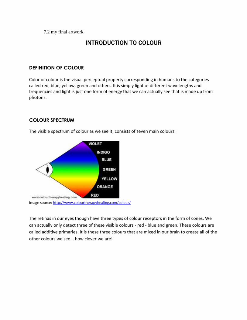
COLOUR SPECTRUM
The visible spectrum of colour as we see it, consists of seven main colours:
Image source: http://www.colourtherapyhealing.com/colour/
The retinas in our eyes though have three types of colour receptors in the form of cones. We
can actually only detect three of these visible colours - red - blue and green. These colours are
called additive primaries. It is these three colours that are mixed in our brain to create all of the
other colours we see... how clever we are!
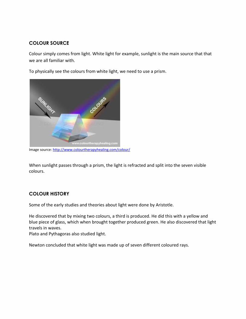
COLOUR SOURCE
Colour simply comes from light. White light for example, sunlight is the main source that that
we are all familiar with.
To physically see the colours from white light, we need to use a prism.
Image source: http://www.colourtherapyhealing.com/colour/
When sunlight passes through a prism, the light is refracted and split into the seven visible colours.
COLOUR HISTORY
Some of the early studies and theories about light were done by Aristotle.
He discovered that by mixing two colours, a third is produced. He did this with a yellow and blue piece of glass, which when brought together produced green. He also discovered that light travels in waves. Plato and Pythagoras also studied light.
Newton concluded that white light was made up of seven different coloured rays.

COLOUR SYSTEMS
Colour systems are the combination methods used on different medium. For example, artists use subtractive method as they mix blue and yellow paint to get a shade of green on painting. Scientists mix green and red light to create yellow for computer to generate digital media, the colors are achieved with the additive color method.
SUBTRACTIVE COLOUR
When we mix colors using paint, or through the printing process, we are using the subtractive color method. Subtractive color mixing means that one begins with white and ends with black; as one adds color, the result gets darker and tends to black.
Image source: http://www.worqx.com/color/color_systems.htm
Image source: http://www.worqx.com/color/color_systems.htm
The CMYK color system is the color system used for printing.
Those colors used in painting—an example of the subtractive color method.

ADDIT IVE COLO UR
If we are working on a computer, the colors we see on the screen are created with light using the additive color method. Additive color mixing begins with black and ends with white; as more color is added, the result is lighter and tends to white.
Image source: http://www.worqx.com/color/color_systems.htm
Image source: http://www.worqx.com/color/color_systems.htm
The RGB colors are light primaries and colors are created with light.
Percentages of red, green, & blue light are used to generate color on a computer screen.
COLOUR PROPERTIES
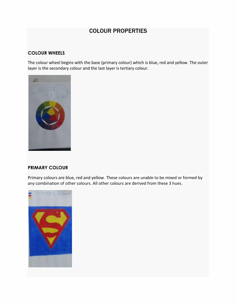
COLOUR WHEELS
The colour wheel begins with the base (primary colour) which is blue, red and yellow. The outer layer is the secondary colour and the last layer is tertiary colour.
PRIMARY COLOUR
Primary colours are blue, red and yellow. These colours are unable to be mixed or formed by any combination of other colours. All other colours are derived from these 3 hues.
SECONDARY COLOUR
Secondary colours are green, orange and purple. They are formed by mixing the primary colours.
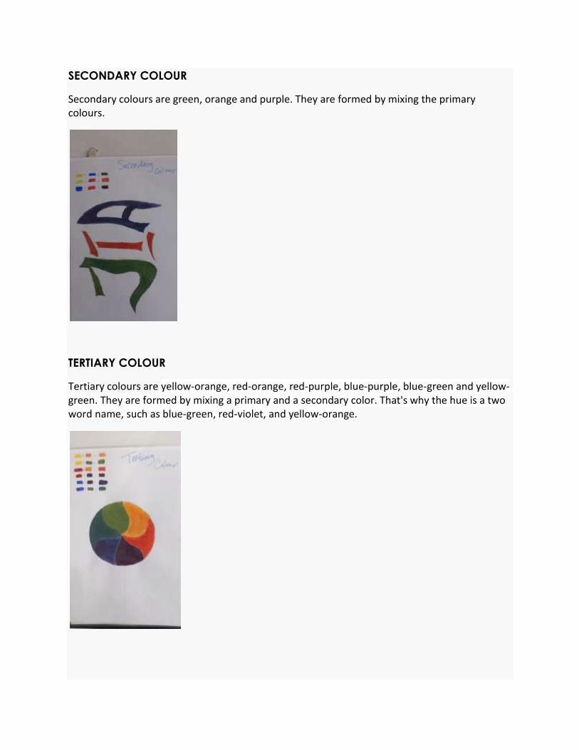
TERTIARY COLOUR
Tertiary colours are yellow-orange, red-orange, red-purple, blue-purple, blue-green and yellow-green. They are formed by mixing a primary and a secondary color. That's why the hue is a two word name, such as blue-green, red-violet, and yellow-orange.

COLOUR HARMONY
ANALOGOUS COLOUR
Analogous colors are any three colors which are side by side on a 12 part color wheel, such as yellow-green, yellow, and yellow-orange. Usually one of the three colors predominates.
COMPLEMENTARY COLOUR
Complementary colors are any two colors which are directly opposite each other, such as red and green and red-purple and yellow-green. In the illustration above, there are several variations of yellow-green in the leaves and several variations of red-purple in the orchid. These opposing colors create maximum contrast and maximum stability.
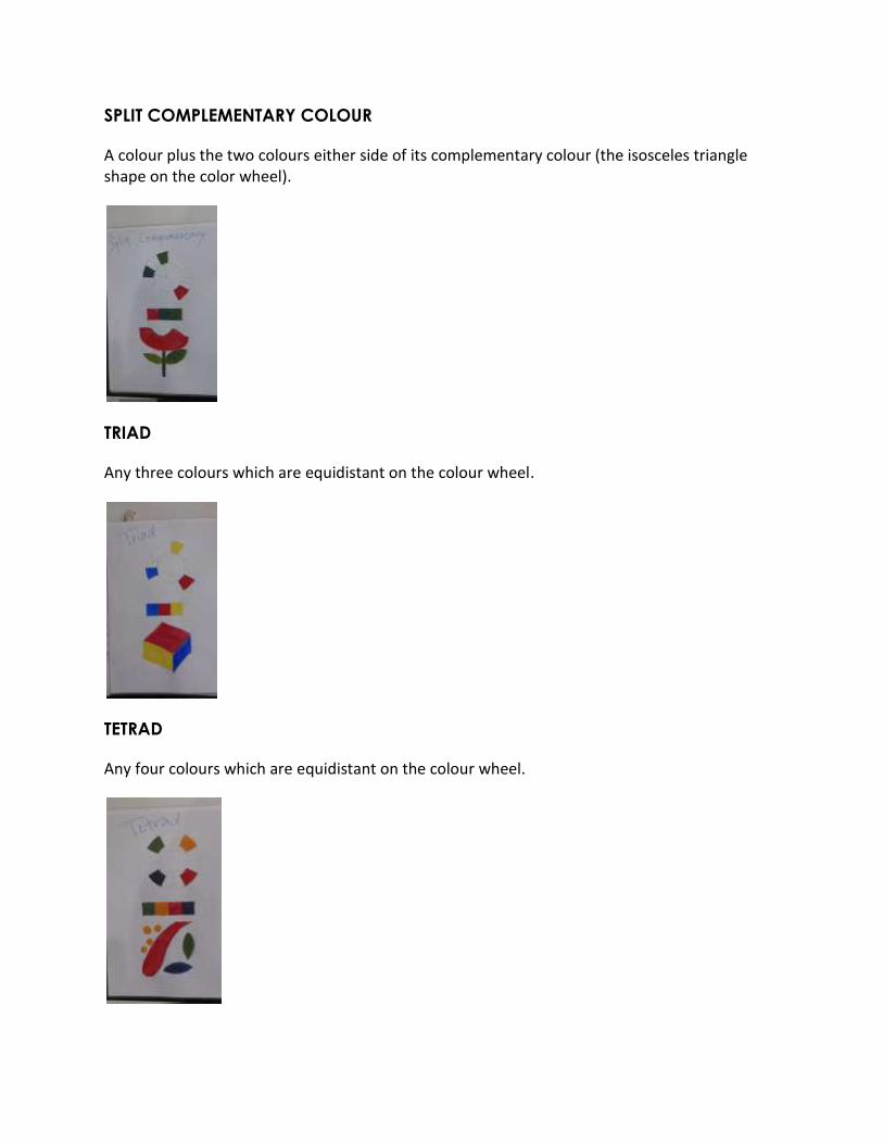
SPLIT COMPLEMENTARY COLOUR
A colour plus the two colours either side of its complementary colour (the isosceles triangle shape on the color wheel).
TRIAD
Any three colours which are equidistant on the colour wheel.
TETRAD
Any four colours which are equidistant on the colour wheel.

ACHROMATIC AND MONOCHROMATIC COLOUR
TINTS
Tints are created when white is added to any hue on the color wheel. This will lighten and desaturate the hue, making it less intense.
TONES
Tones are created when both black and white is added to a hue. We could also say grey has been added.
SHADES
Shades are created when only black is added to a hue. This results in a rich, often more intense and darker color.

COLOUR PSYCHOLOGY
DEFINITION OF COLOUR PSYCHOLOGY
Colour psychology is the study of colour as a determinant of human behavior. However, the interface between color and environmental stimuli is a highly complex interface and one which is open to the influence of a large number of factors. In addition, there are a number of key reasons why the principle of caveat emptor should prevail in regard to colour psychology, especially in regard to information about colour psychology found in mainstream media and popular culture.
USES OF COLOUR PSYCHOLOGY
Since color is an important factor in the visual appearance of products as well as in brand recognition, color psychology has become important to marketing. Color mapping provides a means of identifying potential logo colors for new brands and ensuring brand differentiation within a visually cluttered marketplace. Different colours can be used in different fields to have unique meaning of each of them. Besides, colours can also create feelings of coziness or spaciousness. Therefore, colours can be also used in interior design to create different space.
PSYCHOLOGICAL EFFECTS OF COLOUR
While perceptions of color are somewhat subjective, there are some color effects that have universal meaning. Colors in the red area of the color spectrum are known as warm colors and include red, orange and yellow. These warm colors evoke emotions ranging from feelings of warmth and comfort to feelings of anger and hostility. Colors on the blue side of the spectrum are known as cool colors and include blue, purple and green. These colors are often described as calm, but can also call to mind feelings of sadness or indifference.
COLOUR PSYCHOLOGY AS THERAPY
Color therapy, also known as chromatherapy, is the principle that certain colors are infused with healing powers. Chromotherapy is sometimes referred to as light therapy or colourology and is still used today as a holistic or alternative treatment. The seven colors of the rainbow improve balance and healing in the mind and body.

In treatment,
Red was used to stimulate the body and mind to increase circulation.
Yellow was thought to stimulate the nerves and purify the body.
Orange was used to heal the lungs and to increase energy levels.
Blue was believed to soothe illnesses and treat pain.
Indigo shades were thought to alleviate skin problems.
COLOUR MEANING & SYMBOLISM
There are meanings and symbolism for each of the existing colour. Colors do influence emotion,
and hold significance for people around the world.
RED: Physical Positive: Physical courage, strength, warmth, energy, basic survival, 'fight or flight', stimulation, masculinity, excitement. Negative: Defiance, aggression, visual impact, strain.
Being the longest wavelength, red is a powerful colour. Although not technically the most visible, it has the property of appearing to be nearer than it is and therefore it grabs our attention first. Hence its effectiveness in traffic lights the world over. Its effect is physical; it stimulates us and raises the pulse rate, giving the impression that time is passing faster than it is. It relates to the masculine principle and can activate the "fight or flight" instinct. Red is strong, and very basic. Pure red is the simplest colour, with no subtlety. It is stimulating and lively, very friendly. At the same time, it can be perceived as demanding and aggressive.
BLUE: Intellectual Positive: Intelligence, communication, trust, efficiency, serenity, duty, logic, coolness, reflection, calm. Negative: Coldness, aloofness, lack of emotion, unfriendliness.
Blue is the colour of the mind and is essentially soothing; it affects us mentally, rather than the physical reaction we have to red. Strong blues will stimulate clear thought and lighter, soft blues will calm the mind and aid concentration. Consequently it is serene and mentally calming. It is the colour of clear communication. Blue objects do not appear to be as close to us as red ones. Time and again in research, blue is the world's favourite colour. However, it can be perceived as cold, unemotional and unfriendly.

YELLOW: Emotional Positive: Optimism, confidence, self-esteem, extraversion, emotional strength, friendliness, creativity. Negative: Irrationality, fear, emotional fragility, depression, anxiety, suicide.
The yellow wavelength is relatively long and essentially stimulating. In this case the stimulus is emotional, therefore yellow is the strongest colour, psychologically. The right yellow will lift our spirits and our self-esteem; it is the colour of confidence and optimism. Too much of it, or the wrong tone in relation to the other tones in a colour scheme, can cause self-esteem to plummet, giving rise to fear and anxiety. Our "yellow streak" can surface.
VIOLET: Spiritual Positive: Spiritual awareness, containment, vision, luxury, authenticity, truth, quality. Negative: Introversion, decadence, suppression, inferiority.
The shortest wavelength is violet, often described as purple. It takes awareness to a higher level of thought, even into the realms of spiritual values. It is highly introvertive and encourages deep contemplation, or meditation. It has associations with royalty and usually communicates the finest possible quality. Being the last visible wavelength before the ultra-violet ray, it has associations with time and space and the cosmos. Excessive use of purple can bring about too much introspection and the wrong tone of it communicates something cheap and nasty, faster than any other colour.
PINK: Hope Positive: Intuitive and insightful, tenderness and kindness with its empathy and sensitivity. Negative: Lack of will power, lack of self-reliance and lack of self-worth, overly emotional
and overly cautious nature.
It is a positive color inspiring warm and comforting feelings, a sense that everything will be
okay. The color pink puts people in touch with the nurturing side of themselves, through
either the need to receive or the need to give, nurturing and TLC (tender loving care!). Pink
can also remind you of earlier childhood memories, associated with nurturing and comfort from your mother or a mother figure.
ORANGE: Energy Positive: Physical comfort, food, warmth, security, sensuality, passion, abundance, fun. Negative: Deprivation, frustration, frivolity, immaturity.
Since it is a combination of red and yellow, orange is stimulating and reaction to it is a combination of the physical and the emotional. It focuses our minds on issues of physical comfort - food, warmth, shelter etc. - and sensuality. It is a 'fun' colour. Negatively, it might focus on the exact opposite - deprivation. This is particularly likely when warm orange is used with black. Equally, too much orange suggests frivolity and a lack of serious intellectual values.
GREY: Intelligence Positive: Psychological neutrality. Negative: Lack of confidence, dampness, depression, hibernation, lack of energy.
Pure grey is the only colour that has no direct psychological properties. It is, however, quite suppressive. A virtual absence of colour is depressing and when the world turns grey we are instinctively conditioned to draw in and prepare for hibernation. Unless the precise tone is right, grey has a dampening effect on other colours used with it. Heavy use of grey usually indicates a lack of confidence and fear of exposure.
BLACK: Power Positive: Sophistication, glamour, security, emotional safety, efficiency, substance. Negative: Oppression, coldness, menace, heaviness.
Black is all colours, totally absorbed. The psychological implications of that are considerable. It creates protective barriers, as it absorbs all the energy coming towards you, and it enshrouds the personality. Black is essentially an absence of light, since no wavelengths are reflected and it can, therefore be menacing; many people are afraid of the dark. Positively, it communicates absolute clarity, with no fine nuances. It communicates sophistication and uncompromising excellence and it works particularly well with white. Black creates a perception of weight and seriousness. It is a myth that black clothes are slimming:
WHITE: Reverence Positive: Hygiene, sterility, clarity, purity, cleanness, simplicity, sophistication, efficiency. Negative: Sterility, coldness, barriers, unfriendliness, elitism.
Just as black is total absorption, so white is total reflection. In effect, it reflects the full force of the spectrum into our eyes. Thus it also creates barriers, but differently from black, and it is often a strain to look at. It communicates, "Touch me not!" White is purity and, like black, uncompromising; it is clean, hygienic, and sterile. The concept of sterility can also be negative. Visually, white gives a heightened perception of space. The negative effect of white on warm colours is to make them look and feel garish.
BROWN: Stability Positive: Seriousness, warmth, Nature, earthiness, reliability, support. Negative: Lack of humour, heaviness, lack of sophistication.
Brown usually consists of red and yellow, with a large percentage of black. Consequently, it has much of the same seriousness as black, but is warmer and softer. It has elements of the red and yellow properties. Brown has associations with the earth and the natural world. It is a solid, reliable colour and most people find it quietly supportive - more positively than the ever-popular black, which is suppressive, rather than supportive.
COLOUR IN MY CULTURE
Colors hold significance for people around the world. Not only do colors influence emotion, but they also hold meaning in religion and various cultures.
Here is the cultural meaning of colours in China:
RED
the color of good luck and celebration
vitality, happiness, long life
used as a wedding color
used in many ceremonies from funerals to weddings
used for festive occasions
traditionally worn on Chinese New Year to bring luck and prosperity
YELLOW
sacred
imperial, royalty
honor
masculine color
GREEN
new life, regeneration and hope
fertility
disgrace - giving a Chinese man a green hat indicates his wife is cheating on him
exorcism
studies show it is generally not good for packaging
BLUE
immortality
associated with pornography and 'blue films'
feminine color

WHITE
death and mourning
virginity and purity
humility
age
misfortune
BLACK
color for young boys
BROWN
In Chinese Horoscopes brown is the color for earth

FINAL PROJECT
RATIONALE
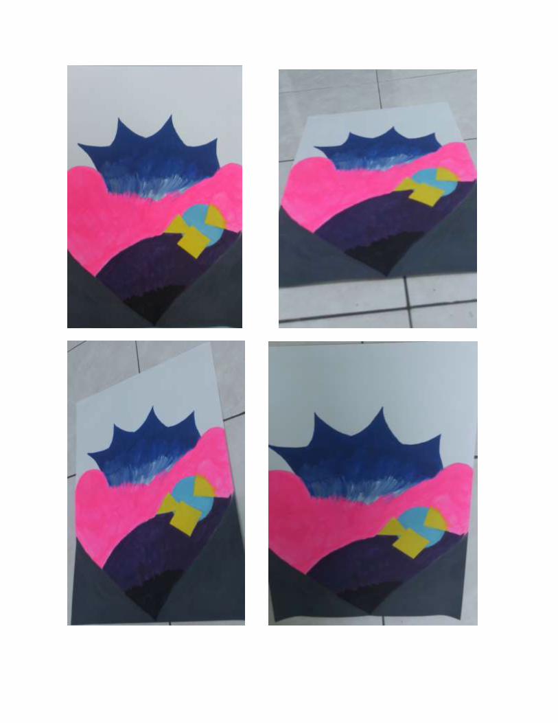
I have created a painting based on my personality. The colour combination used in my artwork strongly brings out my personal identity. I have painted the colours deep in my heart as I use a heart as my main subject in my artwork. There are thorns on the upper part of the heart, which means the outer part of me, and they are in blue colour. It shows the coldness and unfriendliness of me when people don’t get know of me. As the blue colour slowly turns lighter downwards, and mixed with a little bit white colour, it slowly reflects the real personality of me. The pink colour occupied most of the spacein my heart shows that I am intuitive and insightful. But I am lack of will power, lack of self-reliance and lack of self-worth. Moreover, I am overly emotional and overly cautious nature. There is a small part in my heart fill with yellow colour and light blue. Those are the things in my thought. Those things are complicated and causes emotional and depression. The light blue part helps to calm down my mind. Deep down inside of me, there is violet colour. I have my own quality but also inferiority. The lowest part of the heart is secured with black colour. There is heaviness down there and it absorbs all the energy coming towards me, and enshrouds my personality.

REFERENCES
1. http://www.colourtherapyhealing.com/colour/
2. http://en.wikipedia.org/wiki/Color
3. http://www.colourtherapyhealing.com/colour/colour_history.php
4. http://www.worqx.com/color/color_systems.htm
5. http://www.colormatters.com/color-and-design/color-systems-rgb-and-
cmyk
6. http://www.colormatters.com/color-and-design/basic-color-theory
7. http://www.craftsy.com/blog/2013/05/hues-tints-tones-and-shades/
8. http://en.wikipedia.org/wiki/Color_psychology
9. http://en.wikipedia.org/wiki/Color_psychology#Uses_in_marketing
10. http://en.wikipedia.org/wiki/Color_psychology#Attracting_attention
11. http://11eleven-life.blogspot.com/2011/01/psychological-effects-of-
colors.html
12. http://psychology.about.com/od/sensationandperception/a/colorpsych.
htm
13. http://www.colour-affects.co.uk/psychological-properties-of-colours
14. http://www.empower-yourself-with-color-psychology.com/cultural-
color.html