choosing and visualizing waiting time indicators in ... · choosing and visualizing waiting time...
TRANSCRIPT

Choosing and visualizing waiting
time indicators in diagnostic
medical imaging department for
different purposes and audiences Author: Anisia Fotiadou
Master's Programme in Health Informatics
Spring Semester 2013
Degree thesis, 30 Credits
Author: Anisia Fotiadou
Main supervisor: Lucy Hederman, School of Computer Science and Statistics,
Trinity College Dublin
Co supervisor: Vasilis Hervatis, Dept of LIME, Karolinska Institutet
Examiner: Sabine Koch, Dept of LIME, Karolinska Institutet

Master's Programme in Health Informatics
Spring Semester 2013
Degree thesis, 30 Credits
Choosing and visualizing waiting time indicators in
diagnostic medical imaging department for different
purposes and audiences
Abstract
Background: Providing information regarding waiting times in a diagnostic
medical imaging department via an information system can facilitate quality and
performance improvement.
Objective: The purpose of this study is to acquire new knowledge regarding the
ways of choosing between different waiting time indicators according to the
specific purposes and stakeholders of a diagnostic medical imaging department in
a public hospital and propose an initial design for a system presenting visualization
for such indicators.
Methods: The study employed methodological triangulation. First, clinical
operational data from St. James’s Hospital’s radiology department was analysed in
order to reach conclusions regarding the features of waiting time indicators.
Subsequently, a qualitative study including in-depth interviews was performed. The
selection of participants was strategic. Representatives of most categories of
potential audiences of the system were interviewed. Thematic content analysis was
performed on the interviews.
Results: The interviews confirmed the results of data analysis that the most
informative and useful indicator is the X Percentile, while Median and Average
waiting time indicators are also useful as complementary indicators. The study

showed that the purposes of the indicators are to obtain a dynamic view of the
situation, detect the constraint points, provide an overview of performance,
facilitate resource allocation, comparison between hospitals, better informed choice
of alternative hospitals or exams and transparency.
Conclusion: The study suggests an interactive information system which will
primarily present the X Percentile indicator using speedometers as a visualisation
technique, but will also allow the user to seek for more detailed information.
Keywords: waiting lists, quality indicators, radiology, diagnostic
imaging, quality improvement

iv
Acknowledgements
I would like to express my gratitude to my supervisor Lucy Hederman for her
tremendous support and engagement through the learning process of this master
thesis. Without her encouragement and guidance this project would not have been
possible. Furthermore, I would like to thank Niall Sheehy and Seán Cournane for
introducing me to the topic and for their support and help on the way. Additionally,
I would like to express my appreciation to my co-supervisor Vasilis Hervatis for
his comments and help. Finally, I would like to thank the participants in my study,
who have willingly shared their time during the process of the interviewing.

v
Table of contents
Glossary / List of abbreviations .............................................................................................. viii
List of figures ............................................................................................................................ ix
List of tables ............................................................................................................................... x
1. Introduction ...................................................................................................................... 1
1.1. Background ............................................................................................................... 1
1.2. Problem definition .................................................................................................... 5
1.3. Aims .......................................................................................................................... 5
1.4. Research questions .................................................................................................... 5
2. Methods ............................................................................................................................ 7
2.1. Study design .............................................................................................................. 7
2.2. Study flow ................................................................................................................. 8
2.3. Data acquisition ........................................................................................................ 9
2.3.1. Clinical operational data........................................................................................ 9
2.3.2. In-depth interviews .............................................................................................. 10
2.4. Data analysis ........................................................................................................... 11
2.4.1. Clinical operational data...................................................................................... 11
2.4.2. In-depth interviews .............................................................................................. 12
2.5. Ethical considerations ............................................................................................. 13
3. Results ............................................................................................................................ 14
3.1. Data analysis ........................................................................................................... 14
3.1.1. List of indicators.................................................................................................. 14
3.1.2. Average or Median? ............................................................................................ 16
3.1.3. Point-in-time or time period data? ...................................................................... 17

vi
3.1.4. X Percentile ......................................................................................................... 18
3.2. In-depth interviews ................................................................................................. 20
3.2.1. Participants’ general and decision-making responsibilities ................................ 20
3.2.2. Information useful for decisions ......................................................................... 21
3.2.3. Information available now .................................................................................. 21
3.2.4. Which purposes would waiting time indicators help serve? ............................... 22
3.2.5. Evaluation of proposed indicators ....................................................................... 24
3.2.6. Indicators proposed by participants .................................................................... 26
3.2.7. Visualisation options ........................................................................................... 26
3.2.8. Level of interaction ............................................................................................. 28
3.2.9. Additional comments .......................................................................................... 28
4. Discussion ...................................................................................................................... 29
4.1.1. Sub-question 1 ..................................................................................................... 29
4.1.2. Sub-questions 2 and 3 ......................................................................................... 30
4.1.3. Sub-question 4 ..................................................................................................... 32
4.2. Strengths and weaknesses of the study ................................................................... 32
4.3. Results in relation to other studies .......................................................................... 33
4.4. Meaning and generalizability of the study .............................................................. 34
4.5. Future research ........................................................................................................ 34
5. Conclusions .................................................................................................................... 36
References ................................................................................................................................ 38
Appendix A - Weekly Average O-C algorithm ....................................................................... 42
Appendix B - Interview guide .................................................................................................. 47
Appendix C - Choices of visualisations ................................................................................... 49
Appendix D - Ethics approval .................................................................................................. 53

vii
Research ethical application form .................................................................................... 53
Information sheet for participants .................................................................................... 55
Informed consent form ..................................................................................................... 56
Approval e-mail ............................................................................................................... 59

viii
Glossary / List of abbreviations
EPR Electronic Patient Record
PACS Picture Archiving and Communication System
RIS Radiology Information System
NESWTDC National Elective Surgery Waiting Time Data Collection
MRI Magnetic Resonance Imaging
GP General Practitioner
NHS National Health Service
NTPF National Treatment Purchase Fund
KPI Key Performance Indicators
VBA Visual Basic for Applications
TCA Thematic Content Analysis
ix
List of figures
Figure 1: The simplified workflow of the diagnostic medical department of St. James’s Hospital
....................................................................................................................................................... 14
Figure 2 Average O-C and Median O-C for all types of patients, year 2011, MRI ..................... 16
Figure 3 Average O-C for inpatients and outpatients, year 2011, MRI ........................................ 17
Figure 4 Distribution of frequency for waiting times (O-C) MRI, inpatients, year 2011 (Note:
Frequency is presented in logarithmic scale) ................................................................................ 19
Figure 5 Distribution of cumulative percentage of frequency for waiting times (O-C) MRI,
inpatients, year 2011 ..................................................................................................................... 19
Figure 6 Example of waiting time indicator's visualisation as a graph ........................................ 27
Figure 7 Using speedometer metaphor to visualise indicators ..................................................... 27

x
List of tables
Table 1 Waiting time and list indicators ......................................................................................... 3
Table 2: Description of data fields of the acquired data ................................................................. 9
Table 3 List of data fields used for the analysis of data................................................................ 12
Table 4: Waiting time and list indicators (expanded) ................................................................... 15

1
1. Introduction
1.1. Background
Diagnostic medical imaging departments nowadays are expected to implement quality, safety and
performance improvement programs (1). According to the second report from the Institute of
Medicine Crossing the Quality Chasm (2) there are six aims for improvement in healthcare. More
specifically, health care should be safe, effective, patient-centered, timely, efficient and equitable
(STEEEP). In the case of diagnostic imaging departments the timeliness of health care, which
according to the report can be achieved by “reducing waits and sometimes harmful delays for both
those who receive and those who give care” (2), can be significantly improved by providing
reliable and valid information regarding the waiting times (3). According to Kruskal B. et al in
their study concerning quality improvement in radiology “the initial step is the gathering of
relevant information, followed by the collection and analysis of quality and performance data”(1).
Nowadays a big amount of data deriving from different information systems, such as RIS
(Radiology Information System), PACS (Picture Archiving and Communication System) and EPR
(Electronic Patient Record), is being collected in each diagnostic medical department; however, in
order to make it useful and meaningful, this data should be appropriately managed and presented
to the right audience at the right time. In this case, it can prove to be a powerful tool that facilitates
decision making. The Healthcare Financial Management Association (4) states in its educational
report that data needs to be easily accessible and in a format that facilitates decision making. It is
added that “essentially, it is about having the right metrics categorized and summarized in the right
ways for the right audience” (5) In order to facilitate the processing of the data, visualisation is
used, which is defined as “situations when quantified data which by itself is not visual…is
transformed into a visual representation”(6).
More specifically, the operational data extracted from the clinical information systems can be
processed in order to generate indicators relevant to waiting times. Various definitions have been
proposed in order to determine clinical indicators, such as:
Clinical indicators are tools used for measuring a process or outcome(7).
A quantitative measure of an aspect of patient care that can be used as a guide to monitor and
evaluate the quality and appropriateness of health care delivery(8).

2
Clinical indicators are used in order to measure certain aspects of health care delivery and
inform the appropriate people in charge in order to facilitate decision making. There are various
types of quality clinical indicators. Waiting time indicators are a type of process indicators(1). In
order to promote the quality of healthcare, indicators are used to analyse the processes, see the
changes that occur through time, propose improvements to the processes and apply those
improvements. The use of clinical indicators can serve a variety of purposes, e.g. facilitate decision
making, facilitate the comparison of performance of different hospitals, etc. According to Rubin
Daniel, “radiology departments need to define for themselves a set of indicators and benchmarks
that need to be established as part of a quality improvement program”(9).
In order to get a deeper understanding of how waiting lists are formed, it would be useful to
present certain fundamental terms. According to the National Health Service (NHS) of United
Kingdom one of the main reasons for the development and increase of waiting lists is the variation
or mismatch in capacity and demand (10). NHS provides us with the following definitions:
Demand: All the requests (in case of radiology scan orders) coming from all sources and how
many resources they need.
Capacity: Resources available to do work.
Activity: All the work done. The activity is often less than available capacity.
Backlog: Previous demand that has not been yet dealt with, appearing as a backlog of work
(or waiting list). It appears when demand exceeds capacity.
Calculating the above mentioned measures can help improving the entire patient process by
detecting where the problem lies and taking action in order to solve it. It facilitates the
understanding of the reasons why the backlog or waiting lists form and therefore is a useful tool
to avoid them. It is essential in order to avoid waiting lists growing excessively.
A search of literature about quality indicators related to waiting times and lists resulted in the
list of indicators presented in Table 1. Those are the indicators that have already been proposed or
used in information systems related to radiology and other medical fields.

3
Table 1 Waiting time and list indicators
Indicator Description
Average time The average time from the reception of the order to completion of
image acquisition (11)(12)
Median time (or 50th Percentile) The time within which 50% of the scans were completed
90th Percentile The time within which 90% of the scans were completed
Percentage meeting benchmark The percentage of scans that were completed within the
established benchmark time (12)
Proportion of patients waiting more
than N
Proportion of patients waiting for more than a certain specified
amount of time (13)
Waiting list Number of orders which have been received, however the scan
has not been completed yet
Referral wait time for routine
outpatient diagnostics
The length of time to the next available referral appointment slot
for a scan
It should be noted that according to the definition given by the Canadian Institute for Health
Information, benchmarks “express the amount of time that clinical evidence show is appropriate
to wait for a procedure”(14). The benchmarks referring to diagnostic medical imaging have not
been established in many countries, therefore this indicator cannot be used universally.
Potential audiences that could benefit from the information conveyed by waiting time indicators
include the following categories:
Clinicians: including hospital doctors, radiologists, GPs.
Management positions: this category includes people making managerial decisions. They
could work in hospitals, organizations relevant to healthcare or government.
Patients
In order to achieve the desirable effect, the waiting time indicators should be calculated and
presented to the above mentioned audiences at the right time. Use of informatics methods could
play a significant role in this process. Several attempts have already been made in this area. One
of the most prominent examples is the web site (14) created by the Canadian Institute for Health
Information in the framework of the “10-year plan to strengthen health care” in Canada (15). This
web site displays the waiting times in five priority clinical areas including diagnostic imaging (12).

4
Another initiative in the framework of the same attempt in Canada is the Ontario Wait Time
Information Program which also included the development of a website that provides information
regarding waiting times (16). Similar attempts, though in another department such as elective
surgery, have been made in Australia with the National elective surgery waiting times data
collection (NESWTDC) published online (17). Both the Canadian program and the Australian
publication mention the 90th Percentile waiting time indicator, however without any justification
of its usage. Another example of presentation of different indicators, including waiting time
indicators, would be the automated web-based graphical dashboard developed by Paul G. Nagy et
al (11) which is used to display waiting time indicators amongst other types of metrics.
In Ireland, where this study took place, the National Treatment Purchase Fund (NTPF) (18)
along with the Department of Health (19) and Health Service Executive (20), which is responsible
for providing health and personal social services for the Republic of Ireland, has established the
National Waiting List Management Policy according to which information technology should play
a role in planning, managing and improving the quality, reliability and safety of provided
healthcare and support effective decision-making. Additionally, it suggests that the hospitals
should develop data information Key Performance Indicators (KPI) and that “waiting time
performance dashboard should be implemented and produced weekly by the dedicated executive
lead for the waiting list management project groups and should include overall hospital KPI’s…”.
The NTPF also provides the public with information regarding national waiting list data, however
radiology is not yet included.
HealthStat is a performance information and improvement system which consists of a databank
of performance information concerning Irish public health care. It is developed by the Health
Service Executive and provides monthly results of different hospitals that are published online
(21). Those results are presented in the form of metrics (indicators) including indicators that
concern waiting times. The only indicator relevant to waiting times in diagnostic medical imaging
presented by the HealthStat is the “GP to Hospital Referral Wait Times for Routine Outpatient
Diagnostics” (which include Ultrasound, X-Ray, CT and MRI) which represents the length of time
to the next available appointment slot for diagnostic medical imaging procedure (22).

5
1.2. Problem definition
Due to the importance of providing waiting times information in timely and appropriate manner
for decision support, there is a need for more profound and systematic research regarding waiting
time indicators, their usability, their purposes and characteristics as well as the appropriate ways
to visualize them in order to optimize their usability. Different indicators have been used so far,
without a sufficient justification of their choice (such as the 90th percentile). There is a room for
further investigation regarding the preferences of the different potential audiences concerning
which information would be useful to them, for which purposes and how they would prefer it to
be presented.
1.3. Aims
The overall aim of this study is to investigate how the data that derives from the clinical
information systems in a diagnostic medical imaging department can be used in order to support
effective time and resource management. This study aims to define the features and purposes of
waiting time indicators in order to produce new knowledge regarding the ways of choosing
between them according to different stakeholders of a diagnostic medical imaging department in
a public hospital. Additionally, the study aims to establish the preferences of the above mentioned
stakeholders regarding which information would be useful to them, for which purposes and how
they would prefer it to be presented. The results will inform the design of an information system
which will present visualization for waiting time indicators in a diagnostic medical imaging
department, including suggestions for which waiting time indicators should be presented and
which visualisation option should be used.
1.4. Research questions
Main research question How to choose and visualize waiting time indicators calculated from the
data extracted from information systems (such as EPR, RIS and PACS) using informatics in order
to achieve effective time and resource management in a diagnostic medical imaging department
of a public hospital?
In order to answer the main research question, the following sub-questions will be addressed:
Sub-question 1: What features of waiting time indicators can be defined based on the data extracted
from RIS, PACS and EPR that are relevant for choosing between them?

6
Sub-question 2: What purposes could the waiting time indicators serve?
Sub-question 3: Which of the waiting time indicators is the most appropriate for which purpose?
Sub-question 4: How do the preceding questions inform the design of a waiting time indicator
visualization interface? (Which indicators should be included and how should they be visualized?)

7
2. Methods
In this chapter the study design and the study flow are presented. The methods used for data
acquisition and analysis are also described along with the ethical considerations.
2.1. Study design
In order to provide answers to the research questions an applied analytical study was performed.
An applied study “aims at finding a solution for an immediate problem”(23). The research can also
be characterized as inductive, since general inferences were induced based on specific examples
from reality and inductive reasoning moves from specific to general (24). The strategy used in the
research was triangulation. It can also be characterized as methodological triangulation, as it is
using more than one research method and data collection technique (25). More specifically, the
study followed a qualitative approach, including in-depth interviews, along with other
complementary qualitative and quantitative techniques. Triangulation is preferred over pure
qualitative or quantitative approach for completion purposes, as it helps to increase the
understanding of the subject under study, and to provide more valid and reliable results.
In more detail, the research initiated based on the extensive literature review which was
performed in order to determine which waiting time indicators have already been proposed and
visualised. The next step was an analysis of the clinical data deriving from the information systems
of a diagnostic medical imaging department of a public hospital. The data was used in order to
mathematically calculate the indicators (established in the literature review and analysed later) and
make some initial conclusions regarding their features and characteristics. This step was necessary
in order to gain a deeper understanding of the nature of waiting time indicators and also it
facilitated the interviews that followed. The study continued with the conduct of in-depth
interviews of the participants and concluded with the analysis and synthesis of all the previous
findings, resulting in an initial design proposal for a system which will visualize the waiting time
indicators in a medical imaging department.
This approach was chosen for a number of reasons. The first part provides an insight of the
nature of data that can be collected in a diagnostic medical imaging department and the ways it
can be used. It gives an idea of what kind of data is needed in order to calculate the indicators,
what are the characteristics of the different indicators and what kind of conclusions can be made
from that.

8
Subsequently, a phenomenological approach was followed including in-depth interviews which
provide a perspective on the needs of the different potential audiences. This approach was chosen
because it helps to identify the individual perspective of the audiences on the subject. The in-depth
interviews were chosen over other data collection methods because they provide much more
detailed information regarding the subject under study. The interviewees can reveal much more
concerning their preferences and opinions. It also gives the opportunity to clarify certain points
during the conversation, in case there are uncertainties. The interviews can also vary according to
the position of the interviewee. It is also a more flexible tool that provides the interviewer with the
opportunity to lead the interview in more efficient way depending on the responses. However,
there are certain biases. Most importantly, due to the nature of the in-depth interviews it is only
possible to obtain a limited number of them. Therefore the results cannot be generalized, as they
express only the opinions of certain individuals. The quality of the collected information can also
depend on the interviewer’s skills. An attempt has been made to perform interviews in unbiased
manner, which was achieved by not using leading questions and letting the participants freely
express their opinions. An attempt was also made to collect accurate and sufficient information
and to include interviewees that represent all the possible different audiences.
2.2. Study flow
The study initiated on 13th of January when the first meeting was held with the clinical director of
the radiology department of St. James’s Hospital and the main supervisor of the research. The
initial meeting was followed by a literature review and background research. The literature review
along with the development of the project plan lasted until beginning of February. Subsequently,
the clinical operational data was acquired from the radiology department of St. James’s Hospital.
Several meetings followed with the staff of the hospital in order to facilitate the analysis of the
data. The analysis of the data and the interpretation of the results lasted until end of March. During
the same period an ethics application was prepared in order to obtain ethical approval for the
conduct of the research. Also, the interviewees were identified and contacted and the interview
guide was developed. The interviews were carried out during the first two weeks of April. The
transcription and analysis of the results followed until the end of April. The report was finalized
by the 17th of May.
9
2.3. Data acquisition
2.3.1. Clinical operational data
The study initiated with analysis of clinical operational data. This data was acquired from the
diagnostic medical imaging department of St. James’s Hospital in Dublin, Ireland. A central
database was recently developed in order to collect data that derives from all the information
systems that are currently used by the department. More specifically the information systems are:
RIS (Radiology Information System), PACS (Picture Archiving and Communication System) and
EPR (Electronic Patient Record). The data used in this study was anonymised in order to protect
the confidentiality of the patients involved and did not include any sensitive personal information.
The data that was analysed during this study concerns the time period between 01/01/2010 and
31/12/2012. It refers to the MRI modality, which was chosen as a representative one. The analysis
included only one modality due to time limitations; however the results can be extended and
generalized to other modalities as well. In order to ensure the validity of data, the data from the
common database was compared to the one from EPR, which is the original data, and the average
accuracy was estimated at 98% with a standard deviation of 0.7, which is a satisfactory percentage
of accuracy for the purposes of this study. More specifically, the data used in this study included
the following fields:
Table 2: Description of data fields of the acquired data
Field Description
ORDER_DATE_ID The date when the exam was originally ordered
ORDER_ID The unique identifier of the order
ACCESSION Accession number, identifies the modality, the year and the position of the order
EPISODE_NO The unique number of the episode which led to the exam
order
MODALITY The modality (MRI, CT, ultrasound)
EXAM The type of the exam (e.g. brain general, spine full etc.)
PATIENT_STATUS Patient status (public, private, semi-private)
ORDER_PHYSICIAN_FULL_FORMATTED Full name of the physician who placed the order
ORDERING_SPECIALTY_CODE The code of the specialty placing the order (e.g.
neurology, geriatric etc.)

10
PRIORITY Priority (routine or urgent)
LOCATION Location where the order is made
ORIG_ORDER_DT_TM The date and time of the original exam order
REQUEST_DT_TM The requested date and time of the exam
VETTING_DT_TM The date and time of vetting if it was carried out
ORIGINAL_SCHEDULED_DATE The date and time for which the exam was ordered
CANCEL_DT_TM The date and time of the cancellation of the exam (if
cancelled)
START_DT_TM The date and time when the exam was started
COMPLETE_DT_TM The date and time when the scan was completed
CHECK_IN_DATE The date and time of the check in of the patient
DICTATED_DATE The date and time of dictation by the radiologist
FINAL_DATE The date and time when the report was finalized
CANCELLED_BY Name of the person who cancelled the exam (if cancelled)
CANCELLED_REASON The reason for the cancellation (if cancelled)
CANCELLED_BY_POSITION The position of the person who cancelled the exam (if
cancelled)
ENCOUNTER_TYPE The type of encounter (outpatient, inpatient, emergency)
2.3.2. In-depth interviews
Additional data was acquired through in-depth interviews. Five in-depth interviews were
performed. The interviews were performed based on the developed interview guide, as in
Appendix B. The guide was facilitating the conduct of the interview, however the structure of the
interviews was not very strict, depending on the flow of the conversation with certain variations
based on the position and role of the participant. In the beginning, the interview focused on the
responsibilities and workflow of the participants, what kind of decisions they are making, what
kind of information would facilitate those decisions and whether it is available for them now or
not. Then the interview focused on the waiting time indicators, whether they would consider them
useful or not, which purposes they would help serve, which indicator they would consider to be
the most useful. In the final part the participants were asked to give their opinion regarding the
different visualisation options (Appendix C) and features of a potential information system.
It should be noted that the participants can be characterized as informants rather than
respondents, who according to the definition given by Lewis-Beck et al are “individuals who are

11
interviewed in a more in-depth, less structured manner (semi-structured, un-structured interviews),
most often in a field setting”(26). The sampling technique was purposeful sampling. That means
that the selection of the participants was strategic and not random. Maximum variation was the
most important principle in order to ensure heterogeneity (27). An attempt was made to include
representatives of all the categories of potential audiences of an information system which would
present information regarding waiting times in a diagnostic medical department of a healthcare
facility. Some of the participants in the interviews served double positions. The positions
represented by the participants are the following:
Consultant radiologist
Consultant Physician
General Practitioner (GP)
Clinical Director
Clinical Lead
Director of Performance Improvement
The participants were interviewed in their own settings.
2.4. Data analysis
2.4.1. Clinical operational data
During the literature review a list of waiting time and list indicators was established. The next step
was to analyse the data acquired from the diagnostic medical imaging department of the hospital.
The analysis was made using Microsoft Excel and Visual Basic for Applications (VBA) software.
First, the data was observed in order to obtain an understanding of the workflow and the steps of
the process. The list of indicators was updated based on those findings. Subsequently, using the
above mentioned software tools, some of the indicators from the updated list were calculated. In
order to calculate the indicators, the first step was to identify the fields of the data that were
necessary for the calculations. Those fields are presented in the following table (Table 3).

12
Table 3 List of data fields used for the analysis of data
Field Description
ORDER_DATE_ID The unique ID of the date when the exam was originally ordered
EPISODE_NO The unique number of the episode which led to the exam order
ORIG_ORDER_DT_TM The date and time of the original exam order
COMPLETE_DT_TM The date and time when the exam was completed
FINAL_DATE The date and time when the report was finalized
ENCOUNTER_TYPE The type of encounter (outpatient, inpatient, emergency)
Additionally, the data was checked for missing values. The Average time, Median time, X
Percentile (all types) and Waiting list indicators (listed in Table 4) were mathematically calculated
and visualized in different types of graphs (e.g. line or bar charts). The indicators were calculated
weekly and monthly. The rest of the indicators mentioned in Table 4 could not be calculated either
due to lack of established benchmark (Percentage meeting benchmark, Proportion of patients
waiting more than N) or due to insufficient data (Time to next slot).
For example, in order to calculate the weekly average time between the time the exam was
ordered and the time it was completed for different types of patients (inpatients, outpatients,
emergency), the following steps were followed:
1) The difference between the date and time of the order and the completion of it
(COMPLETE_DT_TM – ORIG_ORDER_DT_TM).
2) The week number was established for each order (e.g. the order which was made on 04/01/2011
relates to week number 2).
3) An algorithm was developed which calculates the average length of waiting time each week
taking into account the different types of patients and producing results for each type (the
algorithm can be found in Appendix B).
After the calculation of the indicators, the results and the created charts were analysed in order to
reach logical conclusions regarding the features of different types of indicators and their
characteristics. The results are covered in section 3.1.
2.4.2. In-depth interviews
The next step after the conduct of the in-depth interviews was transcription. After all the interviews
were transcribed, Thematic Content Analysis (TCA) was applied. TCA is a descriptive

13
presentation of qualitative data, which has the form of interview transcripts (28). The following
steps were followed during the analysis:
All the parts of the transcripts that were not relevant to the topic of inquiry were identified and
excluded.
From the remaining parts of the transcripts, each distinct unit of meaning was marked. This
means that each interview was broken into smaller units, according to their meaning.
Units similar in their meaning were put together and labeled with particular keywords taken
from the text. In this way several themes emerged.
All the themes were read again and units were redistributed in case it was needed.
In the end a certain number of final themes were determined. The result was a descriptive
presentation of those themes based on the answers of the participants, including a number of
direct quotes.
The results of the analysis are covered in section 3.2
2.5. Ethical considerations
The clinical operational data used in the current study was anonymised and therefore non-
identifiable. A necessary subset of data was used and no individual could be identified from it,
thus protecting the patients’ private and sensitive information.
In order to perform the interviews, a research ethical approval was obtained from the School of
Computer Science and Statistics of Trinity College Dublin (the application form, the information
sheet for participants, the informed consent form and the copy of the approval e-mail can be found
in Appendix D). There was no relationship between the researcher and the interviewees; therefore
the objectivity of the study was not compromised. There was also no conflict of interests. The
nature of participation was voluntary. The participants were informed of the nature and goals of
the research as well as of their right to withdraw, to make questions and to review any direct quotes.
A written consent was requested in order to audio tape the interview and to reveal the identity of
the participant in case it was necessary for the purposes of the research.

14
3. Results
This chapter presents the results of the analysis of data collected for this research. In the first
section the results of the operational clinical data analysis are described. The results of the analysis
of in-depth interviews are described in the second section.
3.1. Data analysis
3.1.1. List of indicators
By observing the clinical operational data from the diagnostic medical imaging department of St.
James’s Hospital, it became obvious that the list of waiting time and waiting list indicators in Table
1, drawn from the literature, is somehow limited and that this list could be expanded.
Analysis of data as well as personal communication with the staff of the hospital indicated that
the simplified version of the workflow of the department follows 3 basic steps. First the order for
the scan is made by the hospital doctor (or a GP, who is not affiliated with the hospital). During
the next step the ordered scan is performed and completed. However, in certain occasions for a
number of reasons the order can be cancelled. In this case the procedure ends at this point. As a
final step a radiologist finalizes the report related to the performed scan. This description derives
from the available data and shows only the basic steps of the process. The process is depicted in
the following Figure 1:
Figure 1: The simplified workflow of the diagnostic medical department of St. James’s Hospital

15
The process described above indicates the existence of 3 different types of waiting times:
Time from the moment the order is received until the scan is completed (O – C)
Time from the moment the scan is completed until the report is finalized (C – F)
Time from the moment the order is received until the report is finalized (O – F)
Additionally, it should be noted that 90th percentile is not the only option that can appropriately
indicate the waiting time of the patients. Possibly, in certain occasions (or modalities) another
percentile would indicate the waiting time in a more helpful way for the audience (eg 75th or 80th
percentile).
Moreover, the indicator “Referral wait time for routine outpatient diagnostics” can be
generalized as well. Here, it will be defined as “Time to next slot”
Based on the above observations, Table 1 can be expanded to Table 4:
Table 4: Waiting time and list indicators (expanded)
Indicator Description
Average time O-C The average time from the reception of the order to completion
of scan (11)(12)
Average time C-F The average time from the completion of scan to the finalization
of report
Average time O-F The average time from the reception of the order to the
finalization of report
Median time O-C The time within which 50% of the scans were completed
Median time C-F
Median time O-C
The time it takes for 50% of completed scans to lead to finalized
reports
The time it takes for 50% of the received orders to lead to
finalized reports
X Percentile O-C
X Percentile C-F
X Percentile O-F
The time within which X% of the scans were completed
The time it takes for X% of completed scans to lead to finalized
reports
The time it takes for x% of the received orders to lead to finalized
reports
Percentage meeting benchmark The percentage of scans that were completed within the
established benchmark time (12)

16
Proportion of patients waiting more
than N
Proportion of patients waiting for more than a certain specified
amount of time (13)
Waiting list Number of people waiting at the moment (scans for which the
order have been received, however the scan has not been
completed yet)
Time to next slot The length of time to the next available appointment slot for a
scan
Finally, it should be mentioned that the indicators can be calculated separately for all different
types of patients (outpatient, inpatient and emergency).
3.1.2. Average or Median?
Figure 2 Average O-C and Median O-C for all types of patients, year 2011, MRI

17
The analysis of the data shows that in most cases there is a small number of people who are waiting
for a long time, even though the majority is not, therefore the distribution is not normal. These few
cases influence the average and as a result it does not represent the real picture. In this case median
is a more informative indicator of the real situation. An example of the difference between average
and median is represented on Figure 2. The data concerns all types of patients waiting for an MRI
scan in 2011.
3.1.3. Point-in-time or time period data?
In order to answer the question whether the data used for the calculation of presented indicators
should be for the current point-in-time or for a larger time period the fluctuations of the waiting
times were observed. The conclusion of the observation was that in most cases, except for
emergency patients, the waiting times change abruptly from day to day, therefore point-in-time
data would not be very helpful.
Figure 3 Average O-C for inpatients and outpatients, year 2011, MRI

18
For example, as we can see on Figure 3, during the week 11th-17th of April 2011 the average
waiting time for the outpatients was 68 days, however the following week 18th-24th of April 2011
the average waiting time was 31 days.
3.1.4. X Percentile
As mentioned previously, in chapter 3.1.2, the distribution of waiting times in diagnostic medical
imaging in most cases is not normal and is positively skewed. This occurs due to few cases that
wait for a very extensive period of time. The X Percentile indicator can exclude these cases. For
example, on Figure 4 we can see that the majority of inpatients are waiting for not more than
approximately 10 days and there are only few cases that wait longer than that. (The frequency on
Figure 4 is presented on logarithmic scale in order to reduce the wide range of values and make
the representation easier to interpret). From Figure 5, where we can see the distribution of
cumulative percentage of the frequency, we can see that this number corresponds to approximately
90-95% of the cases. The conclusion is that in this case, 90th Percentile or 95th Percentile would
be an appropriate indicator. However, this number might differ for different modalities, types of
patients, etc. This analysis is based on a conversation with a staff member of radiology department
of St. James’s Hospital (Seán Cournane 2013, oral conversation, April).

19
Figure 4 Distribution of frequency for waiting times (O-C) MRI, inpatients, year 2011 (Note: Frequency is
presented in logarithmic scale)
Figure 5 Distribution of cumulative percentage of frequency for waiting times (O-C) MRI, inpatients, year 2011

20
3.2. In-depth interviews
The following section presents the results of the analysis of the in-depth interviews. During the
analysis a number of themes were identified based on the answers of the participants. The list of
the identified themes include the participants’ general and decision-making responsibilities,
information which is useful for their decisions, information which is available to the participants
at the moment, which purposes would the waiting time indicators help serve, evaluation of the
proposed indicators, new indicators proposed by participants, visualisation options and the level
of interaction of the information system.
3.2.1. Participants’ general and decision-making responsibilities
The participants gave a brief description of their responsibilities and the decisions they are making
during their workflow. Some of the responsibilities can vary in different hospitals and
organizations, however the main description is the same.
The responsibilities of a physician related to radiology mainly concern the ordering of tests
(scans). The decision is often made in collaboration with a radiologist. The urgency of the
procedure is also decided by physicians.
Consultant radiologists examine, interpret and report the results of a diagnostic test. In some
cases radiologists perform some interventional procedures as well. They review the orders and
decide upon their clinical appropriateness. Another one of their responsibilities is to provide
consult service to physicians and discuss individual cases and management decisions.
The responsibilities of a GP relevant to radiology is to refer the patients for an exam (scan) to
a hospital. They decide upon which type of exam should be performed and also which hospital to
refer the patient to. At the moment in Ireland GPs can refer patients to any hospital of their choice,
however they have different level of accessibility to procedures depending on the part of the
country where they are located. For example, in some places GPs only have access to emergency
departments and in others they can also refer patients for X-ray scans or even CT and MRI scans.
The duties of people who are responsible for the management inside the hospital (such as
Clinical Directors) are to overview particular departments from a clinical point of view and from
the point of view of efficiency. They have to ensure safety, efficiency and productivity. An

21
important part of this process is resource allocation. Management of the waiting times inside the
particular department or the whole hospital also falls under their responsibilities.
The final category are people who are making decisions on national level (such as Primary Lead
or Director of Performance Improvement). They are responsible for structural and operational
changes in order to improve the care services in the country. With the goal of reducing the
excessive waiting times they investigate the reasons of why they are formed. They compare
national waiting times and intervene for example by producing guidelines or care pathways for
clinicians in order to improve the situation.
3.2.2. Information useful for decisions
The information necessary for the physicians as well as GPs is how long the waiting time for each
modality is. However, it should be mentioned that while a physician is referring for certain
procedure, the input of the consultant radiologist is also very important for the final decision.
From the point of view of consultant radiologists, in order to make informed decisions they
would need information regarding the waiting times in different modalities for different types of
patients. Knowing which modalities have a very long waiting time would influence their decisions
and the suggestions that they make to physicians during the meetings. Additionally, they would
need to know how urgent is the referral, what are the clinical indications and the type of the patient
(public or private).
According to a clinical director, the information needs of people managing the hospital would
include the number of orders coming in (activity), the capacity, the absolute number of people on
the waiting list and the approximate time it takes them to get examined. Additionally, it would be
useful to have an idea of the maximum waiting time.
In order to make decisions on national level, information regarding the waiting times of each
hospital is needed. This would include the waiting times during all the stages, since the order is
made until the final report. Ideally, the same information should be available for each hospital in
order to make the results comparable.
3.2.3. Information available now
The information available at the moment to the clinical and managerial staff of the hospital is
mostly limited to the maximum amount of time that the patient will wait for a test. This can be

22
estimated by detecting the next available slot for a test. This kind of information can be extracted
from the appointment schedule. According to the consultant physician personal communication
plays an important role for gathering of information. Attempts have been made to deal with the
cases of patients who wait for an excessive amount of time (for example by communicating with
them and enquiring whether they still want to go through with the procedure) which are not
considered successful. More specifically, clinical director №1 mentioned considering the way the
excessive waiting times were managed until recently:
“I don’t think they ever tried to estimate the number of orders coming in on daily basis
and they really just focused on people who were longest on the list. They would simply ring
people if their waiting time was a year and ask them if they still want the test. As it turns
out most of the people said they want the test, so it didn’t work very well.”
GPs are not provided with any information regarding waiting times at all. The only way of
getting an approximate indication of the possible waiting time is upon communication with the
hospital in order to schedule a procedure for a patient. However, this information can still be quite
inaccurate. When asked about whether there is currently any information available the GP №1
mentioned:
“No, except the sort of information I gather when I ring up to get an appointment for a
patient, then I get an idea. They say the patient should come in let’s say 2 weeks and
you’re asked to send in the request form and the hospital sends out an appointment to the
patient, but then you’re never sure how long that’s going to be. So it’s some sort of
indication, but I think you need more than just an indication.”
The only information available to decision makers outside of the hospital environment derives
from HealthStat system (mentioned in the introduction). This information is very limited and
incomplete.
3.2.4. Which purposes would waiting time indicators help serve?
According to the participants the visualization of the waiting time indicators would be useful and
it would help to serve the following purposes:
Obtain a more dynamic view of the situation: The indicators help to obtain a dynamic view
of the situation of each modality. People are still used to the paper based system which follows
the pile system, without considering the general tendency of the waiting lists. Waiting time

23
indicators inform regarding which tendency each modality follows, whether it becomes more
or less busy and where the spikes are, thus providing a more dynamic view of the general
situation. As stated by clinical director №1, from the point of view of radiology department
staff:
“People are used to requests coming in and then going in a pile. And then they would
work from the bottom of the pile. And they would stay at the fixed work rate not paying any
attention whether it’s going up or down and that’s the way people would think about it.
They didn’t really try to look at things dynamically”
Detect the constraint points: The visualization of indicators would make it easier to detect
the constraint points which cause the delays. This happens when the demands exceeds the
capacity resulting in a backlog. Since in certain modalities (such as MRI) the output is fixed (a
certain fixed number of scans per day) it is not clear how long it takes for patients to get
examined. Detecting the points where the problem starts makes it easier to understand the
reasons for the problems and therefore to solve it.
Provide an overview of performance: The waiting time indicators give an overall idea of the
efficiency and performance of a specific department. This information is particularly important
when changes are made. The indicators show whether the change has actually made any
difference or not.
Facilitate resource allocation: Indicators help to understand better the demands of each
department and therefore facilitate the resource allocation, decide where to assign more staff
or equipment.
Facilitate comparison between hospitals: The use of the same waiting time indicators would
facilitate the comparison between different hospitals. Subsequently, information regarding
how each hospital is performing compared to national averages would probably motivate
improvement.
Facilitate better informed choice of alternative hospitals or exams: If there is an option
between alternative exams, knowing which one has the shortest waiting time would facilitate
the clinician to make a better decision. Additionally, if this information would be available to
patients and GPs, they would have the opportunity to go or refer to the hospital with the least
demand and help balance the system this way. Though, this does not work for more rural areas
where there is no choice of different hospitals. However, even though the majority of the

24
participants found that waiting time indicators really help them with this choice, some of the
clinicians mentioned that they already have a sufficiently good idea of the workload gained by
personal communication.
Facilitate transparency: Making the visualization of the indicators available to the public and
the government facilitates transparency. As stated by consultant radiologist №1:
“I think if we had much more transparent system where people could see what we are
doing, they could see how things change, that would be easier for us; it would give people
some sense of participation.”
3.2.5. Evaluation of proposed indicators
The participants were asked which of the proposed indicators they consider to be the most useful
and for which reason. The answers lead to the following conclusions:
X Percentile: All of the participants considered X percentile to be the most useful indicator.
First of all, according to them, it offers the most accurate estimation of how long each patient
would have to wait for a test. The percentile offers the most objective view of the overall
progress, in case changes were made. The average and the median, as opposed to the percentile,
do not provide a good overall idea of the performance because some of the cases that are urgent
can be processed very fast and some routine cases might take a very long time and it is
especially the routine cases that delay the discharge of the patients, which can affect the overall
efficiency of the hospital.
As described by a clinical director, the most important advantage of the percentile is that it
helps to separate the scheduled follow-up cases. There is a certain number of patients on
waiting list, such as cancer or liver patients who have scheduled follow up appointments
regularly. Those patients could be on a waiting list e.g. for a year, but they are not delayed
because they are no available slots, but because their test is appropriately postponed. What
happens now is that a lot of hospitals remove them from the waiting list, which is not
appropriate because in this case, if their appointment is delayed, their waiting time is not
reflected anywhere. Or else, their influence on the waiting times can be used as an excuse. The
X percentile however would help to reflect the waiting times while excluding this category of

25
patients. The clinical director said the following regarding the patients who are waiting for a
follow up appointment:
“So a big problem that other radiologists would have is that they want these people
taken out, but of course how do you find them? How do you know who they are? Most
order systems don’t have the level of sophistication to put in the requested date (as in scan
desired date) and then the date they actually got it. So a lot of hospitals remove those
people from the waiting list, but of course some of those people still wait. So they might say
I want this test do be done in 3 months and it actually happens in 6 months. So the patient
has waited 3 months but it happened 3 months after it was supposed to happen and yet they
would take him off the list. So I’m not sure how to account for them except for to include
them and use the 90th or 80th percentile or something to get rid of them that way.”
According to the same interviewee, the exact number which corresponds to the X in X
percentile can be different for different modalities or types of patients. It depends on the
number of follows ups that are usually scheduled. For example in a certain modality 10%
would be enough to exclude all the follow up appointments, therefore 90th percentile would be
an appropriate indicator and in another modality another number would be more accurate.
However, it was proposed that it might be best to choose one number that would be a
reasonable fit for all the modalities and types of patients in order to render the indications
comparable.
Average and Median: The average and the median waiting time are considered by the
participants to be useful, as they give a certain general idea of the performance, however they
don’t provide with a good estimation of how long a patient would have to wait for a scan,
especially if there is no additional information regarding the patient (e.g. if it is a cancer patient
or not).
Waiting list: The absolute number of people on the waiting list was considered to be useful as
it provides a general idea of the size of the problem. However, it is much more useful when
combined with information regarding the capacity.
Time to next slot: According to the interviewees, this indicator does not really reflect how the
whole system is working, but it is considered useful by some of the participants and should be
presented.

26
Other: The rest of the indicators, such as Percentage meeting benchmark, Wait > N and
Proportion of patients waiting more than N were not considered very informative or helpful.
A reason for that might also be that no official benchmarks have been set in Ireland regarding
radiological procedures.
3.2.6. Indicators proposed by participants
An additional indicator which was proposed by some participants was the fraction of the waiting
list (absolute number of people waiting) divided by the daily activity (number of scans that can be
performed per day). This number would be a good indicator of how long a patient would
potentially wait for a scan. For example, if there are 500 orders waiting and the activity is 40 scans
per day, then the waiting time of a patient would be estimated at approximately 12.5 days. While
presented alone, it does not give a good indication of the reasons of the delay, however it does
represent the current situation well. As described by clinical director №1:
“It is like with the engine temperature of a car. If it is normal, then it’s ok, don’t worry.
But if it’s high, it could be a number of reasons, but at least you know that it’s high.”
3.2.7. Visualisation options
The participants were presented with alternative options of visualisation of the indicators. The
different visualisation options can be found in Appendix C. The type of graph that was chosen as
the most comprehensive one is presented in Figure 6. (Figure 6 is an example of visualisation of
an indicator and it presents the Average O-C indicator for all patient types, year 2011).
However, graphs were not considered to be the optimal way of visualizing indicators. The best
choice for representing the information provided by waiting time indicators is by use of the
speedometer or the traffic light metaphor, where the status is indicated by red, yellow and green
colours, demonstrating the deviations from certain predetermined benchmarks. For example, such
system was presented in Rubin’s study (9), where the speedometer metaphor is used to visualize
clinical performance indicators (Figure 7).

27
Figure 6 Example of waiting time indicator's visualisation as a graph
Figure 7 Using speedometer metaphor to visualise indicators
This approach was considered as the most appropriate one as it is easy to comprehend,
informative and it has already been used for visualization of performance, so the potential users
are familiar with it. It instantly provides information about the constraint points of the system.
Graphs are more useful for well-informed audience that will need much more detailed additional
information in order to make decisions. The speedometer or traffic light metaphor method can only

28
indicate the status, whether it is good or not, without providing any explanation. However, for
certain audiences that is all the information they need.
Finally, the participants were asked to choose between the visualisation of indicators that were
calculated either on a weekly or a monthly basis. All of the participants commented that the
monthly representation is much more clear, useful and less noisy. Therefore it is the preferable
option.
3.2.8. Level of interaction
The majority of the participants agreed that an interactive information system would be the most
appropriate choice. The best solution would be a system that provides the users with a very general
overview, which however will offer them additional information regarding specific department,
modality, type of patients etc. if needed. The information however should be provided in consistent
manner, for example using the same type of visualisation and the same indicator for each separate
unit. At the same time the system should remain simple to use and not require extensive training.
However, an opinion that the system should not be interactive and should just consist of one screen
present the maximum of necessary information was also expressed by a consultant physician.
3.2.9. Additional comments
Additionally, certain propositions regarding the features of a potential information system were
made. For example, it was proposed that such an information system should include a direct
booking option or should be integrated with another system which offers this feature. Finally, it
was proposed that the system includes decision support features. More specifically, the system
could assist the user with the decision whether the ordered scan is clinically appropriate or not.

29
4. Discussion
In this chapter the results presented in the previous chapter are discussed and the major findings
of the study are presented. First, the answers to the research questions are provided followed by
the analysis of the strengths and weaknesses of the study. Reflections regarding the meaning and
generalizability of the study as well as regarding the relation of the research to other studies are
described. Finally, recommendations for future research are made.
4.1.1. Sub-question 1
The first sub-question was what features of waiting time indicators can be defined based on the
data extracted from RIS, PACS and EPR that are relevant for choosing between them. First, the
list of indicators was expanded in order to fit the workflow of the diagnostic medical department
and include each step of the process. Different types of waiting times were established, which is
important, because this way the information needs of all different types of audiences will be
covered. For example the waiting time between the original order and completion of the scan is
useful for the physicians, while the waiting time between the completion of the scan and the final
report is crucial for the radiologists. The list of indicators was also generalized, in order to be
applicable to all diagnostic medical departments. For example, different benchmarks could exist
in different countries.
It was also established that the average indicator appears to be increased in comparison with
the median in case the distribution of the waiting times is not normal. The analysis of the data
shows that in most cases there is a small number of people who are waiting for a long time. Those
are in most cases scheduled follow-up appointments. These few cases influence the average and
as a result it does not represent the real picture. In this case median is a more informative indicator
of the real situation. Therefore, it should be preferred in most of the cases.
Additionally, the observation of the fluctuations of the data lead to the conclusion that in most
cases the indicators should visualize larger time periods (more than a week) in order to be
informative. For most patient types and modalities, except for emergency patients, the waiting
times change abruptly from day to day, therefore point-in-time data would not be very helpful. IT
was not possible to make accurate estimations of the waiting times based on the data available
30
from the previous week. Therefore, it is necessary to present the information for a larger span of
time in order to make well-informed decisions.
Finally, as mentioned previously the distribution of waiting times in diagnostic medical
imaging in most cases is not normal and is positively skewed. One of the reasons is that there is a
certain number of people who are waiting for a long time for a scheduled follow up appointment.
However, those patients are not waiting because of lack of available slots, but because their scan
is appropriately scheduled for a certain date in the future. Therefore, they should not be included
in the estimation of the waiting times, because then the indicators do not represent the real
situation. The X Percentile indicator can solve this problem by excluding those cases.
4.1.2. Sub-questions 2 and 3
The second and third sub-questions concern the purposes of the waiting time indicators and which
of the waiting time indicators established in the literature research is the most appropriate for which
purpose. During the study it was established that the waiting time indicators can serve the
following purposes:
Obtain a more dynamic view of the situation: Waiting time indicators could help to visualize
the general tendency of the waiting lists, whether they become bigger or smaller. They help
provide a fast and accurate view of the situation in each department or modality. The progress
can be easily followed and evaluated and measures can be taken in order to solve existing or
potential problems. The indicators that are most appropriate for this purpose are the Average
time (all types: O-C, C-F and O-F), Median time (all types), X Percentile (all types),
Percentage meeting benchmark and Waiting list, as they provide a good representation of
the general situation.
Detect the constraint points: In order to solve a delay that is higher than appropriate it is
important to detect the constraint point which causes it. Detecting this point will make it easier
to understand the reason of the delay and therefore resolve the problem. The indicators that
would be most appropriate for his purpose are the Average time (all types), Median time (all
types), X Percentile (all types). For example, if there is a big delay in the waiting times for an
MRI scan, by observing the Median time O-C and Median time C-F it to see where the delay
lies, in the time between order and completion of the scan or in the time between completion
of the scan and finalization of report. Having knowledge when in the workflow the delay is

31
occurring makes it easier to take the appropriate measures to solve the problem and reduce the
overall waiting time.
Provide an overview of performance: The indicators give a general idea of the performance
and efficiency of each department or modality. In this way the performance can be observed
over time. This information is especially useful in order to evaluate the results of any
implemented changes. It also facilitates comparison. All of the above mentioned indicators
(presented in Table 4) are useful for this purpose.
Facilitate resource allocation: The indication of the performance additionally facilitates the
decisions that concern resource allocation. The managerial staff of the hospitals needs to make
decisions regarding the allocation of the resources, such as medical staff, equipment etc.
Knowledge of constraint points and performance can facilitate those decisions significantly.
The indicators that would be more appropriate for this purpose are the Average time (all
types), Median time (all types) and X Percentile (all types).
Facilitate comparison between hospitals: Establishing specific indicators which will be used
by all the hospitals would facilitate the comparison between them. This would help the
organizations that are overseeing the general state of health care in the country to make better
informed decisions and would probably also motivate the hospitals that are not meeting the
benchmarks to improve. All indicators (Table 4) would be helpful in order to serve this
purpose.
Facilitate better informed choice of alternative hospitals or exams: Knowledge of the
waiting times of each hospital, department or modality would help the clinicians make better
informed choices between alternative possible scans. This would help minimizing the waiting
time for the patient. The indicators that are the most appropriate for this purpose are the
Average time (all types), Median time (all types) and X Percentile (all types). Particularly
the X Percentile gives the most realistic estimation of the time the patient will probably have
to wait.
Facilitate transparency: Transparency is important in order to make the processes visible to
everybody and give the patients sense of participation. This purpose would be facilitated better
by the Average time (all types), Median time (all types) and X Percentile (all types)
indicators.

32
4.1.3. Sub-question 4
The fourth and final sub-question was: how do the preceding questions inform the design of a
waiting time indicator visualization interface, including which indicators should be presented and
how should they be visualized.
The results of the study suggest that the best solution would be an interactive system, which would
initially present overall information and would subsequently allow the user to observe more
detailed information regarding any choice of his/her interest (e.g. particular modality, type of
patient etc.). The X Percentile indicator should be included in the system, as it was chosen by the
participants the most useful one that helps to serve all the purposes established in sub-question 2.
Other indicators (such as Average time, Median time, Waiting list) can also be presented. Another
suggestion would be to present the fraction of waiting list divided by daily activity. The
visualisation technique for the general overview will be the speedometer or the traffic light
metaphor which will use colors (red, yellow, green) in order to indicate the status of the
performance. However, the user will have the choice to view additional graphs by clicking on it in
case he/she needs more detailed information regarding a specific unit. Finally, the information
should be presented in a consistent way (same visualisation technique for each unit such as
modality, patient type etc.).
4.2. Strengths and weaknesses of the study
The strengths of this study are:
During the study there was access to real clinical operational data extracted from a diagnostic
medical imaging department of a hospital. The accuracy of the data was examined and it was
sufficient for the purposes of the study.
The participants for the interviews were members of the clinical and managerial staff of the
hospital and other organizations, as well as an external GP. Therefore, all types of audiences
of a potential information system, besides the patients, were represented. The interviewees all
had key positions, great amount of experience in radiology and were well qualified to offer
their opinions on the subject.
No major obstacles or unexpected events that would influence the results of the research
occurred during the implementation of the study.

33
The methodological triangulation that was applied ensured better validity. The analysis of the
clinical data was complemented by interviews in order to reach valid conclusions regarding
the subject.
The findings of the study refer to a diagnostic medical department of a specific hospital.
However, the results can be applied to other settings as well (other hospitals and departments).
The conclusions regarding the waiting time indicators can also be relevant to other aspects of
healthcare besides radiology. (More details regarding the generalizability of the study can be
found in section 4.4).
At the end of the study the research questions could be answered to a sufficient extent.
The weaknesses of the study are:
The perspective of the patients, which constitute one type of the audience of the potential
information system, was not investigated. Due to time limitations it was not possible to include
patients in the study. However, this investigation could be a potential subject of future research.
Due to time and resource limitations it was not possible to interview more participants in order
to reach more accurate and valid conclusions. Additionally, it was not possible to investigate
more the different visualization options. Again, that could constitute the subject of a future
research.
Due to the previous limitations, the results of the study are not easily generalizable because
they express the opinion of a limited number of people and can be influenced by their personal
biases and preferences. That constitutes a common limitation of qualitative studies.
4.3. Results in relation to other studies
A number of studies have been performed regarding quality improvement in radiology (1,2,29–
31). Some of them focused on the role of informatics in achievement of quality improvement, such
as clinical dashboards (9,11,32,33). The role of quality indicators has also been researched (13,34–
36). However, the features of waiting times indicators have not been investigated in particular.
Several waiting time indicators have been identified and used in clinical information systems
(dashboards), but the reason for their choice have not been explicitly justified. The purpose of this
study was to fill this gap and complement the previous studies that refer to the use of indicators in
information systems for quality improvement. The conclusions of this research can be used in

34
order to proceed with the development of an information system in a diagnostic medical
department.
4.4. Meaning and generalizability of the study
The results of the study are significant as they provide new knowledge regarding the users’
perspective and needs of a potential information system that would present the waiting times of a
diagnostic medical department. They provide us with an insight of what would be the most efficient
way to convey the information regarding waiting times to potential users of such system. The
conclusions of the study can be used for the development of a system, such as a dashboard.
Specifically, in section 4.1.3 specific suggestions are provided regarding the features of the system
based on the findings of the study.
Since most hospitals nowadays use similar information systems in radiology departments (such
as RIS and PACS), they possess similar sets of data. If, based on that data, the same indicators are
calculated, the results become comparable at a national level. The publication of those results
would facilitate the management on a higher level and also have a positive effect on individual
hospital performance by motivating them to reach the national standards.
Even though the results of a qualitative study including in-depth interviews cannot be easily
generalized due to limited number of participants, general conclusions can still be made. In this
case, the study was conducted in a particular hospital. However, this hospital has a similar
structure, organization and available data with many other hospital, therefore the results can be
generalized to other settings as well. Additionally, the results of the study could be useful to draw
conclusions regarding waiting lists in other departments of a hospital as well, besides diagnostic
medical imaging.
4.5. Future research
Due to time and resource limitations, there are several aspects of the subject that has not been
investigated to a sufficient extent. First, a similar study could include more representatives of each
type of audience, in order to confirm and extend the results of the current study. An additional
study should also be performed which will investigate the perspective of the patients as a potential
audience of an information system considering waiting times. Also, further research could
investigate more additional options for the visualisation of the indicators. Additionally, a study

35
could be performed with the aim to define new waiting time indicators that have not been
performed yet.
The next step would be the implementation and evaluation of a trial system, in order to
investigate the effects. For example, a prototype system could be developed and tested by users.
Observation could be used as an evaluation technique.

36
5. Conclusions
Efforts are being made in many diagnostic medical imaging departments to achieve
improvement in quality, safety and performance. In order to achieve it, it is essential to make
correct use of the large amount of data collected by different radiology information systems. The
purpose of this study was to discover new knowledge regarding the way of using this data in order
to provide a data visualization interface for effective time and resource management. Several
information systems (e.g. dashboards) have already been developed and used in radiology
departments in order to provide information that would facilitate decision making, however there
is a lack of research concerning waiting time indicators. This research attempted to cover this lack
and provide an insight into the ways of choosing and presenting them by use of informatics.
In order to provide an answer to the research question, several steps were taken. First of all, the
data extracted from the information systems used in radiology departments of St. James’s Hospital
in Dublin, Ireland was analysed in order to reach conclusions regarding the features of waiting
times indicators found in the literature. Next, in-depth interviews were carried out with
representatives of potential audiences of the system in order to investigate their opinions and find
out more about the purposes of the indicators, their evaluation and the best way to visualize them.
The interviews confirmed the results of data analysis that stated that the most informative and
useful indicator is the X Percentile, while Median and Average waiting time indicators are also
useful as complementary indicators. The study also showed that the purposes of the presentation
of waiting time indicators are to obtain a more dynamic view of the situation, detect the constraint
points, provide an overview of performance, facilitate resource allocation, comparison between
hospitals, better informed choice of alternative hospitals or exams and transparency. Those
purposes can be served by several indicators, however X Percentile is seen to be the best one to
help achieve all of the goals. The findings were summarized in a suggestion for an interactive
information system which will present the indicators using speedometers or traffic light metaphor,
but will also allow the user to seek for more detailed information.
Certain aspects of the study can be investigated further in future research. For example, patients’
perspective and more different visualisation options could be possible subjects for future studies.
Moreover, a prototype of an information system which will visualize waiting time indicators could
be developed and evaluated by the users.

37
The results of the study are significant as they provide new knowledge regarding the users’
perspective and requirements of a potential information system used in radiology. They can be
used as a guide during the development of such system and are useful in order to draw conclusions
regarding waiting time indicators in general.

38
References
1. Kruskal JB, Eisenberg R, Sosna J, Yam CS, Kruskal JD, Boiselle PM. Quality initiatives:
Quality improvement in radiology: basic principles and tools required to achieve success.
Radiographics : a review publication of the Radiological Society of North America, Inc
[Internet]. 2011 Oct;31(6):1499–509. Available from:
http://www.ncbi.nlm.nih.gov/pubmed/21997978
2. Committee of the Quality of Health Care in America, Institute of Medicine. Crossing the
Quality Chasm: A New Health System for the 21st Century [Internet]. Washington, DC:
National Academies Press; 2001 [cited 2013 Mar 12]. p. 39–40. Available from:
http://www.nap.edu/openbook.php?record_id=10027&page=39
3. HOPE’s Working Party on Management of Waiting Lists. Measuring and comparing
waiting lists: A study in four European countries [Internet]. Brussels; 2004. Available
from:
http://www.hope.be/05eventsandpublications/docpublications/72_waitinglists/72_waitingl
ists_wp_2004.pdf
4. Healthcare Financial Management Association. Healthcare Financial Management
Association [Internet]. 2013 [cited 2013 May 3]. Available from: http://www.hfma.org/
5. Healthcare Financial Management Association. Hospital Strategies for Effective
Performance Management [Internet]. 2010 p. 6. Available from:
http://www.google.ie/url?sa=t&rct=j&q=&esrc=s&source=web&cd=1&ved=0CDYQFjA
A&url=http%3A%2F%2Fwww.hfma.org%2FWorkArea%2Flinkit.aspx%3FLinkIdentifier
%3Did%26ItemID%3D5311&ei=AYiGUYPyFbOh7Ab_koGgDw&usg=AFQjCNH9QQ
NOR-O0dHo0i41-m6oVqtFrSw&bvm=bv.45960087,d.ZGU
6. Manovich L. Data visualisation as new abstractions and anti-sublime. 2002; Available
from: http://www.zannahbot.com/data_art/DataVisAsNewAbstraction.pdf
7. Australian Medical Association. Clinical Indicators - 2012 | Australian Medical
Association [Internet]. 2012 [cited 2013 Mar 16]. Available from:
https://ama.com.au/position-statement/clinical-indicators-2012
8. Joint Commission on Accreditation of Healthcare Organizations. JCAHO Update: Clinical
Indicators. Hospital Food & Nutrition Focus. 1990;6(11).
9. Rubin DL. Informatics in Radiology Measuring and Improving Quality in Radiology :
Meeting the Challenge with. RadioGraphics: the journal of continuing medical education
in radiology. 2011;31(6):1511–27.
10. NHS Institute for Innovation and Improvement. Demand and Capacity - A Comprehensive
Guide [Internet]. 2008 [cited 2013 Jan 21]. Available from:

39
http://www.institute.nhs.uk/quality_and_service_improvement_tools/quality_and_service
_improvement_tools/demand_and_capacity_-_a_comprehensive_guide.html
11. Nagy PG, Warnock MJ, Daly M, Christopher BS, Christopher T, Reuben DM. Informatics
in Radiology Automated Web-based Graphical Dashboard for Radiology Operational.
RadioGraphics: the journal of continuing medical education in radiology.
2009;29(7):1897–907.
12. Canadian Institute for Health Information. Wait Times in Canada - A Summary , 2012
Working Toward Better Cardiac Data Quality Evolution of Wait Time Measurement and
Reporting. 2012;(March):1–11.
13. Australian Institute of Health and Welfare. Waiting times for elective surgery in Australia.
2002.
14. Canadian Institute for Health Information. Wait Times for Priority Procedures in Canada
[Internet]. 2012 [cited 2013 Jan 30]. Available from: http://waittimes.cihi.ca/
15. Health Canada, Government of Canada. A 10-year plan to strengthen health care
[Internet]. 2004 [cited 2013 Jan 30]. Available from: http://www.hc-sc.gc.ca/hcs-
sss/delivery-prestation/fptcollab/2004-fmm-rpm/index-eng.php
16. Kielar AZ, El-Maraghi RH, Schweitzer ME. Improving equitable access to imaging under
universal-access medicine: the ontario wait time information program and its impact on
hospital policy and process. Journal of the American College of Radiology : JACR
[Internet]. Elsevier Inc.; 2010 Aug [cited 2013 Jan 20];7(8):573–81. Available from:
http://www.ncbi.nlm.nih.gov/pubmed/20678727
17. Australian Institute of Health and Welfare. National elective surgery waiting times data
collection (NESWTDC) [Internet]. 2012 [cited 2013 Jan 30]. Available from:
http://www.aihw.gov.au/national-elective-surgery-waiting-times/
18. NTPF. National Treatment Purchase Fund (NTPF) [Internet]. 2013 [cited 2013 Apr 12].
Available from: http://www.ntpf.ie/
19. Department of Health. Department of Health [Internet]. 2013 [cited 2013 Apr 12].
Available from: http://www.dohc.ie/
20. Health Service Executive. Health Service Executive [Internet]. 2012 [cited 2013 Apr 12].
Available from: http://www.hse.ie/
21. Health Service Executive. Healthstat [Internet]. 2012 [cited 2013 Apr 12]. Available from:
http://www.hse.ie/eng/staff/healthstat/
22. Health Service Executive. HealthStat for Hospitals Guide. 2012.

40
23. Kothari CR. Research methodology, Methods and Techniques. Second rev. New Delhi:
New Age International Publishers; 2004. p. 3.
24. World Health Organization, Regional Office for the Western Pacific. Health Research
Methodology, A guide for training in research methods. Second. Manila: World Health
Organization; 2001.
25. Yeasmin S, Ferdousour Rahman K. “Triangulation” Research Method as the Tool of
Social Science Research. BUP Journal. 2012;1(1):154–63.
26. Lewis-Beck MS, Bryman A, Futing Liao T. The SAGE encyclopedia of social science
research methods [Internet]. Rojek C, Haddox E, Birdsall M, editors. SAGE Publications,
Inc; 2004 [cited 2013 Jan 6]. Available from:
http://books.google.com/books?id=eYhW4bbsdBYC&pgis=1
27. Koerber A, McMichael L. Qualitative Sampling Methods. Journal of Business and
Technical Communication. 2008;22(4):454–73.
28. Anderson R. Thematic Content Analysis (TCA) Descriptive Presentation of Qualitative
Data. 1997. p. 1–4.
29. Mainz J. Defining and classifying clinical indicators for quality improvement.
International journal for quality in health care : journal of the International Society for
Quality in Health Care / ISQua [Internet]. 2003 Dec;15(6):523–30. Available from:
http://www.ncbi.nlm.nih.gov/pubmed/14660535
30. Kruskal J, Reedy A, Pascal L, Rosen M, Boiselle P. Quality Initiatives Lean Approach to
Improving Perfor mance and Efficiency in a Radiology. RadioGraphics: the journal of
continuing medical education in radiology. 2012;32(2):573–88.
31. Swensen SJ, Johnson CD. Radiologic quality and safety: mapping value into radiology.
Journal of the American College of Radiology : JACR [Internet]. 2005 Dec [cited 2013
Jan 22];2(12):992–1000. Available from: http://dx.doi.org/10.1016/j.jacr.2005.08.003
32. Morgan MB, Branstetter BF, Lionetti DM, Richardson JS, Chang PJ. The radiology
digital dashboard: effects on report turnaround time. Journal of digital imaging : the
official journal of the Society for Computer Applications in Radiology [Internet]. 2008
Mar [cited 2012 Dec 27];21(1):50–8. Available from:
http://www.pubmedcentral.nih.gov/articlerender.fcgi?artid=3043829&tool=pmcentrez&re
ndertype=abstract
33. Minnigh TR, Gallet J. Maintaining quality control using a radiological digital X-ray
dashboard. Journal of digital imaging : the official journal of the Society for Computer
Applications in Radiology [Internet]. 2009 Mar [cited 2013 Mar 3];22(1):84–8. Available
from:

41
http://www.pubmedcentral.nih.gov/articlerender.fcgi?artid=3043675&tool=pmcentrez&re
ndertype=abstract
34. Ondategui-Parra S, Erturk SM, Ros PR. Survey of the use of quality indicators in
academic radiology departments. AJR. American journal of roentgenology [Internet].
2006 Nov [cited 2012 Nov 28];187(5):W451–5. Available from:
http://www.ncbi.nlm.nih.gov/pubmed/17056874
35. Croft MA, Lynch BP, Smellie MJ. Outpatient Waiting Times : Indicators of Hospital
Performance? Journal of the Royal Army Medical Corps. 1998;144:131–7.
36. Radical Statistics Health Group. NHS “indicators of success”: what do they tell us? BMJ.
1995;310:1045–50.
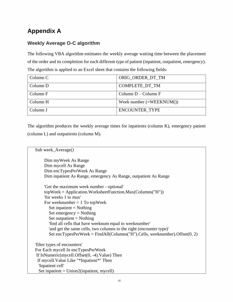
42
Appendix A
Weekly Average O-C algorithm
The following VBA algorithm estimates the weekly average waiting time between the placement
of the order and its completion for each different type of patient (inpatient, outpatient, emergency).
The algorithm is applied to an Excel sheet that contains the following fields:
Column C ORIG_ORDER_DT_TM
Column D COMPLETE_DT_TM
Column F Column D – Column F
Column H Week number (=WEEKNUM())
Column J ENCOUNTER_TYPE
The algorithm produces the weekly average times for inpatients (column K), emergency patient
(column L) and outpatients (column M).
Sub week_Average()
Dim myWeek As Range
Dim mycell As Range
Dim encTypesPerWeek As Range
Dim inpatient As Range, emergency As Range, outpatient As Range
'Get the maximum week number - optional'
topWeek = Application.WorksheetFunction.Max(Columns("H"))
'for weeks 1 to max'
For weeknumber = 1 To topWeek
Set inpatient = Nothing
Set emergency = Nothing
Set outpatient = Nothing
'find all cells that have weeknum equal to weeknumber'
'and get the same cells, two columns to the right (encounter type)'
Set encTypesPerWeek = FindAll(Columns("H").Cells, weeknumber).Offset(0, 2)
'filter types of encounters'
For Each mycell In encTypesPerWeek
If IsNumeric(mycell.Offset(0, -4).Value) Then
If mycell.Value Like "*Inpatient*" Then
'Inpatient cell'
Set inpatient = Union2(inpatient, mycell)
43
ElseIf mycell.Value Like "*Emergency*" Then
'Emergency cell'
Set emergency = Union2(emergency, mycell)
ElseIf True Then
'Outpatient cell'
Set outpatient = Union2(outpatient, mycell)
End If
End If
Next
If Not inpatient Is Nothing Then
'calculate average of inpatients and place result in column K'
Set inpatient = inpatient.Cells.Offset(0, -4)
Cells(weeknumber + 1, "K").Value =
Application.WorksheetFunction.Average(inpatient)
End If
If Not emergency Is Nothing Then
'calculate average of emergencies and place result in column L'
Set emergency = emergency.Cells.Offset(0, -4)
Cells(weeknumber + 1, "L").Value =
Application.WorksheetFunction.Average(emergency)
End If
If Not outpatient Is Nothing Then
'calculate average of outpatients and place result in column M'
Set outpatient = outpatient.Cells.Offset(0, -4)
Cells(weeknumber + 1, "M").Value =
Application.WorksheetFunction.Average(outpatient)
End If
Next weeknumber
End Sub
Function FindAll(SearchRange As Range, _
FindWhat As Variant, _
Optional LookIn As XlFindLookIn = xlValues, _
Optional LookAt As XlLookAt = xlWhole, _
Optional SearchOrder As XlSearchOrder = xlByRows, _
Optional MatchCase As Boolean = False, _
Optional BeginsWith As String = vbNullString, _
Optional EndsWith As String = vbNullString, _
Optional BeginEndCompare As VbCompareMethod = vbTextCompare) As Range
'''''''''''''''''''''''''''''''''''''''''''''''''''''''''''''''''''''''''''''''''''''

44
' FindAll
' This searches the range specified by SearchRange and returns a Range object
' that contains all the cells in which FindWhat was found. The search parameters to
' this function have the same meaning and effect as they do with the
' Range.Find method. If the value was not found, the function return Nothing. If
' BeginsWith is not an empty string, only those cells that begin with BeginWith
' are included in the result. If EndsWith is not an empty string, only those cells
' that end with EndsWith are included in the result. Note that if a cell contains
' a single word that matches either BeginsWith or EndsWith, it is included in the
' result. If BeginsWith or EndsWith is not an empty string, the LookAt parameter
' is automatically changed to xlPart. The tests for BeginsWith and EndsWith may be
' case-sensitive by setting BeginEndCompare to vbBinaryCompare. For case-insensitive
' comparisons, set BeginEndCompare to vbTextCompare. If this parameter is omitted,
' it defaults to vbTextCompare. The comparisons for BeginsWith and EndsWith are
' in an OR relationship. That is, if both BeginsWith and EndsWith are provided,
' a match if found if the text begins with BeginsWith OR the text ends with EndsWith.
'''''''''''''''''''''''''''''''''''''''''''''''''''''''''''''''''''''''''''''''''''''
Dim FoundCell As Range
Dim FirstFound As Range
Dim LastCell As Range
Dim ResultRange As Range
Dim XLookAt As XlLookAt
Dim Include As Boolean
Dim CompMode As VbCompareMethod
Dim Area As Range
Dim MaxRow As Long
Dim MaxCol As Long
Dim BeginB As Boolean
Dim EndB As Boolean
CompMode = BeginEndCompare
If BeginsWith <> vbNullString Or EndsWith <> vbNullString Then
XLookAt = xlPart
Else
XLookAt = LookAt
End If
' this loop in Areas is to find the last cell
' of all the areas. That is, the cell whose row
' and column are greater than or equal to any cell
' in any Area.
For Each Area In SearchRange.Areas
With Area

45
If .Cells(.Cells.Count).Row > MaxRow Then
MaxRow = .Cells(.Cells.Count).Row
End If
If .Cells(.Cells.Count).Column > MaxCol Then
MaxCol = .Cells(.Cells.Count).Column
End If
End With
Next Area
Set LastCell = SearchRange.Worksheet.Cells(MaxRow, MaxCol)
On Error GoTo 0
Set FoundCell = SearchRange.Find(what:=FindWhat, _
after:=LastCell, _
LookIn:=LookIn, _
LookAt:=XLookAt, _
SearchOrder:=SearchOrder, _
MatchCase:=MatchCase)
If Not FoundCell Is Nothing Then
Set FirstFound = FoundCell
Do Until False ' Loop forever. We'll "Exit Do" when necessary.
Include = False
If BeginsWith = vbNullString And EndsWith = vbNullString Then
Include = True
Else
If BeginsWith <> vbNullString Then
If StrComp(Left(FoundCell.Text, Len(BeginsWith)), BeginsWith,
BeginEndCompare) = 0 Then
Include = True
End If
End If
If EndsWith <> vbNullString Then
If StrComp(Right(FoundCell.Text, Len(EndsWith)), EndsWith,
BeginEndCompare) = 0 Then
Include = True
End If
End If
End If
If Include = True Then
If ResultRange Is Nothing Then
Set ResultRange = FoundCell
Else
Set ResultRange = Application.Union(ResultRange, FoundCell)
End If
End If
Set FoundCell = SearchRange.FindNext(after:=FoundCell)

46
If (FoundCell Is Nothing) Then
Exit Do
End If
If (FoundCell.Address = FirstFound.Address) Then
Exit Do
End If
Loop
End If
Set FindAll = ResultRange
End Function
Function Union2(ParamArray Ranges() As Variant) As Range
''''''''''''''''''''''''''''''''''''''''''''''''''''''''
' Union2
' A Union operation that accepts parameters that are Nothing.
''''''''''''''''''''''''''''''''''''''''''''''''''''''''
Dim N As Long
Dim RR As Range
For N = LBound(Ranges) To UBound(Ranges)
If IsObject(Ranges(n)) Then
If Not Ranges(n) Is Nothing Then
If TypeOf Ranges(n) Is Excel.Range Then
If Not RR Is Nothing Then
Set RR = Application.Union(RR, Ranges(n))
Else
Set RR = Ranges(n)
End If
End If
End If
End If
Next N
Set Union2 = RR
End Function

47
Appendix B
Interview guide
Introduction key
components:
Thank you
My introduction
Description of project and
goal of the interview
Information sheet
Confidentiality
Duration
Opportunity for questions
Recording
Signing of consent form
I would like to thank you for meeting me today. My name is
Anisia Fotiadou, I am a master’s student in the field of Health
Informatics.
The aim of the study I am conducting is to investigate how the
data deriving from the information systems of a diagnostic
medical department of a public hospital can be used in order to
support effective time and resource management. More
specifically, I am trying to acquire new knowledge regarding
the choice of different waiting time indicators and how they
should be visualized and presented to different audiences. I
would really appreciate your contribution in this attempt.
You can read all the details regarding the project and the
interview in the information sheet. This interview will not last
more than an hour. I would also like to ask for your permission
to audio tape this session, because I don’t want to miss any of
your comments.
Additionally, I would also like to ask for your permission to
reveal your identity in the final report whenever it is necessary.
You will have the opportunity to revise and review the relevant
parts of the final report if you wish.
You can ask any questions you want before and during the
interview.
Also remember that you can stop the interview at any time and
you do not have to talk about anything that you do not want to.
Please sign the consent form before beginning the session.
Main questions Could you please introduce yourself? What is your
position and main responsibilities?

48
Do you think that information regarding waiting times and
lists would be useful to you?
What kind of decisions are you making?
What kind of information do you need in order to make
those decisions?
What kind of information is available to you at the
moment?
At which point during your workflow would this
information be useful to you?
(Description of the indicators)
Are you familiar with those indicators?
Do you think that a visualization of those indicators would
have beneficial effect?
If yes, what kind of? Which purposes do you think they
would help serve?
Which indicator do you think would be most helpful and
for what purpose?
Is a visualization of the waiting lists (number of people
waiting) useful to you? In which way?
Which type of visualization do you find more helpful and
why?
(Show different kinds of visualisations: different types (e.g.
bar charts, lines etc.), weekly/monthly)
Would you prefer a system that would require interaction
or just pure presentation of the results?
Closing key
components:
Is there anything you would like to add or any other comment
you would like to make?
I would like to remind you once more that you have the right to
withdraw and that you will be given the opportunity to revise
and review the relevant parts of the final report if you wish to
do so.
Thank you for your contribution and your time.

49
Appendix C
Choices of visualisations
During the interviews the participants were asked to choose between the following visualisations
of the same indicator (which in this case is the Average O-C for all types of patients, year 2011).

50

51
Additionally, the participants were asked to choose between the representation of indicators
calculated on a weekly or a monthly basis.
The following figure represents the indicators: Average O-C, 50th, 75th and 90th Percentile O-C for
all types of patients, years 2011-2012.
Weekly:

52
Monthly:

53
Appendix D
Ethics approval
Research ethical application form

54

55
Information sheet for participants
INFORMATION SHEET FOR PARTICIPANTS
BACKGROUND OF RESEARCH: One important aspect of quality improvement in
diagnostic medical imaging departments is to ensure the timely access of the patients to health
care. A big amount of data deriving from different information systems (such as EHR, RIS and
PACS) is being collected in each diagnostic medical department; however, in order to make it
useful and meaningful, this data should be appropriately managed and presented to the right
audience at the right time.
The overall aim of this study is to investigate how the data that derives from the information
systems in a diagnostic imaging department can be used in order to support effective time
management. This study will attempt to acquire new knowledge regarding the ways of choosing
between different waiting time indicators according to the specific purposes and stakeholders of a
diagnostic medical imaging department in a public hospital. The expected result is an initial design
proposal for a system which will present visualization for waiting time indicators in diagnostic
medical imaging department.
PROCEDURES OF THIS STUDY: This study includes the conduct of in-depth interviews
where the participants will be asked to share their views and experiences regarding the choice, use
and visualization of waiting time indicators. There are no risks for the participants involved in the
study.
DECLARATIONS OF CONFLICTS OF INTEREST: No conflicts of interest are identified
in the study.
This research is conducted as a part of a Master’s Degree in Health Informatics.
The nature of participation is voluntary. All participants have the right to withdraw and to omit
individual responses without penalty.
The expected duration of the participant’s involvement is maximum 1 hour.
There are no anticipated risks for the participants.
Participants will be given the opportunity to ask questions on the research at any point.

56
No audio recordings will be made available to anyone other than the research/research team, nor
will any such recordings be replayed in any public forum or presentation of the research. (There
will be no video recording in this study.)
All direct quotations and their contextual appropriateness will be verified.
All participants are over 18 years old and are competent to provide consent.
The data will be used for scientific purposes and might be published in scientific publications.
If a participant makes illicit activities known, these will be reported to appropriate authorities.
The electronic recordings can be stopped by the participant at any time, and may at any time, even
subsequent to the participation be destroyed (except in situations such as above).
Subject to the constraints above, no recordings will be replayed in any public forum or made
available to any audience other than the current researchers/research team.
All participants will be asked to voluntarily agree to be part of this research study, though without
prejudice to legal and ethical rights.
All participants are asked whether they wish to remain anonymous or not in the informed consent
form.
Any direct quotes will be clarified with the participant before including them in the final report.
Informed consent form
INFORMED CONSENT FORM
LEAD RESEARCHER: Anisia Fotiadou
BACKGROUND OF RESEARCH: This research is conducted as a part of Master’s Degree in
Health Informatics.
One important aspect of quality improvement in diagnostic medical imaging departments is to
ensure the timely access of the patients to health care. A big amount of data deriving from different
information systems (such as EHR, RIS and PACS) is being collected in each diagnostic medical

57
department; however, in order to make it useful and meaningful, this data should be appropriately
managed and presented to the right audience at the right time.
The overall aim of this study is to investigate how the data that derives from the information
systems in a diagnostic imaging department can be used in order to support effective time
management. This study will attempt to acquire new knowledge regarding the ways of choosing
between different waiting time indicators according to the specific purposes and stakeholders of a
diagnostic medical imaging department in a public hospital. The expected result is an initial design
proposal for a system which will present visualization for waiting time indicators in diagnostic
medical imaging department.
PROCEDURES OF THIS STUDY: This study includes the conduction of in-depth interviews
where the participants will be asked to share their views and experiences regarding the choice, use
and visualization of waiting time indicators. There are no risks for the participants involved in the
study.
PUBLICATION: The study is conducted as a part of master thesis which will be presented in
front of various audiences.
DECLARATION:
I am 18 years or older and am competent to provide consent.
I have read, or had read to me, a document providing information about this research and this
consent form. I have had the opportunity to ask questions and all my questions have been answered
to my satisfaction and understand the description of the research that is being provided to me.
I agree that my data is used for scientific purposes and I have no objection that my data is published
in scientific publications.
I understand that if I make illicit activities known, these will be reported to appropriate authorities.
I understand that, subject to the constraints above, no recordings will be replayed in any public
forum or made available to any audience other than the current researchers/research team.
I freely and voluntarily agree to be part of this research study, though without prejudice to my
legal and ethical rights.

58
I understand that I may refuse to answer any question and that I may withdraw at any time without
penalty.
I understand that any direct quotes will be clarified with me before including them in the final
report.
I have received a copy of this agreement.
Audio recording:
□ I do not agree to my interview being audio recorded.
□I do agree to my interview being audio recorded. I understand that I may stop electronic
recordings at any time, and that I may at any time, even subsequent to my participation have such
recordings destroyed (except in situations such as above).
Anonymity:
□ I agree that my identity might be revealed, however I wish to review the final text and provide
my consent.
□ I agree that my identity might be revealed and I do not require to review the final text before
publication.
□ I wish to remain anonymous.
PARTICIPANT’S NAME:
PARTICIPANT’S SIGNATURE:
Date:

59
Statement of investigator’s responsibility: I have explained the nature and purpose of this
research study, the procedures to be undertaken and any risks that may be involved. I have offered
to answer any questions and fully answered such questions. I believe that the participant
understands my explanation and has freely given informed consent.
RESEARCHERS CONTACT DETAILS:
INVESTIGATOR’S SIGNATURE:
Date:
Approval e-mail