chapterthree - university of texas at san...
TRANSCRIPT

CHAPTER THREE
Key Concepts
interval, ordinal, and nominal scalequantitative, qualitativecontinuous data, categorical or discrete
datatable, frequency distributionhistogram, bar graph, frequency polygon,
cumulative plot, scatter plot (scatterdiagram), tree diagram,decision tree
proportion, percentage, rateprevalence, incidencerelative risk, odds ratio, prevalence ratio,
attributable risk
sensitivity, specificity, predictive valuesmeasures of central tendency:
meanmedianmode
measures of spread (variability):rangeinterquartile rangevariancestandard variationcoefficient of variation
skewness, kurtosis
Basic Biostatistics for Geneticists and Epidemiologists: A Practical Approach R. Elston and W. Johnson© 2008 John Wiley & Sons, Ltd. ISBN: 978-0-470-02489-8
Descriptive Statistics
SYMBOLS AND ABBREVIATIONSAR attributable riskCV coefficient of variationg2 fourth cumulant; the coefficient
of kurtosis minus 3 (used tomeasure peakedness)
OR odds ratioPR prevalence ratioRR relative risks sample standard deviation
(estimate)s2 sample variance (estimate)
WHY DO WE NEED DESCRIPTIVE STATISTICS?
We stated in Chapter 1 that a statistic is an estimate of an unknown numericalquantity. A descriptive statistic is an estimate that summarizes a particular aspect ofa set of observations. Descriptive statistics allow one to obtain a quick overview, or‘feel’, for a set of data without having to consider each observation, or datum,individually. (Note that the word ‘datum’ is the singular form of the word ‘data’;strictly speaking, ‘data’ is a plural noun, although, like ‘agenda’, it is commonly usedas a singular noun, especially in speech.)
In providing medical care for a specific patient, a physician must consider:(1) historical or background data, (2) diagnostic information, and (3) response totreatment. These data are kept in a patient chart that the physician reviews fromtime to time. In discussing the patient with colleagues, the physician summarizesthe chart by describing the atypical data in it, which would ordinarily represent onlya small fraction of the available data. To be able to distinguish the atypical data, thephysician must know what is typical for the population at large. The descriptive
Basic Biostatistics for Geneticists and Epidemiologists: A Practical Approach R. Elston and W. Johnson© 2008 John Wiley & Sons, Ltd. ISBN: 978-0-470-02489-8

46 BASIC BIOSTATISTICS FOR GENETICISTS AND EPIDEMIOLOGISTS
statistics we discuss in this chapter are tools that are used to help describe apopulation. In addition, as we discussed in Chapter 2, geneticists and epidemi-ologists conduct studies on samples of patients and families and, when they reporttheir general findings, they need to indicate the type of sample they investigated.Descriptive statistics are used both to describe the sample analyzed and to sum-marize the results of analyses in a succinct way. Tables and graphs are also useful inconveying a quick overview of a set of data, and in fact tables and graphs are oftenused for displaying descriptive statistics. We therefore include a brief discussion ofthem in this chapter. First, however, we consider the different kinds of data thatmay need to be described.
SCALES OF MEASUREMENT
We are all familiar with using a ruler to measure length. The ruler is divided intointervals, such as centimeters, and this is called an interval scale. An interval scaleis a scale that allows one to measure all possible fractional values within an interval.If we measure a person’s height in inches, for example, we are not restricted tomeasures that are whole numbers of inches. The scale allows such measures as 70.75or 74.5 inches. Other examples of interval scales are the Celsius scale for measuringtemperature and any of the other metric scales. In each of these examples the traitthat is being measured is quantitative, and we refer to a set of such measurements ascontinuous data. Height, weight, blood pressure, and serum cholesterol levels areall examples of quantitative traits that are commonly measured on interval scales.The number of children in a family is also a quantitative trait, since it is a numericalquantity; however, it is not measured on an interval scale, nor does a set of suchnumbers comprise continuous data. Only whole numbers are permissible, and suchdata are called discrete.
Sometimes we classify what we are measuring only into broad categories. Forexample, we might classify a person as ‘tall’, ‘medium’, or ‘short’, or as ‘hypertensive’,‘normotensive’, or ‘hypotensive’. The trait is then qualitative, and such measure-ments also give rise to discrete, or categorical, data consisting of the counts, ornumbers of individuals, in each category. There are two types of categorical data,depending on whether or not there is a natural sequence in which we can order thecategories. In the examples just given, there is a natural order: ‘medium’ is between‘tall’ and ‘short’, and ‘normotensive’ is between ‘hypertensive’ and ‘hypotensive’.In this case the scale of measurement is called ordinal. The number of children in afamily is also measured on an ordinal scale. If there is no such natural order, the scaleis called nominal, with the categories having names only, and no sequence beingimplied. Hair color, for example (e.g. ‘brown’, ‘blond’, or ‘red’), would be observedon a nominal scale. Of course the distinction between a nominal and an ordinal

DESCRIPTIVE STATISTICS 47
scale may be decided subjectively in some situations. Some would argue that whenwe classify patients as ‘manic’, ‘normal’, or ‘depressed’, this should be considereda nominal scale, while others say that it should be considered an ordinal one. Theimportant thing to realize is that it is possible to consider categorical data from thesetwo different viewpoints, with different implications for the kinds of conclusionswe might draw from them.
TABLES
Data and descriptive statistics are often classified and summarized in tables. Theexact form of a table will depend on the purpose for which it is designed as well ason the complexity of the material. There are no hard and fast rules for constructingtables, but it is best to follow a few simple guidelines to be consistent and to ensurethat the table maintains its purpose:
1. The table should be relatively simple and easy to read.2. The title, usually placed above the table, should be clear, concise, and to the
point; it should indicate what is being tabulated.3. The units of measurement for the data should be given.4. Each row and column, as appropriate, should be labeled concisely and clearly.5. Totals should be shown, if appropriate.6. Codes, abbreviations, and symbols should be explained in a footnote.7. If the data are not original, their source should be given in a footnote.
Tables 3.1 and 3.2 are two very simple tables that display data we shall use,for illustrative purposes, later in this chapter. Table 3.1 is the simplest type oftable possible. In it is given a set of ‘raw’ data, the serum triglyceride values of 30medical students. There is no special significance to the rows and columns, theironly purpose being to line up the data in an orderly and compact fashion. Note that,in addition, the values have been arranged in order from the smallest to the largest.In this respect the table is more helpful than if the values had simply been listed in
Table 3.1 Fasting serum triglyceride levels(mg/dl) of 30 male medical students
45 46 49 54 5561 67 72 78 8083 85 86 88 9093 99 101 106 122
123 124 129 151 165173 180 218 225 287

48 BASIC BIOSTATISTICS FOR GENETICISTS AND EPIDEMIOLOGISTS
Table 3.2 Frequency distribution of fasting serum cholesterollevels (mg/dl) of 1000 male medical students
Cholesterol Level (mg/dl) Number of Students
90–100 2100–110 8110–120 14120–130 21130–140 22140–150 28150–160 95160–170 102170–180 121180–190 166190–200 119200–210 96210–220 93220–230 35230–240 30240–250 23250–260 15260–270 7270–280 3280–290 1Total 1000
the order in which they were determined in the laboratory. There is another kindof table in which the rows and columns have no special significance, and in which,furthermore, the entries are never ordered. This is a table of random numbers,which we referred to in Chapter 2.
The simplest type of descriptive statistic is a count, such as the number ofpersons with a particular attribute. Table 3.2 is a very simple example of how a setof counts can be displayed, as a frequency distribution. Each of the observed 1000cholesterol levels occurs in just one of the interval classes, even though it appearsthat some levels (e.g. 100 and 110 mg/dl) appear in two consecutive classes. Shoulda value be exactly at the borderline between two classes, it is included in the lowerclass. This is sometimes clarified by defining the intervals more carefully (e.g. 90.1–100.0, 100.1–110.0, . . .). Age classes are often defined as 0 to 9 years, 10 to 19 years,etc. It is then understood that the 10 to 19 year class, for example, contains all thechildren who have passed their 10th birthday but not their 20th birthday. Note thatin Table 3.2 some of the information inherent in the original 1000 cholesterol valueshas been lost, but for a simple quick overview of the data this kind of table is muchmore helpful than would be a table, similar to Table 3.1, that listed all 1000 values.

DESCRIPTIVE STATISTICS 49
GRAPHS
The relationships among numbers of various magnitudes can usually be seen morequickly and easily from graphs than from tables. There are many types of graphs,but the basic idea is to provide a sketch that quickly conveys general trends inthe data to the reader. The following guidelines should be helpful in constructinggraphs:
1. The simplest graph consistent with its purpose is the most effective. It shouldbe both clear and accurate.
2. Every graph should be completely self-explanatory. It should be correctlyand unambiguously labeled with title, data source if appropriate, scales, andexplanatory keys or legends.
3. Whenever possible, the vertical scale should be selected so that the zero lineappears on the graph.
4. The title is commonly placed below the graph.5. The graph generally proceeds from left to right and from bottom to top. All
labels and other writing should be placed accordingly.
One particular type of graph, the histogram, often provides a convenient way ofdepicting the shape of the distribution of data values. Two examples of histograms,relating to the data in Tables 3.1 and 3.2, are shown in Figures 3.1 and 3.2. Thepoints you should note about histograms are as follows:
1. They are used for data measured on an interval scale.2. The visual picture obtained depends on the width of the class interval used, which
is to a large extent arbitrary. A width of 10 mg/dl was chosen for Figure 3.1, anda width of 20 mg/dl for Figure 3.2. It is usually best to choose a width that resultsin a total of 10–20 classes.
3. If the observations within each class interval are too few, a histogram gives apoor representation of the distribution of counts in the population. Figure 3.2suggests a distribution with several peaks, whereas a single peak would most likelyhave been found if 1000 triglyceride values had been used to obtain the figure.More observations per class interval could have been obtained by choosing awider interval, but fewer than 10 intervals gives only a gross approximation to adistribution.
A bar graph is very similar to a histogram but is used for categorical data. Itmay illustrate, for example, the distribution of the number of cases of a disease indifferent countries. It would look very similar to Figures 3.1 and 3.2, but, because

50 BASIC BIOSTATISTICS FOR GENETICISTS AND EPIDEMIOLOGISTS
1000
10
20
30
40
50
60
70
80
90
100
110
120
130
140
150
160
120 140 160 180 200 220 240 260 280Cholestrol level (mg/dl)
Num
ber
of s
tude
nts
Figure 3.1 Histogram of 1000 fasting serum cholesterol levels (from Table 3.2).
300
1
2
3
4
5
6
7
8
50 70 90 110 130 150 170190 210 230 250 270 290
Triglyceride level (mg/dl)
Num
ber
of s
tude
nts
Figure 3.2 Histogram of 30 fasting serum triglyceride levels (from Table 3.1).

DESCRIPTIVE STATISTICS 51
the horizontal scale is not continuous, it would be more appropriate to leave gapsbetween the vertical rectangles or ‘bars’. Sometimes the bars are drawn horizontally,with the vertical scale of the graph denoting the different categories. In each case,as also in the case of a histogram, the length of the bar represents either a frequencyor a relative frequency, sometimes expressed as a percentage.
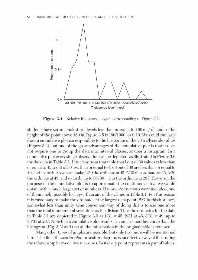
A frequency polygon is also basically similar to a histogram and is used forcontinuous data. It is obtained from a histogram by joining the midpoints of thetop of each ‘bar’. Drawn as frequency polygons, the two histograms in Figures 3.1and 3.2 look like Figures 3.3 and 3.4. Notice that the polygon meets the horizontalaxis whenever there is a zero frequency in an interval – in particular, this occurs atthe two ends of the distribution. Again the vertical scale may be actual frequencyor relative frequency, the latter being obtained by dividing each frequency by thetotal number of observations; we have chosen to use relative frequency. A frequencypolygon is an attempt to obtain a better approximation, from a sample of data, tothe smooth curve that would be obtained from a large population. It has the furtheradvantage over a histogram of permitting two or more frequency polygons to besuperimposed in the same figure with a minimum of crossing lines.
0
0.05
100 120 140 160 180 200 220 240 260 280
0.10
0.15
Pro
port
ion
of s
tude
nts
Cholestrol level (mg/dl)
Figure 3.3 Relative frequency polygon corresponding to Figure 3.1.
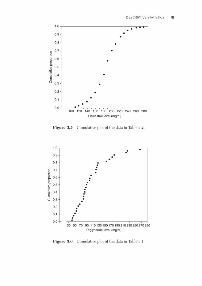
A cumulative plot is an alternative way of depicting a set of quantitative data.The horizontal scale (abscissa) is the same as before, but the vertical scale (ordinate)now indicates the proportion of the observations less than or equal to a particularvalue. A cumulative plot of the data in Table 3.2 is presented in Figure 3.5. We seein Table 3.2, for example, that 2 + 8 + 14 + 21 + 22 + 28 + 95=190 out of the 1000
52 BASIC BIOSTATISTICS FOR GENETICISTS AND EPIDEMIOLOGISTS
300
0.1
0.2
50 70 90 110 130 150 170 190 210 230 250 270 290
Triglyceride level (mg/dl)
Pro
port
ion
of s
tude
nts
Figure 3.4 Relative frequency polygon corresponding to Figure 3.2.
students have serum cholesterol levels less than or equal to 160 mg/ dl, and so theheight of the point above 160 in Figure 3.5 is 190/1000, or 0.19. We could similarlydraw a cumulative plot corresponding to the histogram of the 30 triglyceride values(Figure 3.2), but one of the great advantages of the cumulative plot is that it doesnot require one to group the data into interval classes, as does a histogram. In acumulative plot every single observation can be depicted, as illustrated in Figure 3.6for the data in Table 3.1. It is clear from that table that l out of 30 values is less thanor equal to 45, 2 out of 30 less than or equal to 46, 3 out of 30 are less than or equal to49, and so forth. So we can make 1/30 the ordinate at 45, 2/30 the ordinate at 46, 3/30the ordinate at 49, and so forth, up to 30/30=1 as the ordinate at 287. However, thepurpose of the cumulative plot is to approximate the continuous curve we wouldobtain with a much larger set of numbers. If more observations were included, oneof them might possibly be larger than any of the values in Table 3.1. For this reasonit is customary to make the ordinate at the largest data point (287 in this instance)somewhat less than unity. One convenient way of doing this is to use one morethan the total number of observations as the divisor. Thus the ordinates for the datain Table 3.1 are depicted in Figure 3.6 as 1/31 at 45, 2/31 at 46, 3/31 at 49, up to30/31 at 287. Note that a cumulative plot results in a much smoother curve than thehistogram (Fig. 3.2) and that all the information in the original table is retained.
Many other types of graphs are possible, but only two more will be mentionedhere. The first, the scatter plot, or scatter diagram, is an effective way of illustratingthe relationship between two measures. In it every point represents a pair of values,
DESCRIPTIVE STATISTICS 53
1000.0
0.1
0.2
0.3
0.4
0.5
0.6
0.7
0.8
0.9
1.0
120 140 160 180 200 220 240 260 280
Cholestrol level (mg/dl)
Cum
ulat
ive
prop
ortio
n
Figure 3.5 Cumulative plot of the data in Table 3.2.
300.0
0.1
0.2
0.3
0.4
0.5
0.6
0.7
0.8
0.9
1.0
50 70 90 110 130 150 170 190 210 230 250 270 290Triglyceride level (mg/dl)
Cum
ulat
ive
prop
ortio
n
Figure 3.6 Cumulative plot of the data in Table 3.1.

54 BASIC BIOSTATISTICS FOR GENETICISTS AND EPIDEMIOLOGISTS
such as the values of two different measures taken on the same person. Thus, in thescatter plot depicted in Figure 3.7, every point represents a triglyceride level takenfrom Table 3.1, together with a corresponding cholesterol level measured on thesame blood sample. We can see that there is a slight tendency for one measure to
0
120
140
160
180
200
220
240
260
20 40 60 80 100 120 140 160 180 200 220 240 260 280 300
Triglyceride level (mg/dl)
Cho
lest
rol (
mg/
100m
l)
Figure 3.7 Scatter plot of cholesterol versus triglyceride levels of 30 male medicalstudents.
Acute attack
Sudden death20% to 25%
Immediate survival75% to 80%
Recovery10%
Early complications90%
Death Recovery(rare)
Further infarctionHeart failure
Death
Figure 3.8 Tree diagram indicating outcome of myocardial infarction. (Source: R.A.Cawson, A.W. McCracken and P.B. Marcus (1982). Pathologic mechanisms and Human
Disease. St. Louis, MO: Mosby.)

DESCRIPTIVE STATISTICS 55
depend on the other, a fact that would not have been clear if we had simply listedeach cholesterol level together with the corresponding triglyceride level.
The final graph that we shall mention here is the tree diagram. This is often usedto help in making decisions, in which case it is called a decision tree. A tree diagramdisplays in temporal sequence possible types of actions or outcomes. Figure 3.8gives a very simple example; it indicates the possible outcomes and their relativefrequencies following myocardial infarction. This kind of display is often much moreeffective than a verbal description of the same information. Tree diagrams are alsooften helpful in solving problems.
PROPORTIONS AND RATES
In comparing the number or frequency of events occurring in two groups, rawnumbers are difficult to interpret unless each group contains the same num-ber of persons. We often compute proportions or percentages to facilitate suchcomparisons. Thus, if the purpose of a measure is to determine whether theinhabitants in one community have a more frequent occurrence of tuberculosisthan those in another, simple counts have obvious shortcomings. Community A mayhave more people with the disease (cases) than community B because its popula-tion is larger. To make a comparison, we need to know the proportionate numberof cases in each community. Again, it may be necessary to specify the time at orduring which the events of interest occur. Thus, if 500 new cases of tuberculosiswere observed in a city of 2 million persons in 2007, we say that 0.025% of thepopulation in this city developed tuberculosis in 2007. Although frequencies arecounts, it has been common practice in genetics to use the term allele frequencyinstead of allele relative frequency, or proportion, so that the allele frequencies ata locus always add up to 1. Strictly speaking this is incorrect terminology, but weshall follow this practice throughout this book.
Sometimes it is more convenient to express proportions multiplied by somenumber other than 100 (which results in a percentage). Thus, the new cases oftuberculosis in a city for the year 2007 might be expressed as 500 cases per 2million persons (the actual population of the city), 0.025 per hundred (percent),0.25 per thousand, or 250 per million. We see that three components are requiredfor expressions of this type:
(i) the number of individuals in whom the disease, abnormality, or othercharacteristic occurrence is observed (the numerator);
(ii) the number of individuals in the population among whom the characteristicoccurrence is measured (the denominator);
(iii) a specified period of time during which the disease, abnormality, or character-istic occurrence is observed.
56 BASIC BIOSTATISTICS FOR GENETICISTS AND EPIDEMIOLOGISTS
The numerator and the denominator should be similarly restricted; if the numer-ator represents a count of persons who have a characteristic in a particularage–race–gender group, then the denominator should also pertain to that sameage–race–gender group. When the denominator is restricted solely to thosepersons who are capable of having or contracting a disease, it is sometimesreferred to as a population at risk. For example, a hospital may express itsmaternal mortality as the number of maternal deaths per thousand deliveries.The women who delivered make up the population at risk for maternal deaths.Similarly, case fatality is the number of deaths due to a disease per so manypatients with the disease; here the individuals with the disease constitute thepopulation.
All such expressions are just conversions of counts into proportions or fractionsof a group, in order to summarize data so that comparisons can be made amonggroups. They are commonly called rates, though strictly speaking a rate is a measureof the rapidity of change of a phenomenon, usually per unit time. Expressions suchas ‘maternal death rate’ and ‘case fatality rate’ are often used to describe these pro-portions even when no concept of a rate per unit time is involved. One of the mainconcerns of epidemiology is to find and enumerate appropriate denominators fordescribing and comparing groups in a meaningful and useful way. Two other com-monly seen but often confused measures of disease frequency used in epidemiologyare prevalence and incidence.
The prevalence of a disease is the number of cases (of that disease) at a givenpoint in time. Prevalence is usually measured as the ratio of the number of cases ata given point in time to the number of people in the population of interest at thatpoint in time.
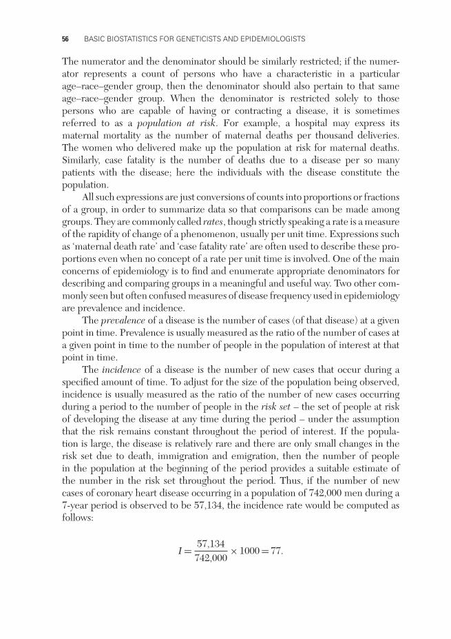
The incidence of a disease is the number of new cases that occur during aspecified amount of time. To adjust for the size of the population being observed,incidence is usually measured as the ratio of the number of new cases occurringduring a period to the number of people in the risk set – the set of people at riskof developing the disease at any time during the period – under the assumptionthat the risk remains constant throughout the period of interest. If the popula-tion is large, the disease is relatively rare and there are only small changes in therisk set due to death, immigration and emigration, then the number of peoplein the population at the beginning of the period provides a suitable estimate ofthe number in the risk set throughout the period. Thus, if the number of newcases of coronary heart disease occurring in a population of 742,000 men during a7-year period is observed to be 57,134, the incidence rate would be computed asfollows:
I = 57,134742,000
× 1000 = 77.
DESCRIPTIVE STATISTICS 57
The incidence was 77 coronary-heart-disease events per 1000 men initially at risk,during the 7-year period. If this were expressed per year, it would be a true rate.Thus, the incidence rate was 11 cases per year per 1000 men over the 7-year period.
When studying a relatively small number of persons followed over time toinvestigate the incidence of events in different treatment or exposure groups, weoften employ the concept of person-years at risk. Person-years at risk is defined asthe total time any person in the study is followed until the event of interest occurs,until death or withdrawal from the study occurs, or until the end of the study periodis reached. In this context, the incidence rate for a disease is the ratio of the numberof new events to the total number of person-years the individuals in the risk setwere followed. We illustrate with a very small and simple example. Suppose 14men were followed for up to 2 years to estimate their incidence of coronary heartdisease. Further, suppose one man developed the disease after 6 months (0.5 years)and a second after 14 months (1.17 years). Finally, suppose that a third man wasfollowed only 18 months (1.5 years) before being lost to follow-up, at which time hewas known not to have had any events associated with coronary heart disease, andthe remaining 11 men were followed for the full 2 years without any such events.The incidence rate would be computed as follows:
I = 20.5 + 1.17 + 1.5 + (11 × 2)
= 225.17
= 0.0795.
Thus, the incidence rate is estimated to be 0.0795 cases per person per year or,equivalently, 0.0795 × 1000 = 79.5 cases per 1000 men per year.
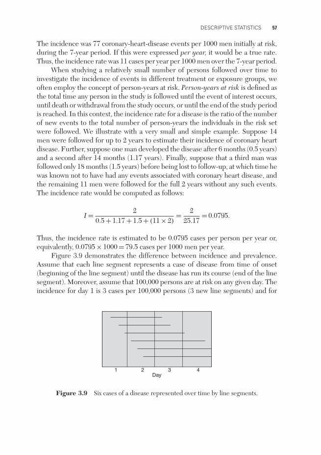
Figure 3.9 demonstrates the difference between incidence and prevalence.Assume that each line segment represents a case of disease from time of onset(beginning of the line segment) until the disease has run its course (end of the linesegment). Moreover, assume that 100,000 persons are at risk on any given day. Theincidence for day 1 is 3 cases per 100,000 persons (3 new line segments) and for
1 2 3 4Day
Figure 3.9 Six cases of a disease represented over time by line segments.

58 BASIC BIOSTATISTICS FOR GENETICISTS AND EPIDEMIOLOGISTS
day 3 it is 0 cases per 100,000 persons (0 new line segments). The prevalence at theend of day 1 is 4 per 100,000 (3 line segments exist), and at the end of day 2 it is6 (6 line segments exist). It should be obvious that two diseases can have identicalincidence, and yet one would have a much higher prevalence if its duration (timefrom onset until the disease has run its course) is much larger.
If the incidence is in a steady state, so that it is constant over a specifictime period of interest, there is a useful relationship between incidence and pre-valence. Let P be the prevalence of a disease at any point, I the incidence and Dthe average duration of the disease. Then
P = I × D,
that is, the prevalence is equal to incidence multiplied by the average duration ofthe disease. We will use this relationship later in this chapter to show how, undercertain conditions, we can obtain useful estimates of relative measures of diseasefrom data that are not conformed to provide such estimates directly.
Incidence measures rate of development of disease. It is therefore a measureof risk of disease and is useful in studying possible reasons (or causes) for diseasedeveloping. We often study the incidence in different groups of people and thentry to determine the reasons why it may be higher in one of the groups. Prevalencemeasures the amount of disease in a population at a given point in time. Becauseprevalence is a function of the duration of a disease, it is of more use in planninghealth-care services for that disease.
In genetic studies, when determining a genetic model for susceptibility toa disease with variable age of onset, it is important to allow for an affectedperson’s age of onset and for the current age of an unaffected person in theanalysis. If we are not studying genetic causes for the development of and/orremission from disease, but simply susceptibility to the disease, we need to con-sider the cumulative probability of a person having or not having the disease bythat person’s age. This quantity, unlike population prevalence, can never decreasewith age.
RELATIVE MEASURES OF DISEASE FREQUENCY
Several methods have been developed for measuring the relative amount of newdisease occurring in different populations. For example, we might wish to measurethe amount of disease occurring in a group exposed to some environmental con-dition, such as cigarette smoking, relative to that in a group not exposed to that

DESCRIPTIVE STATISTICS 59
condition. One measure used for this purpose is the relative risk (RR), which isdefined as
RR = incidence rate of disease in the exposed groupincidence rate of disease in the unexposed group
.
If the incidence of a particular disease in a group exposed to some condition is 30 per100,000 per year, compared with an incidence of 10 per 100,000 per year in a groupunexposed to the condition, then the relative risk (exposed versus unexposed) is
RR = 30 per 100,000 per year10 per 100,000 per year
= 3.
Thus, we say that the risk is 3 times as great in persons exposed to the condition.The phrase ‘exposed to a condition’ is used in a very general sense. Thus, one cantalk of the relative risk of ankylosing spondylitis to a person possessing the HLAantigen B27, versus not possessing that antigen, though of course the antigen isinherited from a parent rather than acquired from some kind of environmentalexposure (HLA denotes the human leukocyte antigen system).
Another relative measure of disease occurrence is the odds ratio (OR). Theodds in favor of a particular event are defined as the frequency with which the eventoccurs divided by the frequency with which it does not occur. For a disease with anincidence of 30 per 100,000 per year, for example, the odds in favor of the diseaseare 30/99,970. The odds ratio is then defined as
OR = odds in favor of disease in exposed groupodds in favor of disease in unexposed group
.
Thus, if the incidences are 30 per 100,000 and 10 per 100,000 as above, the oddsratio for exposed versus unexposed is
OR = 3099,970
/ 1099,990
= 3.00006.
You can see from this example that for rare diseases the odds ratio closely approxim-ates the relative risk. If incidence data are available, there is ordinarily no interestin computing an odds ratio. However, the attractive feature of the odds ratio is thatit can be estimated without actually knowing the incidences. This is often done incase–control studies, which were described in Chapter 2. Suppose, for example, it isfound that 252 out of 1000 cases of a disease (ideally, a representative sample froma well-defined target population of cases) had previous exposure to a particular con-dition, whereas only 103 out of 1000 representative controls were similarly exposed.

60 BASIC BIOSTATISTICS FOR GENETICISTS AND EPIDEMIOLOGISTS
These data tell us nothing about the incidences of the disease among exposed andunexposed persons, but they do allow us to calculate the odds ratio, which in thisexample is
252748
/103893
= 2.92.
Note that OR = 2.92 ∼= 3.00 = RR, so even if only case–control data were available,we could estimate the relative risk of developing disease.
So far we have used data from persons observed over time to estimate risk(incidence) of disease and relative risk of disease in exposed versus unexposedpersons, and data from a sample of cases and a second sample of controls to estimateodds ratios, which, for rare diseases, provide useful estimates of relative risk. Wenow consider a representative sample or cross-section of the population that we donot follow over time, from which we cannot estimate incidence; however, we cancount the numbers who have the disease and do not have the disease, and in eachof these groups the numbers who have and have not been exposed. From this typeof data we can estimate the prevalence of disease in the exposed versus that in theunexposed group and compute a prevalence ratio. Let PE denote the prevalence ofdisease among the exposed and PU the prevalence among the unexposed. Similarly,let IE , IU, DE and DU represent the corresponding incidences and average diseasedurations. Then the prevalence ratio (PR) is
PR = PE
PU= IE × DE
IU × DU.
If the average duration of disease is the same in the exposed and unexposed groups,then
PR = IE
IU= RR.
Therefore, if equality of the disease duration among the exposed and unexposedis a tenable assumption, the prevalence ratio provides a useful estimate of relativerisk. We often see in the literature that an odds ratio is calculated from incidencedata when a relative risk is more appropriate, and from prevalence data when aprevalence ratio is preferable. This appears to be because easily accessible computersoftware was available for calculating odds ratios that take into account concomitantvariables long before corresponding software was available for calculating analogousrelative risks and prevalence ratios.
The last relative measure of disease frequency we shall discuss is the attrib-utable risk (AR), defined as the incidence of disease in an exposed group minus
DESCRIPTIVE STATISTICS 61
the incidence of disease in an unexposed group. Thus, in the previous example, theattributable risk is
AR = 30−10 = 20 per 100,000 per year.
An excess of 20 cases per 100,000 per year can be attributed to exposure to theparticular condition. Sometimes we express attributable risk as a percentage of theincidence of disease in the unexposed group. In the above example, we would have
AR% = 30 − 1010
× 100 = 200%.
In this case we could say there is a 200% excess risk of disease in the exposed group.
SENSITIVITY, SPECIFICITY AND PREDICTIVE VALUES
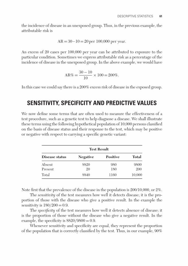
We now define some terms that are often used to measure the effectiveness of atest procedure, such as a genetic test to help diagnose a disease. We shall illustratethese terms using the following hypothetical population of 10,000 persons classifiedon the basis of disease status and their response to the test, which may be positiveor negative with respect to carrying a specific genetic variant:
Test Result
Disease status Negative Positive Total
Absent 8820 980 9800Present 20 180 200Total 8840 1160 10,000
Note first that the prevalence of the disease in the population is 200/10,000, or 2%.The sensitivity of the test measures how well it detects disease; it is the pro-
portion of those with the disease who give a positive result. In the example thesensitivity is 180/200 = 0.9.
The specificity of the test measures how well it detects absence of disease; itis the proportion of those without the disease who give a negative result. In theexample, the specificity is 8820/9800 = 0.9.
Whenever sensitivity and specificity are equal, they represent the proportionof the population that is correctly classified by the test. Thus, in our example, 90%

62 BASIC BIOSTATISTICS FOR GENETICISTS AND EPIDEMIOLOGISTS
of the total population is correctly classified by the test. This does not mean, how-ever, that 90% of those who give a positive result have the disease. In order to knowhow to interpret a particular test result, we need to know the predictive values ofthe test, which are defined as the proportion of those positive who have the disease,and the proportion of those negative who do not have the disease. For our example,these values are 180/1160=0.155, and 8820/8840=0.998, respectively. Especiallyin the case of a rare disease, a high specificity and high sensitivity are not suffi-cient to ensure that a large proportion of those who test positive actually have thedisease.
MEASURES OF CENTRAL TENDENCY
Measures of central tendency, or measures of location, tell us where on our scale ofmeasurement the distribution of a set of values tends to center around. All the valuesin Table 3.1, for example, lie between 45 and 287 mg/dl, and we need our measureof central tendency to be somewhere between these two values. If our values hadbeen in milligrams per liter, on the other hand, we should want our measure ofcentral tendency to be 10 times as large. We shall discuss three measures of centraltendency: the mean, the median, and the mode. They all have the property (whenused to describe continuous data) that if every value in our data set is multipliedby a constant number, then the measure of central tendency is multiplied by thesame number. Similarly, if a constant is added to every value, then the measure ofcentral tendency is increased by that same amount.
The mean of a set of numbers is the best-known measure of central tendencyand it is just their numerical average. You know, for example, that to computeyour mean score for four test grades you add the grades and divide by 4. If yourgrades were 94, 95, 97, and 98, your mean score would be (94 + 95 + 97 + 98)/4 =384/4 = 96.
One of the disadvantages of the mean as a summary statistic is that it is sensitiveto unusual values. The mean of the numbers 16, 18, 20, 22 and 24 is 20, and indeed20 in this example represents the center of these numbers. The mean of the numbers1, 2, 3, 4 and 90 is also 20, but 20 is not a good representation of the center of thesenumbers because of the one unusual value. Another disadvantage of the mean isthat, strictly speaking, it should be used only for data measured on an interval scale,because implicit in its use is the assumption that the units of the scale are all ofequal value. The difference between 50 and 51 mg/dl of triglyceride is in fact thesame as the difference between 250 and 251 mg/dl of triglyceride, (i.e. 1 mg/dl).Because of this, it is meaningful to say that the mean of the 30 values in Table 3.1 is111.2 mg/dl. But if the 30 students had been scored on an 11-point scale, 0 through10 (whether for triglyceride level or anything else), the mean score would be strictly
DESCRIPTIVE STATISTICS 63
appropriate only if each of the 10 intervals, 0 to 1, 1 to 2, etc., were equal in value.Nevertheless, the mean is the most frequently used descriptive statistic because, aswe shall see later, it has statistical properties that make it very advantageous if nounusual values are present.
The geometric mean is another type of mean that is often useful when the datacontain some extreme observations that are considerably larger than most of theother values. The geometric mean of a set of n values is defined as the product of then data values raised to the exponent 1/n. It is usually calculated by taking the naturallogarithms of each value, finding the (arithmetic) mean of these log-transformeddata, and then back-transforming to the original scale by finding the exponential ofthe calculated log-scaled mean. For the numbers 1, 2, 3, 4 and 90, the geometricmean is found as follows:
log(1) + log(2) + log(3) + log(4) + log(90)
5= 1.5356,
geometric mean = exp(1.5356) = 4.644.
By taking logarithms, we shift the large observations closer to the otherobservations and the resulting geometric mean comes closer to a center that isrepresentative of most of the data.
The median is the middle value in a set of ranked data. Thus, the median of thenumbers 16, 18, 20, 22, and 24 is 20. The median of the numbers 1, 2, 3, 4, and90 is 3. In both sets of numbers the median represents in some sense the center ofthe data, so the median has the advantage of not being sensitive to unusual values.If the set of data contains an even number of values, then the median lies betweenthe two middle values, and we usually just take their average. Thus the median ofthe data in Table 3.1 lies between 90 and 93 mg/dl, and we would usually say themedian is 91.5 mg/dl.
A percentile is the value of a trait at or below which the correspondingpercentage of a data set lies. If your grade on an examination is at the 90th percentile,then 90% of those taking the examination obtained the same or a lower grade. Themedian is thus the 50th percentile – the point at or below which 50% of the datapoints lie. The median is a proper measure of central tendency for data measuredeither on an interval or on an ordinal scale, but cannot be used for nominal data.
The mode is defined as the most frequently occurring value in a set of data.Thus, for the data 18, 19, 21, 21, 22, the value 21 occurs twice, whereas all the othervalues occur only once, and so 21 is the mode. In the case of continuous data, themode is related to the concept of a peak in the frequency distribution. If there isonly one peak, the distribution is said to be unimodal; if there are two peaks, it is saidto be bimodal, etc. Hence, the distribution depicted in Figure 3.1 is unimodal, andthe mode is clearly between 180 and 190 mg/dl.

64 BASIC BIOSTATISTICS FOR GENETICISTS AND EPIDEMIOLOGISTS
An advantage of the mode is that it can be used for nominal data: the modalcategory is simply the category that occurs most frequently. But it is often difficultto use for a small sample of continuous data. What, for example, is the mode of thedata in Table 3.1? Each value occurs exactly once, so shall we say there is no mode?The data can be grouped as in Figure 3.2, and then it appears that the 70–90 mg/dlcategory is the most frequent. But with this grouping we also see peaks (and hencemodes) at 150–190, 210–230, and 270–290 mg/dl. For this reason the mode is lessfrequently used as a measure of central tendency in the case of continuous data.
MEASURES OF SPREAD OR VARIABILITY
Suppose you score 80% on an examination and the average for the class is 87%.Suppose you are also told that the grades ranged from 79% to 95%. Obviously youwould feel much better had you been told that the spread was from 71% to 99%.The point here is that it is often not sufficient to know the mean of a set of data;rather, it is of interest to know the mean together with some measure of spread orvariability.
The range is the largest value minus the smallest value. It provides a simplemeasure of variability but is very sensitive to one or two extreme values. The rangeof the data in Table 3.1 is 287 − 45 = 242 mg/dl, but it would be only 173 mg/dl ifthe two largest values were missing. Percentile ranges are less sensitive and providea useful measure of dispersion in data. For example, the 90th percentile minusthe 10th percentile, or the 75th percentile minus the 25th percentile, can be used.The latter is called the interquartile range. For the data in Table 3.1 the interquartilerange is 124 − 67 = 57 mg/dl. (For 30 values we cannot obtain the 75th and 25thpercentiles accurately, so we take the next lowest percentiles: 124 is the 22nd outof 30 values, or 73rd percentile, and 67 is the 7th out of 30, or 23rd percentile.)If the two largest values were missing from the table, the interquartile range wouldbe 123 − 67 = 56 mg/dl, almost the same as for all 30 values.
The variance or its square root, the standard deviation, is perhaps the mostfrequently used measure of variability. The variance, denoted s2, is basically theaverage squared deviation from the mean. We compute the variance of a set of dataas follows:
1. Subtract the mean from each value to get a ‘deviation’ from the mean.2. Square each deviation from the mean.3. Sum the squares of the deviations from the mean.4. Divide the sum of squares by one less than the number of values in the set of
data.

DESCRIPTIVE STATISTICS 65
Thus, for the numbers 18, 19, 20, 21, and 22, we find that the mean is (18 + 19 +20 + 21 + 22)/5 = 20, and the variance is computed as follows:
1. Subtract the mean from each value to get a deviation from the mean, which weshall call d:
d
18 – 20 = –219 – 20 = –120 – 20 = 021 – 20 = +122 – 20 = +2
2. Square each deviation, d, to get squares of deviations, d2:
d d2
−2 4−1 1
0 0+1 1+2 4
3. Sum the squares of the deviations:
4 + 1 + 0 + 1 + 4 = 10.
4. Divide the sum of squares by one less than the number of values in the set ofdata:
Variance = s2 = 105 − 1
= 104
= 2.5.
The standard deviation is just the square root of the variance; that is, in thisexample,
Standard deviation = s = √2.5 = 1.6.
Notice that the variance is expressed in squared units, whereas the standarddeviation gives results in terms of the original units. If, for example, the original

66 BASIC BIOSTATISTICS FOR GENETICISTS AND EPIDEMIOLOGISTS
units for the above data were years (e.g. years of age), then s2 would be 2.5 (years)2,and s would be 1.6 years.
As a second example, suppose the numbers were 1, 2, 3, 4, and 90. Again, theaverage is (1 + 2 + 3 + 4 + 90)/5 = 20, but the data are quite different from thosein the previous example. Here,
s2 = (1 − 20)2 + (2 − 20)2 + (3 − 20)2 + (4 − 20)2 + (90 − 20)2
4
= (−19)2 + (−18)2 + (−17)2 + (−16)2 + 702
4
= 61304
= 1532.5.
The standard deviation is s = √1532.5 = 39.15. Thus, you can see that the vari-
ance and the standard deviation are larger for a set of data that is obviously morevariable.
Two questions you may have concerning the variance and the standard devi-ation are: Why do we square the deviations, and why do we divide by one less thanthe number of values in the set of data being considered? Look back at step 2 andsee what would happen if we did not square the deviations, but simply added upthe unsquared deviations represented above by d. Because of the way in which themean is defined, the deviations always add up to zero! Squaring is a simple device tostop this happening. When we average the squared deviations, however, we divideby one less than the number of values in the data set. The reason for this is that itleads to an unbiased estimate, a concept we shall explain more fully in Chapter 6.For the moment, just note that if the data set consisted of an infinite number ofvalues (which is conceptually possible for a whole population), it would make nodifference whether or not we subtracted one from the divisor.
The last measure of spread we shall discuss is the coefficient of variation. Thisis the standard deviation expressed as a proportion or percentage of the mean. It isa dimensionless measure and, as such, it is a useful descriptive index for comparingthe relative variability in two sets of values where the data in the different setshave quite different distributions and hence different standard deviations. Suppose,for example, that we wished to compare the variability of birth weight with thevariability of adult weight. Clearly, on an absolute scale, birth weights must varymuch less than adult weights simply because they are necessarily limited to beingmuch smaller. As a more extreme example, suppose we wished to compare thevariability in weights of ants and elephants! In such a situation it makes more senseto express variability on a relative scale. Thus, we can make a meaningful comparisonof the variability in two sets of numbers with different means by observing the

DESCRIPTIVE STATISTICS 67
difference between their coefficients of variation. As an example, suppose the meanof a set of cholesterol levels is 219 mg/dl and the standard deviation is 14.3 mg/dl.The coefficient of variation, as a percentage, is then
CV% = standard deviationmean
× 100
= 1.43mg/dl219mg/dl
× 100
= 6.5.
This could then be compared with, for example, the coefficient of variation oftriglyceride levels.
MEASURES OF SHAPE
There are many other descriptive statistics, some of which will be mentioned inlater chapters of this book. We shall conclude this chapter with the names of a fewstatistics that describe the shape of distributions. (Formulas for calculating thesestatistics, as well as others, are presented in the Appendix.)
mean modemedian
Negatively skewed
meanmodemedian
Positively skewed
meanmode
medianSymmetric
Figure 3.10 Examples of negatively skewed, symmetric, and positively skeweddistributions.
The coefficient of skewness is a measure of symmetry. A symmetric distributionhas a coefficient of skewness that is zero. As illustrated in Figure 3.10, a distributionthat has an extended tail to the left has a negative coefficient of skewness and issaid to be negatively skewed; one that has an extented tail to the right has a positivecoefficient of skewness and is said to be positively skewed. Note that in a symmetricunimodal distribution the mean, the median, and the mode are all equal. In a

68 BASIC BIOSTATISTICS FOR GENETICISTS AND EPIDEMIOLOGISTS
unimodal asymmetric distribution, the median always lies between the mean andthe mode. The serum triglyceride values in Table 3.1 have a positive coefficient ofskewness, as can be seen in the histogram in Figure 3.2.
The coefficient of kurtosis measures the peakedness of a distribution. InChapter 6 we shall discuss a very important distribution, called the normal distribu-tion, for which the coefficient of kurtosis is 3. A distribution with a larger coefficientthan this is leptokurtic (‘lepto’ means slender), and one with a coefficient smallerthan this is platykurtic (‘platy’ means flat or broad). Kurtosis, or peakedness, is alsooften measured by the standardized ‘fourth cumulant’ (denoted g2), also called theexcess kurtosis, which is the coefficient of kurtosis minus 3; on this scale, the nor-mal distribution has zero kurtosis. Different degrees of kurtosis are illustrated inFigure 3.11.
Coefficientof Kurtosis:
g2:>3>0
30
<3<0
<3<0
Bimodel
Figure 3.11 Examples of symmetric distributions with coefficient of kurtosis greaterthan 3 (g2>0), equal to 3 (g2=0, as for a normal distribution), and less than 3 (g2<0).
SUMMARY
1. Continuous data arise only from quantitative traits, whereas categorical or dis-crete data arise either from quantitative or from qualitative traits. Continuousdata are measured on an interval scale, categorical data on either an ordinal(that can be ordered) or a nominal (name only) scale.
2. Descriptive statistics, tables, and graphs summarize the essential characteristicsof a set of data.
3. A table should be easy to read. The title should indicate what is being tabulated,with the units of measurement.
4. Bar graphs are used for discrete data, histograms and frequency polygons forcontinuous data. A cumulative plot has the advantage that every data point canbe represented in it. A scatter plot or scatter diagram illustrates the relationship

DESCRIPTIVE STATISTICS 69
between two measures. A tree diagram displays a sequence of actions and/orresults.
5. Proportions and rates allow one to compare counts when denominators areappropriately chosen. The term ‘rate’ properly indicates a measure of rapidityof change but is often used to indicate a proportion multiplied by some numberother than 100. Prevalence is the number or proportion of cases present at aparticular time; incidence is the number or proportion of new cases occurringin a specified period.
6. Relative risk is the incidence of disease in a group exposed to a particularcondition, divided by the incidence in a group not so exposed. The odds ratiois the ratio of the odds in favor of a disease in an exposed group to the oddsin an unexposed group. In the case of a rare disease, the relative risk and theodds ratio are almost equal. Attributable risk is the incidence of a disease in agroup with a particular condition minus the incidence in a group without thecondition, often expressed as a percentage of the latter.
7. The sensitivity of a test is the proportion of those with the disease who givea positive result. The specificity of a test is the proportion of those withoutthe disease who give a negative result. In the case of a rare disease, it is quitepossible for the test to have a low predictive value even though these are bothhigh. The predictive values are defined as the proportion of the positives thathas the disease and the proportion of the negatives that does not have thedisease.
8. Three measures of central tendency, or location, are the mean (arithmetic aver-age), the median (50th percentile), and the mode (one or more peak values). Allthree are equal in a unimodal symmetric distribution. In a unimodal asymmetricdistribution, the median lies between the mean and the mode.
9. Three measures of spread, or variability, are the range (largest value minus smal-lest value), the interquartile range (75th percentile minus 25th percentile), andthe standard deviation (square root of the variance). The variance is basicallythe average squared deviation from the mean, but the divisor used to obtainthis average is one less than the number of values being averaged. The varianceis expressed in squared units whereas the standard deviation is expressed in theoriginal units of the data. The coefficient of variation, which is dimensionless,is the standard deviation divided by the mean (and multiplied by 100 if it isexpressed as a percentage).
10. An asymmetric distribution may be positively skewed (tail to the right) or neg-atively skewed (tail to the left). A distribution may be leptokurtic (peaked) orplatykurtic (flat-topped or multimodal).

70 BASIC BIOSTATISTICS FOR GENETICISTS AND EPIDEMIOLOGISTS
FURTHER READING
Elandt-Johnson, RC. (1975) Definition of rates: Some remarks on their use and misuse.American Journal of Epidemiology 102: 267–271. (This gives very precise definitionsof ratios, proportions, and rates; a complete understanding of this paper requires somemathematical sophistication.)
Stevens, S.S. (1946) On the theory of scales of measurement. Science 103: 677–680. (Thisarticle defines in more detail four hierarchical categories of scales for measurements –nominal, ordinal, interval, and ratio.)
Wainer, H. (1984) How to display data badly. American Statistician 38: 137–147. (Thoughpointed in the wrong direction, this is a serious article. It illustrates the 12 most powerfulmethods – the dirty dozen – of misusing graphics.)
PROBLEMS
1. A nominal scale is used for
A. all categorical dataB. discrete data with categories that do not follow a natural sequenceC. continuous data that follow a natural sequenceD. discrete data with categories that follow a natural sequenceE. quantitative data
2. The following are average annual incidences per million for testicularcancers, New Orleans, 1974–1977:
Age White Black Relative Risk
15–19 29.4 13.4 2.220–29 113.6 9.5 12.030–39 91.0 49.8 1.840–49 75.5 0.0 —50–59 50.2 22.2 2.360–69 0.0 0.0 —70+ 38.2 0.0 —
Based on these data, which of the following is true of New Orleans males,1974–1977?
A. There is no difference in the risk of developing testicular cancer forblacks and whites.
B. The odds of developing testicular cancer are greater in blacks than inwhites.

DESCRIPTIVE STATISTICS 71
C. The racial difference in risk of developing testicular cancer cannot bedetermined from these data.
D. The risk of developing testicular cancer is greater in whites than inblacks in virtually every age group.
3. Refer to the diagram below. Each horizontal line in the diagram indicatesthe month of onset and the month of termination for one of 24 episodesof disease. Assume an exposed population of 1000 individuals in eachmonth.
Jan Feb Mar Apr May Jun Jul Aug Sep Oct Nov Dec
(i) The incidence for this disease during April was
A. 2 per 1000B. 3 per 1000C. 6 per 1000D. 7 per 1000E. 9 per 1000
(ii) The prevalence on March 31 was
A. 2 per 1000B. 3 per 1000C. 6 per 1000D. 7 per 1000E. 9 per 1000
4. The incidence of a certain disease during 1987 was 16 per 100,000 per-sons. This means that for every 100,000 persons in the population ofinterest, 16 people
A. had the disease on January 1, 1987B. had the disease on December 31, 1987C. developed the disease during 1987
72 BASIC BIOSTATISTICS FOR GENETICISTS AND EPIDEMIOLOGISTS
D. developed the disease each month during 1987E. had disease with duration 1 month or more during 1987
5. A large study of bladder cancer and cigarette smoking produced thefollowing data:
Incidence of Bladder Cancer (per
100,000 males per year)
Cigarette smokers 48.0Nonsmokers 25.4
The relative risk of developing bladder cancer for male cigarette smokerscompared with male nonsmokers is
A. 48.0/25.4 = 1.89B. unknownC. 48.0 − 25.4 = 22.6D. 48.0E. (48.0 − 25.4)/48.0 = 0.47
6. Both the specificity and sensitivity of a diagnostic test for a particulardisease are 0.99. All the following are necessarily true except
A. a person who is positive for the test has a 99% chance of having thedisease
B. a person without the disease has a 99% chance of being negative forthe test
C. a person has a 99% chance of being correctly classified by the testD. a person with the disease has a 99% chance of being positive for the
test
7. The specificity of a test is reported as being 0.80. This means that
A. the test gives the correct result in 80% of persons testedB. disease is present in 80% of persons who test positiveC. disease is absent in 80% of persons who test negativeD. the test is positive in 80% of persons tested who have the
diseaseE. the test is negative in 80% of persons tested who are disease-free
8. Most values in a small set of data range from 0 to 35. The data arehighly skewed, however, with a few values as large as 55 to 60. Thebest measure of central tendency is the
DESCRIPTIVE STATISTICS 73
A. meanB. medianC. modeD. standard deviationE. range
9. One useful summary of a set of data is provided by the mean and standarddeviation. Which of the following is true?
A. The mean is the middle value (50th percentile) and the standarddeviation is the difference between the 90th and the 10th percentiles.
B. The mean is the arithmetic average and the standard deviation meas-ures the extent to which observations vary about or are different fromthe mean.
C. The mean is the most frequently occurring observation and thestandard deviation measures the length of a deviation.
D. The mean is half the sum of the largest and smallest value and thestandard deviation is the difference between the largest and smallestobservations.
E. None of the above.
10. All of the following are measures of spread except
A. varianceB. rangeC. modeD. standard deviationE. coefficient of variation
11. The height in centimeters of second-year medical students was recorded.The variance of these heights was calculated. The unit of measurementfor the calculated variance is
A.√
centimetersB. centimetersC. (centimeters)2
D. unit freeE. none of the above
12. The standard deviation for Dr. A’s data was found to be 10 units, whilethat for Dr. B’s data was found to be 15 units. This suggests that Dr. A’sdata are
A. larger in magnitude on averageB. skewed to the rightC. less variable

74 BASIC BIOSTATISTICS FOR GENETICISTS AND EPIDEMIOLOGISTS
D. unbiasedE. unimodal
13. Consider the following sets of cholesterol levels in milligrams per deciliter(mg/dl):
Set 1: 200, 210, 190, 220, 195Set 2: 210, 170, 180, 235, 240
The standard deviation of set 1 is
A. the same as that of set 2B. less than that of set 2C. greater than that of set 2D. equal to the mean for set 2E. indeterminable from these data
14. The following is a histogram for the pulse rates of 1000 students:
60 65 70 75 80 85 90 95
200
175
150
125
100
75
50
25
0
Pulse rate in beats per minute
Num
ber
of s
tude
nts
100
Which of the following is between 70 and 75 beats per minute?
A. The mode of the distributionB. The median of the distributionC. The mean of the distributionD. The range of the distributionE. None of the above

DESCRIPTIVE STATISTICS 75
15. The following cumulative plot was derived from the pulse of 1000students:
Pulse rate in beats per minute60
102030405060708090
100
70 80 90 100
Cum
ulat
ive
rela
tive
freq
uenc
y (%
)
Which of the following is false?
A. The range of the distribution is 60 to 100 beats per minute.B. The mode of the distribution is 100 beats per minute.C. The median of the distribution is 77 beats per minute.D. 92% of the values are less than 90 beats per minute.E. 94% of the values are greater than 65 beats per minute.