chapter descriptive statistics 1 of 149 2 2012 pearson education, inc. all rights reserved
TRANSCRIPT

ChapterDescriptive Statistics
1 of 149
2
2012 Pearson Education, Inc.All rights reserved.
Section 2.1
Frequency Distributions
and Their Graphs
2 of 149© 2012 Pearson Education, Inc. All rights reserved.

Section 2.1 Objectives
• Construct frequency distributions
• Construct frequency histograms, frequency polygons, relative frequency histograms, and ogives
3 of 149© 2012 Pearson Education, Inc. All rights reserved.
Frequency Distribution
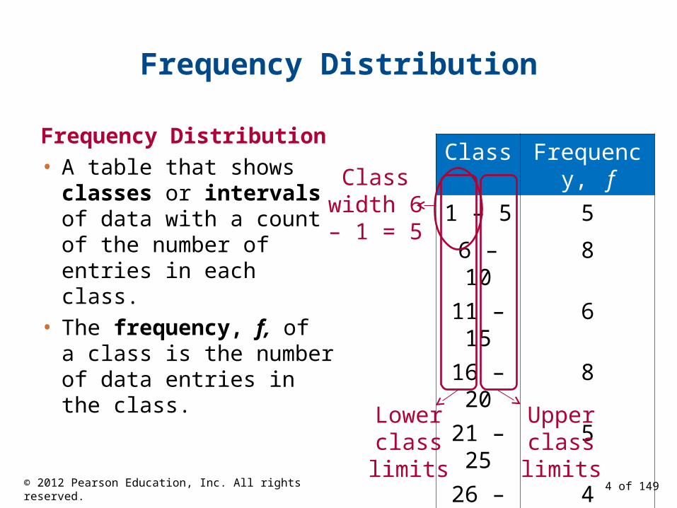
Frequency Distribution
• A table that shows classes or intervals of data with a count of the number of entries in each class.
• The frequency, f, of a class is the number of data entries in the class.
Class Frequency, f
1 – 5 5
6 – 10 8
11 – 15 6
16 – 20 8
21 – 25 5
26 – 30 4
Lower classlimits
Upper classlimits
Class width 6 – 1 = 5
4 of 149© 2012 Pearson Education, Inc. All rights reserved.
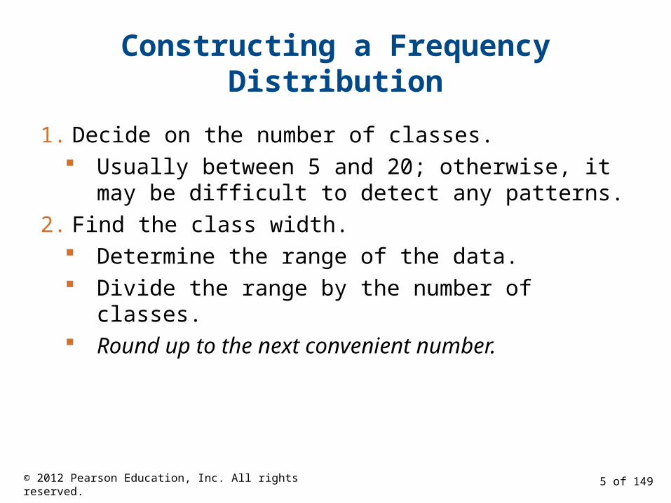
Constructing a Frequency Distribution
1. Decide on the number of classes. Usually between 5 and 20; otherwise, it may be
difficult to detect any patterns.
2. Find the class width. Determine the range of the data. Divide the range by the number of classes. Round up to the next convenient number.
5 of 149© 2012 Pearson Education, Inc. All rights reserved.
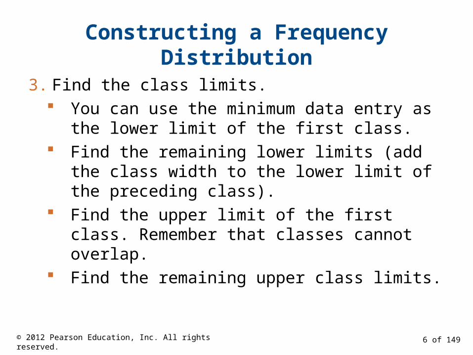
Constructing a Frequency Distribution
3. Find the class limits. You can use the minimum data entry as the lower
limit of the first class. Find the remaining lower limits (add the class
width to the lower limit of the preceding class). Find the upper limit of the first class. Remember
that classes cannot overlap. Find the remaining upper class limits.
6 of 149© 2012 Pearson Education, Inc. All rights reserved.

Constructing a Frequency Distribution
4. Make a tally mark for each data entry in the row of the appropriate class.
5. Count the tally marks to find the total frequency f for each class.
7 of 149© 2012 Pearson Education, Inc. All rights reserved.
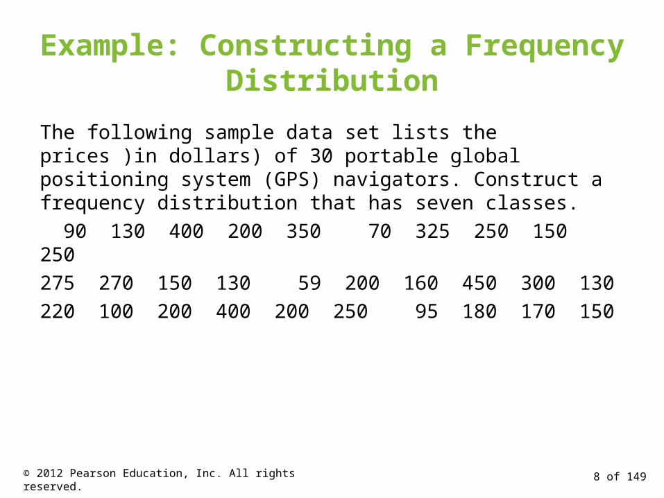
Example: Constructing a Frequency Distribution
The following sample data set lists the prices )in dollars) of 30 portable global positioning system (GPS) navigators. Construct a frequency distribution that has seven classes.
90 130 400 200 350 70 325 250 150 250
275 270 150 130 59 200 160 450 300 130
220 100 200 400 200 250 95 180 170 150
8 of 149© 2012 Pearson Education, Inc. All rights reserved.
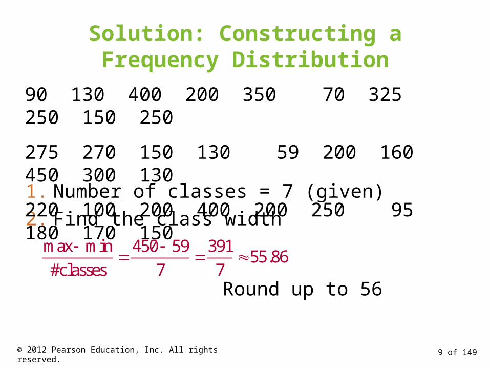
Solution: Constructing a Frequency Distribution
1. Number of classes = 7 (given)
2. Find the class width
max min 450 59 39155.86
#classes 7 7
Round up to 56
90 130 400 200 350 70 325 250 150 250
275 270 150 130 59 200 160 450 300 130
220 100 200 400 200 250 95 180 170 150
9 of 149© 2012 Pearson Education, Inc. All rights reserved.
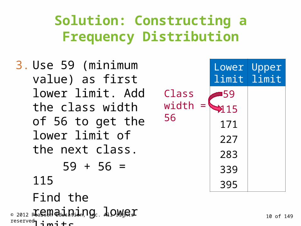
Solution: Constructing a Frequency Distribution
Lower limit
Upper limit
59
115
171
227
283
339
395
Class width = 56
3. Use 59 (minimum value) as first lower limit. Add the class width of 56 to get the lower limit of the next class.
59 + 56 = 115
Find the remaining lower limits.
10 of 149© 2012 Pearson Education, Inc. All rights reserved.
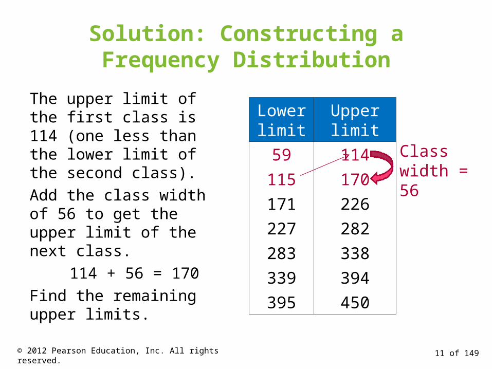
Solution: Constructing a Frequency Distribution
The upper limit of the first class is 114 (one less than the lower limit of the second class).
Add the class width of 56 to get the upper limit of the next class.
114 + 56 = 170
Find the remaining upper limits.
Lower limit
Upper limit
59 114
115 170
171 226
227 282
283 338
339 394
395 450
Class width = 56
11 of 149© 2012 Pearson Education, Inc. All rights reserved.

Solution: Constructing a Frequency Distribution
4. Make a tally mark for each data entry in the row of the appropriate class.
5. Count the tally marks to find the total frequency f for each class.
Class Tally Frequency, f
59 – 114 IIII 5
115 – 170 IIII III 8
171 – 226 IIII I 6
227 – 282 IIII 5
283 – 338 II 2
339 – 394 I 1
395 – 450 III 312 of 149© 2012 Pearson Education, Inc. All rights reserved.

Determining the Midpoint
Midpoint of a class(Lower class limit) (Upper class limit)
2
Class Midpoint Frequency, f
59 – 114 5
115 – 170 8
171 – 226 6
59 11486.5
2
115 170142.5
2
171 226198.5
2
Class width = 56
13 of 149© 2012 Pearson Education, Inc. All rights reserved.
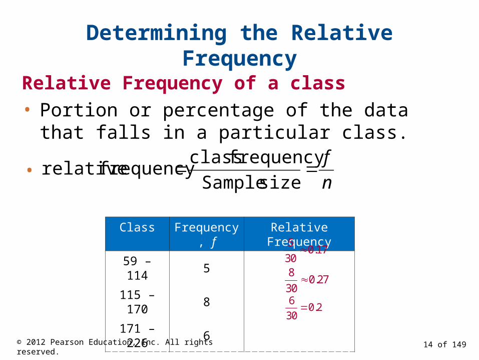
Determining the Relative Frequency
Relative Frequency of a class
• Portion or percentage of the data that falls in a particular class.
n
f
sizeSample
frequencyclassfrequencyrelative
Class Frequency, f Relative Frequency
59 – 114 5
115 – 170 8
171 – 226 6
50.17
30
80.27
30
60.2
30
•
14 of 149© 2012 Pearson Education, Inc. All rights reserved.
Determining the Cumulative Frequency
Cumulative frequency of a class
• The sum of the frequency for that class and all previous classes.
Class Frequency, f Cumulative frequency
59 – 114 5
115 – 170 8
171 – 226 6
+
+
5
13
19
15 of 149© 2012 Pearson Education, Inc. All rights reserved.

Expanded Frequency Distribution
Class Frequency, f MidpointRelative
frequencyCumulative frequency
59 – 114 5 86.5 0.17 5
115 – 170 8 142.5 0.27 13
171 – 226 6 198.5 0.2 19
227 – 282 5 254.5 0.17 24
283 – 338 2 310.5 0.07 26
339 – 394 1 366.5 0.03 27
395 – 450 3 422.5 0.1 30
Σf = 30 1n
f
16 of 149© 2012 Pearson Education, Inc. All rights reserved.
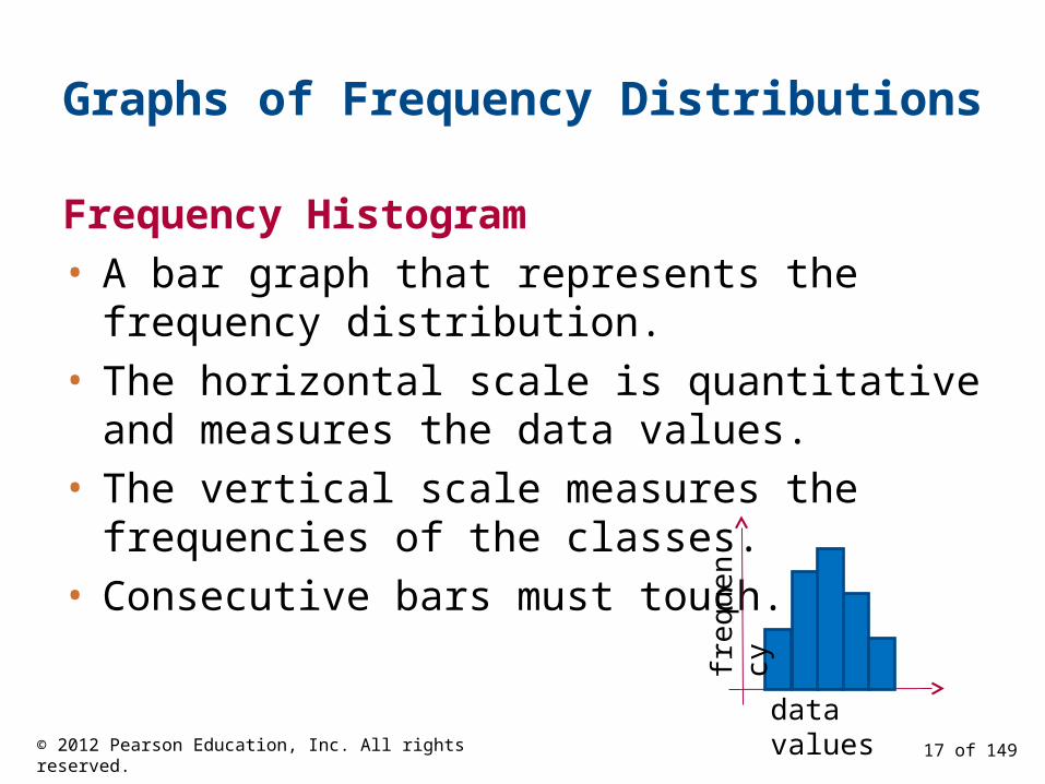
Graphs of Frequency Distributions
Frequency Histogram
• A bar graph that represents the frequency distribution.
• The horizontal scale is quantitative and measures the data values.
• The vertical scale measures the frequencies of the classes.
• Consecutive bars must touch.
data valuesfr
eque
ncy
17 of 149© 2012 Pearson Education, Inc. All rights reserved.

Class Boundaries
Class boundaries
• The numbers that separate classes without forming gaps between them.
ClassClass
BoundariesFrequency,
f
59 – 114 5
115 – 170 8
171 – 226 6
• The distance from the upper limit of the first class to the lower limit of the second class is 115 – 114 = 1.
• Half this distance is 0.5.
• First class lower boundary = 59 – 0.5 = 58.5• First class upper boundary = 114 + 0.5 = 114.5
58.5 – 114.5
18 of 149© 2012 Pearson Education, Inc. All rights reserved.
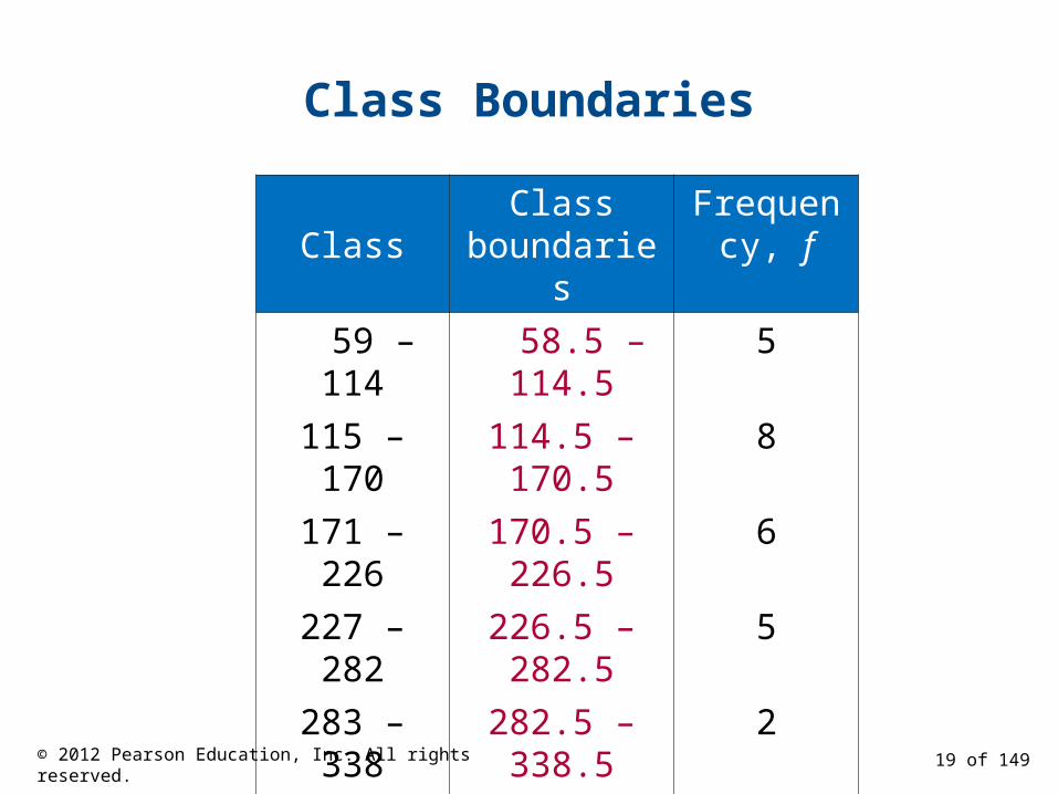
Class Boundaries
ClassClass
boundariesFrequency,
f
59 – 114 58.5 – 114.5 5
115 – 170 114.5 – 170.5 8
171 – 226 170.5 – 226.5 6
227 – 282 226.5 – 282.5 5
283 – 338 282.5 – 338.5 2
339 – 394 338.5 – 394.5 1
395 – 450 394.5 – 450.5 3
19 of 149© 2012 Pearson Education, Inc. All rights reserved.
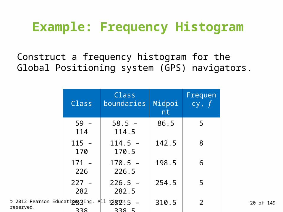
Example: Frequency Histogram
Construct a frequency histogram for the Global Positioning system (GPS) navigators.
ClassClass
boundaries MidpointFrequency,
f
59 – 114 58.5 – 114.5 86.5 5
115 – 170 114.5 – 170.5 142.5 8
171 – 226 170.5 – 226.5 198.5 6
227 – 282 226.5 – 282.5 254.5 5
283 – 338 282.5 – 338.5 310.5 2
339 – 394 338.5 – 394.5 366.5 1
395 – 450 394.5 – 450.5 422.5 3
20 of 149© 2012 Pearson Education, Inc. All rights reserved.

Solution: Frequency Histogram (using Midpoints)
21 of 149© 2012 Pearson Education, Inc. All rights reserved.

Solution: Frequency Histogram (using class boundaries)
You can see that more than half of the GPS navigators are priced below $226.50.
22 of 149© 2012 Pearson Education, Inc. All rights reserved.

Graphs of Frequency Distributions
Frequency Polygon
• A line graph that emphasizes the continuous change in frequencies.
data values
freq
uenc
y
23 of 149© 2012 Pearson Education, Inc. All rights reserved.
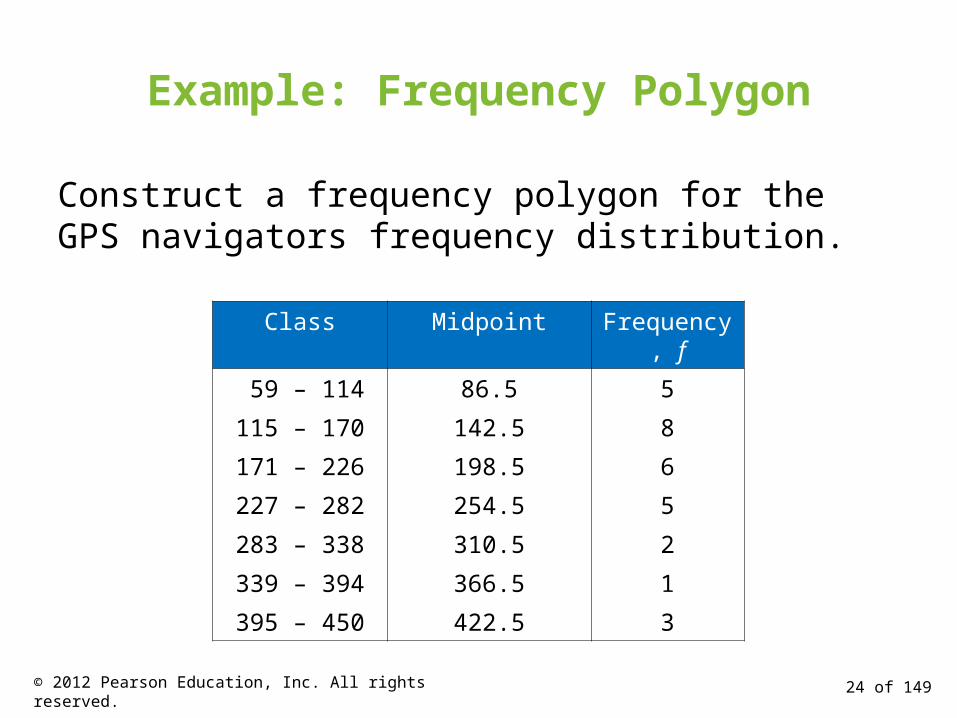
Example: Frequency Polygon
Construct a frequency polygon for the GPS navigators frequency distribution.
Class Midpoint Frequency, f
59 – 114 86.5 5
115 – 170 142.5 8
171 – 226 198.5 6
227 – 282 254.5 5
283 – 338 310.5 2
339 – 394 366.5 1
395 – 450 422.5 3
24 of 149© 2012 Pearson Education, Inc. All rights reserved.

Solution: Frequency Polygon
You can see that the frequency of GPS navigators increases up to $142.50 and then decreases.
The graph should begin and end on the horizontal axis, so extend the left side to one class width before the first class midpoint and extend the right side to one class width after the last class midpoint.
25 of 149© 2012 Pearson Education, Inc. All rights reserved.
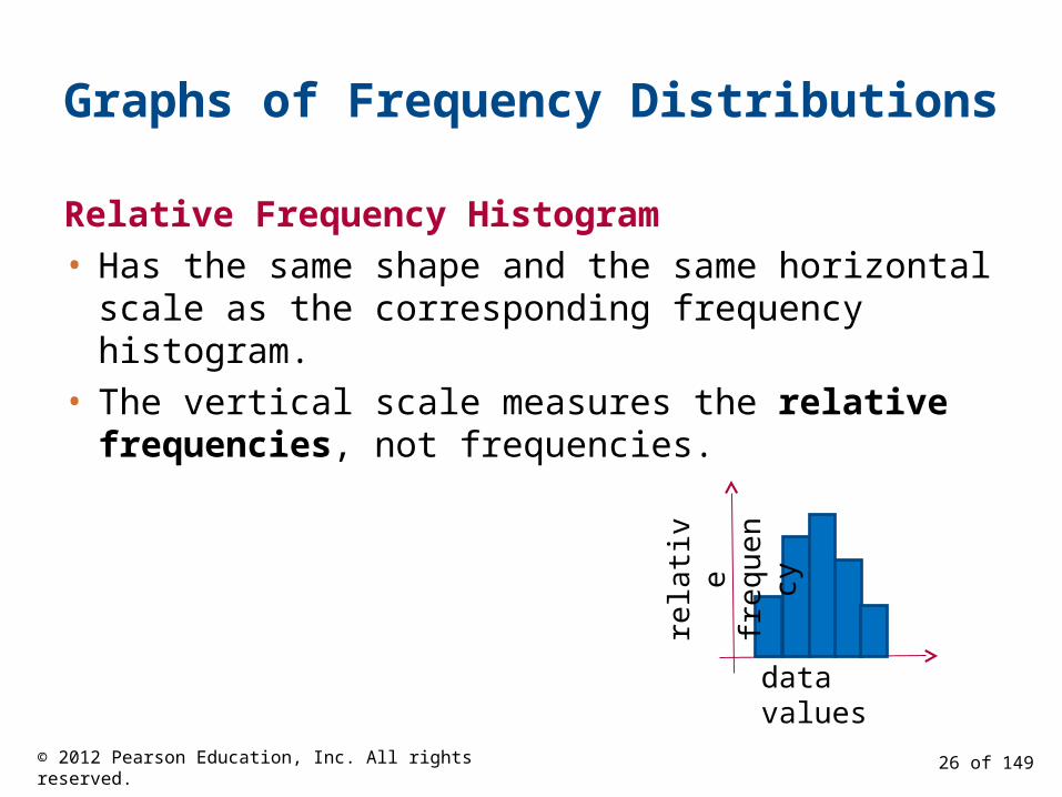
Graphs of Frequency Distributions
Relative Frequency Histogram
• Has the same shape and the same horizontal scale as the corresponding frequency histogram.
• The vertical scale measures the relative frequencies, not frequencies.
data valuesre
lativ
e fr
eque
ncy
26 of 149© 2012 Pearson Education, Inc. All rights reserved.
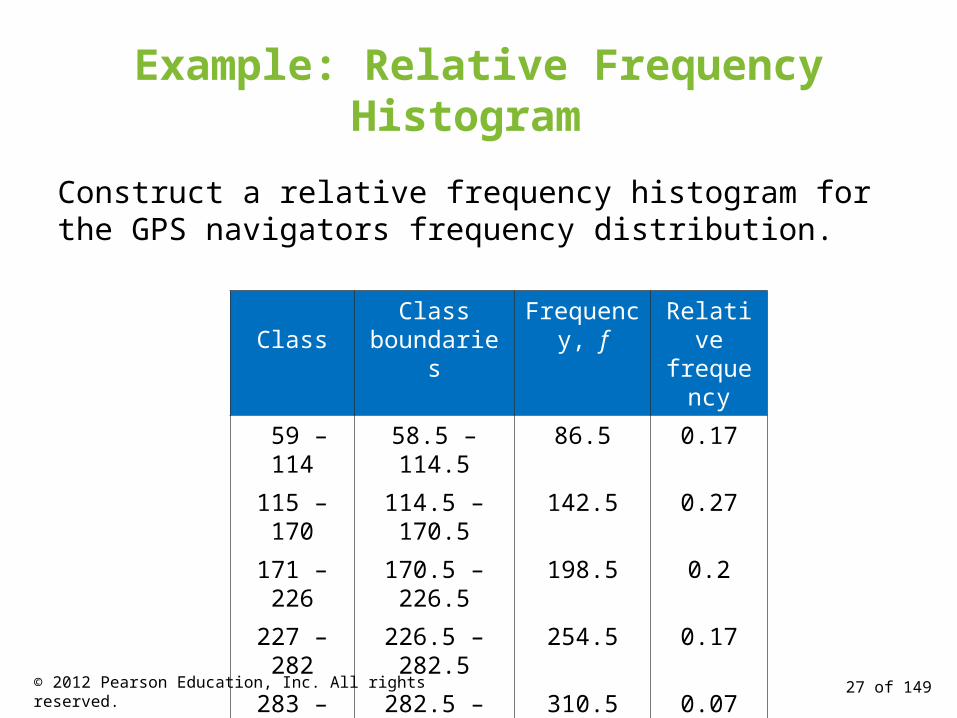
Example: Relative Frequency Histogram
Construct a relative frequency histogram for the GPS navigators frequency distribution.
ClassClass
boundariesFrequency,
fRelative
frequency
59 – 114 58.5 – 114.5 86.5 0.17
115 – 170 114.5 – 170.5 142.5 0.27
171 – 226 170.5 – 226.5 198.5 0.2
227 – 282 226.5 – 282.5 254.5 0.17
283 – 338 282.5 – 338.5 310.5 0.07
339 – 394 338.5 – 394.5 366.5 0.03
395 – 450 394.5 – 450.5 422.5 0.1
27 of 149© 2012 Pearson Education, Inc. All rights reserved.

Solution: Relative Frequency Histogram
6.5 18.5 30.5 42.5 54.5 66.5 78.5 90.5
From this graph you can see that 20% of GPS navigators are priced between $114.50 and $170.50.
28 of 149© 2012 Pearson Education, Inc. All rights reserved.

Graphs of Frequency Distributions
Cumulative Frequency Graph or Ogive
• A line graph that displays the cumulative frequency of each class at its upper class boundary.
• The upper boundaries are marked on the horizontal axis.
• The cumulative frequencies are marked on the vertical axis.
data valuescu
mul
ativ
e fr
eque
ncy
29 of 149© 2012 Pearson Education, Inc. All rights reserved.
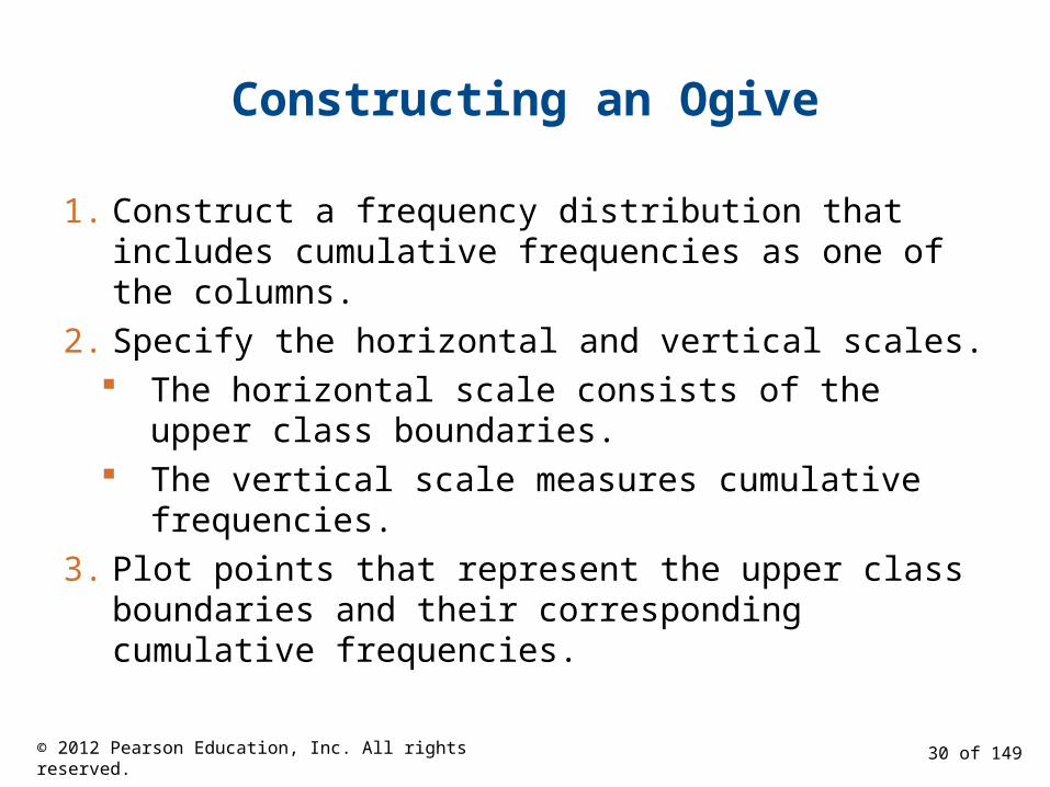
Constructing an Ogive
1. Construct a frequency distribution that includes cumulative frequencies as one of the columns.
2. Specify the horizontal and vertical scales. The horizontal scale consists of the upper class
boundaries. The vertical scale measures cumulative
frequencies.
3. Plot points that represent the upper class boundaries and their corresponding cumulative frequencies.
30 of 149© 2012 Pearson Education, Inc. All rights reserved.

Constructing an Ogive
4. Connect the points in order from left to right.
5. The graph should start at the lower boundary of the first class (cumulative frequency is zero) and should end at the upper boundary of the last class (cumulative frequency is equal to the sample size).
31 of 149© 2012 Pearson Education, Inc. All rights reserved.
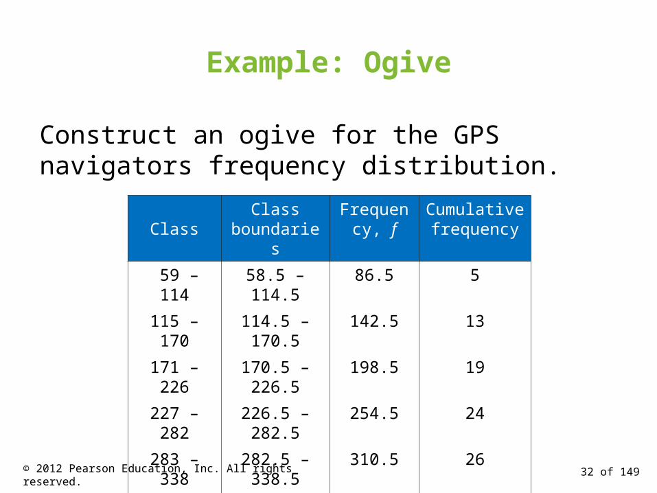
Example: Ogive
Construct an ogive for the GPS navigators frequency distribution.
ClassClass
boundariesFrequency,
fCumulative frequency
59 – 114 58.5 – 114.5 86.5 5
115 – 170 114.5 – 170.5 142.5 13
171 – 226 170.5 – 226.5 198.5 19
227 – 282 226.5 – 282.5 254.5 24
283 – 338 282.5 – 338.5 310.5 26
339 – 394 338.5 – 394.5 366.5 27
395 – 450 394.5 – 450.5 422.5 30
32 of 149© 2012 Pearson Education, Inc. All rights reserved.
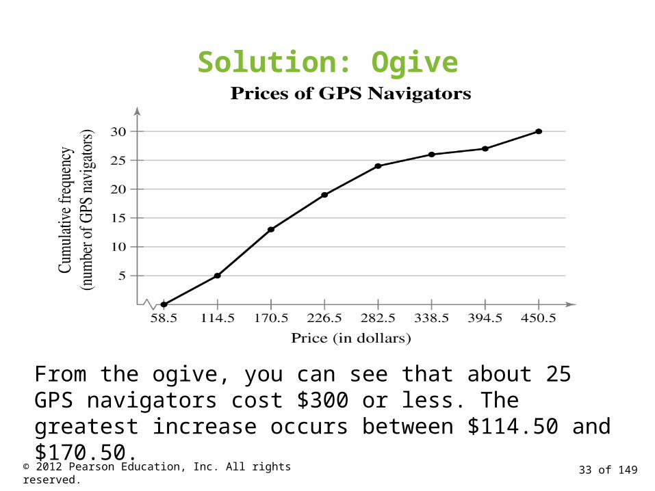
Solution: Ogive
6.5 18.5 30.5 42.5 54.5 66.5 78.5 90.5
From the ogive, you can see that about 25 GPS navigators cost $300 or less. The greatest increase occurs between $114.50 and $170.50.
33 of 149© 2012 Pearson Education, Inc. All rights reserved.

Section 2.1 Summary
• Constructed frequency distributions
• Constructed frequency histograms, frequency polygons, relative frequency histograms and ogives
34 of 149© 2012 Pearson Education, Inc. All rights reserved.

Section 2.2
More Graphs and Displays
35 of 149© 2012 Pearson Education, Inc. All rights reserved.
Section 2.2 Objectives
• Graph quantitative data using stem-and-leaf plots and dot plots
• Graph qualitative data using pie charts and Pareto charts
• Graph paired data sets using scatter plots and time series charts
36 of 149© 2012 Pearson Education, Inc. All rights reserved.
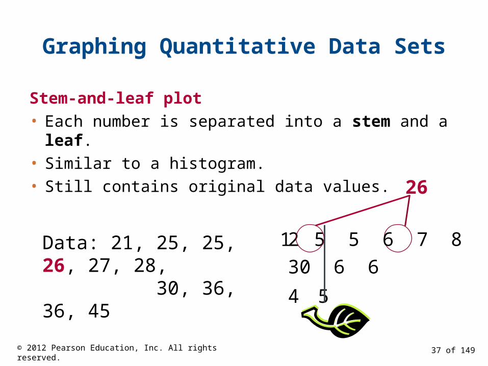
Graphing Quantitative Data Sets
Stem-and-leaf plot
• Each number is separated into a stem and a leaf.
• Similar to a histogram.
• Still contains original data values.
Data: 21, 25, 25, 26, 27, 28, 30, 36, 36, 45
26
2 1 5 5 6 7 8
3 0 6 6
4 5
37 of 149© 2012 Pearson Education, Inc. All rights reserved.
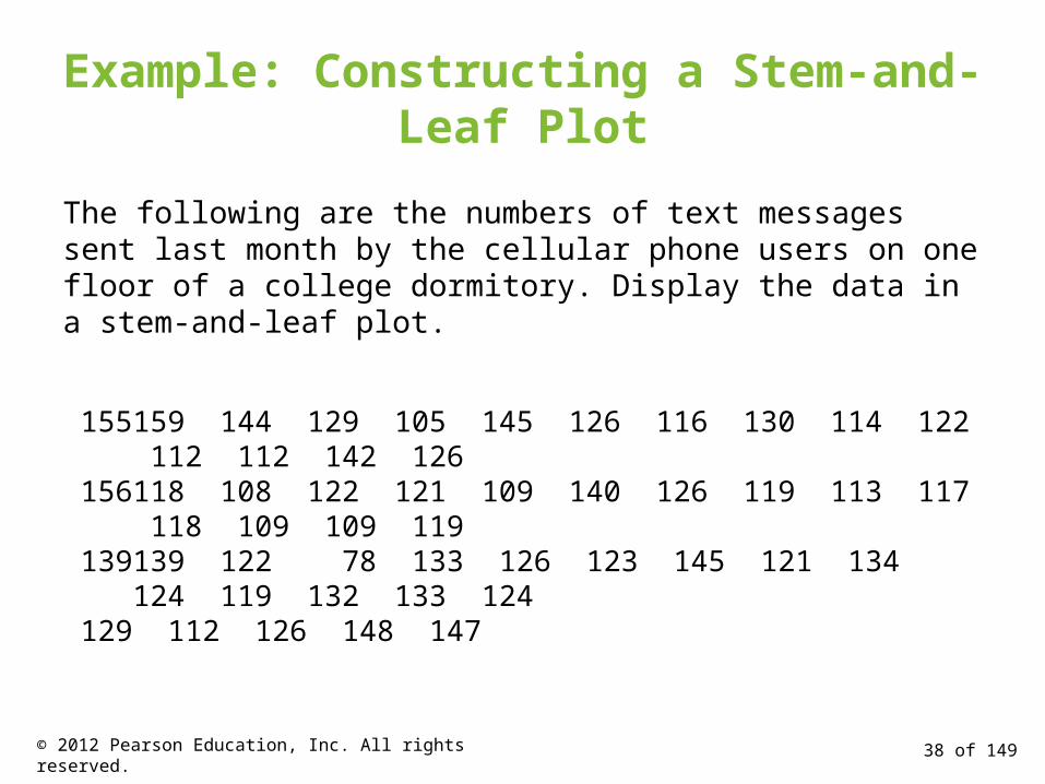
Example: Constructing a Stem-and-Leaf Plot
The following are the numbers of text messages sent last month by the cellular phone users on one floor of a college dormitory. Display the data in a stem-and-leaf plot.
155 159 144 129 105 145 126 116 130 114 122 112 112 142 126156 118 108 122 121 109 140 126 119 113 117 118 109 109 119139 139 122 78 133 126 123 145 121 134 124 119 132 133 124129 112 126 148 147
38 of 149© 2012 Pearson Education, Inc. All rights reserved.
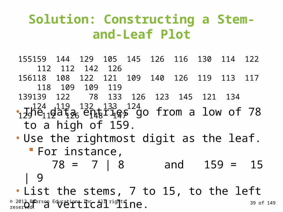
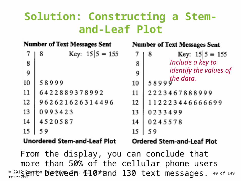
Solution: Constructing a Stem-and-Leaf Plot
• The data entries go from a low of 78 to a high of 159.• Use the rightmost digit as the leaf.
For instance, 78 = 7 | 8 and 159 = 15 | 9
• List the stems, 7 to 15, to the left of a vertical line.• For each data entry, list a leaf to the right of its stem.
155 159 144 129 105 145 126 116 130 114 122 112 112 142 126156 118 108 122 121 109 140 126 119 113 117 118 109 109 119139 139 122 78 133 126 123 145 121 134 124 119 132 133 124129 112 126 148 147
39 of 149© 2012 Pearson Education, Inc. All rights reserved.
Solution: Constructing a Stem-and-Leaf Plot
Include a key to identify the values of the data.
From the display, you can conclude that more than 50% of the cellular phone users sent between 110 and 130 text messages.
40 of 149© 2012 Pearson Education, Inc. All rights reserved.

Graphing Quantitative Data Sets
Dot plot
• Each data entry is plotted, using a point, above a horizontal axis
Data: 21, 25, 25, 26, 27, 28, 30, 36, 36, 45
26
20 21 22 23 24 25 26 27 28 29 30 31 32 33 34 35 36 37 38 39 40 41 42 43 44 45
41 of 149© 2012 Pearson Education, Inc. All rights reserved.
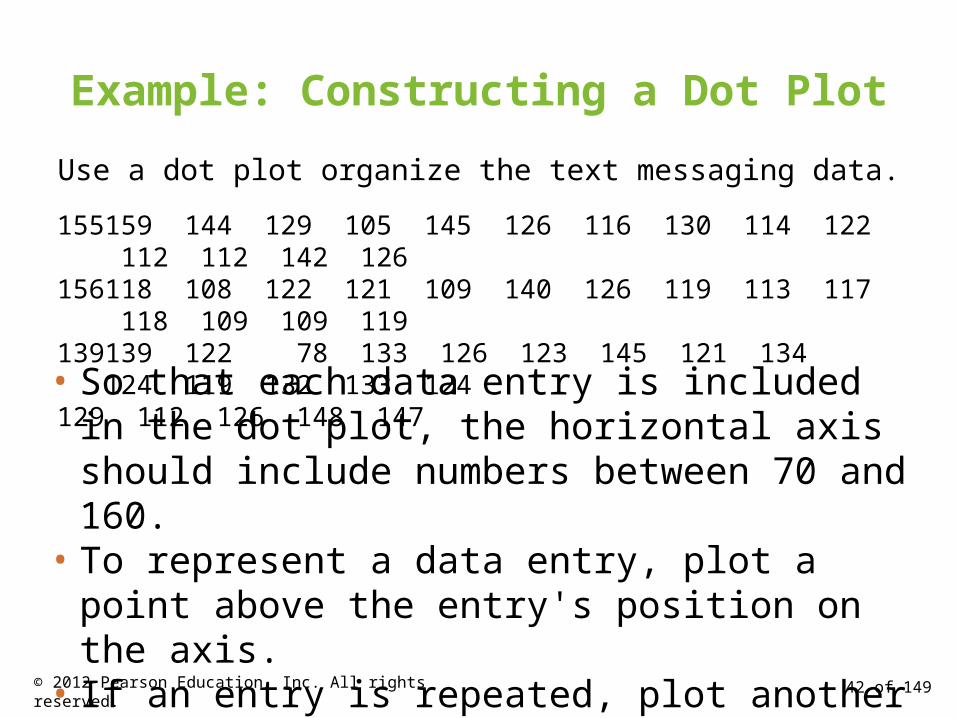
Example: Constructing a Dot Plot
Use a dot plot organize the text messaging data.
• So that each data entry is included in the dot plot, the horizontal axis should include numbers between 70 and 160.
• To represent a data entry, plot a point above the entry's position on the axis.
• If an entry is repeated, plot another point above the previous point.
155 159 144 129 105 145 126 116 130 114 122 112 112 142 126156 118 108 122 121 109 140 126 119 113 117 118 109 109 119139 139 122 78 133 126 123 145 121 134 124 119 132 133 124129 112 126 148 147
42 of 149© 2012 Pearson Education, Inc. All rights reserved.
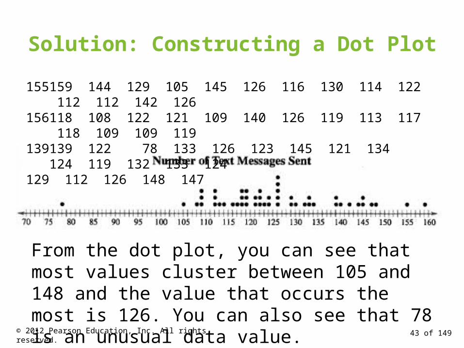
Solution: Constructing a Dot Plot
From the dot plot, you can see that most values cluster between 105 and 148 and the value that occurs the most is 126. You can also see that 78 is an unusual data value.
155 159 144 129 105 145 126 116 130 114 122 112 112 142 126156 118 108 122 121 109 140 126 119 113 117 118 109 109 119139 139 122 78 133 126 123 145 121 134 124 119 132 133 124129 112 126 148 147
43 of 149© 2012 Pearson Education, Inc. All rights reserved.
Graphing Qualitative Data Sets
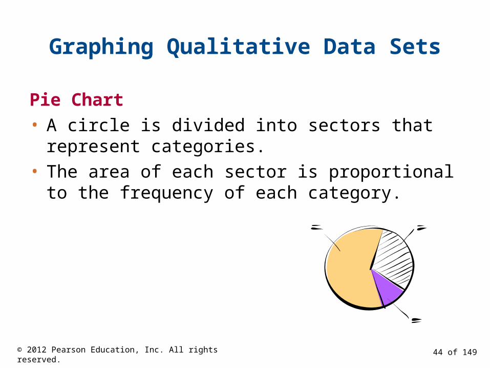
Pie Chart
• A circle is divided into sectors that represent categories.
• The area of each sector is proportional to the frequency of each category.
44 of 149© 2012 Pearson Education, Inc. All rights reserved.
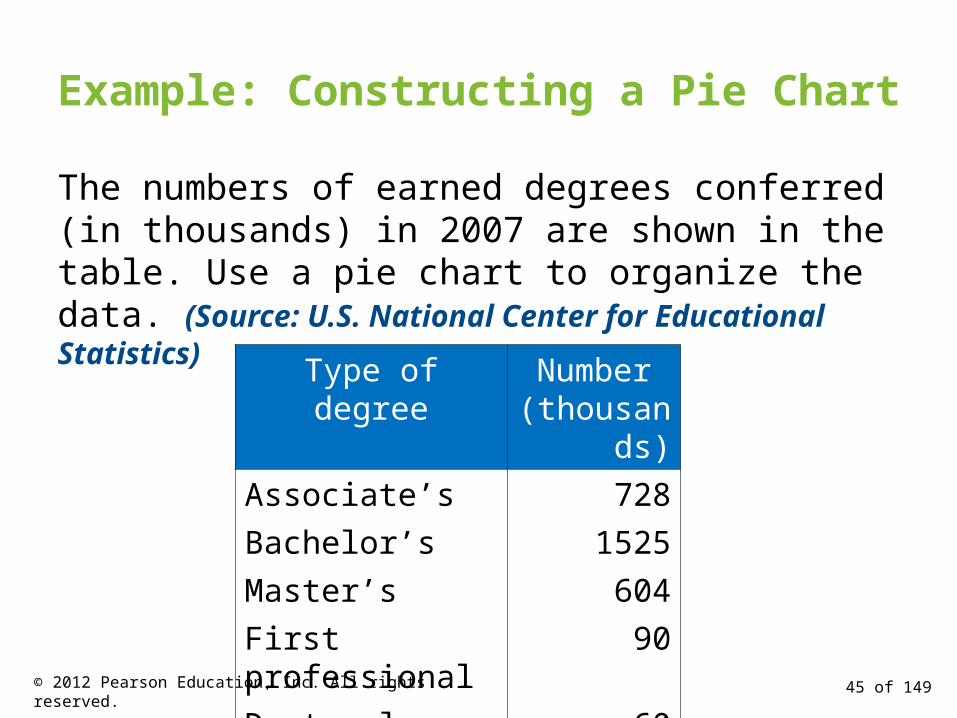
Example: Constructing a Pie Chart
The numbers of earned degrees conferred (in thousands) in 2007 are shown in the table. Use a pie chart to organize the data. (Source: U.S. National Center for Educational Statistics)
Type of degree Number(thousands)
Associate’s 728
Bachelor’s 1525
Master’s 604
First professional 90
Doctoral 6045 of 149© 2012 Pearson Education, Inc. All rights reserved.
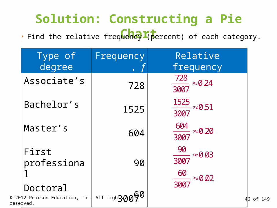
Solution: Constructing a Pie Chart• Find the relative frequency (percent) of each category.
Type of degree Frequency, f Relative frequency
Associate’s 728
Bachelor’s 1525
Master’s 604
First professional90
Doctoral60
3007
7280.24
3007
15250.51
3007
6040.20
3007
900.03
3007
46 of 149© 2012 Pearson Education, Inc. All rights reserved.
600.02
3007

Solution: Constructing a Pie Chart
• Construct the pie chart using the central angle that corresponds to each category. To find the central angle, multiply 360º by the
category's relative frequency. For example, the central angle for cars is
360(0.24) ≈ 86º
47 of 149© 2012 Pearson Education, Inc. All rights reserved.

Solution: Constructing a Pie Chart
Type of degree Frequency, fRelative
frequency Central angle
Associate’s 728 0.24
Bachelor’s 1525 0.51
Master’s 604 0.20
First professional 90 0.03
Doctoral 60 0.02 360º(0.02)≈7º
360º(0.24)≈86º
360º(0.51)≈184º
360º(0.20)≈72º
360º(0.03)≈11º
48 of 149© 2012 Pearson Education, Inc. All rights reserved.

Solution: Constructing a Pie Chart
Type of degreeRelative
frequencyCentral angle
Associate’s 0.24 86º
Bachelor’s 0.51 184º
Master’s 0.20 72º
First professional 0.03 11º
Doctoral 0.02 7º
From the pie chart, you can see that most fatalities in motor vehicle crashes were those involving the occupants of cars.
49 of 149© 2012 Pearson Education, Inc. All rights reserved.
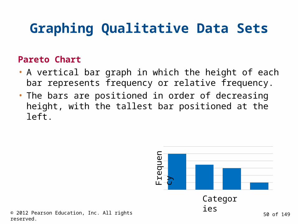
Graphing Qualitative Data Sets
Pareto Chart
• A vertical bar graph in which the height of each bar represents frequency or relative frequency.
• The bars are positioned in order of decreasing height, with the tallest bar positioned at the left.
Categories
Fre
quen
cy
50 of 149© 2012 Pearson Education, Inc. All rights reserved.

Example: Constructing a Pareto Chart
In a recent year, the retail industry lost $36.5 billion in inventory shrinkage. Inventory shrinkage is the loss of inventory through breakage, pilferage, shoplifting, and so on. The causes of the inventory shrinkage are administrative error ($5.4 billion), employee theft ($15.9 billion), shoplifting ($12.7 billion), and vendor fraud ($1.4 billion). Use a Pareto chart to organize this data. (Source: National Retail Federation and Center for Retailing Education, University of Florida)
51 of 149© 2012 Pearson Education, Inc. All rights reserved.
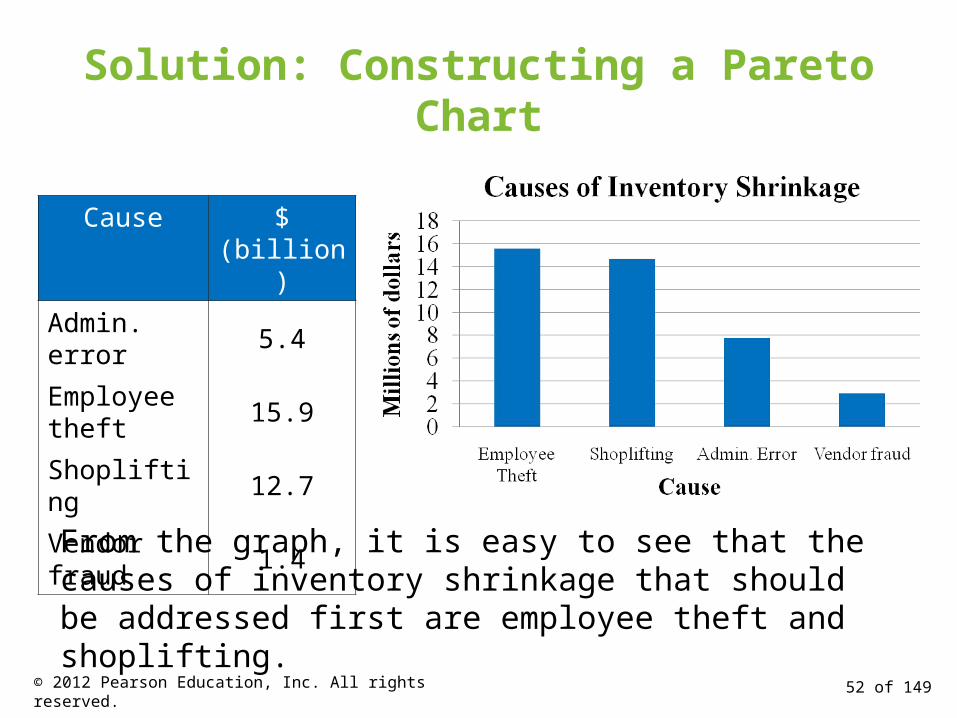
Solution: Constructing a Pareto Chart
Cause $ (billion)
Admin. error 5.4
Employee theft
15.9
Shoplifting 12.7
Vendor fraud 1.4
From the graph, it is easy to see that the causes of inventory shrinkage that should be addressed first are employee theft and shoplifting.
52 of 149© 2012 Pearson Education, Inc. All rights reserved.

Graphing Paired Data Sets
Paired Data Sets
• Each entry in one data set corresponds to one entry in a second data set.
• Graph using a scatter plot. The ordered pairs are graphed as
points in a coordinate plane. Used to show the relationship
between two quantitative variables.x
y
53 of 149© 2012 Pearson Education, Inc. All rights reserved.

Example: Interpreting a Scatter Plot
The British statistician Ronald Fisher introduced a famous data set called Fisher's Iris data set. This data set describes various physical characteristics, such as petal length and petal width (in millimeters), for three species of iris. The petal lengths form the first data set and the petal widths form the second data set. (Source: Fisher, R. A., 1936)
54 of 149© 2012 Pearson Education, Inc. All rights reserved.
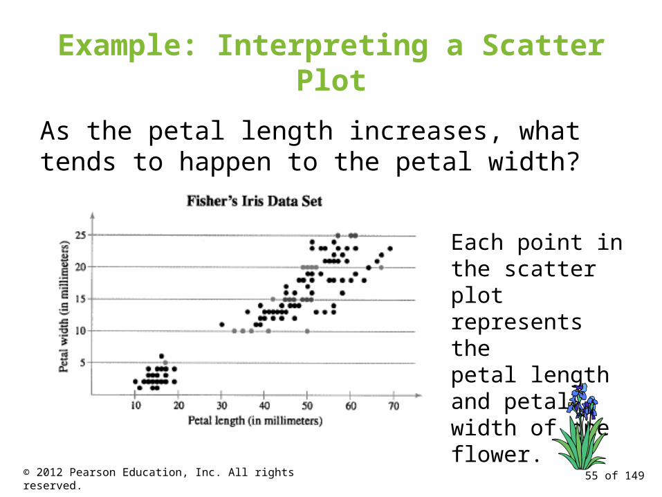
Example: Interpreting a Scatter Plot
As the petal length increases, what tends to happen to the petal width?
Each point in the scatter plot represents thepetal length and petal width of one flower.
55 of 149© 2012 Pearson Education, Inc. All rights reserved.

Solution: Interpreting a Scatter Plot
Interpretation From the scatter plot, you can see that as the petal length increases, the petal width also tends to increase.
56 of 149© 2012 Pearson Education, Inc. All rights reserved.
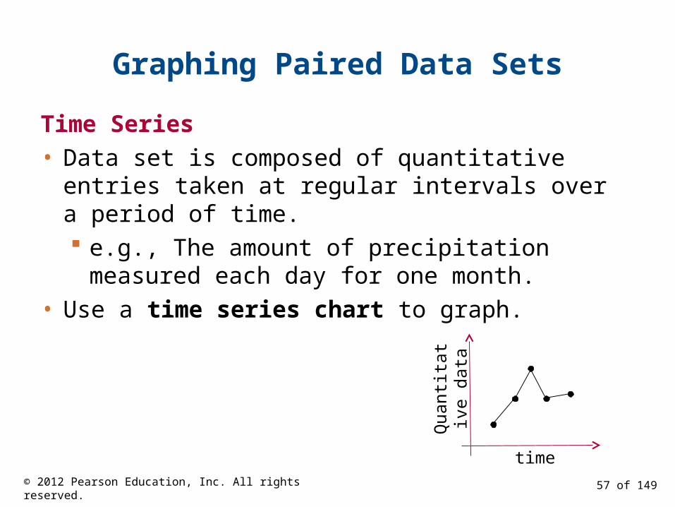
Graphing Paired Data Sets
Time Series
• Data set is composed of quantitative entries taken at regular intervals over a period of time. e.g., The amount of precipitation measured each
day for one month.
• Use a time series chart to graph.
timeQ
uant
itat
ive
data
57 of 149© 2012 Pearson Education, Inc. All rights reserved.
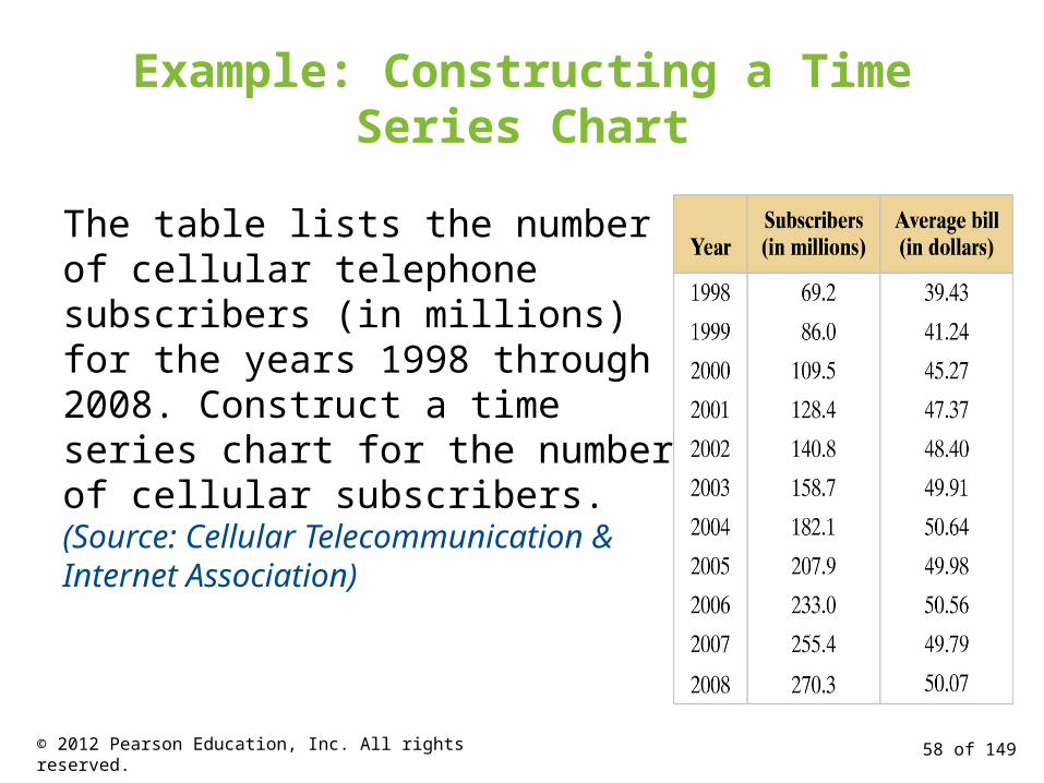
Example: Constructing a Time Series Chart
The table lists the number of cellular telephone subscribers (in millions) for the years 1998 through 2008. Construct a time series chart for the number of cellular subscribers. (Source: Cellular Telecommunication & Internet Association)
58 of 149© 2012 Pearson Education, Inc. All rights reserved.
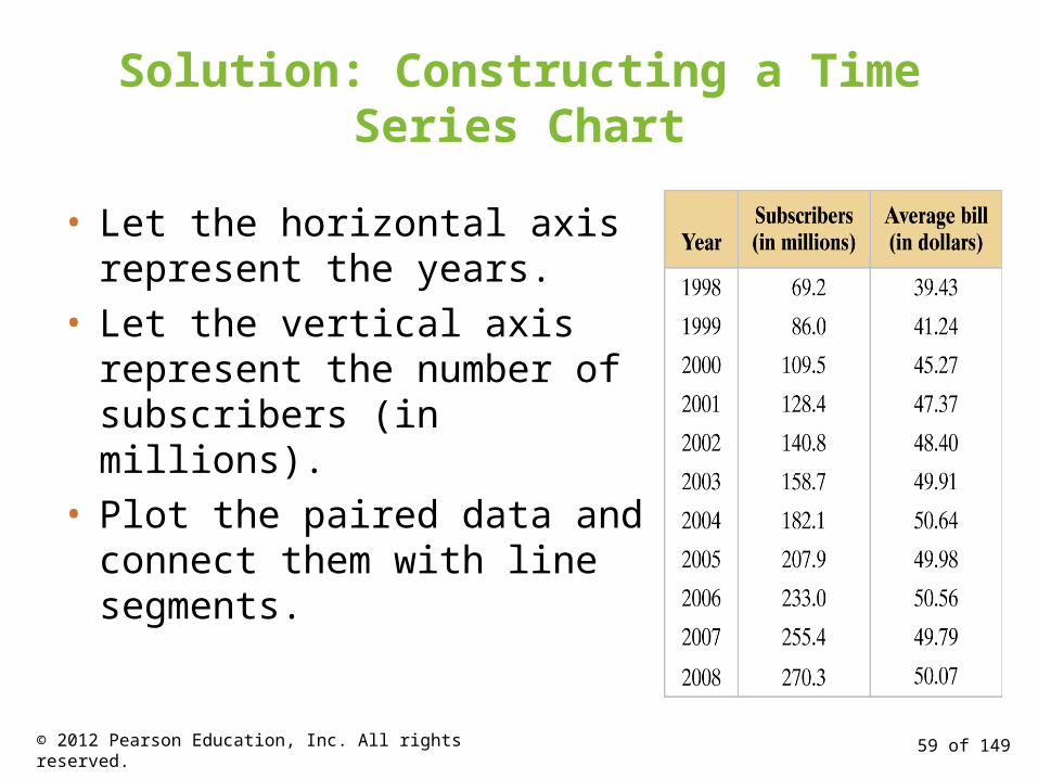
Solution: Constructing a Time Series Chart
• Let the horizontal axis represent the years.
• Let the vertical axis represent the number of subscribers (in millions).
• Plot the paired data and connect them with line segments.
59 of 149© 2012 Pearson Education, Inc. All rights reserved.
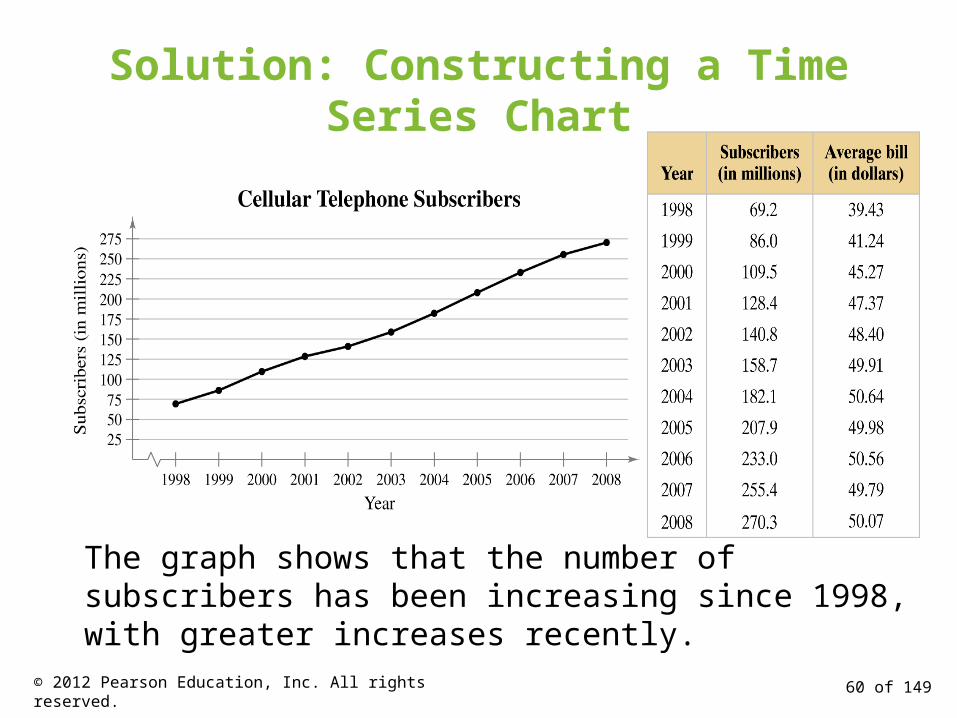
Solution: Constructing a Time Series Chart
The graph shows that the number of subscribers has been increasing since 1998, with greater increases recently.
60 of 149© 2012 Pearson Education, Inc. All rights reserved.
Section 2.2 Summary
• Graphed quantitative data using stem-and-leaf plots and dot plots
• Graphed qualitative data using pie charts and Pareto charts
• Graphed paired data sets using scatter plots and time series charts
61 of 149© 2012 Pearson Education, Inc. All rights reserved.