chapter 4: mobile user interface design. mobile user interface design: design falls into the...
TRANSCRIPT
Chapter 4: Mobile User Interface Design
Mobile User Interface Design:
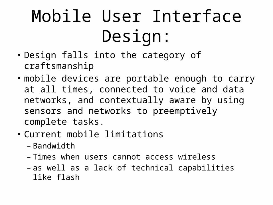
• Design falls into the category of craftsmanship• mobile devices are portable enough to carry at
all times, connected to voice and data networks, and contextually aware by using sensors and networks to preemptively complete tasks.
• Current mobile limitations– Bandwidth– Times when users cannot access wireless– as well as a lack of technical capabilities like flash
Mobile User Interface Design:
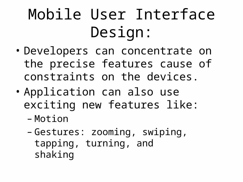
• Developers can concentrate on the precise features cause of constraints on the devices.
• Application can also use exciting new features like:– Motion– Gestures: zooming, swiping, tapping, turning, and
shaking
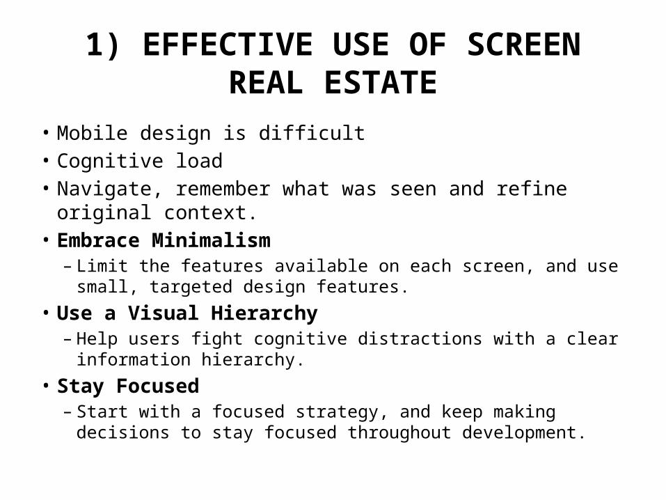
1) EFFECTIVE USE OF SCREEN REAL ESTATE
• Mobile design is difficult• Cognitive load• Navigate, remember what was seen and refine original context.• Embrace Minimalism
– Limit the features available on each screen, and use small, targeted design features.
• Use a Visual Hierarchy– Help users fight cognitive distractions with a clear information
hierarchy. • Stay Focused
– Start with a focused strategy, and keep making decisions to stay focused throughout development.

2) UNDERSTANDING MOBILE APPLICATION USERS
• The Gestalt principles have had a considerable influence on design, describing how the human mind perceives and organizes visual data. The Gestalt principles refer to theories of visual perception developed by German psychologists in the 1920s.
• Key principles include proximity, closure,continuity, figure and ground, and similarity.
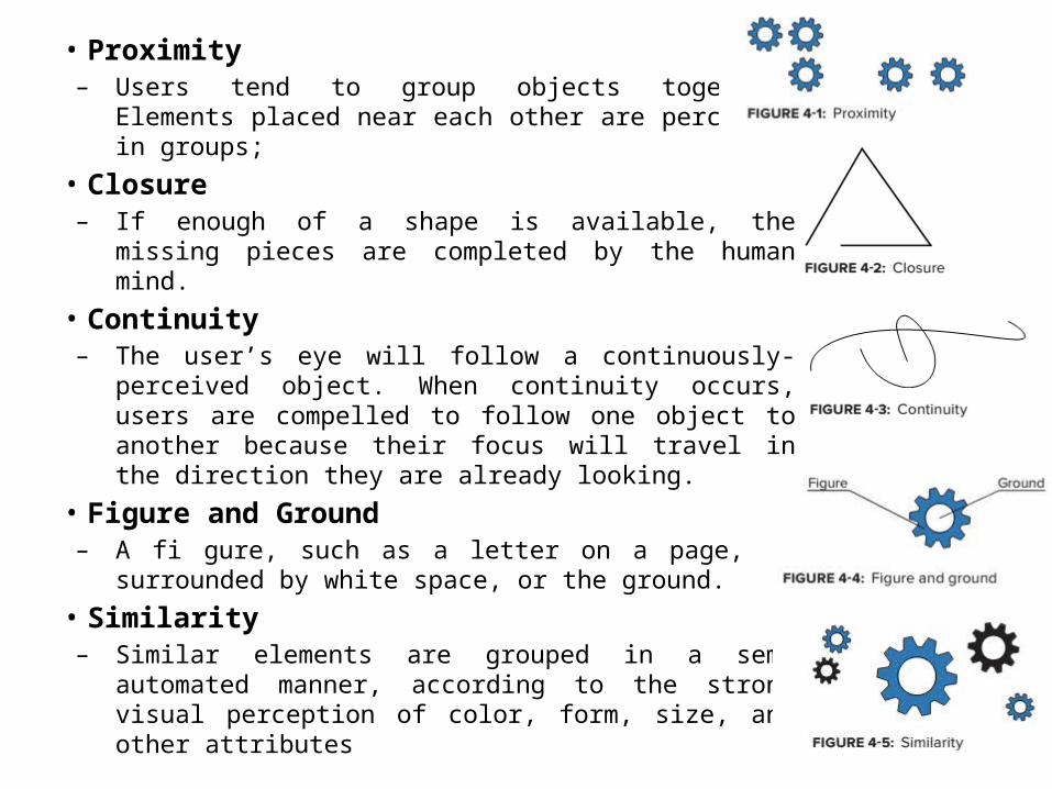
• Proximity– Users tend to group objects together. Elements
placed near each other are perceived in groups; • Closure– If enough of a shape is available, the missing pieces
are completed by the human mind.• Continuity– The user’s eye will follow a continuously-perceived
object. When continuity occurs, users are compelled to follow one object to another because their focus will travel in the direction they are already looking.
• Figure and Ground– A fi gure, such as a letter on a page, is surrounded by
white space, or the ground. • Similarity– Similar elements are grouped in a semi automated
manner, according to the strong visual perception of color, form, size, and other attributes
• The Social Aspect of Mobile– We all want to be connected, and to share
something with the world.– Connect with Existing Outlets
• Usability– In a perfect world, usability considerations would be
a regular, ongoing part of the whole process,checking how pixels and fingers interact in the real world
• Determining and Reaching the Target Audience
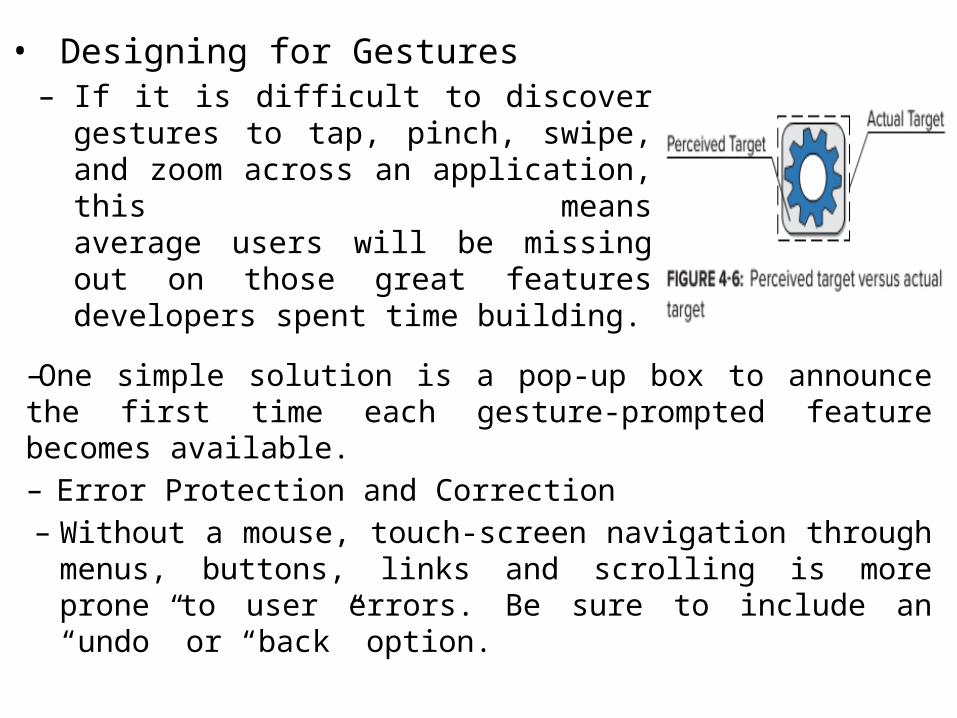
• Designing for Gestures– If it is difficult to discover gestures to
tap, pinch, swipe, and zoom across an application, this meansaverage users will be missing out on those great features developers spent time building.
–One simple solution is a pop-up box to announce the first time each gesture-prompted feature becomes available. – Error Protection and Correction
– Without a mouse, touch-screen navigation through menus, buttons, links and scrolling is moreprone to user errors. Be sure to include an “undo” or “back” option.
• Accessibility – An application that is easier for people to use with poor or diminished vision,
limited dexterity, or a cognitive impairment will be easier for all people to use. Consider accessibility as a way to reachmore users.
– Similar to the Web Content Accessibility Guidelines (WCAG) 2.0 POUR (perceivable, operational, understandable, and robust) principles, Mobile Web Best Practices (MWBP) is a World Wide WebConsortium standard defining a set of five checkpoints for mobile accessibility:
➤ Overall Behavior: Independent of specifi c device features, the guidelines for a general mobile experience.
➤ Navigation and Links: The ease of user interaction with hyperlinks on the mobile device interfaces.
➤ Page Layout and Content: How content is designed on each page, and how chunks of content are laid out for accessible consumption.
➤ Page Definition: Defi ning content areas for mobile device interpretation. ➤ User Input: Considerations of available mobile device input methods.
• Hearing– Moderate to profound hearing loss can make it difficult for many people to communicate with a
standard telephone, but many mobile devices offer features that make promising progress.For moderate hearing loss, adjustable volume control offers a simple way to connect with mobilecontent.
• Vision– Many users depend on tactile, audio, or other sensory alerts to access resources using mobile
devices.• Speech– Aid users with speech-related accessibility issues with output-related functionality using text
features. Text messaging, email, and predictive text are popular solutions.• Dexterity– A hands-free mode can limit how much the phone must be held to properly navigate, which
benefitslow-dexterity users as well as busy cooks, lost drivers, and distracted parents. Voice recognition isan increasingly common way to manage hands-free controls. Limiting text input has a similar effect:auto completion is increasingly common, and incredibly valuable.
• Cognition– Any feature to reduce the cognitive load — the amount of information users must hold in their
memory — is helpful. Associating images or photographs with long lists of information such as contacts can be helpful. Anticipate the information that users are seeking and allow shortcuts and prerecorded commands. Enable user customization to include audio, visual, and tactile alerts, as well as audio, visual, and tactile feedback as users navigate application features.
3) UNDERSTANDING MOBILE INFORMATION DESIGN
• The visual display of information is how people connect with loved ones, colleagues, and friends.
• Information Display– A microwave has a simple display.
Design Patterns
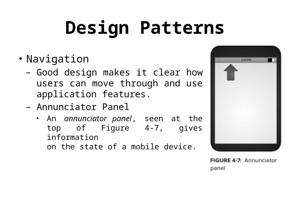
• Navigation– Good design makes it clear how
users can move through and useapplication features.
– Annunciator Panel • An annunciator panel, seen at the top
of Figure 4-7, gives informationon the state of a mobile device.
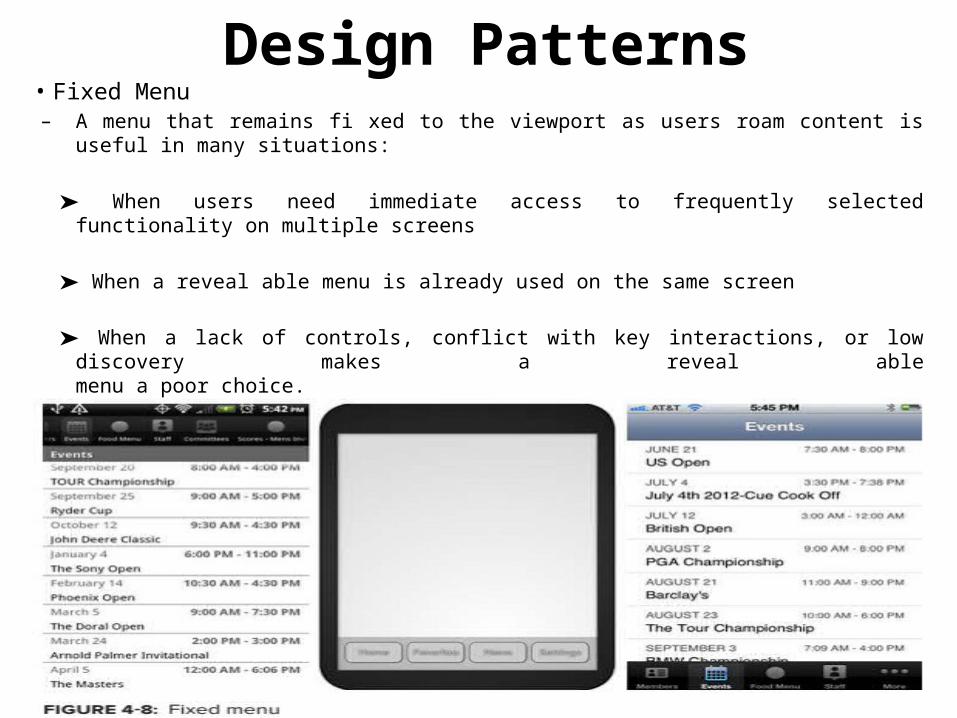
Design Patterns• Fixed Menu – A menu that remains fi xed to the viewport as users roam content is useful in many
situations:
➤ When users need immediate access to frequently selected functionality on multiple screens
➤ When a reveal able menu is already used on the same screen
➤ When a lack of controls, conflict with key interactions, or low discovery makes a reveal ablemenu a poor choice.
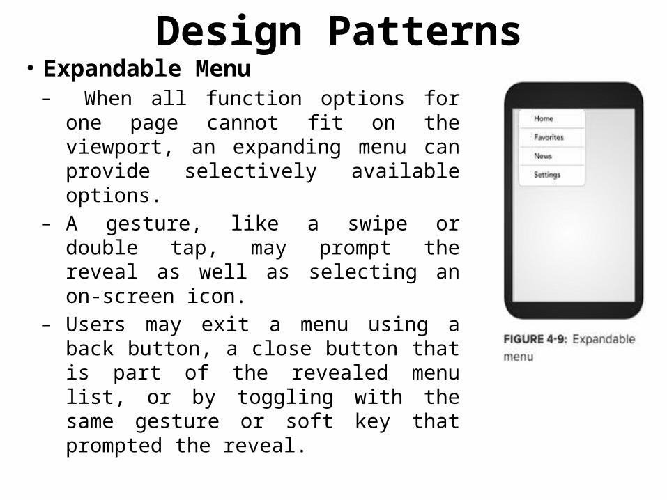
Design Patterns• Expandable Menu – When all function options for one
page cannot fit on the viewport, an expanding menu can provide selectively available options.
– A gesture, like a swipe or double tap, may prompt the reveal as well as selecting an on-screen icon.
– Users may exit a menu using a back button, a close button that is part of the revealed menu list, or by toggling with the same gesture or soft key that prompted the reveal.
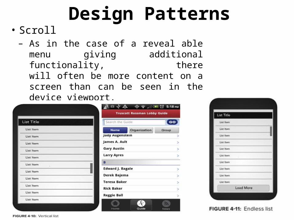
Design Patterns• Scroll – As in the case of a reveal able menu
giving additional functionality, therewill often be more content on a screen than can be seen in the device viewport.
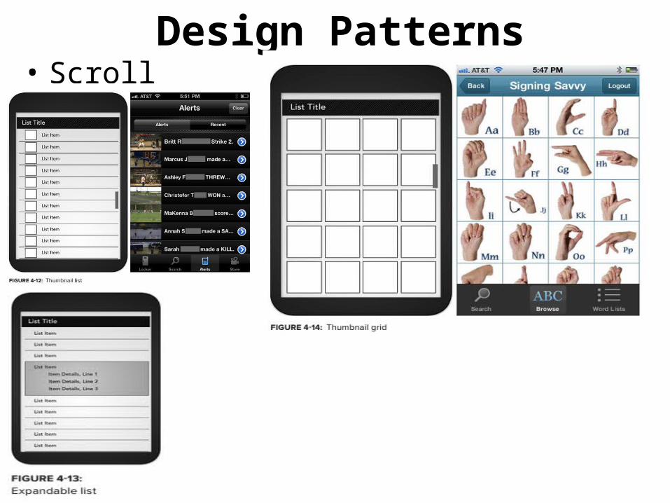
Design Patterns• Scroll
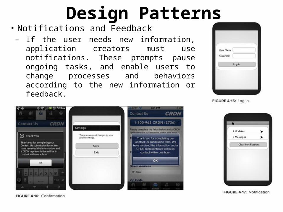
Design Patterns• Notifications and Feedback– If the user needs new information,
application creators must use notifications. These prompts pauseongoing tasks, and enable users to change processes and behaviors according to the new information or feedback.
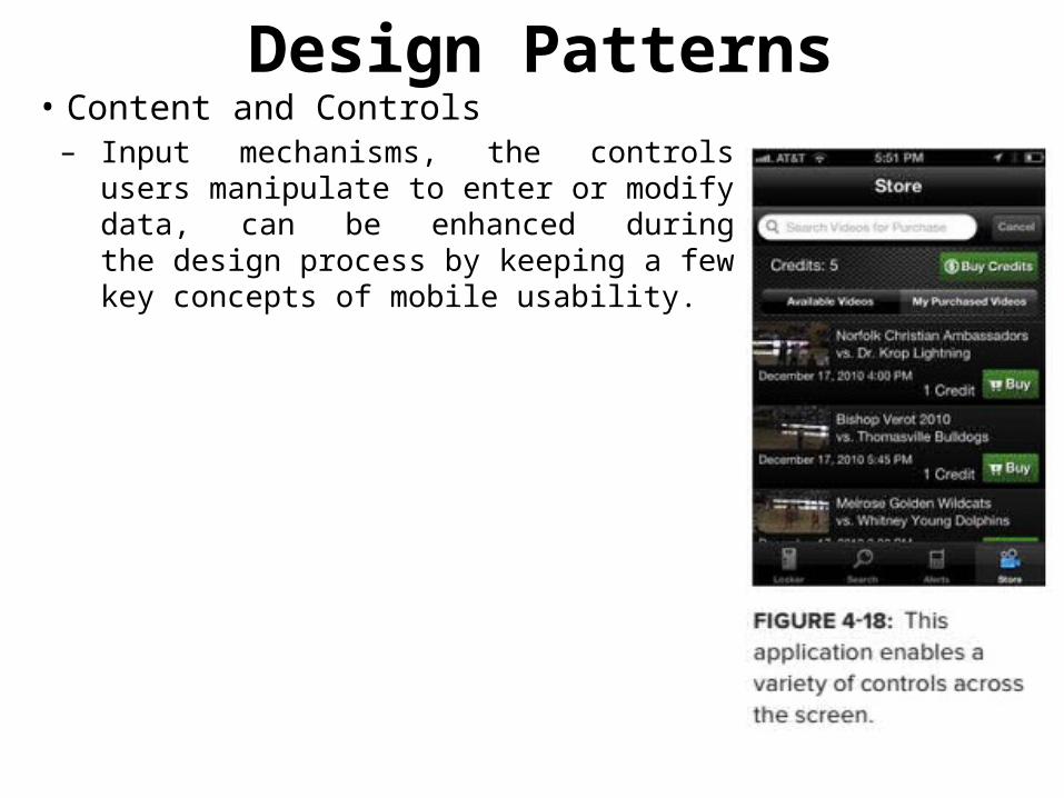
Design Patterns• Content and Controls– Input mechanisms, the controls users
manipulate to enter or modify data, can be enhanced duringthe design process by keeping a few key concepts of mobile usability.

Design Patterns– Reveal Content• You can display content either as a full
page or revealed in context. When you use a full-page layout, the user should not need to constantly bounce back and forth between pages:
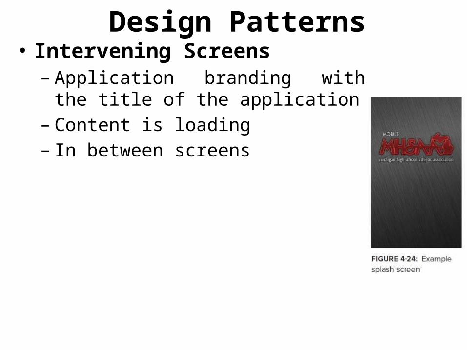
Design Patterns• Intervening Screens – Application branding with the title of the
application– Content is loading– In between screens
The Home and Splash Screen
• The first screen of an application is a great opportunity for branding.
• Minimize the use of long, over-animated splash screens and slow-to-access main features.
• A useful design method to disguise slow launch times is to use the splash screen image
• Application background: users will perceive a quicker entry to application features.
• Parallax scrolling, where foreground and background content move at different speeds.
• The home screen is where important, frequently used features are highlighted
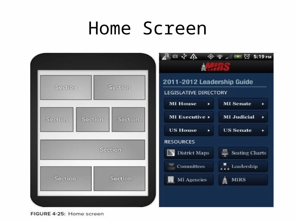
Home Screen
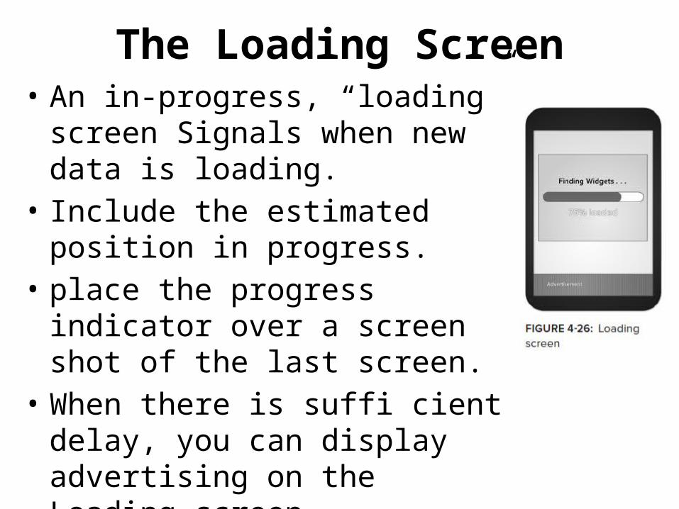
The Loading Screen• An in-progress, “loading” screen
Signals when new data is loading.• Include the estimated position in
progress.• place the progress indicator over a
screen shot of the last screen.• When there is suffi cient delay, you
can display advertising on the Loading screen.
Advertising• Project stakeholders need to pay the bills, and
advertising can certainly help.• Advertising styles and guidelines will vary
across platforms, but advertisements must generally:
➤ Be clearly differentiated from application content. ➤ Remain unobtrusive to application features. ➤ Be actionable, and allow user interaction. ➤ Be legible. ➤ Use consistent styles and layout throughout application screens.
Content Structure and Usage• Mobile application users are there to consume, produce, and share
content.• Users need to quickly locate and effectively use information. • Page layouts must reflect the mental models that users understand. • These content titles should always be horizontal, and set apart with
a different background or surrounding box. • Be sure to maintain consistent capitalization, using either sentence
or title case throughout all headers. • Titles can include icons, but these should be descriptive of the
content, and not needlessly redundant or vague.• Structured, template designs are valuable to great user experience:
– when people can predict which information will appear on what screen, users can more easily manipulate and navigate through mobile screens.
Information Architecture• A strong foundation by organizing, labeling, and
identifying all content that users will perceive.• A growing segment of interactive content is faceted,
tagging chunks of content with attributes• Classifying information by:– Name– Sequence– Fixed relationship between values– The distance between values– Geographic location– Proximity– Goals– Categorical subject matter
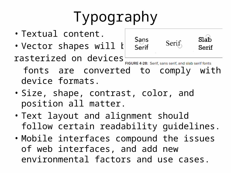
Typography• Textual content.• Vector shapes will berasterized on devices as fonts are converted to comply with device formats.• Size, shape, contrast, color, and position all
matter.• Text layout and alignment should follow certain
readability guidelines.• Mobile interfaces compound the issues of web
interfaces, and add new environmental factors and use cases.
Plain Language• That is clear and understandable to the audience• these tips are especially relevant to mobile
application creators: ➤ Omit unnecessary words. Take the first draft and cut it in half, and then see if you can cut it in half again (you probably can). ➤ Use the simplest form of a verb. ➤ Use short, simple words; avoid jargon and abbreviations. ➤ Use pronouns'.
Plain Language
• Precision is key to successful mobile content. Mobile plain language best practices also include: ➤ Focus keywords to the beginning or top of any screen. ➤ Use the same voice, preferably active voice, throughout the interface. Try to also use the same tense, when practical. ➤ If a product must be referenced, use a consistent product name. ➤ Correct unnecessarily mean or passive-aggressive error messages and task prompts. ➤ Avoid redundant content.
UNDERSTANDING MOBILE PLATFORMS
• Developers can take advantage of native functionality across mobile devices. More than a smaller, web like interface, an Android, BlackBerry, WP7, or iOS device can make phone calls as well as record and transmit contextual information like geolocation.
Android• Android has a diverse ecosystem, with fewer institutionalized
restrictions and a wider variety of mobile devices than other popular systems.
• Interface Tips - Get started on Android application design with these hints: ➤ Android convention is to place view-control tabs across the top, and not the bottom, of the screen. ➤ Use the main application icon for temporal, hierarchical navigation, instead of a “back” button and main icon link to the home screen. ➤ Don’t mimic user interface elements or recycle icons from other platforms. For instance, list items should not use carets to indicate deeper content. ➤ Parallax scrolling is common in Android applications. ➤ Android development can extend to home-screen “widget” tools.
IOS• Apple maintains strict design standards.• iOS interface documentation and general mobile
design strategies are available from Apple, including design strategies and case studies.
• Interface Tips– Apple can reject an application from the offi cial App
Store because of design problems– Follow the current guidelines closely, starting with these
tips:
IOS• Interface Tips– Apple can reject an application from the official App Store
because of design problems– Follow the current guidelines closely, starting with these tips:
➤ iPhone users generally hold from the bottom of the device, so main navigation items should be in reach of user thumbs. ➤ Target areas for controls should be a minimum of 44 x 44 points. ➤ Support standard iOS gestures, such as swiping down from the top to reveal the Notification Center. ➤ Larger iPad screens are great for custom multi-finger gestures, but non-standard gestures should never be the only way to reach and use important features.
– Accessibility
BlackBerry OS• BlackBerry OS is often the mobile device of choice
in government or corporate environments.• BlackBerry includes native support of corporate
emails; and runs on many devices with hard keypads, which is favored by users with accessibility issues as well as late adopters to touch-screen interfaces.
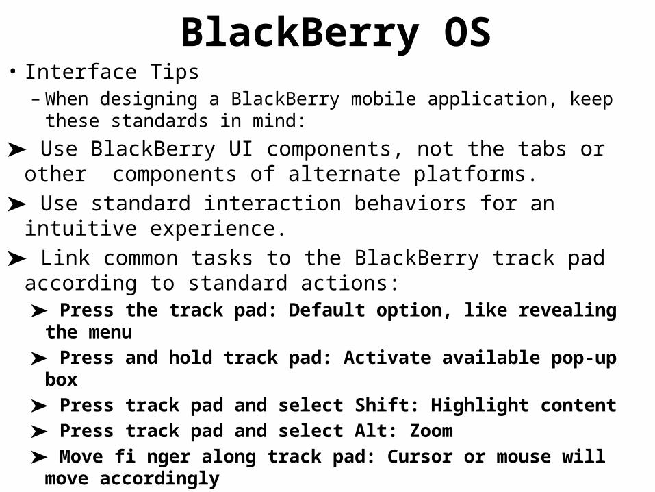
BlackBerry OS• Interface Tips
– When designing a BlackBerry mobile application, keep these standards in mind:
➤ Use BlackBerry UI components, not the tabs or other components of alternate platforms. ➤ Use standard interaction behaviors for an intuitive experience. ➤ Link common tasks to the BlackBerry track pad according to standard actions:
➤ Press the track pad: Default option, like revealing the menu ➤ Press and hold track pad: Activate available pop-up box ➤ Press track pad and select Shift: Highlight content ➤ Press track pad and select Alt: Zoom ➤ Move fi nger along track pad: Cursor or mouse will move accordingly

Windows Phone 7• Developed by Microsoft, Windows Phone 7 (WP7) is
a currently smaller contender, focused on consumer markets. Using the “Metro” theme, features are divided into “Live Tiles” that link to applications.
• Microsoft maintains design-impacting requirements for hardware, including six dedicated hardware buttons (back, start, search, camera, power, and volume), at least 4 GB of Flash memory, and Assisted GPS.
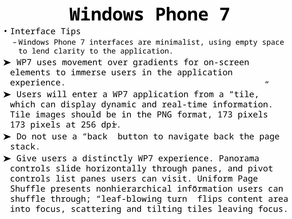
Windows Phone 7• Interface Tips
– Windows Phone 7 interfaces are minimalist, using empty space to lend clarity to the application.
➤ WP7 uses movement over gradients for on-screen elements to immerse users in the application experience. ➤ Users will enter a WP7 application from a “tile,” which can display dynamic and real-time information. Tile images should be in the PNG format, 173 pixels 173 pixels at 256 dpi. ➤ Do not use a “back” button to navigate back the page stack. ➤ Give users a distinctly WP7 experience. Panorama controls slide horizontally through panes, and pivot controls list panes users can visit. Uniform Page Shuffle presents nonhierarchical information users can shuffle through; “leaf-blowing turn” flips content area into focus, scattering and tilting tiles leaving focus.
Mobile Web Browsers• Similarly, mobile web applications should follow key mobile
design methods.• Interface Tips - More detail is included in Chapter 5, but here
are a few quick tips to get started: ➤ Test for a consistent experience when websites are accessed from a variety of mobile browsers. ➤ Provide minimal navigation at the top of the page, and use consistent navigation mechanisms. ➤ Do not change or refresh the current window, or cause pop-ups, without informing the user and providing the means to stop it. ➤ Limit content to what the user has requested, and what the user’s device can display by avoiding large image files. ➤ Specify default input formats; when possible, provide preselected defaults.
USING THE TOOLS OF MOBILE INTERFACE DESIGN• Similarly, mobile web applications should follow key mobile
design methods.• Interface Tips - More detail is included in Chapter 5, but here
are a few quick tips to get started: ➤ Test for a consistent experience when websites are accessed from a variety of mobile browsers. ➤ Provide minimal navigation at the top of the page, and use consistent navigation mechanisms. ➤ Do not change or refresh the current window, or cause pop-ups, without informing the user and providing the means to stop it. ➤ Limit content to what the user has requested, and what the user’s device can display by avoiding large image files. ➤ Specify default input formats; when possible, provide preselected defaults.