chapter 2 : organizing data - wordpress.com 04, 2016 · organizing and presenting data tabulation...
TRANSCRIPT
10102016
1
21
Organizing and Presenting Data
Tabulation and Graphs
Introduction to Biostatistics
Haleema Masud
Going back to the definition of Biostatisticshellip
ndash The collection organization summarization analysis presentation and dissemination of DATA and
ndash The drawing of inferences about about POPULATION from the SAMPLE observed
2
Learning Objectives
Overall To give students a basic understanding of best way of organizing and presenting data
Specific Students will be able to
bull Understand how data can be appropriately organized and displayed
bull Draw Tables
bull Draw Graphs
bull Make Frequency distribution3 24
bull Descriptive statistics involves arranging summarizing and presenting a set of data in such a way that useful information is produced
bull Descriptive statistics make use of graphical techniques and numerical techniques (such as averages) to summarize and present the data
Data
Statistics
Information
Data
QualitativeQuantitative
ContinuousDiscrete
OrdinalNominal
26
Nominal Datahellip
bull The only allowable calculation on nominal data is to count the frequency of each value of the variable
bull We can organize amp summarize the data in a table that presents the categories and their counts called a frequency distribution
10102016
2
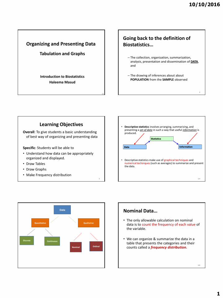
Frequency Distributions
A frequency distribution for qualitative data lists
ndash all categories
and
ndash the number of elements that belong to each of the categories
7
Example
A sample of 30 employees from large companies was selected and these employees were asked how stressful their jobs were
The responses of these employees are recorded
ndash very represents very stressful
ndash somewhat means somewhat stressful and
ndash none stands for not stressful at all
8
Example
9
Some what None Somewhat Very Very None
Very Somewhat Somewhat Very Somewhat Somewhat
Very Somewhat None Very None Somewhat
Somewhat Very Somewhat Somewhat Very None
Somewhat Very very somewhat None Somewhat
Construct a frequency distribution table for these data
Solution
Stress on Job Tally Frequency (f)
Very
Somewhat
None
|||| ||||
|||| |||| ||||
|||| |
10
14
6
Sum = 30
10
Table Frequency Distribution of Stress on Job
Relative Frequency and Percentage Distributions
A relative frequency distribution lists the categories and the proportion with which each occurs
Calculating Relative Frequency of a Category
11
sfrequencie all of Sum
category that ofFrequency category a offrequency lativeRe
Relative Frequency and Percentage Distributions cont
Calculating Percentage
Percentage = (Relative frequency) 100
12
10102016
3
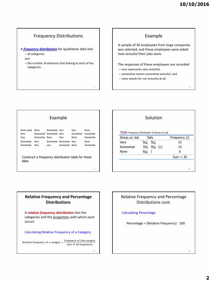
Determine the relative frequency and percentage for the data in Table
Stress on Job Tally Frequency (f)
Very
Somewhat
None
|||| ||||
|||| |||| ||||
|||| |
10
14
6
Sum = 30
13
Table Frequency Distribution of Stress on Job
Solution
Stress on Job Relative Frequency Percentage
Very
Somewhat
None
1030 = 333
1430 = 467
630 = 200
333(100) = 333
467(100) = 467
200(100) = 200
Sum = 100 Sum = 100
14
Table Relative Frequency and Percentage Distributions of Stress on Job
215
Nominal Data (Tabular Summary) - Organizationclassification
bull Tabulation
bull The diagrammatic or graphical representation
16
217
Nominal Data (Frequency)
Bar Charts are often used to display frequencieshellipIs there a better way to order these Would Bar Chart look different if we plotted ldquorelative frequencyrdquo rather than ldquofrequencyrdquo 218
Nominal Data (Relative Frequency)
Pie Charts show relative frequencieshellip
10102016
4
Graphical Presentation of Qualitative Data
Definition
A graph made of bars whose heights represent the frequencies of respective categories is called a bar graph
It is used to display and compare the number frequency or other measure (eg mean) for different discrete categories or groups
19
Figure Bar graph for the frequency distribution of
Table
0
2
4
6
8
10
12
14
16
Very Somewhat None
Strees on Job
Fre
qu
en
cy
20
Bar chartsbull The heights or lengths of different bars are
proportional to the size of the category they represent
bull Since the x-axis represents the different categories it has no scale
bull The y-axis does have a scale and this indicates the units of measurement
bull The bars can be drawn either vertically or horizontally
21
Graphical Presentation of Qualitative Data cont
Definition
A circle divided into portions that represent the relative frequencies or percentages of a population or a sample belonging to different categories is called a pie chart
Pie charts display how the total data are distributed between different categories
22
Table Calculating Angle Sizes for the Pie Chart
Stress on Job Relative Frequency Angle Size
Very
Somewhat
None
333
467
200
360(333) = 11988
360(467) = 16812 360(200) = 7200
Sum = 100 Sum = 360
23
Figure Pie chart for the percentage distribution of Job Stress
24
None 20
Somewhat
4670
Very
3330
10102016
5
25
Pie chart
Civil status of men in a community
Single
31
Married
41
Divorce
d
11
Widowe
d
1
Free
union
16
Civil status of women in a
community
Single
28
Married
44
Widowe
d
8
Free
union
9
Divorce
d
11
Exercise1 Prepare a frequency distribution of different
characteristics of your class
ndash Gender
ndash Professional background
ndash From where you have got information about this institute
(choose as many as applicable)bull Websitebull Newspaperbull SMSbull Bill boardbull Friend bull Others
2 Also make suitable graphs27 28
Bar chart
Gastrintestinal infections
0
12
3
4
56
7
Cryptos Ehistolyt Ecoli Giardia Rotavirus Shigella
Agents
Freq
uen
cy
Grouped bar chart
Gastrointestinal infections
0
1
2
3
4
5
Crypt Ehistolyt Ecoli Giardia Rotavirus Shigella
Agents
Fre
qu
en
cy
Males
Females
10102016
6
Bar Chart
Source Quarterly Country Summaries 2008
56
77
6670
3845
57
46
0
20
40
60
80
100
Country 1 Country 3 Country 4 Country 5
Perc
en
t
Household Ownership of at Least 1 Net or ITN 2008
Any net
LLIN
32
Stacked bar chart
36
26
9
9
11
20
0 20 40 60 80 100
2008
2007
Percent
Year
ACT Quinine
Amodiaquine Sulfadoxine-Pyrimethamine
Chloroquine Other
Children lt5 with Fever who Took Specific Antimalarial 2007-2008
34
35
ORGANIZING AND GRAPHING
QUANTITATIVE DATA
36
10102016
7
ORGANIZING AND GRAPHING QUANTITATIVE DATA
bull Ordered array
bull Frequency Distributions
ndash Constructing Frequency Distribution Tables
ndash Relative and Percentage Distributions
bull Graphing Grouped Data
ndash Histograms
ndash Polygons
ndash Stem and leaf plots37
Organizing amp Grouping Data
bull To facilitate the calculation of various descriptive measures such as percentages and averages (Before the days of computers)
bull The main purpose in grouping data now is summarization
bull Summarization is a way of making it easier to understand the information in data
38
Ordered array
bull A first step in organizing data
bull An ordered array is a
listing of the values of a collection (either population or sample) in order of magnitude from the smallest value to the largest value
bull If the number of measurements to be ordered is of any appreciable size the use of a computer is highly desirable
40
10102016
8
Frequency Distributions
43
Frequency Distributions
bull A frequency distribution for quantitative data lists
ndashall the classes
and
ndashthe number of values that belong to each class
bull Data presented in the form of a frequency distribution are called grouped data
44
45
Frequency Distributions
46
Weekly Earnings
(dollars)
Number of Employees
f
401 to 600
601 to 800
801 to 1000
1001 to 1200
1201 to 1400
1401 to 1600
9
22
39
15
9
6
Table 27 Weekly Earnings of 100 Employees of a Company
Variable
Third class
Lower limit of the sixth class
Upper limit of the sixth class
Frequency of the third class
Frequency column
Class width
Essential Question
How do we construct a frequency distribution table
Process of Constructing a Frequency Table
10102016
9
STEP 1 Determine the tentative number of classes (k)
k = 1 + 3322 log N
Always round ndash off
Note The number of classes should be between 5 and 15 The actual number of classes may be affected by convenience or other subjective factors
Process of Constructing a Frequency Table
STEP 2 Determine the range (R)
R = Highest Value ndash Lowest Value
STEP 3 Find the class width by dividing the range by the number of classes
(Always round ndash off )
k
Rc
classesofnumber
Rangewidthclass
STEP 4 Write the classes or categories starting with the lowest score Stop when the class already includes the highest score
Add the class width to the starting point to get the second lower class limit Add the class width to the second lower class limit to get the third and so on List the lower class limits in a vertical column and enter the upper class limits which can be easily identified at this stage
STEP 5 Determine the frequency for each class by referring to the tally columns and present the results in a table
When constructing frequency tables the following guidelines should be followed
The classes must be mutually exclusive That is each score must belong to exactly one classInclude all classes even if the frequency might be zero
10102016
10
All classes should have the same width although it is sometimes impossible to avoid open ndashended intervals such as ldquo65 years or olderrdquo
The number of classes should be between 5 and 15
Letrsquos Try
bull Time magazine collected information on all 464 people who died from gunfire in the Philippines during one week Here are the ages of 50 men randomly selected from that population Construct a frequency distribution table
19 18 30 40 41 33 73 25
23 25 21 33 65 17 20 76
47 69 20 31 18 24 35 24
17 36 65 70 22 25 65 16
24 29 42 37 26 46 27 63
21 27 23 25 71 37 75 25
27 23
Determine the tentative number of classes (K)
K = 1 + 3 322 log N
= 1 + 3322 log 50
= 1 + 3322 (169897)
= 664
Round ndash off the result to the next integer if the decimal part exceeds 0
K = 7
Determine the range
R = Highest Value ndash Lowest Value
R = 76 ndash 16 = 60
Find the class width (c)
Round ndash off the quotient if the decimal part exceeds 0
k
Rc
classesofnumber
Rangewidthclass
95787
60c
10102016
11
Write the classes starting with lowest score
Classes Tally Marks Freq
70 ndash 78
61 ndash 6952 ndash 6043 ndash 5134 ndash 4225 ndash 33
16 ndash 24
---
---
5
5027
14
17
Using Table
bull What is the lower class limit of the highest class
bull Upper class limit of the lowest class
bull Find the class mark of the class 43 ndash 51
bull What is the frequency of the class 16 ndash 24
Classes True Class boundaries
Tally Marks Freq x
70 ndash 7861 ndash 6952 ndash 6043 ndash 5134 ndash 4225 ndash 3316 ndash 24
695 ndash 785605 ndash 695515 ndash 605 425 ndash 515335 ndash 425245 ndash 335155 ndash 245
------
550
2714 17
74655647382920
Example
Table 29 gives the total home runs hit by all players of each of the 30 Major League Baseball teams during the 2002 season Construct a frequency distribution table
64
Table 29 Home Runs Hit by Major League Baseball
Teams During the 2002 Season
Team Home Runs Team Home Runs
Anaheim
Arizona
Atlanta
Baltimore
Boston
Chicago Cubs
Chicago White Sox
Cincinnati
Cleveland
Colorado
Detroit
Florida
Houston
Kansas City
Los Angeles
152
165
164
165
177
200
217
169
192
152
124
146
167
140
155
Milwaukee
Minnesota
Montreal
New York Mets
New York Yankees
Oakland
Philadelphia
Pittsburgh
St Louis
San Diego
San Francisco
Seattle
Tampa Bay
Texas
Toronto
139
167
162
160
223
205
165
142
175
136
198
152
133
230
187
65
Solution 2-3
2215
124230classeach of width eApproximat
66
Now we round this approximate width to a convenient number ndash say 22
10102016
12
Solution 2-3
The lower limit of the first class can be taken as 124 or any number less than 124 Suppose we take 124 as the lower limit of the first class Then our classes will be
124 ndash 145 146 ndash 167 168 ndash 189 190 ndash 211
and 212 - 233
67
Table 210 Frequency Distribution for the Data of
Table 29
68
Total Home Runs Tally f
124 ndash 145
146 ndash 167
168 ndash 189
190 ndash 211
212 - 233
|||| |
|||| |||| |||
||||
||||
|||
6
13
4
4
3
sumf = 30
Relative Frequency and Percentage Distributions
Relative Frequency and Percentage Distributions
69
100 frequency) (Relative Percentage
sfrequencie all of Sum
class that ofFrequency class a offrequency Relative
f
f
Example 2-4
Calculate the relative frequencies and percentages for Table 210
70
Solution 2-4
71
Total Home
RunsClass Boundaries
Relative Frequency
Percentage
124 ndash 145
146 ndash 167
168 ndash 189
190 ndash 211
212 - 233
1235 to less than 1455
1455 to less than 1675
1675 to less than 1895
1895 to less than 2115
2115 to less than 2335
200
433
133
133
100
200
433
133
133
100
Sum = 999 Sum = 999
Table 211 Relative Frequency and Percentage Distributions for
Table 210
Graphing Grouped Data
Definition
A histogram is a graph in which classes are marked on the horizontal axis and the frequencies relative frequencies or percentages are marked on the vertical axis The frequencies relative frequencies or percentages are represented by the heights of the bars In a histogram the bars are drawn adjacent to each other
72
10102016
13
Figure 23 Frequency histogram for Table 210
73
124 -145
146 -167
168 -
189
190 -
211
212 -
233Total home runs
15
12
9
6
3
0
Fre
qu
en
cy
Figure 24 Relative frequency histogram for Table
210
74
124 -145
146 -167
168 -
189
190 -
211
212 -
233Total home runs
50
40
30
20
10
0
Re
lati
ve
Fre
qu
en
cy
Graphing Grouped Data cont
Definition
A graph formed by joining the midpoints of the tops of successive bars in a histogram with straight lines is called a polygon
75
Figure 25 Frequency polygon for Table 210
76
124 -145
146 -167
168 -
189
190 -
211
212 -
233
15
12
9
6
3
0
Fre
qu
en
cy
Figure 26 Frequency Distribution curve
77
Fre
qu
en
cy
x
Example 2-5
The following data give the average travel time from home to work (in minutes) for 50 states The data are based on a sample survey of 700000 households conducted by the Census Bureau (USA TODAY August 6 2001)
78
10102016
14
Example 2-5
79
224
197
216
154
211
182
270
219
221
254
237
217
232
196
249
198
176
160
214
255
267
177
161
238
201
234
225
223
219
171
235
237
244
219
225
212
287
156
243
292
199
227
267
261
312
236
242
227
226
208
Construct a frequency distribution table Calculate the relative frequencies and percentages for all classes
Solution 2-5
6326
415231classeach of width eApproximat
80
Solution 2-5
Class Boundaries fRelative
Frequency Percentage
15 to less than 18
18 to less than 21
21 to less than 24
24 to less than 27
27 to less than 30
30 to less than 33
7
7
23
9
3
1
14
14
46
18
06
02
14
14
46
18
6
2
Σf = 50 Sum = 100 Sum = 100
81
Table 212 Frequency Relative Frequency and Percentage
Distributions of Average Travel Time to Work
Example 2-6
The administration in a large city wanted to know the distribution of vehicles owned by households in that city A sample of 40 randomly selected households from this city produced the following data on the number of vehicles owned
5 1 1 2 0 1 1 2 1 1
1 3 3 0 2 5 1 2 3 4
2 1 2 2 1 2 2 1 1 1
4 2 1 1 2 1 1 4 1 3
Construct a frequency distribution table for these data and draw a bar graph
82
Solution 2-6
Vehicles OwnedNumber of
Households (f)
0
1
2
3
4
5
2
18
11
4
3
2
Σf = 4083
Table 213 Frequency Distribution of Vehicles Owned
Figure 27 Bar graph for Table 213
0
2
4
6
8
10
12
14
16
18
20
No Car 1 Car 2 Cars 3 Cars 4 Cars 5 Cars
Vehicles owned
Fre
qu
en
cy
84
10102016
15
STEM-AND-LEAF DISPLAYS
Definition
In a stem-and-leaf display of quantitative data each value is divided into two portions ndash a stem and a leaf The leaves for each stem are shown separately in a display
85
Example 2-8
The following are the scores of 30 college students on a statistics test
Construct a stem-and-leaf display
86
75
69
83
52
72
84
80
81
77
96
61
64
65
76
71
79
86
87
71
79
72
87
68
92
93
50
57
95
92
98
Solution 2-8
To construct a stem-and-leaf display for these scores we split each score into two parts The first part contains the first digit which is called the stem The second part contains the second digit which is called the leaf
87
Solution 2-8
We observe from the data that the stems for all scores are 5 6 7 8 and 9 because all the scores lie in the range 50 to 98
88
Figure 213 Stem-and-leaf display
89
5
6
7
8
9
2
5
Leaf for 75
Leaf for 52
Stems
Solution 2-8
After we have listed the stems we read the leaves for all scores and record them next to the corresponding stems on the right side of the vertical line
90
10102016
16
Figure 214 Stem-and-leaf display of test scores
5
6
7
8
9
2 0 7
5 9 1 8 4
5 9 1 2 6 9 7 1 2
0 7 1 6 3 4 7
6 3 5 2 2 8
91
Figure 215 Ranked stem-and-leaf display of test
scores
5
6
7
8
9
0 2 7
1 4 5 8 9
1 1 2 2 5 6 7 9 9
0 1 3 4 6 7 7
2 2 3 5 6 8
92
Example 2-9
The following data are monthly rents paid by a sample of 30 households selected from a small city
Construct a stem-and-leaf display for these data
93
880
1210
1151
1081
985
630
721
1231
1175
1075
932
952
1023
850
1100
775
825
1140
1235
1000
750
750
915
1140
965
1191
1370
960
1035
1280
Solution 2-9
6
7
8
9
10
11
12
13
30
75 50 21 50
80 25 50
32 52 15 60 85 65
23 81 35 75 00
91 51 40 75 40 00
10 31 35 80
70
94
Figure 216Stem-and-leaf display of rents
Example 2-10
The following stem-and-leaf display is prepared for the number of hours that 25 students spent working on computers during the last month
95
Example 2-10
Prepare a new stem-and-leaf display by grouping the stems
96
0
1
2
3
4
5
6
7
8
6
1 7 9
2 6
2 4 7 8
1 5 6 9 9
3 6 8
2 4 4 5 7
5 6
10102016
17
Solution 2-10
97
0 ndash 2 3 ndash 5
6 ndash 8
6 1 7 9 2 6
2 4 7 8 1 5 6 9 9 3 6 8
2 4 4 5 7 5 6
Figure 217 Grouped stem-and-leaf display
298
Scatter Diagramhellip
bull Example 29 A real estate agent wanted to know to what extent the selling price of a home is related to its sizehellip
bull Collect the data
1) Determine the independent variable (X ndashhouse size) and the dependent variable (Y ndashselling price)
Relationship between peoplersquos weight and height
Relationship between of calories eaten and weight gainloss
299
Scatter Diagramhellip
bull It appears that in fact there is a relationship that is the greater the house size the greater the selling pricehellip
2100
Patterns of Scatter Diagramshellip
bull Linearity and Direction are two concepts we are interested in
Positive Linear Relationship Negative Linear Relationship
Weak or Non-Linear Relationship
10102016
2
Frequency Distributions
A frequency distribution for qualitative data lists
ndash all categories
and
ndash the number of elements that belong to each of the categories
7
Example
A sample of 30 employees from large companies was selected and these employees were asked how stressful their jobs were
The responses of these employees are recorded
ndash very represents very stressful
ndash somewhat means somewhat stressful and
ndash none stands for not stressful at all
8
Example
9
Some what None Somewhat Very Very None
Very Somewhat Somewhat Very Somewhat Somewhat
Very Somewhat None Very None Somewhat
Somewhat Very Somewhat Somewhat Very None
Somewhat Very very somewhat None Somewhat
Construct a frequency distribution table for these data
Solution
Stress on Job Tally Frequency (f)
Very
Somewhat
None
|||| ||||
|||| |||| ||||
|||| |
10
14
6
Sum = 30
10
Table Frequency Distribution of Stress on Job
Relative Frequency and Percentage Distributions
A relative frequency distribution lists the categories and the proportion with which each occurs
Calculating Relative Frequency of a Category
11
sfrequencie all of Sum
category that ofFrequency category a offrequency lativeRe
Relative Frequency and Percentage Distributions cont
Calculating Percentage
Percentage = (Relative frequency) 100
12
10102016
3
Determine the relative frequency and percentage for the data in Table
Stress on Job Tally Frequency (f)
Very
Somewhat
None
|||| ||||
|||| |||| ||||
|||| |
10
14
6
Sum = 30
13
Table Frequency Distribution of Stress on Job
Solution
Stress on Job Relative Frequency Percentage
Very
Somewhat
None
1030 = 333
1430 = 467
630 = 200
333(100) = 333
467(100) = 467
200(100) = 200
Sum = 100 Sum = 100
14
Table Relative Frequency and Percentage Distributions of Stress on Job
215
Nominal Data (Tabular Summary) - Organizationclassification
bull Tabulation
bull The diagrammatic or graphical representation
16
217
Nominal Data (Frequency)
Bar Charts are often used to display frequencieshellipIs there a better way to order these Would Bar Chart look different if we plotted ldquorelative frequencyrdquo rather than ldquofrequencyrdquo 218
Nominal Data (Relative Frequency)
Pie Charts show relative frequencieshellip
10102016
4
Graphical Presentation of Qualitative Data
Definition
A graph made of bars whose heights represent the frequencies of respective categories is called a bar graph
It is used to display and compare the number frequency or other measure (eg mean) for different discrete categories or groups
19
Figure Bar graph for the frequency distribution of
Table
0
2
4
6
8
10
12
14
16
Very Somewhat None
Strees on Job
Fre
qu
en
cy
20
Bar chartsbull The heights or lengths of different bars are
proportional to the size of the category they represent
bull Since the x-axis represents the different categories it has no scale
bull The y-axis does have a scale and this indicates the units of measurement
bull The bars can be drawn either vertically or horizontally
21
Graphical Presentation of Qualitative Data cont
Definition
A circle divided into portions that represent the relative frequencies or percentages of a population or a sample belonging to different categories is called a pie chart
Pie charts display how the total data are distributed between different categories
22
Table Calculating Angle Sizes for the Pie Chart
Stress on Job Relative Frequency Angle Size
Very
Somewhat
None
333
467
200
360(333) = 11988
360(467) = 16812 360(200) = 7200
Sum = 100 Sum = 360
23
Figure Pie chart for the percentage distribution of Job Stress
24
None 20
Somewhat
4670
Very
3330
10102016
5
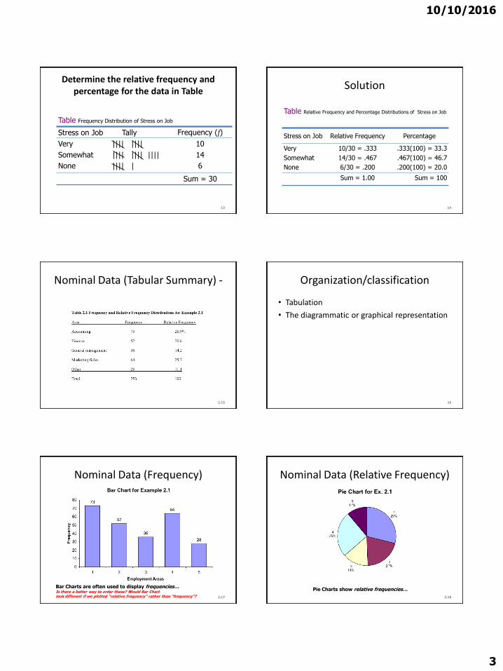
25
Pie chart
Civil status of men in a community
Single
31
Married
41
Divorce
d
11
Widowe
d
1
Free
union
16
Civil status of women in a
community
Single
28
Married
44
Widowe
d
8
Free
union
9
Divorce
d
11
Exercise1 Prepare a frequency distribution of different
characteristics of your class
ndash Gender
ndash Professional background
ndash From where you have got information about this institute
(choose as many as applicable)bull Websitebull Newspaperbull SMSbull Bill boardbull Friend bull Others
2 Also make suitable graphs27 28
Bar chart
Gastrintestinal infections
0
12
3
4
56
7
Cryptos Ehistolyt Ecoli Giardia Rotavirus Shigella
Agents
Freq
uen
cy
Grouped bar chart
Gastrointestinal infections
0
1
2
3
4
5
Crypt Ehistolyt Ecoli Giardia Rotavirus Shigella
Agents
Fre
qu
en
cy
Males
Females
10102016
6
Bar Chart
Source Quarterly Country Summaries 2008
56
77
6670
3845
57
46
0
20
40
60
80
100
Country 1 Country 3 Country 4 Country 5
Perc
en
t
Household Ownership of at Least 1 Net or ITN 2008
Any net
LLIN
32
Stacked bar chart
36
26
9
9
11
20
0 20 40 60 80 100
2008
2007
Percent
Year
ACT Quinine
Amodiaquine Sulfadoxine-Pyrimethamine
Chloroquine Other
Children lt5 with Fever who Took Specific Antimalarial 2007-2008
34
35
ORGANIZING AND GRAPHING
QUANTITATIVE DATA
36
10102016
7
ORGANIZING AND GRAPHING QUANTITATIVE DATA
bull Ordered array
bull Frequency Distributions
ndash Constructing Frequency Distribution Tables
ndash Relative and Percentage Distributions
bull Graphing Grouped Data
ndash Histograms
ndash Polygons
ndash Stem and leaf plots37
Organizing amp Grouping Data
bull To facilitate the calculation of various descriptive measures such as percentages and averages (Before the days of computers)
bull The main purpose in grouping data now is summarization
bull Summarization is a way of making it easier to understand the information in data
38
Ordered array
bull A first step in organizing data
bull An ordered array is a
listing of the values of a collection (either population or sample) in order of magnitude from the smallest value to the largest value
bull If the number of measurements to be ordered is of any appreciable size the use of a computer is highly desirable
40
10102016
8
Frequency Distributions
43
Frequency Distributions
bull A frequency distribution for quantitative data lists
ndashall the classes
and
ndashthe number of values that belong to each class
bull Data presented in the form of a frequency distribution are called grouped data
44
45
Frequency Distributions
46
Weekly Earnings
(dollars)
Number of Employees
f
401 to 600
601 to 800
801 to 1000
1001 to 1200
1201 to 1400
1401 to 1600
9
22
39
15
9
6
Table 27 Weekly Earnings of 100 Employees of a Company
Variable
Third class
Lower limit of the sixth class
Upper limit of the sixth class
Frequency of the third class
Frequency column
Class width
Essential Question
How do we construct a frequency distribution table
Process of Constructing a Frequency Table
10102016
9
STEP 1 Determine the tentative number of classes (k)
k = 1 + 3322 log N
Always round ndash off
Note The number of classes should be between 5 and 15 The actual number of classes may be affected by convenience or other subjective factors
Process of Constructing a Frequency Table
STEP 2 Determine the range (R)
R = Highest Value ndash Lowest Value
STEP 3 Find the class width by dividing the range by the number of classes
(Always round ndash off )
k
Rc
classesofnumber
Rangewidthclass
STEP 4 Write the classes or categories starting with the lowest score Stop when the class already includes the highest score
Add the class width to the starting point to get the second lower class limit Add the class width to the second lower class limit to get the third and so on List the lower class limits in a vertical column and enter the upper class limits which can be easily identified at this stage
STEP 5 Determine the frequency for each class by referring to the tally columns and present the results in a table
When constructing frequency tables the following guidelines should be followed
The classes must be mutually exclusive That is each score must belong to exactly one classInclude all classes even if the frequency might be zero
10102016
10
All classes should have the same width although it is sometimes impossible to avoid open ndashended intervals such as ldquo65 years or olderrdquo
The number of classes should be between 5 and 15
Letrsquos Try
bull Time magazine collected information on all 464 people who died from gunfire in the Philippines during one week Here are the ages of 50 men randomly selected from that population Construct a frequency distribution table
19 18 30 40 41 33 73 25
23 25 21 33 65 17 20 76
47 69 20 31 18 24 35 24
17 36 65 70 22 25 65 16
24 29 42 37 26 46 27 63
21 27 23 25 71 37 75 25
27 23
Determine the tentative number of classes (K)
K = 1 + 3 322 log N
= 1 + 3322 log 50
= 1 + 3322 (169897)
= 664
Round ndash off the result to the next integer if the decimal part exceeds 0
K = 7
Determine the range
R = Highest Value ndash Lowest Value
R = 76 ndash 16 = 60
Find the class width (c)
Round ndash off the quotient if the decimal part exceeds 0
k
Rc
classesofnumber
Rangewidthclass
95787
60c
10102016
11
Write the classes starting with lowest score
Classes Tally Marks Freq
70 ndash 78
61 ndash 6952 ndash 6043 ndash 5134 ndash 4225 ndash 33
16 ndash 24
---
---
5
5027
14
17
Using Table
bull What is the lower class limit of the highest class
bull Upper class limit of the lowest class
bull Find the class mark of the class 43 ndash 51
bull What is the frequency of the class 16 ndash 24
Classes True Class boundaries
Tally Marks Freq x
70 ndash 7861 ndash 6952 ndash 6043 ndash 5134 ndash 4225 ndash 3316 ndash 24
695 ndash 785605 ndash 695515 ndash 605 425 ndash 515335 ndash 425245 ndash 335155 ndash 245
------
550
2714 17
74655647382920
Example
Table 29 gives the total home runs hit by all players of each of the 30 Major League Baseball teams during the 2002 season Construct a frequency distribution table
64
Table 29 Home Runs Hit by Major League Baseball
Teams During the 2002 Season
Team Home Runs Team Home Runs
Anaheim
Arizona
Atlanta
Baltimore
Boston
Chicago Cubs
Chicago White Sox
Cincinnati
Cleveland
Colorado
Detroit
Florida
Houston
Kansas City
Los Angeles
152
165
164
165
177
200
217
169
192
152
124
146
167
140
155
Milwaukee
Minnesota
Montreal
New York Mets
New York Yankees
Oakland
Philadelphia
Pittsburgh
St Louis
San Diego
San Francisco
Seattle
Tampa Bay
Texas
Toronto
139
167
162
160
223
205
165
142
175
136
198
152
133
230
187
65
Solution 2-3
2215
124230classeach of width eApproximat
66
Now we round this approximate width to a convenient number ndash say 22
10102016
12
Solution 2-3
The lower limit of the first class can be taken as 124 or any number less than 124 Suppose we take 124 as the lower limit of the first class Then our classes will be
124 ndash 145 146 ndash 167 168 ndash 189 190 ndash 211
and 212 - 233
67
Table 210 Frequency Distribution for the Data of
Table 29
68
Total Home Runs Tally f
124 ndash 145
146 ndash 167
168 ndash 189
190 ndash 211
212 - 233
|||| |
|||| |||| |||
||||
||||
|||
6
13
4
4
3
sumf = 30
Relative Frequency and Percentage Distributions
Relative Frequency and Percentage Distributions
69
100 frequency) (Relative Percentage
sfrequencie all of Sum
class that ofFrequency class a offrequency Relative
f
f
Example 2-4
Calculate the relative frequencies and percentages for Table 210
70
Solution 2-4
71
Total Home
RunsClass Boundaries
Relative Frequency
Percentage
124 ndash 145
146 ndash 167
168 ndash 189
190 ndash 211
212 - 233
1235 to less than 1455
1455 to less than 1675
1675 to less than 1895
1895 to less than 2115
2115 to less than 2335
200
433
133
133
100
200
433
133
133
100
Sum = 999 Sum = 999
Table 211 Relative Frequency and Percentage Distributions for
Table 210
Graphing Grouped Data
Definition
A histogram is a graph in which classes are marked on the horizontal axis and the frequencies relative frequencies or percentages are marked on the vertical axis The frequencies relative frequencies or percentages are represented by the heights of the bars In a histogram the bars are drawn adjacent to each other
72
10102016
13
Figure 23 Frequency histogram for Table 210
73
124 -145
146 -167
168 -
189
190 -
211
212 -
233Total home runs
15
12
9
6
3
0
Fre
qu
en
cy
Figure 24 Relative frequency histogram for Table
210
74
124 -145
146 -167
168 -
189
190 -
211
212 -
233Total home runs
50
40
30
20
10
0
Re
lati
ve
Fre
qu
en
cy
Graphing Grouped Data cont
Definition
A graph formed by joining the midpoints of the tops of successive bars in a histogram with straight lines is called a polygon
75
Figure 25 Frequency polygon for Table 210
76
124 -145
146 -167
168 -
189
190 -
211
212 -
233
15
12
9
6
3
0
Fre
qu
en
cy
Figure 26 Frequency Distribution curve
77
Fre
qu
en
cy
x
Example 2-5
The following data give the average travel time from home to work (in minutes) for 50 states The data are based on a sample survey of 700000 households conducted by the Census Bureau (USA TODAY August 6 2001)
78
10102016
14
Example 2-5
79
224
197
216
154
211
182
270
219
221
254
237
217
232
196
249
198
176
160
214
255
267
177
161
238
201
234
225
223
219
171
235
237
244
219
225
212
287
156
243
292
199
227
267
261
312
236
242
227
226
208
Construct a frequency distribution table Calculate the relative frequencies and percentages for all classes
Solution 2-5
6326
415231classeach of width eApproximat
80
Solution 2-5
Class Boundaries fRelative
Frequency Percentage
15 to less than 18
18 to less than 21
21 to less than 24
24 to less than 27
27 to less than 30
30 to less than 33
7
7
23
9
3
1
14
14
46
18
06
02
14
14
46
18
6
2
Σf = 50 Sum = 100 Sum = 100
81
Table 212 Frequency Relative Frequency and Percentage
Distributions of Average Travel Time to Work
Example 2-6
The administration in a large city wanted to know the distribution of vehicles owned by households in that city A sample of 40 randomly selected households from this city produced the following data on the number of vehicles owned
5 1 1 2 0 1 1 2 1 1
1 3 3 0 2 5 1 2 3 4
2 1 2 2 1 2 2 1 1 1
4 2 1 1 2 1 1 4 1 3
Construct a frequency distribution table for these data and draw a bar graph
82
Solution 2-6
Vehicles OwnedNumber of
Households (f)
0
1
2
3
4
5
2
18
11
4
3
2
Σf = 4083
Table 213 Frequency Distribution of Vehicles Owned
Figure 27 Bar graph for Table 213
0
2
4
6
8
10
12
14
16
18
20
No Car 1 Car 2 Cars 3 Cars 4 Cars 5 Cars
Vehicles owned
Fre
qu
en
cy
84
10102016
15
STEM-AND-LEAF DISPLAYS
Definition
In a stem-and-leaf display of quantitative data each value is divided into two portions ndash a stem and a leaf The leaves for each stem are shown separately in a display
85
Example 2-8
The following are the scores of 30 college students on a statistics test
Construct a stem-and-leaf display
86
75
69
83
52
72
84
80
81
77
96
61
64
65
76
71
79
86
87
71
79
72
87
68
92
93
50
57
95
92
98
Solution 2-8
To construct a stem-and-leaf display for these scores we split each score into two parts The first part contains the first digit which is called the stem The second part contains the second digit which is called the leaf
87
Solution 2-8
We observe from the data that the stems for all scores are 5 6 7 8 and 9 because all the scores lie in the range 50 to 98
88
Figure 213 Stem-and-leaf display
89
5
6
7
8
9
2
5
Leaf for 75
Leaf for 52
Stems
Solution 2-8
After we have listed the stems we read the leaves for all scores and record them next to the corresponding stems on the right side of the vertical line
90
10102016
16
Figure 214 Stem-and-leaf display of test scores
5
6
7
8
9
2 0 7
5 9 1 8 4
5 9 1 2 6 9 7 1 2
0 7 1 6 3 4 7
6 3 5 2 2 8
91
Figure 215 Ranked stem-and-leaf display of test
scores
5
6
7
8
9
0 2 7
1 4 5 8 9
1 1 2 2 5 6 7 9 9
0 1 3 4 6 7 7
2 2 3 5 6 8
92
Example 2-9
The following data are monthly rents paid by a sample of 30 households selected from a small city
Construct a stem-and-leaf display for these data
93
880
1210
1151
1081
985
630
721
1231
1175
1075
932
952
1023
850
1100
775
825
1140
1235
1000
750
750
915
1140
965
1191
1370
960
1035
1280
Solution 2-9
6
7
8
9
10
11
12
13
30
75 50 21 50
80 25 50
32 52 15 60 85 65
23 81 35 75 00
91 51 40 75 40 00
10 31 35 80
70
94
Figure 216Stem-and-leaf display of rents
Example 2-10
The following stem-and-leaf display is prepared for the number of hours that 25 students spent working on computers during the last month
95
Example 2-10
Prepare a new stem-and-leaf display by grouping the stems
96
0
1
2
3
4
5
6
7
8
6
1 7 9
2 6
2 4 7 8
1 5 6 9 9
3 6 8
2 4 4 5 7
5 6
10102016
17
Solution 2-10
97
0 ndash 2 3 ndash 5
6 ndash 8
6 1 7 9 2 6
2 4 7 8 1 5 6 9 9 3 6 8
2 4 4 5 7 5 6
Figure 217 Grouped stem-and-leaf display
298
Scatter Diagramhellip
bull Example 29 A real estate agent wanted to know to what extent the selling price of a home is related to its sizehellip
bull Collect the data
1) Determine the independent variable (X ndashhouse size) and the dependent variable (Y ndashselling price)
Relationship between peoplersquos weight and height
Relationship between of calories eaten and weight gainloss
299
Scatter Diagramhellip
bull It appears that in fact there is a relationship that is the greater the house size the greater the selling pricehellip
2100
Patterns of Scatter Diagramshellip
bull Linearity and Direction are two concepts we are interested in
Positive Linear Relationship Negative Linear Relationship
Weak or Non-Linear Relationship
10102016
3
Determine the relative frequency and percentage for the data in Table
Stress on Job Tally Frequency (f)
Very
Somewhat
None
|||| ||||
|||| |||| ||||
|||| |
10
14
6
Sum = 30
13
Table Frequency Distribution of Stress on Job
Solution
Stress on Job Relative Frequency Percentage
Very
Somewhat
None
1030 = 333
1430 = 467
630 = 200
333(100) = 333
467(100) = 467
200(100) = 200
Sum = 100 Sum = 100
14
Table Relative Frequency and Percentage Distributions of Stress on Job
215
Nominal Data (Tabular Summary) - Organizationclassification
bull Tabulation
bull The diagrammatic or graphical representation
16
217
Nominal Data (Frequency)
Bar Charts are often used to display frequencieshellipIs there a better way to order these Would Bar Chart look different if we plotted ldquorelative frequencyrdquo rather than ldquofrequencyrdquo 218
Nominal Data (Relative Frequency)
Pie Charts show relative frequencieshellip
10102016
4
Graphical Presentation of Qualitative Data
Definition
A graph made of bars whose heights represent the frequencies of respective categories is called a bar graph
It is used to display and compare the number frequency or other measure (eg mean) for different discrete categories or groups
19
Figure Bar graph for the frequency distribution of
Table
0
2
4
6
8
10
12
14
16
Very Somewhat None
Strees on Job
Fre
qu
en
cy
20
Bar chartsbull The heights or lengths of different bars are
proportional to the size of the category they represent
bull Since the x-axis represents the different categories it has no scale
bull The y-axis does have a scale and this indicates the units of measurement
bull The bars can be drawn either vertically or horizontally
21
Graphical Presentation of Qualitative Data cont
Definition
A circle divided into portions that represent the relative frequencies or percentages of a population or a sample belonging to different categories is called a pie chart
Pie charts display how the total data are distributed between different categories
22
Table Calculating Angle Sizes for the Pie Chart
Stress on Job Relative Frequency Angle Size
Very
Somewhat
None
333
467
200
360(333) = 11988
360(467) = 16812 360(200) = 7200
Sum = 100 Sum = 360
23
Figure Pie chart for the percentage distribution of Job Stress
24
None 20
Somewhat
4670
Very
3330
10102016
5
25
Pie chart
Civil status of men in a community
Single
31
Married
41
Divorce
d
11
Widowe
d
1
Free
union
16
Civil status of women in a
community
Single
28
Married
44
Widowe
d
8
Free
union
9
Divorce
d
11
Exercise1 Prepare a frequency distribution of different
characteristics of your class
ndash Gender
ndash Professional background
ndash From where you have got information about this institute
(choose as many as applicable)bull Websitebull Newspaperbull SMSbull Bill boardbull Friend bull Others
2 Also make suitable graphs27 28
Bar chart
Gastrintestinal infections
0
12
3
4
56
7
Cryptos Ehistolyt Ecoli Giardia Rotavirus Shigella
Agents
Freq
uen
cy
Grouped bar chart
Gastrointestinal infections
0
1
2
3
4
5
Crypt Ehistolyt Ecoli Giardia Rotavirus Shigella
Agents
Fre
qu
en
cy
Males
Females
10102016
6
Bar Chart
Source Quarterly Country Summaries 2008
56
77
6670
3845
57
46
0
20
40
60
80
100
Country 1 Country 3 Country 4 Country 5
Perc
en
t
Household Ownership of at Least 1 Net or ITN 2008
Any net
LLIN
32
Stacked bar chart
36
26
9
9
11
20
0 20 40 60 80 100
2008
2007
Percent
Year
ACT Quinine
Amodiaquine Sulfadoxine-Pyrimethamine
Chloroquine Other
Children lt5 with Fever who Took Specific Antimalarial 2007-2008
34
35
ORGANIZING AND GRAPHING
QUANTITATIVE DATA
36
10102016
7
ORGANIZING AND GRAPHING QUANTITATIVE DATA
bull Ordered array
bull Frequency Distributions
ndash Constructing Frequency Distribution Tables
ndash Relative and Percentage Distributions
bull Graphing Grouped Data
ndash Histograms
ndash Polygons
ndash Stem and leaf plots37
Organizing amp Grouping Data
bull To facilitate the calculation of various descriptive measures such as percentages and averages (Before the days of computers)
bull The main purpose in grouping data now is summarization
bull Summarization is a way of making it easier to understand the information in data
38
Ordered array
bull A first step in organizing data
bull An ordered array is a
listing of the values of a collection (either population or sample) in order of magnitude from the smallest value to the largest value
bull If the number of measurements to be ordered is of any appreciable size the use of a computer is highly desirable
40
10102016
8
Frequency Distributions
43
Frequency Distributions
bull A frequency distribution for quantitative data lists
ndashall the classes
and
ndashthe number of values that belong to each class
bull Data presented in the form of a frequency distribution are called grouped data
44
45
Frequency Distributions
46
Weekly Earnings
(dollars)
Number of Employees
f
401 to 600
601 to 800
801 to 1000
1001 to 1200
1201 to 1400
1401 to 1600
9
22
39
15
9
6
Table 27 Weekly Earnings of 100 Employees of a Company
Variable
Third class
Lower limit of the sixth class
Upper limit of the sixth class
Frequency of the third class
Frequency column
Class width
Essential Question
How do we construct a frequency distribution table
Process of Constructing a Frequency Table
10102016
9
STEP 1 Determine the tentative number of classes (k)
k = 1 + 3322 log N
Always round ndash off
Note The number of classes should be between 5 and 15 The actual number of classes may be affected by convenience or other subjective factors
Process of Constructing a Frequency Table
STEP 2 Determine the range (R)
R = Highest Value ndash Lowest Value
STEP 3 Find the class width by dividing the range by the number of classes
(Always round ndash off )
k
Rc
classesofnumber
Rangewidthclass
STEP 4 Write the classes or categories starting with the lowest score Stop when the class already includes the highest score
Add the class width to the starting point to get the second lower class limit Add the class width to the second lower class limit to get the third and so on List the lower class limits in a vertical column and enter the upper class limits which can be easily identified at this stage
STEP 5 Determine the frequency for each class by referring to the tally columns and present the results in a table
When constructing frequency tables the following guidelines should be followed
The classes must be mutually exclusive That is each score must belong to exactly one classInclude all classes even if the frequency might be zero
10102016
10
All classes should have the same width although it is sometimes impossible to avoid open ndashended intervals such as ldquo65 years or olderrdquo
The number of classes should be between 5 and 15
Letrsquos Try
bull Time magazine collected information on all 464 people who died from gunfire in the Philippines during one week Here are the ages of 50 men randomly selected from that population Construct a frequency distribution table
19 18 30 40 41 33 73 25
23 25 21 33 65 17 20 76
47 69 20 31 18 24 35 24
17 36 65 70 22 25 65 16
24 29 42 37 26 46 27 63
21 27 23 25 71 37 75 25
27 23
Determine the tentative number of classes (K)
K = 1 + 3 322 log N
= 1 + 3322 log 50
= 1 + 3322 (169897)
= 664
Round ndash off the result to the next integer if the decimal part exceeds 0
K = 7
Determine the range
R = Highest Value ndash Lowest Value
R = 76 ndash 16 = 60
Find the class width (c)
Round ndash off the quotient if the decimal part exceeds 0
k
Rc
classesofnumber
Rangewidthclass
95787
60c
10102016
11
Write the classes starting with lowest score
Classes Tally Marks Freq
70 ndash 78
61 ndash 6952 ndash 6043 ndash 5134 ndash 4225 ndash 33
16 ndash 24
---
---
5
5027
14
17
Using Table
bull What is the lower class limit of the highest class
bull Upper class limit of the lowest class
bull Find the class mark of the class 43 ndash 51
bull What is the frequency of the class 16 ndash 24
Classes True Class boundaries
Tally Marks Freq x
70 ndash 7861 ndash 6952 ndash 6043 ndash 5134 ndash 4225 ndash 3316 ndash 24
695 ndash 785605 ndash 695515 ndash 605 425 ndash 515335 ndash 425245 ndash 335155 ndash 245
------
550
2714 17
74655647382920
Example
Table 29 gives the total home runs hit by all players of each of the 30 Major League Baseball teams during the 2002 season Construct a frequency distribution table
64
Table 29 Home Runs Hit by Major League Baseball
Teams During the 2002 Season
Team Home Runs Team Home Runs
Anaheim
Arizona
Atlanta
Baltimore
Boston
Chicago Cubs
Chicago White Sox
Cincinnati
Cleveland
Colorado
Detroit
Florida
Houston
Kansas City
Los Angeles
152
165
164
165
177
200
217
169
192
152
124
146
167
140
155
Milwaukee
Minnesota
Montreal
New York Mets
New York Yankees
Oakland
Philadelphia
Pittsburgh
St Louis
San Diego
San Francisco
Seattle
Tampa Bay
Texas
Toronto
139
167
162
160
223
205
165
142
175
136
198
152
133
230
187
65
Solution 2-3
2215
124230classeach of width eApproximat
66
Now we round this approximate width to a convenient number ndash say 22
10102016
12
Solution 2-3
The lower limit of the first class can be taken as 124 or any number less than 124 Suppose we take 124 as the lower limit of the first class Then our classes will be
124 ndash 145 146 ndash 167 168 ndash 189 190 ndash 211
and 212 - 233
67
Table 210 Frequency Distribution for the Data of
Table 29
68
Total Home Runs Tally f
124 ndash 145
146 ndash 167
168 ndash 189
190 ndash 211
212 - 233
|||| |
|||| |||| |||
||||
||||
|||
6
13
4
4
3
sumf = 30
Relative Frequency and Percentage Distributions
Relative Frequency and Percentage Distributions
69
100 frequency) (Relative Percentage
sfrequencie all of Sum
class that ofFrequency class a offrequency Relative
f
f
Example 2-4
Calculate the relative frequencies and percentages for Table 210
70
Solution 2-4
71
Total Home
RunsClass Boundaries
Relative Frequency
Percentage
124 ndash 145
146 ndash 167
168 ndash 189
190 ndash 211
212 - 233
1235 to less than 1455
1455 to less than 1675
1675 to less than 1895
1895 to less than 2115
2115 to less than 2335
200
433
133
133
100
200
433
133
133
100
Sum = 999 Sum = 999
Table 211 Relative Frequency and Percentage Distributions for
Table 210
Graphing Grouped Data
Definition
A histogram is a graph in which classes are marked on the horizontal axis and the frequencies relative frequencies or percentages are marked on the vertical axis The frequencies relative frequencies or percentages are represented by the heights of the bars In a histogram the bars are drawn adjacent to each other
72
10102016
13
Figure 23 Frequency histogram for Table 210
73
124 -145
146 -167
168 -
189
190 -
211
212 -
233Total home runs
15
12
9
6
3
0
Fre
qu
en
cy
Figure 24 Relative frequency histogram for Table
210
74
124 -145
146 -167
168 -
189
190 -
211
212 -
233Total home runs
50
40
30
20
10
0
Re
lati
ve
Fre
qu
en
cy
Graphing Grouped Data cont
Definition
A graph formed by joining the midpoints of the tops of successive bars in a histogram with straight lines is called a polygon
75
Figure 25 Frequency polygon for Table 210
76
124 -145
146 -167
168 -
189
190 -
211
212 -
233
15
12
9
6
3
0
Fre
qu
en
cy
Figure 26 Frequency Distribution curve
77
Fre
qu
en
cy
x
Example 2-5
The following data give the average travel time from home to work (in minutes) for 50 states The data are based on a sample survey of 700000 households conducted by the Census Bureau (USA TODAY August 6 2001)
78
10102016
14
Example 2-5
79
224
197
216
154
211
182
270
219
221
254
237
217
232
196
249
198
176
160
214
255
267
177
161
238
201
234
225
223
219
171
235
237
244
219
225
212
287
156
243
292
199
227
267
261
312
236
242
227
226
208
Construct a frequency distribution table Calculate the relative frequencies and percentages for all classes
Solution 2-5
6326
415231classeach of width eApproximat
80
Solution 2-5
Class Boundaries fRelative
Frequency Percentage
15 to less than 18
18 to less than 21
21 to less than 24
24 to less than 27
27 to less than 30
30 to less than 33
7
7
23
9
3
1
14
14
46
18
06
02
14
14
46
18
6
2
Σf = 50 Sum = 100 Sum = 100
81
Table 212 Frequency Relative Frequency and Percentage
Distributions of Average Travel Time to Work
Example 2-6
The administration in a large city wanted to know the distribution of vehicles owned by households in that city A sample of 40 randomly selected households from this city produced the following data on the number of vehicles owned
5 1 1 2 0 1 1 2 1 1
1 3 3 0 2 5 1 2 3 4
2 1 2 2 1 2 2 1 1 1
4 2 1 1 2 1 1 4 1 3
Construct a frequency distribution table for these data and draw a bar graph
82
Solution 2-6
Vehicles OwnedNumber of
Households (f)
0
1
2
3
4
5
2
18
11
4
3
2
Σf = 4083
Table 213 Frequency Distribution of Vehicles Owned
Figure 27 Bar graph for Table 213
0
2
4
6
8
10
12
14
16
18
20
No Car 1 Car 2 Cars 3 Cars 4 Cars 5 Cars
Vehicles owned
Fre
qu
en
cy
84
10102016
15
STEM-AND-LEAF DISPLAYS
Definition
In a stem-and-leaf display of quantitative data each value is divided into two portions ndash a stem and a leaf The leaves for each stem are shown separately in a display
85
Example 2-8
The following are the scores of 30 college students on a statistics test
Construct a stem-and-leaf display
86
75
69
83
52
72
84
80
81
77
96
61
64
65
76
71
79
86
87
71
79
72
87
68
92
93
50
57
95
92
98
Solution 2-8
To construct a stem-and-leaf display for these scores we split each score into two parts The first part contains the first digit which is called the stem The second part contains the second digit which is called the leaf
87
Solution 2-8
We observe from the data that the stems for all scores are 5 6 7 8 and 9 because all the scores lie in the range 50 to 98
88
Figure 213 Stem-and-leaf display
89
5
6
7
8
9
2
5
Leaf for 75
Leaf for 52
Stems
Solution 2-8
After we have listed the stems we read the leaves for all scores and record them next to the corresponding stems on the right side of the vertical line
90
10102016
16
Figure 214 Stem-and-leaf display of test scores
5
6
7
8
9
2 0 7
5 9 1 8 4
5 9 1 2 6 9 7 1 2
0 7 1 6 3 4 7
6 3 5 2 2 8
91
Figure 215 Ranked stem-and-leaf display of test
scores
5
6
7
8
9
0 2 7
1 4 5 8 9
1 1 2 2 5 6 7 9 9
0 1 3 4 6 7 7
2 2 3 5 6 8
92
Example 2-9
The following data are monthly rents paid by a sample of 30 households selected from a small city
Construct a stem-and-leaf display for these data
93
880
1210
1151
1081
985
630
721
1231
1175
1075
932
952
1023
850
1100
775
825
1140
1235
1000
750
750
915
1140
965
1191
1370
960
1035
1280
Solution 2-9
6
7
8
9
10
11
12
13
30
75 50 21 50
80 25 50
32 52 15 60 85 65
23 81 35 75 00
91 51 40 75 40 00
10 31 35 80
70
94
Figure 216Stem-and-leaf display of rents
Example 2-10
The following stem-and-leaf display is prepared for the number of hours that 25 students spent working on computers during the last month
95
Example 2-10
Prepare a new stem-and-leaf display by grouping the stems
96
0
1
2
3
4
5
6
7
8
6
1 7 9
2 6
2 4 7 8
1 5 6 9 9
3 6 8
2 4 4 5 7
5 6
10102016
17
Solution 2-10
97
0 ndash 2 3 ndash 5
6 ndash 8
6 1 7 9 2 6
2 4 7 8 1 5 6 9 9 3 6 8
2 4 4 5 7 5 6
Figure 217 Grouped stem-and-leaf display
298
Scatter Diagramhellip
bull Example 29 A real estate agent wanted to know to what extent the selling price of a home is related to its sizehellip
bull Collect the data
1) Determine the independent variable (X ndashhouse size) and the dependent variable (Y ndashselling price)
Relationship between peoplersquos weight and height
Relationship between of calories eaten and weight gainloss
299
Scatter Diagramhellip
bull It appears that in fact there is a relationship that is the greater the house size the greater the selling pricehellip
2100
Patterns of Scatter Diagramshellip
bull Linearity and Direction are two concepts we are interested in
Positive Linear Relationship Negative Linear Relationship
Weak or Non-Linear Relationship

10102016
4
Graphical Presentation of Qualitative Data
Definition
A graph made of bars whose heights represent the frequencies of respective categories is called a bar graph
It is used to display and compare the number frequency or other measure (eg mean) for different discrete categories or groups
19
Figure Bar graph for the frequency distribution of
Table
0
2
4
6
8
10
12
14
16
Very Somewhat None
Strees on Job
Fre
qu
en
cy
20
Bar chartsbull The heights or lengths of different bars are
proportional to the size of the category they represent
bull Since the x-axis represents the different categories it has no scale
bull The y-axis does have a scale and this indicates the units of measurement
bull The bars can be drawn either vertically or horizontally
21
Graphical Presentation of Qualitative Data cont
Definition
A circle divided into portions that represent the relative frequencies or percentages of a population or a sample belonging to different categories is called a pie chart
Pie charts display how the total data are distributed between different categories
22
Table Calculating Angle Sizes for the Pie Chart
Stress on Job Relative Frequency Angle Size
Very
Somewhat
None
333
467
200
360(333) = 11988
360(467) = 16812 360(200) = 7200
Sum = 100 Sum = 360
23
Figure Pie chart for the percentage distribution of Job Stress
24
None 20
Somewhat
4670
Very
3330
10102016
5
25
Pie chart
Civil status of men in a community
Single
31
Married
41
Divorce
d
11
Widowe
d
1
Free
union
16
Civil status of women in a
community
Single
28
Married
44
Widowe
d
8
Free
union
9
Divorce
d
11
Exercise1 Prepare a frequency distribution of different
characteristics of your class
ndash Gender
ndash Professional background
ndash From where you have got information about this institute
(choose as many as applicable)bull Websitebull Newspaperbull SMSbull Bill boardbull Friend bull Others
2 Also make suitable graphs27 28
Bar chart
Gastrintestinal infections
0
12
3
4
56
7
Cryptos Ehistolyt Ecoli Giardia Rotavirus Shigella
Agents
Freq
uen
cy
Grouped bar chart
Gastrointestinal infections
0
1
2
3
4
5
Crypt Ehistolyt Ecoli Giardia Rotavirus Shigella
Agents
Fre
qu
en
cy
Males
Females
10102016
6
Bar Chart
Source Quarterly Country Summaries 2008
56
77
6670
3845
57
46
0
20
40
60
80
100
Country 1 Country 3 Country 4 Country 5
Perc
en
t
Household Ownership of at Least 1 Net or ITN 2008
Any net
LLIN
32
Stacked bar chart
36
26
9
9
11
20
0 20 40 60 80 100
2008
2007
Percent
Year
ACT Quinine
Amodiaquine Sulfadoxine-Pyrimethamine
Chloroquine Other
Children lt5 with Fever who Took Specific Antimalarial 2007-2008
34
35
ORGANIZING AND GRAPHING
QUANTITATIVE DATA
36
10102016
7
ORGANIZING AND GRAPHING QUANTITATIVE DATA
bull Ordered array
bull Frequency Distributions
ndash Constructing Frequency Distribution Tables
ndash Relative and Percentage Distributions
bull Graphing Grouped Data
ndash Histograms
ndash Polygons
ndash Stem and leaf plots37
Organizing amp Grouping Data
bull To facilitate the calculation of various descriptive measures such as percentages and averages (Before the days of computers)
bull The main purpose in grouping data now is summarization
bull Summarization is a way of making it easier to understand the information in data
38
Ordered array
bull A first step in organizing data
bull An ordered array is a
listing of the values of a collection (either population or sample) in order of magnitude from the smallest value to the largest value
bull If the number of measurements to be ordered is of any appreciable size the use of a computer is highly desirable
40
10102016
8
Frequency Distributions
43
Frequency Distributions
bull A frequency distribution for quantitative data lists
ndashall the classes
and
ndashthe number of values that belong to each class
bull Data presented in the form of a frequency distribution are called grouped data
44
45
Frequency Distributions
46
Weekly Earnings
(dollars)
Number of Employees
f
401 to 600
601 to 800
801 to 1000
1001 to 1200
1201 to 1400
1401 to 1600
9
22
39
15
9
6
Table 27 Weekly Earnings of 100 Employees of a Company
Variable
Third class
Lower limit of the sixth class
Upper limit of the sixth class
Frequency of the third class
Frequency column
Class width
Essential Question
How do we construct a frequency distribution table
Process of Constructing a Frequency Table
10102016
9
STEP 1 Determine the tentative number of classes (k)
k = 1 + 3322 log N
Always round ndash off
Note The number of classes should be between 5 and 15 The actual number of classes may be affected by convenience or other subjective factors
Process of Constructing a Frequency Table
STEP 2 Determine the range (R)
R = Highest Value ndash Lowest Value
STEP 3 Find the class width by dividing the range by the number of classes
(Always round ndash off )
k
Rc
classesofnumber
Rangewidthclass
STEP 4 Write the classes or categories starting with the lowest score Stop when the class already includes the highest score
Add the class width to the starting point to get the second lower class limit Add the class width to the second lower class limit to get the third and so on List the lower class limits in a vertical column and enter the upper class limits which can be easily identified at this stage
STEP 5 Determine the frequency for each class by referring to the tally columns and present the results in a table
When constructing frequency tables the following guidelines should be followed
The classes must be mutually exclusive That is each score must belong to exactly one classInclude all classes even if the frequency might be zero
10102016
10
All classes should have the same width although it is sometimes impossible to avoid open ndashended intervals such as ldquo65 years or olderrdquo
The number of classes should be between 5 and 15
Letrsquos Try
bull Time magazine collected information on all 464 people who died from gunfire in the Philippines during one week Here are the ages of 50 men randomly selected from that population Construct a frequency distribution table
19 18 30 40 41 33 73 25
23 25 21 33 65 17 20 76
47 69 20 31 18 24 35 24
17 36 65 70 22 25 65 16
24 29 42 37 26 46 27 63
21 27 23 25 71 37 75 25
27 23
Determine the tentative number of classes (K)
K = 1 + 3 322 log N
= 1 + 3322 log 50
= 1 + 3322 (169897)
= 664
Round ndash off the result to the next integer if the decimal part exceeds 0
K = 7
Determine the range
R = Highest Value ndash Lowest Value
R = 76 ndash 16 = 60
Find the class width (c)
Round ndash off the quotient if the decimal part exceeds 0
k
Rc
classesofnumber
Rangewidthclass
95787
60c
10102016
11
Write the classes starting with lowest score
Classes Tally Marks Freq
70 ndash 78
61 ndash 6952 ndash 6043 ndash 5134 ndash 4225 ndash 33
16 ndash 24
---
---
5
5027
14
17
Using Table
bull What is the lower class limit of the highest class
bull Upper class limit of the lowest class
bull Find the class mark of the class 43 ndash 51
bull What is the frequency of the class 16 ndash 24
Classes True Class boundaries
Tally Marks Freq x
70 ndash 7861 ndash 6952 ndash 6043 ndash 5134 ndash 4225 ndash 3316 ndash 24
695 ndash 785605 ndash 695515 ndash 605 425 ndash 515335 ndash 425245 ndash 335155 ndash 245
------
550
2714 17
74655647382920
Example
Table 29 gives the total home runs hit by all players of each of the 30 Major League Baseball teams during the 2002 season Construct a frequency distribution table
64
Table 29 Home Runs Hit by Major League Baseball
Teams During the 2002 Season
Team Home Runs Team Home Runs
Anaheim
Arizona
Atlanta
Baltimore
Boston
Chicago Cubs
Chicago White Sox
Cincinnati
Cleveland
Colorado
Detroit
Florida
Houston
Kansas City
Los Angeles
152
165
164
165
177
200
217
169
192
152
124
146
167
140
155
Milwaukee
Minnesota
Montreal
New York Mets
New York Yankees
Oakland
Philadelphia
Pittsburgh
St Louis
San Diego
San Francisco
Seattle
Tampa Bay
Texas
Toronto
139
167
162
160
223
205
165
142
175
136
198
152
133
230
187
65
Solution 2-3
2215
124230classeach of width eApproximat
66
Now we round this approximate width to a convenient number ndash say 22
10102016
12
Solution 2-3
The lower limit of the first class can be taken as 124 or any number less than 124 Suppose we take 124 as the lower limit of the first class Then our classes will be
124 ndash 145 146 ndash 167 168 ndash 189 190 ndash 211
and 212 - 233
67
Table 210 Frequency Distribution for the Data of
Table 29
68
Total Home Runs Tally f
124 ndash 145
146 ndash 167
168 ndash 189
190 ndash 211
212 - 233
|||| |
|||| |||| |||
||||
||||
|||
6
13
4
4
3
sumf = 30
Relative Frequency and Percentage Distributions
Relative Frequency and Percentage Distributions
69
100 frequency) (Relative Percentage
sfrequencie all of Sum
class that ofFrequency class a offrequency Relative
f
f
Example 2-4
Calculate the relative frequencies and percentages for Table 210
70
Solution 2-4
71
Total Home
RunsClass Boundaries
Relative Frequency
Percentage
124 ndash 145
146 ndash 167
168 ndash 189
190 ndash 211
212 - 233
1235 to less than 1455
1455 to less than 1675
1675 to less than 1895
1895 to less than 2115
2115 to less than 2335
200
433
133
133
100
200
433
133
133
100
Sum = 999 Sum = 999
Table 211 Relative Frequency and Percentage Distributions for
Table 210
Graphing Grouped Data
Definition
A histogram is a graph in which classes are marked on the horizontal axis and the frequencies relative frequencies or percentages are marked on the vertical axis The frequencies relative frequencies or percentages are represented by the heights of the bars In a histogram the bars are drawn adjacent to each other
72
10102016
13
Figure 23 Frequency histogram for Table 210
73
124 -145
146 -167
168 -
189
190 -
211
212 -
233Total home runs
15
12
9
6
3
0
Fre
qu
en
cy
Figure 24 Relative frequency histogram for Table
210
74
124 -145
146 -167
168 -
189
190 -
211
212 -
233Total home runs
50
40
30
20
10
0
Re
lati
ve
Fre
qu
en
cy
Graphing Grouped Data cont
Definition
A graph formed by joining the midpoints of the tops of successive bars in a histogram with straight lines is called a polygon
75
Figure 25 Frequency polygon for Table 210
76
124 -145
146 -167
168 -
189
190 -
211
212 -
233
15
12
9
6
3
0
Fre
qu
en
cy
Figure 26 Frequency Distribution curve
77
Fre
qu
en
cy
x
Example 2-5
The following data give the average travel time from home to work (in minutes) for 50 states The data are based on a sample survey of 700000 households conducted by the Census Bureau (USA TODAY August 6 2001)
78
10102016
14
Example 2-5
79
224
197
216
154
211
182
270
219
221
254
237
217
232
196
249
198
176
160
214
255
267
177
161
238
201
234
225
223
219
171
235
237
244
219
225
212
287
156
243
292
199
227
267
261
312
236
242
227
226
208
Construct a frequency distribution table Calculate the relative frequencies and percentages for all classes
Solution 2-5
6326
415231classeach of width eApproximat
80
Solution 2-5
Class Boundaries fRelative
Frequency Percentage
15 to less than 18
18 to less than 21
21 to less than 24
24 to less than 27
27 to less than 30
30 to less than 33
7
7
23
9
3
1
14
14
46
18
06
02
14
14
46
18
6
2
Σf = 50 Sum = 100 Sum = 100
81
Table 212 Frequency Relative Frequency and Percentage
Distributions of Average Travel Time to Work
Example 2-6
The administration in a large city wanted to know the distribution of vehicles owned by households in that city A sample of 40 randomly selected households from this city produced the following data on the number of vehicles owned
5 1 1 2 0 1 1 2 1 1
1 3 3 0 2 5 1 2 3 4
2 1 2 2 1 2 2 1 1 1
4 2 1 1 2 1 1 4 1 3
Construct a frequency distribution table for these data and draw a bar graph
82
Solution 2-6
Vehicles OwnedNumber of
Households (f)
0
1
2
3
4
5
2
18
11
4
3
2
Σf = 4083
Table 213 Frequency Distribution of Vehicles Owned
Figure 27 Bar graph for Table 213
0
2
4
6
8
10
12
14
16
18
20
No Car 1 Car 2 Cars 3 Cars 4 Cars 5 Cars
Vehicles owned
Fre
qu
en
cy
84
10102016
15
STEM-AND-LEAF DISPLAYS
Definition
In a stem-and-leaf display of quantitative data each value is divided into two portions ndash a stem and a leaf The leaves for each stem are shown separately in a display
85
Example 2-8
The following are the scores of 30 college students on a statistics test
Construct a stem-and-leaf display
86
75
69
83
52
72
84
80
81
77
96
61
64
65
76
71
79
86
87
71
79
72
87
68
92
93
50
57
95
92
98
Solution 2-8
To construct a stem-and-leaf display for these scores we split each score into two parts The first part contains the first digit which is called the stem The second part contains the second digit which is called the leaf
87
Solution 2-8
We observe from the data that the stems for all scores are 5 6 7 8 and 9 because all the scores lie in the range 50 to 98
88
Figure 213 Stem-and-leaf display
89
5
6
7
8
9
2
5
Leaf for 75
Leaf for 52
Stems
Solution 2-8
After we have listed the stems we read the leaves for all scores and record them next to the corresponding stems on the right side of the vertical line
90
10102016
16
Figure 214 Stem-and-leaf display of test scores
5
6
7
8
9
2 0 7
5 9 1 8 4
5 9 1 2 6 9 7 1 2
0 7 1 6 3 4 7
6 3 5 2 2 8
91
Figure 215 Ranked stem-and-leaf display of test
scores
5
6
7
8
9
0 2 7
1 4 5 8 9
1 1 2 2 5 6 7 9 9
0 1 3 4 6 7 7
2 2 3 5 6 8
92
Example 2-9
The following data are monthly rents paid by a sample of 30 households selected from a small city
Construct a stem-and-leaf display for these data
93
880
1210
1151
1081
985
630
721
1231
1175
1075
932
952
1023
850
1100
775
825
1140
1235
1000
750
750
915
1140
965
1191
1370
960
1035
1280
Solution 2-9
6
7
8
9
10
11
12
13
30
75 50 21 50
80 25 50
32 52 15 60 85 65
23 81 35 75 00
91 51 40 75 40 00
10 31 35 80
70
94
Figure 216Stem-and-leaf display of rents
Example 2-10
The following stem-and-leaf display is prepared for the number of hours that 25 students spent working on computers during the last month
95
Example 2-10
Prepare a new stem-and-leaf display by grouping the stems
96
0
1
2
3
4
5
6
7
8
6
1 7 9
2 6
2 4 7 8
1 5 6 9 9
3 6 8
2 4 4 5 7
5 6
10102016
17
Solution 2-10
97
0 ndash 2 3 ndash 5
6 ndash 8
6 1 7 9 2 6
2 4 7 8 1 5 6 9 9 3 6 8
2 4 4 5 7 5 6
Figure 217 Grouped stem-and-leaf display
298
Scatter Diagramhellip
bull Example 29 A real estate agent wanted to know to what extent the selling price of a home is related to its sizehellip
bull Collect the data
1) Determine the independent variable (X ndashhouse size) and the dependent variable (Y ndashselling price)
Relationship between peoplersquos weight and height
Relationship between of calories eaten and weight gainloss
299
Scatter Diagramhellip
bull It appears that in fact there is a relationship that is the greater the house size the greater the selling pricehellip
2100
Patterns of Scatter Diagramshellip
bull Linearity and Direction are two concepts we are interested in
Positive Linear Relationship Negative Linear Relationship
Weak or Non-Linear Relationship
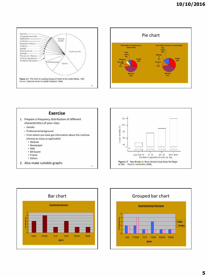
10102016
5
25
Pie chart
Civil status of men in a community
Single
31
Married
41
Divorce
d
11
Widowe
d
1
Free
union
16
Civil status of women in a
community
Single
28
Married
44
Widowe
d
8
Free
union
9
Divorce
d
11
Exercise1 Prepare a frequency distribution of different
characteristics of your class
ndash Gender
ndash Professional background
ndash From where you have got information about this institute
(choose as many as applicable)bull Websitebull Newspaperbull SMSbull Bill boardbull Friend bull Others
2 Also make suitable graphs27 28
Bar chart
Gastrintestinal infections
0
12
3
4
56
7
Cryptos Ehistolyt Ecoli Giardia Rotavirus Shigella
Agents
Freq
uen
cy
Grouped bar chart
Gastrointestinal infections
0
1
2
3
4
5
Crypt Ehistolyt Ecoli Giardia Rotavirus Shigella
Agents
Fre
qu
en
cy
Males
Females
10102016
6
Bar Chart
Source Quarterly Country Summaries 2008
56
77
6670
3845
57
46
0
20
40
60
80
100
Country 1 Country 3 Country 4 Country 5
Perc
en
t
Household Ownership of at Least 1 Net or ITN 2008
Any net
LLIN
32
Stacked bar chart
36
26
9
9
11
20
0 20 40 60 80 100
2008
2007
Percent
Year
ACT Quinine
Amodiaquine Sulfadoxine-Pyrimethamine
Chloroquine Other
Children lt5 with Fever who Took Specific Antimalarial 2007-2008
34
35
ORGANIZING AND GRAPHING
QUANTITATIVE DATA
36
10102016
7
ORGANIZING AND GRAPHING QUANTITATIVE DATA
bull Ordered array
bull Frequency Distributions
ndash Constructing Frequency Distribution Tables
ndash Relative and Percentage Distributions
bull Graphing Grouped Data
ndash Histograms
ndash Polygons
ndash Stem and leaf plots37
Organizing amp Grouping Data
bull To facilitate the calculation of various descriptive measures such as percentages and averages (Before the days of computers)
bull The main purpose in grouping data now is summarization
bull Summarization is a way of making it easier to understand the information in data
38
Ordered array
bull A first step in organizing data
bull An ordered array is a
listing of the values of a collection (either population or sample) in order of magnitude from the smallest value to the largest value
bull If the number of measurements to be ordered is of any appreciable size the use of a computer is highly desirable
40
10102016
8
Frequency Distributions
43
Frequency Distributions
bull A frequency distribution for quantitative data lists
ndashall the classes
and
ndashthe number of values that belong to each class
bull Data presented in the form of a frequency distribution are called grouped data
44
45
Frequency Distributions
46
Weekly Earnings
(dollars)
Number of Employees
f
401 to 600
601 to 800
801 to 1000
1001 to 1200
1201 to 1400
1401 to 1600
9
22
39
15
9
6
Table 27 Weekly Earnings of 100 Employees of a Company
Variable
Third class
Lower limit of the sixth class
Upper limit of the sixth class
Frequency of the third class
Frequency column
Class width
Essential Question
How do we construct a frequency distribution table
Process of Constructing a Frequency Table
10102016
9
STEP 1 Determine the tentative number of classes (k)
k = 1 + 3322 log N
Always round ndash off
Note The number of classes should be between 5 and 15 The actual number of classes may be affected by convenience or other subjective factors
Process of Constructing a Frequency Table
STEP 2 Determine the range (R)
R = Highest Value ndash Lowest Value
STEP 3 Find the class width by dividing the range by the number of classes
(Always round ndash off )
k
Rc
classesofnumber
Rangewidthclass
STEP 4 Write the classes or categories starting with the lowest score Stop when the class already includes the highest score
Add the class width to the starting point to get the second lower class limit Add the class width to the second lower class limit to get the third and so on List the lower class limits in a vertical column and enter the upper class limits which can be easily identified at this stage
STEP 5 Determine the frequency for each class by referring to the tally columns and present the results in a table
When constructing frequency tables the following guidelines should be followed
The classes must be mutually exclusive That is each score must belong to exactly one classInclude all classes even if the frequency might be zero
10102016
10
All classes should have the same width although it is sometimes impossible to avoid open ndashended intervals such as ldquo65 years or olderrdquo
The number of classes should be between 5 and 15
Letrsquos Try
bull Time magazine collected information on all 464 people who died from gunfire in the Philippines during one week Here are the ages of 50 men randomly selected from that population Construct a frequency distribution table
19 18 30 40 41 33 73 25
23 25 21 33 65 17 20 76
47 69 20 31 18 24 35 24
17 36 65 70 22 25 65 16
24 29 42 37 26 46 27 63
21 27 23 25 71 37 75 25
27 23
Determine the tentative number of classes (K)
K = 1 + 3 322 log N
= 1 + 3322 log 50
= 1 + 3322 (169897)
= 664
Round ndash off the result to the next integer if the decimal part exceeds 0
K = 7
Determine the range
R = Highest Value ndash Lowest Value
R = 76 ndash 16 = 60
Find the class width (c)
Round ndash off the quotient if the decimal part exceeds 0
k
Rc
classesofnumber
Rangewidthclass
95787
60c
10102016
11
Write the classes starting with lowest score
Classes Tally Marks Freq
70 ndash 78
61 ndash 6952 ndash 6043 ndash 5134 ndash 4225 ndash 33
16 ndash 24
---
---
5
5027
14
17
Using Table
bull What is the lower class limit of the highest class
bull Upper class limit of the lowest class
bull Find the class mark of the class 43 ndash 51
bull What is the frequency of the class 16 ndash 24
Classes True Class boundaries
Tally Marks Freq x
70 ndash 7861 ndash 6952 ndash 6043 ndash 5134 ndash 4225 ndash 3316 ndash 24
695 ndash 785605 ndash 695515 ndash 605 425 ndash 515335 ndash 425245 ndash 335155 ndash 245
------
550
2714 17
74655647382920
Example
Table 29 gives the total home runs hit by all players of each of the 30 Major League Baseball teams during the 2002 season Construct a frequency distribution table
64
Table 29 Home Runs Hit by Major League Baseball
Teams During the 2002 Season
Team Home Runs Team Home Runs
Anaheim
Arizona
Atlanta
Baltimore
Boston
Chicago Cubs
Chicago White Sox
Cincinnati
Cleveland
Colorado
Detroit
Florida
Houston
Kansas City
Los Angeles
152
165
164
165
177
200
217
169
192
152
124
146
167
140
155
Milwaukee
Minnesota
Montreal
New York Mets
New York Yankees
Oakland
Philadelphia
Pittsburgh
St Louis
San Diego
San Francisco
Seattle
Tampa Bay
Texas
Toronto
139
167
162
160
223
205
165
142
175
136
198
152
133
230
187
65
Solution 2-3
2215
124230classeach of width eApproximat
66
Now we round this approximate width to a convenient number ndash say 22
10102016
12
Solution 2-3
The lower limit of the first class can be taken as 124 or any number less than 124 Suppose we take 124 as the lower limit of the first class Then our classes will be
124 ndash 145 146 ndash 167 168 ndash 189 190 ndash 211
and 212 - 233
67
Table 210 Frequency Distribution for the Data of
Table 29
68
Total Home Runs Tally f
124 ndash 145
146 ndash 167
168 ndash 189
190 ndash 211
212 - 233
|||| |
|||| |||| |||
||||
||||
|||
6
13
4
4
3
sumf = 30
Relative Frequency and Percentage Distributions
Relative Frequency and Percentage Distributions
69
100 frequency) (Relative Percentage
sfrequencie all of Sum
class that ofFrequency class a offrequency Relative
f
f
Example 2-4
Calculate the relative frequencies and percentages for Table 210
70
Solution 2-4
71
Total Home
RunsClass Boundaries
Relative Frequency
Percentage
124 ndash 145
146 ndash 167
168 ndash 189
190 ndash 211
212 - 233
1235 to less than 1455
1455 to less than 1675
1675 to less than 1895
1895 to less than 2115
2115 to less than 2335
200
433
133
133
100
200
433
133
133
100
Sum = 999 Sum = 999
Table 211 Relative Frequency and Percentage Distributions for
Table 210
Graphing Grouped Data
Definition
A histogram is a graph in which classes are marked on the horizontal axis and the frequencies relative frequencies or percentages are marked on the vertical axis The frequencies relative frequencies or percentages are represented by the heights of the bars In a histogram the bars are drawn adjacent to each other
72
10102016
13
Figure 23 Frequency histogram for Table 210
73
124 -145
146 -167
168 -
189
190 -
211
212 -
233Total home runs
15
12
9
6
3
0
Fre
qu
en
cy
Figure 24 Relative frequency histogram for Table
210
74
124 -145
146 -167
168 -
189
190 -
211
212 -
233Total home runs
50
40
30
20
10
0
Re
lati
ve
Fre
qu
en
cy
Graphing Grouped Data cont
Definition
A graph formed by joining the midpoints of the tops of successive bars in a histogram with straight lines is called a polygon
75
Figure 25 Frequency polygon for Table 210
76
124 -145
146 -167
168 -
189
190 -
211
212 -
233
15
12
9
6
3
0
Fre
qu
en
cy
Figure 26 Frequency Distribution curve
77
Fre
qu
en
cy
x
Example 2-5
The following data give the average travel time from home to work (in minutes) for 50 states The data are based on a sample survey of 700000 households conducted by the Census Bureau (USA TODAY August 6 2001)
78
10102016
14
Example 2-5
79
224
197
216
154
211
182
270
219
221
254
237
217
232
196
249
198
176
160
214
255
267
177
161
238
201
234
225
223
219
171
235
237
244
219
225
212
287
156
243
292
199
227
267
261
312
236
242
227
226
208
Construct a frequency distribution table Calculate the relative frequencies and percentages for all classes
Solution 2-5
6326
415231classeach of width eApproximat
80
Solution 2-5
Class Boundaries fRelative
Frequency Percentage
15 to less than 18
18 to less than 21
21 to less than 24
24 to less than 27
27 to less than 30
30 to less than 33
7
7
23
9
3
1
14
14
46
18
06
02
14
14
46
18
6
2
Σf = 50 Sum = 100 Sum = 100
81
Table 212 Frequency Relative Frequency and Percentage
Distributions of Average Travel Time to Work
Example 2-6
The administration in a large city wanted to know the distribution of vehicles owned by households in that city A sample of 40 randomly selected households from this city produced the following data on the number of vehicles owned
5 1 1 2 0 1 1 2 1 1
1 3 3 0 2 5 1 2 3 4
2 1 2 2 1 2 2 1 1 1
4 2 1 1 2 1 1 4 1 3
Construct a frequency distribution table for these data and draw a bar graph
82
Solution 2-6
Vehicles OwnedNumber of
Households (f)
0
1
2
3
4
5
2
18
11
4
3
2
Σf = 4083
Table 213 Frequency Distribution of Vehicles Owned
Figure 27 Bar graph for Table 213
0
2
4
6
8
10
12
14
16
18
20
No Car 1 Car 2 Cars 3 Cars 4 Cars 5 Cars
Vehicles owned
Fre
qu
en
cy
84
10102016
15
STEM-AND-LEAF DISPLAYS
Definition
In a stem-and-leaf display of quantitative data each value is divided into two portions ndash a stem and a leaf The leaves for each stem are shown separately in a display
85
Example 2-8
The following are the scores of 30 college students on a statistics test
Construct a stem-and-leaf display
86
75
69
83
52
72
84
80
81
77
96
61
64
65
76
71
79
86
87
71
79
72
87
68
92
93
50
57
95
92
98
Solution 2-8
To construct a stem-and-leaf display for these scores we split each score into two parts The first part contains the first digit which is called the stem The second part contains the second digit which is called the leaf
87
Solution 2-8
We observe from the data that the stems for all scores are 5 6 7 8 and 9 because all the scores lie in the range 50 to 98
88
Figure 213 Stem-and-leaf display
89
5
6
7
8
9
2
5
Leaf for 75
Leaf for 52
Stems
Solution 2-8
After we have listed the stems we read the leaves for all scores and record them next to the corresponding stems on the right side of the vertical line
90
10102016
16
Figure 214 Stem-and-leaf display of test scores
5
6
7
8
9
2 0 7
5 9 1 8 4
5 9 1 2 6 9 7 1 2
0 7 1 6 3 4 7
6 3 5 2 2 8
91
Figure 215 Ranked stem-and-leaf display of test
scores
5
6
7
8
9
0 2 7
1 4 5 8 9
1 1 2 2 5 6 7 9 9
0 1 3 4 6 7 7
2 2 3 5 6 8
92
Example 2-9
The following data are monthly rents paid by a sample of 30 households selected from a small city
Construct a stem-and-leaf display for these data
93
880
1210
1151
1081
985
630
721
1231
1175
1075
932
952
1023
850
1100
775
825
1140
1235
1000
750
750
915
1140
965
1191
1370
960
1035
1280
Solution 2-9
6
7
8
9
10
11
12
13
30
75 50 21 50
80 25 50
32 52 15 60 85 65
23 81 35 75 00
91 51 40 75 40 00
10 31 35 80
70
94
Figure 216Stem-and-leaf display of rents
Example 2-10
The following stem-and-leaf display is prepared for the number of hours that 25 students spent working on computers during the last month
95
Example 2-10
Prepare a new stem-and-leaf display by grouping the stems
96
0
1
2
3
4
5
6
7
8
6
1 7 9
2 6
2 4 7 8
1 5 6 9 9
3 6 8
2 4 4 5 7
5 6
10102016
17
Solution 2-10
97
0 ndash 2 3 ndash 5
6 ndash 8
6 1 7 9 2 6
2 4 7 8 1 5 6 9 9 3 6 8
2 4 4 5 7 5 6
Figure 217 Grouped stem-and-leaf display
298
Scatter Diagramhellip
bull Example 29 A real estate agent wanted to know to what extent the selling price of a home is related to its sizehellip
bull Collect the data
1) Determine the independent variable (X ndashhouse size) and the dependent variable (Y ndashselling price)
Relationship between peoplersquos weight and height
Relationship between of calories eaten and weight gainloss
299
Scatter Diagramhellip
bull It appears that in fact there is a relationship that is the greater the house size the greater the selling pricehellip
2100
Patterns of Scatter Diagramshellip
bull Linearity and Direction are two concepts we are interested in
Positive Linear Relationship Negative Linear Relationship
Weak or Non-Linear Relationship
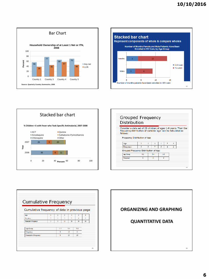
10102016
6
Bar Chart
Source Quarterly Country Summaries 2008
56
77
6670
3845
57
46
0
20
40
60
80
100
Country 1 Country 3 Country 4 Country 5
Perc
en
t
Household Ownership of at Least 1 Net or ITN 2008
Any net
LLIN
32
Stacked bar chart
36
26
9
9
11
20
0 20 40 60 80 100
2008
2007
Percent
Year
ACT Quinine
Amodiaquine Sulfadoxine-Pyrimethamine
Chloroquine Other
Children lt5 with Fever who Took Specific Antimalarial 2007-2008
34
35
ORGANIZING AND GRAPHING
QUANTITATIVE DATA
36
10102016
7
ORGANIZING AND GRAPHING QUANTITATIVE DATA
bull Ordered array
bull Frequency Distributions
ndash Constructing Frequency Distribution Tables
ndash Relative and Percentage Distributions
bull Graphing Grouped Data
ndash Histograms
ndash Polygons
ndash Stem and leaf plots37
Organizing amp Grouping Data
bull To facilitate the calculation of various descriptive measures such as percentages and averages (Before the days of computers)
bull The main purpose in grouping data now is summarization
bull Summarization is a way of making it easier to understand the information in data
38
Ordered array
bull A first step in organizing data
bull An ordered array is a
listing of the values of a collection (either population or sample) in order of magnitude from the smallest value to the largest value
bull If the number of measurements to be ordered is of any appreciable size the use of a computer is highly desirable
40
10102016
8
Frequency Distributions
43
Frequency Distributions
bull A frequency distribution for quantitative data lists
ndashall the classes
and
ndashthe number of values that belong to each class
bull Data presented in the form of a frequency distribution are called grouped data
44
45
Frequency Distributions
46
Weekly Earnings
(dollars)
Number of Employees
f
401 to 600
601 to 800
801 to 1000
1001 to 1200
1201 to 1400
1401 to 1600
9
22
39
15
9
6
Table 27 Weekly Earnings of 100 Employees of a Company
Variable
Third class
Lower limit of the sixth class
Upper limit of the sixth class
Frequency of the third class
Frequency column
Class width
Essential Question
How do we construct a frequency distribution table
Process of Constructing a Frequency Table
10102016
9
STEP 1 Determine the tentative number of classes (k)
k = 1 + 3322 log N
Always round ndash off
Note The number of classes should be between 5 and 15 The actual number of classes may be affected by convenience or other subjective factors
Process of Constructing a Frequency Table
STEP 2 Determine the range (R)
R = Highest Value ndash Lowest Value
STEP 3 Find the class width by dividing the range by the number of classes
(Always round ndash off )
k
Rc
classesofnumber
Rangewidthclass
STEP 4 Write the classes or categories starting with the lowest score Stop when the class already includes the highest score
Add the class width to the starting point to get the second lower class limit Add the class width to the second lower class limit to get the third and so on List the lower class limits in a vertical column and enter the upper class limits which can be easily identified at this stage
STEP 5 Determine the frequency for each class by referring to the tally columns and present the results in a table
When constructing frequency tables the following guidelines should be followed
The classes must be mutually exclusive That is each score must belong to exactly one classInclude all classes even if the frequency might be zero
10102016
10
All classes should have the same width although it is sometimes impossible to avoid open ndashended intervals such as ldquo65 years or olderrdquo
The number of classes should be between 5 and 15
Letrsquos Try
bull Time magazine collected information on all 464 people who died from gunfire in the Philippines during one week Here are the ages of 50 men randomly selected from that population Construct a frequency distribution table
19 18 30 40 41 33 73 25
23 25 21 33 65 17 20 76
47 69 20 31 18 24 35 24
17 36 65 70 22 25 65 16
24 29 42 37 26 46 27 63
21 27 23 25 71 37 75 25
27 23
Determine the tentative number of classes (K)
K = 1 + 3 322 log N
= 1 + 3322 log 50
= 1 + 3322 (169897)
= 664
Round ndash off the result to the next integer if the decimal part exceeds 0
K = 7
Determine the range
R = Highest Value ndash Lowest Value
R = 76 ndash 16 = 60
Find the class width (c)
Round ndash off the quotient if the decimal part exceeds 0
k
Rc
classesofnumber
Rangewidthclass
95787
60c
10102016
11
Write the classes starting with lowest score
Classes Tally Marks Freq
70 ndash 78
61 ndash 6952 ndash 6043 ndash 5134 ndash 4225 ndash 33
16 ndash 24
---
---
5
5027
14
17
Using Table
bull What is the lower class limit of the highest class
bull Upper class limit of the lowest class
bull Find the class mark of the class 43 ndash 51
bull What is the frequency of the class 16 ndash 24
Classes True Class boundaries
Tally Marks Freq x
70 ndash 7861 ndash 6952 ndash 6043 ndash 5134 ndash 4225 ndash 3316 ndash 24
695 ndash 785605 ndash 695515 ndash 605 425 ndash 515335 ndash 425245 ndash 335155 ndash 245
------
550
2714 17
74655647382920
Example
Table 29 gives the total home runs hit by all players of each of the 30 Major League Baseball teams during the 2002 season Construct a frequency distribution table
64
Table 29 Home Runs Hit by Major League Baseball
Teams During the 2002 Season
Team Home Runs Team Home Runs
Anaheim
Arizona
Atlanta
Baltimore
Boston
Chicago Cubs
Chicago White Sox
Cincinnati
Cleveland
Colorado
Detroit
Florida
Houston
Kansas City
Los Angeles
152
165
164
165
177
200
217
169
192
152
124
146
167
140
155
Milwaukee
Minnesota
Montreal
New York Mets
New York Yankees
Oakland
Philadelphia
Pittsburgh
St Louis
San Diego
San Francisco
Seattle
Tampa Bay
Texas
Toronto
139
167
162
160
223
205
165
142
175
136
198
152
133
230
187
65
Solution 2-3
2215
124230classeach of width eApproximat
66
Now we round this approximate width to a convenient number ndash say 22
10102016
12
Solution 2-3
The lower limit of the first class can be taken as 124 or any number less than 124 Suppose we take 124 as the lower limit of the first class Then our classes will be
124 ndash 145 146 ndash 167 168 ndash 189 190 ndash 211
and 212 - 233
67
Table 210 Frequency Distribution for the Data of
Table 29
68
Total Home Runs Tally f
124 ndash 145
146 ndash 167
168 ndash 189
190 ndash 211
212 - 233
|||| |
|||| |||| |||
||||
||||
|||
6
13
4
4
3
sumf = 30
Relative Frequency and Percentage Distributions
Relative Frequency and Percentage Distributions
69
100 frequency) (Relative Percentage
sfrequencie all of Sum
class that ofFrequency class a offrequency Relative
f
f
Example 2-4
Calculate the relative frequencies and percentages for Table 210
70
Solution 2-4
71
Total Home
RunsClass Boundaries
Relative Frequency
Percentage
124 ndash 145
146 ndash 167
168 ndash 189
190 ndash 211
212 - 233
1235 to less than 1455
1455 to less than 1675
1675 to less than 1895
1895 to less than 2115
2115 to less than 2335
200
433
133
133
100
200
433
133
133
100
Sum = 999 Sum = 999
Table 211 Relative Frequency and Percentage Distributions for
Table 210
Graphing Grouped Data
Definition
A histogram is a graph in which classes are marked on the horizontal axis and the frequencies relative frequencies or percentages are marked on the vertical axis The frequencies relative frequencies or percentages are represented by the heights of the bars In a histogram the bars are drawn adjacent to each other
72
10102016
13
Figure 23 Frequency histogram for Table 210
73
124 -145
146 -167
168 -
189
190 -
211
212 -
233Total home runs
15
12
9
6
3
0
Fre
qu
en
cy
Figure 24 Relative frequency histogram for Table
210
74
124 -145
146 -167
168 -
189
190 -
211
212 -
233Total home runs
50
40
30
20
10
0
Re
lati
ve
Fre
qu
en
cy
Graphing Grouped Data cont
Definition
A graph formed by joining the midpoints of the tops of successive bars in a histogram with straight lines is called a polygon
75
Figure 25 Frequency polygon for Table 210
76
124 -145
146 -167
168 -
189
190 -
211
212 -
233
15
12
9
6
3
0
Fre
qu
en
cy
Figure 26 Frequency Distribution curve
77
Fre
qu
en
cy
x
Example 2-5
The following data give the average travel time from home to work (in minutes) for 50 states The data are based on a sample survey of 700000 households conducted by the Census Bureau (USA TODAY August 6 2001)
78
10102016
14
Example 2-5
79
224
197
216
154
211
182
270
219
221
254
237
217
232
196
249
198
176
160
214
255
267
177
161
238
201
234
225
223
219
171
235
237
244
219
225
212
287
156
243
292
199
227
267
261
312
236
242
227
226
208
Construct a frequency distribution table Calculate the relative frequencies and percentages for all classes
Solution 2-5
6326
415231classeach of width eApproximat
80
Solution 2-5
Class Boundaries fRelative
Frequency Percentage
15 to less than 18
18 to less than 21
21 to less than 24
24 to less than 27
27 to less than 30
30 to less than 33
7
7
23
9
3
1
14
14
46
18
06
02
14
14
46
18
6
2
Σf = 50 Sum = 100 Sum = 100
81
Table 212 Frequency Relative Frequency and Percentage
Distributions of Average Travel Time to Work
Example 2-6
The administration in a large city wanted to know the distribution of vehicles owned by households in that city A sample of 40 randomly selected households from this city produced the following data on the number of vehicles owned
5 1 1 2 0 1 1 2 1 1
1 3 3 0 2 5 1 2 3 4
2 1 2 2 1 2 2 1 1 1
4 2 1 1 2 1 1 4 1 3
Construct a frequency distribution table for these data and draw a bar graph
82
Solution 2-6
Vehicles OwnedNumber of
Households (f)
0
1
2
3
4
5
2
18
11
4
3
2
Σf = 4083
Table 213 Frequency Distribution of Vehicles Owned
Figure 27 Bar graph for Table 213
0
2
4
6
8
10
12
14
16
18
20
No Car 1 Car 2 Cars 3 Cars 4 Cars 5 Cars
Vehicles owned
Fre
qu
en
cy
84
10102016
15
STEM-AND-LEAF DISPLAYS
Definition
In a stem-and-leaf display of quantitative data each value is divided into two portions ndash a stem and a leaf The leaves for each stem are shown separately in a display
85
Example 2-8
The following are the scores of 30 college students on a statistics test
Construct a stem-and-leaf display
86
75
69
83
52
72
84
80
81
77
96
61
64
65
76
71
79
86
87
71
79
72
87
68
92
93
50
57
95
92
98
Solution 2-8
To construct a stem-and-leaf display for these scores we split each score into two parts The first part contains the first digit which is called the stem The second part contains the second digit which is called the leaf
87
Solution 2-8
We observe from the data that the stems for all scores are 5 6 7 8 and 9 because all the scores lie in the range 50 to 98
88
Figure 213 Stem-and-leaf display
89
5
6
7
8
9
2
5
Leaf for 75
Leaf for 52
Stems
Solution 2-8
After we have listed the stems we read the leaves for all scores and record them next to the corresponding stems on the right side of the vertical line
90
10102016
16
Figure 214 Stem-and-leaf display of test scores
5
6
7
8
9
2 0 7
5 9 1 8 4
5 9 1 2 6 9 7 1 2
0 7 1 6 3 4 7
6 3 5 2 2 8
91
Figure 215 Ranked stem-and-leaf display of test
scores
5
6
7
8
9
0 2 7
1 4 5 8 9
1 1 2 2 5 6 7 9 9
0 1 3 4 6 7 7
2 2 3 5 6 8
92
Example 2-9
The following data are monthly rents paid by a sample of 30 households selected from a small city
Construct a stem-and-leaf display for these data
93
880
1210
1151
1081
985
630
721
1231
1175
1075
932
952
1023
850
1100
775
825
1140
1235
1000
750
750
915
1140
965
1191
1370
960
1035
1280
Solution 2-9
6
7
8
9
10
11
12
13
30
75 50 21 50
80 25 50
32 52 15 60 85 65
23 81 35 75 00
91 51 40 75 40 00
10 31 35 80
70
94
Figure 216Stem-and-leaf display of rents
Example 2-10
The following stem-and-leaf display is prepared for the number of hours that 25 students spent working on computers during the last month
95
Example 2-10
Prepare a new stem-and-leaf display by grouping the stems
96
0
1
2
3
4
5
6
7
8
6
1 7 9
2 6
2 4 7 8
1 5 6 9 9
3 6 8
2 4 4 5 7
5 6
10102016
17
Solution 2-10
97
0 ndash 2 3 ndash 5
6 ndash 8
6 1 7 9 2 6
2 4 7 8 1 5 6 9 9 3 6 8
2 4 4 5 7 5 6
Figure 217 Grouped stem-and-leaf display
298
Scatter Diagramhellip
bull Example 29 A real estate agent wanted to know to what extent the selling price of a home is related to its sizehellip
bull Collect the data
1) Determine the independent variable (X ndashhouse size) and the dependent variable (Y ndashselling price)
Relationship between peoplersquos weight and height
Relationship between of calories eaten and weight gainloss
299
Scatter Diagramhellip
bull It appears that in fact there is a relationship that is the greater the house size the greater the selling pricehellip
2100
Patterns of Scatter Diagramshellip
bull Linearity and Direction are two concepts we are interested in
Positive Linear Relationship Negative Linear Relationship
Weak or Non-Linear Relationship

10102016
7
ORGANIZING AND GRAPHING QUANTITATIVE DATA
bull Ordered array
bull Frequency Distributions
ndash Constructing Frequency Distribution Tables
ndash Relative and Percentage Distributions
bull Graphing Grouped Data
ndash Histograms
ndash Polygons
ndash Stem and leaf plots37
Organizing amp Grouping Data
bull To facilitate the calculation of various descriptive measures such as percentages and averages (Before the days of computers)
bull The main purpose in grouping data now is summarization
bull Summarization is a way of making it easier to understand the information in data
38
Ordered array
bull A first step in organizing data
bull An ordered array is a
listing of the values of a collection (either population or sample) in order of magnitude from the smallest value to the largest value
bull If the number of measurements to be ordered is of any appreciable size the use of a computer is highly desirable
40
10102016
8
Frequency Distributions
43
Frequency Distributions
bull A frequency distribution for quantitative data lists
ndashall the classes
and
ndashthe number of values that belong to each class
bull Data presented in the form of a frequency distribution are called grouped data
44
45
Frequency Distributions
46
Weekly Earnings
(dollars)
Number of Employees
f
401 to 600
601 to 800
801 to 1000
1001 to 1200
1201 to 1400
1401 to 1600
9
22
39
15
9
6
Table 27 Weekly Earnings of 100 Employees of a Company
Variable
Third class
Lower limit of the sixth class
Upper limit of the sixth class
Frequency of the third class
Frequency column
Class width
Essential Question
How do we construct a frequency distribution table
Process of Constructing a Frequency Table
10102016
9
STEP 1 Determine the tentative number of classes (k)
k = 1 + 3322 log N
Always round ndash off
Note The number of classes should be between 5 and 15 The actual number of classes may be affected by convenience or other subjective factors
Process of Constructing a Frequency Table
STEP 2 Determine the range (R)
R = Highest Value ndash Lowest Value
STEP 3 Find the class width by dividing the range by the number of classes
(Always round ndash off )
k
Rc
classesofnumber
Rangewidthclass
STEP 4 Write the classes or categories starting with the lowest score Stop when the class already includes the highest score
Add the class width to the starting point to get the second lower class limit Add the class width to the second lower class limit to get the third and so on List the lower class limits in a vertical column and enter the upper class limits which can be easily identified at this stage
STEP 5 Determine the frequency for each class by referring to the tally columns and present the results in a table
When constructing frequency tables the following guidelines should be followed
The classes must be mutually exclusive That is each score must belong to exactly one classInclude all classes even if the frequency might be zero
10102016
10
All classes should have the same width although it is sometimes impossible to avoid open ndashended intervals such as ldquo65 years or olderrdquo
The number of classes should be between 5 and 15
Letrsquos Try
bull Time magazine collected information on all 464 people who died from gunfire in the Philippines during one week Here are the ages of 50 men randomly selected from that population Construct a frequency distribution table
19 18 30 40 41 33 73 25
23 25 21 33 65 17 20 76
47 69 20 31 18 24 35 24
17 36 65 70 22 25 65 16
24 29 42 37 26 46 27 63
21 27 23 25 71 37 75 25
27 23
Determine the tentative number of classes (K)
K = 1 + 3 322 log N
= 1 + 3322 log 50
= 1 + 3322 (169897)
= 664
Round ndash off the result to the next integer if the decimal part exceeds 0
K = 7
Determine the range
R = Highest Value ndash Lowest Value
R = 76 ndash 16 = 60
Find the class width (c)
Round ndash off the quotient if the decimal part exceeds 0
k
Rc
classesofnumber
Rangewidthclass
95787
60c
10102016
11
Write the classes starting with lowest score
Classes Tally Marks Freq
70 ndash 78
61 ndash 6952 ndash 6043 ndash 5134 ndash 4225 ndash 33
16 ndash 24
---
---
5
5027
14
17
Using Table
bull What is the lower class limit of the highest class
bull Upper class limit of the lowest class
bull Find the class mark of the class 43 ndash 51
bull What is the frequency of the class 16 ndash 24
Classes True Class boundaries
Tally Marks Freq x
70 ndash 7861 ndash 6952 ndash 6043 ndash 5134 ndash 4225 ndash 3316 ndash 24
695 ndash 785605 ndash 695515 ndash 605 425 ndash 515335 ndash 425245 ndash 335155 ndash 245
------
550
2714 17
74655647382920
Example
Table 29 gives the total home runs hit by all players of each of the 30 Major League Baseball teams during the 2002 season Construct a frequency distribution table
64
Table 29 Home Runs Hit by Major League Baseball
Teams During the 2002 Season
Team Home Runs Team Home Runs
Anaheim
Arizona
Atlanta
Baltimore
Boston
Chicago Cubs
Chicago White Sox
Cincinnati
Cleveland
Colorado
Detroit
Florida
Houston
Kansas City
Los Angeles
152
165
164
165
177
200
217
169
192
152
124
146
167
140
155
Milwaukee
Minnesota
Montreal
New York Mets
New York Yankees
Oakland
Philadelphia
Pittsburgh
St Louis
San Diego
San Francisco
Seattle
Tampa Bay
Texas
Toronto
139
167
162
160
223
205
165
142
175
136
198
152
133
230
187
65
Solution 2-3
2215
124230classeach of width eApproximat
66
Now we round this approximate width to a convenient number ndash say 22
10102016
12
Solution 2-3
The lower limit of the first class can be taken as 124 or any number less than 124 Suppose we take 124 as the lower limit of the first class Then our classes will be
124 ndash 145 146 ndash 167 168 ndash 189 190 ndash 211
and 212 - 233
67
Table 210 Frequency Distribution for the Data of
Table 29
68
Total Home Runs Tally f
124 ndash 145
146 ndash 167
168 ndash 189
190 ndash 211
212 - 233
|||| |
|||| |||| |||
||||
||||
|||
6
13
4
4
3
sumf = 30
Relative Frequency and Percentage Distributions
Relative Frequency and Percentage Distributions
69
100 frequency) (Relative Percentage
sfrequencie all of Sum
class that ofFrequency class a offrequency Relative
f
f
Example 2-4
Calculate the relative frequencies and percentages for Table 210
70
Solution 2-4
71
Total Home
RunsClass Boundaries
Relative Frequency
Percentage
124 ndash 145
146 ndash 167
168 ndash 189
190 ndash 211
212 - 233
1235 to less than 1455
1455 to less than 1675
1675 to less than 1895
1895 to less than 2115
2115 to less than 2335
200
433
133
133
100
200
433
133
133
100
Sum = 999 Sum = 999
Table 211 Relative Frequency and Percentage Distributions for
Table 210
Graphing Grouped Data
Definition
A histogram is a graph in which classes are marked on the horizontal axis and the frequencies relative frequencies or percentages are marked on the vertical axis The frequencies relative frequencies or percentages are represented by the heights of the bars In a histogram the bars are drawn adjacent to each other
72
10102016
13
Figure 23 Frequency histogram for Table 210
73
124 -145
146 -167
168 -
189
190 -
211
212 -
233Total home runs
15
12
9
6
3
0
Fre
qu
en
cy
Figure 24 Relative frequency histogram for Table
210
74
124 -145
146 -167
168 -
189
190 -
211
212 -
233Total home runs
50
40
30
20
10
0
Re
lati
ve
Fre
qu
en
cy
Graphing Grouped Data cont
Definition
A graph formed by joining the midpoints of the tops of successive bars in a histogram with straight lines is called a polygon
75
Figure 25 Frequency polygon for Table 210
76
124 -145
146 -167
168 -
189
190 -
211
212 -
233
15
12
9
6
3
0
Fre
qu
en
cy
Figure 26 Frequency Distribution curve
77
Fre
qu
en
cy
x
Example 2-5
The following data give the average travel time from home to work (in minutes) for 50 states The data are based on a sample survey of 700000 households conducted by the Census Bureau (USA TODAY August 6 2001)
78
10102016
14
Example 2-5
79
224
197
216
154
211
182
270
219
221
254
237
217
232
196
249
198
176
160
214
255
267
177
161
238
201
234
225
223
219
171
235
237
244
219
225
212
287
156
243
292
199
227
267
261
312
236
242
227
226
208
Construct a frequency distribution table Calculate the relative frequencies and percentages for all classes
Solution 2-5
6326
415231classeach of width eApproximat
80
Solution 2-5
Class Boundaries fRelative
Frequency Percentage
15 to less than 18
18 to less than 21
21 to less than 24
24 to less than 27
27 to less than 30
30 to less than 33
7
7
23
9
3
1
14
14
46
18
06
02
14
14
46
18
6
2
Σf = 50 Sum = 100 Sum = 100
81
Table 212 Frequency Relative Frequency and Percentage
Distributions of Average Travel Time to Work
Example 2-6
The administration in a large city wanted to know the distribution of vehicles owned by households in that city A sample of 40 randomly selected households from this city produced the following data on the number of vehicles owned
5 1 1 2 0 1 1 2 1 1
1 3 3 0 2 5 1 2 3 4
2 1 2 2 1 2 2 1 1 1
4 2 1 1 2 1 1 4 1 3
Construct a frequency distribution table for these data and draw a bar graph
82
Solution 2-6
Vehicles OwnedNumber of
Households (f)
0
1
2
3
4
5
2
18
11
4
3
2
Σf = 4083
Table 213 Frequency Distribution of Vehicles Owned
Figure 27 Bar graph for Table 213
0
2
4
6
8
10
12
14
16
18
20
No Car 1 Car 2 Cars 3 Cars 4 Cars 5 Cars
Vehicles owned
Fre
qu
en
cy
84
10102016
15
STEM-AND-LEAF DISPLAYS
Definition
In a stem-and-leaf display of quantitative data each value is divided into two portions ndash a stem and a leaf The leaves for each stem are shown separately in a display
85
Example 2-8
The following are the scores of 30 college students on a statistics test
Construct a stem-and-leaf display
86
75
69
83
52
72
84
80
81
77
96
61
64
65
76
71
79
86
87
71
79
72
87
68
92
93
50
57
95
92
98
Solution 2-8
To construct a stem-and-leaf display for these scores we split each score into two parts The first part contains the first digit which is called the stem The second part contains the second digit which is called the leaf
87
Solution 2-8
We observe from the data that the stems for all scores are 5 6 7 8 and 9 because all the scores lie in the range 50 to 98
88
Figure 213 Stem-and-leaf display
89
5
6
7
8
9
2
5
Leaf for 75
Leaf for 52
Stems
Solution 2-8
After we have listed the stems we read the leaves for all scores and record them next to the corresponding stems on the right side of the vertical line
90
10102016
16
Figure 214 Stem-and-leaf display of test scores
5
6
7
8
9
2 0 7
5 9 1 8 4
5 9 1 2 6 9 7 1 2
0 7 1 6 3 4 7
6 3 5 2 2 8
91
Figure 215 Ranked stem-and-leaf display of test
scores
5
6
7
8
9
0 2 7
1 4 5 8 9
1 1 2 2 5 6 7 9 9
0 1 3 4 6 7 7
2 2 3 5 6 8
92
Example 2-9
The following data are monthly rents paid by a sample of 30 households selected from a small city
Construct a stem-and-leaf display for these data
93
880
1210
1151
1081
985
630
721
1231
1175
1075
932
952
1023
850
1100
775
825
1140
1235
1000
750
750
915
1140
965
1191
1370
960
1035
1280
Solution 2-9
6
7
8
9
10
11
12
13
30
75 50 21 50
80 25 50
32 52 15 60 85 65
23 81 35 75 00
91 51 40 75 40 00
10 31 35 80
70
94
Figure 216Stem-and-leaf display of rents
Example 2-10
The following stem-and-leaf display is prepared for the number of hours that 25 students spent working on computers during the last month
95
Example 2-10
Prepare a new stem-and-leaf display by grouping the stems
96
0
1
2
3
4
5
6
7
8
6
1 7 9
2 6
2 4 7 8
1 5 6 9 9
3 6 8
2 4 4 5 7
5 6
10102016
17
Solution 2-10
97
0 ndash 2 3 ndash 5
6 ndash 8
6 1 7 9 2 6
2 4 7 8 1 5 6 9 9 3 6 8
2 4 4 5 7 5 6
Figure 217 Grouped stem-and-leaf display
298
Scatter Diagramhellip
bull Example 29 A real estate agent wanted to know to what extent the selling price of a home is related to its sizehellip
bull Collect the data
1) Determine the independent variable (X ndashhouse size) and the dependent variable (Y ndashselling price)
Relationship between peoplersquos weight and height
Relationship between of calories eaten and weight gainloss
299
Scatter Diagramhellip
bull It appears that in fact there is a relationship that is the greater the house size the greater the selling pricehellip
2100
Patterns of Scatter Diagramshellip
bull Linearity and Direction are two concepts we are interested in
Positive Linear Relationship Negative Linear Relationship
Weak or Non-Linear Relationship
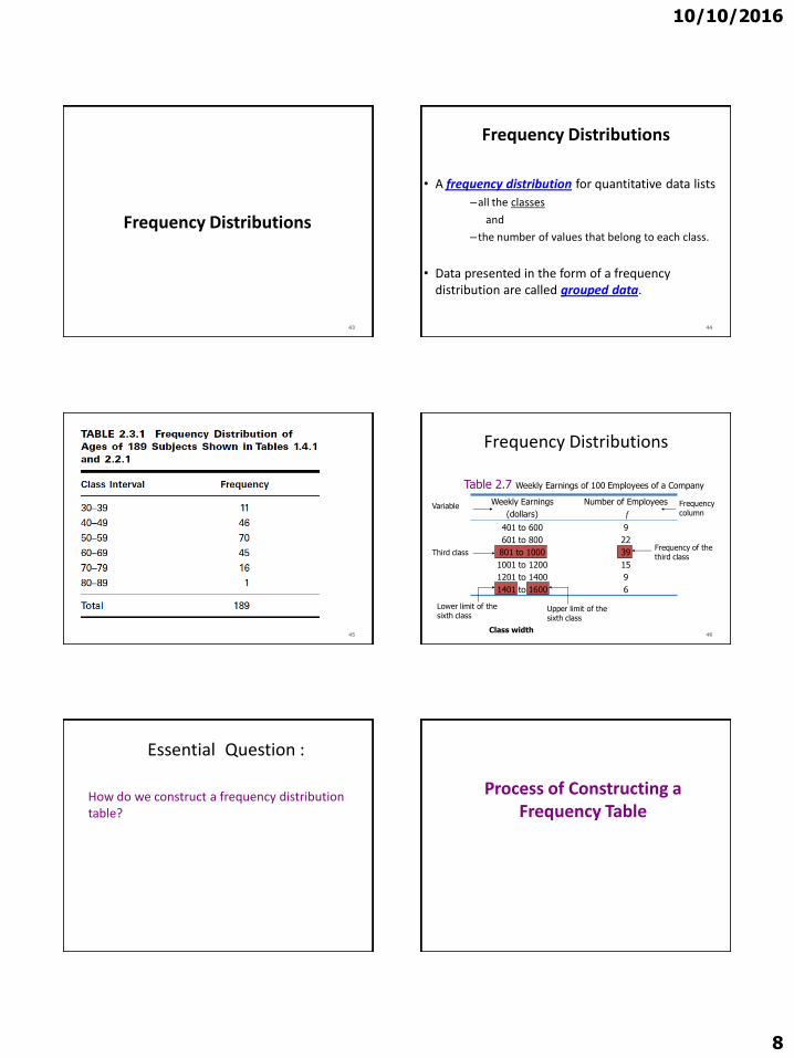
10102016
8
Frequency Distributions
43
Frequency Distributions
bull A frequency distribution for quantitative data lists
ndashall the classes
and
ndashthe number of values that belong to each class
bull Data presented in the form of a frequency distribution are called grouped data
44
45
Frequency Distributions
46
Weekly Earnings
(dollars)
Number of Employees
f
401 to 600
601 to 800
801 to 1000
1001 to 1200
1201 to 1400
1401 to 1600
9
22
39
15
9
6
Table 27 Weekly Earnings of 100 Employees of a Company
Variable
Third class
Lower limit of the sixth class
Upper limit of the sixth class
Frequency of the third class
Frequency column
Class width
Essential Question
How do we construct a frequency distribution table
Process of Constructing a Frequency Table
10102016
9
STEP 1 Determine the tentative number of classes (k)
k = 1 + 3322 log N
Always round ndash off
Note The number of classes should be between 5 and 15 The actual number of classes may be affected by convenience or other subjective factors
Process of Constructing a Frequency Table
STEP 2 Determine the range (R)
R = Highest Value ndash Lowest Value
STEP 3 Find the class width by dividing the range by the number of classes
(Always round ndash off )
k
Rc
classesofnumber
Rangewidthclass
STEP 4 Write the classes or categories starting with the lowest score Stop when the class already includes the highest score
Add the class width to the starting point to get the second lower class limit Add the class width to the second lower class limit to get the third and so on List the lower class limits in a vertical column and enter the upper class limits which can be easily identified at this stage
STEP 5 Determine the frequency for each class by referring to the tally columns and present the results in a table
When constructing frequency tables the following guidelines should be followed
The classes must be mutually exclusive That is each score must belong to exactly one classInclude all classes even if the frequency might be zero
10102016
10
All classes should have the same width although it is sometimes impossible to avoid open ndashended intervals such as ldquo65 years or olderrdquo
The number of classes should be between 5 and 15
Letrsquos Try
bull Time magazine collected information on all 464 people who died from gunfire in the Philippines during one week Here are the ages of 50 men randomly selected from that population Construct a frequency distribution table
19 18 30 40 41 33 73 25
23 25 21 33 65 17 20 76
47 69 20 31 18 24 35 24
17 36 65 70 22 25 65 16
24 29 42 37 26 46 27 63
21 27 23 25 71 37 75 25
27 23
Determine the tentative number of classes (K)
K = 1 + 3 322 log N
= 1 + 3322 log 50
= 1 + 3322 (169897)
= 664
Round ndash off the result to the next integer if the decimal part exceeds 0
K = 7
Determine the range
R = Highest Value ndash Lowest Value
R = 76 ndash 16 = 60
Find the class width (c)
Round ndash off the quotient if the decimal part exceeds 0
k
Rc
classesofnumber
Rangewidthclass
95787
60c
10102016
11
Write the classes starting with lowest score
Classes Tally Marks Freq
70 ndash 78
61 ndash 6952 ndash 6043 ndash 5134 ndash 4225 ndash 33
16 ndash 24
---
---
5
5027
14
17
Using Table
bull What is the lower class limit of the highest class
bull Upper class limit of the lowest class
bull Find the class mark of the class 43 ndash 51
bull What is the frequency of the class 16 ndash 24
Classes True Class boundaries
Tally Marks Freq x
70 ndash 7861 ndash 6952 ndash 6043 ndash 5134 ndash 4225 ndash 3316 ndash 24
695 ndash 785605 ndash 695515 ndash 605 425 ndash 515335 ndash 425245 ndash 335155 ndash 245
------
550
2714 17
74655647382920
Example
Table 29 gives the total home runs hit by all players of each of the 30 Major League Baseball teams during the 2002 season Construct a frequency distribution table
64
Table 29 Home Runs Hit by Major League Baseball
Teams During the 2002 Season
Team Home Runs Team Home Runs
Anaheim
Arizona
Atlanta
Baltimore
Boston
Chicago Cubs
Chicago White Sox
Cincinnati
Cleveland
Colorado
Detroit
Florida
Houston
Kansas City
Los Angeles
152
165
164
165
177
200
217
169
192
152
124
146
167
140
155
Milwaukee
Minnesota
Montreal
New York Mets
New York Yankees
Oakland
Philadelphia
Pittsburgh
St Louis
San Diego
San Francisco
Seattle
Tampa Bay
Texas
Toronto
139
167
162
160
223
205
165
142
175
136
198
152
133
230
187
65
Solution 2-3
2215
124230classeach of width eApproximat
66
Now we round this approximate width to a convenient number ndash say 22
10102016
12
Solution 2-3
The lower limit of the first class can be taken as 124 or any number less than 124 Suppose we take 124 as the lower limit of the first class Then our classes will be
124 ndash 145 146 ndash 167 168 ndash 189 190 ndash 211
and 212 - 233
67
Table 210 Frequency Distribution for the Data of
Table 29
68
Total Home Runs Tally f
124 ndash 145
146 ndash 167
168 ndash 189
190 ndash 211
212 - 233
|||| |
|||| |||| |||
||||
||||
|||
6
13
4
4
3
sumf = 30
Relative Frequency and Percentage Distributions
Relative Frequency and Percentage Distributions
69
100 frequency) (Relative Percentage
sfrequencie all of Sum
class that ofFrequency class a offrequency Relative
f
f
Example 2-4
Calculate the relative frequencies and percentages for Table 210
70
Solution 2-4
71
Total Home
RunsClass Boundaries
Relative Frequency
Percentage
124 ndash 145
146 ndash 167
168 ndash 189
190 ndash 211
212 - 233
1235 to less than 1455
1455 to less than 1675
1675 to less than 1895
1895 to less than 2115
2115 to less than 2335
200
433
133
133
100
200
433
133
133
100
Sum = 999 Sum = 999
Table 211 Relative Frequency and Percentage Distributions for
Table 210
Graphing Grouped Data
Definition
A histogram is a graph in which classes are marked on the horizontal axis and the frequencies relative frequencies or percentages are marked on the vertical axis The frequencies relative frequencies or percentages are represented by the heights of the bars In a histogram the bars are drawn adjacent to each other
72
10102016
13
Figure 23 Frequency histogram for Table 210
73
124 -145
146 -167
168 -
189
190 -
211
212 -
233Total home runs
15
12
9
6
3
0
Fre
qu
en
cy
Figure 24 Relative frequency histogram for Table
210
74
124 -145
146 -167
168 -
189
190 -
211
212 -
233Total home runs
50
40
30
20
10
0
Re
lati
ve
Fre
qu
en
cy
Graphing Grouped Data cont
Definition
A graph formed by joining the midpoints of the tops of successive bars in a histogram with straight lines is called a polygon
75
Figure 25 Frequency polygon for Table 210
76
124 -145
146 -167
168 -
189
190 -
211
212 -
233
15
12
9
6
3
0
Fre
qu
en
cy
Figure 26 Frequency Distribution curve
77
Fre
qu
en
cy
x
Example 2-5
The following data give the average travel time from home to work (in minutes) for 50 states The data are based on a sample survey of 700000 households conducted by the Census Bureau (USA TODAY August 6 2001)
78
10102016
14
Example 2-5
79
224
197
216
154
211
182
270
219
221
254
237
217
232
196
249
198
176
160
214
255
267
177
161
238
201
234
225
223
219
171
235
237
244
219
225
212
287
156
243
292
199
227
267
261
312
236
242
227
226
208
Construct a frequency distribution table Calculate the relative frequencies and percentages for all classes
Solution 2-5
6326
415231classeach of width eApproximat
80
Solution 2-5
Class Boundaries fRelative
Frequency Percentage
15 to less than 18
18 to less than 21
21 to less than 24
24 to less than 27
27 to less than 30
30 to less than 33
7
7
23
9
3
1
14
14
46
18
06
02
14
14
46
18
6
2
Σf = 50 Sum = 100 Sum = 100
81
Table 212 Frequency Relative Frequency and Percentage
Distributions of Average Travel Time to Work
Example 2-6
The administration in a large city wanted to know the distribution of vehicles owned by households in that city A sample of 40 randomly selected households from this city produced the following data on the number of vehicles owned
5 1 1 2 0 1 1 2 1 1
1 3 3 0 2 5 1 2 3 4
2 1 2 2 1 2 2 1 1 1
4 2 1 1 2 1 1 4 1 3
Construct a frequency distribution table for these data and draw a bar graph
82
Solution 2-6
Vehicles OwnedNumber of
Households (f)
0
1
2
3
4
5
2
18
11
4
3
2
Σf = 4083
Table 213 Frequency Distribution of Vehicles Owned
Figure 27 Bar graph for Table 213
0
2
4
6
8
10
12
14
16
18
20
No Car 1 Car 2 Cars 3 Cars 4 Cars 5 Cars
Vehicles owned
Fre
qu
en
cy
84
10102016
15
STEM-AND-LEAF DISPLAYS
Definition
In a stem-and-leaf display of quantitative data each value is divided into two portions ndash a stem and a leaf The leaves for each stem are shown separately in a display
85
Example 2-8
The following are the scores of 30 college students on a statistics test
Construct a stem-and-leaf display
86
75
69
83
52
72
84
80
81
77
96
61
64
65
76
71
79
86
87
71
79
72
87
68
92
93
50
57
95
92
98
Solution 2-8
To construct a stem-and-leaf display for these scores we split each score into two parts The first part contains the first digit which is called the stem The second part contains the second digit which is called the leaf
87
Solution 2-8
We observe from the data that the stems for all scores are 5 6 7 8 and 9 because all the scores lie in the range 50 to 98
88
Figure 213 Stem-and-leaf display
89
5
6
7
8
9
2
5
Leaf for 75
Leaf for 52
Stems
Solution 2-8
After we have listed the stems we read the leaves for all scores and record them next to the corresponding stems on the right side of the vertical line
90
10102016
16
Figure 214 Stem-and-leaf display of test scores
5
6
7
8
9
2 0 7
5 9 1 8 4
5 9 1 2 6 9 7 1 2
0 7 1 6 3 4 7
6 3 5 2 2 8
91
Figure 215 Ranked stem-and-leaf display of test
scores
5
6
7
8
9
0 2 7
1 4 5 8 9
1 1 2 2 5 6 7 9 9
0 1 3 4 6 7 7
2 2 3 5 6 8
92
Example 2-9
The following data are monthly rents paid by a sample of 30 households selected from a small city
Construct a stem-and-leaf display for these data
93
880
1210
1151
1081
985
630
721
1231
1175
1075
932
952
1023
850
1100
775
825
1140
1235
1000
750
750
915
1140
965
1191
1370
960
1035
1280
Solution 2-9
6
7
8
9
10
11
12
13
30
75 50 21 50
80 25 50
32 52 15 60 85 65
23 81 35 75 00
91 51 40 75 40 00
10 31 35 80
70
94
Figure 216Stem-and-leaf display of rents
Example 2-10
The following stem-and-leaf display is prepared for the number of hours that 25 students spent working on computers during the last month
95
Example 2-10
Prepare a new stem-and-leaf display by grouping the stems
96
0
1
2
3
4
5
6
7
8
6
1 7 9
2 6
2 4 7 8
1 5 6 9 9
3 6 8
2 4 4 5 7
5 6
10102016
17
Solution 2-10
97
0 ndash 2 3 ndash 5
6 ndash 8
6 1 7 9 2 6
2 4 7 8 1 5 6 9 9 3 6 8
2 4 4 5 7 5 6
Figure 217 Grouped stem-and-leaf display
298
Scatter Diagramhellip
bull Example 29 A real estate agent wanted to know to what extent the selling price of a home is related to its sizehellip
bull Collect the data
1) Determine the independent variable (X ndashhouse size) and the dependent variable (Y ndashselling price)
Relationship between peoplersquos weight and height
Relationship between of calories eaten and weight gainloss
299
Scatter Diagramhellip
bull It appears that in fact there is a relationship that is the greater the house size the greater the selling pricehellip
2100
Patterns of Scatter Diagramshellip
bull Linearity and Direction are two concepts we are interested in
Positive Linear Relationship Negative Linear Relationship
Weak or Non-Linear Relationship

10102016
9
STEP 1 Determine the tentative number of classes (k)
k = 1 + 3322 log N
Always round ndash off
Note The number of classes should be between 5 and 15 The actual number of classes may be affected by convenience or other subjective factors
Process of Constructing a Frequency Table
STEP 2 Determine the range (R)
R = Highest Value ndash Lowest Value
STEP 3 Find the class width by dividing the range by the number of classes
(Always round ndash off )
k
Rc
classesofnumber
Rangewidthclass
STEP 4 Write the classes or categories starting with the lowest score Stop when the class already includes the highest score
Add the class width to the starting point to get the second lower class limit Add the class width to the second lower class limit to get the third and so on List the lower class limits in a vertical column and enter the upper class limits which can be easily identified at this stage
STEP 5 Determine the frequency for each class by referring to the tally columns and present the results in a table
When constructing frequency tables the following guidelines should be followed
The classes must be mutually exclusive That is each score must belong to exactly one classInclude all classes even if the frequency might be zero
10102016
10
All classes should have the same width although it is sometimes impossible to avoid open ndashended intervals such as ldquo65 years or olderrdquo
The number of classes should be between 5 and 15
Letrsquos Try
bull Time magazine collected information on all 464 people who died from gunfire in the Philippines during one week Here are the ages of 50 men randomly selected from that population Construct a frequency distribution table
19 18 30 40 41 33 73 25
23 25 21 33 65 17 20 76
47 69 20 31 18 24 35 24
17 36 65 70 22 25 65 16
24 29 42 37 26 46 27 63
21 27 23 25 71 37 75 25
27 23
Determine the tentative number of classes (K)
K = 1 + 3 322 log N
= 1 + 3322 log 50
= 1 + 3322 (169897)
= 664
Round ndash off the result to the next integer if the decimal part exceeds 0
K = 7
Determine the range
R = Highest Value ndash Lowest Value
R = 76 ndash 16 = 60
Find the class width (c)
Round ndash off the quotient if the decimal part exceeds 0
k
Rc
classesofnumber
Rangewidthclass
95787
60c
10102016
11
Write the classes starting with lowest score
Classes Tally Marks Freq
70 ndash 78
61 ndash 6952 ndash 6043 ndash 5134 ndash 4225 ndash 33
16 ndash 24
---
---
5
5027
14
17
Using Table
bull What is the lower class limit of the highest class
bull Upper class limit of the lowest class
bull Find the class mark of the class 43 ndash 51
bull What is the frequency of the class 16 ndash 24
Classes True Class boundaries
Tally Marks Freq x
70 ndash 7861 ndash 6952 ndash 6043 ndash 5134 ndash 4225 ndash 3316 ndash 24
695 ndash 785605 ndash 695515 ndash 605 425 ndash 515335 ndash 425245 ndash 335155 ndash 245
------
550
2714 17
74655647382920
Example
Table 29 gives the total home runs hit by all players of each of the 30 Major League Baseball teams during the 2002 season Construct a frequency distribution table
64
Table 29 Home Runs Hit by Major League Baseball
Teams During the 2002 Season
Team Home Runs Team Home Runs
Anaheim
Arizona
Atlanta
Baltimore
Boston
Chicago Cubs
Chicago White Sox
Cincinnati
Cleveland
Colorado
Detroit
Florida
Houston
Kansas City
Los Angeles
152
165
164
165
177
200
217
169
192
152
124
146
167
140
155
Milwaukee
Minnesota
Montreal
New York Mets
New York Yankees
Oakland
Philadelphia
Pittsburgh
St Louis
San Diego
San Francisco
Seattle
Tampa Bay
Texas
Toronto
139
167
162
160
223
205
165
142
175
136
198
152
133
230
187
65
Solution 2-3
2215
124230classeach of width eApproximat
66
Now we round this approximate width to a convenient number ndash say 22
10102016
12
Solution 2-3
The lower limit of the first class can be taken as 124 or any number less than 124 Suppose we take 124 as the lower limit of the first class Then our classes will be
124 ndash 145 146 ndash 167 168 ndash 189 190 ndash 211
and 212 - 233
67
Table 210 Frequency Distribution for the Data of
Table 29
68
Total Home Runs Tally f
124 ndash 145
146 ndash 167
168 ndash 189
190 ndash 211
212 - 233
|||| |
|||| |||| |||
||||
||||
|||
6
13
4
4
3
sumf = 30
Relative Frequency and Percentage Distributions
Relative Frequency and Percentage Distributions
69
100 frequency) (Relative Percentage
sfrequencie all of Sum
class that ofFrequency class a offrequency Relative
f
f
Example 2-4
Calculate the relative frequencies and percentages for Table 210
70
Solution 2-4
71
Total Home
RunsClass Boundaries
Relative Frequency
Percentage
124 ndash 145
146 ndash 167
168 ndash 189
190 ndash 211
212 - 233
1235 to less than 1455
1455 to less than 1675
1675 to less than 1895
1895 to less than 2115
2115 to less than 2335
200
433
133
133
100
200
433
133
133
100
Sum = 999 Sum = 999
Table 211 Relative Frequency and Percentage Distributions for
Table 210
Graphing Grouped Data
Definition
A histogram is a graph in which classes are marked on the horizontal axis and the frequencies relative frequencies or percentages are marked on the vertical axis The frequencies relative frequencies or percentages are represented by the heights of the bars In a histogram the bars are drawn adjacent to each other
72
10102016
13
Figure 23 Frequency histogram for Table 210
73
124 -145
146 -167
168 -
189
190 -
211
212 -
233Total home runs
15
12
9
6
3
0
Fre
qu
en
cy
Figure 24 Relative frequency histogram for Table
210
74
124 -145
146 -167
168 -
189
190 -
211
212 -
233Total home runs
50
40
30
20
10
0
Re
lati
ve
Fre
qu
en
cy
Graphing Grouped Data cont
Definition
A graph formed by joining the midpoints of the tops of successive bars in a histogram with straight lines is called a polygon
75
Figure 25 Frequency polygon for Table 210
76
124 -145
146 -167
168 -
189
190 -
211
212 -
233
15
12
9
6
3
0
Fre
qu
en
cy
Figure 26 Frequency Distribution curve
77
Fre
qu
en
cy
x
Example 2-5
The following data give the average travel time from home to work (in minutes) for 50 states The data are based on a sample survey of 700000 households conducted by the Census Bureau (USA TODAY August 6 2001)
78
10102016
14
Example 2-5
79
224
197
216
154
211
182
270
219
221
254
237
217
232
196
249
198
176
160
214
255
267
177
161
238
201
234
225
223
219
171
235
237
244
219
225
212
287
156
243
292
199
227
267
261
312
236
242
227
226
208
Construct a frequency distribution table Calculate the relative frequencies and percentages for all classes
Solution 2-5
6326
415231classeach of width eApproximat
80
Solution 2-5
Class Boundaries fRelative
Frequency Percentage
15 to less than 18
18 to less than 21
21 to less than 24
24 to less than 27
27 to less than 30
30 to less than 33
7
7
23
9
3
1
14
14
46
18
06
02
14
14
46
18
6
2
Σf = 50 Sum = 100 Sum = 100
81
Table 212 Frequency Relative Frequency and Percentage
Distributions of Average Travel Time to Work
Example 2-6
The administration in a large city wanted to know the distribution of vehicles owned by households in that city A sample of 40 randomly selected households from this city produced the following data on the number of vehicles owned
5 1 1 2 0 1 1 2 1 1
1 3 3 0 2 5 1 2 3 4
2 1 2 2 1 2 2 1 1 1
4 2 1 1 2 1 1 4 1 3
Construct a frequency distribution table for these data and draw a bar graph
82
Solution 2-6
Vehicles OwnedNumber of
Households (f)
0
1
2
3
4
5
2
18
11
4
3
2
Σf = 4083
Table 213 Frequency Distribution of Vehicles Owned
Figure 27 Bar graph for Table 213
0
2
4
6
8
10
12
14
16
18
20
No Car 1 Car 2 Cars 3 Cars 4 Cars 5 Cars
Vehicles owned
Fre
qu
en
cy
84
10102016
15
STEM-AND-LEAF DISPLAYS
Definition
In a stem-and-leaf display of quantitative data each value is divided into two portions ndash a stem and a leaf The leaves for each stem are shown separately in a display
85
Example 2-8
The following are the scores of 30 college students on a statistics test
Construct a stem-and-leaf display
86
75
69
83
52
72
84
80
81
77
96
61
64
65
76
71
79
86
87
71
79
72
87
68
92
93
50
57
95
92
98
Solution 2-8
To construct a stem-and-leaf display for these scores we split each score into two parts The first part contains the first digit which is called the stem The second part contains the second digit which is called the leaf
87
Solution 2-8
We observe from the data that the stems for all scores are 5 6 7 8 and 9 because all the scores lie in the range 50 to 98
88
Figure 213 Stem-and-leaf display
89
5
6
7
8
9
2
5
Leaf for 75
Leaf for 52
Stems
Solution 2-8
After we have listed the stems we read the leaves for all scores and record them next to the corresponding stems on the right side of the vertical line
90
10102016
16
Figure 214 Stem-and-leaf display of test scores
5
6
7
8
9
2 0 7
5 9 1 8 4
5 9 1 2 6 9 7 1 2
0 7 1 6 3 4 7
6 3 5 2 2 8
91
Figure 215 Ranked stem-and-leaf display of test
scores
5
6
7
8
9
0 2 7
1 4 5 8 9
1 1 2 2 5 6 7 9 9
0 1 3 4 6 7 7
2 2 3 5 6 8
92
Example 2-9
The following data are monthly rents paid by a sample of 30 households selected from a small city
Construct a stem-and-leaf display for these data
93
880
1210
1151
1081
985
630
721
1231
1175
1075
932
952
1023
850
1100
775
825
1140
1235
1000
750
750
915
1140
965
1191
1370
960
1035
1280
Solution 2-9
6
7
8
9
10
11
12
13
30
75 50 21 50
80 25 50
32 52 15 60 85 65
23 81 35 75 00
91 51 40 75 40 00
10 31 35 80
70
94
Figure 216Stem-and-leaf display of rents
Example 2-10
The following stem-and-leaf display is prepared for the number of hours that 25 students spent working on computers during the last month
95
Example 2-10
Prepare a new stem-and-leaf display by grouping the stems
96
0
1
2
3
4
5
6
7
8
6
1 7 9
2 6
2 4 7 8
1 5 6 9 9
3 6 8
2 4 4 5 7
5 6
10102016
17
Solution 2-10
97
0 ndash 2 3 ndash 5
6 ndash 8
6 1 7 9 2 6
2 4 7 8 1 5 6 9 9 3 6 8
2 4 4 5 7 5 6
Figure 217 Grouped stem-and-leaf display
298
Scatter Diagramhellip
bull Example 29 A real estate agent wanted to know to what extent the selling price of a home is related to its sizehellip
bull Collect the data
1) Determine the independent variable (X ndashhouse size) and the dependent variable (Y ndashselling price)
Relationship between peoplersquos weight and height
Relationship between of calories eaten and weight gainloss
299
Scatter Diagramhellip
bull It appears that in fact there is a relationship that is the greater the house size the greater the selling pricehellip
2100
Patterns of Scatter Diagramshellip
bull Linearity and Direction are two concepts we are interested in
Positive Linear Relationship Negative Linear Relationship
Weak or Non-Linear Relationship

10102016
10
All classes should have the same width although it is sometimes impossible to avoid open ndashended intervals such as ldquo65 years or olderrdquo
The number of classes should be between 5 and 15
Letrsquos Try
bull Time magazine collected information on all 464 people who died from gunfire in the Philippines during one week Here are the ages of 50 men randomly selected from that population Construct a frequency distribution table
19 18 30 40 41 33 73 25
23 25 21 33 65 17 20 76
47 69 20 31 18 24 35 24
17 36 65 70 22 25 65 16
24 29 42 37 26 46 27 63
21 27 23 25 71 37 75 25
27 23
Determine the tentative number of classes (K)
K = 1 + 3 322 log N
= 1 + 3322 log 50
= 1 + 3322 (169897)
= 664
Round ndash off the result to the next integer if the decimal part exceeds 0
K = 7
Determine the range
R = Highest Value ndash Lowest Value
R = 76 ndash 16 = 60
Find the class width (c)
Round ndash off the quotient if the decimal part exceeds 0
k
Rc
classesofnumber
Rangewidthclass
95787
60c
10102016
11
Write the classes starting with lowest score
Classes Tally Marks Freq
70 ndash 78
61 ndash 6952 ndash 6043 ndash 5134 ndash 4225 ndash 33
16 ndash 24
---
---
5
5027
14
17
Using Table
bull What is the lower class limit of the highest class
bull Upper class limit of the lowest class
bull Find the class mark of the class 43 ndash 51
bull What is the frequency of the class 16 ndash 24
Classes True Class boundaries
Tally Marks Freq x
70 ndash 7861 ndash 6952 ndash 6043 ndash 5134 ndash 4225 ndash 3316 ndash 24
695 ndash 785605 ndash 695515 ndash 605 425 ndash 515335 ndash 425245 ndash 335155 ndash 245
------
550
2714 17
74655647382920
Example
Table 29 gives the total home runs hit by all players of each of the 30 Major League Baseball teams during the 2002 season Construct a frequency distribution table
64
Table 29 Home Runs Hit by Major League Baseball
Teams During the 2002 Season
Team Home Runs Team Home Runs
Anaheim
Arizona
Atlanta
Baltimore
Boston
Chicago Cubs
Chicago White Sox
Cincinnati
Cleveland
Colorado
Detroit
Florida
Houston
Kansas City
Los Angeles
152
165
164
165
177
200
217
169
192
152
124
146
167
140
155
Milwaukee
Minnesota
Montreal
New York Mets
New York Yankees
Oakland
Philadelphia
Pittsburgh
St Louis
San Diego
San Francisco
Seattle
Tampa Bay
Texas
Toronto
139
167
162
160
223
205
165
142
175
136
198
152
133
230
187
65
Solution 2-3
2215
124230classeach of width eApproximat
66
Now we round this approximate width to a convenient number ndash say 22
10102016
12
Solution 2-3
The lower limit of the first class can be taken as 124 or any number less than 124 Suppose we take 124 as the lower limit of the first class Then our classes will be
124 ndash 145 146 ndash 167 168 ndash 189 190 ndash 211
and 212 - 233
67
Table 210 Frequency Distribution for the Data of
Table 29
68
Total Home Runs Tally f
124 ndash 145
146 ndash 167
168 ndash 189
190 ndash 211
212 - 233
|||| |
|||| |||| |||
||||
||||
|||
6
13
4
4
3
sumf = 30
Relative Frequency and Percentage Distributions
Relative Frequency and Percentage Distributions
69
100 frequency) (Relative Percentage
sfrequencie all of Sum
class that ofFrequency class a offrequency Relative
f
f
Example 2-4
Calculate the relative frequencies and percentages for Table 210
70
Solution 2-4
71
Total Home
RunsClass Boundaries
Relative Frequency
Percentage
124 ndash 145
146 ndash 167
168 ndash 189
190 ndash 211
212 - 233
1235 to less than 1455
1455 to less than 1675
1675 to less than 1895
1895 to less than 2115
2115 to less than 2335
200
433
133
133
100
200
433
133
133
100
Sum = 999 Sum = 999
Table 211 Relative Frequency and Percentage Distributions for
Table 210
Graphing Grouped Data
Definition
A histogram is a graph in which classes are marked on the horizontal axis and the frequencies relative frequencies or percentages are marked on the vertical axis The frequencies relative frequencies or percentages are represented by the heights of the bars In a histogram the bars are drawn adjacent to each other
72
10102016
13
Figure 23 Frequency histogram for Table 210
73
124 -145
146 -167
168 -
189
190 -
211
212 -
233Total home runs
15
12
9
6
3
0
Fre
qu
en
cy
Figure 24 Relative frequency histogram for Table
210
74
124 -145
146 -167
168 -
189
190 -
211
212 -
233Total home runs
50
40
30
20
10
0
Re
lati
ve
Fre
qu
en
cy
Graphing Grouped Data cont
Definition
A graph formed by joining the midpoints of the tops of successive bars in a histogram with straight lines is called a polygon
75
Figure 25 Frequency polygon for Table 210
76
124 -145
146 -167
168 -
189
190 -
211
212 -
233
15
12
9
6
3
0
Fre
qu
en
cy
Figure 26 Frequency Distribution curve
77
Fre
qu
en
cy
x
Example 2-5
The following data give the average travel time from home to work (in minutes) for 50 states The data are based on a sample survey of 700000 households conducted by the Census Bureau (USA TODAY August 6 2001)
78
10102016
14
Example 2-5
79
224
197
216
154
211
182
270
219
221
254
237
217
232
196
249
198
176
160
214
255
267
177
161
238
201
234
225
223
219
171
235
237
244
219
225
212
287
156
243
292
199
227
267
261
312
236
242
227
226
208
Construct a frequency distribution table Calculate the relative frequencies and percentages for all classes
Solution 2-5
6326
415231classeach of width eApproximat
80
Solution 2-5
Class Boundaries fRelative
Frequency Percentage
15 to less than 18
18 to less than 21
21 to less than 24
24 to less than 27
27 to less than 30
30 to less than 33
7
7
23
9
3
1
14
14
46
18
06
02
14
14
46
18
6
2
Σf = 50 Sum = 100 Sum = 100
81
Table 212 Frequency Relative Frequency and Percentage
Distributions of Average Travel Time to Work
Example 2-6
The administration in a large city wanted to know the distribution of vehicles owned by households in that city A sample of 40 randomly selected households from this city produced the following data on the number of vehicles owned
5 1 1 2 0 1 1 2 1 1
1 3 3 0 2 5 1 2 3 4
2 1 2 2 1 2 2 1 1 1
4 2 1 1 2 1 1 4 1 3
Construct a frequency distribution table for these data and draw a bar graph
82
Solution 2-6
Vehicles OwnedNumber of
Households (f)
0
1
2
3
4
5
2
18
11
4
3
2
Σf = 4083
Table 213 Frequency Distribution of Vehicles Owned
Figure 27 Bar graph for Table 213
0
2
4
6
8
10
12
14
16
18
20
No Car 1 Car 2 Cars 3 Cars 4 Cars 5 Cars
Vehicles owned
Fre
qu
en
cy
84
10102016
15
STEM-AND-LEAF DISPLAYS
Definition
In a stem-and-leaf display of quantitative data each value is divided into two portions ndash a stem and a leaf The leaves for each stem are shown separately in a display
85
Example 2-8
The following are the scores of 30 college students on a statistics test
Construct a stem-and-leaf display
86
75
69
83
52
72
84
80
81
77
96
61
64
65
76
71
79
86
87
71
79
72
87
68
92
93
50
57
95
92
98
Solution 2-8
To construct a stem-and-leaf display for these scores we split each score into two parts The first part contains the first digit which is called the stem The second part contains the second digit which is called the leaf
87
Solution 2-8
We observe from the data that the stems for all scores are 5 6 7 8 and 9 because all the scores lie in the range 50 to 98
88
Figure 213 Stem-and-leaf display
89
5
6
7
8
9
2
5
Leaf for 75
Leaf for 52
Stems
Solution 2-8
After we have listed the stems we read the leaves for all scores and record them next to the corresponding stems on the right side of the vertical line
90
10102016
16
Figure 214 Stem-and-leaf display of test scores
5
6
7
8
9
2 0 7
5 9 1 8 4
5 9 1 2 6 9 7 1 2
0 7 1 6 3 4 7
6 3 5 2 2 8
91
Figure 215 Ranked stem-and-leaf display of test
scores
5
6
7
8
9
0 2 7
1 4 5 8 9
1 1 2 2 5 6 7 9 9
0 1 3 4 6 7 7
2 2 3 5 6 8
92
Example 2-9
The following data are monthly rents paid by a sample of 30 households selected from a small city
Construct a stem-and-leaf display for these data
93
880
1210
1151
1081
985
630
721
1231
1175
1075
932
952
1023
850
1100
775
825
1140
1235
1000
750
750
915
1140
965
1191
1370
960
1035
1280
Solution 2-9
6
7
8
9
10
11
12
13
30
75 50 21 50
80 25 50
32 52 15 60 85 65
23 81 35 75 00
91 51 40 75 40 00
10 31 35 80
70
94
Figure 216Stem-and-leaf display of rents
Example 2-10
The following stem-and-leaf display is prepared for the number of hours that 25 students spent working on computers during the last month
95
Example 2-10
Prepare a new stem-and-leaf display by grouping the stems
96
0
1
2
3
4
5
6
7
8
6
1 7 9
2 6
2 4 7 8
1 5 6 9 9
3 6 8
2 4 4 5 7
5 6
10102016
17
Solution 2-10
97
0 ndash 2 3 ndash 5
6 ndash 8
6 1 7 9 2 6
2 4 7 8 1 5 6 9 9 3 6 8
2 4 4 5 7 5 6
Figure 217 Grouped stem-and-leaf display
298
Scatter Diagramhellip
bull Example 29 A real estate agent wanted to know to what extent the selling price of a home is related to its sizehellip
bull Collect the data
1) Determine the independent variable (X ndashhouse size) and the dependent variable (Y ndashselling price)
Relationship between peoplersquos weight and height
Relationship between of calories eaten and weight gainloss
299
Scatter Diagramhellip
bull It appears that in fact there is a relationship that is the greater the house size the greater the selling pricehellip
2100
Patterns of Scatter Diagramshellip
bull Linearity and Direction are two concepts we are interested in
Positive Linear Relationship Negative Linear Relationship
Weak or Non-Linear Relationship
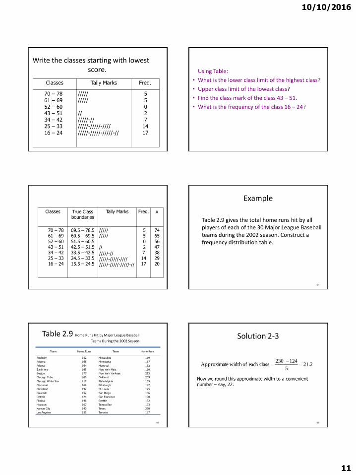
10102016
11
Write the classes starting with lowest score
Classes Tally Marks Freq
70 ndash 78
61 ndash 6952 ndash 6043 ndash 5134 ndash 4225 ndash 33
16 ndash 24
---
---
5
5027
14
17
Using Table
bull What is the lower class limit of the highest class
bull Upper class limit of the lowest class
bull Find the class mark of the class 43 ndash 51
bull What is the frequency of the class 16 ndash 24
Classes True Class boundaries
Tally Marks Freq x
70 ndash 7861 ndash 6952 ndash 6043 ndash 5134 ndash 4225 ndash 3316 ndash 24
695 ndash 785605 ndash 695515 ndash 605 425 ndash 515335 ndash 425245 ndash 335155 ndash 245
------
550
2714 17
74655647382920
Example
Table 29 gives the total home runs hit by all players of each of the 30 Major League Baseball teams during the 2002 season Construct a frequency distribution table
64
Table 29 Home Runs Hit by Major League Baseball
Teams During the 2002 Season
Team Home Runs Team Home Runs
Anaheim
Arizona
Atlanta
Baltimore
Boston
Chicago Cubs
Chicago White Sox
Cincinnati
Cleveland
Colorado
Detroit
Florida
Houston
Kansas City
Los Angeles
152
165
164
165
177
200
217
169
192
152
124
146
167
140
155
Milwaukee
Minnesota
Montreal
New York Mets
New York Yankees
Oakland
Philadelphia
Pittsburgh
St Louis
San Diego
San Francisco
Seattle
Tampa Bay
Texas
Toronto
139
167
162
160
223
205
165
142
175
136
198
152
133
230
187
65
Solution 2-3
2215
124230classeach of width eApproximat
66
Now we round this approximate width to a convenient number ndash say 22
10102016
12
Solution 2-3
The lower limit of the first class can be taken as 124 or any number less than 124 Suppose we take 124 as the lower limit of the first class Then our classes will be
124 ndash 145 146 ndash 167 168 ndash 189 190 ndash 211
and 212 - 233
67
Table 210 Frequency Distribution for the Data of
Table 29
68
Total Home Runs Tally f
124 ndash 145
146 ndash 167
168 ndash 189
190 ndash 211
212 - 233
|||| |
|||| |||| |||
||||
||||
|||
6
13
4
4
3
sumf = 30
Relative Frequency and Percentage Distributions
Relative Frequency and Percentage Distributions
69
100 frequency) (Relative Percentage
sfrequencie all of Sum
class that ofFrequency class a offrequency Relative
f
f
Example 2-4
Calculate the relative frequencies and percentages for Table 210
70
Solution 2-4
71
Total Home
RunsClass Boundaries
Relative Frequency
Percentage
124 ndash 145
146 ndash 167
168 ndash 189
190 ndash 211
212 - 233
1235 to less than 1455
1455 to less than 1675
1675 to less than 1895
1895 to less than 2115
2115 to less than 2335
200
433
133
133
100
200
433
133
133
100
Sum = 999 Sum = 999
Table 211 Relative Frequency and Percentage Distributions for
Table 210
Graphing Grouped Data
Definition
A histogram is a graph in which classes are marked on the horizontal axis and the frequencies relative frequencies or percentages are marked on the vertical axis The frequencies relative frequencies or percentages are represented by the heights of the bars In a histogram the bars are drawn adjacent to each other
72
10102016
13
Figure 23 Frequency histogram for Table 210
73
124 -145
146 -167
168 -
189
190 -
211
212 -
233Total home runs
15
12
9
6
3
0
Fre
qu
en
cy
Figure 24 Relative frequency histogram for Table
210
74
124 -145
146 -167
168 -
189
190 -
211
212 -
233Total home runs
50
40
30
20
10
0
Re
lati
ve
Fre
qu
en
cy
Graphing Grouped Data cont
Definition
A graph formed by joining the midpoints of the tops of successive bars in a histogram with straight lines is called a polygon
75
Figure 25 Frequency polygon for Table 210
76
124 -145
146 -167
168 -
189
190 -
211
212 -
233
15
12
9
6
3
0
Fre
qu
en
cy
Figure 26 Frequency Distribution curve
77
Fre
qu
en
cy
x
Example 2-5
The following data give the average travel time from home to work (in minutes) for 50 states The data are based on a sample survey of 700000 households conducted by the Census Bureau (USA TODAY August 6 2001)
78
10102016
14
Example 2-5
79
224
197
216
154
211
182
270
219
221
254
237
217
232
196
249
198
176
160
214
255
267
177
161
238
201
234
225
223
219
171
235
237
244
219
225
212
287
156
243
292
199
227
267
261
312
236
242
227
226
208
Construct a frequency distribution table Calculate the relative frequencies and percentages for all classes
Solution 2-5
6326
415231classeach of width eApproximat
80
Solution 2-5
Class Boundaries fRelative
Frequency Percentage
15 to less than 18
18 to less than 21
21 to less than 24
24 to less than 27
27 to less than 30
30 to less than 33
7
7
23
9
3
1
14
14
46
18
06
02
14
14
46
18
6
2
Σf = 50 Sum = 100 Sum = 100
81
Table 212 Frequency Relative Frequency and Percentage
Distributions of Average Travel Time to Work
Example 2-6
The administration in a large city wanted to know the distribution of vehicles owned by households in that city A sample of 40 randomly selected households from this city produced the following data on the number of vehicles owned
5 1 1 2 0 1 1 2 1 1
1 3 3 0 2 5 1 2 3 4
2 1 2 2 1 2 2 1 1 1
4 2 1 1 2 1 1 4 1 3
Construct a frequency distribution table for these data and draw a bar graph
82
Solution 2-6
Vehicles OwnedNumber of
Households (f)
0
1
2
3
4
5
2
18
11
4
3
2
Σf = 4083
Table 213 Frequency Distribution of Vehicles Owned
Figure 27 Bar graph for Table 213
0
2
4
6
8
10
12
14
16
18
20
No Car 1 Car 2 Cars 3 Cars 4 Cars 5 Cars
Vehicles owned
Fre
qu
en
cy
84
10102016
15
STEM-AND-LEAF DISPLAYS
Definition
In a stem-and-leaf display of quantitative data each value is divided into two portions ndash a stem and a leaf The leaves for each stem are shown separately in a display
85
Example 2-8
The following are the scores of 30 college students on a statistics test
Construct a stem-and-leaf display
86
75
69
83
52
72
84
80
81
77
96
61
64
65
76
71
79
86
87
71
79
72
87
68
92
93
50
57
95
92
98
Solution 2-8
To construct a stem-and-leaf display for these scores we split each score into two parts The first part contains the first digit which is called the stem The second part contains the second digit which is called the leaf
87
Solution 2-8
We observe from the data that the stems for all scores are 5 6 7 8 and 9 because all the scores lie in the range 50 to 98
88
Figure 213 Stem-and-leaf display
89
5
6
7
8
9
2
5
Leaf for 75
Leaf for 52
Stems
Solution 2-8
After we have listed the stems we read the leaves for all scores and record them next to the corresponding stems on the right side of the vertical line
90
10102016
16
Figure 214 Stem-and-leaf display of test scores
5
6
7
8
9
2 0 7
5 9 1 8 4
5 9 1 2 6 9 7 1 2
0 7 1 6 3 4 7
6 3 5 2 2 8
91
Figure 215 Ranked stem-and-leaf display of test
scores
5
6
7
8
9
0 2 7
1 4 5 8 9
1 1 2 2 5 6 7 9 9
0 1 3 4 6 7 7
2 2 3 5 6 8
92
Example 2-9
The following data are monthly rents paid by a sample of 30 households selected from a small city
Construct a stem-and-leaf display for these data
93
880
1210
1151
1081
985
630
721
1231
1175
1075
932
952
1023
850
1100
775
825
1140
1235
1000
750
750
915
1140
965
1191
1370
960
1035
1280
Solution 2-9
6
7
8
9
10
11
12
13
30
75 50 21 50
80 25 50
32 52 15 60 85 65
23 81 35 75 00
91 51 40 75 40 00
10 31 35 80
70
94
Figure 216Stem-and-leaf display of rents
Example 2-10
The following stem-and-leaf display is prepared for the number of hours that 25 students spent working on computers during the last month
95
Example 2-10
Prepare a new stem-and-leaf display by grouping the stems
96
0
1
2
3
4
5
6
7
8
6
1 7 9
2 6
2 4 7 8
1 5 6 9 9
3 6 8
2 4 4 5 7
5 6
10102016
17
Solution 2-10
97
0 ndash 2 3 ndash 5
6 ndash 8
6 1 7 9 2 6
2 4 7 8 1 5 6 9 9 3 6 8
2 4 4 5 7 5 6
Figure 217 Grouped stem-and-leaf display
298
Scatter Diagramhellip
bull Example 29 A real estate agent wanted to know to what extent the selling price of a home is related to its sizehellip
bull Collect the data
1) Determine the independent variable (X ndashhouse size) and the dependent variable (Y ndashselling price)
Relationship between peoplersquos weight and height
Relationship between of calories eaten and weight gainloss
299
Scatter Diagramhellip
bull It appears that in fact there is a relationship that is the greater the house size the greater the selling pricehellip
2100
Patterns of Scatter Diagramshellip
bull Linearity and Direction are two concepts we are interested in
Positive Linear Relationship Negative Linear Relationship
Weak or Non-Linear Relationship
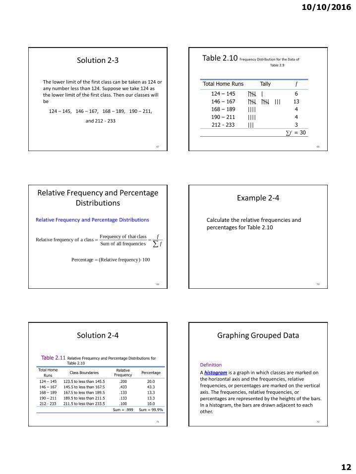
10102016
12
Solution 2-3
The lower limit of the first class can be taken as 124 or any number less than 124 Suppose we take 124 as the lower limit of the first class Then our classes will be
124 ndash 145 146 ndash 167 168 ndash 189 190 ndash 211
and 212 - 233
67
Table 210 Frequency Distribution for the Data of
Table 29
68
Total Home Runs Tally f
124 ndash 145
146 ndash 167
168 ndash 189
190 ndash 211
212 - 233
|||| |
|||| |||| |||
||||
||||
|||
6
13
4
4
3
sumf = 30
Relative Frequency and Percentage Distributions
Relative Frequency and Percentage Distributions
69
100 frequency) (Relative Percentage
sfrequencie all of Sum
class that ofFrequency class a offrequency Relative
f
f
Example 2-4
Calculate the relative frequencies and percentages for Table 210
70
Solution 2-4
71
Total Home
RunsClass Boundaries
Relative Frequency
Percentage
124 ndash 145
146 ndash 167
168 ndash 189
190 ndash 211
212 - 233
1235 to less than 1455
1455 to less than 1675
1675 to less than 1895
1895 to less than 2115
2115 to less than 2335
200
433
133
133
100
200
433
133
133
100
Sum = 999 Sum = 999
Table 211 Relative Frequency and Percentage Distributions for
Table 210
Graphing Grouped Data
Definition
A histogram is a graph in which classes are marked on the horizontal axis and the frequencies relative frequencies or percentages are marked on the vertical axis The frequencies relative frequencies or percentages are represented by the heights of the bars In a histogram the bars are drawn adjacent to each other
72
10102016
13
Figure 23 Frequency histogram for Table 210
73
124 -145
146 -167
168 -
189
190 -
211
212 -
233Total home runs
15
12
9
6
3
0
Fre
qu
en
cy
Figure 24 Relative frequency histogram for Table
210
74
124 -145
146 -167
168 -
189
190 -
211
212 -
233Total home runs
50
40
30
20
10
0
Re
lati
ve
Fre
qu
en
cy
Graphing Grouped Data cont
Definition
A graph formed by joining the midpoints of the tops of successive bars in a histogram with straight lines is called a polygon
75
Figure 25 Frequency polygon for Table 210
76
124 -145
146 -167
168 -
189
190 -
211
212 -
233
15
12
9
6
3
0
Fre
qu
en
cy
Figure 26 Frequency Distribution curve
77
Fre
qu
en
cy
x
Example 2-5
The following data give the average travel time from home to work (in minutes) for 50 states The data are based on a sample survey of 700000 households conducted by the Census Bureau (USA TODAY August 6 2001)
78
10102016
14
Example 2-5
79
224
197
216
154
211
182
270
219
221
254
237
217
232
196
249
198
176
160
214
255
267
177
161
238
201
234
225
223
219
171
235
237
244
219
225
212
287
156
243
292
199
227
267
261
312
236
242
227
226
208
Construct a frequency distribution table Calculate the relative frequencies and percentages for all classes
Solution 2-5
6326
415231classeach of width eApproximat
80
Solution 2-5
Class Boundaries fRelative
Frequency Percentage
15 to less than 18
18 to less than 21
21 to less than 24
24 to less than 27
27 to less than 30
30 to less than 33
7
7
23
9
3
1
14
14
46
18
06
02
14
14
46
18
6
2
Σf = 50 Sum = 100 Sum = 100
81
Table 212 Frequency Relative Frequency and Percentage
Distributions of Average Travel Time to Work
Example 2-6
The administration in a large city wanted to know the distribution of vehicles owned by households in that city A sample of 40 randomly selected households from this city produced the following data on the number of vehicles owned
5 1 1 2 0 1 1 2 1 1
1 3 3 0 2 5 1 2 3 4
2 1 2 2 1 2 2 1 1 1
4 2 1 1 2 1 1 4 1 3
Construct a frequency distribution table for these data and draw a bar graph
82
Solution 2-6
Vehicles OwnedNumber of
Households (f)
0
1
2
3
4
5
2
18
11
4
3
2
Σf = 4083
Table 213 Frequency Distribution of Vehicles Owned
Figure 27 Bar graph for Table 213
0
2
4
6
8
10
12
14
16
18
20
No Car 1 Car 2 Cars 3 Cars 4 Cars 5 Cars
Vehicles owned
Fre
qu
en
cy
84
10102016
15
STEM-AND-LEAF DISPLAYS
Definition
In a stem-and-leaf display of quantitative data each value is divided into two portions ndash a stem and a leaf The leaves for each stem are shown separately in a display
85
Example 2-8
The following are the scores of 30 college students on a statistics test
Construct a stem-and-leaf display
86
75
69
83
52
72
84
80
81
77
96
61
64
65
76
71
79
86
87
71
79
72
87
68
92
93
50
57
95
92
98
Solution 2-8
To construct a stem-and-leaf display for these scores we split each score into two parts The first part contains the first digit which is called the stem The second part contains the second digit which is called the leaf
87
Solution 2-8
We observe from the data that the stems for all scores are 5 6 7 8 and 9 because all the scores lie in the range 50 to 98
88
Figure 213 Stem-and-leaf display
89
5
6
7
8
9
2
5
Leaf for 75
Leaf for 52
Stems
Solution 2-8
After we have listed the stems we read the leaves for all scores and record them next to the corresponding stems on the right side of the vertical line
90
10102016
16
Figure 214 Stem-and-leaf display of test scores
5
6
7
8
9
2 0 7
5 9 1 8 4
5 9 1 2 6 9 7 1 2
0 7 1 6 3 4 7
6 3 5 2 2 8
91
Figure 215 Ranked stem-and-leaf display of test
scores
5
6
7
8
9
0 2 7
1 4 5 8 9
1 1 2 2 5 6 7 9 9
0 1 3 4 6 7 7
2 2 3 5 6 8
92
Example 2-9
The following data are monthly rents paid by a sample of 30 households selected from a small city
Construct a stem-and-leaf display for these data
93
880
1210
1151
1081
985
630
721
1231
1175
1075
932
952
1023
850
1100
775
825
1140
1235
1000
750
750
915
1140
965
1191
1370
960
1035
1280
Solution 2-9
6
7
8
9
10
11
12
13
30
75 50 21 50
80 25 50
32 52 15 60 85 65
23 81 35 75 00
91 51 40 75 40 00
10 31 35 80
70
94
Figure 216Stem-and-leaf display of rents
Example 2-10
The following stem-and-leaf display is prepared for the number of hours that 25 students spent working on computers during the last month
95
Example 2-10
Prepare a new stem-and-leaf display by grouping the stems
96
0
1
2
3
4
5
6
7
8
6
1 7 9
2 6
2 4 7 8
1 5 6 9 9
3 6 8
2 4 4 5 7
5 6
10102016
17
Solution 2-10
97
0 ndash 2 3 ndash 5
6 ndash 8
6 1 7 9 2 6
2 4 7 8 1 5 6 9 9 3 6 8
2 4 4 5 7 5 6
Figure 217 Grouped stem-and-leaf display
298
Scatter Diagramhellip
bull Example 29 A real estate agent wanted to know to what extent the selling price of a home is related to its sizehellip
bull Collect the data
1) Determine the independent variable (X ndashhouse size) and the dependent variable (Y ndashselling price)
Relationship between peoplersquos weight and height
Relationship between of calories eaten and weight gainloss
299
Scatter Diagramhellip
bull It appears that in fact there is a relationship that is the greater the house size the greater the selling pricehellip
2100
Patterns of Scatter Diagramshellip
bull Linearity and Direction are two concepts we are interested in
Positive Linear Relationship Negative Linear Relationship
Weak or Non-Linear Relationship
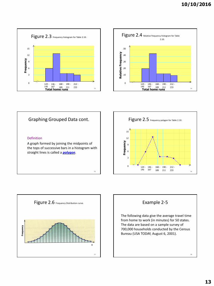
10102016
13
Figure 23 Frequency histogram for Table 210
73
124 -145
146 -167
168 -
189
190 -
211
212 -
233Total home runs
15
12
9
6
3
0
Fre
qu
en
cy
Figure 24 Relative frequency histogram for Table
210
74
124 -145
146 -167
168 -
189
190 -
211
212 -
233Total home runs
50
40
30
20
10
0
Re
lati
ve
Fre
qu
en
cy
Graphing Grouped Data cont
Definition
A graph formed by joining the midpoints of the tops of successive bars in a histogram with straight lines is called a polygon
75
Figure 25 Frequency polygon for Table 210
76
124 -145
146 -167
168 -
189
190 -
211
212 -
233
15
12
9
6
3
0
Fre
qu
en
cy
Figure 26 Frequency Distribution curve
77
Fre
qu
en
cy
x
Example 2-5
The following data give the average travel time from home to work (in minutes) for 50 states The data are based on a sample survey of 700000 households conducted by the Census Bureau (USA TODAY August 6 2001)
78
10102016
14
Example 2-5
79
224
197
216
154
211
182
270
219
221
254
237
217
232
196
249
198
176
160
214
255
267
177
161
238
201
234
225
223
219
171
235
237
244
219
225
212
287
156
243
292
199
227
267
261
312
236
242
227
226
208
Construct a frequency distribution table Calculate the relative frequencies and percentages for all classes
Solution 2-5
6326
415231classeach of width eApproximat
80
Solution 2-5
Class Boundaries fRelative
Frequency Percentage
15 to less than 18
18 to less than 21
21 to less than 24
24 to less than 27
27 to less than 30
30 to less than 33
7
7
23
9
3
1
14
14
46
18
06
02
14
14
46
18
6
2
Σf = 50 Sum = 100 Sum = 100
81
Table 212 Frequency Relative Frequency and Percentage
Distributions of Average Travel Time to Work
Example 2-6
The administration in a large city wanted to know the distribution of vehicles owned by households in that city A sample of 40 randomly selected households from this city produced the following data on the number of vehicles owned
5 1 1 2 0 1 1 2 1 1
1 3 3 0 2 5 1 2 3 4
2 1 2 2 1 2 2 1 1 1
4 2 1 1 2 1 1 4 1 3
Construct a frequency distribution table for these data and draw a bar graph
82
Solution 2-6
Vehicles OwnedNumber of
Households (f)
0
1
2
3
4
5
2
18
11
4
3
2
Σf = 4083
Table 213 Frequency Distribution of Vehicles Owned
Figure 27 Bar graph for Table 213
0
2
4
6
8
10
12
14
16
18
20
No Car 1 Car 2 Cars 3 Cars 4 Cars 5 Cars
Vehicles owned
Fre
qu
en
cy
84
10102016
15
STEM-AND-LEAF DISPLAYS
Definition
In a stem-and-leaf display of quantitative data each value is divided into two portions ndash a stem and a leaf The leaves for each stem are shown separately in a display
85
Example 2-8
The following are the scores of 30 college students on a statistics test
Construct a stem-and-leaf display
86
75
69
83
52
72
84
80
81
77
96
61
64
65
76
71
79
86
87
71
79
72
87
68
92
93
50
57
95
92
98
Solution 2-8
To construct a stem-and-leaf display for these scores we split each score into two parts The first part contains the first digit which is called the stem The second part contains the second digit which is called the leaf
87
Solution 2-8
We observe from the data that the stems for all scores are 5 6 7 8 and 9 because all the scores lie in the range 50 to 98
88
Figure 213 Stem-and-leaf display
89
5
6
7
8
9
2
5
Leaf for 75
Leaf for 52
Stems
Solution 2-8
After we have listed the stems we read the leaves for all scores and record them next to the corresponding stems on the right side of the vertical line
90
10102016
16
Figure 214 Stem-and-leaf display of test scores
5
6
7
8
9
2 0 7
5 9 1 8 4
5 9 1 2 6 9 7 1 2
0 7 1 6 3 4 7
6 3 5 2 2 8
91
Figure 215 Ranked stem-and-leaf display of test
scores
5
6
7
8
9
0 2 7
1 4 5 8 9
1 1 2 2 5 6 7 9 9
0 1 3 4 6 7 7
2 2 3 5 6 8
92
Example 2-9
The following data are monthly rents paid by a sample of 30 households selected from a small city
Construct a stem-and-leaf display for these data
93
880
1210
1151
1081
985
630
721
1231
1175
1075
932
952
1023
850
1100
775
825
1140
1235
1000
750
750
915
1140
965
1191
1370
960
1035
1280
Solution 2-9
6
7
8
9
10
11
12
13
30
75 50 21 50
80 25 50
32 52 15 60 85 65
23 81 35 75 00
91 51 40 75 40 00
10 31 35 80
70
94
Figure 216Stem-and-leaf display of rents
Example 2-10
The following stem-and-leaf display is prepared for the number of hours that 25 students spent working on computers during the last month
95
Example 2-10
Prepare a new stem-and-leaf display by grouping the stems
96
0
1
2
3
4
5
6
7
8
6
1 7 9
2 6
2 4 7 8
1 5 6 9 9
3 6 8
2 4 4 5 7
5 6
10102016
17
Solution 2-10
97
0 ndash 2 3 ndash 5
6 ndash 8
6 1 7 9 2 6
2 4 7 8 1 5 6 9 9 3 6 8
2 4 4 5 7 5 6
Figure 217 Grouped stem-and-leaf display
298
Scatter Diagramhellip
bull Example 29 A real estate agent wanted to know to what extent the selling price of a home is related to its sizehellip
bull Collect the data
1) Determine the independent variable (X ndashhouse size) and the dependent variable (Y ndashselling price)
Relationship between peoplersquos weight and height
Relationship between of calories eaten and weight gainloss
299
Scatter Diagramhellip
bull It appears that in fact there is a relationship that is the greater the house size the greater the selling pricehellip
2100
Patterns of Scatter Diagramshellip
bull Linearity and Direction are two concepts we are interested in
Positive Linear Relationship Negative Linear Relationship
Weak or Non-Linear Relationship
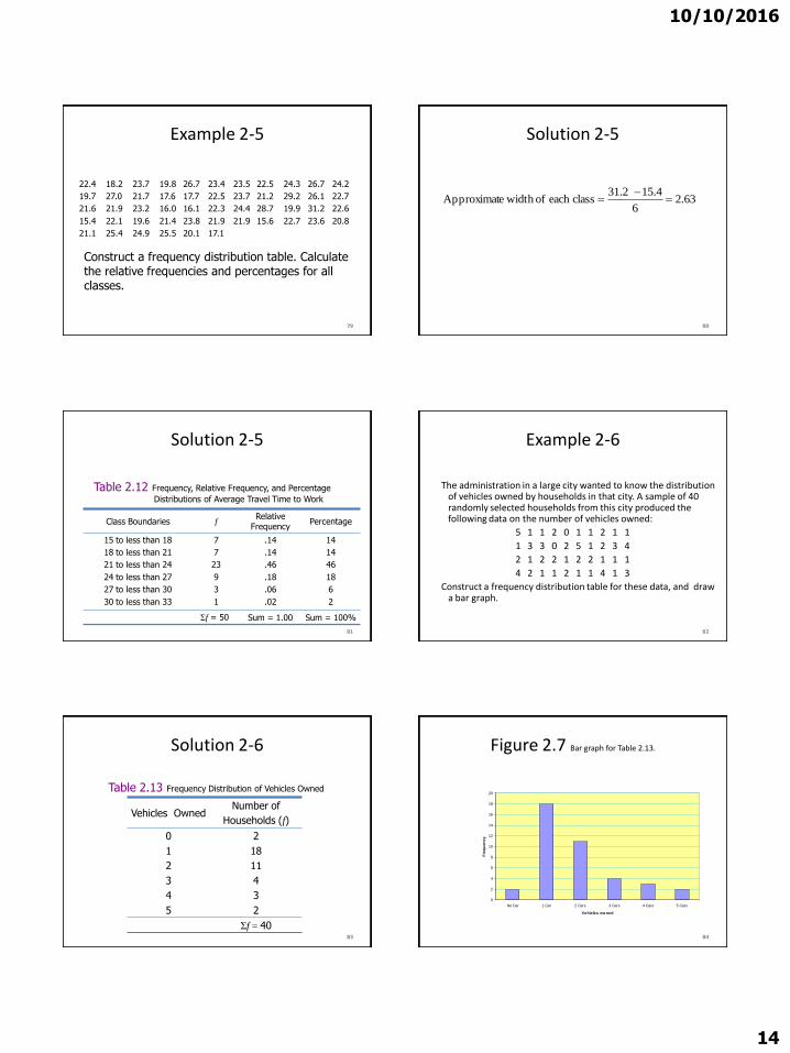
10102016
14
Example 2-5
79
224
197
216
154
211
182
270
219
221
254
237
217
232
196
249
198
176
160
214
255
267
177
161
238
201
234
225
223
219
171
235
237
244
219
225
212
287
156
243
292
199
227
267
261
312
236
242
227
226
208
Construct a frequency distribution table Calculate the relative frequencies and percentages for all classes
Solution 2-5
6326
415231classeach of width eApproximat
80
Solution 2-5
Class Boundaries fRelative
Frequency Percentage
15 to less than 18
18 to less than 21
21 to less than 24
24 to less than 27
27 to less than 30
30 to less than 33
7
7
23
9
3
1
14
14
46
18
06
02
14
14
46
18
6
2
Σf = 50 Sum = 100 Sum = 100
81
Table 212 Frequency Relative Frequency and Percentage
Distributions of Average Travel Time to Work
Example 2-6
The administration in a large city wanted to know the distribution of vehicles owned by households in that city A sample of 40 randomly selected households from this city produced the following data on the number of vehicles owned
5 1 1 2 0 1 1 2 1 1
1 3 3 0 2 5 1 2 3 4
2 1 2 2 1 2 2 1 1 1
4 2 1 1 2 1 1 4 1 3
Construct a frequency distribution table for these data and draw a bar graph
82
Solution 2-6
Vehicles OwnedNumber of
Households (f)
0
1
2
3
4
5
2
18
11
4
3
2
Σf = 4083
Table 213 Frequency Distribution of Vehicles Owned
Figure 27 Bar graph for Table 213
0
2
4
6
8
10
12
14
16
18
20
No Car 1 Car 2 Cars 3 Cars 4 Cars 5 Cars
Vehicles owned
Fre
qu
en
cy
84
10102016
15
STEM-AND-LEAF DISPLAYS
Definition
In a stem-and-leaf display of quantitative data each value is divided into two portions ndash a stem and a leaf The leaves for each stem are shown separately in a display
85
Example 2-8
The following are the scores of 30 college students on a statistics test
Construct a stem-and-leaf display
86
75
69
83
52
72
84
80
81
77
96
61
64
65
76
71
79
86
87
71
79
72
87
68
92
93
50
57
95
92
98
Solution 2-8
To construct a stem-and-leaf display for these scores we split each score into two parts The first part contains the first digit which is called the stem The second part contains the second digit which is called the leaf
87
Solution 2-8
We observe from the data that the stems for all scores are 5 6 7 8 and 9 because all the scores lie in the range 50 to 98
88
Figure 213 Stem-and-leaf display
89
5
6
7
8
9
2
5
Leaf for 75
Leaf for 52
Stems
Solution 2-8
After we have listed the stems we read the leaves for all scores and record them next to the corresponding stems on the right side of the vertical line
90
10102016
16
Figure 214 Stem-and-leaf display of test scores
5
6
7
8
9
2 0 7
5 9 1 8 4
5 9 1 2 6 9 7 1 2
0 7 1 6 3 4 7
6 3 5 2 2 8
91
Figure 215 Ranked stem-and-leaf display of test
scores
5
6
7
8
9
0 2 7
1 4 5 8 9
1 1 2 2 5 6 7 9 9
0 1 3 4 6 7 7
2 2 3 5 6 8
92
Example 2-9
The following data are monthly rents paid by a sample of 30 households selected from a small city
Construct a stem-and-leaf display for these data
93
880
1210
1151
1081
985
630
721
1231
1175
1075
932
952
1023
850
1100
775
825
1140
1235
1000
750
750
915
1140
965
1191
1370
960
1035
1280
Solution 2-9
6
7
8
9
10
11
12
13
30
75 50 21 50
80 25 50
32 52 15 60 85 65
23 81 35 75 00
91 51 40 75 40 00
10 31 35 80
70
94
Figure 216Stem-and-leaf display of rents
Example 2-10
The following stem-and-leaf display is prepared for the number of hours that 25 students spent working on computers during the last month
95
Example 2-10
Prepare a new stem-and-leaf display by grouping the stems
96
0
1
2
3
4
5
6
7
8
6
1 7 9
2 6
2 4 7 8
1 5 6 9 9
3 6 8
2 4 4 5 7
5 6
10102016
17
Solution 2-10
97
0 ndash 2 3 ndash 5
6 ndash 8
6 1 7 9 2 6
2 4 7 8 1 5 6 9 9 3 6 8
2 4 4 5 7 5 6
Figure 217 Grouped stem-and-leaf display
298
Scatter Diagramhellip
bull Example 29 A real estate agent wanted to know to what extent the selling price of a home is related to its sizehellip
bull Collect the data
1) Determine the independent variable (X ndashhouse size) and the dependent variable (Y ndashselling price)
Relationship between peoplersquos weight and height
Relationship between of calories eaten and weight gainloss
299
Scatter Diagramhellip
bull It appears that in fact there is a relationship that is the greater the house size the greater the selling pricehellip
2100
Patterns of Scatter Diagramshellip
bull Linearity and Direction are two concepts we are interested in
Positive Linear Relationship Negative Linear Relationship
Weak or Non-Linear Relationship

10102016
16
Figure 214 Stem-and-leaf display of test scores
5
6
7
8
9
2 0 7
5 9 1 8 4
5 9 1 2 6 9 7 1 2
0 7 1 6 3 4 7
6 3 5 2 2 8
91
Figure 215 Ranked stem-and-leaf display of test
scores
5
6
7
8
9
0 2 7
1 4 5 8 9
1 1 2 2 5 6 7 9 9
0 1 3 4 6 7 7
2 2 3 5 6 8
92
Example 2-9
The following data are monthly rents paid by a sample of 30 households selected from a small city
Construct a stem-and-leaf display for these data
93
880
1210
1151
1081
985
630
721
1231
1175
1075
932
952
1023
850
1100
775
825
1140
1235
1000
750
750
915
1140
965
1191
1370
960
1035
1280
Solution 2-9
6
7
8
9
10
11
12
13
30
75 50 21 50
80 25 50
32 52 15 60 85 65
23 81 35 75 00
91 51 40 75 40 00
10 31 35 80
70
94
Figure 216Stem-and-leaf display of rents
Example 2-10
The following stem-and-leaf display is prepared for the number of hours that 25 students spent working on computers during the last month
95
Example 2-10
Prepare a new stem-and-leaf display by grouping the stems
96
0
1
2
3
4
5
6
7
8
6
1 7 9
2 6
2 4 7 8
1 5 6 9 9
3 6 8
2 4 4 5 7
5 6
10102016
17
Solution 2-10
97
0 ndash 2 3 ndash 5
6 ndash 8
6 1 7 9 2 6
2 4 7 8 1 5 6 9 9 3 6 8
2 4 4 5 7 5 6
Figure 217 Grouped stem-and-leaf display
298
Scatter Diagramhellip
bull Example 29 A real estate agent wanted to know to what extent the selling price of a home is related to its sizehellip
bull Collect the data
1) Determine the independent variable (X ndashhouse size) and the dependent variable (Y ndashselling price)
Relationship between peoplersquos weight and height
Relationship between of calories eaten and weight gainloss
299
Scatter Diagramhellip
bull It appears that in fact there is a relationship that is the greater the house size the greater the selling pricehellip
2100
Patterns of Scatter Diagramshellip
bull Linearity and Direction are two concepts we are interested in
Positive Linear Relationship Negative Linear Relationship
Weak or Non-Linear Relationship
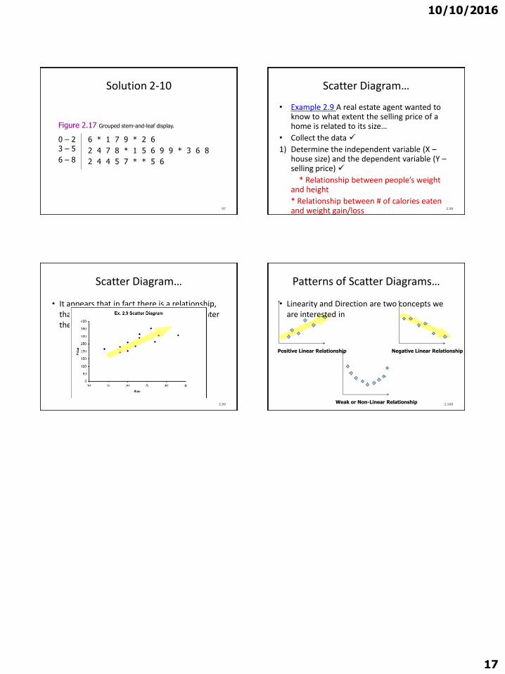
10102016
17
Solution 2-10
97
0 ndash 2 3 ndash 5
6 ndash 8
6 1 7 9 2 6
2 4 7 8 1 5 6 9 9 3 6 8
2 4 4 5 7 5 6
Figure 217 Grouped stem-and-leaf display
298
Scatter Diagramhellip
bull Example 29 A real estate agent wanted to know to what extent the selling price of a home is related to its sizehellip
bull Collect the data
1) Determine the independent variable (X ndashhouse size) and the dependent variable (Y ndashselling price)
Relationship between peoplersquos weight and height
Relationship between of calories eaten and weight gainloss
299
Scatter Diagramhellip
bull It appears that in fact there is a relationship that is the greater the house size the greater the selling pricehellip
2100
Patterns of Scatter Diagramshellip
bull Linearity and Direction are two concepts we are interested in
Positive Linear Relationship Negative Linear Relationship
Weak or Non-Linear Relationship