chapter 2 graphical distributions distribution – a graphical display of data. after a survey or...
TRANSCRIPT
Chapter 2 Graphical Distributions
• Distribution – a graphical display of data. After a survey or experiment is complete, different graphing methods are used to display the data.
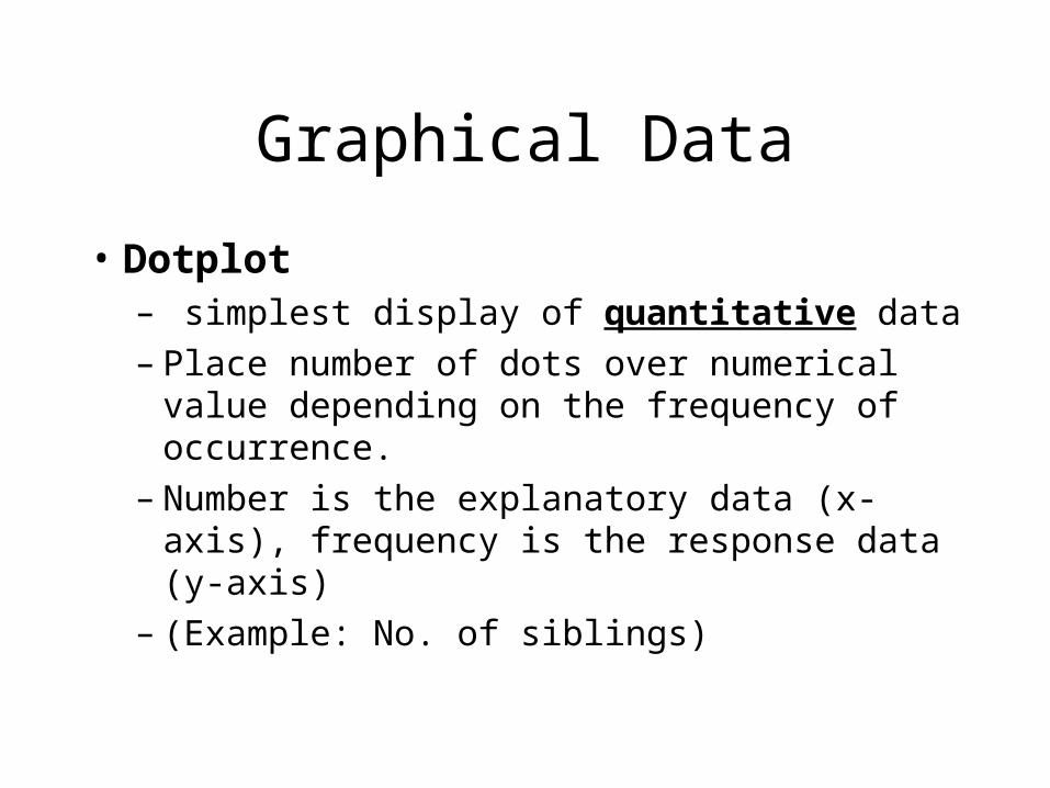
Graphical Data
• Dotplot – simplest display of quantitative data– Place number of dots over numerical value
depending on the frequency of occurrence.– Number is the explanatory data (x-axis),
frequency is the response data (y-axis)– (Example: No. of siblings)
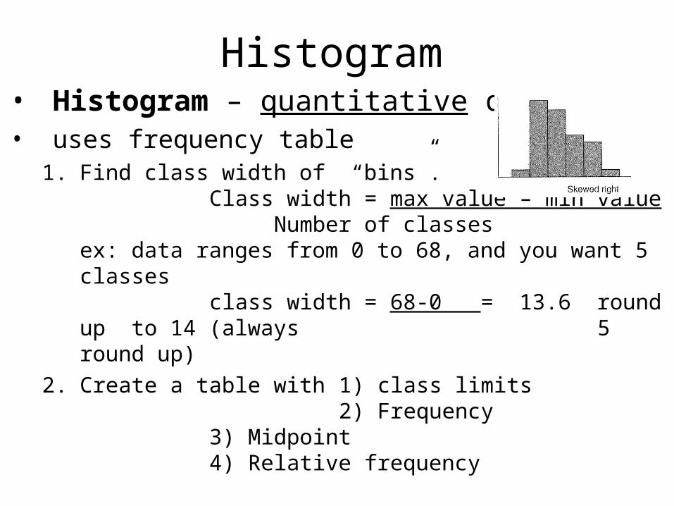
Histogram• Histogram – quantitative data• uses frequency table
1. Find class width of “bins”.Class width = max value – min value
Number of classesex: data ranges from 0 to 68, and you want 5 classes
class width = 68-0 = 13.6 round up to 14 (always 5round up)
2. Create a table with 1) class limits 2) Frequency
3) Midpoint4) Relative frequency
Histogram
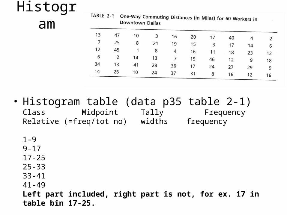
• Histogram table (data p35 table 2-1)Class Midpoint Tally Frequency Relative (=freq/tot no) widths frequency
1-99-1717-2525-3333-4141-49Left part included, right part is not, for ex. 17 in table bin 17-25.
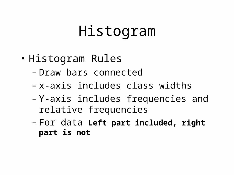
Histogram
• Histogram Rules– Draw bars connected– x-axis includes class widths– Y-axis includes frequencies and relative
frequencies– For data Left part included, right part is not
Draw Histogram
•
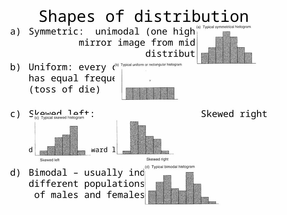
Shapes of distributiona) Symmetric: unimodal (one high point)
mirror image from middle of distribution
b) Uniform: every class has equal frequency(toss of die)
c) Skewed left: Skewed right
direction is toward long tail
d) Bimodal – usually indicatesdifferent populations or sets of males and females.
2.2 Bar graph, Circular Graphs (pie charts), time series graphs
• Used for catagorical data (not quantitative)
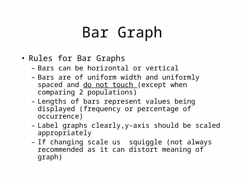
Bar Graph
• Rules for Bar Graphs– Bars can be horizontal or vertical– Bars are of uniform width and uniformly spaced and do
not touch (except when comparing 2 populations)– Lengths of bars represent values being displayed
(frequency or percentage of occurrence)– Label graphs clearly,y-axis should be scaled
appropriately– If changing scale us squiggle (not always
recommended as it can distort meaning of graph)
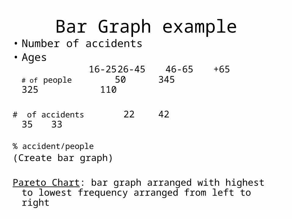
Bar Graph example• Number of accidents• Ages
16-25 26-45 46-65 +65# of people 50 345 325 110
# of accidents 22 42 35 33
% accident/people
(Create bar graph)
Pareto Chart: bar graph arranged with highest to lowest frequency arranged from left to right
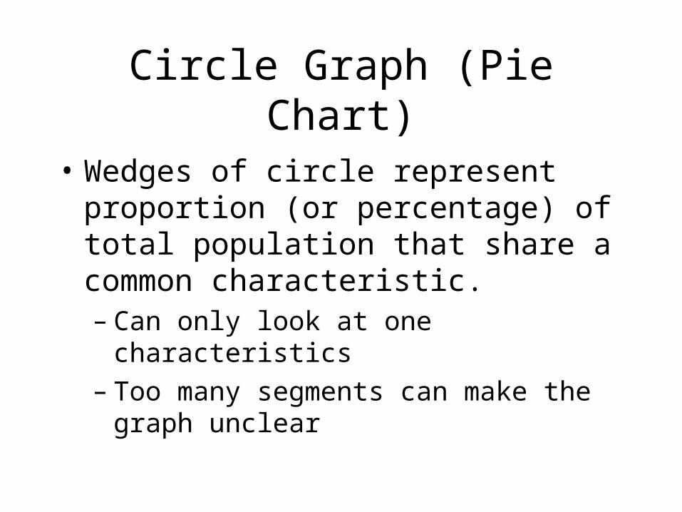
Circle Graph (Pie Chart)
• Wedges of circle represent proportion (or percentage) of total population that share a common characteristic.– Can only look at one characteristics– Too many segments can make the graph
unclear
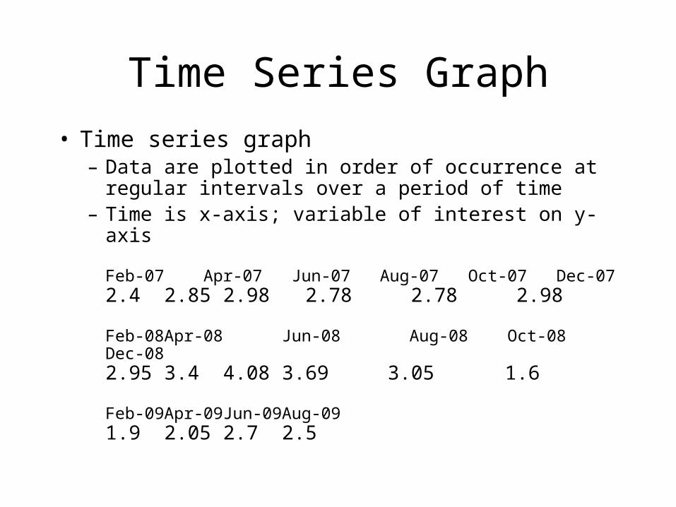
Time Series Graph
• Time series graph– Data are plotted in order of occurrence at regular
intervals over a period of time– Time is x-axis; variable of interest on y-axis
Feb-07 Apr-07 Jun-07 Aug-07 Oct-07 Dec-072.4 2.85 2.98 2.78 2.78 2.98
Feb-08 Apr-08 Jun-08 Aug-08 Oct-08 Dec-082.95 3.4 4.08 3.69 3.05 1.6
Feb-09 Apr-09 Jun-09 Aug-09 1.9 2.05 2.7 2.5
Which type to use
• Bar graphs – quantitative or qualitative(with frequency or percentage). Squiggle can be used, but don’t let it misrepresent the data.
• Pareto charts – bar charts with decreasing order of occurrence.
• Circle Graph – can display only 1 variable. Most effective with 10 or fewer wedges.
• Time-series- display how data changes over time
Stem-and-Leaf Displays
• A stem-and-leaf display is a method used to rank order and arrange data into groups
• Quantitative data• Align the stem in a vertical column from smallest
to largest. Draw a vertical line.• Place all the leaves with the same stem in the same
row as the stem with leaves in increasing order.• Label display.
Stem-and-Leaf Displays
• Benefits – all individual data points can be identified
• Split stem can compare two sets of data. For example men and women heights.