chapter 19. collection views - xamarin.azureedge.net · listview: very often a long list of data...
TRANSCRIPT

Creating Mobile Apps with Xamarin.Forms — Chapter Preview — Updated July 28, 2015
Chapter 19.
Collection Views
Many of the views in Xamarin.Forms correspond to basic C# and .NET data types: The Slider and
Stepper are visual representations of a double, the Switch is a bool, and an Entry allows the user
to edit text exposed as a string. But can this correspondence also apply to collection types in C# and
.NET?
Collections of various sorts have always been essential in digital computing. Even the oldest of
high-level programming languages support both arrays and structures. These two archetypal collec-
tions complement each other: An array is a collection of values or objects generally of the same type,
while a structure is an assemblage of related data items generally of a variety of types.
To supplement these basic collection types, .NET added several useful classes in the Sys-
tem.Collections and System.Collections.Generic namespaces, most notably List and
List<T>, which are expandable collections of objects of the same type. Underlying these collection
classes are three important interfaces that you’ll encounter in this chapter:
IEnumerable allows iterating through the items in a collection.
ICollection derives from IEnumerable and adds a count of the items in the collection.
IList derives from ICollection and supports indexing as well as adding and removing
items.
Xamarin.Forms defines three views that maintain collections of various sorts, sometimes also allow-
ing the user to select an item from the collection, or interact with the item. The three views discussed in
this chapter are:
Picker: A list of text items that lets the user choose one. The Picker usually maintains a short
list of items, generally no more than a dozen or so.
ListView: Very often a long list of data items of the same type rendered in a uniform (or
nearly uniform) manner that is specified by a visual tree described by an object called a cell.
TableView: A collection of cells, usually of various sorts, to display data, or to manage user in-
put. A TableView might take the form of a menu, or a fill-out form, or a collection of applica-
tion settings.
All three of these views provide built-in scrolling.
At first encounter these three views might seem somewhat similar. The purpose of this chapter is to
provide enough examples of how these views are used so that you shouldn’t have any difficultly

Chapter 19. Collection Views Page 516
Creating Mobile Apps with Xamarin.Forms — Chapter Preview — Updated July 28, 2015
choosing the right tool for the job.
Picker and ListView both allow selection, but Picker is restricted to strings while ListView can
display any object rendered in whatever way you want. Picker is generally a short list, while
ListView can maintain must longer lists.
The relationship between ListView and TableView is potentially confusing because both involve
the use of cells, which are derivatives of the Cell class. Cell derives from Element but not Visu-
alElement. A cell is not a visual element itself, but instead provides a description of a visual element.
These cells are used by ListView and TableView in two different ways: ListView generally displays
a list of objects of the same type, the display of which is specified by a single cell. A TableView is a
collection of multiple cells, each of which displays an individual item in a collection of related items.
If you like to equate Xamarin.Forms views with C# and .NET data types, then:
Picker is a visual representation of an array of string.
ListView is a more generalized array of objects, often a List<T> collection. The individual
items in this collection often implement the INotifyPropertyChanged interface.
TableView could be a structure but it is more likely a class, and possibly a class that imple-
ments INotifyPropertyChanged, otherwise known as a ViewModel.
Let’s begin with the simplest of these three, which is the Picker.
Program options with Picker
Picker is a good choice when you need a view that allows the user to choose one item among a col-
lection of several items. Picker is implemented in a platform-specific manner, and has the limitation
that each item is identified solely by a text string.
The Picker and event handling Here’s a program named PickerDemo that implements a Picker to allow you to choose a specialized
keyboard for an Entry view. In the XAML file, the Entry and the Picker are children of a Stack-
Layout, and the Picker is initialized to contain a list of the various keyboard types supported by the
Keyboard class:
<ContentPage xmlns="http://xamarin.com/schemas/2014/forms"
xmlns:x="http://schemas.microsoft.com/winfx/2009/xaml"
x:Class="PickerDemo.PickerDemoPage">
<ContentPage.Padding>
<OnPlatform x:TypeArguments="Thickness"
iOS="0, 20, 0, 0" />
</ContentPage.Padding>
<StackLayout Padding="20"
Chapter 19. Collection Views Page 517
Creating Mobile Apps with Xamarin.Forms — Chapter Preview — Updated July 28, 2015
Spacing="50">
<Entry x:Name="entry"
Placeholder="Type something, type anything" />
<Picker Title="Keyboard Type"
SelectedIndexChanged="OnPickerSelectedIndexChanged">
<Picker.Items>
<x:String>Default</x:String>
<x:String>Text</x:String>
<x:String>Chat</x:String>
<x:String>Url</x:String>
<x:String>Email</x:String>
<x:String>Telephone</x:String>
<x:String>Numeric</x:String>
</Picker.Items>
</Picker>
</StackLayout>
</ContentPage>
The program sets two properties of Picker: The Title property is a string that identifies the function
of the Picker. The Items property is of type IList<string>, and generally you initialize it with a list
of x:String tags in the XAML file. (Picker has no content property attribute, so the explicit Pick-
er.Items tags are required.) In code, you can use the Add or Insert method defined by
IList<string> to put string items into the collection.
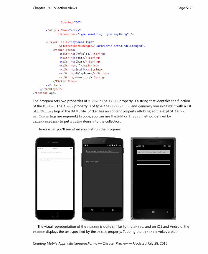
Here’s what you’ll see when you first run the program:
The visual representation of the Picker is quite similar to the Entry, and on iOS and Android, the
Picker displays the text specified by the Title property. Tapping the Picker invokes a plat-

Chapter 19. Collection Views Page 518
Creating Mobile Apps with Xamarin.Forms — Chapter Preview — Updated July 28, 2015
form-specific scrollable list of items:
When you press Done on the iOS screen, or OK on the Android screen, or just tap an item on the
Windows Phone screen, the Picker fires a SelectedIndexChanged event. The SelectedIndex
property of Picker is a zero-based number indicating the particular item the user selected. If no item
is selected—which is the case when the Picker is first created and initialized—SelectedIndex equals
–1.
The PickerDemo program handles the SelectedIndexChanged event in the code-behind file. It
obtains the SelectedIndex from the Picker, uses that number to index the Items collection of the
Picker, and then uses reflection to obtain the corresponding Keyboard object, which it sets to the
Keyboard property of the Entry:
public partial class PickerDemoPage : ContentPage
{
public PickerDemoPage()
{
InitializeComponent();
}
void OnPickerSelectedIndexChanged(object sender, EventArgs args)
{
if (entry == null)
return;
Picker picker = (Picker)sender;
int selectedIndex = picker.SelectedIndex;
if (selectedIndex == -1)
return;

Chapter 19. Collection Views Page 519
Creating Mobile Apps with Xamarin.Forms — Chapter Preview — Updated July 28, 2015
string selectedItem = picker.Items[selectedIndex];
PropertyInfo propertyInfo = typeof(Keyboard).GetRuntimeProperty(selectedItem);
entry.Keyboard = (Keyboard)propertyInfo.GetValue(null);
}
}
At the same time, the interactive Picker display is dismissed and the Picker now displays the se-
lected item:
In a real-life program you might want to provide a simple Label to indicate the function of the Pick-
er to the user.
You can initialize the Picker to display a particular item by setting the SelectedIndex property.
However, you must set SelectedIndex after filling the Items collection, so you’ll probably do it from
code or use property-element syntax:
<Picker Title="Keyboard Type"
SelectedIndexChanged="OnPickerSelectedIndexChanged">
<Picker.Items>
<x:String>Default</x:String>
<x:String>Text</x:String>
<x:String>Chat</x:String>
<x:String>Url</x:String>
<x:String>Email</x:String>
<x:String>Telephone</x:String>
<x:String>Numeric</x:String>
</Picker.Items>
<Picker.SelectedIndex>
6

Chapter 19. Collection Views Page 520
Creating Mobile Apps with Xamarin.Forms — Chapter Preview — Updated July 28, 2015
</Picker.SelectedIndex>
</Picker>
Data binding the Picker The Items property of Picker is not backed by a bindable property; hence it cannot be the target of
a data binding. You cannot bind a collection to a Picker. If you need that facility, you’ll probably want
to use ListView instead.
On the other hand, the SelectedIndex property of the Picker is backed by a BindableProp-
erty and has a default binding mode of TwoWay. This seems to suggest that you can use Selecte-
dIndex in a data binding, and that is true. However, an integer index is usually not what you want in a
data binding.
Even if Picker had a SelectedItem property that provided the actual item rather than the index
of the item, that wouldn’t be optimum either. This hypothetical SelectedItem property would be of
type string, and usually that’s not very useful in data bindings either.
After contemplating this problem—and perhaps being exposed to the ListView coming up
next—you might try to create a class named BindablePicker that derives from Picker. Such a class
could have an ObjectItems property of type IList<object> and a SelectedItem property of type
object. However, without any additional information, this BindablePicker class would be forced to
convert each object in the collection to a string for the underlying Picker, and the only generalized
way to convert an object to a string is with the object’s ToString method. Perhaps the string obtained
from ToString is useful; perhaps not. (You’ll see shortly how the ListView solves this problem in a
very flexible manner.)
Perhaps a better solution for data binding a Picker is a value converter that converts between the
SelectedIndex property of the Picker and an object corresponding to each text string in the Items
collection. To accomplish this conversion, the value converter can maintain its own collection of objects
that correspond to the strings displayed by the Picker. This means that you’ll have two lists associated
with the Picker—one list of strings displayed by the Picker and another list of objects associated
with these strings. These two lists must be in exact correspondence, of course, but if the two lists are
defined close to each other in the XAML file, there shouldn’t be much confusion, and the scheme will
have the advantage of being very flexible.
Such a value converter might be called IndexToObjectConverter.
Or maybe not. In the general case, you’ll want the SelectedIndex property of the Picker to be
the target of the data binding. Making SelectedIndex the target allows the Picker to be used with
a ViewModel as the data-binding source. For that reason, the value converter is better named Ob-
jectToIndexConverter. Here’s the class in the Xamarin.FormsBook.Toolkit library:
using System;
using System.Collections.Generic;
using System.Globalization;
using Xamarin.Forms;

Chapter 19. Collection Views Page 521
Creating Mobile Apps with Xamarin.Forms — Chapter Preview — Updated July 28, 2015
namespace Xamarin.FormsBook.Toolkit
{
[ContentProperty("Items")]
public class ObjectToIndexConverter<T> : IValueConverter
{
public IList<T> Items { set; get; }
public ObjectToIndexConverter()
{
Items = new List<T>();
}
public object Convert(object value, Type targetType,
object parameter, CultureInfo culture)
{
if (value == null || !(value is T) || Items == null)
return -1;
return Items.IndexOf((T)value);
}
public object ConvertBack(object value, Type targetType,
object parameter, CultureInfo culture)
{
int index = (int)value;
if (index < 0 || Items == null || index >= Items.Count)
return null;
return Items[index];
}
}
}
This is a generic class, and it defines a public Items property of type IList<T>, which is also de-
fined as the content property of the converter. The Convert method assumes that the value param-
eter is an object of type T and returns the index of that object within the collection. The ConvertBack
method assumes that the value parameter is an index into the Items collection and returns that ob-
ject.
The PickerBinding program uses the ObjectToIndexConverter to define a binding that allows
a Picker to be used for selecting a font size for a Label. The Picker is the data-binding target and
the FontSize property of the Label is the source. The Binding object is instantiated in element tags
to allow the ObjectToIndexConverter to be instantiated and initialized locally and provide an easy
visual confirmation that the two lists correspond to the same values:
<ContentPage xmlns="http://xamarin.com/schemas/2014/forms"
xmlns:x="http://schemas.microsoft.com/winfx/2009/xaml"
xmlns:toolkit=
"clr-namespace:Xamarin.FormsBook.Toolkit;assembly=Xamarin.FormsBook.Toolkit"
x:Class="PickerBinding.PickerBindingPage">

Chapter 19. Collection Views Page 522
Creating Mobile Apps with Xamarin.Forms — Chapter Preview — Updated July 28, 2015
<ContentPage.Padding>
<OnPlatform x:TypeArguments="Thickness"
iOS="0, 20, 0, 0" />
</ContentPage.Padding>
<StackLayout Padding="20"
Spacing="50">
<Label x:Name="label"
Text="Sample Text"
FontSize="16" />
<Picker Title="Font Size">
<Picker.Items>
<x:String>Font Size = 8</x:String>
<x:String>Font Size = 10</x:String>
<x:String>Font Size = 12</x:String>
<x:String>Font Size = 14</x:String>
<x:String>Font Size = 16</x:String>
<x:String>Font Size = 20</x:String>
<x:String>Font Size = 24</x:String>
<x:String>Font Size = 30</x:String>
</Picker.Items>
<Picker.SelectedIndex>
<Binding Source="{x:Reference label}"
Path="FontSize">
<Binding.Converter>
<toolkit:ObjectToIndexConverter x:TypeArguments="x:Double">
<x:Double>8</x:Double>
<x:Double>10</x:Double>
<x:Double>12</x:Double>
<x:Double>14</x:Double>
<x:Double>16</x:Double>
<x:Double>20</x:Double>
<x:Double>24</x:Double>
<x:Double>30</x:Double>
</toolkit:ObjectToIndexConverter>
</Binding.Converter>
</Binding>
</Picker.SelectedIndex>
</Picker>
</StackLayout>
</ContentPage>
By maintaining separate lists of strings and objects, you can make the strings whatever you want. In
this case, they include some text to indicate what the number actually means. The Label itself is ini-
tialized with a FontSize setting of 16, and the binding picks up that value to display the correspond-
ing string in the Picker when the program first starts up:

Chapter 19. Collection Views Page 523
Creating Mobile Apps with Xamarin.Forms — Chapter Preview — Updated July 28, 2015
The implementations of Picker in iOS and Android should make it obvious that you don’t want to
use the Picker for more than (say) a dozen items. It’s convenient and easy to use, but for lots of items,
you want a view made for the job—a view that is designed to display objects not just as simple text
strings but with whatever visuals you want.
Rendering data with ListView
Let’s move to ListView, which is the primary view for displaying collections of items, usually of the
same type. The ListView always displays the items in a vertical list, and implements scrolling if neces-
sary.
ListView is the only class that derives from ItemsView<T>, but from that class it inherits its most
important property: ItemsSource of type IEnumerable. To this property a program sets an enu-
merable collection of data, and it can be any type of data. For that reason, ListView is one of the
backbones of the View part of the Model-View-ViewModel architectural pattern.
ListView also supports single-item selection. The ListView highlights the selected item and
makes it available as the SelectedItem property. Notice that this property is named SelectedItem
rather than SelectedIndex. The property is of type object. If no item is currently selected in the
ListView, the property is null. ListView fires an ItemSelected event when the selected item
changes, but often you’ll be using data binding in connection with the SelectedItem property.
ListView defines more properties by far than any other single view in Xamarin.Forms. The discus-
sion in this chapter begins with the most important properties and then progressively covers the more
obscure and less common properties.

Chapter 19. Collection Views Page 524
Creating Mobile Apps with Xamarin.Forms — Chapter Preview — Updated July 28, 2015
Collections and selections The ListViewList program defines a ListView that displays 17 Xamarin.Forms Color values. The
XAML file instantiates the ListView but leaves the initialization to the code-behind file:
<ContentPage xmlns="http://xamarin.com/schemas/2014/forms"
xmlns:x="http://schemas.microsoft.com/winfx/2009/xaml"
x:Class="ListViewList.ListViewListPage">
<ContentPage.Padding>
<OnPlatform x:TypeArguments="Thickness"
iOS="10, 20, 10, 0"
Android="10, 0"
WinPhone="10, 0" />
</ContentPage.Padding>
<ListView x:Name="listView" />
</ContentPage>
The bulk of this XAML file is devoted to setting a Padding so that the ListView doesn’t extend to the
left and right edges of the screen. In some cases, you might want to set an explicit WidthRequest for
the ListView based on the width of its largest item.
The ItemsSource property of ListView is of type IEnumerable, an interface implemented by
arrays and the List class, but the property is null by default. Unlike the Picker, the ListView does
not provide its own collection object. That’s your responsibility. The code-behind file of ListViewList
sets the ItemsSource property to an instance of List<Color> that is initialized with Color values:
public partial class ListViewListPage : ContentPage
{
public ListViewListPage()
{
InitializeComponent();
listView.ItemsSource = new List<Color>
{
Color.Aqua, Color.Black, Color.Blue, Color.Fuchsia,
Color.Gray, Color.Green, Color.Lime, Color.Maroon,
Color.Navy, Color.Olive, Color.Pink, Color.Purple,
Color.Red, Color.Silver, Color.Teal, Color.White, Color.Yellow
};
}
}
When you run this program, you’ll discover that you can scroll through the items and select one
item by tapping it. These screenshots show how the selected item is highlighted on the three plat-
forms:

Chapter 19. Collection Views Page 525
Creating Mobile Apps with Xamarin.Forms — Chapter Preview — Updated July 28, 2015
Tapping an item also causes the ListView to fire both an ItemTapped and an ItemSelected
event. If you tap the same item again, the ItemTapped event is fired again but not the ItemSelected
event. The ItemSelected event really indicates a change in the SelectedItem property.
Of course, the items themselves aren’t very attractive. By default the ListView displays each item
by calling the item’s ToString method, and that’s what you see in this ListView. But do not fret:
Much of the discussion about the ListView in this chapter focuses on making the items appear ex-
actly how you’d like!
The row separator Look closely at the iOS and Android displays and you’ll see a thin line separating the rows. You can
suppress the display of that row by setting the SeparatorVisibility property to the enumeration
member SeparatorVisibility.None. The default is SeparatorVisibility.Default, which
means that a separator line is displayed on the iOS and Android screens but not Windows Phone.
For performance reasons you should set the SeparatorVisbility property before adding items
to the ListView. You can try this in the ListViewList program by setting the property in the XAML
file:
<ListView x:Name="listView"
SeparatorVisibility="None" />
Here’s how it looks:

Chapter 19. Collection Views Page 526
Creating Mobile Apps with Xamarin.Forms — Chapter Preview — Updated July 28, 2015
You can also set the separator line it to a different color with the SeparatorColor property, for
example:
<ListView x:Name="listView"
SeparatorColor="Red" />
Now it shows up in red:
The line is rendered in a platform-specific manner. On iOS, that means it doesn’t extend fully to the

Chapter 19. Collection Views Page 527
Creating Mobile Apps with Xamarin.Forms — Chapter Preview — Updated July 28, 2015
left edge of the ListView, and on Windows Phone, that means that there’s no separator line at all.
Data binding the selected item One approach to working with the selected item involves handling the ItemSelected event of the
ListView in the code-behind file and using the SelectedItem property to obtain the new selected
item. (An example is shown later in this chapter.) But in many cases you’ll want to use a data binding
with the SelectedItem property. The ListViewArray program defines a data binding between the
SelectedItem property of the ListView with the Color property of a BoxView:
<ContentPage xmlns="http://xamarin.com/schemas/2014/forms"
xmlns:x="http://schemas.microsoft.com/winfx/2009/xaml"
x:Class="ListViewArray.ListViewArrayPage">
<ContentPage.Padding>
<OnPlatform x:TypeArguments="Thickness"
iOS="10, 20, 10, 0"
Android="10, 0"
WinPhone="10, 0" />
</ContentPage.Padding>
<StackLayout>
<ListView x:Name="listView"
SelectedItem="{Binding Source={x:Reference boxView},
Path=Color,
Mode=TwoWay}">
<ListView.ItemsSource>
<x:Array Type="{x:Type Color}">
<x:Static Member="Color.Aqua" />
<x:Static Member="Color.Black" />
<x:Static Member="Color.Blue" />
<x:Static Member="Color.Fuchsia" />
<x:Static Member="Color.Gray" />
<x:Static Member="Color.Green" />
<x:Static Member="Color.Lime" />
<x:Static Member="Color.Maroon" />
<Color>Navy</Color>
<Color>Olive</Color>
<Color>Pink</Color>
<Color>Purple</Color>
<Color>Red</Color>
<Color>Silver</Color>
<Color>Teal</Color>
<Color>White</Color>
<Color>Yellow</Color>
</x:Array>
</ListView.ItemsSource>
</ListView>
<BoxView x:Name="boxView"
Color="Lime"
HeightRequest="100" />

Chapter 19. Collection Views Page 528
Creating Mobile Apps with Xamarin.Forms — Chapter Preview — Updated July 28, 2015
</StackLayout>
</ContentPage>
This XAML file sets the ItemsSource property of the ListView directly from an array of items.
ItemsSource is not the content property of ListView (in fact, ListView has no content property at
all), so you’ll need explicit ListView.ItemsSource tags. The x:Array element requires a Type at-
tribute indicating the type of the items in the array. For the sake of variety, two different approaches of
specifying a Color value are shown. You can use anything that results in a value of type Color.
The ItemsSource property of ListView is always populated with objects rather visual elements.
For example, if you want to display strings in the ListView, use string objects from code or
x:String elements in the XAML file. Do not fill the ItemsSource collection with Label elements!
The ListView is scrollable, and normally when a scrollable view is a child of a StackLayout, a
VerticalOptions setting of FillAndExpand is required. However, the ListView itself sets its Hor-
izontalOptions and VerticalOptions properties to FillAndExpand.
The data binding targets the SelectedItem property of the ListView from the Color property of
the BoxView. You might be more inclined to reverse the source and target property of that binding
like this:
<BoxView x:Name="boxView"
Color="{Binding Source={x:Reference listView},
Path=SelectedItem}"
HeightRequest="100" />
However, the SelectedItem property of the ListView is null by default, which indicates that noth-
ing is selected, and the binding will fail with a NullReferenceException. To make the binding on
the BoxView work, you need to initialize the SelectedItem property of the ListView after the items
have been added:
<ListView x:Name="listView">
<ListView.ItemsSource>
<x:Array Type="{x:Type Color}">
…
</x:Array>
</ListView.ItemsSource>
<ListView.SelectedItem>
<Color>Lime</Color>
</ListView.SelectedItem>
</ListView>
A better approach—and one that you’ll be using in conjunction with MVVM—is to set the binding
on the SelectedItem property of the ListView. The default binding mode for SelectedItem is
OneWayToSource, which means that the following binding sets the Color of the BoxView to whatever
item is selected in the ListView:
<ListView x:Name="listView"
SelectedItem="{Binding Source={x:Reference boxView},

Chapter 19. Collection Views Page 529
Creating Mobile Apps with Xamarin.Forms — Chapter Preview — Updated July 28, 2015
Path=Color}">
…
</ListView>
However, if you also want to initialize the SelectedItem property from the binding source, use a
TwoWay binding as shown in the XAML file in the ListViewArray program:
<StackLayout>
<ListView x:Name="listView"
SelectedItem="{Binding Source={x:Reference boxView},
Path=Color,
Mode=TwoWay}">
…
</ListView>
<BoxView x:Name="boxView"
Color="Lime"
HeightRequest="100" />
</StackLayout>
You’ll see that the Lime entry in the ListView is selected when the program starts up:
Actually, it’s hard to tell if that’s really the Lime entry or not without examining the RGB values. Alt-
hough the Color structure defines a bunch of static fields with color names, Color values themselves
are not identifiable by name. When the data binding sets a Lime color value to the SelectedItem
property of the ListView, the ListView probably finds a match among its contents using the
Equals method of the Color structure, which compares the components of the two colors.
The improvement of the ListView display is certainly a high priority!

Chapter 19. Collection Views Page 530
Creating Mobile Apps with Xamarin.Forms — Chapter Preview — Updated July 28, 2015
If you examine the ListViewArray screen very closely, you’ll discover that the Color items are not
displayed in the same order that they are defined in the array. The ListViewArray program has anoth-
er purpose: to demonstrate that the ListView does not make a copy of the collection set to its
ItemsSource property. Instead, it uses that collection object directly as a source of the items. In the
code-behind file, after the InitializeComponent call returns, the constructor of ListViewArray-
Page performs an in-place array sort to order the items by Hue:
public partial class ListViewArrayPage : ContentPage
{
public ListViewArrayPage()
{
InitializeComponent();
Array.Sort<Color>((Color[])listView.ItemsSource,
(Color color1, Color color2) =>
{
if (color1.Hue == color2.Hue)
return Math.Sign(color1.Luminosity - color2.Luminosity);
return Math.Sign(color1.Hue - color2.Hue);
});
}
}
This sorting occurs after the ItemsSource property is set, which occurs when the XAML is parsed
by the InitializeComponent call, but before the ListView actually displays its contents during the
layout process.
This code implies that you can change the collection used by the ListView dynamically. However,
if the collection changes after the ListView has displayed its items, the ListView must somehow be
notified that changes have occurred in the collection referenced by its ItemsSource property.
Let’s examine this problem in more detail.
The ObservableCollection difference The ItemsSource property of ListView is of type IEnumerable. Arrays implement the IEnumera-
ble interface, and so do the List and List<T> classes. The List and List<T> collections are partic-
ularly popular for ListView because these classes can dynamically reallocate memory to accommo-
date a collection of almost any size.
You’ve seen that a collection can be modified after it’s been assigned to the ItemsSource property
of a ListView. It should be possible to add items or remove items from the collection referenced by
ItemsSource, and for the ListView to update itself to reflect those changes.
Let’s try it. This ListViewLogger program instantiates a ListView in its XAML file:
<ContentPage xmlns="http://xamarin.com/schemas/2014/forms"
xmlns:x="http://schemas.microsoft.com/winfx/2009/xaml"
x:Class="ListViewLogger.ListViewLoggerPage">

Chapter 19. Collection Views Page 531
Creating Mobile Apps with Xamarin.Forms — Chapter Preview — Updated July 28, 2015
<ContentPage.Padding>
<OnPlatform x:TypeArguments="Thickness"
iOS="10, 20, 10, 0"
Android="10, 0"
WinPhone="10, 0" />
</ContentPage.Padding>
<ListView x:Name="listView" />
</ContentPage>
The code-behind file sets the ItemsSource property of the ListView to a List<DateTime> ob-
ject and adds a DateTime value to this collection every second:
public partial class ListViewLoggerPage : ContentPage
{
public ListViewLoggerPage()
{
InitializeComponent();
List<DateTime> list = new List<DateTime>();
listView.ItemsSource = list;
Device.StartTimer(TimeSpan.FromSeconds(1), () =>
{
list.Add(DateTime.Now);
return true;
});
}
}
When you first run this program, it will seem as if nothing is happening. But if you turn the phone or
emulator sideways, all the items that have added to the collection since the program started will be
displayed. But you won’t see any more until you turn the phone’s orientation again.
What’s happening? When the ListView needs to redraw itself—which is the case when you change
the orientation of the phone or emulator—it will use the current IEnumerable collection. (This is how
the ListViewArray program displayed the sorted array. The array was sorted before the ListView
displayed itself for the first time.)
However, if the ListView does not need to redraw itself, there is no way for the ListView to know
when an item has been added to or removed from the collection. This is not the fault of ListView. It’s
really the fault of the List class. The List and List<T> classes don’t implement a notification mech-
anism that signals the ListView when the collection has changed.
To persuade a ListView to keep its display updated with newly added data, we need a class very
much like List<T>, but which includes a notification mechanism.
We need a class exactly like ObservableCollection.
ObservableCollection is a .NET class. It is defined in the System.Collections.ObjectModel
namespace, and it implements an interface called INotifyCollectionChanged, which is defined in

Chapter 19. Collection Views Page 532
Creating Mobile Apps with Xamarin.Forms — Chapter Preview — Updated July 28, 2015
the System.Collections.Specialized namespace. In implementing this interface, an Observa-
bleCollection fires a CollectionChanged event whenever items are added to or removed from
the collection, or when items are replaced or reordered.
How does ListView know that an ObservableCollection object is set to its ItemsSource
property? When the ItemsSource property is set, the ListView checks if the object set to the prop-
erty implements INotifyCollectionChanged. If so, the ListView attaches a CollectionChanged
handler to the collection to be notified of changes. Whenever the collection changes, the ListView
updates itself.
The ObservableLogger program is identical to the ListViewLogger program except that it uses an
ObservableCollection<DateTime> rather than a List<DateTime> to maintain the collection:
public partial class ObservableLoggerPage : ContentPage
{
public ObservableLoggerPage()
{
InitializeComponent();
ObservableCollection<DateTime> list = new ObservableCollection<DateTime>();
listView.ItemsSource = list;
Device.StartTimer(TimeSpan.FromSeconds(1), () =>
{
list.Add(DateTime.Now);
return true;
});
}
}
Now the ListView updates itself every second.
Of course, not every application needs this facility, and ObservableCollection is overkill for
those that don’t. But it’s an essential part of versatile ListView usage.
Sometimes you’ll be working with a collection of data items, and the collection itself does not
change dynamically—in other words, it always contains the same objects—but properties of the indi-
vidual items change. Can the ListView respond to changes of that sort?
Yes it can, and you’ll see an example later in this chapter. Enabling a ListView to respond to prop-
erty changes in the individual items does not require ObservableCollection or INotifyCollec-
tionChanged. But the data items must implement INotifyPropertyChanged, and the ListView
must display the items using an object called a cell.
Templates and cells The purpose of ListView is to display data. In the real world, data is everywhere, and we are com-
pelled to write computer programs to deal with this data. In program tutorials such as this book, how-
ever, data is harder to come by. So let’s invent a little bit of data to explore ListView in more depth,

Chapter 19. Collection Views Page 533
Creating Mobile Apps with Xamarin.Forms — Chapter Preview — Updated July 28, 2015
and if the data turns out to be otherwise useful, so much the better!
As you know, the colors supported by the Xamarin.Forms Color structure are based on the 16 col-
ors defined in the HTML 4.01 standard. Another popular collection of colors is defined in the Cascading
Style Sheets (CSS) 3.0 standard. That collection contains 147 named colors (seven of which are dupli-
cates for variant spellings) that were originally derived from color names in the X11 windowing system
but converted to camel case.
The NamedColor class included in the Xamarin.FormsBook.Toolkit library lets your Xama-
rin.Forms program get access to those 147 colors. The bulk of NamedColor is the definition of 147
public static read-only fields of type Color. Only a few are shown in an abbreviated list towards the
end of the class:
public class NamedColor
{
// Instance members.
private NamedColor()
{
}
public string Name { private set; get; }
public string FriendlyName { private set; get; }
public Color Color { private set; get; }
public string RgbDisplay { private set; get; }
// Static members.
static NamedColor()
{
List<NamedColor> all = new List<NamedColor>();
StringBuilder stringBuilder = new StringBuilder();
// Loop through the public static fields of type Color.
foreach (FieldInfo fieldInfo in typeof(NamedColor).GetRuntimeFields ())
{
if (fieldInfo.IsPublic &&
fieldInfo.IsStatic &&
fieldInfo.FieldType == typeof (Color))
{
// Convert the name to a friendly name.
string name = fieldInfo.Name;
stringBuilder.Clear();
int index = 0;
foreach (char ch in name)
{
if (index != 0 && Char.IsUpper(ch))
{
stringBuilder.Append(' ');
}

Chapter 19. Collection Views Page 534
Creating Mobile Apps with Xamarin.Forms — Chapter Preview — Updated July 28, 2015
stringBuilder.Append(ch);
index++;
}
// Instantiate a NamedColor object.
Color color = (Color)fieldInfo.GetValue(null);
NamedColor namedColor = new NamedColor
{
Name = name,
FriendlyName = stringBuilder.ToString(),
Color = color,
RgbDisplay = String.Format("{0:X2}-{1:X2}-{2:X2}",
(int)(255 * color.R),
(int)(255 * color.G),
(int)(255 * color.B))
};
// Add it to the collection.
all.Add(namedColor);
}
}
all.TrimExcess();
All = all;
}
public static IList<NamedColor> All { private set; get; }
// Color names and definitions from http://www.w3.org/TR/css3-color/
// (but with color names converted to camel case).
public static readonly Color AliceBlue = Color.FromRgb(240, 248, 255);
public static readonly Color AntiqueWhite = Color.FromRgb(250, 235, 215);
public static readonly Color Aqua = Color.FromRgb(0, 255, 255);
…
public static readonly Color WhiteSmoke = Color.FromRgb(245, 245, 245);
public static readonly Color Yellow = Color.FromRgb(255, 255, 0);
public static readonly Color YellowGreen = Color.FromRgb(154, 205, 50);
}
If your application has a reference to Xamarin.FormsBook.Toolkit and a using directive for the
Xamarin.FormsBook.Toolkit namespace, you can use these fields just like the static fields in the
Color structure, for example:
BoxView boxView = new BoxView
{
Color = NamedColor.Chocolate
};
You can also use them in XAML without too much more difficulty. If you have an XML namespace dec-
laration for the Xamarin.FormsBook.Toolkit assembly, you can reference NamedColor in an
x:Static markup extension:
<BoxView Color="{x:Static toolkit:NamedColor.CornflowerBlue}" />

Chapter 19. Collection Views Page 535
Creating Mobile Apps with Xamarin.Forms — Chapter Preview — Updated July 28, 2015
But that’s not all: In its static constructor, NamedColor uses reflection to create 147 instances of the
NamedColor class that it stores in a list publicly available from the static All property. Each instance of
the NamedColor class has a Name property, a Color property of type Color, a FriendlyName prop-
erty that is the same as the Name except with some spaces inserted, and an RgbDisplay property that
formats the hexadecimal color values.
The NamedColor class does not derive from BindableObject and does not implement INotify-
PropertyChanged. Regardless, you can use this class as a binding source. That’s because these prop-
erties remain constant after each NamedColor object is instantiated. Only if these properties later
changed would the class need to implement INotifyPropertyChanged to serve as a successful
binding source.
The NamedColor.All property is defined to be of type IList<NamedColor>, so we can set it to
the ItemsSource property of a ListView. This is demonstrated by the NaiveNamedColorList pro-
gram:
<ContentPage xmlns="http://xamarin.com/schemas/2014/forms"
xmlns:x="http://schemas.microsoft.com/winfx/2009/xaml"
xmlns:toolkit=
"clr-namespace:Xamarin.FormsBook.Toolkit;assembly=Xamarin.FormsBook.Toolkit"
x:Class="NaiveNamedColorList.NaiveNamedColorListPage">
<ContentPage.Padding>
<OnPlatform x:TypeArguments="Thickness"
iOS="10, 20, 10, 0"
Android="10, 0"
WinPhone="10, 0" />
</ContentPage.Padding>
<ListView ItemsSource="{x:Static toolkit:NamedColor.All}" />
</ContentPage>
You’ll discover that you can scroll this list and select items, but the items themselves might be a little
disappointing, for what you’ll see is a list of 147 fully-qualified class names:

Chapter 19. Collection Views Page 536
Creating Mobile Apps with Xamarin.Forms — Chapter Preview — Updated July 28, 2015
In your future real-life programming work involving ListView, you’ll probably cheer when you see
something like this display because it means that you’ve successfully set ItemsSource to a valid col-
lection. The objects are there. You just need to display them a little better.
This particular ListView displays the fully-qualified class name of NamedColor because
NamedColor does not define its own ToString method, and the default implementation of ToString
displays the class name. One simple solution is to add a ToString method to NamedColor:
public override string ToString()
{
return FriendlyName;
}
Now the ListView displays the friendly names of all the colors. Simple enough.
However, in real-life programming, you might not have the option to add code to your data classes
because you might not have access to the source code. So let’s pursue solutions that are independent
of the actual implementation of the data.
ListView derives from ItemsView, and besides defining the ItemsSource property, ItemsView
also defines a property named ItemTemplate of type DataTemplate. The DataTemplate object
gives you (the programmer) the power to display the items of your ListView in whatever way you
want.
When used in connection with ListView, the DataTemplate references a Cell class to render the
items. The Cell class derives from Element, from which it picks up support for parent/child relation-
ships. But unlike View, Cell does not derive from VisualElement. A Cell is closer to a description of
a tree of visual elements rather than a visual element itself.

Chapter 19. Collection Views Page 537
Creating Mobile Apps with Xamarin.Forms — Chapter Preview — Updated July 28, 2015
Here’s the class hierarchy showing the five classes that derive from Cell:
Object
BindableObject
Element
Cell
TextCell — two Label views
ImageCell — derives from TextCell and adds an Image view
EntryCell — an Entry view with a Label
SwitchCell — a Switch with a Label
ViewCell — any View (likely with children)
The descriptions of Cell types are conceptual only: For performance reasons, the actual composition
of a Cell is defined within each platform.
As you begin exploring these Cell classes and contemplating their use in connection with
ListView, you might question the relevance of a couple of them. But they’re not all intended solely
for ListView. As you’ll see later in this chapter, the Cell classes also play a major role in the
TableView, where they are used in somewhat different ways.
The Cell derivatives that have the most applicability to ListView are probably TextCell, Im-
ageCell, and the powerful ViewCell, which lets you define your own visuals for the items.
Let’s look at TextCell first, which defines six properties backed by bindable properties:
Text of type string
TextColor of type Color
Detail of type string
DetailColor of type Color
Command of type ICommand
CommandParameter of type Object
The TextCell incorporates two Label views that you can set to two different strings and colors. The
font characteristics are fixed in a platform-dependent way.
The TextCellListCode program contains no XAML. Instead, it demonstrates how to use a TextCell
in code to display properties of all the NamedColor objects:
public class TextCellListCodePage : ContentPage
{
public TextCellListCodePage()
{
// Define the DataTemplate.
DataTemplate dataTemplate = new DataTemplate(typeof(TextCell));
dataTemplate.SetBinding(TextCell.TextProperty, "FriendlyName");

Chapter 19. Collection Views Page 538
Creating Mobile Apps with Xamarin.Forms — Chapter Preview — Updated July 28, 2015
dataTemplate.SetBinding(TextCell.DetailProperty,
new Binding(path: "RgbDisplay", stringFormat: "RGB = {0}"));
// Build the page.
Padding = new Thickness(10, Device.OnPlatform(20, 0, 0), 10, 0);
Content = new ListView
{
ItemsSource = NamedColor.All,
ItemTemplate = dataTemplate
};
}
}
The first step in using a Cell in a ListView is to create an object of type DataTemplate:
DataTemplate dataTemplate = new DataTemplate(typeof(TextCell));
Notice that the argument to the constructor is not an instance of TextCell but the type of TextCell.
The second step is to call a SetBinding method on the DataTemplate object, but notice how
these SetBinding calls actually target bindable properties of the TextCell:
dataTemplate.SetBinding(TextCell.TextProperty, "FriendlyName");
dataTemplate.SetBinding(TextCell.DetailProperty,
new Binding(path: "RgbDisplay", stringFormat: "RGB = {0}"));
These SetBinding calls are identical to bindings that you might set on a TextCell object, but at the
time of these calls, there are no instances of TextCell on which to set the bindings!
If you’d like, you can also set some properties of the TextCell to constant values by calling the
SetValue method of the DataTemplate class.
dataTemplate.SetValue(TextCell.TextColorProperty, Color.Blue);
dataTemplate.SetValue(TextCell.DetailColorProperty, Color.Red);
These SetValue calls are similar to calls you might make on visual elements instead of setting proper-
ties directly.
The SetBinding and SetValue methods should be very familiar to you because they are defined
by BindableObject and inherited by very many classes in Xamarin.Forms. However, DataTemplate
does not derive from BindableObject and instead defines its own SetBinding and SetValue
methods. The purpose of these methods is not to bind or set properties of the DataTemplate in-
stance. Because DataTemplate doesn’t derive from BindableObject, it has no bindable properties of
its own. Instead, DataTemplate simply saves these settings in two internal dictionaries that are pub-
licly accessible through two properties that DataTemplate defines named Bindings and Values.
The third step in using a Cell with ListView is to set the DataTemplate object to the ItemTem-
plate property of the ListView:
Content = new ListView
{

Chapter 19. Collection Views Page 539
Creating Mobile Apps with Xamarin.Forms — Chapter Preview — Updated July 28, 2015
ItemsSource = NamedColor.All,
ItemTemplate = dataTemplate
};
Here’s what happens (conceptually anyway):
When the ListView needs to display a particular item (in this case, a NamedColor object), it in-
stantiates the type passed to the DataTemplate constructor, in this case a TextCell. Any bindings or
values that have been set on the DataTemplate are then transferred to this TextCell. The Bind-
ingContext of each TextCell is set to the particular item being displayed, which in this case is a par-
ticular NamedColor object, and that’s how each item in the ListView displays properties of a particu-
lar NamedColor object. Each TextCell is a visual tree with identical data bindings, but unique Bind-
ingContext settings. Here’s the result:
In general, the ListView will not create all the visual trees at once. For performance purposes, it
will create them only as necessary as the user scrolls new items into view. You can get some sense of
this if you install handlers for the ItemAppearing and ItemDisappearing events defined by
ListView. You’ll discover that these events don’t exactly track the visuals—items are reported as ap-
pearing before they scroll into view, and are reported as disappearing after they scroll out of view—but
the exercise is instructive nevertheless.
You can also get a sense of what’s going on with an alternative constructor for DataTemplate that
takes a Func object:
DataTemplate dataTemplate = new DataTemplate(() =>
{
return new TextCell();
});

Chapter 19. Collection Views Page 540
Creating Mobile Apps with Xamarin.Forms — Chapter Preview — Updated July 28, 2015
The Func object is called only as the TextCell objects are required for the items, although these calls
actually are made somewhat in advance of the items scrolling into view.
You might want to include code that actually counts the number of TextCell instances being cre-
ated and displays the result in the Output window of Visual Studio or Xamarin Studio:
int count = 0;
DataTemplate dataTemplate = new DataTemplate(() =>
{
System.Diagnostics.Debug.WriteLine("Text Cell Number " + (++count));
return new TextCell();
});
As you scroll down to the bottom, you’ll discover that a maximum of 147 TextCell objects are creat-
ed for the 147 items in the ListView. The TextCell objects are cached, but not reused as items scroll
in and out of view. However, on a lower level—in particular, involving the platform-specific
TextCellRenderer objects and the underlying platform-specific visuals created by these render-
ers—the visuals are reused. The chapter on renderers will discuss this issue in more detail.
This alternative DataTemplate constructor might be handy if you need to set some properties on
the cell object that you can’t set using data bindings. Perhaps you’ve created a ViewCell derivative
that requires an argument in its constructor. In general, however, use the constructor with the Type
argument or define the data template in XAML.
In XAML, the binding syntax somewhat distorts the actual mechanics used to generate visual trees
for the ListView items, but at the same time the syntax is conceptually clearer and visually more ele-
gant. Here’s the XAML file from the TextCellListXaml program that is functionally identical to the
TextCellListCode program:
<ContentPage xmlns="http://xamarin.com/schemas/2014/forms"
xmlns:x="http://schemas.microsoft.com/winfx/2009/xaml"
xmlns:toolkit=
"clr-namespace:Xamarin.FormsBook.Toolkit;assembly=Xamarin.FormsBook.Toolkit"
x:Class="TextCellListXaml.TextCellListXamlPage">
<ContentPage.Padding>
<OnPlatform x:TypeArguments="Thickness"
iOS="10, 20, 10, 0"
Android="10, 0"
WinPhone="10, 0" />
</ContentPage.Padding>
<ListView ItemsSource="{x:Static toolkit:NamedColor.All}">
<ListView.ItemTemplate>
<DataTemplate>
<TextCell Text="{Binding FriendlyName}"
Detail="{Binding RgbDisplay, StringFormat='RGB = {0}'}" />
</DataTemplate>
</ListView.ItemTemplate>
</ListView>
</ContentPage>

Chapter 19. Collection Views Page 541
Creating Mobile Apps with Xamarin.Forms — Chapter Preview — Updated July 28, 2015
In XAML, set a DataTemplate to the ItemTemplate property of the ListView, and define TextCell
as a child of DataTemplate. Then simply set the data bindings on the TextCell properties as if it
were a normal visual element.
You’ll appreciate this syntax even more when you define your own custom cells.
Custom cells One of the classes that derives from Cell is named ViewCell, which defines a single property named
View that lets you define a custom visual tree for the display of items in a ListView.
There are several ways to define a custom cell, but some are less pleasant than others. Perhaps the
greatest amount of work involves mimicking the existing Cell classes, which doesn’t involve ViewCell
at all but instead requires that you create platform-specific cell renderers. You’ll see that technique lat-
er in this book. You can alternatively derive a class from ViewCell, define several bindable properties
of that class similar to the bindable properties of TextCell and the other Cell derivatives, and define
a visual tree for the cell in either XAML or code, much as you would do for a custom view derived from
ContentView. You can then use that custom cell in code or XAML just like TextCell.
If you want to do the job entirely in code, you can use the DataTemplate constructor with the
Func argument and build the visual tree in code as each item is requested. This approach allows you to
define the data bindings as the visual tree is being built instead of setting bindings on the DataTem-
plate.
But certainly the easiest approach is defining the visual tree and bindings of the cell right in XAML
within the ListView element. The CustomNamedColorList program demonstrates this technique.
Everything is in the XAML file:
<ContentPage xmlns="http://xamarin.com/schemas/2014/forms"
xmlns:x="http://schemas.microsoft.com/winfx/2009/xaml"
xmlns:toolkit=
"clr-namespace:Xamarin.FormsBook.Toolkit;assembly=Xamarin.FormsBook.Toolkit"
x:Class="CustomNamedColorList.CustomNamedColorListPage">
<ContentPage.Padding>
<OnPlatform x:TypeArguments="Thickness"
iOS="10, 20, 10, 0"
Android="10, 0"
WinPhone="10, 0" />
</ContentPage.Padding>
<ListView SeparatorVisibility="None"
ItemsSource="{x:Static toolkit:NamedColor.All}">
<ListView.RowHeight>
<OnPlatform x:TypeArguments="x:Int32"
iOS="90"
Android="90"
WinPhone="120" />
</ListView.RowHeight>

Chapter 19. Collection Views Page 542
Creating Mobile Apps with Xamarin.Forms — Chapter Preview — Updated July 28, 2015
<ListView.ItemTemplate>
<DataTemplate>
<ViewCell>
<ContentView Padding="5">
<Frame OutlineColor="Accent"
Padding="10">
<StackLayout Orientation="Horizontal">
<BoxView x:Name="boxView"
Color="{Binding Color}"
WidthRequest="{Binding Source={x:Reference boxView},
Path=Height}" />
<StackLayout>
<Label Text="{Binding FriendlyName}"
FontSize="Large"
VerticalOptions="StartAndExpand" />
<Label Text="{Binding RgbDisplay, StringFormat='RGB = {0}'}"
FontSize="Medium"
VerticalOptions="CenterAndExpand" />
</StackLayout>
</StackLayout>
</Frame>
</ContentView>
</ViewCell>
</DataTemplate>
</ListView.ItemTemplate>
</ListView>
</ContentPage>
Within the DateTemplate property-element tags is a ViewCell. The content property of View-
Cell is View, so you don’t need ViewCell.View tags. Instead, a visual tree within the ViewCell tags
is implicitly set to the View property. The visual tree begins with a ContentView to add a little pad-
ding, then a Frame, and a pair of nested StackLayout elements with a BoxView and two Label ele-
ments. When the ListView renders its items, the BindingContext for each displayed item is the item
itself, so the Binding markup extensions are generally very simple.
The exception to the binding simplicity in this example is one of the bindings in the BoxView: The
WidthRequest property of the BoxView is bound to the Height property of the same BoxView ele-
ment. This ensures that the BoxView is square. Whatever height the BoxView is assigned from the
layout system, that height becomes the width as well.
Also notice that the RowHeight property of the ListView is set with property element tags for
platform-dependent values. These values here were obtained empirically by trial and error, and result
in the following displays:

Chapter 19. Collection Views Page 543
Creating Mobile Apps with Xamarin.Forms — Chapter Preview — Updated July 28, 2015
Throughout this book, you have seen several scrollable lists of colors, such as the ColorBlocks pro-
gram in Chapter 4, “Scrolling the stack,” and the ColorViewList program in Chapter 8, “Code and
XAML in harmony,” but I think you’ll agree that this is the most elegant solution to the problem.
Explicitly setting the RowHeight property of the ListView is one of two ways to set the height of
the rows. You can experiment with another approach by removing the RowHeight setting and instead
setting the HasUnevenRows property to True. Here’s a variation of the CustomNamedColorList pro-
gram:
<ListView SeparatorVisibility="None"
ItemsSource="{x:Static toolkit:NamedColor.All}"
HasUnevenRows="True">
<ListView.ItemTemplate>
…
</ListView.ItemTemplate>
</ListView>
The HasUnevenRows property is designed specifically to handle cases when the heights of the cells
in the ListView are not uniform. However, you can also use it for cases when all the cells are the same
height but you don’t know precisely what that height is. With this setting, the heights of the individual
rows are calculated based on the visual tree, and that height is used to space the rows. In this example,
the heights of the cells are governed by the heights of the two Label elements. The rows are just a lit-
tle shorter than the heights explicitly set from the RowHeight property:

Chapter 19. Collection Views Page 544
Creating Mobile Apps with Xamarin.Forms — Chapter Preview — Updated July 28, 2015
Although the HasUnevenRows property seems to provide an easier approach to sizing cell heights
than RowHeight, it does have a performance penalty and you should avoid it unless you need it.
But for iOS and Android, you must use one or the other of the two properties when defining a cus-
tom cell. Here’s what happens when neither property is set:
Only Windows Phone automatically uses the rendered size of the visual tree to determine the row
height.

Chapter 19. Collection Views Page 545
Creating Mobile Apps with Xamarin.Forms — Chapter Preview — Updated July 28, 2015
In summary, for best ListView performance, use one of the predefined Cell classes. If you can’t,
use ViewCell and define your own visual tree. Try your best to supply a specific RowHeight property
setting with ViewCell. Use HasUnevenRows only when that is not possible.
Grouping the ListView items It’s sometimes convenient for the items in a ListView to be grouped in some way. For example, a
ListView that lists the names of a user’s friends or contacts is easily navigable if the items are in al-
phabetical order, but it’s even more navigable if all the A’s, B’s, C’s, and so forth are in separate groups,
and a few taps are all that’s necessary to navigate to a particular group.
The ListView supports such grouping and navigation.
As you’ve discovered, the object you set to the ItemsSource property of ListView must imple-
ment IEnumerable. This IEnumerable object is a collection of items.
When using ListView with the grouping feature, the IEnumerable collection you set to Items-
Source contains one item for each group, and these items themselves implement IEnumerable and
contain the objects in that group. In other words, you set the ItemsSource property of ListView to a
collection of collections.
One easy way for the group class to implement IEnumerable is to derive from List or Observa-
bleCollection, depending whether items can be dynamically added to or removed from the collec-
tion. However, you’ll want to add a couple of other properties to this class: One property (typically
called Title) should be a text description of the group. Another property is a shorter text description
that’s used to navigate the list. Based on how this text description is used in Windows Phone, you
should keep this short text description to three letters or fewer.
For example, suppose you want to display a list of colors but divided into groups indicating the
dominant hue (or lack of hue). Here are seven such groups: grays, reds, yellows, greens, cyans, blues,
and magentas.
The NamedColorGroup class in the Xamarin.FormsBook.Toolkit library derives from
List<NamedColor> and hence is a collection of NamedColor objects. It also defines text Title and
ShortName properties and a ColorShade property intended to serve as a pastel-like representative
color of the group:
public class NamedColorGroup : List<NamedColor>
{
// Instance members.
private NamedColorGroup(string title, string shortName, Color colorShade)
{
this.Title = title;
this.ShortName = shortName;
this.ColorShade = colorShade;
}
public string Title { private set; get; }

Chapter 19. Collection Views Page 546
Creating Mobile Apps with Xamarin.Forms — Chapter Preview — Updated July 28, 2015
public string ShortName { private set; get; }
public Color ColorShade { private set; get; }
// Static members.
static NamedColorGroup()
{
// Create all the groups.
List<NamedColorGroup> groups = new List<NamedColorGroup>
{
new NamedColorGroup("Grays", "Gry", new Color(0.75, 0.75, 0.75)),
new NamedColorGroup("Reds", "Red", new Color(1, 0.75, 0.75)),
new NamedColorGroup("Yellows", "Yel", new Color(1, 1, 0.75)),
new NamedColorGroup("Greens", "Grn", new Color(0.75, 1, 0.75)),
new NamedColorGroup("Cyans", "Cyn", new Color(0.75, 1, 1)),
new NamedColorGroup("Blues", "Blu", new Color(0.75, 0.75, 1)),
new NamedColorGroup("Magentas", "Mag", new Color(1, 0.75, 1))
};
foreach (NamedColor namedColor in NamedColor.All)
{
Color color = namedColor.Color;
int index = 0;
if (color.Saturation != 0)
{
index = 1 + (int)((12 * color.Hue + 1) / 2) % 6;
}
groups[index].Add(namedColor);
}
foreach (NamedColorGroup group in groups)
{
group.TrimExcess();
}
All = groups;
}
public static IList<NamedColorGroup> All { private set; get; }
}
A static constructor assembles seven NamedColorGroup instances and sets the static All property to
the collection of these seven objects.
The ColorGroupList program uses this new class for its ListView. Notice that the ItemsSource is
set to NamedColorGroup.All (a collection of seven items) rather than NamedColor.All (a collection
of 147 items).
<ContentPage xmlns="http://xamarin.com/schemas/2014/forms"
xmlns:x="http://schemas.microsoft.com/winfx/2009/xaml"
xmlns:toolkit=
"clr-namespace:Xamarin.FormsBook.Toolkit;assembly=Xamarin.FormsBook.Toolkit"

Chapter 19. Collection Views Page 547
Creating Mobile Apps with Xamarin.Forms — Chapter Preview — Updated July 28, 2015
x:Class="ColorGroupList.ColorGroupListPage">
<ContentPage.Padding>
<OnPlatform x:TypeArguments="Thickness"
iOS="10, 20, 10, 0"
Android="10, 0"
WinPhone="10, 0" />
</ContentPage.Padding>
<ListView ItemsSource="{x:Static toolkit:NamedColorGroup.All}"
IsGroupingEnabled="True"
GroupDisplayBinding="{Binding Title}"
GroupShortNameBinding="{Binding ShortName}">
<ListView.RowHeight>
<OnPlatform x:TypeArguments="x:Int32"
iOS="90"
Android="90"
WinPhone="120" />
</ListView.RowHeight>
<ListView.ItemTemplate>
<DataTemplate>
<ViewCell>
<ContentView Padding="5">
<Frame OutlineColor="Accent"
Padding="10">
<StackLayout Orientation="Horizontal">
<BoxView x:Name="boxView"
Color="{Binding Color}"
WidthRequest="{Binding Source={x:Reference boxView},
Path=Height}" />
<StackLayout>
<Label Text="{Binding FriendlyName}"
FontSize="Large"
VerticalOptions="StartAndExpand" />
<Label Text="{Binding RgbDisplay, StringFormat='RGB = {0}'}"
FontSize="Medium"
VerticalOptions="CenterAndExpand" />
</StackLayout>
</StackLayout>
</Frame>
</ContentView>
</ViewCell>
</DataTemplate>
</ListView.ItemTemplate>
</ListView>
</ContentPage>
Setting IsGroupingEnabled to True is very important. Remove that (as well as the ItemTemplate
setting) and the ListView displays seven items identified by the fully-qualified class name “Xama-
rin.FormsBook.Toolkit.NamedColorGroup”.
The GroupDisplayBinding property is a Binding referencing the name of a property in the
group items that contains a heading or title for the group. This is displayed in the ListView to identify

Chapter 19. Collection Views Page 548
Creating Mobile Apps with Xamarin.Forms — Chapter Preview — Updated July 28, 2015
each group:
The GroupShortNameBinding property is bound to another property in the group objects that
displays a condensed version of the header. If the group headings are just letters A, B, C, and so forth,
you can use the same property for the short names. On the iPhone screen, you can see the short names
at the right side of the screen. In iOS terminology, this is called an index for the list, and tapping one
moves to that part of the list. On Windows Phone, tapping a heading goes to a navigation screen
(called a jump list) where all the short names are arranged in a grid. Tapping one goes back to the
ListView with the corresponding header at the top of the screen. Android provides no navigation.
Even though the ListView is now really a collection of NamedColorGroup objects, SelectedItem
is still a NamedColor object.
In general, if an ItemSelected handler needs to determine the group of a selected item, you can
do that “manually” by accessing the collection set to the ItemsSource property and using one of the
Find methods defined by List. Or, you can store a group identifier within each item. The Tapped
handler provides the group as well as the item.
Custom group headers If you don’t like the particular style of the group headers that Xamarin Forms supplies, there’s some-
thing you can do about it. Rather than setting a binding to the GroupDisplayBinding property, set a
DataTemplate to the GroupHeaderTemplate property:
<ListView ItemsSource="{x:Static toolkit:NamedColorGroup.All}"
IsGroupingEnabled="True"
GroupShortNameBinding="{Binding ShortName}">
Chapter 19. Collection Views Page 549
Creating Mobile Apps with Xamarin.Forms — Chapter Preview — Updated July 28, 2015
…
<ListView.GroupHeaderTemplate>
<DataTemplate>
<ViewCell>
<Label Text="{Binding Title}"
BackgroundColor="{Binding ColorShade}"
TextColor="Black"
FontAttributes="Bold,Italic"
XAlign="Center"
YAlign="Center">
<Label.FontSize>
<OnPlatform x:TypeArguments="x:Double"
iOS="30"
Android="30"
WinPhone="45" />
</Label.FontSize>
</Label>
</ViewCell>
</DataTemplate>
</ListView.GroupHeaderTemplate>
</ListView>
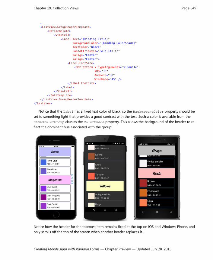
Notice that the Label has a fixed text color of black, so the BackgroundColor property should be
set to something light that provides a good contrast with the text. Such a color is available from the
NamedColorGroup class as the ColorShade property. This allows the background of the header to re-
flect the dominant hue associated with the group:
Notice how the header for the topmost item remains fixed at the top on iOS and Windows Phone, and
only scrolls off the top of the screen when another header replaces it.

Chapter 19. Collection Views Page 550
Creating Mobile Apps with Xamarin.Forms — Chapter Preview — Updated July 28, 2015
ListView and interactivity An application can interact with its ListView in a variety of ways: If the user taps an item, the
ListView fires an ItemTapped event and, if the item is previously not selected, also an Item-
Selected event. A program can also define a data binding using the SelectedItem property. The
ListView has a ScrollTo method that lets a program scroll the ListView to make a particular item
visible. Later in this chapter you’ll see a refresh facility implemented by ListView.
Cell itself defines a Tapped event, but you’ll probably use that event in connection with
TableView rather than ListView. TextCell defines the same Command and CommandParamater
properties as Button and ToolbarItem, but you’ll probably use those properties in connection with
TableView as well. You can also define a context menu on a cell; this is demonstrated in the section
later in this chapter entitled “Context menus.”
It is also possible for a Cell derivative to contain some interactive views. The EntryCell and
SwitchCell allow the user to interact with an Entry or Switch. You can also include interactive
views in a ViewCell.
The InteractiveListView program contains a ListView in its XAML file named listView. The
code-behind file sets the ItemsSource property of that ListView to a collection of type
List<ColorViewModel> containing 100 instances of ColorViewModel—a class described in Chapter
18, “MVVM,” and which can be found in the Xamarin.FormsBook.Toolkit library. Each instance of
ColorViewModel is initialized to a random color:
public partial class InteractiveListViewPage : ContentPage
{
public InteractiveListViewPage()
{
InitializeComponent();
const int count = 100;
List<ColorViewModel> colorList = new List<ColorViewModel>(count);
Random random = new Random();
for (int i = 0; i < count; i++)
{
ColorViewModel colorViewModel = new ColorViewModel();
colorViewModel.Color = new Color(random.NextDouble(),
random.NextDouble(),
random.NextDouble());
colorList.Add(colorViewModel);
}
listView.ItemsSource = colorList;
}
}
The ListView in the XAML file contains a data template using a ViewCell that contains three
Slider views, a BoxView, and a few Label elements to display the hue, saturation, and luminosity
values, all of which are bound to properties of the ColorViewModel class:

Chapter 19. Collection Views Page 551
Creating Mobile Apps with Xamarin.Forms — Chapter Preview — Updated July 28, 2015
<ContentPage xmlns="http://xamarin.com/schemas/2014/forms"
xmlns:x="http://schemas.microsoft.com/winfx/2009/xaml"
xmlns:toolkit=
"clr-namespace:Xamarin.FormsBook.Toolkit;assembly=Xamarin.FormsBook.Toolkit"
x:Class="InteractiveListView.InteractiveListViewPage">
<ContentPage.Padding>
<OnPlatform x:TypeArguments="Thickness"
iOS="10, 20, 10, 0"
Android="10, 0"
WinPhone="10, 0" />
</ContentPage.Padding>
<ContentPage.Resources>
<ResourceDictionary>
<toolkit:ColorToContrastColorConverter x:Key="contrastColor" />
</ResourceDictionary>
</ContentPage.Resources>
<ListView x:Name="listView"
HasUnevenRows="True">
<ListView.ItemTemplate>
<DataTemplate>
<ViewCell>
<Grid Padding="0, 5">
<Grid.RowDefinitions>
<RowDefinition Height="Auto" />
<RowDefinition Height="Auto" />
<RowDefinition Height="Auto" />
</Grid.RowDefinitions>
<Grid.ColumnDefinitions>
<ColumnDefinition Width="*" />
<ColumnDefinition Width="Auto" />
</Grid.ColumnDefinitions>
<Slider Value="{Binding Hue, Mode=TwoWay}"
Grid.Row="0" Grid.Column="0" />
<Slider Value="{Binding Saturation, Mode=TwoWay}"
Grid.Row="1" Grid.Column="0" />
<Slider Value="{Binding Luminosity, Mode=TwoWay}"
Grid.Row="2" Grid.Column="0" />
<ContentView BackgroundColor="{Binding Color}"
Grid.Row="0" Grid.Column="1" Grid.RowSpan="3"
Padding="10">
<StackLayout Orientation="Horizontal"
VerticalOptions="Center">
<Label Text="{Binding Hue, StringFormat='{0:F2}, '}"
TextColor="{Binding Color,
Converter={StaticResource contrastColor}" />

Chapter 19. Collection Views Page 552
Creating Mobile Apps with Xamarin.Forms — Chapter Preview — Updated July 28, 2015
<Label Text="{Binding Saturation, StringFormat='{0:F2}, '}"
TextColor="{Binding Color,
Converter={StaticResource contrastColor}" />
<Label Text="{Binding Luminosity, StringFormat='{0:F2}'}"
TextColor="{Binding Color,
Converter={StaticResource contrastColor}" />
</StackLayout>
</ContentView>
</Grid>
</ViewCell>
</DataTemplate>
</ListView.ItemTemplate>
</ListView>
</ContentPage>
The Label elements sit on top of the BoxView, so they should be made a color that contrasts with
the background. This is accomplished with the ColorToContrastColorConverter class (also in
Xamarin.FormsBook.Toolkit) which calculates the luminance of the color using a standard formula,
and converts to Color.Black for a light color and Color.White for a dark color:
namespace Xamarin.FormsBook.Toolkit
{
public class ColorToContrastColorConverter : IValueConverter
{
public object Convert(object value, Type targetType,
object parameter, CultureInfo culture)
{
return ColorToContrastColor((Color)value);
}
public object ConvertBack(object value, Type targetType,
object parameter, CultureInfo culture)
{
return ColorToContrastColor((Color)value);
}
Color ColorToContrastColor(Color color)
{
// Standard luminance calculation.
double luminance = 0.30 * color.R +
0.59 * color.G +
0.11 * color.B;
return luminance > 0.5 ? Color.Black : Color.White;
}
}
}
Here’s the result:

Chapter 19. Collection Views Page 553
Creating Mobile Apps with Xamarin.Forms — Chapter Preview — Updated July 28, 2015
Each of the items independently lets you manipulate the three Slider elements to select a new
color, and while this example might seem a little artificial, a real-life example involving a collection of
identical visual trees is not inconceivable. Even if there are just a few items in the collection, it might
make sense to use a ListView that displays all the items on the screen and doesn’t scroll. ListView is
one of the most powerful tools that XAML provides to compensate for its lack of programming loops.
ListView and MVVM
ListView is one of the major players in the View part of the Model-View-ViewModel architecture.
Whenever a ViewModel contains a collection, a ListView generally displays the items.
A collection of ViewModels Let’s explore the use of ListView in MVVM with some data that more closely approximates a real-life
example. This is a collection of information about 69 high-school students, including black-and-white
photographs from high-school yearbooks from El Paso, Texas for the years 1912 through 1914. The
yearbooks are in the public domain and can currently be found at the web sites
http://yearbookdigital.com/yearbooks/yb_el_paso_1912-1913.htm and
http://yearbookdigital.com/yearbooks/yb_el_paso_1913-1914.htm.
These photographs and an XML file containing the student names and references to the photo-
graphs are in a web site at http://xamarin.github.io/xamarin-forms-book-preview-2/ElPasoHighSchool.
This web site is hosted from the same GitHub repository as the source code for this book, and the
contents of the site can be found in the gh-pages branch of that repository.

Chapter 19. Collection Views Page 554
Creating Mobile Apps with Xamarin.Forms — Chapter Preview — Updated July 28, 2015
The Students.xml file at that site contains information about the school and students. Here’s the be-
ginning and the end with abbreviated URLs of the photos.
<StudentBody xmlns:xsi=http://www.w3.org/2001/XMLSchema-instance
xmlns:xsd="http://www.w3.org/2001/XMLSchema">
<School>El Paso High School</School>
<Students>
<Student>
<FullName>Adkins Bowden</FullName>
<FirstName>Adkins</FirstName>
<MiddleName />
<LastName>Bowden</LastName>
<Sex>Male</Sex>
<PhotoFilename>http://xamarin.github.io/.../.../AdkinsBowden.png</PhotoFilename>
<GradePointAverage>2.71</GradePointAverage>
</Student>
<Student>
<FullName>Alfred Black</FullName>
<FirstName>Alfred</FirstName>
<MiddleName />
<LastName>Black</LastName>
<Sex>Male</Sex>
<PhotoFilename>http://xamarin.github.io/.../.../AlfredBlack.png</PhotoFilename>
<GradePointAverage>2.87</GradePointAverage>
</Student>
...
<Student>
<FullName>Walter Ponsford</FullName>
<FirstName>Walter</FirstName>
<MiddleName />
<LastName>Ponsford</LastName>
<Sex>Male</Sex>
<PhotoFilename>http://xamarin.github.io/.../.../WalterPonsford.png</PhotoFilename>
<GradePointAverage>2.52</GradePointAverage>
</Student>
<Student>
<FullName>William Sheley Warnock</FullName>
<FirstName>William</FirstName>
<MiddleName>Sheley</MiddleName>
<LastName>Warnock</LastName>
<Sex>Male</Sex>
<PhotoFilename>http://xamarin.github.io/.../.../WilliamSheleyWarnock.png</PhotoFilename>
<GradePointAverage>1.82</GradePointAverage>
</Student>
</Students>
</StudentBody>
The grade point averages were randomly generated when this file was created.
In the Libraries directory among the source code for this book you’ll find a library project named
ElPasoHighSchool that accesses this XML file and uses XML deserialization to convert it into classes
named Student, StudentBody, and SchoolViewModel. Although the Student and StudentBody
classes don’t have the words ViewModel in their names, they qualify as ViewModels reqardless.

Chapter 19. Collection Views Page 555
Creating Mobile Apps with Xamarin.Forms — Chapter Preview — Updated July 28, 2015
The Student class derives from ViewModelBase (a copy of which is included in the ElPasoHigh-
School library) and defines the seven properties associated with each Student element in the XML file.
The class also defines four additional properties of type ICommand and a final property named Stu-
dentBody. These final five properties are not set from the XML deserialization, as the XmlIgnore at-
tributes indicate
namespace ElPasoHighSchool
{
public class Student : ViewModelBase
{
string fullName, firstName, middleName;
string lastName, sex, photoFilename;
double gradePointAverage;
public Student()
{
ResetGpaCommand = new Command(() => GradePointAverage = 2.5m);
MoveToTopCommand = new Command(() => StudentBody.MoveStudentToTop(this));
MoveToBottomCommand = new Command(() => StudentBody.MoveStudentToBottom(this));
RemoveCommand = new Command(() => StudentBody.RemoveStudent(this));
}
public string FullName
{
set { SetProperty(ref fullName, value); }
get { return fullName; }
}
public string FirstName
{
set { SetProperty(ref firstName, value); }
get { return firstName; }
}
public string MiddleName
{
set { SetProperty(ref middleName, value); }
get { return middleName; }
}
public string LastName
{
set { SetProperty(ref lastName, value); }
get { return lastName; }
}
public string Sex
{
set { SetProperty(ref sex, value); }
get { return sex; }
}
public string PhotoFilename

Chapter 19. Collection Views Page 556
Creating Mobile Apps with Xamarin.Forms — Chapter Preview — Updated July 28, 2015
{
set { SetProperty(ref photoFilename, value); }
get { return photoFilename; }
}
public double GradePointAverage
{
set { SetProperty(ref gradePointAverage, value); }
get { return gradePointAverage; }
}
// Properties for implementing commands.
[XmlIgnore]
public ICommand ResetGpaCommand { private set; get; }
[XmlIgnore]
public ICommand MoveToTopCommand { private set; get; }
[XmlIgnore]
public ICommand MoveToBottomCommand { private set; get; }
[XmlIgnore]
public ICommand RemoveCommand { private set; get; }
[XmlIgnore]
public StudentBody StudentBody { set; get; }
}
}
The four properties of type ICommand are set in the Student constructor and associated with short
methods, three of which call methods in the StudentBody class. These will be discussed in more detail
later.
The StudentBody class defines the School and Students properties. The constructor initializes
the Students property as an ObservableCollection<Student> object. In addition, StudentBody
defines three methods called from the Student class that can remove a student from the list or move
a student to the top or bottom of the list:
namespace ElPasoHighSchool
{
public class StudentBody : ViewModelBase
{
string school;
ObservableCollection<Student> students = new ObservableCollection<Student>();
public string School
{
set { SetProperty(ref school, value); }
get { return school; }
}
public ObservableCollection<Student> Students
{

Chapter 19. Collection Views Page 557
Creating Mobile Apps with Xamarin.Forms — Chapter Preview — Updated July 28, 2015
set { SetProperty(ref students, value); }
get { return students; }
}
// Methods to implement commands to move and remove students.
public void MoveStudentToTop(Student student)
{
Students.Move(Students.IndexOf(student), 0);
}
public void MoveStudentToBottom(Student student)
{
Students.Move(Students.IndexOf(student), Students.Count - 1);
}
public void RemoveStudent(Student student)
{
Students.Remove(student);
}
}
}
The SchoolViewModel class is responsible for loading the XML file and deserializing it. It contains a
single property named StudentBody which corresponds to the root tag of the XAML file. This proper-
ty is set to the StudentBody object obtained from the Deserialize method of the XmlSerializer
class.
namespace ElPasoHighSchool
{
public class SchoolViewModel : ViewModelBase
{
StudentBody studentBody;
Random rand = new Random();
public SchoolViewModel()
{
string uri = "http://xamarin.github.io/xamarin-forms-book-preview-2" +
"/ElPasoHighSchool/students.xml";
HttpWebRequest request = WebRequest.CreateHttp(uri);
request.BeginGetResponse((arg) =>
{
// Deserialize XML file.
Stream stream = request.EndGetResponse(arg).GetResponseStream();
StreamReader reader = new StreamReader(stream);
XmlSerializer xml = new XmlSerializer(typeof(StudentBody));
StudentBody = xml.Deserialize(reader) as StudentBody;
// Set StudentBody property in each Student object.
foreach (Student student in StudentBody.Students)
{
student.StudentBody = StudentBody;
}

Chapter 19. Collection Views Page 558
Creating Mobile Apps with Xamarin.Forms — Chapter Preview — Updated July 28, 2015
}, null);
// Adjust GradePointAverage randomly.
Device.StartTimer(TimeSpan.FromSeconds(0.1),
() =>
{
if (studentBody != null)
{
int index = rand.Next(studentBody.Students.Count);
Student student = studentBody.Students[index];
double factor = 1 + (rand.NextDouble() - 0.5) / 5;
student.GradePointAverage = Math.Round(
Math.Max(0, Math.Min(5, factor * student.GradePointAverage)), 2);
}
return true;
});
}
public StudentBody StudentBody
{
protected set { SetProperty(ref studentBody, value); }
get { return studentBody; }
}
}
}
Notice that the data is obtained asynchronously. The properties of the various classes are not set until
sometime after the constructor of this class completes. But the implementation of the INotifyProp-
ertyChanged interface should allow a user-interface to react to data that is acquired sometime after
the program starts up.
The callback to BeginGetResponse runs in the same secondary thread of execution that is used to
download the data in the background. This callback sets some properties that cause Property-
Changed events to fire, which result in data bindings being updated and user-interface objects to
change. Doesn’t this mean that user-interface objects are being accessed from a second thread of ex-
ecution? Shouldn’t Device. BeginInvokeOnMainThread be used to avoid that?
Actually, it’s not necessary. Changes in ViewModel properties that are linked to properties of us-
er-interface objects via data bindings don’t need to be marshalled to the user-interface thread.
The SchoolViewModel class is also responsible for randomly modifying the GradePointAverage
property of the students, in effect simulating dynamic data. Because Student implements INotify-
PropertyChanged (by virtue of deriving from ViewModelBase), we should be able to see these val-
ues change dynamically when displayed by the ListView.
You might want to play around with the StudentViewModel class to get a feel for the nested
properties and how they are expressed in data bindings. You can create a new Xamarin.Forms project
(named Tryout, for example), and then include the ElPasoHighSchool project in the solution, and add
a reference from Tryout to the ElPasoHighSchool library. Then create a ContentPage that looks
something like this:

Chapter 19. Collection Views Page 559
Creating Mobile Apps with Xamarin.Forms — Chapter Preview — Updated July 28, 2015
<ContentPage xmlns="http://xamarin.com/schemas/2014/forms"
xmlns:x="http://schemas.microsoft.com/winfx/2009/xaml"
xmlns:elpaso="clr-namespace:ElPasoHighSchool;assembly=ElPasoHighSchool"
x:Class="Tryout.TryoutListPage">
<ContentPage.Padding>
<OnPlatform x:TypeArguments="Thickness"
iOS="0, 20, 0, 0" />
</ContentPage.Padding>
<ContentPage.BindingContext>
<elpaso:SchoolViewModel />
</ContentPage.BindingContext>
<Label />
</ContentPage>
The BindingContext of the page is set to the SchoolViewModel instance, and you can experi-
ment with bindings on the Text property of the Label. For example, here’s an empty binding:
<Label Text="{Binding StringFormat='{0}'}" />
That displays the fully-qualified class name of the inherited BindingContext:
ElPasoHighSchool.SchoolViewModel
The SchoolViewModel class has one property named StudentBody, so set the Path of the Bind-
ing to that:
<Label Text="{Binding Path=StudentBody, StringFormat='{0}'}" />
Now you’ll see the fully-qualified name of the StudentBody class:
ElPasoHighSchool.StudentBody
The StudentBody class has two properties named School and Students. Try the School proper-
ty:
<Label Text="{Binding Path=StudentBody.School,
StringFormat='{0}'}" />
Finally some actual data is displayed rather than just a class name. It’s the string from the XML file set
to the School property:
El Paso High School
The StringFormat isn’t required in the Binding expression because the property is of type string.
Now try the Students property:
<Label Text="{Binding Path=StudentBody.Students,
StringFormat='{0}'}" />
This displays the fully-qualified class name of ObservableCollection with a collection of Student
object:

Chapter 19. Collection Views Page 560
Creating Mobile Apps with Xamarin.Forms — Chapter Preview — Updated July 28, 2015
System.Collections.ObjectModel.ObservableCollection’1[ElPasoHighSchool.Student]
It should be possible to index this collection, like so:
<Label Text="{Binding Path=StudentBody.Students[34],
StringFormat='{0}'}" />
That is an object of type Student:
ElPasoHighSchool.Student
You can then access any of the Student properties, for example:
<Label Text="{Binding Path=StudentBody.Students[34].FullName,
StringFormat='{0}'}" />
And you’ll see that student’s name:
Irene Bryan
Or, try the GradePointAverage property:
<Label Text="{Binding Path=StudentBody.Students[34].GradePointAverage,
StringFormat='{0}'}" />
Initially you’ll see the randomly generated value stored in the XML file:
2.52
But wait a little while and you should see it change.
Would you like to see a picture of Irene Bryan? Just change the Label to an Image, change the
target property to Source and the source path to PhotoFilename:
<Image Source="{Binding Path=StudentBody.Students[34].PhotoFilename}" />
And there she is, from the class of 1915:

Chapter 19. Collection Views Page 561
Creating Mobile Apps with Xamarin.Forms — Chapter Preview — Updated July 28, 2015
With that background, it should be possible to construct a page that contains both a Label that
displays the name of the school and a ListView that displays all the students with their full names,
grade-point averages, and photos. Each item in the ListView must display two pieces of text and an
image. This is ideal for an ImageCell, which derives from TextCell and adds an image to the two
text items:
<ContentPage xmlns="http://xamarin.com/schemas/2014/forms"
xmlns:x="http://schemas.microsoft.com/winfx/2009/xaml"
xmlns:elpaso="clr-namespace:ElPasoHighSchool;assembly=ElPasoHighSchool"
x:Class="StudentList.StudentListPage">
<ContentPage.Padding>
<OnPlatform x:TypeArguments="Thickness"
iOS="0, 20, 0, 0" />
</ContentPage.Padding>
<ContentPage.BindingContext>
<elpaso:SchoolViewModel />
</ContentPage.BindingContext>
<StackLayout BindingContext="{Binding StudentBody}">
<Label Text="{Binding School}"
FontSize="Large"
FontAttributes="Bold"
XAlign="Center" />
<ListView ItemsSource="{Binding Students}">
<ListView.ItemTemplate>
<DataTemplate>
<ImageCell ImageSource="{Binding PhotoFilename}"
Text="{Binding FullName}"
Detail="{Binding GradePointAverage,

Chapter 19. Collection Views Page 562
Creating Mobile Apps with Xamarin.Forms — Chapter Preview — Updated July 28, 2015
StringFormat='G.P.A. = {0:F2}'}" />
</DataTemplate>
</ListView.ItemTemplate>
</ListView>
</StackLayout>
</ContentPage>
As in the experimental XAML file, the BindingContext of the ContentPage is the SchoolView-
Model object. The StackLayout inherits that BindingContext but sets its own BindingContext to
the StudentBody property, and that’s the BindingContext inherited by the children of the Stack-
Layout. The Text property of the Label is bound to the School property of the StudentBody class,
and the ItemsSource property of the ListView is bound to the Students collection.
This means that the BindingContext for each of the items in the ListView is a Student object,
and the ImageCell properties can be bound to properties of the Student class. The result is scrollable
and selectable, although the selection is displayed in a platform-specific manner:
If you don’t like the default size of these rows, you might be tempted to set the RowHeight prop-
erty, but it doesn’t work in the same way across the platforms, and the only consistent solution is to
switch to a custom ViewCell derivative.
The Label at the top of the page shares the StackLayout with the ListView so that the Label
stays in place as the ListView is scrolled. However, you might want such a header to scroll with the
contents of the ListView and you might want to add a footer as well. The ListView has Header and
Footer properties of type object that you can set to a string or an object of any type (in which
case the header will display the results of that object’s ToString method), or a binding.
Here’s one approach: The BindingContext of the page is set to the SchoolViewModel as before,

Chapter 19. Collection Views Page 563
Creating Mobile Apps with Xamarin.Forms — Chapter Preview — Updated July 28, 2015
but the BindingContext of the ListView is set to the StudentBody property. This means that the
ItemsSource property can reference the Students collection in a binding, and the Header can be
bound to the School property:
<ContentPage … >
…
<ContentPage.BindingContext>
<elpaso:SchoolViewModel />
</ContentPage.BindingContext>
<ListView BindingContext="{Binding StudentBody}"
ItemsSource="{Binding Students}"
Header="{Binding School}">
…
</ListView>
</ContentPage>
That displays the text “El Paso High School” in a header that scrolls with the ListView content.
If you’d like to format that header, you can do that as well. Set the HeaderTemplate property of
the ListView to a DataTemplate, and within the DataTemplate tags define a visual tree. The
BindingContext for that visual tree is the object set to the Header property (in this example the
string with the name of the school).
In the ListViewHeader program shown below, the Header property is bound to the School prop-
erty, and the Label in the visual tree in the HeaderTemplate has an empty binding so the Text
property becomes the text set to the Header property:
<ContentPage xmlns="http://xamarin.com/schemas/2014/forms"
xmlns:x="http://schemas.microsoft.com/winfx/2009/xaml"
xmlns:elpaso="clr-namespace:ElPasoHighSchool;assembly=ElPasoHighSchool"
x:Class="ListViewHeader.ListViewHeaderPage">
<ContentPage.Padding>
<OnPlatform x:TypeArguments="Thickness"
iOS="0, 20, 0, 0" />
</ContentPage.Padding>
<ContentPage.BindingContext>
<elpaso:SchoolViewModel />
</ContentPage.BindingContext>
<ListView BindingContext="{Binding StudentBody}"
ItemsSource="{Binding Students}"
Header="{Binding School}">
<ListView.HeaderTemplate>
<DataTemplate>
<Label Text="{Binding}"
FontSize="Large"
FontAttributes="Bold, Italic"
XAlign="Center" />
</DataTemplate>
</ListView.HeaderTemplate>

Chapter 19. Collection Views Page 564
Creating Mobile Apps with Xamarin.Forms — Chapter Preview — Updated July 28, 2015
<ListView.ItemTemplate>
<DataTemplate>
<ImageCell ImageSource="{Binding PhotoFilename}"
Text="{Binding FullName}"
Detail="{Binding GradePointAverage,
StringFormat='G.P.A. = {0:F2}'}" />
</DataTemplate>
</ListView.ItemTemplate>
</ListView>
</ContentPage>
Unfortunately, with the version of Xamarin.Forms used for this chapter (1.4.2.6359), the header
doesn’t show up on Windows Phone:
Selection and the binding context The StudentBody class doesn’t have a property for the selected student. If it did, you could create a
data binding between the SelectedItem property of the ListView and that selected-student prop-
erty in StudentBody. As usual with MVVM, the property of the view is the data binding target and the
property in the ViewModel is the data binding source.
However, if you want a detailed view of a student directly without the intermediary of a ViewModel,
then the SelectedItem property of the ListView can be the binding source. The SelectedStu-
dentDetail program shows how this might be done. The ListView now shares the screen with a
StackLayout that contains the detail view. To accommodate landscape and portrait orientations, the
ListView and StackLayout are children of a Grid that is manipulated in the code-behind file. The
code-behind file also sets the BindingContext of the page to an instance of the SchoolViewModel

Chapter 19. Collection Views Page 565
Creating Mobile Apps with Xamarin.Forms — Chapter Preview — Updated July 28, 2015
class.
The BindingContext of the StackLayout named “detailLayout” is bound to the SelectedItem
property of the ListView. Because the SelectedItem property is of type Student, bindings within
the StackLayout can simply refer to properties of the Student class:
<ContentPage xmlns="http://xamarin.com/schemas/2014/forms"
xmlns:x="http://schemas.microsoft.com/winfx/2009/xaml"
x:Class="SelectedStudentDetail.SelectedStudentDetailPage"
SizeChanged="OnPageSizeChanged">
<ContentPage.Padding>
<OnPlatform x:TypeArguments="Thickness"
iOS="0, 20, 0, 0" />
</ContentPage.Padding>
<Grid x:Name="mainGrid">
<Grid.RowDefinitions>
<RowDefinition Height="*" />
<RowDefinition Height="*" />
</Grid.RowDefinitions>
<Grid.ColumnDefinitions>
<ColumnDefinition Width="*" />
<ColumnDefinition Width="0" />
</Grid.ColumnDefinitions>
<ListView x:Name="listView"
Grid.Row="0"
Grid.Column="0"
ItemsSource="{Binding StudentBody.Students}">
<ListView.ItemTemplate>
<DataTemplate>
<ImageCell ImageSource="{Binding PhotoFilename}"
Text="{Binding FullName}"
Detail="{Binding GradePointAverage,
StringFormat='G.P.A. = {0:F2}'}" />
</DataTemplate>
</ListView.ItemTemplate>
</ListView>
<StackLayout x:Name="detailLayout"
Grid.Row="1"
Grid.Column="0"
BindingContext="{Binding Source={x:Reference listView},
Path=SelectedItem}">
<StackLayout Orientation="Horizontal"
HorizontalOptions="Center"
Spacing="0">
<StackLayout.Resources>
<ResourceDictionary>
<Style TargetType="Label">
<Setter Property="FontSize" Value="Large" />
<Setter Property="FontAttributes" Value="Bold" />
</Style>
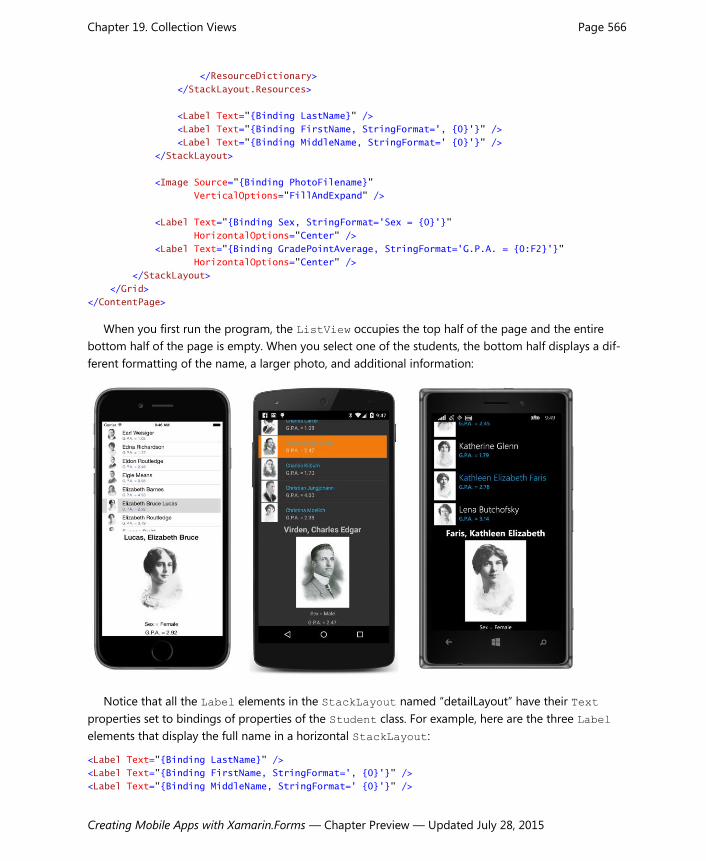
Chapter 19. Collection Views Page 566
Creating Mobile Apps with Xamarin.Forms — Chapter Preview — Updated July 28, 2015
</ResourceDictionary>
</StackLayout.Resources>
<Label Text="{Binding LastName}" />
<Label Text="{Binding FirstName, StringFormat=', {0}'}" />
<Label Text="{Binding MiddleName, StringFormat=' {0}'}" />
</StackLayout>
<Image Source="{Binding PhotoFilename}"
VerticalOptions="FillAndExpand" />
<Label Text="{Binding Sex, StringFormat='Sex = {0}'}"
HorizontalOptions="Center" />
<Label Text="{Binding GradePointAverage, StringFormat='G.P.A. = {0:F2}'}"
HorizontalOptions="Center" />
</StackLayout>
</Grid>
</ContentPage>
When you first run the program, the ListView occupies the top half of the page and the entire
bottom half of the page is empty. When you select one of the students, the bottom half displays a dif-
ferent formatting of the name, a larger photo, and additional information:
Notice that all the Label elements in the StackLayout named “detailLayout” have their Text
properties set to bindings of properties of the Student class. For example, here are the three Label
elements that display the full name in a horizontal StackLayout:
<Label Text="{Binding LastName}" />
<Label Text="{Binding FirstName, StringFormat=', {0}'}" />
<Label Text="{Binding MiddleName, StringFormat=' {0}'}" />

Chapter 19. Collection Views Page 567
Creating Mobile Apps with Xamarin.Forms — Chapter Preview — Updated July 28, 2015
An alternative approach is to use separate Label elements for the text that separates the last name
and first name, and the first name and middle name:
<Label Text="{Binding LastName}" />
<Label Text=", " />
<Label Text="{Binding FirstName}" />
<Label Text=" " />
<Label Text="{Binding MiddleName}" />
Ostensibly these two approaches seem visually identical. However, if no student is currently selected,
the second approach displays a stray comma that looks like an odd speck on the screen. The ad-
vantages of using a binding with StringFormat is that the Label doesn’t appear at all if the Bind-
ingContext is null.
Sometimes it’s unavoidable that some spurious text appears in a detail view when the detail view
isn’t displaying anything otherwise. In such a case you might want to bind the IsVisible property of
the detail Layout object to the SelectedItem property of the ListView with a binding converter
that converts null to false and non-null to true.
The code-behind file in the SelectedStudentDetail program is responsible for setting the Bind-
ingContext for the page and also for handling the SizeChanged event for the page to adjust the
Grid and the detailLayout object for a landscape orientation:
public partial class SelectedStudentDetailPage : ContentPage
{
public SelectedStudentDetailPage()
{
InitializeComponent();
// Set BindingContext.
BindingContext = new SchoolViewModel();
}
void OnPageSizeChanged(object sender, EventArgs args)
{
// Portrait mode.
if (Width < Height)
{
mainGrid.ColumnDefinitions[0].Width = new GridLength(1, GridUnitType.Star);
mainGrid.ColumnDefinitions[1].Width = new GridLength(0);
mainGrid.RowDefinitions[0].Height = new GridLength(1, GridUnitType.Star);
mainGrid.RowDefinitions[1].Height = new GridLength(1, GridUnitType.Star);
Grid.SetRow(detailLayout, 1);
Grid.SetColumn(detailLayout, 0);
}
// Landscape mode.
else
{
mainGrid.ColumnDefinitions[0].Width = new GridLength(1, GridUnitType.Star);
mainGrid.ColumnDefinitions[1].Width = new GridLength(1, GridUnitType.Star);

Chapter 19. Collection Views Page 568
Creating Mobile Apps with Xamarin.Forms — Chapter Preview — Updated July 28, 2015
mainGrid.RowDefinitions[0].Height = new GridLength(1, GridUnitType.Star);
mainGrid.RowDefinitions[1].Height = new GridLength(0);
Grid.SetRow(detailLayout, 0);
Grid.SetColumn(detailLayout, 1);
}
}
}
Here’s a landscape view:
Dividing a page into a ListView and detail view is not the only approach. When the user selects an
item in the ListView, your program could navigate to a separate page to display the detail view. Or,
you could make use of a MasterDetailPage designed specifically for scenarios such as this. You’ll see
examples with these solutions in the chapters ahead.
Context menus A cell can define a context menu that is invoked in a platform-specific manner. Such a context menu
generally allows a user to perform an operation on a specific item in the ListView. When used with a
ListView displaying students, for example, such a context menu allows the user to perform actions on
a specific student.
The CellContextMenu program demonstrates this technique. It defines a context menu with four
items:
Reset GPA (which sets the grade point average of the student to 2.5)

Chapter 19. Collection Views Page 569
Creating Mobile Apps with Xamarin.Forms — Chapter Preview — Updated July 28, 2015
Move to Top (which moves the student to the top of the list)
Move to Bottom (which similarly moves the student to the bottom)
Remove (which removes the student from the list)
On iOS, the context menu is invoked by sliding the item to the left. On Android and Windows Phone,
you press your finger to the item and hold it until the menu appears. Here’s the result:
Only one menu item appears on the iOS screen, and that’s the item which removes the student
from the list. A menu item that removes an entry from the ListView must be specially flagged for iOS.
The Android screen lists the first two menu items at the top of the screen. Only Windows Phone lists
them all.
To see the other menu items, you tap the More button on iOS and the vertical ellipsis on Android.
The other items appear in a list at the bottom of the iOS screen and in a dropdown list at the top right
of the Android screen:

Chapter 19. Collection Views Page 570
Creating Mobile Apps with Xamarin.Forms — Chapter Preview — Updated July 28, 2015
Tapping one of the menu items carries out that operation.
To create a context menu for a cell, you add objects of type MenuItem to the ContextActions
collection defined by the Cell class. You’ve already encountered MenuItem. It is the base class for the
ToolbarItem class described in Chapter 13, “Bitmaps.”
MenuItem defines five properties:
Text of type string
Icon of type FileImageSource to access a bitmap from a platform project
IsDestructive of type bool
Command of type ICommand
CommandParameter of type object
In addition, MenuItem defines a Clicked event. You can handle menu actions either in a Clicked
handler or—if the menu actions are implemented in a ViewModel—an ICommand object.
Here’s how the ContextActions collection is initialized in the CellContextMenu program:
<ContentPage xmlns="http://xamarin.com/schemas/2014/forms"
xmlns:x="http://schemas.microsoft.com/winfx/2009/xaml"
xmlns:elpaso="clr-namespace:ElPasoHighSchool;assembly=ElPasoHighSchool"
x:Class="CellContextMenu.CellContextMenuPage">
<ContentPage.Padding>
<OnPlatform x:TypeArguments="Thickness"
iOS="0, 20, 0, 0" />
</ContentPage.Padding>

Chapter 19. Collection Views Page 571
Creating Mobile Apps with Xamarin.Forms — Chapter Preview — Updated July 28, 2015
<ContentPage.BindingContext>
<elpaso:SchoolViewModel />
</ContentPage.BindingContext>
<StackLayout BindingContext="{Binding StudentBody}">
<Label Text="{Binding School}"
FontSize="Large"
FontAttributes="Bold"
XAlign="Center" />
<ListView ItemsSource="{Binding Students}">
<ListView.ItemTemplate>
<DataTemplate>
<ImageCell ImageSource="{Binding PhotoFilename}"
Text="{Binding FullName}"
Detail="{Binding GradePointAverage,
StringFormat='G.P.A. = {0:F2}'}">
<ImageCell.ContextActions>
<MenuItem Text="Reset GPA"
Command="{Binding ResetGpaCommand}" />
<MenuItem Text="Move to top"
Command="{Binding MoveToTopCommand}" />
<MenuItem Text="Move to bottom"
Command="{Binding MoveToBottomCommand}" />
<MenuItem Text="Remove"
IsDestructive="True"
Command="{Binding RemoveCommand}" />
</ImageCell.ContextActions>
</ImageCell>
</DataTemplate>
</ListView.ItemTemplate>
</ListView>
</StackLayout>
</ContentPage>
Notice that the IsDestructive property is set to True for the Remove item. This is the property
that causes the item to be displayed in red on the iOS screen, and which by convention deletes the
item from the collection.
MenuItem defines an Icon property that you can set to a bitmap stored in a platform project
(much like the icons used with ToolbarItem), but it only works on Android and the bitmap replaces
the Text description.
The Command properties of all four MenuItem objects are bound to properties in the Student class.
A Student object is the binding context for the cell, so it’s also the binding context for these Menu-
Item objects. Here’s how the properties are defined and initialized in Student:
public class Student : ViewModelBase
{

Chapter 19. Collection Views Page 572
Creating Mobile Apps with Xamarin.Forms — Chapter Preview — Updated July 28, 2015
…
public Student()
{
ResetGpaCommand = new Command(() => GradePointAverage = 2.5);
MoveToTopCommand = new Command(() => StudentBody.MoveStudentToTop(this));
MoveToBottomCommand = new Command(() => StudentBody.MoveStudentToBottom(this));
RemoveCommand = new Command(() => StudentBody.RemoveStudent(this));
}
…
// Properties for implementing commands.
[XmlIgnore]
public ICommand ResetGpaCommand { private set; get; }
[XmlIgnore]
public ICommand MoveToTopCommand { private set; get; }
[XmlIgnore]
public ICommand MoveToBottomCommand { private set; get; }
[XmlIgnore]
public ICommand RemoveCommand { private set; get; }
[XmlIgnore]
public StudentBody StudentBody { set; get; }
}
Only the ResetGpaCommand can be handled entirely within the Student class. The other three
commands require access to the collection of students in the StudentBody class. For that reason,
when first loading in the data, the SchoolViewModel sets the StudentBody property in each Stu-
dent object to the StudentBody object with the collection of students. This allows the Move and
Remove commands to be implemented with calls to the following methods in StudentBody:
public class StudentBody : ViewModelBase
{
…
public void MoveStudentToTop(Student student)
{
Students.Move(Students.IndexOf(student), 0);
}
public void MoveStudentToBottom(Student student)
{
Students.Move(Students.IndexOf(student), Students.Count - 1);
}
public void RemoveStudent(Student student)
{
Students.Remove(student);
}
}
Because the Students collection is an ObservableCollection, the ListView redraws itself to
reflect the new number or new ordering of the students.

Chapter 19. Collection Views Page 573
Creating Mobile Apps with Xamarin.Forms — Chapter Preview — Updated July 28, 2015
Varying the visuals Sometimes you don’t want every item displayed by the ListView to be formatted identically. You
might want a little different formatting based on the values of some properties. This is generally a job
for triggers, which you’ll be exploring in Chapter 22. However, you can also vary the visuals of items in
a ListView using a value converter.
Here’s a view of the ColorCodedStudents screen. Every student with a grade-point average less
than 2.0 is flagged in red, perhaps to highlight the need for some special attention:
In one sense, this is very simple: The TextColor property of the ImageCell is bound to the
GradePointAverage property of Student. But that’s a property of type Color bound to a property
of type double, so a value converter is required, and one that’s capable of performing a test on the
GradePointAverage property to convert to the proper color.
Here is the ThresholdToObjectConverter in the Xamarin.FormsBook.Toolkit library:
namespace Xamarin.FormsBook.Toolkit
{
public class ThresholdToObjectConverter<T> : IValueConverter
{
public T TrueObject { set; get; }
public T FalseObject { set; get; }
public object Convert(object value, Type targetType,
object parameter, CultureInfo culture)
{
// Code assumes that all input is valid!

Chapter 19. Collection Views Page 574
Creating Mobile Apps with Xamarin.Forms — Chapter Preview — Updated July 28, 2015
double number = (double)value;
string arg = parameter as string;
char op = arg[0];
double criterion = Double.Parse(arg.Substring(1).Trim());
switch (op)
{
case '<': return number < criterion ? TrueObject : FalseObject;
case '>': return number > criterion ? TrueObject : FalseObject;
case '=': return number == criterion ? TrueObject : FalseObject;
}
return FalseObject;
}
public object ConvertBack(object value, Type targetType,
object parameter, CultureInfo culture)
{
return 0;
}
}
}
Like the BoolToObjectConverter described in Chapter 16, “Data binding,” the ThresholdToOb-
jectConverter is a generic class that defines two properties of type T named TrueObject and
FalseObject. But the choice is based on a comparison of the value argument (which is assumed to
be of type double) and the parameter argument, which is specified as the ConverterParameter in
the binding. This parameter argument is assumed to be a string that contains a one-character com-
parison operator and a number. For purposes of simplicity and clarity, there is no input validation.
Once the value converter is created, the markup is fairly easy:
<ContentPage xmlns="http://xamarin.com/schemas/2014/forms"
xmlns:x="http://schemas.microsoft.com/winfx/2009/xaml"
xmlns:elpaso="clr-namespace:ElPasoHighSchool;assembly=ElPasoHighSchool"
xmlns:toolkit=
"clr-namespace:Xamarin.FormsBook.Toolkit;assembly=Xamarin.FormsBook.Toolkit"
x:Class="ColorCodedStudents.ColorCodedStudentsPage">
<ContentPage.Padding>
<OnPlatform x:TypeArguments="Thickness"
iOS="0, 20, 0, 0" />
</ContentPage.Padding>
<ContentPage.Resources>
<ResourceDictionary>
<toolkit:ThresholdToObjectConverter x:Key="thresholdConverter"
x:TypeArguments="Color"
TrueObject="Default"
FalseObject="Red" />
</ResourceDictionary>
</ContentPage.Resources>
<ContentPage.BindingContext>
<elpaso:SchoolViewModel />

Chapter 19. Collection Views Page 575
Creating Mobile Apps with Xamarin.Forms — Chapter Preview — Updated July 28, 2015
</ContentPage.BindingContext>
<ListView ItemsSource="{Binding StudentBody.Students}">
<ListView.ItemTemplate>
<DataTemplate>
<ImageCell ImageSource="{Binding PhotoFilename}"
Text="{Binding FullName}"
TextColor="{Binding GradePointAverage,
Converter={StaticResource thresholdConverter},
ConverterParameter=>2}"
Detail="{Binding GradePointAverage,
StringFormat='G.P.A. = {0:F2}'}" />
</DataTemplate>
</ListView.ItemTemplate>
</ListView>
</ContentPage>
Refreshing the content As you’ve seen, if you use an ObservableCollection as a source for ListView, any change to the
collection causes ObservableCollection to fire a CollectionChanged event and the ListView
responds by refreshing the display of items.
Sometimes this type of refreshing must be supplemented with something controlled by the user.
For example, consider an email client or RSS reader. Such an application might be configured to look
for new email or an update to the RSS file every 15 minutes or so, but the user might be somewhat
impatient and might want the program to check right away for new data.
For this purpose a convention has developed that is supported by ListView. If the ListView has
its IsPullToRefresh property set to true, and if the user swipes down on the ListView, the
ListView will respond by calling the Execute method of the ICommand object bound to its Re-
freshCommand property. The ListView will also set its IsRefreshing property to true, and display
some kind of animation indicating that it’s busy.
In reality, the ListView is not busy. It’s just waiting to be notified that new data is available. You’ve
probably written the code invoked by the Execute method of the ICommand object to perform an
asynchronous operation such as a web access. It must notify the ListView that it’s finished by setting
the IsRefreshing property of the ListView back to false. At that time, the ListView displays the
new data and the refresh is complete.
This sounds somewhat complicated but it gets a lot easier if you build this feature into the View-
Model that supplies the data. The whole process is demonstrated with a program called RssFeed that
accesses an RSS feed from NASA.
The RssFeedViewModel class is responsible for downloading the XML with the RSS feed and pars-
ing it. This first happens when the Url property is set and the set accessor calls the LoadRssFeed
method:
public class RssFeedViewModel : ViewModelBase

Chapter 19. Collection Views Page 576
Creating Mobile Apps with Xamarin.Forms — Chapter Preview — Updated July 28, 2015
{
string url, title;
IList<RssItemViewModel> items;
bool isRefreshing = true;
public RssFeedViewModel()
{
RefreshCommand = new Command(
execute: () =>
{
LoadRssFeed(url);
},
canExecute: () =>
{
return !IsRefreshing;
});
}
public string Url
{
set
{
if (SetProperty(ref url, value) && !String.IsNullOrEmpty(url))
{
LoadRssFeed(url);
}
}
get
{
return url;
}
}
public string Title
{
set { SetProperty(ref title, value); }
get { return title; }
}
public IList<RssItemViewModel> Items
{
set { SetProperty(ref items, value); }
get { return items; }
}
public ICommand RefreshCommand { private set; get; }
public bool IsRefreshing
{
set { SetProperty(ref isRefreshing, value); }
get { return isRefreshing; }
}
public void LoadRssFeed(string url)
{

Chapter 19. Collection Views Page 577
Creating Mobile Apps with Xamarin.Forms — Chapter Preview — Updated July 28, 2015
WebRequest request = WebRequest.Create(url);
request.BeginGetResponse((args) =>
{
// Download XML.
Stream stream = request.EndGetResponse(args).GetResponseStream();
StreamReader reader = new StreamReader(stream);
string xml = reader.ReadToEnd();
// Parse XML to extract data from RSS feed.
XDocument doc = XDocument.Parse(xml);
XElement rss = doc.Element(XName.Get("rss"));
XElement channel = rss.Element(XName.Get("channel"));
// Set Title property.
Title = channel.Element(XName.Get("title")).Value;
// Set Items property.
List<RssItemViewModel> list =
channel.Elements(XName.Get("item")).Select((XElement element) =>
{
// Instantiate RssItemViewModel for each item.
return new RssItemViewModel(element);
}).ToList();
Items = list;
// Set IsRefreshing to false to stop the 'wait' icon.
IsRefreshing = false;
}, null);
}
}
The LoadRssFeed method uses the LINQ-to-XML interface in the System.Xml.Linq namespace
to parse the XML file and set both the Title property and the Items property of the class. The Items
property is a collection of RssItemViewModel objects that define five properties associated with each
item in the RSS feed. For each item element in the XML file the LoadRssFeed method instantiates an
RssItemViewModel object:
public class RssItemViewModel
{
public RssItemViewModel(XElement element)
{
// Although this code might appear to be generalized, it is
// actually based on desired elements from the particular
// RSS feed set in the RssFeedPage.xaml file.
Title = element.Element(XName.Get("title")).Value;
Description = element.Element(XName.Get("description")).Value;
Link = element.Element(XName.Get("link")).Value;
PubDate = element.Element(XName.Get("pubDate")).Value;
// Sometimes there's no thumbnail, so check for its presence.
XElement thumbnailElement = element.Element(
XName.Get("thumbnail", "http://search.yahoo.com/mrss/"));

Chapter 19. Collection Views Page 578
Creating Mobile Apps with Xamarin.Forms — Chapter Preview — Updated July 28, 2015
if (thumbnailElement != null)
{
Thumbnail = thumbnailElement.Attribute(XName.Get("url")).Value;
}
}
public string Title { protected set; get; }
public string Description { protected set; get; }
public string Link { protected set; get; }
public string PubDate { protected set; get; }
public string Thumbnail { protected set; get; }
}
The constructor of RssFeedViewModel also sets its RefreshCommand property equal to a Command
object with an Execute method that also calls LoadRssFeed, which finishes by setting the IsRe-
freshing property of the class to false. To avoid overlapping web accesses, the CanExecute
method of RefreshCommand returns true only if IsRefreshing is false.
Notice that it’s not necessary for the Items property in RssFeedViewModel to be an Observa-
bleCollection because once the Items collection is created, the items in the collection never
change. When the LoadRssFeed method gets new data, it creates a whole new List object that it sets
to the Items property, which results in the firing of a PropertyChanged event.
The RssFeedPage class shown below instantiates the RssFeedViewModel and assigns the Url
property. This object becomes the BindingContext for a StackLayout that contains a Label to dis-
play the Title property and a ListView. The ItemsSource, RefreshCommand, and IsRefreshing
properties of the ListView are all bound to properties in the RssFeedViewModel:
<ContentPage xmlns="http://xamarin.com/schemas/2014/forms"
xmlns:x="http://schemas.microsoft.com/winfx/2009/xaml"
xmlns:local="clr-namespace:RssFeed"
x:Class="RssFeed.RssFeedPage">
<ContentPage.Padding>
<OnPlatform x:TypeArguments="Thickness"
iOS="10, 20, 10, 0"
Android="10, 0"
WinPhone="10, 0" />
</ContentPage.Padding>
<ContentPage.Resources>
<ResourceDictionary>
<local:RssFeedViewModel x:Key="rssFeed"
Url="http://earthobservatory.nasa.gov/Feeds/rss/eo_iotd.rss" />
</ResourceDictionary>
</ContentPage.Resources>
<Grid>
<StackLayout x:Name="rssLayout"
Chapter 19. Collection Views Page 579
Creating Mobile Apps with Xamarin.Forms — Chapter Preview — Updated July 28, 2015
BindingContext="{StaticResource rssFeed}">
<Label Text="{Binding Title}"
FontAttributes="Bold"
XAlign="Center" />
<ListView x:Name="listView"
ItemsSource="{Binding Items}"
ItemSelected="OnListViewItemSelected"
IsPullToRefreshEnabled="True"
RefreshCommand="{Binding RefreshCommand}"
IsRefreshing="{Binding IsRefreshing}">
<ListView.ItemTemplate>
<DataTemplate>
<ImageCell Text="{Binding Title}"
Detail="{Binding PubDate}"
ImageSource="{Binding Thumbnail}" />
</DataTemplate>
</ListView.ItemTemplate>
</ListView>
</StackLayout>
<StackLayout x:Name="webLayout"
IsVisible="False">
<WebView x:Name="webView"
VerticalOptions="FillAndExpand" />
<Button Text="< Back to List"
HorizontalOptions="Center"
Clicked="OnBackButtonClicked" />
</StackLayout>
</Grid>
</ContentPage>
The items are ideally suited for an ImageCell:

Chapter 19. Collection Views Page 580
Creating Mobile Apps with Xamarin.Forms — Chapter Preview — Updated July 28, 2015
When you swipe your finger down this list, the ListView will go into refresh mode by calling the
Execute method of the RefreshCommand object and displaying an animation indicating that it’s busy.
When the IsRefreshing property is set back to false by RssFeedViewModel, the ListView dis-
plays the new data.
In addition, the page contains another StackLayout towards the bottom of the XAML file that has
its IsVisible property set to false. The first StackLayout with the ListView and this second hid-
den StackLayout share a single-cell Grid, so they both essentially occupy the entire page.
When the user selects an item in the ListView, the ItemSelected event handler in the
code-behind file hides the StackLayout with the ListView and makes the second StackLayout
visible:
public partial class RssFeedPage : ContentPage
{
public RssFeedPage()
{
InitializeComponent();
}
void OnListViewItemSelected(object sender, SelectedItemChangedEventArgs args)
{
if (args.SelectedItem != null)
{
// Deselect item.
((ListView)sender).SelectedItem = null;
// Set WebView source to RSS item
RssItemViewModel rssItem = (RssItemViewModel)args.SelectedItem;
webView.Source = rssItem.Link;

Chapter 19. Collection Views Page 581
Creating Mobile Apps with Xamarin.Forms — Chapter Preview — Updated July 28, 2015
// Hide and make visible.
rssLayout.IsVisible = false;
webLayout.IsVisible = true;
}
}
void OnBackButtonClicked(object sender, EventArgs args)
{
// Hide and make visible.
webLayout.IsVisible = false;
rssLayout.IsVisible = true;
}
}
This second StackLayout contains a WebView for a display of the item referenced by the RSS feed
item and a button to go back to the ListView:
Notice how the ItemSelected event handler sets the SelectedItem property of the ListView to
null, effectively deselecting the item. (However, the selected item is still available in the SelectedI-
tem property of the event arguments.) This is a common technique when using the ListView for
navigational purposes. When the user returns to the ListView, you don’t want the item to be still se-
lected. Setting the SelectedItem property of the ListView to null causes another call to the
ItemSelected event handler, of course, but if the handler begins by ignoring cases when Selecte-
dItem is null, the second call shouldn’t be a problem.
A more sophisticated program would navigagte to a second page or use the detail part of a Mas-
terDetailPage for displaying the item. Those techniques will be demonstrated in future chapters.

Chapter 19. Collection Views Page 582
Creating Mobile Apps with Xamarin.Forms — Chapter Preview — Updated July 28, 2015
The TableView and its intents
The third of the the three collection views in Xamarin.Forms is TableView, and the name might be a
little deceptive. When we hear the word “table” in programming contexts, we usually think of a
two-dimensional grid, such as an HTML table. The Xamarin.Forms TableView is instead a vertical
scrollable list of items that are visually generated from Cell classes. This might sound very similar to a
ListView but the ListView and TableView are quite different in use:
The ListView generally displays a list of items of the same type, usually instances of a particular
data class. These items are in an IEnumerable collection. The ListView specifies a single Cell deriv-
ative for rendering these data objects. Items are selectable.
The TableView displays a list of items of different types. In real-life programming, often these
items are properties of a single class. Each item is associated with its own Cell to display the property
and often to allow the user to interact with the property. In the general case, the TableView displays
more than one type of cell.
Properties and hierarchies ListView defines 18 properties on its own while TableView only has four:
Intent of type TableIntent.
Root of type TableRoot. (This is the content property of TableView.)
RowHeight of type int.
HasUnevenRows of type bool.
The RowHeight and HasUnevenRows properties play the same role in the TableView as in the
ListView.
Perhaps the most revealing property of the TableView class is a property that is not guaranteed to
have any effect on functionality and appearance. This property is named Intent, and it indicates how
you’re using the particular TableView in your program. You can set this property (or not) to a member
of the TableIntent enumeration:
Data
Form
Settings
Menu
These members suggest the various ways that you can use TableView. When used for Data, the
TableView usually displays related items, but items of different types. A Form is a series of items the

Chapter 19. Collection Views Page 583
Creating Mobile Apps with Xamarin.Forms — Chapter Preview — Updated July 28, 2015
user interacts with to enter information. A TableView used for program Settings is sometimes
known as a dialog. This use is similar to Form, except that settings usually have default values. You can
also use a TableView for a Menu, in which case the items are generally displayed using text or bitmaps,
and initiate an action when tapped.
The Root property defines the root of the hierarchy of items displayed by the TableView. Each
item in a TableView is associated with a single Cell derivative, and the various cells can be organized
into sections. To support this hierarchy of items, several classes are defined:
TableSectionBase is an abstract class that derives from BindableObject and defines a Ti-
tle property.
TableSectionBase<T> is an abstract class that derives from TableSectionBase and imple-
ments the IList<T> interface, and hence also the ICollection<T> and IEnumerable<T>
interfaces. The class also implements the INotifyCollectionChanged interface; internally it
maintains an ObservableCollection<T> for this collection. This allows items to be dynami-
cally added to or removed from the TableView.
TableSection derives from TableSectionBase<Cell>.
TableRoot derives from TableSectionBase<TableSection>.
In summary, TableView has a Root property that you set to TableRoot object, which is a collec-
tion of TableSection objects, each of which is a collection of Cell objects.
Notice that both TableSection and TableRoot inherit a Title property from TableSection-
Base. Depending on the derived class, this is either a title for the section or a title for the entire table.
Both TableSection and TableRoot have constructors that let you set this Title property when cre-
ating the object.
The TableSectionBase<T> class defines two Add methods for adding items to the collection. The
first Add method is required by the ICollection interface; the second is not:
public void Add(T item)
public void Add(IEnumerable<T> items)
This second Add method seems to allow you to add one TableSection to another TableSection,
and one TableRoot to another TableRoot, and that process might seem to imply that you can have a
nested series of TableRoot or TableSection instances. But that is not so. This Add method just
transfers the items from one collection to another. The hierarchy never gets any deeper than a
TableRoot that is a collection of TableSection objects, which are collections of Cell objects.
Although the TableView makes use of Cell objects, it does not use DataTemplate. Whether you
define a TableView in code or in XAML, you always set data bindings directly on the Cell objects.
Generally these bindings are very simple because you set a BindingContext on the TableView that
is inherited by the individual items.
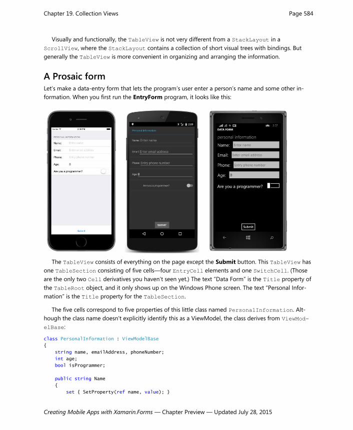
Chapter 19. Collection Views Page 584
Creating Mobile Apps with Xamarin.Forms — Chapter Preview — Updated July 28, 2015
Visually and functionally, the TableView is not very different from a StackLayout in a
ScrollView, where the StackLayout contains a collection of short visual trees with bindings. But
generally the TableView is more convenient in organizing and arranging the information.
A Prosaic form Let’s make a data-entry form that lets the program’s user enter a person’s name and some other in-
formation. When you first run the EntryForm program, it looks like this:
The TableView consists of everything on the page except the Submit button. This TableView has
one TableSection consisting of five cells—four EntryCell elements and one SwitchCell. (Those
are the only two Cell derivatives you haven’t seen yet.) The text “Data Form” is the Title property of
the TableRoot object, and it only shows up on the Windows Phone screen. The text “Personal Infor-
mation” is the Title property for the TableSection.
The five cells correspond to five properties of this little class named PersonalInformation. Alt-
hough the class name doesn’t explicitly identify this as a ViewModel, the class derives from ViewMod-
elBase:
class PersonalInformation : ViewModelBase
{
string name, emailAddress, phoneNumber;
int age;
bool isProgrammer;
public string Name
{
set { SetProperty(ref name, value); }

Chapter 19. Collection Views Page 585
Creating Mobile Apps with Xamarin.Forms — Chapter Preview — Updated July 28, 2015
get { return name; }
}
public string EmailAddress
{
set { SetProperty(ref emailAddress, value); }
get { return emailAddress; }
}
public string PhoneNumber
{
set { SetProperty(ref phoneNumber, value); }
get { return phoneNumber; }
}
public int Age
{
set { SetProperty(ref age, value); }
get { return age; }
}
public bool IsProgrammer
{
set { SetProperty(ref isProgrammer, value); }
get { return isProgrammer; }
}
}
When you fill in the information in the form and press the Submit button, the program displays the
information from the PersonalInformation instance in a little paragraph at the bottom of the
screen:

Chapter 19. Collection Views Page 586
Creating Mobile Apps with Xamarin.Forms — Chapter Preview — Updated July 28, 2015
This program maintains just a single instance of PersonalInformation. A real application would
perhaps create a new instance for each person whose information the user is supplying, and then store
each instance in an ObservableCollection<PersonalInformation> for display by a ListView.
The EntryForm XAML file instantiates PersonalInformation as the BindingContext of the
TableView. You can see here the TableRoot, the TableSection, and the five Cell objects:
<ContentPage xmlns="http://xamarin.com/schemas/2014/forms"
xmlns:x="http://schemas.microsoft.com/winfx/2009/xaml"
xmlns:local="clr-namespace:EntryForm"
x:Class="EntryForm.EntryFormPage">
<ContentPage.Padding>
<OnPlatform x:TypeArguments="Thickness"
iOS="0, 20, 0, 0" />
</ContentPage.Padding>
<StackLayout>
<TableView x:Name="tableView"
Intent="Form">
<TableView.BindingContext>
<local:PersonalInformation />
</TableView.BindingContext>
<TableRoot Title="Data Form">
<TableSection Title="Personal Information">
<EntryCell Label="Name:"
Text="{Binding Name}"
Placeholder="Enter name"
Keyboard="Text" />
<EntryCell Label="Email:"
Text="{Binding EmailAddress}"
Placeholder="Enter email address"
Keyboard="Email" />
<EntryCell Label="Phone:"
Text="{Binding PhoneNumber}"
Placeholder="Enter phone number"
Keyboard="Telephone" />
<EntryCell Label="Age:"
Text="{Binding Age}"
Placeholder="Enter age"
Keyboard="Numeric" />
<SwitchCell Text="Are you a programmer?"
On="{Binding IsProgrammer}" />
</TableSection>
</TableRoot>
</TableView>
<Label x:Name="summaryLabel"
VerticalOptions="CenterAndExpand" />

Chapter 19. Collection Views Page 587
Creating Mobile Apps with Xamarin.Forms — Chapter Preview — Updated July 28, 2015
<Button Text="Submit"
HorizontalOptions="Center"
Clicked="OnSubmitButtonClicked" />
</StackLayout>
</ContentPage>
Each of the properties of the PersonalInformation class corresponds to a Cell. For four of these
properties, this is an EntryCell that consists (at least conceptually) of an identifying Label and an
Entry view. (In reality, the EntryCell consists of platform-specific visual objects, but it’s convenient
to speak of these objects using Xamarin.Forms names.) The Label property specifies the text that ap-
pears at the left; the Placeholder and Keyboard properties of EntryView duplicate the same prop-
erties in Entry. A Text property indicates the text in the Entry view.
The fifth cell is a SwitchCell for the Boolean property IsProgrammer. In this case, the Text
property specifies the text at the left of the cell, and the On property indicates the state of the
Switich.
Because the BindingContext of the TableView is PersonalInformation, the bindings in the
Cell objects can simply reference the properties of PersonalInformation. The binding modes of
the Text property of the EntryCell and the On property of the SwitchCell are both TwoWay. If you
only need to transfer data from the view to the data class, this mode can be OneWayToSource, but in
general you might want to initialize the views from the data class. For example, you can instantiate the
PersonalInformation instance in the XAML file like this:
<TableView.BindingContext>
<local:PersonalInformation Name="Naomi Name"
EmailAddress="[email protected]"
PhoneNumber="555-1212"
Age="29"
IsProgrammer="True" />
</TableView.BindingContext>
The cells will then be initialized with that information when the program starts up.
Both EntryCell and SwitchCell fire events if you prefer obtaining information through event
handling rather than data binding.
The code-behind file simply processes the Clicked event of the Submit button by creating a text
string with the information from the PersonalInformation instance and displaying it with the La-
bel:
public partial class EntryFormPage : ContentPage
{
public EntryFormPage()
{
InitializeComponent();
}
void OnSubmitButtonClicked(object sender, EventArgs args)

Chapter 19. Collection Views Page 588
Creating Mobile Apps with Xamarin.Forms — Chapter Preview — Updated July 28, 2015
{
PersonalInformation personalInfo = (PersonalInformation)tableView.BindingContext;
summaryLabel.Text = String.Format(
"{0} is {1} years old, and has an email address " +
"of {2}, and a phone number of {3}, and is {4}" +
"a programmer.",
personalInfo.Name, personalInfo.Age,
personalInfo.EmailAddress, personalInfo.PhoneNumber,
personalInfo.IsProgrammer ? "" : "not ");
}
}
Custom cells Of course, few people are entirely happy with the first version of an application, and perhaps that is
true for the simple EntryForm program. Perhaps the revised design requirements eliminate the integer
Age property from PersonalInformation and substitute a text AgeRange property with some fixed
ranges. Two more properties are added to the class that pertain only to programmers: These are prop-
erties of type string that indicate the programmer’s preferred computer language and platform,
choosable from lists of languages and platforms.
Here’s the revised ViewModel class, now called ProgrammerInformation:
class ProgrammerInformation : ViewModelBase
{
string name, emailAddress, phoneNumber, ageRange;
bool isProgrammer;
string language, platform;
public string Name
{
set { SetProperty(ref name, value); }
get { return name; }
}
public string EmailAddress
{
set { SetProperty(ref emailAddress, value); }
get { return emailAddress; }
}
public string PhoneNumber
{
set { SetProperty(ref phoneNumber, value); }
get { return phoneNumber; }
}
public string AgeRange
{
set { SetProperty(ref ageRange, value); }
get { return ageRange; }

Chapter 19. Collection Views Page 589
Creating Mobile Apps with Xamarin.Forms — Chapter Preview — Updated July 28, 2015
}
public bool IsProgrammer
{
set { SetProperty(ref isProgrammer, value); }
get { return isProgrammer; }
}
public string Language
{
set { SetProperty(ref language, value); }
get { return language; }
}
public string Platform
{
set { SetProperty(ref platform, value); }
get { return platform; }
}
}
The AgeRange, Language, and Platform properties seem ideally suited for Picker, but using a
Picker inside a TableView requires that the Picker be part of a ViewCell. How do we do this?
When working with a ListView, the simplest way to create a custom cell involves defining a visual
tree in a ViewCell within a DataTemplate right in XAML. This approach makes sense because the
visual tree that you define is probably tailored specifically to the items in the ListView and is proba-
bly not going to be reused somewhere else.
You can use that same technique with a TableView, but with a TableView it’s more likely that
you’ll be reusing particular types of interactive cells. For example, the ProgrammerInformation class
has three properties that are suitable for Picker. This implies that it makes more sense to create a
custom PickerCell class that you can use here and elsewhere.
The Xamarin.FormsBook.Toolkit library contains a PickerCell class that derives from ViewCell
and is basically a wrapper around a Picker view. The class consists of a XAML file and a code-behind
file. The code-behind file defines three properties backed by bindable properties: Label (which identi-
fies the cell just like the Label property in EntryCell), Title (which corresponds to the Title
property of Picker), and SelectedValue, which is the actual string selected in the Picker. In addi-
tion, a get-only Items property exposes the Items collection of the Picker:
namespace Xamarin.FormsBook.Toolkit
{
[ContentProperty("Items")]
public partial class PickerCell : ViewCell
{
public static readonly BindableProperty LabelProperty =
BindableProperty.Create<PickerCell, string>(
cell => cell.Label, default(string));
public static readonly BindableProperty TitleProperty =

Chapter 19. Collection Views Page 590
Creating Mobile Apps with Xamarin.Forms — Chapter Preview — Updated July 28, 2015
BindableProperty.Create<PickerCell, string>
(cell => cell.Title, default(string));
public static readonly BindableProperty SelectedValueProperty =
BindableProperty.Create<PickerCell, string>
(cell => cell.SelectedValue,
null, BindingMode.TwoWay, null,
propertyChanged: (sender, oldValue, newValue) =>
{
PickerCell pickerCell = (PickerCell)sender;
if (String.IsNullOrEmpty(newValue))
{
pickerCell.picker.SelectedIndex = -1;
}
else
{
pickerCell.picker.SelectedIndex =
pickerCell.Items.IndexOf(newValue);
}
});
public PickerCell()
{
InitializeComponent();
}
public string Label
{
set { SetValue(LabelProperty, value); }
get { return (string)GetValue(LabelProperty); }
}
public string Title
{
get { return (string)GetValue(TitleProperty); }
set { SetValue(TitleProperty, value); }
}
public string SelectedValue
{
get { return (string)GetValue(SelectedValueProperty); }
set { SetValue(SelectedValueProperty, value); }
}
// Items property.
public IList<string> Items
{
get { return picker.Items; }
}
void OnPickerSelectedIndexChanged(object sender, EventArgs args)
{
if (picker.SelectedIndex == -1)

Chapter 19. Collection Views Page 591
Creating Mobile Apps with Xamarin.Forms — Chapter Preview — Updated July 28, 2015
{
SelectedValue = null;
}
else
{
SelectedValue = Items[picker.SelectedIndex];
}
}
}
}
The XAML file defines the visual tree of PickerCell, which simply consists of an identifying Label
and the Picker itself. Notice that the root element of the XAML file is ViewCell, which is the class
that PickerCell derives from:
<ViewCell xmlns="http://xamarin.com/schemas/2014/forms"
xmlns:x="http://schemas.microsoft.com/winfx/2009/xaml"
x:Class="Xamarin.FormsBook.Toolkit.PickerCell"
x:Name="cell">
<ViewCell.View>
<StackLayout Orientation="Horizontal"
BindingContext="{x:Reference cell}"
Padding="16, 0">
<Label Text="{Binding Label}"
VerticalOptions="Center" />
<Picker x:Name="picker"
Title="{Binding Title}"
VerticalOptions="Center"
HorizontalOptions="FillAndExpand"
SelectedIndexChanged="OnPickerSelectedIndexChanged" />
</StackLayout>
</ViewCell.View>
</ViewCell>
The Padding value set on the StackLayout was chosen empirically to be visually consistent with
the Xamarin.Forms EntryCell.
Normally the ViewCell.View property element tags wouldn’t be required in this XAML file be-
cause View is the content property of ViewCell. However, the code-behind file defines the content
property of PickerCell to be the Items collection, which means that the content property is no
longer View and the ViewCell.View tags are necessary.
The root element of the XAML file has an x:Name attribute that gives the object a name of “cell”
and the StackLayout sets its BindingContext to that object, which means that the BindingCon-
text for the children of the StackLayout is the PickerCell instance itself. This allows the Label
and Picker to contain bindings to the Label and Title properties defined by PickerCell in the
code-behind file.
The Picker fires a SelectedIndexChanged event that is handled in the code-behind file so that

Chapter 19. Collection Views Page 592
Creating Mobile Apps with Xamarin.Forms — Chapter Preview — Updated July 28, 2015
the code-behind file can convert the SelectedIndex of the Picker to a SelectedValue of the
PickerCell.
This is not the only way to create a custom PickerCell class. You can also create it by defining in-
dividual PickerCellRenderer classes for each platform. This technique will be discussed in a later
chapter.
The TableView in the ConditionalCells program uses this PickerCell for three of the properties
in the ProgrammerInformation class and initializes each PickerCell with a collection of strings:
<ContentPage xmlns="http://xamarin.com/schemas/2014/forms"
xmlns:x="http://schemas.microsoft.com/winfx/2009/xaml"
xmlns:local="clr-namespace:ConditionalCells"
xmlns:toolkit=
"clr-namespace:Xamarin.FormsBook.Toolkit;assembly=Xamarin.FormsBook.Toolkit"
x:Class="ConditionalCells.ConditionalCellsPage">
<ContentPage.Padding>
<OnPlatform x:TypeArguments="Thickness"
iOS="0, 20, 0, 0" />
</ContentPage.Padding>
<StackLayout>
<TableView Intent="Form">
<TableView.BindingContext>
<local:ProgrammerInformation />
</TableView.BindingContext>
<TableRoot Title="Data Form">
<TableSection Title="Personal Information">
<EntryCell Label="Name:"
Text="{Binding Name}"
Placeholder="Enter name"
Keyboard="Text" />
<EntryCell Label="Email:"
Text="{Binding EmailAddress}"
Placeholder="Enter email address"
Keyboard="Email" />
<EntryCell Label="Phone:"
Text="{Binding PhoneNumber}"
Placeholder="Enter phone number"
Keyboard="Telephone" />
<toolkit:PickerCell Label="Age Range:"
Title="Age Range"
SelectedValue="{Binding AgeRange}">
<x:String>10 - 19</x:String>
<x:String>20 - 29</x:String>
<x:String>30 - 39</x:String>
<x:String>40 - 49</x:String>
<x:String>50 - 59</x:String>

Chapter 19. Collection Views Page 593
Creating Mobile Apps with Xamarin.Forms — Chapter Preview — Updated July 28, 2015
<x:String>60 - 99</x:String>
</toolkit:PickerCell>
<SwitchCell Text="Are you a programmer?"
On="{Binding IsProgrammer}" />
<toolkit:PickerCell Label="Language:"
Title="Language"
IsEnabled="{Binding IsProgrammer}"
SelectedValue="{Binding Language}">
<x:String>C</x:String>
<x:String>C++</x:String>
<x:String>C#</x:String>
<x:String>Objective C</x:String>
<x:String>Java</x:String>
<x:String>Other</x:String>
</toolkit:PickerCell>
<toolkit:PickerCell Label="Platform:"
Title="Platform"
IsEnabled="{Binding IsProgrammer}"
SelectedValue="{Binding Platform}">
<x:String>iPhone</x:String>
<x:String>Android</x:String>
<x:String>Windows Phone</x:String>
<x:String>Other</x:String>
</toolkit:PickerCell>
</TableSection>
</TableRoot>
</TableView>
</StackLayout>
</ContentPage>
Notice how the IsEnabled properties of the PickerCell for both the Platform and Language
properties are bound to the IsProgrammer property, which means that these cells should be disabled
unless the SwitchCell is flipped on and the IsProgrammer property is true. That’s why this pro-
gram is called ConditionalCells.
However, it doesn’t seem to work, as this screenshot verifies:

Chapter 19. Collection Views Page 594
Creating Mobile Apps with Xamarin.Forms — Chapter Preview — Updated July 28, 2015
Even though the IsProgrammer switch is off, and the IsEnabled properties of the last two Picker-
Cell elements is set to false, those elements still respond and allow selecting a value.
So let’s try another approach.
Conditional sections A TableView can have multiple sections, and you might want a section to be entirely invisible if it
doesn’t currently apply. In the previous example, a second section entitled “Programmer Information”
might contain the two PickerCell elements for the Language and Platform properties. To make
the section visible or hidden, the section can be added to or removed from the TableRoot based on
the setting of the IsProgrammer property. (Recall that the internal collections in TableView are of
type ObservableCollection, so the TableView should respond to items added or removed dy-
namically from these collections.) Unfortunately, this can’t be handled entirely in XAML, but the code
support is fairly easy.
Here is the XAML file in the ConditionalSection program. It is the same as the XAML file in the
previous program except that the BindingContext is no longer set on the TableView (that happens
in the code-behind file) and the last two PickerCell elements have been moved into a second sec-
tion with the heading “Programmer Information”:
<ContentPage xmlns="http://xamarin.com/schemas/2014/forms"
xmlns:x="http://schemas.microsoft.com/winfx/2009/xaml"
xmlns:local="clr-namespace:ConditionalSection"
xmlns:toolkit=
"clr-namespace:Xamarin.FormsBook.Toolkit;assembly=Xamarin.FormsBook.Toolkit"
x:Class="ConditionalSection.ConditionalSectionPage">
<ContentPage.Padding>
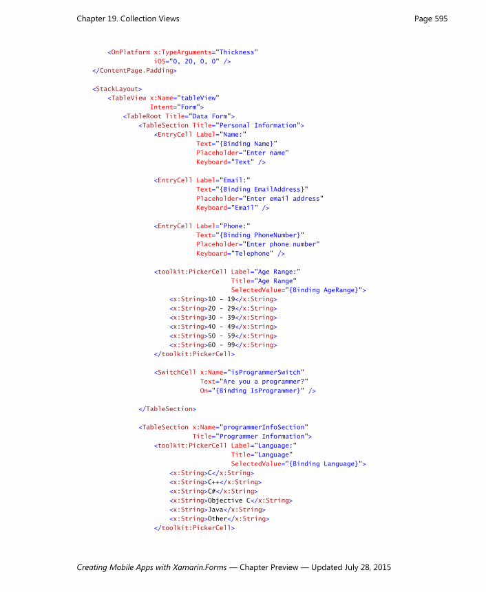
Chapter 19. Collection Views Page 595
Creating Mobile Apps with Xamarin.Forms — Chapter Preview — Updated July 28, 2015
<OnPlatform x:TypeArguments="Thickness"
iOS="0, 20, 0, 0" />
</ContentPage.Padding>
<StackLayout>
<TableView x:Name="tableView"
Intent="Form">
<TableRoot Title="Data Form">
<TableSection Title="Personal Information">
<EntryCell Label="Name:"
Text="{Binding Name}"
Placeholder="Enter name"
Keyboard="Text" />
<EntryCell Label="Email:"
Text="{Binding EmailAddress}"
Placeholder="Enter email address"
Keyboard="Email" />
<EntryCell Label="Phone:"
Text="{Binding PhoneNumber}"
Placeholder="Enter phone number"
Keyboard="Telephone" />
<toolkit:PickerCell Label="Age Range:"
Title="Age Range"
SelectedValue="{Binding AgeRange}">
<x:String>10 - 19</x:String>
<x:String>20 - 29</x:String>
<x:String>30 - 39</x:String>
<x:String>40 - 49</x:String>
<x:String>50 - 59</x:String>
<x:String>60 - 99</x:String>
</toolkit:PickerCell>
<SwitchCell x:Name="isProgrammerSwitch"
Text="Are you a programmer?"
On="{Binding IsProgrammer}" />
</TableSection>
<TableSection x:Name="programmerInfoSection"
Title="Programmer Information">
<toolkit:PickerCell Label="Language:"
Title="Language"
SelectedValue="{Binding Language}">
<x:String>C</x:String>
<x:String>C++</x:String>
<x:String>C#</x:String>
<x:String>Objective C</x:String>
<x:String>Java</x:String>
<x:String>Other</x:String>
</toolkit:PickerCell>

Chapter 19. Collection Views Page 596
Creating Mobile Apps with Xamarin.Forms — Chapter Preview — Updated July 28, 2015
<toolkit:PickerCell Label="Platform:"
Title="Platform"
SelectedValue="{Binding Platform}">
<x:String>iPhone</x:String>
<x:String>Android</x:String>
<x:String>Windows Phone</x:String>
<x:String>Other</x:String>
</toolkit:PickerCell>
</TableSection>
</TableRoot>
</TableView>
</StackLayout>
</ContentPage>
The constructor in the code-behind file handles the rest. It creates the ProgrammerInformation
object to set to the BindingContext of the TableView, and then removes the second TableSec-
tion from the TableRoot. The page constructor then sets a handler for the PropertyChanged event
of ProgrammerInformation and waits for changes to the IsProgrammer property:
public partial class ConditionalSectionPage : ContentPage
{
public ConditionalSectionPage()
{
InitializeComponent();
// Set BindingContext of TableView.
ProgrammerInformation programmerInfo = new ProgrammerInformation();
tableView.BindingContext = programmerInfo;
// Remove programmer-information section!
tableView.Root.Remove(programmerInfoSection);
// Watch for changes in IsProgrammer property in ProgrammerInformation.
programmerInfo.PropertyChanged += (sender, args) =>
{
if (args.PropertyName == "IsProgrammer")
{
if (programmerInfo.IsProgrammer &&
tableView.Root.IndexOf(programmerInfoSection) == -1)
{
tableView.Root.Add(programmerInfoSection);
}
if (!programmerInfo.IsProgrammer &&
tableView.Root.IndexOf(programmerInfoSection) != -1)
{
tableView.Root.Remove(programmerInfoSection);
}
}
};
}
}
In theory, the PropertyChanged handler doesn’t need to check if the TableSection is already part

Chapter 19. Collection Views Page 597
Creating Mobile Apps with Xamarin.Forms — Chapter Preview — Updated July 28, 2015
of the TableRoot collection before adding it, or check if it’s not part of the collection before attempt-
ing to remove it, but the checks don’t hurt.
Here’s the program when it first starts up with only one section visible:
Toggling the SwitchCell on brings the two additional properties into view:
You don’t need to have a single BindingContext for the whole TableView. Each TableSection

Chapter 19. Collection Views Page 598
Creating Mobile Apps with Xamarin.Forms — Chapter Preview — Updated July 28, 2015
can have its own BindingContext, which means that you can divide your ViewModels to coordinate
more closely with the TableView layout.
A TableView menu Besides displaying data, or serving as a form or settings dialog, a TableView can also be a menu.
Functionally, a menu is a collection of buttons, although they might not look like traditional buttons.
Each menu item is a command that triggers a program operation.
This is why TextCell and ImageCell have Command and CommandParameter properties. These
cells can trigger commands defined in a ViewModel, or simply some other property of type ICommand.
The XAML file in the MenuCommand program binds the Command properties of four TextCell
elements with a property named MoveCommand, and passes to that MoveCommand arguments named
“left”, “up”, “right”, and “down”:
<ContentPage xmlns="http://xamarin.com/schemas/2014/forms"
xmlns:x="http://schemas.microsoft.com/winfx/2009/xaml"
x:Class="MenuCommands.MenuCommandsPage"
x:Name="page">
<ContentPage.Padding>
<OnPlatform x:TypeArguments="Thickness"
iOS="0, 20, 0, 0" />
</ContentPage.Padding>
<StackLayout>
<TableView Intent="Menu"
VerticalOptions="Fill"
BindingContext="{x:Reference page}">
<TableRoot>
<TableSection Title="Move the Box">
<TextCell Text="Left"
Command="{Binding MoveCommand}"
CommandParameter="left" />
<TextCell Text="Up"
Command="{Binding MoveCommand}"
CommandParameter="up" />
<TextCell Text="Right"
Command="{Binding MoveCommand}"
CommandParameter="right" />
<TextCell Text="Down"
Command="{Binding MoveCommand}"
CommandParameter="down" />
</TableSection>
</TableRoot>
</TableView>
<AbsoluteLayout BackgroundColor="Maroon"
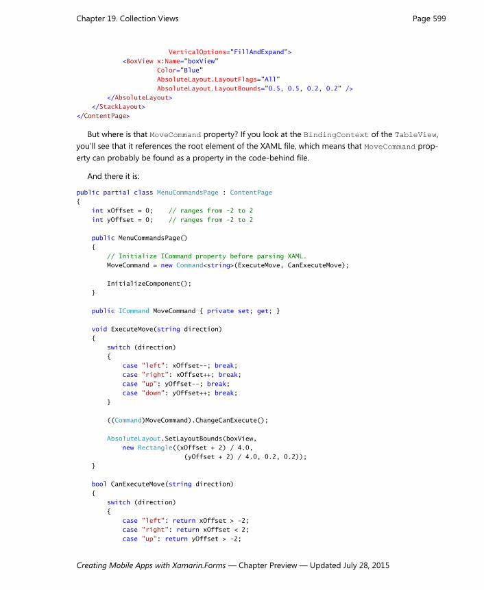
Chapter 19. Collection Views Page 599
Creating Mobile Apps with Xamarin.Forms — Chapter Preview — Updated July 28, 2015
VerticalOptions="FillAndExpand">
<BoxView x:Name="boxView"
Color="Blue"
AbsoluteLayout.LayoutFlags="All"
AbsoluteLayout.LayoutBounds="0.5, 0.5, 0.2, 0.2" />
</AbsoluteLayout>
</StackLayout>
</ContentPage>
But where is that MoveCommand property? If you look at the BindingContext of the TableView,
you’ll see that it references the root element of the XAML file, which means that MoveCommand prop-
erty can probably be found as a property in the code-behind file.
And there it is:
public partial class MenuCommandsPage : ContentPage
{
int xOffset = 0; // ranges from -2 to 2
int yOffset = 0; // ranges from -2 to 2
public MenuCommandsPage()
{
// Initialize ICommand property before parsing XAML.
MoveCommand = new Command<string>(ExecuteMove, CanExecuteMove);
InitializeComponent();
}
public ICommand MoveCommand { private set; get; }
void ExecuteMove(string direction)
{
switch (direction)
{
case "left": xOffset--; break;
case "right": xOffset++; break;
case "up": yOffset--; break;
case "down": yOffset++; break;
}
((Command)MoveCommand).ChangeCanExecute();
AbsoluteLayout.SetLayoutBounds(boxView,
new Rectangle((xOffset + 2) / 4.0,
(yOffset + 2) / 4.0, 0.2, 0.2));
}
bool CanExecuteMove(string direction)
{
switch (direction)
{
case "left": return xOffset > -2;
case "right": return xOffset < 2;
case "up": return yOffset > -2;

Chapter 19. Collection Views Page 600
Creating Mobile Apps with Xamarin.Forms — Chapter Preview — Updated July 28, 2015
case "down": return yOffset < 2;
}
return false;
}
}
The Execute method manipulates the layout bounds of a BoxView in the XAML file so that it
moves around the AbsoluteLayout. The CanExecute method disables an operation if the BoxView
has been moved to one of the edges.
Only on iOS does the disabled TextCell actually appear with a typical gray coloring, but on all
three platforms the TextCell is no longer functional if the CanExecute method returns false:
You can also use TableView as a menu for page navigation or working with master/detail pages,
and for these particular applications you might wonder if a ListView or TableView is the right tool
for the job. Generally it’s ListView if you have a collection of items that should all be displayed in the
same way, or TableView for fewer items that might require individual attention.
What is certain is that you’ll definitely see more examples in the chapters ahead.