chapter 1 · ×100% = 43.3% 5 finally, total the percentages and record. note that the percentages...
TRANSCRIPT
P1: FXS/ABE P2: FXS0521672600Xc01.xml CUAU034-EVANS September 15, 2008 20:51
C H A P T E R
1Univariate data
What are categorical and numerical data?
What is a bar chart and when is it used?
What is a histogram and when is it used?
What is a stem-and-leaf plot and when is it used?
What are the mean, median, range, interquartile range, variance and standard
deviation?
What are the properties of these summary statistics and when is each used?
How do we construct and interpret boxplots?
1.1 Types of variablesSuppose we were to go around the class and ask each student their height. We would expect to
get quite a variety of answers. In this context, the characteristic height is called a variable,
because its value is not always the same.
Several types of variables can be identified. Consider the following situations:
Students answer a question by selecting ‘yes’, ‘no’ or ‘don’t know’.
Students say how they feel about a particular statement by ticking one of ‘strongly agree’,
‘agree’, ‘no opinion’, ‘disagree’ or ‘strongly disagree’.
Students write down the number of brothers they have.
Students write down their height.
These situations give rise to two different broad classifications of data.
Categorical dataThe data arising from the first two situations are called categorical data, because the data can
only be classified by the name of the categories it belongs to. There is no quantity associated
with each category.
Numerical dataThe data arising from the third and fourth situations are called numerical data. These
examples differ slightly from each other in the type of numerical data they generate.
1Cambridge University Press • Uncorrected Sample Pages • 978-0-521-74049-4 2008 © Evans, Lipson, Jones, Avery, TI-Nspire & Casio ClassPad material prepared in collaboration with Jan Honnens & David Hibbard
SAMPLE
Back to Menu >>>

P1: FXS/ABE P2: FXS0521672600Xc01.xml CUAU034-EVANS September 15, 2008 20:51
2 Essential Standard General Mathematics
The number of brothers will give rise to numbers such as 0, 1, 2, . . . These are called
discrete data, because the data can only take particular numerical values. Discrete data
often arises in situations where counting is involved.
Students’ heights will give rise to numbers such as 157.5 cm, 168.2 cm, . . . This is called
continuous data, because the variable can take any numerical value (sometimes within a
specified interval). Continuous data is often generated when measuring is involved.
Exercise 1A
1 Classify the data that arises from the following situations as categorical or numerical.
a Kindergarten pupils bring along their favourite toys, and they are grouped together under
the headings ‘dolls’, ‘soft toys’, ‘games’, ‘cars’ and ‘other’.
b The numbers of students on each of 20 school buses are counted.
c A group of people each write down their favourite colour.
d Each student in a class is weighed in kilograms.
e Each student in a class is weighed and then classified as ‘light’, ‘average’ or ‘heavy’.
f People rate their enthusiasm for a certain rock group as ‘low’, ‘medium’ or ‘high’.
2 Classify the data that arises from the following situations as categorical or numerical.
a The intelligence quotient (IQ) of a group of students is measured using a test.
b A group of people are asked to indicate their attitude to capital punishment by selecting a
number from 1 to 5, where 1 = strongly disagree, 2 = disagree, 3 = undecided,
4 = agree and 5 = strongly agree.
3 Classify the following numerical data as discrete or continuous.
a The number of pages in a book
b The price paid to fill the tank of a car with petrol
c The amount (in litres) of petrol used to fill the tank of a car
d The time between the arrival of successive customers at an ATM
e The number of people at a football match
1.2 Organising and displaying categorical dataWhen analysing categorical data, we are often asked to make sense of a large number of data
values that are given in no particular order. For example, if 30 children were offered a choice
of a sandwich, a salad or a pie for lunch, we might end up with a data set like the following:
sandwich, salad, salad, pie, sandwich, sandwich, salad, salad, pie, pie, pie, salad, pie,
sandwich, salad, pie, salad, pie, sandwich, sandwich, pie, salad, salad, pie, pie, pie, salad, pie,
sandwich, pie
To make sense of the data, we first need to organise it into a more manageable form.
Cambridge University Press • Uncorrected Sample Pages • 978-0-521-74049-4 2008 © Evans, Lipson, Jones, Avery, TI-Nspire & Casio ClassPad material prepared in collaboration with Jan Honnens & David Hibbard
SAMPLE
Back to Menu >>>
P1: FXS/ABE P2: FXS0521672600Xc01.xml CUAU034-EVANS September 15, 2008 20:51
Chapter 1 — Univariate data 3
The frequency tableThe statistical tool used for this purpose is the frequency table. A frequency table is a listing
of the values a variable takes in a data set, along with how often (frequently) each value occurs.
When frequencies are expressed as a proportion of the total number they are called relative
frequencies. Multiplying the relative frequencies by 100 converts them to percentage
frequencies, which are easier to interpret.
Frequency can be recorded as a:
frequency or count: the number of times a value occurs, or
percentage frequency: the percentage of times a value occurs.
percentage frequency = count
total× 100%
A listing of the values a variable takes, along with how frequently each of these values occurs
in a data set, is also called a frequency distribution.
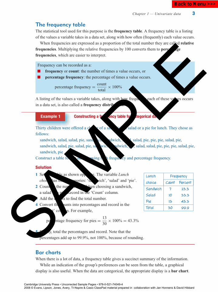
Example 1 Constructing a frequency table for categorical data
Thirty children were offered a choice of a sandwich, a salad or a pie for lunch. They chose as
follows:
sandwich, salad, salad, pie, sandwich, sandwich, salad, salad, pie, pie, pie, salad, pie,
sandwich, salad, pie, salad, pie, sandwich, sandwich, pie, salad, salad, pie, pie, pie, salad, pie,
sandwich, pie
Construct a table for the data showing both frequency and percentage frequency.
Solution
1 Set up a table as shown opposite. The variable Lunch
choice has three categories: ‘sandwich’, ‘salad’ and ‘pie’.
2 Count up the number of children choosing a sandwich,
a salad or a pie. Record in the ‘Count’ column.
3 Add the counts to find the total number.
4 Convert the counts into percentages and record in the
‘Percent’ column. For example,
percentage frequency for pies = 13
30× 100% = 43.3%
5 Finally, total the percentages and record. Note that the
percentages add up to 99.9%, not 100%, because of rounding.
Lunch Frequency
choice Count Percent
Sandwich 7 23.3
Salad 10 33.3
Pie 13 43.3
Total 30 99.9
Bar chartsWhen there is a lot of data, a frequency table gives a succinct summary of the information.
While an indication of the group’s preferences can be seen from the table, a graphical
display is also useful. When the data are categorical, the appropriate display is a bar chart.
Cambridge University Press • Uncorrected Sample Pages • 978-0-521-74049-4 2008 © Evans, Lipson, Jones, Avery, TI-Nspire & Casio ClassPad material prepared in collaboration with Jan Honnens & David Hibbard
SAMPLE
Back to Menu >>>

P1: FXS/ABE P2: FXS0521672600Xc01.xml CUAU034-EVANS September 15, 2008 20:51
4 Essential Standard General Mathematics
In a bar chart:
frequency or percentage frequency is shown on the vertical axis
the variable being displayed is plotted on the horizontal axis
the height of the bar (column) gives the frequency (or percentage)
the bars are drawn with gaps between them to indicate that each value is a separate
category
there is one bar for each category.
Example 2 Constructing a bar chart from a frequency table
Construct a bar chart for the number of students
making each lunch choice shown in the frequency
table opposite.
Lunch Frequency
choice Count Percent
Sandwich 7 23.3
Salad 10 33.3
Pie 13 43.3
Total 30 99.9
Solution
1 Label the horizontal axis with the variable
name, ‘Lunch choice’. Mark the scale off
into three equal intervals and label them
‘Pie’, Salad’ and ‘Sandwich’.
2 Label the vertical axis ‘Frequency’. Scale,
allowing for the maximum frequency,
13. Up to 15 would be appropriate.
Mark the scale in 5s.
3 For each interval, draw in a bar as shown.
Make the width of each bar less than the
width of the category intervals, to show
that the categories are quite separate.
The height of each bar is equal to the
frequency count.
15
10
0
5Fre
que
ncy
Lunch choice
SandwichSaladPie
Note: The order in which the categories are listed on the horizontal axis in a bar chart is not important, as noorder is inherent in the category labels. In this bar chart, the categories are listed in decreasing order byfrequency. From the bar chart, the lunch preferences of the children may be easily compared.
Cambridge University Press • Uncorrected Sample Pages • 978-0-521-74049-4 2008 © Evans, Lipson, Jones, Avery, TI-Nspire & Casio ClassPad material prepared in collaboration with Jan Honnens & David Hibbard
SAMPLE
Back to Menu >>>

P1: FXS/ABE P2: FXS0521672600Xc01.xml CUAU034-EVANS September 15, 2008 20:51
Chapter 1 — Univariate data 5
Bar charts can be constructed equally well using
the percentages in each category rather than the
number in each category. The bar chart will look
exactly the same, except the vertical axis will show
percentage frequencies, as shown opposite.
45
1015202530
4035
05
Fre
quen
cy (
%)
Lunch choiceSandwichSaladPie
The mode or modal categoryOne of the features of a data set that is quickly revealed with a bar chart is the mode or modal
category. This is the most frequently occurring category. In a bar chart, this is given by the
category with the tallest bar. For the bar chart above, the modal category is clearly Pie. That is,
for the children asked, the most frequent or popular lunch choice was a pie.
However, the mode is of interest only when a single value or category in the frequency table
occurs much more often than the others. Modes are of particular importance in popularity
polls. For example, in answering questions like ‘Which is the most frequently watched TV
station between the hours of 6.00 and 8.00 pm?’ or ‘When is a supermarket is in peak demand:
morning, afternoon or night?’
Exercise 1B
1 The sex of 15 people in a bus is as shown (F = female, M = male):
F M M M F M F F M M M F M M M
Construct a frequency table for the data including both frequency and percentage
frequency.
2 The shoe sizes of 20 eighteen-year-old males are as shown:
8 9 9 10 8 8 7 9 8 9
10 12 8 10 7 8 8 7 11 11
Construct a frequency table for the data including both frequency and percentage
frequency.
Cambridge University Press • Uncorrected Sample Pages • 978-0-521-74049-4 2008 © Evans, Lipson, Jones, Avery, TI-Nspire & Casio ClassPad material prepared in collaboration with Jan Honnens & David Hibbard
SAMPLE
Back to Menu >>>

P1: FXS/ABE P2: FXS0521672600Xc01.xml CUAU034-EVANS September 15, 2008 20:51
6 Essential Standard General Mathematics
3 The table shows the frequency distribution of the favourite type of fast food of a group of
students.
a Complete the table.
b How many students preferred Chinese food?
c What percentage of students gave Chicken
as their favourite fast food?
d What was the favourite type of fast food for
these students?
e Construct a frequency bar chart using the
number in each category.
Frequency
Food type Count Percent
Hamburgers 23 33.3
Chicken 7 10.1
Fish and chips 6
Chinese 7 10.1
Pizza 18
Other 8 11.6
Total 99.9
4 The following responses were received to a question regarding the return of capital
punishment.
a Complete the table.
b How many people said Strongly agree?
c What percentage of people said Strongly
disagree?
d What was the most frequent response?
e Construct a bar chart of the frequencies
(count).
Attitude to capital Frequency
punishment Count Percent
Strongly agree 21 8.2
Agree 11 4.3
Don’t know 42
Disagree
Strongly disagree 129 50.4
Total 256 100.0
5 A video shop proprietor took note of the types of films borrowed during a particular day,
with the following results.
a Complete the table.
b How many films borrowed were Horror?
c What percentage of films were Comedy?
d How many films were borrowed in total?
e Construct a bar chart of the frequencies (count).
Frequency
Type of film Count Percent
Comedy 53 22.8
Drama 89
Horror 42 18.1
Musical 15
Other 33 14.2
Total 232
6 A survey of secondary school students’ preferred ways of spending their leisure time at
home gave the following results.
a How many students were surveyed?
b What percentage of students said that they
preferred to spend their leisure time phoning
a friend?
c What was the most popular way of spending
their leisure time for these students?
d Construct a bar chart of the percentage
frequencies.
Frequency
Leisure activity Count Percent
Watch TV 84 42
Read 26 13
Listen to music 46 23
Watch a video 24 12
Phone friends 8 4
Other 12 6
Total 200 100
Cambridge University Press • Uncorrected Sample Pages • 978-0-521-74049-4 2008 © Evans, Lipson, Jones, Avery, TI-Nspire & Casio ClassPad material prepared in collaboration with Jan Honnens & David Hibbard
SAMPLE
Back to Menu >>>
P1: FXS/ABE P2: FXS0521672600Xc01.xml CUAU034-EVANS September 15, 2008 20:51
Chapter 1 — Univariate data 7
1.3 Organising and displaying numerical dataFrequency tables can also be used to organise numerical data. For discrete numerical data, the
process is exactly the same as that for categorical data, as shown in the following example.
Discrete data
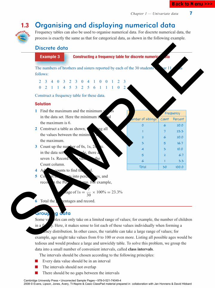
Example 3 Constructing a frequency table for discrete numerical data
The numbers of brothers and sisters reported by each of the 30 students in Year 11 are as
follows:
2 3 4 0 3 2 3 0 4 1 0 0 1 2 3
0 2 1 1 4 5 3 2 5 6 1 1 1 0 2
Construct a frequency table for these data.
Solution
1 Find the maximum and the minimum values
in the data set. Here the minimum is 0 and
the maximum is 6.
2 Construct a table as shown, including all
the values between the minimum and
the maximum.
3 Count up the number of 0s, 1s, 2s, etc.
in the data set. For example, there are
seven 1s. Record these values in the
Count column.
4 Add the counts to find the total.
5 Convert the counts into percentages, and
record in the Percent column. For example,
percentage of 1s = 7
30× 100% = 23.3%
6 Total the percentages and record.
Frequency
Number of siblings Count Percent
0 6 20.0
1 7 23.3
2 6 20.0
3 5 16.7
4 3 10.0
5 2 6.7
6 1 3.3
Total 30 100.0
Grouping dataSome variables can only take on a limited range of values; for example, the number of children
in a family. Here, it makes sense to list each of these values individually when forming a
frequency distribution. In other cases, the variable can take a large range of values; for
example, age might take values from 0 to 100 or even more. Listing all possible ages would be
tedious and would produce a large and unwieldy table. To solve this problem, we group the
data into a small number of convenient intervals, called class intervals.
The intervals should be chosen according to the following principles:
Every data value should be in an interval
The intervals should not overlap
There should be no gaps between the intervals
Cambridge University Press • Uncorrected Sample Pages • 978-0-521-74049-4 2008 © Evans, Lipson, Jones, Avery, TI-Nspire & Casio ClassPad material prepared in collaboration with Jan Honnens & David Hibbard
SAMPLE
Back to Menu >>>
P1: FXS/ABE P2: FXS0521672600Xc01.xml CUAU034-EVANS September 15, 2008 20:51
8 Essential Standard General Mathematics
The choice of intervals can vary, but generally a division which results in about 5 to 15 groups
is preferred. It is also usual to choose an interval width which is easy for the reader to
interpret, such as 10 units, 100 units, 1000 units etc. (depending on the data). By convention,
the beginning of the interval is given the appropriate exact value, rather than the end. For
example, intervals of 0–49, 50–99, 100–149 would be preferred over the intervals 1–50,
51–100, 101–150 etc.
Grouped discrete data
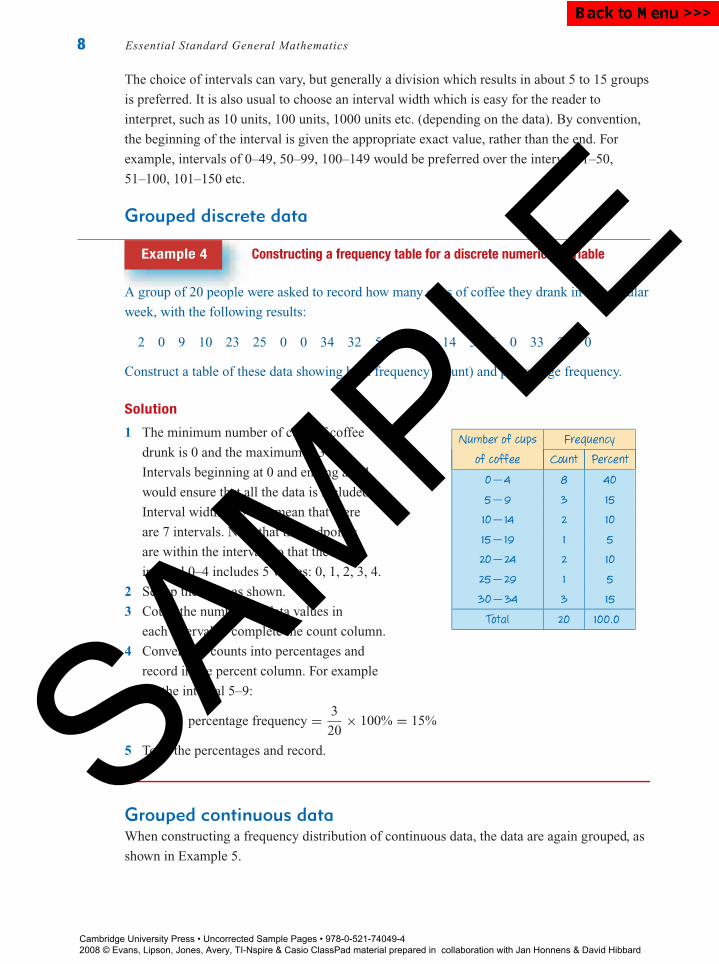
Example 4 Constructing a frequency table for a discrete numerical variable
A group of 20 people were asked to record how many cups of coffee they drank in a particular
week, with the following results:
2 0 9 10 23 25 0 0 34 32 5 0 17 14 3 6 0 33 23 0
Construct a table of these data showing both frequency (count) and percentage frequency.
Solution
1 The minimum number of cups of coffee
drunk is 0 and the maximum is 34.
Intervals beginning at 0 and ending at 34
would ensure that all the data is included.
Interval width of 5 will mean that there
are 7 intervals. Note that the endpoints
are within the interval, so that the
interval 0–4 includes 5 values: 0, 1, 2, 3, 4.
2 Set up the table as shown.
3 Count the numbers of data values in
each interval to complete the count column.
4 Convert the counts into percentages and
record in the percent column. For example
for the interval 5–9:
percentage frequency = 3
20× 100% = 15%
5 Total the percentages and record.
Number of cups Frequency
of coffee Count Percent
0−4 8 40
5−9 3 15
10−14 2 10
15−19 1 5
20−24 2 10
25−29 1 5
30−34 3 15
Total 20 100.0
Grouped continuous dataWhen constructing a frequency distribution of continuous data, the data are again grouped, as
shown in Example 5.
Cambridge University Press • Uncorrected Sample Pages • 978-0-521-74049-4 2008 © Evans, Lipson, Jones, Avery, TI-Nspire & Casio ClassPad material prepared in collaboration with Jan Honnens & David Hibbard
SAMPLE
Back to Menu >>>

P1: FXS/ABE P2: FXS0521672600Xc01.xml CUAU034-EVANS September 15, 2008 20:51
Chapter 1 — Univariate data 9
Example 5 Constructing a frequency table for a continuous numerical variable
The following are the heights of the 41 players in a basketball
club, measured in centimetres:
178.1 185.6 173.3 193.4 183.1 193.0 188.3 189.5
184.6 202.4 170.9 183.3 180.3 182.0 183.6 184.5
185.8 189.1 178.6 194.7 185.3 188.7 192.4 203.7
191.1 189.7 191.1 180.4 180.0 180.1 170.5 179.3
193.8 196.3 189.6 183.9 177.7 184.1 183.8 174.7
178.9
Construct a frequency table of these data.
Solution
1 Find the minimum and maximum heights,
which are 170.5 cm and 203.7. A minimum
value of 170 and a maximum of 204.9 will
ensure that all the data is included.
2 Interval width of 5 cm will mean that there
are 7 intervals from 170 to 204.9, which is
within the guidelines of 5–15 intervals.
3 Set up the table as shown. All values of the
variable which are from 170 to 174.9 have
been included in the first interval. The
second interval includes values from
175 to 179.9, and so on for the rest of the table.
4 The numbers of data values in each interval
are then counted to complete the count
column of the table.
5 Convert the counts into percentages and record.
For example for the interval
175.0–179.9:
percentage frequency = 5
41× 100% = 12.2%
Frequency
Heights Count Percent
170−174.9 4 9.8
175−179.9 5 12.2
180−184.9 13 31.7
185−189.9 9 22.0
190−194.9 7 17.1
195−199.9 1 2.4
200−204.9 2 4.9
Total 41 100.1
The interval which has the highest class frequency is called the modal interval or modal
class. Here the modal class is 180.0–184.9, as 13 players (31.7%) have heights that fall into
this interval.
Cumulative frequenciesTo answer questions concerning the number or proportion of the data values which are less
than a given value, a cumulative frequency distribution can be constructed. In a cumulative
frequency distribution, the number of observations in each class is accumulated from low to
high values of the variable.
Cambridge University Press • Uncorrected Sample Pages • 978-0-521-74049-4 2008 © Evans, Lipson, Jones, Avery, TI-Nspire & Casio ClassPad material prepared in collaboration with Jan Honnens & David Hibbard
SAMPLE
Back to Menu >>>
P1: FXS/ABE P2: FXS0521672600Xc01.xml CUAU034-EVANS September 15, 2008 20:51
10 Essential Standard General Mathematics
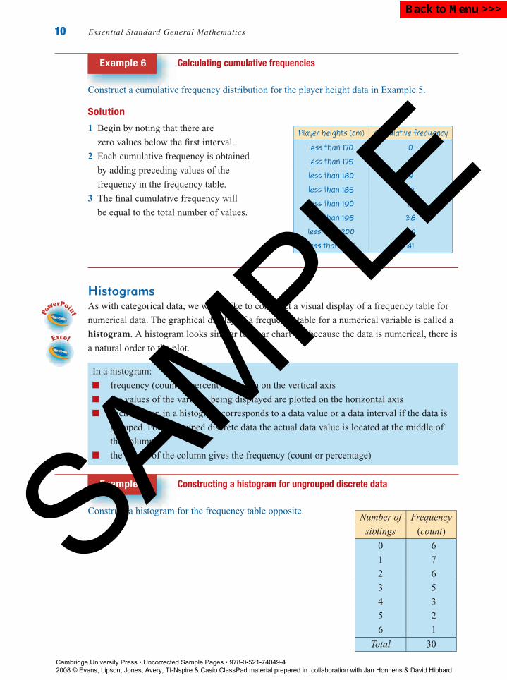
Example 6 Calculating cumulative frequencies
Construct a cumulative frequency distribution for the player height data in Example 5.
Solution
1 Begin by noting that there are
zero values below the first interval.
2 Each cumulative frequency is obtained
by adding preceding values of the
frequency in the frequency table.
3 The final cumulative frequency will
be equal to the total number of values.
Player heights (cm) Cumulative frequency
less than 170 0
less than 175 4
less than 180 9
less than 185 22
less than 190 31
less than 195 38
less than 200 39
less than 205 41
HistogramsAs with categorical data, we would like to construct a visual display of a frequency table for
numerical data. The graphical display of a frequency table for a numerical variable is called a
histogram. A histogram looks similar to a bar chart but because the data is numerical, there is
a natural order to the plot.
In a histogram:
frequency (count or percent) is shown on the vertical axis
the values of the variable being displayed are plotted on the horizontal axis
each column in a histogram corresponds to a data value or a data interval if the data is
grouped. For ungrouped discrete data the actual data value is located at the middle of
the column.
the height of the column gives the frequency (count or percentage)
Example 7 Constructing a histogram for ungrouped discrete data
Construct a histogram for the frequency table opposite.Number of Frequency
siblings (count)
0 6
1 7
2 6
3 5
4 3
5 2
6 1
Total 30
Cambridge University Press • Uncorrected Sample Pages • 978-0-521-74049-4 2008 © Evans, Lipson, Jones, Avery, TI-Nspire & Casio ClassPad material prepared in collaboration with Jan Honnens & David Hibbard
SAMPLE
Back to Menu >>>

P1: FXS/ABE P2: FXS0521672600Xc01.xml CUAU034-EVANS September 15, 2008 20:51
Chapter 1 — Univariate data 11
Solution
1 Label the horizontal axis with the variable name
‘Number of siblings’. Mark in the scale in units,
so that it includes all possible values.
2 Label the vertical axis ‘Frequency’. Scale, allowing
for the maximum frequency, 7. Up to 8 would be
appropriate. Mark the scale in units.
8
7
6
6
5
5
3
3
2
2
1
10
0
4
4
Number of siblings
Fre
que
ncy
3 For each data value, draw in a column. The data is
discrete, so make the width of each column 1, starting
and ending halfway between data values. For example,
the column representing 2 siblings starts at 1.5 and
ends at 2.5. The height of each column is equal to
the frequency.
Example 8 Constructing a histogram for continuous data
Construct a histogram for the frequency
table opposite.Height (cm) Frequency (count)
170.0−174.9 4
175.0−179.9 5
180.0−184.9 13
185.0−189.9 9
190.0−194.9 7
195.0−199.9 1
200.0−204.9 2
Total 41
Solution
1 Label the horizontal axis with the variable
name ‘Height’. Mark in the scale using the
beginning of each interval as the scale
points; that is, 170, 175, . . .
2 Label the vertical axis ‘Frequency’. Scale,
allowing for the maximum frequency, 13.
Up to 15 would be appropriate. Mark the
scale in units.
3 For each interval draw in a column. Each
column starts at the beginning of the interval
and finishes at the beginning of the next
interval. Make the height of each column
equal to the frequency.
15
10
5
0
Fre
que
ncy
170
175 18
018
519
019
520
020
5
Height (cm)
Cambridge University Press • Uncorrected Sample Pages • 978-0-521-74049-4 2008 © Evans, Lipson, Jones, Avery, TI-Nspire & Casio ClassPad material prepared in collaboration with Jan Honnens & David Hibbard
SAMPLE
Back to Menu >>>

P1: FXS/ABE P2: FXS0521672600Xc01.xml CUAU034-EVANS September 15, 2008 20:51
12 Essential Standard General Mathematics
Constructing a histogram using a graphics calculatorIt is relatively quick to construct a histogram from a frequency table. However, if you only
have the data (as you mostly do), it is a very slow process because you have to construct the
frequency table first. Fortunately, a graphics calculator will do this for us.
How to construct a histogram using the TI-Nspire CAS
Display the following set of 27 marks in the form of a histogram.
16 11 4 25 15 7 14 13 14 12 15 13 16 14
15 12 18 22 17 18 23 15 13 17 18 22 23
Steps1 Start a new document: Press and select
6:New Document (or press / + N). If
prompted to save an existing document move
cursor to No and press enter .
2 Select 3:Add Lists & Spreadsheet.Enter the data into a list named marks.
a Move the cursor to the name space of
column A (or any other column) and type in
marks as the list name. Press enter .
b Move the cursor down to row 1, type in the
first data value and press enter .
Continue until all the data has been entered.
Press enter after each entry.
3 Statistical graphing is done through the Data &Statistics application.
Press and select 5:Data & Statistics.
Note: A random display of dots will appear – this is toindicate list data are available for plotting. It is not astatistical plot.
a Move cursor to the text box area below the
horizontal axis. Press (click) when
prompted and select the variable marks.
Press enter to paste the variable marks to that
axis.
b A dot plot is displayed as the default plot. To
change the plot to a histogram press
b/1:Plot Type/3:Histogram.
Keystrokes: b .Cambridge University Press • Uncorrected Sample Pages • 978-0-521-74049-4 2008 © Evans, Lipson, Jones, Avery, TI-Nspire & Casio ClassPad material prepared in collaboration with Jan Honnens & David Hibbard
SAMPLE
Back to Menu >>>
P1: FXS/ABE P2: FXS0521672600Xc01.xml CUAU034-EVANS September 15, 2008 20:51
Chapter 1 — Univariate data 13
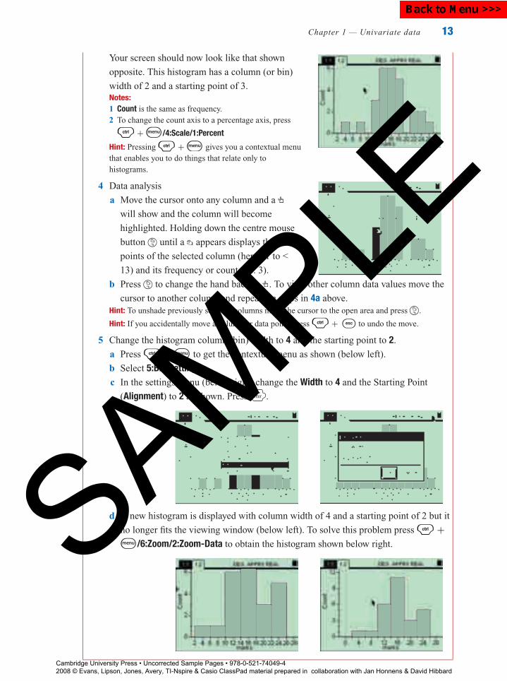
Your screen should now look like that shown
opposite. This histogram has a column (or bin)
width of 2 and a starting point of 3.Notes:1 Count is the same as frequency.2 To change the count axis to a percentage axis, press
/ +b/4:Scale/1:Percent
Hint: Pressing / +b gives you a contextual menuthat enables you to do things that relate only tohistograms.
4 Data analysis
a Move the cursor onto any column and a
will show and the column will become
highlighted. Holding down the centre mouse
button until a appears displays the end
points of the selected column (here 11 to <
13) and its frequency or count (i.e. 3).
b Press to change the hand back to . To view other column data values move the
cursor to another column and repeat the steps in 4a above.Hint: To unshade previously selected columns move the cursor to the open area and press .
Hint: If you accidentally move a column or data point, press / + to undo the move.
5 Change the histogram column (bin) width to 4 and the starting point to 2.
a Press / + b to get the contextual menu as shown (below left).
b Select 5:Bin Settings.
c In the settings menu (below right) change the Width to 4 and the Starting Point
(Alignment) to 2 as shown. Press enter .
d A new histogram is displayed with column width of 4 and a starting point of 2 but it
no longer fits the viewing window (below left). To solve this problem press / +b/6:Zoom/2:Zoom-Data to obtain the histogram shown below right.
Cambridge University Press • Uncorrected Sample Pages • 978-0-521-74049-4 2008 © Evans, Lipson, Jones, Avery, TI-Nspire & Casio ClassPad material prepared in collaboration with Jan Honnens & David Hibbard
SAMPLE
Back to Menu >>>
P1: FXS/ABE P2: FXS0521672600Xc01.xml CUAU034-EVANS September 15, 2008 20:51
14 Essential Standard General Mathematics
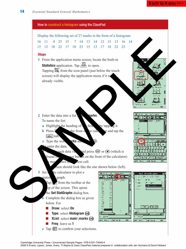
How to construct a histogram using the ClassPad
Display the following set of 27 marks in the form of a histogram.
16 11 4 25 15 7 14 13 14 12 15 13 16 14
15 12 18 22 17 18 23 15 13 17 18 22 23
Steps1 From the application menu screen, locate the built-in
Statistics application. Tap to open.
Tapping from the icon panel (just below the touch
screen) will display the application menu if it is not
already visible.
2 Enter the data into a list named marks.
To name the list:
a Highlight the heading of the first list by tapping it.
b Press k on the front of the calculator and tap the
tab.
c Type the word marks and press E.
To enter the data:
d Type in each data value and press E or (which is
found on the cursor button on the front of the calculator)
to move down to the next cell.
The screen should look like the one shown below (left).
3 Set up the calculator to plot a
statistical graph.
a Tap from the toolbar at the
top of the screen. This opens
the Set StatGraphs dialog box.
b Complete the dialog box as given
below. For
Draw: select OnType: select Histogram ( )XList: select main\marks ( )Freq: leave as 1
c Tap h to confirm your selections.
Cambridge University Press • Uncorrected Sample Pages • 978-0-521-74049-4 2008 © Evans, Lipson, Jones, Avery, TI-Nspire & Casio ClassPad material prepared in collaboration with Jan Honnens & David Hibbard
SAMPLE
Back to Menu >>>

P1: FXS/ABE P2: FXS0521672600Xc01.xml CUAU034-EVANS September 15, 2008 20:51
Chapter 1 — Univariate data 15
Note: To make sure only this graph is drawn, select SetGraph from the menu bar at the top andconfirm there is a tick only beside StatGraph1 and no others.
4 To plot the graph:
a Tap in the toolbar at
the top of the screen.
b Complete the Set Interval dialog
box for the histogram as given
below. For� HStart: type in 2 (i.e. the
starting point of the first
interval)� HStep: type in 4 (i.e. the
interval width)
Tap OK.
The screen is split into two halves, with the graph displayed in the bottom half, as
shown opposite.
Tapping from the icon panel
will allow the graph to fill the entire
screen. The graph is drawn in an
automatically scaled window. Tap
again to return to half-screen
size.
Tapping from the toolbar places
a marker at the top of the first column of
the histogram (see opposite)
and tells us that� the first interval begins at 2 (xc = 2)� for this interval, the frequency is 1 (Fc = 1)
To find the frequencies and starting points of the other intervals, use the arrow ( ) to
move from interval to interval.
Exercise 1C
1 The numbers of magazines purchased in a month by 15 different people were as follows:
0 5 3 0 1 0 2 4 3 1 0 2 1 2 1
Construct a frequency table for the data, including both the number and percentage in each
category.
2 The amounts of money carried by 20 students are as follows:
$4.55 $1.45 $16.70 $0.60 $5.00 $12.30 $3.45 $23.60 $6.90 $4.35
$0.35 $2.90 $1.70 $3.50 $8.30 $3.50 $2.20 $4.30 $0 $11.50Cambridge University Press • Uncorrected Sample Pages • 978-0-521-74049-4 2008 © Evans, Lipson, Jones, Avery, TI-Nspire & Casio ClassPad material prepared in collaboration with Jan Honnens & David Hibbard
SAMPLE
Back to Menu >>>

P1: FXS/ABE P2: FXS0521672600Xc01.xml CUAU034-EVANS September 15, 2008 20:51
16 Essential Standard General Mathematics
Construct a frequency table for the data, including both the number and percentage in each
category. Use intervals of $5, starting at $0.
3 A group of 28 students were asked to draw a line that they estimated to be the same length
as a 30 cm ruler. The results are shown in the frequency table below.
Length of line Frequency
(cm) Count Per cent
28.0−28.9 1 3.6
29.0−29.9 2 7.1
30.0−30.9 8 28.6
31.0−31.9 9 32.1
32.0−32.9 7 25.0
33.0−33.9 1 3.6
Total 28 100.0
a How many students drew a line with a length:
i from 29.0 to 29.9 cm?
ii of less than 30 cm?
iii of 32 cm or more?
b What percentage of students drew a line
with a length:
i from 31.0 to 31.9 cm?
ii of less than 31 cm?
iii of 30 cm or more?
c Use the table to construct a histogram using
the counts.
4 The number of children in the family for each student in a class is shown in the following
histogram.
Num
ber
of s
tude
nts 10
5
5 6 7 8 9 1043210
Children in family
a How many students are the only
child in a family?
b What is the most common number
of children in a family?
c How many students come from
families with 6 or more children?
d How many students are there in the class?
5 The following histogram gives the scores on a general knowledge quiz for a class of
Year 11 students.
Num
ber
of s
tude
nts 10
5
50 60 70 80 90 100403020100
Marks
a How many students scored from
10 to 19 marks?
b How many students attempted the
quiz?
c What is the modal class?
d If a mark of 50 or more is
designated as a pass, how many
students passed the quiz?
6 A student purchased 21 new textbooks from a school book supplier with the following
prices (in dollars):
21.65 14.95 12.80 7.95 32.50 23.99 23.99 7.80 3.50 7.99 42.98
18.50 19.95 3.20 8.90 17.15 4.55 21.95 7.60 5.99 14.50
Cambridge University Press • Uncorrected Sample Pages • 978-0-521-74049-4 2008 © Evans, Lipson, Jones, Avery, TI-Nspire & Casio ClassPad material prepared in collaboration with Jan Honnens & David Hibbard
SAMPLE
Back to Menu >>>
P1: FXS/ABE P2: FXS0521672600Xc01.xml CUAU034-EVANS September 15, 2008 20:51
Chapter 1 — Univariate data 17
a Use a graphics calculator to construct a histogram with column width 2 and starting
point 3. Name the variable price.
b For this histogram:
i what is the starting point of the third column?
ii what is the ‘count’?
iii what is the modal class?
7 The maximum temperatures for several capital cities around the world on a particular day,
in degrees Celsius, were:
17 26 36 32 17 12 32 2 16 15 18 25
30 23 33 33 17 23 28 36 45 17 19 37
a Use a graphics calculator to construct a histogram with column width 2 and starting
point 3. Name the variable maxtemp.
b For this histogram:
i what is the starting point of the 2nd column?
ii what is the ‘count’?
c Use the window menu to redraw the histogram with a column width of 5 and a starting
point of 0.
d For this histogram:
i how many cities had maximum temperatures from 20◦C to 25◦C?
ii what is the modal class?
8 The numbers of words in each of the first 30 sentences of a book were recorded, with the
following results.
41 30 30 12 28 29 26 31 23 36 21 25 18 23 28
21 39 48 15 24 24 23 17 19 24 28 25 8 17 28
a Use a graphics calculator to construct a histogram with column width 5 and starting
point 5. Name the variable words.
b For this histogram:
i how many books had from 20 to less than 25 words in the first sentence?
ii what is the modal class?
9 The batting averages for several cricketers were:2.70 35.51 30.28 3.00 38.00 24.38 8.00
50.04 11.12 38.38 14.18 26.90 9.26 23.36
3.40 36.86 27.69 32.27 20.71 32.79 10.08
a Draw a histogram to display the frequency distribution.
using Xmin = 0, Xmax = 55 and Xscl = 5.
b Construct a cumulative percentage frequency distribution
for these data values.
Cambridge University Press • Uncorrected Sample Pages • 978-0-521-74049-4 2008 © Evans, Lipson, Jones, Avery, TI-Nspire & Casio ClassPad material prepared in collaboration with Jan Honnens & David Hibbard
SAMPLE
Back to Menu >>>
P1: FXS/ABE P2: FXS0521672600Xc01.xml CUAU034-EVANS September 15, 2008 20:51
18 Essential Standard General Mathematics
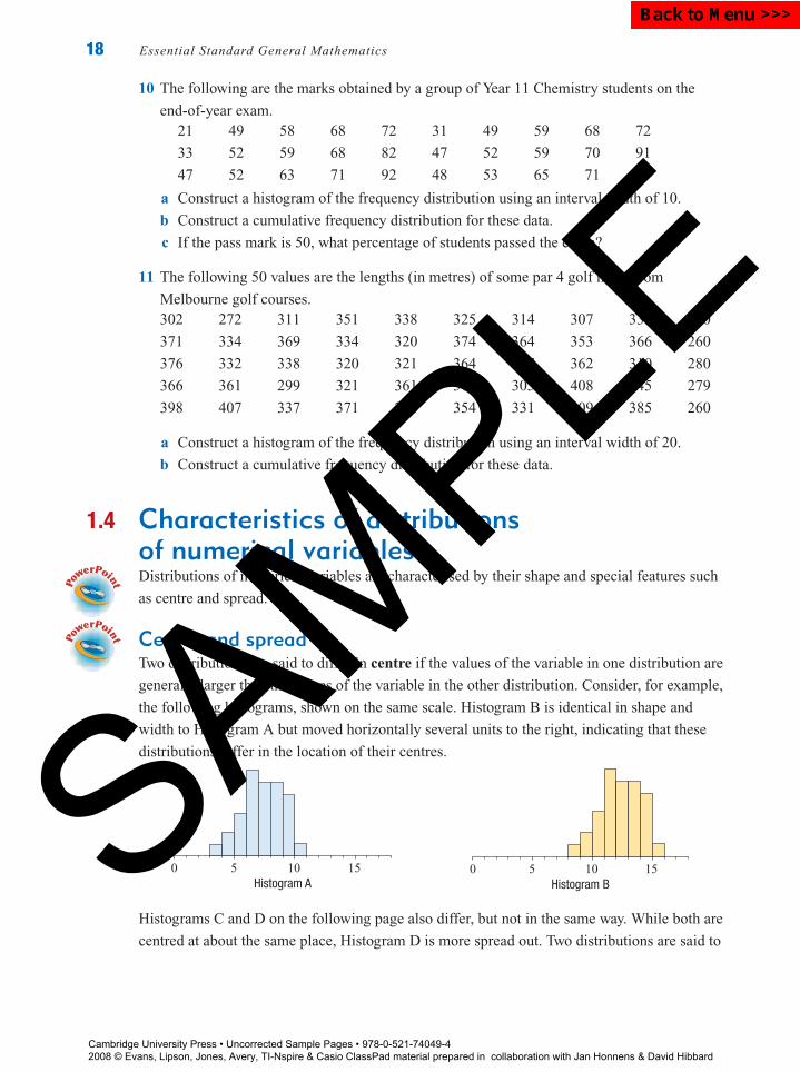
10 The following are the marks obtained by a group of Year 11 Chemistry students on the
end-of-year exam.21 49 58 68 72 31 49 59 68 72
33 52 59 68 82 47 52 59 70 91
47 52 63 71 92 48 53 65 71 99
a Construct a histogram of the frequency distribution using an interval width of 10.
b Construct a cumulative frequency distribution for these data.
c If the pass mark is 50, what percentage of students passed the exam?
11 The following 50 values are the lengths (in metres) of some par 4 golf holes from
Melbourne golf courses.302 272 311 351 338 325 314 307 336 310
371 334 369 334 320 374 364 353 366 260
376 332 338 320 321 364 317 362 310 280
366 361 299 321 361 312 305 408 245 279
398 407 337 371 266 354 331 409 385 260
a Construct a histogram of the frequency distribution using an interval width of 20.
b Construct a cumulative frequency distribution for these data.
1.4 Characteristics of distributionsof numerical variablesDistributions of numerical variables are characterised by their shape and special features such
as centre and spread.
Centre and spreadTwo distributions are said to differ in centre if the values of the variable in one distribution are
generally larger than the values of the variable in the other distribution. Consider, for example,
the following histograms, shown on the same scale. Histogram B is identical in shape and
width to Histogram A but moved horizontally several units to the right, indicating that these
distributions differ in the location of their centres.
0 5 10 15Histogram A
0 5 10 15Histogram B
Histograms C and D on the following page also differ, but not in the same way. While both are
centred at about the same place, Histogram D is more spread out. Two distributions are said to
Cambridge University Press • Uncorrected Sample Pages • 978-0-521-74049-4 2008 © Evans, Lipson, Jones, Avery, TI-Nspire & Casio ClassPad material prepared in collaboration with Jan Honnens & David Hibbard
SAMPLE
Back to Menu >>>

P1: FXS/ABE P2: FXS0521672600Xc01.xml CUAU034-EVANS September 15, 2008 20:51
Chapter 1 — Univariate data 19
differ in spread if the values of the variable in one distribution tend to be more spread out than
the values of the variable in the other distribution.
0 5 10 15Histogram C
0 5 10 15Histogram D
Symmetry and skewA distribution is said to be symmetric if it forms a mirror image of itself when folded in the
‘middle’ along a vertical axis. Otherwise it is said to be skewed. Histogram E below is
perfectly symmetric, while Histogram F shows a distribution that is approximately symmetric.
0 5 10 15Histogram E
0 5 10 15Histogram F
A histogram may be positively or negatively skewed.
Histogram G below has a short tail to the left and a long tail pointing to the right. It is said
to be positively skewed (because of the many values towards the positive end of the
distribution).
Histogram H below has a short tail to the right and a long tail pointing to the left. It is said
to be negatively skewed (because of the many values towards the negative end of the
distribution).
0 5 10 15Histogram G
Positively skewed
0 5 10 15Histogram H
Negatively skewed
Knowing whether a distribution is skewed or symmetric is important, as this gives
considerable information concerning the choice of appropriate summary statistics, as will be
seen in the next section.
Cambridge University Press • Uncorrected Sample Pages • 978-0-521-74049-4 2008 © Evans, Lipson, Jones, Avery, TI-Nspire & Casio ClassPad material prepared in collaboration with Jan Honnens & David Hibbard
SAMPLE
Back to Menu >>>
P1: FXS/ABE P2: FXS0521672600Xc01.xml CUAU034-EVANS September 15, 2008 20:51
20 Essential Standard General Mathematics
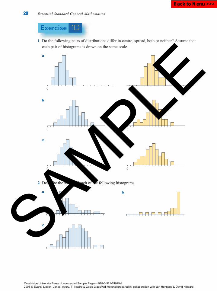
Exercise 1D
1 Do the following pairs of distributions differ in centre, spread, both or neither? Assume that
each pair of histograms is drawn on the same scale.
a
0 0
b
0 0
c
0 0
2 Describe the shape of each of the following histograms.
a b
c
Cambridge University Press • Uncorrected Sample Pages • 978-0-521-74049-4 2008 © Evans, Lipson, Jones, Avery, TI-Nspire & Casio ClassPad material prepared in collaboration with Jan Honnens & David Hibbard
SAMPLE
Back to Menu >>>
P1: FXS/ABE P2: FXS0521672600Xc01.xml CUAU034-EVANS September 15, 2008 20:51
Chapter 1 — Univariate data 21
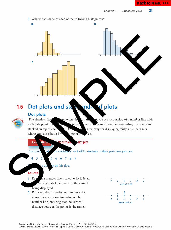
3 What is the shape of each of the following histograms?
a b
c
1.5 Dot plots and stem-and-leaf plotsDot plotsThe simplest display of numerical data is a dot plot. A dot plot consists of a number line with
each data point marked by a dot. When several data points have the same value, the points are
stacked on top of each other. Dot plots are a great way for displaying fairly small data sets
where the data takes a limited number of values.
Example 9 Constructing a dot plot
The numbers of hours worked by each of 10 students in their part-time jobs are:
4 5 5 6 6 6 6 7 8 9
Construct a dot plot of this data.
Solution
1 Draw in a number line, scaled to include all
data values. Label the line with the variable
being displayed.
4 5 6 7 8 9
Hours worked
2 Plot each data value by marking in a dot
above the corresponding value on the
number line, ensuring that the vertical
distance between the points is the same.Hours worked
4 5 6 7 8 9
Cambridge University Press • Uncorrected Sample Pages • 978-0-521-74049-4 2008 © Evans, Lipson, Jones, Avery, TI-Nspire & Casio ClassPad material prepared in collaboration with Jan Honnens & David Hibbard
SAMPLE
B a c k t o M e n u > > >
P1: FXS/ABE P2: FXS0521672600Xc01.xml CUAU034-EVANS September 15, 2008 20:51
22 Essential Standard General Mathematics
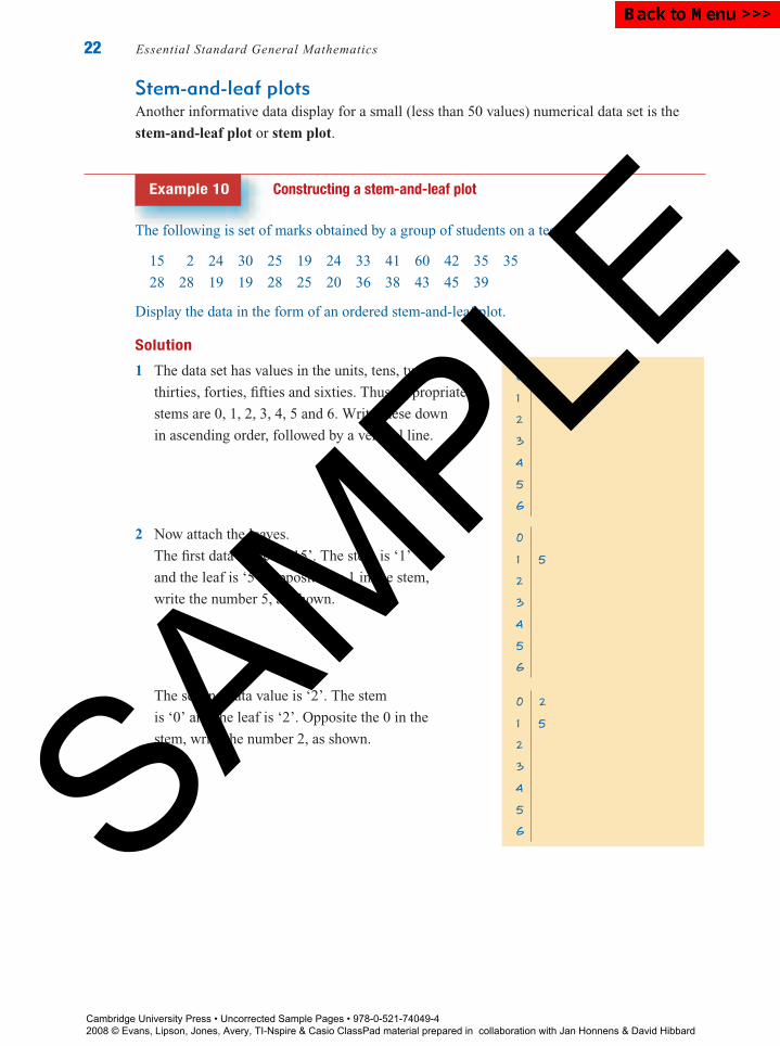
Stem-and-leaf plotsAnother informative data display for a small (less than 50 values) numerical data set is the
stem-and-leaf plot or stem plot.
Example 10 Constructing a stem-and-leaf plot
The following is set of marks obtained by a group of students on a test:
15 2 24 30 25 19 24 33 41 60 42 35 35
28 28 19 19 28 25 20 36 38 43 45 39
Display the data in the form of an ordered stem-and-leaf plot.
Solution
1 The data set has values in the units, tens, twenties,
thirties, forties, fifties and sixties. Thus, appropriate
stems are 0, 1, 2, 3, 4, 5 and 6. Write these down
in ascending order, followed by a vertical line.
0
1
2
3
4
5
6
2 Now attach the leaves.
The first data value is ‘15’. The stem is ‘1’
and the leaf is ‘5’. Opposite the 1 in the stem,
write the number 5, as shown.
0
1 5
2
3
4
5
6
The second data value is ‘2’. The stem
is ‘0’ and the leaf is ‘2’. Opposite the 0 in the
stem, write the number 2, as shown.
0 2
1 5
2
3
4
5
6
Cambridge University Press • Uncorrected Sample Pages • 978-0-521-74049-4 2008 © Evans, Lipson, Jones, Avery, TI-Nspire & Casio ClassPad material prepared in collaboration with Jan Honnens & David Hibbard
SAMPLE
Back to Menu >>>
P1: FXS/ABE P2: FXS0521672600Xc01.xml CUAU034-EVANS September 15, 2008 20:51
Chapter 1 — Univariate data 23
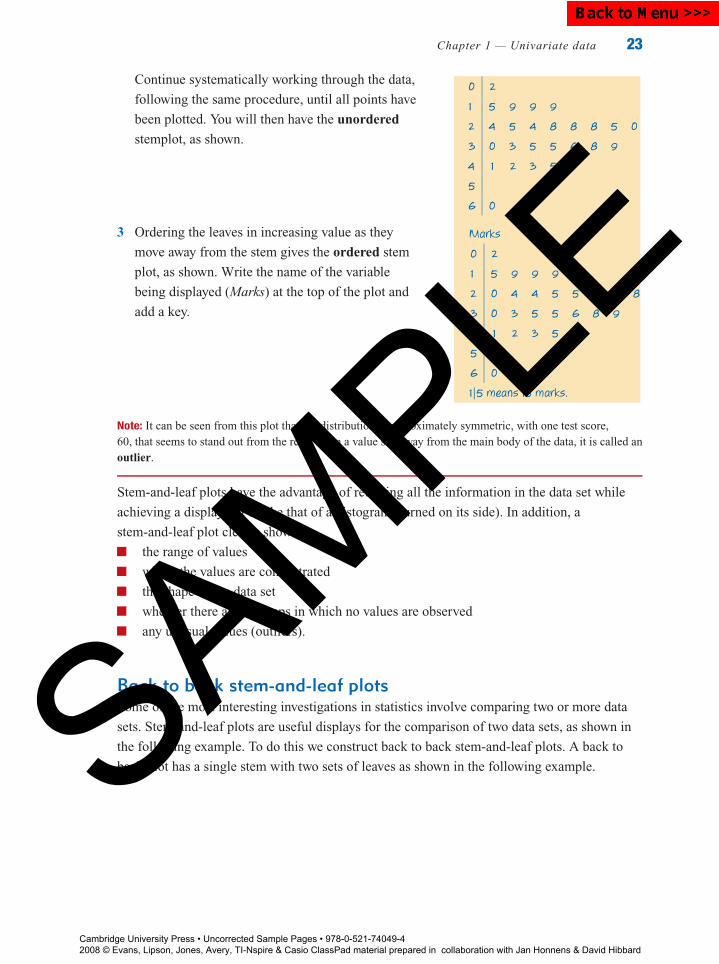
Continue systematically working through the data,
following the same procedure, until all points have
been plotted. You will then have the unordered
stemplot, as shown.
0 2
1 5 9 9 9
2 4 5 4 8 8 8 5 0
3 0 3 5 5 6 8 9
4 1 2 3 5
5
6 0
3 Ordering the leaves in increasing value as they
move away from the stem gives the ordered stem
plot, as shown. Write the name of the variable
being displayed (Marks) at the top of the plot and
add a key.
Marks
0 2
1 5 9 9 9
2 0 4 4 5 5 8 8 8
3 0 3 5 5 6 8 9
4 1 2 3 5
5
6 0
1|5 means 15 marks.
Note: It can be seen from this plot that the distribution is approximately symmetric, with one test score,60, that seems to stand out from the rest. When a value sits away from the main body of the data, it is called anoutlier.
Stem-and-leaf plots have the advantage of retaining all the information in the data set while
achieving a display not unlike that of a histogram (turned on its side). In addition, a
stem-and-leaf plot clearly shows:
the range of values
where the values are concentrated
the shape of the data set
whether there are any gaps in which no values are observed
any unusual values (outliers).
Back to back stem-and-leaf plotsSome of the most interesting investigations in statistics involve comparing two or more data
sets. Stem-and-leaf plots are useful displays for the comparison of two data sets, as shown in
the following example. To do this we construct back to back stem-and-leaf plots. A back to
back plot has a single stem with two sets of leaves as shown in the following example.
Cambridge University Press • Uncorrected Sample Pages • 978-0-521-74049-4 2008 © Evans, Lipson, Jones, Avery, TI-Nspire & Casio ClassPad material prepared in collaboration with Jan Honnens & David Hibbard
SAMPLE
Back to Menu >>>
P1: FXS/ABE P2: FXS0521672600Xc01.xml CUAU034-EVANS September 15, 2008 20:51
24 Essential Standard General Mathematics
Example 11 Constructing and interpreting back to back stem-and-leaf plots
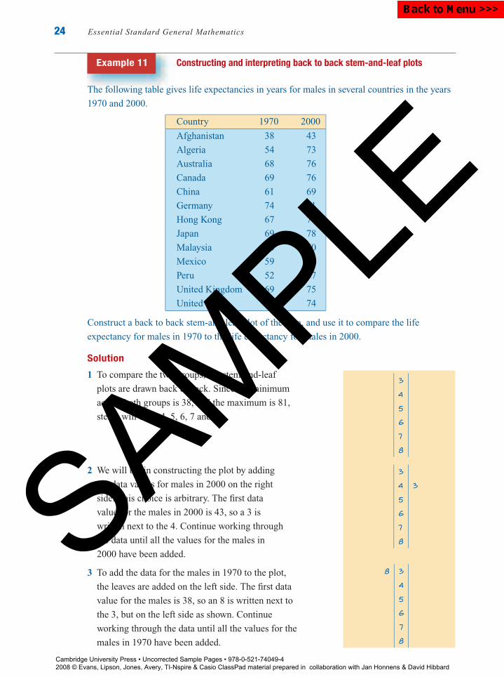
The following table gives life expectancies in years for males in several countries in the years
1970 and 2000.
Country 1970 2000
Afghanistan 38 43
Algeria 54 73
Australia 68 76
Canada 69 76
China 61 69
Germany 74 81
Hong Kong 67 77
Japan 69 78
Malaysia 60 70
Mexico 59 70
Peru 52 67
United Kingdom 69 75
United States 67 74
Construct a back to back stem-and-leaf plot of the data, and use it to compare the life
expectancy for males in 1970 to the life expectancy for males in 2000.
Solution
1 To compare the two groups, the stem-and-leaf
plots are drawn back to back. Since the minimum
across both groups is 38, and the maximum is 81,
stems will be 3, 4, 5, 6, 7 and 8.
3
4
5
6
7
8
2 We will begin constructing the plot by adding
the data values for males in 2000 on the right
side. This choice is arbitrary. The first data
value for the males in 2000 is 43, so a 3 is
written next to the 4. Continue working through
the data until all the values for the males in
2000 have been added.
3
4 3
5
6
7
8
3 To add the data for the males in 1970 to the plot,
the leaves are added on the left side. The first data
value for the males is 38, so an 8 is written next to
the 3, but on the left side as shown. Continue
working through the data until all the values for the
males in 1970 have been added.
8 3
4
5
6
7
8
Cambridge University Press • Uncorrected Sample Pages • 978-0-521-74049-4 2008 © Evans, Lipson, Jones, Avery, TI-Nspire & Casio ClassPad material prepared in collaboration with Jan Honnens & David Hibbard
SAMPLE
Back to Menu >>>
P1: FXS/ABE P2: FXS0521672600Xc01.xml CUAU034-EVANS September 15, 2008 20:51
Chapter 1 — Univariate data 25
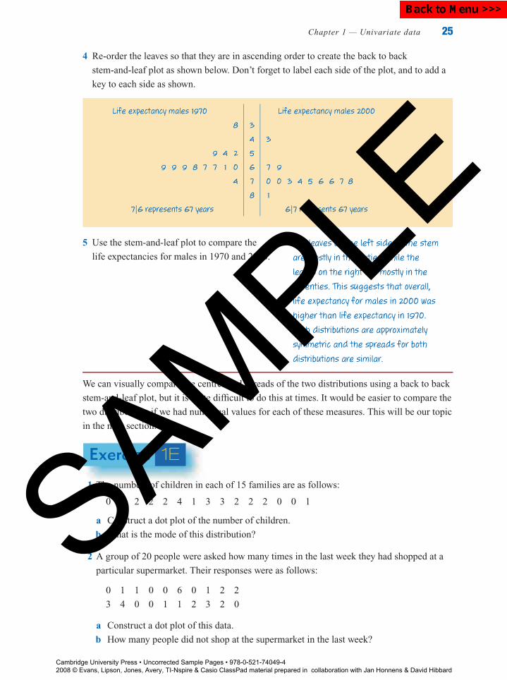
4 Re-order the leaves so that they are in ascending order to create the back to back
stem-and-leaf plot as shown below. Don’t forget to label each side of the plot, and to add a
key to each side as shown.
Life expectancy males 1970 Life expectancy males 2000
8 3
4 3
9 4 2 5
9 9 9 8 7 7 1 0 6 7 9
4 7 0 0 3 4 5 6 6 7 8
8 1
7|6 represents 67 years 6|7 represents 67 years
5 Use the stem-and-leaf plot to compare the
life expectancies for males in 1970 and 2000.
The leaves on the left side of the stem
are mostly in the sixties, while the
leaves on the right are mostly in the
seventies. This suggests that overall,
life expectancy for males in 2000 was
higher than life expectancy in 1970.
Both distributions are approximately
symmetric and the spreads for both
distributions are similar.
We can visually compare the centres and spreads of the two distributions using a back to back
stem-and-leaf plot, but it is quite difficult to do this at times. It would be easier to compare the
two distributions if we had numerical values for each of these measures. This will be our topic
in the next section.
Exercise 1E
1 The numbers of children in each of 15 families are as follows:
0 7 2 2 2 4 1 3 3 2 2 2 0 0 1
a Construct a dot plot of the number of children.
b What is the mode of this distribution?
2 A group of 20 people were asked how many times in the last week they had shopped at a
particular supermarket. Their responses were as follows:
0 1 1 0 0 6 0 1 2 2
3 4 0 0 1 1 2 3 2 0
a Construct a dot plot of this data.
b How many people did not shop at the supermarket in the last week?
Cambridge University Press • Uncorrected Sample Pages • 978-0-521-74049-4 2008 © Evans, Lipson, Jones, Avery, TI-Nspire & Casio ClassPad material prepared in collaboration with Jan Honnens & David Hibbard
SAMPLE
Back to Menu >>>
P1: FXS/ABE P2: FXS0521672600Xc01.xml CUAU034-EVANS September 15, 2008 20:51
26 Essential Standard General Mathematics
3 The numbers of goals scored in an AFL game by each player on one team were as follows:
0 0 0 0 0 0 0 0 0 0 0
0 0 0 1 1 1 1 2 2 3 6
a Construct a dot plot of the number of goals scored.
b What is the mode of this distribution?
4 In a study of the service offered at her cafe, Amanda counted the numbers of people waiting
in the queue every 5 minutes from 12 noon until 1.00 pm, with the following results.
Time 12.00 12.05 12.10 12.15 12.20 12.25 12.30 12.35 12.40 12.45 12.50 12.55 1.00
Number 0 2 4 4 7 8 6 5 0 1 2 1 1
in queue
a Construct a dot plot of the number of people waiting in the queue.
b When does the peak demand at the cafe seem to be?
5 The monthly rainfall for Melbourne, in a particular year, is given in the following table.
Month J F M A M J J A S O N D
Rainfall (mm) 48 57 52 57 58 49 49 50 59 67 60 59
a Construct a dot plot of this data.
b Construct a stem-and-leaf plot of the rainfall.
c In how many months was the rainfall 60 mm or more?
6 The marks obtained by a group of students on an English examination are as follows:
92 65 35 89 79 32 38 46 26 43 83 79
50 28 84 97 69 39 93 75 58 49 44 59
78 64 23 17 35 94 83 23 66 46 61 52
a Construct a stem-and-leaf plot of the marks.
b How many students obtained 50 or more marks?
c What was the lowest mark?
7 The stem-and-leaf plot on the right shows
the ages, in years, of all the people
attending a meeting.
Age(years)
0 2 7
2 1 4 5 5 7 8 9
3 0 3 4 4 5 7 8 9
4 0 1 2 2 3 3 4 5 7 8 8 8
5 2 4 5 6 7 9
6 3 3 3 8
7 0
1|2 represents 12 years.
a How many people attended the meeting?
b What is the shape of the distribution of ages?
c How many of these people were less than
43 years old?
Cambridge University Press • Uncorrected Sample Pages • 978-0-521-74049-4 2008 © Evans, Lipson, Jones, Avery, TI-Nspire & Casio ClassPad material prepared in collaboration with Jan Honnens & David Hibbard
SAMPLE
Back to Menu >>>
P1: FXS/ABE P2: FXS0521672600Xc01.xml CUAU034-EVANS September 15, 2008 20:51
Chapter 1 — Univariate data 27
8 An investigator recorded the amounts of time for which 24 similar batteries lasted in a toy.
Her results (in hours) were:
26 40 30 24 27 31 21 27 20 30 33 22
4 26 17 19 46 34 37 28 25 31 41 33
a Make a stem-and-leaf plot of these times.
b How many of the batteries lasted for more than 30 hours?
9 The amounts of time (in minutes) that a class of students spent on homework on one
particular night were:
10 27 46 63 20 33 15 21 16 14 15
39 70 19 37 56 20 28 23 0 29 10
a Make a stem-and-leaf plot of these times.
b How many students spent more than 60 minutes on homework?
c What is the shape of the distribution?
10 The prices of a selection of brands of track shoes at a retail outlet are as follows:
$49.99 $75.49 $68.99 $79.99 $75.49 $39.99 $35.99 $52.99 $149.99 $84.99
$36.98 $95.49 $28.99 $25.49 $78.99 $45.99 $46.99 $76.99 $82.99
a Construct a stem-and-leaf plot of this data. Truncate (remove the decimal part of each
data value) before plotting.
b What is the shape of the distribution?Note: Truncating is done rather than rounding because it saves having to write out the data again, and little
information of value is lost.
Cambridge University Press • Uncorrected Sample Pages • 978-0-521-74049-4 2008 © Evans, Lipson, Jones, Avery, TI-Nspire & Casio ClassPad material prepared in collaboration with Jan Honnens & David Hibbard
SAMPLE
Back to Menu >>>

P1: FXS/ABE P2: FXS0521672600Xc01.xml CUAU034-EVANS September 15, 2008 20:51
28 Essential Standard General Mathematics
11 The ages of patients admitted to a particular hospital during one week are given below:
Males : 13.1 16.7 21.2 26.0 25.7 24.6 27.1 40.5 47.8 34.1
Females : 9.6 10.4 15.1 50.4 79.8 40.0 27.6 31.9 37.3 43.9
a Construct a back to back stem plot for male and female ages. Truncate the data values
first.
b Compare the ages at admission to hospital for male and female patients in terms of
shape, centre and spread.
12 The results of a mathematics test for two different classes of students are given in the table.
Class A
22 19 48 39 68 47 58 77 76 89 85
82 85 79 45 82 81 80 91 99 55 65
79 71
Class B
12 13 80 81 83 98 70 70 71 72 72
73 74 76 80 81 82 84 84 88 69 73
88 91
a Construct a back to back stem-and-leaf plot to compare the data sets.
b How many students in each class scored less than 50%?
c Which class do you think performed better overall on the test? Give reasons for your
answer.
13 The following table shows the number of nights spent away from home in the past year by a
group of 21 Australian tourists, and by a group of 21 Japanese tourists:
Australian
3 14 15 3 6 17 2
7 4 8 23 5 7 21
9 11 11 33 4 5 3
Japanese14 3 14 7 22 5 15
26 28 12 22 29 23 17
32 5 9 23 6 44 19
a Construct a back to back stem-and-leaf plot of these data sets.
b Compare the number of nights spent away by Australian and Japanese tourists in terms
of shape, centre and spread.
Cambridge University Press • Uncorrected Sample Pages • 978-0-521-74049-4 2008 © Evans, Lipson, Jones, Avery, TI-Nspire & Casio ClassPad material prepared in collaboration with Jan Honnens & David Hibbard
SAMPLE
Back to Menu >>>
P1: FXS/ABE P2: FXS0521672600Xc01.xml CUAU034-EVANS September 15, 2008 20:51
Chapter 1 — Univariate data 29
1.6 Summarising dataA statistic is any number that can be computed from data. Certain special statistics are called
summary statistics, because they numerically summarise certain features of the data set. Of
course, whenever any set of numbers is summarised into just one or two figures, much
information is lost. However, if the summary statistics are well chosen, they will also help to
reveal other important information that may be hidden in the data set.
Summary statistics are generally either measures of centre or measures of spread. There
are many different examples for each of these measures, and there are situations when one of
the measures is more appropriate than another.
Measures of centre
The meanThe most commonly used measure of centre of a distribution of a numerical variable is the
mean. The mean is calculated by summing all the data values and dividing by the
number of values in the data set. The mean of a set of data is what most people call the ‘average’.
Mean = sum of data values
total number of data values
For example, consider the set of data: 1 5 2 4
For this set of data: Mean = 1 + 5 + 2 + 4
4= 12
4= 3
Some notationBecause the rule for the mean is relatively simple, it is easy to write in words. However, later
you will meet other rules for calculating statistical quantities that are extremely complicated
and hard to write out in words. To overcome this problem, we use a shorthand notation that
enables complex statistical formulas to be written out in a compact form. In this notation we
use:
the Greek capital letter sigma, Σ, as a shorthand way of writing ‘sum of’
a lower case x to represent a data value
a lower case x with a bar, x (pronounced ‘x bar’), to represent the mean of the data values
n to represent the total number of data values.
The rule for calculating the mean then becomes:
x = �x
n
Cambridge University Press • Uncorrected Sample Pages • 978-0-521-74049-4 2008 © Evans, Lipson, Jones, Avery, TI-Nspire & Casio ClassPad material prepared in collaboration with Jan Honnens & David Hibbard
SAMPLE
Back to Menu >>>
P1: FXS/ABE P2: FXS0521672600Xc01.xml CUAU034-EVANS September 15, 2008 20:51
30 Essential Standard General Mathematics
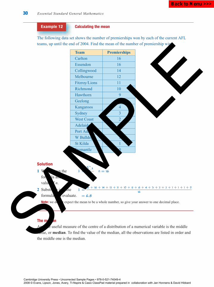
Example 12 Calculating the mean
The following data set shows the number of premierships won by each of the current AFL
teams, up until the end of 2004. Find the mean of the number of premiership wins.
Team Premierships
Carlton 16
Essendon 16
Collingwood 14
Melbourne 12
Fitzroy/Lions 11
Richmond 10
Hawthorn 9
Geelong 6
Kangaroos 4
Sydney 3
West Coast 2
Adelaide 2
Port Adelaide 1
W Bulldogs 1
St Kilda 1
Fremantle 0
Solution
1 Write down the
formula and the
value of n.
2 Substitute into the
formula and evaluate.
Note: we do not expect the mean to be a whole number, so give your answer to one decimal place.
-x =∑
x
nn = 16
-x = 16 + 16 + 14 + 12 + 11 + 10 + 9 + 6 + 4 + 3 + 2 + 2 + 1 + 1 + 1 + 0
16
= 6.8
The medianAnother useful measure of the centre of a distribution of a numerical variable is the middle
value, or median. To find the value of the median, all the observations are listed in order and
the middle one is the median.
Cambridge University Press • Uncorrected Sample Pages • 978-0-521-74049-4 2008 © Evans, Lipson, Jones, Avery, TI-Nspire & Casio ClassPad material prepared in collaboration with Jan Honnens & David Hibbard
SAMPLE
Back to Menu >>>

P1: FXS/ABE P2: FXS0521672600Xc01.xml CUAU034-EVANS September 15, 2008 20:51
Chapter 1 — Univariate data 31
For example, the median of the following data set is 6, as there are five observations on
either side of this value when the data are listed in order.
median = 6
↓2 3 4 5 5 6 7 7 8 8 11
When there is an even number of data values, the median is defined as the mid-point of the
two middle values. For example, the median of the following data set is 6.5, as there are six
observations on either side of this value when the data are listed in order.
median = 6.5
↓2 3 4 5 5 6 7 7 8 8 11 11
Example 13 Calculating the median
Find the median number of premierships in the AFL ladder using the data in Example 12.
Solution
1 As the data are already given in order, it only remains
to decide which is the middle observation.
16 16 14 12 11 10 9 6 4 3 2 2 1 1 1 0
2 Since there are 16 entries in the table there is no actual
middle observation, so the median is chosen as the value
half-way between the two middle observations, in this
case the eighth and ninth (4 and 6).
median = 1
2(4 + 6)
= 5
3 The interpretation here is, that of the teams in the AFL,
half (or 50%) have won the premiership 5 or more times
and half (or 50%) have won the premiership 5 or less times.
For larger data sets, the following rule for locating the median is helpful.
In general, to compute the median of a distribution:
Arrange all the observations in ascending order according to size.
If n, the number of observations, is odd, then the median is then + 1
2th observation
from the end of the list.
If n, the number of observations, is even, then the median is found by averaging the two
middle observations in the list. That is, to find the median then
2th and the
(n
2+ 1
)th
observations are added together, and divided by 2.
The median value is easily determined from an ordered stem-and-leaf plot by counting to the
required observation or observations from either end.
Cambridge University Press • Uncorrected Sample Pages • 978-0-521-74049-4 2008 © Evans, Lipson, Jones, Avery, TI-Nspire & Casio ClassPad material prepared in collaboration with Jan Honnens & David Hibbard
SAMPLE
Back to Menu >>>
P1: FXS/ABE P2: FXS0521672600Xc01.xml CUAU034-EVANS September 15, 2008 20:51
32 Essential Standard General Mathematics
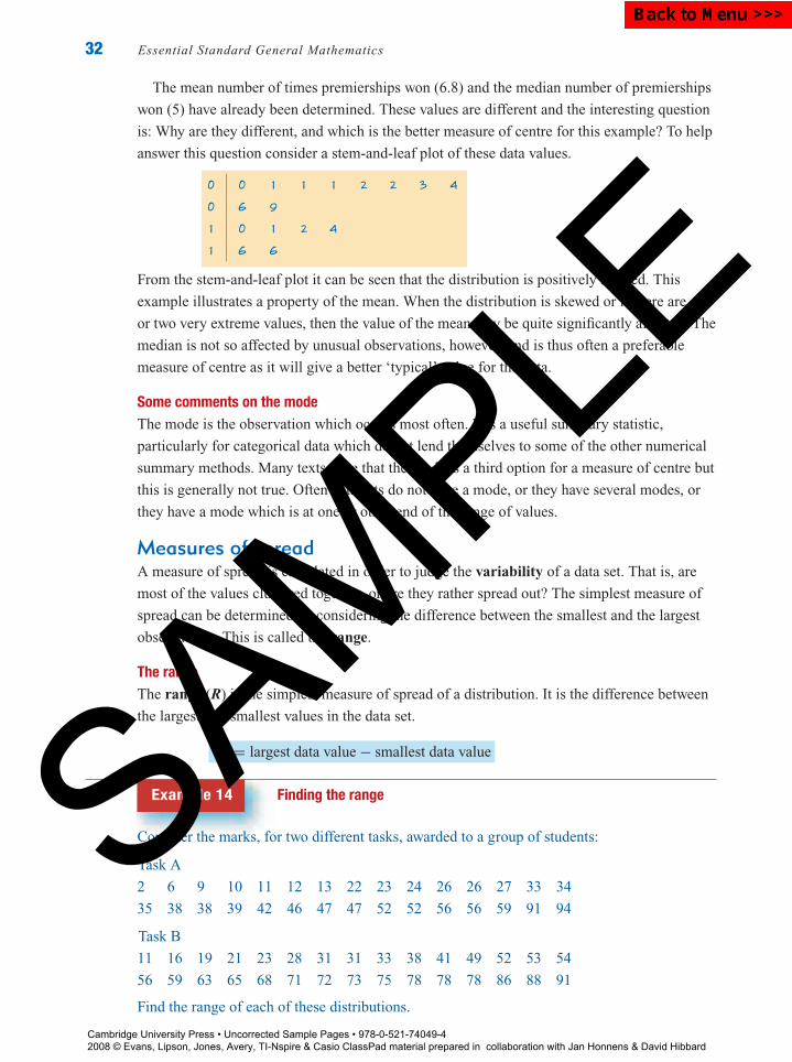
The mean number of times premierships won (6.8) and the median number of premierships
won (5) have already been determined. These values are different and the interesting question
is: Why are they different, and which is the better measure of centre for this example? To help
answer this question consider a stem-and-leaf plot of these data values.
0 0 1 1 1 2 2 3 4
0 6 9
1 0 1 2 4
1 6 6
From the stem-and-leaf plot it can be seen that the distribution is positively skewed. This
example illustrates a property of the mean. When the distribution is skewed or if there are one
or two very extreme values, then the value of the mean may be quite significantly affected. The
median is not so affected by unusual observations, however, and is thus often a preferable
measure of centre as it will give a better ‘typical’ value for the data.
Some comments on the modeThe mode is the observation which occurs most often. It is a useful summary statistic,
particularly for categorical data which do not lend themselves to some of the other numerical
summary methods. Many texts state that the mode is a third option for a measure of centre but
this is generally not true. Often data sets do not have a mode, or they have several modes, or
they have a mode which is at one or other end of the range of values.
Measures of spreadA measure of spread is calculated in order to judge the variability of a data set. That is, are
most of the values clustered together, or are they rather spread out? The simplest measure of
spread can be determined by considering the difference between the smallest and the largest
observations. This is called the range.
The rangeThe range (R) is the simplest measure of spread of a distribution. It is the difference between
the largest and smallest values in the data set.
R = largest data value − smallest data value
Example 14 Finding the range
Consider the marks, for two different tasks, awarded to a group of students:
Task A
2 6 9 10 11 12 13 22 23 24 26 26 27 33 34
35 38 38 39 42 46 47 47 52 52 56 56 59 91 94
Task B
11 16 19 21 23 28 31 31 33 38 41 49 52 53 54
56 59 63 65 68 71 72 73 75 78 78 78 86 88 91
Find the range of each of these distributions.
Cambridge University Press • Uncorrected Sample Pages • 978-0-521-74049-4 2008 © Evans, Lipson, Jones, Avery, TI-Nspire & Casio ClassPad material prepared in collaboration with Jan Honnens & David Hibbard
SAMPLE
Back to Menu >>>

P1: FXS/ABE P2: FXS0521672600Xc01.xml CUAU034-EVANS September 15, 2008 20:51
Chapter 1 — Univariate data 33
Solution
1 For Task A, the minimum mark is
2 and the maximum mark is 94.
2 Substitute these values in the rule
for the range.
3 For Task B, the minimum mark is
11 and the maximum mark is 91
4 Substitute these values in the rule
for the range.
Range for Task A = 94 − 2 = 92
Range for Task B = 91 − 11 = 80
The range for Task A is greater than the range for Task B. Is the range a useful summary
statistic for comparing the spread of the two distributions? To help make this decision,
consider the stem-and-leaf plots of the data sets:
Task A Task B
0 2 6 9 0
1 0 1 2 3 1 1 6 9
2 2 3 4 6 6 7 2 1 3 8
3 3 4 5 8 8 9 3 1 1 3 8
4 2 6 7 7 4 1 9
5 2 2 6 6 9 5 2 3 4 6 9
6 6 3 5 8
7 7 1 2 3 5 8 8 8
8 8 6 8
9 1 4 9 1
From the stem-and-leaf plots of the data it appears that the spread of marks for the two tasks is
not really described by the range. The marks for Task A are more concentrated than the marks
for Task B, except for the two unusual values for Task A. Another measure of spread is needed,
one which is not so influenced by these extreme values. For this the interquartile range is
used.
The interquartile rangeThe interquartile range (IQR) gives the spread of the middle 50% of data values.
How to find the interquartile range of a distribution:
Arrange all observations in order according to size.
Divide the observations into two equal-sized groups. If n is odd, omit the median from
both groups.
Locate Q1, the first quartile, which is the median of the lower half of the observations,
and Q3, the third quartile, which is the median of the upper half of the observations.
The interquartile range IQR is defined as the difference between the quartiles:
IQR = Q3 − Q1
Cambridge University Press • Uncorrected Sample Pages • 978-0-521-74049-4 2008 © Evans, Lipson, Jones, Avery, TI-Nspire & Casio ClassPad material prepared in collaboration with Jan Honnens & David Hibbard
SAMPLE
Back to Menu >>>
P1: FXS/ABE P2: FXS0521672600Xc01.xml CUAU034-EVANS September 15, 2008 20:51
34 Essential Standard General Mathematics
Definitions of the quartiles of a distribution sometimes differ slightly from the one given here.
Using different definitions may result in slight differences in the values obtained, but these will
be minimal and should not be considered a difficulty.
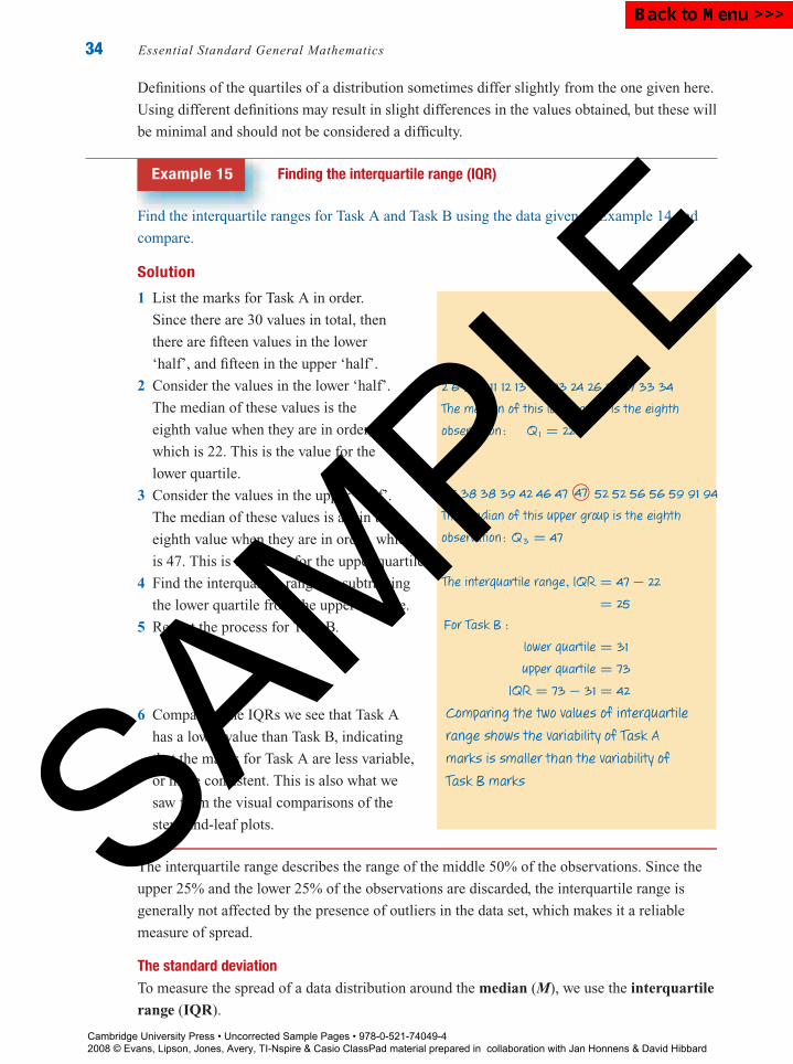
Example 15 Finding the interquartile range (IQR)
Find the interquartile ranges for Task A and Task B using the data given in Example 14 and
compare.
Solution
1 List the marks for Task A in order.
Since there are 30 values in total, then
there are fifteen values in the lower
‘half’, and fifteen in the upper ‘half’.
2 Consider the values in the lower ‘half’.
The median of these values is the
eighth value when they are in order,
which is 22. This is the value for the
lower quartile.
3 Consider the values in the upper ‘half’.
The median of these values is again the
eighth value when they are in order, which
is 47. This is the value for the upper quartile.
4 Find the interquartile range by subtracting
the lower quartile from the upper quartile.
5 Repeat the process for Task B.
6 Comparing the IQRs we see that Task A
has a lower value than Task B, indicating
that the marks for Task A are less variable,
or more consistent. This is also what we
saw from the visual comparisons of the
stem-and-leaf plots.
2 6 9 10 11 12 13 22© 23 24 26 26 27 33 34
The median of this lower group is the eighth
observation : Q1 = 22
35 38 38 39 42 46 47 47© 52 52 56 56 59 91 94
The median of this upper group is the eighth
observation : Q3 = 47
The interquartile range, IQR = 47 − 22
= 25
For Task B :
lower quartile = 31
upper quartile = 73
IQR = 73 − 31 = 42
Comparing the two values of interquartile
range shows the variability of Task A
marks is smaller than the variability of
Task B marks
The interquartile range describes the range of the middle 50% of the observations. Since the
upper 25% and the lower 25% of the observations are discarded, the interquartile range is
generally not affected by the presence of outliers in the data set, which makes it a reliable
measure of spread.
The standard deviationTo measure the spread of a data distribution around the median (M), we use the interquartile
range (IQR).
Cambridge University Press • Uncorrected Sample Pages • 978-0-521-74049-4 2008 © Evans, Lipson, Jones, Avery, TI-Nspire & Casio ClassPad material prepared in collaboration with Jan Honnens & David Hibbard
SAMPLE
Back to Menu >>>
P1: FXS/ABE P2: FXS0521672600Xc01.xml CUAU034-EVANS September 15, 2008 20:51
Chapter 1 — Univariate data 35
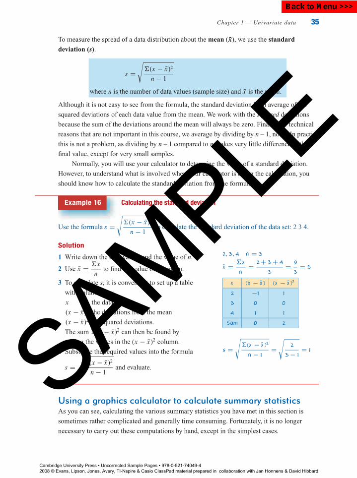
To measure the spread of a data distribution about the mean (x), we use the standard
deviation (s).
s =√
�(x − x)2
n − 1
where n is the number of data values (sample size) and x is the mean.
Although it is not easy to see from the formula, the standard deviation is an average of the
squared deviations of each data value from the mean. We work with the squared deviations
because the sum of the deviations around the mean will always be zero. Finally, for technical
reasons that are not important in this course, we average by dividing by n – 1, not n. In practice
this is not a problem, as dividing by n – 1 compared to n makes very little difference to the
final value, except for very small samples.
Normally, you will use your calculator to determine the value of a standard deviation.
However, to understand what is involved when your calculator is doing the calculation, you
should know how to calculate the standard deviation from the formula.
Example 16 Calculating the standard deviation
Use the formula s =√
�(x − x)2
n − 1to calculate the standard deviation of the data set: 2 3 4.
Solution
1 Write down the data values and the value of n.
2 Use x = �x
nto find the value of the mean.
3 To calculate s, it is convenient to set up a table
with columns for:
x the data values
(x − x) the deviations from the mean
(x − x)2 the squared deviations.
The sum �(x − x)2 can then be found by
adding the values in the (x − x)2 column.
4 Substitute the required values into the formula
s =√
�(x − x)2
n − 1and evaluate.
2, 3, 4 n = 3
-x = �x
n= 2 + 3 + 4
3= 9
3= 3
x (x − -x ) (x − -x )2
2 −1 1
3 0 0
4 1 1
Sum 0 2
s =√
�(x − -x )2
n − 1=
√2
3 − 1= 1
Using a graphics calculator to calculate summary statisticsAs you can see, calculating the various summary statistics you have met in this section is
sometimes rather complicated and generally time consuming. Fortunately, it is no longer
necessary to carry out these computations by hand, except in the simplest cases.
Cambridge University Press • Uncorrected Sample Pages • 978-0-521-74049-4 2008 © Evans, Lipson, Jones, Avery, TI-Nspire & Casio ClassPad material prepared in collaboration with Jan Honnens & David Hibbard
SAMPLE
Back to Menu >>>

P1: FXS/ABE P2: FXS0521672600Xc01.xml CUAU034-EVANS September 15, 2008 20:51
36 Essential Standard General Mathematics
How to calculate measures of centre and spread using the TI-Nspire CAS
The table shows the monthly rainfall figures for a year in Melbourne.
Month J F M A M J J A S O N D
Rainfall (mm) 48 57 52 57 58 49 49 50 59 67 60 59
Determine the mean and standard deviation, median and interquartile range, and the range
for this data set. Give your answers correct to 1 decimal point where necessary.
Steps1 Start a new document: Press and select
6:New Document (or press / + N).
2 Select 3:Add Lists & Spreadsheet. Enter the
data into a list named rain, as shown.
Statistical calculations can be done in the Lists& Spreadsheet application or the Calculatorapplication.
3 Press and select 1:Add Calculator.a Press b/6:Statistics/1:Stat
Calculations/1:One-Variable Statistics.
Keystrokes: b .
b Press the key to highlight OK and pressenter .
c Use the arrow and enter to paste in the list
name rain. Press enter to exit the pop-up
screen and generate the statistical results
screen shown below.
Notes:1 The sample standard deviation is sx.2 Use the arrows to scroll through the results
screen to see the full range of statistical valuescalculated.
4 Write the answers to the required
degree of accuracy (i.e. 1 decimal
place).
x = 55.4, 5 = 5.8
M = 57, |Q R = Q3 − Q1 = 59 − 59.5 = 9.5
R = max − min = 67 − 48 = 19
Cambridge University Press • Uncorrected Sample Pages • 978-0-521-74049-4 2008 © Evans, Lipson, Jones, Avery, TI-Nspire & Casio ClassPad material prepared in collaboration with Jan Honnens & David Hibbard
SAMPLE
Back to Menu >>>

P1: FXS/ABE P2: FXS0521672600Xc01.xml CUAU034-EVANS September 15, 2008 20:51
Chapter 1 — Univariate data 37
How to calculate measures of centre and spread using the ClassPad
The table shows the monthly rainfall figures for a year in Melbourne.
Month J F M A M J J A S O N D
Rainfall (mm) 48 57 52 57 58 49 49 50 59 67 60 59
Determine the mean and standard deviation, median and interquartile range, and the range
for this data set. Give your answers correct to 1 decimal point where necessary.
Steps1 Open the Statistics application and
enter the data into the column
labelled rain. Your screen should look
like the one shown.
2 To calculate the mean, median,
standard deviation, and quartiles,
select Calc from the menu bar and tap
One-Variable from the drop-down
menu to open the Set Calculationdialog box shown below (left).
3 Complete the dialog box as follows. For� XList: select main \ rain ( )� Freq: leave as 1
4 Tap OK to confirm your selections and calculate the
required statistics as shown.Notes:1 The value of the standard deviation is given by .2 Use the side-bar arrows to scroll through the results screen to
obtain values for additional statistical values (median, Q3 and themaximum value) if required.
5 Write the answers to the required
degree of accuracy (i.e. 1 decimal
place).
x = 55.4, 5 = 5.8
M = 57, |Q R = Q3 − Q1 = 59 − 59.5 = 9.5
R = max − min = 67 − 48 = 19
Cambridge University Press • Uncorrected Sample Pages • 978-0-521-74049-4 2008 © Evans, Lipson, Jones, Avery, TI-Nspire & Casio ClassPad material prepared in collaboration with Jan Honnens & David Hibbard
SAMPLE
Back to Menu >>>
P1: FXS/ABE P2: FXS0521672600Xc01.xml CUAU034-EVANS September 15, 2008 20:51
38 Essential Standard General Mathematics
Exercise 1F
1 Find, without using a calculator, the mean of each of these data sets.
a 2 5 7 2 9
b 4 11 3 5 6 1
c 15 25 10 20 5
d 101 105 98 96 97 109
e 1.2 1.9 2.3 3.4 7.8 0.2
2 Find, without using a calculator, the median of each of the data sets in Question 1.
3 The following table gives the area, in hectares, of each of the suburbs of a city:
3.6 2.1 4.2 2.3 3.4 40.3 11.3 19.4 28.4 27.6 7.4 3.2 9.0
a Find the mean and the median areas.
b Which do you think is a better measure of centre for the data set? Explain your answer.
4 The price, in dollars, of houses sold in a particular suburb during one week were:
$387 500 $329 500 $293 400 $600 000 $318 000 $368 000 $750 000
$333 500 $335 500 $340 000 $386 000 $340 000 $404 000 $322 000
a Find the mean and the median of the prices.
b Which do you think is a better measure of centre of the data set? Explain your answer.
5 Find, without using a calculator, the IQR and range of each of these ordered data sets.
a 2 2 5 7 9 11 12 16 23
b 1 3 3 5 6 7 9 11 12 12
c 21 23 24 25 27 27 29 31 32 33
d 101 101 105 106 107 107 108 109
e 0.2 0.9 1.0 1.1 1.2 1.2 1.3 1.9 2.1 2.2 2.9
6 A manufacturer advertised that a can of soft-drink contains 375 mL of liquid. A sample of
16 cans yielded the following contents:
357 375 366 360 371 363 351
358 382 367 372 360 375 356
369 371
Find the mean and standard deviation, median and IQR, and range for the volume of drink in
the cans. Give answers correct to 1 decimal place.
7 The serum cholesterol levels for a sample of 20 people are:
231 159 203 304 248 238 209 193 225 244
190 192 209 161 206 224 276 196 189 199
Find the mean and standard deviation, median and IQR, and range of the serum cholesterol
levels. Give answers correct to 1 decimal place.
Cambridge University Press • Uncorrected Sample Pages • 978-0-521-74049-4 2008 © Evans, Lipson, Jones, Avery, TI-Nspire & Casio ClassPad material prepared in collaboration with Jan Honnens & David Hibbard
SAMPLE
Back to Menu >>>

P1: FXS/ABE P2: FXS0521672600Xc01.xml CUAU034-EVANS September 15, 2008 20:51
Chapter 1 — Univariate data 39
8 Twenty babies were born at a local hospital on one weekend. Their birth weights are given in
the stem plot below.
Birth weight (kg)
2 1 5 7 9 9
3 1 3 3 4 4 5 6 7 7 9
4 1 2 2 3 5 3 | 6 represents 3.6 kg.
Find the mean and standard deviation, median and IQR, and range of the birth weights.
9 The results of a student’s Chemistry experiment
were as follows:
7.3 8.3 5.9 7.4 6.2 7.4 5.8 6.0
a i Find the mean and the median of the results.
ii Find the interquartile range and the standard
deviation of the results.
b Unfortunately, when the student was
transcribing his results into his Chemistry
book, he made a small error and wrote:
7.3 8.3 5.9 7.4 6.2 7.4 5.8 60
i Find the mean and the median of these
results.
ii Find the interquartile range and the standard
deviation of these results.
c Describe the effect the error had on the
summary statistics calculated in parts a and b.
1.7 BoxplotsKnowing the median and quartiles of a distribution means that quite a lot is known about the
central region of the data set. If something is known about the tails of the distribution as well,
then a good picture of the whole data set can be obtained. This can be achieved by knowing the
maximum and minimum values of the data.
These five important statistics can be derived from a data set: the median, the two quartiles
and the two extremes. These values are called the five-number summary and can be used to
provide a succinct graphical representation of a data set, called a box-and-whisker plot or
boxplot.
Cambridge University Press • Uncorrected Sample Pages • 978-0-521-74049-4 2008 © Evans, Lipson, Jones, Avery, TI-Nspire & Casio ClassPad material prepared in collaboration with Jan Honnens & David Hibbard
SAMPLE
Back to Menu >>>

P1: FXS/ABE P2: FXS0521672600Xc01.xml CUAU034-EVANS September 15, 2008 20:51
40 Essential Standard General Mathematics
In a boxplot:
Whisker Whisker
Minimum Q1 Q3 Maximum
Box
Median
M
a box is used to represent the middle 50% of scores
the median is shown by a vertical line drawn within the box
lines (‘whiskers’) extend out from the lower and upper ends of the box to the smallest
and largest data values of the data set respectively.
Example 17 Constructing a simple boxplot
The following are the monthly rainfall figures for a year in Melbourne.
Month J F M A M J J A S O N D
Rainfall (mm) 48 57 52 57 58 49 49 50 59 67 60 59
Construct a boxplot to display this data, given the five-number summary:
Min = 48, Q1 = 49.5, M = 57, Q3 = 59, Max = 67
Solution
1 Draw in a labelled and scaled number
line that covers the full range of values. 45 50 55 60 65 70
Rainfall (mm)
2 Draw in a box starting at Q1 = 49.5
and ending at Q3 = 59.
4545 5050 5555 6060 6565 7070
Rainfall (mm)Rainfall (mm)
3 Mark in the median value with a vertical
line segment at M = 57.
45 50 55 60 65 70
Rainfall (mm)
4 Draw in the whiskers, lines joining midpoint
of the ends of the box to the minimum and
maximum values, 48 and 67, respectively.45 50 55 60 65 70
Rainfall (mm)
Cambridge University Press • Uncorrected Sample Pages • 978-0-521-74049-4 2008 © Evans, Lipson, Jones, Avery, TI-Nspire & Casio ClassPad material prepared in collaboration with Jan Honnens & David Hibbard
SAMPLE
Back to Menu >>>
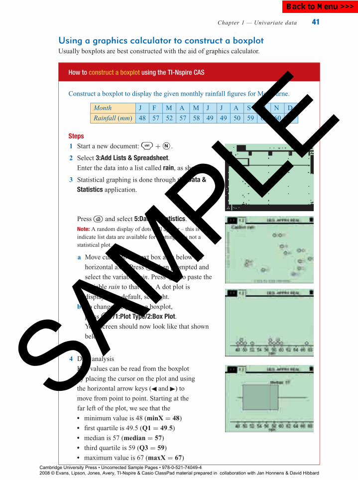
P1: FXS/ABE P2: FXS0521672600Xc01.xml CUAU034-EVANS September 15, 2008 20:51
Chapter 1 — Univariate data 41
Using a graphics calculator to construct a boxplotUsually boxplots are best constructed with the aid of graphics calculator.
How to construct a boxplot using the TI-Nspire CAS
Construct a boxplot to display the given monthly rainfall figures for Melbourne.
Month J F M A M J J A S O N D
Rainfall (mm) 48 57 52 57 58 49 49 50 59 67 60 59
Steps1 Start a new document: / + N .
2 Select 3:Add Lists & Spreadsheet.Enter the data into a list called rain, as shown.
3 Statistical graphing is done through the Data &Statistics application.
Press and select 5:Data & Statistics.
Note: A random display of dots will appear – this is toindicate list data are available for plotting. It is not astatistical plot.
a Move cursor to the text box area below the
horizontal axis. Press when prompted and
select the variable rain. Press enter to paste the
variable rain to that axis. A dot plot is
displayed by default, see right.
b To change the plot to a boxplot,
press b/1:Plot Type/2:Box Plot.Your screen should now look like that shown
below.
4 Data analysis
Key values can be read from the boxplot
by placing the cursor on the plot and using
the horizontal arrow keys ( and ) to
move from point to point. Starting at the
far left of the plot, we see that the� minimum value is 48 (minX = 48)� first quartile is 49.5 (Q1 = 49.5)� median is 57 (median = 57)� third quartile is 59 (Q3 = 59)� maximum value is 67 (maxX = 67)
Cambridge University Press • Uncorrected Sample Pages • 978-0-521-74049-4 2008 © Evans, Lipson, Jones, Avery, TI-Nspire & Casio ClassPad material prepared in collaboration with Jan Honnens & David Hibbard
SAMPLE
Back to Menu >>>

P1: FXS/ABE P2: FXS0521672600Xc01.xml CUAU034-EVANS September 15, 2008 20:51
42 Essential Standard General Mathematics
How to construct a boxplot using the ClassPad
Construct a boxplot to display the given monthly rainfall figures for Melbourne.
Month J F M A M J J A S O N D
Rainfall (mm) 48 57 52 57 58 49 49 50 59 67 60 59
Steps1 Open the Statistics application and
enter the data into the column
labelled rain.
2 Open the Set StatGraphs dialog box
by tapping in the toolbar.
Complete the dialog box as given
below. For� Draw: select On� Type: select MedBox ( )� XList: select main \ rain ( )� Freq: leave as 1Tap the Show Outliers box to add a tick ( ).
Note: Tapping in the square to the left of Show Outliers ( ) will allow a boxplot with outliersto be drawn, but only if they are present in the data. In this case, a standard boxplot will be drawn asthere are no outliers.
3 To plot the graph:
Tap y from the left-hand side of
the toolbar at the top of the screen.
The graph is drawn in an
automatically scaled window.
The screen is split into two halves,
with the graph showing in the bottom
half. Tapping r from the icon
panel will allow the graph to fill the
entire screen.
4 Key values can be read from the boxplot by tapping in
the toolbar. This places a marker on the boxplot. You can
use the horizontal cursor arrows ( and ) to move from one
summary statistic to the next.
Starting at the far left of the plot, we see that the� minimum value is 48 (minX = 48)� first quartile is 49.5 (Q1 = 49.5)� median is 57 (Median = 57)� third quartile is 59 (Q3 = 59)� maximum value is 67 (maxX = 67)
Cambridge University Press • Uncorrected Sample Pages • 978-0-521-74049-4 2008 © Evans, Lipson, Jones, Avery, TI-Nspire & Casio ClassPad material prepared in collaboration with Jan Honnens & David Hibbard
SAMPLE
Back to Menu >>>
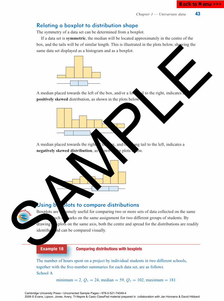
P1: FXS/ABE P2: FXS0521672600Xc01.xml CUAU034-EVANS September 15, 2008 20:51
Chapter 1 — Univariate data 43
Relating a boxplot to distribution shapeThe symmetry of a data set can be determined from a boxplot.
If a data set is symmetric, the median will be located approximately in the centre of the
box, and the tails will be of similar length. This is illustrated in the plots below, showing the
same data set displayed as a histogram and as a boxplot.
A median placed towards the left of the box, and/or a long tail to the right, indicates a
positively skewed distribution, as shown in the plots below.
A median placed towards the right of the box, and/or a long tail to the left, indicates a
negatively skewed distribution, as shown in the plots below.
Using boxplots to compare distributionsBoxplots are extremely useful for comparing two or more sets of data collected on the same
variable, such as marks on the same assignment for two different groups of students. By
drawing boxplots on the same axis, both the centre and spread for the distributions are readily
identified and can be compared visually.
Example 18 Comparing distributions with boxplots
The number of hours spent on a project by individual students in two different schools,
together with the five-number summaries for each data set, are as follows
School A
minimum = 2, Q1 = 24, median = 59, Q3 = 102, maximum = 181
Cambridge University Press • Uncorrected Sample Pages • 978-0-521-74049-4 2008 © Evans, Lipson, Jones, Avery, TI-Nspire & Casio ClassPad material prepared in collaboration with Jan Honnens & David Hibbard
SAMPLE
Back to Menu >>>

P1: FXS/ABE P2: FXS0521672600Xc01.xml CUAU034-EVANS September 15, 2008 20:51
44 Essential Standard General Mathematics
School B
minimum = 1, Q1 = 17.5, median = 48, Q3 = 106.5, maximum = 227
Construct boxplots of the data, and use to compare the distributions of the hours spent on the
project in each school in terms of shape, centre and spread.
Solution
1 Draw both boxplots on the same axes so that they can be compared.
0 50 100
Hours spent on project
150 200 250
School B
School A
2 Compare the two distributions by comparing the shape, centre and spread for each of the
boxplots.
The distributions for both schools are positively skewed, indicating a larger range of values in
the upper half of the distributions. The centre for School A is higher than the centre for
School B (59 hours compared to 48 hours). As can be seen by comparing the box widths,
which indicate the IQR, the spread of the data for school A (IQR = 78) is slightly less than
the spread of the data for school B (IQR = 89).
The boxplot is useful for summarising large data sets and for comparing several sets of data. It
focuses attention on important features of the data and gives a picture of the data which is easy
to interpret. When a single data set is being investigated a stem-and-leaf plot is sometimes
better, as a boxplot may hide the local detail of the data set.
Exercise 1G
1 The heights (in centimetres) of a class of girls are:
160 165 123 143 154 180 133 123 157 157
135 140 140 150 154 159 149 167 176 163
154 167 168 132 145 143 157 156
The five-number summary for this data is:
Min = 123, Q1 = 141.5, M = 154, Q3 = 161.5, Max = 180
a Construct a boxplot. b Use a graphics calculator to construct the same boxplot.
c Describe the distribution in terms of shape, centre and spread.
2 The data shows how many weeks each of the singles in the Top 41 has been in the charts, in
a particular week:
24 11 5 7 4 15 13 4 12 14 3 12 4 4
3 10 17 8 6 2 18 15 5 6 9 14 4 5
14 12 16 11 6 7 12 4 16 2 8 10 1Cambridge University Press • Uncorrected Sample Pages • 978-0-521-74049-4 2008 © Evans, Lipson, Jones, Avery, TI-Nspire & Casio ClassPad material prepared in collaboration with Jan Honnens & David Hibbard
SAMPLE
Back to Menu >>>

P1: FXS/ABE P2: FXS0521672600Xc01.xml CUAU034-EVANS September 15, 2008 20:51
Chapter 1 — Univariate data 45
The five-number summary for this data is:
Min = 1, Q1 = 4, M = 8, Q3 = 13.5, Max = 24
a Construct a boxplot. b Use a graphics calculator to construct the same boxplot.
c Describe the distribution in terms of shape, centre and spread.
3 The amount of pocket money paid per week to a sample of Year 8 students is as follows:
$5.00 $10.00 $12.00 $8.00 $7.50 $12.00 $15.00
$10.00 $10.00 $0.00 $5.00 $10.00 $20.00 $15.00
$25.00 $13.50 $15.00 $5.00 $15.00 $25.00 $16.00
The five-number summary for this data is:
Min = 0, Q1 = 7.75, M = 12, Q3 = 15, Max = 25
a Construct a boxplot. b Use a graphics calculator to construct the same boxplot.
c Describe the distribution in terms of shape, centre and spread.
4 The lengths of time, in years, that employees have been employed by a company are:
5 1 20 8 6 9 13 15 4 2
15 14 13 4 16 18 26 6 8 2
6 7 20 2 1 1 5 8
The five-number summary for this data is:
Min = 1, Q1 = 4, M = 7.5, Q3 = 14, Max = 26
a Construct a boxplot. b Use a graphics calculator to construct the same boxplot.
c Describe the distribution in terms of shape, centre and spread.
5 The time taken, in seconds, for a group of children to tie a shoelace is:
8 6 18 39 7 10 5 8 6 14 11 10
8 35 6 6 14 15 6 7 6 5 8 11
8 15 8 8 7 8 8 6 29 5 7
The five-number summary for this data is:
Min = 5, Q1 = 6, M = 8, Q3 = 11, Max = 39
a Construct a boxplot. b Use a graphics calculator to construct the same boxplot.
c Describe the distribution in terms of shape, centre and spread.
6 The boxplots below compare the numbers of hours spent on homework per week by a group
of students in Year 8 and a group of students in Year 12.
0 1 2 3 4
Hours doing homework
5 6 7 8 9
Year 8
Year 12
On the basis of the information contained in the boxplots:
a Which group does the most homework? Give a reason for your conclusion.
b Which group varies more in the number of hours of homework they do? Give a reason for
your conclusion.
Cambridge University Press • Uncorrected Sample Pages • 978-0-521-74049-4 2008 © Evans, Lipson, Jones, Avery, TI-Nspire & Casio ClassPad material prepared in collaboration with Jan Honnens & David Hibbard
SAMPLE
Back to Menu >>>
P1: FXS/ABE P2: FXS0521672600Xc01.xml CUAU034-EVANS September 15, 2008 20:51
46 Essential Standard General Mathematics
7 The boxplots below compares the ages of 40 mothers at the birth of their first child, in 1970
and 1990.
Age15 20 25 30 35 40 45 50
1970
1990
Compare the ages of the mothers in 1970 and 1990 in terms of shape, centre and spread.
8 The following table gives the percentage of females and males who smoke in several
countries around the world.
Country Female (% ) Male (% )
Albania 18 60
Belarus 9 53
Brazil 27 35
Croatia 27 34
Czech Republic 22 36
Denmark 29 32
Egypt 18 40
El Salvador 15 42
Estonia 20 44
France 21 33
Germany 31 39
Greece 29 47
Hong Kong 4 25
Iceland 23 25
Iran 2 22
Japan 12 47
Kenya 32 67
Lithuania 16 51
Morocco 2 35
Nepal 24 40
Puerto Rico 10 17
South Africa 12 44
Ukraine 10 57
United States 21 26
a Construct boxplots of these two sets of data on the same axes.
b Compare the smoking rates of males and females in terms of shape, centre and spread.
Cambridge University Press • Uncorrected Sample Pages • 978-0-521-74049-4 2008 © Evans, Lipson, Jones, Avery, TI-Nspire & Casio ClassPad material prepared in collaboration with Jan Honnens & David Hibbard
SAMPLE
Back to Menu >>>
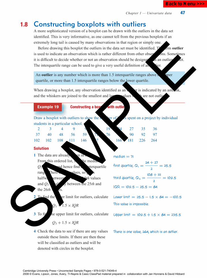
P1: FXS/ABE P2: FXS0521672600Xc01.xml CUAU034-EVANS September 15, 2008 20:51
Chapter 1 — Univariate data 47
1.8 Constructing boxplots with outliersA more sophisticated version of a boxplot can be drawn with the outliers in the data set
identified. This is very informative, as one cannot tell from the previous boxplots if an
extremely long tail is caused by many observations in that region or simply one.
Before drawing this boxplot the outliers in the data set must be identified. The term outlier
is used to indicate an observation which is rather different from other observations. Sometimes
it is difficult to decide whether or not an observation should be designated as an outlier or not.
The interquartile range can be used to give a very useful definition of an outlier.
An outlier is any number which is more than 1.5 interquartile ranges above the upper
quartile, or more than 1.5 interquartile ranges below the lower quartile.
When drawing a boxplot, any observation identified as an outlier is indicated by an asterisk,
and the whiskers are joined to the smallest and largest values which are not outliers.
Example 19 Constructing a boxplot with outliers
Draw a boxplot with outliers to show the number of hours spent on a project by individual
students in a particular school.2 3 4 9 9 13 19 24 27 35 36
37 40 48 56 59 71 76 86 90 92 97
102 102 108 111 146 147 147 166 181 226 264
Solution
1 The data are already given in order.
From this ordered list, find the median,
Q1 and Q3, and hence find the interquartile
range. There are 33 values, so Q1 is
halfway between the 8th and 9th values
and Q3 is halfway between the 25th and
the 26th values.
2 To find the lower limit for outliers, calculate
Q1 − 1.5 × IQR
3 To find the upper limit for outliers, calculate
Q3 + 1.5 × IQR
4 Check the data to see if there are any values
outside these limits. If there are then these
will be classified as outliers and will be
denoted with circles in the boxplot.
median = 71
first quartile, Q1 = 24 + 27
2= 25.5
third quartile, Q3 = 108 + 111
2= 109.5
IQR = 109.5 − 25.5 = 84
Lower limit = 25.5 − 1.5 × 84 = −100.5
This value is impossible.
Upper limit = 109.5 + 1.5 × 84 = 235.5
There is one value, 264, which is an outlier.
Cambridge University Press • Uncorrected Sample Pages • 978-0-521-74049-4 2008 © Evans, Lipson, Jones, Avery, TI-Nspire & Casio ClassPad material prepared in collaboration with Jan Honnens & David Hibbard
SAMPLE
Back to Menu >>>

P1: FXS/ABE P2: FXS0521672600Xc01.xml CUAU034-EVANS September 15, 2008 20:51
48 Essential Standard General Mathematics
5 Find the largest value which is not an outlier.
The right hand whisker of the boxplot will finish
at this value.
6 The boxplot can now be constructed
as shown.
The largest value which is not an outlier is 226.
0 100 200 300
The graphics calculator will also construct a boxplot with outliers. Consider again the data
from Example 19.
How to construct a boxplot with outliers using the TI-Nspire CAS
Draw a box plot with outliers to show the number of hours spent on a project by
individual students in a particular school.
2 3 4 9 9 13 19 24 27 35 36
37 40 48 56 59 71 76 86 90 92 97
102 102 108 111 146 147 147 166 181 226 264
Steps1 Start a new document: / + N .
2 Select 3:Add Lists & Spreadsheet.Enter the data into a list called hours, as shown.
3 Statistical graphing is done through the Data &Statistics application. Press and select 5:Data& Statistics.Note: A random display of dots will appear – this is toindicate list data are available for plotting. It is not astatistical plot.
a Move the cursor to the textbox area below the
horizontal axis. Press when prompted and
select the variable hours. Press enter to paste
the variable hours to that axis. A dot plot is
displayed as the default plot.
Cambridge University Press • Uncorrected Sample Pages • 978-0-521-74049-4 2008 © Evans, Lipson, Jones, Avery, TI-Nspire & Casio ClassPad material prepared in collaboration with Jan Honnens & David Hibbard
SAMPLE
Back to Menu >>>

P1: FXS/ABE P2: FXS0521672600Xc01.xml CUAU034-EVANS September 15, 2008 20:51
Chapter 1 — Univariate data 49
b To change the plot to a boxplot, press
b/1:Plot Type/2:Box Plot to obtain the screen
shown right. Outliers are indicated by a dot(s)
lying outside the main body of the plot.
4 Data Analysis
Starting at the far left of the plot, we see that the� minimum value is 2 (MinX = 2)� first quartile is 25.5 (Q1 = 25.5)� median is 71 (Median = 71)� third quartile is 109.5 (Q3 = 109.5)� maximum value is 264 (MaxX = 264). It is also an outlier.
How to construct a boxplot with outliers using the ClassPad
Draw a boxplot with outliers to show the number of hours spent on a project by individual
students in a particular school.
2 3 4 9 9 13 19 24 27 35 36
37 40 48 56 59 71 76 86 90 92 97
102 102 108 111 146 147 147 166 181 226 264
Steps1 Open the Statistics application and
enter the data into the column
labelled hours.
2 Open the Set StatGraphs dialog
box by tapping in the toolbar.
Complete the dialog box as given
below. For� Draw: select On� Type: select MedBox ( )� XList: select main \ hours ( )� Freq: leave as 1Tap the Show Outliers box to add
a tick ( ).
Cambridge University Press • Uncorrected Sample Pages • 978-0-521-74049-4 2008 © Evans, Lipson, Jones, Avery, TI-Nspire & Casio ClassPad material prepared in collaboration with Jan Honnens & David Hibbard
SAMPLE
Back to Menu >>>

P1: FXS/ABE P2: FXS0521672600Xc01.xml CUAU034-EVANS September 15, 2008 20:51
50 Essential Standard General Mathematics
3 Tap y to plot the boxplot and then
tap r to obtain a full-screen
display.
Key values can be read from the
boxplot by tapping . Use the
horizontal cursor arrows ( and )
to move from point to point on the
box plot.
Starting at the far left of the plot, we see that the� minimum value is 2 (minX = 2)� first quartile is 25.5 (Q1 = 25.5)� median is 71 (Median = 71)� third quartile is 109.5 (Q3 = 109.5)� maximum value is 264 (maxX = 264). It is also an outlier.
Exercise 1H
1 A researcher is interested in the number of books people borrow from a library. She decided
to select a sample of 38 cards and record the number of books each person has borrowed in
the previous year. Here are her results:
7 28 0 2 38 18 0 0 4 0 0
2 13 1 1 14 1 8 27 0 52 4
0 12 28 15 10 1 0 2 0 1 11
5 11 0 13 0
a Determine the five-number summary for this data set.
b Determine if there are any outliers.
c Draw a boxplot of the data, showing any outliers.
d Describe the number of books borrowed in terms of shape, centre, spread and outliers.
2 The winnings (in dollars) of the top 25 male tennis players in 2004 are given in the
following table:
Cambridge University Press • Uncorrected Sample Pages • 978-0-521-74049-4 2008 © Evans, Lipson, Jones, Avery, TI-Nspire & Casio ClassPad material prepared in collaboration with Jan Honnens & David Hibbard
SAMPLE
Back to Menu >>>
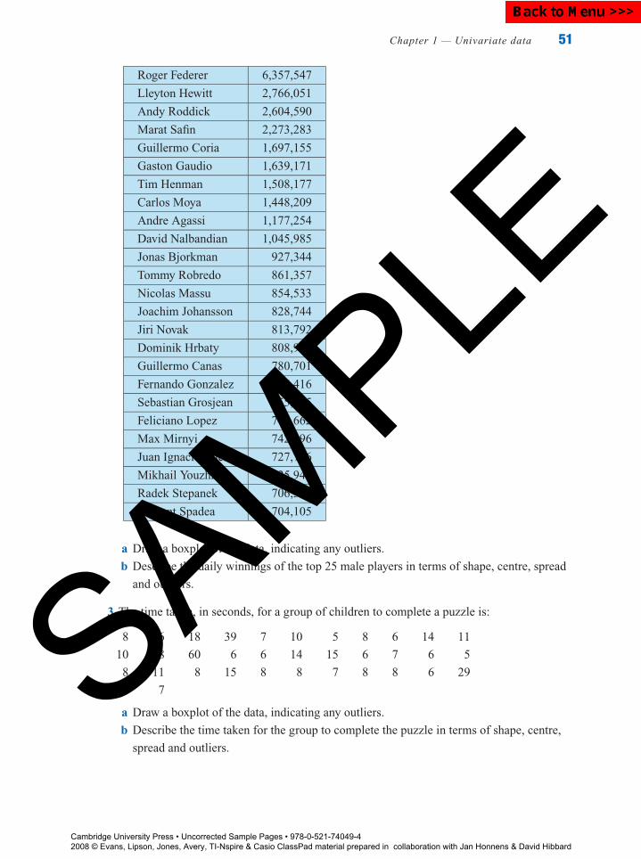
P1: FXS/ABE P2: FXS0521672600Xc01.xml CUAU034-EVANS September 15, 2008 20:51
Chapter 1 — Univariate data 51
Roger Federer 6,357,547
Lleyton Hewitt 2,766,051
Andy Roddick 2,604,590
Marat Safin 2,273,283
Guillermo Coria 1,697,155
Gaston Gaudio 1,639,171
Tim Henman 1,508,177
Carlos Moya 1,448,209
Andre Agassi 1,177,254
David Nalbandian 1,045,985
Jonas Bjorkman 927,344
Tommy Robredo 861,357
Nicolas Massu 854,533
Joachim Johansson 828,744
Jiri Novak 813,792
Dominik Hrbaty 808,944
Guillermo Canas 780,701
Fernando Gonzalez 766,416
Sebastian Grosjean 755,795
Feliciano Lopez 748,662
Max Mirnyi 742,196
Juan Ignacio Chela 727,736
Mikhail Youzhny 725,948
Radek Stepanek 706,387
Vincent Spadea 704,105
a Draw a boxplot of the data, indicating any outliers.
b Describe the daily winnings of the top 25 male players in terms of shape, centre, spread
and outliers.
3 The time taken, in seconds, for a group of children to complete a puzzle is:
8 6 18 39 7 10 5 8 6 14 11
10 8 60 6 6 14 15 6 7 6 5
8 11 8 15 8 8 7 8 8 6 29
5 7
a Draw a boxplot of the data, indicating any outliers.
b Describe the time taken for the group to complete the puzzle in terms of shape, centre,
spread and outliers.
Cambridge University Press • Uncorrected Sample Pages • 978-0-521-74049-4 2008 © Evans, Lipson, Jones, Avery, TI-Nspire & Casio ClassPad material prepared in collaboration with Jan Honnens & David Hibbard
SAMPLE
Back to Menu >>>

P1: FXS/ABE P2: FXS0521672600Xc01.xml CUAU034-EVANS September 15, 2008 20:51
52 Essential Standard General Mathematics
4 The daily circulation of several daily newspapers in Australia is:
570 000 327 654 299 797 273 248 258 700
230 487 217 284 214 000 212 770 171 568
170 000 125 778 98 158 77 500 56 000
43 330 17 398
a Draw a boxplot of the data, indicating any outliers.
b Describe the daily newspaper circulation in terms of shape, centre, spread and outliers.
5 To test the effect of a physical fitness course the number of sit ups that a person could do in
one minute, both before and after the course, were recorded. Twenty randomly selected
participants scored as follows.
Before 29 22 25 29 26 24 31 46 34 28
23 22 26 26 30 12 17 21 20 30
After 28 26 25 35 33 36 32 54 50 43
25 24 30 34 30 15 29 21 19 34
a Construct boxplots of these two sets of data on the same axis.
b Describe the effect of the physical fitness course on the number of sit ups achieved in
terms of shape, centre, spread and outliers.
6 The following table gives life expectancies in years for males and females in several
countries around the world in the year 2000.
Country Male Female
Afghanistan 43 43
Algeria 73 69
Australia 76 82
Canada 76 82
China 69 72
Germany 81 74
Hong Kong 77 82
Jamaica 73 77
Japan 78 84
Malaysia 70 75
Mexico 70 76
Peru 67 72
United Arab Emirates 74 77
United Kingdom 75 80
United States 74 80
a Construct boxplots of these two sets of data on the same axis.
b Compare the life expectancies for males and females in terms of shape, centre, spread
and outliers.
Cambridge University Press • Uncorrected Sample Pages • 978-0-521-74049-4 2008 © Evans, Lipson, Jones, Avery, TI-Nspire & Casio ClassPad material prepared in collaboration with Jan Honnens & David Hibbard
SAMPLE
Back to Menu >>>
P1: FXS/ABE P2: FXS0521672600Xc01.xml CUAU034-EVANS September 15, 2008 20:51
Review
Chapter 1 — Univariate data 53
Key ideas and chapter summary
Types of data Data can be classified as numerical or categorical.
Frequency table A frequency table is a listing of the values that a variable takes in a data
set, along with how often (frequently) each value occurs.
Frequency can be recorded as a count (the number of times a value
occurs) or a percent (the percentage of times a value occurs).
Categorical data Categorical data arises when classifying or naming some quality or
attribute.
Bar chart A bar chart is used to display the frequency distribution of categorical
data.
Mode, modal The mode (or modal category) is the value of a variable (or the category)
that occurs most frequently. The modal class, for grouped data, is the
interval that occurs most frequently.
category/class
Numerical data Numerical data arises from measuring or counting some quantity.
Discrete numerical data can only take particular values, usually whole
numbers, and often arises from counting.
Continuous numerical data describes numerical data that can take any
value, sometimes in an interval, and often arises from measuring.
Histogram A histogram is used to display the frequency distribution of a numerical
variable: suitable for medium- to large-sized data sets.
Stem plot A stem plot is a visual display of a numerical data set, an alternative
display to the histogram: suitable for small- to medium-sized data sets.
Leading digits are shown as the stem and the final digit as the leaf.
Dot plot A dot plot consists of a number line with each data point marked by a
dot: suitable for small sets of data only.
Describing the The distribution of a numerical variable can described in terms of shape
(symmetric or skewed: positive or negative), centre (the midpoint of
the distribution) and spread.
distribution of anumerical variable
Outliers Outliers are data values that appear to stand out (not belong) from the
rest of the data set. Formally defined as a value more then 1.5 IQR below
Q1, or more than 1.5 IQR above Q3.
Summary statistics Summary statistics are used to give numerical values to special features
of a data distribution such as centre and spread.
Mean The mean (x) is a summary statistic that can be used to locate the centre
of a symmetric distribution.
x = �x
n
where �x is the sum of the data values and n is the number of data
values.
Cambridge University Press • Uncorrected Sample Pages • 978-0-521-74049-4 2008 © Evans, Lipson, Jones, Avery, TI-Nspire & Casio ClassPad material prepared in collaboration with Jan Honnens & David Hibbard
SAMPLE
Back to Menu >>>
P1: FXS/ABE P2: FXS0521672600Xc01.xml CUAU034-EVANS September 15, 2008 20:51
Rev
iew
54 Essential Standard General Mathematics
Range The range (R) is the difference between the smallest and the largest
data values. It is the simplest measure of spread.
Range = largest value − smallest value
Standard deviation The standard deviation (s) is a summary statistic that measures the
spread of the data values around the mean.
s =√
�(x − x)2
n − 1.
Median The median (M ) is a summary statistic that can be used to locate the
centre of a distribution. It is the midpoint of a distribution, so that 50%
of the data values are less than this value and 50% are more.
If the distribution is clearly skewed or there are outliers, the median is
preferred to the mean as a measure of centre.
Quartiles Quartiles are summary statistics that divide an ordered data set into
four equal groups.
The first quartile (Q1) is the value such that 25% of values are less
than this value and 75% are more.
The third quartile (Q3) is the value such that 75% of values are less
than this value and 25% are more.
Interquartile range The interquartile range (IQR) gives the spread of the middle 50% of
data values in an ordered data set.
IQR = Q3 − Q1
If the distribution is highly skewed or there are outliers, the IQR is
preferred to the standard deviation as a measure of spread.
Five-number The median, the first quartile, the third quartile, along with the
minimum and the maximum values in a data set, are known as a
five-number summary.
summary
Boxplot A visual display of a five-number summary. An alternative to a
histogram or stemplot for numerical data. The boxplot is constructed
by drawing a horizontal box with the ends at the first and third
quartiles. The minimum value is joined to the lower end of the box
with a horizontal line and the maximum joined to the upper end of the
box with a horizontal line. The median is located with a vertical line.
Boxplot with outliers A more complex version of the boxplot with outliers shown. Outliers
are determined according to the formal definition of an outlier, and
illustrated on the plot with an asterisk. The boxplot is constructed as
before but the lower end of the box is joined by a horizontal line to the
smallest value which is not an outlier, and the upper end of the box is
joined by a horizontal line to the largest value which is not an outlier.
Cambridge University Press • Uncorrected Sample Pages • 978-0-521-74049-4 2008 © Evans, Lipson, Jones, Avery, TI-Nspire & Casio ClassPad material prepared in collaboration with Jan Honnens & David Hibbard
SAMPLE
Back to Menu >>>
P1: FXS/ABE P2: FXS0521672600Xc01.xml CUAU034-EVANS September 15, 2008 20:51
Review
Chapter 1 — Univariate data 55
Comparing When comparing distributions of two or more data sets the comparison
should be made in terms of shape, centre, spread and outliers for each
distribution.
distributions
Skills check
Having completed this chapter you should be able to:
differentiate between numerical and categorical data
interpret the information contained in a frequency table
identify the mode from a frequency table and interpret it
construct a bar chart or histogram from a frequency table
construct a histogram from raw data using a graphics calculator
construct a dot plot and stem-and-leaf plot from raw data
recognise symmetric, positively skewed and negatively skewed distributions
identify potential outliers in a distribution from its histogram or stem plot
locate the median and quartiles of a data set and hence calculate the IQR
produce a five-number summary from a set of data
construct a boxplot from a stem plot
construct a boxplot from raw data using a graphics calculator
use a boxplot to identify key features of a data set, such as shape, centre and spread
use the information in a boxplot to describe and compare distributions
calculate the mean and standard deviation of a data set
understand the difference between the mean and the median as measures of centre
and be able to identify situations where it is more appropriate to use the median
write a paragraph comparing distributions in terms of shape, centre, spread and
outliers.
Multiple-choice questions
1 In a survey, a number of people were asked to indicate how much they exercised by
selecting one of the options never, seldom, occasionally or regularly. The resulting
variable was named Level of exercise. The type of data generated is:
A variable B numerical C constant D categorical E metric
2 For which of the following variables is a bar chart an appropriate display?
A Weight (kg) B Age (years) C Distance between towns (km)
D Hair colour E Reaction time (seconds)
3 For which of the following variables is a histogram an appropriate display?
A Weight (under weight, average, over weight) B Sex (male, female)
C Distance between towns (km) D Hair colour E Postcode
Cambridge University Press • Uncorrected Sample Pages • 978-0-521-74049-4 2008 © Evans, Lipson, Jones, Avery, TI-Nspire & Casio ClassPad material prepared in collaboration with Jan Honnens & David Hibbard
SAMPLE
Back to Menu >>>
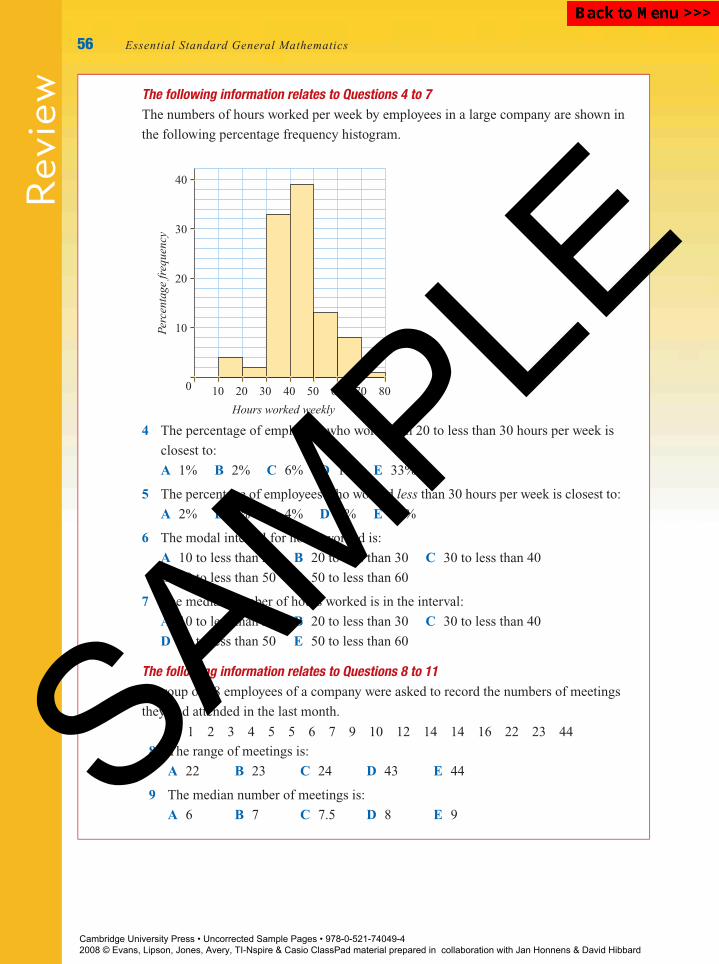
P1: FXS/ABE P2: FXS0521672600Xc01.xml CUAU034-EVANS September 15, 2008 20:51
Rev
iew
56 Essential Standard General Mathematics
The following information relates to Questions 4 to 7The numbers of hours worked per week by employees in a large company are shown in
the following percentage frequency histogram.
10 20 30 40 50 60 70 800
10
20
30
40
Hours worked weekly
Perc
enta
ge fr
eque
ncy
4 The percentage of employees who work from 20 to less than 30 hours per week is
closest to:
A 1% B 2% C 6% D 10% E 33%
5 The percentage of employees who worked less than 30 hours per week is closest to:
A 2% B 3% C 4% D 6% E 30%
6 The modal interval for hours worked is:
A 10 to less than 20 B 20 to less than 30 C 30 to less than 40
D 40 to less than 50 E 50 to less than 60
7 The median number of hours worked is in the interval:
A 10 to less than 20 B 20 to less than 30 C 30 to less than 40
D 40 to less than 50 E 50 to less than 60
The following information relates to Questions 8 to 11A group of 18 employees of a company were asked to record the numbers of meetings
they had attended in the last month.
1 1 2 3 4 5 5 6 7 9 10 12 14 14 16 22 23 44
8 The range of meetings is:
A 22 B 23 C 24 D 43 E 44
9 The median number of meetings is:
A 6 B 7 C 7.5 D 8 E 9
Cambridge University Press • Uncorrected Sample Pages • 978-0-521-74049-4 2008 © Evans, Lipson, Jones, Avery, TI-Nspire & Casio ClassPad material prepared in collaboration with Jan Honnens & David Hibbard
SAMPLE
Back to Menu >>>
P1: FXS/ABE P2: FXS0521672600Xc01.xml CUAU034-EVANS September 15, 2008 20:51
Review
Chapter 1 — Univariate data 57
10 The mean number of meetings is closest to:
A 7 B 8 C 9 D 10 E 11
11 The interquartile range (IQR) of the number of meetings is:
A 0 B 4 C 9.5 D 10 E 14
12 The heights of six basketball players (in cm) are:
178.1 185.6 173.3 193.4 183.1 193.0
The mean and standard deviation are closest to:
A mean = 184.4; standard deviation = 8.0
B mean = 184.4; standard deviation = 7.3
C mean = 182.5; standard deviation = 7.3
D mean = 182.5; standard deviation = 8.0
E mean = 183.1; standard deviation = 7.3
The following information relates to Questions 13 and 14The dot plot below gives the examination scores in Mathematics for a group of
20 students.
4032 48 56 64 72 80Mathematics score
88
13 The number of students who scored 56 on the examination is:
A 1 B 2 C 3 D 4 E 5
14 The percentage of students who scored between 40 and 80 on the examination is
closest to:
A 60% B 70% C 80% D 90% E 100%
The following information relates to Questions 15 to 18The number of years for which a sample of people have lived at their current address is
summarised in the boxplot.
0 10 20 30 40 50
Years lived at this address
15 The shape of the distribution of Years lived at this address is:
A positively skewed B negatively skewed C bimodal
D symmetric E symmetrically skewed
Cambridge University Press • Uncorrected Sample Pages • 978-0-521-74049-4 2008 © Evans, Lipson, Jones, Avery, TI-Nspire & Casio ClassPad material prepared in collaboration with Jan Honnens & David Hibbard
SAMPLE
Back to Menu >>>

P1: FXS/ABE P2: FXS0521672600Xc01.xml CUAU034-EVANS September 15, 2008 20:51
Rev
iew
58 Essential Standard General Mathematics
16 The median number of Years lived at this address is closest to:
A 5 B 9 C 12 D 15 E 47
17 The interquartile range of the number of Years lived at this address is closest to:
A 5 B 10 C 15 D 20 E 45
18 The percentage who have lived at this address for more than 15 years is closest to:
A 10% B 25% C 50% D 60% E 75%
The following information relates to Questions 19 to 21The amounts paid per annum to the employees of each of three large companies are
shown in the boxplots.
0 20000 40000 60000 80000 100000
Yearly pay ($)
Company 1
Company 2
Company 3
19 The company with the lowest typical wage is:
A Company 1 B Company 2 C Company 3
D Company 1 and Company 2 E Company 2 and Company 3
20 The company with the largest variation in wages is:
A Company 1 B Company 2 C Company 3
D Company 1 and Company 2 E Company 2 and Company 3
21 Which of the following statements is not true?
A All workers in Company 3 earned less than $60 000 per year.
B 50% of workers in Company 2 earned less than $40 000 per year.
C 75% of workers in Company 2 earned less than the median wage in Company 3.
D More than 25% of the workers in Company 1 earned more than anyone working
for Company 3.
E Less than 25% of the workers in Company 1 earned more than the median wage
at Company 2.
Cambridge University Press • Uncorrected Sample Pages • 978-0-521-74049-4 2008 © Evans, Lipson, Jones, Avery, TI-Nspire & Casio ClassPad material prepared in collaboration with Jan Honnens & David Hibbard
SAMPLE
Back to Menu >>>

P1: FXS/ABE P2: FXS0521672600Xc01.xml CUAU034-EVANS September 15, 2008 20:51
Review
Chapter 1 — Univariate data 59
Short-answer questions
1 Classify the data that arises from the following situations as categorical or
numerical.
a The number of phone calls a hotel receptionist receives each day
b Interest in politics on a scale from 1 to 5, where 1 = very interested,
2 = quite interested, 3 = somewhat interested, 4 = not very interested,
and 5 = uninterested.
2 The following bar chart shows the percentage of working people in a certain town
who are employed in private companies, work for the government or are
self-employed.
a Is the data categorical or numerical?
b Approximately what percentage of the people are self-employed?
Private Government Self-employed0
10
20
30
Perc
ent
50
40
Type of company worked for
3 A researcher asked a group of people to record how many cigarettes they had
smoked on a particular day. Here are her results:
0 0 9 10 23 25 0 0 34 32 0 0 30 0 4
5 0 17 14 3 6 0 33 23 0 32 13 21 22 6
Using class intervals of width 5, construct a histogram of this data.
4 A teacher recorded the time taken (in minutes) by each of a class of students to
complete a test:
56 57 47 68 52 51 43 22 59 51 39
54 52 69 72 65 45 44 55 56 49 50
a Make a dot plot of this data.
b Make a stem-and-leaf plot of these times.
c Use this stem plot to find the median and quartiles for the time taken.
Cambridge University Press • Uncorrected Sample Pages • 978-0-521-74049-4 2008 © Evans, Lipson, Jones, Avery, TI-Nspire & Casio ClassPad material prepared in collaboration with Jan Honnens & David Hibbard
SAMPLE
Back to Menu >>>
P1: FXS/ABE P2: FXS0521672600Xc01.xml CUAU034-EVANS September 15, 2008 20:51
Rev
iew
60 Essential Standard General Mathematics
5 The weekly rentals, in dollars, for apartments in a particular suburb are given below:
285 185 210 215 320 680 280
265 300 210 270 190 245 315
Find the mean and standard deviation, the median and the IQR, and the range of the
weekly rentals.
6 Geoff decided to record the time (in minutes) it takes him to complete his mail
round each working day for 4 weeks. His data is recorded below:
170 189 201 183 168 182 161 166 167 173
164 176 161 187 180 201 147 188 186 176
182 167 188 211 174 193 185 183
Find the mean and standard deviation of his mail round times.
7 A group of students was asked to record the number of SMS messages that they sent
in one 24-hour period, and the following five-number summary was obtained from
the data set.
Min = 0, Q1 = 3, M = 5, Q3 = 12, Max = 24
Use the summary to construct a boxplot of this data.
8 The following data gives the numbers of students absent from a large secondary
college on each of 36 randomly chosen school days:
7 22 12 15 21 16 23 23 17 23 8 16
7 3 21 30 13 2 7 12 18 14 14 0
15 16 13 21 10 16 11 4 3 0 31 44
a Construct a boxplot of this data.
b What was the median number of students absent each day during this period?
c On what percentage of days were more than 20 students absent?
Extended-response questions
1 The divorce rates (in percentages) of 19 countries are:
27 18 14 25 28 6 32 44 53 0
26 8 14 5 15 32 6 19 9
a Is the data categorical or numerical?
b Construct an ordered stem plot of divorce rates.
c Construct a dot plot of divorce rates.
d What shape is the distribution of divorce rates?
e What percentage of the 19 countries have divorce rates greater than 30%?
f Calculate the mean and median of the distribution of divorce rates.
Cambridge University Press • Uncorrected Sample Pages • 978-0-521-74049-4 2008 © Evans, Lipson, Jones, Avery, TI-Nspire & Casio ClassPad material prepared in collaboration with Jan Honnens & David Hibbard
SAMPLE
Back to Menu >>>

P1: FXS/ABE P2: FXS0521672600Xc01.xml CUAU034-EVANS September 15, 2008 20:51
Review
Chapter 1 — Univariate data 61
g Construct a histogram of the data with class intervals of width 10.
i What is the shape of the histogram?
ii How many of the 19 countries have divorce rates from 10% to less than 20%?
2 Hillside Trains has decided to improve its service on the Lilydale line. Trains were
timed on the run from Lilydale to Flinders Street, and their times recorded over a
period of 6 weeks at the same time each day. The journey times are shown below (in
minutes):
60 61 70 72 68 80 76 65 69 79 82
90 59 86 70 77 64 57 65 60 68 60
63 67 74 78 65 68 82 89 75 62 64
58 64 69 59 62 63 89 74 60a Construct a histogram of the times taken for the journey from Lilydale to
Flinders Street, using class intervals 55–59, 60–64, 65–69, etc. minutes.
i On how many days did the trip take 65–69 minutes?
ii What shape is the histogram?
iii What percentage of trains took less than 65 minutes to reach Flinders Street?
b Calculate the following summary statistics for the time taken (correct to
2 decimal places):
x, s, Min, Q1, M, Q3, Max
c Use the summary statistics to complete the following report.
i The mean time taken from Lilydale to Flinders Street was
minutes.
ii 50% of the trains took more than minutes to travel from Lilydale
to Flinders Street.
iii The range of travelling times was minutes, while the
interquartile range was minutes.
iv 25% of trains took more than minutes to travel to Flinders Street.
v The standard deviation of travelling times was minutes.
d Summary statistics for the year before Hillside Trains took over the Lilydale line
from the Met are:
Min = 55, Q1 = 65, M = 70, Q3 = 89, Max = 99
Construct boxplots for the last year the Met ran the line and for the data from
Hillside Trains on the same plot.
e Use the information from the boxplots to compare travelling times for the two
transport corporations in terms of shape, centre and spread.
Cambridge University Press • Uncorrected Sample Pages • 978-0-521-74049-4 2008 © Evans, Lipson, Jones, Avery, TI-Nspire & Casio ClassPad material prepared in collaboration with Jan Honnens & David Hibbard
SAMPLE
Back to Menu >>>

P1: FXS/ABE P2: FXS0521672600Xc01.xml CUAU034-EVANS September 15, 2008 20:51
Rev
iew
62 Essential Standard General Mathematics
3 In a small company, upper management
wants to know whether there is a difference
in the three types of methods used to train
its machine operators. One method uses a
hands-on approach. A second method uses
a combination of classroom instruction and
on-the-job training. The third method is based
completely on classroom training. Fifteen
trainees are assigned to each training
technique. The data shown is the result of
a test administered after completion of the
training for people trained using each method.
Method 1 Method 2 Method 3
98 79 70
100 62 74
89 61 60
90 89 72
81 69 65
85 99 49
97 87 71
95 62 75
87 65 55
70 88 65
69 98 70
75 79 59
91 73 77
92 96 67
93 83 80
a Draw boxplots of the data sets, on the
same axis.
b Write a paragraph comparing the three
training methods in terms of shape, centre,
spread and outliers.
c Which training method would you recommend?
4 It has been argued that there is a relationship between a child’s level of independence
and the order in which they were born in the family. Suppose that the children in
13 three-child families are rated on a 50-point scale of independence. This is done
when all children are adults, thus eliminating age effects. The results are as follows.
Family 1 2 3 4 5 6 7 8 9 10 11 12 13
First-born 38 45 30 29 34 19 35 40 25 50 44 36 26
Second-born 9 40 24 16 16 21 34 29 22 29 20 19 18
Third-born 12 12 12 25 9 11 20 12 10 20 16 13 10
a Draw boxplots of the data sets on the same axis. Use a calculator.
b Write a paragraph comparing level of independence for the three birth orders in
terms of shape, centre, spread and outliers.
Cambridge University Press • Uncorrected Sample Pages • 978-0-521-74049-4 2008 © Evans, Lipson, Jones, Avery, TI-Nspire & Casio ClassPad material prepared in collaboration with Jan Honnens & David Hibbard
SAMPLE
Back to Menu >>>